Create successful ePaper yourself
Turn your PDF publications into a flip-book with our unique Google optimized e-Paper software.
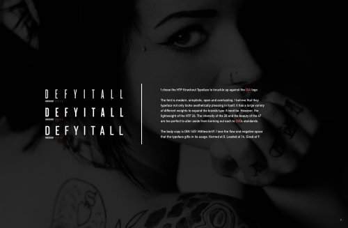
I chose the HTF Knockout Typeface to knuckle up against the DIA logo.<br />
The font is modern, simplistic, open and everlasting. I believe that they<br />
typeface not only looks aesthetically pleasing in itself, it has a large variety<br />
of different weights to expand the brands type if need be. However, the<br />
lightweight of the HTF 26, The intensity of the 28 and the beauty of the 47<br />
are too perfect to alter aside from kerning out each to DIA’s standards.<br />
The body copy is DIN 1451 Mittleschriff. I love the flow and negative space<br />
that the typeface gifts in its usage. Kerned at 0, Leaded at 14, Sized at 9.<br />
10


