T-Medicus Style Guide

Create successful ePaper yourself
Turn your PDF publications into a flip-book with our unique Google optimized e-Paper software.
T-MEDICUS<br />
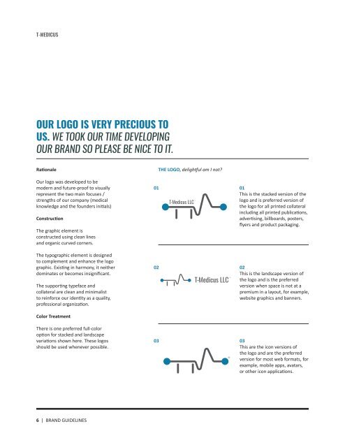
OUR LOGO IS VERY PRECIOUS TO<br />
US. WE TOOK OUR TIME DEVELOPING<br />
OUR BRAND SO PLEASE BE NICE TO IT.<br />
Rationale<br />
Our logo was developed to be<br />
modern and future-proof to visually<br />
represent the two main focuses /<br />
strengths of our company (medical<br />
knowledge and the founders initials)<br />
Construction<br />
The graphic element is<br />
constructed using clean lines<br />
and organic curved corners.<br />
The typographic element is designed<br />
to complement and enhance the logo<br />
graphic. Existing in harmony, it neither<br />
dominates or becomes insignificant.<br />
The supporting typeface and<br />
collateral are clean and minimalist<br />
to reinforce our identity as a quality,<br />
professional organization.<br />
Color Treatment<br />
There is one preferred full-color<br />
option for stacked and landscape<br />
variations shown here. These logos<br />
should be used whenever possible.<br />
THE LOGO, delightful am I not?<br />
01<br />
02<br />
03<br />
01<br />
This is the stacked version of the<br />
logo and is preferred version of<br />
the logo for all printed collateral<br />
including all printed publications,<br />
advertising, billboards, posters,<br />
flyers and product packaging.<br />
02<br />
This is the landscape version of<br />
the logo and is the preferred<br />
version when space is not at a<br />
premium in a layout, for example,<br />
website graphics and banners.<br />
03<br />
This are the icon versions of<br />
the logo and are the preferred<br />
version for most web formats, for<br />
example, mobile apps, avatars,<br />
or other icon applications.<br />
6 | BRAND GUIDELINES