

Haan Ilango About Me
My Folio, with tips and tricks on typography and colors. You may refer to them for designing your powerpoint, marketing collaterals etc.
My Folio, with tips and tricks on typography and colors. You may refer to them for designing your powerpoint, marketing collaterals etc.

You also want an ePaper? Increase the reach of your titles
YUMPU automatically turns print PDFs into web optimized ePapers that Google loves.
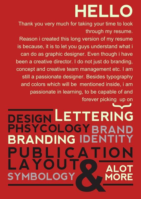
HELLO<br />
Thank you very much for taking your time to look<br />
through my resume.<br />
Reason i created this long version of my resume<br />
is because, it is to let you guys understand what i<br />
can do as graphic designer. Even though i have<br />
been a creative director. I do not just do branding,<br />
concept and creative team management etc. I am<br />
still a passionate designer. Besides typography<br />
and colors which will be mentioned inside, i am<br />
passionate in learning, to be capable of and<br />
forever picking up on<br />
}<br />
DESIGN<br />
PHSYCOLOGYBRAND<br />
BRANDING<br />
IDENTITY<br />
PUBLI CATION<br />
LAYOUT<br />
SYMBOLOGY<br />
&<br />
ALOT<br />
MORE
HAAN<br />
ILANGO<br />
BRAND DESIGN AND GRAPHIC DESIGN<br />
SINCE 2013<br />
EMAIL<br />
haan.ilango@gmail.com<br />
TELEPHONE<br />
65 81333450<br />
PORTFOLIO<br />
http://haanilango4.wixsite.com<br />
/unorthodox<br />
WORK EXPERIENCE<br />
MAGNET SINGAPORE<br />
CREATIVE DIRECTOR (Nov 2013 - Recent)<br />
- creative team management & training<br />
- brief intrepertation<br />
- research and planning<br />
- brand strategy design<br />
- brand identity design<br />
- graphic design<br />
- quality assurance<br />
- concept creation<br />
AARON WILLIS<br />
CREATIVE EVENTS DESIGNER (Mar 2013 - Oct 2013)<br />
- graphic design for event platforms<br />
- vendor & client liaison<br />
- events setup<br />
INSTAGRAM Freelancing<br />
unorthodox_haaninked<br />
FACEBOOK Freelancing<br />
65 81333450<br />
MALIFAX TECHNOLOGIES<br />
IT TECH SUPPORT (Jul 2012 - Oct 2013)<br />
- job assignment planning<br />
- remote troubleshooting<br />
- on-site support<br />
- adhoc duties<br />
ABOUT ME<br />
PASSION AND PERSONALITY<br />
Really love<br />
typography , colors,<br />
lettering and graphic design, I<br />
understand branding pretty well due<br />
to heavy engagement on brand<br />
strategy and conceptualizing design<br />
approaches in my creative journey<br />
Fun and nice to work with, hardworking<br />
and I am like a good librarian for<br />
branding and design books due<br />
to my consistent reading,<br />
learning and practice<br />
PRICEWATERHOUSECOOPER<br />
COMPUTER OPERATOR (Apr 2008 - Jun 2012)<br />
- server monitoring, data archiving<br />
- ID administrator<br />
- supervising vendors on relocation<br />
- monthly server maintenance<br />
- technical and remote support<br />
MORE JOBS<br />
KULLIQ AND SOFFAE<br />
PRODUCT TECHNICIAN (Feb 2007 - Dec 2007)<br />
3M<br />
PRODUCT TECHNICIAN (Sep 2005 - Oct 2006)
EDUCATION<br />
First <strong>Me</strong>dia Design School<br />
Diploma In Visual Communication Jan 2014 - Aprl 2015<br />
Nanyang Academy Of Fine Arts<br />
Certificate In Design Jan 2010 - June 2010<br />
Institute Of Technical Education<br />
Nitec In <strong>Me</strong>chatronics Jan 2000 - Dec 2001<br />
Siling Secondary School<br />
N-LEVEL Jan 1995 to Dec 1998<br />
Shuqun Primary School<br />
PSLE Jan 1989 to Dec 1994<br />
- Zepht Chen<br />
TESTIMONIALS<br />
“ Mr Mohammed Farhaan is a fully capable Creative Director able to lead in<br />
campaigns and designs of all sorts, with good speed, precision, and design<br />
sense. He is also blessed with a natural ability to teach other designers, in<br />
simple ways that can easily be understood. His drive and talent in branding<br />
make him a very valuable asset, competent from low levels (hands-on design)<br />
to high levels (leading a full team of designers and developers).”<br />
EXECUTIVE<br />
DIRECTOR, MAGNET<br />
“ Farhaan's insights in design and his work ethics are very much appreciated<br />
over here at Avanture. He have consistently shown himself to be<br />
knowledgeable and continues to improve on his skill sets routinely. A team<br />
player with a desire to spread his knowledge, he is truly an asset on our brand<br />
advisory board.”<br />
- Kaw Swuan Yee<br />
EXECUTIVE<br />
DIRECTOR, AVANTURE<br />
“ Farhaan is a capable creative director who has a great passion for design.<br />
He has helped our company design a brand identity that leaves a vivid<br />
impression of our company in various organisations. Farhaan spends most of<br />
his time reading and upgrading his knowledge and skills in branding and<br />
design. He is able to set directions for projects assigned to him. A very good<br />
team player,and a patient leader.”<br />
- May Chua<br />
FINANCE<br />
EXECUTIVE, START
What I Can Do<br />
For You #1<br />
TYPOGRAPHY<br />
the art or procedure of arranging type<br />
or processing data and printing from it.<br />
It is useful for print<br />
matters, identity<br />
design, and unique<br />
play for displaying<br />
contents<br />
Finding the right personality and creating the right type helps create the right message<br />
hello<br />
hello hello hello hello<br />
They look similar but the one on<br />
the left is a humanist serif and<br />
the one on the right is<br />
transitional serif, left is more<br />
warmer and has a much more<br />
human touch to it, the curvy<br />
serifs on the baseline is also<br />
more rounded edges etc on the<br />
serifs, see the letter ‘e’ and<br />
compare.<br />
Both is actually the same fonts<br />
with is classic sans serif, but i<br />
edited the one on the right with<br />
thicker strokes, make it have<br />
more rounded geometrical<br />
shape, and the terminals of ‘e’<br />
and ‘l’ has been changed to add<br />
in more personality<br />
Scripts are beautiful but they can<br />
be an issue in readability<br />
sometimes. As you can see the<br />
one on the left can be hard to<br />
read for some, I do not believe in<br />
leaving it to chance if there is<br />
time. I played with the hairline<br />
stroke of the letter ‘e’ on the right<br />
and took out the the hairline<br />
stroke of the letters ‘l’ so it is<br />
much legible and readable for<br />
the eyes.
TYPOGRAPHY<br />
Using type anatomy to create unique logos<br />
Some logos can be pretty lively<br />
depending on the theme, direction and<br />
personality of the brand<br />
hello<br />
there
TYPOGRAPHY<br />
Composition and layout for publications or posters<br />
Reason i caps my name<br />
HAAN<br />
is because if it is in lower<br />
case, the ascender for the<br />
letter ‘h’ interrupts the whole<br />
composition<br />
hello my name is haan<br />
OR MAYBE<br />
THIS ONE<br />
TOO<br />
if you are a designer<br />
you will know this part is tricky<br />
any have forgot drop capitals,<br />
text wrap and many<br />
other experimental stuffs<br />
on publication or paragraph design.<br />
It helps make reading stuffs less<br />
boring.<br />
Actually there are alot more stuff a<br />
designer can do with a good<br />
understanding of typography,<br />
from emphasis, redesigning<br />
newer<br />
fonts, using glyphs<br />
as icons for a<br />
message or<br />
a brand.<br />
Visual<br />
communication<br />
is all<br />
about capturing the<br />
viewers attention with<br />
the right message and<br />
graphics, and messages in the<br />
corporate world usually are represented<br />
with words, thats when typography<br />
comes in handy.
What I Can Do<br />
For You #2<br />
Colors<br />
I treat colors as a painting, with tones, saturation and<br />
the right relationship for the theme<br />
Pretty colors ain’t<br />
straightforward.<br />
Usually it involves<br />
patience and deep<br />
explorationI have lots of fun usually exploring colors,<br />
and thanks to illustrator and adobe<br />
softwares. It prevents me from fear of<br />
mixing the wrong colors on the graphic<br />
design.<br />
Colors have relationship, personality and mood that has already been perceived<br />
With the right control of value,<br />
any color can be used.<br />
Nowadays, most artist paint in<br />
grayscale first to ensure that<br />
the colour concept is all<br />
accurately emphasized and<br />
displayed. As you can see the<br />
letter above shows the<br />
difference in value. It is not<br />
adjusted by opacity but more<br />
on pallete selection and color<br />
editing<br />
Saturation<br />
Saturation is basically the most<br />
intense part of a color that the<br />
designer picked. It can put the eye<br />
on attention and not using it<br />
carefully will create reading<br />
discomfort. As you can see the<br />
letter ‘S’ is highly saturated. It is<br />
intense. It creates a strong<br />
emphasis on the word. If the whole<br />
word is highly saturated. It can<br />
really strain the eye. Aside from size<br />
for emphasize. This approach can<br />
be used to create focus on a page<br />
that has all similar size and shape.<br />
Hue<br />
Hue are basically another term for<br />
color. If you are lucky, by just<br />
choosing colors from the swatch<br />
pallete you might hit the jackpot to<br />
the right color theme for your<br />
design. But usually its not that easy.<br />
The ‘Hue’ of the word above is<br />
arranged from warm to cool and in<br />
primary color tone. There are<br />
primary, secondary and tertiary<br />
colors in the color wheel.<br />
Understanding this helps to do<br />
proper colour seeding and create<br />
good color relationships on the<br />
graphics.
COLORS<br />
hello there hello there<br />
Primary<br />
Primary colors are basically Red, Yellow Blue. but<br />
as you can see at the graphic above the colors<br />
are somewhat different. It is because the value,<br />
hue and saturation is being played accordingly.<br />
hello<br />
Tertiary<br />
there<br />
Tertiary colors are colors with two hues.<br />
Like orange-red, yellow-green, and violet<br />
blue. Which is exactly what you see above.<br />
The orange actually has a mix of red in it.<br />
Violet with some blue in it and yellow with<br />
more green in it<br />
Secondary<br />
Secondary colors are orange, green and violet. Even<br />
the green is not that obvious in the graphic, i muted<br />
the green with a hint of warm grey to create a darker<br />
unique tone, so it plays well as the thick stroke.<br />
Actually a warmer brown can make the strokes nicer,<br />
but the challenge here is to show with the right values,<br />
any colour can be used accordingly.<br />
There are actually alot<br />
more color principles<br />
and theory which can<br />
cover lots of pages,<br />
from color relationships,<br />
muting, emphasis,<br />
layout, hiearchy and<br />
phsycology and a lot<br />
more, but i do not plan<br />
to go that far. We leave<br />
that for later.