
Create successful ePaper yourself
Turn your PDF publications into a flip-book with our unique Google optimized e-Paper software.
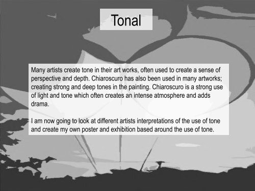
<strong>Tonal</strong><br />
Many artists create tone in their art works, often used to create a sense of<br />
perspective and depth. Chiaroscuro has also been used in many artworks;<br />
creating strong and deep tones in the painting. Chiaroscuro is a strong use<br />
of light and tone which often creates an intense atmosphere and adds<br />
drama.<br />
I am now going to look at different artists interpretations of the use of tone<br />
and create my own poster and exhibition based around the use of tone.
Jan Van Eyck<br />
Van Eyck is a Flemish painter who was born the 1380’s: he had a<br />
sister and two brothers. Both of his brothers were also painters. He<br />
was the painter for John III the Pitiless and after his death Van Eyck<br />
became employed by the Duke of Burgundy. In 1429 Van Eyck<br />
moved to Bruges where he lived the rest of his life and continued his<br />
work as a master painter under the employment of the Duke of<br />
Burgundy, Philip the good.<br />
Van Eyck, Portrait of a Man<br />
( possibly a self portrait) , 1433<br />
The Ghent Altarpiece, 1432, Oil on panel, Hubert<br />
and Jan Van Eyck.<br />
Van Eyck died in 1441. In the 16 th century a famous<br />
writer named Vasari wrote that Van Eyck was the<br />
creator of oil painting, however this was not true.<br />
Although Van Eyck did perfect the technique of applying<br />
translucent glazes to create depth and perspective in<br />
his paintings. He was very successful at creating light in<br />
his paintings down to the tiny details of reflections and<br />
lines in peoples eyes and faces.
1434,<br />
Oil on canvas,<br />
82 x 60cm<br />
The Arnolfini Portrait
In the background of the<br />
painting there are oranges<br />
visible on the left hand side.<br />
Van Eyck painted these to<br />
represent the wealth of Mr. and<br />
Mrs. Arnolfini in the painting.<br />
The oranges represented<br />
wealth because during the 15 th<br />
century in Bruges oranges<br />
were expensive because they<br />
were not commonly sold.<br />
In the background of this painting Van<br />
Eyck has signed his name above the<br />
mirror along with the date in which he<br />
has painted it. His writing roughly<br />
translates to “Van Eyck was here”.<br />
Van Eyck’s attention to detail<br />
in shown in the background<br />
where he has painted a<br />
mirror. Surrounding the mirror<br />
are 10 circular discs showing<br />
images of the crucifixion of<br />
Jesus. Van Eyck also painted<br />
the reflection of the room in<br />
the mirror with Mr. and Mrs.<br />
Arnolfini talking to two other<br />
people. In the reflection Van<br />
Eyck has also created a<br />
glimpse of the outside world<br />
along a corridor.
At the top of the painting in the centre Van Eyck has painted<br />
a chandelier with great detail. His use of chiaroscuro has<br />
created the illusion of the cold metal the chandelier is made<br />
from. He has also used symbolism because only one of the<br />
candles is lit. the candle that is burnt out is above Mrs.<br />
Arnolfini it is though that the woman is supposed to<br />
represent Costanza Arnolfini who died before this painting<br />
was made. The burnt out candle could represent her death.<br />
However people also believe that it could be Mr. Arnolfini’s<br />
cousin, but they weren’t married until after this painting was<br />
made.<br />
The bulky dress of Mrs. Arnolfini often<br />
makes people think that she may be<br />
pregnant however Costanza Arnolfini<br />
was childless. There is speculation<br />
however that she may have died in child<br />
birth but nothing is certain. Positioned on<br />
the bedpost however is a statue of St<br />
Margret the patron saint of pregnancy.
In the foreground of this<br />
painting there is a dog.<br />
Dogs were commonly<br />
used in paintings to<br />
represent loyalty because<br />
dogs are loyal. They were<br />
also used to represent<br />
faith and trust.<br />
Mr. Arnolfini is wearing pine marten fur on his cloak which<br />
would have taken a lot of them. Pine marten was an<br />
expensive fur so having him wear it as a fur lined cloak it<br />
represents his wealth. He is also wearing a straw hat that<br />
has been dyed black. Van Eyck painted the straw hat in<br />
great detail. Mrs. Arnolfini is wearing Minerva which is the<br />
white section on the chest of a squirrel. It has been said<br />
that it would have taken about 2000 squirrels to create her<br />
dress.<br />
The shoes on the<br />
floor in the<br />
foreground<br />
represent that they<br />
had a life outside of<br />
the house, as these<br />
were outside<br />
shoes.
Northern Renaissance<br />
Now I am going to look at some Northern Renaissance paintings as the style of the Arnolfini portrait<br />
has inspired me. Northern Renaissance paintings are a good example for my theme of tone and I<br />
would like to look in more detail and how they used tone.<br />
The Northern Renaissance started to show the world in a more realistic view. The Northern<br />
Renaissance influenced many artists across Europe from the 14 th and 15 th centuries. Van Eyck<br />
strongly influenced the Northern Renaissance by mastering the three-quarter view point, which<br />
allowed for more exploration of facial features. This then influenced other artists to explore this same<br />
technique. Many pieces of artwork created during this time period were altarpieces for cathedrals and<br />
churches. However portraits where still in high demand from royal families and leaders. Northern<br />
Renaissance work strongly focused or religious subjects rather than the classical styles of Greek or<br />
Roman subjects.<br />
Much of the inspiration for the Northern Renaissance came from Italy. At the<br />
time Italy was doing extensive trading and there where market places<br />
everywhere. This trading inspired artists to paint the traders, like Van Eyck<br />
did in the Arnolfini Portrait. The Northern Renaissance style also included a<br />
lot of symbolism in there paintings and they developed the technique of<br />
perspective with the use of overlapping. The Northern Renaissance began<br />
to develop when King Charles viii claimed the throne of Naples, this made<br />
many artists move north. This then gave them new inspirations.
1435,<br />
Oil on Panel,<br />
66 x 62cm.<br />
Madonna of Chancellor Rolin
In the background of the<br />
image Van Eyck has<br />
painted a balcony garden<br />
with roses and lilies.<br />
These flowers are<br />
symbols which could<br />
represent Mary’s virginity.<br />
Slightly further back in the<br />
photo you can also see to<br />
smaller figures and<br />
positioned to the left of<br />
them are two peacocks,<br />
these two peacocks are<br />
also symbolism which<br />
represent immortality.<br />
The figures in this portrait are wearing elaborate<br />
clothing. Chancellor Rolin is wearing Mink fur which is<br />
highly expensive. It is a gold brocade jacket that it<br />
trimmed with Mink fur. When Van Eyck painted this<br />
painting Rolin was supposed to be in his sixties.<br />
In this portrait Rolin is<br />
painted kneeling through the<br />
book of hours. He has his<br />
hand placed palms together<br />
as if in prayer above the<br />
book. The book of hours is<br />
the most common surviving<br />
type of medieval manuscript,<br />
it was a religious devotion<br />
book for Christians.<br />
People in the Northern<br />
Renaissance commonly<br />
wore expensive furs in there<br />
portraits because it showed<br />
their wealth and high social<br />
status.
In the background of the image you can see<br />
the aerial perspective of the outside world,<br />
this shows the vineyards in which Chancellor<br />
Rolin gains most of his wealth.<br />
Baby Jesus sat on the lap of the virgin Mary, has<br />
very old looking features. Van Eyck may have<br />
painted him this way to show how wise Jesus is<br />
supposed to be.<br />
The Virgin Mary is clothed in a long red gown. Flying above her head is an angel which is placing a crown<br />
upon her head. Mary is not engaging with the viewer or any of the other people in the picture. It is unusual<br />
for her to be clothed in red because in most portraits she is shown to be painted in blue. This was due to the<br />
fact that blue was an expensive colour because it was made for lapis lazuli which can only be found in<br />
mines in Afghanistan.<br />
On the capitals of the columns you can see detailed sculptures of the sins of man. Van Eyck has painted in great detail the<br />
drunkenness of Noah and the sins of Adam and Eve. These are stories from the Old Testament. The columns in the background and<br />
the arches are in the style of Romanesque architecture.
Rogier Van der Weyden<br />
Rogier van der Weyden,<br />
portrait by Cornelis Cort,<br />
1572.<br />
Rogier was believed to have been born at the beginning of the 15 th century.<br />
Not much is known about his life because not many records exist. Rogier’s<br />
work is very deep with the use of the expressions and emotions portrayed in<br />
his paintings. All of the surviving works by him are either of the religious<br />
subjects or portraits. However, Rogier never signed any of his works so the<br />
style and age of the painting are the only way of possibly crediting him. In<br />
1427, he was apprenticed to Robert Campin, Rogier combined his deep<br />
expressions and emotions with the use of expressive realism. During the<br />
15 th century Rogier was a very famous painter, many people of high nobility,<br />
even royalty commissioned him to paint for them. He was seen to be an<br />
international painter because many of his works were exported to other<br />
countries, like Italy, Spain, Germany and France.<br />
Rogier spent most of his lifetime in Brussels.<br />
During World War II many records were lost<br />
about early artists but it is believed that Rogier<br />
was considered to be a master painter and one<br />
of the most influential Northern painters after<br />
Robert Campin and Van Eyck.<br />
Beaune Altarpiece, 1445-50, oil on oak.
1435,<br />
Oil on panel,<br />
220 x 262 cm.<br />
The Descent from the Cross
This painting depicts<br />
Jesus being lowered<br />
from the cross with<br />
Mary in the<br />
foreground passing<br />
out in shock and<br />
horror. In this painting<br />
Mary has been<br />
painted wearing the<br />
blue made from Lapis<br />
Lazuli. This was<br />
common due to the<br />
fact that the colour<br />
was very expensive<br />
and churches only<br />
wanted the virgin<br />
Mary to be painted<br />
wearing, to show her<br />
as a high respected<br />
holy figure.<br />
Rogier has created a very expressive painting<br />
conveying the emotions of the figures. By the<br />
expressions and positioning of their bodies you can<br />
clearly see they are all in pain and are distraught.<br />
In this painting Rogier has used<br />
echoing forms between the virgin<br />
Mary and Jesus. This is very<br />
successful at showing the viewer the<br />
pain and despair of Mary.<br />
The other figures are evenly distributed with three to the left and three to the<br />
right, with two in the middle behind Jesus. This successfully draws your<br />
attention towards the centre of the painting with Mary and Jesus because<br />
having a symmetrical composition to the background and side figures<br />
makes the viewer look to the centre and more irregularly placed figures.
The faces of the figures in<br />
this painting are<br />
recognizable portraits, like<br />
the youthful face of John<br />
the Baptiste. John is<br />
consoling Mary who has<br />
fainted in the lower left<br />
hand side of the image.<br />
Rogier in this painting has<br />
depicted the figures in the<br />
foreground with a<br />
background of a gold<br />
backdrop. The gold<br />
backdrop pushes the<br />
figures forwards into the<br />
viewers space. This is a<br />
good use of a repoussior<br />
pulling the viewer into the<br />
image. This technique<br />
adds drama to the painting<br />
add makes the viewer<br />
really feel the emotions of<br />
the painting.<br />
Near Mary’s hand in the<br />
bottom left hand corner<br />
you can see a skull, this<br />
is a momento mori<br />
reminding people of their<br />
mortality and that they to<br />
will one day die.<br />
In this painting Rogier has<br />
painted the figures with<br />
complementary colours. The<br />
reds compliment well with the<br />
blue of Mary’s dress. John the<br />
Baptists red robe contrasts with<br />
the gold robe of the man holding<br />
Jesus’ legs. This contrast<br />
catches the viewers attention<br />
making them look towards the<br />
decent of Jesus’ body.
Martyrdom<br />
After looking at the Descent from the Cross, I would now like to look at the use of Martyrdom in<br />
tonal paintings. I have decided to do this because I think they make good subject matter and would<br />
be good images to use in an exhibition gallery catching peoples attention.<br />
Martyrs are often created in either religious or political situations. A person becomes a martyr when<br />
their beliefs and or opinion leads them to refuse the orders of an external party. This normally leads<br />
to the death of the person creating them into a Martyr. Martyrs are often seen to be heroic leaders by<br />
their people making a tremendous sacrifice to represent their beliefs. Martyrs often spur on the<br />
people following and can cause riots.<br />
The word Martyr was written in the bible and actually meant “witness” these were people that<br />
witnessed an event and wanted to speak up about it their testimonies. It was not intended for these<br />
“witnesses/ Martyrs” to be killed, however that became the common conclusion.<br />
Jesus is a Martyr because he was hung on the cross for doing what he believed in. Many artists<br />
painted Jesus on the cross showing him in a heroic light with his followers often around him filled<br />
with sorrow. To his followers Jesus was a highly respected person which was a common belief<br />
towards most Martyrs.
Michelangelo<br />
Merisi da<br />
Caravaggio<br />
Caravaggio was an Italian painter born in 1571, in his paintings he<br />
showed very detailed expressions of human forms and emotions<br />
along with a dramatic use of lighting. This was a strong influence<br />
into the baroque style. Caravaggio trained as an artist in Milan<br />
under Simone Peterzano, who trained under Titian.<br />
Later in his life Caravaggio was commissioned to paint a vast<br />
amount of large pieces for the ever more churches and palazzos<br />
being built in Rome. However it is said that once he finished a<br />
painting he spent many days wandering around streets with a<br />
weapon at his side.<br />
Caravaggio got into many fights and arguments which made him<br />
very famous during his time. He was imprisoned many times and<br />
ended up with a death sentence after murdering a young man. This<br />
caused him to flee Rome.<br />
Not long after this many people attempted to end his life however<br />
none were successful, but did leave him badly injured. In 1610<br />
Caravaggio died heading back towards Rome. It was thought that<br />
he was heading back to Rome because the Pop was going to<br />
pardon him.<br />
After his death Caravaggio was forgotten and it wasn’t until the 20 th<br />
century that his influence in Baroque art was recognized and he<br />
again became famous.
1608,<br />
Oil on canvas,<br />
361 x 520 cm.<br />
Beheading of St John the Baptist
Caravaggio has used a very unusual composition choice for this<br />
painting. He has created an off centre piece of work. Towards the<br />
bottom left hand corner of the image is where he has placed all of the<br />
main figures that are beheading St John the Baptist. For the majority<br />
of the rest of the painting the viewer is merely looking at wall space<br />
and the background. However in the top right hand corner Caravaggio<br />
has painted to prisoners watching through the bars. It is believed that<br />
he did this because after being in prison a few times he wanted to<br />
show similar events and fights that he may have seen while inside.<br />
This bold use of composition is actually very successful at portraying<br />
to the viewer the reality of life and it brings the scene to life, making<br />
the viewer feel the horror and sorrow towards St John the Baptist.<br />
Caravaggio has brought the beheading into the<br />
foreground of the image this brings the scene<br />
into the viewers space. This use of repoussior<br />
makes the viewer feel all the emotions of the<br />
people in the painting. St John the Baptist has<br />
been painted face towards the viewer, with his<br />
body being pinned down by the muscular<br />
executioner above him. St John is already<br />
wounded with a cut to his throat. However it can<br />
be seen that the executioner is about to swing<br />
and slice his throat again with the knife behind<br />
his back. This sense of movement again shows<br />
the viewer the reality of the image and it is a<br />
typical technique in baroque work.
The woman in the foreground holding out the dish is believed to be<br />
Salome. Salome was well know because she used to demand the<br />
head of St John the Baptist, this was written in the bible. In this<br />
painting Caravaggio has painted her similarly to the executioner, in<br />
mid movement. This adds tension to the painting as the viewer is<br />
patiently waiting for the head to be placed in her dish.<br />
The other woman in the painting appears to be<br />
simply a bystander in which has seen the<br />
horror of the events and does not approve of<br />
what is going on.<br />
This painting is famous<br />
because Caravaggio<br />
signed this painting but<br />
not in the usual way. He<br />
signed this painting in<br />
the blood that has<br />
spilled from St John the<br />
Baptists neck.<br />
This painting<br />
had been<br />
commissioned<br />
by the Knights<br />
of the order of<br />
St John, who<br />
ruled Malta, as<br />
an altarpiece.<br />
This painting is<br />
on a very large<br />
scale and the<br />
figures are<br />
considered to<br />
be life size. St<br />
John the<br />
Baptist was<br />
their patron<br />
saint.<br />
This composition is also very successful at<br />
drawing your attention towards the most brutal<br />
part of this image. This is because the<br />
executioner and St John are partially nude<br />
compared to the other figures. The lightness of<br />
their skin contrasts to the dark background.
Eugene Delacroix<br />
Eugene Delacroix was a French Romanticism painter born 1798. he was<br />
a very influential painter because he was the leader of a French Romantic<br />
school. He was influenced by Gericault’s raft of the Medusa and it led him<br />
to paint his first major painting. Delacroix learned at Lycée Louis le Grand<br />
and trained with Pierre-Narcisse Guérin. Delacroix actually studied<br />
Neoclassical style painting in the likes of Jacques-Louis David, Death of<br />
Marat. The Barque of Dante was inspired by Gericault and was exhibited<br />
in the Salon 1822. in 1825 he visited England and met Thomas Lawrence<br />
and Richard Parkes Bonington. With the trip to England and the<br />
inspiration of Gericault Delacroix started with Romanticism and painted<br />
the Death of Sardanapalus.<br />
Delacroix, Self Portrait, 1837,<br />
romanticism , oil on canvas,<br />
54x 65cm.<br />
The Death of<br />
Sardanapalus,<br />
1827,<br />
Romanticism,<br />
3.9 x 4.9 m<br />
This image is morbid with the<br />
King sat watching his guards<br />
follow out his orders and kill all of<br />
his servants.
1827,<br />
Oil on canvas,<br />
392 x 496cm.<br />
The Death of Sardanapalus
This painting depicts the story of<br />
Sardanapalus a tale from Diodorus<br />
Siculus. Delacroix was inspired to paint<br />
this image after seeing a play written by<br />
Lord Byron about Sardanapalus.<br />
Sardanapalus was the Assyrian King<br />
who was married to Zarina Salemenes'<br />
sister. One night Salemenes<br />
approaches Sardanapalus and informs<br />
him of treachery towards the throne.<br />
Sardanapalus<br />
trusted his brother<br />
in laws instincts<br />
and told him he<br />
has the power to<br />
arrest the leaders<br />
of the rebellion.<br />
At the end the traitors<br />
say they’ll surrender if<br />
Sardanapalus dies,<br />
which he refuses.<br />
After an hour of<br />
peace the king then<br />
builds a pyre and kills<br />
himself then shortly<br />
followed by Myyrha.<br />
Salemenes walks in while<br />
Beleses and Arbaces<br />
plan the murder of the<br />
King. He starts to arrest<br />
them when the king walks<br />
in. He lets the traitors off<br />
because he couldn’t<br />
come to terms with his<br />
astrologer and governor<br />
being traitors.<br />
The battles start again after<br />
the kings wife has fled the city<br />
with their children. Salemenes<br />
dies in the battle from blood<br />
loss and the kings armies are<br />
losing.<br />
They came out of the battle<br />
wounded and Myyrha the kings<br />
lover is worried about his injuries,<br />
but they celebrated a small<br />
victory even though they were<br />
closely followed by the traitors.<br />
Later the king believes that<br />
Salemenes was right because the<br />
two traitors are leading rebel armies<br />
to kill him. He decides to prepare<br />
his army and fight alongside his<br />
brother in law.
Delacroix exhibited this painting in the<br />
Salon of 1827 and this Romantic<br />
painting goes against everything<br />
Classical and traditional which would<br />
have once been exhibited in the<br />
Salon.<br />
Delacroix has gone against traditional<br />
methods of painting a hero and has<br />
decided to paint Sardanapalus who<br />
couldn’t be further from a hero. In this<br />
painting he has depicted the King<br />
destroying all the things he loves in<br />
his life on a pyre, ornaments, slaves,<br />
women, even himself. Rather than<br />
dying in battle.<br />
Sardanapalus can be seen in the top left<br />
hand corner of the painting. Unusually<br />
Delacroix has decided to paint him wearing a<br />
white robe. White normally symbolizes<br />
innocence and purity but Sardanapalus was<br />
not a pure and innocent man because he was<br />
well known for cheating on his wife.<br />
A serpentine form echo's<br />
around the canvas with<br />
the positioning of the<br />
women's bodies, the<br />
horse and even the scarf<br />
on the end of the bed.<br />
This serpentine forms<br />
mimics the shape of<br />
flames which is suggest<br />
full that this is a<br />
representation of the pyre<br />
upon which<br />
Sardanapalus destroys<br />
everything.<br />
In this painting the bed has been<br />
foreshortened which creates the<br />
sense that all the chaos and<br />
corruption is tumbling out of the<br />
painting into the viewers space.
Paul Delaroche<br />
Paul Delaroche was a French painter, born 1797. He was a student of Gros<br />
one of the leading artists in France at the time. Delaroche used classical<br />
sketches to plan and prepare for his work. When Jehosheba was exhibited<br />
by Delaroche he met Gericault and Delacroix and the three of them formed<br />
a group of Historical painters. Delacroix and Gericault’s paintings were<br />
associated with romanticism where as Delaroche was more neoclassical<br />
like David. Delaroche’s paintings were on a large scale because they were<br />
historical paintings, seen to be one of the highest genres in art work.<br />
Portrait of Paul Delaroche, by<br />
Eugène-Ferdinand Buttura<br />
Delaroche had many students himself, from<br />
Britain and America. This made him a very<br />
influential painter during the French revolution.<br />
Like David Delaroche painted Napoleon<br />
crossing the alps, however Delaroche depicted<br />
the actual event with Napoleon crossing of a<br />
mule rather than a fiery steed.<br />
The Execution of Lady Jane<br />
Grey, 1833.<br />
Delaroche painted a portrait of Eugéne-<br />
Ferinand Buttura in 1863 and in turn<br />
Buttura painted a portrait of him to.
1855,<br />
Oil paint,<br />
67.3 x 58.3 cm. <br />
The Young Martyr
In this painting Delaroche has depicted a<br />
young woman's body peacefully floating in a<br />
calm pool of water. The woman has been<br />
placed in the foreground to pull the viewer into<br />
the painting. The level of emotion in this<br />
painting is intense because the girl is dead<br />
however Delaroche has depicted her so life<br />
like. He has painted as if we were there a<br />
couple of seconds earlier she could have been<br />
saved which creates despair in the painting.<br />
It is thought that the young<br />
martyr took her own life because<br />
of the ropes that are tied around<br />
her wrists. Delaroche has<br />
depicted her to look innocent<br />
with the use of the white dress<br />
and making her very youthful.<br />
This effect makes the viewer feel<br />
emotional towards the painting.<br />
The composition in this painting is similar to<br />
the painting Ophelia by Millet. However<br />
Ophelia is believed to have taken her own<br />
life where as the young martyr is believed to<br />
have been murdered.<br />
The woman in this painting is believed to been a Christian martyr<br />
from the 3 rd century A.D. Delaroche has painted the young woman<br />
with a halo above her head. The halo is suggestive that the woman is<br />
holy and is represents her as a martyr. The halo creates a<br />
luminescent glow across the body of the young woman and creates a<br />
sense of depth in the water, with the ripples and the tone. The light<br />
in this painting is coming from two sources, one being the halo seen<br />
on the right hand side and one assumed to be the orange glow of the<br />
sun in the background which isn’t a visible source.
The background in this painting is created with<br />
a sloping hill upwards which creates the sense<br />
of a closed composition. Seen to the left of the<br />
painting positioned behind the young martyr is<br />
a boat. This boat is overlapping the landscape<br />
and is cropped, this adds depth to the painting<br />
bringing the young martyr ever closer to the<br />
viewer.<br />
Behind the two figures the atmosphere is<br />
completed with the sunrise in the background<br />
of this painting. The sun isn’t visible but it’s<br />
distinct orange and yellow glow highlights the<br />
sky, behind the two figures. The rising sun is<br />
suggesting the dawn of a new day and could<br />
be representative of change now that the<br />
young martyr has died.<br />
Delaroche has aimed the<br />
viewers gaze towards the<br />
young martyr herself. He has<br />
done this by making her the<br />
centre of the painting and<br />
also positioning her in the<br />
foreground. The shape of the<br />
canvas as well being an arch<br />
instead of a quadrilateral<br />
highlights the young martyr.<br />
In the top left hand<br />
corner of this painting<br />
two figures can been<br />
seen comforting each<br />
other as they gaze upon<br />
the body of the young<br />
martyr. Nothing is known<br />
about these two figures<br />
but the emotions on their<br />
faces and the way they<br />
embrace each other is<br />
suggestive that they<br />
could be her grieving<br />
parents.
Gustave Moreau<br />
Moreau was a well known French Symbolist painter born in 1826. In<br />
most of his paintings Moreau depicted biblical and mythological<br />
subject matters. Moreau’s first painting was a pieta and many of his<br />
works were strongly influenced by Théodore Chassériau. He studied<br />
in his younger years under François-Édouard Picot. In the 1853<br />
Salon Moreau exhibited painting that depicted a scene from the<br />
Song of Songs.<br />
Moreau’s work came to be know as very eccentric when he<br />
moved into the Symbolist works. One of his first Symbolist<br />
works was Oedipus and the Sphinx which he exhibited in the<br />
1864 Salon. Alexandrine Dureux was thought to be Moreau’s<br />
lover as she was the subject of many of his paintings however<br />
when she died he didn’t take the news very well, which is<br />
depicted in his works because they become much darker. Later<br />
in Moreau’s life he became a professor at the École des beaux<br />
arts where he taught many fauvist painters including Henri<br />
Matisse. By the end of his life it is believed that Moreau created<br />
about 8000 paintings.<br />
Oedipus and<br />
the Sphinx,<br />
1864,<br />
Oil on<br />
canvas.
The Apparition<br />
1876,<br />
Watercolour,<br />
56 x 47cm.
This painting depicts an episode from the<br />
Gospel of Mathew and Mark. Moreau created<br />
many images based upon this story creating<br />
19 paintings and over 150 sketches.<br />
In this painting you can see the<br />
King Herod Antipas seated<br />
upon his throne while the<br />
princess Salome dances in<br />
front of him. In this painting the<br />
King is supposedly enjoying<br />
the festivities that have been<br />
arranged for his birthday.<br />
The King did not break his word and he<br />
brought her the head of St John the<br />
Baptist, even though he didn’t approve.<br />
The head was brought in on a charger<br />
and given to her. In this painting you can<br />
see Salome standing to the left hand<br />
side of the painting pointing towards the<br />
vision of the head of St John the Baptist.<br />
Salome then handed her mother the<br />
head because she had gotten her<br />
revenge. Herodias was in fact actually<br />
the Kings 3 rd wife but Salome was only<br />
his step daughter.<br />
The King enjoyed the dance by Salome<br />
so much that he promised her she<br />
could have anything she wanted.<br />
Salome consulted her mother,<br />
Herodias, who wanted the head of St<br />
John the Baptist. Herodias was<br />
believed to want the head of St John<br />
the Baptist because of his comments<br />
on her marriage. However it is also<br />
believed it was because she was in<br />
love with him.
Moreau has created a 2D halo around the<br />
head of St John the Baptist. Tone has been<br />
used in this painting to make his head stand<br />
out. Moreau has done this by highlight the<br />
head and also he has placed it in the centre of<br />
the painting which draws the viewers attention<br />
towards it.<br />
In this painting Moreau<br />
gained inspiration from<br />
Japanese works and<br />
the head of St John the<br />
Baptist was also<br />
inspired by the head of<br />
Medusa.<br />
In the 1876 Salon an<br />
art dealer bought this<br />
painting, which he then<br />
later loaned to an art<br />
gallery in London.<br />
Sitting behind Salome you can see her<br />
mother happy about the events that<br />
unfolding in front of her. Herodias had held<br />
St John the Baptist captive before<br />
condemning him to execution.<br />
Seen stood behind<br />
the head of St John<br />
the Baptist is the<br />
executioner himself<br />
wearing red which<br />
imitates the colour<br />
of the blood<br />
dripping on the floor<br />
from the head.
John William Waterhouse<br />
Waterhouse was a English Pre-Raphaelite painter who was born in<br />
1849, Rome. He lived many years after the end of the Pre-<br />
Raphaelites and continued to paint, with the majority of his subject<br />
matters containing Greek mythology and Arthurian Legend. 1849 was<br />
the year that Pre-Raphaelite artists like Millais and Holmen-Hunt<br />
started to influence artists in London. Waterhouse’s parents were both<br />
artists and encouraged him from a young age to produced artwork.<br />
Ophelia,<br />
1894.<br />
At the age of 5 Waterhouse and his family moved back to London this<br />
was when he started to show that art was influencing him. As a<br />
teenager Waterhouse used to visit the National Gallery and the British<br />
Museum to sketch from the artwork. In 1871 Waterhouse had enrolled<br />
into the Royal academy where he had intended to train in sculpture<br />
before moving on to painting. Later in life Waterhouse became<br />
entranced with painting Ophelia and had started to create a collection<br />
however he died before finishing the series.
Saint Eulalia<br />
1885,<br />
Oil on canvas,<br />
187 x 118 cm.
In this painting Waterhouse<br />
has depicted a very old story<br />
from roughly 304AD. The story<br />
is about a young girl St Eulalia<br />
who became a Martyr.<br />
In this painting Water House<br />
has included a cross on the<br />
right hand side of the painting<br />
which is suggestive to the<br />
viewer that she was crucified<br />
which she was not. This use<br />
of symbolism compares St<br />
Eulalia to Jesus and is<br />
suggestive that she will also<br />
come back like he did.<br />
This painting was exhibited in<br />
the Salon and was well<br />
received. This composition<br />
was risky for Waterhouse<br />
because the nudity of the<br />
young girl was radical,<br />
however it wasn’t commented<br />
upon by critics because of the<br />
subject matter.<br />
She was said to be a 12 year old<br />
girl when she was brutally<br />
murdered. St Eulalia became<br />
Martyred after she refused to make<br />
sacrifices to the Roman Gods.<br />
It is said that her death was<br />
very gruesome and painful.<br />
Two executioners were<br />
sent to murder her by<br />
tearing apart her body with<br />
hooks and burning her<br />
breasts with hot torches.<br />
Eulalia died from<br />
suffocation after her hair<br />
caught fire from the<br />
torches.<br />
Realism was not a style<br />
Waterhouse wanted to<br />
portray in this painting. He<br />
has depicted her body as<br />
un marked or scared as if<br />
she died without bodily<br />
harm. He depicts her body<br />
half naked in the snow<br />
which doesn’t show Eulalia<br />
as a weak and pathetic, but<br />
desirable.
For Waterhouse this composition was<br />
quite risky with the use of foreshortening<br />
on St Eulalia’s body in the foreground<br />
because it left the centre of the painting<br />
empty. However the way Waterhouse<br />
positioned all the other figures in the<br />
painting far into the background it drew<br />
the viewers attention back to St Eulalia in<br />
the foreground.<br />
The compositional layout in this painting creates a<br />
very bleak atmosphere. The empty centre of the<br />
painting alienates St Eulalia from the rest of the<br />
painting which draws the viewers attention towards<br />
her. The use of the snow in this painting also creates<br />
a bleak and cold atmosphere, a day in which no one<br />
wants to be outside. This makes the very feel<br />
sympathetic towards Eulalia because he body<br />
deserves more respect than to be left in the snow.<br />
Waterhouse has left St Eulalia completely<br />
untouched even by the snow. At Eulalia’s feet<br />
there are multiple doves this could be<br />
suggesting that St Eulalia is now at peace or<br />
that peace can now be made with the Roman<br />
gods now she is dead.<br />
The dove flying<br />
away has been<br />
said to be St<br />
Eulalia’s soul<br />
flying away and<br />
that God has<br />
sent the snow as<br />
a blanket to<br />
cover up her<br />
body.
Surrealism<br />
In the 1920’s after WW1 Surrealism developed from the previous style Dada. In Surrealism artists<br />
wanted to break the barrier between dreaming and reality. They did this in many ways, like turning<br />
everyday objects into weird creatures. In this new style of artwork artists created developed their<br />
paintings to be photogenic.<br />
Guillaume Apollinaire was the man who coined the term Surrealist it was first shown on the preface<br />
to one of his plays which was written in 1903 and the first performed in 1917. By 1920 a group had<br />
started to develop and wrote a magazine that believed in automatism. Writing without censoring the<br />
thoughts. This style of writing also included dreams which was the beginning of the Surrealist<br />
movement.<br />
Sigmund Freud inspired Surrealist artists with his ideas of interpreting thoughts and dreams he<br />
played a large part in the development of Surrealism because he was a big influence. Artists<br />
welcome this idea of interpreting dreams and Dali stated that “There is only one difference between a<br />
madman and me. I am not mad” because many people thought that the Surrealists were mad.<br />
In 1924 two Surrealist manifestos had been created by two separate factions of surrealists. This then<br />
inspired the Bureau of Surrealist Research to develop a magazine called La Révolution surréaliste<br />
also published in 1924.
Salvador Dali<br />
Dali was a famous surrealist, Spanish painter who was born in<br />
1904. Dali had an older brother also called Salvador that died a<br />
year before he was born. Dali’s parents told him he was a<br />
reincarnation of his brother. He came to believe this and during<br />
his life time Dali painted many images of his late brother. From a<br />
young age Dali attended drawing school with the support of his<br />
mum. He then took a trip to Cadaqués where he discovered<br />
modernist paintings. In 1917 his father created an art exhibition<br />
of all of Dali’s charcoal works around there house.<br />
Later in life Dali moved to Madrid where he enrolled and<br />
studied at the Real Academia de Bellas Artes de San<br />
Fernando. However in Dali’s finally years he was expelled<br />
from the academy before completing his course. After this<br />
he visited Paris for the first time in which he met Pablo<br />
Picasso. Dali and Picasso became friends and as Dali’s<br />
style was developing he was strongly influenced and<br />
inspired by Picasso’s work. The Persistence of Memory, 1931.
Christ of Saint<br />
John<br />
of the Cross<br />
1951,<br />
Oil on canvas,<br />
205 x 116 cm.
This painting was called Christ<br />
of Saint John on the cross<br />
because Dali was influenced by<br />
16 th century Spanish sketch of<br />
the crucifixion.<br />
The composition in this painting is geometric. Dali<br />
created a triangle with the arms and a circle with<br />
the head which gives a symmetrical composition.<br />
The triangle in this painting could be there to<br />
represent the holy trinity and the circle has been<br />
used to represent unity.<br />
Dali started to create this painting<br />
after he had a dream which is<br />
what influenced him to depict<br />
Christ at this unusual angle. On<br />
Christ in this painting there is no<br />
visible wound marks or nails<br />
holding him on to the cross. Dali<br />
did this because he believed<br />
these objects would mask his<br />
vision of Christ on the cross.<br />
This<br />
painting<br />
was first<br />
exhibited in<br />
1952 at the<br />
Kelvingrove<br />
Art Gallery<br />
and<br />
Museum.<br />
When creating this painting Dali wanted to depict the<br />
body of Christ perfectly. So he hired a Hollywood stunt<br />
man, Russell Saunders to be hung in the position<br />
Christ is. Dali wanted to see this because he wanted<br />
to know how the human body would be effected by<br />
gravity and what the limbs would like.
In the bottom of this<br />
painting Dali has depicted<br />
a picturesque scene of the<br />
Bay of Port Lligat. Dali<br />
included this in his<br />
painting because it was<br />
where he was living at the<br />
time.<br />
Dali’s style of surrealism<br />
in this painting is clearly<br />
distinct with its dream<br />
like effects. This can be<br />
seen with the use of<br />
Christ floating in the top<br />
half of the painting. The<br />
coloration of the clouds<br />
and the sky also create<br />
the dream like effect.<br />
In 1952 Dali sold this painting to the city of<br />
Glasgow along with its copyright. When the<br />
painting was displayed it brought much attention<br />
towards the gallery and was popular. However the<br />
painting was well received by every one and the<br />
painting has come under attack from vandalism<br />
twice. One visitor ripped the canvas with a sharp<br />
stone but that has since been repaired making the<br />
damage barley visible. This painting has also had<br />
many copyright issues which has brought more<br />
attention towards the painting because companies<br />
were using the image without permission.<br />
The tone used in this painting<br />
can been seen from the dark<br />
overcast of black at the top<br />
which with a smooth gradient<br />
moves down into a light yellow<br />
and blue port composition. In the<br />
bottom half of this composition<br />
Dali has also created more<br />
depth with the use of<br />
atmospheric perspective. This<br />
technique also pushes Christ's<br />
feet into the background.<br />
The horizon line in very low in this painting which<br />
allows Dali to focus his attention on Christ which he<br />
has depicted in the top larger half of the painting.
My Intentions<br />
Now I have looked and analysed key examples of work, I intend to develop my findings into a<br />
gallery exhibition, poster design and booklet.<br />
As I analysed more paintings the work developed towards Martyrdom. Therefore I intend to create<br />
my work based around this subject matter. All the paintings I analysed depicted martyrs in many<br />
different ways. However they all include the martyr themselves. Also in the paintings I analysed<br />
they depicted the body with many visible flesh wounds apart from the beheadings. The colours<br />
used in these paintings also tended to me more subtle compared the works of an impressionist<br />
artist.<br />
I also intend to analyse existing poster, booklet and gallery designs because I would like to include<br />
compositional elements and techniques which I like from these. In the work I develop I would like to<br />
depict the body of a martyr which gives I direct link to the work I have developed. Finally I would like<br />
to depict a simple poster design like Delaroche’s the young martyr scene, with the center of<br />
attention in the foreground.
Creation of Exhibition title<br />
and Font Creation<br />
• Historical Martyrs<br />
• <strong>Tonal</strong><br />
• The Tone of Martyrs<br />
• Martyrdom<br />
• Martyr’s<br />
• Sufferer for a Cause
Finalising My Font Style<br />
Here I have chosen my four favourite font design which I have analysed further to acquire the two most suitable for further<br />
development towards my poster. The two fonts will need to be suitable for a clipping mask therefore the font width needs to be<br />
fairly large, or else this image wont be visible.<br />
I love this font because of the irregularity of its shape with<br />
the raised letters. The shape of these letters would also<br />
work well for a clipping mask because of there even<br />
spacing and wide width. This font is different because of<br />
the tonal colouring on it which is eye catching.<br />
I really like this font and the broken effect created throughout<br />
the letters. This font links well with my theme of Martyrdom<br />
because this font is broken and the paintings I have analysed<br />
involve people that have been broken and made into martyrs.<br />
I also like the even spacing and symmetry in this font design.<br />
This font is very eye catching the way the lines frame<br />
the text. I like the font but not the lines because the text<br />
would look out of place on a poster. However I do like<br />
the use that the M is larger than the rest of the letters,<br />
but this font wouldn’t create a good clipping mask.<br />
This font would link well with my theme of Martyrdom because<br />
the font appears as if it could be written in blood of the<br />
Martyrs. I like this font because the letters are all in capitals<br />
which makes the writing easier to read. However I don’t like<br />
how close the letter spacing is.<br />
The two fonts below are the ones that I have chosen to develop further because they link in well with my theme of Martyrdom and<br />
would be suitable to create into a clipping mask.
What stands out to me the<br />
most about this font is that the<br />
letters are at all different<br />
levels. This effect is eye<br />
catching and is clearer now I<br />
have Photoshopped the font.<br />
I have Photoshopped this font design because the rustic and eroded<br />
look that it created would have made it very difficult to create a clipping<br />
mask. In Photoshop I simplified the font to make it just the shape of the<br />
font instead of the erosion on it. I also smoothed the edges so the font<br />
didn’t look so pixelated.<br />
I like that this font is sans serif<br />
because it simplifies the design and<br />
allows the letters to flow better.<br />
What I like about both of these fonts is the width of them would be suitable for a clipping mask. Also these fonts are both in capitals<br />
which means the ascenders and descenders are at equal heights apart from the style of the top one which moves the letters. I love<br />
both of these fonts because they are so different and distinct from one another. I also like how simple shaped the fonts are with even<br />
lettering sizes, this allows the viewer to focus more on the word its self and the details inside the letters. This makes the shape of the<br />
letters perfect for a clip[ping mask.<br />
The thin white lines<br />
running through this<br />
font contrast well to<br />
the thick black lines<br />
of the font itself. This<br />
contrast works well<br />
at standing out, good<br />
for a poster.<br />
I like how<br />
symmetrical this<br />
font is because it<br />
allows your<br />
attention to be<br />
drawn towards the<br />
broken effect<br />
running through it.
Clipping Masks<br />
With my two chosen font<br />
designs I now intend to<br />
create clipping masks as a<br />
further development for my<br />
font.<br />
Out of all the paintings I analysed I chose the most<br />
suitable one. I thought that beheading of St John the<br />
Baptiste would be a good example because of the<br />
deep tonal contrasts and it would fit the scene of the<br />
beheading in the font.<br />
When choosing the font for my clipping mask I made sure that<br />
the letter width was quite wide, otherwise the image would not<br />
be visible. This font is suitable for a clipping mask and the<br />
spacing between the letters makes it even easier to read.<br />
Next I chose what part of the picture would be shown through the font. For this<br />
painting I wanted to capture the action of the beheading and include the bowl<br />
upon which the head will be placed.<br />
In Photoshop I<br />
separated the font<br />
from its background<br />
so I could create a<br />
clipping mask. This<br />
also gave me a<br />
better view of what<br />
part of the painting<br />
would be included in<br />
my font.<br />
Finally I created the clipping mask and it looks really good.<br />
In Photoshop I accentuated the gaps in the letters which<br />
made the effect more dramatic. I love how this clipping mask<br />
turned out because it links well to Martyrdom, being broken.
Clipping Masks<br />
For my second clipping<br />
mask I chose to use the<br />
young martyr. I thought this<br />
would be a suitable painting<br />
because the composition<br />
isn’t very busy. This would<br />
make the image appear<br />
clear through the font.<br />
I wanted to position this text over the young martyr herself.<br />
The composition of this painting works really well with a<br />
clipping mask because the whole body of the young martyr<br />
can fit in my chosen font. The text I have positioned so<br />
that it includes the halo above her head.<br />
The font I have chosen is suitable for my clipping mask<br />
because it has even spacing between the letters and the width<br />
of the letters would allow for the image to be visible.<br />
Next I removed the background from the text so the shape<br />
of the font is visible. This allowed me to see what parts of<br />
the image will fit in my font.<br />
This clipping mask came out<br />
really well. I managed to<br />
capture all the parts of the<br />
image I wanted, her tided up<br />
hands and the halo. The shape<br />
of this font also works well with<br />
the clipping mask because of<br />
its uneven levels of the letters.
Logo Analysis<br />
I am now going to look at other companies logo and analyse how they have been designed. I intend to learn and<br />
gain inspiration from these designs so that I can create my own logo, that fits in with the theme of my gallery,<br />
Martyrdom.<br />
The imagery used in this<br />
logo is very simple with just<br />
the silhouette or a rabbit<br />
rather than all the details.<br />
For this design the<br />
simplicity of the imagery<br />
works well because it then<br />
contrasts to the<br />
overpowering combination<br />
of the colours.<br />
The colours used in this design contrast<br />
each other well which captures the viewers<br />
attention. The colours are how this design<br />
reflects the theme of their gallery, Illusion,<br />
rather than the imagery itself. The colours<br />
are a power representation of their theme<br />
because the illusion effects the viewer<br />
directly creating a strong and memorable<br />
impact.<br />
The imagery in this logo design<br />
is very power with the use of<br />
overlapping silhouettes. The<br />
silhouettes in this design have<br />
had the transparency increased<br />
so you can still see the outlines<br />
of both shapes. This design has<br />
been finished off with small dots<br />
spraying up from the feet of the<br />
rabbits which creates a sense of<br />
movement in the design.<br />
The text in this logo design very cleverly reflects the imagery design<br />
with the use of the two colours repeated. The repeated colours unify<br />
the design so that when you position it on a poster you can tell what<br />
it is. The colours in the text mimic how they have been positioned in<br />
the imagery as well, with the use of the red on the left and the blue<br />
on the right. I really like this concept of having the writing fitting in<br />
with the imagery through the use of colours. The font in this design<br />
has been kept simple with even width and no serifs.
2 nd Logo Analysis<br />
Similarly to the other logo I analysed the imagery in this<br />
one is very simple because it is just the silhouette of an<br />
image and is flat rather than having details and depth. This<br />
works well in a logo design because the simplicity is also<br />
usually reflected in the text which unifies the design. In<br />
logo design the imagery tends to reflect the theme that the<br />
company is trying to portray and can commonly be<br />
inspired by a work in the gallery title. In this design the<br />
image is a young boy fishing well sat upon a moon. This<br />
could represent a dream and therefore depicts the title<br />
DreamWorks. I like this idea and would like continue in<br />
forward into my own logo design, so have my image depict<br />
a word in my galley name.<br />
For this logo design it has a very limited colour<br />
palate with only the use of blue. This unifies the<br />
design and helps the viewer distinguish what it is<br />
when placed upon a poster. When creating my<br />
logo design I would also like to use a limited<br />
colour because this technique is used in both logo<br />
deign I have analysed and successfully unifies the<br />
design and writing.<br />
In this design the writing takes up the majority of the<br />
central space however doesn’t detract from the imagery<br />
because of how simple and ordinary the font is. In this<br />
design the font is also made to be a smaller size than the<br />
imagery to the left therefore appearing to add depth as if it<br />
were in perspective. When I create my logo design I would<br />
like to make the writing smaller than the imagery because<br />
I don’t want it being the viewers main focus.
I now intend to create my<br />
Logo design<br />
own logo design with<br />
inspiration from the logos<br />
and the paintings I have<br />
analysed. I first gained<br />
inspiration from Paul<br />
Delaroche’s The Young<br />
Martyr. So I wanted to<br />
depicted that martyrdom<br />
was forced upon people.<br />
For me the part of this image<br />
that stood out was the young<br />
girls hands which were<br />
intricately tied up. This was the<br />
symbol that I wanted to use for<br />
my logo design. Therefore in<br />
Photoshop I created a simple<br />
outline of the image section<br />
that I wanted.<br />
I then became inspired to take<br />
inspiration from the first logo I<br />
analysed. I really like the effect<br />
created between the two<br />
primary colours. I decided to<br />
use this effect on my logo<br />
because it made the imagery<br />
capture the viewers attention.<br />
I placed the red as<br />
the bottom because I<br />
wanted that to bee<br />
the colour seeping<br />
through in the same<br />
sense blood would,<br />
which links to my<br />
theme of martyrdom<br />
and their blood spilt.<br />
Overall this effect turned out<br />
really well. However I decided<br />
to include the original black<br />
outline of the image to add<br />
depth and definition o my<br />
logo. Next I intend to<br />
incorporate a small amount of<br />
text in my logo design.
To complete my logo design I have chosen a font which will stand out against the harsh colours and optical<br />
illusion of the imagery. I really like this font because of how bold the writing stands out. The contrast with the<br />
black and white compliments the contrast between the red and blue of the imagery. This logo design is<br />
aesthetically pleasing with a limited colour palette which allows the viewers attention to been drawn to the shape<br />
and writing. I think this logo design will work well on any poster I create because the silhouetted outline of the<br />
image and writing will make It easy to distinguish on a busy background.
Poster mood board <br />
On this page I have created a<br />
mood board of posters, in which<br />
I can choose my favorites from.<br />
Then I will analyse them further<br />
and develop my poster with key<br />
elements. This mood board is<br />
helpful because it gives me an<br />
insight into poster designs and<br />
Photoshop effects.
The composition of this<br />
poster works really well. I<br />
like the use of a silhouette<br />
containing another image,<br />
this makes the poster stand<br />
out really well. The train<br />
coming towards the viewer<br />
in the silhouette is<br />
foreshortened which adds<br />
depth to the poster. The<br />
trains tracks also come right<br />
up to the edge of the image<br />
creating repoussior which<br />
makes the viewer feel as if<br />
they’re part of the image. In<br />
this poster I also like the<br />
shadowy figures overlapping<br />
the image inside the<br />
silhouette because this<br />
again adds more depth to<br />
the image which contrasts to<br />
the flat white background<br />
around the silhouette.<br />
Poster Analysis<br />
I like the use of the QR code in the bottom left hand<br />
corner of this poster because it minimalizes the amount<br />
off writing that you have to include on the poster. This<br />
enables for you to focus on the imagery more.<br />
The information in this poster complements<br />
well with the imagery because it only overlaps<br />
the pictures slightly. The font in this poster<br />
stands out well against the background<br />
because the colours between the dark blue<br />
and black contrast well with the white font<br />
colour. When I create my poster I would like<br />
to use contrasting colours like this because it<br />
makes the text easier to read. I would also<br />
like to try and incorporate the I idea of having<br />
the font the same colour as the background,<br />
but having the writing overlap a dark<br />
silhouette because this effect is aesthetically<br />
pleasing. In this poster I also like the way<br />
they have placed all the information<br />
necessary in the bottom half of the painting<br />
and only the title is in a large font to save<br />
space for the imagery.
In the bottom left hand corner is all the information in a small font apart from the<br />
poster title. This composition is effective because the font is very small so it doesn’t<br />
draw the viewers attention away from the poster title or imagery. When I create my<br />
poster I intend to incorporate this idea so I can focus on the imagery effects and have<br />
a simpler poster, without to much overlapping.<br />
The composition of the poster design<br />
works because of the complementary<br />
earth tones. I love the design of this<br />
image with the mans head which has the<br />
hair smoothly blend into the city scape.<br />
This effect works really well because of<br />
its originality makes the poster stand out<br />
well. I would like to develop my poster to<br />
include an idea like this one. I like the<br />
simplicity of this poster because the<br />
imagery stands out well against the flat<br />
background. The way the man leans in<br />
from the right hand side adds depth to<br />
the image with the use of cropping. To<br />
add depth o my image I would also like<br />
to have a figure or image cropped from<br />
one side of the painting which will then<br />
lead the viewer into the poster.<br />
Simplicity in this poster has been<br />
created with a flat one colour<br />
background. This is successful at<br />
highlighting the imagery in the<br />
foreground. The title of this poster<br />
stands out well with its contrasting<br />
colour. The font in this poster also<br />
adds attention towards the imagery<br />
because of its simplicity. When I<br />
create my poster I would like to<br />
experiment with using my clipping<br />
mask and just the font in a flat<br />
colour depending on how much<br />
detail is in my imagery. The font<br />
also works well for this title<br />
because of the even but wide letter<br />
spacing adding emphasis on it.
Poster design<br />
I am now going to design and create a final<br />
poster that incorporates some of the images I<br />
analysed to reflect Martyrdom and <strong>Tonal</strong>. The<br />
poster I aim to create will contain all the<br />
necessary information and I would like to<br />
create an effect in Photoshop to make the<br />
poster stand out.<br />
For my poster I started off by choosing an image from the paintings I<br />
analysed that would create the biggest impact on the viewer. I chose the<br />
beheading of St John the Baptist because this painting incorporated my<br />
theme of Martyrdom with a strong depiction of tonal as well. As posters<br />
are portrait I had to select the part of the painting that I wanted to use.<br />
For this poster I cropped out the majority of the background and just<br />
included the five main figures. Because this image is so dark I wanted to<br />
create a Photoshop effect that overlapped the image and brightened it<br />
up. I did this by adding a smoke effect. This smoke effect was successful<br />
at also dispersing the image. I wanted to brighten the image because I<br />
would then it will contrast better with any text that I add.
The smoke effect I added in Photoshop was very<br />
successful at complimenting the imagery in the<br />
painting. This was because the blend between the<br />
smoke and the image had a smooth gradient. To<br />
create the right contrast between the smoke and<br />
the image I used the dodge and burn tools, this<br />
also allowed me to create a suitable light to the<br />
background upon which I could place the text and<br />
title. For this poster I decided not to use either of<br />
my clipping masks because there detail got lost in<br />
the background and didn’t compliment the imagery<br />
well therefore I chose to use just the plain black<br />
font for the strong contrast.<br />
In the bottom left hand corner I lightened the<br />
imagery to create an area in which I could place<br />
my gallery logo. The logo works well on this<br />
poster because it overlaps the imagery creating<br />
depth to the poster. It also stands out due to its<br />
bright contrasting colours, however it doesn’t<br />
detract the viewers attention away from the<br />
poster imagery because of where I have<br />
positioned it and its size.
My final poster<br />
design works<br />
really well at<br />
depicting my<br />
theme of<br />
Martyrdom and<br />
<strong>Tonal</strong>. I really like<br />
this poster<br />
because the<br />
dramatic scene in<br />
the painting is<br />
brought right into<br />
the viewers space,<br />
which captures<br />
their attention.
Ticket Analysis<br />
I now intend to analyse tickets so that I can gather information upon which my ticket will need to contain. I also<br />
intend to gather some inspiration for my tickets design by which techniques work well and what don’t work so well.<br />
By analyzing these tickets I will also look at what shape and layout works best for a successful ticket design.<br />
The shape of this ticket design is a simple quadrilateral which is suitable for its function, because it allows the<br />
gallery to keep the main attention on the information which is the priority. Also this simple shape is easy to<br />
produce on a large quantity which is again a priority for a ticket. When I create my ticket I intend to keep mine<br />
simple like this one with the use of a regular shape, to add the main focus on the writing.<br />
In this design I really like the use of the imagery to compliment the text but not detract the attention. A tickets<br />
designs main priority is its function therefore the writing. In this design there is a large volume of text containing all<br />
the necessary information. Information that I will need to include. For example: Price, Date, Time, Location,<br />
Gallery, Exhibition title and also instructions about one ticket per person. The main attention on this ticket is the<br />
Date and Time, this is made clear by the use of the bold larger font text in the centre of the ticket. For this ticket<br />
design they have also included the tear of section for the staff member. When I create my ticket I would like to use<br />
a simple piece of imagery like this but perhaps my gallery logo so it links to the posters. I also intend to use a<br />
simple colour scheme like this one.
The second ticket I am going to analyse is not a gallery exhibition ticket however the imagery was really captivating<br />
and caught my attention, therefore I would like to gain inspiration from this one because of its attraction. Similarly to<br />
the last ticket I analysed the shape of the ticket is a simple quadrilateral. This common rectangular shape is easy to<br />
associate with being a ticket, where has an A3 sheet of paper would be a poster. Both the tickets I have analysed<br />
have been landscape, so I therefore intend to create my ticket landscape. This is because the ticket layout works<br />
better with the words flowing in sentences across rather than down, making them easier to understand and read.<br />
This ticket design has been split into two section with the use of the design and colours. This split is what captivated<br />
my attention the most due to its bold contrast. I really like this bold direct contrast and I would like to use this style<br />
because of how captivating it is. This design also works really well at displaying the text because the Title has been<br />
highlighted on the coloured background where as the rest of the text has all been pushed to the side on a plain white<br />
background.<br />
The text included on this ticket is a similar volume to the amount of text on the previous ticket because they're<br />
including all the necessary information for the visitor to be in the right place at the right time. When I create my ticket<br />
I am going to include the text that is necessary for an art gallery though rather than a show ticket. Inspired by this<br />
design I love how regular even the design is, with the use of the flat background colour and the imagery contained in<br />
a rectangular box at the end. This is definitely a technique I intend to use because it keeps the design unified and<br />
simple making it suitable for its function.
Ticket design<br />
On this page I have gather all the information and imagery I feel<br />
is necessary and has to be included in my ticket design. This will<br />
therefore help the development of my design and none of the<br />
important information will be missed.<br />
• Date <br />
• Exhibi2on Title <br />
• Time <br />
• Loca2on, Address, Postcode <br />
• Gallery <br />
• Price <br />
• Website <br />
• Phone Number <br />
• General Instruc2ons, Informa2on <br />
• Design <br />
• Colour scheme <br />
• Image <br />
• Logo
On this slide I have designed add created my own ticket. To do this I have gained inspiration from the tickets I have<br />
analysed and also my poster and the paintings I have previously analysed. To link my poster and ticket together I<br />
have used the same imagery so they are clearly link. I really like this because it shows to the visitor what show<br />
they’re attending visually. I have also decided to include my logo design so people can also connect which gallery the<br />
exhibition belongs to. In this ticket design I have also linked it to my poster with the use of the same fonts this unifies<br />
my materials bringing them together.<br />
Monday<br />
9 th April 2017<br />
3pm<br />
£6.50<br />
@9091 International Drive Florida<br />
www.MartyrGalleries/Art.co.uk<br />
Telephone: 01793427639<br />
DO NOT DETACH <br />
VISITORS <br />
ADMITENCE <br />
STUB <br />
I really like this ticket design with how the information flows across the ticket. In this ticket design my text is the main<br />
focus with the date, time and price being a large font in bold contrasting to the smoky background. My gallery<br />
exhibition title also contrasts well on this ticket with the imagery in the background which makes it stand out. The<br />
other text I have used in my ticket design I have tried to not draw to much attention because it has less priority<br />
therefore I have kept it in a small, not bold font.
I am now going to analyse two existing gallery booklets because I intend to create<br />
one for my gallery. This analysis will help my development of my own booklet<br />
because I will gain knowledge of what information is necessary and what else I<br />
could add to inspire the viewers. When analyzing these booklets I intend to gain<br />
inspiration from their designs and layouts to see what works well and what could be<br />
improved.<br />
This booklet starts with a very simple cover page, including minimal imagery and<br />
text. The red box captures the viewers attention because it’s the only colour on the<br />
cover, this creates a nice contrast. However I don’t like the design of this cover<br />
because it doesn’t capture the viewers attention making them want to read it. I<br />
therefore intend to include some imagery on my booklet cover, I also want to include<br />
more colour so the cover isn’t monotone.<br />
Booklet Analysis<br />
The next page in the booklet is an information page. I<br />
really like the idea of having the information page on<br />
the inside cover because it will be easy for the viewer<br />
to find. This information page includes opening hours<br />
and days, alongside contact details, tours, WIFI,<br />
booking reservations and social media. When I create<br />
my booklet I intend to include a page like this because<br />
it is relevant to the booklets function. The next page is<br />
a background about the exhibition that is taking place<br />
so the viewers have some basic knowledge before<br />
continuing to read and view the gallery.
For the middle section of the booklet this gallery has included a selection of the artworks that will be on display. These<br />
pictures have been framed in bold corners. I don’t like this technique because I find my eyes focusing on them more<br />
than anything else, therefore I don’t intend to use this idea. However I do like the design of having the artwork above the<br />
description so the viewer can easily match it to the artwork in the gallery. When I create my booklet I intend to do this<br />
with the artworks that I have in my exhibition. I also like that each piece of artwork has its own page so that the focus is<br />
directly on that piece. This idea I also intend to use in my booklet<br />
design because the layout works really well. However the writing<br />
on these pages looks monotonous and un appealing, so I intend<br />
to break the writing up around the imagery. These pages are also<br />
very plain with the use of a plain white background and no<br />
decoration or design. This focuses mainly on the writing however I<br />
would like to make by booklet more visually appealing for the<br />
viewer. I intend to do this by having a theme running through the<br />
booklet pages so that the booklet looks unified like these ones do<br />
with the black corner frames.
This back inside cover of this booklet is composed of a small map, of a section of the gallery. At the top of the page<br />
it includes a small Key to help read the map. The section of the gallery highlighted here is the part in which the<br />
exhibition is taking place with all the art work they have just described. I like the idea of having a map of the gallery<br />
showing which paintings will be placed in which rooms because this is helpful for the viewers to look where they<br />
need to go. However the design layout of this page is what I intend to achieve because the map is very small and<br />
would look better if enlarged. Enlarging the map would not only make the page more visually appealing than the<br />
plain grey background, but also easier for the viewer to read. The choice of design on this page is also something<br />
that I don't intend to use in my booklet because the design is to simple and monotone. However I do like the use of<br />
the same colours linking the booklet throughout which in this case would be the red and greys.<br />
The final page of this booklet is made up of another map. This map cover the<br />
entire back cover. I like this idea because it is easy for the viewer to see<br />
where they need to travel to without having to open the booklet up and find<br />
the right page every time. I intend to use this idea in my booklet because it<br />
suits the function and is also a sensible use of the back cover. This map<br />
again links to the rest of the booklet with the colour scheme of the reds and<br />
greys.
This booklet then goes straight into talking about the<br />
paintings and artworks that are in the exhibition.<br />
However when I create my booklet I intend to include<br />
and information page and brief description page about<br />
the exhibition first like the last booklet I analysed. For<br />
the second page I do like the use of having the cover<br />
image repeated inside but this time not cropped. This<br />
technique keeps the booklet flowing smoothly and is<br />
another idea I would like to take forward into my own<br />
booklet design.<br />
The second booklet I am analyzing is a much smaller length one. However I<br />
like this booklet because the design is very eye catching with the use of strong<br />
imagery. The cover of the booklet is composed of the title and the gallery<br />
name. the design in the background is then a zoomed in image of one of the<br />
paintings that will be in the exhibition. I like this idea because along side a<br />
ticket and poster you could use the same image therefore linking all three<br />
together making is easy for the viewer to associate with what exhibition they<br />
are attending. I intend to use this idea in my booklet design because I think it<br />
will look visually appealing and clearly connect to the theme of the exhibition.<br />
However for my cover I would like to experiment with more details because the<br />
writing on this cover doesn’t stand out well from the background, this I would<br />
therefore rectify with Photoshop techniques.
The middle pages of this booklet are much more appealing than the pages<br />
from the last booklet I analysed because they have made the imagery the<br />
center of attention with its increased size. On these pages the volume of text<br />
is also minimal allowing for the viewer to find it an easier read. I like this style<br />
better because it fits in well with the rest of the work I have created. The text<br />
on these pages also aren’t as daunting because it has been split up into<br />
paragraphs and columns among multiple pictures of the artworks. However<br />
this booklet is also lacking in a design theme to flow through it to unify the<br />
works. I intend in my booklet to use the same colour scheme throughout<br />
because the plain white background and black text is unappealing.<br />
The final page in this booklet is composed<br />
of the information about tours and<br />
sponsors. I like the idea of having a page<br />
near the back of the booklet to include a<br />
thanks section to sponsors and donors<br />
because it could inspire the readers to<br />
become donors or sponsors for the next<br />
exhibition. This booklet is however missing<br />
a map which I do intend to include as the<br />
back cover of my booklet.
Booklet Design<br />
For my booklet the first thing I designed was the cover.<br />
I have chosen to use the same paintings that I used for<br />
my ticket and poster. I have decided to do this because<br />
I wanted them be unified and make it easier for the<br />
viewer to associate them for the same gallery<br />
exhibition. This image that I have chosen also works<br />
really well as the booklet cover because the image is<br />
so captivating and it clearly depicts both martyrdom<br />
and tonal. I created this cover on Photoshop because I<br />
wanted to add the red box merging into the image at<br />
the top. I have done this because I wanted a suitable<br />
surface in which my title would overlap and stand out. I<br />
chose the colour red because I wanted to depict the<br />
blood of the martyrs and the colour complimented the<br />
image really well. On this cover I decided to keep the<br />
text to a minimal because I wanted to make the<br />
imagery the center of attention, also the other booklets<br />
I analysed didn’t depict much text. In the bottom left<br />
hand corner I have also placed my gallery logo, so<br />
again the viewer can easily see that this booklet is for<br />
the same exhibition as the ticket and poster I have<br />
created.
On the inside cover I have decided to add directions to<br />
the gallery so that when the leaflets are being<br />
displayed and handed out at other locations people<br />
will be able to easily find their way there. On this page<br />
I have also included a map in which people can<br />
visually where the gallery is located. On this page I<br />
have also incorporated the contacts details and<br />
information about becoming a member for exclusive<br />
discounts.<br />
The background of this page have developed a fading<br />
background using a dispersion effect. I have created<br />
this background because I wanted my pages to all<br />
flow together. This style I also used on the cover which<br />
shows the clear link between the pages.
The next page in my booklet I have added a background<br />
knowledge on Martyrdom because I wanted people to<br />
understand the ideas behind the artwork and what they<br />
represent. I started off with using a red box at the top of<br />
my page as the background design but I then decided to<br />
use a gradient dispersion effect because it complimented<br />
the work in the foreground better. This background will<br />
then be used throughout the rest of my booklet. On this<br />
page I have included the complete image of my booklet<br />
cover because I wanted people to know that the image<br />
has been cropped. Finally on this page I have included a<br />
general information section with times and dates of<br />
events. I wanted this because it shows to the reader<br />
extra things they can do at the gallery and it also<br />
includes prices for books and audio guides. In the<br />
information I have included gallery open times and<br />
contact information if the reader has more questions.
I have now started to add information about the artists so that the reader will<br />
have a background knowledge before looking at the paintings in the gallery.<br />
I wanted to do this because it will also give the reader a better<br />
understanding of the painting and why it has been created. I have displayed<br />
my pages so that there are two artists per page, by doing this I have<br />
ensured that I don’t include to much unnecessary information and also that<br />
the pages aren’t cramped. I like the layout of the page by having one artist<br />
at the top and one at the bottom because it helps the booklet flow well but<br />
you can clearly distinguish who the information is about. Alongside the<br />
artists information I have also included one of the paintings they produced I<br />
tried to use the images which are going to be in my gallery.<br />
On the next page I have decided to<br />
create a double page spread of one of<br />
the paintings. I have incorporated this<br />
because it is visually appealing to the<br />
viewer and it compliments the volume of<br />
text in the booklet making it more<br />
intriguing to look at.
I have included all of the artists in my booklet that I will be displaying the work of. This works well at creating a factual<br />
and interesting booklet that captures the viewers attention. In this booklet I also like the balance between the amount<br />
of images to text because the writing doesn’t look so daunting. On these pages I have kept the same background<br />
throughout and the same font because I wanted to keep the booklet unified. For this booklet I have chosen a simple<br />
non italic font with a suitable text size so that the majority of people will be able to read it. I also made the font colour<br />
black to again make the text have the strongest contrast to the<br />
background making it easier to read. In this booklet I created two<br />
double page spreads of images because I wanted to make my<br />
booklet visually appealing to the viewer. These spreads turned out<br />
really well because the image filled the pages but didn’t need to be<br />
cropped.
I like my final booklet design because it incorporates all the ideas and themes<br />
that I wanted to include. The planning and analysis of other booklets definitely<br />
helped me create this booklet because I was inspired by design layouts and<br />
compositional elements. My favourite part of this booklet are the double page<br />
image spreads because they are visually appealing to the viewer. In this booklet I<br />
also like that I have included all the images that are going to be displayed in my<br />
gallery. This will be helpful to the reader because I shows them visually which<br />
artist painted the painting. Finally I also like the design of my booklet because the<br />
red dispersion background unifies the whole booklet and adds an extra visual<br />
element for the viewer.<br />
For the back cover of my booklet I have<br />
included the floor map of the gallery. I<br />
wanted to include this on the back cover<br />
because the reader doesn’t have to keep<br />
opening the booklet to know where they<br />
are in the gallery. The map fitted really<br />
well on the back cover as well because it<br />
is clear to distinguish which room is<br />
which and the scale worked well.
Exhibition analysis<br />
I am now going to analyse existing art galleries to see what<br />
components work well in the interior design and layout. I intend to<br />
gather inspiration from these designs and use them to develop my<br />
own design. The first gallery I’m looking at is Nove Zamky, Slovakia. I<br />
have gathered some panoramic images of the gallery so that I can<br />
see how their paintings have been displayed and what room size is<br />
necessary. In this design they have used a very limited colour palette<br />
for the walls. Throughout the whole of the building they have painted<br />
all of the walls magnolia do that it looks bright and clean and doesn’t<br />
detract any attention away from the paintings.<br />
Throughout this gallery they have also used the same wood flooring,<br />
this flooring is practical because it would be easy to clean. When I<br />
create my gallery I intend to use wood flooring throughout because it<br />
also unifies the building and combined with the use of arches instead of<br />
doors like this gallery it allows the viewers to flow through the gallery<br />
with ease. This design is very simple and the layout of the gallery is a<br />
consistent arrangement of quadrilateral rooms linked with arch ways.<br />
The paintings in this galley are positioned at a central height so that as<br />
people of different heights walk past they will all be able to see.<br />
I also like that in this gallery they have evenly spaced the<br />
pictures so that your attention doesn’t get drawn to one more<br />
than the others. In this gallery they have also taken into<br />
consideration the size of the painting and arranged the rooms<br />
so that pictures of similar scale are near to each other this<br />
creates a better impact on the viewer. This design has rooms<br />
at different levels with a small number of stairs traveling from<br />
one to another, however in my design I would like to keep all<br />
mine on one level because it will be more wheel chair friendly.
The next gallery I am going to analyse is the National Gallery in<br />
London. This gallery is only a very large scale with loads of rooms<br />
filled with paintings. However I intend to create a smaller scale<br />
gallery so with the design I will not be looking at their scale. In this<br />
gallery they have created a large impact on the viewer with the dark<br />
green skirting board and arch ways, I don’t intend to use this idea<br />
because the strong colours detract the attention away from the<br />
paintings. I therefore do intend to add skirting board but I would like<br />
to keep mine simple, either matching the light colour of the wood<br />
floor or white.<br />
The colour scheme in this gallery doesn’t have such a limited<br />
colour palette as the last one that I analysed and the bright<br />
colours I can see don’t work well at adding emphasis on the<br />
paintings. So when I create my gallery exhibition I intend to use<br />
pastel colours which will add focus to the artworks while keeping<br />
the room bright. I also intend to use at a maximum of two<br />
colours where as this gallery uses multiple different paint<br />
colours. The paintings in this gallery have been positioned at<br />
different heights on the wall depending on size, this is a good<br />
idea because it keeps the paintings at an average eye level.<br />
This gallery has also included benched in the rooms allowing<br />
viewers to have a rest while looking at the paintings, I intend to<br />
use this idea in my gallery. I have also noticed that the ceiling<br />
heights in this gallery is higher than normal this is good because<br />
it gives plenty of space for the larger scale images. This gallery<br />
similarly to the last one has a layout that is composed of<br />
quadrilateral rooms that are linked through arches not doors and<br />
the flooring is also wood throughout.
Exhibition Design 1<br />
I'm am now designing my own gallery exhibition. I have decided to do this<br />
because I would like to create a concept upon which works best for my gallery<br />
design. In this concept I am going to explore which elements work best to<br />
compliment my art works. In creating this design I will gather inspiration from<br />
the existing galleries that I have analysed. I started off this design with a<br />
reception are upon which the visitors will enter through. They will then go to<br />
the left and flow through the gallery in a clockwise motion. Inside my gallery I<br />
have placed evenly spaced benches to fulfill the visitors needs.<br />
The exhibition I have designed to flow from one room to another with the use<br />
of arch ways instead of doorways because it keeps the rooms open and free<br />
flowing. For this design I have also aimed the ways upon which the visitors<br />
flow with the use of the arches only flowing into one room therefore they<br />
have to pass through all the rooms and none of the artwork will be missed.
In this design I have also included the toilets to be halfway around the building so that they can be quickly and easily<br />
travelled to whatever part of the building you are in. At the end of my gallery exhibition I have positioned the gift shop<br />
so that all the visitors have to pass through this before exiting. I used this idea from the other galleries I analysed<br />
because this is used as a marketing technique to gain funding for the gallery. The colour scheme in this design I have<br />
design to keep simple with the use of two colours of paint through out the whole of the building. This technique works<br />
well because I don’t think it will detract attention away from the paintings. This design also works well because it<br />
unifies the whole building again helping the gallery flow better. For this design I have also positioned a fire exit near<br />
the back of the building so that people could be close to an exit from any part of the building in an emergency. This<br />
design concept is very simple however the rooms are unusual shapes due to the layout. Therefore I intend to design<br />
my rooms with more regular shapes for my next design because this will maximize wall space for the paintings.<br />
Another technique I will use in the next design which I have also used in this design Is have no windows because this<br />
maximizes wall space and also helps protect the paintings from damage of sun light.
Exhibition Design 2<br />
For my second design I have included the ideas from my last exhibition<br />
design as well as the ones I analysed. In this design I have further<br />
developed the gallery space with the use of more regular shaped rooms. I<br />
started this gallery again the same as the last one with the visitors<br />
entering in through the reception and the moving to the left and flowing<br />
around the gallery in a clockwise motion. I like this idea because it helps<br />
organize the space and allows all the visitors to freely flow through the<br />
gallery but not miss a room or any of the art works.<br />
In this design similarly to the last one I have included the use of benches<br />
for the visitors to rest at. I gained this idea from the gallery exhibitions I<br />
previously analysed. I have not used doors in the gallery but again used<br />
arch ways because they flow better and open up the composition.
For this design I have kept the layout much more regular and simplified in shape because it allows for more wall<br />
space internally. This design allows the building to fulfill its function as a gallery space making it successful. I have<br />
again not used windows to maximize the open wall space and keep the works for becoming damaged by sunlight. In<br />
this design I have also positioned my fire exit halfway around the building because this evenly spreads out the exits.<br />
The bathrooms have also been placed to the back similarly to my last design to allow people to get their quickly no<br />
matter what part of the gallery they're in. the gift shop in this design has been placed in the same position to my last<br />
design meaning the visitors have to flow through it to get to the exit, a concept I really like. Finally in this design I have<br />
kept the colour scheme again simple but I have complimented the purple with the use of a grey. The grey in this<br />
design works really well because of its monotone. This flat colour should work really well at making the art work stand<br />
out.
I have now added the work to my walls of the gallery exhibition I design online. To add the work to the walls I used<br />
Photoshop when I did this I made sure that all the paintings where in perspective so that I could create the most<br />
realistic design. The paintings worked really well in this design because there was plenty of walls space for them<br />
without it being over crowded and also the colour scheme of the paints didn’t detract from the works at all which<br />
was very successful. This design fulfills all the criteria I created that an exhibition gallery needs to be therefore my<br />
final design is fit for its function.