
Create successful ePaper yourself
Turn your PDF publications into a flip-book with our unique Google optimized e-Paper software.
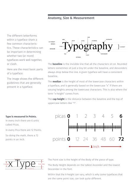
Anatomy, Size & Measurement<br />
The different letterforms<br />
within a typeface share a<br />
few common characteristics.<br />
These characteristics can<br />
be important in determining<br />
whether two (or more)<br />
typefaces work well together,<br />
or clash.<br />
Here are the most basic parts<br />
of a typeface:<br />
The image shows the different<br />
guidelines that are generally<br />
present in a typeface.<br />
The baseline is the invisible line that all the characters sit on. Rounded<br />
letters sometimes sit just a tiny bit under the baseline, and descenders<br />
always drop below this line. A given typeface will have a consistent<br />
baseline.<br />
The median is the height of most of the lowercase characters within<br />
a typeface, and is generally based on the lowercase “x” if there are<br />
varying heights among the lowercase characters. This is also where the<br />
term “x-height” comes from.<br />
The cap height is the distance between the baseline and the top of<br />
uppercase letters like “T”.<br />
Type is measured in Points.<br />
In every Inch there are 6 units<br />
called Picas.<br />
In every Pica there are 12 Points.<br />
So doing the math, there a 72<br />
points in an Inch.<br />
1 Inch<br />
X height<br />
x<br />
Ascender<br />
Type<br />
line<br />
Descender line<br />
Font Size<br />
The Point size is the height of the Body of the piece of type.<br />
The Body Height depends on the tallest Ascender and the lowest<br />
Descender in the font.<br />
Within that the X-height can vary, which is why some typefaces that<br />
are the same point size, can look quite different.