

Website Design Trends Are on Top in 2017
For 2017, the main catalyst for the traffic would be mobile browsing. To turn your website user-free, there is some latest Responsive web design which trends for your website.
For 2017, the main catalyst for the traffic would be mobile browsing. To turn your website user-free, there is some latest Responsive web design which trends for your website.

You also want an ePaper? Increase the reach of your titles
YUMPU automatically turns print PDFs into web optimized ePapers that Google loves.
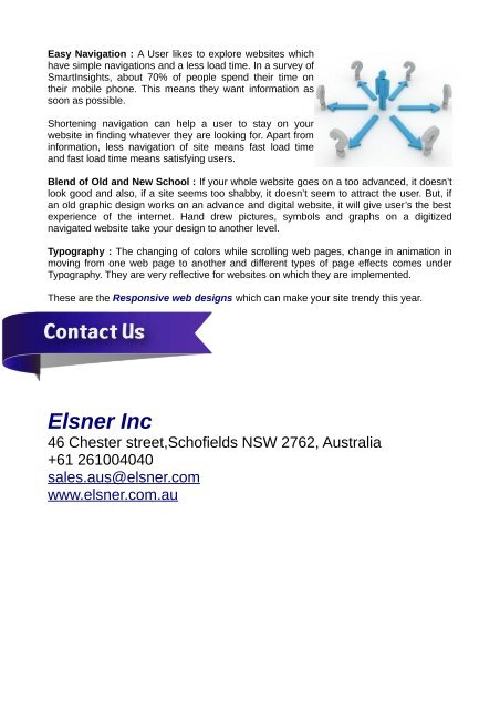
Easy Navigati<strong>on</strong> : A User likes to explore websites which<br />
have simple navigati<strong>on</strong>s and a less load time. In a survey of<br />
SmartInsights, about 70% of people spend their time <strong>on</strong><br />
their mobile ph<strong>on</strong>e. This means they want <strong>in</strong>formati<strong>on</strong> as<br />
so<strong>on</strong> as possible.<br />
Shorten<strong>in</strong>g navigati<strong>on</strong> can help a user to stay <strong>on</strong> your<br />
website <strong>in</strong> f<strong>in</strong>d<strong>in</strong>g whatever they are look<strong>in</strong>g for. Apart from<br />
<strong>in</strong>formati<strong>on</strong>, less navigati<strong>on</strong> of site means fast load time<br />
and fast load time means satisfy<strong>in</strong>g users.<br />
Blend of Old and New School : If your whole website goes <strong>on</strong> a too advanced, it doesn’t<br />
look good and also, if a site seems too shabby, it doesn’t seem to attract the user. But, if<br />
an old graphic design works <strong>on</strong> an advance and digital website, it will give user’s the best<br />
experience of the <strong>in</strong>ternet. Hand drew pictures, symbols and graphs <strong>on</strong> a digitized<br />
navigated website take your design to another level.<br />
Typography : The chang<strong>in</strong>g of colors while scroll<strong>in</strong>g web pages, change <strong>in</strong> animati<strong>on</strong> <strong>in</strong><br />
mov<strong>in</strong>g from <strong>on</strong>e web page to another and different types of page effects comes under<br />
Typography. They are very reflective for websites <strong>on</strong> which they are implemented.<br />
These are the Resp<strong>on</strong>sive web designs which can make your site trendy this year.<br />
Elsner Inc<br />
46 Chester street,Schofields NSW 2762, Australia<br />
+61 261004040<br />
sales.aus@elsner.com<br />
www.elsner.com.au


 Change language