

Website Design Trends Are on Top in 2017
For 2017, the main catalyst for the traffic would be mobile browsing. To turn your website user-free, there is some latest Responsive web design which trends for your website.
For 2017, the main catalyst for the traffic would be mobile browsing. To turn your website user-free, there is some latest Responsive web design which trends for your website.

You also want an ePaper? Increase the reach of your titles
YUMPU automatically turns print PDFs into web optimized ePapers that Google loves.
5 <str<strong>on</strong>g>Website</str<strong>on</strong>g> <str<strong>on</strong>g>Design</str<strong>on</strong>g> <str<strong>on</strong>g>Trends</str<strong>on</strong>g> <str<strong>on</strong>g>Are</str<strong>on</strong>g> <strong>on</strong> <strong>Top</strong> <strong>in</strong> <strong>2017</strong><br />
<strong>2017</strong> can be an era for a revoluti<strong>on</strong>ary <strong>in</strong>crease <strong>in</strong> the use of trendy websites. As the<br />
design will be more user-friendly, traffic will be <strong>in</strong>creased. A web design is a major th<strong>in</strong>g<br />
that attracts traffic towards your website. Therefore, designers are look<strong>in</strong>g for the<br />
anticipati<strong>on</strong> of the design trends <strong>in</strong> <strong>2017</strong>.<br />
It is always good to be prepared, especially <strong>in</strong> this c<strong>on</strong>t<strong>in</strong>uously grow<strong>in</strong>g <strong>in</strong>dustry. In the<br />
below given article, we have briefly described how the design for a website will look like for<br />
the com<strong>in</strong>g years. For <strong>2017</strong>, the ma<strong>in</strong> catalyst for the traffic would be mobile brows<strong>in</strong>g. To<br />
turn your website user-free, there is some latest Resp<strong>on</strong>sive web design which trends<br />
for your website.<br />
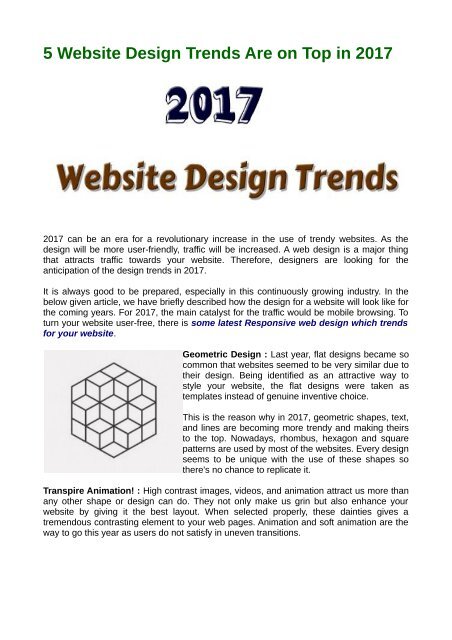
Geometric <str<strong>on</strong>g>Design</str<strong>on</strong>g> : Last year, flat designs became so<br />
comm<strong>on</strong> that websites seemed to be very similar due to<br />
their design. Be<strong>in</strong>g identified as an attractive way to<br />
style your website, the flat designs were taken as<br />
templates <strong>in</strong>stead of genu<strong>in</strong>e <strong>in</strong>ventive choice.<br />
This is the reas<strong>on</strong> why <strong>in</strong> <strong>2017</strong>, geometric shapes, text,<br />
and l<strong>in</strong>es are becom<strong>in</strong>g more trendy and mak<strong>in</strong>g theirs<br />
to the top. Nowadays, rhombus, hexag<strong>on</strong> and square<br />
patterns are used by most of the websites. Every design<br />
seems to be unique with the use of these shapes so<br />
there's no chance to replicate it.<br />
Transpire Animati<strong>on</strong>! : High c<strong>on</strong>trast images, videos, and animati<strong>on</strong> attract us more than<br />
any other shape or design can do. They not <strong>on</strong>ly make us gr<strong>in</strong> but also enhance your<br />
website by giv<strong>in</strong>g it the best layout. When selected properly, these da<strong>in</strong>ties gives a<br />
tremendous c<strong>on</strong>trast<strong>in</strong>g element to your web pages. Animati<strong>on</strong> and soft animati<strong>on</strong> are the<br />
way to go this year as users do not satisfy <strong>in</strong> uneven transiti<strong>on</strong>s.
Easy Navigati<strong>on</strong> : A User likes to explore websites which<br />
have simple navigati<strong>on</strong>s and a less load time. In a survey of<br />
SmartInsights, about 70% of people spend their time <strong>on</strong><br />
their mobile ph<strong>on</strong>e. This means they want <strong>in</strong>formati<strong>on</strong> as<br />
so<strong>on</strong> as possible.<br />
Shorten<strong>in</strong>g navigati<strong>on</strong> can help a user to stay <strong>on</strong> your<br />
website <strong>in</strong> f<strong>in</strong>d<strong>in</strong>g whatever they are look<strong>in</strong>g for. Apart from<br />
<strong>in</strong>formati<strong>on</strong>, less navigati<strong>on</strong> of site means fast load time<br />
and fast load time means satisfy<strong>in</strong>g users.<br />
Blend of Old and New School : If your whole website goes <strong>on</strong> a too advanced, it doesn’t<br />
look good and also, if a site seems too shabby, it doesn’t seem to attract the user. But, if<br />
an old graphic design works <strong>on</strong> an advance and digital website, it will give user’s the best<br />
experience of the <strong>in</strong>ternet. Hand drew pictures, symbols and graphs <strong>on</strong> a digitized<br />
navigated website take your design to another level.<br />
Typography : The chang<strong>in</strong>g of colors while scroll<strong>in</strong>g web pages, change <strong>in</strong> animati<strong>on</strong> <strong>in</strong><br />
mov<strong>in</strong>g from <strong>on</strong>e web page to another and different types of page effects comes under<br />
Typography. They are very reflective for websites <strong>on</strong> which they are implemented.<br />
These are the Resp<strong>on</strong>sive web designs which can make your site trendy this year.<br />
Elsner Inc<br />
46 Chester street,Schofields NSW 2762, Australia<br />
+61 261004040<br />
sales.aus@elsner.com<br />
www.elsner.com.au


 Change language