

Brand Deck

You also want an ePaper? Increase the reach of your titles
YUMPU automatically turns print PDFs into web optimized ePapers that Google loves.
01<br />
Mission Statement<br />
10<br />
Photography<br />
02<br />
Our Objective<br />
11<br />
Style<br />
03<br />
Logo<br />
12<br />
Color Palette<br />
04<br />
Mark<br />
13<br />
Social Media<br />
05<br />
Lock Up<br />
14<br />
Photography<br />
06<br />
Use<br />
15<br />
Logo Placement<br />
07<br />
Typography and Color<br />
16<br />
Guidelines<br />
08<br />
Typeface<br />
09<br />
Black and Red
“To provide a premium and balanced line of energy products that inspire and propel individuals to excel.”<br />
Our passion for energy has led us to create our RTD supplements with a unique and purpose-driven formulation.<br />
We are about balance, control, and engagement. With the right balance of energy, we believe anyone can become the best version of themselves, having the<br />
Energy, focus, and mental stamina that matches your ambitions, is…<br />
HOW ENERGY SHOULD FEEL.
MAKE UPTIME SYNONYMOUS WITH SUCCESS
18-60 year males and females<br />
People who want to perform at their highest level<br />
• Intelligence<br />
• Successful<br />
• Value appearance and social status<br />
• Health-conscious<br />
• Mature<br />
• Social
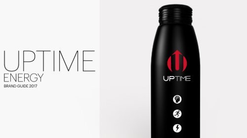
Our logo was created through the combination of three symbols that represent our brand. A liquid drop<br />
which symbolizes the refreshment of beverage, the letter U representing UPTIME, and an up arrow<br />
indicating upward movement.
Our logo can be used in several different ways: the standard lock up (1) is used the majority of the time for print and web but a flush<br />
version (2) is available when space needs to be maximized in a 1:1 area or when used small. A mark only version (3) is also<br />
preferable when the logo is used small and as a bug when the UPTIME name is made clear or appears elsewhere. The horizontal<br />
lock ups (4) and (5) are for all horizontal applications with the full lock up (4) being generally preferred and used whenever possible.
These are examples of acceptable logo usage over white and black. A solid version of the logo should be used over imagery.<br />
Never alter color, add a stroke, tilt/skew, or otherwise alter the relationship between the logo mark and logo type. Also avoid placing the<br />
logo on any color other than black or white. If the logo must be placed over a color of photo, the all white version must be used.
Our photography style must be authentic and inspirational. The aim for any photography is to market the lifestyle of successful, driven, inspiring people and<br />
their surroundings. Visual style of these images must be consistent and cohesive. Simple beautiful compositions with a muted palette with low saturation or<br />
high fade. Examples are as follows in this section.
Note how no one in these examples is lounging. UPTIME is about energy. Always focus on action, energy and experiences.
This is the preferred color palette for our imagery. Note how these photographs display a very muted and cool palette yet some of them do use accent colors.<br />
This constant balance between the lack and presence of color is key to maintaining the correct visual style.
For social media images the correct marriage of content and palette must be maintained as well as a clever, sexy, or tongue in cheek aspect in the image or<br />
caption that keeps the users engaged. Our products should also regularly appear but is not required for every post.
For Instagram posts, image size and logo placement (3) must be uniform and our<br />
Photoshop template should always be utilized. In some instances (1) a black logo<br />
will need to be used for legibility though most images can be used with the white<br />
logo which is always preferred. When placing a photo consider where the logo<br />
falls in relationship to the composition. Some images (2) will need to be cropped<br />
or treated in a way that prevents the logo from being obscured or to prevent an<br />
awkward or displeasing composition overall.
Target Audience<br />
Always remember the demographic<br />
and target audience.<br />
Tell Stories / Be Interesting<br />
We should be able to tell interesting<br />
stories with our posts.<br />
Be a Personality<br />
Social media should be a conversation with our<br />
audience, never a one-way dialogue. Avoid<br />
branding and product-focused content.<br />
One Size Does Not Fit All<br />
Diversify. Learn what type of content does best to get more<br />
of our audience engaged and to earn more fans. But<br />
remember: content that is good for one social channel<br />
doesn’t mean that it’s good for all social channels.<br />
Use Themes and Quotes to Inspire<br />
Recurring themese are a good way to inject our<br />
brand into culturally relevant conversation and<br />
drive engagement.<br />
Keep Content Congruent<br />
Make sure the copy reflects the imagery and<br />
focuses on a single primary message.<br />
Maintain a Consistent Look and Feel<br />
When searching for or creating imagery for our<br />
social media channels, make sure it is aspirational<br />
and has the same look and feel as the website.<br />
Vary Content<br />
All forms of content should be tested to determine the<br />
type of content that resonates best with our audience.<br />
When creating an editorial calendar, content types should<br />
be spread out so they aren’t repeated too frequently.