KFUEIT Brand Guideline
Khwaja Fareed University of Engineering & Information Technology Brand Guidelines
Khwaja Fareed University of Engineering & Information Technology Brand Guidelines

Create successful ePaper yourself
Turn your PDF publications into a flip-book with our unique Google optimized e-Paper software.
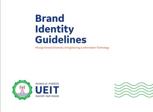
<strong>Brand</strong><br />
Identity<br />
<strong>Guideline</strong>s<br />
Khwaja Fareed University of Engineering & Information Technology
Our Vision<br />
To become a world-class University of Engineering and Information<br />
Technology that contributes significantly to the development of regional<br />
economy and uplift of local community by becoming a power house of<br />
intellectual and human capital generation.
Core values<br />
Our six core values help tell the story of who we are,<br />
where we’ve come from, what inspires us and why life<br />
at university can be life-changing.<br />
Knowledgeable<br />
Faithful<br />
Useful<br />
Eco-friendly<br />
Innovative<br />
Tolerant
Purpose<br />
Our leading edge education and research is focused on the needs of a<br />
connected global society and is driven by a culture that’s alive with the<br />
spirit of curiosity and a passion for knowledge.<br />
We’re constantly in the pursuit of excellence to find the solutions to real<br />
world issues and inspiring research to have real world impact. Together,<br />
we meet the challenges of our time head on. We provide answers to<br />
questions that reach out far beyond the walls of our University. Answers<br />
that come from intensive research, years of experience and expertise<br />
forged from some of the most exceptional minds in the world.
What is our brand?<br />
Our brand is a wide range of elements all working together<br />
through many different channels that creates a feeling of<br />
engagement with our target audiences.<br />
It’s our promotional material, course guides, alumni, advertising, buildings, environments, media<br />
coverage, public relations, internet, students’ word of mouth, open days, faculty and curriculum,<br />
application process, location and people.<br />
<strong>KFUEIT</strong> is an organisation with many different touchpoints. We want our brand to encapsulate<br />
the rich blend of people, heritage, culture, technology, innovation, entrepreneurial spirit and all<br />
the emotive connotations that make us distinctive and special.<br />
So, it's our culture, people and their dedication that differentiate us from other similar<br />
establishments. Every passing day we are coming up stronger with learning, development and<br />
World-beating stories. We must tell these to our audiences with strength and confidence whilst<br />
demonstrating how we are shaping a better world.<br />
We are building a global brand with international appeal, so let’s think, act and look like leaders.
Our tone of voice<br />
Our tone of voice is how we communicate with our target audiences, and one of the most important<br />
ways we communicate is through the way we write. A distinctive and consistent tone of voice helps<br />
us tell the world who we are. It builds recognition and brings understanding to what we offer as a<br />
University.<br />
How we say it<br />
It is not only what we say but also how we say it. There are some values that should be consistent in<br />
our tone-of-voice.<br />
We should be positive - looking to the future and speaking enthusiastically about University.<br />
We should talk about our spirit of innovation - the desire to bring new ideas and experience to the<br />
world. We are pioneers of education and research and the way we talk should reflect this.<br />
We should be inspiring. What we say should make an impression on people and be captivating to<br />
every audience.<br />
We should be proud of our academic achievement. Our writing should also communicate how proud<br />
we are to have a world-class learning community.
Our identity<br />
Our identity is made up of four key elements:<br />
The Engineering gear, communication tower,<br />
sea of knowledge and the name of the<br />
University as text. All elements are to always<br />
appear together as our primary logo, apart<br />
from circumstances where this is not possible<br />
and has been agreed in the brand guidelines or<br />
by the Marketing & Communications<br />
Department.<br />
The icons is our most valuable visual asset. It’s a mark of authenticity<br />
that states who we are and sets us apart from other universities. This<br />
section explains how to use our logo.
Egineering<br />
Gear Wheel<br />
Knowlege<br />
Wave<br />
Technology<br />
Tower
09 | Logo<br />
Main version of our logo<br />
It is essential to the success of our brand that the logo is treated with care and respect in every application and<br />
according to these guidelines. This is the main <strong>KFUEIT</strong>’s Logo and preferred version to use wherever possible unless<br />
format or background colour dictates otherwise.
10<br />
Logo versions<br />
The <strong>KFUEIT</strong>’s logo can be used for online and offline<br />
applications in following ways.<br />
Our primary logo - landscape<br />
This version is used on the majority of applications and should be used<br />
whenever possible.<br />
Single colour logo - landscape<br />
Our single colour logo is used in exceptional circumstances for mono<br />
applications only, when our logo needs to appear on a white or very<br />
light background.<br />
Black logo - landscape<br />
Our black logo is used in exceptional circumstances for mono<br />
applications only, when our logo needs to appear on a white or very<br />
light background.<br />
The reversed version - landscape<br />
This version is an alternative and can be reversed out of darker<br />
backgrounds. The logo should never appear in a box.
11 | Logo<br />
Dimensional Value<br />
100%<br />
43% 7%<br />
50%<br />
The logo captures the values of the brand and conveys them in a clear break. It is geometric, simple and innovative,<br />
with enormous flexibility of application in the innumerable means. It is a mathematical shape, but also a curious form<br />
that invites further investigation and in-depth knowledge.
12<br />
Horizontal Version<br />
2Y<br />
Y<br />
X<br />
The main representation of the brand is through its horizontal form. It is the horizontal form that appears in all the<br />
media in digital or analog, above or below the line. The logo should always be reproduced from the original artwork.
13 | Logo<br />
Normal Exclusion Zone<br />
When laying up the logo, give it breathing space and treat it with respect. To maximise the logo’s presence and visual<br />
impact always maintain adequate clear space around it. The exclusion zone around the logo defines the area into<br />
which no other graphic elements, such as text, imagery or other brandmarks can intrude.<br />
The distance marked X represents the size of letter “U” of the UEIT text. This formula applies to all sizes of the logo<br />
reproduction.<br />
X<br />
X<br />
X<br />
X
14<br />
Minimum Exclusion Zone for Exceptional Cases<br />
The exclusion zone for exceptional cases is used when it is impossible to use the normal exclusion zone without<br />
compromising the size of the logo, for example within a mobile application. The width of the two letters of ‘I’ within<br />
the <strong>KFUEIT</strong>’s logo is used to define the exclusion zone for exceptional cases.<br />
The distance marked Y represents the size of two letters “I” of the UEIT text. This formula applies to all sizes of the<br />
logo reproduction.<br />
Y<br />
Y<br />
Y<br />
Y
15 | Logo<br />
Usage<br />
As our most recognisable visual asset we<br />
want our logo to feature prominently on all<br />
applications without dominating the page.<br />
Oversizing of our logo shows a lack of<br />
confidence and can weaken the message<br />
we are trying to communicate, so getting<br />
the proportion and size correct is an<br />
important part of every communication.<br />
50mm<br />
Our logo must always be scaled<br />
proportionally to avoid any distortion. For<br />
print, the minimum width size of the<br />
<strong>KFUEIT</strong>’s landscape logo is 25mm. In<br />
situations where available space is limited -<br />
on digital media that can be viewed on a<br />
small smart-phone screen, or on a pen for<br />
example - the absolute minimum width is<br />
15mm.<br />
30mm<br />
15mm
16<br />
Positioning<br />
To ensure that our graphic language is used<br />
to the best effect and can be fresh and<br />
flexible in every situation, the <strong>KFUEIT</strong>’s logo<br />
can be placed in four different positions in<br />
the majority of applications.<br />
Top right hand side<br />
Bottom right hand side<br />
Top left hand side<br />
Bottom left hand side<br />
X<br />
X<br />
X<br />
In each situation the logo adheres to the<br />
basic principles of the exclusion zone.<br />
The logo is positioned top left on digital<br />
media such as websites and banner ads.<br />
X
17 | Faculty Logo<br />
Faculty Logo<br />
When putting up the <strong>KFUEIT</strong>’s logo with a faculty or school the name<br />
of the school or faculty can be placed in position as shown.<br />
The logo and the text should be divided by a single stroke and should<br />
use the double size of the ‘I’ in the logo as a spacing marker.
18<br />
Dimensional Value<br />
Lorem ipsum dolor sit amet, consectetuer adipiscing elit, sed diam nonummy nibh euismod tincidunt ut laoreet dolore<br />
magna aliquam erat volutpat. Ut wisi enim ad minim veniam, quis nostrud exerci tation ullamcorper suscipit lobortis<br />
nisl ut aliquip ex ea commodo consequat.
19 | Logo<br />
Do’s
20<br />
Don’ts<br />
X<br />
X<br />
X<br />
X<br />
X X X X<br />
X<br />
X<br />
X<br />
X
21 | Colour<br />
Colour<br />
While blue is the most commonly used<br />
colour within our communications, we also<br />
have a primary colour palette. We add<br />
warmth and sophistication through our rich<br />
vibrant secondary colour palette to support<br />
photography and body copy.<br />
The secondary palette is to be used in charts and diagrams and to<br />
emphasise headlines.
20<br />
Blue colour is inherent in our brand communications and it helps us stand out and<br />
differentiates us from others.<br />
<strong>KFUEIT</strong>’S BLUE<br />
PANTONE P 103-8 C<br />
At the heart of our brand is Queen’s vibrant red and as<br />
our lead corporate colour will be used as the dominant<br />
presence across all applications.
23 | Colour<br />
Primary Colour Pallete<br />
Primary colours serve as the fundamental palette that<br />
works across the entire remit of our collateral. These<br />
colours will be the foundation of our expression, and<br />
when highlighted with the colours of our secondary<br />
palette, bring a unique personality to our<br />
communications.<br />
PANTONE<br />
P 148-8 U<br />
80%<br />
60%<br />
40%<br />
20%<br />
White Space<br />
We refer to the unprinted areas of a layout that have<br />
intentionally been left blank as ‘white space’. This<br />
‘white space’ is also an integral part of the visual<br />
language and promotes clarity.<br />
PANTONE<br />
P 48-8 U<br />
80%<br />
60%<br />
40%<br />
20%<br />
White is also an important part of identity. Using white<br />
sufficiently across our communications maintains a<br />
clean and clear approach.<br />
PANTONE<br />
P 103-8 C<br />
80%<br />
60%<br />
40%<br />
20%
24<br />
Secondary Colour Pallete<br />
Our secondary colour palette complements our primary palette. It introduces style and vibrancy into charts and<br />
diagrams and creates hotspots of colour into layouts adding an extra dimension to our communications.<br />
The secondary colours and tints are intended to be used as accent colours alongside our primary colour palette.<br />
PANTONE<br />
P 61-7 U<br />
PANTONE<br />
P 93-8 C<br />
PANTONE<br />
P 179-11 C<br />
PANTONE<br />
P 138-16 C<br />
PANTONE<br />
P 22-16 C<br />
PANTONE<br />
P 14-5 C<br />
PANTONE<br />
P 112-5 C<br />
PANTONE<br />
P 179-6 C<br />
PANTONE<br />
P 157-7 C<br />
PANTONE<br />
P 14-8 C
25 | Typeface<br />
Primary Typeface<br />
For the construction of the logo, as well as all other<br />
expressions of the brand in any medium, the font used is<br />
the GE Inspira Sans. This one font must also be used for<br />
flowing text and titles in print media, television and other<br />
media where it is possible to create a printing of the<br />
typography (ie, not using the base font software), in all type<br />
of institutional or commercial communication.<br />
Aa<br />
GE Inspira Sans Bold<br />
abcdefghijklmnopqrstuvwxyz<br />
ABCDEFGHIJKLMNOPQRSTUVWXYZ<br />
01234567890<br />
GE Inspira Sans Bold Italic<br />
abcdefghijklmnopqrstuvwxyz<br />
ABCDEFGHIJKLMNOPQRSTUVWXYZ<br />
01234567890<br />
GE Inspira Sans Regular<br />
abcdefghijklmnopqrstuvwxyz<br />
ABCDEFGHIJKLMNOPQRSTUVWXYZ<br />
01234567890<br />
GE Inspira Sans Italic<br />
abcdefghijklmnopqrstuvwxyz<br />
ABCDEFGHIJKLMNOPQRSTUVWXYZ<br />
01234567890
26<br />
Secondary Typeface<br />
Secondary typoface can never be used to make up the logo.<br />
Museo Sans 100<br />
abcdefghijklmnopqrstuvwxyz<br />
ABCDEFGHIJKLMNOPQRSTUVWXYZ<br />
01234567890<br />
Museo Sans 300<br />
abcdefghijklmnopqrstuvwxyz<br />
ABCDEFGHIJKLMNOPQRSTUVWXYZ<br />
01234567890<br />
Museo Sans 500<br />
abcdefghijklmnopqrstuvwxyz<br />
ABCDEFGHIJKLMNOPQRSTUVWXYZ<br />
01234567890<br />
Museo Sans 100 Italic<br />
abcdefghijklmnopqrstuvwxyz<br />
ABCDEFGHIJKLMNOPQRSTUVWXYZ<br />
01234567890<br />
Museo Sans 300 Italic<br />
abcdefghijklmnopqrstuvwxyz<br />
ABCDEFGHIJKLMNOPQRSTUVWXYZ<br />
01234567890<br />
Museo Sans 500 Italic<br />
abcdefghijklmnopqrstuvwxyz<br />
ABCDEFGHIJKLMNOPQRSTUVWXYZ<br />
01234567890<br />
Museo Sans 700<br />
abcdefghijklmnopqrstuvwxyz<br />
ABCDEFGHIJKLMNOPQRSTUVWXYZ<br />
01234567890<br />
Museo Sans 700 Italic<br />
abcdefghijklmnopqrstuvwxyz<br />
ABCDEFGHIJKLMNOPQRSTUVWXYZ<br />
01234567890<br />
Museo Sans 900<br />
abcdefghijklmnopqrstuvwxyz<br />
ABCDEFGHIJKLMNOPQRSTUVWXYZ<br />
01234567890
27 | Typeface<br />
Secondary Typeface<br />
Secondary typoface can never be used to make up the logo.<br />
IBM Plex Serif Bold<br />
abcdefghijklmnopqrstuvwxyz<br />
ABCDEFGHIJKLMNOPQRSTUVWXYZ<br />
01234567890<br />
IBM Plex Serif SemiBold<br />
abcdefghijklmnopqrstuvwxyz<br />
ABCDEFGHIJKLMNOPQRSTUVWXYZ<br />
01234567890<br />
IBM Plex Serif Medium<br />
abcdefghijklmnopqrstuvwxyz<br />
ABCDEFGHIJKLMNOPQRSTUVWXYZ<br />
01234567890<br />
IBM Plex Serif Bold Italic<br />
abcdefghijklmnopqrstuvwxyz<br />
ABCDEFGHIJKLMNOPQRSTUVWXYZ<br />
01234567890<br />
IBM Plex Serif SemiBold Italic<br />
abcdefghijklmnopqrstuvwxyz<br />
ABCDEFGHIJKLMNOPQRSTUVWXYZ<br />
01234567890<br />
IBM Plex Serif Medium Italic<br />
abcdefghijklmnopqrstuvwxyz<br />
ABCDEFGHIJKLMNOPQRSTUVWXYZ<br />
01234567890
28<br />
IBM Plex Serif Regular<br />
abcdefghijklmnopqrstuvwxyz<br />
ABCDEFGHIJKLMNOPQRSTUVWXYZ<br />
01234567890<br />
IBM Plex Serif Light<br />
abcdefghijklmnopqrstuvwxyz<br />
ABCDEFGHIJKLMNOPQRSTUVWXYZ<br />
01234567890<br />
IBM Plex Serif Thin<br />
abcdefghijklmnopqrstuvwxyz<br />
ABCDEFGHIJKLMNOPQRSTUVWXYZ<br />
01234567890<br />
IBM Plex Serif Italic<br />
abcdefghijklmnopqrstuvwxyz<br />
ABCDEFGHIJKLMNOPQRSTUVWXYZ<br />
01234567890<br />
IBM Plex Serif Light Italic<br />
abcdefghijklmnopqrstuvwxyz<br />
ABCDEFGHIJKLMNOPQRSTUVWXYZ<br />
01234567890<br />
IBM Plex Serif Thin Italic<br />
abcdefghijklmnopqrstuvwxyz<br />
ABCDEFGHIJKLMNOPQRSTUVWXYZ<br />
01234567890
29 | Typeface<br />
Secondary Typeface<br />
For email communication use only.<br />
Secondary typoface can never be used to make up the logo.<br />
Gadugi Bold<br />
abcdefghijklmnopqrstuvwxyz<br />
ABCDEFGHIJKLMNOPQRSTUVWXYZ<br />
01234567890<br />
Gadugi Regular<br />
abcdefghijklmnopqrstuvwxyz<br />
ABCDEFGHIJKLMNOPQRSTUVWXYZ<br />
01234567890
30<br />
Secondary Typeface<br />
For exceptional use only.<br />
Secondary typoface can never be used to make up the logo.<br />
Maiandra GD Regular<br />
abcdefghijklmnopqrstuvwxyz<br />
ABCDEFGHIJKLMNOPQRSTUVWXYZ<br />
01234567890<br />
Maiandra GD Demi Bold<br />
abcdefghijklmnopqrstuvwxyz<br />
ABCDEFGHIJKLMNOPQRSTUVWXYZ<br />
01234567890<br />
Maiandra Black GD<br />
abcdefghijklmnopqrstuvwxyz<br />
ABCDEFGHIJKLMNOPQRSTUVWXYZ<br />
01234567890<br />
Gadugi Regular<br />
abcdefghijklmnopqrstuvwxyz<br />
ABCDEFGHIJKLMNOPQRSTUVWXYZ<br />
01234567890<br />
Maiandra GD Demi Bold Italic<br />
abcdefghijklmnopqrstuvwxyz<br />
ABCDEFGHIJKLMNOPQRSTUVWXYZ<br />
01234567890<br />
Maiandra GD Black Italic<br />
abcdefghijklmnopqrstuvwxyz<br />
ABCDEFGHIJKLMNOPQRSTUVWXYZ<br />
01234567890
www.kfueit.edu.pk<br />
For more information, visit or call us on:<br />
Abu Dhabi Road, Rahim Yar Khan<br />
Tel: +92 68 5882400, +92 68 5882432<br />
Fax: +92 68 5882405<br />
or<br />
write us at info@kfueit.edu.pk<br />
© The Khwaja Fareed University of Engineering & Information Technology.