In Concert Catalogue
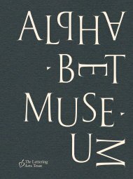
2017 catalogue for the In Concert exhibition celebrating the 50th anniversary of the opening of Snape Maltings Concert Hall
2017 catalogue for the In Concert exhibition celebrating the 50th anniversary of the opening of Snape Maltings Concert Hall
You also want an ePaper? Increase the reach of your titles
YUMPU automatically turns print PDFs into web optimized ePapers that Google loves.
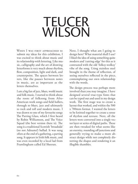
TEUCER<br />
WILSON<br />
When I was first approached to<br />
submit my ideas for this exhibition, I<br />
was excited to think about music and<br />
its relationship with lettering. Like music,<br />
calligraphy and the art of drawing<br />
letterforms is very much about rhythm,<br />
flow, composition, light and dark, and<br />
counterpoint. The spaces between letters,<br />
like the pauses between notes<br />
in music, are as important as the<br />
letters themselves.<br />
I am a big fan of jazz, blues, world music<br />
and folk music. I started to think about<br />
the roots of folksong from Afro-<br />
American work songs and field hollers,<br />
through to blues, jazz and ultimately<br />
to rock and roll and modern music. I<br />
was drawn to one of my favourite songs<br />
The Parting Glass, which I first heard<br />
by Robin Williamson, and The Voice<br />
Squad (the best version there is). The<br />
song is a traditional Scottish ‘broadside’<br />
(no not Adnams!) ballad. It was sung<br />
often at the end of a gathering, a parting<br />
song. It appears in Irish folk music, and<br />
was even recorded by a local lad from<br />
Framlingham called Ed Sheeran.<br />
Next, I thought what am I going to<br />
design here? What material shall I use?<br />
I liked the idea of using something quite<br />
modern and ‘cutting edge’ for this as it<br />
contrasted with the old ‘folksy-wolksy’<br />
vibe of the song. Using stainless steel<br />
brought in the theme of reflection, of<br />
seeing ourselves reflected in the piece,<br />
contemplating our own relationship<br />
with the words.<br />
The design process was perhaps more<br />
involved than you may imagine. I have<br />
designed several true-type fonts that<br />
can be typed out and used in my design<br />
work. The first stage was to create a<br />
layout that worked, and within the 500<br />
x 700mm format. I wanted the letters<br />
to be knitted together to create a sense<br />
of rhythm and texture. Next, all the<br />
letters were converted into a single vector<br />
layer or series of digital paths. These<br />
are then tweaked for what seems like<br />
an eternity, rounding off junctions and<br />
generally trying to make a more abstract<br />
design while not completely distorting<br />
the shapes and rendering it an<br />
illegible shambles.<br />
The Parting Glass<br />
laser cut stainless steel<br />
500 x 700 mm<br />
60<br />
61


