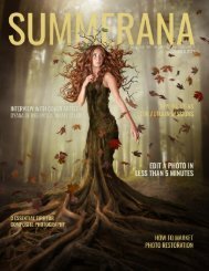
SUMMERANA MAGAZINE |October 2018 |The "Fall" Issue
October 2018 | The "Fall" Issue
October 2018 | The "Fall" Issue

You also want an ePaper? Increase the reach of your titles
YUMPU automatically turns print PDFs into web optimized ePapers that Google loves.
<strong>SUMMERANA</strong><br />
<strong>MAGAZINE</strong><br />
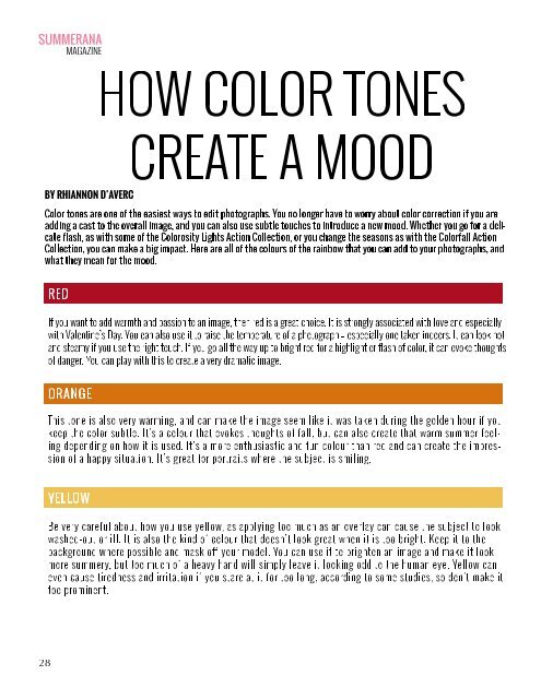
HOW COLOR TONES<br />
CREATE A MOOD<br />
BY RHIANNON D’AVERC<br />
Color tones are one of the easiest ways to edit photographs. You no longer have to worry about color correction if you are<br />
adding a cast to the overall image, and you can also use subtle touches to introduce a new mood. Whether you go for a delicate<br />
flash, as with some of the Colorosity Lights Action Collection, or you change the seasons as with the Colorfall Action<br />
Collection, you can make a big impact. Here are all of the colours of the rainbow that you can add to your photographs, and<br />
what they mean for the mood.<br />
RED<br />
If you want to add warmth and passion to an image, then red is a great choice. It is strongly associated with love and especially<br />
with Valentine’s Day. You can also use it to raise the temperature of a photograph – especially one taken indoors. It can look hot<br />
and steamy if you use the right touch. If you go all the way up to bright red for a highlight or flash of color, it can evoke thoughts<br />
of danger. You can play with this to create a very dramatic image.<br />
ORANGE<br />
This tone is also very warming, and can make the image seem like it was taken during the golden hour if you<br />
keep the color subtle. It’s a colour that evokes thoughts of fall, but can also create that warm summer feeling<br />
depending on how it is used. It’s a more enthusiastic and fun colour than red and can create the impression<br />
of a happy situation. It’s great for portraits where the subject is smiling.<br />
YELLOW<br />
Be very careful about how you use yellow, as applying too much as an overlay can cause the subject to look<br />
washed-out or ill. It is also the kind of colour that doesn’t look great when it is too bright. Keep it to the<br />
background where possible and mask off your model. You can use it to brighten an image and make it look<br />
more summery, but too much of a heavy hand will simply leave it looking odd to the human eye. Yellow can<br />
even cause tiredness and irritation if you stare at it for too long, according to some studies, so don’t make it<br />
too prominent.<br />
28