SUMMERANA MAGAZINE |October 2018 |The "Fall" Issue
October 2018 | The "Fall" Issue
October 2018 | The "Fall" Issue

Create successful ePaper yourself
Turn your PDF publications into a flip-book with our unique Google optimized e-Paper software.
<strong>SUMMERANA</strong><br />
<strong>MAGAZINE</strong><br />
BLACK<br />
Black will always darken your image dramatically, so this is something that you have to consider carefully.<br />
It’s not generally a good choice unless the image was overexposed in the first place. It will dominate the<br />
image and may even distract the viewer from the subject. It makes for a good choice if you want spooky<br />
images, however, such as for Halloween specials. It can also close the image in and make it feel more claustrophobic,<br />
especially if used as a vignette.<br />
BLUE<br />
You probably know that blue is associated with calmness, which makes this a good colour for toning down<br />
images that are a little too busy. It can also edge over into sadness, so look at the tones that you are choosing<br />
if you want to really emphasise the poignancy of an image. Deep, dark blue can also create a sense of<br />
mystery and even mysticism in an image. It’s quite a powerful colour and is often used to convey corporate<br />
messages, so it will function well for more official uses. A sunny day can be turned cold and even wintery<br />
with use of blue tones over the background. Your model can also become cold, unfeeling, or sad when you<br />
apply the color over the whole image.<br />
GREEN<br />
Adding green to a photograph can help it to feel calmer and more tranquil. It’s a natural color and this can<br />
help to add vibrancy as well. If you want to make yellow work better, try pairing it with green – as these colours<br />
have the opposite effects, they can cancel one another out. Outdoor photographs can benefit from a<br />
splash of green, which can transform a cold day into spring sunshine. It can also feel very nature-friendly.<br />
WHITE<br />
White is the opposite of black, and will help to open the image up. You can make it brighter and even create<br />
a sense of space in the photograph. Go too far, though, and you will end up with a misty look to your photograph,<br />
which may even convince the viewer that you got the exposure wrong. White requires a light touch<br />
and is often best used in combination with other photographs.<br />
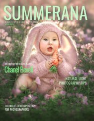
PINK<br />
Pink is a colour of youth, of romance, and of the flush of spring. It helps the image to warm up and can even<br />
make the subject appear more likeable. It’s a great option for senior portraits as it can bring a young and<br />
playful vibe to the photographs. In couples shoots, you will find that a dash of pink evokes feelings of love.<br />
Of course, when shooting a female subject, it can also give that overall girly and feminine look!<br />
29