

Web_Designer_UK__May_2018

You also want an ePaper? Increase the reach of your titles
YUMPU automatically turns print PDFs into web optimized ePapers that Google loves.
Tutorials<br />
There’s so much that can be achieved<br />
natively in the browser using CSS3 or the<br />
<strong>Web</strong> Radial menus. It’s something we’ve<br />
seen used on the web before, mainly<br />
back in the days of Adobe Flash — although recently<br />
implementations in JS and/or Canvas have been<br />
spotted in the wild — but they’re often seen in software<br />
used on touch screens. We’ll be creating our very own<br />
radial menu but we’ll be using SVG for the drawing and<br />
jQuery and GSAP to handle the interaction and animation.<br />
SVG is perfect for these kinds of elements due to its<br />
navigable DOM and responsive nature. We can capitalise<br />
on these properties to create a complete user interface<br />
(UI) or specific parts of a UI — such as a menu.<br />
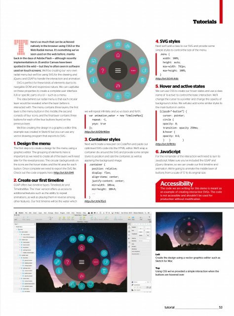
The idea behind our radial menu is that each circular<br />
layer would be revealed when the layer before is<br />
interacted with. The menu contains three layers; the first<br />
layer is the menu button in the middle; the second<br />
consists of four icons; and the final layer contains three<br />
buttons for each of the four buttons found on the<br />
previous layer.<br />
We’ll be creating the design in a graphics editor (this<br />
example was created in Sketch) but you can use any<br />
vector drawing program that exports to SVG.<br />
1. Design the menu<br />
The first step is to create a design for the menu using a<br />
graphics editor. The grouping of elements here is<br />
important as we need to create all of the layers we’ll need<br />
later for the reveal process. The circular backgrounds on<br />
the icons are the hover states and the hit area for each<br />
button. Once complete we need to export the SVG file.<br />
Check out the code snippets here: http://srt.lt/c0H1.<br />
2. Create our first timeline<br />
GSAP offers two timeline types: TimelineLite and<br />
TimelineMax. The ‘max’ version offers us access to<br />
additional features such as the ability to repeat<br />
animations, as well as playing them in reverse among<br />
other features. Our first timeline will be the water which<br />
we will repeat infinitely and yo-yo back and forth.<br />
var animation_water = new TimelineMax({<br />
repeat: -1,<br />
yoyo: true<br />
});<br />
http://srt.lt/D9rN0m<br />
3. Container styles<br />
Next we’ll create a new pen on CodePen and paste our<br />
optimised SVG code into the HTML editor. We’ll wrap a<br />
container div around the SVG and provide some simple<br />
styles to position and size the container, as well as<br />
applying the background image.<br />
.container {<br />
position: relative;<br />
display: flex;<br />
align-items: center;<br />
justify-content: center;<br />
min-width: 100vw;<br />
min-height: 100vh;<br />
...<br />
}<br />
http://srt.lt/k7EeS<br />
4. SVG styles<br />
Next we’ll add a class to our SVG and provide some<br />
simple styles to control the size of the menu.<br />
.menu {<br />
width: 100%;<br />
height: auto;<br />
max-width: 792px;<br />
max-height: 100%;<br />
}<br />
http://srt.lt/zYcA4c<br />
5. Hover and active states<br />
We can use CSS to create our hover states and use a class<br />
name of ‘is-active’ to control the basic interaction. We’ll<br />
change the cursor to a pointer and change the opacity of<br />
background circles. We will also add some similar styles to<br />
the main button in centre.<br />
[class$=”-button”] {<br />
cursor: pointer;<br />
circle {<br />
opacity: 0;<br />
transition: opacity 250ms;<br />
&:hover {<br />
opacity: 0.6;<br />
} } }<br />
http://srt.lt/RtXn<br />
6. JavaScript<br />
For the remainder of the interaction we’ll need to turn to<br />
JavaScript. Make sure you’ve included the GSAP and<br />
jQuery libraries, so we can create our first timeline and<br />
animation. We’re going to animate the middle layer of<br />
buttonsfromascaleof‘0’toitsoriginalsize.<br />
Accessibility<br />
The code we are writing for this demo is meant as<br />
an example of creating interactive SVGs. The code<br />
is not accessible and shouldn’t be used for<br />
production without modification.<br />
Left<br />
Create the design using a vector graphics editor such as<br />
Sketch for Mac<br />
Top<br />
Using CSS we’ve provided a simple interaction when the<br />
buttons are hovered over<br />
tutorial _________________________________________________53
 Change language