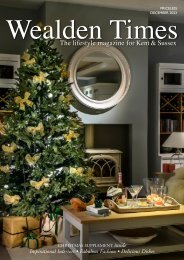
Wealden Times | WT203 | January 2019 | Interiors supplement inside
Wealden Times - The lifestyle magazine for the Weald
Wealden Times - The lifestyle magazine for the Weald

You also want an ePaper? Increase the reach of your titles
YUMPU automatically turns print PDFs into web optimized ePapers that Google loves.
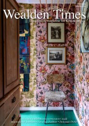
Full English<br />
Perhaps it’s the rigour of its vertical plan, but the classic townhouse seems to<br />
inspire owners to be wonderfully bold with paint and decoration<br />
Ros Byam Shaw’s beautiful book,<br />
Perfect English Townhouse is a<br />
tribute to one of our loveliest of<br />
vernacular home styles – the multi-storeyed,<br />
terraced or semi-detached, uniquely<br />
urban dwelling that is the townhouse.<br />
The thirteen houses featured in the<br />
book date from 1670 to 1965, but<br />
while they span historic eras from the<br />
Stuarts, through Georgian, Regency<br />
and Victorian, right up to the reign<br />
of our own dear Queen, they share a<br />
special appeal: a familiarity of layout and<br />
proportion that just feels right to the eye.<br />
On top of all that is common among<br />
them, each of the houses in the book<br />
is wonderfully quirky and original,<br />
packed full of ideas to aspire to –<br />
repaying repeated visits to the pages.<br />
One theme that particularly jumped<br />
out at us as worthy of further study<br />
is the way all the houses balance very<br />
strong colour and vivid prints, with lots<br />
of art, features and collections – yet<br />
never look cluttered, messy, or hectic.<br />
We’ve come to the conclusion that the<br />
secret is having a certain proportion of<br />
balancing neutral tones in natural materials,<br />
be it in original wood floorboards, linen<br />
upholstery, sisal flooring, bamboo, rattan<br />
and wood furniture, or wicker details.<br />
Here are some of our favourite examples<br />
– followed by suggestions of how to achieve<br />
such exquisite colour balance at home. <br />
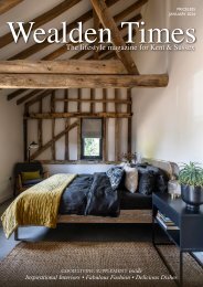
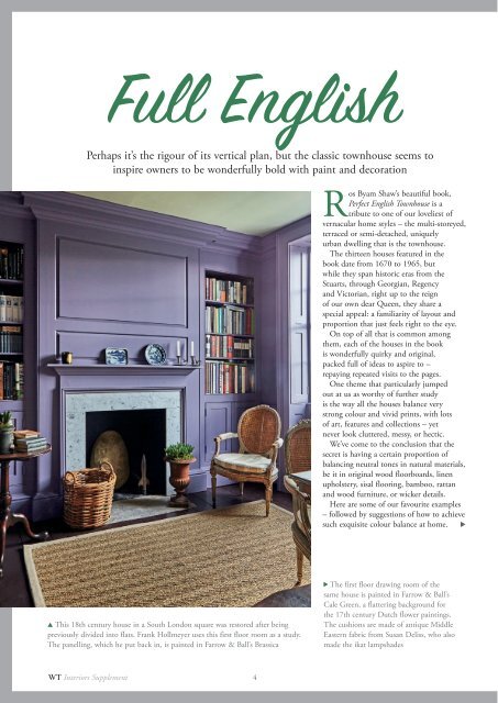
▲ This 18th century house in a South London square was restored after being<br />
previously divided into flats. Frank Hollmeyer uses this first floor room as a study.<br />
The panelling, which he put back in, is painted in Farrow & Ball’s Brassica<br />
The first floor drawing room of the<br />
same house is painted in Farrow & Ball’s<br />
Cale Green, a flattering background for<br />
the 17th century Dutch flower paintings.<br />
The cushions are made of antique Middle<br />
Eastern fabric from Susan Deliss, who also<br />
made the ikat lampshades<br />
WT <strong>Interiors</strong> Supplement<br />
4