brand-Guide-polson-park

Create successful ePaper yourself
Turn your PDF publications into a flip-book with our unique Google optimized e-Paper software.
1
“<br />
LET ALL THAT YOU DO,<br />
BE DONE IN LOVE<br />
CONTENTS<br />
-1 Corinthians 16:14<br />
Logo<br />
4<br />
Staging and Sizes<br />
Do Nots<br />
Type<br />
Colours<br />
Imagery<br />
8<br />
9<br />
10<br />
12<br />
14<br />
2<br />
3
THE LOGO<br />
4<br />
5
THE HORIZONTAL LOGO<br />
6<br />
7
THE RULES<br />
A: Ensure there is appropriate<br />
contrast.<br />
A<br />
B<br />
Rules are made to<br />
be broken...<br />
B: Do not move or rearrange logo<br />
elements<br />
But not logo rules. In order for your<br />
logo to positively represent your<br />
C: Do not use a non-<strong>brand</strong> colours.<br />
Logo can be featured in any single<br />
<strong>brand</strong> colour.<br />
C<br />
D<br />
business you should abide the following<br />
guidelines when using your logo.<br />
Clear space for the logo. When plac-<br />
D: Keep logo proportions. Do not<br />
skew , squish, stretch, or in any<br />
other way warp the logo<br />
ing the logo, please allow a<br />
sized<br />
space between other elements<br />
E: Ensure there is appropriate<br />
contrast when placing on busy<br />
backgrounds<br />
E<br />
F<br />
F: No effects such as drop shadow,<br />
outline, emboss etc.<br />
G: No adding of imagery to text<br />
elements to the logo<br />
G<br />
H<br />
H: Do not add any form of colour<br />
effects such as gradients or<br />
unapproved overlays<br />
childrens club<br />
Minimal Sizes. When placing the logo,<br />
please refrain from scaling below the<br />
sizes listed here.<br />
I: Do not scale logo elements<br />
independently of each other<br />
I<br />
<strong>polson</strong> <strong>park</strong><br />
J<br />
Print: 1.5in<br />
Digital: 150px<br />
J: Do not change logo fonts.<br />
8<br />
9
THE FONTS<br />
Nunito<br />
Aa Bb Cc Dd Ee Ff Gg Hh Ii Jj Kk Ll Mn Nn Oo Pp Qq Rr Ss Tt Uu Vv Ww Xx Yy Zz<br />
Qq<br />
1 2 3 4 5 6 7 8 9 0 - + = “ { } [ ] | @ # % & ? / < ><br />
Aa Bb Cc Dd Ee Ff Gg Hh Ii Jj Kk Ll Mn Nn Oo Pp Qq Rr Ss Tt Uu Vv Ww Xx Yy Zz<br />
1 2 3 4 5 6 7 8 9 0 - + = “ { } [ ] | @ # % & ? / < ><br />
Header: Nunito Bold<br />
Getting Out of Bed<br />
Montserrat<br />
Qq<br />
Aa Bb Cc Dd Ee Ff Gg Hh Ii Jj Kk Ll Mn Nn Oo Pp Qq Rr Ss Tt Uu Vv Ww Xx Yy Zz<br />
1 2 3 4 5 6 7 8 9 0 - + = “ { } [ ] | @ # % & ? / < ><br />
Aa Bb Cc Dd Ee Ff Gg Hh Ii Jj Kk Ll Mn Nn Oo Pp Qq Rr Ss Tt Uu Vv Ww Xx Yy Zz<br />
1 2 3 4 5 6 7 8 9 0 - + = “ { } [ ] | @ # % & ? / < ><br />
Sub-Head: Nunito Light-Italic<br />
Paragraph: Montserrat Light<br />
A morning Haiku<br />
No no no no no<br />
no no no no no no no<br />
no no no no no.<br />
Yellowtail<br />
Accent Font: Yellowtail<br />
For various notes & additions!<br />
Qq<br />
Aa Bb Cc Dd Ee Ff Gg Hh Ii Jj Kk Ll Mn Nn Oo Pp Qq Rr Ss Tt Uu Vv Ww Xx Yy Zz<br />
1 2 3 4 5 6 7 8 9 0 - + = “ { } [ ] | @ # % & ? / < ><br />
10<br />
11
COLOURS<br />
”<br />
The best colour in the<br />
whole world, is the one<br />
that looks good on you<br />
Coral<br />
Plum<br />
Platinum<br />
Sunset Orange<br />
Deep Taupe<br />
-Coco Chanel<br />
Pantone: 1565 C<br />
Pantone: 262 C<br />
RGB: 229, 229, 229<br />
RGB: 250, 105, 80<br />
RGB: 99, 89, 92<br />
RGB: 248, 161, 107<br />
RGB: 83, 40, 79<br />
CMYK: 0,0,0,10<br />
CMYK: 0, 58, 68, 2<br />
CMYK: 0, 10, 7, 61<br />
CMYK: 00,44,62,00<br />
CMYK: 67, 91, 40, 35<br />
HEX: #E5E5E5<br />
HEX: #FA6950<br />
HEX: # 63595C<br />
HEX: #f8a16b<br />
HEX: #53284f<br />
RGB: 244, 126, 84<br />
RGB: 58, 35, 67<br />
RGB: 206, 211, 200<br />
RGB: 240, 81, 60<br />
RGB: 90, 64, 68<br />
CMYK: 0, 48, 65, 4<br />
CMYK: 13, 47, 0, 73<br />
CMYK: 2, 0, 5, 17<br />
CMYK: 0, 66, 74, 5<br />
CMYK: 0, 28, 24, 64<br />
HEX: #F47E54<br />
HEX: #3A2343<br />
HEX: #ced3c8<br />
HEX: # F0513C<br />
HEX: # 5A4044<br />
12<br />
13
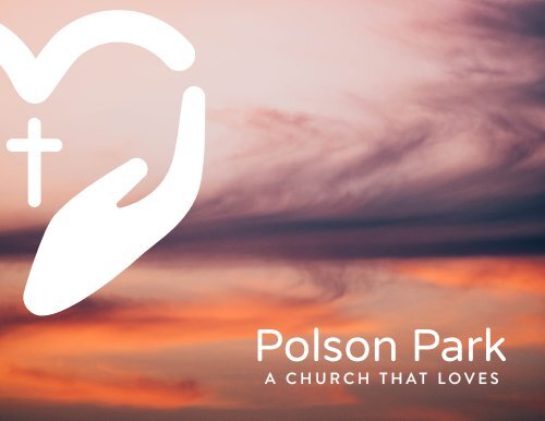
IMAGERY<br />
The images to the right will<br />
function as initial<br />
templates, and can be<br />
found on Canva.<br />
Imagery should be powerful and<br />
emotive, incorporating organization<br />
colours and impactful black<br />
and white or muted imagery. Nature<br />
images and inspiring landscapes<br />
are great for quote style posts and<br />
imagery including people should be<br />
candid and happy, avoiding being<br />
too staged.<br />
When creating materials for the<br />
organization remember to use the<br />
company fonts and colours.<br />
Matt Shipley / This Title / www.3degreeam.com /<br />
14<br />
15
QUESTIONS? Contact the designer at<br />
abbie@abbiecranegraphics.ca<br />
16