Viva Lewes Issue #151 April 2019

Create successful ePaper yourself
Turn your PDF publications into a flip-book with our unique Google optimized e-Paper software.
ON THIS MONTH: ART<br />
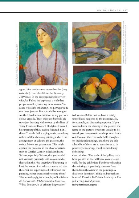
Portrait of a Girl, 1912 by Mark Gertler. © Tate, London <strong>2019</strong><br />
agree. <strong>Viva</strong> readers may remember the (very<br />
colourful) cover she did for the February<br />
<strong>2019</strong> issue. In the accompanying interview<br />
with Joe Fuller, she expressed a wish that<br />
people would try wearing more colour, ‘because<br />
it’s so life enhancing’. So perhaps we’re<br />
not there just yet. But it would be wrong to<br />
see the Charleston exhibition as any part of a<br />
colour crusade. True, there are big bold pictures<br />
just bursting with colour by the likes of<br />
Terry Frost and Howard Hodgkin. It would<br />
be surprising if they weren’t featured. But I<br />
think Cressida Bell is trying to do something<br />
rather subtler, choosing paintings where the<br />
arrangement of colours, the patterns, the<br />
colour balance are paramount. This might<br />
explain the presence in the show of artists<br />
such as Charles Ginner, Ethel Sands and<br />
Sickert, especially Sickert, that you would<br />
not associate primarily with colour. And as<br />
she said in the <strong>Viva</strong> interview: ‘I’m trying to<br />
look for works of art where you can tell that<br />
the artist has superimposed colours on the<br />
painting, rather than actually seeing them.’<br />
This would apply, for example, to Stanislawa<br />
de Karlowska’s At Churchstanton, Somerset.<br />
What, I suspect, is of primary importance<br />
to Cressida Bell is that we have a totally<br />
unmediated response to the paintings. So,<br />
for example, no distracting captions. If you<br />
want to know the identity of the painter, the<br />
name of the picture, where it’s usually to be<br />
found, you have to refer to the printed handout.<br />
Even on that, Cressida Bell’s thoughts<br />
on individual paintings, and there are only<br />
a handful of these, are so tentative as to be<br />
positively endearing. It’s all tremendously<br />
refreshing.<br />
One criticism. The walls of the gallery have<br />
been painted in four different colours, especially<br />
for the exhibition. Far from enhancing<br />
the paintings, it positively distracts from<br />
them, from the colour in the paintings. A<br />
disastrous decision? I think so, but perhaps<br />
it wasn’t Cressida Bell’s idea. And maybe I’m<br />
just wrong. David Jarman<br />
info@charleston.org.uk<br />
The Pond at Charleston by Vanessa Bell. Estate of Vanessa Bell<br />
courtesy of Henrietta Garnett and The Charleston Trust<br />
Oranges and Quinces by Robert Dukes.<br />
Courtesy of Robert Dukes<br />
53