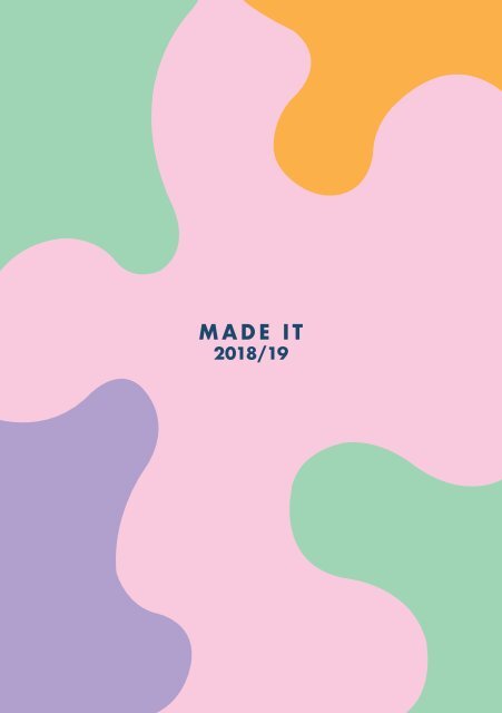
Made It Show Catalogue 1819

Create successful ePaper yourself
Turn your PDF publications into a flip-book with our unique Google optimized e-Paper software.
2018/19
WE MADE IT<br />
The graduating classes of 2018/19<br />
Higher National Diploma in Art & Design<br />
(Graphic Design)<br />
and<br />
Foundation Diploma in Art & Design<br />
<strong>Made</strong> <strong>It</strong> design identity:<br />
Annie Marr, HND Graphic Design student
HIGHER NATIONAL DIPLOMA<br />
ART & DESIGN (GRAPHIC DESIGN)<br />
Looking to learn highly-employable skills and start a new<br />
career in the creative industries? This course has been<br />
designed to provide you with a core understanding of the<br />
fundamentals of graphic design and visual communication,<br />
and prepare you for a career in the contemporary creative<br />
industries.<br />
A practical, employment-focused and cost-effective<br />
alternative to expensive university courses, this vocational<br />
course will teach you the skills required to get you into<br />
the creative workplace.<br />
The programme of study has been developed by professionals<br />
who have held senior posts at national creative companies<br />
and have also worked for high calibre regional employers in<br />
the creative sector. <strong>It</strong> is taught by an experienced teaching<br />
team who are all practicing creatives in their own rights,<br />
enabling students to receive the relevant knowledge and<br />
expertise needed in today’s fast-paced creative industries.
RHYS BARTHOLOMEW<br />
My name is Rhys Bartholomew and I chose Graphic Design by<br />
accident in 2015 and haven’t stopped loving it since. I’d<br />
also never been interested in University until I got into<br />
Footwear Design.<br />
I’m now 22 years old, about to go into my final year of<br />
university and I’m still heavily inspired to learn by the<br />
ever-growing industry of both Graphic & Sneaker Design.<br />
I’m known mostly for my intense passion for Sneakers and<br />
Sneaker design itself, however some of my favourite pieces<br />
of work have been through magazine design, film posters &<br />
Social Media campaigns. That being said, the majority of<br />
my work includes Sneakers in some way or another, usually<br />
heavily focussed on Adidas due to my long standing passion<br />
for the German brand.<br />
In 2017, I started Vooruitgang, a clothing brand standing<br />
for positivity, forward drive and motivated young persons.<br />
We are able to boast the pre-release sell out of both of our<br />
first two releases, allowing for a fast paced introduction<br />
into my clothing design ventures.<br />
With aspirations to work with the likes of Adidas, Carhartt<br />
& The North Face, plus my own business/design ventures, I<br />
hope to contribute towards the future designs and concepts<br />
of Sneakers, Clothing & more through my intuitive everexpanding<br />
interest in multiple forms of design.<br />
Progression<br />
BA (Hons) Graphic Design (top-up year)<br />
The University of Sheffield<br />
Contact<br />
07496 308436<br />
rhyslbartholemew@gmail.com<br />
Instagram @rhyslbartholomew
995 Designs
JAMES COWAN<br />
James Cowan is the proud owner and creator of 995 Designs.<br />
Originally working under the name of Cowan Creations, he’s<br />
established a long list of successful clients, focusing<br />
specifically on web and app design, rebranding as well as<br />
traditional print based graphic design.<br />
His most notable work includes the graphic overhaul of<br />
Southampton life jacket company TeamO. Creating a completely<br />
new style with updated postcards, posters, new additions to<br />
their web store and online posts.<br />
James began his transition into graphic design in 2017,<br />
moving away from a background in account management and<br />
into an HND at Bournemouth and Poole College.<br />
He is now in the latter part of his course and is getting<br />
ready to finish his final year at Arts University Bournemouth<br />
to get his BA (Hons) Degree.<br />
Going forward, James plans to continue running 995 Designs<br />
as well as find a job as a junior graphic designer at a<br />
digital agency.<br />
Progression<br />
BA (Hons) Graphic Design (top-up year)<br />
Arts University Bournemouth<br />
Contact<br />
07864 188312<br />
jamescowan995@outlook.com<br />
www.995Designs.com
LUKE HEATHCOTE<br />
Luke Heathcote Design is an English-based retouching studio<br />
based fully online with the goal of creating meaningful<br />
edits for my clients and their audiences. As an individual<br />
I truly believe that every photo should be its best and I<br />
promise custom wow with every piece of work I do.<br />
Luke Heathcote Designs was set up in 2019 by a student named<br />
Luke Heathcote who has a burning passion for graphic design<br />
and primarily Photoshop. Taking this passion and trying<br />
to make something of it, Luke Heathcote branched out and<br />
specialised in photo retouching where he has had a steady<br />
stream of clients since April.<br />
Progression<br />
BA (Hons) Graphic Design (top-up year)<br />
University of East London<br />
Contact<br />
07753107915<br />
lukeheathcotedesign@gmail.com<br />
www.lukeheathcotedesign.com
ANNIE MARR<br />
My name is Annie, I’m also known as BB Designs. I studied<br />
Graphic Designs at Level 3 at Bournemouth and Poole College,<br />
where I then have gone on to do the HND Graphic Design<br />
pathway that the college offered.<br />
In my spare time, I love to sew and embroider, creating<br />
patterns from my Photoshop skills. I am a keen Illustrator<br />
and love to create surface designs, which I would say is a<br />
deep passion of mine. In addition, I am a keen drawer and<br />
crafter, often making homemade greeting cards for family<br />
and friends.<br />
I have a deep understanding of the Adobe software Photoshop,<br />
Illustrator, and InDesign, with Illustrator being my favourite<br />
and thus where my talent lies. I have been uploading work<br />
regularly to the website Redbubble, that allows me to sell<br />
work all over the world from France to America, Netherlands<br />
and Australia. I also have an Instagram account, where I<br />
upload and showcase my work, under the name annie.marr198.<br />
My future plans are to go freelance and to perhaps do an<br />
online top-up year in BA (Hons) Graphic Design.<br />
Progression<br />
Employment<br />
Contact<br />
Instagram @annie.marr198<br />
Redbubble Anniemarr<br />
anniebbdesigns@outlook.com<br />
www.anniebbdesigns.wixsite.com/website
FOUNDATION DIPLOMA ART & DESIGN<br />
The Level 3/4 Diploma in Foundation Studies Art & Design<br />
is recognised across the UK and also internationally as<br />
the primary entry route to the best courses at the most<br />
prestigious universities, with more than 15,000 students<br />
completing the qualification each year.<br />
This course enables students to develop the skills needed<br />
to make an informed decision when applying to art and<br />
design higher education institutions, or seeking employment<br />
within a related industry.<br />
The qualification has been designed to encourage exploration<br />
and experimentation. You will learn through projects,<br />
assignments, presentations and group discussions which will<br />
enable you to develop strong practical and communication<br />
skills essential to specialist art and design education.
FRANKIE ALTON<br />
Breaking Down<br />
In this project I chose to explore the concept of evolution<br />
and how we impact the world around us, as well as its other<br />
inhabitants. To represent this, I have developed a series<br />
of screen prints in order to delve into the connections<br />
we have with nature, and how short lived they may be if we<br />
continue to consume the way we do.<br />
Research has played an important role in my project. <strong>It</strong> led<br />
me to create a survey to investigate what others believe<br />
about Evolution and what their predictions for the future<br />
might be. These responses have a direct link to my final<br />
series which draw on ideas of extinction and destruction.<br />
I’ve really enjoyed experimenting with different processes,<br />
such as cyanotype, which I’ve found to be a useful tool<br />
to express my ideas. I aim to present the importance of<br />
conservation in a subtle yet engaging way in my final prints.<br />
We are all linked in some way through evolution, so who are<br />
we to change this?<br />
Progression<br />
BA (Hons) Primary Education (with QTS)<br />
University of Winchester<br />
Contact<br />
Instagram @frankie.art
INDIA BEAUDRO<br />
Who am I?<br />
Who am I? We often ask ourselves this, but do we ever really<br />
figure it out?<br />
For my project I looked at identity, considering everything<br />
about everyone.<br />
Gradually I narrowed down my ideas through artist research<br />
such as; The Guerrilla Girls, Ellen Gallagher and Dominic<br />
Beyeler. Their boldness within their fields have really<br />
inspired me, for example, speaking out about racism and<br />
gender equality. The styles they use have given me a vast<br />
range of ideas for this project, and I have experimented<br />
with a range of styles and techniques, to communicate my<br />
own individual twist.<br />
As I came into my final piece development, I decided to focus<br />
on my identity. I have created a large-scale piece, in a<br />
collage layout, including a range of canvases, experiments<br />
I have completed throughout the project (such as screen<br />
prints, photo-layering, mark-making and spray painting)<br />
and projections. These projections will be continuously<br />
changing after a certain amount of time, just like we do.<br />
In this outcome I have linked material, time, message and<br />
colour to me and my identity.<br />
Now think about it, who are you? What would your identity<br />
look like hung up on a wall for everyone to see?<br />
Progression<br />
BA (Hons) Fine Art<br />
Cardiff Metropolitan University<br />
Contact<br />
indijb2812@googlemail.com
KAT BEWLEY<br />
The Unknown<br />
If you like horror then you’ll surely like my horror clip,<br />
this little charming film contains long and eerie shots<br />
of the forest, whilst there is chilling audio within the<br />
background.<br />
Watch as a young girl and older man have one of the worst<br />
times ever. This film is very suggestive as to what is<br />
really happening, but (spoiler alert) is pretty gruesome.<br />
This heart pumping, bone chilling, knee quaking nail-biting<br />
horror will surely knock your socks off.<br />
Created within the depths of a 3 bedroomed house and the<br />
expensive Moores valley, enjoy the scenery whilst you can...<br />
Because it’s like 4 minutes long<br />
<strong>It</strong> is recommended that children under 7 years old do not<br />
watch this however, I’m not one to withhold experiences<br />
from others...<br />
Directed by Kathryn Bewley<br />
Contact<br />
bewley.k@yahoo.com
CHLOE BLAKE<br />
Home<br />
What does home mean to you?<br />
‘Home’ is a short film documenting the meaning of home<br />
from different perspectives, along with my own personal<br />
experiences and feelings towards the topic. My aim is to<br />
provide some sense of comfort amongst students like me<br />
living independently for the first time. Trying to capture<br />
nostalgia and fondness towards the past (whilst still<br />
bearing eagerness for the years to come) was important to<br />
me in this project. I used different editing techniques;<br />
creating a vintage style colour palette and jerky sequences<br />
often found on old pieces of cine film. Reflecting on the past<br />
is a very personal thing, and I wanted to show my reflection<br />
in a positive light as I look excitedly to the future.<br />
My traditional cyanotype is a nod to all things old fashioned,<br />
connecting my childhood home as something that can be laid<br />
to rest as still part of me, but allowing me to move on to<br />
new things. Visitors are welcomed to write anything onto<br />
the cyanotype.<br />
Progression<br />
BA (Hons) Photography<br />
London College of Communication<br />
University of the Arts London<br />
Contact<br />
chloeeblake04@gmail.com
KELLY LOUISE COPPINI<br />
Horror in Milton<br />
My horror scene in Milton is a fantasy horror of my life<br />
with my boyfriend in our haunted mansion.<br />
The movie Coraline and Tim Burton inspired me to create<br />
the horror theme and to make it spooky. I also researched<br />
Disney to inspire the childlike imagery and wanted to add a<br />
horror theme, as I wanted my work to be unique.<br />
I chose to make a 2D animation and add sound effects and<br />
special effects. I have added in subtitles so my viewers<br />
can understand what we are saying so this tells my audience<br />
more about the story I’m trying to convey.<br />
Progression<br />
BA (Hons) Computer Animation Art and Design<br />
Bournemouth University
IMOGEN DAVENPORT<br />
Link<br />
In this project I wanted to look into people; this includes<br />
the relationship between people and environment and the<br />
relationship between people and people. I’ve always been<br />
interested in the bonds people share and I feel there<br />
is something organic in photos where people are captured<br />
accidentally. This is why I used images from my family photo<br />
albums. I was inspired by the otherworldly photographic<br />
work of Charlotte Rutherford and the collaged portraits of<br />
John Stezaker. This inspiration and further research led<br />
me to change the landscape of the holiday pictures and then<br />
remove the people in them to make them more important. I<br />
altered these images in Photoshop and then printed them out<br />
onto acetate and to make them into a diorama.<br />
Progression<br />
Gap Year
SHANNON EVANS<br />
Sense of Self<br />
Throughout this project I decided to develop my own<br />
understanding of how people think individually yet<br />
instinctively, and our responses to various life experiences.<br />
I have always been curious about the reasoning behind our<br />
way of thinking and how we choose to communicate our inner<br />
thoughts, emotions and intentions. I like to say I am<br />
inspired by the structure of us.<br />
I question frequently, who am I as a person? What defines<br />
us? How are we programmed and shaped by the world? What is<br />
our purpose? The meaning of life is undoubtedly discussed<br />
by everyone. As an art student, I have noticed how this is<br />
portrayed through my sketches, photos and books of creative<br />
writing.<br />
Artists, photographers, writers and other creative<br />
individuals tend to express their individuality, many who<br />
attempt to translate the unexplainable creatively through<br />
their work. For example, a colour can define an emotion, and<br />
a line may represent a thought.<br />
I feel this project outcome represents the human awareness<br />
of one’s self and the sense of insecurity of the unknown.<br />
One of the biggest mysteries out there, is us.<br />
Progression<br />
BA (Hons) Photography<br />
Arts University Bournemouth
CHEN HAO (HOW)<br />
Hot Air Balloon Pack<br />
I would like to show the structure of a hot air balloon, I<br />
made many hot air balloon models so as to study the shape of<br />
hot air and summarise the methods to improve the production<br />
during the making process.<br />
I was inspired by the metal mesh artworks I saw in the<br />
museum, and I also found many pictures of metal mesh artworks<br />
online.<br />
After looking up the history of hot air balloons and the<br />
video model making on the Internet, I decided to make a hot<br />
air balloon model with metal mesh and various materials.<br />
However, I encountered many difficulties. Because the<br />
ordinary metal mesh is very hard and cannot easily change<br />
the current situation.<br />
In these models, I used plastic, paper, cloth, metal mesh,<br />
different colours of wire. Each balloon model used different<br />
methods and techniques, such as paper stitching, metal<br />
netting, white glue and thread.<br />
When I made a foldable model, I was inspired and interested<br />
in its unique structure. Combined with my major in jewellery,<br />
I came up with the idea of making a wearable hot air balloon<br />
model and a foldable brooch.<br />
Progression<br />
BTEC HND Jewellery and Silversmithing<br />
Birmingham City University (School of Jewellery)
YITONG HE (KRYSTEN)<br />
80s<br />
My inspiration came from a Chinese movie called ‘80s’.This<br />
movie moved me, not only for its fragile and strong emotion<br />
but also the production of the movie and storyline.<br />
The film tells the story of several families and their<br />
complicated relationships and tragedies.<br />
When I researched this film, I discovered it was adapted<br />
from ‘the glass house’ directed by Li Fangfang. I finally<br />
understood that the real name of this film should be called<br />
the glass house, which inspired ideas for my project.<br />
I also researched glass, plastic and 3D shapes used in<br />
architecture, for example: OFF Portugal’s Glass Cares<br />
(Blown glassware),Selgas Cano (glass building),The National<br />
Theatre structure (half-glass building) and so forth.<br />
In the movie, I found a cold colour palette, which I used<br />
in experiments for my final piece.<br />
I mainly used transparent boards and foams. This is a<br />
maquette for a piece which could be larger and the shape<br />
could be modified in the production process.<br />
I have carefully analysed the fashion trends, and the<br />
production process, to create two pieces which could be<br />
used on a fashion runway.<br />
Progression<br />
BA (Hons) Fashion Design<br />
University of Westminster
WENLI HOU IGLESIAS<br />
Surrounded by Water<br />
Over this year I have developed my Fine Art skills even<br />
though I am planning to focus on digital skills in the<br />
future as I decided to study Visual Communications at AUB.<br />
From my point of view all the Fine Art I have learned and I<br />
am still learning will help me to develop better ideas, for<br />
example altered books, and dada project outcomes.<br />
As I always ended up painting or representing something<br />
about ‘Water’ like in my dada project, or the ‘Where I am’<br />
project I displayed something related with the sea.<br />
So, because I was always interested in how to display the<br />
sea I want to take it further and I wanted to learn how<br />
to display water in different techniques such as marbling,<br />
watercolours, acrylics.<br />
First of all, I will display some artists’ works that I<br />
research in order to learn the techniques that they use and<br />
make the most of it before I develop my final piece, such as<br />
Sally Mustang & Ian Davenport.<br />
Progression<br />
BA (Hons)Visual Communication<br />
Arts University Bournemouth
JIAN HUANG (JANE)<br />
‘Violence’ and ‘Shame’<br />
In the first painting - “Violence”, I used the woman in the<br />
wedding dress to visually identify the victim of the domestic<br />
violence, and used the knife in her hand to represent<br />
resistance, but ironically, women who resist domestic<br />
violence in China are often jailed instead. At the same<br />
time, because they are bound by both family relationships<br />
and violence, I used the “violent” chain as a symbol for<br />
how they are treated. I wanted to make this female image<br />
non- representative. So I tried to hide her appearance to<br />
make her abstract - a symbol rather than a specific person.<br />
In the second painting, “Shame,” I depicted a scene in<br />
which a victim is abandoned in a desolate place. In China,<br />
the description of the uninhabited place is “The cliff on<br />
the horizon and the corner of the sea “, which means the end<br />
of world. This led me to draw waves around the abandoned<br />
woman to create a desolate scene, referring to both the<br />
geographical remoteness and the psychological victim.<br />
Progression<br />
BA (Hons) Fine Art<br />
University for the Creative Arts
JADE LEWINS<br />
Innocence<br />
For my final major project, I had originally planned to<br />
create pieces using Scanography. However, after a trial<br />
I had realised it wasn’t appearing how I had envisioned<br />
it. This meant I then had to try and think of something<br />
else that would create the same impression I had wanted<br />
the scans to hold. Previously I have looked into milk bath<br />
photography and been heavily influenced by Claire Luxton,<br />
her work stands out to me and I feel it is so unique.<br />
Therefore, I decided to progress with my FMP with using the<br />
influence of Claire Luxton and my previous skills from milk<br />
bath photography and create a series of three images that<br />
I feel portray innocence.<br />
Progression<br />
Gap Year<br />
Contact<br />
jadelewins@hotmail.com
BINGYU LI (BRANDY)<br />
Clouds<br />
My inspiration was from the clouds over Bournemouth’s beach.<br />
I am an International student from China, and when I came<br />
to this new city, many things were unknown to me. Whenever<br />
I felt helpless or embarrassed, I always liked to see the<br />
clouds floating in the sky through my window...<br />
In my fashion designs, blue and white represent the sky<br />
and clouds, respectively. The cloud is very soft in my<br />
impression. For this reason, in the choice of fabrics, I<br />
used some soft and comfortable fabrics and techniques such<br />
as knitting & embroidery. Another main fabric used in my<br />
garment is muslin, as I want to show the features of layers<br />
and layers of lightweight clouds in the sky.<br />
The embroidery pattern on the left side of the garment was<br />
inspired by Van Gogh's work ‘The Starry Night’, which shows<br />
the clouds, the stars and the street light combined, and a<br />
feeling of dreams, which I wanted to include in my work.<br />
The thick and soft clouds are like a safe haven. In the<br />
design of this dress I have expressed my dreamful imagining<br />
about clouds.<br />
Progression<br />
Gap Year<br />
Contact<br />
libingyu1367501860@gmail.com
ANNA MILLER<br />
Dementia-friendly Textile Design<br />
Whilst working in the care industry I have met people from<br />
different walks of life all with a brilliant story to tell.<br />
What saddens me is the condition Dementia which prevents<br />
people from remembering a lot of their cherished memories<br />
and loved ones. For my final major project I wanted to try<br />
and make a difference to these people’s lives using my<br />
chosen pathway of textiles. For this project I sat down<br />
with two people who suffer from the illness to find out their<br />
interests, hobbies and fondest memories from their life.<br />
From this information I used it to sketch designs which<br />
I could use within different methods of printing. I used<br />
a mixture of sublimation, digital, lino block and screen<br />
printing throughout my project.<br />
A photographer who really inspired me whilst researching<br />
was ‘Tom Hussey’ who made a series of photographs where<br />
elderly people look at their younger reflections in a mirror.<br />
This really moved me. The print designer ‘Marimekko’ has<br />
inspired my work as basic representations that she presents<br />
in her work is something my prints have to reflect. Colour<br />
has also been a major part of my FMP, finding the right<br />
colours based on the clients likes and dislikes and also<br />
colours that have been proven to be dementia friendly.<br />
This has been a great project for me, and if it has helped<br />
my client to remember her past, that would give me great<br />
satisfaction.<br />
Progression<br />
BA (Hons) Textiles
ROBBIE MORROW<br />
Cover Up<br />
During the UAL Foundation Diploma Course in Art and Design,<br />
I experimented with different media and I was introduced to<br />
research and experimentation.<br />
Researching Dadaism, I discovered collage and a performance<br />
by Hugo Ball dressed as a bishop, and their anti-establishment/<br />
art theme. This inspired me to produce collages in paper<br />
and Photoshop.<br />
Through research of abuse I discovered Elone a German<br />
artist who pasted sanitary pads around her city with<br />
printed messages, and South African artists Jenny Nijenhuis<br />
and Nondumiso Msimanga, who hung out 3000 pairs of soiled<br />
knickers of victims of rape, both of which were highlighting<br />
sexual abuse.<br />
‘Cover-up’ is a performance highlighting sexual abuse by<br />
minorities within churches, but moreover, it highlights the<br />
‘cover-up’ of these crimes by the Church.<br />
My FMP presents first of all an image of normality within<br />
the Church using mixed media, which follows on into a<br />
performance of exposing abuse and the subsequent cover up<br />
of it.<br />
Progression<br />
BA (Hons) Fine Art<br />
Arts University Bournemouth
ZSUZSANNA MUNKACSI<br />
Invisible Matters<br />
In this project I aimed to represent the struggles I have<br />
every day living up to the high expectations society and we<br />
set ourselves.<br />
Social media puts way too much pressure on all of us but<br />
from my perspective I decided to focus on women and mothers.<br />
We all want to seem perfect in some way. But what if we are<br />
already perfect as we are?<br />
I was planning to incorporate text or words as I have a<br />
great passion for them so I started to experiment with<br />
techniques and that’s when I found blind embossing.<br />
Text created with blind embossing is delicate and clean.<br />
<strong>It</strong>’s invisible from a distance but it’s clearly there,<br />
just as are all those struggles behind the pressure to be<br />
perfect.<br />
The zines supporting this project contain illustration and<br />
text pieces inspired by interviews with other 21st century<br />
women about the fears and challenges they face every day.<br />
Progression<br />
BA (Hons) Graphic Design<br />
Art University Bournemouth<br />
Contact<br />
Instagram @munkacsizsu<br />
susan.munkacsi@gmail.com
ANAIS NORMAN-TOMAS<br />
*Ring Ring*<br />
My chosen topic for my final piece is looking at the lives<br />
of phone sex workers, after I watched a documentary on the<br />
subject and was instantly inspired.<br />
My aim for this project was to show that anyone - of any<br />
age, gender, race, situation - can be a phone sex worker.<br />
I wanted to show the way they can be judged, treated and<br />
how their job can affect them. Likewise, I wanted to show<br />
the client and show that anyone can use them as well. They<br />
include audio, which is a mash-up of different videos and<br />
a dialling tone (playing through hidden speakers), to make<br />
the phones more realistic and give an idea of conversations<br />
and an insight into the character’s lives.<br />
Also, in my body of work, is information and statistics<br />
on people’s opinions of phone sex workers and physical<br />
characteristics they found attractive. This information was<br />
gathered by doing two questionnaires asking over 108 people<br />
in total; I wanted to research this to give an indication<br />
of who people expect to be behind the phone, as well as<br />
investigate any stereotypes people had about them. This was<br />
in order to disprove or confirm these beliefs.<br />
Progression<br />
Gap year / Employment<br />
Contact<br />
Instagram @anaismarieart<br />
anaismarient@gmail.com<br />
www.anaismarie1807.wixsite.com/anaisartanddesign
JACK PLUCKROSE<br />
Fragile<br />
My final outcome was to produce two or more bags (rucksack<br />
style) to be presented as my FMP with loads of supporting<br />
work to go along with and I felt I have done what I set out<br />
to do and am very proud of that but there are things I would<br />
change and improve on if I did this project again.<br />
Throughout the project I had a concept of making bags but<br />
was not sure what style of bag to go for, which is when<br />
I made the Ikea bag as a prototype and tester to see if<br />
it could be done and if it was really what I wanted as my<br />
FMP. After designing the bag I shortly realised I wanted<br />
to carry on in a style of destructive anarchy, following on<br />
from my previous ‘structure’ project, while using recycled<br />
materials.<br />
Progression<br />
BA (Hon) Fashion<br />
Arts University Bournemouth<br />
Contact<br />
jack.pluckrose1@gmail.com
BEATRICE READ<br />
Behind the Lens<br />
For this project, I continued with a previous idea researching<br />
the structure of cameras.<br />
The reason why I decided to study the structure of a camera<br />
is because I’ve always been behind a camera taking photos<br />
and I’ve always been curious as to what is behind the lens.<br />
I undertook primary research by visiting two camera museums<br />
in London and many camera shops, this helped me learn a lot<br />
more about cameras by talking to specialists. This meant<br />
that I was exposed to a wide range of cameras which have<br />
been discontinued or would have been too expensive to buy<br />
for my project.<br />
When it came to developing my final piece I explored various<br />
ways of presenting the images, taking studio shots of the reconstructed<br />
cameras, as well as making anthotypes of them. I<br />
then returned to cyanotypes (which I had experimented with<br />
before), as this is one of the first printing techniques<br />
and relates with the old styles of cameras I have chosen to<br />
study and reconstruct.<br />
Overall my final piece is a series of re-constructed cameras,<br />
of which I have taken both film and digital photos, and<br />
presented as a series of cyanotypes. Also I have created<br />
a book of photos to display along with the re-constructed<br />
cameras.<br />
Progression<br />
BA (Hons) Commercial Photography<br />
Plymouth College of Art
BRADLEY STOCKHAM<br />
The Nerve of Some People<br />
This final piece is a representation of the structural<br />
composition found within nervous tissue. <strong>It</strong> was my primary<br />
focus for this project to research the central nervous<br />
system, specifically the pathways within the brain and to<br />
depict their form in a physical model.<br />
Continuing from the previous project, where inspiration<br />
came from a two photon microscopic image, I decided to<br />
create this artwork, focussing on the anatomy of the cells<br />
and their respective forms.<br />
This was accomplished by drawing the various cells digitally<br />
where they were then laser etched onto 3mm cast acrylic,<br />
each layer slightly different to create a more immersive<br />
model.<br />
The outcome: A simplistic, clean illustration of neurons<br />
and neuroglia, used as both an aesthetically pleasing model<br />
and an educational tool.<br />
Progression<br />
BA (Hons) Computer Aided Design<br />
University of Winchester
DOMINIKA SZTUBECKA<br />
Why Have We Lost Each Other<br />
Essence & Roiael<br />
Music video<br />
I’ve had this idea of a fan-made music video since last<br />
summer – I originally wanted to make it as a personal<br />
project, however I realised it would make a great final<br />
major project as it’s quite ambitious and requires a lot<br />
of work. I carried out research into music videos as a<br />
genre to better understand how it connects the viewer with<br />
the music. I was heavily inspired by visuals-driven and<br />
conceptual videos that are more art than just storytelling.<br />
The video was filmed and edited like a standard music video,<br />
then I drew over every frame to create an animation. This<br />
let me utilise my interest in digital drawing and creating<br />
very visuals-driven videos. I tried my best to make a video<br />
that complements the music, expresses the same theme and<br />
creates a harmonious duo. The result was a loose narrative<br />
centred around the breakdown of a relationship.<br />
I’m hoping this project could extend into future freelance<br />
work. I would love to work with artists and specialise in<br />
making animated music videos alongside my animation studies<br />
at university and afterwards.<br />
Progression<br />
BA (Hons) Animation<br />
Edinburgh College of Art, The Edinburgh University<br />
Contact<br />
Instagram @dominika_schz
KATHARINE VAN WYMEERSCH<br />
Fundamental Error of The Plastic Age<br />
Nights of scrolling down social media reading the odd bit<br />
of positive news but mostly bad news about the climate, led<br />
me to think: is it actually a climate emergency? I carried<br />
out a range of research from documentaries to looking at the<br />
inspirational works of Kurt Jackson who has strong concerns<br />
for the environment, Sue Lipscombe’s plastic Bristol Whales<br />
and Steve Cutts whose work conveys the honest reality of<br />
the modern world. From there I decided I wanted to base my<br />
project around plastic pollution to create something with<br />
substance and meaning. I live by the sea which is beautiful<br />
yet spoiled with plastic which gave me inspiration for what<br />
I wanted to do.<br />
I started collecting single use plastic waste from myself<br />
and peers in the studio then experimented with photography<br />
and the effectiveness of cyanotypes, printing and collages<br />
to eventually pull all my strengths in these techniques as<br />
well as all my primary and secondary research together to<br />
produce a large scale, mixed media painting that’s pleasing<br />
to look at but carries a message about a prominently raised<br />
subject that keeps being swept under the rug. My painting<br />
represents us and our harm to the environment.<br />
Progression<br />
BA (Hons) Drawing and Print<br />
University of the West of England<br />
Contact<br />
katharineelizabethv@gmail.com
BYRON WALKLEY<br />
Wave Chase<br />
Band merchandise, something that everyone has and probably<br />
will buy again in their life. But if you’re like me then<br />
you’d be bored of an overpriced hoodie with the band’s name<br />
slapped in the middle of the chest. For my project I have<br />
looked at creating band merchandise and how they could<br />
advertise themselves which isn’t filtered to only the band’s<br />
name.<br />
I started by looking into some well-known bands and what<br />
could be found on their merch stalls. I then decided what<br />
attire I would make; what you can see here today. For this<br />
project, I wanted to stray away from the band name and use<br />
the lyrics from some of their songs and use their words to<br />
inspire my designs. My t-shirts were heavily inspired by<br />
skate/ surf styles and driven by a desire to make my work<br />
commercially focused. Having to learn how to screen print<br />
took my work from being on paper, to being on the t-shirts<br />
and hoodies.<br />
Thank you for taking the time to read this and looking at my<br />
work. If you would like to purchase any pieces then follow<br />
‘Wave Chase’ on Facebook for updates.<br />
Progression<br />
BA (Hons) Photography<br />
University of Suffolk<br />
Contact<br />
walkleyschool@gmail.com
MIA ELIZABETH WIGNALL<br />
What’s it Like to be Free from the Weight of Giving a Sh*t?<br />
Through this exhibition I have combined one of the biggest<br />
issues of today, Plastic Pollution, with my driven desire<br />
to help others make their way to a more self-aligned life.<br />
<strong>It</strong>’s a project created to get a reaction and allow change.<br />
To express the urgency of this issue, I have created a<br />
jacket purely from recycled materials. I have combined<br />
lost items that stir your thoughts. The jacket is an anticonforming<br />
statement to society. This supports others to<br />
feel free to dress the way they WANT and not give a damn!<br />
The surrounding pieces are my fashion photography and magazine<br />
layouts, focusing on my future goals and aspirations to work<br />
in fashion marketing. These share the work of people who<br />
are different and doing things their way. <strong>It</strong> also provides<br />
tips and mindful ideas to those who are inspired by this.<br />
The pages include my own productions, photographs and<br />
doodles. Inspired by magazines like flow, Dazed and oh comely,<br />
I have created a few focused double-page spreads, designed<br />
to be as different and free as possible, challenging the<br />
norms to really convey that message to the audience.<br />
Progression<br />
BA (Hons) Fashion Promotion<br />
Ravensbourne University<br />
Contact<br />
Instagram @miawignall<br />
miaelizabeth3@outlook.com
JODI WILLIAMSON<br />
Poetic Symmetry<br />
Researching the technique of hyper realism, I wanted to<br />
try to convey family, bloodline, and the relationships<br />
that come from this. I decided to use the non-existent<br />
relationship between my father and brother, with an age gap<br />
of 53 years between them for this, as they look so alike,<br />
and yet have not spoken in 10 years.<br />
After researching hyper realism, I wanted my pieces of work<br />
to have a very real feel to them, whilst also bringing<br />
forward some form of emotion in the subjects. My aim was to<br />
raise the question of whether family is a matter of blood<br />
or a title that is earned through love and respect.<br />
Progression<br />
BA (Hons) Drawing and Print<br />
University of the West of England
SHELLY WILLIAMSON<br />
49th<br />
For this final project I wanted to draw people's attention<br />
to a man called Peter Tobin. My aim was to create an<br />
installation showcasing who he was, what he did and his<br />
effect on people.<br />
I felt that it was disrespectful to include information<br />
about his victims so I instead incorporated photography to<br />
try to reflect what these women might have gone through.<br />
In addition to the photography aspect of my aim, I have<br />
developed my skills in painting - focussing more on<br />
portraits as that was something I had not done before.<br />
Using my knowledge of criminology and psychology into<br />
criminal behaviour, I developed an artistic response to<br />
a case I know of, from my own research. I have studied<br />
this case in my personal time and had never thought to do<br />
anything creative related to it.<br />
Whilst exploring the case I came to see that there is not<br />
currently any artwork related to it or any cases similar so<br />
I enjoyed the challenge, seeing how I can create something<br />
thought-provoking and in some ways beautiful out of something<br />
really quite sinister.<br />
Progression<br />
BA (Hons) Drawing and Print<br />
University of the West of England
HOLLY WOOLLARD<br />
Identity<br />
Identity can relate to many different aspects of an<br />
individual- their cultural background, their gender, their<br />
physical appearance...<br />
My focus into this topic was how social standards and the<br />
media pressure us to change who we are and conform with<br />
social expectations.<br />
We are a world of digital natives - those who have never<br />
lived in a world without the internet. With the average<br />
brit checking their phone as often as 28 times a day, I felt<br />
as though I wanted to show the effects of this.<br />
Looking at artists such as Ant Carver and Kemi Mai who use<br />
portraiture to promote powerful imagery, I wanted send a<br />
message of how society is manipulative and dangerous.<br />
Progression<br />
Employment<br />
Contact<br />
hollywoollard1999@hotmail.co.uk
LEWIS WOODWORTH<br />
Sci-Fi Ballistic Vest Prop<br />
My piece has changed a lot from my initial idea of a bulky<br />
costume and I decided to go for a more sleek and lightweight<br />
design.<br />
I have decided that this piece would be best used for<br />
theatre, a piece for a convention/promotional use or for a<br />
themed area (such as at a theme park or themed maze). I have<br />
never made a costume using foam so this was a big step for<br />
me. I have definitely learned that this is a time-consuming<br />
project.<br />
For research I watched a few Sci-Fi films and have been<br />
watching tutorials and gaining tips/ideas from You-Tube<br />
content creators.<br />
Next year I plan on working on my skills as a chef and<br />
creating more costumes and props to hone my skills, I would<br />
like to visit comic-cons and conventions to display my<br />
pieces and learn from cos players I will meet there. From<br />
there I would like to apply for university to study model<br />
making and learn new methods.<br />
Progression<br />
Employment<br />
Contact<br />
Lewiswoodworth1999@gmail.com
WING YAN CHAN (ANGEL)<br />
The Historical and Contemporary Chinese Interior Design<br />
Through this project, I am looking at the Chinese interior<br />
design. I know, Chinese interior design went through many<br />
different periods. So, my study and work will mainly focus<br />
on the most famous and prolific periods of Chinese history—<br />
Ming and Tang Dynasties. I did a lot of research on the<br />
characteristics, the main elements of historical Chinese<br />
interior design, as well as the recent trends in contemporary<br />
design. For the artist, I took reference from the work and<br />
concepts of Antoni Gaudí and Yang Bangsheng (a Chinese<br />
interior designer).<br />
As I am Asian, I really want to show and use Chinese style<br />
and analyse how those periods changed the style of interior<br />
design. Therefore, I made an interior paper model as a<br />
plan. I did a couple of experimental works using paper<br />
straws and wooden sticks to make some building models. By<br />
extending the previous ‘structure’ project, I choose to use<br />
the circular shape for the exterior wall.<br />
I have created a completed paper model with a perfect floor<br />
plan with some successful practical work.<br />
Progression<br />
BA (Hons) Interior Architecture and Design<br />
University for the Creative Arts
WEI ZHANG (JAMES)<br />
Freedom<br />
In general, people have too many things they need to think<br />
about. When they remember one thing, they will forget<br />
another.<br />
Additionally, people find it is hard to prioritise: especially<br />
in the busy world of today.<br />
For this reason, I have created ‘freedom’, an app which<br />
helps people collect together their to-do lists.<br />
I investigated the vast majority of existing software on<br />
the market, including the standard to do list App, which is<br />
based on The Eisenhower Method, but my research shows it<br />
is used for more strategic thinking and is not suitable for<br />
daily tasks. My survey report of sixty people shows that<br />
nearly half of the people often don't know what they should<br />
be doing and often delay the more important things, it also<br />
seems that about 80% of people suffer from procrastination<br />
and inefficiency.<br />
I researched the existing theory further, and as a result<br />
I made this humanity app for daily events; it can manage<br />
tasks more efficiently and improve time utilisation.<br />
Progression<br />
BA (Hons) User Experience Design<br />
London College of Communication<br />
University of the Arts London
KAIXHANG ZHANG (FRANKIE)<br />
K. N. O. W.<br />
I want to create an integrated language system to compare<br />
the nothingness in Buddhism, Taoism, and physics context.<br />
There is a hidden route that firstly begins with the wormholelike<br />
shape which indicates a bridge between the outer and<br />
inner world, thing and non-thing, macro and micro space.<br />
For the Buddhist section, I researched the theory of<br />
Mādhyamaka and tried to emphasize the emptiness of the<br />
worldly matters, that can be easily changed as if the<br />
reflection on the water.<br />
The thing and nothing are opposite equivalently but also<br />
has a chronological order in Taoism. Everything is derived<br />
from the Dao and the thing is generated from nothing. The<br />
white light represents the very first thing. <strong>It</strong> can produce<br />
all the other visible lights, while the black implying the<br />
origin of the thing.<br />
Humans have been seeking for the ultimacy of the world<br />
for thousands of years, but when we drive our curiosity<br />
deeper, the upcoming sight is constantly besieged by new<br />
questions. What can we see when the light is on? The peep<br />
holes represent the limitation of what I or we know. All<br />
of us are looking at the world with restricted boundaries.<br />
Progression<br />
BA (Hons) Fine Art<br />
Chelsea College of Art<br />
University of the Arts London
ZIHAN ZHAO (JESSICA)<br />
The Ship of Theseus<br />
For the final major project, I have created work based on<br />
a paradox that I was really interested in while I learnt<br />
about it in a psychology course in high school. This is<br />
called ‘The Ship of Theseus’, and describes a ship that has<br />
been at sea for hundreds of years, as soon as a piece of<br />
wood rots, it is replaced, until all of the features are<br />
not the first ones.<br />
Is the resulting ship the same ‘Theseus’ or a different<br />
ship altogether? If not the original ship, at what point is<br />
it no longer the original ship?<br />
I have developed this idea by also looking at human memory<br />
and Alzheimers, and I have designed a garment based on this<br />
concept.<br />
Progression<br />
BA (Hons) Fashion Design Technology: Womenswear<br />
London College of Fashion<br />
University of the Arts London
Art & Design<br />
Bournemouth & Poole College<br />
2019