Watercolor Studio - Missouri Watercolor Society
Watercolor Studio - Missouri Watercolor Society
Watercolor Studio - Missouri Watercolor Society

You also want an ePaper? Increase the reach of your titles
YUMPU automatically turns print PDFs into web optimized ePapers that Google loves.
<strong>Watercolor</strong> <strong>Studio</strong><br />
The Magazine of The <strong>Missouri</strong> <strong>Watercolor</strong> <strong>Society</strong><br />
Snow Demo<br />
by Hugh Greer<br />
Negative Painting Exercise<br />
by Shirley Nachtrieb<br />
When you Have Lemons...<br />
by Chris Krupinski<br />
Make your Paintings Pop<br />
by Debi Watson<br />
Painting Historic Cape<br />
by Yevgeny Sokolov<br />
Spring 2010
Liluma by Marilynne Bradley<br />
Music of the Night by Doris Davis Glackin<br />
ADVERTISING INFORMATION<br />
All rates for display ads are per insertion. Ad design is included in price of ad. Payment for ads is due before<br />
publication of each issue. 3” x 2” ad $25 3” x 3” ad $35 3” x 4” ad $50 4” x5” ad $75<br />
<strong>Watercolor</strong> <strong>Studio</strong> is posted quarterly on www.mowsart.com for a worldwide audience at no charge.<br />
Contact Laura King by email at laura@laurakingstudio.com or by phone at 573-356-1236.<br />
MoWS Board<br />
of Directors:<br />
George “Papa” Tutt<br />
Executive Director<br />
Fulton, <strong>Missouri</strong><br />
Jo Tutt, Treasurer<br />
Fulton, <strong>Missouri</strong><br />
Catherine Mahoney,<br />
Secretary<br />
Hermann, <strong>Missouri</strong><br />
David Kuczynski<br />
Fulton, <strong>Missouri</strong><br />
Jerry Berneche<br />
Columbia, <strong>Missouri</strong><br />
Jerry Ellis<br />
Carthage, <strong>Missouri</strong><br />
Jean Kalin<br />
Platte City, <strong>Missouri</strong><br />
Barbara Maxwell<br />
Kansas City, Kansas<br />
Debra Sutherland<br />
Springfield, <strong>Missouri</strong><br />
Paul Jackson<br />
Columbia, <strong>Missouri</strong><br />
Kate Gray<br />
Columbia, <strong>Missouri</strong><br />
MoWS Office:<br />
Administration:<br />
Papa and Jo Tutt<br />
1406 Kenwood Drive<br />
Fulton, MO 65251-1317<br />
573-642-6410<br />
georgetutt@socket.net<br />
Magazine & Web site:<br />
Laura King<br />
1513 Thoroughbred Cir.<br />
Columbia, MO 65202<br />
Phone: 573-356-1236<br />
laura@laurakingstudio.com
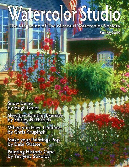
ON OUR COVER<br />
<strong>Watercolor</strong> <strong>Studio</strong><br />
Volume 6, Issue 2 - Spring 2010<br />
Flower Riot by Hugh Greer<br />
Hugh graduated from the University of Kansas with<br />
a degree in industrial design. He worked over forty<br />
years in the architectural field. Hugh’s work in painting<br />
is based on his formal training as an architectural delineator,<br />
but he is always open to new avenues to accomplish<br />
a consistent end result.<br />
Hugh has just received the “Award of Excellence” (Best of<br />
Show) from the <strong>Watercolor</strong> <strong>Missouri</strong> National 2010 for his<br />
painting “Posts.” Hugh’s entry in the Kansas <strong>Watercolor</strong><br />
<strong>Society</strong> National Exhibition 2009, “Upper Fox Creek,” received<br />
a Purchase Award and a Cash Award. Also in 2009,<br />
he received “The Sutherland Lumber Co. Award” from the<br />
<strong>Watercolor</strong> <strong>Missouri</strong> National 2009 for his painting “Family<br />
Cycle.” He received the “George Latta Memorial Award”<br />
from the 2008 <strong>Watercolor</strong> <strong>Missouri</strong> National show for his<br />
painting “Greenwood County Winter.” In 2007, he was honored<br />
with a cash award from the Kansas <strong>Watercolor</strong> <strong>Society</strong><br />
“Winter Invitational” for his painting “River Town.” In 2006<br />
and 2007, Hugh received the H K Holbein Award from the<br />
<strong>Missouri</strong> <strong>Watercolor</strong> <strong>Society</strong> Members’ Invitational show.<br />
In September 2003, Hugh won the Grand Prize at Arts for<br />
the Parks Top 100, an International competition. In 2002,<br />
Hugh was the winner for Region III in the Arts for the Parks<br />
competition and the People’s choice award for the same<br />
painting. He is the author of two books. Hugh Greer <strong>Missouri</strong><br />
to New Mexico, published in 1997, is a sampling of<br />
Hugh’s art with verse by Cathy Bolon Stephenson. Acrylic<br />
Landscape Painting Techniques, published in 2001 by<br />
North Light, is a “how to” book.<br />
Also available through Creative Catalyst Productions are<br />
three instruction DVD’s: Acrylic Landscape Painting Tools &<br />
Techniques, Landscape Studies in Acrylic, and Create Mood<br />
and Atmosphere With Color & Value. For ordering information<br />
contact www.ccpvideos.com<br />
<strong>Missouri</strong>...where the watercolors flow!<br />
4<br />
6<br />
8<br />
10<br />
12<br />
14<br />
16<br />
19<br />
23<br />
24<br />
CONTENTS<br />
Snow Demo<br />
by Hugh Greer<br />
Negative Painting Exercise<br />
by Shirley Nachtrieb<br />
When You Have Lemons...<br />
by Chris Krupinski<br />
In Memory of Al, Joe Sartor’s<br />
Church Murals and En Plein Air<br />
<strong>Watercolor</strong> <strong>Missouri</strong> National<br />
2010 photos & results<br />
Make your Paintings Pop with<br />
Strong Values<br />
by Debi Watson<br />
Painting Historic Cape<br />
by Yevgeny Sokolov<br />
Art Y’all - Members Making News<br />
Midnight Cosmos<br />
by Norma Herring<br />
Book Review<br />
by Susanne Clark<br />
Copyright 2010 <strong>Missouri</strong> <strong>Watercolor</strong> <strong>Society</strong>. Copyright covers all<br />
content and may not be reproduced in any manner without permission<br />
from the Executive Director of MoWS. NOTE: Copyright on<br />
all artwork and articles is held by each published artist or writer.<br />
3
SNOW<br />
DEMO<br />
by Hugh Greer<br />
It’s Time to Make the<br />
Most of Those Snow<br />
Scenes you Photographed<br />
Over the Winter<br />
Working with acrylics is like working with a medium from Mars. Maybe not everyday, but every week<br />
that goes by I learn something new about how to manipulate acrylics.<br />
You can paint opaque or transparent with acrylics. When I’m painting for a<br />
watercolor competition, I paint as transparent as possible. Some watercolor<br />
competitions require the use of the white of the paper. That is a subject for<br />
another day.<br />
The following snow demo is about layering. Unlike watercolors, acrylics can<br />
be layered (wash upon wash) without disturbing the color underneath. The<br />
following steps were initially created for one of my workshops and specifically<br />
designed to be easily understood.<br />
Figure 1 looks like a value scale, and it is of sorts. A base tone or underpainting<br />
of blue/gray was brushed on all over the surface and allowed to<br />
dry; this is the background layer. My goal here is to show you in figure 1<br />
how many thin washes of white are needed to get to pure white.<br />
After the blue/gray background color has dried, layer #1 was painted over<br />
the background color in the form of a rectangle and allowed to dry, and so<br />
on until 9 layers have been applied, drying between each coat. Finally, after<br />
9 layers have been applied to the base blue/gray, the brightest white has<br />
been achieved. Layers 1 thru 8 are value tones of the white.<br />
The underpainting or background color can be any color you choose. It will<br />
influence your whole painting, thereby color coordinating your entire painting.<br />
At least, that is the goal.<br />
Figure 2. A crescent 115 watercolor board has been toned with a blue/<br />
gray color (just like our value scale example). The sketch is transferred with<br />
white Saral® Paper. (When the background color is very light, I use graphite<br />
Saral® Paper.)<br />
Figure 3. Layers of white, just like the value demo, are placed on different<br />
surfaces of the “white” barn in the snow. You have to determine which is the<br />
brightest, the barn or the snow. I figure fresh snow is brighter than worn<br />
4<br />
Figure 1<br />
Figure 5<br />
Crisp Winter Night by Hugh Greer
wood. So the snow on the roof gets 3 layers of white, the wood barn gets 2 layers, and there will be no layering<br />
on the shaded side of the barn. The background trees were “scumbled” in.<br />
Figure 4. The stone wall and rough grasses are painted in and layers of thin white washes are placed in the<br />
foreground. Shadows are painted in their appropriate location and an extra layer of white is placed on the<br />
doors of the barn.<br />
Figure 2<br />
Figure 3<br />
Figure 4<br />
Figure 5. Finalize the painting by adding more<br />
trees and fence posts, and give more definition<br />
to the grasses and windows in the barn with a<br />
#1 Script brush.<br />
<strong>Missouri</strong><br />
<strong>Watercolor</strong><br />
<strong>Society</strong><br />
2010 Members’<br />
Invitational Show<br />
Columbia Art League,<br />
Columbia, <strong>Missouri</strong><br />
Paintings are to be hand-delivered<br />
(only) to the CAL Gallery<br />
August 16th-21st, 2010.<br />
Show will hang from Sunday,<br />
August 21 through Friday,<br />
October 15, 2010.<br />
Reception and Awards:<br />
September 12th.<br />
Download prospectus<br />
and entering instructions at<br />
www.mowsart.com<br />
5
Negative Painting Exercise by Shirley Nachtrieb<br />
This is a fun exercise for new or advanced artists using a<br />
variety of subject matter from leaves to fish or butterflies<br />
and triads from Nita Leland’s compatible color system as<br />
seen in the book, Exploring Color. Draw subject matter<br />
on cardstock and cut out the shapes to trace around during<br />
the painting process.<br />
o start, prepare several 5 ½” x7 ½” 140 lb. papers by<br />
applying various compatible colors wet-into-wet, then<br />
adding salt for texture. It’s important to leaves whites<br />
as this will be the only white left when the painting is<br />
finished. Try colors # 12, 1, 2, and 3 for a cool (green)<br />
palette. Try colors # 4, 5, 6, and 7 for a Violet range. Try<br />
colors 12, 11, 10, 9, and 7 for a warm (orange) palette.<br />
Use the neighbor color each time you change the layer<br />
of paint. You’ll be working from light to dark, drying the<br />
paper between each layer of paint you apply.<br />
Draw your shapes lightly over the dried under-painting,<br />
trapping some white within the image.<br />
Using the lightest pigment (make a large puddle) in your<br />
sequence, add details over the subject matter. Use the<br />
same pigment as the entire background color. Dry.<br />
Using clean water start the second layer of subject.<br />
Draw subject “behind” the first. No new pencil lines<br />
should appear on top of the first subjects painted.<br />
6<br />
Rainbow Greens by Shirley Nachtrieb<br />
Take the second darkest pigment in the compatible color<br />
sequence; add details to the second positive shapes and<br />
in the background negative area. (The first background<br />
colors become the second subject matter colors.)<br />
Draw layer three subjects behind layer two. Paint details<br />
and background with the third darkest pigment in the<br />
sequence you are using.<br />
You may add up to five layers of subject matter depending<br />
on the amount of space you have on the paper.<br />
Go back to the first layer of subject matter. This should<br />
have more detail and contrast as it is your focal point.<br />
Add #5 or # 6 violet as your darkest detailing. Keep this<br />
minimal so as not to destroy the mood you have already<br />
created. This should be your darkest dark.<br />
Once you have completed the first painting, try this technique<br />
several more times using a different section of the<br />
color wheel you have created with the triad. Remember<br />
to make large puddles of the pigment you’ll be using as<br />
your background and detailing colors. Have fun.<br />
Note: Sketch up several themes ahead of time. Keep the<br />
subject matter relatively simple so that the color theory<br />
is the main focus. Once the color theory is internalized,<br />
move to more complex subject matter.
Fowl Language by Paul Jackson<br />
Creation in the face<br />
of destruction!<br />
Join Paul Jackson and friends<br />
in creating and donating<br />
to raise money for the<br />
Wildlife Rehabilitation & Nature<br />
Preservation <strong>Society</strong>.<br />
Here’s how you can help:<br />
• create a new painting or choose an existing<br />
painting to sell and donate the proceeds<br />
•Buy t-shirts, posters, etc. of Paul’s painting<br />
“Fowl Language” at www.zazzle.com<br />
(Search on the Zazzle site for “fowl language”)<br />
•Donate directly to the Wildlife Rehabilitation<br />
& Nature Preservation <strong>Society</strong><br />
(WRNAPS), an all-volunteer organization<br />
which is helping the wildlife on the gulf coast.<br />
Paul Jackson says, “The Gulf oil spill is ongoing and wildlife along the coast are in peril. I'm offering this image and several<br />
others to do what I can to help. Many of my artist friends are committed to doing the same.” For those of you on Facebook,<br />
become a fan of the page “Art Vs. Oil Spill - Here’s How You Can Help”.<br />
The Wildlife Rehabilitation & Nature Preservation <strong>Society</strong>, Inc. (WRANPS). They were formed in 1983 and are a 501(c)3.<br />
TIN is 64-0701440. Their info can be verified on Guidestar, the official website that monitors US Non-Profits. They are also<br />
registered with the Secretary of State of MS as a Charity. Their address is P O Box 209; Long Beach, MS 39560.<br />
Snapper by William James<br />
Looking for Jellyfish by Barbara Martin Smith<br />
7
8<br />
When You Have Lemons,<br />
Make Lemonade<br />
Sometimes life doesn’t seem quite fair and deals<br />
a blow that alters your imagined future. Those<br />
are the times that we need to pick up the pieces,<br />
put them back together (and it is usually in a different<br />
order) and move on.<br />
Quite a few years ago, I thought my life was total<br />
and I was extremely happy. I had a great husband,<br />
three wonderful children, and a nice home. I stayed<br />
home with the kids and was involved in all of their<br />
activities—a Girl Scout leader, Little League Board,<br />
PTA Board, and more. After a full day of kids and<br />
family, I would pull out my paints and find myself<br />
painting until the wee hours of the morning. That was<br />
“my time”.<br />
Then, tragedy struck. My husband died of a sudden<br />
heart attack. Here I was with three relatively young<br />
children (12, 11, and 8 years of age). Our lives were<br />
shattered. But, I didn’t have time to dwell on my loss.<br />
I had a family to support, both financially and emotionally.<br />
I had decisions to make. I hadn’t worked<br />
in years and had always been there for the kids. I<br />
didn’t want to leave the house for a full workday and<br />
by Chris Krupinski<br />
change their lives dramatically. They had just dealt<br />
with a severe blow as it was. So, I decided to try to<br />
make a living as an artist.<br />
I was lucky enough to have found an art buyer that<br />
bought fine art to hang in their restaurant chain. They<br />
kept me financially afloat for a couple of years. I<br />
continued to be active in the kids’ lives as much as I<br />
could. I couldn’t subsidize my art career with teaching<br />
or workshops because time was short. I didn’t have<br />
enough hours in the day nor the flexibility to add<br />
anything additional. I also found that my stress level<br />
was rising. I was never sure when the next sale would<br />
happen. A lot of my work was commissioned and<br />
I found that I was painting out of my clients’ heads<br />
and not painting what motivated me. I started to feel<br />
a burnout. That scared me. Art has always been an<br />
integral part of my life. I couldn’t lose that part of me.<br />
I felt like I would lose my identity. I needed to find<br />
another avenue to create income.<br />
I had somewhat of a background in graphic design.<br />
But, that was many, many years ago and pre-computers.<br />
Graphic design offered a solution to continue to
spend my time in a creative venue. So, I decided to<br />
go back to school and bring myself up to date. My<br />
life was in overload for a couple of years. I continued<br />
to paint, go to school, and keep up with the kids.<br />
When I went to bed at night, I was asleep before my<br />
head even hit the pillow. But, I had a goal and I knew<br />
this was just temporary.<br />
I am a strong believer in making use of your resources.<br />
I knew a lot of people through my volunteer<br />
efforts, from my husband’s career, and my circle of<br />
friends. So, I hung out my CK Art and Design <strong>Studio</strong><br />
shingle about 11 years ago and tapped these resources.<br />
I started with a few small projects and over<br />
the years have grown my studio into a successful<br />
venture.<br />
All the while, I devoted a small chunk of time to “me”.<br />
That was the time that I continued to paint. Now my<br />
artwork became more than just time to follow my motivation.<br />
Painting became my therapist—my outlet. I<br />
found that the stress of the day was released through<br />
painting. Sometimes I would get lost in detail and<br />
forget the daily issues. Painting gave me the freedom<br />
to do what I wanted and offset the restrictions that<br />
my clients put on my creativity during the day. I didn’t<br />
have the time to get out and effectively market my<br />
art. But, I could enter national exhibitions and get my<br />
artwork circulated and recognized. That has happened<br />
and has opened the door to other opportunities.<br />
Today, I find that my life is total and I am extremely<br />
happy. I have three wonderful young adult children, a<br />
terrific business, and great accomplishments over the<br />
years. I continue to paint every day and love that I am<br />
an artist.<br />
We are all struck with tragic events of different<br />
proportions during our lifetimes—that is life. But, it<br />
is how we handle these times that form who we are<br />
for the balance of our lives. We need not lose sight<br />
of what is important. For me, art has always been<br />
the glue. It is something that I have to do and I will<br />
always keep doing as part of who I am.<br />
9
y Diane Hark<br />
At this time of year, the call of the cherry<br />
blossoms goes out and artists migrate<br />
to the beauty that is all around us. In past<br />
years, I traveled to Giverney, or Washington<br />
DC, but this year, I looked outside, and lo<br />
and behold, acres of diamonds in my own<br />
backyard.<br />
In Fairmont Park, Phila, is the Japanese<br />
festival and along the East River Drive, all<br />
the blossoms are open. I packed my stuff<br />
last saturday in the glorious sunshine that<br />
peaked through, and picked out a table/<br />
bench, and set up for three hours to paint<br />
this glorious scene.<br />
In the midst of the bikers and the hikers,<br />
the rowers and the mowers, I managed to<br />
compose a winner. The famous train bridge<br />
that spans the Schulkyl (not spelled right) is<br />
one of 12 bridges that continue to hypnotize<br />
me. Their different construction adds to the<br />
beauty of the reflections and the scullers<br />
that line the river. Each year, these rowers<br />
10<br />
En Plein Air<br />
In Memory of Al by Bill James<br />
In Memory of Al<br />
by Bill James<br />
originally titled this painting “Black Cannoneer”. As<br />
I you probably know, the artist Al Zerries passed away<br />
last year. About five years ago, I contacted him to say<br />
how much I enjoyed looking at his work. He told me<br />
that he felt the same way about my paintings. We started<br />
to email each other over the years and became very<br />
good friends. Al would always talk about how much he<br />
like the watercolor of the “cannoneer with the big red<br />
gloves.” After he died, I would always think of my good<br />
friend every time I looked at the painting, so, I told his<br />
wife that if I ever got in into another show, I will change<br />
the title to “In Memory of Al”. It not only got into the<br />
SWS show, but won the Gold Award, which will always<br />
make it a very special watercolor painting to me.<br />
The reason Al and I were such good friends was because<br />
we were a lot alike. Both of us were not politically<br />
correct and said what was on our minds concerning<br />
the politics in our field art and the paintings of<br />
contemporary artists working today. Talking to him was<br />
so enlightening and interesting. Since Al’s death, I have<br />
tried to start art relationships with several other artists,<br />
but to no avail. In my mind, there will never be another<br />
artist friend like my buddy Al. I miss him!<br />
Scullers at Dadvale Regatta by Diane Hark<br />
come for the Penn University Dadvale Regatta and the river is<br />
filled with shouts and cheers.<br />
The trick to getting this action on paper is a camera, a tree to<br />
shade your paper and a patient husband to relax your activity.<br />
Don’t rush! Let the paper dry in between washes, and stop<br />
and smell the roses! This day will be a winner.
Joe Sartor’s church murals showcased<br />
By Nona Camuel Special to The Morehead<br />
News<br />
April 23, 2010 (excerpted) —<br />
Morehead United Methodist Church<br />
members are fortunate to claim artist Joe<br />
Sartor as one of their own. As a gift to<br />
his church and especially to the children<br />
of the church, Dr. Sartor has conceived<br />
and painted the entire Creation Story in<br />
the hallway of the Education Building.<br />
These brightly colored masterpieces in<br />
the hallway take you from the beginning<br />
of time, and as you enter various classrooms,<br />
through several Bible parables<br />
with a few surprises along the way.<br />
Dr. Sartor said he is not used to painting<br />
large areas and that he is more accustomed<br />
to painting on canvases. He knew<br />
the church wanted the creation story as something<br />
all could relate to, not too juvenile or too adult. He<br />
also thought that sky and clouds could bring this all<br />
together. He achieved a perfect balance with all the<br />
scenes using the blue sky, white fluffy clouds and a<br />
border around the painting of each day of Creation<br />
that is repeated in other rooms. He also decided to<br />
use beasts, fowl and fish that are indigenous to the<br />
Rowan County area and would be familiar to the<br />
children.<br />
After choosing colors from hundreds of paint chips,<br />
he decided to go with mostly primary colors. Using<br />
charcoal to sketch onto the walls, or making paper<br />
patterns for the larger objects, Sartor began his work<br />
at the beginning of February 2009. Except for a brief<br />
period when he was participating in the play 1776, he<br />
worked every afternoon until the beginning of October<br />
2009.<br />
Dr. Joe Sartor with his robin mural in the music room<br />
The first room he painted following the hallway was<br />
the Children’s Chapel. Walking into the room, you are<br />
greeted with large “doors” opening out into a scene<br />
reminiscent of Cave Run Lake, with a path leading<br />
to the water, a family enjoying the day, and the<br />
mountains in the distance. The walls of the room are<br />
decorated with windows that include symbols from<br />
the real windows in the Sanctuary. Sartor felt that this<br />
would give the children a sense of continuity and a<br />
familiar feel.<br />
In another classroom, the first thing you see is a large<br />
painting of Jesus with the children. To either side are<br />
children’s forms that merge into real children as they<br />
enter the picture. The silhouettes, which give the appearance<br />
of a children’s finger painting contain every<br />
color used in the painting. It is perfect for this room,<br />
along with the wildlife paintings alongside the window<br />
on the adjoining wall.<br />
Dr. Sartor is pictured above with his mural<br />
in the music room.As you enter the “music”<br />
or “bird” room, you are immediately struck<br />
by the melodious flow of colors in the musical<br />
staff that spreads around the room. The<br />
streamers of color flow past a painting of 2<br />
robins, with a city scene that looks a lot like<br />
Morehead in the background, around the<br />
corner of the room, past a birdhouse, around<br />
a window and out from the feathers of a<br />
soaring bird, “Sing to the Lord a new song….”<br />
Joe Sartor was born in <strong>Missouri</strong> and has lived<br />
in Kentucky since 1968. He taught art for 33<br />
years as Associate Professor of Art at Morehead<br />
State University. Since retiring, he pursues<br />
his love of music, theatre and painting.<br />
11
<strong>Watercolor</strong> <strong>Missouri</strong> National 2010<br />
Left to Right: National Churchill Museum and Library Executive Director Dr. Rob Havers,<br />
Award of Excellence winner Hugh Greer and MOWS Executive Director Papa Tutt<br />
12<br />
Award of Excellence: Hugh Greer’s “Posts”<br />
Statement from the Juror of Awards,<br />
Mary Lou Corn NWS, MOWS-HR, KWS:<br />
I want to thank the <strong>Missouri</strong> <strong>Watercolor</strong><br />
<strong>Society</strong>, for the honor and privilege of judging<br />
the awards for the MWS 2010 exhibition.<br />
<strong>Missouri</strong> is my home state and so it is<br />
with loyalty and pride that I have visited this<br />
show since its beginning. Each year it has<br />
become better and more exciting.<br />
As I stood before so many excellent paintings,<br />
it was difficult not to want to give twice<br />
as many awards. I found it not an easy task<br />
to make the final selections, as it meant<br />
eliminating many top quality works of art.<br />
The 2010 show was one of the best I have<br />
seen at MOWS in Fulton.<br />
Here is my criteria for what did move me to<br />
declare the final winners:<br />
•The overall design and composition of the<br />
painting. Composition is very important to<br />
the way I paint. It is the classic element in<br />
all styles of work.<br />
•The unique way of expressing or choosing<br />
a familiar subject. Here is where originality<br />
separated the winners from the others.<br />
•The skill in executing the chosen medium.<br />
Critical to art, is expertise. This is a national<br />
show, I want to see top-notch ability.<br />
Each of us has our own idea of what makes<br />
a good painting, and what appeals to us,<br />
but in my experience, I want to be moved<br />
and captivated by the painting. It may be<br />
simple, or complex, like the layering that<br />
takes many hours, but when I see it, it is<br />
something most exciting, especially if we<br />
have not seen it before.<br />
Most sincerely, I want to acknowledge<br />
George (Papa) Tutt and his wife, Jo, with a<br />
special thank you for their dedicated work<br />
in making this show possible. Their devotion<br />
and time spent in making the <strong>Missouri</strong><br />
<strong>Watercolor</strong> <strong>Society</strong> exist, is invaluable. It<br />
is their personal effort that gives our state<br />
and its artists the opportunity to experience<br />
national recognition. This not only helps<br />
individual careers, but it enhances <strong>Missouri</strong>’s<br />
credentials as a place of importance<br />
in Art itself.
<strong>Watercolor</strong> <strong>Missouri</strong> National 2010<br />
JoAnne and Jerry Berneche<br />
AWARDS WATERCOLOR MISSOURI NATIONAL 2010<br />
Award of Excellence.............................Hugh Greer - Wichita, KS<br />
Board of Directors Award.....................Bill James - Ocala, FL<br />
The Sutherland Lumber Co Award.....Catherine Hearding - Lake Elmo, MN<br />
George Latta Memorial Award............Jane Hoffsetter - Santa Clara, CA<br />
MoWS Members Award………………….Sy Ellens - Kalamazoo. MI<br />
<strong>Missouri</strong> Artist Award……………………..Jerry Ellis - Carthage, MO<br />
Award of Distinction……………………….Pat Cook - Waynesboro, VA<br />
Award of Distinction..............................Don Gore - Independence, MO<br />
Award of Distinction..............................Marion Hylton - Gainsville, FL<br />
National Churchill Museum Award…..Bev Jozwiak - Vancouver, WA<br />
Winston Churchill Painting Award.......Susan Lynn - Kansas City, MO<br />
<strong>Missouri</strong> Artist Merit Award..................Denis Thien - Ballwin, MO<br />
<strong>Missouri</strong> Artist Merit Award..................Brenda Beck-Fisher - Hannibal, MO<br />
<strong>Missouri</strong> Artist Merit Award..................Fred Schollmeyer - Chamois, MO<br />
<strong>Missouri</strong> Artist Merit Award..................Lee Hinderliter - Gladstone, MO<br />
<strong>Missouri</strong> Artist Merit Award..................Mary Gish - Kansas City, MO<br />
<strong>Missouri</strong> Artist Merit Award..................Linda Rhoads - Sedalia, MO<br />
<strong>Missouri</strong> Artist Merit Award..................Larry Carver - Jefferson City, MO<br />
<strong>Missouri</strong><br />
<strong>Watercolor</strong><br />
<strong>Society</strong><br />
2010 Members’<br />
Invitational Show<br />
Columbia Art League,<br />
Columbia, <strong>Missouri</strong><br />
Paintings are to be hand-delivered<br />
(only) to the CAL Gallery<br />
August 16th-21st, 2010.<br />
Show will hang from Sunday,<br />
August 21 through Friday,<br />
October 15, 2010.<br />
Reception and Awards:<br />
September 12th.<br />
Download prospectus<br />
and entering instructions at<br />
www.mowsart.com<br />
13
Make Your Paintings Pop<br />
With Strong Values<br />
by Debi Watson<br />
This scene was from Myrtle Beach, S.C. I’m an early riser and was up with my camera and coffee before<br />
dawn. I had to lay down in the sand and wait for the sun to get this angle. Several joggers eyed me curiously<br />
as they went by. I think they thought I’d slept on the beach, but I wasn’t a vagrant, just an artist, looking for my<br />
own unique point of view.<br />
For this painting, I drew right on my 300 lb. cold-pressed Arches paper. (Often I blow up my photographs on<br />
my computer to the size I want and transfer the image to my paper with saral graphite paper, but I made so<br />
many changes in this photo, I had to draw it.) My palette consisted of quinacridone gold, quinacridone burnt<br />
sienna, cobalt blue and my own black, which I mix with raw umber violet and thalo (Joe’s) blue, using Cheap<br />
Joe’s American Journey paints.<br />
1. Initially, I put a wash of the gold touched<br />
with the burnt sienna down on everything but<br />
where the waves would be. When that was dry,<br />
I painted in the pier, using my black, the cobalt<br />
and burnt sienna. Establishing my darks early<br />
in the painting helps me to judge all the other<br />
values. The raw umber violet, thalo blue mixture<br />
make a rich, glowing dark that can easily be<br />
made warm or cool.<br />
2. Next, I started putting in some of the darkest<br />
reflections and shadows in the waves.<br />
For the shadows, I mixed the cobalt blue with<br />
the black.<br />
14
3. I continued painting waves and shadows. The<br />
light areas start to glow when they’re surrounded<br />
by darks, especially when you use complementary<br />
colors.<br />
4. As I begin to finish the waves, I softened up<br />
some of the dark reflections by edging them with<br />
the quinacridone burnt sienna, and painted the<br />
piers a second time with more burnt sienna, also.<br />
5. Final value adjustments. I decided the splash<br />
on the back right needed to be stronger, so I made<br />
the wave behind it darker and put some of the<br />
gold/sienna mix in with the blue of the wave.<br />
15
How To… Painting Historic Cape<br />
by Yevgeny Sokolov<br />
There are many different approaches to painting a landscape in watercolor; each of them are great in their<br />
own way. I have seen many artists telling their story of how their painting came about and what road they<br />
took to make it happen, and all of those demonstrations were impressive. Some artists may have a better way<br />
of getting to where they are going; they all have their own unique qualities, yet here is my take on how to<br />
paint a landscape (cityscape) scene.<br />
My work process starts with stretching the watercolor<br />
paper. I use 140lb Strathmore cold press paper, and<br />
I stretch it on a half-inch plywood, using gummed<br />
tape. When the paper is dry, I draw out a detailed<br />
sketch of the composition. I mostly work from photographs,<br />
which sometimes can be a bad idea, since<br />
the images could be badly distorted. I do some<br />
adjustments to the drawing; by using some artistic<br />
license, I take some details out of the image and<br />
leave just enough to have the right feel. The drawing<br />
is done using a 2H pencil and a right triangle ruler<br />
(transparent). It helps me see the lines while I am<br />
drawing the lines parallel to one another.<br />
After the sketch is finished and I am happy with it, I move onto the next step, which is masking the areas that<br />
I want to keep untouched by any color. I also use masking tape for the windows; it’s an easier and faster<br />
process when you are using masking tape instead of<br />
masking fluid on shapes with straight lines.<br />
I tape down the windows and I’m ready to paint. The<br />
way I approach the painting is working from background<br />
to foreground, working from light to dark. I<br />
paint the sky with a mixture of cobalt blue and viridian.<br />
It makes a great turquoise color that is perfect for<br />
the sky.<br />
I take some paper towels or tissues to wipe off the<br />
paint where I need to create some lighter shade to<br />
give impression of the light clouds.<br />
The next step is to block in the largest areas that have<br />
a solid color. Since my buildings are brick, I use the<br />
same mixture for all of the buildings except for the<br />
16<br />
building in the background. That building has<br />
darker brick, so I had to use darker mix of color<br />
for the under-painting. I use a mixture of Burnt<br />
Sienna, Alizarin Crimson, Yellow Ochre, and<br />
Permanent Orange. In some variations I add<br />
more Alizarin Crimson or more Yellow Ochre<br />
to make the brick darker or lighter. Sometimes I<br />
leave the Alizarin Crimson out altogether.<br />
While working the beams, I move on to the<br />
brickwork of the middle building. The brickwork<br />
is done loosely, not too much detail is added yet.<br />
Next I move on to the windows and the beams<br />
on the top. I use a combination of Cobalt Blue,<br />
Ultramarine, and Viridian to paint the beams;<br />
and Sap Green, Ultramarine, and Phtalo Green
for the bottom trim of the windowpane. For the<br />
actual trim of the windows, I use a combination<br />
of Alizarin Crimson and Deoxidized Purple. I<br />
do not finish the top part of the smaller building<br />
right away. I leave it for the end of the process,<br />
where I will be retouching some spots and putting<br />
on the final details. I also finish the detail in<br />
the awning that hangs on the side of the farthest<br />
building. Finishing the awning makes the background<br />
look complete, but I always keep in mind<br />
that I may go back to it later for some touch-ups.<br />
The awning is not difficult; it was blocked with<br />
masking fluid, so now all I had to do is use a<br />
size 4 round to get the details just right. The rails<br />
that run through the center on top of the building<br />
are done last.<br />
With most of the background in good shape, I move toward the foreground. I begin by painting the tall beams<br />
that separate the windows. The same colors are used as the window trim on the far right window (alizarin<br />
crimson and deoxidized purple). I use less water this time to make the beams stand out. The colors get sharper<br />
and crisper as the object moves toward the foreground.<br />
With the beams almost finished, I move to the top of the building. I do not finish all the windows yet; I need to<br />
see what the painting is going to look like with the brickwork on the front building first. I paint the brick and<br />
work on the small windows below. All the<br />
bricks are painted using 12 synthetic round.<br />
When working with the reflections in the<br />
windows, it’s always nice to have a paper<br />
towel or a tissue around. The textures created<br />
in the windows are done with a tissue,<br />
making the glass look natural and imperfect.<br />
At this time I also add small details to<br />
the overhanging lights to the right, I remove<br />
masking from the middle building and finish<br />
the cable on the side of the building.<br />
Now, I move on to finishing the windows<br />
and painting the rest of the brick in the<br />
front building. Final details and reflections<br />
are added.<br />
After the windows below are finished, it<br />
is time for the windows on top, putting on<br />
finishing touches and adding details where<br />
needed. I use more masking fluid to close the areas of the windows that will be bright, then I move on to<br />
paint the lightest blues in the windows and working it all the way to the darkest reflections. I used Phtalo Blue,<br />
Ultramarine, Cobalt Blue, Viridian and Lamp Black to finish the windows, and the same combination of colors<br />
for the wires and the motion light to the right of the windows.<br />
The finishing touch is adding some darker brick and some light mixture of sap green and phtalo green to the<br />
bricks, which creates a sense of rustiness and age to the buildings. To create darker bricks, I use Burnt Umber,<br />
Burnt Sienna and Alizarin Crimson.<br />
The last thing I do is paint the rail on top of the middle building; I use the combination of Lamp Black and<br />
Ultramarine to make that gray tone. The rail does exist on the photo; with it in the painting everything looks<br />
tied together as it should be.<br />
See the finished painting and list of materials on page 18...<br />
17
18<br />
The complete painting: Historic Cape, 13x19”, watercolor, 2010, Yevgeny Sokolov.<br />
My working tools:<br />
- Artist quality watercolors<br />
(Lukas and Shin Han)<br />
- Strathmore 140lb cold press paper<br />
- 12 synthetic round, and 4 sable round<br />
- Squirrel oval wash ¾ inch<br />
- Paper towels/Tissue<br />
My palette:<br />
Alizarin Crimson<br />
Burnt Sienna<br />
Burnt Umber<br />
Cad. Red medium<br />
Cad. Yellow Light<br />
Deoxidized Purple<br />
Light Green<br />
Perm. Green Medium<br />
Sap Green<br />
Phtalo. Green<br />
Phtalo Blue<br />
Cobalt Blue<br />
Ultramarine<br />
Perm. Orange<br />
Scarlet Lake<br />
Lamp Black<br />
Yellow Ochre<br />
Art Y’all Instructions:<br />
Email your accomplishments to Laura King at<br />
laura@laurakingstudio<br />
or mail to 1513 Thoroughbred Cir.,<br />
Columbia, MO 65202<br />
Format for shows: award (if any, including new signature<br />
membership), name of show, sponsoring organization,<br />
city/state<br />
Format for honors in print or other media: title of article,<br />
book, etc.; name of magazine, newspaper, etc.,<br />
city/state if applicable<br />
Policy on signature membership initials: We will list<br />
up to three organizations after your name - but you<br />
must specify them each time you send accomplishments.<br />
We will publish the first three sets of initials you<br />
send; any more will be truncated.<br />
We are aware that some artists listed in this issue<br />
who don’t have initials after their names, very likely<br />
belong to some of the same organizations as the<br />
artists who do have them listed... but we don’t keep<br />
track of that information from issue to issue.<br />
You have to tell us each time you send your info.
ART Y’ALL Members Making News<br />
Daven Anderson is the guest artist at Gateway Gallery,<br />
Clayton, MO through early July.<br />
Barb Lindsey has been awarded the Marcia W. Justice<br />
$250 Cash Award in <strong>Watercolor</strong> USA 2010 at the Springfield<br />
Art Museum, Springfield, MO. She also had a painting<br />
in The 29th Annual Adirondacks National Exhibition<br />
of American <strong>Watercolor</strong>s at The Old Forge Art Center, Old<br />
Forge, New York; and a painting in The National <strong>Watercolor</strong><br />
<strong>Society</strong> 2010 All Member Exhibit at the National <strong>Watercolor</strong><br />
<strong>Society</strong> Gallery in San Pedro, California. Barb also received<br />
the honor of being in the 2009 Paint America Second 100.<br />
Julie Baldwin had a solo exhibit of watercolor paintings<br />
and lino block prints at Dillon Nature Center, Hutchinson,<br />
Kansas, entitled "Nature - Pure and Simple."<br />
Ali Cavanaugh has an exhibit with America Martin at the<br />
Wally Workman Gallery. called “Ali Cavanaugh + America<br />
Martin: Two Figures.”<br />
Diane Hark, as a signature member of the Philadelphia<br />
Sketch Club, shares in their glory of celebrating their 150th<br />
anniversary. During this past year her original watercolors,<br />
that convey historic and significant accounts of the Philadelphia<br />
area, have been exhibited throughout the city to<br />
highlight this occasion. Diane will also have a solo exhibit at<br />
the Cosmopolitan Club in December, and will be having solo<br />
exhibits in South Jersey during the summer months.<br />
Marsha Harris's painting "Moon Music" (shown at right)<br />
was accepted in the Louisiana <strong>Watercolor</strong> <strong>Society</strong> 40th<br />
Annual International Exhibition, giving Marsha her 8th<br />
Signature Membership.<br />
Cathy Hegman received Signature status from the American<br />
<strong>Watercolor</strong> <strong>Society</strong>.<br />
Bill James receieved the following awards and honors: <strong>Watercolor</strong><br />
<strong>Missouri</strong> National 2010 - Board of Directors Award;<br />
Illinois <strong>Watercolor</strong> <strong>Society</strong> 26th Annual Open Exhibition -<br />
Richeson <strong>Watercolor</strong> Award; Tallahassee <strong>Watercolor</strong> <strong>Society</strong><br />
22nd Juried Water Media Exhibition - Award Of Excellence;<br />
<strong>Watercolor</strong> Art <strong>Society</strong> - Houston 33rd International Exhibition<br />
- Jennifer Williamson Award; Georgia <strong>Watercolor</strong> <strong>Society</strong><br />
XXX1 National Exhibition - Holbein Award; <strong>Watercolor</strong> <strong>Society</strong><br />
of Alabama 69th Annual Exhibition - Georgia <strong>Watercolor</strong><br />
<strong>Society</strong> Award; and Southern <strong>Watercolor</strong> <strong>Society</strong> 33rd Annual<br />
Exhibit - Gold Award.<br />
Jane Freeman had a painting accepted for the new Splash<br />
12 book due out next May.<br />
Moon Music by Marsha Harris<br />
Hazel Stone AzAq, TNS had two paintings juried into the<br />
Arizona Aqueous XXIV, Tubac Center for the Arts, Tubac,<br />
Arizona; one received "The Creative Mind" cash award. She<br />
also had a painting juried into the Texas <strong>Watercolor</strong> <strong>Society</strong><br />
Exhibition at the Rockport Center for the Arts, Rockport,<br />
Texas, and was awarded Signature Membership in the<br />
Texas <strong>Watercolor</strong> <strong>Society</strong>. In addition, she had a painting<br />
juried into <strong>Watercolor</strong> U.S.A. at the Springfield Art Museum,<br />
Springfield, <strong>Missouri</strong>.<br />
Jean Kalin, MOWS, TWSA, NOAPS had a painting included<br />
in the Western Colorado <strong>Watercolor</strong> <strong>Society</strong>’s Rockies West<br />
National 2010 Juried <strong>Watercolor</strong> Exhibition in Grand Junction,<br />
Colorado. She also has a painting selected for the upcoming<br />
North Light publishing book, Splash 12. In addition,<br />
she has two paintings included in the NOAPS (National Oil<br />
and Acrylic Painters <strong>Society</strong>) Signature Show, Estes Park,<br />
Colorado.
ART Y’ALL Members Making News<br />
Daven Anderson is the guest artist at Gateway Gallery,<br />
Clayton, MO through early July.<br />
Barb Lindsey has been awarded the Marcia W. Justice<br />
$250 Cash Award in <strong>Watercolor</strong> USA 2010 at the Springfield<br />
Art Museum, Springfield, MO. She also had a painting<br />
in The 29th Annual Adirondacks National Exhibition<br />
of American <strong>Watercolor</strong>s at The Old Forge Art Center, Old<br />
Forge, New York; and a painting in The National <strong>Watercolor</strong><br />
<strong>Society</strong> 2010 All Member Exhibit at the National <strong>Watercolor</strong><br />
<strong>Society</strong> Gallery in San Pedro, California. Barb also received<br />
the honor of being in the 2009 Paint America Second 100.<br />
Julie Baldwin had a solo exhibit of watercolor paintings<br />
and lino block prints at Dillon Nature Center, Hutchinson,<br />
Kansas, entitled "Nature - Pure and Simple."<br />
Ali Cavanaugh has an exhibit with America Martin at the<br />
Wally Workman Gallery. called “Ali Cavanaugh + America<br />
Martin: Two Figures.”<br />
Diane Hark, as a signature member of the Philadelphia<br />
Sketch Club, shares in their glory of celebrating their 150th<br />
anniversary. During this past year her original watercolors,<br />
that convey historic and significant accounts of the Philadelphia<br />
area, have been exhibited throughout the city to<br />
highlight this occasion. Diane will also have a solo exhibit at<br />
the Cosmopolitan Club in December, and will be having solo<br />
exhibits in South Jersey during<br />
the summer months.<br />
Marsha Harris's painting "Moon<br />
Music" (shown at right) was accepted<br />
in the Louisiana <strong>Watercolor</strong><br />
<strong>Society</strong> 40th<br />
Annual International Exhibition,<br />
giving Marsha her 8th<br />
Signature Membership.<br />
Cathy Hegman received Signature<br />
status from the American<br />
<strong>Watercolor</strong> <strong>Society</strong>.<br />
Bill James receieved the following<br />
awards and honors: <strong>Watercolor</strong><br />
<strong>Missouri</strong> National 2010 -<br />
Board of Directors Award; Illinois<br />
<strong>Watercolor</strong> <strong>Society</strong> 26th Annual<br />
Open Exhibition - Richeson<br />
<strong>Watercolor</strong> Award; Tallahassee<br />
<strong>Watercolor</strong> <strong>Society</strong> 22nd Juried<br />
Water Media Exhibition - Award<br />
Of Excellence; <strong>Watercolor</strong> Art <strong>Society</strong><br />
- Houston 33rd International<br />
20<br />
Exhibition - Jennifer Williamson Award; Georgia <strong>Watercolor</strong><br />
<strong>Society</strong> XXX1 National Exhibition - Holbein Award; <strong>Watercolor</strong><br />
<strong>Society</strong> of Alabama 69th Annual Exhibition - Georgia<br />
<strong>Watercolor</strong> <strong>Society</strong> Award; and Southern <strong>Watercolor</strong> <strong>Society</strong><br />
33rd Annual Exhibit - Gold Award.<br />
Jane Freeman had a painting accepted for the new Splash<br />
12 book due out next May.<br />
Hazel Stone AzAq, TNS had two paintings juried into the<br />
Arizona Aqueous XXIV, Tubac Center for the Arts, Tubac,<br />
Arizona; one received "The Creative Mind" cash award. She<br />
also had a painting juried into the Texas <strong>Watercolor</strong> <strong>Society</strong><br />
Exhibition at the Rockport Center for the Arts, Rockport,<br />
Texas, and was awarded Signature Membership in the<br />
Texas <strong>Watercolor</strong> <strong>Society</strong>. In addition, she had a painting<br />
juried into <strong>Watercolor</strong> U.S.A. at the Springfield Art Museum,<br />
Springfield, <strong>Missouri</strong>.<br />
Jean Kalin, MOWS, TWSA, NOAPS had a painting included<br />
in the Western Colorado <strong>Watercolor</strong> <strong>Society</strong>’s Rockies West<br />
National 2010 Juried <strong>Watercolor</strong> Exhibition in Grand Junction,<br />
Colorado. She also has a painting selected for the upcoming<br />
North Light publishing book, Splash 12. In addition,<br />
she has two paintings included in the NOAPS (National Oil<br />
and Acrylic Painters <strong>Society</strong>) Signature Show, Estes Park,<br />
Colorado.<br />
Peas in a Pod by Julie Baldwin
ART Y’ALL Members Making News<br />
Jerry Stitt AWS, NWS, MOWS won the Bud and Gretchen<br />
Marble Medal in the 143rd Annual Exhibition of the American<br />
<strong>Watercolor</strong> <strong>Society</strong> held at the Salmagundi Club in New<br />
York City.<br />
Diane Stolz, MoWS, KWS, ISAP has been juried into the<br />
following shows for Spring of 2010. Chicago Pastel Painters,<br />
Chicago Cultural Center, Renaissance Ct Gallery, Chicago,<br />
Illinois; Southeastern Pastel <strong>Society</strong>, Oglethorpe University,<br />
Atlanta, Georgia; Louisiana <strong>Watercolor</strong> <strong>Society</strong>, Covington,<br />
Louisiana; Rockies West National Exhibition, Grand Junction,<br />
Colorado; Cape Cod "For Pastels Only", Cultural Center<br />
of Cape Cod; and Great Lakes Pastel <strong>Society</strong> National Exhibition.<br />
A painting was juried into the Heartland Artist Exhibition<br />
2010 at the Irene French Gallery in Merriam, Kansas;<br />
Diane had two pastels juried into the Richeson Pastel 75;<br />
she also won 3rd Place in the Fall NOAPS, Best of <strong>Missouri</strong><br />
Show in Marcelline, <strong>Missouri</strong>; won an Honorable Mention at<br />
the <strong>Missouri</strong> State Fair; and won the Donna Pastel Award at<br />
The Raven by Toni Elkins<br />
the Images Gallery 6th National Juried Exhibition in Kansas<br />
City. In addition, Diane is a 5-time winner in Jerry's Artarama<br />
Art Stars Contest. Go on-line and vote for her video<br />
(watercolor demo) as she competes w/29 other artists!<br />
Roberta M. Tiemann MOWS had a painting juried into the<br />
70th Annual Northwest <strong>Watercolor</strong> <strong>Society</strong>'s Open National<br />
Exhibition at the Washington State Convention and Trade<br />
Center in Seattle, Washington.<br />
Anita J. Cooke had a painting selected for the 2010 Arkansas<br />
Small Works on Paper, sponsored by the Arkansas Arts<br />
Council.<br />
Fealing Lin had a one-person show at the Crain Art Gallery,<br />
San Marino, California. Fealing also gave a free painting<br />
demonstration at the gallery.<br />
Janet Doll had a painting accepted into WAS-H 33rd International<br />
Exhibition in Houston, Texas. She had paintings<br />
accepted into the Louisiana <strong>Watercolor</strong> <strong>Society</strong> 40th<br />
International Exhibition in New Orleans; the Red River<br />
17th National Watermedia Exhibition in Moorhead,<br />
Minnesota; the Illinois <strong>Watercolor</strong> <strong>Society</strong><br />
Exhibition in Dixon, Illinois; <strong>Watercolor</strong> USA at the<br />
Springfield Art Museum in Springfield, MO and the<br />
29th Adirondacks National Exhibition in Old Forge,<br />
New York. She also received a merit award in the St.<br />
Louis <strong>Watercolor</strong>'s Juried Exhibition in St. Louis, <strong>Missouri</strong>.<br />
Betty Jameson won the following awards: 3rd Place<br />
in Waterloo <strong>Watercolor</strong> Group's 32nd Annual Spring<br />
Members' Juried Show, Austin. In addition, Betty had<br />
paintings in the following shows: Richardson Civic Art<br />
<strong>Society</strong>'s 44th Annual Regional Juried Art Exhibition<br />
at the Charles W Eiseman Center, Richardson, Texas;<br />
The World of Art Juried Art Exhibition, South Cobb Arts<br />
Alliance, Inc., Mableton, Georgia; Red River <strong>Watercolor</strong><br />
<strong>Society</strong>'s 17th Annual national Juried Watermedia<br />
Exhibition at the Hjemkomst Center Gallery, Moorhead,<br />
Minnesota; two paintings in the Associated Arts<br />
of Ocean Shores 41st National Juried Fine Art Show,<br />
Ocean Shores, Washington; a painting in the Southern<br />
<strong>Watercolor</strong> <strong>Society</strong>'s 33rd Annual Water Media Exhibit,<br />
Madisonville, Kentucky; the 61st Texas <strong>Watercolor</strong><br />
<strong>Society</strong>'s Exhibition, April 1 – May 8, 2010 at Rockport<br />
Center for the Arts, Rockport, Texas; Northwest <strong>Watercolor</strong><br />
<strong>Society</strong>'s 70th Annual Open Exhibition, Seattle,<br />
Washington.<br />
Charlene Madden had a painting accepted into The<br />
2010 Heartland Artist Exhibition, Merriam, Kansas.<br />
21
22<br />
ART Y’ALL Members Making News<br />
Robert Koch was a featured award winning artist from the<br />
Riverwalk Art Fair in the “Vibrant Moods” exhibit, Naperville,<br />
Illinois. He recieved Best Naperville Area Artist award<br />
in 2008. In addition, he had paintings accepted in Illinois<br />
<strong>Watercolor</strong> <strong>Society</strong>’s 26th Annual Open Juried Exhibition,<br />
Dixon, Illinois; in the Lousiana <strong>Watercolor</strong> <strong>Society</strong>’s 40th<br />
Annual International Exhibition, New Orleans, Louisiana; the<br />
Transparent <strong>Watercolor</strong> <strong>Society</strong> of America’s 34th Annual<br />
National Exhibition, Kenosha, Wisconsin; and in the Norris<br />
Gallery “<strong>Watercolor</strong> 2010” exhibition at the Dellora A. Norris<br />
Cultural Arts Center, St. Charles, Illinois. Robert was honored<br />
to have a painting from this show accepted into the<br />
Norris Gallery’s permanent collection.<br />
George Ronshold had a one-room show at the Anderson<br />
Art Center, Kenosha, Wisconsin.<br />
Marlin Rotach, NWS, MOWS-HR won two awards at the<br />
Cheyenne Frontier Days Old West Museum exhibition: best<br />
in the <strong>Watercolor</strong> Media Category and “Best in Show.”<br />
Doris Davis-Glackin MoWS, NWS was a finalist in the International<br />
Artist Magazine’s “Flowers and Gardens” competition.<br />
Her painting “Music of the Night” appears in the April/<br />
May issue of the magazine.<br />
Chris Beck, TWSA, WW, MoWS will have her award-winning<br />
painting “Snail Mail” featured on the cover of Best of<br />
America, Watermedia II (Kennedy Publishing).<br />
Toni M. Elkins won the President’s award in The Rockies<br />
West National 2010.<br />
Paul Jackson AWS, NWS, MOWS-HR. Paul has been selected<br />
to be included in a new book Secrets of the Award-<br />
Winning American <strong>Watercolor</strong> Artists, Volume I.<br />
Jean K. Gill AWS, NWS, MOWS has a painting included<br />
in the 2010 Zhujiajiao International Watercolour Biennial<br />
Exhibition in Shanghai, China. She received the Winsor &<br />
Newton Award in the 2010 WCWS Rockies West National<br />
Exhibition and third place in the recent Green Spring Gardens<br />
Show, sponsored by the Potomac Valley <strong>Watercolor</strong>ists<br />
in Arlington, Virginia. Her works have been accepted in the<br />
2010 NWS Signature & Associate Members Juried Exhibition<br />
and the Virginia <strong>Watercolor</strong> <strong>Society</strong>’s 31st Annual, and<br />
her painting, Frond Flow No. 2, will appear in a new book by<br />
Chris Unwin, The Artistic Touch 4, due out in June 2010.<br />
Geri M. Davis had a painting accepted into the Southern<br />
<strong>Watercolor</strong> <strong>Society</strong>’s 33rd Annual Exhibition in Madisionville,<br />
Kentucky, and won the M. Graham & Co. Award.<br />
She also earned Signature Membership in the Southern<br />
<strong>Watercolor</strong> <strong>Society</strong> with this acceptance. Geri was recently<br />
commissioned by the United States National Infantry Museum<br />
at Ft. Benning, Georgia to paint a watercolor rendition<br />
of the museum. The painting now hangs in the museum,<br />
and hand-tinted giclee copies were presented to former<br />
Secretary of State, Colin Powell and State Representative,<br />
Sanford Bishop during the dedication ceremony.<br />
Norma Herring had one or more paintings accepted in the<br />
following shows for 2010: Kansas <strong>Watercolor</strong> <strong>Society</strong> Show,<br />
<strong>Missouri</strong> <strong>Watercolor</strong> <strong>Society</strong> Show, Heartland (Merriam)<br />
Art Exhibition, Images Art Gallery Juried Show, KC Voices<br />
Art/Literary magazine. She is also a featured artist for the<br />
online magazine, www.PresentMagazine.com. Most exciting,<br />
she was named a “Finalist” in the International Artist<br />
magazine’s “Florals and Gardens” world-wide Competition,<br />
receiving full-page coverage (p.21)of her watercolor “Midnight<br />
Cosmos” in the April/May issue.<br />
Sy Ellens was the winner in the acrylic division of the All-<br />
Media Competition sponsored by The Artist’s Magazine. His<br />
painting is shown on page 15 of the July-August issue of<br />
The Artist’s Magazine.<br />
Laurin McCracken was the winner of the watercolor division<br />
of the All-Media Competition sponsored by The Artist’s<br />
Magazine. His painting is also show on page 15 of The Artist’s<br />
Magazine.<br />
Toni M. Elkins has won the President Award in Western<br />
Colorado <strong>Watercolor</strong>, and also won Master Painter status<br />
for acceptance in ten exhibitions. She also received an Honorable<br />
Mention in Western Federation <strong>Society</strong> of <strong>Watercolor</strong><br />
Painters.<br />
Welcome to Our New MOWS Members:<br />
Yevgeny Sokolov - Malden, MO<br />
Kathryn Breitenstein - Patton, MO<br />
Don Gore - Independence, MO<br />
Norma J. Herring - Leawood, KS<br />
Gail Hibert - Kansas City, MO<br />
Shana Cochran - Mammoth Spring, AR<br />
Richard Webb - Cape Girardeau, MO<br />
Carolyn Webb - Cape Girardeau, MO<br />
Andrea Talley - Jackson, MO<br />
Leigh Rampley - Jackson, MO<br />
Janienne Moore - Jackson, MO<br />
Shannon M. Ross - Lexington, MO<br />
Judy Maniscalco - Omaha, NE<br />
Bess Duston - Kansas City, MO
The Story of “Midnight Cosmos”<br />
by Norma Herring<br />
International Artist Magazine -<br />
Finalist in the Flowers and Gardens<br />
Competition, April/May 2010<br />
My Inspiration:<br />
Cosmos (C. bipinnatus) is one of my favorite<br />
flowers with airy, delicate blossoms ranging from<br />
pure white to deep rose along with many luscious<br />
shades of pastel pink. Pink is one of my favorite<br />
colors…I admit to loving “all things pink” and this<br />
was even before I became a breast cancer survivor<br />
in 2001. I’m enchanted by the intrinsic beauty of<br />
Cosmos and because they attract hummingbirds,<br />
butterflies and moths which I include in some paintings.<br />
They’re famously easy to grow, demand very<br />
little attention and thrive despite fierce winds and<br />
torrential downpours here in Kansas and at our<br />
summer home in Canada. Late one afternoon I noticed<br />
a striking cluster of graceful Cosmos framed<br />
against a backdrop of tall Iris. It was one of those<br />
special moments when my heart took flight and I<br />
realized “this” was a scene I’d love to try to capture<br />
with watercolors, my singular favorite medium. And<br />
so the vision began to take form in “my mind’s eye”<br />
for the painting titled “Midnight Cosmos.”<br />
My Design Strategy:<br />
Foremost in my design strategy was how to draw<br />
the viewer’s eye into, around and through the<br />
painting. Also very important was the suggestion<br />
of slight movement for these stunning flowers by positioning them leaning opposite to the unmoving Iris. I simplified the<br />
composition to one that was most harmonious and pleasing, one that had maximum dramatic impact and incorporated<br />
good design elements and principles of art thereby increasing my chances for a successful painting. I purposely left room<br />
for the viewer to finish the painting by creating a mysterious undefined background. Zoltan Szabo, a master watercolor<br />
teacher from my past, deserves credit for opening my eyes to the value of such preplanning and for encouraging me to<br />
paint flowers with boldness and passion.<br />
My Working Process:<br />
When a thought or scene strikes my fancy I try to memorize everything impacting my senses at that precise moment. This<br />
awareness is key for remembering more than just what appears before my eyes, such as the serene mood that enveloped<br />
these cosmic beauties. Using my photos for reference I drew several thumbnail sketches, enlarging the best to 5 x 7<br />
inches. Next I experimented with various shades of green for the Iris (using Windsor-Newton watercolors) to ensure good<br />
contrast with the soft pink petals. With a cheerful bouquet of Cosmos to keep me company, I began sketching lightly with<br />
a .5mm mechanical pencil on 300 lb. cold pressed Arches watercolor paper taped to a large drawing board. I love this paper<br />
because it maintains its integrity with repeated scrubbing, lifting, scraping, etc. Masking fluid was used on the edges<br />
of the large blooms, for stems, leaves and silhouetted weeds. Each leaf was painted individually paying close attention<br />
to the minor imperfections that add a unique character to each leaf. I painted slowly, with patience and pleasure using<br />
wet in wet and dry brush techniques, lifting out highlights and glazing to add depth. Coarse salt was sprinkled lightly for<br />
textural and whimsical effects. After removing the masking fluid I painted the lush flowers, saving my whites and using my<br />
rigger for fine detail. Finally, masking fluid was applied again, this time covering the edges of the painted blossoms and<br />
leaves while I completed the background “last.” This is opposite to how I usually proceed (painting the background first)<br />
but worked well this time. At long last my vision became a reality.<br />
23 19
If you have ever admired beautiful Chinese ink and<br />
watercolor paintings and want to try some or all of the<br />
techniques used to create them, this is a wonderful book<br />
to get started with.<br />
Author Lian Quan Zhen’s incorporates both eastern and<br />
Western methods in his Chinese brush paintings. His<br />
book breaks down and illustrates<br />
the three approaches<br />
used in painting flowers; Chinese<br />
spontaneous style, Chinese<br />
detail style and traditional<br />
Western watercolor<br />
style. All three techniques<br />
employ a very limited palette of<br />
colors, usually only three or four<br />
pigments, with ink being used<br />
in the two Chinese styles.<br />
The elements of composition,<br />
unique and aesthetically different<br />
from our familiar way of<br />
working, stress the ‘essence’<br />
of the subject, rather than the<br />
details. Zhen lists the ‘composition<br />
secrets’ as focal point,<br />
strong contrast, relative balance,<br />
three line integration,<br />
grouping objects, dynamic<br />
orientation and white space.<br />
Paintings are done in a loose,<br />
somewhat impressionistic<br />
mode. Details are limited to the<br />
focal point while backgrounds<br />
and secondary images are rendered as softer shapes.<br />
Two thirds of the book is devoted to detailed demonstrations.<br />
Eight of the thirteen presentations illustrate both<br />
BOOK REVIEW<br />
by Susanne Clark IWS, NWWS, WYWS<br />
CHINESE WATERCOLOR TECHNIQUES FOR<br />
EXQUISITE FLOWERS<br />
2009, North Light Books $29.99<br />
by LIAN QUAN ZHEN<br />
the traditional Chinese method and the Western watercolor<br />
style for the same flower and four are in Zhen’s<br />
experimental style. The spontaneous paintings are done<br />
on a variety of rice paper called Shuan and use the same<br />
type of brush used in Chinese calligraphy. Paintings done<br />
on Shuan are stretched after the piece has dried. First,<br />
to help make the colors more vivid, a second layer of<br />
paper is attached to the back of<br />
the moistened painting with wallpaper<br />
paste. Then both layers are<br />
stretched flat on plywood to dry. If<br />
this is a little too involved for you,<br />
the Westernized painting technique<br />
using familiar watercolor<br />
paper, brushes and methods may<br />
be more appealing.<br />
The final chapter has four very<br />
different painting experiments:<br />
painting on glass and using it to<br />
print onto Shuan paper; crinkling<br />
the rice paper before painting; using<br />
glue as a resist; and painting<br />
on primed canvas with Chinese<br />
watercolors.<br />
Spring is a wonderful time to<br />
paint flowers and any of these<br />
different techniques are fun to<br />
explore. Sometimes trying a different<br />
way of working jump starts<br />
the imagination. I did two of the<br />
demonstrations; the grapes in the<br />
Chinese style and the hollyhocks<br />
with the Westernized method, and had a wonderful afternoon<br />
trying something new.