Watercolor Studio - Missouri Watercolor Society
Watercolor Studio - Missouri Watercolor Society
Watercolor Studio - Missouri Watercolor Society

You also want an ePaper? Increase the reach of your titles
YUMPU automatically turns print PDFs into web optimized ePapers that Google loves.
Make Your Paintings Pop<br />
With Strong Values<br />
by Debi Watson<br />
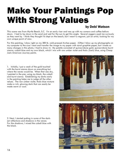
This scene was from Myrtle Beach, S.C. I’m an early riser and was up with my camera and coffee before<br />
dawn. I had to lay down in the sand and wait for the sun to get this angle. Several joggers eyed me curiously<br />
as they went by. I think they thought I’d slept on the beach, but I wasn’t a vagrant, just an artist, looking for my<br />
own unique point of view.<br />
For this painting, I drew right on my 300 lb. cold-pressed Arches paper. (Often I blow up my photographs on<br />
my computer to the size I want and transfer the image to my paper with saral graphite paper, but I made so<br />
many changes in this photo, I had to draw it.) My palette consisted of quinacridone gold, quinacridone burnt<br />
sienna, cobalt blue and my own black, which I mix with raw umber violet and thalo (Joe’s) blue, using Cheap<br />
Joe’s American Journey paints.<br />
1. Initially, I put a wash of the gold touched<br />
with the burnt sienna down on everything but<br />
where the waves would be. When that was dry,<br />
I painted in the pier, using my black, the cobalt<br />
and burnt sienna. Establishing my darks early<br />
in the painting helps me to judge all the other<br />
values. The raw umber violet, thalo blue mixture<br />
make a rich, glowing dark that can easily be<br />
made warm or cool.<br />
2. Next, I started putting in some of the darkest<br />
reflections and shadows in the waves.<br />
For the shadows, I mixed the cobalt blue with<br />
the black.<br />
14