
You also want an ePaper? Increase the reach of your titles
YUMPU automatically turns print PDFs into web optimized ePapers that Google loves.
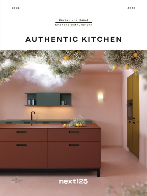
2022–<br />
<strong>2023</strong><br />
Küchen und Möbel<br />
Kitchens and furniture<br />
AUTHENTIC KITCHEN
IST ES<br />
EINE NUDEL<br />
ODER DER WEG<br />
ZUR PERFEKTEN<br />
LÖSUNG?<br />
INNOVATION HEISST:<br />
AUSPROBIEREN!<br />
WHAT´S NEXT?<br />
IS IT<br />
A NOODLE<br />
OR THE PATH<br />
TO THE PERFECT<br />
SOLUTION?<br />
INNOVATION SAYS:<br />
TRY, TRY AGAIN!
<br />
What´s next<br />
Edition<br />
2022 – <strong>2023</strong><br />
003<br />
004<br />
010<br />
016<br />
018<br />
026<br />
030<br />
032<br />
034<br />
038<br />
042<br />
044<br />
0 4 5<br />
048<br />
056<br />
058<br />
067<br />
070<br />
078<br />
082<br />
084<br />
088<br />
092<br />
094<br />
096<br />
102<br />
103<br />
106<br />
112<br />
116<br />
118<br />
120<br />
124<br />
128<br />
132<br />
135<br />
140<br />
142<br />
143<br />
144<br />
149<br />
154<br />
160<br />
161<br />
next 125 – Authentic kitchen<br />
Creative Makers – Valentina Teinitzer de Pasquale & Claus Friedrich Rudolph:<br />
Die Wolke / The Cloud<br />
INSPIRATION<br />
nx660 + nx960<br />
The Icons #1 – next 125 Die Vitrine / The glass display unit<br />
nx670 + nx912<br />
nx510 + nx640<br />
The Icons #2 – next 125 Das Pocketsystem / The pocket system<br />
nx505<br />
nx505 + nx650<br />
nx510 + nx505<br />
Open Mindset: Unzählige Möglichkeiten / Countless possibilities<br />
Farben / Colours<br />
12.5 Fragen / Questions – Thomas Pfister, Head of Design<br />
nx510<br />
The Icons #3 – next 125 Das Sideboard / The sideboard<br />
Creative Makers – Caesar Zumthor: 3 Häuser / 3 houses<br />
12.5 Fragen / Questions – Caesar Zumthor, Architekt / architect<br />
nx510<br />
nx640 + nx510<br />
The Icons #4 – next 125 Der Trolley / The Trolley<br />
nx870 + nx620<br />
nx912 + nx505<br />
n x 5 1 0<br />
nx950 + nx912<br />
nx670<br />
Materialien / materials<br />
12.5 Fragen / Questions – Melanie Zechmeister, Food-Bloggerin / food-blogger<br />
nx510<br />
nx870 + nx650<br />
The Icons #5 – next 125 Der Kochtisch / The cooking table<br />
nx510<br />
nx960 + nx620<br />
Creative Makers – Design Story, Echt / Authentic<br />
Made in Germany<br />
FEATURES<br />
Korpusausführungen / Carcase designs<br />
Griffvarianten / Handle versions<br />
Ausstattungsvarianten / Equipment versions: Schübe & Züge / Drawers and pull-outs<br />
Ausstattungsvarianten / Equipment versions: Innenausstattung / Interior equipment<br />
Ausstattungsvarianten / Equipment versions: Flex-Boxen / Flex-Boxes<br />
Cube System: Aufbewahrung / Storage system<br />
Fronten / Fronts<br />
Systemo: Arbeitsplatten, Wangen und Nischenverkleidungen /<br />
Worktops, sidepanels and recess claddings<br />
Küchenfachhändler in Ihrer Nähe / Kitchen specialist dealer next to you<br />
Impressum / Imprint<br />
4
Editorial<br />
AUTHENTIC KITCHEN<br />
Entdecken Sie kreative Macher,<br />
Designer, Architekten, Künstler, die Menschen,<br />
die mit unseren Möbeln leben.<br />
Entdecken Sie neue Küchen,<br />
inspirierende Räume und ikonische Möbel,<br />
die die Zeit überdauern.<br />
Im next 125 Journal.<br />
Discover the creative makers,<br />
designers, architects, artists and people<br />
that live with our furniture.<br />
Discover new kitchens,<br />
inspiring spaces and iconic furniture,<br />
that will stand the test of time.<br />
In the next 125 journal.<br />
1
<br />
2<br />
DIE UNBESCHWERTE n x 510 AUF SEITE 106
<br />
AUTHENTIC KITCHEN, MADE IN GERMANY<br />
NEXT125.COM<br />
THE CAREFREE n x 510 ON PAGE 106 3
C R E A T I V E M A K E R S<br />
MAKE<br />
4
C R E A T I V E M A K E R S<br />
Valentina Teinitzer de Pasquale<br />
Claus Friedrich Rudolph<br />
Making of<br />
Die Wolke<br />
The Cloud<br />
5
C R E A T I V E M A K E R S<br />
CREATE<br />
6
C R E A T I V E M A K E R S<br />
Die Wolke<br />
The Cloud<br />
EXPERIMENTIER-<br />
FREUDIG<br />
EXPERIMENTAL<br />
EINE NEXT 125 KANN ZIEMLICH VIEL, NICHT NUR KÜCHE.<br />
Aber wir wollten auch wissen, was man mit und<br />
aus einer next 125 alles machen kann. Also haben<br />
wir zwei Kreative eingeladen, unsere Sicht der<br />
Dinge, Küche und Technik mit Kunst und Natur zu<br />
vereinen, einfach mal weiterzuspinnen. Creative<br />
Makers unter sich: next 125 im Dialog mit der<br />
Botanical Set-Designerin Valentina Teinitzer de<br />
Pasquale vom Studio De Pasquale und dem Fotokünstler<br />
Claus Friedrich Rudolph.<br />
FÜR DIE BEIDEN EINE HELLE FREUDE, sich frei von<br />
Regeln und Vorgaben mit Formen, Farben und<br />
Materialien im Kontext Küche zu beschäftigen. Zu<br />
zeigen, dass man eine next 125 auch im Spannungsfeld<br />
von klaren, geometrischen Linien und<br />
einer Art floralem Traumgebilde zu einem sinnlichen<br />
Erlebnis verdichten kann.<br />
DIE NATUR ALS INNENARCHITEKTUR, MEISTERHAFT MIT<br />
60 BUND SCHLEIERKRAUT UND 30 KILO ZITRUSFRÜCHTEN<br />
ARRANGIERT. Wie man diesem Freigeist von Küche<br />
beikommt? Einerseits mit der für next 125 typischen<br />
Reduktion auf das Wesentliche und einer<br />
schwebenden Leichtigkeit; andererseits durch<br />
die Lust am Experimentieren. So stellen die<br />
Künstler der funktionalen Verbindlichkeit der<br />
Küche einen verträumt-magischen Entwurf<br />
gegenüber – und lassen damit eine tiefe emotionale<br />
Verbundenheit entstehen.<br />
„CLAUS HAT GESAGT, WIR SIND WIE ZIRKUSKINDER“, SAGT<br />
VALENTINA. „Und genauso habe ich mich gefühlt<br />
am Set: immer am Raufklettern, irgendwas heben,<br />
ständig am Rumspringen, sich die tollsten Dinge<br />
ausdenken.“ Da ist sie wieder, die kindliche<br />
Freude am Choreografieren. Doch bei aller künstlerischen<br />
Freiheit bleibt das Wesen der next 125<br />
erkennbar – die Küche als Wohlfühlinsel, die uns<br />
erdet und gleichzeitig nach den Sternen greifen<br />
lässt. In der wir verweilen und uns emotional aufladen<br />
können. Und die wir am liebsten nicht mehr<br />
verlassen möchten. Weil sie in uns die kindliche<br />
Freude am Spielen, Machen und Tun lebendig<br />
hält. Und wir uns geborgen fühlen wie einst das<br />
Kind im Mutterleib.<br />
A NEXT 125 KITCHEN CAN BE QUITE A LOT MORE THAN<br />
JUST A KITCHEN. But we wanted to know what you<br />
can make with and out of one. So we invited two<br />
creatives to combine our vision, kitchens and<br />
technology with art and nature, just to explore<br />
that idea further. Creative makers meet: next 125<br />
in dialogue with Botanical Set Designer Valentina<br />
Teinitzer de Pasquale from Studio De Pasquale<br />
and Photo Artist Claus Friedrich Rudolph.<br />
FOR BOTH ARTISTS, IT BRINGS GREAT JOY to work with<br />
shapes, colours and materials in a kitchen environment,<br />
free from the shackles of rules and specifications.<br />
To show that a <strong>next125</strong> kitchen can<br />
be condensed into a sensual experience that<br />
combines clear, geometric lines with a kind of<br />
floral, dream-like creation.<br />
NATURE AS INTERIOR DESIGN, MASTERFULLY ARRANGED<br />
WITH 60 BUNCHES OF GYPSOPHILA AND 30 KILOS OF<br />
LEMONS. How to handle this free spirit of a kitchen?<br />
On the one hand, with <strong>next125</strong>’s typical approach<br />
of paring things down to the essentials, combined<br />
with an airy lightness; and, on the other, through<br />
a desire for experimentation. That’s how the<br />
artists contrast the functional reliability of a kitchen<br />
with a dreamy, magical design – while creating<br />
a deep emotional connection.<br />
“CLAUS SAID WE’RE LIKE CIRCUS KIDS,” SAYS VALENTINA.<br />
“And that’s exactly how I felt on set: constantly<br />
climbing on things, lifting things up, jumping<br />
around, coming up with the coolest things.”<br />
There it is again, the childlike joy of choreography.<br />
But despite their artistic license, the essence of<br />
<strong>next125</strong> can still be seen – the kitchen as an island<br />
of well-being that grounds us, while enabling us<br />
to reach for the stars. That goes beyond its pure<br />
and simple function – and enables us to surpass<br />
ourselves. In which we pause and recharge our<br />
emotional battery. And that we ideally never want<br />
to leave again. Because it keeps the childlike joy<br />
of playing, making and doing alive within us. And<br />
we feel safe, like a child in the womb.<br />
Valentina Teinitzer de Pasquale<br />
studiodepasquale.de<br />
Claus Friedrich Rudolph<br />
clausrudolph.wordpress.com<br />
7
8<br />
A U T H E N T I C K I T C H E N
A U T H E N T I C K I T C H E N<br />
AUTHENTISCHE<br />
KÜCHEN,<br />
WOHNWELTEN<br />
UND IKONISCHE<br />
EINZELSTÜCKE.<br />
PURISTISCH, KLAR<br />
UND REDUZIERT.<br />
INSPIRATION<br />
AUTHENTIC<br />
KITCHENS,<br />
LIVING SPACES<br />
AND ICONIC<br />
PIECES.<br />
PURIST, CLEAR<br />
AND MINIMALIST.<br />
9
Im Studio zuhause<br />
DIE INDIVIDUELLE<br />
–<br />
In the home studio<br />
THE INDIVIDUAL<br />
nx660 + nx960<br />
1 0
A U T H E N T I C K I T C H E N<br />
nx870 / nx620<br />
11
P O R T R A I T<br />
nx660<br />
nx960<br />
1 2
P O R T R A I T<br />
nx660 + nx960<br />
OFFEN FÜR ALLES<br />
–<br />
Open to everything<br />
Die Details<br />
nx660<br />
Holzfront mit<br />
Design Rahmen<br />
F634 Eiche elegant<br />
natur<br />
nx960<br />
Ceramicfront,<br />
Rahmen onyxschwarz<br />
C2785 Ceramic bianco<br />
beige<br />
Systemo<br />
Arbeitsplatte<br />
C2780 Bianco beige<br />
The Details<br />
nx660<br />
Wood front with<br />
design frame<br />
F634 Elegant<br />
natural oak<br />
nx960<br />
Ceramic front,<br />
frame onyx black<br />
C2785 Ceramic<br />
bianco beige<br />
Systemo<br />
Worktop<br />
C2780 Bianco beige<br />
ZUM BEISPIEL FERDINAND, DER MODEDESIGNER,<br />
TÄTIG FÜR NAMHAFTE LABLES. Was liegt hier<br />
näher, als ein Kreativstudio in einem ehemaligen<br />
Umspannwerk selbst zur Marke<br />
auszubauen? Staunen und inspirieren lassen<br />
ist die Devise, wenn Kunden zu Besuch<br />
in sein Atelier am Naviglio Grande in Mailand<br />
kommen und Ferdinand schon mal zum<br />
Business-Lunch in seine Küche bittet. Die<br />
Wahl fiel auf eine offene, luftige Lösung,<br />
eine Art „Schauküche“, die wie eine verlängerte<br />
Werkbank des Kreativen anmutet.<br />
Herzstück ist eine Insel mit Fronten in<br />
Ceramic bianco beige. Ein Farbton, der die<br />
Robustheit des Materials sanft bricht und in<br />
seiner feinen Maserung stilistisch zur<br />
Nischenzeile und zu den Hochschränken<br />
überleitet, wo sie in den Rahmenfronten als<br />
natürliche Fladerung im Furnier Eiche elegant<br />
natur weitergespielt wird. Kühl- ele gantes<br />
Glas, harter Stein, wärmendes Holz –<br />
eine Küche wie ein souverän zusammengestelltes<br />
Outfit; dazu Englische Züge, die<br />
eine weitere Spielart zur Geltung bringen:<br />
den Wechsel von geschlossenen und offenen<br />
Fronten, haptisch und sinnlich, ruhig,<br />
klar und belebt.<br />
MEET FERDINAND, THE FASHION DESIGNER WORK-<br />
ING FOR LEADING BRANDS. What could be more<br />
natural than growing his creative studio in<br />
a former substation into a brand? Clients<br />
are left feeling amazed and inspired after a<br />
visit to Ferdinand’s studio on Naviglio<br />
Grande in Milan and an invite to a business<br />
lunch in his kitchen. He opted for an open,<br />
airy solution, a kind of “open-plan kitchen”,<br />
like an extension of the designer’s workbench.<br />
The centrepiece is an island with<br />
ceramic bianco beige fronts. A shade that<br />
gently softens the sturdiness of the material,<br />
and with its fine grain, leads stylistically<br />
to the recesses and tall units where it is<br />
carried over into the natural grain of the<br />
frame fronts in elegant natural oak veneer.<br />
Cool, elegant glass, hard stone, warming<br />
wood – a kitchen like a confidently curated<br />
outfit; and English pull-outs that highlight<br />
another feature: the alternation between<br />
closed and open fronts, tactile and sensual,<br />
calm, clear and animated.<br />
1 3
1 4<br />
nx660 + nx960
nx660 + nx960<br />
HOLZ, KLASSE!<br />
Eine Küche, die nichts zu verbergen hat: Ein<br />
beleuchtetes Wandregal bietet Platz für<br />
Dekoratives. Und die Unterschränke mit<br />
Englischen Zügen geben diskrete Einblicke<br />
in das Kochverhalten ihrer Nutzer.<br />
WOOD, AMAZING!<br />
A kitchen with nothing to hide. An illuminated<br />
shelf provides space for decorative items.<br />
And the base units with English pull-outs<br />
offer a discreet glimpse into the user’s cooking<br />
habits.<br />
1 5
GLASS DISPLAY UNIT<br />
THE<br />
ICONS1<br />
1 6
A U T H E N T I C K I T C H E N<br />
The Icons<br />
DIE VITRINE<br />
–<br />
The glass display unit<br />
FÜR JÄGER UND SAMMLER: Mit der Vitrine liefert<br />
<strong>next125</strong> den passenden Rahmen, um Kostbarkeiten<br />
und andere Schätze adäquat zur<br />
Geltung zu bringen. Das liegt einerseits am<br />
Materialmix aus onyxschwarzem Metall,<br />
Echtholz, Glastüren in Ultragrey und am<br />
edlen Griff in Lederoptik; zum anderen an<br />
den sechs Regalböden, die reichlich Fläche<br />
zum Präsentieren bieten. Auch zum Repräsentieren.<br />
Denn Form und Inhalt bedingen<br />
sich gegenseitig. Nicht nur, dass die Vitrine<br />
als ästhetisches Gebrauchsmöbel jeden<br />
Einrichtungsstil aufwertet. Mit ihrer dimmbaren<br />
LED-Beleuchtung lässt sie auch tief<br />
blicken – und rückt das Stelldichein aus<br />
Erbstück, Flohmarktfund, Souvenir und<br />
Shopping ausflug überhaupt erst ins rechte<br />
Licht. Die Vitrine kann sowohl frei im Raum<br />
platziert als auch in eine Hochschrankreihe<br />
eingebettet werden. Aber wie auch immer:<br />
Sie ist ein Schmuckstück in Ihrer Wohnung.<br />
THE COLLECTOR’S CHOICE: With the glass display<br />
unit, <strong>next125</strong> provides the perfect setting<br />
to show off valuables and other treasures<br />
in style. That’s down to the combination<br />
of onyx black metal, real wood, glass doors<br />
in ultragrey and the elegant leather-look<br />
handle, as well as six shelves, providing<br />
plenty of space to display and impress, as<br />
form and content go hand in hand. Not only<br />
does the glass display unit enhance any<br />
interior design style as an aesthetic piece<br />
of utility furniture, with its dimmable LED<br />
lighting, it reveals deep inside and puts a<br />
spotlight on your collection of heirlooms,<br />
flea market finds, souvenirs and shopping<br />
hauls. The glass display unit can be<br />
free-standing or built into tall units. Either<br />
way, it’s the gem of your home.<br />
next 125 Vitrine – links<br />
F734 Asteiche natur gebürstet,<br />
G933 Glas glanz ultragrey<br />
next 125 Glass display unit – left<br />
F734 Natural knotty oak, brushed,<br />
G933 Glass gloss ultragrey<br />
1 7
nx670 + nx912<br />
Ein Apartment auf dem Dach<br />
DIE GLAMOURÖSE<br />
–<br />
An apartment on the rooftop<br />
THE GLAMOROUS<br />
1 8
A U T H E N T I C K I T C H E N<br />
1 9
P O R T R A I T<br />
nx670<br />
nx912<br />
2 0
P O R T R A I T<br />
nx670 + nx912<br />
EINE EINLADENDE GESTE<br />
–<br />
An inviting gesture<br />
Die Details<br />
nx670<br />
Holzfront mit<br />
vertikalen Rillen<br />
F685 Nussbaum natur<br />
nx912<br />
Glasfront matt,<br />
Rahmen onyxschwarz<br />
G582 Glas matt<br />
basalt metallic<br />
Systemo<br />
Arbeitsplatte<br />
K187F SensiQ onyxschwarz<br />
feinmatt AFP<br />
The Details<br />
nx670<br />
Wood front<br />
with vertical grooving<br />
F685 Natural walnut<br />
nx912<br />
Glass front matt,<br />
frame onyx black<br />
G582 Glass matt<br />
basalt metallic<br />
Systemo<br />
Worktop<br />
K187F SensiQ onyx black<br />
fine matt AFP<br />
ZUM BEISPIEL GEORGIA, DIE AUCH ABSEITS IHRES<br />
JOBS IN DER STERNEGASTRONOMIE GERN EINE GUTE<br />
GASTGEBERIN IST. Spätestens, als diese monatelang<br />
schließen musste, stand für die vielfach<br />
ausgezeichnete Küchenchefin fest: Eine<br />
eigene Hausbar musste her. Etwas Repräsentatives,<br />
mit Fläche zum Lagern, Kühlen,<br />
Ausstellen und Vorbereiten; damit fiel das<br />
meiste wie eine Anrichte oder ein Barwagen<br />
mangels Platzangebot oder Flexibilität schon<br />
mal weg. Zumal sich die künftige Hausbar<br />
stilistisch in ihr Ambiente fügen sollte, das aus<br />
ausgewählten Space-Age- und Mid-Century-<br />
Stücken besteht. Fündig wurde Georgia bei<br />
next 125, wo für die Pocket-Elemente nun<br />
auch eine Bareinteilung vorgesehen ist – als<br />
Aufsatz auf Unterschränke – bestehend aus<br />
Frame-Nischenregalen mit Spiegelrückwand,<br />
Effektbeleuchtung, Wand steckboard,<br />
Gläserhalterung, großzügigen Schüben<br />
sowie einem Kühlschrank für Weine und<br />
Champagner. Was Georgia mit den auffallend<br />
roten Haaren besonders gefällt: Die individuell<br />
gestaltbare Rückwand nebst Fronten<br />
wertet ihr Einrichtungskonzept auf. Dafür<br />
sorgt eine Vielzahl an Werkstoffen und Farbgebungen.<br />
MEET GEORGIA WHO, BESIDES HER JOB AT A<br />
MICHELIN- STARRED RESTAURANT, LIKES TO BE A<br />
GOOD HOSTESS. After being forced to close for<br />
months, the multi-award-winning chef came<br />
to a conclusion: she needed her own home<br />
bar. Something impressive, with space for<br />
storage, keeping things cool and showcasing<br />
and preparing drinks. Most options like a<br />
sideboard or trolley could be ruled out due<br />
to a lack of space and flexibility. In particular,<br />
her future home bar needed to blend in<br />
stylistically with its surroundings, featuring<br />
a selection of Space Age and mid-century<br />
pieces. Georgia found what she was looking<br />
for at <strong>next125</strong>, which provides a bar partition<br />
for pocket elements – as a base unit attachment<br />
– with frame recess shelving with a<br />
mirrored back panel, feature lighting, a floating<br />
shelf, a glass holder, deep drawers and a<br />
transparent fridge for wine and champagne.<br />
The hostess with striking red hair particularly<br />
likes the fact that the customisable back<br />
panel and fronts enhance her interior design<br />
concept without diluting it, thanks to the<br />
wide range of materials and colourways.<br />
2 1
nx670 + nx912<br />
OFFEN<br />
OPENMINDED<br />
2 2
nx670 + nx912<br />
2 3
2 4<br />
nx670 + nx912
nx670 + nx912<br />
FÜR DIE SINNE<br />
Das Regal von next 125 spielt mit den Sinnen.<br />
Neugierig tasten die Finger an der gerillten<br />
Front entlang, gleitet das Auge über offene<br />
und geschlossene Fächer – geleitet von der<br />
eleganten Lichtführung.<br />
FOR YOUR SENSES<br />
The shelves by <strong>next125</strong> are a treat for the<br />
senses. Your fingers feel their way inquisitively<br />
along the grooved front, your eyes follow<br />
the open and closed compartments –<br />
guided by the elegant lighting.<br />
2 5
nx510 + nx640<br />
Wohnen im Farbrikloft<br />
DIE PURISTISCHE<br />
–<br />
Living in a factory loft<br />
THE PURIST<br />
2 6
2 7
nx510 + nx640<br />
LOFT AND LOVE<br />
Die Details<br />
nx510<br />
Samtmatt-Lackfront<br />
L202M Saharabeige<br />
samtmatt AFP<br />
nx640<br />
Holzfront<br />
F644 Eiche elegant<br />
perlgrau<br />
Systemo<br />
Arbeitsplatte<br />
K202F SensiQ saharabeige<br />
feinmatt AFP<br />
MEET FRANKA AND RALPH, WHO OPTED FOR A NEW<br />
KIND OF HOME IN THE PRIME OF THEIR LIVES: a loft<br />
conversion in a former furniture workshop<br />
on an old industrial site. A life surrounded by<br />
porous walls and the raw charm of exposed<br />
concrete surfaces. A life across one level,<br />
driven by exciting visual connections<br />
between the various functional areas – with<br />
their new kitchen as the hub and focal point.<br />
Not to mention the sociable standalone centrepiece<br />
in the form of a large kitchen island<br />
flanked by a pocket system, both tailor-made<br />
for the ambitious kitchen architects. Both<br />
central design elements work together for<br />
full functionality, such as food preparation,<br />
cooking, washing up, refrigeration and storage.<br />
Everything is within reach when needed,<br />
yet aesthetically tucked away behind fronts,<br />
drawers and pull-outs. With its sleek onyx<br />
black plinth frame, the island gives the space<br />
a light and airy feel. And that sense of ease<br />
comes through in every dish prepared by<br />
Franka and Ralph.<br />
LOFT UND LIEBE<br />
ZUM BEISPIEL FRANKA UND RALPH, BEIDE IM<br />
BESTEN ALTER, DIE SICH FÜR EINE NEUE FORM DES<br />
WOHNENS ENTSCHIEDEN HABEN: Eine zum Loft<br />
umgebaute, alte Möbelschreinerei in einem<br />
alten Industrieareal. Ein Leben inmitten von<br />
offenporigen Wänden und dem rauen<br />
Charme von Sichtbetonflächen. Ein Leben<br />
auf einer Ebene, getragen von spannenden<br />
Blickbeziehungen zwischen den verschiedenen<br />
Funktionsbereichen – mit ihrer neuen<br />
Küche als Dreh- und Angelpunkt. Allem voran<br />
der kommunikative Solitär in Form einer großzügigen<br />
Kochinsel, flankiert von einem<br />
Pocketsystem; beides wie geschaffen für<br />
anspruchsvolle Küchenarchitekturen. Denn<br />
die beiden zentralen Gestaltungselemente<br />
vereinen sämtliche Funktionen wie Vor- und<br />
Zubereiten, Kochen, Spülen, Kühlen und Verstauen.<br />
Alles ist griffbereit, wenn es<br />
gebraucht wird, und doch ästhetisch hinter<br />
Fronten, Türen, Schüben und Zügen verstaut.<br />
Dabei bringt die Insel mit ihrem<br />
filigra nen, onyxschwarzen Sockelgestell eine<br />
geradezu schwebende Leichtigkeit in den<br />
Raum. Und genau dieses Gefühl überträgt<br />
sich auf jedes Gericht von Franka und Ralph.<br />
The Details<br />
nx510<br />
Matt velvet lacquer<br />
front<br />
L202M Sahara beige<br />
matt velvet AFP<br />
nx640<br />
Wood front<br />
F644 Elegant oak pearl<br />
grey<br />
Systemo<br />
Worktop<br />
K202F SensiQ Sahara<br />
beige fine matt AFP<br />
2 8
nx510 + nx640<br />
2 9
P O C K E T S Y S T E M<br />
THE<br />
ICONS 2<br />
3 0
P O C K E T S Y S T E M<br />
The Icons<br />
DAS POCKETSYSTEM<br />
–<br />
The pocket system<br />
AUF, ZU, AUF, ZU, AUF ZU NEUEN UFERN! Das<br />
Pocketsystem ist eine Art offenes Geheimnis.<br />
Sein Wert findet Ausdruck in einem<br />
Spiel aus Bergen und Verbergen. In geschlossenem<br />
Zustand wirkt es in seiner raumbildenden<br />
Ausprägung wie ein architektonisches<br />
Puzzleteil, strahlt Ruhe, Eleganz,<br />
Erhabenheit aus. Durch Antippen weichen<br />
die großen Falttüren zur Seite und verschwinden<br />
fast schwebend im Korpus. Das<br />
Pocketsystem macht aus dem Möbel einen<br />
Verwandlungskünstler, der mal als Homeoffice-Lösung,<br />
mal als Barschrank fungiert<br />
oder beliebig viele Funktionen der Küche<br />
aufnehmen kann, bis hin zur voll funktionsfähigen<br />
Pantry-Küche. Bei aller Ästhetik ist<br />
es bestückt mit Elektrogeräten, Schubladen<br />
und Arbeitsflächen praktisch, und durchdacht<br />
bis ins Detail. Und Künstler ist er auch<br />
deshalb, weil kontrastierende Farben und<br />
Materialien ein gestalterisches Ausrufezeichen<br />
setzen können.<br />
OPEN, CLOSE, OPEN, CLOSE, OPENING DOORS TO<br />
NEW HORIZONS! The pocket system is like an<br />
open secret. Its value is expressed by a play<br />
of revealing and concealing. When closed,<br />
it’s like an architectural puzzle that defines<br />
the space around it, exuding calm, elegance<br />
and nobility. With a simple tap, the large folding<br />
doors move to the side and disappear<br />
into the unit, as if floating. The pocket system<br />
is like a quick-change artist; it can serve<br />
as a home office solution or a cocktail cabinet.<br />
It can take on any function you need in<br />
the kitchen, even a fully functional kitchenette.<br />
It’s not just a pretty face, as it’s also<br />
equipped with electrical appliances, drawers,<br />
work surfaces that are practical and well<br />
thought-out down to the last detail. And it’s<br />
truly artistic, as contrasting colours and<br />
materials can make a creative statement.<br />
next 125 Pocketsystem – links<br />
nx640: F644 Eiche elegant perlgrau<br />
nx505: L190 Lavaschwarz satin<br />
next 125 Pocket System – left<br />
nx640: F644 Elegant oak pearl grey<br />
nx505: L190 Lava black satin<br />
3 1
P O C K E T S Y S T E M<br />
The Icons<br />
KOMPAKT UND WUNDERSCHÖN<br />
–<br />
Compact and beautiful<br />
next 125 Pocketsystem<br />
nx505: L275 Achatgrau satin<br />
nx240: K122F SensiQ kristallgrau feinmatt AFP<br />
next 125 Pocket System<br />
nx505: L275 Agate grey satin<br />
nx240: K122F SensiQ crystal grey fine matt AFP<br />
3 2
P O C K E T S Y S T E M<br />
nx505<br />
3 3
3 4<br />
A U T H E N T I C K I T C H E N
nx505 + nx650<br />
Ein Haus im Grünen<br />
DIE EDLE<br />
–<br />
A house in nature<br />
THE REFINED<br />
3 5
nx505 + nx650<br />
Die Details<br />
nx505<br />
Satinlack-Front<br />
L335 Jaguargrün satin<br />
nx650<br />
Holzfront<br />
F805 Alteiche<br />
Systemo<br />
Arbeitsplatte<br />
C2160 Marmor Carrara<br />
Nachbildung<br />
The Details<br />
nx505<br />
Satin lacquer front<br />
L335 Jaguar green satin<br />
nx650<br />
Wood front<br />
F805 Old oak<br />
Systemo<br />
Worktop<br />
C2160 Marble Carrara<br />
effect<br />
3 6
nx505 + nx650<br />
DER FEINE UNTERSCHIED<br />
Eine Küchenformation, so außergewöhnlich<br />
wie ihre Farben und Materialien: Zum massiven<br />
Küchenblock gesellt sich ein Umfeld, das<br />
aus sieht wie aus einem Block Carrara Marmor<br />
herausgeschnitten. In ihrem kühl-strahlenden<br />
Weiß bildet sie einen schönen Kontrast<br />
zum edlen Satinlack-Ton in Jaguargrün,<br />
einem von vier Koloriten der Klasse „Elegant“<br />
der next 125 Farbkollektion. Das Prinzip der<br />
Vielfalt, eingefangen als gedämpfter Chic mit<br />
leuchtenden Akzenten, weckt die Lust am<br />
Kombinieren und lädt ein, den Freiraum Küche<br />
höchst persönlich zu interpretieren.<br />
A FINE LINE<br />
A kitchen layout that’s as exceptional as the<br />
colours and materials, as the huge kitchen<br />
unit is complemented by a design that looks<br />
like it has been cut out of a block of Carrara<br />
marble. In cool, radiant white, the front beautifully<br />
contrasts the sleek satin lacquer in<br />
jaguar green, one of four elegant shades in<br />
the next 125 colour collection. The principle<br />
of variety, captured through a muted chicness<br />
with bright accents, awakens the<br />
desire to mix and match, inviting you to put<br />
your own spin on the open-plan kitchen.<br />
3 7
A U T H E N T I C K I T C H E N<br />
Die Details<br />
nx510<br />
Samtmatt-Lackfront<br />
L187M Onyxschwarz<br />
samtmatt AFP<br />
nx505<br />
Satinlack-Front<br />
L235 Steingrau satin<br />
Systemo<br />
Arbeitsplatte<br />
K187F SensiQ onyxschwarz<br />
feinmatt AFP<br />
The Details<br />
nx510<br />
Matt velvet<br />
lacquer front<br />
L187M Onyx black matt<br />
velvet AFP<br />
nx505<br />
Satin lacquer front<br />
L235 Stone grey satin<br />
Systemo<br />
Worktop<br />
K187F SensiQ onyx black<br />
fine matt AFP<br />
3 8
Ein Apartment für zwei<br />
DIE URBANE<br />
–<br />
An apartment for two<br />
THE URBAN<br />
nx510 + nx505<br />
3 9
nx510 + nx505<br />
FLIESSENDER ÜBERGANG<br />
Eine Szenerie, typisch für next 125: Sie erzählt<br />
von der gelungenen Entgrenzung der<br />
Küche einerseits und der Einbeziehung des<br />
wohnlichen Umfelds andererseits. Allem<br />
voran die kubische Insel mit inte grierter Bar<br />
in Steingrau satin. Zusammen mit dem rückwärtigen<br />
Pocketsystem aus Onyxschwarz<br />
und expressivem Indischrot entsteht eine<br />
kultivierte Küchenlandschaft von ebenso<br />
zurückhaltender Ausstrahlung wie zweckmäßiger<br />
Präsenz, darunter reichlich Stauraum:<br />
Die Küche als architektonisches Ausrufezeichen.<br />
A SEAMLESS TRANSITION<br />
It’s a typical scenario for <strong>next125</strong>: the kitchen<br />
has been successfully transformed into a<br />
boundless space while retaining a homely<br />
environment. And the cubic island with an<br />
integrated bar in stone grey satin is the star<br />
of the show. The rear tall unit with retractable<br />
doors in onyx black and expressive Indian<br />
red creates a refined kitchen setting with<br />
both a subtle charm and functional presence<br />
thanks to ample storage space – the kitchen<br />
as an architectural statement.<br />
4 0
nx510 + nx505<br />
41
A U T H E N T I C K I T C H E N<br />
OPEN<br />
MINDSET<br />
4 2
A U T H E N T I C K I T C H E N<br />
Open Mindset<br />
UNENDLICHE MÖGLICHKEITEN<br />
–<br />
Unlimited options<br />
4 3
T H E E S S E N T I A L S<br />
FARBEN<br />
BUNT FÜRS LEBEN: Natürlich wissen wir, dass Weiß in der Küche ein Evergreen ist.<br />
Doch wir wissen auch: Das Leben ist nicht nur eintönig. Deshalb haben wir<br />
unsere Palette auf 18 sorgfältig kuratierte Farben erweitert. Wir unterscheiden<br />
jetzt zwischen essentiellen, eleganten und außergewöhnlichen Farben. So<br />
bringen Sie Ihre Individualität noch besser zum Ausdruck.<br />
AS COLOURFUL AS LIFE ITSELF: we are, of course, aware that white kitchens will be<br />
forever popular. But we also know that life is far from monochrome. We’ve therefore<br />
expanded our range to include 18 carefully curated colours and differentiate<br />
between essential, elegant and extraordinary shades, so you can better<br />
express your individuality.<br />
COLOURS<br />
4 4
C R E A T I V E M A K E R S<br />
WORKSHOP<br />
Thomas Pfister<br />
Designer<br />
FRAGEN<br />
12 5<br />
QUESTIONS<br />
4 5
C R E A T I V E M A K E R S<br />
FRAGEN<br />
12 5<br />
QUESTIONS<br />
Thomas Pfister<br />
WIE DIE KÜCHE ZUM ERLEBNIS WIRD<br />
#1 – WIE FINDET MAN DIE RICHTIGE FARBE UND DAS RICHTIGE<br />
MATERIAL? Sich fragen, ob und wie viel Farbe es sein darf.<br />
Wenn man unsicher ist, empfehle ich, von diesem Ton ein<br />
Muster anfertigen zu lassen – und es zu Hause bei verschiedenen<br />
Tageszeiten und Lichtstimmungen auf sich wirken<br />
zu lassen.<br />
#2 – WAS RATEN SIE MENSCHEN, DIE FARBEN SKEPTISCH<br />
GEGENÜBERSTEHEN? Lieber die Küche dezenter halten und<br />
Farbe über Accessoires oder Wände in den Raum bringen;<br />
im Zweifel ist eine Wand schneller gestrichen oder die<br />
Dekoration einfacher erneuert als die komplette Küche<br />
getauscht.<br />
#3 – UND WAS MACHE ICH, WENN ICH MEHRERE FARBEN KOM-<br />
BINIEREN MÖCHTE? Eine Führungsfarbe wählen, dazu Akzentfarben.<br />
Oder in Blöcken denken: Der Küchenblock in einer<br />
Farbe, der Hochschrankbereich in einer anderen. Wer<br />
Bedenken hat, kann schon vorab ausprobieren, wie das<br />
wirkt. Dafür gibt es Visualisierungen.<br />
#4 – WAS GEHÖRT NOCH ZU EINER GUTEN KÜCHENGESTALTUNG?<br />
Ein gut beleuchteter Arbeitsplatz, ein Funktionslicht. Idealerweise<br />
ist es dimmbar, damit ich nach dem Kochen eine<br />
andere Stimmung in den Raum bringe, vielleicht auch über<br />
die Farbtemperatur. Mit einem warmen Licht klingt der<br />
Tag doch ganz anders aus. Gerade in der Küche, wo erfahrungsgemäß<br />
viele Einladungen oder Familienzusammen<br />
künfte enden.<br />
#5 – WELCHE LICHTSITUATIONEN SOLLTE ICH IDEALERWEISE EIN-<br />
PLANEN? Ein Arbeitslicht, das von oben oder vorn kommt;<br />
dazu Akzentbeleuchtung, etwa über Sockel, Griffmulde, die<br />
Unterseite von Oberschränken oder rückwärtigen Paneelen.<br />
#6 – WIE BRINGT MAN AUCH BEI KLEINEN RÄUMEN ÄSTHETIK INS<br />
SPIEL? Sich aufs Wesentliche konzentrieren. Eher einseitig<br />
mit raumhohen Möbeln arbeiten. Und die andere Seite atmen<br />
lassen. Für ein klareres Raumgefühl.<br />
#7 – WAS IST BEI OFFENEN, GROSSZÜGIGEN GRUNDRISSEN ZU<br />
BEACHTEN? Die Funktionsbereiche zonieren; von rückwärtiger<br />
Zeile über Kochinsel und Hochschränke bis zu Tisch und<br />
Bänken. Mit einer Bar als Übergang zur Wohnfläche.<br />
#8 – WELCHES ELEMENT FINDEN SIE BESONDERS SPANNEND IN<br />
DER KÜCHE? Die Arbeitsplatte und alles, was oberhalb<br />
davon an der Wand hinten so ist, zum Beispiel ein offenes<br />
Regalsystem. Also diese Aktionsfläche, wo das Vorbereiten,<br />
Kochen und Nachbereiten stattfindet. Offene Bereiche<br />
verraten viel über die Menschen.<br />
#9 – GIBT ES TYPISCHE FEHLER BEIM PLANEN DER KÜCHE? Zu<br />
viel zu wollen, selbst wenn man es kaum nutzt. Und<br />
dafür wertvolle Arbeitsfläche zu opfern. Grundsätzlich:<br />
Anschlüsse einplanen und Platz zwischen Kochfeld und<br />
Spüle.<br />
#10 – WELCHE VERÄNDERUNG BEOBACHTEN SIE BEI FARBE UND<br />
MATERIAL? Dass die Menschen experimentierfreudiger werden,<br />
weg von Weiß-, Beige- oder Grautönen gehen und<br />
Farbe bekennen. Auch beim Material zeichnet sich mehr<br />
Lust an der Vielfalt ab: neben Kunststoffen und SensiQ<br />
vermehrt auch Quarzstein, Keramik, Massivholz.<br />
#11 – WIE SIEHT IHRE EIGENE KÜCHE AUS? Relativ schlicht (lacht).<br />
Unterschränke, ein Wandbord aus Massivholz. Und ein<br />
Hochschrankblock, in dem von Kühlschrank bis Backofen<br />
alles drin ist.<br />
#12 – WELCHEN STELLENWERT HAT DESIGN FÜR SIE PERSÖNLICH?<br />
Ich bin ein gestaltungsaffiner Mensch, das geht bei mir weit<br />
über Produktdesign hinaus. Denn Küche ist nicht losgelöst<br />
von dem Raum zu sehen, in dem sie später mal steht.<br />
Damit eine Küche funktioniert, muss man zum Beispiel<br />
auch wissen, wie sich Lichtstimmungen auf sie auswirken.<br />
Ich würde sagen, dass mich alles anspricht, wo Form und<br />
Material harmonieren. Auch gute Architektur.<br />
Eine Küche sollte unbedingt ...<br />
UND<br />
WAS UNS NOCH<br />
INTERESSIERT ...<br />
… eine next 125 sein (lacht)! Im Ernst: Sie muss funktionieren, am besten auch nach vielen<br />
Jahren noch gefallen. Die Abläufe müssen stimmen. Und sie darf auch emotional ansprechen.<br />
Allgemein gesprochen: Sie sollte ihre Nutzer widerspiegeln.<br />
4 6
C R E A T I V E M A K E R S<br />
FRAGEN<br />
12 5<br />
QUESTIONS<br />
Thomas Pfister<br />
TRANSFORMING A KITCHEN INTO AN EXPERIENCE<br />
#1 – HOW DO YOU FIND THE RIGHT COLOUR AND MATERIAL? Ask<br />
yourself how much colour you want, if any. If you’re unsure,<br />
I recommend getting a sample in this shade and looking at it<br />
at different times of the day and in different lights at home.<br />
#2 – WHAT IS YOUR ADVICE FOR PEOPLE WHO ARE SCEPTICAL<br />
ABOUT COLOUR? Keep the kitchen more subtle and add colour<br />
to the room through accessories or walls; if in doubt, it’s<br />
quicker and easier to paint a wall or update the decor than<br />
replace an entire kitchen.<br />
#3 – WHAT SHOULD I DO IF I WANT TO COMBINE SEVERAL COLOURS?<br />
Choose a dominant colour, then accent colours. Or think<br />
in blocks: the kitchen island in one colour, the tall units in<br />
another. If you’re unsure, you can test how it would look<br />
beforehand with a visualisation.<br />
#4 – WHAT ELSE DO YOU NEED FOR A SUCCESSFUL KITCHEN<br />
DESIGN? A well-lit workspace with functional lighting. Ideally,<br />
dimmable lighting to add a different feel to the room after<br />
you’ve finished cooking, perhaps through the colour<br />
temperature too. The end of the day feels very different<br />
with warm lighting, particularly in the kitchen, where, in my<br />
experience, parties and family gatherings tend to end.<br />
#5 – WHAT KIND OF LIGHTING SHOULD I IDEALLY INCLUDE? A work<br />
light that comes from above or in front; then accent lighting<br />
above plinths, grip ledges, the undersides of wall units or<br />
rear panels.<br />
#6 – HOW DO YOU BRING AESTHETICS INTO PLAY IN SMALL SPACES?<br />
Focus on the essentials. Work on one side of the room with<br />
floor-to-ceiling furniture, and let the other side breathe for a<br />
clearer sense of space.<br />
#7 – WHAT SHOULD YOU KEEP IN MIND WITH OPEN, SPACIOUS<br />
LAYOUTS? Divide the functional areas into zones; from the<br />
rear units, kitchen island and tall units, through to the table<br />
and benches. Use a bar as a transition into the living area.<br />
#8 – WHAT PART OF THE KITCHEN DO YOU GET PARTICULARLY<br />
EXCITED ABOUT? The worktop and everything above on the<br />
wall behind, like an open shelving system. So the workspace<br />
where you prepare, cook and clean up. Open areas reveal a<br />
lot about people.<br />
#9 – WHAT ARE THE CLASSIC MISTAKES WHEN PLANNING A<br />
KITCHEN? Wanting too much when you’ll hardly use it, and<br />
therefore sacrificing precious workspace. In general, you<br />
should factor in transitions and space between the hob and<br />
the sink area.<br />
#10 – WHAT CHANGES ARE YOU SEEING IN THE CHOICE OF COLOURS<br />
AND MATERIALS? People are becoming more experimental,<br />
moving away from white, beige and grey tones and showing<br />
their true colours. And there is a greater desire for variety<br />
when it comes to materials: in addition to laminate and<br />
SensiQ, quartz, ceramic and solid wood are becoming more<br />
popular.<br />
#11 – WHAT DOES YOUR OWN KITCHEN LOOK LIKE? Pretty plain<br />
(laughs). Base units, a floating shelf made of solid wood.<br />
And a block of tall units that houses everything from the<br />
fridge to the oven.<br />
#12 – HOW IMPORTANT IS DESIGN FOR YOU PERSONALLY? I’m a<br />
design-conscious person. To me, it goes far beyond product<br />
design. The kitchen shouldn’t be seen as separate from the<br />
room it’s going to be a part of. For a kitchen to function, you<br />
also need to know what effect light, for example, will have.<br />
I’d say I like it best when form and material are in harmony.<br />
And good architecture.<br />
And lastly: A kitchen should absolutely...<br />
AND<br />
WHAT ELSE<br />
INTERESTS US ...<br />
... be a <strong>next125</strong> kitchen (laughs). In all seriousness, it needs to function, and ideally you should<br />
still like it after many years. Everything needs to flow. And it needs to appeal to your emotions.<br />
Generally speaking, it should reflect its user.<br />
47
nx510<br />
Ein Haus am Meer<br />
DIE NATÜRLICHE<br />
–<br />
A house by the sea<br />
THE NATURAL<br />
4 8
A U T H E N T I C K I T C H E N<br />
4 9
P O R T R A I T<br />
nx510<br />
5 0
P O R T R A I T<br />
nx510<br />
DER FELS IN DER BRANDUNG<br />
–<br />
Beacon of calm<br />
Die Details<br />
nx510<br />
Samtmatt-Lackfront<br />
L097M Muschelweiß<br />
samtmatt AFP<br />
Systemo<br />
Arbeitsplatte<br />
und Umfeld<br />
Q1330 Poblenou matt<br />
The Details<br />
nx510<br />
Matt velvet lacquer<br />
front<br />
L097M Seashell white<br />
matt velvet AFP<br />
Systemo<br />
Worktop and design<br />
Q1330 Poblenou matt<br />
ZUM BEISPIEL SABINA UND ADRIAN, DAS PAAR HAT<br />
SICH EINEN LANG GEHEGTEN TRAUM ERFÜLLT: ein<br />
Hideaway direkt am Meer. Doch Abstriche in<br />
Sachen Lebensqualität waren kein Thema für<br />
sie, die Küche galt als gesetzt. Allerdings<br />
sollte sie das Haus, das im Wesentlichen<br />
aus einem großen, locker möblierten Raum<br />
besteht, nicht dominieren. Zudem wünschten<br />
sich die beiden Stauraum, um auf der<br />
Wohnfläche ohne Schränke auszukommen,<br />
die den Blick auf die See nur getrübt hätten.<br />
So kam es zu der L-förmigen Zeile mit<br />
deckenhohen Schränken und einem vorgelagerten<br />
Küchenblock, der den Übergang<br />
zum Essbereich und in die Lounge markiert.<br />
Großflächige Fronten im Farbton Muschelweiß<br />
greifen das maritime Flair auf, korrespondieren<br />
mit der hellen Zimmerdecke<br />
und der Sandsteinwand – und bringen eine<br />
geradezu meditative Ruhe in den Raum.<br />
Und das vielleicht Beste neben ihrer Ausstattung<br />
für kulinarische Unternehmungen<br />
jeglicher Art: Die vielen Fächer und Regalböden<br />
bieten weiteren wertvollen Stauraum<br />
– und lassen die Küche damit stets aufgeräumt<br />
erscheinen.<br />
MEET SABINA AND ADRIAN, THE COUPLE THAT MADE<br />
A LIFE-LONG DREAM COME TRUE: a seaside hideaway.<br />
For them, compromising on quality of<br />
life was out of the question. The kitchen was<br />
set in stone. But they didn’t want it to dominate<br />
the house, which is essentially a large,<br />
casually furnished room. The pair also<br />
wanted storage, so they could do without<br />
cupboards in the living area, which would<br />
only obscure the view of the sea. So they<br />
opted for L-shaped kitchen units with floorto-ceiling<br />
cupboards and an island in front,<br />
which marks the transition between the dining<br />
area and lounge. Large fronts in seashell<br />
white capture the maritime charm, match the<br />
bright ceiling and sandstone wall, and give<br />
the room an almost meditative sense of<br />
calm. It’s a kitchen that’s equipped for any<br />
kind of culinary venture, but perhaps what’s<br />
even more impressive is the many drawers<br />
and shelves for yet more precious storage<br />
space, while making the kitchen look clean<br />
and tidy at all times.<br />
51
5 2<br />
nx510
nx510<br />
FREI<br />
R AUM<br />
FREE<br />
SPACE<br />
5 3
nx510<br />
HOME SWEET HOMEOFFICE<br />
Mehr als ein raffiniertes Möbelstück für die<br />
Küche: Bewundernde Blicke sind sicher,<br />
wenn der Besuch entdeckt, was sich hinter<br />
der Front des Pocketsystems verbirgt: ein<br />
perfektes Homeoffice.<br />
HOME SWEET HOMEOFFICE<br />
It’s more than just an elegant piece of kitchen<br />
furniture. Jaws are bound to drop when<br />
guests discover what’s hiding behind the<br />
front of the tall unit with retractable doors:<br />
the perfect home office.<br />
5 4
SIDEBOARD<br />
next 125 Sideboard<br />
F685 Nussbaum natur,<br />
G933 Glas glanz ultragrey<br />
next 125 Sideboard<br />
F685 Natural walnut,<br />
G933 Glass gloss ultragrey<br />
5 5
SIDEBOARD<br />
THE<br />
ICONS3<br />
5 6
A U T H E N T I C K I T C H E N<br />
The Icons<br />
DAS SIDEBOARD<br />
–<br />
The sideboard<br />
EIN MÖBEL FÜR ALLE FÄLLE: DAS SIDEBOARD IST WIE<br />
DAS WEISSE HEMD ODER DIE SCHWARZE HOSE; es<br />
gehört zu jedem stilbewussten Haushalt,<br />
weil es immer passt. Ob in der Küche, im Essbereich<br />
– oder als Solitär, etwa als Hausbar<br />
im Wohnzimmer. In seinem Namen steckt<br />
„Seite“, was es gut trifft. Denn wenn es eines<br />
ist, dann vielseitig. Es gibt die Sideboards<br />
mit abgesenktem Ablagetray, mit Regaleinschüben<br />
oder Englischen Zügen; bodennah,<br />
mit Fußgestell oder auf filigranen Beinen<br />
stehend. Wer es puristischer mag, greift zu<br />
einer geschlossenen Front in Satin- oder<br />
Samtmattlack. Wie wär’s zum Beispiel mit<br />
einem SensiQ-Schichtstoff oder einem edlen<br />
Furnier? Oder einem Mix aus Holz und Lack?<br />
Um es noch persönlicher anzugehen, stehen<br />
zudem verschiedene Korpushöhen und<br />
-breiten zur Wahl. Damit Ihr Sideboard weder<br />
das gleiche und schon gar nicht dasselbe ist<br />
wie das Ihrer Freunde. Sondern so einmalig<br />
wie Sie.<br />
A PIECE FOR EVERY OCCASION: THE SIDEBOARD IS<br />
LIKE A WHITE SHIRT OR BLACK TROUSERS; every<br />
stylish household has one, as it goes with<br />
everything, whether it’s in the kitchen or the<br />
dining area – it can even be a standalone unit,<br />
like a home bar in your living room. The“side”<br />
in “sideboard” is rather apt. Because if it’s<br />
anything, it’s many-sided. There are sideboards<br />
with sunken storage trays, shelf<br />
inserts and English pull-outs. They can be on<br />
the ground, on a pedestal or on filigree legs.<br />
If you like a purist look, opt for a closed front<br />
in satin or matt velvet lacquer. How about a<br />
SensiQ laminate or an elegant veneer, for<br />
instance? Or a mix of wood and lacquer? To<br />
customise it even more, you can also choose<br />
from a range of carcase heights and widths.<br />
That way you’ll be sure your sideboard<br />
stands out from your friends’ and is just as<br />
unique as you.<br />
next 125 Sideboard – links<br />
L292M Indischrot samtmatt AFP, Englische Auszüge<br />
in F734 Asteiche natur gebürstet<br />
next 125 Sideboard – left<br />
L292M Indian red matt velvet AFP, english style<br />
pull-outs in F734 Natural knotty oak, brushed<br />
57
C R E A T I V E M A K E R S<br />
MAKE<br />
5 8
C R E A T I V E M A K E R S<br />
Caesar Zumthor Architekten<br />
Caesar Zumthor Architects<br />
Basel<br />
3 Häuser<br />
3 Houses<br />
5 9
C R E A T I V E M A K E R S<br />
Ackermätteli – Basel<br />
6 0
GSPublisherVersion 0.92.100.72<br />
GSPublisherVersion 0.92.100.72<br />
C R E A T I V E M A K E R S<br />
Claramatte – Basel<br />
6 1
C R E A T I V E M A K E R S<br />
Wohnhaus – Oberwil<br />
Residential building – Oberwil<br />
CREATE<br />
6 2
C R E A T I V E M A K E R S<br />
Für Groß und Klein<br />
LEBEN UND BAUEN IM KONTEXT<br />
NATÜRLICH DENKT MAN UNWEIGERLICH AN SEINEN<br />
BERÜHMTEN ONKEL, WENN MAN SEINEN NAMEN LIEST.<br />
An Caesar Zumthor ist irgendwie alles groß:<br />
sein Vorname, der im römischen Kaiserreich<br />
Bestandteil sämtlicher Herrschertitel war. Sein<br />
Nachname, den er mit Peter Zumthor teilt, dem<br />
spätberufenen Architekten und Pritzker-Preisträger,<br />
bekannt geworden vor allem durch seine<br />
stil bildende Therme in Vals.<br />
UND DANN IST DA DIE IMPOSANTE KÖRPERGRÖSSE VON<br />
1,95 METERN, mit der er die meisten seiner Zeitgenossen<br />
überragt, zumal ihn sein aufragender<br />
Haarschopf, die dunkle Brille und seine schwarze<br />
Garderobe von Haus aus als ebenso markante wie<br />
elegante Erscheinung ausweist.<br />
WER CAESAR ZUMTHOR IN SEINEM BASLER BÜRO BESUCHT,<br />
das einmal Teil einer Druckerei war und ganz früher<br />
auch Pferdestallungen umfasste, lernt einen<br />
angenehm zurückhaltenden 40-Jährigen kennen,<br />
der gern reflektiert und eigentlich kein großes<br />
Federlesen um seine Arbeit macht. Eher verwundert<br />
nimmt er das Interesse an seiner Person zur<br />
Kenntnis; was nicht heißt, dass er nicht bereitwillig<br />
über sich und seine Projekte Auskunft gibt.<br />
Spontan führt er seinen Besuch später sogar<br />
durch die Stadt, um ihm das eine oder andere<br />
Projekt näherzubringen: zwei der kultigen Pavillons,<br />
von denen noch die Rede sein wird.<br />
INMITTEN VON STATTLICHEN SUKKULENTEN SIND<br />
DERZEIT ACHT KREATIVE UNTERSCHIEDLICHER NATIONA-<br />
LITÄTEN FÜR CAESAR ZUMTHOR ARCHITEKTEN TÄTIG.<br />
Überall im Büro hängen Moodboards, sind Architekturmodelle<br />
zur Schau gestellt, verweisen<br />
Fotos und Skizzen auf den Stand der Leistungsphasen.<br />
Was auffällt, lässt man einmal Bauten wie<br />
das Basler Department für Sport, Bewegung und<br />
Gesundheit, die Schweizer Botschaft in Afrika<br />
oder das Gewerbe- und Bürogebäude Polyfeld<br />
außer Acht: Caesar Zumthor mag es auch kleinmaßstäblich.<br />
AUF DEM BESPRECHUNGSTISCH STEHT EIN MODELL, DAS<br />
ZWEI KOMPAKTE, WEISS GEKALKTE BAUKÖRPER ZEIGT,<br />
umfriedet von getrockneten Pflanzen, die das<br />
üppige Grün des heimischen Rosenfeldparks<br />
beschreiben. Ein zur Baukunst erhobenes Abortgebäude<br />
für die flanierende Parkgesellschaft im<br />
grünen Zentrum der pulsierenden Schweizer<br />
Industriemetropole.<br />
DANEBEN, IM SCHWERLASTREGAL, DER ENTWURF FÜR<br />
EIN ZWEIFAMILIENHAUS IN DER BASLER AGGLOMERATION<br />
IN OBERWIL. Eine aus Betonelementen und Glas<br />
bestehende, nach oben hin abgestufte Wohnskulptur,<br />
von der Zumthor sagt, sie wächst aus<br />
der gewachsenen Villenlandschaft aus den 70er-<br />
Jahren heraus. Und doch wirkt dieser spätmoderne<br />
Vertreter eines poetic brutalism wie eine<br />
harmonische Nachverdichtung, was einerseits<br />
an der geschickt in die Topografie modellierten<br />
Setzung liegen mag.<br />
ANDERERSEITS MACHT DIE INHALTLICHE AUSGESTAL-<br />
TUNG ES DEN NACHBARN LEICHT, nicht mit dem Nachzügler<br />
zu fremdeln: helle Sichtbetonflächen,<br />
wohin das Auge reicht, sanft aufgebrochen durch<br />
eine Amboss-ähnliche Kochinsel – und aufgewärmt<br />
durch vereinzelte Holzmöbel wie ein Sideboard,<br />
eine Esstisch-Gruppe und die hölzernen<br />
Stufen einer Treppe. Selten hat man ein minimalistischer<br />
anmutendes Inventar gesehen.<br />
OB EINE WC-ANLAGE AUS TRASSKALK, POETISCH ANKLIN-<br />
GENDE PRIVATHÄUSER, EINE ORNAMENTAL VERBRÄMTE<br />
TRAFOSTATION ODER HÜSLI für die jüngste Zielgruppe<br />
des Architekturbüros, die in der Schweiz populären<br />
Kindertankstellen, im Gespräch mit Zumthor<br />
wird deutlich: Er sucht das Zwiegespräch mit der<br />
Natur, mit der Kultur eines Ortes, an dem seine<br />
Gebäude manifest werden. Und er gibt Bauherrn<br />
das Gefühl, die Idee für ein Projekt entspringe<br />
durchaus ihrem eigenen Horizont. Er beteiligt sie,<br />
damit sie verstehen. Er will – sagt Zumthor – aus<br />
seiner Disziplin keine Raketenwissenschaft<br />
machen. Bauen ist eigentlich ganz einfach. Zumindest<br />
lässt er es einfach aussehen. Forscht nach<br />
den richtigen Antworten und, vielleicht noch wichtiger,<br />
formuliert die richtigen Fragen.<br />
ENTGEGEN KOMMT ZUMTHOR SEINE KULTURELLE OFFEN-<br />
HEIT, DIE NICHT NUR BERUFLICH MOTIVIERT IST. Während<br />
eines Studienjahrs in São Paulo lernte er<br />
seine brasilianische Frau kennen. Daraus resultierte<br />
auch der Auftrag für ein Wochenendhaus<br />
für die Schwiegerleute. Zumthor hat zu jener Zeit<br />
viel über lokale Baugepflogenheiten und Materialkunde<br />
gelernt. Das gilt auch für das Botschaftsgebäude<br />
in Kamerun, das Jahre auf Eis lag und<br />
nun seinem Happy End entgegensteuert.<br />
IMMER WIEDER FÄLLT DAS WORT „MATERIALECHTHEIT“.<br />
In Yaoundé ist viel von klimafreundlichem Bauen<br />
6 3
C R E A T I V E M A K E R S<br />
die Rede, davon, ressourcenschonend zu wirtschaften.<br />
So fand unter anderem ein spezieller<br />
Schweizer Öko-Zement Verwendung. Auch ging<br />
man dazu über, statt Ziegel zu brennen, einfach<br />
nur zu pressen und trocknen zu lassen; was wiederum<br />
aufwändige Tests mit sich brachte, damit<br />
die Bauqualität gewährleistet bleibt.<br />
DER DISKURS MIT DENEN, DIE SPÄTER DIE ARCHITEKTUR<br />
„BEDIENEN“, IST FÜR ZUMTHOR ESSENTIELL. Denn die<br />
Qualität einer Bauaufgabe zeigt sich im Regelbetrieb.<br />
Am Ende des Tages muss Architektur<br />
funktionieren. Sie misst sich daran, wie nutzerfreundlich<br />
sie ist. Ob sie das Leben derer, für die<br />
sie gedacht ist, steigert, eine Situation nachhaltig<br />
verbessern hilft.<br />
ZUMTHOR HAT SICH IM LAUFE DER JAHRE AUCH DEN RUF<br />
EINES QUARTIERERNEUERERS ERARBEITET. Eingebettet<br />
in die Parks der Stadt Basel sind mittlerweile drei<br />
seiner nutzwertigen Pavillons zu finden. Es sind<br />
Häuser en minature, jedes für sich ein Unikat. Mal<br />
aus Holz, wie eine Gartenlaube, mal mit Misapor,<br />
ein bauteilaktivierender Dämmbeton, dem eine<br />
haptisch reizvoll-poröse Außenhaut zu eigen ist,<br />
um das Binnenklima des Gebäudes zu regulieren.<br />
EIN DRITTES WIEDERUM, GEWISSERMASSEN HISTORISIE-<br />
REND, SCHMIEGT SICH AN MÄCHTIGE KASTANIEN IN<br />
DIE OEKOLAMPAD ANLAGE – mit Bitumendach,<br />
hochkant angeordnetem belgischem Klinker,<br />
innen holzverkleidet und mit Blickbeziehungen<br />
in den Park und auf die umliegende Bebauung.<br />
Jedes Hüsli, erzählt Zumthor, folge seiner eigenen<br />
Typologie, trete zu seiner Umgebung und<br />
den dort lebenden Menschen auf vielerlei Arten<br />
in Beziehung. Die sogenannten Kindertankstellen<br />
verfügen über einen Spielzeugverleih, eine kleine<br />
Gastronomie mit Küchenzeile, dazu sanitäre<br />
Einrichtungen.<br />
EINE FAHRT ZU IHNEN, MIT DER TRAM ÜBER DEN RHEIN,<br />
DER GROSS- VON KLEINBASEL TRENNT, konfrontiert<br />
Zumthor zwangsläufig mit der eigenen Biografie.<br />
Ein paar Jahre arbeitete der gelernte Hochbauzeichner<br />
und studierte Architekt für Herzog & de<br />
Meuron, die gestalterischen Schwergewichte mit<br />
Basler Genen. In dieser Zeit verantwortete er den<br />
Innenausbau des ersten der beiden zweieiigen<br />
Zwillingstürme des Pharmariesen La Roche, eine<br />
fast 180 Meter hohe, terrassiert angelegte Hochhauslandschaft<br />
am Ufer des Flusses.<br />
NEBENBEI SCHRUBBTE ZUMTHOR WETTBEWERBE. Einen<br />
davon, den Auftrag zum Neubau der Schweizer<br />
Botschaft in Kameruns Hauptstadt Yaoundé,<br />
gewann er prompt. Für ihn Anlass, den sicheren<br />
Schoß der Vollbeschäftigung aufzugeben und<br />
den Weg des unbekannten Glücks zu gehen. Seit<br />
2012 unterhält er nun die luftige, loftartige Büroetage<br />
in einer verkehrsberuhigten Straße nahe<br />
der historischen Äußeren Stadtmauer, von der<br />
freilich nur noch Rudimente wie das nahe Spalen-<br />
Tor zeugen.<br />
AM ERSTEN PAVILLON ANGEKOMMEN, ist der Quartierstreff<br />
an diesem sonnigen Donnerstagnachmittag<br />
bevölkert von Jung und Alt. Kinder sausen mit<br />
ihren Wägli den U-förmigen Parcours auf und ab,<br />
es gibt frisch gepufftes Popcorn und Eis am Stiel.<br />
Die Szene mutet an wie in einem Wimmelbild des<br />
Illustrators Ali Mitgutsch.<br />
KEINE FRAGE, DAS KONZEPT GEHT AUF, DIE ARCHITEKTUR<br />
MACHT ETWAS MIT DEN MENSCHEN. Sie berührt und<br />
verwandelt sie. Und mit ihnen das gesamte Viertel.<br />
Das gleiche Bild am Pavillon Claramatte, der<br />
ergänzt um ein Bassin etwas von einem Strandbad<br />
hat. Gemein ist den Park-Magneten ihre funktionale<br />
Ästhetik, was insofern ungewöhnlich ist,<br />
da es letztlich ja immer noch um Infrastrukturgebäude<br />
geht.<br />
ZUMTHOR SAGT, MAN DÜRFE SICH NICHT TÄUSCHEN<br />
LASSEN, ABER DEM ERGEBNIS GEHE EINE OFT JAHRE-<br />
LANGE PLANUNGSPHASE VORAUS. Die Stadt, die<br />
Anwohner, Fauna und Flora, die späteren Nutzergruppen<br />
– alle und alles will berücksichtigt sein.<br />
Dafür ist die Identifikation später hoch, das Wir-<br />
Gefühl Formsache.<br />
WOBEI ZU VIEL DEMOKRATIE MANCHMAL AN IHRE GREN-<br />
ZEN STÖSST. Weil Kids ein Trafohäuschen als Torwand<br />
ausmachten, brachte ein lärmempfindlicher<br />
Nachbar hölzerne Ornamente an. Zumthor war<br />
gefragt, den Funktionsbau zu arrondieren und<br />
stilistisch aufzumöbeln. Für die Kids wird’s ob der<br />
vielen Alternativen im Park verschmerzbar gewesen<br />
sein.<br />
Caesar Zumthor Architekten<br />
caesarzumthor.com<br />
6 4
C R E A T I V E M A K E R S<br />
For big and small<br />
LIVING AND BUILDING IN CONTEXT<br />
OF COURSE, YOU CAN’T HELP BUT THINK OF HIS FAMOUS<br />
UNCLE WHEN YOU SEE HIS NAME. Somehow<br />
everything about Caesar Zumthor is grandiose.<br />
His first name, the title used by Roman emperors.<br />
His surname, shared with Peter Zumthor,<br />
the late-blooming architect and laureate of the<br />
Pritzker Architecture Prize, and made famous by<br />
his trend-setting thermal baths in Vals in the<br />
Swiss Alps.<br />
AND THEN THERE’S HIS IMPOSING HEIGHT AT 6’3”, at<br />
which he towers above most of his contemporaries,<br />
as well as his signature tousled hair, dark<br />
glasses and black clothes that give him a distinctive<br />
and elegant look.<br />
IF YOU WERE TO VISIT CAESAR ZUMTHOR AT HIS BASEL<br />
OFFICE, which was once part of a printing house<br />
and even comprised horse stables a long time<br />
ago, you would meet a pleasant, modest 40-yearold<br />
who likes to reflect and makes no bones<br />
about his work. If anything, he’s puzzled by people’s<br />
interest in him, but that doesn’t mean he’s<br />
reluctant to talk about himself and his projects.<br />
Later, he even takes his guests on a spontaneous<br />
tour of the city to show them a couple of projects:<br />
two of the iconic pavilions that we’ll be talking<br />
about later on.<br />
EIGHT CREATIVES OF VARIOUS NATIONALITIES CUR-<br />
RENTLY WORK FOR CAESAR ZUMTHOR ARCHITEKTEN,<br />
SURROUNDED BY MAJESTIC SUCCULENTS. All over the<br />
office, moodboards hang on the wall, architectural<br />
models are on display, and photos and<br />
sketches allude to the progress of their projects.<br />
If you overlook buildings like the Basel Department<br />
of Sport, Physical Activity and Health, the<br />
Swiss Embassy in Africa and the Polyfeld office<br />
and commercial building, what’s striking is that<br />
Caesar Zumthor also likes small-scale projects.<br />
A MODEL SITS ON THE CONFERENCE TABLE, DEPICTING<br />
TWO COMPACT, WHITEWASHED STRUCTURES surrounded<br />
by dried plants to represent the lush<br />
greenery of the local Rosenfeldpark. A toilet<br />
block, elevated into an architectural masterpiece,<br />
designed for visitors strolling around the green<br />
heart of the vibrant industrial Swiss city.<br />
THEN, ON A HEAVY-DUTY SHELF, PLANS FOR A DUPLEX<br />
IN OBERWIL IN THE SWISS AGGLOMERATION OF BASEL. A<br />
tiered residential sculpture made of concrete and<br />
glass, which according to Zumthor landed like a<br />
UFO in the established 70s villa landscape. And<br />
yet this late-modern example of poetic brutalism<br />
has the effect of harmonious densification, perhaps<br />
due to its carefully designed placement in<br />
the topography.<br />
THEN AGAIN, THE INTERIOR DESIGN MEANS THE NEIGH-<br />
BOURS won’t feel alienated by the new kids on the<br />
block: bright exposed concrete surfaces as far<br />
as the eye can see, gently broken up by an anvillike<br />
kitchen island – with a handful of wooden<br />
furnishings that add a touch of warmth, like a<br />
sideboard, dining set and the wooden steps of<br />
the staircase. Rarely do you see a more minimalist-looking<br />
decor.<br />
WHETHER IT’S A TRASS LIME TOILET BLOCK, POETICALLY<br />
RESONANT PRIVATE HOMES, AN ORNAMENTALLY CLAD<br />
SUBSTATION OR “HÜSLI” (“miniature houses”) for the<br />
architectural firm’s youngest end-users, the popular<br />
children’s pavilions in Switzerland, two things<br />
becomes evident when talking to Zumthor: he<br />
seeks a dialogue with nature, with the culture of<br />
the places where his buildings will stand. And he<br />
makes developers feel like they came up with the<br />
idea for a project themselves. He involves them<br />
so that they understand. “I don’t want my profession<br />
to be rocket science,” says Zumthor. “Building<br />
is actually quite easy.” At least, he makes it<br />
look easy. He looks for the right answers and,<br />
perhaps even more importantly, asks the right<br />
questions.<br />
ZUMTHOR’S CULTURAL OPEN-MINDEDNESS DOESN’T<br />
JUST STEM FROM HIS WORK. He met his Brazilian wife<br />
during a year abroad in São Paulo, which also<br />
resulted in him working on a weekend cottage for<br />
his in-laws. At the time, Zumthor learned a lot<br />
about local building practices and materials. The<br />
same goes for the embassy building in Cameroon,<br />
which was put on hold for years and is now<br />
getting its happy ending.<br />
THE NOTION OF “MATERIAL AUTHENTICITY” COMES UP A<br />
LOT. In Yaoundé, there’s a lot of talk about environmentally<br />
friendly building and saving<br />
resources, which is why they used a special<br />
Swiss eco-cement, for example. And rather than<br />
burning bricks, they were simply pressed and left<br />
to dry, although this did involve costly tests to<br />
guarantee the build quality.<br />
6 5
C R E A T I V E M A K E R S<br />
FOR ZUMTHOR, IT IS ESSENTIAL TO ENGAGE IN DIALOGUE<br />
WITH THOSE WHO WILL GO ON TO “USE” THE ARCHITEC-<br />
TURE. After all, it is in everyday use that the quality<br />
of a construction project becomes apparent. At<br />
the end of the day, architecture needs to be functional.<br />
It is measured by how user-friendly it is,<br />
whether it enhances the lives of those for whom<br />
it has been designed and makes a long-lasting<br />
improvement to a situation.<br />
OVER THE YEARS, ZUMTHOR HAS ALSO EARNED A REPU-<br />
TATION FOR REVIVING NEIGHBOURHOODS. Today, you<br />
can find three of his much-loved pavilions nestled<br />
in the city of Basel’s parks. They’re miniature<br />
houses, each one unique. One made out of wood,<br />
like a summer house, one built with Misapor, a<br />
component-activating insulating concrete with a<br />
porous exterior that’s delightful to the touch,<br />
which regulates the building’s internal climate.<br />
THE THIRD, HOWEVER, IS SOMEWHAT HISTORICIST IN<br />
STYLE, NESTLED IN THE MIGHTY CHESTNUT TREES IN THE<br />
OEKOLAMPAD COMPLEX – with a bitumen roof, vertical<br />
Belgian brickwork, interior wood panelling and<br />
views of the park and the surrounding buildings.<br />
Each Hüsli, says Zumthor, has its own typology<br />
and relates to its surroundings and the people<br />
that live there in many ways. The children’s kiosks<br />
comprise a toy rental shop, a small café with a<br />
kitchenette and toilet facilities.<br />
AS HE TAKES THE TRAM TO THE HÜSLI OVER THE RHINE,<br />
WHICH SEPARATES GROSSBASEL FROM KLEINBASEL,<br />
Zumthor is bound to be confronted with his past.<br />
For a few years, the trained structural draughtsman<br />
and architect worked for Herzog & de Meuron,<br />
the design heavyweights with Basel in their<br />
DNA. During this time, he was responsible for the<br />
interior construction of the first of the non-identical<br />
twin towers for pharmaceutical giant Roche,<br />
an almost 180-metre, terraced high-rise on the<br />
river bank.<br />
ZUMTHOR ENTERED COMPETITIONS ON THE SIDE. He<br />
soon won one, a contract to build the new Swiss<br />
Embassy in Cameroon’s capital Yaoundé. It was<br />
an opportunity to escape the comfort of full-time<br />
work and take the path towards a new sense of<br />
happiness. Since 2012, he’s worked in an airy, loftlike<br />
office on a pedestrianised street near the<br />
historic city walls, of which only traces remain,<br />
like the nearby Spalentor gate.<br />
AS WE APPROACH THE FIRST PAVILION, the local<br />
hangout is full of people, both young and old, on<br />
this sunny Thursday afternoon. Children zoom up<br />
and down the U-shaped path on their toy cars.<br />
Others enjoy fresh popcorn and ice lollies. The<br />
scene looks like something out of a hidden picture<br />
book by illustrator Ali Mitgutsch.<br />
IT GOES WITHOUT SAYING THAT THE CONCEPT WORKS.<br />
ARCHITECTURE DOES SOMETHING TO PEOPLE. It moves<br />
and transforms them. And with them, the entire<br />
neighbourhood. It’s the same at the Claramatte<br />
pavilion, which, with its basin, looks a bit like a<br />
lido. What the park hubs share is their functional<br />
aesthetic, which is unusual because they are<br />
essentially just infrastructure buildings.<br />
ZUMTHOR SAYS WE SHOULD NOT BE DECEIVED; OFTEN<br />
YEARS OF PLANNING GOES INTO A PROJECT BEFORE THE<br />
FINAL RESULT. The city, the locals, the fauna and<br />
flora, the end-users – everything should be<br />
taken into account. And that’s why it is easy to<br />
identify with the buildings; they create a sense<br />
of togetherness.<br />
BUT SOMETIMES DEMOCRACY REACHES ITS LIMITS.<br />
Children were once using the wall of a substation<br />
as a goal, so a neighbour aggravated by the<br />
noise decorated it with wooden ornaments.<br />
Zumthor was asked to complete the functional<br />
building and revamp the design. At least the park<br />
will have offered plenty of alternatives to keep<br />
the children happy.<br />
Caesar Zumthor Architects<br />
caesarzumthor.com<br />
6 6
C R E A T I V E M A K E R S<br />
WORKSHOP<br />
Caesar Zumthor<br />
Architect<br />
FRAGEN<br />
12 5<br />
QUESTIONS<br />
6 7
C R E A T I V E M A K E R S<br />
FRAGEN<br />
12 5<br />
QUESTIONS<br />
Caesar Zumthor<br />
WO DIE KÜCHE SICH ENTFALTET<br />
#1 – WIE SIEHT DER PERFEKTE RAUM FÜR EINE KÜCHE AUS?<br />
Er sollte die sozialen Aspekte widerspiegeln, die heute<br />
im Zusammenleben wichtig sind. Bei uns erfüllt er ganz<br />
viele Anforderungen, auch, weil vieles, was früher im<br />
Wohnzimmer stattfand, sich in die Küche verlagert hat.<br />
Der perfekte Raum ist ein hybrides Zentrum zwischen<br />
einer soliden Funktionalität und informeller Aneigenbarkeit,<br />
ob man nun die Ferien plant, sich mit den Kindern über<br />
die Erlebnisse im Kindergarten austauscht oder unter<br />
Erwachsenen diskutiert.<br />
#2 – WIE WIRD MAN DER KÜCHE ALS „HERZSTÜCK DES HAUSES“<br />
GESTALTERISCH GERECHT? Indem sie offen an der Schnittstelle<br />
zu den anderen Räumen geplant wird, vielleicht auch mit<br />
Anschluss zum Außenraum. Die zentrale aber individuelle<br />
Verankerung der Küche innerhalb der Wohnung finde ich<br />
ganz wichtig.<br />
#3 – WIE HÄNGEN RAUMNUTZUNG UND GESTALTUNG ZUSAMMEN?<br />
Je besser ich mich in die Räume und ihre Nutzung versetzen<br />
kann, umso emphatischer die Planung. Zu fragen ist: Wie<br />
nutze ich das, wie fühlt es sich an?<br />
#4 – WO FANGE ICH GEDANKLICH AN, WENN ICH EIN HAUS BAUEN<br />
MÖCHTE? Zunächst ist der Ort wichtig: Stadt oder Land? Dann<br />
natürlich auch Fragen wie: Wie lang will ich dort wohnen?<br />
Bewohne ich es ständig selbst oder für wen ist es noch<br />
gedacht? Darauf fangen wir an schematische Visionen zu<br />
umreißen und eine Collage zu erstellen, welche sich langsam<br />
zu einem architektonischen Konzept extrahiert.<br />
#5 – WIE SCHAFFE ICH ES, RÄUME EMOTIONAL AUFZULADEN? Hier<br />
spielen Licht und Akustik eine große Rolle. Also die Setzung<br />
der Fenster, sowohl der Räume zueinander. Die Wahl der<br />
Materialien, wie sich der Schall an ihnen bricht. Nicht zu<br />
vergessen sind jedoch auch persönliche Erfahrungen<br />
welche der oder die Bewohner/in aus bei spiels wei se<br />
Ferienaufenthalten adaptiert.<br />
#6 – WELCHE MATERIALIEN FÜR WELCHE STIMMUNG? Will ich<br />
Ruhe und Klarheit in den Raum bringen, mich erden, dann<br />
neige ich zu materialechten Stoffen welche im natürlichen<br />
Ökosystem einen Bezug zueinander haben. Wobei auch eine<br />
interessante Kombination bzw. Spannung entstehen kann,<br />
wenn ich natürliche Materialien wie Hölzer mit Kunststoffen<br />
zusammenbringe.<br />
#7 – WAS EIGNET SICH GUT FÜR DIE GESTALTUNG IN DER KÜCHE? Ich<br />
finde Linoleum ein fantastisches Material. Es ist organisch,<br />
zeitlos und bietet großes Potenzial.<br />
#8 – INWIEWEIT VERÄNDERT SICH DIE ATMOSPHÄRE IN KLEI-<br />
NEN UND GROSSEN RÄUMEN? Größere Räume sind für mehr<br />
Menschen geeignet, daher kommt, wie gesagt, dem Thema<br />
Akustik hier eine größere Bedeutung zu. Die Raumgröße<br />
sollte immer auf die spätere Nutzung abgestimmt sein.<br />
Dabei ist auf eine geschickte Lenkung der Oberflächen<br />
zu achten. Vielleicht braucht es Vorhänge, die den Schall<br />
absorbieren. Licht, welches je nach Einfall zu einem starken<br />
individuellen Charakter verhilft. Persönlich ist mir die Akustik<br />
ein besonderes Anliegen: Man stelle sich nur eine Party vor,<br />
die Küche voller Menschen. Da spielen lautstark Kinder,<br />
jemand verräumt schnell das Geschirr oder holt Pfannen<br />
aus dem Regal – wie ich die Geräuschkulisse empfinde, hat<br />
großen Einfluss auf mein Wohlbefinden.<br />
#9 – WAS IST DAS WICHTIGSTE ELEMENT IM RAUM? Wichtig ist,<br />
dass die verschiedenen Elemente gut zusammenspielen,<br />
eine harmonische Balance schaffen. Allen voran die<br />
Beleuchtung und eben auch die Akustik.<br />
#10 – WELCHE ROLLE SPIELEN DETAILS IN EINER REDUZIERTEN<br />
ARCHITEKTUR? Sie rücken dann umso mehr in den Vordergrund<br />
und werden umso wichtiger. Da steckt viel Arbeit drin,<br />
auch wenn wir versuchen, es einfach aussehen zu lassen.<br />
Zum Beispiel, wie der Übergang von Küche und Boden<br />
gelingt. Oder zwischen Wand und Decke. Eine sensible<br />
Ausarbeitung dieser Details führt das Werk über in einen<br />
sensibilisierten Raum, welcher die Bewohner in ihrem Alltag<br />
umschließt.<br />
#11 – WAS MACHT EINE ARCHITEKTUR IKONISCH UND ZEITLOS?<br />
Indem sie auf den Ort abgestimmt ist, auf die Nutzung.<br />
Und ein durchgängiges Konzept verfolgt, dem eine Idee<br />
zugrunde liegt: einfach, klar, mit Charakter auf das Wesentliche<br />
reduziert.<br />
#12 – WIE FINDE ICH HERAUS, WELCHE RAUMGESTALTUNG<br />
ZU MIR PASST? Offen durchs Leben gehen, erkunden,<br />
experimentieren, Eindrücke sammeln – und dann mit einem<br />
Profi eine Lösung erarbeiten.<br />
Eine Küche sollte unbedingt ...<br />
UND<br />
WAS UNS NOCH<br />
INTERESSIERT ...<br />
… funktional sein – die Möglichkeit bieten, Kräuter aufzustellen; nicht versteckt, sondern im<br />
Blickfeld und immer griffbereit. Ich liebe es, und Kinder lieben es, wenn man den Oregano<br />
oder Koriander frisch pflücken und direkt verwenden kann.<br />
6 8
C R E A T I V E M A K E R S<br />
FRAGEN<br />
12 5<br />
QUESTIONS<br />
Caesar Zumthor<br />
WHERE THE KITCHEN SHINES<br />
#1 – WHAT DOES THE PERFECT KITCHEN SPACE LOOK LIKE? It<br />
should reflect the social aspects that are important to coexistence<br />
today. For us, it fulfils a lot of requirements, as<br />
many things that used to take place in the living room have<br />
now shifted to the kitchen, The perfect room is a hybrid of<br />
reliable functionality and its ability to become an informal<br />
setting for when you’re planning your holidays, listening<br />
to your kids’ stories about their experiences in school or<br />
simply having a conversation.<br />
#2 – HOW DO YOU MAKE THE KITCHEN “THE HEART OF THE HOME”<br />
THROUGH ITS DESIGN? By opening it up and putting it at the<br />
intersection of other spaces, perhaps by connecting it<br />
to the balcony or garden. So I think it’s very important to<br />
anchor the kitchen in the house.<br />
#3 – HOW IS THE WAY WE USE A SPACE CONNECTED TO DESIGN?<br />
The better the planning, the better I can inhabit and use the<br />
space. You need to ask yourself, how do I use it and how<br />
does it feel?<br />
#4 – WHAT’S THE FIRST THING I SHOULD THINK ABOUT IF I WANT<br />
TO BUILD A HOUSE? Firstly, the location is important: city or<br />
countryside? Then obviously you should ask yourself things<br />
like, how long do I want to live there? Will I be living there<br />
alone all the time or who else am I designing it for? This is<br />
what we start with when we outline our visions and create a<br />
collage which slowly turn into an architectural concept.<br />
#5 – HOW DO YOU CREATE EMOTIONALLY CHARGED SPACES? Here,<br />
light and acoustics play a key role, So, window placement<br />
and where the rooms are in relation to each other, as well as<br />
the choice of materials and how they absorb sound. But you<br />
can’t forget about the personal experiences that the owner<br />
adapts from their holidays, for example.<br />
#6 – WHICH MATERIALS FOR WHICH AMBIENCE? If I want to<br />
introduce peace and clarity into a room and ground myself,<br />
then I tend to use authentic materials that are related to each<br />
other in the natural ecosystem. But putting natural materials<br />
like woods next to plastics can also make for interesting<br />
combinations or contrast.<br />
#7 – WHAT WORKS WELL WHEN DESIGNING A KITCHEN? I think<br />
lino is a fantastic material. It’s organic and timeless and has<br />
great potential.<br />
#8 – HOW DOES THE ATMOSPHERE CHANGE IN SMALL AND LARGE<br />
ROOMS? Larger rooms are great for more people. Like I said,<br />
acoustics are very important here. The size of the room<br />
should always be adapted to its future use. Make sure<br />
you choose surfaces wisely. You might need curtains to<br />
absorb sound. And light; the lighting can also be carefully<br />
controlled. But nothing works without acoustics: just<br />
imagine the kitchen full of people at a party. The children<br />
are playing loudly, someone’s quickly putting the dishes<br />
away or getting pots off a shelf – how I perceive background<br />
noise has a big influence on my well-being.<br />
#9 – WHAT IS THE MOST IMPORTANT ELEMENT IN A ROOM?<br />
It’s important that the various elements work well together<br />
and create a nice balance, particularly lighting and, of<br />
course, acoustics.<br />
#10 – WHAT ROLE DO DETAILS PLAY IN MINIMALIST ARCHITECTURE?<br />
They come even more to the forefront and become even<br />
more important. A lot of work goes into them, even if we try<br />
to make them look simple. For example, the transition from<br />
kitchen units to the floor. Or from wall to ceiling. Planning<br />
these details in a conscientious way means the architecture<br />
transitions into a conscientious space that surrounds its<br />
occupants in their day-to-day lives.<br />
#11 – WHAT MAKES ARCHITECTURE ICONIC AND TIMELESS?<br />
By adapting it to the location and its use, and having a<br />
consistent concept based on a single idea: simple, clear<br />
and pared down to the essentials.<br />
#12 – HOW DO I FIND OUT WHAT INTERIOR DESIGN SUITS ME? Go<br />
through life with an open mindset, explore, experiment,<br />
collect experiences – and then work with a pro to find a<br />
solution.<br />
A kitchen absolutely needs to...<br />
WE’D<br />
ALSO LIKE<br />
TO KNOW...<br />
… be functional – and there should be somewhere for you to have your herbs on display, fully<br />
visible and within reach instead of hidden away. The children and I love picking fresh oregano<br />
and coriander and using it straight away.<br />
6 9
70<br />
A U T H E N T I C K I T C H E N
In der Ferne so nah<br />
DIE INTERKULTURELLE<br />
–<br />
So far and yet so near<br />
THE INTERCULTURAL<br />
nx510<br />
7 1
P O R T R A I T<br />
nx510<br />
7 2
P O R T R A I T<br />
nx510<br />
INS BLAUE HINEIN LEBEN<br />
–<br />
Out of the blue<br />
Die Details<br />
nx510<br />
Samtmatt-Lackfront<br />
L417M Azurblau<br />
samtmatt AFP<br />
L262M Terragrau<br />
samtmatt AFP<br />
Systemo<br />
Arbeitsplatte<br />
und Umfeld<br />
K417F SensiQ azurblau<br />
feinmatt AFP<br />
K262F SensiQ terragrau<br />
feinmatt AFP<br />
The Details<br />
nx510<br />
Matt velvet<br />
lacquer front<br />
L417M Azure blue matt<br />
velvet AFP<br />
L262M Terra grey matt<br />
velvet AFP<br />
Systemo<br />
Worktop and design<br />
K417F SensiQ azure blue<br />
fine matt AFP<br />
K262F SensiQ terra grey<br />
fine matt AFP<br />
ZUM BEISPIEL JANNIK UND DALIAH, DIE VON IHREM<br />
ARBEITGEBER, EINEM SCHWEIZER PHARMAUNTER-<br />
NEHMEN, FÜR EIN PAAR JAHRE NACH TEL AVIV ENT-<br />
SANDT WURDEN. Neue Wohnung? Gerne! Aber<br />
nicht ohne die alte Küche. Vieles, was sie<br />
schon daheim liebgewonnen hatten, wurde<br />
verschifft, etwa das Ensemble aus Tisch<br />
und Bänken in Asteiche natur für den Essbereich.<br />
Oder der Trolley. Anderes, wie die<br />
wandhängenden Elemente in griffloser Ausführung<br />
ihrer azurblauen Küche, wurde vor<br />
Ort neu aufgebaut. Und um passende Oberschränke<br />
im gleichen Farbton ergänzt. Überhaupt<br />
hat der spezielle Grundriss nach einer<br />
individuellen Lösung verlangt: einer Küche,<br />
die sich über die Wohnfläche erstreckt und<br />
mit vorhandenen Nischen spielt. Neben dem<br />
„Tableau“ mit der Kochzeile tut sich hinter<br />
einem gotischen Bogen die Speise kammer<br />
auf. Der farblich mit Möbeln in Terragrau<br />
samtmatt abgegrenzte Bereich versammelt<br />
weitere Küchenhilfen, bietet decken hohen<br />
Stauraum und einen Wein kühler als Eyecatcher.<br />
Effektvoll illuminiert ist hier auf offenen<br />
Regal böden auch Platz für Küchenutensilien,<br />
Kunst und viel Dekoratives.<br />
MEET JANNIK AND DALIAH, WHO WERE TRANS-<br />
FERRED TO TEL AVIV FOR A FEW YEARS BY THEIR<br />
EMPLOYER, A SWISS PHARMACEUTICAL COMPANY.<br />
New apartment? Yes, please! But not without<br />
the old kitchen. Many things they had<br />
fallen in love with at home were shipped over,<br />
like the table and bench set in natural knotty<br />
oak for the dining area. And the trolley. Other<br />
things, like the handleless, wall-mounted<br />
elements in their azure blue kitchen were<br />
rebuilt on site and complemented by matching<br />
wall units in the same shade. The special<br />
layout required a unique solution: a kitchen<br />
that extends across the living area and plays<br />
with the existing recesses. Next to the kitchenette<br />
“tableau”, the pantry opens up behind<br />
a Gothic arch. This colourfully demarcated<br />
area with terra grey matt velvet furnishings<br />
houses additional kitchen appliances and<br />
offers floor-to-ceiling storage with an eyecatching<br />
wine cooler. The impressively<br />
lit pantry also provides space for kitchen<br />
utensils, art and decorative items on the<br />
open shelves.<br />
7 3
nx510<br />
RUHEINSEL<br />
RESTISLAND<br />
74
nx510<br />
75
76<br />
nx510
nx510<br />
EIN BACK-UP FÜR DIE KÜCHE<br />
Effizienter kann man Küche kaum gestalten:<br />
Der gekonnte Mix aus Regalböden mit geringer<br />
Tiefe, Zügen und Schüben sowie Einbaugeräten<br />
lässt einen erweiterten Funktionsraum<br />
entstehen.<br />
A BACK-UP KITCHEN<br />
You can’t get more efficient when designing<br />
a kitchen. The clever mix of shallow shelves,<br />
pull-outs, drawers and built-in appliances<br />
provides additional functional space.<br />
7 7
A U T H E N T I C K I T C H E N<br />
Die Details<br />
nx640<br />
Holzfront<br />
F646 Eiche elegant<br />
graphitgrau<br />
nx510<br />
Samtmatt-Lackfront<br />
L142M Kobaltgrün<br />
samtmatt AFP<br />
Systemo<br />
Arbeitsplatte<br />
K187F SensiQ onyxschwarz<br />
feinmatt AFP<br />
The Details<br />
nx640<br />
Wood front<br />
F646 Elegant oak<br />
graphite grey<br />
nx510<br />
Matt velvet lacquer<br />
front<br />
L142M Cobalt green<br />
matt velvet AFP<br />
Systemo<br />
Worktop<br />
K187F SensiQ onyx<br />
black fine matt AFP<br />
7 8
nx640 + nx510<br />
Eine alte Werkstatt<br />
DIE ESSENTIELLE<br />
–<br />
An old workshop<br />
THE ESSENTIAL<br />
7 9
nx640 + nx510<br />
TOUGH, ROUGH, LOVE<br />
Ein Raum, wie mit dem Meißel behauen. Darin eine Zeile von Küche, ebenso kernig wie elegant.<br />
Fronten aus Eiche graphitgrau treffen auf kobaltgrüne Lackmöbel. Und alles voll auf Funktion<br />
getrimmt. Der Herd mit Knöpfen zum Drehen, die Arbeitsplatte aus Ceramic, dahinter das<br />
hinterleuchtete Regalsystem Frame – mit den besten Freunden des Profikochs: ausgesuchte<br />
Gewürze, scharfe Messer, feine Gläser und Gefäße.<br />
TOUGH, ROUGH, LOVE<br />
A room that looks like it has been carved with a chisel. With a row of kitchen units, as robust<br />
as they are elegant. Fronts in oak graphite grey combined with furnishings lacquered in cobalt<br />
green. And everything is optimised for full functionality. The stove with rotating knobs, the<br />
ceramic worktop and the back-lit ‘Frame’ shelf system behind – complete with a pro chef’s<br />
best friends: a selection of spices, razor-sharp knives, fine glassware and receptacles.<br />
8 0
nx640 + nx510<br />
8 1
T R O L L E Y<br />
THE<br />
ICONS4<br />
8 2
A U T H E N T I C K I T C H E N<br />
The Icons<br />
DER TROLLEY<br />
–<br />
The trolley<br />
EIN MÖBEL AUF REISEN: Natürlich ist der Bar-<br />
Trolley die geborene Küchenhilfe, etwa im<br />
Pas de deux mit unserem Kochtisch. Doch<br />
genauso zu Hause fühlt er sich im Homeoffice.<br />
Oder in der Bastelwerkstatt. Oder als<br />
Servierhilfe im Essbereich. Oder, oder, oder.<br />
Der praktische Trolley macht in jeder Situation<br />
und überall eine gute Figur. Denn seine<br />
vier parkettfreundlichen Rollen, die einen<br />
Korpus aus onyxschwarzem Metall mit Tablaren<br />
in Eiche Natur tragen, machen ihn zu<br />
einem selbstbewussten Statement gleitender<br />
Eleganz. So ist er immer dort, wo er von<br />
Nutzen ist. Ein stummer Diener, der aber<br />
ganz schön umtriebig sein kann. Ein Möbel<br />
mit Ecken und Kanten, sprich: einer Griffleiste<br />
und einer Fläche zum Anrichten und<br />
Vorbereiten. Mit Stauraum für alles, was<br />
nicht griffbereit sein muss, jedoch immer<br />
wieder einmal zur Hand. Ein Individualist,<br />
inspiriert von der Formensprache der<br />
next 125 Familie.<br />
FURNITURE ON THE MOVE: The bar trolley is of<br />
course a born kitchen aid, as if in a pas de<br />
deux with our cooking table. But it belongs<br />
just as much in the home office. Or in a craft<br />
studio. Or as a serving aid in the dining room.<br />
The list goes on. The practical trolley cuts a<br />
fine figure in any situation, anywhere. Its four<br />
parquet-friendly castors, supporting an<br />
onyx black metal frame and natural oak<br />
shelves, make it a self-assured statement<br />
piece with gliding elegance. So it’s always<br />
there when you need it. A silent (yet diligent)<br />
waiter. An edgy piece with its grip ledge and<br />
space for presenting and preparing, as well<br />
as storage for everything that doesn’t need<br />
to be at hand, yet still within reach. An individualist,<br />
inspired by the <strong>next125</strong> family’s<br />
design language.<br />
next 125 Trolley – links<br />
Onyxschwarz<br />
next 125 Trolley – left<br />
Onyx black<br />
8 3
8 4<br />
A U T H E N T I C K I T C H E N
Vom Leben auf dem Land<br />
DIE NATURSCHÖNE<br />
–<br />
Life in the country<br />
THE NATURAL BEAUTY<br />
nx870 + nx620<br />
8 5
nx870 + nx620<br />
AUG IN AUG MIT DER NATUR<br />
DRAUSSEN DIE UNBÄNDIGE NATUR, SATTES GRÜN,<br />
WOHIN DAS AUGE REICHT. Durch die großflächige<br />
Fensterfront darf sie auch ungehindert nach<br />
innen strömen, wo sie, visuell gefiltert und<br />
gerahmt, sozusagen als erdiges, von Menschenhand<br />
gemachtes Möbel, gespiegelt<br />
wird. Bis unter den Sturz baut sich der<br />
Raumteiler auf, der vor allem ein Bücherregal<br />
ist. In seiner Verlängerung: Eine Kochinsel,<br />
die in ihrer mokkabraunen Oberfläche maximal<br />
pur und ursprünglich wirkt; fast schon<br />
wie ein Stück Braunkohle. Und auch die Zeile,<br />
eine architektonisch geformte Hochschrank-Einheit,<br />
macht mit ihren Fronten aus<br />
Nussbaum natur Anleihen bei der Natur.<br />
Auch, weil die Systemo Oberflächen der<br />
Rückwand aussehen, als habe sie fließendes<br />
Gewässer in Tausenden von Jahren weichgespült.<br />
Apropos: Sämt liche Geräte nehmen<br />
sich in ihrer reduzierten Formensprache<br />
angenehm zurück, werden förmlich eins mit<br />
den sorgsam im Raum platzierten Küchenmodulen.<br />
In Erinnerung bleibt eine modern<br />
interpretierte Feuerstelle, die sich mit<br />
ursprünglichen Farben und Materialien<br />
umgibt. Und die Küche damit umso naturwüchsiger<br />
und harmoni scher erscheinen<br />
lässt.<br />
Die Details<br />
nx870<br />
Vollkernfront SensiQ<br />
feinmatt AFP,<br />
Rahmen onyxschwarz<br />
V492F SensiQ mokkabraun<br />
feinmatt AFP<br />
nx620<br />
Holzfront<br />
F685 Nussbaum natur<br />
Systemo<br />
Arbeitsplatte<br />
und Umfeld<br />
K492F SensiQ mokkabraun<br />
feinmatt AFP<br />
C2240 Travertin dunkel<br />
matt Nachbildung<br />
FACE TO FACE WITH NATURE<br />
The Details<br />
nx870<br />
Solid core front SensiQ<br />
fine matt AFP,<br />
frame onyx black<br />
V492F SensiQ<br />
mocha brown<br />
fine matt AFP<br />
nx620<br />
Wood front<br />
F685 Natural walnut<br />
Systemo<br />
Worktop and design<br />
K492F SensiQ mocha<br />
brown fine matt AFP<br />
C2240 Travertine dark<br />
matt effect<br />
OUTSIDE, UNRULY NATURE AND LUSH GREENERY AS<br />
FAR AS THE EYE CAN SEE. It flows, unobstructed,<br />
through the large windows and into the<br />
kitchen, where, visually filtered and framed,<br />
it is mirrored by the earthy, handmade furniture.<br />
A bookshelf stretching from the floor<br />
to the lintel serves as a partition. Out of it<br />
protrudes a kitchen island, ultra pure and primal<br />
with its mocha brown surfaces, like a<br />
piece of brown coal. Even the row of architectural<br />
tall units are inspired by nature, with<br />
their natural walnut fronts and the coated<br />
Systemo surface on the back panel, which<br />
looks like it has been softened by flowing<br />
water over thousands of years. The minimalist<br />
appliances are pleasantly restrained,<br />
becoming one with the carefully positioned<br />
kitchen units. It’s like a modern take on a fireplace,<br />
surrounded by natural colours and<br />
materials that give the kitchen an even more<br />
harmonious look.<br />
8 6
nx870 + nx620<br />
8 7
8 8<br />
A U T H E N T I C K I T C H E N
nx912 + nx505<br />
Raum zum Atmen<br />
DIE LUFTIGE<br />
–<br />
Room to breathe<br />
THE AIRY<br />
8 9
nx912 + nx505<br />
OUT WITH THE OLD,<br />
IN WITH THE NEXT125<br />
Die Details<br />
nx912<br />
Glasfront matt,<br />
Rahmen onyxschwarz<br />
G277 Glas matt<br />
achatgrau<br />
nx505<br />
Satinlack-Front<br />
L405 Cognac satin<br />
Systemo<br />
Arbeitsplatte<br />
G277A Glas matt<br />
achatgrau AS<br />
MEET EVA AND GEORGE WHO LOOKED AT EACH<br />
OTHER ONE EVENING AND THOUGHT: WE NEED A<br />
CHANGE OF SCENERY, A NEW, BIGGER KITCHEN.<br />
The project really took off. By the end, the<br />
dining room wall was gone, making way for<br />
a large, multi-functional space for cooking,<br />
dining, lounging and spending time together<br />
as a couple and with guests, thanks, in part,<br />
to an unusual, yet skilful mix of styles.<br />
Turquoise wall tiles, inspired by Chinese<br />
rugs and ceramics from Canton Province,<br />
contrast the wall unit in cognac satin. The<br />
agate grey units in glass matt and ceiling-high<br />
cupboard elements create a stylistic<br />
link to the cosy living area with its gas<br />
fireplace, bookcase and Scandinavian table<br />
and chairs. The units, with their aesthetically<br />
pleasing handleless design and strong<br />
geometric joint pattern, provide ample storage<br />
space. For the couple, everyday tasks<br />
are a delight in this perfectly organised,<br />
ergonomic environment.<br />
AUS ALT MACH’ next1 2 5<br />
ZUM BEISPIEL EVA UND GEORGE, DIE SICH EINES<br />
ABENDS ANSCHAUTEN UND DASSELBE DACHTEN:<br />
EIN TAPETENWECHSEL MÜSSE HER, EINE NEUE<br />
KÜCHE, GRÖSSER ALS DIE ALTE. Das Projekt entwickelte<br />
eine Eigendynamik. Am Ende war<br />
die Wand zum Essbereich weg und ein großzügiger<br />
Raum entstanden, der vieles vereint:<br />
kochen, genießen, gemütlich beisammensitzen;<br />
ein Tummelplatz für das Paar und<br />
seine Gäste. Was auch mit dem ungewöhnlichen<br />
wie gekonnten Stilmix zu tun hat. Blaugrüne<br />
Wandkacheln, inspiriert von chinesischen<br />
Teppichen und Keramiken der Kanton<br />
Region, kontrastiert von einem Oberschrank<br />
in Cognac satin. Den stilistischen Bogen zum<br />
eher wohnlichen Bereich mit Gaskamin,<br />
Bücherwand und einer skandinavischen<br />
Sitzgruppe spannt die achatgraue Zeile in<br />
Glas matt nebst raumhoch geplanten<br />
Schrankelementen. Ihre grifflose Ausführung<br />
macht sie zum ästhetischen Vergnügen;<br />
zudem offenbart sich hinter dem streng<br />
geometrisch verlaufenden Fugenbild ein<br />
wahres Stauraumwunder. Für das Paar eine<br />
Wohltat mit perfekt organisierten, ergonomischen<br />
Arbeitsabläufen.<br />
The Details<br />
nx912<br />
Glass front matt,<br />
frame onyx black<br />
G277 Glass matt<br />
agate grey<br />
nx505<br />
Satin lacquer front<br />
L405 Cognac satin<br />
Systemo<br />
Worktop<br />
G277A Glass matt<br />
agate grey AS<br />
9 0
nx912 + nx505<br />
9 1
A U T H E N T I C K I T C H E N<br />
Die Details<br />
nx510<br />
Samtmatt-Lackfront<br />
L277M Achatgrau<br />
samtmatt AFP<br />
L092M Kristallweiß<br />
samtmatt AFP<br />
Systemo<br />
Arbeitsplatte<br />
und Umfeld<br />
C2750 Marmor bianco<br />
Nachbildung<br />
The Details<br />
nx510<br />
Matt velvet lacquer<br />
front<br />
L277M Agate grey<br />
matt velvet AFP<br />
L092M Crystal white<br />
matt velvet AFP<br />
Systemo<br />
Worktop and Design<br />
C2750 Marble bianco<br />
effect<br />
9 2
nx510<br />
Über den Dächern<br />
DIE KOMPAKTE<br />
–<br />
From the rooftops<br />
THE COMPACT<br />
9 3
A U T H E N T I C K I T C H E N<br />
Die Details<br />
nx950<br />
Ceramicfront,<br />
Rahmen edelstahlfarben<br />
C2765 Ceramic Marmor<br />
grigio Nachbildung<br />
nx912<br />
Glasfront matt,<br />
Rahmen onyxschwarz<br />
G187 Glas matt<br />
onyxschwarz<br />
Systemo<br />
Arbeitsplatte<br />
und Umfeld<br />
C2760 Marmor grigio<br />
Nachbildung<br />
The Details<br />
nx950<br />
Ceramic front,<br />
frame stainless steel<br />
coloured<br />
C2765 Ceramic marble<br />
grigio effect<br />
nx912<br />
Glasfront matt,<br />
Frame onyx black<br />
G187 Glass matt<br />
onyx black<br />
Systemo<br />
Worktop and design<br />
C2760 Marble<br />
grigio effect<br />
9 4
nx950 + nx912<br />
Küchen-Party mit Stil<br />
DIE INDUSTRIELLE<br />
–<br />
A classy kitchen party<br />
THE INDUSTRIAL<br />
9 5
nx670<br />
Ein Bungalow zum Verlieben<br />
DIE VIELSCHICHTIGE<br />
–<br />
The bungalow you’ll fall in love with<br />
THE ECLECTIC<br />
9 6
A U T H E N T I C K I T C H E N<br />
9 7
P O R T R A I T<br />
nx670<br />
9 8
P O R T R A I T<br />
nx670<br />
VOLL AUF LINIE, ABER UNANGEPASST<br />
–<br />
Contemporary, but unconventional<br />
Die Details<br />
nx670<br />
Holzfront mit<br />
vertikalen Rillen<br />
F628 Eiche elegant<br />
bianco hell<br />
Systemo<br />
Arbeitsplatte<br />
und Umfeld<br />
C2260 Marmor Dolomiti<br />
Nachbildung<br />
The Details<br />
nx670<br />
Wood front with<br />
vertical gooving<br />
F628 Elegant light<br />
oak bianco<br />
Systemo<br />
Worktop and Design<br />
C2260 Marble Dolomiti<br />
effect<br />
ZUM BEISPIEL STEPHANE UND CELINE, DIE EINE<br />
SCHWÄCHE FÜR ARCHITEKTENHÄUSER HABEN.<br />
Und für gutes Essen. Als das Objekt zum<br />
Kauf stand, stand auch die Frage nach der<br />
richtigen Küche im Raum. Eine, die es mit<br />
dem speziellen Zuschnitt des Bungalows<br />
aufnimmt. Die das Handwerk ehrt und es mit<br />
Technik verbündet. Die Charakter hat,<br />
bewusst mit Gegensätzen spielt – und eine<br />
in Haptik, Materialität und Form von allen<br />
klassischen Regeln befreite Schöpferkraft<br />
freisetzt; schon in der Planung, vor allem<br />
jedoch in der täglichen Nutzung. Noch<br />
immer fühlt es sich für die beiden an wie<br />
frisch verliebt, wenn sie in ihrer Küche werken;<br />
das Auge fasziniert über die vertikale<br />
Rillenfront in Eiche elegant bianco hell streift,<br />
sich an der Äderung des in Schwarz- und<br />
Braun tönen schillernden Marmordekors<br />
weidet, das Arbeitsplatte, Rückwand und<br />
Insel ziert – und in Wahrheit Ceramic ist.<br />
Typisch next 125, Ästhetik und Funktion<br />
unter einen Hut zu bringen. Denn das aus<br />
der Labortechnik entlehnte Material ist<br />
hart im Nehmen und lässt sich filigran verarbeiten.<br />
Entstanden ist ein Kunstwerk von<br />
hohem Gebrauchswert.<br />
MEET STEPHANE AND CELINE, WHO HAVE A SOFT<br />
SPOT FOR ARCHITECTURAL HOUSES. And good<br />
food. So when the property came on the<br />
market, there was the question of finding the<br />
right kitchen. One that could accommodate<br />
the bungalow’s unique floor plan. That celebrated<br />
craftsmanship and combined it with<br />
technology. That had character, played<br />
deliberately with contrasts and unleashed a<br />
creative power free from the traditional rules<br />
of texture, materiality and form, in its design<br />
but above all in everyday use. For the couple,<br />
using the kitchen still feels like falling in love<br />
for the first time; the eye, mesmerised,<br />
sweeps over the vertical grooved fronts in<br />
elegant light oak bianco, feasting on the<br />
veining the iridescent black and brown marble<br />
effect of the worktops, back panel and<br />
island – which is, in fact, ceramic. Quintessentially<br />
<strong>next125</strong>, it unites aesthetics and<br />
function. The material, used in laboratory<br />
technology, is hard-wearing and can be elegantly<br />
processed. The result is a highly practical<br />
work of art.<br />
9 9
1 0 0<br />
nx670
nx670<br />
FREIHEIT BEIM KOCHEN<br />
Gradlinigkeit in der Gestaltung und ungezählte<br />
Möglichkeiten in der Umsetzung<br />
gehen bei uns immer Hand in Hand. Außergewöhnliche<br />
Oberflächen mit einer außergewöhnliche<br />
Haptik runden die Küche ab.<br />
FLEXIBILITY IN THE KITCHEN<br />
Simple design and countless execution<br />
options always go hand in hand at <strong>next125</strong>.<br />
Exceptional surfaces with unique textures<br />
round the kitchen off.<br />
1 0 1
T H E E S S E N T I A L S<br />
MATERIALIEN<br />
EIN AUGENSCHMAUS! Wenn Arbeitsplatten und Fronten das Gesicht der Küche sind,<br />
dann sind die Materialien seine mimischen Facetten. Ob Glas, glänzend oder<br />
matt, hochverdichtetes Ceramic, gebeizte Rahmen- oder Rillenoptik, markante<br />
Holzfurniere oder auch feinmatter Schichtstoff – sie definieren die Ausstrahlung<br />
einer Küche. Und erzählen von der Stimmung des Raums. Ganz ohne Worte.<br />
A FEAST FOR THE EYES! If worktops and fronts are the face of the kitchen, the<br />
materials are its facial expressions. Whether glass, glossy or matt, high-density<br />
ceramic, striking wood veneers, fine matt laminate, or with a stained frame or<br />
grooved look, materials lend the kitchen its charisma and personality and set<br />
the mood of the entire room – no words necessary.<br />
MATERIALS<br />
1 0 2
C R E A T I V E M A K E R S<br />
WORKSHOP<br />
Melanie Zechmeister<br />
dasmundwerk.at<br />
FRAGEN<br />
12 5<br />
QUESTIONS<br />
1 0 3
C R E A T I V E M A K E R S<br />
FRAGEN<br />
12 5<br />
QUESTIONS<br />
Melanie Zechmeister<br />
WAS ES ZUM LEBEN BRAUCHT<br />
#1 – WELCHE ROLLE SPIELT DIE KÜCHE FÜR DICH ALS FOOD-<br />
BLOGGERIN? Sie ist Zentrum des Geschehens, wo meine<br />
Familie und ich mehrmals am Tag zusammenkommen.<br />
Das ist ein schönes, buntes Miteinander zum Kochen und<br />
Diskutieren, zum Besprechen und Mitarbeiten.<br />
#2 – WELCHE DREI WORTE BESCHREIBEN DEINEN WOHNSTIL AM<br />
BESTEN? Einladend, natürlich und authentisch.<br />
#3 – HOLZ SPIELT IN DEINEM ZUHAUSE EINE WICHTIGE ROLLE,<br />
WARUM? Das ist eine Lebensphilosophie. Wir wollten was<br />
Massives, außerdem haben wir Weingärten, und das Haus<br />
sollte auf Augenhöhe mit der Natur sein.<br />
#4 – WIE FINDET MAN DAS MATERIAL, DAS ZU EINEM PASST? Es<br />
geht um ein stimmiges Gesamtbild. Mein Haus ist innen mit<br />
Lehm verputzt, und ich dachte: Ok, Lehm, Stein, Holz – das<br />
sind so die Grundelemente, das ist das Natürlichste, was es<br />
gibt. Und das ist das, was ich in meinem Zuhause haben will.<br />
#5 – WAS WAR DIE GRÖSSTE HERAUSFORDERUNG BEI DER KÜ-<br />
CHENPLANUNG? Wir haben rund um die Küche sehr viel<br />
Holz, einen Holzboden und einen offenen Dachstuhl aus<br />
Weißtanne. Die Challenge war also, für die Küche ein<br />
Holzfurnier zu finden, das nicht mit den anderen Holzarten<br />
konkurriert, sondern harmoniert. Zumal die Küche sockellos<br />
ist und direkt am Boden aufsitzt. Und dann wollten wir auch<br />
noch den Blick durch die Fenster erhalten.<br />
#6 – STAURAUM IST GOLD WERT, WAS GILT ES HIER IN DER KÜCHE<br />
ZU BEACHTEN? Immer genügend einplanen, zumal wir keinen<br />
Keller haben. Aber mit der Kochinsel und ihren Schubladen<br />
ringsum kriegt man extrem viel rein.<br />
#7 – WARUM HAST DU DICH FÜR EINE OFFENE KÜCHE ENTSCHIEDEN?<br />
Das war mir ganz wichtig, weil dort alles passiert. Das Haus<br />
wurde sozusagen um Küche und Wohnbereich herum<br />
gebaut (lacht).<br />
#8 – WIE GELINGT EIN REDUZIERTES UND DOCH WOHNLICHES DE-<br />
SIGN MIT CHARAKTER? Bei mir stehen immer Blumen oder<br />
Pflanzen da. Und ich mag irrsinnig gerne dekorative,<br />
selbstgestaltete Objekte im Regal. Auch deshalb habe ich<br />
auf Oberschränke verzichtet. Offene Bereiche bringen<br />
Leben in die Küche.<br />
#9 – WAS TUN, WENN ICH MIR DORT NOCH MEHR PERSÖNLICHKEIT<br />
WÜNSCHE? Schwarze Griffe etwa, passend zu den Elektrogeräten.<br />
Sie setzen sich von Wänden und Holzfronten ab,<br />
wie ein Fluss in einer Schneelandschaft.<br />
#10 – INWIEFERN IST NACHHALTIGKEIT EIN THEMA IN DEINER<br />
KÜCHE? Indem ich auf eine gut verarbeitete Küche geschaut<br />
habe, die lang hält. Lieber verändere ich mit der Zeit mal die<br />
Griffe oder rüste hier und dort nach.<br />
#11 – WAS RÄTST DU JEMANDEM, DER GERADE SEINE KÜCHE PLANT?<br />
Sich Zeit nehmen, mit anderen Menschen über ihre<br />
Erfahrungen sprechen. Und auf einen Küchenplaner seines<br />
Vertrauens setzen.<br />
#12 – WEISST DU NOCH, WAS ES AM ERSTEN TAG IN DEINER NEUEN<br />
KÜCHE GAB? Eine Pasta mit getrockneten Paradeisern, Oliven<br />
und frischen Kräutern, dazu einen Frizzante von der<br />
blaufränkischen Traube aus eigenem Anbau.<br />
Eine Küche sollte unbedingt ...<br />
UND<br />
WAS UNS NOCH<br />
INTERESSIERT ...<br />
… zu einem passen. Das ist ein ganz wichtiger Punkt: Dass man sich da immer wohlfühlt, sich<br />
wie zu Hause fühlt, und sie immer wieder aufs Neue gerne nutzt. Mit anderen Worten: Sie<br />
muss für das eigene Leben stehen.<br />
1 0 4
C R E A T I V E M A K E R S<br />
FRAGEN<br />
12 5<br />
QUESTIONS<br />
Melanie Zechmeister<br />
WHAT IT TAKES TO LIVE<br />
#1 – WHAT ROLE DOES THE KITCHEN PLAY FOR YOU AS A FOOD<br />
BLOGGER? It’s the heart of the action, where my family and<br />
I gather several times a day. A place of beautiful and vibrant<br />
coexistence for cooking, sharing, talking and working together.<br />
#2 – WHAT THREE WORDS BEST DESCRIBE YOUR INTERIOR DESIGN<br />
STYLE? Inviting, natural and authentic.<br />
#3 – WOOD PLAYS AN IMPORTANT ROLE IN YOUR HOME. WHY IS<br />
THAT? It’s a way of life. We wanted something solid. We<br />
also have a vineyard, so we wanted the house to be at one<br />
with nature.<br />
#4 – HOW DO YOU FIND A MATERIAL THAT SUITS YOU? The overall<br />
look has to be coherent. My house is plastered with clay,<br />
so I thought, “Okay, clay, stone, wood – those are the basic<br />
components and the most natural materials available. And<br />
that is what I want in my home”.<br />
#5 – WHAT WAS THE BIGGEST CHALLENGE WHEN DESIGNING YOUR<br />
KITCHEN? We have a lot of wood around the kitchen, with a<br />
wooden floor and an open roof truss made of silver fir. So<br />
the challenge was finding a wood veneer for the kitchen<br />
that would go with the other types of wood, rather than<br />
competing with them. And the kitchen doesn’t have any<br />
plinths; it sits directly on the ground. We also wanted to<br />
keep the view through the windows<br />
#7 – WHY DID YOU OPT FOR AN OPEN-PLAN KITCHEN? It was really<br />
important to me as everything happens there. The house<br />
was basically built around the kitchen and living area (laughs).<br />
#8 – HOW DO YOU ACHIEVE A MINIMALIST YET HOMELY DESIGN<br />
WITH CHARACTER? I always have flowers and plants around the<br />
place. And I really love having decorative, personal objects<br />
on the shelves. That’s why I didn’t choose to have wall units.<br />
Open areas bring the kitchen alive.<br />
#9 – HOW CAN I ADD MORE PERSONALITY TO MY KITCHEN? Black<br />
handles, perhaps, that match the appliances. They contrast<br />
with walls and wood fronts, like a river in a snowy landscape.<br />
#10 – HOW DOES SUSTAINABILITY COME INTO YOUR KITCHEN?<br />
I looked for a well-made kitchen that will last a long time.<br />
Over time, I like to change handles and upgrade things here<br />
and there.<br />
#11 – WHAT ADVICE WOULD YOU GIVE SOMEONE DESIGNING A<br />
KITCHEN? Take your time, talk to other people about their<br />
experiences and use a kitchen designer you trust.<br />
#12 – CAN YOU REMEMBER THE FIRST THING YOU MADE IN YOUR NEW<br />
KITCHEN? Pasta with sun-dried tomatoes, olives and fresh<br />
herbs, and a sparkling wine with Blaufränkisch grapes from<br />
our own vineyard.<br />
#6 – STORAGE IS PRICELESS. WHAT SHOULD YOU KEEP IN MIND IN<br />
THE KITCHEN? Careful planning, especially as we don’t have a<br />
basement. But you can fit a lot in the kitchen island and the<br />
drawers around it.<br />
A kitchen should absolutely...<br />
WE’D<br />
ALSO LIKE<br />
TO KNOW...<br />
… suit you. It’s really important to always feel comfortable and at home there and enjoy using<br />
it over and over again. In other words, it needs to reflect your life.<br />
1 0 5
nx510<br />
Im rechten Licht<br />
DIE UNBESCHWERTE<br />
–<br />
In the right light<br />
THE CAREFREE<br />
1 0 6
A U T H E N T I C K I T C H E N<br />
1 0 7
P O R T R A I T<br />
nx510<br />
1 0 8
P O R T R A I T<br />
nx510<br />
IM DSCHUNGEL DER GEFÜHLE<br />
–<br />
In the jungle of emotion<br />
Die Details<br />
nx510<br />
Samtmatt-Lackfront<br />
L292M Indischrot<br />
samtmatt AFP<br />
L142M Kobaltgrün<br />
samtmatt AFP<br />
L397M Olivgelb<br />
samtmatt AFP<br />
Systemo<br />
Arbeitsplatte<br />
K292F SensiQ indischrot<br />
feinmatt AFP<br />
K142F SensiQ kobaltgrün<br />
feinmatt AFP<br />
The Details<br />
nx510<br />
Matt velvet<br />
lacquer front<br />
L292M Indian red<br />
matt velvet AFP<br />
L142M Cobalt green<br />
matt velvet AFP<br />
L397M Olive yellow<br />
matt velvet AFP<br />
Systemo<br />
Worktop<br />
K292F SensiQ Indian<br />
red fine matt AFP<br />
K142F SensiQ cobalt<br />
green fine matt AFP<br />
ZUM BEISPIEL POONAM, DIE ALS STYLISTIN FÜR<br />
IHRE KLIENTEN RUND UM DEN ERDBALL REIST. Verständlich,<br />
dass der Wunsch nach einem Fixpunkt<br />
mit der Zeit immer größer wurde. Wie<br />
aber könnte eine Oase der Ruhe aussehen,<br />
wenn man nicht ständig aus dem Koffer<br />
leben möchte? Ganz einfach: Man holt sich<br />
den Duft der weiten Welt einfach nach<br />
Hause. Im Mittelpunkt steht eine next 125 in<br />
den Primärfarben Indischrot, Kobaltgrün und<br />
Olivgelb, welche die verschiedenen Funktionsbereiche<br />
des Küchenensembles betonen.<br />
So finden im Unterschrank Wasseraufbereitungssysteme<br />
ihren Platz; das Regal mit<br />
Schiebetür bietet Stauraum der dezenten<br />
Art. Und hinter den Zügen und Schüben ist<br />
das Besteck – in haptisch ansprechendem<br />
Formvlies gebettet – bestens aufgehoben.<br />
So fühlt sich auch Poonam, die trotz der stolzen<br />
Maße ihre neue Küche als schwebeleicht<br />
empfindet; auch dank des Alu-Systemgestells<br />
und der zurückhaltenden Griffschalen.<br />
Formsprache, Farbgebung – lobende Worte<br />
für ihr visuelles Statement ist die Stylistin<br />
mittlerweile gewohnt. Vor allem, wie sehr die<br />
Küche modernste Funktionsabläufe und<br />
gestalterische Highlights vereint.<br />
MEET POONAM, A STYLIST WHO TRAVELS THE<br />
GLOBE FOR HER CLIENTS. It’s understandable<br />
that her desire for a base grew greater and<br />
greater over time. But what would such a<br />
haven look like to someone who doesn’t<br />
want to live out of a suitcase all the time?<br />
It’s simple: bring the big wide world into your<br />
home. The focal point is a <strong>next125</strong> kitchen<br />
in primary colours Indian red, cobalt green<br />
and olive yellow, which highlight the various<br />
functional areas of the kitchen ensemble.<br />
Water treatment systems are tucked away<br />
in the base unit; the shelf with a sliding door<br />
provides discreet storage space. And in the<br />
pull-outs and drawers, the kitchen utensils –<br />
nestled against moulded non-woven material<br />
that is pleasant to the touch – are right<br />
at home. And that’s how Poonam feels as<br />
well in her new kitchen. It’s a dream to use<br />
despite its indulgent proportions, thanks to<br />
the aluminium system frame and inconspicuous<br />
recessed handles. “Design language”,<br />
“colour scheme” – the stylist is used to<br />
hearing words of praise for her visual statement,<br />
especially how the kitchen successfully<br />
combines modern function with design<br />
highlights.<br />
1 0 9
110<br />
nx510
nx510<br />
OASE<br />
OASIS<br />
111
112<br />
A U T H E N T I C K I T C H E N
nx870 + nx650<br />
Stadl statt Stadt<br />
DIE GRENZGÄNGERIN<br />
–<br />
Swapping city life for barn life<br />
THE BORDER CROSSER<br />
113
nx870 + nx650<br />
A CHARMING LOOK<br />
Die Details<br />
nx870<br />
Vollkernfront SensiQ<br />
feinmatt AFP,<br />
Rahmen onyxschwarz<br />
V187F SensiQ<br />
onyxschwarz<br />
feinmatt AFP<br />
nx650<br />
Holzfront<br />
F600 Lärche geräuchert<br />
gebürstet<br />
Systemo<br />
Arbeitsplatte<br />
und Umfeld<br />
K187F SensiQ onyxschwarz<br />
feinmatt AFP<br />
L187M Onyxschwarz<br />
samtmatt AFP<br />
PEOPLE HAVE A LOT TO SAY ABOUT NEXT125<br />
KITCHENS; THAT THEY’RE PLEASANT, STRIKING AND<br />
TIMELESS. And this one’s a shining example:<br />
a hut in the middle of nowhere, the ideal<br />
retreat for a self-care weekend with friends.<br />
The primitive, weather-beaten charm has<br />
been retained, while the kitchen stands out<br />
like a tailor-made theatre set against its<br />
historical backdrop – a successful interior<br />
design fusion. The 16th century timber<br />
framework appears more alive than ever.<br />
And the <strong>next125</strong> ensemble, comprising a<br />
cooking table, tall unit, sideboard and wall<br />
panel, brings out all its character. Onyx black<br />
fine matt coated surfaces and veneer made<br />
of smoked and brushed larch celebrate the<br />
rustic hues and are a fine example of how<br />
old and new can be skilfully merged. The<br />
combination of appliances, taps and wallmounted<br />
kitchen utensils from the cube<br />
series gives the space a harmonious feel, as<br />
if it’s developed organically over years.<br />
CHARMANTE ERSCHEINUNG<br />
MAN SAGT EINER NEXT 125 VIELES NACH: DASS<br />
SIE GEFÄLLT, DASS SIE AUFFÄLLT, DASS SIE NIE<br />
AUS DER ZEIT FÄLLT. Bestes Beispiel: eine Hütte<br />
im Nirgendwo, das ideale Refugium für ein<br />
gepflegtes Wochenende unter Freunden.<br />
Der Charme des Urwüchsigen und Verwitterten<br />
bleibt erhalten, während die Küche sich<br />
wie ein maßgefertigtes Bühnenbild vor das<br />
historische Setting schiebt – ein Akt gelungener<br />
innenarchitektonischer Fusion. Das<br />
hölzerne Grundgerüst aus dem 16. Jahrhundert<br />
zeigt sich lebendiger denn je. Und das<br />
next 125 Ensemble, bestehend aus Kochtisch,<br />
Hochschrankzeile, Anrichte und<br />
Wandpaneel, darf seine ganzen charakterlichen<br />
Eigenschaften an den Tag legen.<br />
Onyxschwarz feinmatt beschichtete Oberflächen<br />
und Furniere aus geräucherter und<br />
gebürsteter Lärche feiern das rustikale<br />
Lokalkolorit und zeugen von einem gelungenen<br />
Beispiel, wie alt und neu geschickt<br />
ineinander aufgehen. Kombiniert mit der<br />
Bestückung aus Geräten, Armaturen und<br />
den rückwärtig eingehängten Küchen helfern<br />
der Cube Serie ergibt sich ein harmonisches<br />
Raumgefühl, das erscheint wie über die<br />
Jahre gewachsen.<br />
The Details<br />
nx870<br />
Solid core front SensiQ<br />
fine matt AFP,<br />
frame onyx black<br />
V187F SensiQ<br />
onyx black<br />
fine matt AFP<br />
nx650<br />
Wood front<br />
F600 Larch smoked,<br />
brushed<br />
Systemo<br />
Worktop and design<br />
K187F SensiQ onyx black<br />
fine matt AFP<br />
L187M Onyx black matt<br />
velvet AFP<br />
114
nx870 + nx650<br />
115
C O O K I N G T A B L E<br />
THE<br />
ICONS5<br />
116
C O O K I N G T A B L E<br />
The Icons<br />
DER KOCHTISCH<br />
–<br />
The cooking table<br />
BITTE ZU TISCH – WER KÖNNTE DER AUFFORDERUNG<br />
WIDERSTEHEN ANGESICHTS DIESES SOLITÄRS? DER<br />
KOCHTISCH IST DIE VERSCHLANKTE FORM DER<br />
KOCHINSEL. Er bricht mit der starren Funktionsteilung<br />
von Arbeit und Freizeit. Als Animateur<br />
in eigener Sache lädt er zur Teilhabe am<br />
Geschehen, das sich nicht auf Kulinarisches<br />
beschränkt. In seiner Natur als multifunktionales<br />
Möbel liegt es, Menschen um sich zu<br />
versammeln, die sich sowohl auf die Kunst<br />
der Essensgänge als auch auf jene des<br />
Müßiggangs verstehen. So hat der Kochtisch<br />
das Zeug, zum Stammtisch für Familienmitglieder<br />
und deren Freunde zu werden:<br />
von Profi- und Hobbyköchen, von Liebhabern<br />
und Genießern, von Jung und Alt. Die<br />
Möglichkeit, ihn stehend und sitzend zu<br />
bespielen, zeigt seine Nutzungsvielfalt und<br />
stärkt die Aufenthaltsqualität. Ein filigranes<br />
Stück – selbst dann, wenn er mit Unterbauschrank,<br />
Hightech-Kochfeld, Dunstesse oder<br />
Muldenlüfter komplett ausgestattet ist.<br />
DINNER’S SERVED! AND WHO COULD RESIST THE<br />
PULL OF THIS STANDALONE UNIT? THE COOKING<br />
TABLE, A STREAMLINED VERSION OF OUR KITCHEN<br />
ISLAND. It breaks away from the rigid functional<br />
separation of work and free time. A<br />
host in its own right, it invites you into the<br />
heart of the action, and we don’t just mean<br />
cooking. As a multifunctional piece, it naturally<br />
attracts those who know a thing or two<br />
about the art of dining and leisure. The cooking<br />
table has what it takes to become the<br />
hub of the home for family and friends,<br />
whether pro or amateur chefs, foodies or<br />
connoisseurs, young or old. It can be used<br />
while standing or sitting, offering a variety of<br />
uses and creating a pleasant environment.<br />
An elegant piece – even when it’s fully<br />
equipped with a base unit, high-tech hobs,<br />
extractor hood or downdraft extractor.<br />
next 125 Kochtisch – links<br />
F685 Nussbaum natur, K187F SensiQ onyxschwarz<br />
feinmatt AFP<br />
next 125 Cooking Table – left<br />
F685 Natural walnut, K187F SensiQ onyx black<br />
fine matt AFP<br />
117
nx510<br />
Ein puristisches Vergnügen<br />
DER SOLOKÜNSTLER<br />
–<br />
Pure joy<br />
THE SOLOIST<br />
118
A U T H E N T I C K I T C H E N<br />
Die Details<br />
nx510<br />
Samtmatt-Lackfront<br />
L092M Kristallweiß<br />
samtmatt AFP<br />
Kochtisch<br />
F729 Asteiche bianco<br />
hell glatt<br />
Systemo<br />
Arbeitsplatte<br />
Q1340 Blanco Zeus matt<br />
The Details<br />
nx510<br />
Matt velvet<br />
lacquer front<br />
L092M Crystal white<br />
matt velvet AFP<br />
Cooking table<br />
F729 Light knotty oak<br />
bianco, smooth<br />
Systemo<br />
Worktop<br />
Q1340 Blanco Zeus matt<br />
119
1 2 0<br />
A U T H E N T I C K I T C H E N
Ein Case Study House neu interpretiert<br />
DIE EXPERIMENTELLE<br />
–<br />
A new take on a Case Study House<br />
THE EXPERIMENTAL<br />
nx960 + nx620<br />
1 2 1
nx960 + nx620<br />
Die Details<br />
nx960<br />
Ceramicfront,<br />
Rahmen onyxschwarz<br />
C2775 Ceramic<br />
Marmor nero<br />
Nachbildung<br />
nx620<br />
Holzfront<br />
F685 Nussbaum natur<br />
Systemo<br />
Arbeitsplatte<br />
und Umfeld<br />
C2770 Marmor nero<br />
Nachbildung<br />
H689 Nussbaum natur<br />
geölt<br />
The Details<br />
nx960<br />
Ceramic front,<br />
frame onyx black<br />
C2775 Ceramic marble<br />
nero effect<br />
nx620<br />
Wood front<br />
F685 Natural walnut<br />
Systemo<br />
Worktop and design<br />
C2770 Marble nero<br />
effect<br />
H689 Natural walnut,<br />
oiled<br />
1 2 2
nx960 + nx620<br />
WER WAGT, GEWINNT<br />
Eine Küche ist auch ein Experimentierfeld.<br />
Etwa, wenn dunkle Fronten in Ceramic Marmor<br />
nero Nachbildung auf warmes Nussbaumholz<br />
treffen. Eine wandhängende Unter -<br />
schrankzeile mit einem schwebenden und<br />
hinterleuchteten Wandregal interagiert. Oder<br />
eine markante Arbeitsplatte und Nische mit<br />
filigranen Nischenprofilen für das Ordnungsprinzip<br />
next 125 Cube in Verbindung tritt. Individuell<br />
und einzigartig kombiniert.<br />
WHO DARES WINS<br />
A kitchen is also a place for experimentation,<br />
when dark fronts in ceramic marble nero<br />
effect meet warm walnut, when wallmounted<br />
base units are enhanced by a floating, backlit<br />
shelf, or when a striking worktop and<br />
filigree recess profiles come together to<br />
form the <strong>next125</strong> Cube principle of order.<br />
Individual and unique combinations.<br />
1 2 3
C R E A T I V E M A K E R S<br />
MAKE<br />
1 2 4
C R E A T I V E M A K E R S<br />
DESIGN<br />
S T O R Y<br />
ECHT!<br />
–<br />
AUTHENTIC!<br />
1 2 5
C R E A T I V E M A K E R S<br />
Kitchen Possible<br />
DIE INDUSTRIELLE EVOLUTION<br />
ANFANGS HABEN SIE AN ANDERE GEDACHT. Haben angefertigt, was der Markt von einer aufstrebenden Schreinerei<br />
eben verlangt. Doch irgendwann war das Verlangen größer, als nur Küchenbuffets in Lizenz herzustellen,<br />
oder später Einbauküchen. Sie hatten einen Traum, hier in Herrieden, das nicht gerade als<br />
Epizentrum der Küchenindustrie gilt. Gut, Palo Alto sieht man auch nicht an, dass dort an der Zukunft<br />
des Internets gearbeitet wird – und so machten sie sich in der fränkischen Kleinstadt daran, das nächs te<br />
große Ding zu entwerfen.<br />
EINE KÜCHE, BEZEICHNENDERWEISE next 125 GENANNT, WOBEI DIE ZAHLEN FÜR DAS METRISCHE RASTERMASS VON<br />
12,5 ZENTIMETERN STEHEN. Eine Rasterküche also, mit der Schüller sein Terrain um Premium erweiterte<br />
und damit in der Branche ein mittleres Beben auslöste. Weil next 125 eine nie gekannte Vielfalt in der<br />
Planung von Korpushöhen, -tiefen und -breiten ermöglicht, dazu eine reiche Auswahl authentischer<br />
Materialien. Das alles geformt zu hochfunktionalen und dabei ansprechenden Küchen, ergänzt um<br />
lifestylige Möbel, mit denen nicht zuletzt die Entgrenzung der Küche und ihre Einbeziehung in den<br />
Wohnbereich vorangetrieben wird. So erscheint mit der jungen Marke next 125 der Raum, in dem das<br />
Herz der eigenen vier Wände schlägt, plötzlich in einem völlig neuen Licht. „Wobei wir zunächst nie<br />
von einer Marke gesprochen haben“, sagt Markus Schüller, der Geschäftsführer, „sondern nur von<br />
Premium, von einem anderen Marktsegment, anderen Handelsstrukturen und anderen Zielgruppen.“<br />
Und Thomas Pfister, Head of Design, ergänzt: „Gesetzt war nur die Rasterlogik.“ Die Küche sollte sich<br />
gut im Raum integrieren und kombinieren lassen und technisch ganz vorne mitspielen. „Mit der Vorgabe,<br />
formvollendete Unikate in Serie fertigen zu können.“<br />
Form follows function<br />
Die Form unserer Küchen und Möbel folgt ihrer Funktion. Es ist eine nutzwertige Funktion,<br />
immer am Leben der Menschen orientiert. Ziel ist das Streben nach einer funktionalen<br />
Ästhetik, die die Küche zu einem langlebigen Gebrauchsgut macht, mit dem man sich täglich<br />
gerne umgibt. Alles, was eine next 125 auszeichnet, folgt einer klaren Linie: die Reduktion<br />
aufs Wesentliche, eine zeitlose Gestaltung, die wir von ihrer Produzierbarkeit her denken und<br />
die untrennbar mit der Emotion des Authentischen verbunden ist. So treiben wir, ganz im<br />
Geiste des Bauhaus, die Demokratisierung des Designs voran.<br />
DASS MAN DEN MARKT FERNAB DER GROSSSTADT VON HINTEN AUFROLLT, entpuppt sich dabei als Standortvorteil.<br />
Im Weinbau spricht man von autochthon, also Rebsorten, die unabhängig von äußeren Einflüssen in<br />
ihrem eigenen Terroir – und nur dort – gedeihen, sich dort in Ruhe entwickeln dürfen. Gepaart mit der<br />
Leidenschaft, etwas nachhaltig auf- und auszubauen, führt das letztlich zu eigenständigen Produkten<br />
– zumal ein reiferer Wein besser schmeckt. Die Rückbesinnung auf die eigenen Werte war ein weiterer<br />
Glücksfall. Das Authentische, diese Bodenhaftung, und trotzdem offen im Denken und Tun, zeichnet<br />
den Menschenschlag hier aus. Über 2.000 Mitarbeiter bauen rund 165.000 Küchen im Jahr, ein Drittel<br />
davon für den internationalen Markt. „Wir sind ein bisschen gewachsen – und uns dabei treu geblieben“,<br />
sagen sie hier. „Ohne angegliederte Zulieferer haben wir sehr viel in die Wertschöpfung des eigenen<br />
Unternehmens gesteckt“, sagt Markus Schüller. Das führe zu einer hohen Fertigungstiefe. Fast alles<br />
werde vor Ort gesteuert und produziert. Auch ein ausgeprägter Sinn für Kreativität konnte sich so, weit<br />
weg vom Wettbewerb, entwickeln.<br />
MIT DEM ERFOLG KAM DAS MARKENBEWUSSTSEIN, DAS „MARKENSELBSTBEWUSSTSEIN“, WIE THOMAS PFISTER ES<br />
NENNT. Geblieben ist der Blick auf next 125, das kein elitäres Anschauungsobjekt sei, sondern sich<br />
immer an seinem Wert als Gebrauchsgut messen lassen müsse. „Aktuell“, so Marketingleiterin Annette<br />
Schumacher, „bespielen wir unser Pocketsystem als Homeoffice-Lösung.“ Das allein zeige die Nutzungsflexibilität<br />
unserer Küchen. Allgemein gesprochen geht es um eine gute Balance zwischen dem künstlerischen<br />
Entwurf und der technischen Machbarkeit. Eine Synthese, die next 125 von der Bauhaus-<br />
Schule entlehnt hat. „Im Grunde treiben wir mit unserer Küche die Demokratisierung des Designs voran“,<br />
resümiert Annette Schumacher.<br />
1 2 6
C R E A T I V E M A K E R S<br />
Kitchen Possible<br />
THE INDUSTRIAL EVOLUTION<br />
AT FIRST, THEY CAME UP WITH OTHER THINGS. They manufactured exactly what the market expected from<br />
an aspiring joiner’s workshop. But eventually they wanted to do more than just produce kitchen sideboards,<br />
and later fitted kitchens, under licence. They had a dream, here in Herrieden, which wasn’t<br />
exactly the epicentre of the kitchen industry. Then again, Palo Alto doesn’t look like the kind of place<br />
that would be shaping the future of the internet – and so they set about developing the next big thing<br />
in the small Franconian town.<br />
A KITCHEN, EMBLEMATICALLY NAMED NEXT125, WHERE THE NUMBER STANDS FOR THE METRIC GRID SIZE OF 12.5 CEN-<br />
TIMETRES. A grid system with which Schüller expanded his territory to premium kitchens and shook up<br />
the industry, as <strong>next125</strong> offers unprecedented versatility when designing carcase heights, depths and<br />
widths, as well as a wide selection of authentic materials. Everything came together to create a highly<br />
functional, emotionally charged collection of kitchens, complemented by stylish furniture, which ultimately<br />
drives the dissolution of the kitchen boundaries and its integration into the living area. And with<br />
it, the young <strong>next125</strong> brand suddenly showed the beating heart of the home in a completely new light.<br />
“At first we never talked about a brand,” says CEO Markus Schüller. “We only talked about premium<br />
kitchens, a different market segment, different commercial structures and different target audiences.”<br />
Thomas Pfister, Head of Design, adds, “The grid system was the only thing set in stone.” The kitchen<br />
had to integrate well into the space, combine well with other features and be at the forefront of technology.<br />
“And we had to be able to mass-produce perfectly designed, one-of-a-kind pieces.”<br />
Form follows function<br />
The shape and form of our kitchens and furniture are designed with function in mind – and<br />
their function is to serve people in their daily lives. The goal is to achieve a functional aesthetic<br />
that makes the kitchen a durable commodity that people enjoy being surrounded by<br />
every day. Everything that sets a <strong>next125</strong> piece apart follows a clear line: reduction to the<br />
essentials and a timeless design that is based on producibility and inextricably linked to the<br />
emotion of authenticity. In this way, we’re adhering to the Bauhaus philosophy and continuing<br />
to promote the democratisation of design.<br />
THE FACT THAT NEXT125 IS REVOLUTIONISING THE MARKET FAR AWAY FROM THE BIG CITY has turned out to be<br />
a major advantage. In viticulture, people talk about native grape varieties flourishing in their own terroir<br />
– and only there – as they are able to grow in peace, unaffected by external influences. Paired<br />
with a passion for building and developing something sustainable, this ultimately leads to independent<br />
products – after all, wine tastes better with age. Returning to their own values was another stroke of<br />
luck. That down-to-earth, yet open-minded authenticity in everything they think and do is what sets<br />
the people at <strong>next125</strong> apart. Over 2,000 employees build around 165,000 kitchens a year, a third of<br />
which is for the international market. “We have grown quite a bit – but we’ve stayed true to ourselves,”<br />
they say. “We’ve invested a lot into bringing added-value to our own company without affiliated suppliers,”<br />
says Markus Schüller. That has resulted in a high level of vertical integration. Nearly everything<br />
is managed and produced on site, and so a strong sense of creativity could develop, far away from<br />
the competition.<br />
WITH SUCCESS CAME BRAND AWARENESS, OR “BRAND SELF-AWARENESS” AS THOMAS PFISTER PUTS IT. But the vision<br />
for <strong>next125</strong> has stayed the same; it’s not an elite showpiece, rather it should always be measured by<br />
its value as a commodity. “Today,” says Head of Marketing Annette Schumacher. “We are designing<br />
our pocket system as a home office solution.” That alone shows the flexibility of use of our kitchens.<br />
Generally speaking, it’s about getting a good balance between artistic design and technical feasibility.<br />
It’s a fusion that <strong>next125</strong> has borrowed from the Bauhaus school of art. “We are essentially promoting<br />
the democratisation of design with our kitchens,” concludes Annette Schumacher.<br />
1 2 7
C R E A T I V E M A K E R S<br />
CREATE<br />
1 2 8
A U T H E N T I C K I T C H E N<br />
The Icons<br />
MADE IN GERMANY<br />
–<br />
Designed in Germany<br />
FÜR DEN MADE-IN-COUNTRY-INDEX WERDEN<br />
VERBRAUCHER IN MEHR ALS 50 LÄNDERN GEFRAGT,<br />
WELCHE HERKUNFTSBEZEICHNUNG DIE GRÖSSTE<br />
WERTSCHÄTZUNG WELTWEIT GENIESSE. Made<br />
in Germany ist meist vorn, was Qualität,<br />
Erfindergeist, Ingenieurskunst und Sicherheit<br />
angeht. next 125 geht noch weiter: Made<br />
in Herrieden – entlang der ganzen Wertschöpfungskette.<br />
Ohne Anspruch auf Vollständigkeit:<br />
Pioniergeist und der Mut zur<br />
Innovation, Leidenschaft, Machen, Premium,<br />
Kunst, Technik, Produktion, Verwaltung,<br />
Logistik, Automatisierung, Prozesssteuerung,<br />
industrielle Highend-Fertigung, nachhaltiges<br />
Energiemanagement, vorausschauende<br />
Küchengestaltung: Was wir selbst<br />
machen können, machen wir selbst. Vielleicht<br />
sind wir auch mehr Made in Germany,<br />
weil unsere Küchen von den Ideen des<br />
Bauhauses inspiriert sind. Gestaltet im metrischen<br />
Rastermaß von 12,5 Zentimetern,<br />
das next 125 den Namen gegeben hat, entstehen<br />
bei uns Unikate in Serie. Sinnlich und<br />
schön, reduziert in der Form und optimiert<br />
im Gebrauch, langlebig und perfekt verarbeitet.<br />
Denn auch das ist next 125: so viel Funktion<br />
wie nötig, so viel Emotion wie möglich.<br />
FOR THE MADE-IN-COUNTRY INDEX, USERS IN OVER<br />
50 COUNTRIES WERE ASKED WHICH COUNTRY OF<br />
ORIGIN IS THE MOST RESPECTED WORLDWIDE.<br />
“Made in Germany” usually comes out on top<br />
when it comes to quality, ingenuity, engineering<br />
and safety. But <strong>next125</strong> is taking it<br />
a step further: “Made in Herrieden” – along<br />
the entire value chain. The list is by no means<br />
exhaustive: a pioneering spirit and the courage<br />
to innovate, passion, making, premium,<br />
art, technology, production, management,<br />
logistics, automation, process control, highend<br />
industrial manufacturing, sustainable<br />
energy management, forward-thinking<br />
kitchen design. If we can do it ourselves, we<br />
will. And maybe we’re even more “Made in<br />
Germany”, as our kitchens are inspired by<br />
the Bauhaus philosophy. We mass-produce<br />
one-of-a-kind pieces designed according to<br />
the 12.5-centimetre metric grid size that<br />
gave <strong>next125</strong> its name. Sensual and beautiful,<br />
minimalist in form and functionally optimised,<br />
long-lasting and perfectly crafted,<br />
because that’s also what <strong>next125</strong> is all<br />
about: as much function as necessary, as<br />
much emotion as possible.<br />
1 2 9
1 3 0<br />
A U T H E N T I C K I T C H E N
A U T H E N T I C K I T C H E N<br />
FLEXIBEL<br />
UND INDIVIDUELL.<br />
AUTHENTISCHE<br />
MATERIALIEN.<br />
QUALITÄT<br />
UND PERFEKTION<br />
MADE IN GERMANY.<br />
FEATURES<br />
FLEXIBLE<br />
AND INDIVIDUAL.<br />
AUTHENTIC<br />
MATERIALS,<br />
QUALITY<br />
AND PERFECTION<br />
MADE IN GERMANY.<br />
1 3 1
FEATURES<br />
<strong>next125</strong><br />
KORPUSAUSFÜHRUNGEN<br />
–<br />
Carcase designs<br />
Korpushöhe 75 cm<br />
Carcase height 75 cm<br />
Korpushöhe 81,25 cm<br />
Carcase height 81.25 cm<br />
Korpushöhe 87,5 cm<br />
Carcase height 87.5 cm<br />
Wandhängend<br />
Wall-mounted<br />
Sockelhöhen<br />
5 cm, 7,5 cm, 10 cm,<br />
12,5 cm, 15 cm, 17,5 cm<br />
und 20 cm<br />
Sockelhöhen<br />
5 cm, 7,5 cm, 10 cm,<br />
12,5 cm, 15 cm, 17,5 cm<br />
und 20 cm<br />
Sockelhöhen<br />
5 cm, 7,5 cm, 10 cm,<br />
12,5 cm, 15 cm, 17,5 cm<br />
und 20 cm<br />
Plinth heights<br />
5 cm, 7.5 cm, 10 cm,<br />
12.5 cm, 15 cm, 17.5 cm<br />
and 20 cm<br />
Plinth heights<br />
5 cm, 7.5 cm, 10 cm,<br />
12.5 cm, 15 cm, 17.5 cm<br />
and 20 cm<br />
Plinth heights<br />
5 cm, 7.5 cm, 10 cm,<br />
12.5 cm, 15 cm, 17.5 cm<br />
and 20 cm<br />
next 125 – DER NAME GEHT AUF DAS RASTERMASS VON 125 MM ZURÜCK. Eine Küche lebt durch maßgeschneiderte<br />
Planungen, die auf die Ergonomie des Menschen und die Architektur des Raumes abgestimmt<br />
sind. Zusätzlich zu den bestehenden Korpushöhen 75 cm und 87,5 cm sorgt das neue Maß 81,25 cm<br />
ab sofort für noch mehr Freiraum bei der Gestaltung. Erhältlich für Planungen mit Griffmulde und der<br />
Kombination aus Griffmulde und TIP-ON können dadurch noch mehr individuelle Ansprüche und räumliche<br />
Gegebenheiten gelöst werden. Durch das einheitliche Raster der Front bleibt das homogene<br />
Erscheinungsbild erhalten. Ob Ergonomie, Stauraum oder Optik: next 125 bietet für vielfältige Anforderungen<br />
die ideale Lösung.<br />
next 125 – THE NAME IS BASED ON THE GRID SIZE OF 125 MM. Planning a kitchen calls for made-to-measure<br />
designs that are tailored to the ergonomics of its users and the architecture of the room. In addition to<br />
the existing carcase heights of 75 cm and 87.5 cm, our new 81.25 cm dimension now offers even more<br />
design freedom. Available for designs with grip ledges or a combination of grip ledge and TIP-ON, this<br />
new option makes it even easier to meet individual and spatial requirements. The homogeneous appearance<br />
is retained thanks to the uniform grid for the fronts. Whether in terms of ergonomics, storage<br />
space or visual appeal, the <strong>next125</strong> system offers the perfect solution for the broadest range<br />
of requirements.<br />
1 3 2
FEATURES<br />
KÜCHEN UND AUSSTATTUNGEN<br />
–<br />
Kitchens and features<br />
1 3 3
FEATURES<br />
Mit Griffen oder<br />
mit Griffen und TIP-ON<br />
With handles or<br />
with handles and TIP-ON<br />
Mit TIP-ON<br />
With TIP-ON<br />
Grifflos oder grifflos<br />
mit TIP-ON<br />
Handleless or handleless<br />
with TIP-ON<br />
SINGLE LINE Grifflos in<br />
Kombination mit TIP-ON<br />
SINGLE LINE Handleless in<br />
combination with TIP-ON<br />
Beispiel: Korpushöhe 87,5 cm<br />
Example: Carcase height 87.5 cm<br />
1 3 4
FEATURES<br />
<strong>next125</strong><br />
GRIFFVARIANTEN<br />
–<br />
Handle versions<br />
Griffschalen<br />
Shell handles<br />
Griffstangen<br />
Handle bars<br />
Griffmulden<br />
Grip ledge profile<br />
Griffe<br />
Handles<br />
ZUM ÖFFNEN VON TÜREN, SCHÜBEN UND ZÜGEN gibt es verschiedene Möglichkeiten. Eine beliebte und<br />
puristische Lösung ist die grifflose Variante, die in drei Ausführungen erhältlich ist und zusätzlich durch<br />
einen TIP-ON-Mechanismus unterstützt werden kann. Für Liebhaber von funktionalen oder dekorativen<br />
Griffen stehen Griffausführungen in verschiedenen Stilen zur Wahl.<br />
THERE ARE VARIOUS OPTIONS FOR OPENING DOORS, DRAWERS AND PULL-OUTS. A popular and purist solution is<br />
the handleless option, which is available in three versions and can be additionally assisted by a TIP-ON<br />
mechanism. Admirers of practical or decorative handles can choose from a wealth of different designs.<br />
1 3 5
GRIFFVARIANTEN / HANDLE VERSIONS<br />
Griffe / Handles<br />
LA 128<br />
205<br />
OceanIX Plastic schwarz /<br />
OceanIX Plastic black<br />
LA 160<br />
401<br />
Edelstahlfarben /<br />
Stainless steel coloured<br />
402<br />
Onyxschwarz /<br />
Onyx black<br />
463<br />
Onyxschwarz /<br />
Onyx black<br />
LA 192<br />
457<br />
Nickel matt /<br />
Matt nickel<br />
475<br />
Edelstahlfarben /<br />
Stainless steel coloured<br />
484<br />
Edelstahlfarben /<br />
Stainless steel coloured<br />
485<br />
Schwarz /<br />
Black<br />
547<br />
Edelstahlfarben /<br />
Stainless steel coloured<br />
518<br />
Edelstahlfarben /<br />
Stainless steel coloured<br />
519<br />
Schwarz /<br />
Black<br />
LA 192 / 320<br />
776<br />
Edelstahlfarben /<br />
Stainless steel coloured<br />
778<br />
Edelstahlfarben /<br />
Stainless steel coloured<br />
Stangengriff / Bar handle<br />
700 / 770<br />
700<br />
Edelstahlfarben /<br />
Stainless steel coloured<br />
770<br />
Edelstahlfarben /<br />
Stainless steel coloured<br />
1 3 6
GRIFFVARIANTEN / HANDLE VERSIONS<br />
Griffstange / Handle bar<br />
710 / 711 / 712<br />
710<br />
Edelstahlfarben /<br />
Stainless steel coloured<br />
711<br />
Onyxschwarz /<br />
Onyx black<br />
712<br />
Kristallweiß /<br />
Crystal white<br />
Griffleiste / Grip ledge<br />
935 / 936<br />
945 / 946<br />
935<br />
Edelstahlfarben /<br />
Stainless steel coloured<br />
936<br />
Schwarz /<br />
Black<br />
945<br />
Edelstahlfarben /<br />
Stainless steel coloured<br />
946<br />
Onyxschwarz /<br />
Onyx black<br />
Griffmulde / Grip ledge profile<br />
Farblich abgestimmt auf<br />
die essentiellen Farben aus<br />
dem Colour Concept /<br />
Colour matched to the<br />
essential colours from the<br />
Colour Concept<br />
7173<br />
Edelstahlfarben /<br />
Stainless steel coloured<br />
7092<br />
Kristallweiß matt /<br />
Crystal white matt<br />
7097<br />
Muschelweiß matt /<br />
Seashell white matt<br />
7122<br />
Kristallgrau matt /<br />
Crystal grey matt<br />
7237<br />
Steingrau matt /<br />
Stone grey matt<br />
7277<br />
Achatgrau matt /<br />
Agate grey matt<br />
7262<br />
Terragrau matt /<br />
Terra grey matt<br />
7202<br />
Saharabeige matt /<br />
Sahara beige matt<br />
7492<br />
Mokkabraun /<br />
Mocha brown<br />
7192<br />
Lavaschwarz matt /<br />
Lava black matt<br />
7185<br />
Onyxschwarz /<br />
Onyx black<br />
1 3 7
GRIFFVARIANTEN / HANDLE VERSIONS<br />
Griffschale / Shell handle<br />
L 194<br />
Farblich abgestimmt auf<br />
die essentiellen Farben aus<br />
dem Colour Concept /<br />
Colour matched to<br />
the essential colours from<br />
the Colour Concept<br />
6173<br />
Edelstahlfarben /<br />
Stainless steel coloured<br />
6092<br />
Kristallweiß matt /<br />
Crystal white matt<br />
6097<br />
Muschelweiß matt /<br />
Seashell white matt<br />
6122<br />
Kristallgrau matt /<br />
Crystal grey matt<br />
6237<br />
Steingrau matt /<br />
Stone grey matt<br />
6277<br />
Achatgrau matt /<br />
Agate grey matt<br />
6262<br />
Terragrau matt /<br />
Terra grey matt<br />
6202<br />
Saharabeige matt /<br />
Sahara beige matt<br />
6492<br />
Mokkabraun matt /<br />
Mocha brown matt<br />
6192<br />
Lavaschwarz matt /<br />
Lava black matt<br />
6187<br />
Onyxschwarz matt /<br />
Onyx black matt<br />
nx901 / nx911<br />
Farblich abgestimmt<br />
auf die Frontfarben /<br />
Colour matched<br />
to the front colours<br />
9091<br />
Glanz kristallweiß /<br />
Gloss crystal white<br />
9096<br />
Glanz muschelweiß /<br />
Gloss seashell white<br />
9121<br />
Glanz kristallgrau /<br />
Gloss crystal grey<br />
9236<br />
Glanz steingrau /<br />
Gloss stone grey<br />
9276<br />
Glanz achatgrau /<br />
Gloss agate grey<br />
9261<br />
Glanz terragrau /<br />
Gloss terra grey<br />
9201<br />
Glanz saharabeige /<br />
Gloss Sahara beige<br />
9571<br />
Glanz platin metallic /<br />
Gloss platinum metallic<br />
9576<br />
Glanz bronze metallic /<br />
Gloss bronze metallic<br />
9581<br />
Glanz basalt metallic /<br />
Gloss basalt metallic<br />
9491<br />
Glanz mokkabraun /<br />
Gloss mocha brown<br />
9191<br />
Glanz lavaschwarz /<br />
Gloss lava black<br />
9186<br />
Glanz onyxschwarz /<br />
Gloss onyx black<br />
1 3 8
GRIFFVARIANTEN / HANDLE VERSIONS<br />
Griffschale / Shell handle<br />
nx902 / nx912<br />
Farblich abgestimmt<br />
auf die Frontfarben /<br />
Colour matched<br />
to the front colours<br />
9092<br />
Matt kristallweiß /<br />
Matt crystal white<br />
9097<br />
Matt muschelweiß /<br />
Matt seashell white<br />
9122<br />
Matt kristallgrau /<br />
Matt crystal grey<br />
9237<br />
Matt steingrau /<br />
Matt stone grey<br />
9277<br />
Matt achatgrau /<br />
Matt agate grey<br />
9262<br />
Matt terragrau /<br />
Matt terra grey<br />
9202<br />
Matt saharabeige /<br />
Matt Sahara beige<br />
9572<br />
Matt platin metallic /<br />
Matt platinum metallic<br />
9577<br />
Matt bronze metallic /<br />
Matt bronze metallic<br />
9582<br />
Matt basalt metallic /<br />
Matt basalt metallic<br />
9492<br />
Matt mokkabraun /<br />
Matt mocha brown<br />
9192<br />
Matt lavaschwarz /<br />
Matt lava black<br />
9187<br />
Matt onyxschwarz /<br />
Matt onyx black<br />
nx860 / nx870<br />
Farblich abgestimmt<br />
auf die Frontfarben /<br />
Colour matched<br />
to the front colours<br />
8092<br />
SensiQ kristallweiß<br />
feinmatt AFP /<br />
SensiQ crystal white<br />
fine matt AFP<br />
8237<br />
SensiQ steingrau<br />
feinmatt AFP /<br />
SensiQ stone grey<br />
fine matt AFP<br />
8202<br />
SensiQ saharabeige<br />
feinmatt AFP /<br />
SensiQ Sahara beige<br />
fine matt AFP<br />
8492<br />
SensiQ mokkabraun<br />
feinmatt AFP /<br />
SensiQ mocha brown<br />
fine matt AFP<br />
nx930 / nx940<br />
8187<br />
SensiQ onyxschwarz<br />
feinmatt AFP /<br />
SensiQ onyx black<br />
fine matt AFP<br />
8257<br />
SensiQ inox feinmatt AFP /<br />
SensiQ inox fine matt AFP<br />
nx950 / nx960<br />
Farblich abgestimmt<br />
auf die Frontfarben /<br />
Colour matched<br />
to the front colours<br />
2785<br />
Ceramic bianco beige /<br />
Ceramic bianco beige<br />
2765<br />
Ceramic Marmor grigio<br />
Nachbildung /<br />
Ceramic marble grigio<br />
effect<br />
2075<br />
Ceramic beton grau<br />
Nachbildung /<br />
Ceramic concrete grey<br />
effect<br />
2055<br />
Ceramic grafit /<br />
Ceramic graphite<br />
2775<br />
Ceramic Marmor nero<br />
Nachbildung /<br />
Ceramic marble nero<br />
effect<br />
2275<br />
Ceramic arctic black /<br />
Ceramic arctic black<br />
1 3 9
FEATURES<br />
<strong>next125</strong><br />
AUSSTATTUNGSVARIANTEN FÜR<br />
SCHÜBE UND ZÜGE<br />
–<br />
Equipment versions for drawers and pull-outs<br />
EINE IDEE FÜR SCHÜBE UND ZÜGE: UNSERE FLEX-BOXEN AUS FORMVLIES. Das weiche Vliesmaterial ist haptisch<br />
angenehm und dämpft die Geräusche von Besteck, Küchenwerkzeugen oder Porzellan. Es gibt 7 Formvliesteile,<br />
die sich individuell zu einer Innenausstattung zusammenstellen lassen. Die Flex-Boxen aus<br />
Formvlies können bestens mit den Flex-Boxen aus Eiche kombiniert werden, da beide Ausführungen<br />
maßlich aufeinander abgestimmt sind. Die Reinigung der Flex-Boxen aus Formvlies erfolgt ganz einfach<br />
durch Absaugen oder Auswischen (mit einem feuchten Lappen).<br />
AN IDEA FOR DRAWERS AND PULL-OUTS: OUR FLEX-BOXES MADE FROM MOULDED NON-WOVEN MATERIAL. The soft<br />
material is pleasant to the touch and softens the noise of cutlery, kitchen utensils and china. There<br />
are seven such inserts that can be combined as desired to create unique interiors. The Flex-Boxes<br />
made from moulded non-woven material can be optimally combined with those made from oak<br />
as the two types are size coordinated. They can be easily cleaned by vacuuming them or wiping them<br />
(with a damp cloth).<br />
1 4 0
AUSSTATTUNGSVARIANTEN / EQUIPMENT VERSIONS<br />
Besteckeinsatz,<br />
Messerblock, Kochutensilieneinsatz und Einlegematte aus<br />
Formvlies in Kombination mit vier Porzellanschalen.<br />
Cutlery insert, knife block, cooking utensils insert and anti-slip mat<br />
made from moulded non-woven material in combination with four<br />
porcelain bowls.<br />
Besteckeinsatz,<br />
Flex-Boxen und Einlegematte aus Formvlies in Kombination<br />
mit Flex-Boxen aus Echtholz.<br />
Cutlery insert, Flex-Boxes and anti-slip mat made from<br />
moulded non-woven material in combination with<br />
real oak Flex-Boxes.<br />
Flex-Boxen und Einlegematte aus Formvlies<br />
in Kombination mit Flex-Boxen aus Echtholz.<br />
Flex-Boxes and anti-slip mat made from moulded non-woven<br />
material in combination with real wood Flex-Boxes.<br />
Tellerhalter aus Formvlies in Kombination mit Lochplatte<br />
und Trennstegen aus Echtholz.<br />
Plate rack made from moulded non-woven material in combination<br />
with a perforated baseboard and separating strips in real wood.<br />
141
FEATURES<br />
INNENAUSSTATTUNG PRIMUS<br />
Die Natur des Purismus: Das intelligente, variable Ordnungssystem in elegantwarmer<br />
Eiche natur organisiert sämtliche Küchenutensilien.<br />
Besteckeinsatz,<br />
2 Porzellanschalen, Folienabroller für<br />
3 Rollen und 4 Serviettenringe<br />
Cutlery insert, 2 porcelain bowls, film dispenser<br />
for 3 rolls and 4 napkin rings<br />
Besteckeinsatz,<br />
Ahorn-Schneidebrett mit Abstellrost,<br />
2 Porzellanschalen und 4 Serviettenringe<br />
Cutlery insert, maple chopping board with<br />
trivet, 2 porcelain bowls and 4 napkin rings<br />
Besteckeinsatz,<br />
4 Serviettenringe, 2 Porzellanschalen<br />
und Messerblock<br />
Cutlery insert, 4 napkin rings,<br />
2 porcelain bowls and knife block<br />
Besteckeinsatz, 12 Gewürzdosen,<br />
4 Porzellanschalen und 4 Serviettenringe<br />
Cutlery insert, 12 spice jars, 4 porcelain bowls<br />
and 4 napkin rings<br />
Lochplatte mit Trennstegen:<br />
Die Lochplatte ermöglicht eine individuelle<br />
Platzierung der Trennstege<br />
Perforated baseboard with separating strips:<br />
the perforated baseboard makes it possible to<br />
position the separating strips as desired<br />
Deckelhalter aus Metall:<br />
Töpfe lassen sich bequem stapeln. Deckel<br />
finden sicher Halt und klappern nicht mehr<br />
Metal lid holder: pans can be conveniently<br />
stacked. Lids can be securely stored and no<br />
longer clatter<br />
INTERIOR EQUIPMENT PRIMUS<br />
The nature of purism: The intelligent, variable classification system in elegant and<br />
warm natural oak organizes all kitchen utensils.<br />
1 4 2
FEATURES<br />
FLEX-BOXEN AUS ECHTHOLZ<br />
Die praktischen Flex-Boxen aus Echtholz sehen hochwertig aus und sorgen für aufgeräumte<br />
Schränke. Sie sind genau auf die Maße der next 125 Schränke zugeschnitten, extrem vielseitig und<br />
flexibel. Stapelbar und verschiebbar, nehmen sie selbst kleinste Dinge auf. Und in den entstehenden<br />
Zwischenräumen der Flex-Boxen wird gleichzeitig Platz für Töpfe und Pfannen geschaffen.<br />
REAL WOOD FLEX-BOXES<br />
The practical real wood Flex-Boxes ooze quality and keep cupboards neat and tidy. They are precisely<br />
tailored to the next 125 units, extremely versatile and highly flexible. They can be stacked and moved<br />
around to accommodate every last item, no matter how small. And in the gaps between the Flex-<br />
Boxes, there is still plenty of room for pots and pans.<br />
1 4 3
FEATURES<br />
<strong>next125</strong><br />
CUBE<br />
AUFBEWAHRUNGSSYSTEME<br />
–<br />
Cube storage systems<br />
UNSER NEXT 125 CUBE SYSTEM IST EIN ECHTES NISCHENPRODUKT. Es macht das Arbeiten in der Küche um vieles<br />
leichter und schneller. Mit einem Griff ist alles zur Hand. Lösungen, die aus der Praxis kommen. Die<br />
Küchenrolle zum Aufwischen – ein Griff. Das Gemüsemesser aus dem Block – parat. Keramikschalen<br />
in unterschiedlichen Größen, Borde als praktische Abstellflächen. Selbst Gewürze, Kochlöffel, Olivenöl<br />
und frisches Basilikum ... alles direkt erreichbar. Notizen und Rezepte werden nicht mehr vergessen,<br />
denn next 125 Cube berücksichtigt einfach alles.<br />
OUR NEXT 125 CUBE SYSTEM IS A REAL NICHE PRODUCT. It makes working in the kitchen far easier and quicker.<br />
Everything instantly at hand. Practical solutions. Kitchen roll to wipe up mess – right there. The vegetable<br />
knife in the knife block – ready and waiting. Ceramic bowls in various sizes and convenient shelves<br />
as practical storage space. Spices, utensils, olive oil and fresh basil – everything is within reach. Notes<br />
and recipes are no longer forgotten, as <strong>next125</strong> Cube takes care of everything.<br />
1 4 4
C U B E<br />
ZWEI FARBEN<br />
Das next 125 Cube System ist in Edelstahlfarben oder in Onyxschwarz erhältlich.<br />
cube_01_Küchenrolle:<br />
Optimaler Zugriff auf die verdeckte Rolle,<br />
auch bei geschlossener Tür<br />
cube_01_Kitchen rolls:<br />
Optimal access to the hidden roll even when<br />
the door is closed<br />
cube_02_Schalen:<br />
Raumsparend untergebracht – die 5 stapelbaren<br />
Porzellanschalen (spülmaschinenfest)<br />
cube_02_Bowls:<br />
Space-saving – 5 stackable china bowls<br />
(dishwasher proof)<br />
cube_09_Schalen:<br />
Bietet Platz für 3 kleine und 1 große<br />
Porzellan schale (spülmaschinenfest)<br />
cube_09_Bowls:<br />
Provides space for 3 small and 1 large china<br />
bowls (dishwasher proof)<br />
cube_06_Hakenleiste:<br />
Immer zur Hand und dennoch unsichtbar –<br />
4 Haken für Küchenwerkzeuge und mehr<br />
cube_06_Hook rail:<br />
Always accessible nevertheless invisible –<br />
4 hooks for kitchen tools and even more<br />
cube_07_Steckdosenleiste:<br />
3 Steckdosen da, wo man sie braucht:<br />
sichtbar oder versteckt<br />
cube_07_Multiple socket outlet:<br />
3 sockets placed where you need them –<br />
visible or hidden<br />
cube_08_Essig- und Ölflaschen<br />
direkt im Zugriff. Ausgestattet mit<br />
zwei Edelstahlböden<br />
cube_08_Vinegar and oil bottles<br />
at your fingertips. Equipped with two<br />
stainless steel shelves<br />
TWO COLOURS<br />
The next 125 Cube system is available in aluminium stainless steel coloured or in onyx black.<br />
1 4 5
C U B E<br />
cube_53_Hakenset:<br />
Mit 3 Einzel haken, zum Aufhängen von<br />
Kochen utensilien<br />
cube_53_Hook set:<br />
with 3 individual hooks for hanging up<br />
cooking utensils<br />
cube_51_Paneelgarten ohne Beleuchtung:<br />
für frische Kräuter in der Küche<br />
cube_51_Panel garden without lighting:<br />
for fresh herbs in the kitchen<br />
cube_03_Allzweckbehälter:<br />
für alles alles, was man gerne griffbereit hat<br />
cube_03_All-purpose containers:<br />
for anything you like to have at hand<br />
cube_05_Messerblock:<br />
Griffbereit oder aufgeräumt – mit 2 Einsätzen<br />
für je 3 Messer<br />
cube_05_Knife block:<br />
Within reach or tidy –<br />
with 2 inserts for 3 knives each<br />
cube_44_Messerblock:<br />
Schöner Schutz – 6 Messer finden sicher<br />
ihren Platz<br />
cube_44_Knife block:<br />
Beautiful protection – 6 knives securely find<br />
their place<br />
cube_40_Regalbord:<br />
Eine praktische Ablage für die Aufnahme von<br />
Porzellanschalen (Schalen optional)<br />
cube_40_Shelf:<br />
a practical option for holding porcelain bowls<br />
(bowls optional)<br />
1 4 6
C U B E<br />
cube_47_Abstellfläche:<br />
Essig und Öl immer im Blick und schnell<br />
griffbereit<br />
cube_47_Storage shelf:<br />
Vinegar and oil always in view and quickly<br />
within reach<br />
cube_41_Bord abgehängt:<br />
Ob hoch oder niedrig, für alle Porzellanschalen<br />
passend (Schalen optional)<br />
cube_41_Suspended shelf:<br />
Whether big or small – suitable for all china<br />
bowls (bowls optional)<br />
cube_46_Köcher:<br />
Praktisch – abgehängtes Board mit hoher<br />
Porzellanschale (spülmaschinenfest)<br />
cube_46_Bowl:<br />
Practical – suspended board with high china<br />
bowl (dishwasher proof)<br />
cube_50_Tablethalter:<br />
Hängt und steht gut sichtbar in der Küche<br />
cube_50_Tablet holder:<br />
for clear visibility in the kitchen whether<br />
suspended or standing<br />
cube_54_Gewürzregal:<br />
Aus Metall, mit Gewürzdosen für<br />
unterschiedliche Gewürze<br />
cube_54_Spice rack: made of metal with jars<br />
for various spices<br />
cube_43_Aufnahme für Kücherolle:<br />
Damit liegt die Küchenrolle bequem im Zugriff<br />
cube_43_Kitchen roll holder:<br />
for easy access to kitchen roll<br />
147
C U B E<br />
cube_30_Bilderrahmen:<br />
1 Rahmen, 2 Möglichkeiten – als Bilderrahmen<br />
oder Memoboard verwendbar<br />
cube_30_Picture frame:<br />
1 frame, 2 possibilities – usable as a picture<br />
frame or as a memo board<br />
cube_42_Hakenleiste:<br />
Küchenutensilien schnell zur Hand –<br />
Hakenleiste mit 6 Haken<br />
cube_42_Hook rail: for kitchen<br />
utensils within easy reach – a hook rail<br />
with 6 hooks<br />
cube_31_Hakenleiste mit Glas:<br />
6 Haken vor klarem Glas<br />
cube_31_Hook rail with glass:<br />
6 hooks in front of clear glass<br />
cube_21_Flaschenregal:<br />
Dekorativ aus massiver Eiche natur,<br />
für 5 Weinflaschen geeignet<br />
cube_21_Bottle rack:<br />
Decorative in natural oak, suitable for<br />
5 wine bottles<br />
1 4 8
FEATURES<br />
FRONTEN<br />
–<br />
Fronts<br />
1 4 9
FRONTEN / FRONTS<br />
nx240<br />
Schichtstoff-Front SensiQ<br />
feinmatt AFP /<br />
Laminated front SensiQ<br />
fine matt AFP<br />
PGR 2 / K092F<br />
SensiQ kristallweiß<br />
feinmatt AFP /<br />
SensiQ crystal white<br />
fine matt AFP<br />
PGR 2 / K097F<br />
SensiQ muschelweiß<br />
feinmatt AFP /<br />
SensiQ seashell white fine<br />
matt AFP<br />
PGR 2 / K122F<br />
SensiQ kristallgrau<br />
feinmatt AFP /<br />
SensiQ crystal grey<br />
fine matt AFP<br />
PGR 2 / K237F<br />
SensiQ steingrau<br />
feinmatt AFP /<br />
SensiQ stone grey<br />
fine matt AFP<br />
PGR 2 / K277F<br />
SensiQ achatgrau<br />
feinmatt AFP /<br />
SensiQ agate grey<br />
fine matt AFP<br />
PGR 2 / K262F<br />
SensiQ terragrau<br />
feinmatt AFP /<br />
SensiQ terra grey<br />
fine matt AFP<br />
PGR 2 / K202F<br />
SensiQ saharabeige<br />
feinmatt AFP /<br />
SensiQ Sahara beige<br />
fine matt AFP<br />
PGR 2 / K492F<br />
SensiQ mokkabraun<br />
feinmatt AFP /<br />
SensiQ mocha brown<br />
fine matt AFP<br />
PGR 2 / K192F<br />
SensiQ lavaschwarz<br />
feinmatt AFP /<br />
SensiQ lava black<br />
fine matt AFP<br />
PGR 2 / K187F<br />
SensiQ onyxschwarz<br />
feinmatt AFP /<br />
SensiQ onyx black<br />
fine matt AFP<br />
nx501<br />
Hochglanzlack-Front<br />
High gloss lacquer front<br />
PGR 4 / L091<br />
Kristallweiß hochglanz /<br />
Crystal white high gloss<br />
PGR 4 / L111G<br />
Brillantweiß hochglanz /<br />
Brilliant white high gloss<br />
PGR 4 / L121<br />
Kristallgrau hochglanz /<br />
Crystal grey high gloss<br />
nx505<br />
Satinlack-Front<br />
Satin lacquer front<br />
PGR 3 / L090<br />
Kristallweiß satin /<br />
Crystal white satin<br />
PGR 3 / L095<br />
Muschelweiß satin /<br />
Seashell white satin<br />
PGR 3 / L120<br />
Kristallgrau satin /<br />
Crystal grey satin<br />
PGR 3 / L235<br />
Steingrau satin /<br />
Stone grey satin<br />
PGR 3 / L275<br />
Achatgrau satin /<br />
Agate grey satin<br />
PGR 3 / L260<br />
Terragrau satin /<br />
Terra grey satin<br />
PGR 3 / L200<br />
Saharabeige satin /<br />
Sahara beige satin<br />
PGR 3 / L395<br />
Olivgelb satin /<br />
Olive yellow satin<br />
PGR 3 / L345<br />
Toskanagelb satin /<br />
Tuscany yellow satin<br />
PGR 3 / L405<br />
Cognac satin /<br />
Cognac satin<br />
PGR 3 / L290<br />
Indischrot satin /<br />
Indian red satin<br />
PGR 3 / L415<br />
Azurblau satin /<br />
Azure blue satin<br />
PGR 3 / L550<br />
Tiefblau satin /<br />
Deep blue satin<br />
PGR 3 / L140<br />
Kobaltgrün satin /<br />
Cobalt green satin<br />
PGR 3 / L335<br />
Jaguargrün satin /<br />
Jaguar green satin<br />
PGR 3 /L490<br />
Mokkabraun satin /<br />
Mocha brown satin<br />
PGR 3 / L190<br />
Lavaschwarz satin /<br />
Lava black satin<br />
PGR 3 / L185<br />
Onyxschwarz satin /<br />
Onyx black satin<br />
1 5 0
FRONTEN / FRONTS<br />
nx510<br />
Samtmatt-Lackfront<br />
Matt velvet lacquer front<br />
PGR 3 / L092M<br />
Kristallweiß samtmatt<br />
AFP /<br />
Crystal white matt velvet<br />
AFP<br />
PGR 3 / L097M<br />
Muschelweiß samtmatt<br />
AFP /<br />
Seashell white matt velvet<br />
AFP<br />
PGR 3 / L122M<br />
Kristallgrau samtmatt<br />
AFP /<br />
Crystal grey matt velvet<br />
AFP<br />
PGR 3 / L237M<br />
Steingrau samtmatt<br />
AFP /<br />
Stone grey matt velvet<br />
AFP<br />
PGR 3 / L277M<br />
Achatgrau samtmatt<br />
AFP /<br />
Agate grey matt velvet<br />
AFP<br />
PGR 3 / L262M<br />
Terragrau samtmatt<br />
AFP /<br />
Terra grey matt velvet<br />
AFP<br />
PGR 3 / L202M<br />
Saharabeige samtmatt<br />
AFP /<br />
Sahara beige matt velvet<br />
AFP<br />
PGR 3 / L397M<br />
Olivgelb samtmatt<br />
AFP /<br />
Olive yellow matt velvet<br />
AFP<br />
PGR 3 / L347M<br />
Toskanagelb samtmatt<br />
AFP /<br />
Tuscany yellow matt velvet<br />
AFP<br />
PGR 3 / L407M<br />
Cognac samtmatt<br />
AFP /<br />
Cognac matt velvet<br />
AFP<br />
PGR 3 / L292M<br />
Indischrot samtmatt<br />
AFP /<br />
Indian red matt velvet<br />
AFP<br />
PGR 3 / L417M<br />
Azurblau samtmatt<br />
AFP /<br />
Azure blue matt velvet<br />
AFP<br />
PGR 3 / L552M<br />
Tiefblau samtmatt<br />
AFP /<br />
Deep blue matt velvet<br />
AFP<br />
PGR 3 / L142M<br />
Kobaltgrün samtmatt<br />
AFP /<br />
Cobalt green matt velvet<br />
AFP<br />
PGR 3 / L337M<br />
Jaguargrün samtmatt<br />
AFP /<br />
Jaguar green matt velvet<br />
AFP<br />
PGR 3 / L492M<br />
Mokkabraun samtmatt<br />
AFP /<br />
Mocha brown matt velvet<br />
AFP<br />
PGR 3 / L192M<br />
Lavaschwarz samtmatt<br />
AFP /<br />
Lava black matt velvet<br />
AFP<br />
PGR 3 / L187M<br />
Onyxschwarz samtmatt<br />
AFP /<br />
Onyx black matt velvet<br />
AFP<br />
nx620<br />
Holzfront<br />
Wood front<br />
PGR 5 / F728<br />
Asteiche bianco hell<br />
gebürsted /<br />
Light knotty oak bianco,<br />
brushed<br />
PGR 5 / F734<br />
Asteiche natur<br />
gebürstet /<br />
Natural knotty oak,<br />
brushed<br />
PGR 5 / F737<br />
Asteiche seidengrau<br />
gebürstet /<br />
Silk grey knotty oak,<br />
brushed<br />
PGR 5 / F744<br />
Asteiche perlgrau<br />
gebürstet /<br />
Pearl grey knotty oak,<br />
brushed<br />
PGR 5 / F746<br />
Asteiche graphitgrau<br />
gebürstet /<br />
Graphite grey knotty oak,<br />
brushed<br />
PGR 5 / F741<br />
Asteiche tabak<br />
gebürstet /<br />
Tobacco knotty oak,<br />
brushed<br />
PGR 5 / F685<br />
Nussbaum natur /<br />
Natural walnut<br />
nx640<br />
Holzfront<br />
Wood front<br />
PGR 5 / F628<br />
Eiche elegant bianco hell /<br />
Elegant light oak bianco<br />
PGR 5 / F634<br />
Eiche elegant natur /<br />
Elegant natural oak<br />
PGR 5 / F637<br />
Eiche elegant seidengrau /<br />
Elegant oak silk grey<br />
PGR 5 / F644<br />
Eiche elegant perlgrau /<br />
Elegant oak pearl grey<br />
PGR 5 / F646<br />
Eiche elegant graphitgrau /<br />
Elegant oak graphite grey<br />
PGR 5 / F641<br />
Eiche elegant tabak /<br />
Elegant oak tobacco<br />
www.<strong>next125</strong>.com<br />
Weitere Informationen zu den Ausführungen unserer Küchenfronten<br />
finden Sie auf unserer Homepage /<br />
Further information on the kitchen front versions available can be found<br />
on our website<br />
151
FRONTEN / FRONTS<br />
nx901 / nx911<br />
nx901<br />
Glasfront hochglänzend,<br />
Rahmen edelstahlfarben /<br />
Glass front high gloss,<br />
frame stainless steel<br />
coloured<br />
PGR 6 / G091<br />
Glas glanz kristallweiß /<br />
Glass gloss crystal white<br />
PGR 6 / G096<br />
Glas glanz muschelweiß /<br />
Glass gloss seashell white<br />
PGR 6 / G121<br />
Glas glanz kristallgrau /<br />
Glass gloss crystal grey<br />
PGR 6 / G236<br />
Glas glanz steingrau /<br />
Glass gloss stone grey<br />
nx911<br />
Glasfront hochglänzend,<br />
Rahmen onyxschwarz /<br />
Glass front high gloss,<br />
frame onyx black<br />
PGR 6 / G276<br />
Glas glanz achatgrau /<br />
Glass gloss agate grey<br />
PGR 6 / G261<br />
Glas glanz terragrau /<br />
Glass gloss terra grey<br />
PGR 6 / G201<br />
Glas glanz saharabeige /<br />
Glass gloss Sahara beige<br />
PGR 6 / G571<br />
Glas glanz platin metallic /<br />
Glass gloss platinum<br />
metallic<br />
PGR 6 / G576<br />
Glas glanz bronze metallic /<br />
Glass gloss bronze metallic<br />
PGR 6 / G581<br />
Glas glanz basalt metallic /<br />
Glass gloss basalt metallic<br />
PGR 6 / G491<br />
Glas glanz mokkabraun /<br />
Glass gloss mocha brown<br />
PGR 6 / G191<br />
Glas glanz lavaschwarz /<br />
Glass gloss lava black<br />
PGR 6 / G186<br />
Glas glanz onyxschwarz /<br />
Glass gloss onyx black<br />
nx902 / nx912<br />
nx902<br />
Glasfront matt,<br />
Rahmen edelstahlfarben /<br />
Glass front matt,<br />
frame stainless steel<br />
coloured<br />
PGR 7 / G092<br />
Glas matt kristallweiß /<br />
Glass matt crystal white<br />
PGR 7 / G097<br />
Glas matt muschelweiß /<br />
Glass matt seashell white<br />
PGR 7 / G122<br />
Glas matt kristallgrau /<br />
Glass matt crystal grey<br />
PGR 7 / G237<br />
Glas matt steingrau /<br />
Glass matt stone grey<br />
nx912<br />
Glasfront matt,<br />
Rahmen onyxschwarz /<br />
Glass front matt,<br />
frame onyx black<br />
PGR 7 / G277<br />
Glas matt achatgrau /<br />
Glass matt agate grey<br />
PGR 7 / G262<br />
Glas matt terragrau /<br />
Glass matt terra grey<br />
PGR 7 / G202<br />
Glas matt saharabeige /<br />
Glass matt Sahara beige<br />
PGR 7 / G572<br />
Glas matt platin metallic /<br />
Glass matt platinum metallic<br />
PGR 7 / G577<br />
Glas matt bronze metallic /<br />
Glass matt bronze metallic<br />
PGR 7 / G582<br />
Glas matt basalt metallic /<br />
Glass matt basalt metallic<br />
PGR 7 / G492<br />
Glas matt mokkabraun /<br />
Glass matt mocha brown<br />
PGR 7 / G192<br />
Glas matt lavaschwarz /<br />
Glass matt lava black<br />
PGR 7 / G187<br />
Glas matt onyxschwarz /<br />
Glass matt onyx black<br />
nx860 / nx870<br />
nx860<br />
Vollkernfront SensiQ<br />
feinmatt AFP,<br />
Rahmen edelstahlfarben /<br />
Solid core front, SensiQ<br />
fine matt AFP,<br />
frame stainless steel<br />
coloured<br />
PGR 7 / V092F<br />
SensiQ kristallweiß<br />
feinmatt AFP /<br />
SensiQ crystal white<br />
fine matt AFP<br />
PGR 7 / V237F<br />
SensiQ steingrau<br />
feinmatt AFP /<br />
SensiQ stone grey<br />
fine matt AFP<br />
PGR 7 / V202F<br />
SensiQ saharabeige<br />
feinmatt AFP /<br />
SensiQ Sahara beige<br />
fine matt AFP<br />
PGR 7 / V492F<br />
SensiQ mokkabraun<br />
feinmatt AFP /<br />
SensiQ mocha brown<br />
fine matt AFP<br />
nx870<br />
Vollkernfront SensiQ<br />
feinmatt AFP,<br />
Rahmen onyxschwarz /<br />
Solid core front, SensiQ<br />
fine matt AFP,<br />
frame onyx black<br />
PGR 7 / V187F<br />
SensiQ onyxschwarz<br />
feinmatt AFP /<br />
SensiQ onyx black<br />
fine matt AFP<br />
1 5 2
FRONTEN / FRONTS<br />
nx930 / nx940<br />
nx930<br />
Vollkernfront SensiQ inox<br />
feinmatt AFP,<br />
Rahmen edelstahlfarben /<br />
Solid core front, SensiQ<br />
inox fine matt,<br />
frame stainless steel<br />
coloured<br />
PGR 9 /V257F<br />
SensiQ inox feinmatt AFP /<br />
SensiQ inox fine matt AFP<br />
nx940<br />
Vollkern-Front SensiQ inox,<br />
Rahmen onyxschwarz /<br />
Solid core front, SensiQ<br />
inox fine matt,<br />
frame onyx black<br />
nx650<br />
Holzfront, Wangen nur<br />
in 1,3 und 2,5 cm erhältlich,<br />
keine Sichtseiten möglich /<br />
Wood front, support panels<br />
are only available in 1.3 and<br />
2.5 cm, no visible sides<br />
PGR 8 / F805<br />
Alteiche /<br />
Old oak<br />
PGR 8 / F600<br />
Lärche geräuchert<br />
gebürstet /<br />
Larch smoked, brushed<br />
nx950 / nx960<br />
nx950<br />
Ceramicfront,<br />
Rahmen edelstahlfarben /<br />
Ceramic front,<br />
frame stainless steel<br />
coloured<br />
PGR 9 / C2075<br />
Ceramic beton grau<br />
Nachbildung /<br />
Ceramic concrete grey<br />
effect<br />
PGR 9 / C2785<br />
Ceramic bianco beige /<br />
Ceramic bianco beige<br />
PGR 9 / C2765<br />
Ceramic Marmor grigio<br />
Nachbildung /<br />
Ceramic marble grigio<br />
effect<br />
PGR 9 / C2055<br />
Ceramic grafit /<br />
Ceramic graphite<br />
nx960<br />
Ceramicfront,<br />
Rahmen onyxschwarz /<br />
Ceramic front,<br />
frame onyx black<br />
PGR 9 / C2775<br />
Ceramic Marmor nero<br />
Nachbildung /<br />
Ceramic marble nero<br />
effect<br />
PGR 9 / C2275<br />
Ceramic arctic black /<br />
Ceramic arctic black<br />
nx660<br />
Holzfront mit<br />
Design Rahmen /<br />
Wood front with<br />
design frame<br />
PGR 9 / F628<br />
Eiche elegant bianco hell /<br />
Elegant light oak bianco<br />
PGR 9 / F634<br />
Eiche elegant natur /<br />
Elegant natural oak<br />
PGR 9 / F637<br />
Eiche elegant seidengrau /<br />
Elegant oak silk grey<br />
PGR 9 / F644<br />
Eiche elegant perlgrau /<br />
Elegant oak pearl grey<br />
PGR 9 / F646<br />
Eiche elegant graphitgrau /<br />
Elegant oak graphite grey<br />
PGR 9 / F641<br />
Eiche elegant tabak /<br />
Elegant oak tobacco<br />
nx670<br />
Holzfront mit<br />
vertikalen Rillen /<br />
Wood front with<br />
vertical grooving<br />
PGR 11 / F628<br />
Eiche elegant bianco hell /<br />
Elegant light oak bianco<br />
PGR 11 / F685<br />
Nussbaum natur /<br />
Natural walnut<br />
AFP = Anti-Finger-Print /<br />
Anti Finger Print<br />
1 5 3
FEATURES<br />
<strong>next125</strong> & Systemo<br />
ARBEITSPLATTEN, WANGEN UND<br />
NISCHENVERKLEIDUNGEN<br />
–<br />
Worktops, side panels and recess claddings<br />
Arbeits- & Barplatte<br />
Worktop & bar panel<br />
Nischenverkleidung<br />
Recess cladding<br />
Wangenelement und<br />
Wangenseite<br />
Support panel element<br />
and support side panel<br />
WER IN SEINER KÜCHE DESIGN UND FUNKTION VERBINDEN WILL, bekommt mit Systemo die ideale Voraus setzung<br />
dazu. Arbeitsplatten, Nischenverkleidungen und Wangenelemente schaffen die perfekte Basis, authentische<br />
Optik mit angenehmer Haptik zu vereinen. Darüber hinaus bieten die Oberflächen aus Ceramic,<br />
Quarzstein, SensiQ, Glas und Massivholz optimale Funktionalität und sind lebensmittelecht. Jedes<br />
Material besitzt einzigartige Produkteigenschaften. Ceramic-Arbeitsplatten zeichnet beispielsweise<br />
eine besonders hohe Kratzfestigkeit aus. Bei hochwertigen Planungen wird empfohlen, Wandverkleidung<br />
und Arbeitsplatte aufeinander abzustimmen. Um Sie zu den vielfältigen Planungsoptionen beraten<br />
zu können, steht Ihnen gerne der qualifizierte Fachhandel zur Verfügung.<br />
SYSTEMO IS THE IDEAL STARTING POINT FOR THOSE LOOKING TO COMBINE DESIGN AND FUNCTION IN THEIR KITCHEN.<br />
Worktops, recess cladding and support panel elements form the perfect basis for an authentic look<br />
and a pleasant feel. Ceramic, quartz, SensiQ, glass and solid wood surfaces also offer optimal functionality<br />
and are safe for use with foods. Each material has its own unique product characteristics. Ceramic<br />
worktops, for example, are particularly scratch-resistant. When designing premium kitchens, the wall<br />
cladding should ideally match the worktops. Our specialist retailers will gladly advise you on the wide<br />
range of planning options.<br />
1 5 4
FEATURES<br />
next 125 & Systemo<br />
–<br />
1 5 5
<strong>next125</strong> & Systemo<br />
QUARZSTEIN<br />
Quartz stone<br />
SENSIQ<br />
GLAS<br />
Glass<br />
CERAMIC<br />
MASSIVHOLZ<br />
Solid wood<br />
1 5 6
<strong>next125</strong> & Systemo<br />
Systemo<br />
DIE MATERIALIEN<br />
–<br />
The materials<br />
Ceramic<br />
Widerstandsfähigkeit trifft auf Eleganz – aufgrund<br />
seiner herausragenden Eigenschaften<br />
wird Ceramic in der Labortechnik und Raumfahrt<br />
gerne genutzt. Die innovative Funktionalität<br />
macht das Material zum Liebling der<br />
Küchenprofis. Da die porenlose Oberfläche<br />
weder Flüssigkeiten noch Fette absorbiert,<br />
ist sie pflegeleicht und hygienisch.<br />
Quarzstein<br />
Quarzsteine sind hybride Materialien aus<br />
natürlichen Mineralien und recycelten Materialien,<br />
die der Oberfläche eine außergewöhnliche<br />
Resistenz verleihen. Die Kombination<br />
der Bestandteile und das Fertigungsverfahren<br />
sorgen dafür, dass Quarzsteine ähnliche<br />
Eigenschaften besitzen wie ein hochwertiger<br />
Naturstein.<br />
SensiQ<br />
SensiQ besteht aus einer Schichtstoff-Oberfläche<br />
aus verschiedenen Lagen. Durch die<br />
Elektronenstrahlhärtung erhält die Oberfläche<br />
ihre matte Optik und samtweiche Haptik.<br />
Das Material besticht mit tollen Eigenschaften.<br />
Dank einer innovativen Anti-Finger-Print-<br />
Eigenschaft gehören lästige Fingerabdrücke<br />
der Vergangenheit an.<br />
Glas<br />
Aufgrund seiner einmaligen Eigenschaften<br />
und vielfältigen Gestaltungsmöglichkeiten<br />
ist Glas bestens für Arbeitsplatten geeignet.<br />
Die speziell behandelte Oberfläche des satinierten<br />
Opti-White-Glases punktet mit einer<br />
hohen Widerstandsfähigkeit gegen Kratzer<br />
und Schnitte.<br />
Massivholz<br />
Die verwendeten Hölzer stammen aus nachhaltiger<br />
Forstwirtschaft und werden von<br />
uns mit einem hochwertigen Massivholzöl<br />
vorbehandelt. Bei der Produktion unserer<br />
Arbeitsplatten verwenden wir ausschließlich<br />
hochwertige Hölzer und legen besonderen<br />
Wert auf handwerkliche Verarbeitung.<br />
Ceramic<br />
Durability meets elegance! Thanks to its<br />
extraordinary properties, ceramic is frequently<br />
used in laboratory technology and<br />
the aerospace industry. Its innovative functionality<br />
makes the material a favourite<br />
among professional chefs. The non-porous<br />
surface absorbs neither liquids nor grease,<br />
making it easy to clean and hygienic.<br />
Quartz<br />
Quartz is a hybrid material made from natural<br />
minerals and recycled materials, which make<br />
the surface incredibly durable. The combination<br />
of the components and production<br />
method gives quartz similar properties to<br />
high-quality natural stone.<br />
SensiQ<br />
SensiQ comprises a laminated surface made<br />
of different layers. Electron beam hardening<br />
gives the surface its matt look and velvety<br />
soft feel. The material boasts excellent properties.<br />
Thanks to innovative anti-fingerprint<br />
technology, those pesky fingerprints are a<br />
thing of the past.<br />
G l a s s<br />
Its unique properties and many design possibilities<br />
make glass ideal for worktops. The<br />
satinated optiwhite glass benefits from a<br />
special surface treatment that is highly<br />
resistant to scratches and cut marks.<br />
Solid wood<br />
Our timber comes from sustainably managed<br />
forests and is pre-treated with a<br />
high-quality solid wood oil. When producing<br />
our worktops, we exclusively use high-quality<br />
timber and are committed to offering outstanding<br />
workmanship.<br />
157
<strong>next125</strong> & Systemo<br />
Ceramic<br />
C2300<br />
Quarzit grau* /<br />
Quartzite grey*<br />
C2070<br />
Beton grau Nachbildung* /<br />
Concrete grey effect*<br />
C2210<br />
Concrete grey /<br />
Concrete grey<br />
C2290<br />
Beton braungrau* /<br />
Concrete brown grey*<br />
C2250<br />
Alpina nero /<br />
Alpina nero<br />
C2040<br />
Lavaschwarz /<br />
Lava black<br />
C2050<br />
Grafit /<br />
Graphite<br />
C2080<br />
Eisenglimmer braun /<br />
Iron glimmer brown<br />
C2730<br />
Eisenglimmer grau /<br />
Iron glimmer grey<br />
C2750<br />
Marmor bianco<br />
Nachbildung* /<br />
Marble bianco effect*<br />
C2160<br />
Marmor Carrara<br />
Nachbildung* /<br />
Marble Carrara effect*<br />
C2780<br />
Bianco beige /<br />
Bianco beige<br />
C2190<br />
Luna grigio /<br />
Luna grigio<br />
C2270<br />
Arctic black /<br />
Arctic black<br />
C2230<br />
Travertin hochglanz<br />
Nachbildung* /<br />
Travertine high gloss<br />
effect*<br />
C2240<br />
Travertin dunkel matt<br />
Nachbildung* /<br />
Travertine dark matt<br />
effect*<br />
C2180<br />
Terrazo grigio /<br />
Terrazo grigio<br />
C2220<br />
Porto nero hochglanz /<br />
Porto nero high gloss<br />
C2280<br />
Alpenschiefer grau* /<br />
Alpine slate grey*<br />
C2310<br />
Marmor Venezia<br />
Nachbildung* /<br />
Marble Venezia effect*<br />
C2260<br />
Marmor Dolomiti<br />
Nachbildung* /<br />
Marble Dolomiti effect*<br />
C2760<br />
Marmor grigio<br />
Nachbildung* /<br />
Marble grigio effect*<br />
C2770<br />
Marmor nero<br />
Nachbildung* /<br />
Marble nero effect*<br />
Quarzstein<br />
Quartz<br />
Q1340<br />
Blanco Zeus matt /<br />
Blanco Zeus matt<br />
Q1360<br />
Calypso matt /<br />
Calypso matt<br />
Q1310<br />
Cemento Spa poliert /<br />
Cemento Spa polished<br />
Q1300<br />
Negro Tebas 18 poliert /<br />
Negro Tebas 18 polished<br />
Q1330<br />
Poblenou matt /<br />
Poblenou matt<br />
Q1320<br />
Seaport matt /<br />
Seaport matt<br />
Q1370<br />
Et. Calacatta Gold matt /<br />
Et. Calacatta Gold matt<br />
Q1350<br />
Et. Marquina matt /<br />
Et. Marquina matt<br />
* Dieses Dekor hat in der Fläche unterschiedliche Einläufe /<br />
This decor has different colour gradients in the surface<br />
AFP: Anti-Finger-Print / Anti Finger Print<br />
1 5 8
<strong>next125</strong> & Systemo<br />
SensiQ<br />
K092F<br />
SensiQ kristallweiß<br />
feinmatt AFP /<br />
SensiQ crystal white<br />
fine matt AFP<br />
K097F<br />
SensiQ muschelweiß<br />
feinmatt AFP /<br />
SensiQ seashell white<br />
fine matt AFP<br />
K122F<br />
SensiQ kristallgrau<br />
feinmatt AFP /<br />
SensiQ crystal grey<br />
fine matt AFP<br />
K237F<br />
SensiQ steingrau<br />
feinmatt AFP /<br />
SensiQ stone grey<br />
fine matt AFP<br />
K277F<br />
SensiQ achatgrau<br />
feinmatt AFP /<br />
SensiQ agate grey<br />
fine matt AFP<br />
K262F<br />
SensiQ terragrau<br />
feinmatt AFP /<br />
SensiQ terra grey<br />
fine matt AFP<br />
K202F<br />
SensiQ saharabeige<br />
feinmatt AFP /<br />
SensiQ Sahara beige<br />
fine matt AFP<br />
K492F<br />
SensiQ mokkabraun<br />
feinmatt AFP /<br />
SensiQ mocha brown fine<br />
matt AFP<br />
K347F<br />
SensiQ toskanagelb<br />
feinmatt AFP /<br />
SensiQ tuscany yellow<br />
fine matt AFP<br />
K292F<br />
SensiQ indischrot<br />
feinmatt AFP /<br />
SensiQ Indian red<br />
fine matt AFP<br />
K142F<br />
SensiQ kobaltgrün<br />
feinmatt AFP /<br />
SensiQ cobalt green<br />
fine matt AFP<br />
K417F<br />
SensiQ azurblau<br />
feinmatt AFP /<br />
SensiQ azure blue<br />
fine matt AFP<br />
K257F<br />
SensiQ inox feinmatt AFP /<br />
SensiQ inox fine matt AFP<br />
K192F<br />
SensiQ lavaschwarz<br />
feinmatt AFP /<br />
SensiQ lava black<br />
fine matt AFP<br />
K187F<br />
SensiQ onyxschwarz<br />
feinmatt AFP /<br />
SensiQ onyx black<br />
fine matt AFP<br />
Glas<br />
Glass<br />
G092A<br />
Glas matt kristallweiß AS /<br />
Glass matt crystal white AS<br />
G097A<br />
Glas matt muschelweiß AS /<br />
Glas matt seashell white AS<br />
G122A<br />
Glas matt kristallgrau AS /<br />
Glass matt crystal grey AS<br />
G237A<br />
Glas matt steingrau AS /<br />
Glass matt stone grey AS<br />
G277A<br />
Glas matt achatgrau AS /<br />
Glass matt agate grey AS<br />
G262A<br />
Glas matt<br />
terragrau AS /<br />
Glass matt<br />
terra grey AS<br />
G202A<br />
Glas matt<br />
saharabeige AS /<br />
Glass matt<br />
Sahara beige AS<br />
G492A<br />
Glas matt<br />
mokkabraun AS /<br />
Glass matt<br />
mocha brown AS<br />
G187A<br />
Glas matt onyxschwarz AS /<br />
Glass matt onyx black AS<br />
G572A<br />
Glas matt platin<br />
metallic AS /<br />
Glass matt platinum<br />
metallic AS<br />
G577A<br />
Glas matt<br />
bronze metallic AS /<br />
Glass matt<br />
bronze metallic AS<br />
G582A<br />
Glas matt<br />
basalt metallic AS /<br />
Glass matt<br />
basalt metallic AS<br />
G192A<br />
Glas matt lavaschwarz AS /<br />
Glass matt lava black AS<br />
Massivholz<br />
Solid wood<br />
H789<br />
Eiche natur geölt /<br />
Natural oak, oiled<br />
H749<br />
Asteiche natur geölt /<br />
Natural knotty oak, oiled<br />
H689<br />
Nussbaum natur geölt /<br />
Natural walnut, oiled<br />
1 5 9
IHRE KÜCHE / YOUR KITCHEN<br />
n e x t 1 2 5<br />
Die next 125 Küchencheckliste<br />
hilft Ihnen, Ihre individuellen Wünsche, Vorlieben und Bedürfnisse zu erkunden:<br />
Die perfekte Vorbereitung für ein persönliches Beratungsgespräch mit einem<br />
Fachhändler in Ihrer Nähe<br />
Finden Sie den Küchenfachhändler in Ihrer Nähe.<br />
Find the kitchen specialist dealer next to you.<br />
The next 125 kitchen checklist<br />
helps you to explore your individual wishes, preferences and needs:<br />
The perfect preparation for a personal consultation with a<br />
specialist dealer in your neighbourhood<br />
Technische Änderungen und drucktechnisch<br />
bedingte Farbabweichungen vorbehalten.<br />
All rights reserved for technical changes and variations<br />
in shade and colour due to printing quality.<br />
20<br />
40<br />
20 40 60<br />
H20060124<br />
20<br />
<strong>next125</strong><br />
20<br />
20<br />
MADE IN<br />
GERMANY<br />
MÖBEL • FURNITURE<br />
Hersteller-Nr. / manufacturer-no.<br />
H20060124<br />
20<br />
Programm / program / Modell / model<br />
<strong>next125</strong><br />
60<br />
80<br />
100<br />
15-012-20<br />
A<br />
40B<br />
C<br />
D<br />
A<br />
RAL-RG 0191<br />
dgm-moebel.de/mmig<br />
40<br />
Zertifiziert durch die DGM<br />
Verband der Deutschen Möbelindustrie e.V.<br />
H20060124<br />
120<br />
H20060124<br />
60<br />
60<br />
140<br />
1 6 0<br />
ZERTIFIZIERUNGEN / CERTIFICATIONS
What´s next<br />
Edition<br />
2022 – <strong>2023</strong><br />
HERAUSGEBER<br />
PUBLISHER<br />
Schüller Möbelwerk KG<br />
Rother Straße 1<br />
91567 Herrieden<br />
Germany<br />
Tel +49 (0) 9825 83-0<br />
Fax +49 (0) 9825 83-1210<br />
info@<strong>next125</strong>.de<br />
www.<strong>next125</strong>.com<br />
KONZEPT UND GESTALTUNG<br />
CONCEPT AND DESIGN<br />
Strichpunkt – Agentur für<br />
visuelle Kommunikation GmbH<br />
www.strichpunkt-design.de<br />
CREATIVE MAKERS<br />
Valentina Teinitzer de Pasquale<br />
Claus Friedrich Rudolph<br />
Melanie Zechmeister<br />
Caesar Zumthor<br />
FOTOGRAFIE<br />
PHOTOGRAPHY<br />
Gieske Studios GmbH & Co. KG<br />
Korbinian Seifert<br />
BILDBEARBEITUNG<br />
IMAGEWORKS<br />
KOOPERATIONSPARTNER<br />
COOPERATION PARTNERS<br />
Wir danken<br />
unseren Kooperationspartnern für die<br />
Zurverfügungstellung ihrer Produkte für<br />
die Fotografie unserer next 125 Küchen:<br />
Our thanks<br />
are due to our cooperation partners<br />
for providing their products for the<br />
photographs of our next 125 kitchens:<br />
COR Sitzmöbel Helmut Lübke GmbH & Co. KG<br />
www . c o r . d e<br />
WALTER KNOLL AG & Co. KG<br />
www.walterknoll.de<br />
LYS Vintage GmbH<br />
www.lys-vintage.com<br />
Tobias Grau GmbH<br />
www.tobiasgrau.com<br />
flex! mid-century vintage design<br />
www . fl e x - n b g . d e<br />
Rosenthal GmbH<br />
www.rosenthal.de<br />
DRUCK<br />
PRINT<br />
Mayr Miesbach GmbH<br />
www.mayrmiesbach.de<br />
F&W Perfect Image GmbH<br />
www.medien-und-printpartner.de<br />
FOLLOW US
IST ES<br />
EINE PUSTEBLUME<br />
ODER<br />
DER ZÜNDENDE<br />
FUNKE?<br />
INNOVATION HEISST:<br />
INSPIRIEREN!<br />
WHAT´S NEXT?<br />
IS IT<br />
A BLOWBALL<br />
OR<br />
THE INSPIRING<br />
SPARK?<br />
INNOVATION MEANS:<br />
INSPIRE THE NEW!
FOLLOW US ON INSTAGRAM, PINTEREST & FACEBOOK<br />
NEXT125.COM<br />
Sinnvoll und sinnlich. In der Form. In Material, Funktion und Gebrauch.<br />
Kreativ, innovativ und überraschend anders. Reduziert, essentiell und zeitlos elegant.<br />
Inspiriert vom Bauhaus, gestaltet und gefertigt in Deutschland.<br />
Das Wesen macht die Persönlichkeit.<br />
Der Fokus auf das Wesentliche macht next 125 authentisch.<br />
Sensible and sensual. The form and the material, the function and the use.<br />
Creative, innovative and surprisingly different. Minimalist, essential and timelessly elegant.<br />
Inspired by the Bauhaus, designed and manufactured in Germany.<br />
The essentials are what personality is made of.<br />
The focus on the essential makes next 125 authentic.