Study Guide to Accompany Meggs' History of Graphic Design
Study Guide to Accompany Meggs' History of Graphic Design
Study Guide to Accompany Meggs' History of Graphic Design

Create successful ePaper yourself
Turn your PDF publications into a flip-book with our unique Google optimized e-Paper software.
<strong>Study</strong> <strong>Guide</strong> <strong>to</strong> <strong>Accompany</strong><br />
Meggs’ His<strong>to</strong>ry <strong>of</strong> <strong>Graphic</strong> <strong>Design</strong><br />
Fourth Edition<br />
Prepared by<br />
Susan Merritt<br />
Pr<strong>of</strong>essor and Head <strong>of</strong> <strong>Graphic</strong> <strong>Design</strong><br />
School <strong>of</strong> Art, <strong>Design</strong>, and Art His<strong>to</strong>ry<br />
San Diego State University (SDSU)<br />
With assistance from Chris McCampbell and Jenny Yoshida<br />
John Wiley & Sons, Inc.<br />
i
DISCLAIMER<br />
The information in this book has been derived and extracted from a multitude <strong>of</strong> sources including<br />
building codes, fire codes, industry codes and standards, manufacturer’s literature, engineering reference<br />
works, and personal pr<strong>of</strong>essional experience. It is presented in good faith. Although the authors and the<br />
publisher have made every reasonable effort <strong>to</strong> make the information presented accurate and<br />
authoritative, they do not warrant, and assume no liability for, its accuracy or completeness or fitness for<br />
any specific purpose. The information is intended primarily as a learning and teaching aid, and not as a<br />
final source <strong>of</strong> information for the design <strong>of</strong> building systems by design pr<strong>of</strong>essionals. It is the<br />
responsibility <strong>of</strong> users <strong>to</strong> apply their pr<strong>of</strong>essional knowledge in the application <strong>of</strong> the information<br />
presented in this book, and <strong>to</strong> consult original sources for current and detailed information as needed, for<br />
actual design situations.<br />
This book is printed on acid-free paper.<br />
Copyright © 2006 by John Wiley and Sons. All rights reserved<br />
Published by John Wiley & Sons, Inc., Hoboken, New Jersey<br />
Published simultaneously in Canada<br />
No part <strong>of</strong> this publication may be reproduced, s<strong>to</strong>red in a retrieval system, or transmitted in any form or<br />
by any means, electronic, mechanical, pho<strong>to</strong>copying, recording, scanning, or otherwise, except as<br />
permitted under Section 107 or 108 <strong>of</strong> the 1976 United States Copyright Act, without either the prior<br />
written permission <strong>of</strong> the Publisher, or authorization through payment <strong>of</strong> the appropriate per-copy fee <strong>to</strong><br />
the Copyright Clearance Center, 222 Rosewood Drive, Danvers, MA 01923, (978) 750-8400, fax (978)<br />
646-8600, or on the web at www.copyright.com. Requests <strong>to</strong> the Publisher for permission should be<br />
addressed <strong>to</strong> the Permissions Department, John Wiley & Sons, Inc., 111 River Street, Hoboken, NJ<br />
07030, (201) 748-6011, fax (201) 748-6008.<br />
Limit <strong>of</strong> Liability/Disclaimer <strong>of</strong> Warranty: While the publisher and the author have used their best efforts in<br />
preparing this book, they make no representations or warranties with respect <strong>to</strong> the accuracy or<br />
completeness <strong>of</strong> the contents <strong>of</strong> this book and specifically disclaim any implied warranties <strong>of</strong><br />
merchantability or fitness for a particular purpose. No warranty may be created or extended by sales<br />
representatives or written sales materials. The advice and strategies contained herein may not be<br />
suitable for your situation. You should consult with a pr<strong>of</strong>essional where appropriate. Neither the<br />
publisher nor the author shall be liable for any loss <strong>of</strong> pr<strong>of</strong>it or any other commercial damages, including<br />
but not limited <strong>to</strong> special, incidental, consequential, or other damages.<br />
For general information about our other products and services, please contact our Cus<strong>to</strong>mer Care<br />
Department within the United States at (800) 762-2974, outside the United States at (317) 572-3993 or<br />
fax (317) 572-4002.<br />
Wiley also publishes its books in a variety <strong>of</strong> electronic formats. Some content that appears in print may<br />
not be available in electronic books. For more information about Wiley products, visit our web site at<br />
www.wiley.com.<br />
This material may be reproduced for educational purposes by students using the text Meggs: Meggs’<br />
His<strong>to</strong>ry <strong>of</strong> <strong>Graphic</strong> <strong>Design</strong>, Fourth Edition, (ISBN: 0471-69902-0)<br />
Library <strong>of</strong> Congress Cataloging-in-Publication Data:<br />
Printed in the United States <strong>of</strong> America.<br />
10 9 8 7 6 5 4 3 2 1<br />
ii
Table <strong>of</strong> Contents<br />
Acknowledgements<br />
Author Biography<br />
Part One The Prologue <strong>to</strong> <strong>Graphic</strong> <strong>Design</strong>: The visual message from<br />
prehis<strong>to</strong>ry through the medieval era<br />
Chapter 1 The Invention <strong>of</strong> Writing<br />
Chapter 2 Alphabets<br />
Chapter 3 The Asian Contribution<br />
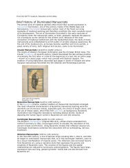
Chapter 4 Illuminated Manuscripts<br />
Part Two A graphic renaissance: The origins <strong>of</strong> European typography and<br />
design for printing<br />
Chapter 5 Printing Comes <strong>to</strong> Europe<br />
Chapter 6 The German Illustrated Book<br />
Chapter 7 Renaissance <strong>Graphic</strong> <strong>Design</strong><br />
Chapter 8 An Epoch <strong>of</strong> Typographic Genius<br />
Part Three The Bridge <strong>to</strong> the Twentieth Century—The Industrial Revolution:<br />
The impact <strong>of</strong> industrial technology upon visual communications<br />
Chapter 9 <strong>Graphic</strong> <strong>Design</strong> and the Industrial Revolution<br />
Chapter 10 The Arts and Crafts Movement and Its Heritage<br />
Chapter 11 Art Nouveau<br />
Chapter 12 The Genesis <strong>of</strong> Twentieth-Century <strong>Design</strong><br />
Part Four The Modernist Era: <strong>Graphic</strong> design in the first half <strong>of</strong> the twentieth<br />
century<br />
Chapter 13 The Influence <strong>of</strong> Modern Art<br />
iii
Chapter 14 Pic<strong>to</strong>rial Modernism<br />
Chapter 15 A New Language <strong>of</strong> Form<br />
Chapter 16 The Bauhaus and the New Typography<br />
Chapter 17 The Modern Movement in America<br />
Part Five The Age <strong>of</strong> Information: graphic design in the global village<br />
Chapter 18 The International Typographic Style<br />
Chapter 19 The New York School<br />
Chapter 20 Corporate Identity and Visual Systems<br />
Chapter 21 The Conceptual Image<br />
Chapter 22 National Visions within a Global Dialogue<br />
Chapter 23 Postmodern <strong>Design</strong><br />
Chapter 24 The Digital Revolution and Beyond<br />
Answer Key<br />
iv
Acknowledgments<br />
I would like <strong>to</strong> thank Chris McCampbell and Jenny Yoshida for their assistance in the<br />
development <strong>of</strong> these online materials. They provided pertinent student perspectives,<br />
and their insight, diligence, and calming personalities were invaluable. Without their<br />
help, completing this project would have been even more difficult than it was.<br />
I am grateful <strong>to</strong> my friend and colleague Michelle Hays, assistant pr<strong>of</strong>essor <strong>of</strong><br />
communication design, Department <strong>of</strong> Art and <strong>Design</strong>, Texas State University, San<br />
Marcos, for her guidance and expertise in matters <strong>of</strong> teaching and learning.<br />
Special thanks <strong>to</strong> my husband and partner in design, Calvin Woo, for his unwavering<br />
support; Senior Edi<strong>to</strong>r, Margaret Cummins, and Assistant Developmental Edi<strong>to</strong>r, Lauren<br />
LaFrance, <strong>of</strong> John Wiley & Sons, Inc. for their patience and encouragement; and<br />
copyedi<strong>to</strong>r Andrew Miller for his expertise.<br />
I would like <strong>to</strong> acknowledge Phil Meggs for his contributions <strong>to</strong> design education and for<br />
making all <strong>of</strong> us aware through his book <strong>of</strong> the rich his<strong>to</strong>ry <strong>of</strong> graphic design.<br />
v
Author Biography<br />
Susan Merritt<br />
Pr<strong>of</strong>essor and Head <strong>of</strong> <strong>Graphic</strong> <strong>Design</strong><br />
School <strong>of</strong> Art, <strong>Design</strong>, SM and Art His<strong>to</strong>ry<br />
San Diego State University (SDSU)<br />
Pr<strong>of</strong>essor Merritt teaches undergraduate and graduate courses in the School <strong>of</strong> Art,<br />
<strong>Design</strong>, and Art His<strong>to</strong>ry at San Diego State University. She is a design principal at<br />
CWA, Inc. in San Diego, and co-founder, with business partner Calvin Woo, <strong>of</strong> the<br />
<strong>Design</strong> Innovation Institute, a nonpr<strong>of</strong>it organization committed <strong>to</strong> interdisciplinary<br />
design research and education. Pr<strong>of</strong>essor Merritt is also co-author, with Jack Davis, <strong>of</strong><br />
The Web <strong>Design</strong> Wow! Book, and has served on the board <strong>of</strong> the San Diego chapter <strong>of</strong><br />
the American Institute <strong>of</strong> <strong>Graphic</strong> Arts (AIGA), on the chapter’s advisory board, its<br />
education committee, and as curriculum direc<strong>to</strong>r for AIGA’s national Creativity Kits<br />
Project. She is the founder <strong>of</strong> the AIGA student group at SDSU, and a Friend <strong>of</strong> the<br />
International Council <strong>of</strong> <strong>Graphic</strong> <strong>Design</strong> Associations (ICOGRADA). SM Friend is a<br />
“membership” category. Technically, individuals cannot be members since only<br />
organizations are members. Everyone knows the organization as ICOGRADA.<br />
Pr<strong>of</strong>essor Merritt was a graduate student from 1971 <strong>to</strong> 1976 at the<br />
Kunstgewerbeschule-Basel (Basel School <strong>of</strong> <strong>Design</strong>), where she studied with Armin<br />
H<strong>of</strong>mann, Wolfgang Weingart, André Gürtler, and Kurt Hauert. While living in Europe for<br />
six years, and later in Hawaii for five years, where she was on the faculty <strong>of</strong> the<br />
University <strong>of</strong> Hawaii at Manoa, Pr<strong>of</strong>essor Merritt developed a deep appreciation for<br />
different cultures and their communities. She continues <strong>to</strong> travel and research the role<br />
<strong>of</strong> visual communication design within the context <strong>of</strong> culture, with an emphasis on<br />
consumer packaging design. While at Basel, Pr<strong>of</strong>essor Merritt became interested in<br />
letterpress printing, which spawned an interest in book arts. She spent a month in<br />
residence at the Hamil<strong>to</strong>n Wood Type and Printing Museum in Two Rivers, Wisconsin,<br />
where she studied the museum’s collection <strong>of</strong> his<strong>to</strong>rical wood type, and printed<br />
broadsides, on the museum’s letterpresses.<br />
vi
Introduction, 4<br />
Prehis<strong>to</strong>ric visual communication, 6<br />
The cradle <strong>of</strong> civilization, 6<br />
The earliest writing, 6<br />
Chapter 1 – The Invention <strong>of</strong> Writing<br />
Mesopotamian visual identification, 9<br />
Egyptian hieroglyphs, 10<br />
Papyrus and writing, 12<br />
The first illustrated manuscripts, 14<br />
Egyptian visual identification, 17<br />
Key Terms (in order <strong>of</strong> appearance; the first page number <strong>of</strong> their appearance is<br />
listed)<br />
Ideograph, page 4<br />
Petroglyph, page 4, (Fig. 1-2)<br />
Pic<strong>to</strong>graph, page 4<br />
Substrate, page 4<br />
Mesopotamia, page 6<br />
Ziggurat, page 6<br />
Cuneiform, page 7, (Fig. 1-7)<br />
Phonogram, page 7<br />
Rebus writing, page 7<br />
Scribe, page 7<br />
Edubba, page 8<br />
1
Cylinder seal, page 9, (Fig. 1-12)<br />
Stele, page 9, (Figs. 1-10 and 1-11)<br />
Determinatives, page 10<br />
Hieroglyphics, page 10, (Fig. 1-15)<br />
Obelisk, page 10<br />
Rosetta S<strong>to</strong>ne, page 10, (Fig. 1-16)<br />
Ankh, page 12<br />
Car<strong>to</strong>uche, page 12, (Fig. 1-18)<br />
Papyrus, page 12<br />
The Book <strong>of</strong> the Dead, page 14, (Fig. 1-25)<br />
C<strong>of</strong>fin texts, page 14<br />
Demotic script, page 14, (Fig. 1-24)<br />
Hieratic script, page 14<br />
Papyrus manuscripts, page 14<br />
Pyramid text, page 14<br />
Rec<strong>to</strong>, page 14<br />
Verso, page 14<br />
Key People and their Major Contributions (in order <strong>of</strong> appearance; the first<br />
page number <strong>of</strong> their appearance is listed)<br />
Sumerians, page 6<br />
Hammurabi, page 8<br />
Dr. Thomas Young, page 10, (Fig. 1-17)<br />
Jean-François Champollion (A.D. 1790–1832), page 10<br />
<strong>Study</strong> Test<br />
2
Multiple Choice<br />
Chapter 1 – <strong>Study</strong> Questions<br />
1. It is not known precisely when or where the biological species <strong>of</strong> conscious,<br />
thinking people, Homo sapiens, emerged. It is believed that we evolved from a<br />
species that lived in the southern part <strong>of</strong> __________.<br />
A. Europe<br />
B. Africa<br />
C. Australia<br />
D. China<br />
2. These early hominids ventured out on<strong>to</strong> the grassy plains and in<strong>to</strong> __________<br />
as the forests slowly disappeared in that part <strong>of</strong> the world. In the tall grass, they<br />
began <strong>to</strong> stand erect and their hands developed an ability <strong>to</strong> carry food and hold<br />
objects.<br />
A. canyons<br />
B. caves<br />
C. trees<br />
D. mountains<br />
3. Found near Lake Turkana in _________, a nearly three-million-year-old s<strong>to</strong>ne<br />
that had been sharpened in<strong>to</strong> an implement proves the thoughtful and deliberate<br />
development <strong>of</strong> a technology—a <strong>to</strong>ol—which may have been used <strong>to</strong> dig for<br />
roots or <strong>to</strong> cut away flesh from dead animals for food.<br />
A. Kenya<br />
B. Spain<br />
C. France<br />
D. Turkey<br />
4. A number <strong>of</strong> quantum leaps provided the capacity <strong>to</strong> organize a community and<br />
gain some measure <strong>of</strong> control over human destiny. Speech—the ability <strong>to</strong> make<br />
sounds in order <strong>to</strong> communicate—was an early skill developed by the species on<br />
the long evolutionary trail from its archaic beginnings. __________ is the visual<br />
counterpart <strong>of</strong> speech.<br />
3
A. Talking<br />
B. Painting<br />
C. Writing<br />
D. Drawing<br />
5. The invention <strong>of</strong> writing brought people the luster <strong>of</strong> civilization and made it<br />
possible <strong>to</strong> preserve hard-won knowledge, experiences, and thoughts. The<br />
development <strong>of</strong> visible language had its earliest origins in ___________.<br />
A. letterforms<br />
B. abstract color fields<br />
C. simple pictures<br />
D. hieroglyphs<br />
6. From the early Paleolithic <strong>to</strong> the Neolithic period (35,000–4000 B.C.), early<br />
Africans and Europeans left paintings in caves, including the Lascaux caves in<br />
France and __________.<br />
A. the grassy plains <strong>of</strong> southern Africa<br />
B. Lake Turkana in Kenya<br />
C. Altamira in Spain<br />
D. the Persian Gulf region<br />
7. These early cave drawings were probably created for three <strong>of</strong> the reasons below.<br />
Which does NOT belong? ___________<br />
A. art<br />
B. ritual<br />
C. survival<br />
D. utility<br />
8. The animals and objects painted on the caves are ___________elementary<br />
pictures or sketches representing the things depicted.<br />
A. petroglyphs<br />
B. ideographs<br />
C. phonograms<br />
D. pic<strong>to</strong>graphs<br />
4
9. Throughout the world, from Africa <strong>to</strong> North America <strong>to</strong> the islands <strong>of</strong> New<br />
Zealand, prehis<strong>to</strong>ric people left numerous __________, which are carved or<br />
scratched signs or simple figures on rocks.<br />
A. petroglyphs<br />
B. ideographs<br />
C. phonograms<br />
D. pic<strong>to</strong>graphs<br />
10. Some <strong>of</strong> the carved or scratched signs on the rocks may be __________, or<br />
symbols <strong>to</strong> represent ideas or concepts.<br />
A. petroglyphs<br />
B. ideographs<br />
C. phonograms<br />
D. pic<strong>to</strong>graphs<br />
11. By the late Paleolithic period, some __________ had been reduced <strong>to</strong> the point<br />
that they almost resembled letters.<br />
A. petroglyphs and phonograms<br />
B. petroglyphs and pic<strong>to</strong>graphs<br />
C. phonograms and pic<strong>to</strong>graphs<br />
D. petroglyphs and ideographs<br />
12. Until recent discoveries indicated that early peoples in Thailand may have<br />
practiced agriculture and manufactured pottery at an even earlier date,<br />
archaeologists had long believed that the ancient land <strong>of</strong> ___________, “the land<br />
between rivers,” was the cradle <strong>of</strong> civilization.<br />
A. Kenya<br />
B. Mesopotamia<br />
C. Egypt<br />
D. Turkey<br />
13. In “the land between rivers,” early humans ceased their restless nomadic<br />
wanderings and established a village society. Around 8000 B.C., wild grain was<br />
planted, animals were domesticated, and agriculture began. By the year 6000<br />
B.C., objects were being hammered from copper. The Bronze Age was ushered<br />
in about 3000 B.C., when copper was alloyed with tin <strong>to</strong> make durable <strong>to</strong>ols and<br />
5
weapons; the invention <strong>of</strong> the wheel followed. The leap from village culture <strong>to</strong><br />
high civilization occurred after the __________ people arrived near the end <strong>of</strong> the<br />
fourth millennium B.C.<br />
A. Hittite<br />
B. Babylonian<br />
C. Persian<br />
D. Sumerian<br />
14. Of the numerous inventions that launched people on<strong>to</strong> the path <strong>of</strong> civilization, the<br />
invention <strong>of</strong> ____________ brought about an intellectual revolution that had a<br />
vast impact upon social order, economic progress, and technological and future<br />
cultural developments.<br />
A. a system <strong>of</strong> gods<br />
B. architecture<br />
C. writing<br />
D. a god-man relationship<br />
15. Writing may have evolved in Sumeria because ancient temple chiefs needed<br />
_________.<br />
A. ornament for the ziggurat<br />
B. <strong>to</strong> employ scribes<br />
C. <strong>to</strong> keep records systematically<br />
D. intellectual stimulation<br />
16. The __________ may be the oldest extant artifact combining words and pictures<br />
on the same surface.<br />
A. Rosetta s<strong>to</strong>ne<br />
B. Blau monument<br />
C. Code <strong>of</strong> Hammurabi<br />
D. Sarcophagus <strong>of</strong> Aspalta<br />
17. The stele <strong>of</strong> Hammurabi, who reigned from 1792–1750 B.C., is an artifact <strong>of</strong> the<br />
Babylonian culture written in careful cuneiform. The text contains ________.<br />
A. a code <strong>of</strong> laws and consequences for violating them<br />
B. a narrative about Hammurabi’s military conquests<br />
6
C. annual records <strong>of</strong> crop production from the late eighteenth century B.C.<br />
D. a calendar <strong>of</strong> important Babylonian holy days<br />
18. Two natural byproducts <strong>of</strong> the rise <strong>of</strong> village culture were the ownership <strong>of</strong><br />
property and the specialization <strong>of</strong> trades or crafts. Both made visual identification<br />
necessary. Proprietary marks and __________ were first developed so that<br />
ownership could be established.<br />
A. cattle brands<br />
B. printing<br />
C. symbols<br />
D. contracts<br />
19. In Mesopotamia, _______________ provided a forgery-pro<strong>of</strong> method for sealing<br />
documents and proving their authenticity. Images and writing were etched in<strong>to</strong><br />
their surfaces. When they were rolled across a damp clay tablet, a raised<br />
impression <strong>of</strong> the depressed design, which became a “trademark” for the owner,<br />
was formed.<br />
A. finger prints<br />
B. cylinder seals<br />
C. adhesive made from papyrus<br />
D. Persian chalcedony stamps<br />
20. All but one <strong>of</strong> the scripts listed below is found on the Rosetta S<strong>to</strong>ne. Which does<br />
NOT belong? __________<br />
A. Greek<br />
B. Latin<br />
C. hieroglyphic<br />
D. demotic<br />
21. The third phase in the evolution <strong>of</strong> __________ was the Book <strong>of</strong> the Dead.<br />
A. biographies<br />
B. papyri<br />
C. funerary texts<br />
D. written communication<br />
7
22. Three <strong>of</strong> the following are characteristics <strong>of</strong> ancient Egyptian illustrated<br />
manuscripts. Which does NOT belong? ___________<br />
A. Important persons were shown in larger scale than other persons.<br />
B. One or two horizontal bands, usually colored, ran across the <strong>to</strong>p and<br />
bot<strong>to</strong>m <strong>of</strong> the manuscript.<br />
C. Images were inserted on separate pages opposite the text they illustrated.<br />
D. A sheet was sometimes divided in<strong>to</strong> rectangular zones <strong>to</strong> separate text<br />
and images.<br />
23. The ancient Egyptians inherited the use <strong>of</strong> ___________ from the Sumerians.<br />
Matching<br />
A. papyrus<br />
B. identification seals<br />
C. books <strong>of</strong> the dead<br />
D. writing palettes<br />
I. Match the following terms with their correct definition:<br />
1. determinatives ____<br />
2. car<strong>to</strong>uche ____<br />
3. hieroglyphics ____<br />
4. homonyms ____<br />
5. ankh ____<br />
6. obelisk ____<br />
A. This hieroglyph <strong>of</strong> a cross surmounted by a loop had modest origins as<br />
the symbol for a sandal strap yet gained meaning as a symbol for life and<br />
immortality.<br />
B. Having the same name<br />
C. Egyptian pic<strong>to</strong>grams that depict objects or beings<br />
D. Signs that indicate how the preceding glyph should be interpreted<br />
8
E. A tall, geometric, <strong>to</strong>tem-like Egyptian monument<br />
F. F. Bracket-like plaques containing the glyphs <strong>of</strong> important names, such as<br />
P<strong>to</strong>lemy and Cleopatra<br />
II. Match the following terms with their correct definition:<br />
1. demotic ____<br />
2. papyrus ____<br />
3. rec<strong>to</strong> ____<br />
4. hieratic ____<br />
5. verso ____<br />
A. A paperlike substrate for manuscripts made from a plant that grew along<br />
the Nile in shallow marshes and pools<br />
B. The upper surface <strong>of</strong> horizontal fibers <strong>of</strong> the finished sheets <strong>of</strong> this<br />
Egyptian substrate<br />
C. The bot<strong>to</strong>m surface <strong>of</strong> vertical fibers <strong>of</strong> the finished sheets <strong>of</strong> this Egyptian<br />
substrate<br />
D. A simplification <strong>of</strong> the hieroglyphic book hand developed by priests for<br />
religious writings, from the Greek word “priestly”<br />
E. An abstract script <strong>of</strong> the hieroglyphic book hand that came in<strong>to</strong> secular<br />
use for commercial and legal writing, from the Greek word for “popular”<br />
III. Match the following terms with their correct definition:<br />
1. edduba ____<br />
2. ziggurat ____<br />
3. phonograms ____<br />
4. rebus ____<br />
5. stele ____<br />
6. cuneiform ____<br />
9
A. An inscribed or carved s<strong>to</strong>ne or slab used for commemorative purposes<br />
B. An abstract sign writing style from the Latin for “wedge shaped”<br />
C. A multis<strong>to</strong>ry stepped brick temple constructed as a series <strong>of</strong> recessed<br />
levels that were smaller <strong>to</strong>ward the <strong>to</strong>p<br />
D. Pictures representing words and syllables with the same or similar sound<br />
as the object depicted<br />
E. A writing school or “tablet house”<br />
F. <strong>Graphic</strong> symbols representing sounds<br />
Image Identification<br />
I. Identify the title and the date <strong>of</strong> the following images:<br />
1. Fig. 1-1 ________________________________________________<br />
2. Fig. 1-5 ________________________________________________<br />
3. Fig. 1-10 _______________________________________________<br />
4. Fig. 1-12 _______________________________________________<br />
5. Fig. 1-16 _______________________________________________<br />
6. Fig. 1-26 _______________________________________________<br />
7. Figs. 1-27 and 1-28 ______________________________________<br />
II. Match each <strong>of</strong> the images shown with the correct name <strong>of</strong> the writing style used.<br />
1. Fig. 1-2 ____<br />
2. Fig. 1-11 ____<br />
3. Fig. 1-23 ____<br />
A. hieroglyphs<br />
B. petroglyphs<br />
C. cuneiform<br />
10
Introduction, 18<br />
Cretan pic<strong>to</strong>graphs, 18<br />
The north Semitic alphabet, 19<br />
Chapter 2 – Alphabets<br />
The Aramaic alphabet and its descendants, 20<br />
The Greek alphabet, 22<br />
The Latin alphabet, 26<br />
The Korean alphabet, 29<br />
Key Terms (in order <strong>of</strong> appearance; the first page number <strong>of</strong> their appearance is<br />
listed)<br />
Alphabet, page 18<br />
Minoan civilization, page 18, (Fig. 2-1)<br />
Crete, page 18, (Fig. 2-2)<br />
Substrate, page 19<br />
Principle <strong>of</strong> movable type, page 19<br />
North Semitic writing, page 19<br />
Phoenicia, page 19<br />
Sui generis, page 19<br />
Byblos, page 19<br />
Sinaitic script, page 19<br />
Acrophonic, page 19<br />
Ras Shamra script, page 20, (Fig. 2-3)<br />
Alphabetical order, page 20<br />
11
Phoenician alphabet, page 19<br />
Aramaic alphabet, page 20, (Fig. 2-4)<br />
Square Hebrew alphabet, page 20, (Fig. 2-5)<br />
Arabic writing, page 21<br />
Kufic, page 21, (Fig. 2-6)<br />
Naskhi, page 21, (Fig. 2-7)<br />
Qur’an or Koran, page 21<br />
Calligraphy, page 21<br />
Greek alphabet, page 22, (Fig. 2-9) (Fig. 2-1)<br />
Votive stela, page 23, (Fig. 2-11)<br />
Boustrophedon, page 24<br />
Uncials, page 24, (Fig. 2-12)<br />
Latin alphabet, page 26, (Fig. 2-1)<br />
Capitalis Monumentalis, page 26, (Figs. 2-17 and 2-18)<br />
Serif, page 26<br />
Capitalis Quadrata, page 28, (Fig. 2-19)<br />
Capitalis Rustica, page 28, (Fig. 2-20)<br />
Vellum, page 29<br />
Codex, page 29<br />
Scroll, page 29<br />
Rotulus, page 29<br />
Signatures, page 29<br />
Hangul, page 29, (Fig.s 2-22 through 2-24)<br />
Key People and their Major Contributions (in order <strong>of</strong> appearance; the first<br />
page number <strong>of</strong> their appearance is listed)<br />
12
Phoenicians, page 19<br />
Cadmus <strong>of</strong> Miletus (dates unknown), page 22<br />
Etruscans, page 26, (Fig. 2-16)<br />
Spurius Carvilius (c. 250 B.C.), page 26<br />
P<strong>to</strong>lemy V <strong>of</strong> Alexandria (ruled c. 205–181 B.C.), page 28<br />
King Eumenes II <strong>of</strong> Pergamum (d. 160/159 B.C.), page 28<br />
Sejong (A.D. 1397–1450), page 29<br />
13
Multiple Choice<br />
Chapter 2 – <strong>Study</strong> Questions<br />
1. Early visual language systems were complex and required knowledge <strong>of</strong><br />
hundreds <strong>of</strong> signs and symbols, whereas an alphabet, a set <strong>of</strong> visual symbols<br />
or characters that represent the elementary __________ <strong>of</strong> a spoken language,<br />
require only twenty or thirty easily learned signs.<br />
A. vowels<br />
B. sounds<br />
C. consonants<br />
D. concepts<br />
2. Unearthed in Crete in 1908, the __________ contains pic<strong>to</strong>graphic and<br />
seemingly alphabetic forms imprinted on both sides in spiral bands.<br />
A. Greek signature seal<br />
B. Greek allotment <strong>to</strong>ken<br />
C. Phais<strong>to</strong>s Disk<br />
D. Etruscan Bucchero vase<br />
3. During the second millennium B.C., the __________ became seafaring<br />
merchants whose ships linked settlements throughout the Mediterranean region.<br />
Influences and ideas were absorbed from other areas, such as cuneiform from<br />
Mesopotamia in the west and Egyptian hieroglyphics and scripts from the south.<br />
A. Greeks<br />
B. Etruscans<br />
C. Romans<br />
D. Phoenicians<br />
4. Around 1500 B.C., Semitic workers in Egyptian turquoise mines in the Sinai<br />
desert developed an acrophonic adaptation <strong>of</strong> Egyptian hieroglyphics called<br />
Sinaitic script. In an acrophonic system, pic<strong>to</strong>rial symbols or hieroglyphs are used<br />
<strong>to</strong> represent _________.<br />
14
A. the most important words in a sentence<br />
B. the most important vowel sound in a word<br />
C. the initial sound <strong>of</strong> the object depicted<br />
D. an abstract idea<br />
5. The Phoenician alphabet was adopted by the ancient Greeks and spread through<br />
their city-states around 1000 B.C. The Greeks changed five consonants <strong>to</strong><br />
vowels and, most importantly, they modified the Phoenician characters by<br />
making them __________.<br />
A. resemble animal forms in nature<br />
B. more geometrically structured<br />
C. resemble cuneiform characters<br />
D. calligraphic and gestural<br />
6. When the Greeks adopted Phoenician writing, they developed a writing method<br />
called boustrophedon, which means __________.<br />
A. alternating left <strong>to</strong> right and right <strong>to</strong> left<br />
B. left <strong>to</strong> right<br />
C. right <strong>to</strong> left<br />
D. bot<strong>to</strong>m <strong>to</strong> <strong>to</strong>p<br />
7. Writing <strong>to</strong>ols and substrates influenced written forms. For example, as early as<br />
the second century A.D., Greek scribes made their pens from hard reeds cut in<strong>to</strong><br />
nibs and split at the tip <strong>to</strong> aid ink flow. These pens gave their writing style a<br />
different character than writing by Egyptian scribes, who used s<strong>of</strong>t reeds <strong>to</strong> brush<br />
ink on<strong>to</strong> the substrate. The Greeks developed a more rounded writing style called<br />
_________, which could be written more quickly because the rounded letters<br />
were formed with fewer strokes.<br />
A. uncials<br />
B. Capitalis Monumentalis<br />
C. Capitalis Rustica<br />
D. Capitalis Quadrata<br />
8. In the fourth century B.C., Alexander the Great expanded Greek culture<br />
throughout the ancient world, including Egypt, Mesopotamia, and India. Reading<br />
and writing had become more important by this time because ___________.<br />
15
A. Alexander the Great wished <strong>to</strong> build vast libraries in distant countries<br />
B. military leaders required a means <strong>of</strong> transferring information across<br />
geographic areas<br />
C. an oral culture no longer had the capacity <strong>to</strong> contain and document<br />
knowledge and information<br />
D. demand rose for Greek philosophical and dramatic works<br />
9. The Greek alphabet fathered three <strong>of</strong> the following alphabets. Which one does<br />
NOT belong? __________<br />
A. Latin<br />
B. Cyrillic<br />
C. Phoenican<br />
D. Etruscan<br />
10. The Latin alphabet came <strong>to</strong> the Romans from Greece by way <strong>of</strong> the_______,<br />
who dominated the Italian peninsula in the first millennium B.C.<br />
A. Ionians<br />
B. Spartans<br />
C. Etruscans<br />
D. Corinthians<br />
11. Around the first century B.C., the Roman alphabet—the forerunner <strong>of</strong> the<br />
contemporary English alphabet—contained twenty-three letters. The letters J, V,<br />
and W were added __________. The J is an outgrowth <strong>of</strong> the I, which was<br />
lengthened <strong>to</strong> indicate use with consonantal force, particularly as the first letter <strong>of</strong><br />
some words. Both U and W are variants <strong>of</strong> V, which was used for two different<br />
sounds in England.<br />
A. after the advent <strong>of</strong> the printing press<br />
B. during the Middle Ages<br />
C. by seventeenth-century Greek scholars<br />
D. when they were rediscovered in the first century A.D.<br />
12. The __________, a revolutionary design format, came <strong>to</strong> be used increasingly in<br />
Rome and Greece beginning about the time <strong>of</strong> Christ. The durability and<br />
permanence <strong>of</strong> this format appealed <strong>to</strong> Christians because their writings were<br />
considered sacred. The Christians also sought this format as a means <strong>to</strong><br />
distance themselves from pagan formats.<br />
16
A. codex<br />
B. rotulus<br />
C. scroll<br />
D. disk<br />
13. The Roman letter _______________ was designed by Spurius Carvilius around<br />
250 B.C. <strong>to</strong> replace the Greek zeta, which at the time was <strong>of</strong> little value <strong>to</strong> the<br />
Romans. After this addition, the Latin alphabet contained twenty-one letters.<br />
A. W<br />
B. G<br />
C. J<br />
D. Y<br />
14. The Aramaic alphabet is a major early derivation from the North Semitic script. It<br />
is the predecessor <strong>of</strong> hundreds <strong>of</strong> scripts, including modern Hebrew and Arabic.<br />
______________, a bold inscriptional Arabic lettering with extended, thick<br />
characters, was widely used on coins, manuscripts, and inscriptions on metal<br />
and s<strong>to</strong>ne. It is still used for titles and decorative elements.<br />
A. Sinaitic<br />
B. Naskhi<br />
C. Ras Shamra<br />
D. Kufic<br />
15. King Eumenes II <strong>of</strong> Pergamum developed the process <strong>of</strong> making _________ <strong>to</strong><br />
overcome an embargo placed by P<strong>to</strong>lemy V during a fierce rivalry.<br />
A. paper<br />
B. codices<br />
C. parchment<br />
D. papyrus<br />
16. The Hangul alphabet, which was introduced by the Korean monarch Sejong by<br />
royal decree in A.D. 1446, consists <strong>of</strong> fourteen consonants represented by<br />
__________.<br />
A. abstract depictions <strong>of</strong> the mouth and <strong>to</strong>ngue<br />
B. acrophonic symbols<br />
17
Matching<br />
C. dots placed next <strong>to</strong> horizontal or vertical lines<br />
D. letters similar <strong>to</strong> those <strong>of</strong> the early Phoenicians<br />
I. Match the key words with the correct definitions.<br />
True/False<br />
1. vellum ____<br />
2. serifs ____<br />
3. signature ____<br />
4. Capitalis Quadrata ____<br />
5. Capitalis Monumentalis ____<br />
6. parchment ____<br />
7. Capitalis Rustica ____<br />
A. Rome <strong>to</strong>ok great pride in its imperial accomplishments and conquests,<br />
and created these letterforms for architectural inscriptions celebrating<br />
military leaders and their vic<strong>to</strong>ries.<br />
B. The most important form <strong>of</strong> the Roman written hand, this style, which was<br />
written carefully and slowly with a flat pen, was widely used from the<br />
second century A.D. until the fifth century.<br />
C. Small lines extending from the ends <strong>of</strong> the major strokes <strong>of</strong> Roman<br />
letterforms<br />
D. Another form <strong>of</strong> the Roman written hand, these condensed letterforms,<br />
which were written quickly and saved space, were widely used from the<br />
second century A.D. until the fifth century.<br />
E. A writing surface made from the skins <strong>of</strong> domestic animals, particularly<br />
calves, sheep, and goats<br />
F. The finest <strong>of</strong> writing surfaces, made from the smooth skins <strong>of</strong> newborn<br />
calves<br />
G. G. Two, four, or eight sheets gathered then folded, stitched, and bound<br />
18
1. The invention <strong>of</strong> the alphabet and the subsequent spread <strong>of</strong> literacy had a<br />
leveling effect on society; it eventually diminished the power <strong>of</strong> priest/scribes<br />
found in earlier societies. _____<br />
2. The Hangul writing system—the Korean alphabet—is based on the Chinese<br />
writing system but is more complex. _____<br />
3. Around 2000 B.C., the Phoenicians developed an early alphabetic writing system<br />
called sui generis, which was a script devoid <strong>of</strong> any pic<strong>to</strong>rial meaning. _____<br />
4. Capitalis Quadrata were capitals <strong>of</strong> the Roman Latin alphabet created for<br />
architectural inscriptions celebrating military leaders and their vic<strong>to</strong>ries. _____<br />
5. The modern book format, which replaced the scroll in Rome and Greece<br />
beginning at the time <strong>of</strong> Christ, was made by gathering parchment in<strong>to</strong> signatures<br />
and binding them <strong>to</strong> form codices. _____<br />
Image Identification<br />
I. Identify the title and the date <strong>of</strong> the following images.<br />
1. Fig. 2-2 ________________________________________________<br />
2. Fig. 2-11 _______________________________________________<br />
3. Fig. 2-12 _______________________________________________<br />
4. Fig. 2-16 _______________________________________________<br />
II. Match each <strong>of</strong> the images shown with the correct writing style.<br />
1. Fig. 2-18 ____<br />
2. Fig. 2-19 ____<br />
3. Fig. 2-20 ____<br />
A. Capitalis Quadrata<br />
B. Capitalis Monumentalis<br />
C. Capitalis Rustica<br />
19
Introduction, 31<br />
Chinese calligraphy, 31<br />
The invention <strong>of</strong> paper, 34<br />
The discovery <strong>of</strong> printing, 35<br />
The invention <strong>of</strong> movable type, 40<br />
Chapter 3 – The Asian Contribution<br />
Key Terms (in order <strong>of</strong> appearance; the first page number <strong>of</strong> their appearance is<br />
listed)<br />
Chinese calligraphy, page 31<br />
Paper, page 31<br />
Logograms, page 31<br />
Chiaku-wen (bone-and-shell script), page 31, (Figs. 3-1 and 3-2)<br />
Oracle bones, page 31<br />
Chin-wen (bronze script), page31, (Fig. 3-3)<br />
Hsiao chuan (small-seal style), page 32, (Fig. 3-1)<br />
Chen-shu or kai-shu (regular style), page 32, (Fig. 3-4)<br />
Li, page 32<br />
Tao, page 34<br />
Relief printing, page 35<br />
Chop, page 35, (Fig. 3-8)<br />
Cinnabar, page 35<br />
Woodblock printing, page 36<br />
Diamond Sutra, page 37<br />
20
Dharani, page 36<br />
Accordion-style book, page 38<br />
Codex-style book, page 39<br />
Pen Ts’ao, page 39<br />
Movable type, page 40<br />
Key People and their Major Contributions (in order <strong>of</strong> appearance; the first<br />
page number <strong>of</strong> their appearance is listed)<br />
Ts-ang Chieh, page 31<br />
Prime Minister Li Ssu (c. 280–208 B.C.), page 32<br />
Li Fangying, page 32, (Fig. 3-6)<br />
Shitao Yuanji (A.D. 1630–c. 1707), page 34, (Fig. 3-7)<br />
Ts’ai Lun, page 34<br />
Pi Sheng (A.D. 1023–1063), page 40<br />
21
Multiple Choice<br />
Chapter 3 – <strong>Study</strong> Questions<br />
1. Legend suggests that by the year 2000 B.C., a culture was evolving in China in<br />
virtual isolation from the pockets <strong>of</strong> civilization in the West. Three innovations<br />
developed by the ancient Chinese that changed the course <strong>of</strong> human events are<br />
listed below. Which does NOT belong? __________<br />
A. oil paint<br />
B. gunpowder<br />
C. paper<br />
D. the compass<br />
2. About 1800 B.C., __________ was inspired <strong>to</strong> invent Chinese writing by claw<br />
marks <strong>of</strong> birds and footprints <strong>of</strong> animals. Elementary pic<strong>to</strong>graphs <strong>of</strong> things in<br />
nature were highly stylized and composed <strong>of</strong> a minimum number <strong>of</strong> lines.<br />
A. Shih Huang Ti<br />
B. Li Ssu<br />
C. Ts-ang Chieh<br />
D. Li Fangying<br />
3. There is no direct relationship between the spoken and written Chinese<br />
languages. Written Chinese was never broken down in<strong>to</strong> syllabic or alphabetic<br />
signs for elementary sounds. The Chinese calligraphic writing system consists <strong>of</strong><br />
___________, graphic signs that represent an entire word.<br />
A. pic<strong>to</strong>graphs<br />
B. logograms<br />
C. car<strong>to</strong>uches<br />
D. ideograms<br />
4. The earliest known Chinese writing, called __________, was in use from 1800 <strong>to</strong><br />
1200 B.C. and was closely bound <strong>to</strong> the art <strong>of</strong> divination, an effort <strong>to</strong> foretell<br />
future events through communication with the gods or long-dead ances<strong>to</strong>rs. It<br />
22
was also called bone-and-shell script because it was incised on <strong>to</strong>r<strong>to</strong>ise shells<br />
and the flat shoulder bones <strong>of</strong> large animals, called oracle bones.<br />
A. chin-wen<br />
B. hsaio chuan<br />
C. chen-shu<br />
D. chiaku-wen<br />
5. In earlier times, the Chinese wrote on bamboo slats or wooden strips using a<br />
bamboo pen and dense, durable ink. After the invention <strong>of</strong> woven silk cloth, it,<br />
<strong>to</strong>o, was used as a writing substrate; however, it was very costly. __________, a<br />
Chinese high government <strong>of</strong>ficial, is credited with the invention <strong>of</strong> paper in A.D.<br />
105, and was deified as the god <strong>of</strong> the papermakers. His process for making<br />
paper from natural fibers continued almost unchanged until papermaking was<br />
mechanized in nineteenth-century England.<br />
A. Ts’ai Lun<br />
B. Li Tsu<br />
C. Chu-Yun-Ming<br />
D. Yuan Chao Meng-fu<br />
6. One theory about the origins <strong>of</strong> relief printing in China focuses on chops, seals<br />
made by carving calligraphic characters in<strong>to</strong> a flat surface <strong>of</strong> jade, silver, gold, or<br />
ivory. Another theory focuses on the practice <strong>of</strong> making __________ from<br />
inscriptions carved in s<strong>to</strong>ne.<br />
A. inked rubbings<br />
B. impressions in s<strong>of</strong>t clay<br />
C. playing cards<br />
D. calligraphy<br />
7. The oldest surviving printed manuscript is the ________, which was printed by<br />
one Wang Chieh <strong>to</strong> honor his parents and widely distributed in A.D. 868. It<br />
consists <strong>of</strong> seven sheets <strong>of</strong> paper pasted <strong>to</strong>gether <strong>to</strong> form a scroll. Six sheets <strong>of</strong><br />
the text convey Buddha’s revelations <strong>to</strong> his elderly follower Subhuti.<br />
A. Album <strong>of</strong> Eight Leaves<br />
B. Yuan Chao Meng-fu (A Goat and Sheep)<br />
C. Mountain and River Landscape scroll<br />
D. Diamond Sutra<br />
23
8. China became the first society in which ordinary people were in daily contact with<br />
printed images. In addition <strong>to</strong> block prints <strong>of</strong> religious images and texts, paper<br />
___________ began <strong>to</strong> be designed and printed around A.D. 1000 due <strong>to</strong> an iron<br />
shortage.<br />
A. charms, called dharani,<br />
B. playing cards<br />
C. money<br />
D. medical herbals<br />
9. In China beginning in the ninth or tenth century A.D., the scroll evolved in<strong>to</strong> a<br />
paged format. Instead <strong>of</strong> rolling the scroll, it was folded ___________. In the<br />
tenth or eleventh century, stitched books were developed: two pages <strong>of</strong> text were<br />
printed from one block; the sheet was folded down the middle, then the sheets<br />
were gathered and sewn <strong>to</strong> make a codex-style book.<br />
A. European-style<br />
B. accordion-style<br />
C. like a letter<br />
D. in half<br />
10. When making a woodblock print in China, the wood around each character is<br />
painstakingly cut away. Around A.D. 1045, the Chinese alchemist Pi Sheng<br />
extended this process by developing the concept <strong>of</strong> __________, an innovative<br />
printing process that was never widely used in Asia because the sheer number <strong>of</strong><br />
characters made the process <strong>to</strong>o tedious.<br />
A. stamping<br />
B. relief printing<br />
C. casting type<br />
D. moveable type<br />
11. The painting <strong>of</strong> bamboo from the ___________ by Li Fangying shows how<br />
vividly descriptive strokes made with a bamboo brush join calligraphy, painting,<br />
poem, and illustration in<strong>to</strong> a unified communication.<br />
A. bamboo scrolls<br />
B. Mountain and River Landscape scroll<br />
C. Album <strong>of</strong> Eight Leaves<br />
D. Diamond Sutra<br />
24
Matching<br />
I. Match the key term with the correct definition.<br />
True/False<br />
1. chin-wen ____<br />
2. hsaio chuan ____<br />
3. k’ai-shu ____<br />
4. chia-ku-wen ____<br />
A. This phase in Chinese calligraphy is called bronze script because it<br />
consisted <strong>of</strong> inscriptions on cast-bronze objects, such as food and water<br />
vessels, musical instruments, weapons, coins, and seals.<br />
B. When one wished <strong>to</strong> consult an exalted ances<strong>to</strong>r or a god, the royal<br />
diviner was asked <strong>to</strong> inscribe the message on a polished animal bone.<br />
This writing was called bone-and-shell script.<br />
C. Small seal script was a new writing style designed by Prime Minister Li<br />
Ssu during the reign <strong>of</strong> emperor Shih Huang Ti. This graceful, flowing style<br />
is much more abstract than other styles.<br />
D. The final step in the evolution <strong>of</strong> Chinese calligraphy, regular script is<br />
considered the highest art form in China, more important even than<br />
painting.<br />
1. Chinese calligraphy is a purely visual language. _____<br />
2. The Chinese calligraphic system consists <strong>of</strong> about forty characters. _____<br />
3. In contrast <strong>to</strong> Western writing, Chinese calligraphic strokes express spiritual<br />
states and deep feelings. _____<br />
4. The Chinese were immediately receptive <strong>to</strong> the use <strong>of</strong> paper in its early decades<br />
because <strong>of</strong> its greater elitist appeal. _____<br />
5. During the Han Dynasty, seals, called chops, were made by carving the<br />
background away from a calligraphic character. The resulting print was a red<br />
character on a white background. _____<br />
25
6. In the tenth century A.D., Prime Minister Feng Tao ordered the use <strong>of</strong> wood<br />
blocks <strong>to</strong> print Confucian classics so that they would be available <strong>to</strong> the masses.<br />
_____<br />
7. Relief printing is the process <strong>of</strong> removing the negative spaces surrounding an<br />
image and then inking the raised surface, which is rubbed on<strong>to</strong> paper.<br />
8. The pages <strong>of</strong> the Pen Ts’ao medical herbal were assembled as a folded<br />
accordion-style book, which replaced the scroll format in the ninth and tenth<br />
centuries A.D.<br />
Image Identification<br />
I. Identify the title and date <strong>of</strong> the following images.<br />
1. Fig. 3-6 _________________________________________________<br />
2. Fig. 3-8 _________________________________________________<br />
3. Fig. 3-15 ________________________________________________<br />
II. Match each <strong>of</strong> the images shown with the correct writing style.<br />
1. Fig. 3-2 ____<br />
2. Fig. 3-3 ____<br />
3. Fig. 3-4 ____<br />
A. Chiaku-wen (bone-and-shell script)<br />
B. Chen-shu (regular style calligraphy)<br />
C. Chin-wen (bronze script)<br />
26
Introduction, 42<br />
The classical style, 43<br />
Celtic book design, 44<br />
The Caroline graphic renewal, 47<br />
Spanish pic<strong>to</strong>rial expressionism, 51<br />
Chapter 4 – Illuminated Manuscripts<br />
Romanesque and Gothic manuscripts, 54<br />
Judaic manuscripts, 56<br />
Islamic manuscripts, 56<br />
Late medieval illuminated manuscripts, 58<br />
Key Terms (in order <strong>of</strong> appearance; the first page number <strong>of</strong> their appearance is<br />
listed)<br />
Illuminated manuscript, page 42<br />
Gold leaf, page 42<br />
Scrip<strong>to</strong>rium, page 42<br />
Scrit<strong>to</strong>ri, page 42<br />
Copisti, page 42<br />
Illumina<strong>to</strong>r, page 42<br />
Colophon, page 42<br />
Musical notation, page 42<br />
Frontispiece, page 43<br />
Classical style, page 43, (Fig. 4-1)<br />
Medieval, page 43<br />
27
Uncials, page 44, (Fig. 4-2)<br />
Uncia, page 44<br />
Semi-uncials or half-uncials, page 44, (Fig. 4-3)<br />
Majuscules, page 44<br />
Minuscules, page 44<br />
Ascenders, page 44<br />
Descenders, page 44<br />
Celtic style, pages 44–47, (Fig. 4-4 through 4-9)<br />
Carpet pages, page 45, (Fig. 4-6)<br />
Interlace, page 45, (Fig. 4-4)<br />
Lacertines, page 45,<br />
Diminuendo, page 45, (Fig. 4-5)<br />
Scriptura scottia (insular script), page 46, (Fig. 4-5) (Fig. 4-9)<br />
Carolingian or Caroline miniscule, page 42, (Fig. 4 -10)<br />
Turba scrip<strong>to</strong>rium, page 49<br />
Labyrinth page, page 52, (Fig. 4-12)<br />
Apocalypse, page 53, (Figs. 4-13 and 4-14)<br />
Textura, page 54, (Fig. 4-15)<br />
Haggadot, page 56, (Fig. 4-17)<br />
Qur’an or Koran, page 56<br />
Aniconism, page 57<br />
Book <strong>of</strong> Hours, page 58<br />
Key People and their Major Contributions (in order <strong>of</strong> appearance; the first<br />
page number <strong>of</strong> their appearance is listed)<br />
Charlemagne (c. 742 or 747–814), pages 47–49, (Fig. 4 -10)<br />
28
Multiple Choice<br />
Chapter 4 – <strong>Study</strong> Questions<br />
1. Production <strong>of</strong> illuminated manuscripts in the scrip<strong>to</strong>rium, or writing room, included<br />
the head <strong>of</strong> the scrip<strong>to</strong>rium, called the scrit<strong>to</strong>ri, a well-educated scholar who<br />
unders<strong>to</strong>od Greek and Latin and functioned as both an edi<strong>to</strong>r and art direc<strong>to</strong>r.<br />
The __________ was a production letterer who spent his days bent over a<br />
writing table penning page after page in a trained lettering style.<br />
A. colophon<br />
B. scrit<strong>to</strong>ri<br />
C. copisti<br />
D. illumina<strong>to</strong>r<br />
2. The Vatican Virgil, completely Roman and pagan in its conception and execution,<br />
is an example <strong>of</strong> the __________ manuscript style. This volume, created in the<br />
late fourth or early fifth century A.D., contains two major poems by Rome’s<br />
greatest poet, Publius Vergilius Maro: the Aeneid and the Georgics. The<br />
illustrations combine rustic capitals with echoes <strong>of</strong> the rich colors and illusionist<br />
space <strong>of</strong> the wall frescoes <strong>of</strong> Pompeii.<br />
A. classical<br />
B. Celtic<br />
C. Mozarabic<br />
D. Gothic<br />
3. __________ design, as seen in the Book <strong>of</strong> Durrow, is abstract and extremely<br />
complex; geometric linear patterns weave, twist, and fill the space with thick<br />
visual textures, and bright, pure colors are used in juxtaposition.<br />
A. Classical<br />
B. Carolingian<br />
C. Celtic<br />
D. Gothic<br />
29
4. A radical design innovation in Celtic manuscripts was using __________ <strong>to</strong><br />
separate strings <strong>of</strong> letters in<strong>to</strong> words allowing readers <strong>to</strong> recognize them more<br />
quickly.<br />
A. punctuation<br />
B. lacertine animals<br />
C. diminuendo<br />
D. word spaces<br />
5. Charlemagne, King <strong>of</strong> the Franks, who was declared emperor <strong>of</strong> the Holy Roman<br />
Empire by Pope Leo III on Christmas Day, A.D. 800, fostered a revival <strong>of</strong> learning<br />
and the arts. He recruited ___________ <strong>to</strong> come <strong>to</strong> his palace at Aachen and<br />
establish a school and a scrip<strong>to</strong>rium where master copies <strong>of</strong> important religious<br />
texts were prepared.<br />
A. a turba scrip<strong>to</strong>rium<br />
B. the scribe Florentius<br />
C. the English scholar Alcuin <strong>of</strong> York<br />
D. the Limbourg brothers<br />
6. Charlemagne mandated reform by royal edict in A.D. 789 and succeeded in<br />
reforming the alphabet with the use <strong>of</strong> four guidelines, ascenders, and<br />
descenders. The resulting uniform script, called __________, is the forerunner <strong>of</strong><br />
our contemporary lowercase alphabet.<br />
A. Caroline miniscules<br />
B. Celtic unicials<br />
C. diminuendo<br />
D. Celtic semi-unicials<br />
7. Many examples <strong>of</strong> Moorish-influenced manuscripts from Spain, such as the Four<br />
Horsemen <strong>of</strong> the Apocalypse from the Beatus <strong>of</strong> Fernando and Sancha, in which<br />
arrows pierce the hearts <strong>of</strong> nonbelievers, are texts on ___________.<br />
A. prayers and calendars <strong>of</strong> saints’ days<br />
B. the Book <strong>of</strong> Revelation<br />
C. the Qu’ran<br />
D. classical literature from ancient Rome<br />
30
8. During the Romanesque period (A.D. c. 1000 <strong>to</strong> 1150), which saw renewed<br />
religious fervor and even stronger feudalism, universal design characteristics<br />
seemed possible because ___________.<br />
A. travel increased due <strong>to</strong> the crusades and pilgrimages<br />
B. isolated villages had minor skirmishes<br />
C. barbaric tribes became nomadic<br />
D. feudal lords increased their terri<strong>to</strong>ries<br />
9. The textura lettering style (from the Lain texturum, meaning woven fabric or<br />
texture) seen in Gothic manuscripts—composed <strong>of</strong> vertical strokes capped with<br />
pointed serifs—was also called by other terms, which were misleading and<br />
vague. Which name was the preferred name during its time? ___________<br />
A. littera moderna<br />
B. lettre de forme<br />
C. black letter<br />
D. old English<br />
10. Muhammad called upon his followers <strong>to</strong> learn <strong>to</strong> read and write, and calligraphy<br />
quickly became an important <strong>to</strong>ol for government business and religion. Islamic<br />
manuscript decoration is characterized by all but one <strong>of</strong> the elements below.<br />
Which does NOT belong? __________<br />
A. Rosettes drawn <strong>to</strong> separate verses<br />
B. Intricate geometric and arabesque designs<br />
C. Ornate vowel marks<br />
D. Figurative illustrations<br />
11. In the early 1400s, the___________, a private devotional text that contained<br />
religious texts, prayers, and calendars listing the days <strong>of</strong> the important saints,<br />
became Europe’s most popular book.<br />
A. Commentary <strong>of</strong> Beatus<br />
B. Book <strong>of</strong> Hours<br />
C. Apocalypse<br />
D. Four Gospels<br />
12. In the early scrip<strong>to</strong>rium, the ________ was responsible for the execution <strong>of</strong><br />
ornament and image in visual support <strong>of</strong> the text.<br />
31
A. colophon<br />
B. scrit<strong>to</strong>ri<br />
C. copisti<br />
D. illumina<strong>to</strong>r<br />
13. The ____________ <strong>of</strong> a manuscript or book is an inscription, usually at the end,<br />
containing facts about its production.<br />
A. colophon<br />
B. frontispiece<br />
C. copisti<br />
D. lacertine<br />
14. Manuscripts in the ____________ style were <strong>of</strong>ten lettered in rustic capitals in<br />
one wide column on each page, with illustrations <strong>of</strong> the same width as the text<br />
column framed in bright bands <strong>of</strong> color.<br />
A. Celtic<br />
B. medieval<br />
C. classical<br />
D. Renaissance<br />
15. So named because they were written between two guidelines that were one inch<br />
apart, __________ were rounded, freely drawn letters more suited <strong>to</strong> rapid<br />
writing.<br />
A. miniscules<br />
B. uncials<br />
C. descenders<br />
D. majuscules<br />
16. In the early fifteenth century, the Limbourg brothers created their masterpiece,<br />
___________, which included an illustrated calendar depicting the seasonal<br />
activities <strong>of</strong> each month crowned with graphic astronomical charts. They sought a<br />
convincing realism as atmospheric perspective pushed planes and volumes back<br />
in deep space.<br />
A. the Vatican Virgil<br />
B. the Book <strong>of</strong> Kells<br />
32
Matching<br />
C. Les très riches heures du Duc de Berry<br />
D. the Ormesby Psalter<br />
I. Match the key term with the correct definition.<br />
True/False<br />
A. Gothic ____<br />
B. classical style ____<br />
C. Celtic ____<br />
A. This manuscript style was lettered in rustic capitals in one wide column on<br />
each page, usually above or below an illustration.<br />
B. This manuscript style originated in Ireland and used ornate initials,<br />
diminuendo, carpet pages, and half-uncial script.<br />
C. This manuscript style used textura lettering, <strong>of</strong>ten in two columns.<br />
Illustrations were divided in<strong>to</strong> segments by elaborate framing; figures were<br />
elongated and wore fashionable clothing.<br />
1. Illuminated manuscripts in the Middle Ages were costly and time consuming <strong>to</strong><br />
produce. In addition <strong>to</strong> expensive minerals for ink, the skins <strong>of</strong> up <strong>to</strong> five animals<br />
were <strong>of</strong>ten required <strong>to</strong> make parchment for one text. _____<br />
2. The illustrations and decorations in illuminated manuscripts were intended <strong>to</strong><br />
educate the reader as well as beautify the book. _____<br />
3. The frontispiece <strong>of</strong> a manuscript is the front cover, usually made <strong>of</strong> ivory or<br />
precious metals encrusted with semiprecious gems. _____<br />
4. Illustrations in late medieval illuminated manuscripts from the fifteenth century<br />
are characterized by elongated, vertical figures and increased naturalism. _____<br />
5. The Haggadot are Judaic texts containing Jewish his<strong>to</strong>rical accounts and<br />
proverbs. _____<br />
6. A diminuendo is the transition from large introduc<strong>to</strong>ry script in<strong>to</strong> the smaller text.<br />
_____<br />
33
7. In manuscripts that were created in the Renaissance style, such as the Vatican<br />
Virgil, the text is lettered in crisp rustic capitals. Illustrations could be positioned<br />
either at the <strong>to</strong>p, middle, or bot<strong>to</strong>m <strong>of</strong> a page, usually adjacent <strong>to</strong> a single column<br />
<strong>of</strong> text. _____<br />
8. Aniconism was a common theme used in Islamic manuscripts. _____<br />
9. The invention <strong>of</strong> musical notation has also been attributed <strong>to</strong> scribes working in<br />
medieval monasteries. _____<br />
Image Identification<br />
I. Identify the title and the date <strong>of</strong> the following images.<br />
1. Fig. 4-6 __________________________________________________<br />
2. Figs. 4-7 through 4-9 ________________________________________<br />
3. Fig. 4-10 _________________________________________________<br />
4. Fig. 4-11 _________________________________________________<br />
5. Fig. 4-13 _________________________________________________<br />
6. Fig. 4-19 _________________________________________________<br />
7. Figs. 4-20 and 4-21 ________________________________________<br />
II. Match each <strong>of</strong> the images shown with the correct style <strong>of</strong> the design.<br />
1. Fig. 4-5<br />
2. Fig. 4-16<br />
3. Fig. 4-18<br />
A. Islamic book design<br />
B. Celtic book design<br />
C. Gothic manuscript<br />
34
Introduction, 64<br />
Early European block printing, 64<br />
Movable typography in Europe, 69<br />
Copperplate engraving, 77<br />
Chapter 5 – Printing Comes <strong>to</strong> Europe<br />
Key Terms (in order <strong>of</strong> appearance; the first page number <strong>of</strong> their appearance is<br />
listed)<br />
Xylography, page 64<br />
Typography, page 64<br />
Watermark, page 64<br />
Block print, page 64<br />
Ars moriendi, page 65<br />
Block book, page 65<br />
Biblia Pauperum, page 67, (Fig. 5-8)<br />
Forty-two Line Bible, page 69, (see Fig. 5-13)<br />
Textura, page 69<br />
Ligature, page 70<br />
Punch, page 70, (Fig. 5-10a)<br />
Matrix, page 70, (Fig. 5-10b)<br />
Letters <strong>of</strong> indulgence, page 71, (Fig. 5-12)<br />
Rubrication, page 71<br />
Psalter, page 73<br />
Colophon, page 73<br />
35
Copperplate engraving, page 77<br />
Key People and their Major Contributions (in order <strong>of</strong> appearance; the first<br />
page number <strong>of</strong> their appearance is listed)<br />
Procopius Waldfoghel, page 69<br />
Johann Fust (c. 1400–1466), page 71<br />
Peter Schoeffer (c. 1425–1502), page 71<br />
Fust and Schoeffer, page 71<br />
Master <strong>of</strong> the Playing Cards, page 77, (Fig. 5-17)<br />
36
Multiple Choice<br />
Chapter 5 – <strong>Study</strong> Questions<br />
1. ___________, which ranged in size from small enough <strong>to</strong> fit in a person’s hand<br />
<strong>to</strong> about 10 by 14 inches, were the first known European block printings with a<br />
communications function. Image and lettering were cut from the same block <strong>of</strong><br />
wood and printed as a complete word-and-picture unit.<br />
A. Devotional prints <strong>of</strong> saints<br />
B. Block books<br />
C. Playing cards<br />
D. Paper monetary bills<br />
2. Death was an ever-present preoccupation in fourteenth-century Europe. The<br />
great cycles <strong>of</strong> bubonic plague, called the Black Death, claimed one fourth <strong>of</strong><br />
Europe’s inhabitants during the fourteenth century and caused thousands <strong>of</strong><br />
villages <strong>to</strong> either vanish <strong>to</strong>tally or become critically depopulated. ___________<br />
was a type <strong>of</strong> block book that <strong>of</strong>fered advice on preparing for death and how <strong>to</strong><br />
meet one’s final hour.<br />
A. The Book <strong>of</strong> Hours<br />
B. The Psalter<br />
C. The Ars Moriendi<br />
D. The Biblia Pauperum<br />
3. Several fac<strong>to</strong>rs created a climate in fifteenth-century Europe that made<br />
typography feasible: an insatiable demand for books, an emerging literate<br />
middle class, students in the rapidly expanding universities who had seized the<br />
monopoly on literacy from the clergy and created a vast new market for reading<br />
material, and the slow, expensive, process <strong>of</strong> bookmaking, which had changed<br />
little in one thousand years. However, without _____________, which reached<br />
Europe by way <strong>of</strong> a six-hundred-year journey, the speed and efficiency <strong>of</strong><br />
printing would have been useless.<br />
A. writing<br />
B. the alphabet<br />
C. moveable type<br />
37
D. paper<br />
4. Printers in Germany, the Netherlands, France, and Italy sought after the<br />
mechanization <strong>of</strong> book production by such means as movable type. It was<br />
_______________ <strong>of</strong> Haarlem in Holland who explored the concept <strong>of</strong> movable<br />
type first by cutting out letters or words from his woodblocks for reuse.<br />
A. Laurens Janszoon Coster<br />
B. Procopius Waldfoghel<br />
C. Johann Gensfleisch von Gutenberg<br />
D. John Baskerville<br />
5. In Avignon, France, goldsmith _______________ was involved in the<br />
production <strong>of</strong> “alphabets <strong>of</strong> steel” around 1444, but with no known results.<br />
A. Laurens Janszoon Coster<br />
B. Procopius Waldfoghel<br />
C. Johann Gensfleisch von Gutenberg<br />
D. John Baskerville<br />
6. Around 1450, Johann Gutenberg was the first <strong>to</strong> bring <strong>to</strong>gether the complex<br />
systems and subsystems necessary <strong>to</strong> print a typographic book, including a<br />
thick, tacky ink that could be smoothly applied and did not run <strong>of</strong>f the metal<br />
type; a strong, sturdy press; and a metal alloy that was s<strong>of</strong>t enough <strong>to</strong> cast yet<br />
hard enough <strong>to</strong> hold up for thousands <strong>of</strong> impressions. But the key <strong>to</strong> his<br />
invention was the __________ used for casting the individual letters.<br />
A. brass matrix<br />
B. antimony<br />
C. type mold<br />
D. steel punch<br />
7. Johann Gutenberg adopted ___________, the style <strong>of</strong> manuscript lettering<br />
commonly used by German scribes <strong>of</strong> his day, as the model for his type,<br />
because early printers sought <strong>to</strong> compete with calligraphers by imitating their<br />
work as closely as possible.<br />
A. rustic capitals<br />
B. square capitals<br />
C. half uncials<br />
38
D. textura<br />
8. Early surviving examples <strong>of</strong> typographic design and printing include a German<br />
poem on the Last Judgment, four calendars, and a number <strong>of</strong> editions <strong>of</strong> a<br />
Latin grammar by Aelius Donatus. The earliest dated examples <strong>of</strong> typographic<br />
printing are the ____________, issued in Mainz, Germany in 1454.<br />
A. “Letters <strong>of</strong> Indulgence” by Pope Nicholas V<br />
B. “Ninety-Five Theses” by Martin Luther<br />
C. Decameron s<strong>to</strong>ries by Boccacio<br />
D. Shipping News broadsheets for Venetian merchants<br />
9. A heroic effort was required <strong>to</strong> produce the Forty-two Line Bible, so-named<br />
because the first nine pages have forty lines per column, the tenth page has<br />
forty-one lines per column, and the remaining pages have forty-two lines per<br />
column. The increase <strong>of</strong> two lines per column saved an additional sixty pages.<br />
Gutenberg’s original format included three characteristics below. Which does<br />
NOT belong? ___________<br />
A. 1,282 pages in two volumes<br />
B. 11-3/4-by-15-inch pages<br />
C. 418 full-page illustrations<br />
D. Blank spaces for decorative initials <strong>to</strong> be drawn in later by a scribe<br />
10. At the same time (and in the same area <strong>of</strong> Europe) that Johann Gutenberg<br />
invented moveable type, an unidentified artist called the Master <strong>of</strong> the Playing<br />
Cards created the earliest known __________.<br />
A. printed materials using wooden printing blocks<br />
B. copperplate engravings<br />
C. special ink that would not rub <strong>of</strong>f on card players’ hands<br />
D. heavy paper that was used for making playing cards<br />
11. In papermaking, a translucent emblem, or ______________, can be produced<br />
by pressure from a raised design on a mold. It is visible when a sheet <strong>of</strong> paper<br />
is held up <strong>to</strong> light. These were used in Italy as early as 1282, and as they grew<br />
in popularity, they began <strong>to</strong> be used <strong>to</strong> designate sheet and mold sizes as well<br />
as paper grade.<br />
A. heraldic shield<br />
B. watermark<br />
39
C. ligature<br />
D. matrix<br />
12. The magnificent Latin Psalter published by _________ on August 14, 1457,<br />
was the first book <strong>to</strong> bear a printer’s trademark and imprint, printed date <strong>of</strong><br />
publication, and colophon. In addition, the Psalter had large red and blue<br />
initials printed from two-part metal blocks that were inked separately,<br />
reassembled, and either printed with the text in one press impression, or<br />
stamped after the text was printed. These famous decorated two-color initials<br />
were a major innovation.<br />
Matching<br />
A. Johann Gutenberg<br />
B. Johann Fust and Peter Schoeffer<br />
C. Jost Amman<br />
D. Procopius Waldfoghel<br />
I. Match the key terms with the correct definition.<br />
A. punch ____<br />
B. xylography ____<br />
C. matrix ____<br />
D. engraving ____<br />
E. typography ____<br />
A. A printing process during which the image is incised or cut down in<strong>to</strong> the<br />
printing surface<br />
B. The technical term for the relief printing from a raised surface that<br />
originated in Asia<br />
C. In casting type, a steel bar with a character engraved in<strong>to</strong> the <strong>to</strong>p, which is<br />
then pressed in<strong>to</strong> a s<strong>of</strong>ter metal <strong>to</strong> make a negative impression <strong>of</strong> the<br />
character<br />
D. Printing with independent, movable, and reusable bits <strong>of</strong> metal or wood,<br />
each <strong>of</strong> which has a raised letterform on one face<br />
40
True/False<br />
E. In casting type, the negative impression <strong>of</strong> a character is pressed in<strong>to</strong> this,<br />
then filled with a molten lead alloy that creates the finished piece <strong>of</strong> type.<br />
1. The press Johann Gutenberg used for printing was based on the cheese or wine<br />
press, familiar in the Rhine wine-producing area <strong>of</strong> Germany. _____<br />
2. Although Johann Fust loaned money <strong>to</strong> Johann Gutenberg, he later foreclosed<br />
on Gutenberg and confiscated his printing equipment. _____<br />
3. According <strong>to</strong> one account, Johann Fust attempted <strong>to</strong> sell printed Bibles in Paris<br />
as manuscripts. _____<br />
4. Printers left the city <strong>of</strong> Mainz, Germany in 1462 because <strong>of</strong> an outbreak <strong>of</strong> the<br />
plague. _____<br />
5. The Biblia Pauperum was a block book intended <strong>to</strong> instruct the faithful in Old and<br />
New Testament parallel narratives. _____<br />
6. Copperplate printing, like typographic printing, is a relief process. _____<br />
7. In addition <strong>to</strong> the rapid spread <strong>of</strong> knowledge, the invention <strong>of</strong> the typographic<br />
press is also directly responsible for increased literacy in the fifteenth century.<br />
_____<br />
8. With his moveable type, Johann Gutenberg used an ink made from boiled<br />
linseed oil colored with lampblack. _____<br />
9. In early block books, woodblock images were cut separately from the wood type<br />
and could be set in different arrangements on the page. _____<br />
10. Fust and Shoeffer’s Rationale divinorum <strong>of</strong>ficiorum (Rationale <strong>of</strong> Holy Duties)<br />
was an important innovation because it was the first typographic book <strong>to</strong> use a<br />
small-sized type style <strong>to</strong> conserve space. ______<br />
11. The printing <strong>of</strong> classics from antiquity spurred interest in ancient Greek and<br />
Roman culture. The fusion <strong>of</strong> the medieval with the classical became a catalyst<br />
for the creation <strong>of</strong> the modern world. _____<br />
Image Identification<br />
I. Identify the title and the date <strong>of</strong> the following images.<br />
1. Fig. 5-2 _________________________________________________<br />
2. Fig. 5-5 _________________________________________________<br />
41
3. Fig. 5-7 _________________________________________________<br />
4. Fig. 5-9 _________________________________________________<br />
5. Fig. 5-12 ________________________________________________<br />
II. Match each <strong>of</strong> the images shown with the name <strong>of</strong> its designer.<br />
1. Fig. 5-11 ____<br />
2. Fig. 5-13 ____<br />
3. Figs. 5-14 and 5-15 ____<br />
A. Jost Amman<br />
B. Fust and Schoeffer<br />
C. Johann Gutenberg<br />
42
Introduction, 78<br />
Chapter 6 – The German Illustrated Book<br />
Origins <strong>of</strong> the illustrated typographic book, 79<br />
Nuremberg becomes a printing center, 81<br />
The further development <strong>of</strong> the German illustrated book, 89<br />
Typography spreads from Germany, 91<br />
Key Terms (in order <strong>of</strong> appearance; the first page number <strong>of</strong> their appearance is<br />
listed)<br />
Incunabula, page 78<br />
Broadsheet, page 78<br />
Broadside, page 78<br />
Incipit, page 79<br />
Ex libris, page 79<br />
Nuremburg, page 81<br />
Exemplar, page 83<br />
Criblé, page 93<br />
Polyglot, page 93<br />
Key People and their Major Contributions (in order <strong>of</strong> appearance; the first<br />
page number <strong>of</strong> their appearance is listed)<br />
Martin Luther (c. 1483–1546), page 79<br />
Albrecht Pfister (c. 1420–c.1470), page 79, (Fig. 6-2)<br />
43
Günther Zainer (d. 1478), page 79, (Fig. 6-3)<br />
Johann Zainer, page 79, (Figs. 6-4 and Fig. 6-5)<br />
Erhard Reuwich, page 81, (Fig. 6-6)<br />
An<strong>to</strong>n Koberger (c. 1440–1513), page 81, (Figs. 6-7 through 6 -10)<br />
Michael Wolgemuth (1434–1519), page 81, (Figs. 6-11 and 6-12)<br />
Wilhelm Pleydenwurff (d. 1494), page 83, (Figs. 6-11 and 6-12)<br />
Albrecht Dürer (1471–1528), page 83, (Figs. 6-13 through 6-16)<br />
Hans Schäufelein (c. 1480–c.1540), page 89, (Fig. 6-18)<br />
Lucas Cranach the Elder (1472–1553), page 89, (Fig. 6-19)<br />
Hans Cranach (d. 1537) and Lucas Cranach the Younger (1515–1586), page 91, (Figs.<br />
6-20 and 6-21)<br />
Conrad Sweynheym (d. 1477) and Arnold Pannartz (d. 1476), page 91, (Fig. 6-22)<br />
William Cax<strong>to</strong>n (c. 1421–1491), page 91, (Fig. 6-23)<br />
Phillipe Pigouchet, page 93, (Fig. 6-25)<br />
44
Multiple Choice<br />
Chapter 6 – <strong>Study</strong> Questions<br />
1. The Renaissance innova<strong>to</strong>rs altered the perception <strong>of</strong> information by creating two<br />
visual systems: painting and typography. Typography created a sequential and<br />
repeatable ordering <strong>of</strong> information and space, as well as three <strong>of</strong> the following<br />
situations. Which one does NOT belong? ____________<br />
A. Typography led people <strong>to</strong>ward linear thought and logic.<br />
B. Typography led people <strong>to</strong>ward a categorization and compartmentalization<br />
<strong>of</strong> information that formed the basis <strong>of</strong> empirical scientific enquiry.<br />
C. Typography evoked illusions <strong>of</strong> the natural world on flat surfaces through<br />
such means as the fixed viewpoint.<br />
D. Typography fostered individualism, a dominant aspect <strong>of</strong> Western society<br />
since the Renaissance.<br />
2. After Johann Gutenberg’s invention <strong>of</strong> moveable type, typographic printing<br />
spread rapidly. By 1500, printing was practiced in over 140 <strong>to</strong>wns throughout<br />
Europe. In addition <strong>to</strong> books, a vast array <strong>of</strong> ephemera, including religious tracts,<br />
pamphlets, and broadsides, were printed during this period. Books printed from<br />
Gutenberg’s invention <strong>of</strong> typography until the end <strong>of</strong> the fifteenth century are<br />
referred <strong>to</strong> as _____________ texts, a Latin word that means “cradle” or “rebirth.”<br />
A. exemplars<br />
B. ex libris<br />
C. incunabula<br />
D. broadsheets<br />
3. Early printers followed the manuscript cus<strong>to</strong>m <strong>of</strong> putting the title and author at the<br />
<strong>to</strong>p <strong>of</strong> the first page, in the same size and style lettering as the text. A short<br />
space was skipped, then Incipit, the Latin term for “__________,” launched the<br />
book.<br />
A. in God we trust<br />
B. dedicated <strong>to</strong> the glory <strong>of</strong> God<br />
C. here begins<br />
45
D. in your honor<br />
4. Woodcut artists and typographic printers in Germany during the last half <strong>of</strong> the<br />
fifteenth century collaborated <strong>to</strong> develop the illustrated typographic book. A<br />
favored page proportion was the golden rectangle, whose ratio is<br />
_______________.<br />
A. 3:4<br />
B. 1:1<br />
C. 2:3<br />
D. 1:1.618<br />
5. At his press in Ulm, ____________ used woodblock prints in many <strong>of</strong> his books<br />
that were not completely enclosed with rectangular borders, allowing the white<br />
space from the margins <strong>to</strong> flow in<strong>to</strong> the pictures. This approach can be seen in<br />
the 175 woodcuts <strong>of</strong> the 1479 edition <strong>of</strong> Aesop’s Vita et fabulae (Life and Tales).<br />
A. An<strong>to</strong>n Koberger<br />
B. Albrecht Pfister<br />
C. Johann Zainer<br />
D. Erhard Reuwich<br />
6. Erhard Reuwich was the first __________ <strong>to</strong> be identified as such in a book for<br />
his work in Peregrinationes in Montem Syon (Travels in Mount Syon), which was<br />
printed with Peter Schoeffer’s types in 1486.<br />
A. printer<br />
B. illustra<strong>to</strong>r<br />
C. papermaker<br />
D. typesetter<br />
7. Published in German and Latin versions in 1493, this six-hundred-page book was<br />
an ambitious his<strong>to</strong>ry <strong>of</strong> the world from the biblical dawn <strong>of</strong> creation until 1493.<br />
The title page for the index is a full-page woodblock <strong>of</strong> calligraphy attributed <strong>to</strong><br />
the scribe George Alt. The book contained 1,809 woodcut illustrations in its<br />
complex, carefully designed, 18-by-12-inch pages and is considered one <strong>of</strong> the<br />
masterpieces <strong>of</strong> graphic design from this period.<br />
A. Nuremberg Chronicle<br />
B. Polyglot Bible<br />
C. Peregrinationes in montem Syon (Travels in Mount Syon)<br />
46
D. Aesop’s Vita et fabulae (Aesop’s Fables)<br />
8. This Renaissance artist, whose godfather was An<strong>to</strong>n Koberger, became well<br />
known at age twenty-seven for his detailed woodcuts in the Latin and German<br />
editions <strong>of</strong> The Apocalypse. The woodcuts have an unprecedented emotional<br />
power and graphic expressiveness. __________ became a major influence in the<br />
cultural exchange that saw the Renaissance spirit filter in<strong>to</strong> Germany. He<br />
believed German artists and craftsmen were producing work inferior <strong>to</strong> that <strong>of</strong> the<br />
Italians because they lacked theoretical knowledge. This inspired his first book,<br />
Underweysung der Messung mit dem Zirkel und Richtscheit (A Course in the Art<br />
<strong>of</strong> Measurement with Compass and Ruler), which included theoretical<br />
discussions <strong>of</strong> linear geometry, two-dimensional geometric construction, and<br />
clear instructions for constructing beautifully proportioned Roman capitals.<br />
A. Michael Wolgemuth<br />
B. Martin Kranz<br />
C. Ulrich Gering<br />
D. Albrecht Dürer<br />
9. Martin Luther found a loyal friend and follower in __________, who had been<br />
called <strong>to</strong> Wittenberg by the elec<strong>to</strong>rs <strong>of</strong> Saxony. He operated a studio as well as a<br />
printing <strong>of</strong>fice, a bookshop, and a paper mill. He furthered the cause <strong>of</strong> the<br />
Protestant Reformation by portraying the reformers and their cause in books and<br />
broadsides. Ironically, he also regularly accepted commissions for Madonnas<br />
and Crucifixions from Catholic clients, and many <strong>of</strong> the woodcuts he produced for<br />
the Luther Bible were also used in a subsequent Catholic edition.<br />
A. An<strong>to</strong>n Koberger<br />
B. Johann Schoensperger<br />
C. Lucas Cranach the Elder<br />
D. Adolph <strong>of</strong> Mainz<br />
10. Italy was at the forefront <strong>of</strong> Europe’s transition from the feudal medieval world <strong>to</strong><br />
one <strong>of</strong> cultural and commercial renaissance. Italy sponsored the first printing<br />
press outside <strong>of</strong> Germany when Cardinal Turrecremata <strong>of</strong> the Benedictine<br />
monastery at Subiaco invited two printers, _____________, <strong>to</strong> establish a press.<br />
The types that they designed marked the first step <strong>to</strong>ward a Roman-style<br />
typography based on letterforms that had been developed by Italian scribes.<br />
They created a typographic “double alphabet” by combining the capital letters <strong>of</strong><br />
ancient Roman inscriptions with the rounded miniscules that had evolved in Italy<br />
from the Caroline miniscule.<br />
A. Hans Cranach and Lucas Cranach the Younger<br />
47
B. Hans Schaufelein and Vincent Rockner<br />
C. William Cax<strong>to</strong>n and Colard Mansion<br />
D. Arnold Pannartz and Conrad Sweynheym<br />
11. William Cax<strong>to</strong>n left his native land for the textile center <strong>of</strong> Bruges in the Low<br />
Country, where he set up his own business as a merchant and diplomat. In the<br />
early 1470s, while spending a year and a half in Cologne, he learned printing.<br />
Upon returning <strong>to</strong> Bruges, he set up a press. The typographic works <strong>of</strong> William<br />
Cax<strong>to</strong>n are significant for three <strong>of</strong> the reasons listed below. Which does NOT<br />
belong? ______________<br />
A. They were elegant and refined.<br />
B. They unified various dialects spoken in the British Isles.<br />
C. They encompassed major English literature <strong>to</strong> 1500.<br />
D. They stabilized written language.<br />
12. Philippe Pigouchet’s Horae (Book <strong>of</strong> Hours) established the graphic excellence <strong>of</strong><br />
this popular book form, such as his 1498 Horae Beatus Virginis Mariae (Hours <strong>of</strong><br />
the Blessed Virgin Mary). The dense complexity <strong>of</strong> illustration, typography, and<br />
ornaments compressed in<strong>to</strong> the space is typical <strong>of</strong> Pigouchet’s book design. He<br />
is credited with introducing criblé, a technique for woodblock printing that<br />
features ________.<br />
A. line illustrations that were not completely enclosed with rectangular<br />
borders<br />
B. white dots punched in<strong>to</strong> black areas <strong>to</strong> create <strong>to</strong>ne<br />
C. cross-hatching <strong>to</strong> create <strong>to</strong>ne<br />
D. line drawings that combined textured areas with some solid blacks<br />
13. A single leaf <strong>of</strong> paper printed on both sides is frequently called a ___________.<br />
A. newspaper<br />
B. broadsheet<br />
C. broadside<br />
D. pamphlet<br />
14. Handmade model layouts and manuscript texts, such as the Latin version<br />
created for the Nuremberg Chronicle by Michael Wolgemuth and Wilhelm<br />
Pleydenwurff, were used as guides for the woodcut illustrations, typesetting,<br />
48
page design, and makeup <strong>of</strong> books. These _______________ provide rare<br />
insights in<strong>to</strong> the design and production process during the fifteenth century.<br />
True/False<br />
A. matrices<br />
B. indulgences<br />
C. exemplars<br />
D. block books<br />
1. Printing with moveable type was a technological advancement eagerly welcomed<br />
by artisans involved in book production throughout Europe. _____<br />
2. Rubrication, decoration, and illumination were almost always done by hand in the<br />
period just following Gutenberg’s invention <strong>of</strong> moveable type due <strong>to</strong> the<br />
difficulties <strong>of</strong> color printing and, possibly, because <strong>of</strong> political pressure. _____<br />
3. Albrecht Pfister’s edition <strong>of</strong> Johannes von Tepl’s Der Ackerman aus Böhmen<br />
(Death and the Plowman) is an example <strong>of</strong> popular literature, in contrast <strong>to</strong> the<br />
theological and scholarly texts published by many contemporary printers <strong>of</strong> his<br />
time. _____<br />
4. By the 1490s, most German printers had abandoned large page sizes for their<br />
books. _____<br />
5. In Italy, empty space was left for initial capitals <strong>to</strong> be hand rendered. Sometimes<br />
the initial letter was never added, and eventually the blank space alone indicated<br />
a paragraph. _____<br />
6. Martin Luther’s “Ninety-five Theses” spread word <strong>of</strong> the Protestant movement<br />
through Europe quickly due <strong>to</strong> the innovations in typography and printing. _____<br />
7. Arñao Guillen de Brocar’s Polyglot Bible was a uniquely Spanish masterpiece<br />
because it was the first book printed solely in the Spanish language. _____<br />
Matching<br />
I. Match the key term with the correct definition.<br />
1. ex libris ____<br />
2. fraktur ____<br />
3. broadside ____<br />
49
4. exemplar ____<br />
A. A single leaf <strong>of</strong> paper printed on one side only<br />
B. Textura-style type designed by court calligrapher Vincenz Rockner for<br />
Melchior Pfintzing’s Teuerdank, distinguished by its flowing calligraphic<br />
curves<br />
C. Layout for illustrated books or broadsides<br />
D. Book plate<br />
Image Identification<br />
I. Identify the designer, title, and date <strong>of</strong> the following images.<br />
1. Fig. 6-4 _________________________________________________<br />
2. Fig. 6-9 _________________________________________________<br />
3. Fig. 6-14 ________________________________________________<br />
4. Fig. 6-20 ________________________________________________<br />
5. Fig. 6-25 ________________________________________________<br />
II. Match each <strong>of</strong> the images shown with the name <strong>of</strong> its designer.<br />
1. Fig. 6-7 ____<br />
2. Fig. 6-15 ____<br />
3. Fig. 6-21 ____<br />
A. Lucas Cranach the Younger<br />
B. Albrecht Dürer<br />
C. An<strong>to</strong>n Koberger<br />
50
Introduction, 94<br />
Chapter 7 – Renaissance <strong>Graphic</strong> <strong>Design</strong><br />
<strong>Graphic</strong> design <strong>of</strong> the Italian Renaissance, 94<br />
Italian writing masters, 103<br />
Innovation passes <strong>to</strong> France, 103<br />
Basel and Lyons become design centers, 110<br />
The seventeenth century, 113<br />
Key Terms (in order <strong>of</strong> appearance; the first page number <strong>of</strong> their appearance is<br />
listed)<br />
Renaissance, page 94<br />
Trademarks, page 95<br />
Reversed designs, page 97<br />
Type specimen sheet, page 99<br />
Fleurons (printer’s flowers), page 99<br />
Humanism, page 100<br />
Pocket book, page 101<br />
Cancelleresca, page 101<br />
Renaissance man, page 104<br />
Headpiece, page 110<br />
Tailpiece, page 110<br />
Imagines Mortis (The Dance <strong>of</strong> Death), page 111<br />
Arabesque, page 112<br />
Bracketing, page 116<br />
51
Key People and Their Major Contributions (in order <strong>of</strong> appearance; the first<br />
page number <strong>of</strong> their appearance is listed)<br />
Johannes de Spira (d. 1470), page 94, (Fig. 7-1)<br />
Nicolas Jenson (c. 1420–1480), page 94, (Fig. 7-2)<br />
Erhard Ratdolt (1442–1528), page 95, (Fig. 7-6) (Fig. 7-9)<br />
Johannes Nicolai de Verona, page 99<br />
Aldus Manutius (1450–1515), page 100, (Figs. 7-15 through 7-17)<br />
Francesco da Bologna, surnamed Griffo (1450–1518), page 100, (Fig. 7-14)<br />
Ludovico Arrighi (d. c. 1527), page 103, (Fig. 7-20)<br />
Henri Estienne (d. 1520), page 103, (Fig. 7-21)<br />
Simon de Colines (d. 1546), page 103,<br />
Robert Estienne (1503–59), page 103, (Fig. 7-22)<br />
Ge<strong>of</strong>froy Tory (1480–1533), page 104, (Figs. 7-27 and 7-28)<br />
Claude Garamond (c. 1480–1561), page 104, (Fig. 7-32)<br />
Oronce Finé (1494–1555), page 108, (Fig. 7-33)<br />
Johann Froben (1460–1527), page 110<br />
Hans Holbein the Younger (1497–1543), page 110, (Figs. 7-36 and 7-37)<br />
Johann Oporinus (1507–1568), page 111, (Fig. 7-38)<br />
Jean de Tournes (1504–1564), page 111, (Fig. 7-39)<br />
Robert Granjon (d. 1579), page 112, (Fig. 7-40)<br />
Chris<strong>to</strong>phe Plantin (1514–1589), page 112, (Fig. 7-41)<br />
Stephen Daye (c. 1594–1668), page 113, (Fig. 7-43)<br />
Chris<strong>to</strong>ffel van Dyck (1601–1669), page 116, (Fig. 7-46)<br />
52
Multiple Choice<br />
Chapter 7 – <strong>Study</strong> Questions<br />
1. ___________, the center <strong>of</strong> commerce and Europe’s gateway <strong>to</strong> trade with the<br />
eastern Mediterranean nations, India, and the Orient, led the way in Italian<br />
typographic book design.<br />
A. Milan<br />
B. Rome<br />
C. Florence<br />
D. Venice<br />
2. A goldsmith from Mainz, Germany, _______________ was given a five-year<br />
monopoly on printing in Venice. He printed the first typographic book with page<br />
numbers, the 1470 edition <strong>of</strong> De civitate dei, and designed an innovative and<br />
handsome Roman type that cast <strong>of</strong>f some <strong>of</strong> the Gothic qualities found in earlier<br />
fonts.<br />
A. Johannes de Spira<br />
B. Henri Estienne<br />
C. Chris<strong>to</strong>phe Plantin<br />
D. Ludovico Arrighi<br />
3. _______________, who had been master <strong>of</strong> the Royal Mint <strong>of</strong> Tours, France,<br />
was a highly skilled cutter <strong>of</strong> the dies used for striking coins. He established<br />
Venice’s second press. One <strong>of</strong> his<strong>to</strong>ry’s greatest typeface designers and punch<br />
cutters, his fonts were characterized by extreme legibility and established a new<br />
standard <strong>of</strong> excellence, with wider letterforms, lighter <strong>to</strong>ne, and a more even<br />
texture <strong>of</strong> black strokes on the white background.<br />
A. Erhard Ratdolt<br />
B. Nicolas Jenson<br />
C. Ge<strong>of</strong>froy Tory<br />
D. Hans Holbein the Younger<br />
4. Fear and superstition were swept away as scientists began <strong>to</strong> understand natural<br />
phenomena, leading <strong>to</strong> a shift in content for graphic design. In Erhard Ratdolt’s<br />
53
____________, sixty diagrams printed in black and yellow were used <strong>to</strong><br />
scientifically explain solar and lunar eclipses. The understanding <strong>of</strong> eclipses<br />
moved from black magic <strong>to</strong> predictable fact, and the book contains a three-part<br />
mathematical wheel for calculating solar cycles.<br />
A. Geometriae elementa<br />
B. Calendarium<br />
C. Lune Solarium<br />
D. Ars Moriendi<br />
5. Rober<strong>to</strong> Valturio’s manual on warfare, De re militari (About Warfare), which is<br />
identified as having been printed by Johannes Nicolai de Verona, includes<br />
examples <strong>of</strong> the fine-line style <strong>of</strong> woodblock illustration that became popular in<br />
Italian graphic design later in the fifteenth century. This extraordinary book is a<br />
compendium <strong>of</strong> contemporary techniques and devices for scaling walls,<br />
catapulting missiles, ramming fortifications, and <strong>to</strong>rturing enemies. The text is set<br />
in a tight column with wide margins, and the freely shaped images are spread<br />
across the pages in dynamic, __________ layouts.<br />
A. symmetrical<br />
B. asymmetrical<br />
C. reversed<br />
D. bordered<br />
6. A new concern for human potential and value characterized Renaissance<br />
humanism, a philosophy <strong>of</strong> human dignity and worth that defined man as capable<br />
<strong>of</strong> using reason and scientific inquiry <strong>to</strong> achieve an understanding <strong>of</strong> the world<br />
and self-meaning. This new spirit was accompanied by a renewed study <strong>of</strong><br />
classical writings. _______________ was an important humanist and scholar <strong>of</strong><br />
the Italian Renaissance who established Aldine Press and published major works<br />
<strong>of</strong> the great thinkers <strong>of</strong> the Greek and Roman cultures.<br />
A. Robert Granjon<br />
B. Nicolas Jenson<br />
C. Aldus Manutius<br />
D. Ludovico Arrighi<br />
7. In 1501, the Aldine Press published Virgil’s Opera (Works), which was the<br />
pro<strong>to</strong>type <strong>of</strong> the ________ book. This edition had a 3.75-by-6-inch page size and<br />
was set in the first italic type font. Between the smaller type size and the<br />
narrower width <strong>of</strong> italic characters, a 50 percent gain in the number <strong>of</strong> characters<br />
54
per line <strong>of</strong> a given measure was achieved over Nicolas Jenson’s and Francesco<br />
Griffo’s types.<br />
A. type specimen<br />
B. abecedarian<br />
C. pocket<br />
D. incunabula<br />
8. _______________ was a brilliant typeface designer and punch cutter who cut<br />
Roman, Greek, Hebrew, and the first italic types for Aldine Press editions. His<br />
initial project in Venice was a Roman face for De Aetna by Pietro Bembo in 1495,<br />
which survives as the book text face Bembo. He researched pre-Caroline scripts<br />
<strong>to</strong> produce a Roman type that was more authentic than Nicolas Jenson’s<br />
designs.<br />
A. Erhard Ratdolt<br />
B. Johannes de Spira<br />
C. Aldus Manutius<br />
D. Francesco Griffo (Francesco da Bologna)<br />
9. The publication <strong>of</strong> Ludovico Arrighi’s small volume <strong>of</strong> 1522 entitled La Operina da<br />
Imparare di scrivere littera cancellerescha was the first <strong>of</strong> many sixteenthcentury<br />
_____________ manuals and marked the beginning <strong>of</strong> a new era that<br />
ended the exclusive domain <strong>of</strong> the scrip<strong>to</strong>rium.<br />
A. illustration<br />
B. printing<br />
C. reading<br />
D. writing<br />
10. With the sack <strong>of</strong> Rome, the Italian Renaissance began <strong>to</strong> fade and eventually<br />
innovation in book design and printing passed <strong>to</strong> ___________, where two<br />
brilliant graphic artists, Ge<strong>of</strong>froy Tory and Claude Garamond, created visual<br />
forms that were embraced for two hundred years.<br />
A. The Netherlands<br />
B. France<br />
C. England<br />
D. Spain<br />
55
11. A true renaissance man, Ge<strong>of</strong>froy Tory’s accomplishments include the following.<br />
Which does NOT belong? _______________<br />
A. Translating, editing, and publishing Latin and Greek texts<br />
B. Introducing the apostrophe, accent, and cedilla <strong>to</strong> the French language<br />
C. Issuing the first printer’s type specimen sheet<br />
D. Writing books on the proportions <strong>of</strong> roman letters.<br />
12. ___________, the first punch cutter who worked independently <strong>of</strong> printing firms,<br />
established his type foundry <strong>to</strong> sell cast type that was ready <strong>to</strong> distribute in<strong>to</strong><br />
composi<strong>to</strong>rs’ cases. The fonts he cut during the 1540s achieved a tighter fit that<br />
allowed closer word spacing and a harmony <strong>of</strong> design between capitals,<br />
lowercase letters, and italics.<br />
A. Francesco Griffo<br />
B. Ge<strong>of</strong>froy Tory<br />
C. An<strong>to</strong>ine Augereau<br />
D. Claude Garamond<br />
13. A mathematics pr<strong>of</strong>essor and author, his abilities as a graphic artist<br />
complemented his scientific publications. __________ illustrated his own<br />
mathematics, geography, and astronomy books and worked closely with printers,<br />
particularly Simon de Colines, in the design and production <strong>of</strong> his books. The<br />
border on the title page for his 1533 book Arithmetica used carefully measured<br />
strapwork, symbolic figures representing areas <strong>of</strong> knowledge, and a criblé<br />
background. This border, combined with de Coline’s typography, created a<br />
masterpiece <strong>of</strong> Renaissance graphic design.<br />
A. Hans Holbein<br />
B. Oronce Finé<br />
C. Robert Estienne<br />
D. Jacques Kerver<br />
14. When a serious arm injury ended Chris<strong>to</strong>phe Plantin’s bookbinding career in the<br />
early 1550s, he changed his occupation <strong>to</strong> printing, and the Netherlands found its<br />
greatest printer. His company became the world’s largest and strongest<br />
publishing house and printed a full range <strong>of</strong> material, including classics and<br />
Bibles, herbals and medicine books, music and maps. Plantin’s main design<br />
contribution was the use <strong>of</strong> __________ <strong>to</strong> illustrate his books.<br />
A. stylized renderings<br />
56
B. copperplate engravings<br />
C. delicate arabesques<br />
D. con<strong>to</strong>ur-line woodblock prints<br />
15. A _______________ is a word, phrase, symbol, or design—or a combination <strong>of</strong><br />
words, phrases, symbols, or designs—that identifies and distinguishes the<br />
source <strong>of</strong> the goods or services <strong>of</strong> one party from those <strong>of</strong> others.<br />
A. colophon<br />
B. criblé<br />
C. fleuron<br />
D. trademark<br />
16. In 1639, _______________, a Bristish locksmith and his son, designed and<br />
printed the first book in the English American colonies, The Whole Booke <strong>of</strong><br />
Psalms (now called The Bay Psalm Book). The design and production <strong>of</strong> this<br />
book understandably lacked refinement. In spite <strong>of</strong> strong censorship and a<br />
stamp tax on newspapers and advertising, printing grew steadily in the colonies.<br />
True/False<br />
A. Stephen and Matthew Daye<br />
B. Robert and Henri Estienne<br />
C. Hans Holbein the Elder and Hans Holbein the Younger<br />
D. Robert Granjon and Chris<strong>to</strong>phe Plantin<br />
1. The Medicis, a wealthy family in Florence, embraced humanism but rejected the<br />
technology <strong>of</strong> printing. _____<br />
2. The Aldine Press trademark, designed around 1500, consisted <strong>of</strong> a lion and a<br />
shield that signified the epigram, “Make haste slowly.” _____<br />
3. Aldus Manutius designed new capitals for his book Hypnero<strong>to</strong>machia Poliphili<br />
(The Strife <strong>of</strong> Love in a Dream or The Dream <strong>of</strong> Poliphilus), which used a one-<strong>to</strong>ten<br />
stroke weight <strong>to</strong> height proportion advanced by leading mathematicians <strong>of</strong> the<br />
era and made the height <strong>of</strong> the lowercase ascenders taller than the capitals <strong>to</strong><br />
correct an optical color problem that had plagued earlier Roman fonts. _____<br />
4. The 1476 book entitled Calendarium (Record Book) by Regiomontanus<br />
contained the first complete title page used <strong>to</strong> identify a book. _____<br />
57
5. The pot cassé trademark Ge<strong>of</strong>froy Tory used on the sign <strong>of</strong> his bookseller’s shop<br />
in Paris was symbolic <strong>of</strong> the death <strong>of</strong> his daughter. _____<br />
6. Tory’s Champ Fleury was the author’s attempt <strong>to</strong> analyze, describe, and<br />
prescribe rules <strong>of</strong> the French language, both spoken and written. _____<br />
7. Hans Holbein the Younger created a series <strong>of</strong> forty-one woodcuts illustrating<br />
Imagines Mortis (The Dance <strong>of</strong> Death), in which skele<strong>to</strong>ns are depicted leading<br />
the living <strong>to</strong> their graves. _____<br />
8. Not much innovation occurred in typography during the seventeenth century in<br />
Europe. Since there was an abundance <strong>of</strong> s<strong>to</strong>ck ornaments, punches, matrices,<br />
and woodblocks, there was little incentive for printers <strong>to</strong> commission new graphic<br />
material. _____<br />
Matching<br />
I. Match the key terms with the correct definitions.<br />
1. bracketing ____<br />
2. fleurons ____<br />
3. headpiece ____<br />
4. tailpiece ____<br />
5. trademarks ____<br />
6. type specimen sheet ____<br />
A. An emblem designed <strong>to</strong> identify a book produced by a certain printer<br />
B. Decorative elements cast like type<br />
C. The connecting curves that unify a serif with the main stroke <strong>of</strong> a letter<br />
D. An ornamental design at the <strong>to</strong>p <strong>of</strong> a page<br />
E. An ornamental design at the bot<strong>to</strong>m <strong>of</strong> a page<br />
F. Displays a range <strong>of</strong> typographic sizes and styles—Erhard Ratdolt issued<br />
the first one upon his return <strong>to</strong> Augsburg, Germany from Venice<br />
II. Match the key people with their accomplishments.<br />
58
1. Francesco da Bologna, surnamed Griffo ____<br />
2. Claude Garamond ____<br />
3. Robert Granjon ____<br />
4. Nicolas Jenson ____<br />
5. Aldus Manutius ____<br />
6. Ge<strong>of</strong>froy Tory ____<br />
A. A master <strong>of</strong> the Royal Mint <strong>of</strong> Tours, France, he was a highly skilled cutter<br />
<strong>of</strong> the dies used for striking coin. He established Venice’s second press<br />
shortly after Johannes de Spira’s death, and became one <strong>of</strong> his<strong>to</strong>ry’s<br />
greatest typeface designers and punch cutters, whose ability <strong>to</strong> design the<br />
spaces between the letters and within each form created an even <strong>to</strong>ne<br />
throughout the page. The characters in his fonts aligned more perfectly<br />
than those <strong>of</strong> any other printer <strong>of</strong> his time. His types first used in<br />
Eusebius’s De praeparatione evangelica (Evangelical Preparation)<br />
present the full flowering <strong>of</strong> Roman type design.<br />
B. An important humanist and scholar <strong>of</strong> the Italian Renaissance, he founded<br />
the Aldine Press, which published major works <strong>of</strong> the great thinkers <strong>of</strong> the<br />
Greek and Roman worlds and the pro<strong>to</strong>type <strong>of</strong> the pocket book, which<br />
addressed the need for smaller, more economical books. Especially<br />
noteworthy is Aldine’s 1499 edition <strong>of</strong> Fra Francesco Colonna’s<br />
Hypnero<strong>to</strong>machia Poliphili (The Strife <strong>of</strong> Love in a Dream or The Dream <strong>of</strong><br />
Poliphilus), a masterpiece <strong>of</strong> graphic design that achieved an elegant<br />
harmony <strong>of</strong> typography and illustration that has seldom been equaled.<br />
C. A brilliant typeface designer and punch cutter at Aldine Press whose initial<br />
project in Venice was a roman face for De Aetna by Pietro Bembo, in<br />
1495, which survives <strong>to</strong>day as the book text face Bembo.<br />
D. A true renaissance man who introduced the apostrophe, the accent, and<br />
the cedilla <strong>to</strong> the French language and developed a uniquely French<br />
Renaissance school <strong>of</strong> book design and illustration, as seen in Champ<br />
Fleury (subtitled The art and science <strong>of</strong> the proper and true proportions <strong>of</strong><br />
the attic letters, which are otherwise called antique letters, and in common<br />
speech roman letters). In Champ Fleury, first published in 1529, he<br />
discusses the his<strong>to</strong>ry <strong>of</strong> roman letters and compares their proportions with<br />
the ideal proportions <strong>of</strong> the human figure and face, which influenced a<br />
generation <strong>of</strong> French printers and punch cutters. He became the most<br />
influential graphic designer <strong>of</strong> his century.<br />
59
E. A typeface designer and punch cutter who was the first <strong>to</strong> work<br />
independently <strong>of</strong> printing firms, he established his type foundry <strong>to</strong> sell cast<br />
type ready <strong>to</strong> distribute in<strong>to</strong> composi<strong>to</strong>rs’ cases. The types he cut during<br />
the 1540s achieved a mastery <strong>of</strong> visual form and a tighter fit that allowed<br />
closer word spacing and a harmony <strong>of</strong> design between capitals, lowercase<br />
letters, and italics. The influence <strong>of</strong> writing as a model diminished in his<br />
work, for typography was evolving in<strong>to</strong> a language <strong>of</strong> form rooted in the<br />
processes <strong>of</strong> making steel punches, casting metal type, and printing<br />
instead <strong>of</strong> imitating forms created by hand gestures.<br />
F. He created delicate italic fonts featuring beautiful italic capitals with<br />
swashes <strong>to</strong> replace regular capitals that were being used with italic<br />
lowercase letters. The fleurons he designed were modular and could be<br />
put <strong>to</strong>gether in endless combinations <strong>to</strong> make headpieces, tailpieces,<br />
ornaments, and borders.<br />
Image Identification<br />
I. Identify the designer, title, and date <strong>of</strong> the following images.<br />
A. Fig. 7-7 and 7-8 _________________________________________<br />
B. Fig. 7-9 ________________________________________________<br />
C. Figs. 7-16 and 7-17 ______________________________________<br />
D. Fig. 7-25 _______________________________________________<br />
E. Fig. 7-27 _______________________________________________<br />
F. Fig. 7-28 _______________________________________________<br />
G. Fig. 7-37 _______________________________________________<br />
H. Fig. 7-38 _______________________________________________<br />
II. Match each <strong>of</strong> the images shown with the name <strong>of</strong> its designer.<br />
1. Fig. 7-9 ____<br />
2. Fig. 7-31 ____<br />
3. Fig. 7-43 ____<br />
A. Simon de Colines<br />
60
B. Erhard Ratdolt<br />
C. Stephen and Matthew Daye<br />
61
Introduction, 117<br />
Chapter 8 – An Epoch <strong>of</strong> Typographic Genius<br />
<strong>Graphic</strong> design <strong>of</strong> the rococo era, 117<br />
Caslon and Baskerville, 121<br />
Origins <strong>of</strong> information graphics, 125<br />
The imperial designs <strong>of</strong> Louis-René Luce, 125<br />
The modern style, 126<br />
The illuminated printing <strong>of</strong> William Blake, 128<br />
The epoch closes, 130<br />
Key Terms (in order <strong>of</strong> appearance; the first page number <strong>of</strong> their appearance is<br />
listed)<br />
Romain du Roi, page 117<br />
Folio, page 117<br />
Old style, page 117<br />
Pouce, page 117<br />
Point, page 117<br />
Type family, page 118<br />
Engraving, page 119<br />
Packing, page 123<br />
Paper with laid finish, page 124<br />
Paper with wove finish, page 124<br />
Calendaring paper, page 124<br />
Analytic geometry, page 125<br />
62
Axes, page 125<br />
Cartesian coordinates, page 125<br />
Line (or fever) graph, page 125<br />
Modern, page 127<br />
Neoclassicism, page 127, (Fig. 8-17)<br />
Maigre (thin), page 127<br />
Gras (fat), page 127<br />
Pied de roi, page 127<br />
Stereotyping, page 128<br />
Éditions du Louvre, page 128<br />
Romanticism, page 129<br />
Wood engraving, page 130<br />
Key People and Their Major Contributions (in order <strong>of</strong> appearance; the first<br />
page number <strong>of</strong> their appearance is listed)<br />
Pierre Simon Fournier le Jeune (1712–1768), page 117, (Figs. 8-4 through 8-7)<br />
George Bickham the Elder (d. 1769), page 119, (Fig. 8-8)<br />
John Pine (1690–1756), page 119, (Fig. 8-9)<br />
William Caslon (1692–1766), page 121, (Fig. 8-10)<br />
John Baskerville (1706–1775), page 122, (Figs. 8-11 through 8-13)<br />
René Descartes (1596–1650), page 125,<br />
William Playfair (1759–1823), page 125, (Fig. 8-14)<br />
Louis-René Luce (d. 1773), page 125, (Fig. 8-15)<br />
Giambattista Bodoni (1740–1813), page 126, (Figs. 8-16 through 8-18)<br />
François Didot (1689–1757), page 127<br />
Françoise-Ambroise Didot (1730–1804), page 127, (Fig. 8-19)<br />
63
Pierre Didot (1761–1853), page 127, (Fig. 8-20)<br />
Firmin Didot (1764–1836), page 127<br />
William Blake (1757–1827), page 128, (Fig. 8-21)<br />
William Bulmer (1757–1830), page 130, (Fig. 8-23)<br />
Thomas Bewick (1753–1828), page 130, (Fig. 8-22)<br />
64
Multiple Choice<br />
Chapter 8 – <strong>Study</strong> Questions<br />
1. In 1695, Louis Simonneau created large engraved copperplate prints <strong>of</strong> the<br />
master alphabets for France’s Imprimerie Royale, the royal printing <strong>of</strong>fice.<br />
These copperplate engravings were intended <strong>to</strong> establish graphic standards for<br />
the new typeface, which was called ____________.<br />
A. Garamond<br />
B. Romain du Roi<br />
C. Bodoni<br />
D. Baskerville<br />
2. The Romain du Roi types began a new category <strong>of</strong> types called ____________<br />
roman. The new typeface had increased contrast between thick and thin<br />
strokes, sharp horizontal serifs, and an even balance <strong>to</strong> each letterform.<br />
A. old style<br />
B. fraktur<br />
C. modern<br />
D. transitional<br />
3. Pierre Simon Fournier le Jeune was influenced by the Romain du Roi and by<br />
the ornate French rococo style. Fournier le Jeune and his contemporary, Louis-<br />
René Luce, contributed <strong>to</strong> the French monarchy’s graphic expression <strong>of</strong><br />
authority and opulence through their type designs and series <strong>of</strong> letterpress<br />
borders, ornaments, trophies, and other devices. Fournier le Jeune’s other<br />
typographic innovations include three <strong>of</strong> the following. Which one does NOT<br />
belong? __________<br />
A. The idea <strong>of</strong> a type family <strong>of</strong> various weights and widths, and roman and<br />
italic faces<br />
B. Moveable type<br />
C. Single-, double-, and triple-ruled lines up <strong>to</strong> 35.5 cm (about 14 inches)<br />
65
4. The renowned English writing master and engraver ___________ was the<br />
most celebrated penman <strong>of</strong> his time. In 1743, he published The Universal<br />
Penman.<br />
A. John Baskerville<br />
B. George Bickham<br />
C. William Caslon<br />
D. William Playfair<br />
5. Englishman John Pine printed independent books such as Opera Horatii<br />
(Works <strong>of</strong> Horace), in which he ____________, resulting in the serifs and thin<br />
strokes <strong>of</strong> letterforms being reduced <strong>to</strong> delicate lines. The contrast in the text<br />
was dazzling and inspired imitation by typographic designers.<br />
A. included delicate copperplate engravings with typographic text<br />
B. printed both the illustrations and text from one copper plate for each page<br />
C. combined woodcuts and copperplate prints <strong>to</strong> illustrate the text<br />
D. hand colored the neoclassical woodblock prints<br />
6. In 1722, William Caslon, an engraver <strong>of</strong> gunlocks and barrels, designed Caslon<br />
Old Style and its italic version. ________________ introduced the typeface<br />
Caslon in<strong>to</strong> the American colonies, where it was used extensively, including for<br />
the <strong>of</strong>ficial printing <strong>of</strong> the Declaration <strong>of</strong> Independence.<br />
A. George Washing<strong>to</strong>n<br />
B. William Blake<br />
C. George Bickham<br />
D. Benjamin Franklin<br />
7. A native <strong>of</strong> rural Worcestershire, John Baskerville had “admired the beauty <strong>of</strong><br />
letters” as a boy; as a young man, he became a master writing teacher and<br />
s<strong>to</strong>necutter. After making a fortune manufacturing japanned ware, he returned<br />
<strong>to</strong> his first love, the art <strong>of</strong> letters, and began <strong>to</strong> experiment with printing. His<br />
refined printing resulted from three <strong>of</strong> the four elements listed below. Which<br />
does NOT belong? _________<br />
A. elegant type<br />
B. ink made <strong>of</strong> boiled linseed oil with resin<br />
C. paper formed by a mold with fine, woven wires<br />
D. arabesques in headpieces and tailpieces<br />
66
8. Baskerville’s type design represents the zenith <strong>of</strong> the __________ style. His<br />
types are wider, the contrast between the weight <strong>of</strong> the thick and thin strokes<br />
greater, and the serifs flow smoothly out <strong>of</strong> the major strokes and terminate in<br />
fine points.<br />
A. modern<br />
B. old<br />
C. transitional<br />
D. Egyptian<br />
9. _____________, the Scottish author and scientist who converted statistical<br />
data in<strong>to</strong> symbolic graphics, introduced the first “divided circle” diagram (called<br />
a pie chart <strong>to</strong>day) in his 1805 English translation <strong>of</strong> The Statistical Account <strong>of</strong><br />
the United States <strong>of</strong> America. He created a new category <strong>of</strong> graphic design,<br />
now called information graphics.<br />
A. John Baskerville<br />
B. William Bewick<br />
C. William Playfair<br />
D. François Didot<br />
10. The revolt against the French monarchy led <strong>to</strong> rejection <strong>of</strong> the lush designs that<br />
were popular during the reigns <strong>of</strong> Louis XV and XVI. All areas <strong>of</strong> design<br />
required a new approach <strong>to</strong> replace the outmoded rococo style. Giambattista<br />
Bodoni led the way in evolving new ___________ and page layouts.<br />
A. typefaces<br />
B. bookbinding methods<br />
C. papermaking methods<br />
D. printing equipment<br />
11. Giambattista Bodoni was asked <strong>to</strong> take charge <strong>of</strong> the Stamperia Reale, the<br />
<strong>of</strong>ficial press <strong>of</strong> Ferdinand, Duke <strong>of</strong> Parma. He accepted, became the private<br />
printer <strong>of</strong> the court, and printed <strong>of</strong>ficial documents and publications as well as<br />
projects he conceived and initiated himself. Bodoni redefined roman<br />
letterforms, giving them a more mathematical, geometric, and mechanical look.<br />
He reinvented the serifs by making them hairlines that formed sharp right<br />
angles <strong>to</strong> the upright strokes; the thin strokes <strong>of</strong> his letterforms were the same<br />
weight as the hairline serifs. His typeface design exemplifies the<br />
________________.<br />
A. old style<br />
67
B. modern style<br />
C. transitional style<br />
D. sans-serif style<br />
12. Late works printed by Giambattista Bodoni, such as Virgil’s Opera (Works)<br />
reflect the contemporary late eighteenth-century ____________ style, which<br />
demonstrated a return <strong>to</strong> “antique virtue.”<br />
A. baroque<br />
B. rococo<br />
C. neoclassical<br />
D. romantic<br />
13. Giambattista Bodoni had planned a monumental type specimen book<br />
presenting three hundred type fonts that he had designed. After his death, his<br />
widow and foreman published the two-volume __________ in 1818. This<br />
massive work celebrated Bodoni’s genius and is a miles<strong>to</strong>ne in the his<strong>to</strong>ry <strong>of</strong><br />
graphic design.<br />
A. Éditions du Louvre<br />
B. Essai d’une Nouvelle Typographie<br />
C. Manuel Typographique<br />
D. Manuale Tipografico<br />
14. The Didot family type foundry revised Pierre Simon Fournier le Jeune’s system<br />
<strong>of</strong> type measurement and created the ___________ system, which divided a<br />
French inch in<strong>to</strong> seventy-two points. Type size was identified by the measure <strong>of</strong><br />
the metal type body in points. In 1886, the Didot system was revised <strong>to</strong> suit the<br />
English inch and adopted as a standard point measure by American type<br />
foundries.<br />
A. pied de roi<br />
B. point<br />
C. maigre<br />
D. petit romain<br />
15. Pierre Didot l’Aîné printed the Éditions du Louvre from the printing <strong>of</strong>fice once<br />
occupied by the Imprimerie Royale, The Éditions du Louvre series included<br />
____________.<br />
A. novels by Balzac<br />
68
B. classics by Virgil<br />
C. plays by Molière and Beaumarchais<br />
D. essays by Voltaire and Rousseau<br />
16. The process <strong>of</strong> ___________ involves casting a duplicate <strong>of</strong> a relief printing<br />
surface by pressing a molding material (such as damp paper pulp, plaster, or<br />
clay) against it <strong>to</strong> make a matrix, then pouring molten metal in<strong>to</strong> the matrix <strong>to</strong><br />
form a duplicate printing plate. This achievement <strong>of</strong> Firmin Didot’s made longer<br />
press runs possible.<br />
A. stereotyping<br />
B. duplicate engraving<br />
C. packing<br />
D. double casting<br />
17. British national pride led <strong>to</strong> the establishment <strong>of</strong> the ______________ in 1786,<br />
which printed editions <strong>of</strong> equal quality <strong>to</strong> the folio volumes <strong>of</strong> Paris and Parma.<br />
A. Tudor Press<br />
B. Oxford Editions<br />
C. Shakespeare Press<br />
D. London Editions<br />
18. William Blake’s illustrations for his poetry are in the style known as<br />
_____________, which contrasted with the styles <strong>of</strong> layout and typography <strong>of</strong><br />
Bodoni and Didot.<br />
True/False<br />
A. the baroque<br />
B. the rococo<br />
C. neoclassicism<br />
D. romanticism<br />
1. Old style typefaces retain calligraphic qualities and have bracketed serifs. _____<br />
2. Fournier Le Jeune’ s type specimen book, Modèles des Caractères de<br />
l’Imprimerie (Models <strong>of</strong> Printing Characters), presented transitional roman forms<br />
based on the Romain du Roi letters from 1702. _____<br />
69
3. The wove finish paper used by John Baskerville had a textural pattern <strong>of</strong><br />
horizontal lines created by heavier wire woven in<strong>to</strong> a screen <strong>of</strong> thinner wire.<br />
_____<br />
4. Cartesian coordinates on an x- and y-axis represent use a pair <strong>of</strong> numbers <strong>to</strong><br />
represent a point in space and are named after the French philosopher,<br />
mathematician, and scientist René Descartes. _____<br />
5. Types designed for the Imprimerie Royale brought about an upgrade <strong>of</strong> printing<br />
throughout Paris when they appeared in booksellers’ shops. _____<br />
6. Louis-René Luce, who had designed letterpress borders and ornaments for the<br />
Imprimerie Royale, found that his designs were being used in political tracts after<br />
the French Revolution. _____<br />
7. The rococo style <strong>of</strong> art, closely associated with the reign <strong>of</strong> King Louis XV, is best<br />
represented in the graphic designs <strong>of</strong> the Didot family <strong>of</strong> printers. _____<br />
8. Thomas Bewick in England developed a “white line” technique <strong>of</strong> engraving,<br />
which came <strong>to</strong> be used as an illustration method in letterpress printing until it was<br />
replaced by the half<strong>to</strong>ne printing method. _____<br />
9. William Caslon modified Nicolas Jenson’s type designs for his own types. _____<br />
10. Giambattista Bodoni was an important innova<strong>to</strong>r in typographic design and<br />
processes, more so than the Didot family in Paris. They were rivals, and<br />
therefore were never influenced by each other. _____<br />
Image Identification<br />
I. Identify the designer, title, and date <strong>of</strong> the following images.<br />
1. Fig. 8-1 and 8-2 __________________________________________<br />
2. Fig. 8-8 _________________________________________________<br />
3. Fig. 8-9 _________________________________________________<br />
4. Fig. 8-16 ________________________________________________<br />
5. Fig. 8-20 ________________________________________________<br />
II. Match each <strong>of</strong> the images shown with the name <strong>of</strong> its designer.<br />
1. Fig. 8-7 ____<br />
2. Fig. 8-12 ____<br />
70
3. Fig. 8-14 ____<br />
A. John Baskerville<br />
B. William Playfair<br />
C. Pierre Simon Fournier le Jeune<br />
71
Chapter 9 – <strong>Graphic</strong> <strong>Design</strong> and the Industrial Revolution<br />
Introduction, 134<br />
Innovations in typography, 135<br />
The wood-type poster, 139<br />
A revolution in printing, 140<br />
The mechanization <strong>of</strong> typography, 141<br />
Pho<strong>to</strong>graphy, the new communications <strong>to</strong>ol, 142<br />
The inven<strong>to</strong>rs <strong>of</strong> pho<strong>to</strong>graphy, 143<br />
The application <strong>of</strong> pho<strong>to</strong>graphy <strong>to</strong> printing, 147<br />
Defining the medium, 149<br />
Pho<strong>to</strong>graphy as reportage, 150<br />
Popular graphics <strong>of</strong> the Vic<strong>to</strong>rian era, 152<br />
The development <strong>of</strong> lithography, 153<br />
The Bos<strong>to</strong>n school <strong>of</strong> chromolithography, 153<br />
The design language <strong>of</strong> chromolithography, 155<br />
The battle on the signboards, 157<br />
Images for children, 159<br />
The rise <strong>of</strong> American edi<strong>to</strong>rial and advertising design, 160<br />
Vic<strong>to</strong>rian typography, 165<br />
Key Terms (in order <strong>of</strong> appearance; the first page number <strong>of</strong> their appearance is<br />
listed)<br />
Industrial Revolution, page 134, (Fig. 9-1)<br />
Fat faces, page 135, (Fig. 9-2)<br />
72
Egyptian type, page 137, (Fig. 9-3)<br />
Bracket, page 137, (Fig. 9-5)<br />
Clarendon typeface, page 137, (Fig. 9-6)<br />
Tuscan-style letters, page 137, (Fig. 9-7)<br />
Sans-serif type, page 138, (Fig. 9-12)<br />
Wood type, page 139<br />
Composi<strong>to</strong>r, page 139<br />
Fourdrinier machine, page 141<br />
Linotype machine, page 141, (Figs. 9-17 and 9-18)<br />
Monotype machine, page 142<br />
Pho<strong>to</strong>typography, page 142<br />
Camera obscura, page 142, (Fig. 9-19)<br />
Bitumen <strong>of</strong> Judea, page 143<br />
Heliogravure, page 143, (Figs. 9-20 and 9-21)<br />
Daguerreotype, page 144, (Fig. 9-22)<br />
Pho<strong>to</strong>genic drawings, page 145, (Fig. 9-23)<br />
Pho<strong>to</strong>grams, page 145, (Fig. 9-23)<br />
Negative, page 145, (Fig. 9-24)<br />
Positive, page 145, (Fig. 9-25)<br />
Pho<strong>to</strong>graphy, page 145<br />
Calotype, page 145<br />
Talbotype, page 145<br />
The Pencil <strong>of</strong> Nature, page 145, (Fig. 9-26) (Fig. 9-40)<br />
Collodion, page 145<br />
Kodak camera, page 147, (Fig. 9-27)<br />
Gelatin emulsion, page 147,<br />
Half<strong>to</strong>ne screen, page 147, (Figs. 9-31 and 9-32)<br />
73
First pho<strong>to</strong>graphic separation, page 149,<br />
First pho<strong>to</strong>graphic interview, page 149, (Fig. 9-36)<br />
Vic<strong>to</strong>rian Era, page 152, (Fig. 9-40)<br />
Great Exhibition or Crystal Palace Exhibition, page 153<br />
Lithography, page 153<br />
Planographic printing, page 153<br />
Chromolithographie, page 153<br />
Rotary lithographic press, page 153<br />
Scrap, page 155<br />
Toy books, page 159, (Fig. 9-54)<br />
Harper’s Illuminated and New Pic<strong>to</strong>rial Bible, page 161, (Fig. 9-57)<br />
Electrotyping, page 161<br />
Harper’s New Monthly Magazine, page 161, (Fig. 9-58)<br />
Harper’s Weekly, page 161, (Fig. 9-59)<br />
Harper’s Bazaar, page 161<br />
Harper’s Young People, page 161<br />
Century typeface, page 164<br />
Key People and Their Major Contributions (in order <strong>of</strong> appearance; the first<br />
page number <strong>of</strong> their appearance is listed)<br />
Joseph Jackson (1733–1792), page 135<br />
Thomas Cotterell (d. 1785), page 135, (Fig. 9-1)<br />
Robert Thorne (d. 1820), page 135, (Fig. 9-2)<br />
William Thorowgood (d. 1877), page 135<br />
Vincent Figgins (1766–1844), page 137, (Fig. 9-3) (Fig. 9-13)<br />
William Caslon IV (1781–1869), page 138, (Fig. 9-12)<br />
74
Darius Wells (1800–1875), page 139<br />
William Leavenworth (1799 –1860), page 139<br />
Lord Stanhope, page 140, (Fig. 9-15)<br />
Friedrich Koenig (1774–1883), page 140, (Fig. 9-16)<br />
William Cowper (1731–1800), page 141<br />
Nicolas-Louis Robert (1761–1828), page 141<br />
John Gamble, page 141<br />
Ottmar Mergenthaler (1854–99), 141, (Fig. 9-17)<br />
Tolbert Lans<strong>to</strong>n (1844–1913), page 142<br />
American Type Founders Company (ATF), page 142<br />
Joseph Niepce (1765–1833), page 143, (Figs. 9-20 and 9-21)<br />
Louis-Jacques Daguerre (1799–1851), page 144, (Fig. 9-22)<br />
William Henry Fox Talbot (1800–1877), page 145, (Fig. 9-23) (Fig. 9-26) (Fig. 9-40)<br />
Sir John Herschel (1792–1871), page 145, (Figs. 9-24 and 9-25)<br />
Frederick Archer (1813–1857), page 145<br />
George Eastman (1854–1932), page 147, (Fig. 9-27)<br />
John Calvin Moss (b. 1838), page 147, (Fig. 9-28)<br />
Stephen H. Horgan (1854–1941), page 147, (Figs. 9-31 and 9-32)<br />
Frederick E. Ives (1856–1937), page 149<br />
Max Ives and Louis Levy, page 149<br />
David Octavius Hill (1802–1870), page 149, (Fig. 9-33)<br />
Robert Adamson (1821–1848), page 149, (Fig. 9-33)<br />
Julia Margaret Cameron (1815–1879), page 149, (Fig. 9-34)<br />
Frenchman F. T. Nadar (1820–1910), page 149, (Figs. 9-35 and 9-36)<br />
Mathew Brady (c. 1823–1896), page 149, (Fig. 9-37)<br />
Eadweard Muybridge (1830–1904), page 151, (Fig. 9-39)<br />
Queen Vic<strong>to</strong>ria (1819–1901), page 152<br />
75
A. W. N. Pugin (1812–1852), page 152, (Fig. 9-41)<br />
Owen Jones (1809–1874), page 153, (Fig. 9-42)<br />
Richard M. Hoe (1812–1886), page 153, (see Fig. 9-47)<br />
John H. Bufford (d. 1870), page 153, (Figs. 9-43 and 9-44)<br />
Louis Prang (1824–1909), page 154, (Figure 9-45)<br />
L. Prang and Company, page 154<br />
Walter Crane (1845–1915), page 159, (Fig. 9-54)<br />
Randolph Caldecott (1846–1886), page 160, (Fig. 9-55)<br />
Kate Greenaway (1846–1901), page 160, (Fig. 9-56)<br />
James (1795–1869) and John (1797–1875) Harper, page 160<br />
Wesley (1801–1870) and Fletcher (1807–1877) Harper, page 160<br />
Harper and Brothers, page 160, (Fig. 9-57) (Fig. 9-58)<br />
Thomas Nast (1840–1902), page 161, (Fig. 9-60)<br />
Charles Dana Gibson (1867–1944), page 163, (Fig. 9-61)<br />
Howard Pyle (1853–1911), page 163, (Fig. 9-62)<br />
Volney Palmer, page 164<br />
N. W. Ayer and Son, page 164<br />
MacKellar, Smiths & Jordan Foundry, page 165, (Fig. 9-64)<br />
76
Multiple Choice<br />
Chapter 9 – <strong>Study</strong> Questions<br />
1. During the Industrial Revolution—a radical process <strong>of</strong> social and economic<br />
change that occurred in England between 1760 and 1840—the role <strong>of</strong> graphic<br />
design and graphic communications expanded due <strong>to</strong> three the following<br />
situations. Which does NOT belong? __________<br />
A. Fac<strong>to</strong>ry output increased and designers were needed <strong>to</strong> help market<br />
goods.<br />
B. Signage was needed <strong>to</strong> guide residents through the streets <strong>of</strong> fast-growing<br />
cities.<br />
C. Greater human equality sprang from the French and American<br />
Revolutions and led <strong>to</strong> increased public education and literacy.<br />
D. The production <strong>of</strong> printed materials increased due <strong>to</strong> advances in<br />
technology, which lowered per-unit costs.<br />
2. During the Industrial Revolution, the range <strong>of</strong> typographic sizes and letterform<br />
styles exploded, and type grew steadily bolder. Around 1803, Robert Thorne <strong>of</strong><br />
England created a major category <strong>of</strong> type design called ___________, roman<br />
faces whose contrast and weight were increased by expanding the thickness <strong>of</strong><br />
the heavy strokes. The ratio <strong>of</strong> the stroke width <strong>to</strong> the capital height was 1 <strong>to</strong> 2.5<br />
or even 1 <strong>to</strong> 2.<br />
A. sans-serif faces<br />
B. Tuscan style faces<br />
C. Egyptian faces<br />
D. fat faces<br />
3. A second major innovation <strong>of</strong> nineteenth-century type design were the antique<br />
faces, also known as ___________, which convey a bold, machine-like feeling<br />
through slablike serifs, an even weight throughout the letters, and short<br />
ascenders and descenders. Vincent Figgins displayed a full range <strong>of</strong> antiques in<br />
his 1815 printing specimens.<br />
A. sans-serif faces<br />
B. Tuscan-style faces<br />
C. Egyptian faces<br />
77
D. fat faces<br />
4. A third major innovation <strong>of</strong> nineteenth-century type design were the __________<br />
faces, which were introduced in an 1816 specimen book issued by William<br />
Caslon IV. The specimen looked a lot like an Egyptian face with its serifs<br />
removed, which is probably how Caslon designed it.<br />
A. sans-serif<br />
B. Tuscan-style<br />
C. Egyptian<br />
D. fat<br />
5. Vincent Figgins’s 1815 printing specimens also showed the first nineteenthcentury<br />
version <strong>of</strong> __________ letters whose serifs are extended and curved,<br />
sometimes with bulges, cavities, and ornaments.<br />
A. sans-serif<br />
B. Tuscan-style<br />
C. Egyptian<br />
D. fat-face<br />
6. Each designer and foundry assigned its own name <strong>to</strong> type without serifs: William<br />
Caslon called them “Doric,” William Thorowgood named them “grotesque,”<br />
Stephenson Blake named its version “sans-surryph,” and in the United States,<br />
the Bos<strong>to</strong>n Type and Stereotype Foundry called them “Gothic.” But ___________<br />
called them “sans serif” in his 1832 specimen in recognition <strong>of</strong> the style’s most<br />
apparent feature, and the name stuck.<br />
A. Robert Thorne<br />
B. Vincent Figgins<br />
C. Woods and Sharwoods<br />
D. Robert Besley<br />
7. An American printer named __________ experimented with hand-carved<br />
wooden types and in 1827 invented a lateral router that enabled the economical<br />
mass manufacture <strong>of</strong> wood types for display printing.<br />
A. Friedrich Koenig<br />
B. William Leavenworth<br />
C. William Cowper<br />
78
D. Darius Wells<br />
8. In 1834, ___________ combined the pan<strong>to</strong>graph with the router, making it so<br />
easy <strong>to</strong> introduce new wood-type fonts that cus<strong>to</strong>mers were invited <strong>to</strong> send a<br />
drawing <strong>of</strong> one letter, based on which the manufacturer would design and<br />
produce the entire font—without any additional charge.<br />
A. Friedrich Koenig<br />
B. William Leavenworth<br />
C. William Cowper<br />
D. Darius Wells<br />
9. In the late nineteenth century, poster houses specialized in letterpress display<br />
materials, and wood and metal types were used <strong>to</strong>gether freely in the design <strong>of</strong><br />
handbills, posters, and broadsheets. <strong>Design</strong>ers had access <strong>to</strong> a broad range <strong>of</strong><br />
type sizes, styles, weights, and novel ornaments, and the design philosophy was<br />
<strong>to</strong> use it all. However, there was a practical reason for the extensive mixing <strong>of</strong><br />
styles: the ___________.<br />
A. desire <strong>to</strong> emphasize particular words<br />
B. competition among printers for virtuoso designs<br />
C. need <strong>to</strong> command the viewer’s attention<br />
D. limited number <strong>of</strong> characters in each font<br />
10. Many people, including the writer Mark Twain, invested millions <strong>of</strong> dollars in the<br />
search for au<strong>to</strong>matic typesetting. Ottmar Mergenthaler, a German immigrant<br />
working in a Baltimore machine shop, demonstrated his Linotype machine on<br />
July 3, 1886, in the <strong>of</strong>fice <strong>of</strong> the New York Tribune. The Linotype allowed the<br />
opera<strong>to</strong>r <strong>to</strong> compose an entire line <strong>of</strong> type by operating a keyboard that released<br />
a __________ for a particular character.<br />
A. metal type<br />
B. brass matrix<br />
C. steel punch<br />
D. wood type<br />
11. ___________, the first person credited with producing a pho<strong>to</strong>graphic image,<br />
was a lithographic printer <strong>of</strong> popular religious images who was searching for a<br />
new way <strong>to</strong> make printing plates other than by drawing.<br />
A. Eadweard Muybridge<br />
79
B. Sir John Herschel<br />
C. Louis-Jacques Daguerre<br />
D. Joseph Niepce<br />
12. On January 7, 1839, Louis-Jacques Daguerre presented his process <strong>to</strong> the<br />
French Academy <strong>of</strong> Sciences. The members marveled at the clarity and minute<br />
detail <strong>of</strong> Daguerre’s early daguerreotype prints, one-<strong>of</strong>-a-kind images <strong>of</strong><br />
predetermined size with polished surfaces that had a tendency <strong>to</strong> produce glare.<br />
In the daguerrotype “Paris Boulevard,” the Paris street appears almost empty<br />
because Daguerre made the image __________.<br />
A. at daybreak when little activity <strong>to</strong>ok place on the streets<br />
B. after a Paris uprising, and many residents had fled <strong>to</strong> rural areas<br />
C. with a long exposure time, so moving subjects, such as carriages and<br />
pedestrians, were not recorded<br />
D. after arranging a time with local residents, who cleared the streets<br />
13. An adventurous pho<strong>to</strong>grapher who lived in San Francisco and pho<strong>to</strong>graphed<br />
Yosemite National Park, Alaska, and Central America, Eadweard Muybridge<br />
helped settle a $25,000 bet by documenting a trotting horse and demonstrating<br />
that the horse lifted all four feet <strong>of</strong>f the ground simultaneously. The development<br />
<strong>of</strong> ___________ was a logical extension <strong>of</strong> Muybridge’s innovation.<br />
A. ana<strong>to</strong>mical studies for surgeons<br />
B. motion picture pho<strong>to</strong>graphy<br />
C. train design<br />
D. mechanical engineering (machines based on natural forms)<br />
14. A ___________ changes continuous <strong>to</strong>nes in<strong>to</strong> dots <strong>of</strong> varying sizes. Squares<br />
are formed by horizontal and vertical rules etched on pieces <strong>of</strong> glass. The<br />
amount <strong>of</strong> light that passes through each square determines the size <strong>of</strong> each dot.<br />
A. pho<strong>to</strong>gram<br />
B. daguerreotype<br />
C. half<strong>to</strong>ne screen<br />
D. pho<strong>to</strong>engraving<br />
15. Vic<strong>to</strong>ria became queen <strong>of</strong> the United Kingdom <strong>of</strong> Great Britain and Ireland in<br />
1837, and her reign spanned two-thirds <strong>of</strong> the nineteenth century. Three <strong>of</strong> the<br />
80
following advances in graphic design occurred during the Vic<strong>to</strong>rian era. Which<br />
does NOT belong? ______________<br />
A. An influential approach <strong>to</strong> children’s graphics through the development <strong>of</strong><br />
<strong>to</strong>y books<br />
B. The beginning <strong>of</strong> the monthly pic<strong>to</strong>rial magazine and the weekly periodical<br />
news magazine<br />
C. The first use <strong>of</strong> sans-serif typography as a running book text<br />
D. The development <strong>of</strong> advertising agencies and conventions <strong>of</strong> persuasive<br />
selling<br />
16. <strong>Graphic</strong>s from the Vic<strong>to</strong>rian era can be identified by their ____________.<br />
A. unified harmony<br />
B. angry aggression<br />
C. aesthetic confusion<br />
D. playful classicism<br />
17. The English designer, author, and authority on color _____________ became a<br />
major design influence in the mid-nineteenth century. During his mid-twenties, he<br />
traveled <strong>to</strong> Spain and the Near East and made systematic studies <strong>of</strong> Islamic<br />
design. He introduced Moorish ornament <strong>to</strong> Western design in his 1842–1845<br />
book Plans, Elevations, Sections, and Details <strong>of</strong> the Alhambra, but his main<br />
influence was through his widely studied 1856 book <strong>of</strong> large color plates, The<br />
Grammar <strong>of</strong> Ornament. This catalog <strong>of</strong> design possibilities from Eastern and<br />
Western cultures, “savage” tribes, and natural forms became the nineteenthcentury<br />
designer’s bible <strong>of</strong> ornament.<br />
A. A. W. N. Pugin<br />
B. Louis Prang<br />
C. Owen Jones<br />
D. William Sharp<br />
18. Based on the simple chemical principle that oil and water do not mix,<br />
____________ is the process <strong>of</strong> printing color pictures and lettering from a series<br />
<strong>of</strong> s<strong>to</strong>ne or zinc printing plates. Each color requires a separate s<strong>to</strong>ne or plate and<br />
a separate run through the press.<br />
A. Letterpress<br />
B. Chromolithography<br />
81
C. Electrotyping<br />
D. Wood engraving<br />
19. The Vic<strong>to</strong>rians developed a more tender attitude <strong>to</strong>ward children, and this was<br />
expressed through the development <strong>of</strong> colorful picture books for preschool<br />
children called ____________.<br />
A. <strong>to</strong>y books<br />
B. abecedarians<br />
C. illuminated Bibles<br />
D. nursery rhymes<br />
20. As a teenager, ____________ apprenticed as a wood engraver and was twenty<br />
years old when Railroad Alphabet, a children’s picture book, was published in<br />
1865. Breaking with the tradition <strong>of</strong> earlier children’s books, this illustra<strong>to</strong>r sought<br />
<strong>to</strong> entertain rather than teach or preach <strong>to</strong> the young. His inspiration came from<br />
the flat color and flowing con<strong>to</strong>urs <strong>of</strong> Japanese woodblock prints.<br />
A. Randolph Caldecott<br />
B. Kate Greenaway<br />
C. Howard Pyle<br />
D. Walter Crane<br />
21. ____________developed a passion for drawing, possessed a unique sense <strong>of</strong><br />
the absurd, and had an ability <strong>to</strong> exaggerate movement and facial expressions <strong>of</strong><br />
both people and animals: dishes and plates are personified, cats make music,<br />
children are at the center <strong>of</strong> society, and adults become servants. This<br />
illustra<strong>to</strong>r’s humorous drawing style became a pro<strong>to</strong>type for children’s books and<br />
later, animated films.<br />
A. Randolph Caldecott<br />
B. Kate Greenaway<br />
C. Howard Pyle<br />
D. Walter Crane<br />
22. James and John Harper launched a New York printing firm in 1817 and by midcentury,<br />
Harper and Brothers had become the largest printing and publishing firm<br />
in the world. With the rapid expansion <strong>of</strong> the reading public and the economies<br />
resulting from new technologies, publishers focused on large press runs and<br />
modest prices. In 1859, the firm opened the era <strong>of</strong> the pic<strong>to</strong>rial magazine. Which<br />
<strong>of</strong> the following does NOT fall in<strong>to</strong> this category? ______________<br />
82
A. Harper’s New Monthly Magazine<br />
B. Harper’s Illuminated and New Pic<strong>to</strong>rial Bible<br />
C. Harper’s Weekly<br />
D. Harper’s Young People<br />
23. Dissatisfied with the thin modern typefaces used in one <strong>of</strong> the magazines that his<br />
firm printed, Theodore Low De Vinne commissioned Linn Boyd Ben<strong>to</strong>n <strong>to</strong> design<br />
a blacker, more readable typeface that was slightly extended, with thicker thin<br />
strokes and short slab serifs. This typeface is called __________.<br />
A. Columbus<br />
B. Century<br />
C. Jenson Old Style<br />
D. Hough<strong>to</strong>n<br />
24. The development <strong>of</strong> advertising agencies such as N. W. Ayer and Son not only<br />
placed advertisements in periodicals but also provided additional services. Which<br />
services below did advertising agencies during the Vic<strong>to</strong>rian period NOT <strong>of</strong>fer?<br />
_________<br />
True/False<br />
A. market research<br />
B. art direction<br />
C. media selection<br />
D. copywriting<br />
1. During the Industrial Revolution, the unity that had existed between design and<br />
production ended, and the specialization <strong>of</strong> the fac<strong>to</strong>ry system fractured graphic<br />
communications in<strong>to</strong> separate design and production components. _____<br />
2. During the Industrial Revolution, type foundries modified letterforms and<br />
proportions and applied all manner <strong>of</strong> decoration <strong>to</strong> their alphabets because the<br />
mechanization <strong>of</strong> manufacturing processes made the application <strong>of</strong> decoration<br />
more economical and efficient. _____<br />
3. The basic organizing principle <strong>of</strong> the wood-type poster was horizontal and<br />
vertical emphasis, which resulted from the need <strong>to</strong> lock all elements tightly on the<br />
press. _____<br />
83
4. During the Industrial Revolution, inven<strong>to</strong>rs applied mechanical theory <strong>to</strong> the<br />
design <strong>of</strong> printing presses, and new presses with cast-iron parts eventually<br />
replaced the wooden hand presses, increasing efficiency and the size <strong>of</strong> the<br />
impression. _____<br />
5. The Fourdrinier machine, from which an unending sheet <strong>of</strong> paper can be<br />
manufactured, is still in use <strong>to</strong>day. It is a mechanized papermaking process that<br />
pours a suspension <strong>of</strong> fiber and water in a thin stream upon a vibrating wiremesh<br />
conveyer belt. _____<br />
6. The Linotype led <strong>to</strong> a surge in the production <strong>of</strong> periodicals and illustrated<br />
weeklies, including the Saturday Evening Post and Collier’s. ____<br />
7. The typographic poster houses that produced letterpress posters began <strong>to</strong><br />
decline after 1870, in part because <strong>of</strong> the increased use <strong>of</strong> colorful lithographic<br />
posters and the decline <strong>of</strong> traveling entertainment shows. _____<br />
8. Before early experiments with pho<strong>to</strong>graphy, the camera obscura was used by<br />
artists <strong>to</strong> capture images without the use <strong>of</strong> a drawing utensil. _____<br />
9. William Henry Fox Talbot’s calotypes were sharp and clear, in contrast <strong>to</strong><br />
daguerreotypes. _____<br />
10. In 1844, William Henry Fox Talbot began publishing The Pencil <strong>of</strong> Nature, which<br />
included twenty-four pho<strong>to</strong>graphs in each issue. _____<br />
11. In 1888, George Eastman, an American dry-plate manufacturer, introduced the<br />
Minolta camera, which allowed ordinary citizens <strong>to</strong> create images and preserve a<br />
graphic record <strong>of</strong> their lives and experiences. _____<br />
12. Vic<strong>to</strong>rian type and hand-drawn lettering were characterized by simplicity with few<br />
embellishments. _____<br />
13. In the four decades from 1860 <strong>to</strong> 1900, lithography was the dominant printing<br />
medium for advertising posters. _____<br />
14. Scrap refers <strong>to</strong> printer’s pro<strong>of</strong>s that lithographers discard after the plates <strong>of</strong> colors<br />
have been approved for the final printing. _____<br />
15. During the nineteenth century, product packaging was printed in reverse on thin<br />
paper, then transferred <strong>to</strong> tin under great pressure. The paper backing was<br />
soaked <strong>of</strong>f, leaving printed images on the tin plate. ____<br />
16. Charles Dana Gibson’s images <strong>of</strong> young women, called Gibson Girls, were<br />
featured in Scribner’s magazine posters and established a canon <strong>of</strong> physical<br />
beauty in the mass media. Gibson was as meticulous in his selection <strong>of</strong> type as<br />
he was in his renderings <strong>of</strong> idealized beauty. _____<br />
84
Matching<br />
I. Match the key people with their major contributions.<br />
1. William Henry Fox Talbot ____<br />
2. Sir John Herschel ____<br />
3. Stephen H. Horgan ____<br />
4. Julia Margaret Cameron ____<br />
5. Mathew Brady ____<br />
A. Sent a score <strong>of</strong> his pho<strong>to</strong>graphic assistants <strong>to</strong> document the American<br />
Civil War, which had a pr<strong>of</strong>ound impact upon the public’s romantic ideas<br />
about war. His 1862 pho<strong>to</strong>graph “Dunker Church and the Dead” was shot<br />
in the aftermath <strong>of</strong> the Battle <strong>of</strong> Antietam, the bloodiest battle <strong>of</strong> the Civil<br />
War.<br />
B. An eminent astronomer and chemist, was the first <strong>to</strong> use sodium<br />
thiosulfate <strong>to</strong> fix the pho<strong>to</strong>graphic image on paper, thereby halting the<br />
action <strong>of</strong> light. He also named the process <strong>of</strong> pho<strong>to</strong>graphy (from the Greek<br />
pho<strong>to</strong>s graphos, meaning “light drawing”).<br />
C. Invented the half<strong>to</strong>ne screen.<br />
D. Pioneered a process <strong>of</strong> making images without the use <strong>of</strong> a camera by<br />
holding objects over paper treated with silver compounds and exposing it<br />
<strong>to</strong> light. He called these images pho<strong>to</strong>genic drawings, and they formed the<br />
basis for both pho<strong>to</strong>graphy and pho<strong>to</strong>graphic printing plates.<br />
E. Received a camera and the equipment for processing collodion wet plates<br />
as a forty-ninth birthday present and extended the artistic potential <strong>of</strong><br />
pho<strong>to</strong>graphy through portraiture that recorded “faithfully the greatness <strong>of</strong><br />
the inner man as well as the features <strong>of</strong> the outer man.”<br />
Image Identification<br />
I. Identify the designer, title, and date <strong>of</strong> the following images.<br />
1. Fig. 9-2 ________________________________________________<br />
2. Fig. 9-18 _______________________________________________<br />
3. Fig. 9-22 _______________________________________________<br />
85
4. Fig. 9-26 ______________________________________________<br />
5. Figs. 9-31 and 9-32 _____________________________________<br />
6. Fig. 9-34 ______________________________________________<br />
7. Fig. 9-37 ______________________________________________<br />
8. Fig. 9-43 ______________________________________________<br />
9. Fig. 9-56 ______________________________________________<br />
II. Match each <strong>of</strong> the images shown with the name <strong>of</strong> its designer.<br />
1. Fig. 9-21 ____<br />
2. Fig. 9-39 ____<br />
3. Fig. 9-61 ____<br />
A. Joseph Niepce<br />
B. Charles Dana Gibson<br />
C. Eadweard Muybridge<br />
86
Chapter 10 – The Arts and Crafts Movement and Its Heritage<br />
Introduction, 167<br />
The Century Guild, 169<br />
The Kelmscott Press, 172<br />
The private press movement, 176<br />
A book-design renaissance, 180<br />
Key Terms (in order <strong>of</strong> appearance; the first page number <strong>of</strong> their appearance is<br />
listed)<br />
The Elements <strong>of</strong> Euclid, page 167, (Fig. 10-2)<br />
Arts and crafts movement, page 167<br />
Red House, page 168<br />
Societies and guilds, page 169<br />
The Century Guild Hobby Horse, page 169<br />
Wren’s City Churches, page 171, (Fig. 10-6)<br />
Private press movement, page 171<br />
Golden typeface, page 172, (Fig. 10-15) (see Fig. 7-2)<br />
Troy typeface, page 172, (Fig. 10-17)<br />
Chaucer typeface, page 172<br />
The Works <strong>of</strong> Ge<strong>of</strong>frey Chaucer, page 172, (Figs. 10-18 and 10-19)<br />
Essex House Psalter <strong>of</strong> 1902, page 176, (Fig. 10-22)<br />
Doves Press Bible, page 177, (Fig. 10-23)<br />
Brook typeface, page 179, (Fig. 10-26)<br />
Netherlands arts and crafts, page 180<br />
87
Lutetia typeface, page 181, (Fig. 10-30)<br />
Camelot typeface, page 185<br />
<strong>Graphic</strong> designer, page 186<br />
Caledonia typeface, page 186<br />
Centaur typeface, page 187, (Fig. 10-40)<br />
Cloister family, page 188, (Fig. 10-44)<br />
Cheltenham family, page 188<br />
Century Schoolbook typeface, page 188, (Fig. 10-44)<br />
Key People and Their Major Contributions (in order <strong>of</strong> appearance; the first<br />
page number <strong>of</strong> their appearance is listed)<br />
William Pickering (1796–1854), page 167, (Fig. 10-1) (Fig. 10-2)<br />
William Morris (1834–1896), page 167, (Fig. 10-3) (Fig. 10-4) (Fig. 10-16) (Fig. 10-15)<br />
(Figs. 10-18 and 10-19)<br />
John Ruskin (1819–1900), page 167<br />
Edward Burne-Jones (1833–1898), page 168, (Figs. 10-18 and 10-19)<br />
Philip Webb (1831–1915), page 168<br />
Dante Gabriel Rossetti (1828–82), page 168<br />
Arthur H. Mackmurdo (1851–1942), page 169, (Fig. 10-5) (Fig. 10-6) (Fig. 10-7) (Fig.<br />
10-8) (Fig. 10-9)<br />
Selwyn Image (1849–1930), page 169, (Figs. 10-10 and 10-11)<br />
Herbert Horne (1864–1916), page 169, (Fig. 10-12) (Fig. 10-14)<br />
Century Guild, page 169, (Fig. 10-8) (Fig. 10-9) (Figs. 10-10 and 10-11)<br />
Sir Emery Walker (1851–1933), page 171<br />
Art Workers Guild, page 172<br />
Combined Arts Society, page 172<br />
Walter Crane, page 172, (Fig. 10-17), (Fig. 10-20)<br />
88
Arts and Crafts Exhibition Society, page 172<br />
Kelmscott Press, page 172, (Fig. 10-16) (Fig. 10-17) (Figs. 10-18 and 10-19)<br />
William H. Hooper (1834–1912), page 172<br />
Charles R. Ashbee (1863–1942), page 176<br />
Essex House, page 176<br />
Essex House Press, page 176<br />
T. J. Cobden-Sanderson (1840–1922), page 177, (Fig. 10-23)<br />
Doves Press, page 177, (Fig. 10-23)<br />
Edward Johns<strong>to</strong>n (1872–1944), page 177, (Fig. 10-23)<br />
Ashendene Press, page 177, (Fig. 10-24)<br />
C. H. St. John Hornby, page 177, (Fig. 10-24)<br />
Elbert Hubbard (1856–1915), page 179<br />
Lucien Pissarro (1863–1944), page 179, (Fig. 10-26) (Fig. 10-27)<br />
Eragny Press, page 179, (Fig. 10-27)<br />
Sjoerd H. De Roos, page 180, (Fig 10-28)<br />
Jan van Krimpen (1892–1958), page 181, (Fig. 10-29) (Fig. 10-30)<br />
Charles Nypels (1895–1952), page 181, (Fig. 10-31) (Fig. 10-32)<br />
A. A. M. (Sander) S<strong>to</strong>ls (1900–1973), page 182, (Fig. 10-33)<br />
Jean François van Royen (1878–1942), page 183, (Fig. 10-34)<br />
De Zilverdistel, page 185<br />
De Kunera Pers, page 185<br />
Rudolph Koch (1876–1934), page 185, (Fig. 10-35) (Fig. 10-36)<br />
Klingspor Type Foundry, page 185<br />
Frederic W. Goudy (1865–1947), page 185, (Fig. 10-37) (Fig. 10-38)<br />
Camelot Press, page 185<br />
Booklet Press, page 185<br />
Village Press, page 185, (Fig. 10-37)<br />
89
Village Letter Foundry, page 186<br />
William Addison Dwiggins (1880–1956), page 186, (Fig. 10-39) (Fig. 10-40) (Fig. 10-41)<br />
(Fig. 10-42)<br />
Riverside Press, page 186<br />
Beatrice Warde, page 187<br />
American Type Founders Company (ATF), page 188, (Fig. 10-43)<br />
Morris F. Ben<strong>to</strong>n (1872–1948), page 188, (Fig. 10-43) (Fig. 10-44)<br />
Thomas Maitland Cleland (1880–1964), page 188, (Fig. 10-43)<br />
Bertram Goodhue (1869–1924), page 188<br />
90
Multiple Choice<br />
Chapter 10 – <strong>Study</strong> Questions<br />
1. William Pickering played an important role in the separation <strong>of</strong> graphic design<br />
from printing production. Pickering’s 1847 edition <strong>of</strong> Oliver Byrne’s The Elements<br />
<strong>of</strong> Euclid, a geometry text, marked a break from tradition because<br />
______________.<br />
A. color was used <strong>to</strong> identify the lines and shapes in the diagrams<br />
B. it used sans-serif type<br />
C. it was bound in a s<strong>of</strong>t cover<br />
D. it was commissioned by a national school system<br />
2. John Ruskin, an English social critic, writer, and artist inspired the philosophy <strong>of</strong><br />
the arts and crafts movement. He rejected the mercantile economy and pointed<br />
<strong>to</strong>ward the union <strong>of</strong> __________ and labor in service <strong>to</strong> society as exemplified in<br />
the design and construction <strong>of</strong> the medieval Gothic cathedral.<br />
A. art<br />
B. religion<br />
C. the Renaissance guilds<br />
D. the fac<strong>to</strong>ry system<br />
3. As a twenty-six-year-old architect, Arthur Mackmurdo met William Morris and<br />
was inspired by his ideas and accomplishments in applied design. He led the<br />
group that established the Century Guild, which aimed <strong>to</strong> elevate the design arts.<br />
They incorporated Renaissance and __________ design ideas in<strong>to</strong> their work.<br />
Their designs provide one <strong>of</strong> the links between the arts and crafts movement and<br />
the floral stylization <strong>of</strong> art nouveau. Some <strong>of</strong> their swirling organic forms, in fact,<br />
seem <strong>to</strong> be pure art nouveau in their conception and execution.<br />
A. medieval<br />
B. Mesopotamian<br />
C. incunabula<br />
D. Japanese<br />
91
4. William Morris, a pivotal figure in the his<strong>to</strong>ry <strong>of</strong> design, was concerned about the<br />
problems <strong>of</strong> industrialization and the fac<strong>to</strong>ry system and tried <strong>to</strong> implement John<br />
Ruskin’s ideas. Committed <strong>to</strong> recapturing the beauty <strong>of</strong> incunabula books, Morris<br />
established the Kelmscott Press and designed three typefaces for use in books<br />
printed at the press. Two were based on incunabula types, but _____________<br />
was based on Nicolas Jensen’s Venetian roman faces, which were designed<br />
between 1470 and 1476.<br />
A. Chaucer<br />
B. Troy<br />
C. Golden<br />
5. The private press movement, which included Kelmscott, Doves, and Essex<br />
House Presses, was most concerned with _______________.<br />
A. quick production <strong>to</strong> meet consumer needs<br />
B. the integration <strong>of</strong> industrial technologies <strong>to</strong> improve printing<br />
C. the promotion and dissemination <strong>of</strong> great literature<br />
D. regaining high standards <strong>of</strong> design, materials, and workmanship<br />
6. _____________, architect, graphic designer, jeweler, silversmith, and follower <strong>of</strong><br />
John Ruskin, established a workshop in 1888 called the Guild <strong>of</strong> Handicraft,<br />
which was inspired by socialism and the ideals <strong>of</strong> the arts and crafts movement.<br />
In 1890, the guild leased Essex House and formed the Essex House Press,<br />
where its design masterpiece, the Essex House Psalter <strong>of</strong> 1902, was produced.<br />
The Psalter was based on a unique graphic program for each psalm that<br />
consisted <strong>of</strong> a roman numeral, the Latin title in red capitals, an English<br />
descriptive title in black capitals, an illustrated woodcut initial, and the body <strong>of</strong> the<br />
psalm.<br />
A. William Morris<br />
B. Charles R. Ashbee<br />
C. T. J. Cobden-Sanderson<br />
D. Emery Walker<br />
7. Kelmscott Press’s The Works <strong>of</strong> Ge<strong>of</strong>frey Chaucer included all <strong>of</strong> the following<br />
EXCEPT: ___________<br />
A. Eighty-seven woodcut illustrations from drawings by Edward Burne-Jones<br />
B. Fourteen large borders and eighteen small frames designed by William<br />
Morris<br />
92
C. The use <strong>of</strong> seven different colors <strong>of</strong> ink<br />
D. The Chaucer typeface, developed specifically for the book by William<br />
Morris<br />
8. The long-range effect <strong>of</strong> William Morris’s body <strong>of</strong> work was ______ throughout<br />
the world.<br />
A. an angry rejection <strong>of</strong> machine production<br />
B. a revival <strong>of</strong> interest in the medieval past<br />
C. a significant upgrade <strong>of</strong> book design<br />
D. interest in one-<strong>of</strong>-a-kind works <strong>of</strong> art<br />
9. The most important <strong>of</strong> the German type designers during the early twentieth<br />
century was Rudolf Koch, who designed the Neuland typeface. He was deeply<br />
mystical, medieval in his viewpoints, and a devout Catholic who felt that the<br />
_________ was a supreme spiritual achievement <strong>of</strong> humanity.<br />
A. alphabet<br />
B. book<br />
C. Bible<br />
D. printing press<br />
10. In America, the arts and crafts movement had an influence on the revitalization <strong>of</strong><br />
typography and book design. Frederic W. Goudy had a passionate love <strong>of</strong><br />
letterforms and, inspired by the Kelmscott Press, he established the Camelot<br />
Press and then designed Camelot, his first typeface. Goudy went on <strong>to</strong> design a<br />
<strong>to</strong>tal <strong>of</strong> 122 typefaces, many <strong>of</strong> which were based on ____________ type<br />
designs.<br />
A. German incunabula<br />
B. Morris’s Kelmscott<br />
C. transitional<br />
D. Venetian and French Renaissance<br />
11. In the 1920s, ____________ was the first <strong>to</strong> use the term “graphic designer” <strong>to</strong><br />
describe his pr<strong>of</strong>essional activities. He was a book designer who established a<br />
house style for the Alfred A. Knopf publishing company, where he designed<br />
hundreds <strong>of</strong> books. He also designed Caledonia, one <strong>of</strong> the most widely used<br />
book faces.<br />
A. Frederic Goudy<br />
93
B. William Addison Dwiggins<br />
C. Albert Bruce Rogers<br />
D. Morris Ben<strong>to</strong>n<br />
12. Inspired by Kelmscott Press books, the interest <strong>of</strong> ___________ shifted <strong>to</strong>ward<br />
the <strong>to</strong>tal design <strong>of</strong> books. He joined the Riverside Press <strong>of</strong> the Hough<strong>to</strong>n Mifflin<br />
Company in 1896 and designed books with a strong arts and crafts influence. In<br />
1900, Riverside established a special department for high-quality limited editions,<br />
and he was the designer for sixty limited editions over the next twelve years.<br />
Centaur, his 1915 typeface design, is one <strong>of</strong> the finest <strong>of</strong> the numerous fonts<br />
inspired by Nicolas Jenson. He applied the ideal <strong>of</strong> the beautifully designed book<br />
<strong>to</strong> commercial book production and set the standard for twentieth-century book<br />
design.<br />
A. Frederic Goudy<br />
B. William Addison Dwiggins<br />
C. Albert Bruce Rogers<br />
D. Morris Ben<strong>to</strong>n<br />
13. The head <strong>of</strong> typeface development at the American Type Founders Company,<br />
Morris F. Ben<strong>to</strong>n designed important revivals <strong>of</strong> many typefaces, including one <strong>of</strong><br />
Nicolas Jenson’s, under the name Cloister. He carefully studied human<br />
perception and reading comprehension <strong>to</strong> develop ___________ Schoolbook, a<br />
type designed for and widely used in textbooks.<br />
A. Franklin Gothic<br />
B. Souvenir<br />
C. Cheltenham<br />
D. Century<br />
14. This company established an extensive typographic research library and<br />
produced revivals <strong>of</strong> past typeface designs, such as Bodoni and Garamond.<br />
_________<br />
A. Morris and Company<br />
B. The Century Guild<br />
C. American Type Founders Company (ATF)<br />
D. Klingspor Type Foundry<br />
94
15. __________ established Eragny Press, where both the past and the present<br />
inspired them. They collaborated on designing, wood engraving, and printing.<br />
Their books combined the traditional sensibilities <strong>of</strong> the private press movement<br />
with an interest in the blossoming art nouveau movement and expressionism.<br />
A. Bruce Rogers and Beatrice Warde<br />
B. Lucien and Esther Pissarro<br />
C. T. J. Cobden-Sanderson and Emery Walker<br />
D. Arthur H. Mackmurdo and Herbert Horne<br />
16. In the Netherlands, the traditional vanguard, led by Sjoerd H. De Roos and<br />
__________, the preeminent book designer <strong>of</strong> his generation, sought <strong>to</strong> revive<br />
the printing arts through a return <strong>to</strong> traditional standards. Their guidelines<br />
included symmetrical layouts, tranquil harmony and balance, careful margin<br />
proportions, proper letter and word spacing, single traditional typefaces in as few<br />
sizes as possible, and skillful letterpress printing. They believed the typographer<br />
should first serve the text and otherwise remain in the background.<br />
A. Jean François van Royen<br />
B. Charles Nypels<br />
C. A. A. M. S<strong>to</strong>ls<br />
D. Jan van Krimpen<br />
17. In 1912, Type Foundry Amsterdam issued ___________, the first typeface<br />
designed and produced in the Netherlands for over a century. <strong>Design</strong>ed by<br />
Sjoerd H. de Roos, the text face was based on fifteenth-century Venetian types.<br />
This was followed by eight more type designs from de Roos.<br />
True/False<br />
A. Hollandsche Mediaeval<br />
B. Stymie Medium<br />
C. Centaur<br />
D. Cloister<br />
1. According <strong>to</strong> John Ruskin, art and society separated after the Renaissance.<br />
Industrialization and technology brought the separation <strong>to</strong> a critical stage. _____<br />
2. John Ruskin, along with other artists, believed that beautiful things were valuable<br />
simply because they were beautiful. _____<br />
95
3. William Morris, whose own family was poor, sought quality goods for all. _____<br />
4. The first book <strong>to</strong> be printed in Morris’ Kelmscott Press was the 556-page The<br />
Works <strong>of</strong> Ge<strong>of</strong>frey Chaucer. _____<br />
5. The Doves Press Bible is best known for its exquisite line illustrations and<br />
decorative elements. _____<br />
6. The art <strong>of</strong> calligraphy was greatly influenced by the research and teachings <strong>of</strong><br />
Edward Johns<strong>to</strong>n, who gave up his medical studies for the life <strong>of</strong> a scribe. _____<br />
7. William Morris strongly supported the Guild <strong>of</strong> Handicraft, Charles Ashbee’s<br />
program <strong>to</strong> unify the teaching <strong>of</strong> design with workshop experience. _____<br />
8. In a Hobby Horse article, Selwyn Image defined art as painting and crafts as<br />
applied arts such as printing. _____<br />
9. Ironically, while William Morris was returning <strong>to</strong> printing methods <strong>of</strong> the<br />
incunabula, he used modular, interchangeable, and repeatable elements; he<br />
applied industrial production methods <strong>to</strong> the printed page. _____<br />
10. Lucien and Esther Pisarro <strong>of</strong> Eragny Press were best known for purely<br />
typographic books, which contained no illustrations or decorations. _____<br />
11. Elbert Hubbard’s Roycr<strong>of</strong>ters arts and crafts center in upstate New York brought<br />
relatively high-quality products <strong>to</strong> ordinary people who could not likely have<br />
afforded them otherwise. _____<br />
12. Those involved in the Dutch book design movement at the turn <strong>of</strong> the twentieth<br />
century viewed the Industrial Revolution as a blessing and soon adopted the fully<br />
au<strong>to</strong>mated methods <strong>of</strong> printing. _____<br />
Image Identification<br />
I. Identify the designer, title, and date <strong>of</strong> the following images.<br />
1. Fig. 10-2 __________________________________________________<br />
2. Fig. 10-6 __________________________________________________<br />
3. Fig. 10-10 _________________________________________________<br />
4. Fig. 10-22 _________________________________________________<br />
5. Fig. 10-23 _________________________________________________<br />
6. Fig. 10-37 _________________________________________________<br />
96
II. Match each <strong>of</strong> the images shown with the name <strong>of</strong> its designer.<br />
1. Fig. 10-18 ____<br />
2. Fig. 10-32 ____<br />
3. Fig. 10-36 ____<br />
A. Charles Nypels<br />
B. William Morris<br />
C. Rudolf Koch<br />
97
Introduction, 190<br />
The influence <strong>of</strong> ukiyo-e, 190<br />
Art nouveau, 194<br />
Chéret and Grasset, 195<br />
English art nouveau, 199<br />
Chapter 11 – Art Nouveau<br />
The further development <strong>of</strong> French art nouveau, 202<br />
Art nouveau comes <strong>to</strong> America, 207<br />
Innovation in Belgium and the Netherlands, 211<br />
The German Jugendstil movement, 216<br />
The Italian pic<strong>to</strong>rial tradition, 219<br />
Key Terms (in order <strong>of</strong> appearance; the first page number <strong>of</strong> their appearance is<br />
listed)<br />
Ukiyo-e, page 190<br />
Tokugawa period (1603–1867), page 190<br />
Shogun, page 190<br />
Emaki, page 190<br />
“The floating world,” page 190<br />
Edo, page 190<br />
Surimono, page 192<br />
Yellowbacks, page 192<br />
Mount Fuji, page 192, (Fig. 11-5)<br />
Japonisme, page 194<br />
98
Art nouveau, page 194<br />
His<strong>to</strong>ricism, page 195<br />
Anachronistic, page 195<br />
French symbolist movement, page 195<br />
Chérettes, page 197, (Fig. 11-11)<br />
Jules Chéret Museum, page 199, (Fig. 11-14)<br />
The Studio, page 199, (Fig. 11-15) (Fig. 11-16)<br />
“The black spot,” page 200, (Fig. 11-17)<br />
The Yellow Book, page 200<br />
Rodolphe Salis’s Le Chat Noir, page 202<br />
La Belle Époque (The Beautiful Era), page 203, (Fig. 11-25)<br />
Le style moderne, page 205<br />
Le style Mucha, page 205<br />
L’art nouveau, page 205<br />
Jugendstil, page 205<br />
Sezessionstil, page 205<br />
Stile Floreale or Stile Liberty, page 205<br />
Modernismo, page 205<br />
Nieuwe Kunst, page 205<br />
Archetypal, page 205<br />
Combinaisons ornementales, page 205, (Fig. 11-36)<br />
General Electric (GE), page 207, (Fig. 11-38)<br />
Harper’s magazines, page 207, (Fig. 11-39)<br />
Bradley: His Book, page 208, (Fig. 11-44)<br />
Chapbooks, page 209<br />
Chapbook style, page 209, (Fig. 11-45)<br />
American Chap-Book, page 209, (Fig. 11-45)<br />
99
Cercle des XX (Group <strong>of</strong> Twenty), page 211, (Fig. 11-52)<br />
Van Nu en Straks (Today and Tomorrow), page 211, (Fig. 11-53)<br />
Driehoeken bij ontwerpen van ornament (Triangles in the <strong>Design</strong> <strong>of</strong> Ornament), page<br />
215, (Fig. 11-60)<br />
Theosophy, page 215<br />
Klingspor Foundry, page 217, (Fig. 11-71; see also Fig. 12-32)<br />
Eckmannschrift, page 217, (Fig. 11-71; see also Fig. 12-32)<br />
Key People and Their Major Contributions (in order <strong>of</strong> appearance; the first<br />
page number <strong>of</strong> their appearance is listed)<br />
Hishikawa Moronobu (1618–94), page 190, (Fig. 11-1)<br />
Okumura Masanobu (1686–1764), page 191<br />
Suzuki Harunobu (c. 1725–1770), page 191<br />
Kitagawa Utamaro (c. 1753–1806), page 191, (Fig. 11-3)<br />
Katsushika Hokusai (1760–1849), page 191, (Fig. 11-5) (Fig. 11-4)<br />
Ando Hiroshige (1797–1858), page 193, (Fig. 11-6)<br />
Commodore Matthew C. Perry (1794–1858), page 194<br />
Samuel Bing (1838–1905), page 194<br />
Baron Vic<strong>to</strong>r Horta (1861–1947), page 195<br />
Jules Chéret (1836–1933), page 195, (Fig. 11-8) (Fig. 11-9) (Fig. 11-10) (Fig. 11-11)<br />
Eugène Grasset (1841–1917), page 195<br />
Eugene Rimmel, page 196<br />
Charles Gillot, page 199<br />
Aubrey Beardsley (1872–1898), page 199, (Figs. 11-17 and 11-18)<br />
Walter Crane (1845–1915), page 199<br />
Charles Ricketts (18861931), page 201, (Fig. 11-23)<br />
Georges Auriol (1863–1939), page 202, (Fig. 11-36)<br />
100
Henri de Toulouse-Lautrec (1864–1901), page 202, (Figs. 11-24, 11-25, 11-26, and 11-<br />
27)<br />
Théophile-Alexandre Steinlen (1859–1923), page 202<br />
Alphonse Mucha (1860–1939), page 205, (Fig. 11-33 and 11-34)<br />
Samuel Bing (1838–1905), page 205<br />
Emmanuel Orazi (1860–1934), page 207<br />
Louis Rhead (1857–1926), page 207<br />
William H. Bradley (1868–1962), page 207, (Figs. 11-41, 11-42, and 11-43) (Fig. 11-43)<br />
Ethel Reed (b. 1876), page 209, (Fig. 11-46)<br />
Edward Penfield (1866–1925), page 210<br />
William Carqueville (1871–1946), page 210, (Fig. 11-50)<br />
Maxfield Parrish (1870–1966), page 211, (Fig. 11-51)<br />
Henri Clemens van de Velde (1863–1957), page 211, (Fig. 11-53) (Fig. 11 – 54<br />
Privat Livemont (1861–1936), page 214, (Fig. 11-58)<br />
Gisbert Combaz (1869–1941), page 214, (Fig. 11-59)<br />
Chris Lebeau, page 215, (Fig. 11-61)<br />
Jan Toorop (1858–1928), page 216, (Fig. 11-62) (Fig. 11-63)<br />
Sjoerd Hendrik de Roos (1877–1966), page 216<br />
Hans Christiansen (1866–1945), page 217, (Fig. 11-66) (Fig. 11-68)<br />
Peter Behrens (1868–1940), page 217, (Fig. 11-67) (Fig. 11-69) (Fig. 11-72)<br />
Ot<strong>to</strong> Eckmann (1865–1902), page 217, (Fig. 11-70) (Fig. 11-71)<br />
Adolfo Hohenstein (1854–1928), page 219, (Fig. 11-73)<br />
Leopoldo Metlicovitz (1868–1944), page 219, (Fig. 11-74)<br />
Giovanni Mataloni (1869–1944), page 219, (Fig. 11-75)<br />
Marcello Dudovich (1878–1962), page 219, (Fig. 11-76)<br />
Franz Lask<strong>of</strong>f (1869–1918), page 220, (Fig. 11-77)<br />
Leonet<strong>to</strong> Capiello (1875–1942), page 220, (Fig. 11-78)<br />
101
Multiple Choice<br />
Chapter 11 – <strong>Study</strong> Questions<br />
1. During Japan’s Tokugawa period, the country adopted an <strong>of</strong>ficial policy <strong>of</strong><br />
national seclusion. This was a time <strong>of</strong> economic expansion, internal stability, and<br />
flourishing cultural arts. The entertainment districts <strong>of</strong> major cities were called<br />
“the floating world,” and became the focus <strong>of</strong> inspiration for many artists. The<br />
earliest Japanese ukiyo-e (“pictures <strong>of</strong> the floating world”) were __________<br />
depicting these entertainment districts <strong>of</strong> urban Japan.<br />
A. lithographic prints<br />
B. screen paintings<br />
C. s<strong>to</strong>ne engravings<br />
D. copper reliefs<br />
2. Katsushika Hokusai apprenticed as a woodblock engraver before turning <strong>to</strong><br />
drawing and painting. During seven decades <strong>of</strong> artistic creation, he produced an<br />
estimated thirty-five thousand works that spanned the gamut <strong>of</strong> ukiyo-e subjects,<br />
including album prints, genre scenes, his<strong>to</strong>rical events, illustrations for novels,<br />
landscape series, nature studies, and privately commissioned prints for special<br />
occasions called surimono. He is perhaps best known for _______________, his<br />
series <strong>of</strong> prints that depicts the external appearances <strong>of</strong> nature and symbolically<br />
interpret the vital energy forces found in the sea, winds, and clouds surrounding<br />
Japan’s famous twelve-thousand-foot volcano.<br />
A. Hokusai Soga<br />
B. Famous Places in Edo: A Hundred Views<br />
C. Fifty-three Stages <strong>of</strong> the Tokaido<br />
D. Thirty-six Views <strong>of</strong> Mount Fuji<br />
3. Although art nouveau artists did not use a his<strong>to</strong>ricist approach <strong>to</strong> their designs,<br />
they were influenced by past as well as contemporary art. All but one <strong>of</strong> the<br />
examples below were influences on art nouveau. Which does NOT belong?<br />
_____________<br />
A. Japanese decorative designs<br />
B. the rococo style<br />
102
C. Celtic ornament<br />
D. Assyrian motifs<br />
4. Jules Chéret, the father <strong>of</strong> the modern poster, featured beautiful young women in<br />
his posters. At a time when options for women were limited, these self-assured,<br />
happy women were depicted enjoying life <strong>to</strong> the fullest, wearing low-cut dresses,<br />
dancing, drinking wine, and even smoking in public. Dubbed ___________, these<br />
female archetypes became the new role model for women in the late Vic<strong>to</strong>rian<br />
period.<br />
A. Vic<strong>to</strong>rianettes<br />
B. “fallen women”<br />
C. Chérettes<br />
D. les enfants terribles<br />
5. Upon viewing Aubrey Beardsley’s illustrations in a new edition <strong>of</strong> Thomas<br />
Malory’s Morte d’Arthur, ____________ was so angry that he considered legal<br />
action because he believed Beardsley had vulgarized the design ideas <strong>of</strong> the<br />
Kelmscott style by replacing the formal, naturalistic borders with more stylized,<br />
flat patterns.<br />
A. Walter Crane<br />
B. William Morris<br />
C. Jan Toorop<br />
D. Edward Burne-Jones<br />
6. In 1894, Oscar Wilde’s Salomé received widespread no<strong>to</strong>riety for the obvious<br />
erotic sensuality <strong>of</strong> __________’s illustrations. Late-Vic<strong>to</strong>rian English society was<br />
shocked by the celebration <strong>of</strong> evil, which reached its peak in an edition <strong>of</strong><br />
Aris<strong>to</strong>phanes’s Lysistrata. Banned by English censors, it was widely circulated on<br />
the Continent.<br />
A. Eugène Grasset<br />
B. Charles Ricketts<br />
C. Jan Toorop<br />
D. Aubrey Beardsley<br />
7. There is an affinity between the posters and prints <strong>of</strong> Théophile-Alexandre<br />
Steinlen and his friend and sometime rival, Henri de Toulouse-Lautrec. Steinlen’s<br />
first commissions were drawings for _____________. He had a mania for cats<br />
and during the 1880s and 1890s became a prolific illustra<strong>to</strong>r. His radical political<br />
103
views, socialist affiliations, and anticlerical stance led him <strong>to</strong>ward asocial realism,<br />
and he chose <strong>to</strong> depict poverty, exploitation, and the working class.<br />
A. the Moulin Rouge<br />
B. Le Chat Noir<br />
C. the actress Sarah Bernhardt<br />
D. the printer Charles Verneau<br />
8. On Christmas Eve 1894, the young Czech artist Alphonse Mucha was at the<br />
Lemercier’s printing company correcting pro<strong>of</strong>s for a friend when the printing<br />
firm’s manager burst in<strong>to</strong> the room, upset because the famous actress Sarah<br />
Bernhardt was demanding a new poster for the play Gismonda by New Year’s<br />
Day. Mucha was the only artist available, so he received the commission. He<br />
used the basic pose from an earlier poster <strong>of</strong> Bernhardt in Joan <strong>of</strong> Arc that had<br />
been done by __________.<br />
A. Jules Chéret<br />
B. Eugène Grasset<br />
C. Henri de Toulouse-Lautrec<br />
D. Théophile Alexandre Steinlen<br />
9. During an 1895 visit <strong>to</strong> the Bos<strong>to</strong>n Public Library, Will Bradley studied the<br />
collection <strong>of</strong> small, crudely printed books from colonial New England called<br />
chapbooks. These inspired a new direction in graphic design that became known<br />
as the chapbook style. All <strong>of</strong> the following traits except one apply. Which does<br />
NOT apply? _______________<br />
A. Caslon types with wide letter spacing<br />
B. a mix <strong>of</strong> roman, italic, and all-capital type<br />
C. yellow covers<br />
D. sturdy woodcuts and plain rules<br />
10. Many trademarks <strong>of</strong> art nouveau origin have been in continuous use since the<br />
1890s, such as those <strong>of</strong> General Electric and Insel-Verlag, both <strong>of</strong> which are<br />
characterized by __________.<br />
A. geometric ordering <strong>of</strong> space<br />
B. being contained in squares<br />
C. the use <strong>of</strong> sans serif type<br />
D. swirling organic lines<br />
104
11. A member <strong>of</strong> the Flemish Group <strong>of</strong> Twenty, Henri van de Velde had enormous<br />
influence on design and architecture. His only poster design was for Tropon,<br />
____________, for which he created labeling and advertisements in 1899.<br />
Rather than communicating information about the product or depicting people<br />
using it, van de Velde engaged the viewer with symbolic form and color.<br />
A. a salad oil<br />
B. a concentrated food supplement<br />
C. a c<strong>of</strong>fee concentrate<br />
D. a cocoa powder<br />
12. In his teaching and writings, Belgian designer Henri van de Velde became a vital<br />
source for the development <strong>of</strong> twentieth-century architecture and design theory.<br />
He taught that all branches <strong>of</strong> art share a common language <strong>of</strong> form and are <strong>of</strong><br />
equal importance <strong>to</strong> the human community. He demanded __________. He saw<br />
ornament not as decoration but as a means <strong>of</strong> expression that could achieve the<br />
status <strong>of</strong> art.<br />
A. appropriate materials, functional forms, and a unity <strong>of</strong> visual organization<br />
B. machine-made objects that appeared <strong>to</strong> be handmade<br />
C. abolishing the past and starting anew<br />
D. a lot <strong>of</strong> decoration and ornament<br />
13. The Dutch book design style <strong>of</strong> Nieuwe Kunst spanned roughly the fourteen<br />
years between 1892 through 1906. After 1895, mathematics was seen as a<br />
creative source in itself, with symmetry and rationalism each playing a part.<br />
Some <strong>of</strong> the special qualities <strong>of</strong> the movement’s book design are described<br />
below. Which one doe NOT apply? ____________<br />
A. unpredictable<br />
B. eccentric<br />
C. geometric<br />
D. illustrative<br />
14. One <strong>of</strong> Dutch designer Jan Toorop’s biggest sources <strong>of</strong> inspiration was<br />
___________, which can be seen especially in his use <strong>of</strong> silhouette, his linear<br />
style, and the forms, expressions, and hair styles <strong>of</strong> his female figures.<br />
A. Renaissance era use <strong>of</strong> space<br />
B. Javanese culture<br />
105
C. geometry<br />
D. medieval illustration<br />
15. While German Jugendstil shared common characteristics with French and<br />
English art nouveau, one distinction was that it reflected the German interest in<br />
____________, as can be seen in the blending <strong>of</strong> contradic<strong>to</strong>ry influences in<br />
Eckmannschrift by Ot<strong>to</strong> Eckmann.<br />
A. medieval letters<br />
B. landscapes in deep space<br />
C. value gradients and shading for volume<br />
D. traditional figurative subjects<br />
16. The new art had different names in different countries. Which <strong>of</strong> the following<br />
was NOT one <strong>of</strong> them? _____________<br />
True/False<br />
A. Nieuwe Kunst<br />
B. Jugendstil<br />
C. Sezessionstil<br />
D. Surimono<br />
1. Ukiyo-e refers <strong>to</strong> an art movement beginning in the seventeenth century and<br />
ending in the nineteenth century, a time period when Japan actively sought trade<br />
with Western European countries. _____<br />
2. In Japan, ukiyo-e practitioners were considered mere artisans, but they<br />
captivated European artists, who drew inspiration from their calligraphic line<br />
drawing, abstraction and simplification, flat color and silhouettes, unconventional<br />
use <strong>of</strong> black shapes, and decorative patterns. _____<br />
3. The late-nineteenth-century Western mania for all things Japanese is called<br />
japanned ware. _____<br />
4. Unlike contemporary literary artists, visual artists working in the art nouveau style<br />
rejected realism in favor <strong>of</strong> the metaphysical and the sensuous. _____<br />
5. Eugène Grasset, like his rival Jules Chéret, incorporated exuberant women in his<br />
poster illustrations. _____<br />
106
6. The coloring book style <strong>of</strong> Aubrey Beardsley used a thick black con<strong>to</strong>ur drawing<br />
<strong>to</strong> lock forms in<strong>to</strong> flat areas <strong>of</strong> color in a manner similar <strong>to</strong> medieval stained-glass<br />
windows. _____<br />
7. Although Charles Ricketts’s page designs were influenced somewhat by William<br />
Morris, his work tended <strong>to</strong> be much lighter, more open, and geometric. _____<br />
8. The Netherlands’ relationship with the Dutch East Indies (Indonesia) allowed<br />
Dutch designers <strong>to</strong> access the traditional craft <strong>of</strong> batik. Its introduction as a<br />
contemporary design medium was one <strong>of</strong> Holland’s important contributions <strong>to</strong> the<br />
international art nouveau movement. _____<br />
9. Henri de Toulouse-Lautrec developed a journalistic, illustrative style that<br />
captured the nightlife <strong>of</strong> La Belle Époque (“The Beautiful Era”)—a term used <strong>to</strong><br />
describe late-nineteenth-century Paris. _____<br />
10. Art nouveau was first seen in America on Harper’s magazine covers illustrated by<br />
Will Bradley, one <strong>of</strong> the two major American practitioners <strong>of</strong> art nouveau–inspired<br />
graphic design and illustration. _____<br />
11. Beginning in 1894, Will Bradley’s work for the Inland Printer and the Chap Book<br />
ignited art nouveau in America. _____<br />
12. Ethel Reed became the first woman in England <strong>to</strong> achieve national prominence<br />
for her work as a graphic designer and illustra<strong>to</strong>r. _____<br />
13. Henri van de Velde’s works are early examples <strong>of</strong> the modernist integration <strong>of</strong><br />
form and function; their forms communicated their uses objectively and clearly.<br />
_____<br />
14. Eckmannschrift, designed by Ot<strong>to</strong> Eckmann, attempted <strong>to</strong> revitalize typography<br />
by combining fraktura with modern type. _____<br />
15. Jugendstil artist Ot<strong>to</strong> Eckmann abandoned painting in order <strong>to</strong> turn his full<br />
attention <strong>to</strong> the applied arts. _____<br />
16. Jugend, an art nouveau–style magazine popular in Germany, allowed each<br />
week’s cover designer <strong>to</strong> design a different logotype <strong>to</strong> match his or her own<br />
illustration. _____<br />
17. Italian turn-<strong>of</strong>-the-century posters were characterized by sensuous exuberance<br />
and elegance like that <strong>of</strong> France’s La Belle Époque. _____<br />
Image Identification<br />
I. Identify the designer, title, and date <strong>of</strong> the following images.<br />
1. Fig. 11-7 ________________________________________________<br />
107
2. Fig. 11-16 _______________________________________________<br />
3. Figs. 11-21 and 11-22 _____________________________________<br />
4. Fig. 11-24 _______________________________________________<br />
5. Fig. 11-28 _______________________________________________<br />
6. Fig. 11-33 _______________________________________________<br />
7. Fig. 11-45 _______________________________________________<br />
8. Fig. 11-55 _______________________________________________<br />
9. Fig. 11-58 _______________________________________________<br />
10. Fig. 11-70 _______________________________________________<br />
II. Match each <strong>of</strong> the images shown with the name <strong>of</strong> its designer.<br />
1. Fig. 11-3 ____<br />
2. Fig. 11-5 ____<br />
3. Fig. 11-11 ____<br />
4. Fig. 11-20 ____<br />
5. Fig. 11-32 ____<br />
6. Fig. 11-43 ____<br />
7. Fig. 11-65 ____<br />
A. Jules Chéret<br />
B. Katsushika Hokusai<br />
C. Aubrey Beardsley<br />
D. Alphonse Mucha<br />
E. Kitagawa Utamaro<br />
F. Will Bradley<br />
G. Ot<strong>to</strong> Eckmann<br />
108
Chapter 12 – The Genesis <strong>of</strong> Twentieth Century <strong>Design</strong><br />
Introduction, 221<br />
Frank Lloyd Wright and the Glasgow School, 221<br />
The Vienna Secession, 225<br />
Peter Behrens and the new objectivity, 233<br />
<strong>Design</strong> for the London Underground, 242<br />
Key Terms (in order <strong>of</strong> appearance; the first page number <strong>of</strong> their appearance is<br />
listed)<br />
The Studio, page 221<br />
The Glasgow School (The Four), page 222, (Figs. 12-2 through 12-4)<br />
Sezessionstil (The Vienna Secession), page 225, (Figs. 12-9 through 12-16) (Fig. 12-<br />
23)<br />
Ver Sacrum (Sacred Spring) (Ver Sacrum), page 225, (Figs. 12-11 through 12-16)<br />
Line and Form, page 231, (Fig. 12-24)<br />
Wiener Werkstätte (Vienna Workshops), page 231, (Figs. 12-29 through 12-31)<br />
Celebration <strong>of</strong> Life and Art: A Consideration <strong>of</strong> the Theater as the Highest Symbol <strong>of</strong> a<br />
Culture, page 234, (Fig. 12-33)<br />
Berthold Foundry, page 235, (Fig. 12-35)<br />
Akzidenz Grotesk, page 235, (Fig. 12-35)<br />
Behrensschrift, page 235, (Fig. 12-36)<br />
Deutsche Werkbund (German Association <strong>of</strong> Craftsmen), page 237<br />
Gesamkultur, page 238<br />
Sachlichkeit, page 238<br />
Analogous colors, page 239<br />
109
Key People and Their Major Contributions (in order <strong>of</strong> appearance; the first<br />
page number <strong>of</strong> their appearance is listed)<br />
Frank Lloyd Wright (1867–1959), page 221, (Fig. 12-1)<br />
Charles Rennie Mackin<strong>to</strong>sh (1868 –1928), page 221, (Fig. 12-4)<br />
J. Herbert McNair (1868–1955), page 221, (Fig. 12-3)<br />
Jessie Marion King (1876–1949), page 225, (Fig. 12-5)<br />
Talwin Morris (1865–1911), page 225, (Figs. 12-6 through 12-8)<br />
Gustav Klimt (1862–1918), page 225, (Fig. 12-9)<br />
Joseph Maria Olbrich (1867–1908), page 225<br />
Josef H<strong>of</strong>fmann (1870–1956), page 225, (Fig. 12-14) (Fig. 12-16) (Figs. 12-29 through<br />
12-31)<br />
Koloman Moser (1868–1918), page 225, (Fig. 12-10) (Fig. 12-13) (Fig. 12-16) (Figs. 12-<br />
22 and 12-23) (Fig. 12-19)<br />
Adolf Loos (1870–1933), page 229<br />
Alfred Roller (1864–1935), page 231, (Fig. 12-17) (Fig. 12-20) (Fig. 12-25 through 12-<br />
27)<br />
Berthold Löffler (1874–1960), page 231, (Fig. 12-28)<br />
Peter Behrens, page 233, (Figs. 12-32 through 12-34) (Figs. 12-36 and 12-37) (Figs.<br />
12-9 through 12-48)<br />
J. L. Mathieu Lauweriks (1864–1932), page 236, (Fig. 12-38)<br />
Emil Rathenau, page 236<br />
Frank Pick (1878–1941), page 242, (Fig. 12-51)<br />
Edward Johns<strong>to</strong>n (1872–1944), page 243, (Figs. 12-50 and 12-51)<br />
110
Multiple Choice<br />
Chapter 12 – <strong>Study</strong> Questions<br />
1. As the nineteenth century drew <strong>to</strong> a close and the twentieth century began,<br />
designers across the disciplines <strong>of</strong> architectural, fashion, graphic, and product<br />
design searched for new forms <strong>of</strong> expression. Technological and industrial<br />
advances fed these concerns. The artists and designers discussed in Chapter 12<br />
moved away from the floral and curvilinear elements <strong>of</strong> art nouveau <strong>to</strong>ward a<br />
more____________ style <strong>of</strong> composition.<br />
A. Vic<strong>to</strong>rian<br />
B. international<br />
C. geometric<br />
D. Celtic<br />
2. During the final years <strong>of</strong> the nineteenth century, American architect<br />
____________ was becoming known <strong>to</strong> European artists and designers not only<br />
for his architecture, but for his design interests in furniture, fabrics, wallpapers,<br />
and stained-glass windows. He rejected his<strong>to</strong>ricism and saw space as the<br />
essence <strong>of</strong> design. His repetition <strong>of</strong> rectangular zones and use <strong>of</strong> asymmetrical<br />
spatial organization were adopted by other designers.<br />
A. Robert Venturi<br />
B. Frank Lloyd Wright<br />
C. Charles Rennie Mackin<strong>to</strong>sh<br />
D. J. Herbert McNair<br />
3. “The Studio” and its reproductions <strong>of</strong> work by Aubrey Beardsley and Jan Toorop<br />
had a strong influence on a young group <strong>of</strong> Scottish artists who became friends<br />
at the Glasgow School <strong>of</strong> Art. The students began <strong>to</strong> collaborate and were soon<br />
christened _____________. The rising verticality and integration <strong>of</strong> flowing<br />
curves with a rectangular structure are hallmarks <strong>of</strong> their mature works, as shown<br />
here in Margaret Macdonald’s 1896 bookplate design (Fig. 12-2).<br />
A. Hobbyhorses<br />
B. Dadaists<br />
C. Futurists<br />
111
D. The Four<br />
4. Among those who drew inspiration from the Glasgow School were<br />
______________, whose medieval-style fantasy illustrations accompanied by<br />
stylized lettering influenced fiction illustration throughout the twentieth century,<br />
and _____________, who became the art direc<strong>to</strong>r <strong>of</strong> the Glasgow publishing firm<br />
Blackie’s, which provided a forum for applying the geometric spatial division and<br />
lyrical organic forms <strong>of</strong> the Glasgow group <strong>to</strong> mass communication.<br />
A. Josef H<strong>of</strong>fmann and J. Herbert McNair<br />
B. Joseph Maria Olbrich and Adolf Loos<br />
C. Jessie Marion King and Talwin Morris<br />
D. Frances Macdonald and Charles Rennie Macin<strong>to</strong>sh<br />
5. Financed by industrialist Fritz Wändorfer, the _____________ was an outgrowth<br />
<strong>of</strong> Sezessionstil and sought a close union <strong>of</strong> the fine and applied arts in the<br />
design <strong>of</strong> lamps, fabrics, books, greeting cards, and other printed matter. The<br />
goal was <strong>to</strong> <strong>of</strong>fer an alternative <strong>to</strong> poorly designed, mass-produced articles and<br />
trite his<strong>to</strong>ricism. Decoration was used only when it served these goals.<br />
A. Wiener Werkstätte (Vienna Workshops)<br />
B. Deutsche Werkbund (German Association <strong>of</strong> Craftsmen)<br />
6. The most beautiful <strong>of</strong> the turn-<strong>of</strong>-the-century magazines was the Vienna<br />
Secession’s elegant _____________, published from 1898 until 1903. A<br />
continuously changing edi<strong>to</strong>rial staff, design responsibility handled by a rotating<br />
committee <strong>of</strong> artists, and unpaid contributions <strong>of</strong> art and design were all focused<br />
on experimentation and graphic excellence. The publication was more <strong>of</strong> a<br />
design labora<strong>to</strong>ry than a magazine and enabled designers <strong>to</strong> experiment with<br />
innovative graphics as they explored the merger <strong>of</strong> text, illustration, and<br />
ornament in<strong>to</strong> a lively unity.<br />
A. Jugend<br />
B. The Chap-Book<br />
C. Black and White<br />
D. Ver Sacrum<br />
7. The German artist, architect, and designer ____________ played a major role in<br />
charting a course for design in the first decade <strong>of</strong> the twentieth century. He<br />
sought typographic reform and was an early advocate <strong>of</strong> sans-serif typography.<br />
In 1900, he set the twenty-five-page booklet Celebration <strong>of</strong> Life and Art: A<br />
Consideration <strong>of</strong> the Theater as the Highest Symbol <strong>of</strong> Culture in sans-serif type.<br />
The German typographic his<strong>to</strong>rian Hans Loubier believed this booklet may<br />
112
epresent the first use <strong>of</strong> sans-serif type as running book text. His work pushed<br />
twentieth-century design <strong>to</strong>ward rational geometry as an underlying system for<br />
visual organization. He introduced the concept <strong>of</strong> Gesamkultur (<strong>to</strong>tal design) <strong>to</strong><br />
industry with the first comprehensive visual identification system that included<br />
graphic design, architecture, and product design.<br />
A. Charles Rennie Mackin<strong>to</strong>sh<br />
B. Peter Behrens<br />
C. Talwin Morris<br />
D. Josef H<strong>of</strong>fmann<br />
8. ____________ is a sans-serif typeface designed by the Berthold Foundry. Ten<br />
variations were designed: four weights plus three expanded and three<br />
condensed versions, which allowed composi<strong>to</strong>rs <strong>to</strong> achieve contrast and<br />
emphasis within one family <strong>of</strong> typefaces. This was a major step in the evolution<br />
<strong>of</strong> the unified and systemized type family.<br />
A. Behrenschrift<br />
B. Akzidenz Grotesque<br />
9. In 1916, dissatisfaction with typography on Underground materials prompted<br />
Frank Pick <strong>to</strong> commission the eminent calligrapher __________ <strong>to</strong> design an<br />
exclusive, patented typeface for the world’s first underground electric railway<br />
system, which had opened in London in 1890. Railway Type is a sans-serif<br />
typeface whose strokes have consistent weight; however, the letters have the<br />
basic proportions <strong>of</strong> classical Roman inscriptions. The designer achieved<br />
absolute functional clarity by reducing the characters <strong>to</strong> the simplest possible<br />
forms: the M is a perfect square whose forty-five degree diagonal strokes meet in<br />
the exact center <strong>of</strong> the letter. The O is a perfect circle. All <strong>of</strong> the letters have a<br />
similar elemental design. The lowercase I has a tail <strong>to</strong> avoid confusion with the<br />
uppercase I.<br />
A. Alfred Roller<br />
B. Peter Behrens<br />
C. Edward Johns<strong>to</strong>n<br />
D. Walter Crane<br />
10. Three schools that were influential in the evolution <strong>of</strong> graphic design and design<br />
education were introduced in Chapter 12. Which one does not belong? ________<br />
A. Glasgow School <strong>of</strong> Art in Scotland<br />
B. The Bauhaus in Germany<br />
113
True/False<br />
C. Vienna School for the Applied Arts in Austria<br />
D. Düsseldorf school <strong>of</strong> Arts and Crafts in Germany<br />
1. Dutch architect J. L. Mathieu Lauweriks, who was fascinated with geometric<br />
form, developed grids that began with a square circumscribed around a circle<br />
and made numerous permutations by subdividing and duplicating this basic<br />
structure. _____<br />
2. The Berthold Foundry designed a family <strong>of</strong> ten sans-serif typefaces that were<br />
variations on one original font, Akzidenz Grotesk (called Standard in the United<br />
States). This marked a major step in the evolution <strong>of</strong> the unified and<br />
systematized type family and had a major influence on twentieth-century<br />
typography. _____<br />
Image Identification<br />
I. Identify the designer, title, and the date <strong>of</strong> the following images.<br />
1. Fig. 12-5 _________________________________________________<br />
2. Fig. 12-6 _________________________________________________<br />
3. Fig. 12-19 ________________________________________________<br />
4. Fig. 12-20 ________________________________________________<br />
5. Fig. 12-26 ________________________________________________<br />
6. Fig. 12-30 ________________________________________________<br />
7. Fig. 12-33 ________________________________________________<br />
II. Match each <strong>of</strong> the three images shown with the correct name <strong>of</strong> the designers.<br />
1. Fig. 12-23 ____<br />
2. Fig. 12-27 ____<br />
3. Fig. 12-46 ____<br />
A. Alfred Roller<br />
114
B. Peter Behrens<br />
C. Koloman Moser<br />
115
Introduction, 248<br />
Cubism, 248<br />
Furturism, 250<br />
Dada, 256<br />
Surrealism, 262<br />
Expressionism, 264<br />
Chapter 13 – The Influence <strong>of</strong> Modern Art<br />
Pho<strong>to</strong>graphy and the modern movement, 266<br />
Key Terms (in order <strong>of</strong> appearance; the first page number <strong>of</strong> their appearance is<br />
listed)<br />
Analytical cubism, page 249<br />
Collage, page 249<br />
Synthetic cubism, page 249<br />
Futurism, page 250<br />
Manifes<strong>to</strong>, page 250<br />
Parole in libertà, page 251, (Figs. 13-8 through 13-12)<br />
Pattern poetry, page 251, (Fig. 13-13)<br />
Calligrammes, page 253, (Figs. 13-15 and 13-16)<br />
Simultaneity, page 255<br />
Artist’s book, page 256<br />
Dada, page 256, (Fig. 13-23)<br />
Ready-made, page 257, (Fig. 13-24 and Fig. 13-25)<br />
116
Pho<strong>to</strong>montage, page 259<br />
Merz, page 259, (Fig. 13-27)<br />
Surrealism, page 262<br />
Frottage, page 263<br />
Decalcomania, page 263<br />
Emblematics, page 264<br />
Expressionism, page 264<br />
Die Brücke (The Bridge), page 265<br />
Der Blaue Reiter (The Blue Rider), page 265<br />
Fauves, page 266<br />
Vor<strong>to</strong>graphs, page 266<br />
Solarization, page 267, (Fig. 13-52)<br />
Rayographs, page 267, (Fig. 13-54) (Fig. 13-53)<br />
Key People and Their Major Contributions (in order <strong>of</strong> appearance; the first<br />
page number <strong>of</strong> their appearance is listed)<br />
Pablo Picasso (1881–1973), page 248<br />
Georges Braque (1881–1963), page 249<br />
Juan Gris (1887–1927), page 249, (Fig. 13-4),<br />
Fernand Léger (1881–1955), page 250<br />
Filippo Marinetti (1876–1944), page 250<br />
Arno Holz (1863–1929), page 251<br />
Stéphane Mallarmé (1842–98), page 253, (Fig. 13-14)<br />
Guillaume Apollinaire (1880–1918), page 253<br />
An<strong>to</strong>nio Sant’Elia (1888–1916), page 255, (Fig. 13-18)<br />
Fortuna<strong>to</strong> Depero (1892–1960), page 255, (Fig. 13-19) (Figs. 13-20 and 13-21)<br />
117
Hugo Ball (1886–1927), page 257<br />
Tristan Tzara (1896–1963), page 257, (Fig. 13-22)<br />
Jean (Hans) Arp (1887–1966), page 257<br />
Marcel Duchamp (1887–1968), page 257<br />
Raoul Hausmann (1886–1977), page 259<br />
Hannah Höch (1889–1978), page 259<br />
Kurt Schwitters (1887–1948), page 259, (Fig. 13-30)<br />
John Heartfield (1891–1968), page 259<br />
Wieland Herzfelde (b. 1896), page 259, (Fig. 13-38)<br />
George Grosz (1893–1959), page 259, (Fig. 13-39)<br />
André Bre<strong>to</strong>n (1896–1966), page 260<br />
Giorgio de Chirico (1888–1978), page 262, (Fig. 13-41)<br />
Max Ernst (1891–1965), page 262<br />
René Magritte (1898–1967), page 263, (Fig. 13-43)<br />
Salvador Dali (1904–1989), page 264, (Fig. 13-44)<br />
Käthe Schmidt Kollwitz (1867–1945), page 265, (Fig. 13-46)<br />
Wassily Kandinsky (1866–1944), page 265, (Fig. 13-47)<br />
Paul Klee (1879–1940), page 265, (Fig. 13-48)<br />
Henri Matisse (1869–1954), page 266<br />
Francis Bruguière (1880–1945), page 266<br />
Alvin Langdon Coburn (1882–1966), page 266, (Fig. 13-50)<br />
Man Ray (1890–1976), page 266<br />
118
Multiple Choice<br />
Chapter 13 – <strong>Study</strong> Questions<br />
1. Which form <strong>of</strong> cubism depicted the essence <strong>of</strong> an object rather than a<br />
representation <strong>of</strong> the subject matter based on its outward appearance? _______<br />
A. Analytical cubism<br />
B. Synthetic cubism<br />
2. ____________ moved cubism away from the initial impulses <strong>of</strong> its founders and<br />
<strong>to</strong>ok Paul Cézanne’s famous dictum, “treat nature in terms <strong>of</strong> the cylinder and the<br />
sphere and the cone,” far more seriously than any other cubist. The letterforms in<br />
his graphic work, such as those shown in Fig. 13-7, pointed the way <strong>to</strong>ward<br />
geometric letterforms. His flat planes <strong>of</strong> color, urban motifs, and the hard-edged<br />
precision <strong>of</strong> his machine forms helped define the modern sensibility after World<br />
War I.<br />
A. Juan Gris<br />
B. Fernand Léger<br />
C. Georges Braque<br />
D. Pablo Picasso<br />
3. Futurism was launched when the Italian ____________ Filippo Marinetti<br />
published his “Manifes<strong>to</strong> <strong>of</strong> Futurism” in the Paris newspaper Le Figaro on<br />
February 20, 1909. His stirring words established futurism as a revolutionary<br />
movement through which all artists could test their ideas and forms against the<br />
new realities <strong>of</strong> a scientific and industrial society.<br />
A. painter<br />
B. sculp<strong>to</strong>r<br />
C. poet<br />
D. businessman<br />
4. Dada artists claim <strong>to</strong> have invented pho<strong>to</strong>montage, the technique <strong>of</strong> manipulating<br />
found pho<strong>to</strong>graphic images <strong>to</strong> create jarring juxtapositions and chance<br />
associations. ____________ created outstanding work in the medium.<br />
119
A. Pablo Picasso<br />
B. Annie French<br />
C. Fernand Léger<br />
D. Hannah Höch<br />
5. Guillaume Apollinaire’s unique contribution <strong>to</strong> graphic design was the 1918<br />
publication <strong>of</strong> a book entitled _____________, poems in which the letterforms<br />
are arranged <strong>to</strong> form a visual design, figure, or pic<strong>to</strong>graph, such as the poem<br />
entitled “Il Pleut.”<br />
A. La Fin du Monde<br />
B. Line and Form<br />
C. Merz<br />
D. Calligrammes<br />
6. A Die Brücke artist, ____________ had great empathy for the suffering <strong>of</strong> women<br />
and children. Her figurative paintings and woodblock prints were forged with<br />
thick, raw strokes, <strong>of</strong>ten becoming bold statements about alienation, anxiety, and<br />
despair.<br />
A. Hannah Höch<br />
B. Jessie Marion King<br />
C. Margaret Macdonald<br />
D. Käthe Kollwitz<br />
7. “Der Blaue Reiter” artists sought a spiritual reality beyond the outward<br />
appearance <strong>of</strong> nature and explored problems <strong>of</strong> form and color. Two founding<br />
members <strong>of</strong> this group included Russian émigré __________ and the Swiss artist<br />
____________.<br />
A. Fortuna<strong>to</strong> Depero and Hugo Ball<br />
B. Wassily Kandinsky and Paul Klee<br />
C. Tristan Tzara and Jean Arp<br />
D. Salvador Dali and Max Ernst<br />
8. ____________ used the harsh disjunctions <strong>of</strong> pho<strong>to</strong>montage as a propaganda<br />
weapon and was an innova<strong>to</strong>r in the preparation <strong>of</strong> mechanical art for <strong>of</strong>fset<br />
printing. A Berlin Dadaist, he held revolutionary political beliefs and oriented<br />
many <strong>of</strong> his artistic activities <strong>to</strong>ward visual communications <strong>to</strong> raise public<br />
consciousness and promote social change. In a 1930 poster, he attacked the<br />
120
press: a head wrapped in newspaper appears over the headline, “Whoever reads<br />
the bourgeois press turns deaf and blind….” His montages are the most urgent in<br />
the his<strong>to</strong>ry <strong>of</strong> the pho<strong>to</strong>montage.<br />
A. Max Ernst<br />
B. Kurt Schwitters<br />
C. John Heartfield<br />
D. Marcel Duchamp<br />
9. ____________ frequently made pho<strong>to</strong>graphic exposures with moving beams <strong>of</strong><br />
light. He also used dis<strong>to</strong>rtion, printing through textures, and multiple exposures<br />
as he searched for dreamlike images and new interpretations <strong>of</strong> time and space<br />
in his pr<strong>of</strong>essional pho<strong>to</strong>graphy assignments, such as the poster design for the<br />
London Underground, Fig. 13-54.<br />
True/False<br />
A. Kurt Schwitters<br />
B. Man Ray<br />
C. Paul Klee<br />
D. Wassily Kandinsky<br />
1. Dada writers and artists were concerned with shock, protest, and nonsense.<br />
_____<br />
2. Man Ray was the first pho<strong>to</strong>grapher <strong>to</strong> explore the creative potential <strong>of</strong><br />
solarization, the reversal <strong>of</strong> the <strong>to</strong>nal sequence in the denser areas <strong>of</strong> a<br />
pho<strong>to</strong>graphic negative or print, which adds strong black con<strong>to</strong>urs <strong>to</strong> the edges <strong>of</strong><br />
major shapes. _____<br />
Matching<br />
I. Amid the social, political, cultural, and economic turbulence <strong>of</strong> the early twentieth<br />
century, visual art and design experienced a series <strong>of</strong> creative revolutions that<br />
brought the role <strong>of</strong> art and design in society in<strong>to</strong> question, along with the longheld<br />
values and approaches <strong>to</strong> organizing space. These modern movements<br />
influenced the graphic language <strong>of</strong> form and visual communications in the<br />
twentieth century. Match the descriptions <strong>of</strong> the five movements with the names<br />
<strong>of</strong> the movements listed below.<br />
121
1. Expressionism ____<br />
2. Surrealism ____<br />
3. Cubism ____<br />
4. Futurism ____<br />
5. Dada ____<br />
A. An explosive and emotionally charged poetry that defied correct syntax<br />
and grammar set this movement in motion. The movement’s leaders<br />
initiated the publication <strong>of</strong> manifes<strong>to</strong>s, typographic experimentation, and<br />
publicity stunts, forcing poets and graphic designers <strong>to</strong> rethink the very<br />
nature <strong>of</strong> the typographic word and its meaning.<br />
B. Young French writers and poets in Paris sparked this movement in 1924.<br />
They sought the “more real than real world behind the real”—the world <strong>of</strong><br />
intuition, dreams, and the unconscious realm explored by Freud. They<br />
pr<strong>of</strong>essed a poetic faith in man and his spirit, believing humanity could be<br />
freed from its social and moral conventions, and that intuition and feeling<br />
could be freed as well. In his 1924 manifes<strong>to</strong>, the movement’s founder<br />
imbued the world with all the magic <strong>of</strong> dreams, the spirit <strong>of</strong> rebellion, and<br />
the mysteries <strong>of</strong> the subconscious.<br />
C. Reacting against a world gone mad, the participants in this movement<br />
claimed <strong>to</strong> be anti-art and had a strong negative and destructive element.<br />
Its writers and artists were concerned with shock, protest, and nonsense.<br />
They bitterly rebelled against the horrors <strong>of</strong> the world war, the decadence<br />
<strong>of</strong> European society, the shallowness <strong>of</strong> blind faith in technological<br />
progress, and the inadequacy <strong>of</strong> religion and conventional moral codes.<br />
Rejecting all tradition, they sought complete freedom. Through a synthesis<br />
<strong>of</strong> spontaneous chance actions with planned decisions, they further rid<br />
typographic design <strong>of</strong> its traditional precepts and continued the concept <strong>of</strong><br />
letterforms as concrete visual shapes, not just phonetic symbols.<br />
D. By innovating a new approach <strong>to</strong> visual composition, this movement<br />
changed the course <strong>of</strong> painting and graphic design. Its visual inventions<br />
became a catalyst for experiments that pushed art and design <strong>to</strong>ward<br />
geometric abstraction and new approaches <strong>to</strong> pic<strong>to</strong>rial space.<br />
E. This movement emerged as an organized movement in Germany before<br />
World War I and was characterized by the tendency <strong>to</strong> depict not objective<br />
reality, but subjective emotions and personal responses <strong>to</strong> subjects and<br />
events. Revolting against conventional aesthetic forms and cultural norms,<br />
the movement’s leaders felt a deep sense <strong>of</strong> social crisis, especially<br />
during the years surrounding World War I. Many <strong>of</strong> its adherents rejected<br />
122
the authority <strong>of</strong> the military, education, government, and the emperor; felt<br />
deep empathy for the poor and social outcasts, who were frequent<br />
subjects <strong>of</strong> their work; and believed art was a beacon pointing <strong>to</strong>ward a<br />
new social order and improving the human condition.<br />
II. Match the key words with the correct definitions.<br />
1. collage ____<br />
2. manifes<strong>to</strong> ____<br />
3. pattern poetry ____<br />
4. calligrammes ____<br />
5. simultaneity ____<br />
6. pho<strong>to</strong>montage ____<br />
A. A public declaration <strong>of</strong> principles, policies, or intentions<br />
B. Concurrent existence or occurrence, such as the presentation <strong>of</strong> different<br />
views in the same work <strong>of</strong> art<br />
C. The technique <strong>of</strong> manipulating found pho<strong>to</strong>graphic images <strong>to</strong> create jarring<br />
juxtapositions and chance associations<br />
D. A composition <strong>of</strong> elements glued on<strong>to</strong> a surface<br />
E. Guillame Apollinaire’s name for poems in which the letterforms are<br />
arranged <strong>to</strong> form a visual design, figure, or pic<strong>to</strong>graph<br />
F. The futurist concept that writing and/or typography could become a<br />
concrete visual that expressed audi<strong>to</strong>ry effects by such devices as<br />
omitting capitalization and punctuation, varying word spacing <strong>to</strong> signify<br />
pauses, and using multiple punctuation marks for emphasis<br />
III. Match the techniques listed below with the definitions listed at right.<br />
1. Pho<strong>to</strong>montage ____<br />
2. Solarization ____<br />
3. Au<strong>to</strong>matism ____<br />
123
A. This technique seeks uninhibited truth through stream-<strong>of</strong>-consciousness<br />
writing.<br />
B. This technique manipulates found pho<strong>to</strong>graphic images <strong>to</strong> create jarring<br />
juxtapositions and chance associations.<br />
C. This technique adds strong black con<strong>to</strong>urs <strong>to</strong> the edges <strong>of</strong> major shapes<br />
and is achieved by giving a latent or developing pho<strong>to</strong>graphic image a<br />
second exposure <strong>to</strong> light.<br />
Image Identification<br />
I. Identify the designer, the movement, and date <strong>of</strong> the following images.<br />
1. Fig. 13-9 _____________________________________________<br />
2. Fig. 13-29 ____________________________________________<br />
3. Fig. 13-42 ____________________________________________<br />
4. Fig. 13-46 ____________________________________________<br />
124
Introduction, 269<br />
Plakatstil, 270<br />
Switzerland and the Sachplakat, 272<br />
The poster goes <strong>to</strong> war, 274<br />
The maverick from Munich, 277<br />
Post-cubist pic<strong>to</strong>rial modernism, 278<br />
Chapter 14 – Pic<strong>to</strong>rial Modernism<br />
Key Terms (in order <strong>of</strong> appearance; the first page number <strong>of</strong> their appearance is<br />
listed)<br />
The Beggarstaffs, page 269<br />
Plakatstil (poster style), page 270<br />
Sachplakat, page 274, (Fig. 14-17)<br />
Mein Kampf, page 278<br />
Swastika, page 278<br />
Art deco, page 279<br />
Zigzag line, page 279<br />
Armory Show, page 279<br />
Key People and Their Major Contributions (in order <strong>of</strong> appearance; the first<br />
page number <strong>of</strong> their appearance is listed)<br />
James Pryde (1866–1941), page 269<br />
125
William Nicholson (1872–1949), page 269<br />
Dudley Hardy (1866–1922), page 270<br />
Lucian Bernhard (1883–1972), page 270, (Fig. 14-7)<br />
Hans Rudi Erdt (1883–1918), page 271, (Figs. 14-8 and 14-9)<br />
Julius Gipkens (b. 1883), page 271, (Fig. 14-10)<br />
Julius Klinger (1876–1950), page 271, (Fig. 14-19)<br />
Emil Cardinaux (1877–1936), page 272, (Fig. 14-15)<br />
Niklaus S<strong>to</strong>eklin (1896–1982), page 274<br />
Herbert Leupin (1814–99), page 274<br />
Ot<strong>to</strong> Lehmann (b. 1865), page 275, (Fig. 14-24)<br />
Alfred Leete (1882–1933), page 275<br />
James Montgomery Flagg (1877–1960), page 275, (Fig. 14-27)<br />
Joseph C. Leyendecker (1874–1951), page 275<br />
Jesse Willcox Smith (1863–1935), page 276, (Fig. 14-30)<br />
Elizabeth Shippen Green (1871–1954), page 277<br />
Violet Oakley (1874–1961), page 277<br />
Ludwig Hohlwein (1874–1949), page 277<br />
Edward McKnight Kauffer (1890–1954), page 279, (Figs. 14-38 through 14-40)<br />
A. M. Cassandre (1901–1968), page 279<br />
Jean Carlu (1900–1989), page 283<br />
Paul Colin (1892–1989), page 283, (Fig. 14-51)<br />
Austin Cooper (1890–1964), page 283, (Fig. 14-52)<br />
Joseph Binder (1898–1972), page 284<br />
Abram Games (1914–1996), page 285<br />
126
Multiple Choice<br />
Chapter 14 – <strong>Study</strong> Questions<br />
1. The modern-art movements and the communication needs <strong>of</strong> world war affected<br />
the approach <strong>to</strong> poster design. The shift from naturalism, which began with Henri<br />
Toulouse-Lautrec, continued with the work <strong>of</strong> James Pryde and William<br />
Nicholson during their brief advertising career. But it was Lucian Bernhard who<br />
inspired the design approach that emerged in Germany early in the twentieth<br />
century known as _____________.<br />
A. pic<strong>to</strong>rial modernism<br />
B. Sachplakat<br />
C. Plakatstil<br />
D. art deco<br />
2. Bernhard’s approach, and the subsequent style that he inspired, was<br />
characterized by three <strong>of</strong> the following. Which does NOT belong? ___________<br />
A. concept<br />
B. flat color<br />
C. product name<br />
D. dominant, simple images<br />
3. Brothers-in-law James Pryde and William Nicholson, both respected academic<br />
painters, opened an advertising design studio in 1898. To protect their<br />
reputations as artists, they <strong>to</strong>ok on the pseudonym _____________.<br />
A. Priester<br />
B. Manoli<br />
C. Metropolis<br />
D. The Beggarstaffs<br />
4. During their brief collaboration, James Pryde and William Nicholson developed a<br />
new technique that was later named _____________. Their 1895 poster for<br />
Harper’s Magazine (Fig. 14-2) is an example that uses this technique.<br />
A. collage<br />
127
B. Plakatstil<br />
C. Sachplakat<br />
D. art deco<br />
5. In Switzerland, even after modern production procedures such as <strong>of</strong>fset printing<br />
began <strong>to</strong> be used for most poster production, traditional lithographic crafts were<br />
retained in what was known as Basel realism. The works <strong>of</strong> Niklaus S<strong>to</strong>ecklin,<br />
Ot<strong>to</strong> Baumberger, and Herbert Leupin, which were characterized by a simple,<br />
laconic, and sometimes hyperrealistic approach, were called _____________<br />
because they featured individual objects as the main subject.<br />
A. collage<br />
B. Plakatstil<br />
C. Sachplakat<br />
D. art deco<br />
6. The poster reached the zenith <strong>of</strong> its importance as a communications medium<br />
during World War I (1914–18). Which <strong>of</strong> the following communications goals<br />
does NOT belong <strong>to</strong> the role <strong>of</strong> the poster during this period? ______________<br />
A. Posters were used <strong>to</strong> recruit soldiers and <strong>to</strong> boost public morale <strong>to</strong><br />
maintain popular support for the war effort.<br />
B. Posters helped raise money <strong>to</strong> finance the war and prevent government<br />
bankruptcy.<br />
C. Posters rallied public support for conservation and home gardening <strong>to</strong><br />
lessen the risk <strong>of</strong> acute shortages while resources were diverted <strong>to</strong> the<br />
war effort.<br />
D. Posters promoted radio programs that kept listeners informed about the<br />
conditions <strong>of</strong> the war.<br />
E. Posters assailed the enemy for its barbarism and threat <strong>to</strong> civilization.<br />
7. A direct application <strong>of</strong> ____________ can be seen in this poster by Austin<br />
Cooper (Fig. 14-52), which attempts <strong>to</strong> spark memories <strong>of</strong> the viewer’s earlier<br />
Continental visits by presenting fragments and glimpses <strong>of</strong> landmarks.<br />
A. futurism<br />
B. expressionism<br />
C. Dada<br />
D. cubism<br />
128
E. surrealsim<br />
8. ____________ <strong>of</strong> Munich began his career as a graphic illustra<strong>to</strong>r with work<br />
commissioned by Jugend magazine as early as 1904. James Pryde and William<br />
Nicholson were his initial inspiration; however, he applied a rich range <strong>of</strong> texture<br />
and decorative pattern <strong>to</strong> his images. During the first half <strong>of</strong> the twentieth century,<br />
his work evolved with changing social conditions. Hitler’s ideas gained a visual<br />
presence through his work as the repetition <strong>of</strong> his images reinforced Nazi<br />
propaganda. As the Nazi dicta<strong>to</strong>rship consolidated its power, his work moved<br />
<strong>to</strong>ward a bold, imperial, and militaristic style <strong>of</strong> tight, heavy forms and strong,<br />
<strong>to</strong>nal contrasts. His reputation as a significant graphic designer was seriously<br />
tarnished by his close collaboration with the Nazis.<br />
A. Edward McKnight Kauffer<br />
B. A. M. Cassandre<br />
C. Ludwig Hohlwein<br />
D. James Montgomery Flagg<br />
9. During World War I, posters <strong>of</strong> the Central Powers countries (led by Germany<br />
and Austria-Hungary) differed from those <strong>of</strong> the Allied Powers countries (led by<br />
France and Great Britain and joined by the United States in 1917). Posters from<br />
the United States, for example, tended <strong>to</strong> be more ____________ than those<br />
from Germany.<br />
A. expressive<br />
B. restrained<br />
C. symbolic<br />
D. illustrative<br />
10. All <strong>of</strong> the following but one were influences on art deco. Which one does NOT<br />
belong? ___________<br />
A. cubism<br />
B. the Vienna Secession<br />
C. Käthe Schmidt Kollwitz<br />
D. Egyptian motifs<br />
11. His love <strong>of</strong> letterforms is evidenced by an exceptional ability <strong>to</strong> integrate words<br />
and images in<strong>to</strong> a <strong>to</strong>tal composition. He achieved concise statements by<br />
combining telegraphic copy (text), powerful geometric forms, and symbolic<br />
imagery created by simplifying natural forms in<strong>to</strong> almost pic<strong>to</strong>graphic silhouettes.<br />
Among his well-known works are the Dubonnet advertising campaign (Fig. 14-<br />
129
46), the 1931 poster for the ocean liner L’Atlantique, and typefaces for the<br />
Deberny and Peignot type foundry, including Bifur, a quintessential art deco<br />
display typeface. ___________<br />
A. Lord Horatio Kitchener<br />
B. A. M. Cassandre<br />
C. Edward McKnight Kauffer<br />
D. James Montgomery Flagg<br />
12. In 1924, Austin Cooper made an interesting foray in<strong>to</strong> the use <strong>of</strong> pure geometric<br />
shape and ____________ <strong>to</strong> solve a communications problem for the London<br />
Underground, in which he symbolized the temperature changes as one leaves<br />
the cold street in winter or the hot street in summer for the greater comfort <strong>of</strong> the<br />
underground railway.<br />
True/False<br />
A. color<br />
B. solarization<br />
C. textura typography<br />
D. pho<strong>to</strong>montage<br />
1. In the style known as Plakatstil, which emerged during the 1920s and 1930s,<br />
streamlining, zigzag, and decorative geometry were used <strong>to</strong> express the modern<br />
era <strong>of</strong> the machine while still satisfying a passion for decoration that carried over<br />
from art nouveau. _____<br />
2. The posters “L’Atlantique” (“The Atlantic”) and “L’É<strong>to</strong>ile du Nord” (“North Star<br />
Paris-<strong>to</strong>-Amsterdam Night Train”) include areas <strong>of</strong> value gradients (shading),<br />
which s<strong>of</strong>ten the severe geometry <strong>of</strong> the work. _____<br />
3. While the poster was an important vehicle for propaganda during World War I, it<br />
was secondary <strong>to</strong> the new medium <strong>of</strong> radio. _____<br />
Image Identification<br />
I. Identify the designer, the style, and the date <strong>of</strong> the following images.<br />
1. Fig. 14-3 _______________________________________________<br />
2. Fig. 14-7 _______________________________________________<br />
130
3. Fig. 14-8 _______________________________________________<br />
II. Match the image with the name <strong>of</strong> its designer.<br />
1. Fig. 14-36 ____<br />
2. Fig. 14-38 ____<br />
3. Fig. 14-53 ____<br />
A. Austin Cooper<br />
B. Ludwig Hohlwein<br />
C. Edward McKnight Kauffer<br />
131
Introduction, 287<br />
Chapter 15 – A New Language <strong>of</strong> Form<br />
Russian suprematism and constructivism, 287<br />
De Stijl, 299<br />
The spread <strong>of</strong> constructivism, 305<br />
Key Terms (in order <strong>of</strong> appearance; the first page number <strong>of</strong> their appearance is<br />
listed)<br />
Cubo-futurism, page 287<br />
Suprematism, page 287<br />
Constructivists, page 289<br />
Tec<strong>to</strong>nics, page 289<br />
Texture, page 289<br />
Construction, page 289<br />
PROUNS, page 290, (Fig. 15-8)<br />
Novyi lef (Left Front <strong>of</strong> the Arts), page 294<br />
Serial painting, page 295, (Fig. 15-29)<br />
Infantilism, page 298, (Figs. 15-38 and 15-39) (Figs. 15-40 and 15-41)<br />
De Stijl, page 299, (Figs. 15-42 through 15-44)<br />
De Stijl journal, page 300<br />
Clementarism, page 301<br />
Mechano-faktura theory, page 304, (Fig. 15-62)<br />
Roklama mechano, page 307<br />
132
Dev\tsil (Nine Forces), page 307<br />
Key People and Their Major Contributions (in order <strong>of</strong> appearance; the first<br />
page number <strong>of</strong> their appearance is listed)<br />
Kasimir Malevich (1878–1935), page 287, (Fig. 15-5 through 15-7)<br />
Vladimir Tatlin (1885–1953), page 287<br />
Alexander Rodchenko (1891–1956), page 287, (Figs. 15-25 through 15-29)<br />
Aleksei Gan (1893–1942), page 289<br />
El Lissitzky, page 289, (Figs. 15-8 through 15-10) (Fig. 15-12 through 15-17)<br />
Salomon Telingater, page 295, (Fig. 15-30)<br />
Georgii (1900–1933) and Vladimir Augus<strong>to</strong>vich (1899–1982) Stenberg, page 295, (Figs.<br />
15-31 through 15-33)<br />
Gustav Klutsis (1895–1944), page 295, (Figs. 15-34 through 15-37)<br />
Vladimir Vasilevich Lebedev (1891–1967), page 296, (Figs. 15-38 through 15-41)<br />
Théo van Doesburg (1883–1931), page 299, (Fig. 15-43)<br />
Piet Mondrian (1872–1944), page 299, (Fig. 15-42)<br />
Bart Anthony van der Leck (1876–1958), page 299, (Figs. 15-44 and 15-45)<br />
Vilmos Huszár (1884–1960), page 299, (Figs. 15-46 and 15-47)<br />
Jacobus Johannes Pieter Oud (1890–1963), page 299, (Fig. 15-55)<br />
László Moholy-Nagy (1895–1946), page 300, (Figs. 15-69 and 15-70)<br />
Gerrit Rietveld (1888–1964), page 303, (Fig. 15-54)<br />
Henryk Berlewi (1894–1967), page 304, (Fig. 15-62)<br />
Ladislav Sutnar (1897–1976), page 307, (Figs. 15-64 through 15-66)<br />
Karel Teige (1900–1951), page 307, (Fig. 15-67)<br />
133
Chapter 15 – <strong>Study</strong> Questions<br />
1. The constructivist ideal was best exemplified by ____________, who was<br />
influenced by Kasimir Malevich and applied suprematist theory <strong>to</strong> constructivism,<br />
as evident in the 1919 poster “Beat the Whites with the Red Wedge” (Fig. 15-9),<br />
in which he transformed suprematist design elements in<strong>to</strong> political symbolism for<br />
communication purposes.<br />
A. Ilya Zdanevich<br />
B. El Lissitzky<br />
C. Vladimir Tatlin<br />
D. Alexander Rodchenko<br />
2. By 1920, a deep ideological split developed in Russia concerning the role <strong>of</strong> the<br />
artist in the new communist state. Some artists argued that art should remain an<br />
essentially spiritual activity apart from the utilitarian needs <strong>of</strong> society. They<br />
rejected a social or political role, believing the sole aim <strong>of</strong> art <strong>to</strong> be realizing<br />
perceptions <strong>of</strong> the world by inventing forms in space and time. Others renounced<br />
“art for art’s sake” <strong>to</strong> devote themselves <strong>to</strong> industrial design, visual<br />
communications, and applied arts serving the new communist society. For<br />
example, _____________ turned from sculpture <strong>to</strong> the design <strong>of</strong> a s<strong>to</strong>ve that<br />
would provide maximum heat from minimum fuel, and ____________ gave up<br />
painting for graphic design and pho<strong>to</strong>journalism.<br />
A. Edward McKnight Kauffer and A. M. Cassandre<br />
B. Vladimir Tatlin and Alexander Rodchenko<br />
C. Frank Lloyd Wright and Peter Behrens<br />
D. Kasimir Malevich and Wassily Kandinsky<br />
3. One <strong>of</strong> the most influential book designs <strong>of</strong> the 1920s was ______________, a<br />
forty-eight-page pic<strong>to</strong>rially illustrated portfolio that El Lissitzky edited with Dadaist<br />
Hans Arp. The format for this book was an important step <strong>to</strong>ward the creation <strong>of</strong><br />
a visual program for organizing information. Other important design<br />
considerations included asymmetrical balance, silhouette half<strong>to</strong>nes, a skillful use<br />
<strong>of</strong> white space, and sans-serif typography with bold rules, an early expression <strong>of</strong><br />
the modernist aesthetic.<br />
A. For the Voice<br />
B. Notes <strong>of</strong> a Poet<br />
C. The Isms <strong>of</strong> Art<br />
134
D. Basic Concepts <strong>of</strong> Form-Making<br />
4. ______________, the master <strong>of</strong> propaganda pho<strong>to</strong>montage, referred <strong>to</strong> the<br />
medium as “the art construction for socialism.” He used the poster as a means <strong>of</strong><br />
ex<strong>to</strong>lling Soviet accomplishments, as in the 1931 poster “Building Socialism<br />
Under the Banner <strong>of</strong> Lenin.” His work has been compared <strong>to</strong> John Heartfield’s<br />
powerful political posters.<br />
A. Vladimir Augus<strong>to</strong>vich Stenberg<br />
B. Alexander Rodchenko<br />
C. El Lissitzky<br />
D. Gustav Klutsis<br />
5. With the growth <strong>of</strong> the Soviet children’s book industry under Vladimir Lenin’s New<br />
Economic Policy <strong>of</strong> the 1920s, ______________ became the father <strong>of</strong> the<br />
twentieth-century Russian picture book. He cultivated “infantilism” in his work by<br />
borrowing the spontaneous and naïve techniques <strong>of</strong> children’s art. In his picture<br />
books, he illustrated Marxist parables on the superiority <strong>of</strong> the Soviet system <strong>to</strong><br />
capitalism.<br />
A. Gustav Klutsis<br />
B. Vladimir Vasilevich Lebedev<br />
C. Georgii Stenberg<br />
D. Saloman Telingater<br />
6. The de Stijl movement’s founder and guiding spirit _____________ was de Stijl,<br />
so it is understandable that de Stijl as an organized movement did not survive his<br />
death at age forty-seven in 1931.<br />
A. Théo van Doesburg<br />
B. Piet Mondrian<br />
C. Bart Anthony van der Leck<br />
D. Vilmos Huszár<br />
7. After World War I, constructivist ideas were adopted by artists in other countries,<br />
including Czechoslovakia, Hungary, and Poland. In Czechoslavakia, __________<br />
became the leading supporter and practitioner <strong>of</strong> functional design. He<br />
advocated the constructivist ideal and the application <strong>of</strong> design principles <strong>to</strong><br />
every aspect <strong>of</strong> contemporary life. His book jackets and edi<strong>to</strong>rial designs evinced<br />
an organizational simplicity and typographic clarity, giving graphic impact <strong>to</strong> the<br />
communication. A good example is the 1929 cover design for Getting Married, in<br />
135
which a triangle creates a strong focal point, unifies the silhouetted figures, and<br />
becomes the main structural element in a delicately balanced composition.<br />
A. Henryk Berlewi<br />
B. Ladislav Sutnar<br />
C. László Moholy-Nagy<br />
8. In 1921, the Hungarian ____________ moved <strong>to</strong> Berlin, where El Lissitzky, Kurt<br />
Schwitters, and Théo van Doesburg were frequent visi<strong>to</strong>rs <strong>to</strong> his studio. He saw<br />
type as form and texture, <strong>to</strong> be composed with a rectangle, lines, and spatial<br />
intervals in order <strong>to</strong> achieve dynamic equilibrium through which clarity <strong>of</strong><br />
communication and harmony <strong>of</strong> form could be achieved, as in his design for<br />
Arthur Lehning’s avant-garde publication i10 (Fig. 15-70). This is one <strong>of</strong> the<br />
purest examples <strong>of</strong> de Stijl principles applied <strong>to</strong> typography.<br />
A. László Moholy-Nagy<br />
B. Ladislav Sutnar<br />
C. Henryk Berlewi<br />
9. The Polish designer ____________ evolved his mechano-faktura theory while<br />
working in Germany in 1922 and 1923. He believed that modern art was filled<br />
with illusionistic pitfalls, so he mechanized painting and graphic design in<strong>to</strong> a<br />
constructed abstraction that abolished any illusions <strong>of</strong> three dimensions, as on<br />
page 6 <strong>of</strong> the 1925 Pu<strong>to</strong>s Chocolates brochure (Fig. 16-63).<br />
A. László Moholy-Nagy<br />
B. Ladislav Sutnar<br />
C. Henryk Berlewi<br />
Image Identification<br />
I. Match the figure with the name <strong>of</strong> its designer or appropriate movement.<br />
1. Fig. 15-18 __________<br />
A. El Lissitsky<br />
B. Théo van Doesburg<br />
C. Alexander Rodchenko<br />
2. Fig. 15 -17 __________<br />
A. El Lissitsky<br />
136
B. Théo van Doesburg<br />
C. Alexander Rodchenko<br />
3. Fig. 15-23 __________<br />
A. El Lissitsky<br />
B. B. Théo van Doesburg<br />
C. Alexander Rodchenko<br />
4. Fig. 15-43 _________<br />
A. constructivism<br />
B. Dada<br />
C. suprematism<br />
D. de Stijl<br />
5. Fig. 15-48 __________<br />
A. Piet Mondrian<br />
B. Bart van der Leck<br />
C. Théo van Doesburg<br />
D. Gerrit Rietveld<br />
II. During the postwar years, when Edward McKnight Kauffer and A. M. Cassandre<br />
were applying synthetic cubism’s planes <strong>to</strong> the poster in England and France, a<br />
formal typographic approach <strong>to</strong> graphic design emerged in Holland and Russia.<br />
Match the description <strong>of</strong> the movement listed below with the name <strong>of</strong> the<br />
movement.<br />
1. The leaders <strong>of</strong> this movement rejected both utilitarian function and pic<strong>to</strong>rial<br />
representation, instead seeking the “expression <strong>of</strong> feeling, seeking no<br />
practical values, no ideas, no promised land.” They believed that the<br />
essence <strong>of</strong> the art experience was the perceptual effect <strong>of</strong> color. Visual<br />
form became the content, and expressive qualities developed from the<br />
intuitive organization <strong>of</strong> the forms and colors. ____<br />
2. This movement symbolized the creative process and the search for laws<br />
<strong>of</strong> visual organization. The movement’s leader developed a painting style<br />
that he called PROUNS (“projects for the establishment <strong>of</strong> a new art”),<br />
which introduced three-dimensional illusions that both receded behind the<br />
137
picture plane and projected forward form the picture plane. He developed<br />
visual ideas about balance, space, and form in his paintings, which<br />
became the basis for his graphic design and architecture. He put<br />
increasing emphasis on graphic design, as he moved from private<br />
aesthetic experience in<strong>to</strong> the mainstream <strong>of</strong> communal life. ____<br />
3. This movement was launched in the Netherlands in the late summer <strong>of</strong><br />
1917. Working in an abstract geometric style, the leaders <strong>of</strong> this<br />
movement sought universal laws <strong>of</strong> equilibrium and harmony for art, which<br />
could then be a pro<strong>to</strong>type for a new social order. They worked within a<br />
proscribed SM Should be prescribed ( a rule <strong>to</strong> be followed) visual<br />
vocabulary that was reduced <strong>to</strong> the use <strong>of</strong> primary colors (red, yellow, and<br />
blue) with neutrals (black, gray, and white), straight horizontal and vertical<br />
lines, and flat planes limited <strong>to</strong> rectangles and squares. They advocated<br />
the absorption <strong>of</strong> pure art by applied art. The spirit <strong>of</strong> art could then<br />
permeate society through architectural, product, and graphic design.<br />
Under this system, art would not be subjugated <strong>to</strong> the level <strong>of</strong> the<br />
everyday object; the everyday object (and, through it, everyday life) would<br />
be elevated <strong>to</strong> the level <strong>of</strong> art. ____<br />
A. de Stijl<br />
B. suprematism<br />
C. constructivism<br />
III. As with earlier movements, unique publications spread ideas about<br />
suprematism, constructivism, and de Stijl. Match the descriptions <strong>of</strong> the<br />
magazines below with the titles <strong>of</strong> the publications.<br />
1. Théo van Doesburg edited and published this journal. He designed a logo<br />
for the magazine with letters constructed from an open grid <strong>of</strong> squares and<br />
rectangles. The publication advocated the absorption <strong>of</strong> pure art by<br />
applied art and became a natural vehicle for expressing the movement’s<br />
principles through graphic design. ____<br />
2. During the early 1920s, the Soviet government <strong>of</strong>fered <strong>of</strong>ficial<br />
encouragement <strong>to</strong> the new Russian art and even sought <strong>to</strong> publicize it<br />
through an international journal created by Ilya Ehrenburg and El Lissitzky.<br />
They saw the publication as a meeting point for new works from different<br />
nations in which parallel yet isolated art and design movements that had<br />
occurred during a seven-year period <strong>of</strong> isolation caused by revolution and<br />
war could be showcased. The title was chosen because the edi<strong>to</strong>rs<br />
believed that art meant the creation <strong>of</strong> new objects. ____<br />
138
3. Alexander Rodchenko designed this magazine for all fields <strong>of</strong> the creative<br />
arts. His design style was rooted in strong, static horizontal and vertical<br />
forms. Overprinting, kiss registration, and pho<strong>to</strong>montage were used<br />
regularly. Rodchenko delighted in contrasting bold, blocky type and hardedged<br />
shapes against the s<strong>of</strong>ter forms and edges <strong>of</strong> pho<strong>to</strong>montages, as<br />
shown in Chapter 17 on the magazine’s cover designs. ____<br />
A. Novyi lef (Left Front <strong>of</strong> the Arts)<br />
B. De Stijl magazine<br />
C. Veshch/Gegenstand/Objet<br />
139
Chapter 16 – The Bauhaus and the New Typography<br />
Introduction, 310<br />
The Bauhaus at Weimar, 310<br />
The impact <strong>of</strong> László Moholy-Nagy, 312<br />
The Bauhaus at Dessau, 315<br />
The final years <strong>of</strong> the Bauhaus, 317<br />
Jan Tschichold and Die Neue Typographie (The New Typography), 319<br />
Typeface design in the first half <strong>of</strong> the twentieth century, 323<br />
The Isotype movement, 326<br />
The pro<strong>to</strong>type for the modern map, 327<br />
Independent voices in the Netherlands, 328<br />
New approaches <strong>to</strong> pho<strong>to</strong>graphy, 333<br />
Key Terms (in order <strong>of</strong> appearance; the first page number <strong>of</strong> their appearance is<br />
listed)<br />
The Bauhaus, page 310<br />
Bauhaus Manifes<strong>to</strong>, page 310<br />
U<strong>to</strong>pia, page 310<br />
Typopho<strong>to</strong>, page 313, (Fig. 16-8)<br />
Pho<strong>to</strong>plastics, page 314, (Fig. 16-11)<br />
Die Neue Typographie, page 319<br />
Kabel, page 324, (Fig. 16-40) (see Fig. 10-35)<br />
Isotype, page 326, (Fig. 16-42)<br />
Typotekt, page 330<br />
140
Experimenta Typographica, page 333, (Figs. 16-57 and 16-58)<br />
Graphis, page 334<br />
Key People and Their Major Contributions (in order <strong>of</strong> appearance; the first<br />
page number <strong>of</strong> their appearance is listed)<br />
Walter Gropius (1883–1969), page 269<br />
Johannes Itten (1888–1967), page 311<br />
Lyonel Feininger (1871–1956), page 312<br />
László Moholy-Nagy, page 312<br />
Gyorgy Kepes (1906–2002), page 313<br />
Herbert Bayer (1900–1985), page 316, (Fig. 16-19)<br />
Joost Schmidt (1893–1948), page 317, (Fig. 16-22)<br />
Ludwig Mies van der Rohe (1886–1969), page 318<br />
Jan Tschichold (1902–1974), page 319<br />
Eric Gill (1882–1940), page 323<br />
Stanley Morison (1889–1967), page 324<br />
Paul Renner (1878–1956), page 324<br />
Rudolf Koch, page 324, (Fig. 16-40)<br />
Ot<strong>to</strong> Neurath (1882–1945), page 326<br />
Marie Reidermeister (1898–1959), page 326<br />
Gerd Arntz (1900–1988), page 326, (Fig. 16-43)<br />
Rudolf Modley (1906–1976), page 327<br />
Henry C. Beck (b. 1903), page 327<br />
Piet Zwart (1885–1977), page 328, (Fig. 16-50)<br />
Hendrik N. Werkman (1882–1945), page 331<br />
Paul Schuitema (1897–1973), page 331<br />
141
Willem Sandberg (1897–1984), page 333, (Figs. 16-57 and 16-58)<br />
Herbert Matter (1907–1984), page 333, (Fig. 16-62)<br />
Walter Herdeg (1908–1995), page 334, (Fig. 16-65)<br />
142
Multiple Choice<br />
Chapter 16 – <strong>Study</strong> Questions<br />
1. Located in _____________ from 1919–1924, the Bauhaus was the German<br />
design school where ideas from all the advanced art and design movements<br />
were explored, combined, and applied <strong>to</strong> problems <strong>of</strong> functional design and<br />
machine production. Workshops were taught both by an artist who focused on<br />
form, and a craftsman who focused on production. At first the workshops were<br />
organized like medieval guilds—master, journeyman, and apprentice. The<br />
original slogan <strong>of</strong> the school, “A Unity <strong>of</strong> Art and Handicraft,” was later replaced<br />
by “Art and Technology, A New Unity.” A new seal designed by Oscar<br />
Schlemmer replaced the 1919 Bauhaus seal, which is attributed <strong>to</strong> Johannes<br />
Auerbach.<br />
A. Dessau, Germany<br />
B. Weimar, Germany<br />
C. Dusseldorf, Germany<br />
D. Ulm, Germany<br />
2. Due <strong>to</strong> growing tension between the Bauhaus and the city government, on<br />
December 26, 1924, the direc<strong>to</strong>r and masters <strong>of</strong> the school all signed a letter <strong>of</strong><br />
resignation. Two weeks later the students signed a letter informing the<br />
government that they would leave with the masters. In April 1925, the Bauhaus<br />
moved <strong>to</strong> _____________. A new building complex was designed, and the<br />
curriculum was reorganized in the fall <strong>of</strong> 1926.<br />
A. Dessau, Germany<br />
B. Weimar, Germany<br />
C. Dusseldorf, Germany<br />
D. Ulm, Germany<br />
3. ____________’s passion for typography and pho<strong>to</strong>graphy inspired a Bauhaus<br />
interest in visual communications and led <strong>to</strong> important experiments in the<br />
unification <strong>of</strong> these two arts. He saw graphic design, particularly the poster, as<br />
evolving <strong>to</strong>ward the “typopho<strong>to</strong>.” He called this objective integration <strong>of</strong> word and<br />
image <strong>to</strong> communicate a message with immediacy “the new visual literature.”<br />
The 1923 “Pneumatik” poster is an experimental typopho<strong>to</strong>. He also believed that<br />
the pho<strong>to</strong>gram, because it allowed an artist <strong>to</strong> capture a patterned interplay <strong>of</strong><br />
143
light and dark on a sheet <strong>of</strong> light-sensitive paper without a camera, represented<br />
the essence <strong>of</strong> pho<strong>to</strong>graphy.<br />
A. Herbert Bayer<br />
B. Walter Gropius<br />
C. László Moholy-Nagy<br />
D. Joost Schmidt<br />
4. During the period from 1925–1932, the typography workshop at the Bauhaus<br />
taught by _____________ solicited printing orders from local businesses and<br />
made typographic design innovations along functional and constructivist lines.<br />
Sans-serif type was used almost exclusively. This pr<strong>of</strong>essor experimented with<br />
flush-left, ragged-right typesetting; established visual hierarchy after careful<br />
analysis <strong>of</strong> content; and explored open composition on an implied grid and a<br />
system <strong>of</strong> sizes for type, rules, and pic<strong>to</strong>rial images. He designed a universal<br />
type that reduced the alphabet <strong>to</strong> clear, simple, and rationally constructed forms.<br />
He argued that we print and write with two alphabets (capital and lowercase) that<br />
are incompatible in design and that two <strong>to</strong>tally different signs represent the same<br />
spoken sound.<br />
A. Walter Gropius<br />
B. László Moholy-Nagy<br />
C. Herbert Bayer<br />
D. Josef Albers<br />
5. The accomplishments and influences <strong>of</strong> the Bauhaus transcend its fourteen-year<br />
life, thirty-three faculty members, and approximately 1,250 students. It created a<br />
viable, modern design movement spanning architecture, product design, and<br />
visual communications. A modernist approach <strong>to</strong> visual education was<br />
developed, and the faculty’s class preparation and teaching methods made a<br />
major contribution <strong>to</strong> visual theory. In dissolving the boundaries between fine and<br />
applied arts, the school tried <strong>to</strong> bring art in<strong>to</strong> a close relationship with life by way<br />
<strong>of</strong> design, which was seen as a vehicle for social change and cultural<br />
revitalization. The ______________, which dominated the city council, canceled<br />
faculty contracts in 1932. The faculty voted <strong>to</strong> dissolve the school, and on August<br />
10, 1933, it closed.<br />
A. Thuringian government<br />
B. Nazi Party<br />
C. Catholic Church<br />
D. Bolsheviks<br />
144
6. Much <strong>of</strong> the creative innovation in graphic design during the first decades <strong>of</strong> the<br />
twentieth century occurred as part <strong>of</strong> the modern-art movements and at the<br />
Bauhaus, but these explorations <strong>to</strong>ward a new approach <strong>to</strong> graphic design were<br />
<strong>of</strong>ten seen and unders<strong>to</strong>od only by a limited audience outside the mainstream <strong>of</strong><br />
society. It was ______________, the son <strong>of</strong> a designer and sign painter in<br />
Leipzig, Germany, who applied the new design approaches <strong>to</strong> a wide audience <strong>of</strong><br />
printers, typesetters, and designers through his book Die Neue Typographie (The<br />
New Typography). He was disgusted with the “degenerate typefaces and<br />
arrangements” and sought <strong>to</strong> find a new, asymmetrical typography <strong>to</strong> express the<br />
spirit, life, and visual sensibility <strong>of</strong> the day. His objective was functional design by<br />
the most straightforward means, and he declared the aim <strong>of</strong> every typographic<br />
work <strong>to</strong> be the delivery <strong>of</strong> a message in the shortest, most efficient manner.<br />
A. Mies van der Rohe<br />
B. Walter Gropius<br />
C. Herbert Bayer<br />
D. Jan Tschichold<br />
7. Which typeface is associated with Paul Renner? _________<br />
A. Times New Roman<br />
B. Leichte Kabel<br />
C. Futura<br />
D. Universal Alphabet<br />
8. Which typeface is associated with Herbert Bayer? _________<br />
A. Times New Roman<br />
B. Leichte Kabel<br />
C. Futura<br />
D. Universal Alphabet<br />
9. Which typeface is associated with Rudolph Koch? _________<br />
A. Times New Roman<br />
B. Leichte Kabel<br />
C. Futura<br />
D. Universal Alphabet<br />
145
10. Which typeface is associated with Stanley Morison, the typographic advisor <strong>to</strong><br />
the British Monotype Corporation, who supervised the design <strong>of</strong> a major<br />
twentieth-century typeface that was introduced on Oc<strong>to</strong>ber 3, 1932? _________<br />
A. Times New Roman<br />
B. Leichte Kabel<br />
C. Futura<br />
D. Universal Alphabet<br />
11. An architectural apprentice dropout tu<strong>to</strong>red by Edward Johns<strong>to</strong>n at the turn <strong>of</strong> the<br />
nineteenth century, type designer ___________ embraced his<strong>to</strong>rical influences,<br />
such as the Trajan capitals, medieval manuscripts, the incunabula, Baskerville,<br />
and Caslon. He designed Golden Cockerel, which is a revitalized roman<br />
incorporating both old style and transitional qualities. He also designed Perpetua,<br />
an antique roman face inspired by the inscription on Trajan’s column but subtly<br />
reconceived <strong>to</strong> accommodate the needs <strong>of</strong> typecasting and printing. Another<br />
typeface he designed was named after him. His work for The Four Gospels (Fig.<br />
16-36) demonstrates a synthesis <strong>of</strong> old and new.<br />
A. Paul Renner<br />
B. Jakob Erbar<br />
C. Rudolph Koch<br />
D. Eric Gill<br />
12. The important movement <strong>to</strong>ward developing a “world language without words”<br />
began in the 1920s, continued in<strong>to</strong> the 1940s, and still has important influences<br />
<strong>to</strong>day. The ____________ concept involves the use <strong>of</strong> elementary pic<strong>to</strong>graphs <strong>to</strong><br />
convey information. The origina<strong>to</strong>r <strong>of</strong> this effort was Vienna sociologist Ot<strong>to</strong><br />
Neurath. He felt that the social and economic changes following World War I<br />
demanded clear communication <strong>to</strong> assist public understanding <strong>of</strong> important<br />
social issues relating <strong>to</strong> housing, health, and economics. A system <strong>of</strong> elementary<br />
pic<strong>to</strong>graphs <strong>to</strong> present complex data, particularly statistical data, was developed.<br />
A. pic<strong>to</strong>graphic<br />
B. Isotype<br />
C. Typotekt<br />
D. Bauhaus<br />
13. In the Netherlands, several designers were influenced by the modern movements<br />
and the new typography. Among them was Dutch designer _____________, who<br />
combined the Dada movement’s playful vitality and de Stijl’s functionalism and<br />
formal clarity. As his work evolved, he rejected both traditional symmetrical<br />
146
layouts and de Stijl’s insistence on strict verticals and horizontals. Instead, he<br />
designed the space as a “field <strong>of</strong> tension” brought alive by rhythmic composition,<br />
vigorous contrasts <strong>of</strong> size and weight, and a dynamic interplay between<br />
typographic form and the background page. His personal logo is a visual/verbal<br />
pun based on his last name.<br />
A. Hendrik N. Werkman<br />
B. Piet Zwart<br />
C. Willem Sandberg<br />
D. Paul Schuitema<br />
14. Dutch designer _____________ is noted for his experimentation with type,<br />
printing ink, brayers, ink rollers, and a small press <strong>to</strong> produce monoprints that he<br />
called druksels (prints). In September 1923, he began publication <strong>of</strong> The Next<br />
Call, a small magazine <strong>of</strong> typographic experiments and texts, in which he<br />
explored type as concrete visual form as well as alphabetic communication. His<br />
process <strong>of</strong> building a design from ready-made components can be compared <strong>to</strong><br />
the creative process <strong>of</strong> the Dadaists, particularly collage (Fig. 16-54), pages 4<br />
and 5 <strong>of</strong> the January 24, 1924 issue <strong>of</strong> The Next Call.<br />
A. Hendrik N. Werkman<br />
B. Piet Zwart<br />
C. Willem Sandberg<br />
D. Paul Schuitema<br />
15. Another important Dutch constructivist graphic designer, _____________<br />
integrated objective pho<strong>to</strong>graphy with typography (Fig. 16-55). This example <strong>of</strong> a<br />
brochure cover was for Berkel Model Z scales, one <strong>of</strong> his most important clients.<br />
He taught at the Koninklijke Academie van Beeldende Kunsten (Royal Academy<br />
<strong>of</strong> Fine Arts) in The Hague for thirty years, where he inspired several generations<br />
<strong>of</strong> designers.<br />
A. Hendrik N. Werkman<br />
B. Piet Zwart<br />
C. Willem Sandberg<br />
D. Paul Schuitema<br />
16. _____________ was the direc<strong>to</strong>r <strong>of</strong> the Stedelijk Museum in Amsterdam from<br />
1945 until 1963. While hiding and working for the Resistance during World War<br />
II, he created his Experimenta Typographica, a series <strong>of</strong> probing typographic<br />
experiments in form and space that was published in the mid-1950s. He was<br />
fascinated by serendipity, such as the unexpected relationship that occurred<br />
147
when the rough edges <strong>of</strong> <strong>to</strong>rn paper were juxtaposed with crisp edges <strong>of</strong> type<br />
(Figs.16-60 and 16-61), the cover and inside spread from Nu (Now) no. 2, 1968.<br />
A. Hendrik N. Werkman<br />
B. Piet Zwart<br />
C. Willem Sandberg<br />
D. Paul Schuitema<br />
17. The role <strong>of</strong> pho<strong>to</strong>graphy as a graphic communications <strong>to</strong>ols was expanded by<br />
________________. At age 25 he returned <strong>to</strong> Switzerland from Paris, where he<br />
had studied painting under Fernand Léger and worked with the Deberny and<br />
Peignot type foundry. His posters from the 1930s for the Swiss National Tourist<br />
Office use montage, dynamic scale changes, and an effective integration <strong>of</strong><br />
typography and illustration. Pho<strong>to</strong>graphic images become pic<strong>to</strong>rial symbols that<br />
have been removed from their naturalistic environments and linked <strong>to</strong>gether in<br />
unexpected ways. In his travel poster proclaiming that all roads lead <strong>to</strong><br />
Switzerland, three levels <strong>of</strong> pho<strong>to</strong>graphic information combine in a dramatic<br />
expression <strong>of</strong> space. In the foreground, a cobbles<strong>to</strong>ne road pho<strong>to</strong>graphed from<br />
ground level thrusts back in<strong>to</strong> the space. Its motion is s<strong>to</strong>pped by a ridge bearing<br />
the famous Swiss roadway that twists and winds over the mountains. Finally, a<br />
majestic mountain peak soars up against the blue sky.<br />
A. Walter Herdeg<br />
B. Herbert Matter<br />
18. During the depths <strong>of</strong> World War II, graphic designer Walter Herdeg launched a<br />
bimonthly international graphic design magazine called _____________. He<br />
published, edited, and designed the magazine for forty-two years and 246 issues.<br />
This magazine stimulated an unprecedented global dialogue among graphic<br />
designers and is still being published <strong>to</strong>day.<br />
A. CA<br />
B. Graphis<br />
C. ID<br />
D. Typographische Monatsblätter<br />
148
Introduction, 336<br />
Chapter 17 – The Modern Movement in America<br />
Immigrants <strong>to</strong> America, 339<br />
The Works Progress Administration Poster Project, 342<br />
The flight from fascism, 342<br />
A patron <strong>of</strong> design, 342<br />
The war years, 344<br />
After the war, 346<br />
International and scientific graphics, 350<br />
Key Terms (in order <strong>of</strong> appearance; the first page number <strong>of</strong> their appearance is<br />
listed)<br />
Armory Show, page 336<br />
Rural Electrification Administration, page 338<br />
Works Progress Administration (WPA), page 342<br />
Federal Art Project, page 342<br />
Container Corporation <strong>of</strong> America (CCA), page 342, (Fig. 17-21)<br />
Key People and Their Major Contributions (in order <strong>of</strong> appearance; the first<br />
page number <strong>of</strong> their appearance is listed)<br />
William Addison Dwiggins (1880–1956), page 336, (Fig. 17-2)<br />
S. A. Jacobs, page 337, (Fig. 17-3)<br />
Merle Armitage (1893–1975), page 337, (Fig. 17-4)<br />
149
Lester Beall (1903–1969), page 337, (Fig. 17-5)<br />
Erté (Romain de Tir<strong>to</strong>ff) (1892–1990), page 339, (Fig. 17-9)<br />
Dr. Mehemed Fehmy Agha (1896–1978), page 339<br />
Alexey Brodovitch (1898–1971), page 339, (Figs. 17-11 through 17-14)<br />
Alexander Liberman (1912–1999), page 339, (Fig. 17-16)<br />
Carmel Snow (1887–1961), page 339<br />
Martin Munkacsi (1896–1963), page 339, (Fig. 17-10)<br />
Joseph Binder (1898–1972), page 341, (Fig. 17-45)<br />
Herbert Bayer (1900–1985), page 342 (also see Chapter 16)<br />
Will Burtin (1908–1972), page 342, (Fig. 17-20)<br />
Jean Carlu (1900–1997), page 342, (Fig. 17-24)<br />
George Giusti (1908–90), page 342<br />
Herbert Matter (1907–1984), page 342<br />
Ladislav Sutnar (1897–1976), page 342, (Fig. 17-48)<br />
Walter P. Paepcke (1896–1960), page 342<br />
Elizabeth Nitze Paepcke (1902–94), page 342<br />
Egbert Jacobson (1890–1966), page 342<br />
Charles Coiner (1898–1989), page 343<br />
John Ather<strong>to</strong>n (1900–1952), page 344, (Fig. 17-25)<br />
Ben Shahn (1898–1969), page 344, (Fig. 17-28)<br />
Art Kane (1925–1995), page 348<br />
150
Multiple Choice<br />
Chapter 17 – <strong>Study</strong> Questions<br />
1. America was introduced <strong>to</strong> modernism at the 1913 _____________ but it was<br />
met by public protest and initially rejected. The same reaction awaited Jan<br />
Tschichold’s Élémentaire Typographie insert. However, a small number <strong>of</strong><br />
American typographers and designers, such as William Addison Dwiggins, S. A.<br />
Jacobs, Merle Armitage, and Lester Beall, recognized the value <strong>of</strong> the new ideas,<br />
and modernism slowly gained ground in book design, edi<strong>to</strong>rial design for fashion<br />
and business magazines catering <strong>to</strong> affluent audiences, and promotional and<br />
corporate graphics. By the 1930s, modernist European design had become a<br />
significant influence in America.<br />
A. New York World’s Fair<br />
B. Armory Show<br />
C. Federal Art Project<br />
2. The modernist approach slowly gained ground in America on several fronts.<br />
Among the transitional designers in America was _____________. After two<br />
decades in advertising, he began designing books for Alfred A. Knopf in 1926,<br />
and established Knopf’s reputation for excellence in book design. He<br />
experimented with uncommon title page layouts, two-column book formats, and<br />
collage-like stenciled ornaments that reflected the influence <strong>of</strong> cubism, as seen in<br />
the 1936 title pages from The Power <strong>of</strong> Print and Men (Fig. 17-2). He also<br />
designed eighteen typefaces for Mergenthaler Linotype, including the text face<br />
Caledonia; Electra, a modern design with reduced thick and thin contrast; and<br />
Metro, Linotype’s geometric sans-serif created <strong>to</strong> compete with Futura and<br />
Kabel.<br />
A. S. A. Jacobs<br />
B. Merle Armitage<br />
C. William Addison Dwiggins<br />
D. Lester Beall<br />
3. The work <strong>of</strong> __________ broke with traditional advertising layout. He unders<strong>to</strong>od<br />
Jan Tschichold’s new typography and the Dada movement’s random<br />
organization, the intuitive placement <strong>of</strong> elements and role <strong>of</strong> chance in the<br />
creative process. He <strong>of</strong>ten combined flat planes <strong>of</strong> color and elementary signs,<br />
such as arrows with pho<strong>to</strong>graphy. He admired the strong character and form <strong>of</strong><br />
151
nineteenth-century American wood types and incorporated them in<strong>to</strong> his work.<br />
He sought visual contrast and a rich level <strong>of</strong> information content. In his posters<br />
for the Rural Electrification Administration, a Federal agency charged with<br />
bringing electricity <strong>to</strong> less densely populated areas <strong>of</strong> the United States, the<br />
benefits <strong>of</strong> electricity are presented through signs understandable <strong>to</strong> illiterate and<br />
semiliterate audiences.<br />
A. Alexey Brodovitch<br />
B. Martin Munkácsi<br />
C. Lester Beall<br />
D. William Addison Dwiggins<br />
4. A migra<strong>to</strong>ry process began slowly and reached the end <strong>of</strong> a crescendo by the<br />
late 1930s as cultural leaders from Europe, including many graphic designers,<br />
came <strong>to</strong> America. __________ became art direc<strong>to</strong>r <strong>of</strong> Harper’s Bazaar in 1934<br />
and remained in this position until 1958. A Russian immigrant <strong>to</strong> France, he<br />
established himself as a leading contemporary designer in Paris before heading<br />
<strong>to</strong> the United States in 1930. He had a passion for white space and open pages.<br />
He rethought the approach <strong>to</strong> edi<strong>to</strong>rial design and sought a musical feeling in the<br />
flow <strong>of</strong> text and pictures, which was energized by the art and pho<strong>to</strong>graphy that he<br />
commissioned from major European artists. He taught designers how <strong>to</strong> use<br />
pho<strong>to</strong>graphy. His choices for cropping enlarging, and juxtaposing images, and<br />
his exquisite selections from contact sheets all relied on his extraordinary<br />
intuition. He saw contrast as a dominant <strong>to</strong>ol in edi<strong>to</strong>rial design and paid close<br />
attention <strong>to</strong> the individual page, the spread, and the graphic movement through<br />
the edi<strong>to</strong>rial pages <strong>of</strong> each issue (Figs. 17-11 and 17-12).<br />
A. A. M. Cassandre<br />
B. Erté<br />
C. Joseph Binder<br />
D. Alexey Brodovitch<br />
5. On the eve <strong>of</strong> World War II, world events forced the United States <strong>to</strong> cast aside<br />
its neutrality, traditionalism, and provincialism; the new embrace <strong>of</strong> modernist<br />
design was part <strong>of</strong> this process. This 1939 poster for the New York World’s Fair<br />
by _____________ (Fig. 17-17) signifies America’s embrace <strong>of</strong> modernism,<br />
technology, and global power. This designer’s strong cubist beginnings yielded <strong>to</strong><br />
a stylized realism, and his technique became more refined, in part because he<br />
used an airbrush <strong>to</strong> achieve highly finished forms.<br />
A. A. M. Cassandre<br />
B. Will Burtin<br />
152
C. Joseph Binder<br />
D. Jean Carlu<br />
6. In 1935, as part <strong>of</strong> President Franklin Delano Roosevelt’s New Deal, the federal<br />
government created the Works Progress Administration (WPA), which provided<br />
job opportunities for the unemployed. The WPA’s _____________ enabled<br />
ac<strong>to</strong>rs, musicians, visual artists, and writers <strong>to</strong> continue their pr<strong>of</strong>essional<br />
careers. A poster project was included, and thousands <strong>of</strong> posters were designed<br />
and silk-screen printed for government-sponsored cultural events, including<br />
theatrical performances and art exhibitions, and public-service communications<br />
about health, crime prevention, housing, and education. The flat color<br />
characteristic <strong>of</strong> silk-screen combined with influences from the Bauhaus, pic<strong>to</strong>rial<br />
modernism, and constructivism, producing a modernist result that contrasted with<br />
the traditional illustration style that dominated American graphic communication<br />
during this time.<br />
A. Great Ideas <strong>of</strong> Western Man<br />
B. Federal Art Project<br />
C. Great Books <strong>of</strong> the Western World<br />
D. World Geo-<strong>Graphic</strong> Atlas<br />
7. A major figure in the development <strong>of</strong> modern design beginning in the 1930s was<br />
a Chicago industrialist named Walter P. Paepcke, who founded __________ in<br />
1926. Paepcke was unique among the captains <strong>of</strong> industry <strong>of</strong> his generation, for<br />
he recognized that design could serve both a pragmatic business function and<br />
become a major cultural thrust by the corporation. The company’s ad campaign,<br />
called “Great Ideas <strong>of</strong> Western Man,” for example, separated it from its army <strong>of</strong><br />
competi<strong>to</strong>rs. The campaign made the company appear somehow different <strong>to</strong><br />
diverse audiences: a company whose management spent a portion <strong>of</strong> its<br />
advertising budget <strong>to</strong> convey great ideas must likewise possess positive social<br />
and cultural values.<br />
A. Upjohn<br />
B. Knoll Associates<br />
C. Sweet’s Catalog Service<br />
D. the Container Corporation <strong>of</strong> America<br />
8. America’s wartime graphics, commissioned by the U.S. Office <strong>of</strong> War<br />
Information, ranged from posters <strong>to</strong> informational training materials and<br />
amateurish car<strong>to</strong>ons. Illustra<strong>to</strong>r John Ather<strong>to</strong>n, social realist Ben Shahn, and<br />
designers Joseph Binder, Edward McKnight Kauffer, and Herbert Bayer were<br />
among those commissioned by the Office <strong>of</strong> War Information <strong>to</strong> create posters in<br />
support <strong>of</strong> the war effort. A 1943 poster by _____________ (Fig. 17-25)<br />
153
penetrates <strong>to</strong> the heart <strong>of</strong> the problem <strong>of</strong> careless talk, gossip, and discussion <strong>of</strong><br />
troop movements as a source <strong>of</strong> enemy information.<br />
A. John Ather<strong>to</strong>n<br />
B. Ben Shahn<br />
C. Joseph Binder<br />
D. Edward McKnight Kauffer<br />
E. Herbert Bayer<br />
9. In 1941, as America’s entry in<strong>to</strong> the global conflict became more obviously<br />
inevitable, the federal government began <strong>to</strong> develop propaganda posters <strong>to</strong><br />
promote production. This famous poster (Fig. 17-24), created by _____________<br />
for the Office <strong>of</strong> Emergency Management, is one <strong>of</strong> the finest designs <strong>of</strong> his<br />
career. Known as the “America’s answer! Production” poster, visual and verbal<br />
elements are inseparably interlocked in<strong>to</strong> an intense symbol <strong>of</strong> productivity and<br />
work. Over 100,000 <strong>of</strong> these posters were distributed throughout the country and<br />
the designer was recognized with a <strong>to</strong>p award by the New York Art Direc<strong>to</strong>r’s<br />
Club Exhibition.<br />
A. John Ather<strong>to</strong>n<br />
B. Jean Carlu<br />
C. Joseph Binder<br />
D. Edward McKnight Kauffer<br />
E. Herbert Bayer<br />
10. Working closely with Sweet’s research direc<strong>to</strong>r Knut Lönberg-Holm,<br />
____________ developed a philosophy for structuring information in a logical<br />
and consistent manner. In two landmark books, Catalog <strong>Design</strong> and Catalog<br />
<strong>Design</strong> Progress, they documented and explained their approach. Informational<br />
design is defined as a synthesis <strong>of</strong> function, flow, and form. Function is utilitarian<br />
need with a definite purpose: <strong>to</strong> make information easy <strong>to</strong> find, read,<br />
comprehend, and recall. Flow means the logical sequence <strong>of</strong> information. Form<br />
refers <strong>to</strong> the arrangement <strong>of</strong> information. As he approached problems <strong>of</strong> form,<br />
static and uniform arrangements <strong>of</strong> information gave way <strong>to</strong> dynamic information<br />
patterns and clear, rational organization.<br />
A. Will Burtin<br />
B. Ladislav Sutnar<br />
C. Herbert Bayer<br />
D. Joseph Binder<br />
154
11. An important miles<strong>to</strong>ne in the visual presentation <strong>of</strong> data was the publication in<br />
1953 <strong>of</strong> the World Geo-<strong>Graphic</strong> Atlas by the Container Corporation <strong>of</strong> America.<br />
_____________, the designer and edi<strong>to</strong>r, worked for five years on the 368-page<br />
atlas, which contained 120 full-page maps <strong>of</strong> the world and 1,200 diagrams,<br />
graphs, charts, symbols, and other graphic communications about the planet.<br />
True/False<br />
A. Will Burtin<br />
B. Edward McKnight Kauffer<br />
C. Herbert Bayer<br />
D. Joseph Binder<br />
E. Jean Carlu<br />
1. During the 1920s and 1930s, graphic design in America was dominated by<br />
traditional illustration. _____<br />
Image Identifiaction<br />
I. Match the figure with the name <strong>of</strong> its designer.<br />
1. Fig. 17-11 ________<br />
A. Alexey Brodovitch<br />
B. Erté<br />
C. M. Cassandre<br />
2. Fig. 17-9 _________<br />
A. Alexey Brodovitch<br />
B. Erté<br />
C. M. Cassandre<br />
3. Fig. 17-23 _________<br />
A. Alexey Brodovitch<br />
B. Erté<br />
C. M. Cassandre<br />
155
4. Fig. 17-28 _________<br />
A. Herbert Bayer<br />
B. Joseph Binder<br />
C. Ben Shahn<br />
5. Fig. 17-31 _________<br />
A. Herbert Bayer<br />
B. Joseph Binder<br />
C. Ben Shahn<br />
6. Fig. 17-45 _________<br />
A. Herbert Bayer<br />
B. Joseph Binder<br />
C. Ben Shahn<br />
156
Introduction, 356<br />
Chapter 18 – The International Typographic Style<br />
Pioneers <strong>of</strong> the movement, 356<br />
Functional graphics for science, 359<br />
New Swiss sans-serif typefaces, 361<br />
A master <strong>of</strong> classical typography, 361<br />
<strong>Design</strong> in Basel and Zurich, 363<br />
The International Typographic Style in America, 370<br />
Key Terms (in order <strong>of</strong> appearance; the first page number <strong>of</strong> their appearance is<br />
listed)<br />
International Typographic Style, page 356<br />
Art concret, page 356<br />
Semiotics, page 357<br />
Semantics, page 357<br />
Syntactics, page 358<br />
Pragmatics, page 358<br />
Tec<strong>to</strong>nic element, page 360<br />
Univers, page 361, (Figs. 18-13 and 18-14)<br />
Helvetica, page 361, (Fig. 18-15)<br />
Manuale Typographicum, page 363, (Figs. 18-17 and 18-18)<br />
The golden mean, page 365<br />
157
Key People and Their Major Contributions (in order <strong>of</strong> appearance; the first<br />
page number <strong>of</strong> their appearance is listed)<br />
Ernst Keller (1891–1968), page 356, (Fig. 18-1)<br />
Théo Ballmer (1902–1965), page 356, (Figs. 18-2 and 18-3)<br />
Max Bill (1908–1994), page 356, (Fig. 18-4)<br />
Otl Aicher (1922–1991), page 357, (see Figs. 22-37 through 22-40)<br />
Anthony Froshaug (1918–1984), page 357, (Fig. 18-6)<br />
Max Huber (1919–1992), page 358, (Figs. 18-7 and 18-8)<br />
An<strong>to</strong>n Stankowski (1906–1998), page 359, (Figs. 18-9 through 18-12)<br />
Adrian Frutiger (b. 1928), page 361, (Figs. 18-13 and 18-14)<br />
Edouard H<strong>of</strong>fman (d. 1980) and Max Miedinger (1910–1980), page 361, (Fig. 18-15)<br />
Hermann Zapf (b. 1918), page 361, (Figs. 18-16 through 18-18)<br />
Emil Ruder (1914–1970), page 363, (Fig. 18-19)<br />
Armin H<strong>of</strong>mann (b. 1920), page 363, (Figs. 18-20 through 18-23)<br />
Karl Gerstner (b. 1930), page 363<br />
Carlo L. Vivarelli (1919–1986), page 364, (Fig. 18-25)<br />
Josef Müller-Brockmann (1914–1996), page 364, (Figs. 18-30 through 18-33)<br />
Siegfried Odermatt (b. 1926), page 365, (Figs. 18-36 through 18-38)<br />
Rosmarie Tissi, (b. 1937), page 370, (Fig. 18-39)<br />
Rudolph de Harak (b. 1924), page 370, (Figs. 18-40 through 18-42)<br />
Jacqueline S. Casey (1927–1991), page 372, (Fig. 18-43) (Fig. 18-45)<br />
Ralph Coburn (b. 1923), page 373, (Figs. 18-44)<br />
Dietmar Winkler (b. 1938), page 373, (Fig. 18-46)<br />
Arnold Saks (b. 1931), page 373, (Fig. 18-47)<br />
158
Multiple Choice<br />
Chapter 18 – <strong>Study</strong> Questions<br />
1. During the 1950s, a design movement emerged in Switzerland and Germany that<br />
has been called Swiss design or, more appropriately, the __________. The<br />
visual characteristics <strong>of</strong> this design movement include visual unity <strong>of</strong> design<br />
achieved through the asymmetrical organization <strong>of</strong> the design elements on a<br />
mathematically constructed grid; objective pho<strong>to</strong>graphy and copy that present<br />
visual and verbal information in a clear and factual manner, free from the<br />
exaggerated claims <strong>of</strong> much propaganda and commercial advertising; and sansserif<br />
typography set flush left, ragged right. The initia<strong>to</strong>rs <strong>of</strong> this movement<br />
believed sans-serif typography expressed the spirit <strong>of</strong> a progressive age and that<br />
mathematical grids were the most legible and harmonious means for structuring<br />
information. This design movement won converts throughout the world and<br />
remained a major force for over two decades, and its influence continues.<br />
A. Dada<br />
B. Memphis<br />
C. International Typographic Style<br />
D. new wave<br />
2. The emerging Swiss design gained its alphabetical expression in several sansserif<br />
type families designed in the 1950s. The geometric sans-serif styles,<br />
mathematically constructed with drafting instruments during the 1920s and<br />
1930s, were rejected in favor <strong>of</strong> new designs inspired by nineteenth-century<br />
Akzidenz Grotesk fonts. One <strong>of</strong> the new typefaces designed during this period<br />
was _____________, which was created as a palette <strong>of</strong> twenty-one visually<br />
related fonts. All twenty-one have the same x-height and baseline, and all<br />
ascenders and descenders are the same length. Numbers replaced conventional<br />
nomenclature.<br />
A. Neuland<br />
B. Futura<br />
C. Helvetica<br />
D. Univers<br />
3. __________ was the designer <strong>of</strong> the typeface mentioned in the preceding<br />
question, which was created as a palette <strong>of</strong> twenty-one visually-related fonts that<br />
159
all have the same x-height and baseline and whose ascenders and descenders<br />
are the same length.<br />
A. Adrian Frutiger<br />
B. Emil Ruder<br />
C. Karl Gerstner<br />
D. Otl Aicher<br />
4. Another new sans-serif was released as Neue Haas Grotesk by Edouard<br />
H<strong>of</strong>fman and Max Miedinger. When this design was produced in Germany by the<br />
now-defunct D. Stempel AG in 1961, the face was renamed with the traditional<br />
Latin name for Switzerland. _________<br />
A. Neuland<br />
B. Futura<br />
C. Helvetica<br />
D. Univers<br />
5. More important than the visual appearance <strong>of</strong> Swiss design is the attitude<br />
developed by early pioneers about their pr<strong>of</strong>ession. Which <strong>of</strong> the following<br />
statements does NOT belong? ____________<br />
A. <strong>Design</strong> is a socially useful and important activity.<br />
B. Personal expression and eccentric solutions were rejected, while a more<br />
universal and scientific approach <strong>to</strong> design problem solving was<br />
embraced.<br />
C. The designer is not an artist but an objective conduit for spreading<br />
important information among various components <strong>of</strong> society.<br />
D. Ornamentation was prized for its decorative quality.<br />
E. Achieving clarity and order is the ideal.<br />
6. A native <strong>of</strong> Nuremberg, Germany, _____________ apprenticed as a pho<strong>to</strong><br />
re<strong>to</strong>ucher and studied calligraphy after he acquired a copy <strong>of</strong> Rudolph Koch’s<br />
book Das Schreiben als Kunstfertigkeit (Writing as an Art Form). He became a<br />
freelance book designer and typographic designer, and at age twenty-two the<br />
first <strong>of</strong> his more than fifty typefaces was designed and cut for Stempel foundry.<br />
He developed an extraordinary sensitivity <strong>to</strong> letterforms in his activities as a<br />
calligrapher, typeface designer, typographer, and graphic designer. He viewed<br />
typeface design as “one <strong>of</strong> the most visible visual expressions <strong>of</strong> an age.” He<br />
designed Palatino in 1950, Melior in 1952, and Optima in 1958.<br />
160
A. Adrian Frutiger<br />
B. Max Miedinger<br />
C. Edouard H<strong>of</strong>fman<br />
D. Hermann Zapf<br />
7. ___________ was a leading design theorist and practitioner in Zurich,<br />
Switzerland. He sought absolute and universal graphic expression through an<br />
objective and impersonal presentation, communicating <strong>to</strong> the audience without<br />
the interference <strong>of</strong> the designer’s subjective feelings or propagandistic<br />
techniques <strong>of</strong> persuasion, as in his 1960 public awareness poster “Weniger<br />
Lärm” (“Less Noise”). In his celebrated concert posters, like the “Musica Viva”<br />
concert poster <strong>of</strong> 1972, the language <strong>of</strong> constructivism created a visual<br />
equivalent <strong>to</strong> the structural harmony <strong>of</strong> the music <strong>to</strong> be performed. He worked<br />
extensively with mathematical grid structures. His 1960 exhibition poster “der<br />
Film” demonstrates the universal design harmony achieved by mathematical<br />
spatial division.<br />
A. Josef Müller-Brockman<br />
B. Armin H<strong>of</strong>mann<br />
C. Siegfried Odermatt<br />
D. Rudolph de Harak<br />
8. The _____________has a three-<strong>to</strong>-five ratio. A rectangle with this ratio was<br />
considered by the ancient Greeks <strong>to</strong> be the most beautifully proportioned<br />
rectangle.<br />
A. tec<strong>to</strong>nic element<br />
B. art concret<br />
C. golden mean<br />
D. manuale typographicum<br />
9. In 1950, Max Bill became involved in developing the graphic design program at<br />
the Institute <strong>of</strong> <strong>Design</strong> Institute in Ulm, Germany, which attempted <strong>to</strong> establish a<br />
center for research and training <strong>to</strong> address the design problems <strong>of</strong> the era. Otl<br />
Aicher, one <strong>of</strong> the Ulm c<strong>of</strong>ounders, played an important role in establishing the<br />
graphic design program, and Anthony Froshaug set up the typography workshop.<br />
The curriculum included a study <strong>of</strong> __________: the general philosophical theory<br />
<strong>of</strong> signs and symbols.<br />
A. semantics<br />
B. pragmatics<br />
161
C. semiotics<br />
D. syntactics<br />
10. Particularly innovative in pho<strong>to</strong>graphy, pho<strong>to</strong>montage, and darkroom<br />
manipulation <strong>of</strong> images, visual pattern and form were explored in<br />
_____________’s close-up pho<strong>to</strong>graphs <strong>of</strong> common objects, whose texture and<br />
detail were transformed in<strong>to</strong> abstract images. Ideas about color and form from his<br />
paintings <strong>of</strong>ten found their way in<strong>to</strong> his graphic designs; conversely, wide-ranging<br />
form experimentation in search <strong>of</strong> design solutions seems <strong>to</strong> have provided<br />
shapes and compositional ideas for his fine art. After the war, his work started <strong>to</strong><br />
crystallize in<strong>to</strong> what was <strong>to</strong> become his major contribution <strong>to</strong> graphic design: the<br />
creation <strong>of</strong> visual forms <strong>to</strong> communicate invisible processes and physical forces.<br />
A. Otl Aicher<br />
B. Anthony Froshaug<br />
C. Richard Lohse<br />
D. An<strong>to</strong>n Stankowski<br />
11. In his work and in his teaching, __________ sought a dynamic harmony through<br />
which all the parts <strong>of</strong> a design were unified. He saw the relationship <strong>of</strong><br />
contrasting elements as the means <strong>of</strong> breathing life in<strong>to</strong> a visual design. These<br />
contrasts included light <strong>to</strong> dark, curved lines <strong>to</strong> straight lines, form <strong>to</strong> counterform,<br />
and dynamic <strong>to</strong> static. He began teaching at the Basel School <strong>of</strong> <strong>Design</strong> in 1947,<br />
after completing his education in Zurich, Switzerland, and working as a staff<br />
designer for several studios. At the same time he opened a design studio in<br />
collaboration with his wife. He applied a deep sense <strong>of</strong> aesthetic values and<br />
understanding <strong>of</strong> form <strong>to</strong> both teaching and designing. He evolved a design<br />
philosophy based on the elemental graphic-form language <strong>of</strong> point, line, and<br />
plane. His work includes the logotype for the Stadt Theater Basel (Basel Civic<br />
Theater), 1954; the poster for the Basel Theater’s production <strong>of</strong> Giselle, 1959;<br />
and the trademark for the Swiss National Exhibition, Expo 1964.<br />
A. Emil Ruder<br />
B. Max Huber<br />
C. Armin H<strong>of</strong>mann<br />
D. Josef Müller-Brockman<br />
12. In 1947, Armin H<strong>of</strong>mann began teaching graphic design at the _____________,<br />
and <strong>to</strong>gether with Emil Ruder, he developed an educational model linked <strong>to</strong> the<br />
elementary design principles <strong>of</strong> the Vorkurs (Preliminary Course) established in<br />
1908. The same year, he opened a design studio in collaboration with his wife,<br />
Dorothea, where he applied deep aesthetic values and understanding <strong>of</strong> form <strong>to</strong><br />
both teaching and designing. As time passed, he evolved a design philosophy<br />
162
ased on the elemental graphic-form language <strong>of</strong> point, line, and plane, replacing<br />
traditional pic<strong>to</strong>rial ideas with a modernist aesthetic. In 1965, he published<br />
<strong>Graphic</strong> <strong>Design</strong> Manual, a book that presents his application <strong>of</strong> elemental design<br />
principles <strong>to</strong> graphic design.<br />
A. School <strong>of</strong> Applied Art in Zurich, Switzerland<br />
B. Institute <strong>of</strong> <strong>Design</strong> in Ulm, Germany<br />
C. Basel School <strong>of</strong> <strong>Design</strong> in Basel, Switzerland<br />
13. Siegfried Odermatt played an important role in applying the International<br />
Typographic Style <strong>to</strong> the communications <strong>of</strong> business and industry. He combined<br />
a succinct, efficient presentation <strong>of</strong> information with a dynamic visual quality,<br />
using straightforward pho<strong>to</strong>graphy with drama and impact. Ordinary images were<br />
turned in<strong>to</strong> convincing and engaging pho<strong>to</strong>graphs through the careful use <strong>of</strong><br />
cropping, scale, and lighting, with attention <strong>to</strong> shape and texture as qualities that<br />
cause an image <strong>to</strong> emerge from the page. In the early 1960s, _____________<br />
joined Odermatt. They loosened the boundaries <strong>of</strong> the International Typographic<br />
Style and introduced elements <strong>of</strong> chance, the development <strong>of</strong> surprising and<br />
inventive forms, and intuitive visual organization in<strong>to</strong> the vocabulary <strong>of</strong> graphic<br />
design. This phase <strong>of</strong> the studio’s development marked the beginning <strong>of</strong> a break<br />
with the traditions <strong>of</strong> Swiss design.<br />
A. Emil Ruder<br />
B. Karl Gerstner<br />
C. Dietmar Winkler<br />
D. Rosmarie Tissi<br />
14. The Swiss style was embraced in American corporate and institutional graphics<br />
during the 1960s and remained a prominent aspect <strong>of</strong> American design for over<br />
two decades. A notable example was found in the graphic design <strong>of</strong>fice at the<br />
Massachusetts Institute <strong>of</strong> Technology (MIT). In the early 1950s, MIT established<br />
a graphic design program enabling all members <strong>of</strong> the university community <strong>to</strong><br />
benefit from free, pr<strong>of</strong>essional design assistance on their publications and<br />
publicity materials. This was an early recognition <strong>of</strong> the cultural and<br />
communicative value <strong>of</strong> design by an American university. MIT based its graphic<br />
design program on a commitment <strong>to</strong> the grid and sans-serif typography. The staff<br />
was innovative in the use <strong>of</strong> designed letterforms, and manipulated words as<br />
vehicles <strong>to</strong> express content. This approach evolved in the work <strong>of</strong> ___________,<br />
the direc<strong>to</strong>r <strong>of</strong> the <strong>Design</strong> Services Office. Letterforms became illustrations, for<br />
the design and arrangement <strong>of</strong> the letters in key words frequently became the<br />
dominant image, as in the 1974 poster for an MIT open house in which stencil<br />
letterforms announce the open house, and the open O does double duty as a<br />
concrete symbol <strong>of</strong> the opening <strong>of</strong> the campus <strong>to</strong> visi<strong>to</strong>rs.<br />
163
A. Jacqueline Casey<br />
B. Ralph Coburn<br />
C. Dietmar Winkler<br />
D. Rosmarie Tissi<br />
Image Identification<br />
I. Match the figure with the name <strong>of</strong> its designer.<br />
1. Fig. 18-1 _________<br />
A. Max Bill<br />
B. Théo Ballmer<br />
C. Ernst Keller<br />
2. Fig. 18-5 _________<br />
A. Max Bill<br />
B. Théo Ballmer<br />
C. Ernst Keller<br />
3. Fig. 18-25 _________<br />
A. Max Bill<br />
B. Théo Ballmer<br />
C. Ernst Keller<br />
D. Carlo Vivarelli<br />
4. Fig. 18-25 _________<br />
A. Josef Müller-Brockmann<br />
B. Carlo Vivarelli<br />
5. Fig. 18-31 _________<br />
A. Josef Müller-Brockmann<br />
B. Carlo Vivarelli<br />
164
Introduction, 374<br />
Pioneers <strong>of</strong> the New York School, 374<br />
Chapter 19 – The New York School<br />
<strong>Graphic</strong> design education at Yale University, 382<br />
An edi<strong>to</strong>rial design revolution, 383<br />
Edi<strong>to</strong>rial design after the decline, 386<br />
The new advertising, 389<br />
American typographic expressionism, 391<br />
Key Terms (in order <strong>of</strong> appearance; the first page number <strong>of</strong> their appearance is<br />
listed)<br />
Visual/verbal syntax, page 390<br />
“The new advertising,” page 391<br />
Figurative typography, page 391<br />
Pho<strong>to</strong>typography, page 392<br />
Typogram, page 393<br />
Key People and Their Major Contributions (in order <strong>of</strong> appearance; the first<br />
page number <strong>of</strong> their appearance is listed)<br />
Paul Rand (1914–1996), page 374, (Figs. 19-1 through 19-7)<br />
Bill Bernbach (1911–1982), page 375<br />
Alvin Lustig (1915–1955), page 375, (Figs. 19-8 through 19-13)<br />
Alex Steinweiss (b. 1916), page 377, (Fig. 19-14)<br />
165
Bradbury Thompson (1911–1995), page 377, (Figs. 19-15 through 19-18)<br />
Saul Bass (1919–1996), page 378, (Figs. 19-19 through Fig. 19-21)<br />
George Tscherny (b. 1924), page 381, (Figs. 19-23 and 19-24)<br />
Robert Brownjohn (1925–1970), page 381<br />
Ivan Chermayeff (b. 1932), page 381<br />
Thomas H. Geismar (b. 1931), page 381<br />
Brownjohn, Chermayeff, and Geismar, page 381, (Figs. 19-25 through 19-27)<br />
Norman Ives (1923–1978), page 383<br />
Leo Lionni (1910–1999), page 383, (Fig. 19-32)<br />
Alexander Liberman (1912–1999), page 383<br />
Cipe Pineles (1910–1991), page 383, (Fig. 19-31)<br />
Ot<strong>to</strong> S<strong>to</strong>rch (b. 1913), page 384, (Figs. 19-33 through 19-36)<br />
Henry Wolf (b. 1925), page 385, (Figs. 19-37 through 19-40)<br />
Peter Palazzo (1926–2005), page 387, (Figs. 19-42 and 19-41)<br />
Dugald Stermer (b. 1936), page 388, (Fig. 19-43)<br />
Bea Feitler (1938–1982), page 388, (Fig. 19-44)<br />
Michael Salisbury (b. 1941), page 389, (Figs. 19-45 and 19-46)<br />
Doyle Dane Bernbach Agency, page 389, (Figs. 19-47 through 19-50)<br />
Bob Gage (b. 1919–2000), page 389<br />
Phyllis Robinson (b. 1921), page 389<br />
Gene Frederico (1919–1999), page 391, (Fig. 19-53)<br />
Edward Rondthaler (b. 1905), page 393<br />
John Alcorn (1935–1992), page 393, (Fig. 19-55)<br />
Herb Lubalin (1918–1981), page 393, (Figs. 19-56 through 19-70)<br />
Aaron Burns (1922–1991), page 396<br />
International Typeface Corporation (ITC), (Figs. 19-68 through 19-70)<br />
George Lois (b. 1931), page 397, (Figs. 19-71 through 19-73)<br />
166
Multiple Choice<br />
Chapter 19 – <strong>Study</strong> Questions<br />
1. Although talented European immigrants who had fled <strong>to</strong>talitarianism in Europe<br />
introduced modern design in America during the 1940s, an original American<br />
approach <strong>to</strong> modernist design gained international prominence in the 1950s and<br />
continued as a dominant force in graphic design until the 1970s. An egalitarian<br />
society with capitalist values, limited artistic traditions before World War II, and a<br />
diverse ethnic heritage engendered an original approach <strong>to</strong> American modernist<br />
design. Where European design was <strong>of</strong>ten theoretical and highly structured,<br />
American design was pragmatic, intuitive, and less formal in its approach <strong>to</strong><br />
organizing space. Emphasis was placed on the expression <strong>of</strong> _____________<br />
and an open, direct presentation <strong>of</strong> information. Novelty <strong>of</strong> technique and<br />
originality <strong>of</strong> concept were much prized in this highly competitive society, and<br />
designers sought <strong>to</strong> solve communications problems while satisfying a need for<br />
personal expression.<br />
A. modernism<br />
B. ideas<br />
C. politics<br />
D. simultaneity<br />
2. Just as Paris had been receptive <strong>to</strong> new ideas and images during the late<br />
nineteenth and early twentieth centuries, ____________ assumed that role<br />
during the middle <strong>of</strong> the twentieth century.<br />
A. Berlin<br />
B. London<br />
C. New York City<br />
D. Zurich<br />
3. More than any other designer, ____________ initiated the American approach <strong>to</strong><br />
modern design. He had an ability <strong>to</strong> manipulate visual form (i.e., shape, color,<br />
space, line, and value), and <strong>to</strong> skillfully analyze communications content,<br />
reducing it <strong>to</strong> a symbolic essence without making it sterile or dull. Visual<br />
contrasts marked his work: he played red against green, organic shape against<br />
geometric shape, pho<strong>to</strong>graphic <strong>to</strong>ne against flat color, cut or <strong>to</strong>rn edges against<br />
167
sharp forms, and the textural pattern <strong>of</strong> type against white margins. The cover<br />
design for Direction magazine shows the important role <strong>of</strong> visual and symbolic<br />
contrast in his designs. His 1946 book Thoughts on <strong>Design</strong> inspired a generation<br />
<strong>of</strong> designers. His collaborations with copywriter Bill Bernbach became a<br />
pro<strong>to</strong>type for the now ubiqui<strong>to</strong>us art/copy team at advertising agencies. The<br />
emphasis <strong>of</strong> his later work was on trademark and corporate design for such<br />
clients as IBM.<br />
A. Alvin Lustig<br />
B. Bradbury Thompson<br />
C. Paul Rand<br />
D. Saul Bass<br />
4. _____________ emerged as one <strong>of</strong> the most influential graphic designers in<br />
postwar America. His designs for Westvaco Inspirations, four-color publications<br />
demonstrating printing papers, made a significant impact. A thorough knowledge<br />
<strong>of</strong> printing and typesetting, combined with a penchant for adventurous<br />
experimentation, allowed him <strong>to</strong> expand the range <strong>of</strong> design possibilities. He<br />
discovered and explored the potential <strong>of</strong> eighteenth- and nineteenth-century<br />
engravings as design resources. Large, bold, organic and geometric shapes<br />
were used <strong>to</strong> bring graphic and symbolic power <strong>to</strong> the page. Letterforms and<br />
patterns, such as the details from half<strong>to</strong>ne reproductions, were <strong>of</strong>ten enlarged<br />
and used as design elements or <strong>to</strong> create visual patterns and movements. During<br />
the 1960s and 1970s, he turned increasingly <strong>to</strong> a classical approach <strong>to</strong> book and<br />
edi<strong>to</strong>rial format design. Readability, formal harmony, and a sensitive use <strong>of</strong> old<br />
style typefaces marked his work for periodicals such as Smithsonian and<br />
ARTnews.<br />
A. Alvin Lustig<br />
B. Bradbury Thompson<br />
C. Paul Rand<br />
D. Saul Bass<br />
5. ____________ brought the sensibilities <strong>of</strong> the New York School <strong>to</strong> Los Angeles<br />
in 1950. He frequently reduced his graphic designs <strong>to</strong> a single dominant image,<br />
<strong>of</strong>ten centered in the space. The simplicity and directness <strong>of</strong> his work allowed the<br />
viewer <strong>to</strong> interpret the content immediately. He had a remarkable ability <strong>to</strong><br />
identify the nucleus <strong>of</strong> a design problem and <strong>to</strong> express it with images that<br />
became glyphs, or elemental pic<strong>to</strong>rial signs, which exerted great graphic power.<br />
The 1955 design program for Ot<strong>to</strong> Preminger’s film The Man with the Golden<br />
Arm was the first comprehensive design program unifying both print and media<br />
graphics for a movie. In addition <strong>to</strong> his film work, he created numerous corporateidentity<br />
programs, such as AT&T’s, the Girl Scouts’, and United Airlines’.<br />
168
A. Paul Rand<br />
B. Saul Bass<br />
C. Alvin Lustig<br />
D. Bradbury Thompson<br />
6. During the 1940s, only a moderate number <strong>of</strong> American magazines were<br />
designed well. These included Fortune, Harper’s Bazaar, and Vogue. An art<br />
direc<strong>to</strong>r’s assistant at Vogue during the 1930s, ____________ made a major<br />
contribution <strong>to</strong> edi<strong>to</strong>rial design during the 1940s and 1950s, first as the art<br />
direc<strong>to</strong>r at Glamour, then at Seventeen, Charm, and Mademoiselle. Her<br />
publication designs were characterized by a lyrical appreciation <strong>of</strong> color, pattern,<br />
and form. She became the first woman admitted <strong>to</strong> membership in the New York<br />
Art Direc<strong>to</strong>r’s Club. On a cover for Seventeen she designed in 1949, stripe<br />
patterns and a mirror-image reflection achieved a graphic vitality.<br />
A. Rosmarie Tissi<br />
B. Jaqueline Casey<br />
C. Cipe Pineles<br />
D. Bea Feitler<br />
7. The initial contribution <strong>of</strong> Brownjohn, Chermayeff, and Geismar <strong>to</strong> American<br />
graphic design sprang from a strong aesthetic background and an understanding<br />
<strong>of</strong> the major ideas <strong>of</strong> European modern art, which had been reinforced by their<br />
contacts with architect-teacher Serge Chermayeff, Ivan Chermayeff’s father;<br />
László Moholy-Nagy, with whom Brownjohn had studied painting and design; and<br />
Alvin Lustig, for whom Ivan Chermayeff had worked as an assistant. Solutions<br />
grew out <strong>of</strong> the needs <strong>of</strong> the client, and design problems were characterized by<br />
inventive and symbolic manipulation <strong>of</strong> imagery and forms, including letterforms<br />
and typography. Images and symbols were combined with a surreal sense <strong>of</strong><br />
dislocation <strong>to</strong> convey the essence <strong>of</strong> the subject on posters and book jackets,<br />
such as the cover <strong>of</strong> Bertrand Russell’s Common Sense and Nuclear Warfare, on<br />
which the a<strong>to</strong>mic blast became a visual metaphor for the brain. In 1960,<br />
Brownjohn left the partnership and moved <strong>to</strong> England, where he made significant<br />
contributions <strong>to</strong> British graphic design, especially in the area <strong>of</strong> film titles, such as<br />
for the motion picture Goldfinger. The firm then changed its name <strong>to</strong> Chermayeff<br />
& Geismar Associates and played a major role in the development <strong>of</strong><br />
_____________.<br />
A. furniture design<br />
B. corporate identity<br />
C. advertising<br />
169
D. packaging<br />
8. Many <strong>of</strong> the pioneers <strong>of</strong> the New York School were either guest lecturers or<br />
served on the faculty <strong>of</strong> _____________’s graphic design program under the<br />
direction <strong>of</strong> Alvin Eisenman and later Sheila de Bretteville, the current direc<strong>to</strong>r.<br />
This program has contributed <strong>to</strong> the advancement <strong>of</strong> graphic design and design<br />
education throughout the world, as many <strong>of</strong> its alumni have become prominent<br />
designers and educa<strong>to</strong>rs; the first among them <strong>to</strong> receive an MFA after Josef<br />
Spelling Albers restructured the program was Norman Ives.<br />
A. New York University<br />
B. the Chicago Art Institute<br />
C. the School <strong>of</strong> Visual Arts<br />
D. Yale University<br />
9. Over the course <strong>of</strong> the 1950s, a revolution in edi<strong>to</strong>rial design occurred, and<br />
edi<strong>to</strong>rial design experienced one <strong>of</strong> its greatest eras. In 1953, ____________<br />
was named the art direc<strong>to</strong>r <strong>of</strong> McCall’s magazine and in 1958 was given a free<br />
hand <strong>to</strong> upgrade the graphics; an as<strong>to</strong>unding visual approach subsequently<br />
developed. Typography was unified with pho<strong>to</strong>graphy by designing the type <strong>to</strong><br />
lock tightly in<strong>to</strong> the pho<strong>to</strong>graphic image. Type was warped and bent, or became<br />
the illustration. He ranks among the major innova<strong>to</strong>rs <strong>of</strong> the period. His<br />
philosophy that idea, copy, art, and typography should be inseparable in edi<strong>to</strong>rial<br />
design influenced both edi<strong>to</strong>rial and advertising graphics.<br />
A. Henry Wolf<br />
B. Ot<strong>to</strong> S<strong>to</strong>rch<br />
10. In 1953, Vienna-born ________________ became the art direc<strong>to</strong>r <strong>of</strong> Esquire,<br />
and in 1958 he became art direc<strong>to</strong>r <strong>of</strong> Harper’s Bazaar. He sought <strong>to</strong> make the<br />
magazines he designed visually beautiful. He experimented with typography,<br />
making it large enough <strong>to</strong> fill the page on one spread and then using petite<br />
headlines on other pages. His vision <strong>of</strong> the magazine cover was an exquisitely<br />
simple image conveying a visual idea. The sophistication and inventiveness <strong>of</strong><br />
pho<strong>to</strong>graphy commissioned by Harper's Bazaar during his tenure were<br />
extraordinary.<br />
A. Henry Wolf<br />
B. Ot<strong>to</strong> S<strong>to</strong>rch<br />
11. During the 1960s in America, a new, smaller-format breed <strong>of</strong> periodicals<br />
emerged and thrived by addressing the interests <strong>of</strong> specialized audiences. The<br />
new edi<strong>to</strong>rial climate, with more emphasis on content, longer articles, and less<br />
opportunity for lavish visual treatment, necessitated a new approach <strong>to</strong> edi<strong>to</strong>rial<br />
design. Layout became more controlled, and the use <strong>of</strong> a consistent typographic<br />
170
format and grid became the norm. Among the magazines listed below, which one<br />
became the journal <strong>of</strong> record for public opposition <strong>to</strong> the Vietnam War and for a<br />
host <strong>of</strong> other social and environmental issues? The art direc<strong>to</strong>r, Dugald Stermer,<br />
did not commission images <strong>to</strong> illustrate the articles and <strong>to</strong>pics; he used images<br />
as a separate communication <strong>to</strong> provide “information, direction, and purpose”<br />
distinct from the printed word. One cover <strong>of</strong> this magazine depicted four hands<br />
burning facsimile draft cards <strong>of</strong> Stermer and the three edi<strong>to</strong>rs. ______________<br />
A. New York<br />
B. Ms.<br />
C. Ramparts<br />
D. Rolling S<strong>to</strong>ne<br />
12. The 1940s were a lackluster decade for advertising. On June 1, 1949, a new<br />
advertising agency opened its doors at 350 Madison Avenue in New York City.<br />
For each campaign, this agency developed strategy surrounding any important<br />
advantage, useful difference, or superior feature <strong>of</strong> the product. It combined<br />
words and images in a new way and established a synergistic relationship<br />
between visual and verbal components. It evolved the visual/verbal syntax: word<br />
and image fused in<strong>to</strong> a conceptual expression <strong>of</strong> an idea so that they become<br />
completely interdependent. One <strong>of</strong> its most memorable ad campaigns was for<br />
Volkswagen, in which “strange little cars with their beetle shapes” were marketed<br />
<strong>to</strong> a public used <strong>to</strong> luxury and high horsepower as status symbols. What is the<br />
name <strong>of</strong> the agency? ___________<br />
A. Pentagram<br />
B. George Nelson & Associates<br />
C. Brownjohn, Chermayeff & Geismar<br />
D. Doyle Dane Bernbach<br />
13. In the 1950s and 1960s, a playful direction called ____________ emerged<br />
among New York graphic designers. Letterforms became objects; objects<br />
became letterforms. Gene Federico was one <strong>of</strong> the first graphic designers who<br />
delighted in using letterforms as images, as shown in this 1953 double-page<br />
advertisement from the New Yorker magazine, in which the perfectly round Os <strong>of</strong><br />
Futura form bicycle wheels.<br />
A. the International Typographic Style<br />
B. new wave<br />
C. figurative typography<br />
D. typogram<br />
171
14. Hailed as the typographic genius <strong>of</strong> his time (1918–1981), ____________’s<br />
achievements included advertising and edi<strong>to</strong>rial design, trademark and typeface<br />
design, posters, and packaging. He abandoned traditional typographic rules and<br />
practice and looked at the characters <strong>of</strong> the alphabet as both visual forms and a<br />
means <strong>of</strong> communication. Words and letters could become images; images could<br />
become a word or a letter. He practiced design as a means <strong>of</strong> giving visual form<br />
<strong>to</strong> a concept or message, as in the proposed logo for Mother and Child<br />
magazine, in which the ampersand enfolds and protects the “child” in a visual<br />
metaphor for motherly love. Among his typeface designs is Avant Garde. He was<br />
also the design direc<strong>to</strong>r for International Typeface Corporation’s tabloid-size<br />
journal known as U&lc.<br />
A. George Lois<br />
B. Mike Salisbury<br />
C. Herb Lubalin<br />
Image Identification<br />
I. Match the figure with the name <strong>of</strong> its designer.<br />
1. Fig. 19-1 ________<br />
A. Saul Bass<br />
B. Ivan Chermayeff<br />
C. Alvin Lustig<br />
D. Paul Rand<br />
2. Fig. 19-45 _________<br />
Matching<br />
A. Dugald Stermer<br />
B. Mike Salisbury<br />
C. Peter Palzzo<br />
D. Bea Feitler<br />
I. Match the terms with the correct definitions.<br />
1. Pho<strong>to</strong>typography ____<br />
172
2. Visual/verbal syntax ____<br />
3. Figurative typography ____<br />
4. Typogram ____<br />
A. The Bernbach approach—word and image fused in<strong>to</strong> a conceptual<br />
expression <strong>of</strong> an idea so that they become completely interdependent—<br />
evolved during the 1950s and 1960s by Bill Bernbach at the New York<br />
advertising agency Doyle Dane Bernbach.<br />
B. A playful direction taken by New York graphic designers during the 1950s<br />
and 1960s spearheaded by Gene Frederico, which <strong>to</strong>ok many forms.<br />
Letterforms sometimes became images, such as the wheels in the<br />
Frederico’s ad for Woman’s Day. Sometimes, the visual properties <strong>of</strong><br />
words themselves, or their organization in space, were used <strong>to</strong> express an<br />
idea, such as in Don Egensteiner’s “Tonnage” advertisement, in which the<br />
visual form <strong>of</strong> the word takes on a connotative meaning.<br />
C. The setting <strong>of</strong> type by exposing negatives <strong>of</strong> alphabet characters <strong>to</strong><br />
pho<strong>to</strong>graphic paper dawned in 1925 with the public announcement <strong>of</strong> the<br />
Thothmic pho<strong>to</strong>graphic composing machine invented by E. K. Hunter and<br />
J. R. C. August <strong>of</strong> London. A keyboard produced a punched tape <strong>to</strong><br />
control a long, opaque master film with transparent letterforms. As a given<br />
letter moved in<strong>to</strong> position in front <strong>of</strong> a lens, it was exposed <strong>to</strong> pho<strong>to</strong>graphic<br />
paper by a beam <strong>of</strong> light.<br />
D. A brief, visual typographic form in which concept and visual form are<br />
merged in<strong>to</strong> a oneness.<br />
173
Chapter 20 – Corporate Identity and Visual Systems<br />
Introduction, 399<br />
<strong>Design</strong> at CBS, 399<br />
The New Haven Railroad design program, 403<br />
Corporate identification comes <strong>of</strong> age, 404<br />
Programmed visual identification systems, 411<br />
The Federal <strong>Design</strong> Improvement Program, 412<br />
Transportation signage symbols, 414<br />
<strong>Design</strong> systems for the Olympic Games, 415<br />
The Music Television logo, 422<br />
Key Terms (in order <strong>of</strong> appearance; the first page number <strong>of</strong> their appearance is<br />
listed)<br />
Proprietary marks, page 399<br />
Logotype, page 399<br />
Corporate identity, page 403<br />
Annual report, page 405<br />
Corporate identity manual, page 405<br />
Federal <strong>Design</strong> Improvement Program, page 412<br />
Idiom, page 419<br />
Sonotube columns, page 419, (Figs. 20-59 and 20-60)<br />
Key People and Their Major Contributions (in order <strong>of</strong> appearance; the first<br />
page number <strong>of</strong> their appearance is listed)<br />
174
Adriano Olivetti (1901–1970), page 399<br />
Giovanni Pin<strong>to</strong>ri (1912–1998), page 399, (Fig. 20-1)<br />
Frank Stan<strong>to</strong>n (b. 1908), page 399<br />
William Golden (1911–1959), page 399, (Fig. 20-4)<br />
Georg Olden (1920–1975), page 401, (Fig. 20-6)<br />
Lou Dorfsman (b. 1918), page 402, (Fig. 20-8 through 20-10)<br />
Eero Saarinen (1910–1961), page 402<br />
Paul Rand (1914–1996), page 404, (Figs. 20-14 through 20-21)<br />
Lester Beall (1903–1969), page 404, (Figs. 20-22 and 20-23)<br />
Chermayeff & Geismar, page 404, (Figs. 20-24 through 20-26)<br />
Eliot Noyes (1910–1977), page 405<br />
Saul Bass/Herb Yeager & Associates, page 409, (Figs. 20-27 and 20-28)<br />
Muriel Cooper (1925–1994), page 409, (Fig. 20-30)<br />
Otl Aicher (1922–1991), page 411, (Figs. 20-31 through 20-34)<br />
Ralph Eckerstrom (c. 1920–1996), page 411, (Fig. 20-35)<br />
Unimark, page 411, (Fig. 20-36)<br />
Massimo Vignelli (b. 1931), page 411<br />
Vignelli Associates, page 412, (Figs. 20-39 and 20-40)<br />
John Massey (b.1931) SM, page 412<br />
American Institute <strong>of</strong> <strong>Graphic</strong> Arts (AIGA), page 414, (Figs. 20-42 and 20-43)<br />
Thomas H. Geismar (b. 1932), page 414, (Fig. 20-42)<br />
Roger Cook (b. 1930), page 415, (Fig. 20-43)<br />
Don Shanosky (b. 1937), page 415, (Fig. 20-43)<br />
Cook and Shanosky Associates, page 415, (Fig. 20-43)<br />
Pedro Ramirez Vazquez (b. 1919), page 416<br />
Lance Wyman (b. 1937), page 416, (Figs. 20-44 through 20-48)<br />
175
Peter Murdoch (b. 1940), page 416, (Fig. 20-49)<br />
Jerde Partnership, page 419, (Fig. 20-59)<br />
Sussman/Prejza & Co., page 419, (Figs. 20-57 and 20-58) (Fig. 20-60)<br />
Manhattan <strong>Design</strong>, page 422, (Figs. 20-61 through 20-64)<br />
176
Multiple Choice<br />
Chapter 20 – <strong>Study</strong> Questions<br />
1. After World War II, the technological advances made during the war were applied<br />
<strong>to</strong> the production <strong>of</strong> _____________.<br />
A. military tanks<br />
B. bombs<br />
C. military airplanes<br />
D. consumer goods<br />
2. _______________ was the rallying cry within the graphic design community<br />
during the 1950s, and more perceptive corporate leaders unders<strong>to</strong>od the need <strong>to</strong><br />
develop corporate design programs <strong>to</strong> help shape their companies’ reputations<br />
for quality and reliability.<br />
A. “<strong>Design</strong> for all.”<br />
B. “Good design is good business.”<br />
C. “We start by designing the price.”<br />
3. The visual identification systems during the 1950s went beyond_____________ ,<br />
which had been in use since the medieval guilds, <strong>to</strong> produce consistent design<br />
systems that projected a cohesive image for corporations with expanding<br />
national and multinational presences.<br />
A. ideographs<br />
B. logotypes<br />
C. trademarks<br />
D. pic<strong>to</strong>graphs<br />
4. William Golden designed one <strong>of</strong> the most successful trademarks <strong>of</strong> the twentieth<br />
century for ____________. Two circles and two arcs form a pic<strong>to</strong>graphic eye.<br />
When the pic<strong>to</strong>graphic eye first appeared, it was superimposed over a cloudfilled<br />
sky and projected an almost surreal sense <strong>of</strong> an eye in a sky. The<br />
effectiveness <strong>of</strong> the symbol demonstrated <strong>to</strong> the larger management community<br />
177
how a contemporary graphic mark could compete successfully with more<br />
traditional illustrative or alphabetic trademarks.<br />
A. CBS<br />
B. CBS Television Network<br />
C. Columbia Broadcasting System<br />
D. All <strong>of</strong> the above<br />
5. Early black-and-white television was incapable <strong>of</strong> differentiating between subtle<br />
color and <strong>to</strong>nal contrasts, and television sets <strong>of</strong>ten markedly cropped the edges<br />
<strong>of</strong> the signal. Two-dimensional titles were only on the air for a few seconds,<br />
requiring rapid viewer comprehension. To overcome these problems,<br />
_____________ designed on-air graphics from the center out, using simple<br />
symbolic imagery with strong silhouettes and linear properties. Emphasis was<br />
placed on concepts that quickly captured the essence <strong>of</strong> each program, using the<br />
connotative power <strong>of</strong> simple signs, symbols, and images, such as the zippered<br />
mouth (Fig. 20-6) that becomes an immediate and unequivocal symbolic<br />
statement for the television program I’ve Got a Secret. This designer was the<br />
grandson <strong>of</strong> a slave from a northern Kentucky plantation and the first African<br />
American <strong>to</strong> achieve prominence as a graphic designer.<br />
A. Lou Dorfsman<br />
B. Giovanni Pin<strong>to</strong>ri<br />
C. Georg Olden<br />
D. William Golden<br />
6. _____________ became the art direc<strong>to</strong>r for CBS Radio in 1946; in 1954 he was<br />
named the direc<strong>to</strong>r <strong>of</strong> advertising and promotion for the CBS Radio Network.<br />
After William Golden’s sudden death at age forty-eight, he became the creative<br />
direc<strong>to</strong>r <strong>of</strong> CBS Television. He was named direc<strong>to</strong>r <strong>of</strong> design for the entire CBS<br />
Corporation in 1964 and vice president in 1968, in keeping with CBS President<br />
Frank Stan<strong>to</strong>n’s philosophy that design is a vital area that should be managed by<br />
a pr<strong>of</strong>essional.<br />
A. Lou Dorfsman<br />
B. Eero Saarinen<br />
C. Georg Olden<br />
D. Reynolds Ruffin<br />
7. Who designed the New York, New Haven, and Hartford Railroad trademark in<br />
1954? The design included a geometric slab-serif capital N above an H, and a<br />
red, black, and white color scheme.<br />
178
A. Herbert Matter<br />
B. Norman Ives<br />
C. Paul Rand<br />
D. Chermayeff & Geismar<br />
8. “A symbol is an image <strong>of</strong> a company, an institution or an idea that should convey<br />
with a clear statement, or by suggestion, the activity it represents…. The symbol,<br />
besides being memorable and legible, must be designed so that it can be used in<br />
many sizes and situations without losing its identity. The designer must dis<strong>to</strong>rt,<br />
unify, and create a new form for the letter, so that it is unique, and yet has the<br />
necessary attributes <strong>of</strong> the letter for recognition. There is no part <strong>of</strong> a symbol that<br />
can be eliminated without destroying the image it creates. It is a true gestalt, in<br />
which the psychological effect <strong>of</strong> the <strong>to</strong>tal image is greater than the sum <strong>of</strong> its<br />
parts would indicate….” Who said this in 1960 about the designer’s mission in<br />
logo design?<br />
A. Herbert Matter<br />
B. Norman Ives<br />
C. Paul Rand<br />
D. Chermayeff & Geismar<br />
9. The trademark for International Business Machines (IBM) was developed from an<br />
infrequently used typeface called City Medium, designed by Georg Trump in<br />
1930. City Medium is a geometric slab-serif typeface. The slab serifs and square<br />
negative spaces in the B lent the trademark unity and distinction. In the 1970s,<br />
the IBM corporate trademark was updated by introducing stripes <strong>to</strong> unify the<br />
three letterforms and evoke scan lines on video terminals. Who designed this<br />
powerful logo? ___________<br />
A. Herbert Matter<br />
B. Norman Ives<br />
C. Paul Rand<br />
D. Chermayeff & Geismar<br />
10. Which designer designed the trademarks for the American Broadcasting<br />
Company (ABC) and Westinghouse? ________<br />
A. Herbert Matter<br />
B. Norman Ives<br />
C. Paul Rand<br />
179
D. Chermayeff & Geismar<br />
11. Chermayeff & Geismar Associates moved <strong>to</strong> the forefront <strong>of</strong> the corporate<br />
identity movement in 1960 with a comprehensive visual image program for<br />
_____________. The logo was composed <strong>of</strong> four geometric wedges rotating<br />
around a central square <strong>to</strong> form an external octagon. It was an abstract form un<strong>to</strong><br />
itself, free from alphabetic, pic<strong>to</strong>graphic, or figurative connotations. Although it<br />
had over<strong>to</strong>nes <strong>of</strong> security or protection because four elements confined the<br />
square, it proved a completely abstract form could successfully function as a<br />
large organization’s visual identifier.<br />
A. NeXT<br />
B. the International Paper Company<br />
C. Minolta<br />
D. Chase Manhattan Bank <strong>of</strong> New York<br />
12. _____________’s mastery <strong>of</strong> elemental form can be seen in the iconic and<br />
widely imitated trademarks produced by his firm. He believed a trademark must<br />
be readily unders<strong>to</strong>od yet possess elements <strong>of</strong> metaphor and ambiguity that will<br />
attract the viewer again and again. Many <strong>of</strong> his trademarks became important<br />
cultural icons. Within two years after he redesigned the Bell Telephone System<br />
bell trademark, public recognition <strong>of</strong> the symbol rose from 71 <strong>to</strong> more than 90<br />
percent. After the AT&T long-distance telephone network was split from the local<br />
Bell system telephone companies in 1984, he designed a new mark <strong>to</strong> reposition<br />
the firm as “a global communications company” rather than “the national<br />
telephone system.” This concept was expressed through a computer graphics<br />
animation with information bits circling a globe, which became the identification<br />
tag for AT&T television commercials.<br />
A. Ivan Chermayeff<br />
B. Saul Bass<br />
C. Lester Beall<br />
D. Paul Rand<br />
13. _____________, an international design firm, was founded in Chicago by a<br />
group <strong>of</strong> partners including Ralph Eckerstrom, James K. Fogleman, and<br />
Massimo Vignelli. The firm rejected individualistic design, believing that design<br />
could be a system: a basic structure set up so that other people could implement<br />
it effectively. The basic <strong>to</strong>ol for this effort was the grid, which standardized all<br />
graphic communications for dozens <strong>of</strong> large clients, including Alcoa, Ford Mo<strong>to</strong>r<br />
Company, JCPenney, Memorex, Panasonic, Steelcase, and Xerox. Helvetica<br />
was the preferred typeface for all their visual identity systems, as it was<br />
considered the most legible type family. Objectivity was the firm’s goal, and it<br />
180
spread a generic conformity across the face <strong>of</strong> multinational corporate<br />
communications. The design programs that it created were rational and so<br />
rigorously systemized that they became virtually foolpro<strong>of</strong> as long as the<br />
standards were maintained.<br />
A. Vignelli Associates<br />
B. Unimark<br />
C. Chermayeff & Geismar Associates<br />
D. Saul Bass & Associates<br />
14. In May 1974, the U.S. government initiated the Federal <strong>Design</strong> Improvement<br />
Program in response <strong>to</strong> a growing awareness <strong>of</strong> design as an effective <strong>to</strong>ol for<br />
achieving objectives. All aspects <strong>of</strong> federal design, including architecture, interior<br />
space planning, landscaping, and graphic design were upgraded under the<br />
program. The <strong>Graphic</strong>s Improvement Program set out <strong>to</strong> improve the quality <strong>of</strong><br />
visual communications and the ability <strong>of</strong> governmental agencies <strong>to</strong> communicate<br />
effectively <strong>to</strong> citizens. One <strong>of</strong> the most successful federal visual identification<br />
systems was the Unigrid system, developed in 1977 for the _______________.<br />
The Unigrid unified the hundreds <strong>of</strong> informational folders used at about 350<br />
different locations. The standardized format <strong>of</strong> the Unigrid enabled the<br />
publications staff <strong>to</strong> focus on achieving excellence in the development and<br />
presentation <strong>of</strong> pic<strong>to</strong>rial and typographic information.<br />
A. U.S. Internal Revenue Service<br />
B. U.S. Department <strong>of</strong> Transportation<br />
C. U.S. National Park Service<br />
D. U.S. Department <strong>of</strong> Labor<br />
15. In 1974, the U.S. Department <strong>of</strong> Transportation commissioned ____________ <strong>to</strong><br />
create a master set <strong>of</strong> thirty-four passenger- and pedestrian-oriented symbols for<br />
use in transportation facilities. This effort represented an important first step<br />
<strong>to</strong>ward the goal <strong>of</strong> unified and effective graphic communications transcending<br />
cultural and linguistic barriers in a shrinking world. A 225-page book published by<br />
the Department <strong>of</strong> Transportation provides invaluable information about the<br />
design and evaluation process used <strong>to</strong> arrive at this system.<br />
A. the American Institute <strong>of</strong> <strong>Graphic</strong> Arts (AIGA)<br />
B. Vignelli Associates<br />
C. John Massey<br />
D. Chermayeff & Geismar Associates<br />
181
16. By the late 1960s, the concept <strong>of</strong> comprehensive design systems had become a<br />
reality. Planners realized that comprehensive planning for large organizations<br />
and events was not only functional and desirable but actually necessary if large<br />
numbers <strong>of</strong> people were <strong>to</strong> be accommodated. This was particularly true for<br />
international events, including world’s fairs and Olympic Games, for which<br />
international and multilingual audiences had <strong>to</strong> be directed and informed. Among<br />
many outstanding efforts <strong>to</strong> develop comprehensive design systems for the<br />
Olympic Games, three <strong>of</strong> the following were cited in Chapter 20 as miles<strong>to</strong>nes in<br />
the evolution <strong>of</strong> graphic systems. Which one does NOT belong? ____________<br />
A. the 1968 Mexico City Nineteenth Olympiad<br />
B. the 1972 Munich Twentieth Olympiad<br />
C. the 1980 Moscow Twenty-second Olympiad<br />
D. the 1984 Los Angeles Twenty-third Olympiad<br />
17. The concept <strong>of</strong> a logo with a constantly changing persona is contrary <strong>to</strong> the<br />
widely held belief that trademarks and visual identifiers should be absolutely fixed<br />
and used in a consistent manner. The _____________ logo changed the face,<br />
the idea, and the speed <strong>of</strong> graphic design; it played a major role in redefining<br />
visual identity in the electronic age. This logo anticipated the kinetic world <strong>of</strong><br />
motion graphics soon <strong>to</strong> explode as cable television, video games, and computer<br />
graphics expanded the variety and range <strong>of</strong> kinetic graphic messages.<br />
A. 1984 Los Angeles Olympiad “Star-in-Motion”<br />
B. U.S. Department <strong>of</strong> Labor “Striped Ls”<br />
C. Lufthansa Airlines<br />
D. Music Television (MTV)<br />
18. Music Television (MTV), a round-the-clock music television station, first went on<br />
the air in 1981 at a time when music videos had not yet reached their peak as a<br />
creative medium. ___________, a New York City studio noted for its<br />
independence and risk-taking experimentation, especially for music-industry<br />
clients, was commissioned <strong>to</strong> design the logo.<br />
A. Vignelli Associates<br />
B. Chermayeff & Geismar Associates<br />
C. Manhattan <strong>Design</strong><br />
D. John Jerde Partnership<br />
19. Who designed the United States postage stamp commemorating the onehundredth<br />
anniversary <strong>of</strong> the Emancipation Proclamation?<br />
182
Matching<br />
A. Georg Olden<br />
B. Massimo Vignelli<br />
C. Lou Dorfsman<br />
D. William Golden<br />
I. Match the definition <strong>to</strong> the correct term.<br />
1. A company brand mark consisting <strong>of</strong> only letterforms ____<br />
2. A system <strong>of</strong> visual elements used in a comprehensive program <strong>to</strong> project<br />
a consistent image <strong>of</strong> the company ____<br />
3. A publication that federal law requires all public companies <strong>to</strong> provide <strong>to</strong><br />
their s<strong>to</strong>ckholders ____<br />
4. A firm’s book <strong>of</strong> guidelines and standards for implementing its corporate<br />
identity program ____<br />
A. annual report<br />
B. corporate identity<br />
C. corporate identity manual<br />
D. logotype<br />
183
Introduction, 424<br />
The Polish poster, 424<br />
American conceptual images, 428<br />
Poster mania, 438<br />
European visual poets, 440<br />
The Third-World poster, 445<br />
Chapter 21 – The Conceptual Image<br />
Key Terms (in order <strong>of</strong> appearance; the first page number <strong>of</strong> their appearance is<br />
listed)<br />
Concept, page 424<br />
Motif, page 424<br />
Metaphysical, page 425<br />
Narrative illustration, page 428<br />
Push Pin Almanack, page 429<br />
Push Pin Studio, page 429<br />
Iconography, page 429<br />
Push Pin style, page 431<br />
Print magazine, page 437<br />
Psychedelic posters, page 438<br />
Twen, page 440<br />
Grapus, page 444<br />
Third-World poster, page 445<br />
184
Key People and Their Major Contributions (in order <strong>of</strong> appearance; the first<br />
page number <strong>of</strong> their appearance is listed)<br />
Armando Testa (1917–1992), page 424<br />
Tadeusz Trepkowski (1914–1956), page 424, (Fig. 21-3)<br />
Henryk Tomaszewski (b. 1914), page 424, (Figs. 21-4 and 21-5)<br />
Jerzy Flisak (b. 1930), page 425<br />
Franciszek Starowiejski (b. 1930), page 425<br />
Jan Lenica (b. 1928), page 426, (Figs. 21-9 and 21-10)<br />
Waldemar Swierzy (b. 1931), page 427, (Fig. 21-11)<br />
Roman Cieslewicz (b. 1930–1996), page 427, (Figs. 21-13 and 21-14)<br />
Seymour Chwast (b. 1931), page 429<br />
Mil<strong>to</strong>n Glaser (b. 1929), page 429, (Fig. 21-18 and 21-19) (Fig. 21-22)<br />
Reynolds Ruffins (b. 1930), page 429, (Fig. 21-17)<br />
Edward Sorel (b. 1929), page 429<br />
Barry Zaid (b. 1939), page 432<br />
James McMullan (b. 1934), page 432<br />
Paul Davis (b. 1938), page 433, (Fig. 21-31)<br />
Richard Hess (1934–1991), page 433, (Fig. 21-32)<br />
Arnold Varga (1926–1994), page 434, (Fig. 21-33)<br />
John Berg (b. 1932), page 437, (Figs. 21-39 and 21-40)<br />
Stan Richards (b. 1932), page 437<br />
Woody Pirtle (b. 1943), page 437, (Figs. 21-41 and 21-42)<br />
Robert Wesley “Wes” Wilson (b. 1937), page 438<br />
Vic<strong>to</strong>r Moscoso (b. 1936), page 438, (Figs. 21-45 and 21-46)<br />
Peter Max (b. 1937), page 438, (Fig. 21-47)<br />
David Lance Goines (b. 1945), page 439, (Fig. 21-48)<br />
185
Gunther Kieser (b. 1930), page 440, (Fig. 21-49)<br />
Gunther Rambow (b. 1938), page 441<br />
Robert Massin (b. 1925), page 442<br />
Pierre Bernard (b. 1942), page 444<br />
François Miehe (b. 1942), page 444<br />
Gerard Paris-Clavel (b. 1943), page 444<br />
Raúl Martínez, page 445, (Fig. 21-65)<br />
Felix Beltrán (b. 1938), page 445, (Fig. 21-66)<br />
186
Multiple Choice<br />
Chapter 21 – <strong>Study</strong> Questions<br />
1. During the decades after World War II, the conceptual image emerged. It dealt<br />
with the design <strong>of</strong> the entire space, including the integration <strong>of</strong> word and image,<br />
and conveyed not merely narrative information but ideas and concepts. The<br />
creation <strong>of</strong> conceptual images became a significant design approach in Poland,<br />
the United States, Germany, and Cuba. The first poster artist <strong>to</strong> emerge in<br />
Poland after World War I was ______________. His famous 1953 antiwar poster<br />
(Fig. 21-3) demonstrates his technique <strong>of</strong> distilling content <strong>to</strong> the simplest<br />
statement. A few simple shapes symbolize a devastated city, which is<br />
superimposed on a silhouette <strong>of</strong> a falling bomb. The word nie! (no!) expresses<br />
the tragedy <strong>of</strong> war.<br />
A. Tadeusz Trepkowski<br />
B. Armando Testa<br />
C. Jerzy Flisak<br />
D. Henryk Tomaszewski<br />
2. After the death <strong>of</strong> the designer referred <strong>to</strong> in the previous question,<br />
______________, a pr<strong>of</strong>essor at the Warsaw Academy <strong>of</strong> Fine Arts, became the<br />
spiritual head <strong>of</strong> Polish graphic design. His posters, such as the football poster<br />
for the Olympic Games in 1948, were composed <strong>of</strong> bits <strong>of</strong> <strong>to</strong>rn and cut paper,<br />
then printed by the silkscreen process. He led the trend <strong>to</strong>ward developing an<br />
aesthetically pleasing approach, escaping from the somber world <strong>of</strong> tragedy and<br />
remembrance in<strong>to</strong> a bright, decorative world <strong>of</strong> color and shape.<br />
A. Tadeusz Trepkowski<br />
B. Armando Testa<br />
C. Jerzy Flisak<br />
D. Henryk Tomaszewski<br />
3. As pho<strong>to</strong>graphy s<strong>to</strong>le illustration’s traditional function, a new approach <strong>to</strong><br />
illustration emerged. This more conceptual approach <strong>to</strong> illustration began with a<br />
group <strong>of</strong> young New York graphic artists: Seymour Chwast, Mil<strong>to</strong>n Glaser,<br />
Reynolds Ruffins, and Edward Sorel banded <strong>to</strong>gether and shared a l<strong>of</strong>t studio.<br />
Freelance assignments were solicited through a joint publication called the<br />
187
_____________. Published bimonthly, it featured interesting edi<strong>to</strong>rial material<br />
from old almanacs illustrated by the group.<br />
A. Push Pin <strong>Graphic</strong><br />
B. Push Pin Almanack<br />
C. Pushpin Group<br />
D. Push Pin<br />
4. Mil<strong>to</strong>n Glaser’s 1967 image <strong>of</strong> the popular folk-rock singer Bob Dylan is<br />
presented as a black silhouette with brightly colored hair patterns inspired by<br />
_____________ sources. Nearly six million copies <strong>of</strong> the poster were produced<br />
for inclusion in a best-selling record album. It became a graphic icon in the<br />
collective American experience. A pho<strong>to</strong>grapher <strong>to</strong>ld Glaser about being on<br />
assignment on the Amazon River and seeing the Dylan poster in a hut in a<br />
remote Indian village.<br />
A. art deco<br />
B. art nouveau<br />
C. cubism<br />
D. surrealism<br />
5. _____________’s vision is very personal, yet communicates on a universal level.<br />
In his work, an absolute flatness is usually maintained. He has a love <strong>of</strong> Vic<strong>to</strong>rian<br />
and figurative letterforms; the ability <strong>to</strong> integrate figurative and alphabetic<br />
information has enabled him <strong>to</strong> produce unexpected design solutions. His album<br />
cover for The Threepenny Opera demonstrates his ability <strong>to</strong> synthesize diverse<br />
resources—the German expressionist woodcut, surreal spatial dislocations, and<br />
dynamic color found in primitive art—in<strong>to</strong> an appropriate expression <strong>of</strong> the<br />
subject. From antiwar protest <strong>to</strong> food packaging and magazine covers, he has<br />
reformulated earlier art and graphics <strong>to</strong> express new concepts in new contexts.<br />
A. Barry Zaid<br />
B. Reynolds Ruffin<br />
C. Mil<strong>to</strong>n Glaser<br />
D. Seymour Chwast<br />
6. Both ____________ and _____________ developed a number <strong>of</strong> novelty display<br />
typefaces. Often these began as lettering for assignments that were then<br />
developed in<strong>to</strong> full alphabets. Fig. 21-27 shows the logo developed for Ar<strong>to</strong>ne<br />
Ink; the graded version <strong>of</strong> Blimp, based on old woodtypes; a geometric face<br />
inspired by the logo designed for a film studio; a typeface based on lettering first<br />
188
developed for a Mademoiselle poster; and the Buffalo typeface, originally devised<br />
for a French product named Buffalo Gum, which was never produced.<br />
A. James McMullen and Paul Davis<br />
B. Barry Zaid and Reynolds Ruffin<br />
C. Seymour Chwast and Mil<strong>to</strong>n Glaser<br />
D. Richard Hess and Arnold Varga<br />
7. Illustrative, conceptual images and the influence <strong>of</strong> Push Pin Studios <strong>of</strong>ten<br />
mingled with Wild West, Mexican, and Native American motifs and colors in a<br />
regional school <strong>of</strong> graphic design that emerged in Texas during the 1970s and<br />
became a major force in the 1980s. The work <strong>of</strong> ______________, one <strong>of</strong> many<br />
major Texas designers who worked for the Stan Richards Group in Dallas during<br />
their formative years, epi<strong>to</strong>mizes the originality <strong>of</strong> Texas graphics. His logo for<br />
Mr. and Mrs. Aubrey Hair (Fig. 21-41) evidences an unexpected wit, while his<br />
Knoll “Hot Seat” poster (Fig. 21-42) ironically combines the clean Helvetica type<br />
and generous white space <strong>of</strong> modernism with regional iconography. In 1988, he<br />
moved on <strong>to</strong> join the Manhattan <strong>of</strong>fice <strong>of</strong> the British design studio Pentagram.<br />
A. John Berg<br />
B. Woody Pirtle<br />
C. Arnold Varga<br />
D. Richard Hess<br />
8. The poster craze in the United States during the 1960s was a grassroots affair<br />
fostered by a climate <strong>of</strong> social activism. These posters made statements about<br />
social viewpoints rather than advertising commercial messages. The first wave <strong>of</strong><br />
poster culture emerged from the late-1960s hippie subculture centered in the<br />
Haight-Ashbury section <strong>of</strong> San Francisco. Because the media and general public<br />
related these posters <strong>to</strong> antiestablishment values, rock music, and psychedelic<br />
drugs, they were called psychedelic posters. The graphics movement that<br />
expressed this cultural climate drew from a number <strong>of</strong> resources: the flowing,<br />
sinuous curves <strong>of</strong> ____________; intense optical color vibration associated with<br />
the brief op-art movement popularized by a Museum <strong>of</strong> Modern Art exhibition;<br />
and the recycling <strong>of</strong> images from popular culture or by manipulation that was<br />
prevalent in pop art (such as reducing continuous-<strong>to</strong>ne images <strong>to</strong> high-contrast<br />
black-and-white).<br />
A. art nouveau<br />
B. art deco<br />
C. de Stijl<br />
189
D. Dada<br />
9. A Grateful Dead poster (Fig. 21-44) designed by Robert Wesley “Wes” Wilson<br />
contains swirling lines and letterforms, which are variants <strong>of</strong> Alfred Roller’s art<br />
nouveau. Wilson was the innova<strong>to</strong>r <strong>of</strong> the psychedelic poster style and created<br />
many <strong>of</strong> its stronger images. According <strong>to</strong> newspaper reports, respectable and<br />
intelligent businessmen were unable <strong>to</strong> comprehend the lettering on these<br />
posters, yet they communicated well enough <strong>to</strong> fill audi<strong>to</strong>riums with members <strong>of</strong> a<br />
younger generation who deciphered, rather than read, their messages. Other<br />
prominent members <strong>of</strong> this brief movement included Kelly/Mouse Studios<br />
and______________, the only major artist <strong>of</strong> the movement with formal art<br />
training (Figs. 21-45 and 21-46).<br />
A. Woody Pirtle<br />
B. Wes Wilson<br />
C. Mil<strong>to</strong>n Glaser<br />
D. Vic<strong>to</strong>r Moscoso<br />
10. A mundane advertising slogan, “End Bad Breath,” gained new life when it was<br />
combined with a blue woodcut and <strong>of</strong>fset-printed green and red areas in this<br />
1968 poster (Fig. 21-26) protesting the American bombing <strong>of</strong> Hanoi. Who is its<br />
designer? _________<br />
A. Seymour Chwast<br />
B. Woody Pirtle<br />
C. Wes Wilson<br />
D. Mil<strong>to</strong>n Glaser<br />
E. Vic<strong>to</strong>r Moscoso<br />
11. Lettering becomes an image, signifying a cultural and generational shift in values<br />
in this 1966 concert poster for The Association (Fig. 21-43). Who is its designer?<br />
___________<br />
A. Seymour Chwast<br />
B. Woody Pirtle<br />
C. Wes Wilson<br />
D. Mil<strong>to</strong>n Glaser<br />
E. Vic<strong>to</strong>r Moscoso<br />
190
12. The vibrant contrasting colors and Vienna Secession lettering inside <strong>of</strong> the<br />
sunglasses implies the drug culture <strong>of</strong> the period in this 1967 poster for the<br />
Chambers Brothers. Who is the designer? __________<br />
A. Seymour Chwast<br />
B. Woody Pirtle<br />
C. Wes Wilson<br />
D. Mil<strong>to</strong>n Glaser<br />
E. Vic<strong>to</strong>r Moscoso<br />
13. Beginning in the 1960s and continuing in<strong>to</strong> the 1990s, a poetic approach <strong>to</strong><br />
graphic design emerged in Europe. It was based on imagery and its manipulation<br />
through collage, montage, and both pho<strong>to</strong>graphic and pho<strong>to</strong>mechanical<br />
techniques. _______________, a German master <strong>of</strong> this movement, is a brilliant<br />
imagist who consistently demonstrated an ability <strong>to</strong> invent unexpected visual<br />
content <strong>to</strong> solve communications problems. He brings <strong>to</strong>gether images or ideas<br />
<strong>to</strong> create a new vitality, new arrangements, and the synthesis <strong>of</strong> disparate<br />
objects. His “Alabama Blues” poster combines two pho<strong>to</strong>graphs, <strong>of</strong> a dove and a<br />
civil-rights demonstration, with typography inspired by nineteenth-century wood<br />
type (Fig. 21-49). His poetic visual statements always have a rational basis that<br />
link expressive forms <strong>to</strong> communicative content. It is this ability that separates<br />
him from design practitioners who use fantasy or surrealism as ends rather than<br />
means.<br />
A. Gunter Rambow<br />
B. Willy Fleckhouse<br />
C. Gunther Kieser<br />
D. Michael van de Sand<br />
14. Launched in Munich in 1959, the German periodical Twen (Fig. 21-52) derived its<br />
name by chopping the last two letters from the English word that signified the age<br />
group <strong>of</strong> sophisticated young adults <strong>to</strong> whom the magazine was addressed. The<br />
magazine featured excellent pho<strong>to</strong>graphy used in dynamic layouts by its art<br />
direc<strong>to</strong>r, _____________.<br />
A. Gunter Rambow<br />
B. Willy Fleckhouse<br />
C. Gunther Kieser<br />
D. Michael van de Sand<br />
191
15. During the 1960s, literary and graphic design communities throughout the world<br />
were as<strong>to</strong>unded and delighted by the experimental typography <strong>of</strong> French<br />
designer ______________, whose work has affinities with futurist and Dadaist<br />
typography. His designs for Eugène Ionesco’s plays combine the pic<strong>to</strong>rial<br />
conventions <strong>of</strong> the comic book with the sequencing and visual flow <strong>of</strong> the cinema.<br />
The drama <strong>of</strong> La Cantatrice Chauve (The Bald Soprano) is enacted through<br />
Henry Cohen’s high-contrast pho<strong>to</strong>graphs (Fig. 21-59). Each character is<br />
assigned a typeface for his or her speaking voice (Fig. 21-60) and is identified<br />
not by name but by a small pho<strong>to</strong>graphic portrait. ______________<br />
A. Pierre Bernard<br />
B. François Miehe<br />
C. Gerard Paris-Clavel<br />
D. Robert Massin<br />
Image Identification<br />
From the end <strong>of</strong> World War II until the dismantling <strong>of</strong> the Iron Curtain in 1989, the<br />
industrialized nations formed two groups: the capitalist democracies <strong>of</strong> Western Europe,<br />
North America, and Japan, and the communist bloc led by the Soviet Union. The<br />
emerging nations <strong>of</strong> Latin America, Asia, and Africa have been called the Third World.<br />
Third-World posters address two constituencies: in their native lands, they tackle<br />
political and social issues, motivating people <strong>to</strong>ward one side <strong>of</strong> a political or social<br />
struggle; a secondary audience exists in the industrial democracies, where distribu<strong>to</strong>rs<br />
such as Liberation <strong>Graphic</strong>s in Alexandria, Virginia make posters available <strong>to</strong><br />
Westerners who feel strongly about international issues. Identify the designers <strong>of</strong> the<br />
following posters:<br />
1. Poster honoring the Cuban people, c. 1970 (Fig. 21-65) ____<br />
A. Raúl Martínez<br />
B. Elena Serrano<br />
C. Felix Beltrán<br />
2. Poster celebrating the “Day <strong>of</strong> the Heroic Guerilla”, 1968, (Fig. 21-67) ____<br />
A. Raúl Martínez<br />
B. Elena Serrano<br />
C. Felix Beltrán<br />
192
Chapter 22 – National Visions within a Global Dialogue<br />
Introduction, 447<br />
Postwar graphic design in the United Kingdom, 447<br />
The rise <strong>of</strong> Japanese design, 448<br />
<strong>Design</strong> in the Netherlands, 456<br />
Key Terms (in order <strong>of</strong> appearance; the first page number <strong>of</strong> their appearance is<br />
listed)<br />
Pluralistic, page 448<br />
Global village, page 447<br />
Mon, page 448<br />
House style, page 458<br />
Fluxus, page 459<br />
Staged pho<strong>to</strong>graphy, page 461<br />
Closed texts, page 464<br />
Open texts, page 464<br />
Key People and Their Major Contributions (in order <strong>of</strong> appearance; the first<br />
page number <strong>of</strong> their appearance is listed)<br />
Herbert Spencer (1922–2002), page 447<br />
Alan Fletcher (b. 1931), Colin Forbes (b. 1928), and Bob Gill (b. 1931), page 447<br />
Theo Crosby (1925–1994), page 447<br />
Pentagram, page 447, (Figs. 22-1 through 22-4)<br />
193
Ryuichi Yamashiro (b. 1920), page 448, (Fig. 22-5)<br />
Yusaku Kamekura (1915–1997), page 449, (Figs. 22-7 through 22-12)<br />
Masuda Tadashi (b. 1922), page 451, (Fig. 22-13)<br />
Kazumasa Nagai (b. 1929), page 451, (Fig. 22-14)<br />
Ikko Tanaka (1930–2002), page 451, (Figs. 22-15 and 22-16)<br />
Takenobu Igarashi (b. 1944), page 453, (Figs. 22-17 through 22-20)<br />
Tadanori Yokoo (b. 1936), page 453, (Figs. 22-22 and 22-23)<br />
Shigeo Fukuda (b. 1932), page 454, (Figs. 22-24 through 22-26)<br />
Koichi Sa<strong>to</strong> (b. 1944), page 455, (Figs. 22-27 through 22-29)<br />
Wim Crouwel (b. 1928), Frisco Kramer, and Benno Wissing (b. 1923), page 453<br />
Total <strong>Design</strong>, page 456, (Fig. 22-31) (Figs. 22-32 and 22-33)<br />
Pieter Brattinga (b. 1931), page 458<br />
Jean François van Royen (1878–1942), page 458<br />
R. D. E. Oxenaar (b. 1929), page 458<br />
Anthon Beeke (b. 1940), page 459, (Fig. 22-37)<br />
Hard Werken <strong>Design</strong>, page 459, (Fig. 22-45 and 22-46)<br />
Wild Plakken, page 459, (Figs. 22-48 through 22-50)<br />
Ghislain (Gielijn) Dapnis Escher (b. 1945), page 460, (Figs. 22-40 through 22-42)<br />
Gert Dumbar (b. 1940), page 461, (see Fig. 22-35) (Fig. 22-43)<br />
194
Multiple Choice<br />
Chapter 22 – <strong>Study</strong> Questions<br />
1. The 1960s saw the beginning <strong>of</strong> a global dialogue that embraced the fine arts,<br />
performing arts, and design. During the 1980s and 1990s, the rapid growth <strong>of</strong><br />
electronic and computer technology began <strong>to</strong> change the processes and<br />
appearance <strong>of</strong> design. Overnight express mail, fax machines, global televisual<br />
communications such as the continuous Cable News Network (CNN), and directdial<br />
international long-distance telephone service all served <strong>to</strong> further shrink the<br />
human community in<strong>to</strong> Marshall McLuhan’s “global village.” This complex world<br />
<strong>of</strong> cultural and visual diversity created an environment in which a vast global<br />
dialogue co-existed with national visions, resulting in an explosive and pluralistic<br />
era for graphic design. A design partnership, which formed in London in 1962,<br />
made significant contributions <strong>to</strong> international design. Thorough evaluation <strong>of</strong> the<br />
communications problem and the specific nature <strong>of</strong> the environmental conditions<br />
under which the design was <strong>to</strong> appear combined with British wit and a willingness<br />
<strong>to</strong> try the unexpected summarize the essence <strong>of</strong> __________ approach <strong>to</strong><br />
graphic design.<br />
A. Push Pin Studios’<br />
B. Pentagram’s<br />
C. Chermayeff & Geismar Associates’<br />
D. Vignelli Associates’<br />
2. __________ became an important voice in renewing British graphic design after<br />
World War II through his writing, teaching, and graphic design practice. As edi<strong>to</strong>r<br />
and designer <strong>of</strong> the journal Typographica and author <strong>of</strong> Pioneers <strong>of</strong> Modern<br />
Typography, an influential 1969 book that informed the postwar generation about<br />
the accomplishments <strong>of</strong> earlier twentieth-century designers, he encouraged a<br />
worldwide dialogue.<br />
A. Alan Fletcher<br />
B. Herbert Spencer<br />
C. Colin Forbes<br />
D. Theo Crosby<br />
3. The traditional Japanese family symbol or crest, called the ___________, was an<br />
important inspiration for the Japanese graphic designer. These simplified designs<br />
<strong>of</strong> flowers, birds, animals, plants, and household objects contained in a circle<br />
195
were applied <strong>to</strong> belongings and clothing and have been in use for thousands <strong>of</strong><br />
years in Japan.<br />
A. <strong>to</strong>tal image<br />
B. house style<br />
C. mon<br />
D. Nihon Buyo<br />
4. Plane and shape are the nucleus <strong>of</strong> _____________’s work. His work is<br />
influenced by traditional Japanese motifs and incorporates grid structures and<br />
vibrant planes <strong>of</strong> color that explore warm/cool contrast, close-valued color, and<br />
analogous color ranges. In the 1974 poster for Senei Ikenobo’s flower<br />
arrangements, mountains and waves are created by a rhythmic sequence <strong>of</strong> blue<br />
and blue-green bands under a graduated tan sky. His 1981 Nihon Buyo poster<br />
for the Asian Performing Arts Institute uses planes <strong>of</strong> color on a twelve-unit grid<br />
<strong>to</strong> define the abstracted and expressive portrait.<br />
A. Ikko Tanaka<br />
B. Takenobu Igarashi<br />
C. Tadanori Yokoo<br />
D. Shigeo Fukuda<br />
5. Takanobu Igarashi is a paradigm <strong>of</strong> the blending <strong>of</strong> Eastern and Western ideas.<br />
After graduating from Tama University in 1968, Igarashi earned a graduate<br />
degree from the University <strong>of</strong> California, Los Angeles. Upon returning <strong>to</strong> Japan,<br />
he found design firms and corporations unreceptive <strong>to</strong> a designer who had spent<br />
time abroad, so he opened his own design <strong>of</strong>fice in 1970. Much <strong>of</strong> his studio’s<br />
work is in trademarks, corporate identity, and environmental and product design.<br />
By 1976, Igarashi’s experiments with ____________ drawn on isometric grids<br />
were attracting clients and international recognition. In 1983, Igarashi began a<br />
ten-year project designing the Igarashi Poster Calendar, starting with five years<br />
for the Museum <strong>of</strong> Modern Art in New York.<br />
A. Japanese crests<br />
B. symbols<br />
C. alphabets<br />
D. landscapes<br />
6. The work <strong>of</strong> Japanese designer _____________ demonstrates a fascination with<br />
popular art, comic books, and mass media—television, movies, radio, and<br />
records. His 1968 poster for a printmaking exhibition entitled “Sixth International<br />
196
Biennial Exhibition <strong>of</strong> Prints in Tokyo” combines a variety <strong>of</strong> techniques, including<br />
half<strong>to</strong>ne, airbrush, calligraphic writing, and montage.<br />
A. Ikko Tanaka<br />
B. Takenobu Igarashi<br />
C. Tadanori Yokoo<br />
D. Shigeo Fukuda<br />
7. Unexpected violations <strong>of</strong> spatial logic and universal order characterize the work<br />
<strong>of</strong> Japanese designer _____________. Playfulness, humor, and intentional<br />
ambiguity are abundant in his designs. In his poster “Vic<strong>to</strong>ry 1945,” which<br />
commemorates the thirtieth anniversary <strong>of</strong> the end <strong>of</strong> World War II, the folly <strong>of</strong><br />
war is expressed simply by turning a shell back <strong>to</strong>ward a gun. The optical illusion<br />
featured in his 1975 exhibition poster for the Keio Department S<strong>to</strong>re is typical <strong>of</strong><br />
his work.<br />
A. Ikko Tanaka<br />
B. Takenobu Igarashi<br />
C. Tadanori Yokoo<br />
D. Shigeo Fukuda<br />
8. World War II and German occupation completely disrupted Dutch society;<br />
transportation and communication came <strong>to</strong> a virtual halt, and terrible shortages<br />
developed. The postwar years were a time <strong>of</strong> rebuilding the economy and<br />
working <strong>to</strong> res<strong>to</strong>re prewar cultural and social life. As Dutch design evolved, two<br />
strong currents became evident: ____________ and ____________. This duality<br />
is not surprising, for the Dutch are known as a thrifty people who favor order and<br />
structure; they are also broad-minded and <strong>to</strong>lerant <strong>of</strong> diverse political, religious,<br />
and artistic ideas.<br />
A. pragmatic constructivism<br />
B. graphics based on work being produced in New York<br />
C. traditional Dutch motifs reinvented in a modernist design idiom<br />
D. a vigorous expressionism with jolting images and spontaneous spatial<br />
syntax<br />
9. A group known as ______________, which included graphic designer Wim<br />
Crouwel, product designer Frisco Kramer, and graphic and architectural designer<br />
Benno Wissing, was a comprehensive design firm whose goal was <strong>to</strong> conceive<br />
and implement “ideas on design in all fields, in order whenever possible <strong>to</strong><br />
achieve a unity <strong>of</strong> thought…in these fields.” During the 1960s and 1970s, this<br />
firm played a dominant role in Dutch design. Projects included visual-identity<br />
197
programs, such as the ones for the PAM petroleum company and Furness<br />
Holding, and for museum exhibitions with related graphics, book design, signage,<br />
and environments.<br />
A. Hard Werken<br />
B. Wild Plakken<br />
C. Total <strong>Design</strong><br />
D. PTT<br />
10. Dutch designer ______________’s design philosophy was less emphatic about<br />
universal form and standardized formats than that <strong>of</strong> other Dutch designers. He<br />
emphasized the designer as an objective problem solver who finds solutions<br />
through research and analysis, simplifying the message and the means for<br />
conveying it <strong>to</strong> an audience. He believed the flood <strong>of</strong> typographic messages in<br />
contemporary society demanded clarity and simplicity.<br />
A. Wim Crouwel<br />
B. Gert Dumbar<br />
C. Anthon Beeke<br />
D. Pieter Brattinga<br />
11. Dutch designer ______________ learned all aspects <strong>of</strong> printing by working at his<br />
father’s printing company, De Jong & Co., near Amsterdam. He curated small<br />
exhibitions intended <strong>to</strong> introduce advanced art and graphic design <strong>to</strong> a wider<br />
audience. These exhibitions were held in a small gallery at the printing firm. He<br />
designed posters for these exhibitions, which were constructed on a grid <strong>of</strong><br />
fifteen squares. One or more <strong>of</strong> these modules always appeared as an element<br />
in the design, such as the 1960 exhibition poster for “De Man Achter due<br />
Vormgeving van de PTT” (The Man Behind the <strong>Design</strong> for the Dutch Post<br />
Service). He also edited a square-format journal called Kwadraatblad (Quadrate),<br />
which was printed at De Jong and showcased the work <strong>of</strong> leading artists and<br />
designers while demonstrating printing capabilities. And he designed posters and<br />
publications for the well-known Kröller-Müller Museum in Otterlo.<br />
A. Wim Crouwel<br />
B. Gert Dumbar<br />
C. Anthon Beeke<br />
D. Pieter Brattinga<br />
12. The Provo youth movement, which emphasized individual freedom and rejected<br />
social conformity, inspired a new expressionism in Dutch graphic design, which<br />
increased dramatically during the 1970s and 1980s. Late twentieth-century<br />
198
designers, such as ______________, and groups such as Studio Dumbar, Hard<br />
Werken, and Wild Plakken, pushed beyond the traditional values <strong>of</strong> harmony,<br />
unity, and order in their quests for individual meaning and subjective expression.<br />
A. Wim Crouwel<br />
B. Gert Dumbar<br />
C. Anthon Beeke<br />
D. Pieter Brattinga<br />
13. A provocateur who pushed for maximum freedom <strong>of</strong> expression and thought,<br />
Dutch graphic designer and pho<strong>to</strong>grapher _____________ sought<br />
unconventional solutions <strong>to</strong> visual communications assignments. Many <strong>of</strong> his<br />
works, like the 1979 theater poster for Leonce and Lena, contain jolting<br />
ambiguities and erotic over<strong>to</strong>nes. His typographic oeuvre is unrestrained, from<br />
handwritten titles jotted on<strong>to</strong> pho<strong>to</strong>graphs <strong>to</strong> eloquent classical typography—and<br />
sometimes both combined.<br />
A. Wim Crouwel<br />
B. Gert Dumbar<br />
C. Anthon Beeke<br />
D. Pieter Brattinga<br />
14. More <strong>of</strong> an informal association than a structured business, _____________<br />
embraced the contemporary art scene and rejected design refinement. The<br />
group, which included Henk Elenga, Gerard Hadders, Tom van der Haspel,<br />
Helen Howard, and Rick Vermeulen, developed a relaxed, anything-goes attitude<br />
and rejected all styles and theories in favor <strong>of</strong> the subjective interpretation <strong>of</strong> a<br />
problem. They were open <strong>to</strong> any conceivable typographic or image possibility.<br />
They emphasized the message as well as materials and methods used <strong>to</strong> convey<br />
the message <strong>to</strong> an audience.<br />
A. Wild Plakken<br />
B. Studio Dumbar<br />
C. Hard Werken<br />
15. Its name can be translated as “Unauthorized Bill-Posting.” The group, believing<br />
that designers should match their beliefs <strong>to</strong> the content <strong>of</strong> their graphic designs,<br />
accepts or rejects commissions based on the client’s ideological viewpoint. Its<br />
work has addressed such issues as the environment, women’s rights, gay rights,<br />
and racism, such as the 1984 poster for the anti-apartheid movement <strong>of</strong> the<br />
Netherlands. It does all <strong>of</strong> its own pho<strong>to</strong>graphy, so its designers can feel free <strong>to</strong><br />
199
Matching<br />
experiment in the darkroom, cutting, tearing, and combining images without<br />
needing <strong>to</strong> maintain the integrity <strong>of</strong> an outside pho<strong>to</strong>grapher’s work. __________<br />
A. Wild Plakken<br />
B. Studio Dumbar<br />
C. Hard Werken<br />
I. Match the term with its definition.<br />
1. Clear, straightforward images that viewers can only interpret in one<br />
specific, carefully controlled way ____<br />
2. A 1960s neo-Dadaist movement that explored conceptual and<br />
performance art, happenings, experimental poetry, and language art ____<br />
3. Greater freedom for imaginative interpretation by introducing surrealist<br />
imagery, pho<strong>to</strong>montages using <strong>to</strong>rn and fragmented images, and brightly<br />
colored shapes ____<br />
A. Fluxus<br />
B. Closed texts<br />
C. Open texts<br />
Image Identification<br />
I. Match the image with the designer or design studio.<br />
1. Cover for Graphis 119, 1965, (Fig. 22-1) __________<br />
A. Pentagram<br />
B. Wim Crouwel<br />
C. Tadanori Yokoo<br />
D. Studio Dumbar<br />
2. Poster for a tree planting campaign, 1961, (Fig. 22-5) ___________<br />
200
A. Masuda Tadashi<br />
B. Takenobu Igarashi<br />
C. Ryuichi Yamashiro<br />
D. Ikko Tanaka<br />
3. Postage stamp for the Netherlands Postage and Telecommunications<br />
Service (PTT), 1976, (Fig. 22-30) __________<br />
A. Studio Dumbar<br />
B. Wim Crouwel<br />
C. Pieter Brattinga<br />
D. Hard Werken <strong>Design</strong><br />
4. Exhibition poster postage stamp for the PTT, 1960, (Fig. 22-34) ________<br />
A. Studio Dumbar<br />
B. Wim Crouwel<br />
C. Pieter Brattinga<br />
D. Hard Werken <strong>Design</strong><br />
5. PTT corporate identity system, 1989, (Fig. 22-35) __________<br />
A. Studio Dumbar<br />
B. Wim Crouwel<br />
C. Pieter Brattinga<br />
D. Hard Werken <strong>Design</strong><br />
6. Theater poster for Leonce and Lena, 1979, (Fig. 22-37) _________<br />
A. R. E. D. Oxenaar<br />
B. Pieter Brattinga<br />
C. Gert Dumbar<br />
D. An<strong>to</strong>n Beeke<br />
201
Introduction, 466<br />
Precursors <strong>to</strong> postmodern design, 466<br />
Early Swiss postmodern design, 468<br />
New-wave typography, 471<br />
Chapter 23 – Postmodern <strong>Design</strong><br />
The Memphis and San Francisco schools, page 477<br />
Retro and vernacular design, page 481<br />
Key Terms (in order <strong>of</strong> appearance; the first page number <strong>of</strong> their appearance is<br />
listed)<br />
Postmodernism, page 466<br />
Late modernism, page 466<br />
Mannerism, page 466<br />
Supermannerism, page 466<br />
Supergraphics, page 466<br />
New-wave typography, page 469<br />
Half<strong>to</strong>ne dots, page 471<br />
Moiré, page 471<br />
“Gutenberg approach,” page 472<br />
Radical modernism, page 475<br />
Retro design, page 481<br />
Vernacular design, page 481<br />
202
Key People and Their Major Contributions (in order <strong>of</strong> appearance; the first<br />
page number <strong>of</strong> their appearance is listed)<br />
Wolfgang Weingart (b. 1941), page 467<br />
Robert Venturi (b. 1925), page 467<br />
Barbara Stauffacher Solomon (b. 1932), page 467<br />
Rosmarie Tissi (b. 1937), page 468<br />
Siegfried Odermatt (b. 1926), page 468, (Fig. 23-4)<br />
Steff Geissbuhler (b. 1942), page 468, (Fig. 23-8)<br />
Dan Friedman (1945–1995), page 472<br />
April Greiman (b. 1948), page 472<br />
Willi Kunz (b. 1943), page 472, (Fig. 23-27)<br />
Jayme Odgers (b. 1939), page 475<br />
Kenneth Hiebert (b. 1930), page 477, (Fig. 23-28)<br />
Memphis, page 477<br />
Michael Graves (b.1934), page 478<br />
Michael Vanderbyl (b. 1947), page 478, (Fig. 23-31) (Fig. 23-34)<br />
Michael Manwaring (b. 1942), page 478, (Fig. 23-35)<br />
Michael Cronin (b. 1951), page 478, (Fig. 23-37)<br />
Paula Scher (b. 1948), page 481<br />
Louise Fili (b. 1951), page 481<br />
Carin Goldberg (b. 1953), page 481, (Figs. 23-42 and 23-43)<br />
Terry Koppel (b. 1950), page 481<br />
Lorraine Louie (b. 1955), page 482<br />
Daniel Pelavin (b. 1948), page 482 (Figs. 23-45 and 23-46)<br />
Joe Duffy (b. 1949), page 484<br />
Charles S. Anderson (b. 1958), page 484 (Figs. 23-47 through 23-49)<br />
203
Neville Brody (b. 1957), page 484<br />
204
Multiple Choice<br />
Chapter 23 – <strong>Study</strong> Questions<br />
1. By the 1970s, many believed the modern era was drawing <strong>to</strong> a close in art, design,<br />
politics, and literature. The social, economic, and environmental awareness <strong>of</strong> the<br />
period caused many <strong>to</strong> believe the modern aesthetic was no longer relevant in an<br />
emerging postindustrial society. People in many fields, including architects,<br />
economists, feminists, and even theologians, embraced the term postmodernism<br />
<strong>to</strong> express a climate <strong>of</strong> cultural change. Maddeningly vague and overused, this<br />
term became a byword in the last quarter <strong>of</strong> the twentieth century. Late modernism<br />
and ______________ are pr<strong>of</strong>fered as alternative terms for late twentieth-century<br />
design.<br />
A. new wave<br />
B. mannerism<br />
C. modern radicalism<br />
D. vernacular<br />
2. The term ______________ design refers <strong>to</strong> artistic and technical expression<br />
broadly characteristic <strong>of</strong> a locale or his<strong>to</strong>rical period.<br />
A. retro<br />
B. Memphis<br />
C. new-wave typography<br />
D. vernacular<br />
3. Siegfried Odermatt and ____________ sought logical and effective solutions <strong>to</strong><br />
design problems through a playful sense <strong>of</strong> form, the unexpected manipulation <strong>of</strong><br />
space, and designs with strong graphic impact. They achieved typographic<br />
vitality by overlapping and combining letterforms in the presentation folder for the<br />
printing firm An<strong>to</strong>n Schöb (Fig. 23-6). Placing typography on geometric shapes<br />
whose configuration was generated by the line lengths <strong>of</strong> the text itself was a<br />
technique they frequently used during the 1980s.<br />
A. Steff Geissbuhler<br />
B. Rosmarie Tissi<br />
C. William Longhauser<br />
205
D. Barbara Stauffacher<br />
4. Through his instruction at the Basel School <strong>of</strong> <strong>Design</strong> and his personal projects,<br />
____________ consciously sought <strong>to</strong> breathe a new spirit in<strong>to</strong> the typography <strong>of</strong><br />
order and neatness by questioning the premises, rules, and surface appearances<br />
that were hardening the innovations <strong>of</strong> the Swiss masters in<strong>to</strong> an academic style<br />
in the hands <strong>of</strong> their followers. In the mid-1970s, he experimented with <strong>of</strong>fset<br />
printing and film systems. The printer’s camera was used <strong>to</strong> alter images, and the<br />
unique properties <strong>of</strong> the film were explored. He began <strong>to</strong> move away from purely<br />
typographic form and embraced collage as a medium for visual communication,<br />
as shown in the 1974 announcement from Typographische Monatsblätter<br />
magazine (Fig. 23-13).<br />
A. Dan Friedman<br />
B. Willi Kunz<br />
C. Steff Geissbuhler<br />
D. Wolfgang Weingart<br />
5. _____________ and other pioneers strongly rejected the notion <strong>of</strong> style and saw<br />
their work as an attempt <strong>to</strong> expand the parameters <strong>of</strong> typographic<br />
communication, yet their work was so widely imitated, especially in design<br />
education, that it gave rise <strong>to</strong> a prevailing typographic approach in the late 1970s<br />
and 1980s. Specific design ideas explored by him and his students in the late<br />
1960s and early 1970s and adopted a decade later include letter-spaced, sansserif<br />
type; bold, stair-step rules; ruled lines punctuating and energizing space;<br />
diagonal type; the introduction <strong>of</strong> italic type and/or weight changes within words;<br />
and type reversed from a series <strong>of</strong> bars.<br />
A. Dan Friedman<br />
B. Willi Kunz<br />
C. Steff Geissbuhler<br />
D. Wolfgang Weingart<br />
6. Some young designers who spent time at the Basel School <strong>of</strong> <strong>Design</strong> came <strong>to</strong><br />
the United States <strong>to</strong> teach and practice afterwards. _____________, an<br />
American who studied at the Ulm Institute <strong>of</strong> <strong>Design</strong> in 1967 and 1968 and at the<br />
Basel School <strong>of</strong> <strong>Design</strong> from 1968 <strong>to</strong> 1970, taught courses at Yale University and<br />
the Philadelphia College <strong>of</strong> Art in 1970 and 1971. He addressed the problem <strong>of</strong><br />
teaching the basics <strong>of</strong> typography through syntactic and semantic investigations,<br />
using such ordinary copy as a daily weather report (Fig. 23-18). He urged his<br />
students <strong>to</strong> make their work both functional and aesthetically unconventional.<br />
The 1973 publication <strong>of</strong> this work in the journal Visible Language had a<br />
206
widespread influence on typographic education in the United States and other<br />
countries.<br />
A. Dan Friedman<br />
B. Willi Kunz<br />
C. Steff Geissbuhler<br />
D. Kenneth Hiebert<br />
7. Typographic design has usually been the most two-dimensional <strong>of</strong> all the visual<br />
disciplines, but April Greiman evolved a new attitude <strong>to</strong>ward space. She<br />
achieved a sense <strong>of</strong> depth in her typographic pages. Overlapping form, diagonal<br />
lines that imply perspective or reverse perspective, floating forms that cast<br />
shadows, and gestured strokes that move back in space, overlap, or move<br />
behind geometric elements are the means she uses <strong>to</strong> make forms move forward<br />
and backward from the surface <strong>of</strong> the printed page. Greiman’s typographic space<br />
operates with the same governing principle defined by ____________ in his<br />
PROUN paintings but that he never applied <strong>to</strong> his typographic designs.<br />
A. Alexander Rodchencko<br />
B. El Lissitzky<br />
C. Jan Tschichold<br />
D. Herbert Bayer<br />
8. _____________ accepted a one-year appointment <strong>to</strong> teach typography at the<br />
Basel School <strong>of</strong> <strong>Design</strong> while Wolfgang Weingart was on sabbatical. Inspired by<br />
the research <strong>of</strong> Weingart and his students, and with the type shop at his disposal,<br />
he began a series <strong>of</strong> typographic interpretations <strong>of</strong> writings by Canadian<br />
philosopher Marshall McLuhan. These were hand-printed and published under<br />
the title 12 T y p o graphical Interpretations (Fig. 23-25). McLuhan’s thoughts on<br />
communications and printing were visualized and intensified by contrasting type<br />
weights, sometimes within the same word; geometric stair-step forms;<br />
unorthodox letter, word, and line spacing; lines and bars used as visual<br />
punctuation and spatial elements; and textual areas introduced in<strong>to</strong> the spatial<br />
field.<br />
A. Dan Friedman<br />
B. Willi Kunz<br />
C. Steff Geissbuhler<br />
D. Kenneth Hiebert<br />
9. The postmodernist architect _____________ used an energetic, high-spirited<br />
geometry <strong>of</strong> decorative surfaces and tactile repetitive patterns. His visual motifs<br />
207
are expressed in a poster designed by Philadelphia graphic designer William<br />
Longhauser (Fig. 23-30) for an exhibition <strong>of</strong> the architect’s works. In this poster,<br />
which became an influential postmodern design in itself, a background pattern <strong>of</strong><br />
repetitive dots is produced by the letters M I C H A E L letter spaced on a grid.<br />
A. Robert Venturi<br />
B. Michael Graves<br />
C. Et<strong>to</strong>re Sottsass<br />
D. Le Corbusier<br />
10. In the early 1980s in San Francisco, Michael Vanderbyl, Michael Manwaring, and<br />
Michael Cronin forged a postmodern design movement that positioned San<br />
Francisco as a creative center <strong>of</strong> design. Although the San Francisco designers<br />
share gestures, shapes, palettes, intuitive spatial arrangements, and assign<br />
symbolic roles <strong>to</strong> geometric elements, personal attitudes are nonetheless evident<br />
in their work. __________ combines a casual postmodern vitality with a<br />
typographic clarity, which reflects his background in the international style. This<br />
influence is evident in the 1979 “California Public Radio” poster (Fig. 23-31) and<br />
the 1985 promotional mailer for the Simpson Paper Company (Fig. 23-32).<br />
A. Michael Vanderbyl<br />
B. Michael Manwaring<br />
C. Michael Cronin<br />
11. Retro thrived in book jacket design, as is evident in the work <strong>of</strong> _____________.<br />
She finds inspiration in the vernacular graphics <strong>of</strong> France and Italy, which she<br />
collects during summer vacations in Europe. Eccentric letterforms on signs and<br />
vernacular graphics with long-lost typefaces discovered in flea markets and<br />
used-book stalls inform her highly personal and intuitive approach.<br />
A. Paula Scher<br />
B. Lorraine Louie<br />
C. Louise Fili<br />
D. Barbara Stauffacher<br />
12. A famous 1930s Swiss travel poster designed by _____________ is parodied in<br />
Paula Scher’s 1985 retro-style poster for Swatch (Fig. 23-40), the Swiss watch<br />
manufacturer.<br />
A. Armin H<strong>of</strong>mann<br />
B. Josef Müller-Brockmann<br />
208
C. Herbert Matter<br />
D. Walter Herdeg<br />
13. Postmodernism heralded a spirit <strong>of</strong> liberation that allowed designers <strong>to</strong> respond<br />
positively <strong>to</strong> vernacular and his<strong>to</strong>ric forms and <strong>to</strong> incorporate them in<strong>to</strong> their work.<br />
An atmosphere <strong>of</strong> inclusion and expanding possibilities encouraged designers <strong>to</strong><br />
experiment. The English designer _____________ wondered, “Why can’t you<br />
take a painterly approach within the print medium?” His work evolves from an<br />
effort <strong>to</strong> discover an intuitive yet logical approach <strong>to</strong> design, expressing a<br />
personal vision that could have meaning <strong>to</strong> his audience. His typographic<br />
configurations project an emblematic authority that evokes heraldry and military<br />
emblems (Fig. 23-52).<br />
Matching<br />
A. Joe Duffy<br />
B. Daniel Pelavin<br />
C. Charles S. Anderson<br />
D. Neville Brody<br />
I. Match the description <strong>of</strong> the movement with its name.<br />
In the 1970s, the term postmodernism designated the work <strong>of</strong> architects and<br />
designers who were breaking with the international style that had been so<br />
prevalent since the Bauhaus. However, graphic design, rapidly changing and<br />
ephemeral, was never dominated by the international style the way architecture<br />
had been, so postmodern graphic design can be loosely categorized as having<br />
moved in several major directions:<br />
1. This movement was characterized by a typographic revolt, as practitioners<br />
and teachers schooled in the International Typographic Style sought <strong>to</strong><br />
reinvent typographic design. ____<br />
2. As the 1970s closed and the 1980s began, a new movement in postmodern<br />
design swept in<strong>to</strong> international prominence. Function became secondary <strong>to</strong><br />
surface pattern and texture, color, and fantastic forms in the lamps, s<strong>of</strong>as,<br />
and cabinets <strong>of</strong> this movement’s designers. ____<br />
3. This movement was characterized by an uninhibited, eclectic interest in<br />
modernist European design, particularly in the decades between the world<br />
wars; a flagrant disregard for the rules <strong>of</strong> proper typography; and a<br />
fascination with eccentric typefaces designed and widely used during the<br />
1920s and 1930s. ____<br />
209
A. Memphis<br />
B. new-wave typography<br />
C. retro<br />
Image Identification<br />
I. Match the image with the designer(s) or design studio.<br />
1. Poster for the California Institute <strong>of</strong> the Arts, 1979 (Fig. 23-24), __________<br />
A. Michael Vanderbyl<br />
B. William Longhauser<br />
C. Kenneth Hiebert<br />
D. April Greiman and Jayme Odgers<br />
2. Trademark for Marine Midland Au<strong>to</strong> Financing Division, 1985, (Fig. 23-47)<br />
__________<br />
A. Charles S. Anderson<br />
B. Daniel Pelavin<br />
C. Paula Scher<br />
D. Daniel Pelavin<br />
3. Book cover for Hoover’s <strong>Guide</strong> <strong>to</strong> the Top Southern California Companies,<br />
1994, (Fig. 23-46) _________<br />
A. Charles S. Anderson<br />
B. Daniel Pelavin<br />
C. Paula Scher<br />
4. “Language is a Deadly Weapon,” 1994 graphic for MTV’s “Free Your Mind”<br />
campaign, (Fig. 23-55) __________<br />
A. Charles S. Anderson<br />
B. Daniel Pelavin<br />
C. Paula Scher<br />
210
II. Identify the postmodern movement associated with the image.<br />
1. Poster for the California Institute <strong>of</strong> the Arts, 1979, (Fig. 23-24) _________<br />
A. retro<br />
B. Memphis<br />
A. new-wave typography<br />
2. Book cover for Hoover’s <strong>Guide</strong> <strong>to</strong> the Top Southern California Companies,<br />
1994, (Fig. 23-46) __________<br />
A. retro<br />
B. Memphis<br />
C. new wave<br />
211
Introduction, 488<br />
Chapter 24 – The Digital Revolution and Beyond<br />
The origins <strong>of</strong> computer-aided graphic design, 488<br />
Pioneers <strong>of</strong> digital graphic design, 490<br />
Revitalizing magazine design, 495<br />
The digital type foundry, page 498<br />
Digital imaging, page 501<br />
Interactive media, the Internet, and the World Wide Web, page 503<br />
The new conceptual poster, page 507<br />
The conceptual book cover, page 514<br />
A voice from Africa, page 514<br />
A new generation <strong>of</strong> film titles, page 517<br />
A digital vanguard, page 517<br />
Recent British graphic design, page 519<br />
New typographic expression, page 522<br />
A Mexican vanguard, page 528<br />
Key Terms (in order <strong>of</strong> appearance; the first page number <strong>of</strong> their appearance is<br />
listed)<br />
Pluralism, page 488<br />
Pixels, page 488<br />
Bit-mapped fonts, page 489, (Fig. 24-2)<br />
Bezier splines, page 489, (Fig. 24-3)<br />
Linotron, page 489<br />
212
Desk<strong>to</strong>p publishing, page 490<br />
Émigré, page 490, (Figs. 24-6 and 24-7)<br />
Entropy, page 493<br />
Kern, page 495<br />
Em, page 495<br />
Gutter, page 495<br />
Zines, page 495<br />
Oxford rules, page 496<br />
<strong>Design</strong> axis, page 498<br />
Hypertext, page 503<br />
Interactive media/hypermedia, page 503<br />
Linear series, page 504<br />
Spatial zoom, page 504<br />
Parallel texts, page 504<br />
Overlays, page 504<br />
Hierarchies, page 504<br />
Matrix, page 504<br />
Web structure, page 504<br />
Internet, page 504<br />
World Wide Web, page 504<br />
Hyperlinks, page 505<br />
Information superhighway, page 505<br />
Information architecture, page 505<br />
Key People and Their Major Contributions (in order <strong>of</strong> appearance; the first<br />
page number <strong>of</strong> their appearance is listed)<br />
213
Douglas C. Engelbart (b. 1925), page 488<br />
Susan Kare (b. 1954), page 489, (Fig. 24-2)<br />
Pierre Bézier (1910–1999), page 489, (Fig. 24-3)<br />
Paul Brainerd, page 489<br />
Rudy Vanderlans (b. 1955), page 490, (Figs. 24-6 and 24-7)<br />
Zuzana Licko (b. 1961), page 490, (Fig. 24-8)<br />
Katherine McCoy (b. 1945), page 492, (Fig. 24-9)<br />
Edward Fella (b. 1939), page 492<br />
David Carson (b. 1956), page 495, (Fig. 24-12)<br />
Fred Woodward (b. 1953), page 495, (Figs. 24-15 through 24-17)<br />
Gail Anderson (b. 1962), page 495, (Fig. 24-16)<br />
John Plunkett (b. 1952) and Barbara Kuhr (b. 1954), page 497, (Figs. 24-19 through 24-<br />
21)<br />
Sumner S<strong>to</strong>ne (b. 1945), page 498, (Fig. 24-22)<br />
Carol Twombly (b. 1959), page 498, (Fig. 24-23)<br />
Robert Slimbach (b. 1956), page 498, (Fig. 24-24)<br />
Matthew Carter (b. 1937), page 500, (Figs. 24-27 and 24-28)<br />
Laurie Haycock Makela (b. 1956) and Matt Eller (b. 1968), page 501<br />
Erik Spiekermann (b. 1947), page 504<br />
Netscape Communications, page 505<br />
Jessica Helfand (b. 1960), page 505, (Fig. 24-36 through 24-41)<br />
Richard Saul Wurman (b. 1935), page 505<br />
Clement Mok (b. 1958), page 505<br />
Bob Aufuldish (b. 1961) and Kathy Warinner (b. 1957), page 507, (Figs. 24-43 and 24-<br />
44)<br />
Helmut Brade (b. 1937), page 507, (Fig. 24-46)<br />
Gitte Kath (b. 1948), page 507, (Figs. 24-47 and 24-48)<br />
Luba Lukova (b. 1960), page 508, (Figs. 24-49 and 24-50)<br />
214
Hideki Nakajima (b. 1961), page 508, (Fig. 24-51)<br />
Mako<strong>to</strong> Sai<strong>to</strong> (b. 1952), page 509, (Fig. 24-52)<br />
Shin Matsunaga (b. 1940), page 509, (Fig. 24-54)<br />
Mitsuo Katsui (b. 1931), page 510, (Fig. 24-55)<br />
Jianping He (b. 1973), page 510, (Fig. 24-56)<br />
Stefan Sagmeister (b. 1962), page 510, (Fig. 24-57)<br />
Werner Jeker (b. 1944), page 511, (Fig. 24-58)<br />
Jean-Benoît Lévy (b. 1959), page 511, (Figs. 24-59 and 24-60)<br />
Rudi Meyer (b. 1943), page 511, (Figs. 24-61 and 24-62)<br />
Niklaus Troxler (b. 1947), page 512, (Figs. 24-63 and 24-64)<br />
Karl Dominic Geissbuhler (b. 1932), page 512, (Figs. 24-65 and 24-66)<br />
Uwe Loesch (b. 1943), page 512, (Fig. 24-67)<br />
Holger Matthies (b. 1940), page 513, (Fig. 24-68)<br />
Philippe Apeloig (1962), page 513, (Fig. 24-69)<br />
David Tartakover (b. 1944), page 514, (Fig. 24-70)<br />
Reza Abedini (b. 1967), page 514, (Figs. 24-71 and 24-72)<br />
Charles I. (Chip) Kidd (b. 1964), page 514, (Figs. 24-73 and 24-74)<br />
Katsumi Asaba (b. 1940), page 514, (Fig. 24-75)<br />
Chaz Maviyane Davies (b. 1952), page 514, (Fig. 24-76)<br />
Erik Adigard (b. 1953) and Patricia McShane (b. 1953), page 517, (Figs. 24-80 and 24-<br />
81)<br />
Vaughan Oliver (b. 1957), page 519, (Fig. 24-83)<br />
Michael Johns<strong>to</strong>n (b. 1964), page 519, (Fig. 24-84)<br />
Vince Frost (b. 1964), page 520, (Fig. 24-88)<br />
Alan Kitching (b. 1940), page 520, (Figs. 24-89 and 24-90)<br />
Shuichi Nogami (b. 1954), page 522, (Fig. 24-91)<br />
Shinnoske Sugisaki (b. 1953), page 522, (Fig. 24-92)<br />
Ralph Schraivogel (b. 1960), page 522, (Fig. 24-93)<br />
215
Melchior Imboden (b.1956), page 522, (Figs. 24-94 and 24-95)<br />
Paula Scher (b. 1948), page 522, (Figs. 24-96 and 24-97)<br />
Nancy Skolos (b. 1955) and Thomas Wedell (b. 1949), page 523, (Figs. 24-98 and 24-<br />
99)<br />
Hans Dieter Reichert (b. 1959), page 523, (Figs. 24-100 and 24-101)<br />
Mirko Ilic (b. 1956), page 524, (Fig. 24-102)<br />
Wladyslaw Pluta (b. 1949), page 526, (Figs. 24-103 and 24-104)<br />
Ahn Sang-Soo (b. 1952), page 527, (Fig. 24-105)<br />
Michael Bierut (b. 1957), page 527, (Fig. 24-106)<br />
Helmut Schmid (b. 1942), page 527, (Fig. 24-107)<br />
Jacques Koeweiden (b. 1957) and Paul Postma (b. 1958), page 528, (Fig. 24-108)<br />
Max Kisman (b. 1953), page 528, (Fig. 24-109)<br />
Felix Beltrán (b. 1938), page 528, (Fig. 24-110)<br />
Luís Almeida Herrera (b. 1946), page 529, (Figs. 24-111 and 24-112)<br />
German Montalvo (b. 1956), page 529, (Fig. 24-113)<br />
Gabriela Rodriguez (b. 1956), page 529, (Fig. 24-114)<br />
Alejandro Magallanes (b. 1971), page 530, (Figs. 24-115 and 24-116)<br />
216
Multiple Choice<br />
Chapter 24 – <strong>Study</strong> Questions<br />
1. During the 1960s, when ______________ became a prevalent means <strong>of</strong><br />
typesetting, it <strong>to</strong>ok a team <strong>of</strong> skilled specialists <strong>to</strong> create and print graphic<br />
communications. These specialists included graphic designers, who created<br />
page layouts; typesetters, who operated text and display typesetting equipment;<br />
production artists, who pasted all <strong>of</strong> the elements in<strong>to</strong> position on boards; camera<br />
opera<strong>to</strong>rs, who made pho<strong>to</strong>graphic negatives <strong>of</strong> the paste-ups, art, and<br />
pho<strong>to</strong>graphs; strippers, who assembled these negatives <strong>to</strong>gether; plate makers,<br />
who prepared the printing plates; and press opera<strong>to</strong>rs, who ran the printing<br />
presses.<br />
A. metal type<br />
B. lithography<br />
C. pho<strong>to</strong>type<br />
D. wood type<br />
2. By the 1990s, ______________ technology enabled one person operating a<br />
desk<strong>to</strong>p computer <strong>to</strong> control most—or even all—<strong>of</strong> these functions. New pho<strong>to</strong>optical<br />
printing machines used computer-controlled lasers <strong>to</strong> pho<strong>to</strong>sensitize<br />
printing drums, making short-run and even individualized full-color press sheets<br />
possible.<br />
A. pho<strong>to</strong>graphic<br />
B. <strong>of</strong>fset lithographic<br />
C. laser<br />
D. digital<br />
3. During the 1980s, three companies introduced powerful hardware and s<strong>of</strong>tware<br />
<strong>to</strong> the marketplace, bringing the digital revolution <strong>to</strong> the desk<strong>to</strong>ps <strong>of</strong> individual<br />
graphic designers. Which company does NOT belong <strong>to</strong> that group? __________<br />
A. Adobe Systems<br />
B. Micros<strong>of</strong>t<br />
C. Apple Computer<br />
217
D. Aldus<br />
4. By 1990, ____________ began receiving significant numbers <strong>of</strong> idiosyncratic and<br />
novel fonts from outside designers. Recognizing the originality <strong>of</strong> many <strong>of</strong> these<br />
submissions, partners Zuzana Licko and Rudy Vanderlans began <strong>to</strong> license and<br />
distribute the designs. Some <strong>of</strong> these typefaces (Fig. 24-26) were extremely<br />
controversial, even as they were rapidly adopted and used extensively in major<br />
advertising campaigns and publication designs. Licko designed the two typefaces<br />
at the bot<strong>to</strong>m: Mrs Eaves is an exemplary interpretation <strong>of</strong> John Baskerville’s<br />
eighteenth-century transitional fonts, and Filos<strong>of</strong>ia captures the spirit <strong>of</strong> modernstyle<br />
typefaces.<br />
A. Adobe Systems<br />
B. Émigré Fonts<br />
C. Linotype<br />
D. Monotype<br />
5. <strong>Graphic</strong> designer _____________ created a 1987 issue <strong>of</strong> <strong>Design</strong> Quarterly<br />
magazine for the Walker Art Center in Minneapolis as a 12-by-6-foot single-sheet<br />
digital collage executed entirely on the Macin<strong>to</strong>sh computer (Fig. 24-5). Images<br />
were captured from video and digitized, and words and pictures were integrated<br />
in<strong>to</strong> a single computer file. In 1988, this designer expressed an obligation <strong>to</strong> “take<br />
on the challenge <strong>of</strong> continuing forward <strong>to</strong>ward a new landscape <strong>of</strong><br />
communications,” adding, “[t]o use these <strong>to</strong>ols <strong>to</strong> imitate what we already know<br />
and think is a pity. I think there has <strong>to</strong> be another layer applied here. And that’s<br />
about ideas.”<br />
A. April Greiman<br />
B. Katherine McCoy<br />
C. Edward Fella<br />
D. Zuzana Licko<br />
6. With roots in American vernacular design and early modernist typography,<br />
__________’s experimental work became a major influence on a generation <strong>of</strong><br />
designers. From 1983 until 1991, he contributed graphics <strong>to</strong> the Detroit Focus<br />
Gallery and produced flyers, such as the one shown here (Fig. 24-10), and<br />
catalogues whose typography and lettering challenged the reader in the same<br />
way advanced art in a gallery challenged the viewer. He explored entropy, the<br />
disintegration <strong>of</strong> form from repeated copying, and an unbounded range <strong>of</strong><br />
techniques: found typography, scribbles, brush writing, typesetting, rubdown<br />
letters, public-domain clip art, stencils, etc. He investigated the aesthetic potential<br />
<strong>of</strong> invented letterforms, irregular spatial intervals, eccentric characters, personal<br />
glyphs, and vernacular imagery. Although his influence permeates work by young<br />
218
designers vigorously committed <strong>to</strong> computer graphics, he rarely uses computers<br />
and favors hand processes.<br />
A. David Carson<br />
B. Fred Woodward<br />
C. Edward Fella<br />
D. John Hersey<br />
7. During the 1990s, many designers energized their work through advanced<br />
computer graphics. New directions migrated from personal exploration and<br />
design education <strong>to</strong> the mainstream as edi<strong>to</strong>rial designers for specialized<br />
magazines applied computer experimentation <strong>to</strong> their pages. As art<br />
direc<strong>to</strong>r/designer for Transworld Skateboarding (1983–1987), Musician (1988),<br />
Beach Culture (1989–1991), Surfer (1991–1992), and Ray Gun (1992–1996),<br />
____________ shunned grid formats and a consistent approach <strong>to</strong> typographic<br />
layout. Instead, he chose <strong>to</strong> explore the expressive possibilities <strong>of</strong> each subject<br />
and each page or spread, rejecting conventional notions <strong>of</strong> typographic syntax,<br />
visual hierarchy, and imagery. In the 1994 article “Morrissey: The Loneliest<br />
Monk,” in Ray Gun (Fig. 24-14), the unusual pho<strong>to</strong>graphic cropping and<br />
deconstructed headline convey the musician’s romanticism and mystery.<br />
A. David Carson<br />
B. Fred Woodward<br />
C. Edward Fella<br />
D. John Hersey<br />
8. After art directing Texas Monthly and Regardie’s, ____________ became the art<br />
direc<strong>to</strong>r <strong>of</strong> the semi-monthly rock-and-roll magazine Rolling S<strong>to</strong>ne. An intuitive<br />
designer, he tried <strong>to</strong> match typefaces and images <strong>to</strong> content. In this 1990<br />
breakthrough layout <strong>of</strong> an article on Sinead O’Connor (Fig. 24-15), large-scale<br />
display type over two pages is used as a dynamic counterpoint <strong>to</strong> the<br />
pho<strong>to</strong>graphic portrait.<br />
A. David Carson<br />
B. Fred Woodward<br />
C. Edward Fella<br />
D. John Hersey<br />
9. A virtual explosion in the release <strong>of</strong> new typefaces occurred in the 1990s, as<br />
large type vendors were joined by independent type foundries set up by studios<br />
and individual designers. _________________ became a prolific and influential<br />
219
digital type foundry. An early type family developed for its PostScript pagedescription<br />
language was S<strong>to</strong>ne, designed by Sumner S<strong>to</strong>ne.<br />
A. Adobe Systems<br />
B. Micros<strong>of</strong>t<br />
C. Apple Computer<br />
D. Aldus<br />
10. John Plunkett and Barbara Kuhr, principals <strong>of</strong> Plunkett + Kuhr, located in Park<br />
City, Utah, envisioned a magazine that would do for the information<br />
superhighway what Rolling S<strong>to</strong>ne had done for the rock-and-roll a generation<br />
earlier. What is the name <strong>of</strong> this magazine? ____________<br />
A. Ray Gun<br />
B. Billboard<br />
C. Wired<br />
D. Zembla<br />
11. As a staff typeface designer at Adobe, _____________ created original designs<br />
and respected digital adaptations <strong>of</strong> classical typefaces, including three masterful<br />
families inspired by his<strong>to</strong>rical lettering: Charlemagne, which is freely based on<br />
the decorative capitals used as versals and titling in Carolingian-era illuminated<br />
manuscripts; Lithos, inspired by the monoline simplicity and even-textured<br />
economy <strong>of</strong> Greek s<strong>to</strong>ne inscriptions; and Trajan, inspired by the inscription on<br />
Trajan’s column.<br />
A. Robert Slimbach<br />
B. Carol Twombly<br />
C. Sumner S<strong>to</strong>ne<br />
D. Susan Kare<br />
12. Standardization and interchangeable parts became the norm <strong>of</strong> the industrial<br />
revolution; in typography, this conformity was realized through the repetition <strong>of</strong><br />
letterform parts and redundant layout formats. The digital revolution ushered in<br />
an era <strong>of</strong> individualization, flexibility, and cus<strong>to</strong>mization. London-born<br />
____________’s typeface Walker (Fig. 24-28), designed for the Minneapolisbased<br />
Walker Art Center, provides a stunning example <strong>of</strong> expanding typographic<br />
possibilities. Sturdy sans-serif capitals have a series <strong>of</strong> five “snap-on” serifs,<br />
which can be attached at will <strong>to</strong> the vertical strokes <strong>of</strong> each letter.<br />
A. Rudy Vanderlans<br />
220
B. Matthew Carter<br />
C. Robert Slimbach<br />
D. Carol Twombly<br />
13. Because electronic imaging s<strong>of</strong>tware allowed seamless and undetectable image<br />
manipulation, the _____________ lost its status as the undisputed<br />
documentation <strong>of</strong> visual reality. The boundaries between pho<strong>to</strong>graphy,<br />
illustration, and fine art began <strong>to</strong> crumble along with those separating designer,<br />
illustra<strong>to</strong>r, and pho<strong>to</strong>grapher.<br />
A. illustration<br />
B. pho<strong>to</strong>graph<br />
C. painting<br />
D. lithographic print<br />
14. The 1982 press kit cover designed by Pat Gorman <strong>of</strong> Manhattan <strong>Design</strong> for<br />
_____________ is a forerunner <strong>of</strong> the image invention made possible with digital<br />
computers. This cover was created before the Macin<strong>to</strong>sh computer at a time<br />
when the creative potential <strong>of</strong> electronic technology was seldom explored<br />
because designers rarely had access <strong>to</strong> sophisticated and costly technology.<br />
Gorman made color variations <strong>of</strong> the logo by exploring editing controls in a<br />
television studio. Randomly generated color combinations were selected and<br />
composed in a repeated pattern <strong>to</strong> convey the network’s constantly changing<br />
character in a nonverbal manner.<br />
A. NBC<br />
B. ABC<br />
C. MTV<br />
D. CBS<br />
15. In 1976, architect and designer Richard Saul Wurman coined the term<br />
___________________ and predicted it would become a new pr<strong>of</strong>ession for<br />
individuals who make complex information understandable. Twenty years later,<br />
this term became widely used <strong>to</strong> denote a process <strong>of</strong> analyzing complex<br />
information and giving it structure and order, enabling audiences <strong>to</strong> glean its<br />
essence in an efficacious manner.<br />
A. hypermedia<br />
B. information superhighway<br />
C. information architecture<br />
221
D. network structures<br />
16. ______________, a vast network <strong>of</strong> linked computers, had its origins in the late<br />
1960s, when scientists at the United States Department <strong>of</strong> Defense Advanced<br />
Research Projects Agency (DARPA) established the ARPAnet computer network<br />
so they could transfer data between sites working on similar research projects.<br />
This led <strong>to</strong> a quantum leap forward in computer communications.<br />
A. the World Wide Web<br />
B. the Internet<br />
17. _____________ , which provides a means <strong>to</strong> easily organize and access the vast<br />
and ever-increasing digital content <strong>of</strong> text, images, sound, animation, and video,<br />
was first developed in 1990 by physicist Tim Berners-Lee at the European<br />
Organization for Nuclear Research (CERN) in Geneva, Switzerland. Berners-Lee<br />
developed the three main building blocks: Hypertext Transfer Pro<strong>to</strong>col (HTTP),<br />
Hypertext Markup Language (HTML), and a specification for the “address” <strong>of</strong><br />
every file, called the Uniform Resource Loca<strong>to</strong>r (URL).<br />
A. the World Wide Web<br />
B. the Internet<br />
18. _____________’s graphic design is consistently characterized by an<br />
uncompromising and harsh directness. On a poster for a Lou Reed album, lyrics<br />
from one <strong>of</strong> Reed’s songs are handwritten across his face like graffiti. Born in<br />
Austria, he received his first diploma in graphic design from the University <strong>of</strong><br />
Applied Arts in Vienna, and while on a Fulbright scholarship, he earned a<br />
master’s from Pratt Institute in New York. After first working in New York and<br />
later as the creative direc<strong>to</strong>r for the Hong Kong <strong>of</strong>fice <strong>of</strong> the Leo Burnett<br />
advertising agency, he returned <strong>to</strong> New York in 1993 <strong>to</strong> found his own studio. He<br />
has designed graphics and packaging for the Rolling S<strong>to</strong>nes, David Byrne, Lou<br />
Reed, Aerosmith, and Pat Metheny, among other clients.<br />
A. Werner Jeker<br />
B. Stefan Sagmeister<br />
C. Rudi Meyer<br />
D. Helmut Brade<br />
19. In his book jacket designs for Alfred A. Knopf, _____________ frequently uses<br />
vintage images such as old prints and family albums found in flea markets and<br />
junk shops. His visual cues are elusive and require the viewer <strong>to</strong> excavate the<br />
message, as in the 1997 design for David Sedaris’s Naked. In this example,<br />
there are two covers in one. After the dust jacket, which shows a pair <strong>of</strong> boxer<br />
shorts, is removed, an X-ray is revealed on the book’s cover. In a recent<br />
monograph on his work, author Véronique Vienne stated: “By distancing the title<br />
222
from the image on the cover, he puts a very specific kind <strong>of</strong> pressure on readers:<br />
he asks them <strong>to</strong> bridge the gap between what they read and what they see. In<br />
the process he empowers them by demanding they take control <strong>of</strong> the<br />
communication.”<br />
A. Katsumi Asaba<br />
B. Angus Hyland<br />
C. Chip Kidd<br />
D. Andrew Altmann<br />
20. _____________ continues <strong>to</strong> be a major force in graphic design and <strong>to</strong> draw<br />
upon his<strong>to</strong>rical models while transforming them in<strong>to</strong> her own unique form <strong>of</strong><br />
expression. An example <strong>of</strong> this ability is her 1994 poster for the Public Theater<br />
production <strong>of</strong> Diva Is Dismissed, which reflects music posters from the 1960s.<br />
Her typographic poster for the 1995 New York Shakespeare Festival’s<br />
productions <strong>of</strong> The Tempest and Troilus & Cressida seems like a refined version<br />
<strong>of</strong> the typographic posters <strong>of</strong> the nineteenth century.<br />
True/False<br />
A. Nancy Skolos<br />
B. Gabriela Rodriguez<br />
C. Katherine McCoy<br />
D. Paula Scher<br />
1. Galliard (Fig. 24-27), which was designed by Matthew Carter in 1978, is a<br />
masterful adaptation <strong>of</strong> a sixteenth-century design by Robert Granjon. _____<br />
Matching<br />
I. Match the person with the innovation.<br />
1. Douglas C. Engelbart ____<br />
2. Susan Kare ____<br />
3. Pierre Bézier ____<br />
4. Paul Brainerd ____<br />
223
A. This thirty-six-year-old former newspaper edi<strong>to</strong>r formed a company called<br />
Aldus (after the fifteenth-century printer Aldus Manutius) <strong>to</strong> develop<br />
s<strong>of</strong>tware for the Macin<strong>to</strong>sh so newspapers could produce advertisements<br />
more efficiently. In 1985, Aldus introduced PageMaker s<strong>of</strong>tware.<br />
B. The French mathematician who invented mathematically generated,<br />
nonuniform curves (in contrast <strong>to</strong> curves with uniform curvatures, called<br />
arcs) defined by four control points, which are particularly useful for<br />
creating letterforms and computer graphics.<br />
C. A scientist at the federal government’s Augmentation Research Center in<br />
the 1960s, this person invented the first mouse, a small wooden box on<br />
steel wheels.<br />
D. This person worked in the Apple Computer design department and<br />
designed early bit-mapped fonts that were then released by Apple.<br />
II. Match the term with the definition.<br />
1. entropy ____<br />
2. kern ____<br />
3. em ____<br />
4. zine ____<br />
A. A horizontal measurement equivalent <strong>to</strong> the width <strong>of</strong> the letter m<br />
B. Self-published personal magazines using desk<strong>to</strong>p-publishing s<strong>of</strong>tware<br />
and inexpensive printing or copier reproduction<br />
C. The disintegration <strong>of</strong> form from repeated copying<br />
D. To increase or decrease the space between pairs <strong>of</strong> letters<br />
III. Match the typefaces with the type designers who designed them.<br />
1. Zuzana Licko ____<br />
2. Matthew Carter ____<br />
3. Robert Slimbach ____<br />
224
4. Susan Kare ____<br />
5. Carol Twombly ____<br />
A. Lithos<br />
B. Geneva<br />
C. Mrs Eaves<br />
D. Minion<br />
E. Bell Centennial<br />
IV. Match each term with its definition.<br />
1. hypermedia ____<br />
2. hypertext ____<br />
3. multiple-master typefaces ____<br />
A. Text on a computer screen containing pointers <strong>to</strong> other text, which can be<br />
accessed in a nonlinear way and is instantly available in a nonlinear way<br />
by placing the cursor on the key word or icon and clicking on the mouse.<br />
B. Two or more master designs that combine <strong>to</strong> generate an extensive<br />
sequence <strong>of</strong> fonts whose weight, width, style, and optical size are<br />
determined by a design axis.<br />
C. A combination <strong>of</strong> audio, visual, and cinematic communications connected<br />
<strong>to</strong> form a coherent body <strong>of</strong> information.<br />
V. Seven basic structural methods are <strong>of</strong>ten used in interactive media. Match the<br />
terms with their definitions.<br />
1. linear series ____<br />
2. spatial zoom ____<br />
3. parallel texts ____<br />
4. overlays ____<br />
5. hierarchies ____<br />
225
6. matrix ____<br />
7. web structures ____<br />
A. Networks constructed with links designed <strong>to</strong> guide the viewer through<br />
interconnected information<br />
B. Different views <strong>of</strong> the same information, such as a series <strong>of</strong> maps showing<br />
the Roman Empire at different stages in its his<strong>to</strong>ry<br />
C. A sequence <strong>of</strong> screens, much like the pages <strong>of</strong> a book or images in a slide<br />
show, which can be called up on the screen one after another<br />
D. Modified versions <strong>of</strong> the same document<br />
E. Lets the viewer acquire closer or more detailed data by clicking on a word<br />
<strong>to</strong> see its definition or by focusing in on a detail <strong>of</strong> a map or diagram<br />
F. Organizes data on a grid <strong>of</strong> interconnected pathways that intersect at<br />
appropriate tangential points<br />
G. Branching structures organized like a family tree allowing the user <strong>to</strong><br />
select options that lead down the various branches<br />
VI. Match the people with their contributions.<br />
1. Jessica Helfand ____<br />
2. Clement Mok ____<br />
3. Erik Spiekermann ____<br />
4. Richard Saul Wurman ____<br />
A. Coined the term information architecture for a process <strong>of</strong> analyzing<br />
complex information and giving it structure and order, and predicted it<br />
would become a new pr<strong>of</strong>ession for individuals who made complex<br />
information understandable.<br />
B. Headed Meta<strong>Design</strong>, an information graphics firm with <strong>of</strong>fices in Berlin,<br />
London, and San Francisco. <strong>Design</strong>ed the Meta type family and founded<br />
the FontShop digital type foundry.<br />
C. An Apple Computer creative direc<strong>to</strong>r who left the company <strong>to</strong> open a<br />
design studio in 1987, which was renamed Studio Archetype in 1996. An<br />
early advocate <strong>of</strong> the graphic designer’s role in the rapidly changing world<br />
226
<strong>of</strong> interactive media who believed design should be defined not as an<br />
isolated entity, such as packaging or graphics that is added on<strong>to</strong> the<br />
product or service, but as an integral part <strong>of</strong> an organization’s overall<br />
vision and strategy.<br />
D. <strong>Design</strong>ed the initial website for the Discovery Channel, which<br />
demonstrated in the infancy <strong>of</strong> the medium that graphic designers could<br />
create identity, aid navigation, and bring visual interest <strong>to</strong> websites, and<br />
became a paradigm <strong>of</strong> web design.<br />
Image Identification<br />
Identify the designer and the date <strong>of</strong> the following images.<br />
1. Fig. 24-5 ______________________________________________________<br />
2. Fig. 24-9 ______________________________________________________<br />
3. Fig. 24-10 _____________________________________________________<br />
4. Fig. 24-13 _____________________________________________________<br />
5. Fig. 24-57 _____________________________________________________<br />
6. Fig. 24-59 _____________________________________________________<br />
7. Fig. 24-61 _____________________________________________________<br />
8. Fig. 24-82 _____________________________________________________<br />
9. Fig. 24-99 _____________________________________________________<br />
10. Fig. 24-105 ____________________________________________________<br />
11. Fig. 24-106 ____________________________________________________<br />
12. Fig. 24-109 ____________________________________________________<br />
13. Fig. 24-114 ____________________________________________________<br />
227
Multiple Choice<br />
1. B – Africa<br />
2. B – Caves<br />
3. A – Kenya<br />
4. C – Writing<br />
5. C – Simple Pictures<br />
6. C – Altamira in Spain<br />
7. A – Art<br />
8. D – pic<strong>to</strong>graphs<br />
9. A – petroglyphs<br />
10. B – ideographs<br />
11. B – petroglyphs and pic<strong>to</strong>graphs<br />
12. B – Mesopotamia<br />
13. D – Sumerian<br />
14. C – Writing<br />
15. C – <strong>to</strong> keep records systematically<br />
16. B – Blau monument<br />
Chapter 1 – Answer Key<br />
17. A – a code <strong>of</strong> laws and consequences for violating them<br />
18. A – cattle brands<br />
19. B – cylinder seals<br />
20. B – latin<br />
21. C – funerary texts<br />
22. C – Images were inserted on separate pages opposite the text they illustrated.<br />
23. B – identification seals<br />
228
Matching<br />
I.<br />
II.<br />
III.<br />
1. determinatives – D<br />
2. car<strong>to</strong>uche – F<br />
3. hieroglyphics – C<br />
4. homonymous – B<br />
5. ankh – A<br />
6. obelisk – E<br />
1. demotic – E<br />
2. papyrus – A<br />
3. rec<strong>to</strong> – B<br />
4. hieratic – D<br />
5. verso – C<br />
1. ziggurat – C<br />
2. edduba – E<br />
3. phonograms – F<br />
4. stele – A<br />
5. rebus – D<br />
6. cuneiform – B<br />
Image Identification<br />
I.<br />
229
II.<br />
1. Fig. 1-1: Cave painting from Lascaux, c. 15,000–10,000 B.C.<br />
2. Fig. 1-5: Early Sumerian pic<strong>to</strong>graphic tablet, c. 3100 B.C.<br />
3. Fig. 1-10: Stele bearing the Code <strong>of</strong> Hammurabi and detail, c. 1800 B.C.<br />
4. Fig. 1-12: Hittite cylinder seal, undated<br />
5. Fig. 1-16: The Rosetta S<strong>to</strong>ne, c. 197–196 B.C.<br />
6. Fig. 1-26: Vignette from Papyrus <strong>of</strong> Ani, c. 1420 B.C.<br />
7. Figs. 1-27 and 1-28: Scarab <strong>of</strong> Ikhna<strong>to</strong>n and Nefertiti, c. 1370 B.C.<br />
1. Fig. 1-2: B – petroglyphs<br />
2. Fig. 1-11: C – cuneiform<br />
3. Fig. 1-23: A – hieroglyphs<br />
230
Multiple Choice<br />
1. B – sounds<br />
2. C – Phais<strong>to</strong>s Disk<br />
3. D – Phoenicians<br />
Chapter 2 – Answer Key<br />
4. C – the initial sound <strong>of</strong> the object depicted<br />
5. B – more geometrically structured<br />
6. A – alternating left <strong>to</strong> right and right <strong>to</strong> left<br />
7. A – uncials<br />
8. C – an oral culture no longer had the capacity <strong>to</strong> contain and document<br />
knowledge and information<br />
9. C – Phoenician<br />
10. C – Etruscans<br />
11. B – during the Middle Ages<br />
12. A – codex<br />
13. B – G<br />
14. D – Kufic<br />
15. C – parchment<br />
16. A – abstract depictions <strong>of</strong> the mouth and <strong>to</strong>ngue<br />
Matching<br />
I.<br />
1. vellum: F<br />
2. serifs: C<br />
3. signature: G<br />
231
4. Capitalis Quadrata: B<br />
5. Capitalis Monumentalis: A<br />
6. parchment: E<br />
7. Capitalis Rustica: D<br />
True/False<br />
1. True<br />
2. False<br />
3. True<br />
4. False<br />
5. True<br />
Image Identification<br />
I.<br />
II.<br />
1. Fig. 2-2 – The Phais<strong>to</strong>s Disk, undated<br />
2. Fig. 2-11 – Greek votive stela with four figures, c. 500 B.C.<br />
3. Fig. 2-12 – Greek wooden tablet with uncials, A.D. 326[AM5]<br />
4. Fig. 2-16 – Inscribed Etruscan Bucchero, seventh or sixth century B.C.<br />
1. Fig. 2-18: B – Capitalis Monumentalis<br />
2. Fig. 2-19: A – Capitalis Quadrata<br />
3. Fig. 2-20: C – Capitalis Rustica<br />
232
Multiple Choice<br />
1. A – oil paint<br />
2. C – Ts-ang Chieh<br />
3. B – logograms<br />
4. D – chiaku-wen<br />
5. A – Ts’ai Lun<br />
6. A – inked rubbings<br />
7. D – Diamond Sutra<br />
8. C – money<br />
9. B – accordion-style<br />
10. D – moveable type<br />
11. C – Album <strong>of</strong> Eight Leaves<br />
Matching<br />
1. chin-wen: A<br />
2. hsaio chuan: C<br />
3. k’ai-shu: D<br />
4. chia-ku-wen: B<br />
True/False<br />
1. True<br />
2. Flase<br />
3. True<br />
4. False<br />
Chapter 3 – Answer Key<br />
233
5. False<br />
6. False<br />
7. True<br />
8. False<br />
Image Identification<br />
I.<br />
II.<br />
1. Fig. 3-6: Page from the Album <strong>of</strong> Eight Leaves, A.D. 1744<br />
2. Fig. 3-8: Chinese chop<br />
3. Fig. 3-15: Pages from the Pen Ts’ao, A.D. 1249<br />
1. Fig. 3-2: A – Chiaku-wen (bone-and-shell script)<br />
2. Fig. 3-3: C – Chin-wen (bronze script)<br />
3. Fig. 3-4: B – Chen-shu (regular style calligraphy)<br />
234
Multiple Choice<br />
1. C – copisti<br />
2. A – classical<br />
3. C – Celtic<br />
4. D – word spaces<br />
Chapter 4 – Answer Key<br />
5. C – the English scholar Alcuin <strong>of</strong> York<br />
6. A – Caroline miniscules<br />
7. B – the Book <strong>of</strong> Revelation<br />
8. A – travel increased due <strong>to</strong> the crusades and pilgrimages<br />
9. A – littera moderna<br />
10. D – Figurative illustrations<br />
11. B – Book <strong>of</strong> Hours<br />
12. D – illumina<strong>to</strong>r<br />
13. A – colophon<br />
14. C – classical<br />
15. B – unicals<br />
16. C – Les tres riches heures du Duc de Berry<br />
Matching<br />
I.<br />
1. Gothic: C<br />
2. classical style: A<br />
3. Celtic: B<br />
235
True/False<br />
1. False<br />
2. True<br />
3. False<br />
4. True<br />
5. True<br />
6. True<br />
7. False<br />
8. True<br />
9. True<br />
Image Identification<br />
I.<br />
II.<br />
1. Fig. 4-6: The Lindisfarne Gospels, c. 698<br />
2. Figs. 4-7, 4-8 and 4-9: The Book <strong>of</strong> Kells, c. 794–806<br />
3. Fig. 4-10: Caroline minuscules, ninth century A.D.<br />
4. Fig. 4-11: Coronation Gospels, c. 800<br />
5. Fig. 4-13: The Four Horsemen <strong>of</strong> the Apocalypse, 1047<br />
6. Fig. 4-19: Islamic manuscript Padishahnamah, c. 1700<br />
7. Figs. 4-20 and 4-21: Les très riches heures du Duc de Berry, 1413–16<br />
1. Fig. 4-5: B-Celtic book design<br />
2. Fig. 4-16: C-Gothic manuscript<br />
3. Fig. 4-18: A-Islamic book design<br />
236
Multiple Choice<br />
1. A – Devotional prints <strong>of</strong> saints<br />
2. C – The Ars Moriendi<br />
3. D – paper<br />
4. A – Laurens Janszoon Coster<br />
5. B – Procopius Waldfoghel<br />
6. C – type mold<br />
7. D – textura<br />
Chapter 5 – Answer Key<br />
8. A – “Letters <strong>of</strong> Indulgence” by Pope Nicholas V<br />
9. C – 418 full-page illustrations<br />
10. B – copperplate engravings<br />
11. B – watermark<br />
12. B – Johann Fust and Peter Schoeffer<br />
Matching<br />
I.<br />
1. Punch: C<br />
2. Xylography: B<br />
3. Matrix: E<br />
4. Engraving: A<br />
5. Typography: D<br />
True/False<br />
1. True<br />
237
2. True<br />
3. True<br />
4. False<br />
5. True<br />
6. False<br />
7. True<br />
8. True<br />
9. False<br />
10. True<br />
11. True<br />
Image Identification<br />
I.<br />
II.<br />
1. Fig. 5-2: Jack <strong>of</strong> Diamonds woodblock playing card, c. 1400<br />
2. Fig. 5-5: Block book page from The S<strong>to</strong>ry <strong>of</strong> the Blessed Virgin, 1400s<br />
3. Fig. 5-7: Pages from an ars moriendi, 1466<br />
4. Fig. 5-9: Pages from Ars Memorandi per Figuras Evangelistarum (Book <strong>of</strong><br />
Notable Religious Figures), c. 1470<br />
5. Fig. 5-12: Johann Gutenberg, Letters <strong>of</strong> Indulgence, c. 1454<br />
1. Fig. 5-11: A – Jost Amman<br />
2. Fig. 5-13: C – Johann Gutenberg<br />
3. Figs. 5-14 and 5-15: B – Fust and Schoeffer<br />
238
Multiple Choice<br />
Chapter 6 – Answer Key<br />
1. C – Typography evoked illusions <strong>of</strong> the natural world on flat surfaces through<br />
such means as the fixed viewpoint.<br />
2. C – incunabula<br />
3. C – here begins<br />
4. D – 1:1.618<br />
5. C – Johann Zainer<br />
6. B – illustra<strong>to</strong>r<br />
7. A – Nuremberg Chronicle<br />
8. D – Albrecht Dürer<br />
9. C – Lucas Cranach the Elder<br />
10. D – Arnold Pannartz and Conrad Sweynheym<br />
11. A – They were elegant and refined.<br />
12. B – white dots punched in<strong>to</strong> black areas <strong>to</strong> create <strong>to</strong>ne<br />
13. B – broadsheet<br />
14. C – exeplars<br />
True/False<br />
1. False<br />
2. True<br />
3. True<br />
4. True<br />
5. True<br />
6. True<br />
239
7. False<br />
Matching<br />
I.<br />
1. ex libris: D<br />
2. fraktur: B<br />
3. broadside: A<br />
4. exemplar: C<br />
Image Identification<br />
I.<br />
II.<br />
1. Fig. 6-4: Johann Zainer, page from De mulieribus claris (On Famous Women),<br />
1473<br />
2. Fig. 6-9: An<strong>to</strong>n Koberger, pages from the Nuremberg Chronicle, 1493<br />
3. Fig. 6-14: Albrecht Dürer, title page for The Life <strong>of</strong> the Virgin, 1511<br />
4. Fig. 6-20: Hans Lufft and Lucas Cranach the Younger, pages from Fabian von<br />
Auerswald’s Ringer Kunst (Art <strong>of</strong> Wrestling), 1539<br />
5. Fig. 6-25: Phillipe Pigouchet, pages from Horae Beatus Virginis Mariae (Hours <strong>of</strong><br />
the Blessed Virgin Mary), 1498<br />
1. Fig. 6-7: C – An<strong>to</strong>n Koberger<br />
2. Fig. 6-15: B – Albrecht Dürer<br />
3. Fig. 6-21: A – Lucas Cranach the Younger<br />
240
Multiple Choice<br />
1. D – Venice<br />
2. A – Johannes de Spira<br />
3. B – Nicolas Jenson<br />
4. B – Calendarium<br />
5. B – asymmetrical<br />
6. C – Aldus Manutius<br />
7. C – pocket<br />
Chapter 7 – Answer Key<br />
8. D – Francesco Griffo (Francesco da Bologna)<br />
9. D – writing<br />
10. B – France<br />
11. C – Issuing the first printer’s type specimen sheet<br />
12. D – Claude Garamond<br />
13. B – Oronce Finé<br />
14. B – copperplate engravings<br />
15. D – trademark<br />
16. A – Stephen and Matthew Dye<br />
True/False<br />
1. True<br />
2. False<br />
3. False<br />
4. True<br />
5. True<br />
241
6. True<br />
7. True<br />
8. True<br />
Matching<br />
I.<br />
II.<br />
1. bracketing: C<br />
2. fleurons: B<br />
3. headpiece: D<br />
4. tailpiece: E<br />
5. trademarks: A<br />
6. type specimen sheet: F<br />
1. Francesco da Bologna, surnamed Griffo: C<br />
2. Claude Garamond: E<br />
3. Robert Granjon: F<br />
4. Nicolas Jenson: A<br />
5. Aldus Manutius: B<br />
6. Ge<strong>of</strong>froy Tory: D<br />
Image Identification<br />
I.<br />
1. Figs. 7-7 and 7-8: Erhard Ratdolt, Peter Loeslein, and Bernhard Maier, pages<br />
from Calendarium, 1476<br />
2. Figs. 7-16 and 7-17: Aldus Manutius, pages from Hypnero<strong>to</strong>machia Poliphili,<br />
1499<br />
3. Fig. 7-25: Ge<strong>of</strong>froy Tory, capital G from a series <strong>of</strong> criblé initials, c. 1526<br />
242
II.<br />
4. Fig. 7-27: Ge<strong>of</strong>froy Tory, pages from Champ Fleury, 1529<br />
5. Fig. 7-28: Ge<strong>of</strong>froy Tory, construction <strong>of</strong> the letter Q from Champ Fleury, 1529<br />
6. Fig. 7-37: Joannes Frellonius and Hans Holbein the Younger, pages from<br />
Imagines Mortis, 1547<br />
7. Fig. 7-38: Johann Oporinus, page from De Humani Corporis Fabrica<br />
(Construction <strong>of</strong> the Human Body), 1543<br />
1. Fig. 7-9: B – Erhard Ratdolt<br />
2. Fig. 7-31: A – Simon de Colines<br />
3. Fig. 7-43: C – Stephen and Matthew Daye<br />
243
Multiple Choice<br />
1. B – Romain du Roi<br />
2. D – transitional<br />
3. B – Moveable type<br />
4. B – George Bickham<br />
Chapter 8 – Answer Key<br />
5. B – printed both the illustrations and text from one copper plate for each page<br />
6. D – Benjamin Franklin<br />
7. D – arabesques in headpieces and tailpieces<br />
8. C – transitional<br />
9. C – William Playfair<br />
10. A – typefaces<br />
11. B – modern style<br />
12. C – neoclassical<br />
13. D – Manuale Tipografico<br />
14. A – pied de roi<br />
15. B – classics by Virgil<br />
16. A – stereotyping<br />
17. C – Shakespeare Press<br />
18. D – romanticism<br />
True/False<br />
1. True<br />
2. True<br />
3. False<br />
244
4. True<br />
5. False<br />
6. False<br />
7. False<br />
8. True<br />
9. False<br />
10. False<br />
Image Identification<br />
I.<br />
II.<br />
1. Fig. 8-1 and 8-2: Louis Simonneau, master alphabets for the Romain du Roi,<br />
1695<br />
2. Fig. 8-8: George Bickham, “A Poem, On the Universal Penman,” c. 1740<br />
3. Figure 8-9: John Pine, Page from Horace’s Opera, Volume II, 1737<br />
4. Figure 8-16: Giambattista Bodoni, title page from Saggio tipographico<br />
(Typographic Essay), 1771<br />
5. Figure 8-20: Pierre Didot, pages from Virgil’s Bucolica, Georgica, et Aeneis<br />
(Pas<strong>to</strong>rials, Farming, and Aeneis), 1798<br />
1. Fig. 8-7: C – Pierre Simon Fournier le Jeune<br />
2. Fig. 8-12: A – John Baskerville<br />
3. Fig. 8-14: B – Willam Playfair<br />
245
Multiple Choice<br />
Chapter 9 – Answer Key<br />
1. B – Signage was needed <strong>to</strong> guide residents through the streets <strong>of</strong> fast-growing<br />
cities<br />
2. D – fat faces<br />
3. C – Egyptian faces<br />
4. A – sans-serif<br />
5. B – Tuscan-style<br />
6. B – Vincent Figgins<br />
7. D – Darius Wells<br />
8. B – William Leavenworth<br />
9. D – limited number <strong>of</strong> characters in each font<br />
10. B – brass matrix<br />
11. D – Joseph Niepce<br />
12. C – with a long exposure time, so moving subjects, such as carriages and<br />
pedestrians, were not recorded<br />
13. B – motion picture pho<strong>to</strong>graphy<br />
14. C – half<strong>to</strong>ne screen<br />
15. C – The first use <strong>of</strong> sans-serif typography as a running book text<br />
16. C – aesthetic confusion<br />
17. C – Owen Jones<br />
18. B – Chromolithography<br />
19. A – <strong>to</strong>y books<br />
20. D – Walter Crane<br />
21. A – Randolph Caldecott<br />
22. B – Harper’s Illuminated and New Pic<strong>to</strong>rial Bible<br />
246
23. B – Century<br />
24. A – market research<br />
True/False<br />
1. True<br />
2. True<br />
3. True<br />
4. True<br />
5. True<br />
6. True<br />
7. True<br />
8. False<br />
9. False<br />
10. True<br />
11. False<br />
12. False<br />
13. True<br />
14. False<br />
15. True<br />
16. False<br />
Matching<br />
I.<br />
1. A – Matthew Brady<br />
2. B – Sir John Herschel<br />
3. C – Stephen H. Horgan<br />
4. D – William Henry Fox Talbot<br />
247
5. E – Julia Margaret Cameron<br />
Image Identification<br />
I.<br />
II.<br />
1. Fig. 9-2: Robert Thorne, fat-face types, 1821<br />
2. Fig. 9-18: Ottmar Mergenthaler, Model 5 Linotype machine, 1886<br />
3. Fig. 9-22: Louis-Jacques Daguerre, daguerreotype <strong>of</strong> Paris boulevard, 1839<br />
4. Fig. 9-26: William Henry Fox Talbot, pages from The Pencil <strong>of</strong> Nature, 1844<br />
5. Figs. 9-31 and 9-32: Stephen H. Horgan, experimental pho<strong>to</strong>engraving <strong>of</strong><br />
half<strong>to</strong>ne image, 1880<br />
6. Fig. 9-34: Julia Margaret Cameron, “Sir John Herschel,” 1867<br />
7. Fig. 9-37: Mathew Brady, “Dunker Church and the Dead,” 1862<br />
8. Fig. 9-43: John H. Bufford’s Sons, “Swedish Song Quartett” poster, 1867<br />
9. Fig. 9-56: Kate Greenaway, page from Under the Window, 1879<br />
1. Fig. 9-21: A – Joseph Niepce<br />
2. Fig. 9-39: C – Eadweard Muybridge<br />
3. Fig. 9-61: B – Charles Dana Gibson<br />
248
Multiple Choice<br />
Chapter 10 – Answer Key<br />
1. A – color was used <strong>to</strong> identify the lines and shapes in the diagrams<br />
2. A – art<br />
3. D – Japanese<br />
4. C – Golden<br />
5. D – regaining high standards <strong>of</strong> design, materials, and workmanship<br />
6. B – Charles R. Ashbee<br />
7. C – The use <strong>of</strong> seven different colors <strong>of</strong> ink<br />
8. C – a significant upgrade <strong>of</strong> book design<br />
9. A – alphabet<br />
10. D – Venetian and French Renaissance<br />
11. B – William Addison Dwiggins<br />
12. C – Albert Bruce Rogers<br />
13. D – Century<br />
14. C – American Type Founders Company (ATF)<br />
15. B – Lucien and Esther Pissaro<br />
16. D – Jan van Krimpen<br />
17. A – Hollandsche Mediaeval<br />
True/False<br />
1. True<br />
2. True<br />
3. FalseFalse<br />
4. False<br />
249
5. True<br />
6. False<br />
7. False<br />
8. True<br />
9. False<br />
10. True<br />
11. False<br />
Image Identification<br />
I.<br />
II.<br />
1. Fig. 10-2: William Pickering, pages from The Elements <strong>of</strong> Euclid, 1847<br />
2. Fig. 10-6: Arthur H. Mackmurdo, title page for Wren’s City Churches, 1883<br />
3. Fig. 10-10: Selwyn Image, title page <strong>to</strong> The Century Guild Hobby Horse, 1884<br />
4. Fig. 10-22: Charles R. Ashbee, page from the Essex House Psalter, 1902<br />
5. Fig. 10-23: T. J. Cobden-Sanderson and Emery Walker, pages from the Dove’s<br />
Press Bible, 1903<br />
6. Fig. 10-37: Frederic W. Goudy, booklet cover, 1911<br />
1. Fig. 10-18: B – William Morris<br />
2. Fig. 10-32: A – Charles Nypels<br />
3. Fig. 10-36: C – Rudolf Koch<br />
250
Multiple Choice<br />
1. B – screen paintings<br />
2. D – Thirty-six Views <strong>of</strong> Mount Fuji<br />
3. D – Assyrian motifs<br />
4. C – Chérettes<br />
5. B – William Mooris<br />
6. D – Aubrey Beardsley<br />
7. B – Le Chat Noir<br />
8. B – Eugène Grasset<br />
9. C – yellow covers<br />
10. D – swirling organic lines<br />
11. B – a concentrated food supplement<br />
Chapter 11 – Answer Key<br />
12. A – appropriate materials, functional forms, and a unity <strong>of</strong> visual organization<br />
13. D – illustrative<br />
14. B – Javanese culture<br />
15. A – medieval letters<br />
16. D – Surimono<br />
True/False<br />
1. False<br />
2. True<br />
3. False<br />
4. True<br />
5. False<br />
251
6. False<br />
7. True<br />
8. True<br />
9. True<br />
10. False<br />
11. True<br />
12. False<br />
13. False<br />
14. False<br />
15. True<br />
16. True<br />
17. True<br />
Image Identification<br />
I.<br />
1. Fig. 11-7: Ando Hiroshige, Evening Squall at Great Bridge near Atake, c. 1856–<br />
59<br />
2. Fig. 11-16: Jan Toorop, The Three Brides, 1893<br />
3. Figs. 11-21 and 11-22: Charles Ricketts, pages from The Sphinx, 1894<br />
4. Fig. 11-24: Henri de Toulouse-Lautrec, “La Goulue au Moulin Rouge” poster,<br />
1891<br />
5. Fig. 11-28: Théophile-Alexandre Steinlen, “Tournée du Chat Noir” poster, 1896<br />
6. Fig. 11-33: Alphonse Mucha, poster for Job cigarette papers, 1898<br />
7. Fig. 11-45: Will Bradley, pages from The American Chap-Book, 1905<br />
8. Fig. 11-55: Henri van de Velde, poster for Tropon food concentrate, 1899<br />
9. Fig. 11-58: Privet Livemont, Rajah C<strong>of</strong>fee poster, 1899<br />
10. Fig. 11-70: Ot<strong>to</strong> Eckmann, cover for Allgemeine Elektrizitats-Gesellschaft<br />
catalogue, 1900<br />
252
II.<br />
1. Fig. 11-3: E – Kitagawa Utamaro<br />
2. Fig. 11-5: B – Katsushika Hokusai<br />
3. Fig. 11-11: A – Jules Chéret<br />
4. Fig. 11-20: C – Aubrey Beardsley<br />
5. Fig. 11-32: D – Alphonse Mucha<br />
6. Fig. 11-43: F – Will Bradley<br />
7. Fig. 11-65: G – Ot<strong>to</strong> Eckmann<br />
253
Multiple Choice<br />
1. C – geometric<br />
2. B – Frank Lloyd Wright<br />
3. D – The Four<br />
Chapter 12 – Answer Key<br />
4. C – Jessie Marion King and Talwin Morris<br />
5. A – Wiener Werkstätte (Vienna Workshops)<br />
6. D – Ver Sacrum<br />
7. B – Peter Behrens<br />
8. B – Akzidenz Grotesque<br />
9. C – Edward Johns<strong>to</strong>n<br />
10. B – The Bauhaus in Germany<br />
True/False<br />
1. True<br />
2. True<br />
Image Identification<br />
I.<br />
1. Fig. 12-5: Jessie Marion King, William Morris’s The Defence <strong>of</strong> Guenevere, 1904<br />
2. Fig. 12-6: Talwin Morris, Red Letter Shakespeare series, c. 1908<br />
3. Fig. 12-19: Koloman Moser, Ver Sacrum, 1901<br />
4. Fig. 12-20: Alfred Roller, Ver Sacrum calendar, 1903<br />
5. Fig. 12-26: Alfred Roller, poster for the Sixteenth Vienna Secession exhibition,<br />
1902<br />
254
II.<br />
6. Fig. 12-30: Josef H<strong>of</strong>fmann, Wiener Werkstätte exhibition poster, 1905<br />
7. Fig. 12-33: Peter Behrens, Celebration <strong>of</strong> Life and Art, 1900<br />
1. Fig. 12-23: C – Koloman Moser<br />
2. Fig. 12-27: A – lfred Roller<br />
3. Fig. 12-46: B – Peter Behrens<br />
255
Multiple Choice<br />
1. B – Synthetic cubism<br />
2. B – Fernand Léger<br />
3. C – poet<br />
4. D – Hannah Höch<br />
5. D – Calligrammes<br />
6. D – Käthe Kollwitz<br />
Chapter 13 – Answer Key<br />
7. B – Wassily Kandinsky and Paul Klee<br />
8. C – John Heartfield<br />
9. B – Man Ray<br />
True/False<br />
1. True<br />
2. True<br />
Matching<br />
I.<br />
II.<br />
1. Expressionism: E<br />
2. Surrealism: B<br />
3. Cubism: D<br />
4. Futurism: A<br />
5. Dada: C<br />
256
III.<br />
1. collage: D<br />
2. manifes<strong>to</strong>: A<br />
3. pattern poetry: F<br />
4. calligrammes: E<br />
5. simultaneity: B<br />
6. pho<strong>to</strong>montage: C<br />
1. Pho<strong>to</strong>montage: B<br />
2. Solarization: C<br />
3. Au<strong>to</strong>matism: A<br />
Image Identification<br />
I.<br />
1. Fig. 13-9: Filippo Marinetti, futurism, 1915<br />
2. Fig. 13-29: Kurt Schwitters, Dada, 1922<br />
3. Fig. 13-42: Max Ernst, surrealism, 1934<br />
4. Fig. 13-46: Käthe Schmidt Kollwitz, expressionism, 1923<br />
257
Multiple Choice<br />
1. C – Plakatstil<br />
2. A – concept<br />
3. D – The Beggarstaffs<br />
4. A – collage<br />
5. C – Sachplakat<br />
Chapter 14 – Answer Key<br />
6. D – Posters promoted radio programs that kept listeners informed about the<br />
conditions <strong>of</strong> war.<br />
7. D – cubism<br />
8. C – Ludwig Hohlwein<br />
9. D – illustrative<br />
10. C – Käthe Schmidt Kollwitz<br />
11. B – A.M. Cassandre<br />
12. A –color<br />
True/False<br />
1. False<br />
2. True<br />
3. False<br />
Image Identification<br />
I.<br />
1. Fig. 14-3: The Beggarstaffs, Plakatstil, 1896<br />
2. Fig. 14-7: Lucian Bernhard, Plakatstil, 1912<br />
258
II.<br />
3. Fig. 14-8: Hans Rudi Erdt, Plakatstil, 1911<br />
1. Fig. 14-36: B – Ludwig Hohlwein<br />
2. Fig. 14-38: C – Edward McKnight Kauffer<br />
3. Fig. 14-53: A – Austin Cooper<br />
259
Multiple Choice<br />
1. B –El Lissitzky<br />
Chapter 15 – Answer Key<br />
2. B – Vladimir Tatlin and Alexander Rodchenko<br />
3. C – The Isms <strong>of</strong> Art<br />
4. D – Gustav Klutsis<br />
5. B – Vladimir Vasilevich Lebedev<br />
6. A – Théo van Doesburg<br />
7. B – Ladislav Sutnar<br />
8. A – László Moholy-Nagy<br />
9. C – Henryk Berlewi<br />
Image Identification<br />
I.<br />
II.<br />
1. A – El Lissitsky<br />
2. A – El Lissitsky<br />
3. A –El Lissitsky<br />
4. D – de Stijl<br />
5. C – Théo van Doesburg<br />
1. C – de Stijl<br />
2. A – suprematism<br />
3. B – constructivism<br />
260
III.<br />
1. C – Novyi lef (Left Front <strong>of</strong> the Arts)<br />
2. A – De Stijl magazine<br />
3. B – Veshch/Gegenstand/Objet<br />
261
Matching<br />
1. B – Weimar, Germany<br />
2. A – Dessau, Germany<br />
3. C – László Moholy-Nagy<br />
4. C – Herbert Bayer<br />
5. B – Nazi Party<br />
6. D – Jan Tschichold<br />
7. C – Futura<br />
8. D – Universal Alphabet<br />
9. B – Leichte Kabel<br />
10. A – Times New Roman<br />
11. D – Eric Gill<br />
12. B – Isotype<br />
13. B – Piet Zwart<br />
14. A – Hendrik N. Werkman<br />
15. D – Paul Schuitema<br />
16. C – Willem Sandberg<br />
17. B – Herbert Matter<br />
18. B – Graphis<br />
Chapter 16 – Answer Key<br />
262
Multiple Choice<br />
1. B – Armory Show<br />
2. C – William Addison Dwiggins<br />
3. C – Lester Bell<br />
4. D – Alexey Brodovitch<br />
5. C – Joseph Binder<br />
6. B – Federal Arts Project<br />
Chapter 17 – Answer Key<br />
7. D – the Container Corporation <strong>of</strong> America<br />
8. A – John Ather<strong>to</strong>n<br />
9. B – Jean Carlu<br />
10. B – Ladislav Sutnar<br />
11. C – Herbert Bayer<br />
True/False<br />
1. True<br />
Image Identification<br />
I.<br />
1. A – Alexey Brodovitch<br />
2. B – Erté<br />
3. C – A. M. Cassandre<br />
4. C – Ben Shahn<br />
263
5. A – Herbert Bayer<br />
6. B – Joseph Binder<br />
264
Multiple Choice<br />
Chapter 18 – Answer Key<br />
1. C – International Typographic Style<br />
2. D – Univers<br />
3. A – Adrian Frutiger<br />
4. C – Helvetica<br />
5. D – Ornamentation was prized for its decorative quality.<br />
6. D – Hermann Zapf<br />
7. A – Josef Müller-Brockman<br />
8. C – golden mean<br />
9. C – semiotics<br />
10. D – An<strong>to</strong>n Stankowski<br />
11. C – Armin H<strong>of</strong>mann<br />
12. C – Basel School <strong>of</strong> <strong>Design</strong> in Basel, Switzerland<br />
13. D – Rosmarie Tissi<br />
14. A – Jacqueline Casey<br />
Image Identification<br />
I.<br />
1. C – Ernst Keller<br />
2. A – Max Bill<br />
3. D – Carlo Vivarelli<br />
4. B – Carlo Vivarelli<br />
5. A – Josef Müller-Brockman<br />
265
Multiple Choice<br />
1. B – ideas<br />
2. C – New York City<br />
3. C – Paul Rand<br />
4. B – Bradbury Thompson<br />
5. B – Saul Bass<br />
6. C – Cipe Pineles<br />
7. B – corporate identity<br />
8. D – Yale University<br />
9. B – Ot<strong>to</strong> S<strong>to</strong>rch<br />
10. A – Henry Wolf<br />
11. C – Ramparts<br />
12. D – Doyle Dane Bernbach<br />
13. C – figurative typography<br />
14. C – Herb Lubalin<br />
Image Identification<br />
I.<br />
1. D – Paul Rand<br />
2. B – Mike Salisbury<br />
Matching<br />
I.<br />
1. A – Visual/verbal syntax<br />
Chapter 19 – Answer Key<br />
266
2. B – Figurative typography<br />
3. C – Pho<strong>to</strong>typography<br />
4. D – Typogram<br />
267
Multiple Choice<br />
1. D – consumer goods<br />
2. B – “Good design is good business.”<br />
3. C – trademarks<br />
4. D – All <strong>of</strong> the above<br />
5. C – Georg Olden<br />
6. A – Lou Dorfsman<br />
7. A – Herbert Matter<br />
8. B – Norman Ives<br />
9. C – Paul Rand<br />
10. C – Paul Rand<br />
Chapter 20 – Answer Key<br />
11. D – Chase Manhattan Bank <strong>of</strong> New York<br />
12. B – Saul Bass<br />
13. B – Unimark<br />
14. C – U.S. National Park Service<br />
15. A – the American Institute <strong>of</strong> <strong>Graphic</strong> Arts (AIGA)<br />
16. C – the 1980 Moscow Twenty-second Olympiad<br />
17. D – Music Television (MTV)<br />
18. B – Manhattan <strong>Design</strong><br />
19. A – Georg Olden<br />
Matching<br />
I.<br />
1. D – logotype<br />
268
2. B – corporate identity<br />
3. A – annual report<br />
4. C – corporate identity manual<br />
269
Multiple Choice<br />
1. A – Tadeusz Terpkowski<br />
2. D – Henryk Tomaszewski<br />
3. B – Push Pin Almanack<br />
4. B – art nouveau<br />
5. D – Seymour Chwast<br />
Chapter 21 – Answer Key<br />
6. C – Seymour Chwast and Mil<strong>to</strong>n Glaser<br />
7. B – Woody Pirtle<br />
8. A – art nouveau<br />
9. D – Vic<strong>to</strong>r Moscoso<br />
10. A – Seymour Chwast<br />
11. C – Wes Wilson<br />
12. E – Vic<strong>to</strong>r Moscoso<br />
13. C – Gunther Kieser<br />
14. B – Willy Fleckhouse<br />
15. D – Robert Massin<br />
Image Identification<br />
1. A – Raúl Martínez<br />
2. B – Elena Serrano<br />
270
Multiple Choice<br />
1. B – Pentagram’s<br />
2. B – Herbert Spencer<br />
3. C – mon<br />
4. A – Ikko Tanaka<br />
5. C – alphabets<br />
6. C – Tadanori Yokoo<br />
7. D – Shigeo Fukuda<br />
Chapter 22 – Answer Key<br />
8. A and D – pragmatic constructivism and a vigorous expressionism with jolting<br />
images and spontaneous spatial syntax<br />
9. C – Total <strong>Design</strong><br />
10. A – Wim Crouwel<br />
11. D – Pieter Brattinga<br />
12. C – Anthon Beeke<br />
13. C – Anthon Beeke<br />
14. C – Hard Werken<br />
15. A – Wild Plakken<br />
Matching<br />
1. B – Closed texts<br />
2. A – Fluxus<br />
3. C – Open texts<br />
Image Identification<br />
271
1. A – Pentagram<br />
2. C – Ryuichi Yamashiro<br />
3. B – Wim Crouwel<br />
4. B – Wim Crouwel<br />
5. A – Studio Dumbar<br />
6. D – An<strong>to</strong>n Beeke<br />
272
Multiple Choice<br />
1. B – mannerism<br />
2. D – vernacular<br />
3. B – Rosmarie Tissi<br />
4. D – Wolfgang Weingart<br />
5. D – Wolfgang Weingart<br />
6. A – Dan Friedman<br />
7. B – El Lissitsky<br />
8. B – Willi Kunz<br />
9. B – Michael Graves<br />
10. A – Michael Vanderbyl<br />
11. C – Louise Fili<br />
12. C – Herbert Matter<br />
13. D – Neville Brody<br />
Matching<br />
I.<br />
1. B – new-wave typography<br />
2. A – Memphis<br />
3. C – retro<br />
Image Identification<br />
I.<br />
Chapter 23 – <strong>Study</strong> Questions<br />
1. D – April Greiman and Jayme Odgers<br />
273
II.<br />
2. A – Charles S. Anderson<br />
3. A – Charles S. Anderson<br />
4. C – Paul Scher<br />
1. A – new-wave typography<br />
2. A – retro<br />
274
Multiple Choice<br />
1. C – pho<strong>to</strong>type<br />
2. D – digital<br />
3. B – Micros<strong>of</strong>t<br />
4. B – Émigré Fonts<br />
5. A – April Greiman<br />
6. C – Edward Fella<br />
7. A – David Carson<br />
8. B – Fred Woodward<br />
9. A – Adobe Systems<br />
10. C – Wired<br />
11. B – Carol Twombly<br />
12. B – Matthew Carter<br />
13. B – pho<strong>to</strong>graph<br />
14. C – MTV<br />
15. C – information architecture<br />
16. B – the Internet<br />
17. A – the World Wide Web<br />
18. B – Stefan Sagmeister<br />
19. C – Chip Kidd<br />
20. D – Paula Scher<br />
True/False<br />
1. True<br />
Chapter 24 – Answer Key<br />
275
Matching<br />
I.<br />
II.<br />
III.<br />
IV.<br />
V.<br />
1. Douglas C. Engelbart – C<br />
2. Susan Kare – D<br />
3. Pierre Bézier – B<br />
4. Paul Brainerd – A<br />
1. entropy – C<br />
2. kern – D<br />
3. em – A<br />
4. zine – B<br />
1. Zuzana Licko – C<br />
2. Matthew Carter – E<br />
3. Robert Slimbach – D<br />
4. Susan Kare – B<br />
5. Carol Twombly – A<br />
1. hypermedia – C<br />
2. hypertext – A<br />
3. multiple-master typefaces – B<br />
276
VI.<br />
1. linear series – C<br />
2. spatial zoom – E<br />
3. parallel texts – D<br />
4. overlays – B<br />
5. hierarchies – G<br />
6. matrix – F<br />
7. web structures – A<br />
1. Jessica Helfand – D<br />
2. Clement Mok – C<br />
3. Erik Spiekermann – B<br />
4. Richard Saul Wurman – A<br />
Image Identification<br />
1. Fig. 24-5: April Greiman, 1987<br />
2. Fig. 24-9: Katherine McCoy, 1989<br />
3. Fig. 24-10: Edward Fella, 1987<br />
4. Fig. 24-13: David Carson, 1994<br />
5. Fig. 24-57: Stefan Sagmeister, 1996<br />
6. Fig. 24-59: Jean-Benoît Lévy, 2001<br />
7. Fig. 24-61: Rudi Meyer, 2001<br />
8. Fig. 24-82: John Maeda, 1996<br />
9. Fig. 24-99: Nancy Skolos and Thomas Wedell, 1999<br />
10. Fig. 24-105: Ahn Sang-Soo, 2002<br />
11. Fig. 24-106: Michael Bierut, 2002<br />
12. Fig. 24-109: Max Kisman, 2001<br />
277
13. Fig. 24-115: Gabriela Rodriguez, 2001<br />
278