

Typesetting Old German: Fraktur, Schwabacher, Gotisch and ... - TUG
Typesetting Old German: Fraktur, Schwabacher, Gotisch and ... - TUG
Typesetting Old German: Fraktur, Schwabacher, Gotisch and ... - TUG

You also want an ePaper? Increase the reach of your titles
YUMPU automatically turns print PDFs into web optimized ePapers that Google loves.
Yannis Haralambous<br />
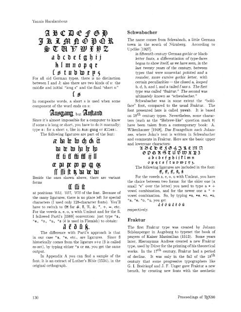
klmnopqr<br />
Ls twbbrp~<br />
For all old <strong>German</strong> types. there is no distinction<br />
between I <strong>and</strong> J; also there are two kinds of s: the<br />
middle <strong>and</strong> initial "long s" <strong>and</strong> the final "short s:"<br />
L s<br />
In composite words, a short s is used when some<br />
component of the word ends on s:<br />
Since it's almost impossible for a computer to know<br />
if some s is long or short, you have to do it manually;<br />
type s : for a short s, like in Aus: gang or Alles :.<br />
The following ligatures are part of the font:<br />
~PpePJ@QlgJ<br />
Rfliftf kbthr<br />
Beside the ones shown above, there are variant<br />
forms<br />
at positions '052, '057, '075 of the font. Because of<br />
the many ligatures. there is no place left for special<br />
characters (I used only 128-character fonts). You'll<br />
have to switch to CM for #, $, %, &. *. +$, =. etc.<br />
For the vowels a, e, o, u with Umlaut <strong>and</strong> for the 8,<br />
I followed Partl's [I9881 convention: just type "a,<br />
"e, "0, "u, "s (e is used in Flemish) to obtain:<br />
diiifit.<br />
The difference with Partl's approach is that<br />
in our case "a, "e, etc.. are ligatures. Since 8<br />
historically comes from the ligature s+z (8 is called<br />
es-zet), by typing either "s or sz, you get the same<br />
output.<br />
In Appendix A you can find a sample of the<br />
font: it is an extract of Luther's Bible (1534), in the<br />
original orthograph.<br />
<strong>Schwabacher</strong><br />
The name comes from Schwabach, a little <strong>German</strong><br />
town in the south of Niirnberg. According to<br />
Updike [1927].<br />
in fifteenth century <strong>German</strong> gothic or black-<br />
letter fonts, a differentiation of type-faces<br />
began to show itself, as we have seen, in the<br />
last twenty years of the century, between<br />
types that were somewhat pointed <strong>and</strong> a<br />
rounder, more cursive gothic letter, with<br />
certain peculiarities - the closed a, looped<br />
b, dl h, <strong>and</strong> 1, <strong>and</strong> a tailed fans s. The first<br />
type was called "fraktur." The second was<br />
ultimately known as "schwabacher. "<br />
<strong>Schwabacher</strong> was in some extent the "bold-<br />
face" font, compared to the usual <strong>Fraktur</strong>. The<br />
font presented here is called yswab. It is based<br />
on lgth century types. Nevertheless, some charac-<br />
ters (such as the "Hebrew-like" question mark 2)<br />
have been taken from a contemporary book: A.<br />
Wikenhauser [1948], Das Evangelium nach Johan-<br />
nes. where John's text is written in <strong>Schwabacher</strong><br />
<strong>and</strong> comments in <strong>Fraktur</strong>. Here are the basic upper<br />
<strong>and</strong> lowercase characters:<br />
abcbefg@ijEImn<br />
opqre ftuvwrp3.<br />
The following ligatures are included in the font:<br />
ff, ffl IT1 121 f'J<br />
For the vowels a, e,o, u with Umlaut, you have<br />
the choice between two forms: for the older one (a<br />
small "en over the letter) you need to type a * +<br />
vowel combination, <strong>and</strong> for the newer one a " +<br />
vowel combination. So, by typing *a, *e, *o: *u:<br />
"a. "e, "0, "u, you get<br />
dt6uii20ii<br />
respectively.<br />
<strong>Fraktur</strong><br />
The first <strong>Fraktur</strong> type was created by Johann<br />
Schonsperger in Augsburg to typeset the book of<br />
prayers of Kaiser Maximilian (1513). Some years<br />
later, Hieronymus Andreae created a new <strong>Fraktur</strong><br />
type, used by Diirer for the printing of his theoretical<br />
works. In the 17th century, <strong>Fraktur</strong> had a period<br />
of decline. It was only in the fall of the lath<br />
century that some progressive typographers like<br />
G. I. Breitkopf <strong>and</strong> J. F. Unger gave <strong>Fraktur</strong> a new<br />
breath, by creating new fonts with the aesthetic<br />
Proceedings of W9O


