- Page 1 and 2:
Using Your Sybex Electronic Book To
- Page 3 and 4:
Associate Publisher: Richard Mills
- Page 5 and 6:
To my family
- Page 7 and 8:
Contents at a Glance Introduction.
- Page 9 and 10:
Introduction Welcome to .NET and Vi
- Page 11 and 12:
INTRODUCTION How About the Advanced
- Page 13 and 14:
INTRODUCTION browser. Web services
- Page 15 and 16:
Chapter 1 Getting Started with VB.N
- Page 17 and 18:
Figure 1.1 This is what you’ll se
- Page 19 and 20:
Figure 1.3 The integrated developme
- Page 21 and 22:
In the Properties window, also know
- Page 23 and 24:
THE INTEGRATED DEVELOPMENT ENVIRONM
- Page 25 and 26:
Figure 1.8 A simple application tha
- Page 27 and 28:
Listing 1.1: Processing a User-Supp
- Page 29 and 30:
Figure 1.10 Displaying options on a
- Page 31 and 32:
THE IDE COMPONENTS As you realize,
- Page 33 and 34:
Figure 1.13 Viewing the possible se
- Page 35 and 36:
THE IDE COMPONENTS Tools Menu This
- Page 37 and 38:
generated by the compiler, and you
- Page 39 and 40:
Controls expose methods, too, which
- Page 41 and 42:
a new application, place a Button c
- Page 43 and 44:
Listing 1.4: A Console Application
- Page 45 and 46:
Chapter 2 Visual Basic Projects The
- Page 47 and 48:
value. In effect, this is the essen
- Page 49 and 50:
BUILDING A LOAN CALCULATOR 2. Place
- Page 51 and 52:
Show Payment button won’t have an
- Page 53 and 54:
◆ The second argument is the dura
- Page 55 and 56:
BUILDING A LOAN CALCULATOR Exit Sub
- Page 57 and 58:
The Single data type can hold much
- Page 59 and 60:
aligned in many ways, so don’t wo
- Page 61 and 62:
Listing 2.4: The Clear Button Priva
- Page 63 and 64:
subroutine on a form on which the v
- Page 65 and 66:
The result variable will most likel
- Page 67 and 68:
clearDisplay = True End Sub Private
- Page 69 and 70:
VB6 programmers used the term error
- Page 71 and 72:
little early in the book to discuss
- Page 73 and 74:
TAKING THE LOANCALCULATOR TO THE WE
- Page 75 and 76:
Figure 2.9 Editing the Web form’s
- Page 77 and 78:
created and displayed. If the varia
- Page 79 and 80:
WORKING WITH MULTIPLE FORMS Working
- Page 81 and 82:
Applications designed for the Windo
- Page 83 and 84:
Figure 2.15 Adding a Setup and Depl
- Page 85 and 86:
The Manufacturer property will beco
- Page 87 and 88:
you’re ready to build an installe
- Page 89 and 90:
Verifying the Installation You alre
- Page 91 and 92:
Chapter 3 Visual Basic: The Languag
- Page 93 and 94:
Variables in VB.NET are more than j
- Page 95 and 96:
When you declare variables in your
- Page 97 and 98:
If you want to declare multiple var
- Page 99 and 100:
Table 3.1: Visual Basic Numeric Dat
- Page 101 and 102:
In a button’s Click event handler
- Page 103 and 104:
of the floating point, and it’s a
- Page 105 and 106:
and display the variable’s value:
- Page 107 and 108:
This listing will generate a NaN va
- Page 109 and 110:
Boolean operators operate on Boolea
- Page 111 and 112:
Char data type exposes interesting
- Page 113 and 114:
If the Strict option is on, you can
- Page 115 and 116:
Figure 3.1 Setting the Strict and E
- Page 117 and 118:
This is called late binding, and it
- Page 119 and 120:
subtle errors, and they avoid it. I
- Page 121 and 122:
When the Strict option is On, VB.NE
- Page 123 and 124:
To declare variables of this new ty
- Page 125 and 126:
{ use brush object to draw with } b
- Page 127 and 128:
numeric value, or click the Cancel
- Page 129 and 130:
variable without good reason. Varia
- Page 131 and 132:
they’re used by a couple of funct
- Page 133 and 134:
The name of the constant follows th
- Page 135 and 136:
salary, but even this data can be h
- Page 137 and 138:
The first element is names(0), and
- Page 139 and 140:
You can think of a three-dimensiona
- Page 141 and 142:
Note that the ReDim statement can
- Page 143 and 144:
VARIABLES AS OBJECTS the meantime,
- Page 145 and 146:
Notice that ToString is a method, n
- Page 147 and 148:
Formatting Dates To format dates, u
- Page 149 and 150:
If…Then…Else A variation of the
- Page 151 and 152:
The Select Case structure tests a s
- Page 153 and 154:
Loop Structures Loop structures all
- Page 155 and 156:
To execute a block of statements un
- Page 157 and 158:
While…End While The While…End W
- Page 159 and 160:
the code automatically as you edit.
- Page 161:
SUMMARY Summary It’s been a long
- Page 164 and 165:
152 Chapter 4 WRITING AND USING PRO
- Page 166 and 167:
154 Chapter 4 WRITING AND USING PRO
- Page 168 and 169:
156 Chapter 4 WRITING AND USING PRO
- Page 170 and 171:
158 Chapter 4 WRITING AND USING PRO
- Page 172 and 173:
160 Chapter 4 WRITING AND USING PRO
- Page 174 and 175:
162 Chapter 4 WRITING AND USING PRO
- Page 176 and 177:
164 Chapter 4 WRITING AND USING PRO
- Page 178 and 179:
166 Chapter 4 WRITING AND USING PRO
- Page 180 and 181:
168 Chapter 4 WRITING AND USING PRO
- Page 182 and 183:
170 Chapter 4 WRITING AND USING PRO
- Page 184 and 185:
172 Chapter 4 WRITING AND USING PRO
- Page 186 and 187:
174 Chapter 4 WRITING AND USING PRO
- Page 188 and 189:
176 Chapter 4 WRITING AND USING PRO
- Page 190 and 191:
178 Chapter 4 WRITING AND USING PRO
- Page 192 and 193:
180 Chapter 4 WRITING AND USING PRO
- Page 194 and 195:
182 Chapter 4 WRITING AND USING PRO
- Page 197 and 198:
Chapter 5 Working with Forms In Vis
- Page 199 and 200:
Clicking the icon on the left end o
- Page 201 and 202:
AutoScrollMinSize This property let
- Page 203 and 204:
Or, you can set the width and heigh
- Page 205 and 206:
“Building Dynamic Forms at Runtim
- Page 207 and 208:
Figure 5.4 A simple data-entry scre
- Page 209 and 210:
compares the key pressed to the F10
- Page 211 and 212:
Figure 5.5 The settings of the Anch
- Page 213 and 214:
Figure 5.8 Filling a form with two
- Page 215 and 216:
Figure 5.10 An elaborate form with
- Page 217 and 218:
There’s a better approach to impo
- Page 219 and 220:
As mentioned earlier, the Paint eve
- Page 221 and 222:
Figure 5.12 In the Properties windo
- Page 223 and 224:
Another technique for exposing the
- Page 225 and 226:
Here, PasswordForm is the name of t
- Page 227 and 228:
Listing 5.5: Prompting the User for
- Page 229 and 230:
MsgBox(MainForm.strProperty, MsgBox
- Page 231 and 232:
The DLG variable is declared on the
- Page 233 and 234:
Table 5.6: The Captions and Names o
- Page 235 and 236:
Programming Menu Commands Menu comm
- Page 237 and 238:
DESIGNING MENUS Using Access and Sh
- Page 239 and 240:
Table 5.7: LongMenu Command Structu
- Page 241 and 242:
Listing 5.11: Programming Dynamic M
- Page 243 and 244:
The code behind the Map Menu button
- Page 245 and 246:
ttn.Text = “New Button” bttn.Le
- Page 247 and 248:
control type. The following stateme
- Page 249 and 250:
Next Else For i = Me.Controls.Count
- Page 251 and 252:
Creating Event Handlers at Runtime
- Page 253 and 254:
Chapter 6 Basic Windows Controls In
- Page 255 and 256:
THE TEXTBOX CONTROL Basic Propertie
- Page 257 and 258:
THE TEXTBOX CONTROL The AcceptsTab
- Page 259 and 260:
Listing 6.1: Locating a String in a
- Page 261 and 262:
SelectedText property. To convert t
- Page 263 and 264:
THE TEXTBOX CONTROL Undoing Edits A
- Page 265 and 266:
Table 6.1: The Menu of the TextPad
- Page 267 and 268:
The Process and Customize Menus The
- Page 269 and 270:
the control to be shared. In our ca
- Page 271 and 272:
The code of the Find Again button i
- Page 273 and 274:
some custom preprocessing of the da
- Page 275 and 276:
With a little additional effort, yo
- Page 277 and 278:
Items The Items property is a colle
- Page 279 and 280:
Each member of the Items collection
- Page 281 and 282:
where item is the object to be adde
- Page 283 and 284:
Figure 6.7 ListDemo demonstrates mo
- Page 285 and 286:
The second arrow button transfers i
- Page 287 and 288:
If you search for “SAC”, for ex
- Page 289 and 290:
There’s one aspect worth mentioni
- Page 291 and 292:
You can also add new items at runti
- Page 293 and 294:
VB.NET at Work: The Colors Project
- Page 295 and 296:
Listing 6.17: Programming the Scrol
- Page 297 and 298:
The Label controls below the tick m
- Page 299:
Listing 6.19: SelectionChanged Even
- Page 302 and 303:
290 Chapter 7 MORE WINDOWS CONTROLS
- Page 304 and 305:
292 Chapter 7 MORE WINDOWS CONTROLS
- Page 306 and 307:
294 Chapter 7 MORE WINDOWS CONTROLS
- Page 308 and 309:
296 Chapter 7 MORE WINDOWS CONTROLS
- Page 310 and 311:
298 Chapter 7 MORE WINDOWS CONTROLS
- Page 312 and 313:
300 Chapter 7 MORE WINDOWS CONTROLS
- Page 314 and 315:
302 Chapter 7 MORE WINDOWS CONTROLS
- Page 316 and 317:
304 Chapter 7 MORE WINDOWS CONTROLS
- Page 318 and 319:
306 Chapter 7 MORE WINDOWS CONTROLS
- Page 320 and 321:
308 Chapter 7 MORE WINDOWS CONTROLS
- Page 322 and 323:
310 Chapter 7 MORE WINDOWS CONTROLS
- Page 324 and 325:
312 Chapter 7 MORE WINDOWS CONTROLS
- Page 326 and 327:
314 Chapter 7 MORE WINDOWS CONTROLS
- Page 328 and 329:
316 Chapter 7 MORE WINDOWS CONTROLS
- Page 330 and 331:
318 Chapter 7 MORE WINDOWS CONTROLS
- Page 332 and 333:
320 Chapter 7 MORE WINDOWS CONTROLS
- Page 334 and 335:
322 Chapter 7 MORE WINDOWS CONTROLS
- Page 336 and 337:
324 Chapter 7 MORE WINDOWS CONTROLS
- Page 338 and 339:
326 Chapter 7 MORE WINDOWS CONTROLS
- Page 340 and 341:
Chapter 8 Building Custom Classes C
- Page 342 and 343:
BUILDING THE MINIMAL CLASS you must
- Page 344 and 345:
The following lines will be printed
- Page 346 and 347:
Every time you create a new variabl
- Page 348 and 349:
Throw AgeException Else tAge = Valu
- Page 350 and 351:
Now we must do something about the
- Page 352 and 353:
The last two statements will print
- Page 354 and 355:
Note Note that the custom Equals me
- Page 356 and 357:
First, you must change the type of
- Page 358 and 359:
provide a handler for the event, th
- Page 360 and 361:
After this declaration, the TimerOb
- Page 362 and 363:
done is out of the question, so thi
- Page 364 and 365:
When an application initiates an op
- Page 366 and 367:
class’s type. If the class has al
- Page 368 and 369:
Note You can use the Split method o
- Page 370 and 371:
strNum = strNum & “ And “ & For
- Page 372 and 373:
openFileDialog1.ShowDialog() Consol
- Page 374 and 375:
Get ContactName = _contactName End
- Page 376 and 377:
method, so we must provide our own
- Page 378 and 379:
contact.EMail = txtEMail.Text conta
- Page 380 and 381:
So, how can we update a class that
- Page 382 and 383:
Original List After Elimination of
- Page 384 and 385:
Polymorphism This is another powerf
- Page 386 and 387:
If there are properties common to a
- Page 388 and 389:
Testing the Shape Class To test the
- Page 390 and 391:
Let’s start with the Triangle cla
- Page 392 and 393:
the month that was passed to the me
- Page 394 and 395:
WHO CAN INHERIT WHAT? Derived Class
- Page 396 and 397:
Get Property2 = “Original Propert
- Page 398 and 399:
Is it reasonable for a method of th
- Page 400 and 401:
The result of a matrix operation is
- Page 402 and 403:
Chapter 9 Building Custom Windows C
- Page 404 and 405:
ENHANCING EXISTING CONTROLS Designe
- Page 406 and 407:
Then save the project by selecting
- Page 408 and 409:
add some visual indication when a m
- Page 410 and 411:
Figure 9.3 The custom properties of
- Page 412 and 413:
Building Compound Controls A compou
- Page 414 and 415:
You can also specify a color value
- Page 416 and 417:
Building User-Drawn Controls This i
- Page 418 and 419:
Table 9.2: The Settings of the Effe
- Page 420 and 421:
The current settings of the two pro
- Page 422 and 423:
This subroutine calls for a few exp
- Page 424 and 425:
The Changed Events The UserControl
- Page 426 and 427:
Then, declare the following event i
- Page 428 and 429:
Listing 9.12: Setting Up the Two Al
- Page 430 and 431:
The procedures for implementing the
- Page 432 and 433:
The code also compares the current
- Page 434 and 435:
Listing 9.19: The RoundButton Contr
- Page 436 and 437:
ackground of each item, draw the te
- Page 438 and 439:
technique—for example, you can pl
- Page 440 and 441:
To test the enhanced ListBox contro
- Page 442 and 443:
Listing 9.25: Navigating to a URL w
- Page 444 and 445:
Chapter 10 Automating Microsoft Off
- Page 446 and 447:
The New keyword tells VB to create
- Page 448 and 449:
Objects That Represent Text The mos
- Page 450 and 451:
As with the Print method, the argum
- Page 452 and 453:
You can then apply the Range object
- Page 454 and 455:
of the members of the WDSelectionTy
- Page 456 and 457:
.Font.Size = WordApp.Selection.Font
- Page 458 and 459:
MsgBox(“The document contains “
- Page 460 and 461:
upon Word’s spell-checking routin
- Page 462 and 463:
Dim SpellCollection As Word.Proofre
- Page 464 and 465:
ListBox2.Items.Add(ListBox1.Items(w
- Page 466 and 467:
To access an individual worksheet,
- Page 468 and 469:
The Clear method resets all the cel
- Page 470 and 471:
Listing 10.9: Preparing a New Sprea
- Page 472 and 473:
Figure 10.5 This spreadsheet was cr
- Page 474 and 475:
to the cell, and if you read back t
- Page 476 and 477:
Figure 10.6 The properties of the C
- Page 478 and 479:
For cnt = 1 To allContacts.Items.Co
- Page 480 and 481:
Figure 10.8 Demonstrating how to re
- Page 482 and 483:
In the Messages project, you use th
- Page 484 and 485:
the case for users with a small num
- Page 486 and 487:
newNode = parentNode.Nodes.Add(subF
- Page 488 and 489:
Part III Basic Framework Classes In
- Page 490 and 491:
480 Chapter 11 STORING DATA IN COLL
- Page 492 and 493:
482 Chapter 11 STORING DATA IN COLL
- Page 494 and 495:
484 Chapter 11 STORING DATA IN COLL
- Page 496 and 497:
486 Chapter 11 STORING DATA IN COLL
- Page 498 and 499:
488 Chapter 11 STORING DATA IN COLL
- Page 500 and 501:
490 Chapter 11 STORING DATA IN COLL
- Page 502 and 503:
492 Chapter 11 STORING DATA IN COLL
- Page 504 and 505:
494 Chapter 11 STORING DATA IN COLL
- Page 506 and 507:
496 Chapter 11 STORING DATA IN COLL
- Page 508 and 509:
498 Chapter 11 STORING DATA IN COLL
- Page 510 and 511:
500 Chapter 11 STORING DATA IN COLL
- Page 512 and 513:
502 Chapter 11 STORING DATA IN COLL
- Page 514 and 515:
504 Chapter 11 STORING DATA IN COLL
- Page 516 and 517:
506 Chapter 11 STORING DATA IN COLL
- Page 518 and 519:
508 Chapter 11 STORING DATA IN COLL
- Page 520 and 521:
510 Chapter 11 STORING DATA IN COLL
- Page 522 and 523:
512 Chapter 11 STORING DATA IN COLL
- Page 524 and 525:
514 Chapter 11 STORING DATA IN COLL
- Page 526 and 527:
516 Chapter 11 STORING DATA IN COLL
- Page 528 and 529:
518 Chapter 11 STORING DATA IN COLL
- Page 530 and 531:
520 Chapter 11 STORING DATA IN COLL
- Page 532 and 533:
522 Chapter 11 STORING DATA IN COLL
- Page 534 and 535:
524 Chapter 11 STORING DATA IN COLL
- Page 536 and 537:
526 Chapter 11 STORING DATA IN COLL
- Page 538 and 539:
528 Chapter 11 STORING DATA IN COLL
- Page 540 and 541:
530 Chapter 12 HANDLING STRINGS, CH
- Page 542 and 543:
532 Chapter 12 HANDLING STRINGS, CH
- Page 544 and 545:
534 Chapter 12 HANDLING STRINGS, CH
- Page 546 and 547:
536 Chapter 12 HANDLING STRINGS, CH
- Page 548 and 549:
538 Chapter 12 HANDLING STRINGS, CH
- Page 550 and 551:
540 Chapter 12 HANDLING STRINGS, CH
- Page 552 and 553:
542 Chapter 12 HANDLING STRINGS, CH
- Page 554 and 555:
544 Chapter 12 HANDLING STRINGS, CH
- Page 556 and 557:
546 Chapter 12 HANDLING STRINGS, CH
- Page 558 and 559:
548 Chapter 12 HANDLING STRINGS, CH
- Page 560 and 561:
550 Chapter 12 HANDLING STRINGS, CH
- Page 562 and 563:
552 Chapter 12 HANDLING STRINGS, CH
- Page 564 and 565:
554 Chapter 12 HANDLING STRINGS, CH
- Page 566 and 567:
556 Chapter 12 HANDLING STRINGS, CH
- Page 568 and 569:
558 Chapter 12 HANDLING STRINGS, CH
- Page 570 and 571:
560 Chapter 12 HANDLING STRINGS, CH
- Page 572 and 573:
562 Chapter 12 HANDLING STRINGS, CH
- Page 574 and 575:
564 Chapter 12 HANDLING STRINGS, CH
- Page 576 and 577:
566 Chapter 12 HANDLING STRINGS, CH
- Page 578 and 579:
568 Chapter 12 HANDLING STRINGS, CH
- Page 580 and 581:
570 Chapter 13 WORKING WITH FOLDERS
- Page 582 and 583:
572 Chapter 13 WORKING WITH FOLDERS
- Page 584 and 585:
574 Chapter 13 WORKING WITH FOLDERS
- Page 586 and 587:
576 Chapter 13 WORKING WITH FOLDERS
- Page 588 and 589:
578 Chapter 13 WORKING WITH FOLDERS
- Page 590 and 591:
580 Chapter 13 WORKING WITH FOLDERS
- Page 592 and 593:
582 Chapter 13 WORKING WITH FOLDERS
- Page 594 and 595:
584 Chapter 13 WORKING WITH FOLDERS
- Page 596 and 597:
586 Chapter 13 WORKING WITH FOLDERS
- Page 598 and 599:
588 Chapter 13 WORKING WITH FOLDERS
- Page 600 and 601:
590 Chapter 13 WORKING WITH FOLDERS
- Page 602 and 603:
592 Chapter 13 WORKING WITH FOLDERS
- Page 604 and 605:
594 Chapter 13 WORKING WITH FOLDERS
- Page 606 and 607:
596 Chapter 13 WORKING WITH FOLDERS
- Page 608 and 609:
598 Chapter 13 WORKING WITH FOLDERS
- Page 610 and 611:
600 Chapter 13 WORKING WITH FOLDERS
- Page 612 and 613:
602 Chapter 13 WORKING WITH FOLDERS
- Page 614 and 615:
604 Chapter 13 WORKING WITH FOLDERS
- Page 616 and 617:
606 Chapter 13 WORKING WITH FOLDERS
- Page 618 and 619:
608 Chapter 13 WORKING WITH FOLDERS
- Page 620 and 621:
610 Chapter 13 WORKING WITH FOLDERS
- Page 622 and 623:
612 Chapter 13 WORKING WITH FOLDERS
- Page 624 and 625:
614 Chapter 13 WORKING WITH FOLDERS
- Page 627 and 628:
Part IV Intermediate Programming In
- Page 629 and 630:
620 Chapter 14 DRAWING AND PAINTING
- Page 631 and 632:
622 Chapter 14 DRAWING AND PAINTING
- Page 633 and 634:
624 Chapter 14 DRAWING AND PAINTING
- Page 635 and 636:
626 Chapter 14 DRAWING AND PAINTING
- Page 637 and 638:
628 Chapter 14 DRAWING AND PAINTING
- Page 639 and 640:
630 Chapter 14 DRAWING AND PAINTING
- Page 641 and 642:
632 Chapter 14 DRAWING AND PAINTING
- Page 643 and 644:
634 Chapter 14 DRAWING AND PAINTING
- Page 645 and 646:
636 Chapter 14 DRAWING AND PAINTING
- Page 647 and 648:
638 Chapter 14 DRAWING AND PAINTING
- Page 649 and 650:
640 Chapter 14 DRAWING AND PAINTING
- Page 651 and 652:
642 Chapter 14 DRAWING AND PAINTING
- Page 653 and 654:
644 Chapter 14 DRAWING AND PAINTING
- Page 655 and 656:
646 Chapter 14 DRAWING AND PAINTING
- Page 657 and 658:
648 Chapter 14 DRAWING AND PAINTING
- Page 659 and 660:
650 Chapter 14 DRAWING AND PAINTING
- Page 661 and 662:
652 Chapter 14 DRAWING AND PAINTING
- Page 663 and 664:
654 Chapter 14 DRAWING AND PAINTING
- Page 665 and 666:
656 Chapter 14 DRAWING AND PAINTING
- Page 667 and 668:
658 Chapter 14 DRAWING AND PAINTING
- Page 669 and 670:
660 Chapter 14 DRAWING AND PAINTING
- Page 671 and 672:
662 Chapter 14 DRAWING AND PAINTING
- Page 673 and 674:
664 Chapter 14 DRAWING AND PAINTING
- Page 675 and 676:
666 Chapter 14 DRAWING AND PAINTING
- Page 677 and 678:
668 Chapter 14 DRAWING AND PAINTING
- Page 679 and 680:
670 Chapter 14 DRAWING AND PAINTING
- Page 681 and 682:
672 Chapter 14 DRAWING AND PAINTING
- Page 683 and 684:
674 Chapter 14 DRAWING AND PAINTING
- Page 685 and 686:
676 Chapter 14 DRAWING AND PAINTING
- Page 687 and 688:
678 Chapter 14 DRAWING AND PAINTING
- Page 689 and 690:
680 Chapter 14 DRAWING AND PAINTING
- Page 691 and 692:
682 Chapter 14 DRAWING AND PAINTING
- Page 693 and 694:
684 Chapter 14 DRAWING AND PAINTING
- Page 695 and 696:
686 Chapter 14 DRAWING AND PAINTING
- Page 697 and 698:
688 Chapter 14 DRAWING AND PAINTING
- Page 699 and 700:
690 Chapter 14 DRAWING AND PAINTING
- Page 701 and 702:
692 Chapter 14 DRAWING AND PAINTING
- Page 703 and 704:
694 Chapter 14 DRAWING AND PAINTING
- Page 705 and 706:
696 Chapter 14 DRAWING AND PAINTING
- Page 708 and 709:
Chapter 15 Printing with VB.NET The
- Page 710 and 711:
This is same object we used in the
- Page 712 and 713:
dialog box was discussed in Chapter
- Page 714 and 715:
PrintPreviewDialog This is another
- Page 716 and 717:
The PrinterSettings object is a pro
- Page 718 and 719:
These statements will produce outpu
- Page 720 and 721:
e.Graphics object represents the dr
- Page 722 and 723:
VB.NET at Work: The PageSettings Pr
- Page 724 and 725:
e.Graphics.TranslateTransform(X, Y)
- Page 726 and 727: X = (LMargin - strHeight) / 2 Y = T
- Page 728 and 729: e.Graphics.ResetTransform() e.Graph
- Page 730 and 731: each row depends on the height of t
- Page 732 and 733: a line for each author. The followi
- Page 734 and 735: W1 = X2 - X1 W2 = X3 - X2 W3 = page
- Page 736 and 737: VB.NET at Work: The PrintText Proje
- Page 738 and 739: start a new line with the last word
- Page 740 and 741: on the previous page. This method i
- Page 742 and 743: ectangle as possible, even if the l
- Page 744 and 745: End If If PictHeight < .Height Then
- Page 746 and 747: Listing 15.14: Printing a Simple Do
- Page 748 and 749: SUMMARY Summary Printing is a major
- Page 750 and 751: 742 Chapter 16 THE TREEVIEW AND LIS
- Page 752 and 753: 744 Chapter 16 THE TREEVIEW AND LIS
- Page 754 and 755: 746 Chapter 16 THE TREEVIEW AND LIS
- Page 756 and 757: 748 Chapter 16 THE TREEVIEW AND LIS
- Page 758 and 759: 750 Chapter 16 THE TREEVIEW AND LIS
- Page 760 and 761: 752 Chapter 16 THE TREEVIEW AND LIS
- Page 762 and 763: 754 Chapter 16 THE TREEVIEW AND LIS
- Page 764 and 765: 756 Chapter 16 THE TREEVIEW AND LIS
- Page 766 and 767: 758 Chapter 16 THE TREEVIEW AND LIS
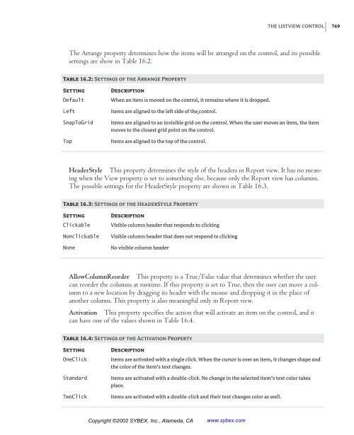
- Page 768 and 769: 760 Chapter 16 THE TREEVIEW AND LIS
- Page 770 and 771: 762 Chapter 16 THE TREEVIEW AND LIS
- Page 772 and 773: 764 Chapter 16 THE TREEVIEW AND LIS
- Page 774 and 775: 766 Chapter 16 THE TREEVIEW AND LIS
- Page 778 and 779: 770 Chapter 16 THE TREEVIEW AND LIS
- Page 780 and 781: 772 Chapter 16 THE TREEVIEW AND LIS
- Page 782 and 783: 774 Chapter 16 THE TREEVIEW AND LIS
- Page 784 and 785: 776 Chapter 16 THE TREEVIEW AND LIS
- Page 786 and 787: 778 Chapter 16 THE TREEVIEW AND LIS
- Page 788 and 789: 780 Chapter 16 THE TREEVIEW AND LIS
- Page 790 and 791: 782 Chapter 16 THE TREEVIEW AND LIS
- Page 792 and 793: 784 Chapter 16 THE TREEVIEW AND LIS
- Page 794 and 795: 786 Chapter 16 THE TREEVIEW AND LIS
- Page 796 and 797: 788 Chapter 16 THE TREEVIEW AND LIS
- Page 798 and 799: Chapter 17 Error Handling and Debug
- Page 800 and 801: Figure 17.3 Once declared, the vari
- Page 802 and 803: the manager of the department calls
- Page 804 and 805: Studying an Exception The exception
- Page 806 and 807: exception is generated, so it’s d
- Page 808 and 809: Listing 17.7: Handling an Exception
- Page 810 and 811: This code is taken from a ProgressB
- Page 812 and 813: The figure displays the first of th
- Page 814 and 815: We’ve seen that error before—it
- Page 816 and 817: SUMMARY Note There are many more ad
- Page 818 and 819: 812 Chapter 18 RECURSIVE PROGRAMMIN
- Page 820 and 821: 814 Chapter 18 RECURSIVE PROGRAMMIN
- Page 822 and 823: 816 Chapter 18 RECURSIVE PROGRAMMIN
- Page 824 and 825: 818 Chapter 18 RECURSIVE PROGRAMMIN
- Page 826 and 827:
820 Chapter 18 RECURSIVE PROGRAMMIN
- Page 828 and 829:
822 Chapter 18 RECURSIVE PROGRAMMIN
- Page 830 and 831:
824 Chapter 18 RECURSIVE PROGRAMMIN
- Page 832 and 833:
826 Chapter 18 RECURSIVE PROGRAMMIN
- Page 834 and 835:
828 Chapter 18 RECURSIVE PROGRAMMIN
- Page 836 and 837:
830 Chapter 18 RECURSIVE PROGRAMMIN
- Page 838 and 839:
832 Chapter 18 RECURSIVE PROGRAMMIN
- Page 840 and 841:
834 Chapter 18 RECURSIVE PROGRAMMIN
- Page 843 and 844:
Chapter 19 The Multiple Document In
- Page 845 and 846:
MDI APPLICATIONS: THE BASICS of the
- Page 847 and 848:
New command. Before we can open a c
- Page 849 and 850:
The other four options of the Windo
- Page 851 and 852:
and ends with a separator. The top
- Page 853 and 854:
Figure 19.5 The parent menu (top le
- Page 855 and 856:
To access the contents of a TextBox
- Page 857 and 858:
Programming the New Command The New
- Page 859 and 860:
Listing 19.6: The Save Command Priv
- Page 861 and 862:
If Me.ActiveMdiChild Is Nothing The
- Page 863 and 864:
ttnFindNext.Enabled = True bttnRepl
- Page 865 and 866:
may have to maintain a list of True
- Page 867 and 868:
2. Rename the form to MDIImage and
- Page 869 and 870:
The code resizes the PictureBox con
- Page 871:
SUMMARY Summary In this, the last c
- Page 874 and 875:
Chapter 20 Databases: Architecture
- Page 876 and 877:
how to extract data from your datab
- Page 878 and 879:
Suppliers Table Each product has a
- Page 880 and 881:
WHAT IS A DATABASE? Exploring the P
- Page 882 and 883:
WHAT IS A DATABASE? is the foreign
- Page 884 and 885:
(basically, the driver you’ll use
- Page 886 and 887:
Figure 20.7 Editing the Customers t
- Page 888 and 889:
THE SERVER EXPLORER in the U.S., yo
- Page 890 and 891:
THE SERVER EXPLORER Enforce relatio
- Page 892 and 893:
THE SERVER EXPLORER Indexes/Keys Ta
- Page 894 and 895:
To make a constraint part of the da
- Page 896 and 897:
Alternatively, you can prefix the S
- Page 898 and 899:
the WHERE clause to specify how the
- Page 900 and 901:
names from the Customers table, you
- Page 902 and 903:
This statement will calculate the s
- Page 904 and 905:
FROM [Order Details] WHERE ProductI
- Page 906 and 907:
You can retrieve the same rows usin
- Page 908 and 909:
Limiting Groups with HAVING The HAV
- Page 910 and 911:
If you want to specify values for a
- Page 912 and 913:
operations, instead of typing compl
- Page 914 and 915:
If you paste this statement in the
- Page 916 and 917:
field in the Orders table. A new li
- Page 918 and 919:
dbo.Products.ProductID = dbo.[Order
- Page 920 and 921:
TitleAuthor, and Authors. Then chec
- Page 922 and 923:
This time the Query Builder will ge
- Page 924 and 925:
The first statement alters the proc
- Page 926 and 927:
Select all the text on the editor a
- Page 928 and 929:
it would be replaced by the second
- Page 930 and 931:
Chapter 21 Building Database Applic
- Page 932 and 933:
THE ARCHITECTURE OF ADO.NET the mod
- Page 934 and 935:
The first object, SqlConnection1, i
- Page 936 and 937:
Figure 21.2 To generate a DataSet,
- Page 938 and 939:
The first statement clears the curr
- Page 940 and 941:
to the parent table, select another
- Page 942 and 943:
CREATING A DATASET By default, the
- Page 944 and 945:
on the Data Adapter Configuration W
- Page 946 and 947:
Listing 21.1: Populating a DataSet
- Page 948 and 949:
and the Tag property to the table
- Page 950 and 951:
The PositionChanged() subroutine di
- Page 952 and 953:
and rename it to LookupCustomers. T
- Page 954 and 955:
DataSet. You can select a few field
- Page 956 and 957:
Listing 21.8: Navigating via the Li
- Page 958 and 959:
PROGRAMMING THE DATAADAPTER OBJECT
- Page 960 and 961:
Listing 21.9: Selecting Customer’
- Page 962 and 963:
THE COMMAND AND DATAREADER OBJECTS
- Page 964 and 965:
at all, and it’s certainly more e
- Page 966:
While SQLReader.Read txtOrders.Text
- Page 969 and 970:
964 Chapter 22 PROGRAMMING THE ADO.
- Page 971 and 972:
966 Chapter 22 PROGRAMMING THE ADO.
- Page 973 and 974:
968 Chapter 22 PROGRAMMING THE ADO.
- Page 975 and 976:
970 Chapter 22 PROGRAMMING THE ADO.
- Page 977 and 978:
972 Chapter 22 PROGRAMMING THE ADO.
- Page 979 and 980:
974 Chapter 22 PROGRAMMING THE ADO.
- Page 981 and 982:
976 Chapter 22 PROGRAMMING THE ADO.
- Page 983 and 984:
978 Chapter 22 PROGRAMMING THE ADO.
- Page 985 and 986:
980 Chapter 22 PROGRAMMING THE ADO.
- Page 987 and 988:
982 Chapter 22 PROGRAMMING THE ADO.
- Page 989 and 990:
984 Chapter 22 PROGRAMMING THE ADO.
- Page 991 and 992:
986 Chapter 22 PROGRAMMING THE ADO.
- Page 993 and 994:
988 Chapter 22 PROGRAMMING THE ADO.
- Page 995 and 996:
990 Chapter 22 PROGRAMMING THE ADO.
- Page 997 and 998:
992 Chapter 22 PROGRAMMING THE ADO.
- Page 999 and 1000:
994 Chapter 22 PROGRAMMING THE ADO.
- Page 1001 and 1002:
VB.NET on the Web Part VI In this s
- Page 1003 and 1004:
1000 Chapter 23 INTRODUCTION TO WEB
- Page 1005 and 1006:
1002 Chapter 23 INTRODUCTION TO WEB
- Page 1007 and 1008:
1004 Chapter 23 INTRODUCTION TO WEB
- Page 1009 and 1010:
1006 Chapter 23 INTRODUCTION TO WEB
- Page 1011 and 1012:
1008 Chapter 23 INTRODUCTION TO WEB
- Page 1013 and 1014:
1010 Chapter 23 INTRODUCTION TO WEB
- Page 1015 and 1016:
1012 Chapter 23 INTRODUCTION TO WEB
- Page 1017 and 1018:
1014 Chapter 23 INTRODUCTION TO WEB
- Page 1019 and 1020:
1016 Chapter 23 INTRODUCTION TO WEB
- Page 1021 and 1022:
1018 Chapter 23 INTRODUCTION TO WEB
- Page 1023 and 1024:
1020 Chapter 23 INTRODUCTION TO WEB
- Page 1025 and 1026:
1022 Chapter 23 INTRODUCTION TO WEB
- Page 1027 and 1028:
1024 Chapter 23 INTRODUCTION TO WEB
- Page 1029 and 1030:
1026 Chapter 23 INTRODUCTION TO WEB
- Page 1031 and 1032:
1028 Chapter 23 INTRODUCTION TO WEB
- Page 1033 and 1034:
1030 Chapter 23 INTRODUCTION TO WEB
- Page 1035 and 1036:
1032 Chapter 23 INTRODUCTION TO WEB
- Page 1037 and 1038:
1034 Chapter 23 INTRODUCTION TO WEB
- Page 1039 and 1040:
1036 Chapter 23 INTRODUCTION TO WEB
- Page 1041 and 1042:
1038 Chapter 23 INTRODUCTION TO WEB
- Page 1043 and 1044:
1040 Chapter 23 INTRODUCTION TO WEB
- Page 1045 and 1046:
1042 Chapter 23 INTRODUCTION TO WEB
- Page 1047 and 1048:
1044 Chapter 23 INTRODUCTION TO WEB
- Page 1049 and 1050:
1046 Chapter 23 INTRODUCTION TO WEB
- Page 1051 and 1052:
1048 Chapter 24 ACCESSING DATA ON T
- Page 1053 and 1054:
1050 Chapter 24 ACCESSING DATA ON T
- Page 1055 and 1056:
1052 Chapter 24 ACCESSING DATA ON T
- Page 1057 and 1058:
1054 Chapter 24 ACCESSING DATA ON T
- Page 1059 and 1060:
1056 Chapter 24 ACCESSING DATA ON T
- Page 1061 and 1062:
1058 Chapter 24 ACCESSING DATA ON T
- Page 1063 and 1064:
1060 Chapter 24 ACCESSING DATA ON T
- Page 1065 and 1066:
1062 Chapter 24 ACCESSING DATA ON T
- Page 1067 and 1068:
1064 Chapter 24 ACCESSING DATA ON T
- Page 1069 and 1070:
1066 Chapter 24 ACCESSING DATA ON T
- Page 1071 and 1072:
1068 Chapter 24 ACCESSING DATA ON T
- Page 1073 and 1074:
1070 Chapter 24 ACCESSING DATA ON T
- Page 1075 and 1076:
1072 Chapter 24 ACCESSING DATA ON T
- Page 1077 and 1078:
1074 Chapter 24 ACCESSING DATA ON T
- Page 1079 and 1080:
1076 Chapter 24 ACCESSING DATA ON T
- Page 1081 and 1082:
1078 Chapter 24 ACCESSING DATA ON T
- Page 1083 and 1084:
1080 Chapter 24 ACCESSING DATA ON T
- Page 1085 and 1086:
Chapter 25 XML Web Services The las
- Page 1087 and 1088:
Building a Web Service In all previ
- Page 1089 and 1090:
The two methods are hyperlinks. Cli
- Page 1091 and 1092:
As you can see, each Web service is
- Page 1093 and 1094:
that appears (Figure 25.5), enter t
- Page 1095 and 1096:
original error message is embedded
- Page 1097 and 1098:
This is a good point to change the
- Page 1099 and 1100:
Figure 25.11 Binding a DataGrid Web


 Change language