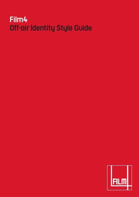
Film4 Off-air Identity Style Guide - Channel 4
Film4 Off-air Identity Style Guide - Channel 4
Film4 Off-air Identity Style Guide - Channel 4

You also want an ePaper? Increase the reach of your titles
YUMPU automatically turns print PDFs into web optimized ePapers that Google loves.
<strong>Film4</strong><br />
<strong>Off</strong>-<strong>air</strong> <strong>Identity</strong> <strong>Style</strong> <strong>Guide</strong>
<strong>Film4</strong> style guide contents<br />
1. On-<strong>air</strong> identity style guide<br />
2. <strong>Off</strong>-<strong>air</strong> identity style guide<br />
2.1.1 The Logo<br />
2.1.2 Logo keyline<br />
2.1.3 Logo position<br />
2.1.4 Isolation area<br />
2.1.5 Logo misuse<br />
2.1.6 Colour<br />
2.1.7 Billing block alternative logo<br />
2.1.8 Typography<br />
2.1.9 <strong>Film4</strong> font<br />
2.1.10 Size<br />
2.1.11 Headline colour<br />
2.2 Print and Poster Advertising<br />
2.2.1 Writing copy<br />
2.2.2 Writing numbers<br />
2.2.3 Advertising signature<br />
2.2.4 Logo position and size<br />
2.2.5 Typography<br />
2.2.6 Headline type position
2. <strong>Film4</strong> <strong>Off</strong>-<strong>air</strong> style guidelines<br />
The term off-<strong>air</strong> defines anything<br />
that is produced by <strong>Film4</strong> not<br />
shown on television/DVD/cinema.<br />
The first section of the guidelines<br />
describes the broad principles of<br />
the off-<strong>air</strong> identity.<br />
The subsequent sections describe<br />
in more detail how the brand is<br />
implemented in different areas.
2.1.1 The logo<br />
Where possible the <strong>Film4</strong> logo should<br />
always appear in Red but in situations<br />
where colour cannot be used it can<br />
appear as a mono in Black.<br />
The ‘Film’ and ‘4’ of the logo should<br />
always be white and can never be<br />
transparent.<br />
At no time can the logo appear in grey<br />
or as a tint of the red.<br />
Logo size<br />
The <strong>Film4</strong> logo has been designed to<br />
reproduce at a minimum height of 8mm.<br />
There is no maximum reproduction size.<br />
8mm
2.1.2 The logo Keyline<br />
The logo should always be used with<br />
a white keyline.<br />
The keyline weight cannot be altered<br />
from the logo provided and therefore<br />
should always be 33% (one third) of<br />
the line width of the white ‘4’.<br />
On a white background the keyline will<br />
become invisible.<br />
33%
2.1.3 The logo position<br />
Where possible, in print, the <strong>Film4</strong> logo<br />
should always appear in the bottom<br />
right-hand position of the page.<br />
It should be placed NO closer than<br />
10mm from the trimmed edge.
2.1.4 The logo Isolation logo<br />
The <strong>Film4</strong> logo should always be<br />
surrounded by a minimum 5mm area<br />
of space. The area is a minimum and<br />
should be increased wherever possible.<br />
The area of isolation ensures that<br />
text or other visual elements do not<br />
encroach on the logo.<br />
10mm
2.1.5 The logo misuse<br />
As a key representative of the brand,<br />
it is important that the appearance of<br />
the logo remains consistent. The logo<br />
should not be misinterpreted, modified<br />
or added to in any way.<br />
It must never be re-drawn or adjusted<br />
and should only be reproduced from<br />
the artwork provided.<br />
To illustrate this point some of the more<br />
likely mistakes are shown.<br />
Do not use the logo without the box Do not distort the logo<br />
Do not use without the keyline<br />
sponsored by<br />
Do not use a different red Do not outline the logo Do not place text on the logo<br />
Do not use grey Do not use a tint of the <strong>Film4</strong> red
2.1.6 Colour<br />
<strong>Film4</strong> uses red as its core colour and<br />
black if the logo must appear as mono.<br />
No other variants of red can be used<br />
for the logo.<br />
A warm grey can be used for design<br />
elements but should never be used<br />
for the logo.<br />
Pantone 186 C0 M100 Y90 K10 R163 G0 B0 Web 99 00 00<br />
Pantone Black 6 C98 M40 Y0 K100 R0 G0 B0 Web 00 00 00<br />
Pantone 5315 C0 M0 Y3 K10 R211 G210 B222 Web cc cc cc
2.1.7 Alternative logo – for Billing block only<br />
When used in a billing block the logo will<br />
have to appear extremely small. In this<br />
instance only, the alternative logo<br />
should be used to increase the legibility<br />
and presence of the mark.<br />
This version of the <strong>Film4</strong> logo must not<br />
be used in any other situation other<br />
than billing blocks.<br />
Both mono and 4 colour versions are<br />
supplied in positive and negative.
2.1.8 <strong>Film4</strong><br />
The ‘four’ in <strong>Film4</strong> should always be<br />
a numeral and both the word and letter<br />
must sit together without a letter break.<br />
Below is the correct title for the channel.<br />
Correct title<br />
<strong>Film4</strong><br />
Incorrect titles<br />
Film 4<br />
FilmFour
2.1.9 Typography<br />
A bespoke typeface has been designed<br />
to be used throughout the channel. It is<br />
called <strong>Film4</strong>.<br />
<strong>Film4</strong> is supplied in the Open Type<br />
Format and is therefore supported<br />
by pc and mac.<br />
<strong>Film4</strong> is a clean, modern font and has<br />
been supplied with the following weights<br />
for off-<strong>air</strong> use:<br />
<strong>Film4</strong><br />
abcdefghijklmnopqrstuvwxyzßæoeABCDEFGHIJKLMN<br />
OPQRSTUVWXYZÆOE&0123456789*#@+'"÷±%<br />
‰⁄?£$€ƒ¥¢,.:;...“”‘’«»‹›·‚„!?¿¡(/)[\]{|}®©TMÄÅÂÁÃÀ<br />
ÇÉÊËÈÍÎÏÌÑØÓÔÒÖÕÜÚÛÙŸáàâäãåçéèêëíìîïñøóòôöõ<br />
ùûüÿ†‡§ao¬•ı°`~^ˆ?•-–_<br />
<strong>Film4</strong> Bold<br />
abcdefghijklmnopqrstuvwxyzßæoeABCDEFGHIJKLMN<br />
OPQRSTUVWXYZÆOE&0123456789*#@+'"÷±%<br />
‰⁄?£$€ƒ¥¢,.:;...“”‘’«»‹›·‚„!?¿¡(/)[\]{|}®©TMÄÅÂÁÃÀ<br />
ÇÉÊËÈÍÎÏÌÑØÓÔÒÖÕÜÚÛÙŸáàâäãåçéèêëíìîïñøóòôöõ<br />
ùûüÿ†‡§ao¬•ı°`~^ˆ?•-–_
2.1.10 Typopgraphy<br />
Type should never appear below 5pt.<br />
There is no maximum limit to type size.<br />
Headlines should always be set using<br />
<strong>Film4</strong> Bold and always in caps.<br />
As they are to appear this way the leading<br />
for headlines should be determined by the<br />
following equation:<br />
leading = font size -5pt<br />
for example:<br />
font size = 70pt<br />
leading = 65pt<br />
Body copy set using <strong>Film4</strong>. It is 8pt type with 11pt<br />
leading. Being a condensed font the extra points in<br />
the leading helps its readability.<br />
Body copy should always be set using<br />
<strong>Film4</strong>. As this is a condensed font, body<br />
copy requires more leading and should<br />
be determined by the folowing equation:<br />
leading = font size +3pt<br />
for example:<br />
font size = 8pt<br />
leading = 11pt<br />
GREAT FILMS<br />
YOU KNOW<br />
Sub headers or tx details look good in <strong>Film4</strong><br />
but words can be picked out in <strong>Film4</strong> Bold.<br />
Lorem ipsum dolor sit amet, consectetuer adipiscing elit.<br />
Sed ut eros vel mi tempor condimentum. Ut nec sapien<br />
eu sem sollicitudin sollicitudin. Duis tortor arcu, tincidunt<br />
sit amet, consequat sed, lacinia volutpat, sapien. Nam<br />
scelerisque tincidunt magna. Ut eleifend enim a mi. Fus<br />
ce consequat luctus ante. In luctus luctus eros. Duis nulla<br />
justo, rutrum et, cursus vitae, rhoncus eget, elit. Pendisse<br />
potenti. Proin a turpis nec magna rhoncus vulputate.<br />
Fusce tincidunt, orci a porttitor vulputate, turpis ante<br />
consequat augue, sed congue neque nunc eu magna.<br />
Mauris cursus lobortis nisl. Phasellus nec ipsum<br />
Curabitur massa justo, pellentesque nec, gravida nec,<br />
hendrerit nec, orci. In purus est, ullamcorper mattis,<br />
semper in, convallis a, eros. Praesent dignissim orci et<br />
tellus. Mauris justo ligula, nonummy et, interdum vitae,<br />
elementum non, felis. Suspendisse consectetuer dui at<br />
urna bibendum vestibulum. Ut purus tellus, feugiat vel,<br />
pretium sed, vehicula sed, sem. Vestibulum congue<br />
viverra elit. Sed a metus porta justo lacinia interdum.<br />
Sed vel nisi. Nunc molestie dolor a lectus. Sed nibh mass,<br />
volutpat eget, rutrum a, tempor tincidunt, enim. In hac<br />
habitasse platea dictumst. Praesent lectus metus, tinc<br />
idunt faucibus, interdum sed, tempor a, augue. Quisque<br />
hendrerit aliquet libero. Maecenas purus. Donec aliquam,<br />
diam et semper tempor, dolor nisi tincidunt est, acvest<br />
ibulum enim metus vel enim. In mattis feugiat tellus.
2.1.11 Type colour<br />
Headlines should always appear in black,<br />
white or red depending on the colour of<br />
background they are sitting over.<br />
Key words or sentences can be picked<br />
out in one of these colours. There doesn’t<br />
always have be an even split but there are<br />
occasions when this will work better.<br />
JUDE LAW<br />
GETS UGLY<br />
Road To Perdition Saturday at 9pm on <strong>Film4</strong><br />
FILM4 IS<br />
NOW FREE
2.2 Print and poster advertising<br />
The following section is a guide<br />
to implementing the new identity<br />
in the medium of print advertising.
2.2.1 Writing copy<br />
The web is written lower case. Other<br />
common technical terms are styled as<br />
follows: CD-Rom, email, voicemail, hi-tech,<br />
hi-res, 3D, voiceover, worldwideweb,<br />
website, dotcom.<br />
Job titles should be written as lower case:<br />
creative director, executive producer<br />
It is preferable to use ‘and’ within text<br />
rather than the ampersand (&).<br />
No full stops in acronyms or after initials.<br />
Captions do not have full stops at the end.<br />
hyphen (-)<br />
used for words that are broken over two<br />
lines or for fractions (two-thirds) or to<br />
join two words (part-time). Avoid hyphens<br />
at the end of lines in range left copy if at<br />
all possible.<br />
en dash (–)<br />
used in place of ‘through’ in numbers<br />
(10–25) or other measurements of<br />
time (May–June).<br />
...“” ‘’<br />
,?!<br />
-–—<br />
em dash (—)<br />
Sometimes used in place of a colon<br />
as punctuation (the work was completed<br />
— all things had been revised).<br />
Ellipses<br />
Three points with a small space either<br />
side which signify a missing word...<br />
To keep the text area as even as possible<br />
it is preferable not to use quotation marks<br />
to signify the title of a film. These can be<br />
signalled by the use of CAPS.
2.2.2 Writing numbers<br />
The ‘four’ in <strong>Film4</strong> should always be<br />
a numeral.<br />
However, in general one to ten are to be<br />
written out: one, two, three, four, five, six,<br />
seven, eight, nine, ten.<br />
Number 11 onwards should be written<br />
in figures: He was 12 years old.<br />
All numbers at the beginning of sentences<br />
should be written out: Two million years ago.<br />
Weights, times, measures and dates<br />
should be stated numerically.<br />
Add an ‘s’ to numerals and dates to<br />
pluralise them: 1940s, B-52’s<br />
Four figure numbers don’t have commas.<br />
Larger ones do:<br />
1750 and 50,000<br />
Decades are written as 70s, 80s, 90s.<br />
Centuries are written as nineteenth<br />
century, twentieth century.<br />
12345<br />
67890
2.2.3 Advertising signature<br />
The url should always be used when there<br />
is relevant and corresponding information<br />
on the <strong>Film4</strong> website. The url should<br />
always be range left and can move up<br />
and down the left hand side of the page<br />
to accommodate imagery.<br />
It must always be the smallest piece<br />
of information (in size) on the page.<br />
However care must be taken to maintain<br />
the URL’s visibility.<br />
url construction<br />
channel4.com/film<br />
Poster scheduling examples<br />
Programme information must<br />
always be represented in the order<br />
of day_date_month_time.<br />
Abbreviations are allowed in the<br />
following combinations:<br />
Monday 3 January at 9pm<br />
Mon 3 Jan 9pm<br />
3 January 9pm<br />
3 Jan 9pm<br />
Road to Perdition Saturday 26 August at 9pm<br />
The British Connection Tuesdays 11pm
2.2.4 Logo position and size<br />
The logo should retain the lower right<br />
postion in any off-<strong>air</strong> advertising format.<br />
The logo should be placed equidistant<br />
from the bottom and right-hand edges.<br />
These margins should be a tenth of the<br />
width of the advert.<br />
Body text/tx details are left aligned at an<br />
equal distance in from the left-hand edge.<br />
When advertising is placed on left-hand<br />
pages in a magazine it may be necessary<br />
to nudge the logo to avoid the fold.<br />
12%<br />
The size of the logo is determined by the<br />
size of the advertisement.<br />
LANDSCAPE ADS<br />
The logo size is calculated as a fifth<br />
of the total height (y).<br />
logo height = 15% poster height<br />
PORTRAIT ADS<br />
The logo needs to be smaller to avoid<br />
clashing with type.<br />
logo height = 12% poster height<br />
text margin<br />
15%<br />
BILLBOARDS<br />
When positioning the logo on 48 or 96<br />
sheet billboards, the right-hand margin<br />
must be increased to avoid being<br />
trimmed off after posting. It is essential<br />
that print specifications are obtained<br />
before the artwork is produced so that<br />
sufficient margin for error is worked in.<br />
15%<br />
y
2.2.5 Typography<br />
There are four levels of typographic<br />
hierarchy:<br />
1. Headline<br />
2. Programme/film title<br />
3. TX information or qualifying statement<br />
4. url or channel details<br />
Ads can exsist with or without a headline<br />
but when set without consider the film<br />
title as a headline.<br />
BRUCE<br />
GOES<br />
BLONDE<br />
The Fifth Element tonight at 9pm<br />
channel4.com/film<br />
FILMS TO SEE BEFORE YOU DIE<br />
Catch the first part of Ford Coppola’s award-winning<br />
trilogy The Godfather, tonight at 9pm.<br />
channel4.com/film
2.2.6 Headline type position<br />
Headline size can vary depending on<br />
the size of the advertisement and the<br />
imagery used. However it should be<br />
larger than the rest of the copy on the<br />
page and always in caps.<br />
9pm tonight on <strong>Film4</strong><br />
BRUCE<br />
GOES<br />
BLONDE<br />
The Fifth Element tonight at 9pm<br />
channel4.com/film<br />
For portrait ads the headline copy can<br />
move up and down the left hand margin<br />
but for all ads or posters that incorporate<br />
the large positive 4s, the headline should<br />
follow the angle of this design element.<br />
BRUCE<br />
GOES<br />
BLONDE<br />
The Fifth Element tonight at 9pm<br />
channel4.com/film
2.2.7 Imagery<br />
<strong>Film4</strong> should always produce engaging, original<br />
and eye-catching advertising solutions. Images<br />
and headlines should reflect the cool, edgy nature<br />
of the channel.<br />
However there will be occassions when film stills<br />
must be used. On these occassions the ‘four’ from<br />
the on-<strong>air</strong> animations must be integrated into the<br />
design, either as a positive or as a negative.<br />
A library of these shapes has been created for<br />
such usage.<br />
shape used as a positive for large media<br />
In some situations, the imagery provided<br />
by the film companies may not be that<br />
stimulating and this can be helped by<br />
using a red tint over the top.<br />
Using dramatic and unusual crops of an<br />
image can also make the composition more<br />
interesting.<br />
shape used as a negative for portrait ads shape used as a positive for landscape ads
2.2.8 Black and white reproduction<br />
When full colour repro is not possible,<br />
monochrome printing of the logotype<br />
is acceptable.The black logo with a white<br />
keyline must be used at ALL times and can<br />
never be reversed out.<br />
When the logo and type are placed over a black<br />
and white image, extra care must be taken to<br />
ensure legibility. Darkening panels may help this.