reddot design award - Red Dot Award
reddot design award - Red Dot Award
reddot design award - Red Dot Award
- TAGS
- award
- reddot
- en.red-dot.org

Create successful ePaper yourself
Turn your PDF publications into a flip-book with our unique Google optimized e-Paper software.
8<br />
Foreword by the editor<br />
Vorwort des Herausgebers<br />
4 red dot <strong>award</strong>: product <strong>design</strong> 2009<br />
<strong>reddot</strong> <strong>design</strong> <strong>award</strong><br />
product <strong>design</strong><br />
10<br />
12<br />
red dot: <strong>design</strong> team of the year<br />
red dot: <strong>design</strong> team of the year<br />
Form. Function. Forerunner.<br />
The Tupperware World Wide<br />
Design Team<br />
Form. Funktion. Vorbild.<br />
Das Tupperware World Wide<br />
Design Team<br />
26<br />
28<br />
red dot: best of the best<br />
red dot: best of the best<br />
<strong>Award</strong>s for the highest <strong>design</strong> quality<br />
Auszeichnungen für höchste Designqualität
74<br />
76<br />
77<br />
78<br />
79<br />
80<br />
81<br />
82<br />
83<br />
The <strong>design</strong>ers of the “red dot: best of the best”<br />
Die Designer der red dot: best of the best<br />
UNStudio, Ben van Berkel<br />
Philippe Nigro<br />
Martin Leuthold and <strong>design</strong> team<br />
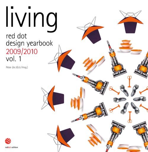
James Dyson<br />
The Tupperware <strong>design</strong> teams<br />
Gerhard Nüssler, Thomas Knöller<br />
Miele <strong>design</strong> team<br />
Leo Aerts<br />
84<br />
86<br />
87<br />
88<br />
89<br />
90<br />
91<br />
92<br />
LSG Sky Chefs, Process Design<br />
Jakob Wagner<br />
EOOS<br />
The Philips Design Team<br />
Grohe In-house Design Team<br />
Constantin Wortmann<br />
Michele De Lucchi<br />
Bruno Houssin<br />
93<br />
94<br />
95<br />
96<br />
97<br />
98<br />
99<br />
Mikko Kärkkäinen<br />
Olavi Lindén, Markus Paloheimo<br />
Mads Odgård Design<br />
Möbel-Liebschaften Design Team<br />
Stefan Vanderick<br />
Michael Sodeau<br />
Isay Weinfeld<br />
Contents 5
6 red dot <strong>award</strong>: product <strong>design</strong> 2009<br />
100<br />
150<br />
226<br />
248<br />
red dot<br />
<strong>Award</strong>s for high <strong>design</strong> quality<br />
Auszeichnungen für hohe Designqualität<br />
Living rooms and bedrooms<br />
Wohnen und Schlafen<br />
Households and kitchens<br />
Haushalt und Küche<br />
Tableware<br />
Tableware<br />
Bathrooms, spa and air-conditioning<br />
Bad, Wellness und Klimatechnik<br />
292<br />
328<br />
342<br />
Lighting and lamps<br />
Licht und Leuchten<br />
Gardens<br />
Garten<br />
Architecture and interior <strong>design</strong><br />
Architektur und Interior Design
398<br />
400<br />
401<br />
402<br />
403<br />
404<br />
405<br />
406<br />
407<br />
408<br />
The jurors of the<br />
“red dot <strong>award</strong>: product <strong>design</strong>”<br />
Die Juroren des<br />
red dot <strong>award</strong>: product <strong>design</strong><br />
Manuel Alvarez Fuentes<br />
Sybs Bauer<br />
Prof. Rido Busse<br />
Shashi Caan<br />
Tony K. M. Chang<br />
Mårten Claesson<br />
Robin Edman<br />
Joachim H. Faust<br />
Prof. Renke He<br />
409<br />
410<br />
411<br />
412<br />
413<br />
414<br />
415<br />
416<br />
417<br />
Prof. Carlos Hinrichsen<br />
Prof. Dr. Florian Hufnagl<br />
Tapani Hyvönen<br />
Prof. Soon-In Lee<br />
Prof. Stefan Lengyel<br />
Prof. Ron Nabarro<br />
Simon Ong<br />
Dirk Schumann<br />
Danny Venlet<br />
418<br />
422<br />
426<br />
The competition<br />
Der Wettbewerb<br />
Design for a modern and<br />
comfortable lifestyle at home<br />
Design für ein stilvolles<br />
und behagliches Leben zu Hause<br />
Appendix: address index<br />
Anhang: Adressregister<br />
Manufacturers and distributors<br />
Hersteller und Vertrieb<br />
Designers<br />
Designer<br />
Contents 7
12 red dot: <strong>design</strong> team of the year
ed dot: <strong>design</strong> team of the year 2009<br />
The Tupperware World Wide Design Team<br />
red dot: <strong>design</strong> team of the year 2009<br />
Das Tupperware World Wide Design Team<br />
Form. Function. Forerunner.<br />
Form. Funktion. Vorbild.<br />
Tupperware is ubiquitous. Tupperware is spoken of<br />
everywhere: Universally acknowledged as a moniker for<br />
sealable plastic containers, the brand has entered the<br />
international vocabulary of recognisable brand names.<br />
In some countries, the Tupperware brand name has a<br />
recognition level of over 90 per cent. Tupperware is seen<br />
everywhere: Tupperware products can be viewed in <strong>design</strong><br />
exhibits at the most prestigious museums around the<br />
globe. Tupperware products are experienced everywhere:<br />
Millions of consumers around the world join the legendary<br />
“Tupperware parties”. And last but not least, Tupperware is<br />
used in almost every kitchen, from the average household<br />
to the kitchens of royal palaces. Even the Queen of<br />
England keeps her royal cornflakes in Tupperware<br />
containers, or so insiders claim.<br />
Tupperware ist überall. Tupperware ist in aller<br />
Munde: Als allgemeiner Terminus für wiederverschließbare<br />
Kunststoffbehälter hat sich Tupperware<br />
als weltbekannte Handelsmarke etabliert. In einigen<br />
Ländern verfügt der Markenname über einen<br />
Bekanntheitsgrad von über 90 Prozent. Tupperware<br />
ist in aller Augen: Besucher namhafter Museen rund<br />
um den Globus bewundern Tupperware-Produkte<br />
als Ausstellungsstücke verschiedener Designkollektionen.<br />
Tupperware ist in aller Hände: Millionen<br />
von Gästen werden jährlich zu einer der legendären<br />
„Tupperpartys“ eingeladen, um die Produkte zu<br />
begutachten und zu befühlen. Und nicht zuletzt ist<br />
Tupperware in aller Küchen: Nicht nur in den bundesbürgerlichen,<br />
sondern auch in den royalen, denn<br />
selbst die englische Queen, so behaupten Insider, soll<br />
ihre königlichen Cornflakes in Tupperware-Behältern<br />
bevorraten.<br />
red dot: <strong>design</strong> team of the year 13
Inventor Earl Silas Tupper busy at his favourite<br />
pastime – experimenting in his laboratory. (left)<br />
The result of Earl Tupper’s endeavours:<br />
a patent drawing of his first big invention,<br />
the “Wonderlier bowl”. (centre)<br />
Earl Tupper and Brownie Wise: together they drew<br />
up the concept for the legendary Tupperware<br />
parties and are considered pioneers of direct<br />
selling methods. (right)<br />
Erfinder Earl Silas Tupper bei seiner<br />
Lieblingsbeschäftigung: Experimentieren in<br />
seinem Labor. (links)<br />
Das Ergebnis von Earl Tuppers Bemühungen:<br />
Patentzeichnung seiner ersten großen Erfindung,<br />
der „Wunderschüssel“. (Mitte)<br />
Earl Tupper und Brownie Wise: Die beiden<br />
entwarfen das Konzept für die legendäre<br />
Tupperparty und gelten als Pioniere<br />
der Direktvertriebsmethode. (rechts)<br />
14 red dot: <strong>design</strong> team of the year<br />
What makes Tupperware so appealing?<br />
What makes Tupperware <strong>design</strong> so special? The answer is as<br />
simple as the Tupperware products themselves, which provide<br />
solutions to a wide range of household problems. The company’s<br />
time-tested equation: material + <strong>design</strong> = functionality + value<br />
in use.<br />
For decades, impervious to all <strong>design</strong> trends, Tupperware has<br />
continued to pursue its classic, aesthetically focused <strong>design</strong><br />
principles to produce consistently functional products that<br />
highlight value and make the most of the materials by applying<br />
quality plastic intelligently. These characteristics are essential<br />
for a <strong>design</strong> to be truly “value-able”, particularly in areas where<br />
functionality and value-in-use are of prime importance – and this<br />
applies in the kitchen more than most other places in the home.<br />
Many products that put the emphasis on extravagant details and<br />
special effects, pursuing aesthetics for its own sake, lack these<br />
attributes, yet Tupperware fits the bill completely.<br />
As an international direct selling company for household and<br />
beauty products based in Orlando, Florida – which has over 2.3<br />
million independent sales consultants – Tupperware is successful<br />
in over 100 countries and has a presence in all continents across<br />
the globe. Although the kitchen utensil industry is marked by<br />
extremely aggressive competition, Tupperware has managed to<br />
prevail over numerous other players in the market, thanks to its<br />
extraordinarily high degree of innovation and orientation towards<br />
<strong>design</strong>. This is confirmed by the red dot institute for advanced<br />
<strong>design</strong> studies, a research institute founded by red dot that has<br />
monitored and analysed the results of the red dot <strong>design</strong> <strong>award</strong><br />
and the general <strong>design</strong> trends of highly-recognised, publiclylisted<br />
companies. Within the framework of one of these research<br />
projects, the <strong>design</strong> activities of companies are indexed by their<br />
commercial success, with the connection between commercial<br />
success and <strong>design</strong> being visible in the company’s success on<br />
the stock exchange. Each year, a <strong>design</strong> rating is calculated for<br />
all of the companies included in the analysis on the basis of an<br />
algorithm developed by red dot specifically for this purpose. The<br />
rating takes account of a range of fixed parameters, such as the<br />
strength of <strong>design</strong> and internal <strong>design</strong> consistency. Tupperware<br />
has held a clear lead over many of its competitors in this ranking<br />
for a number of years. In total, the company has been <strong>award</strong>ed a<br />
red dot 30 times. This year marks the ninth time that Tupperware<br />
has been <strong>award</strong>ed the highest prize, “red dot: best of the best”.<br />
Was macht Tupperware so begehrenswert?<br />
Was macht das Design von Tupperware so besonders?<br />
Die Antwort ist so simpel wie die Lösungen von Tupperware<br />
für diverse Haushaltsprobleme. Die bewährte Formel<br />
des Unternehmens: Material + Design = Funktionalität +<br />
Gebrauchswert.<br />
Seit Jahrzehnten, unbeirrt aller Entwicklungen in der Designgeschichte,<br />
werden bei Tupperware durch einen materialgerechten<br />
und intelligenten Umgang mit hochwertigem<br />
Kunststoff sowie durch eine schlichte und äußerst ästhetische<br />
Gestaltung funktionale Produkte mit optimalem Gebrauchswert<br />
entwickelt. Gerade in Bereichen, in denen es um Funktionalität<br />
und Gebrauchswert geht – und dies trifft auf den<br />
Küchenbereich zu wie auf wenige andere –, sind diese Komponenten<br />
für wirklich „wertvolles“ Design essenziell und<br />
unverzichtbar. Viele Produkte, bei denen Extravaganz und<br />
Effekte im Vordergrund stehen und die auf den Selbstzweck<br />
des Ästhetischen limitiert sind, lassen sie vermissen, Tupperware<br />
jedoch erfüllt genau diesen Anspruch in vollem Maße.<br />
Als internationales Direktvertriebsunternehmen für Haushalts<br />
und Beautyprodukte mit Hauptsitz in Orlando, Florida –<br />
für das weltweit mehr als 2,3 Millionen selbstständige Beraterinnen<br />
tätig sind – ist Tupperware in über 100 Ländern<br />
auf allen Kontinenten erfolgreich. Obwohl im Segment der<br />
Küchenutensilien ein äußerst intensiver Wettbewerb herrscht,<br />
gelingt es Tupperware, sich durch ein außergewöhnlich hohes<br />
Maß an Innovations und Designorientierung gegenüber<br />
zahlreichen Konkurrenzfirmen zu behaupten. Dies bestätigt<br />
auch das red dot institute for advanced <strong>design</strong> studies, ein<br />
von red dot gegründetes Forschungsinstitut, das die Ergebnisse<br />
des red dot <strong>design</strong> <strong>award</strong> und die allgemeine Designentwicklung<br />
namhafter, börsennotierter Unternehmen beobachtet<br />
und bewertet. Im Rahmen eines der Forschungsprojekte<br />
wird die Designtätigkeit der Firmen mit ihrem wirtschaftlichen<br />
Erfolg in Relation gesetzt, wobei ein Zusammenhang<br />
zwischen Erfolg im Design und Erfolg an der Börse erkennbar<br />
ist. In jedem Jahr wird für jedes einzelne Unternehmen durch<br />
eine eigens von red dot entwickelte Formel ein aktueller<br />
Designwert ermittelt, der sich aus verschiedenen festgelegten<br />
Parametern ergibt, wie etwa der Designstärke und der internen<br />
Designkontinuität. Tupperware führt das Ranking im<br />
Bereich Küchenutensilien seit Jahren mit großem Vorsprung
No Tupperware without Tupper<br />
“I want to be a millionaire by the age of 30,” said Tupperware<br />
founder, Earl Silas Tupper. While not exactly modest in his<br />
ambition, Tupper reached this goal through a combination of<br />
perseverance and inexhaustible inventiveness, even if he was<br />
ambitious about the age at which he would join the rank of<br />
millionaires. Following the maxim, from dishwasher to millionaire,<br />
Tupper’s own career set the example for his later product<br />
innovations: from a revolutionary but simple food box system,<br />
Tupperware became a phenomenon that has a lasting influence<br />
on everyday culture in kitchens and households.<br />
Earl Tupper, a farmer’s son, was born in 1907 to a poor New<br />
Hampshire household. However, the entrepreneurial spirit of<br />
this young American showed itself at an early age: In order<br />
to support his parents financially, he widened the market for<br />
the crop from the family farm by delivering produce directly<br />
to customers’ doors. Tupper eventually tailored and perfected<br />
this profitable sales concept to his own company with great<br />
success. The young inventor began cultivating his innate<br />
creativity at an early age. Driven by his constant ambition to<br />
improve the things around him, Tupper created useful tools<br />
for a huge variety of purposes his entire life. After graduating<br />
from high school, he took odd jobs and made a first attempt at<br />
setting up a company. In 1937, he began working for DuPont,<br />
the chemicals giant, but only stayed with the company for one<br />
year, a period which, as he often maintained later in life, was<br />
the “right” training for him. Based on his numerous experiences<br />
in the field of <strong>design</strong>ing and manufacturing plastics which he<br />
gathered in his short time at DuPont, he founded the “Earl S.<br />
Tupper Company” in 1938. At the end of the Second World War<br />
he received polyethylene from DuPont to experiment with, a<br />
type of plastic which was originally a waste product from the<br />
oil industry. Up until this date it had only been used for military<br />
purposes, but now applications of the material widened to<br />
include the growing market for consumer goods. In fact, after<br />
months of experimenting with “Poly-T”, which he simply called<br />
polyethylene, Tupper managed to produce the material in pellet<br />
form from which top-quality plastic goods could be produced<br />
using injection moulding. In the process, the inventor created<br />
the foundation upon which the possibilities of the new plastic<br />
could be utilised for the huge market of home and kitchen use.<br />
But this by no means marked the limit of his creativity. Taking his<br />
vor zahlreichen Konkurrenzunternehmen an. Insgesamt 30<br />
Mal konnte sich die Firma über den Gewinn eines red dot<br />
freuen, in diesem Jahr wurde Tupperware zudem zum neunten<br />
Mal mit der Höchstauszeichnung, dem red dot: best of<br />
the best, bedacht.<br />
Keine Tupperware ohne Tupper<br />
„Mit 30 will ich Millionär sein.“ Dieses Lebensziel zeichnet<br />
sich nicht gerade durch Bescheidenheit aus, doch dem<br />
Firmengründer und Namensgeber Earl Silas Tupper gelang<br />
es tatsächlich, mit Ehrgeiz und dank seines unaufhörlichen<br />
Erfindergeistes diesen Wunsch in die Tat umzusetzen –<br />
nebensächlich ist dabei, dass er sich bezüglich des Lebensalters<br />
für den Eintritt ins Millionärs-Dasein etwas verschätzte.<br />
In Anlehnung an den sprichwörtlichen „Tellerwäscher“, der<br />
zum Millionär wurde, lebte Tupper seinen Produktinnovationen<br />
eine vorbildliche Karriere vor, die diese auf ihre Weise<br />
nachzeichneten: Vom revolutionären, aber simplen Lebensmittelbehälter-System<br />
wurde Tupperware zu einem Phänomen,<br />
das die Alltagskultur in Küche und Haushalt mitgeprägt<br />
hat.<br />
Geboren 1907 in New Hampshire, wächst Earl Tupper als<br />
Sohn einer Farmerfamilie in ärmlichen Verhältnissen auf.<br />
Früh zeigt sich der unternehmerische Geist des jungen Amerikaners:<br />
Um seine Eltern finanziell zu unterstützen, dehnt er<br />
den „Absatzmarkt“ für die Erträge der familieneigenen Felder<br />
aus, indem er den Abnehmern die Produkte direkt zu ihren<br />
Haustüren liefert. Eine gewinnbringende Vertriebsidee, die<br />
er später – angepasst und perfektioniert – in seinem eigenen<br />
Unternehmen mit vielfach gesteigertem Erfolg aufgreifen<br />
wird. Auch seine angeborene Kreativität entfaltet der ambitionierte<br />
Erfinder bereits in jungen Jahren. Angetrieben von<br />
seinem ständigen Ehrgeiz, die Dinge um sich herum zu verbessern,<br />
kreiert Tupper sein Leben lang Hilfsmittel zu unterschiedlichsten<br />
Zwecken. Nach Highschool-Abschluss, Gelegenheitsjobs<br />
und einem ersten Versuch als selbstständiger<br />
Unternehmer beginnt er 1937 seine Tätigkeit für den Chemiekonzern<br />
DuPont, bleibt jedoch nur ein Jahr bei dem Unternehmen,<br />
in dem für Tupper – wie er zeit seines Lebens betont<br />
– die „richtige“ Ausbildung beginnt. Aufbauend auf den vielfältigen<br />
Erfahrungen in den Bereichen Kunststoff-Design und<br />
-Fertigung, die er bei DuPont gemacht hat, gründet er 1938<br />
Setting an example for a multitude of other direct<br />
selling companies: more than 2.3 million<br />
independent consultants work for Tupperware.<br />
On average a Tupperware party begins somewhere<br />
in the world every 2.5 seconds.<br />
Vorbild für viele andere Direktvertriebsunternehmen:<br />
Mehr als 2,3 Millionen selbstständige<br />
Beraterinnen sind für Tupperware tätig,<br />
durchschnittlich alle 2,5 Sekunden beginnt<br />
heutzutage irgendwo auf der Welt eine<br />
Tupperparty.<br />
“I want to be a millionaire by the age of 30.”<br />
Earl Silas Tupper<br />
„Mit 30 will ich Millionär sein.“<br />
Earl Silas Tupper<br />
red dot: <strong>design</strong> team of the year 15
28 red dot <strong>award</strong>: product <strong>design</strong> 2009<br />
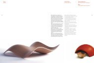
MYchair Lounge Chair<br />
Walter Knoll AG & Co.KG, Herrenberg,<br />
Germany / Deutschland<br />
Design: UNStudio/Ben van Berkel,<br />
Amsterdam, NL<br />
www.walterknoll.de<br />
Interplay – <strong>design</strong> for the zeitgeist<br />
The emergence of new things eludes any kind<br />
of definition, since the human creativity at<br />
work is as multifaceted as the individuals<br />
who develop these new things. Philosophers<br />
from antiquity on have always sought to<br />
explain and trace the processes of creative<br />
thinking, until in the 1960s, the research<br />
scientist Edward de Bono introduced the<br />
term “lateral thinking”. A little later, playful<br />
probing, or free association, was defined as<br />
an essential element of creativity. However,<br />
creativity is always also an expression<br />
embedded in time, an activity aimed at<br />
breaking new ground and offering new<br />
perspectives on things. With the MYchair,<br />
the UNStudio/Ben van Berkel <strong>design</strong> team,<br />
which is known for many impressive <strong>design</strong>s,<br />
managed to create a highly contemporary,<br />
distinctive and exciting interpretation<br />
of a lounge chair that corresponds to<br />
the zeitgeist. MYchair is sweeping and<br />
expressive, it aims to be “quirky” and<br />
provocative in shape – like a sculpture in<br />
space, it boldly underscores the individuality<br />
of its owner. What is interesting about<br />
this chair is how it plays with angles and<br />
our viewing habits: slanting, rounded and<br />
straight areas give way to each other, while<br />
the upholstery too traces and alternates<br />
between convex and concave shapes. This<br />
impressive interplay of geometric forms is<br />
matched by the choice of colours: the base,<br />
seat and back combine intense colours such<br />
as red and black to create dynamic duets.<br />
Multifunctional and well thought-out, the<br />
MYchair invites users to read, to chill and<br />
comfortably relax – like the fluidity of its<br />
lines, the lounge chair is able to adapt just as<br />
easily to different interiors and lifestyles.
Wechselspiel – Design für den Zeitgeist<br />
Die Entstehung des Neuen entzieht sich<br />
jeglicher Definition, denn die menschliche<br />
Kreativität ist so vielschichtig wie auch<br />
die Persönlichkeiten, die sie hervorbringen.<br />
Schon in der Antike suchte man nach<br />
Erklärungen, um kreative Denkprozesse<br />
nachzuvollziehen und in den 1960er<br />
Jahren trat mit dem Forscher Edward<br />
de Bono der Begriff des „Querdenkens“<br />
(lateral thinking) auf den Plan. Später<br />
wurde das spielerische Ausprobieren, das<br />
freie Gedankenspiel, als ein wesentliches<br />
Element der Kreativität bestimmt. Kreativität<br />
ist jedoch auch immer ein zeitlicher<br />
Ausdruck, es geht um das Beschreiten<br />
neuer Wege und eine neue Sichtweise<br />
auf die Dinge. Mit dem Sessel MYchair<br />
gelingt dem für seine imposanten Entwürfe<br />
bekannten holländischen Designteam<br />
UNStudio/Ben van Berkel eine überaus<br />
zeitgemäße, prägnante und spannende<br />
Interpretation eines Sessels, der ganz dem<br />
Zeitgeist entspricht. MYchair ist schwungvoll<br />
und expressiv, er will „schräg“ sein<br />
und durch seine Form provozieren – wie<br />
eine Skulptur steht er im Raum und unterstreicht<br />
selbstbewusst die Individualität<br />
seines Besitzers. Interessant ist bei diesem<br />
Sessel die Art und Weise, wie er mit den<br />
Sehgewohnheiten spielt: schräge, runde<br />
und gerade Flächen wechseln sich ab<br />
und auch das Polster modelliert konvexe<br />
mit konkaven Formen. Diesem beeindruckenden<br />
Spiel mit der Geometrie passt<br />
sich ebenso die Farbgebung von MYchair<br />
an: Die Polster kombinieren intensive<br />
Farben wie Rot und Schwarz und bilden<br />
dabei dynamische Duette. Multifunktional<br />
und klug durchdacht, dient MYchair dem<br />
Menschen zum Sitzen, Lesen oder bequemen<br />
Chillen und Relaxen – so wechselvoll<br />
wie seine Linien vermag er sich gleichsam<br />
auch dem Interieur und Lebensstil anzupassen.<br />
red dot: best of the best 29
Confluences Sofa<br />
Ligne Roset / Roset S.A.,<br />
Briord, France / Frankreich<br />
Design: Philippe Nigro,<br />
Milan, Italy / Mailand, Italien<br />
www.ligne-roset.com<br />
www.philippenigro.com<br />
30 red dot <strong>award</strong>: product <strong>design</strong> 2009<br />
Revolutionary puzzle<br />
Please rearrange freely! A puzzle challenges<br />
the imagination, because cut up into many<br />
tiny pieces at the start, the image only starts<br />
to take shape in the mind by putting together<br />
all the parts. This principle of rearranging<br />
individual parts is perfectly embodied by the<br />
Confluences sofa: its parts can be rearranged<br />
again and again to form something entirely<br />
new. The sofa’s <strong>design</strong>er, Philippe Nigro, was<br />
inspired to this kind of <strong>design</strong> through pieces<br />
of contemporary art, borrowing the principles<br />
of addition and the direct stringing together<br />
of different volumes to lend the sofa its<br />
Revolutionäres Puzzle<br />
Bitte neu zusammensetzen! Ein Puzzle<br />
fordert die Vorstellungskraft heraus, denn<br />
das zu Beginn noch nicht vorhandene<br />
Bild ist zunächst in seine Einzelteile zerlegt<br />
und erst in der Imagination fügt sich<br />
ein Teil zum anderen. Dieses Prinzip des<br />
Neuanordnens einzelner Teile verwirklicht<br />
das Sofa Confluences in geradezu vollendeter<br />
Form: Seine Teile lassen immer<br />
wieder ein völlig neues Ganzes entstehen.<br />
Zu dieser Art der Gestaltung inspirierten<br />
seinen Designer Philippe Nigro Werke<br />
zeitgenössischer Kunst, formgebend waren<br />
die in diesen Kunstwerken vorgefundenen<br />
Prinzipien der Wiederholung und direkten<br />
shape. The result was the idea of a sofa<br />
that combines the power of <strong>design</strong> with the<br />
experience and manufacturing expertise of<br />
the Ligne Roset company. Without symmetry<br />
or any visible regularity, the sofa realises the<br />
principle of a puzzle that is endlessly usable<br />
and makes it possible to create ever different<br />
and surprising combinations. In this way, a<br />
number of seats can be brought close and<br />
locked together. The seat platforms flow<br />
together, overlapping each other as if in a<br />
giant puzzle, connected by nuances of shade.<br />
Thus also emerging are new possibilities<br />
of communication offered by the different<br />
Aneinanderreihung von Elementen unterschiedlichen<br />
Volumens. Was entstand, ist<br />
die Idee eines Sofas, das gestalterische<br />
Kraft mit der Erfahrung und den Fertigungsmöglichkeiten<br />
des Unternehmens<br />
Ligne Roset verknüpft. Ohne Symmetrie<br />
und sichtbare Regelmäßigkeit verwirklicht<br />
es das Prinzip des Puzzles und ermöglicht<br />
damit immer wieder unterschiedliche und<br />
überraschende Sitzmöbelverbindungen. So<br />
können beispielsweise mehrere Sessel mit<br />
verschiedenen Sitzpositionen miteinander<br />
verkeilt werden. Die Sitzplätze fließen<br />
ineinander, sie überlappen sich wie bei<br />
einem Riesenpuzzle und vermischen dabei<br />
ihre Farbnuancen. Was darüber hinaus<br />
configurations of the pieces: love seat “Toi et<br />
Moi” (“You and Me”), “Petite Conversation”<br />
and “Grande Conversation” or the fourseater<br />
with two integrated lounge seats, to<br />
name just a few possible sofa combinations.<br />
According to the sofa’s <strong>design</strong>er, in so far as<br />
“it attempts to solve an ergonomic problem,”<br />
Confluences becomes a plastic and colourful<br />
way of playing with countless permutations<br />
and sitting positions.<br />
entsteht, sind neue Möglichkeiten der<br />
Kommunikation, die mit den unterschiedlichsten<br />
Möbelkonfigurationen einhergehen:<br />
Love Seat „Toi et Moi“ („Du und<br />
ich“), „Petite Conversation“ und „Grande<br />
Conversation“ oder der Viersitzer mit<br />
zwei integrierten Loungesesseln bilden<br />
nur wenige der möglichen Sofavariationen.<br />
Indem es „im Grunde versucht, ein<br />
Ergonomieproblem zu lösen“, wie sein<br />
Gestalter sagt, wird Confluences zu einer<br />
plastischen und farbigen Spielwiese mit<br />
unzähligen Ausführungen und Möglichkeiten.
ed dot: best of the best 31
UNStudio<br />
Ben van Berkel<br />
Ben van Berkel studied architecture at the Gerrit<br />
Rietveld Academy in Amsterdam and at the<br />
Architectural Association in London. The Van<br />
Berkel & Bos Architectuurbureau has realised<br />
many projects, among others, the Karbouw office<br />
building and the NMR facilities for the University<br />
of Utrecht. In 1998, Ben van Berkel and Caroline<br />
Bos established the UNStudio (United Net), which<br />
presents itself as a network of specialists in<br />
architecture, urban development and infrastructure.<br />
With UNStudio, Ben van Berkel realised, amongst<br />
others, the Mercedes-Benz Museum in Stuttgart as<br />
well as a façade and the interior renovation for the<br />
Galleria Department store in Seoul.<br />
Ben van Berkel studierte Architektur an der<br />
Gerrit-Rietveld-Akademie in Amsterdam und<br />
der Architectural Association in London. Das<br />
Van Berkel & Bos Architectuurbureau hat viele<br />
Projekte realisiert, darunter das Bürogebäude<br />
Karbouw und die NMR-Einrichtung der Universität<br />
Utrecht. Im Jahr 1998 gründeten Ben van<br />
Berkel und Caroline Bos das UNStudio (United<br />
Net), das sich als ein Netzwerk von Spezialisten<br />
in den Bereichen Stadtentwicklung und Infrastruktur<br />
versteht. Mit UNStudio verwirklichte<br />
Ben van Berkel unter anderem das Mercedes-<br />
Benz Museum in Stuttgart sowie eine Fassade<br />
und die Innenraumrenovierung des Einkaufshauses<br />
Galleria in Seoul.<br />
76 red dot <strong>award</strong>: product <strong>design</strong> 2009<br />
MYchair Lounge Chair<br />
Page / Seite 28 / 29<br />
Ben van Berkel, the <strong>design</strong>er of the MYchair lounge chair, on his<br />
<strong>design</strong> philosophy and the significance of furniture today:<br />
What <strong>design</strong> philosophies influence your work?<br />
I like to observe how musicians educate their students. One method<br />
is to teach students how to improve their own playing by simply<br />
listening to music. In <strong>design</strong>, we tend to over-intellectualise <strong>design</strong><br />
strategies. However, lately, I see <strong>design</strong> along the lines of composing<br />
and resonating one’s visions and ideas more directly. I’m more<br />
interested in <strong>design</strong>ing through an organic process, as opposed to<br />
a more linear or linguistic approach.<br />
What is the significance of furniture today?<br />
I think that furniture needs to be concerned once again with<br />
environments; creating a form of awareness of both the space the<br />
object of furniture is occupying and the space within the piece of<br />
furniture itself. With our <strong>design</strong> for MYchair, this also includes empty<br />
space, which is considered through the physical and virtual theme of<br />
reflection.<br />
Ben van Berkel, der Designer des Lounge Chairs „MYchair“,<br />
über seine Designphilosophie und die Bedeutung von Möbeln<br />
in unserer Zeit:<br />
Welche Gestaltungsphilosophien beeinflussen Ihre Arbeit?<br />
Mir gefällt die Art, wie Musiker ihre Schüler unterrichten. Eine<br />
Methode besteht darin, Studenten zu zeigen, wie sie ihr Spiel<br />
durch das Hören von Musik verbessern können. In der Gestaltung<br />
neigen wir zur Überbewertung von Strategien. Neuerdings<br />
aber verstehe ich Gestaltung als ein direkteres Komponieren und<br />
Widerhallen eigener Visionen und Ideen. Ich interessiere mich<br />
mehr für Gestaltung als einem organischen Prozess denn als<br />
einem linearen oder linguistischen Ansatz.<br />
Welche Bedeutung haben Möbel für unsere heutige Zeit?<br />
Ich denke, dass Möbel wieder mehr auf die Umgebung eingehen<br />
und eine Form von Bewusstsein sowohl für den Raum, in dem<br />
das Objekt steht, als auch für den Raum, den das Möbelstück<br />
einnimmt, schaffen müssen. Bei unserer Gestaltung für den<br />
MYchair umfasst dies auch den leeren Raum, der durch das<br />
physische und virtuelle Thema der Reflexion einbezogen ist.
Philippe Nigro<br />
Philippe Nigro, born in 1975 in Nice, France,<br />
studied art and industrial <strong>design</strong> in Antibes, Lyon<br />
and Paris. He then worked as a freelance <strong>design</strong>er,<br />
developing projects for Nube, Felicerossi and<br />
Sintesi. Collaborating with the Studio De Lucchi<br />
in Milan, he participated in product, furniture,<br />
interior, events and scenography projects. Since<br />
2005, Nigro has been supported by the French<br />
association VIA to realise <strong>design</strong>s including the<br />
“Spiral” shelf, the “Cross-unit”, the “Universal<br />
base”, the “Twin Chairs”, and the “Intersection”<br />
which in 2009 became the Confluences sofa for<br />
Ligne Roset. He also started collaborating with the<br />
new Skitsch brand where his work has included<br />
the “Build up” cardboard furniture for children, the<br />
“Triangolazioni” table and the “Squilibri” shelf.<br />
Philippe Nigro, geboren 1975 in Nizza, Frankreich,<br />
studierte Kunst und Industrie<strong>design</strong> in<br />
Antibes, Lyon und Paris. Danach arbeitete er als<br />
freiberuflicher Gestalter und entwickelte Projekte<br />
für Nube, Felicerossi und Sintesi. In Zusammenarbeit<br />
mit dem Studio De Lucchi in Mailand<br />
war er an Projekten in den Bereichen Produkt-,<br />
Möbel-, Inneneinrichtungs-, Veranstaltungs- und<br />
Bühnenbildgestaltung beteiligt. Seit 2005 gestaltete<br />
Nigro – vom französischen VIA-Verband<br />
gefördert – das Regal „Spiral“, die „Cross-unit“,<br />
den „Universal Base“, die „Twin Chairs“ und das<br />
„Intersection“, das 2009 zum Sofa „Confluences“<br />
für Ligne Roset wurde. Zudem begann er eine<br />
Zusammenarbeit mit der neuen Marke Skitsch,<br />
für die er das Kartonmöbel „Build up“ für Kinder,<br />
den Tisch „Triangolazioni“ und das Regal „Squilibri“<br />
entwarf.<br />
Philippe Nigro on the things that inspired him while <strong>design</strong>ing<br />
the red dot winning Confluences sofa family and on the role good<br />
<strong>design</strong> plays for him today:<br />
What has inspired you while <strong>design</strong>ing the Confluences sofa<br />
family?<br />
The Confluences sofa family for Ligne Roset was born with the<br />
help of French VIA grants, while observing the irregularities and<br />
asymmetries in nature and in human beings. The eight modules<br />
are asymmetrical and have anthropomorphic attitudes like people<br />
leaning on one another. Those sofas are an answer which collects my<br />
observations and were also inspired by several artistic movements,<br />
through thinking about the concepts of accumulation, repetition and<br />
the meeting of simple shapes to create new ones, as well as through<br />
playing with colour harmonies – imagining this “democratic sofa” as<br />
a dynamic central piece in an interior but trying to take into account<br />
different tastes in colour, attitudes to comfort and the morphologies<br />
of users.<br />
Considering the current difficult economic environment, what role<br />
does good <strong>design</strong> play?<br />
It is maybe to make quotidian life better with affective and emotional<br />
objects. Good <strong>design</strong> could be also an honest way to understand real<br />
needs and helps us to see what is really important to develop and<br />
why we’re developing it, in order not to end up creating too many<br />
ephemeral objects and waste. It’s a way to create a really efficient<br />
and lasting intellectual relationship with a manufacturer in order to<br />
find clever solutions, to optimise production and make the resulting<br />
products durable and reassuring for users.<br />
Confluences Sofa<br />
Page / Seite 30 / 31<br />
Philippe Nigro über die Dinge, die ihn bei der Gestaltung der<br />
mit dem red dot ausgezeichneten Sofafamilie „Confluences“<br />
inspirierten, und über die Rolle, die gutes Design für ihn heute<br />
spielt:<br />
Was hat Sie bei der Gestaltung der Sofafamilie „Confluences“<br />
inspiriert?<br />
Die Sofafamilie „Confluences“ für Ligne Roset wurde mit Fördergeldern<br />
des VIA-Verbandes geboren und folgt den Unregelmäßigkeiten<br />
und Asymmetrien in der Natur und im Menschen. Die<br />
acht Module sind asymmetrisch und weisen antropomorphe Züge<br />
auf, wie Menschen, die sich gegenseitig stützen. Diese Sofas sind<br />
eine Antwort, in der sich meine Beobachtungen bündeln und<br />
die ebenso inspiriert ist von mehreren künstlerischen Handgriffen<br />
wie von dem Nachsinnen über die Konzepte der Sammlung,<br />
Wiederholung und dem Zusammentreffen einfacher Formen, um<br />
daraus neue zu schaffen, und ebenso durch das Spiel mit Farbharmonien<br />
– die Vorstellung dieses „demokratischen Sofas“ als<br />
ein dynamisches Zentralstück inmitten einer Einrichtung, das<br />
aber verschiedenen Farbvorlieben, Komfortansprüchen sowie<br />
den Morphologien der Benutzer entgegenkommt.<br />
Welche Rolle spielt gutes Design in Anbetracht des derzeit<br />
schwierigen ökonomischen Umfeldes?<br />
So gesehen trägt es sicherlich dazu bei, das tägliche Leben durch<br />
gefühlsbezogene und emotionale Objekte besser zu gestalten.<br />
Gutes Design ist auch eine redliche Antwort auf reale Bedürfnisse<br />
und hilft dabei zu verstehen, was es zu entwickeln gilt und<br />
warum, um am Ende nicht mit zu vielen nutzlosen und kurzlebigen<br />
Produkten dazustehen. Zudem schafft es eine wirklich<br />
effiziente und anhaltende geistige Verwandtschaft mit einem<br />
Hersteller, bringt intelligente Lösungen hervor, optimiert die<br />
Herstellung und führt zu Produkten, die langlebig sind und auf<br />
die sich Benutzer verlassen können.<br />
Designers 77
ladybug Sofa<br />
brühl GmbH, Bad Steben,<br />
Germany / Deutschland<br />
Design: Kati Meyer-Brühl, Bad Steben,<br />
Germany / Deutschland<br />
www.bruehl.com<br />
102 red dot<br />
ladybug is conceived as a lounge formation<br />
offering an inspiring scope of arrangements.<br />
The lively curves of sofa sculpture and<br />
recamier create a luxury feelgood factor<br />
complemented by cubic stools in an exciting<br />
way. In this way, the open ensemble<br />
transforms into an “indoor pool” when<br />
sofa and recamier are placed in line with a<br />
stool. The <strong>design</strong> concept allows reclining<br />
in a harmonious comfort zone, as well as<br />
lounging with ample depth and sitting with<br />
casual ease. Conveying its modernity, ladybug<br />
is available in striking red with innovatively<br />
textured and dotted covers. As oversized sofa<br />
made of two recamiers, the ladybug lounge<br />
formation sets interesting formal standards<br />
in the room.<br />
ladybug versteht sich als eine Lounge-<br />
Formation, die dem Nutzer einen inspirierenden<br />
Gestaltungsspielraum offeriert.<br />
Schwungvoll konstituieren sich die<br />
Sofaplastik und die Récamiere zu einem<br />
„Wohlfühl-Ensemble de Luxe“, das formal<br />
spannend von kubischen Hockern ergänzt<br />
wird. Die offene Formation verwandelt<br />
sich auf diese Weise zum „Indoor-Pool“,<br />
wenn das Sofa und die Récamiere mit<br />
einem Hocker längs aneinandergefügt<br />
werden. Das Gestaltungskonzept ermöglicht<br />
das Liegen in einer rundum stimmigen<br />
Komfortzone wie auch ein Lounging mit<br />
Tiefe, und es entstehen lässige Sitzplätze.<br />
Seine Modernität kommunizierend, ist<br />
ladybug in einem signifikanten Rot oder<br />
mit innovativ geprägten Punkt-Bezügen<br />
erhältlich. Formale Maßstäbe im Raum<br />
setzt die Lounge-Formation ladybug als<br />
Oversized-Sofa, gebildet aus zwei<br />
Récamieren.
Living rooms and bedrooms 103
TK 73001<br />
Fully Automatic Coffee Maker /<br />
Kaffeevollautomat<br />
BSH Bosch und Siemens Hausgeräte<br />
GmbH, Munich, Germany / München,<br />
Deutschland<br />
In-house <strong>design</strong> / Werks<strong>design</strong>:<br />
Helmut Kaiser, Gregor Luippold<br />
Design: Daniels & Koitzsch<br />
(Stefan Koitzsch, Micha Daniels),<br />
Darmstadt, Germany / Deutschland<br />
www.bsh-group.de<br />
www.daniels-koitzsch.de<br />
The <strong>design</strong> concept of this fully automatic<br />
coffee maker reflects sophisticated<br />
functionality. In addition, the superior ease<br />
of use comes along with a pleasant look,<br />
which reminds of professional catering.<br />
The combination of a stainless steel front<br />
and black corpus harmoniously blends in<br />
with up-to-date kitchen concepts. The onetouch<br />
function that even allows the fully<br />
automatic preparation of cappuccino and<br />
latte macchiato at the push of a button is<br />
quite user-friendly. This was achieved by the<br />
innovative movable outlet and the matching<br />
separate milk container. Further handling is<br />
pleasing, intuitive, and visually supported<br />
by a high-quality plain text LCD display.<br />
The especially developed “aroma pressure<br />
system” brewing technology with minimal<br />
heat-up time provide for impeccable taste.<br />
Furthermore, the “single portion cleaning<br />
system” facilitates cleaning the compact<br />
appliance.<br />
Im Gestaltungskonzept dieses Kaffeevollautomaten<br />
spiegelt sich vor allem eine<br />
gut durchdachte Funktionalität wider.<br />
Außerdem wird der gehobene Bedienkomfort<br />
durch eine ansprechende Geräteoptik,<br />
die an die Profi-Gastronomie erinnert,<br />
ergänzt. Die Kombination aus Edelstahlfront<br />
und schwarzem Korpus fügt sich<br />
harmonisch in aktuelle Küchenkonzepte<br />
ein. Benutzerfreundlich ist insbesondere<br />
die One-Touch-Funktion, mittels der<br />
selbst Cappuccino und Latte Macchiato<br />
auf Knopfdruck vollautomatisch zubereitet<br />
werden können. Ermöglicht wird dies<br />
durch den innovativen, schwenkbaren<br />
Auslauf und den passenden, separaten<br />
Milchbehälter. Intuitiv und angenehm ist<br />
die weitere Gerätebedienung, die durch<br />
ein hochwertiges Klartext-LCD-Display<br />
visuell unterstützt wird. Für tadellosen<br />
Geschmack sorgt zudem die eigens entwickelte<br />
„aroma pressure system“-Brühtechnik<br />
bei minimaler Aufheizzeit. Das „single<br />
portion cleaning system“ erleichtert darüber<br />
hinaus die Reinigung des kompakten<br />
Geräts.<br />
172 red dot
TK 76009<br />
Fully Automatic Coffee Maker /<br />
Kaffeevollautomat<br />
BSH Bosch und Siemens Hausgeräte<br />
GmbH, Munich, Germany /<br />
München, Deutschland<br />
In-house <strong>design</strong> / Werks<strong>design</strong>:<br />
Helmut Kaiser, Gregor Luippold<br />
Design: Daniels & Koitzsch<br />
(Stefan Koitzsch, Micha Daniels),<br />
Darmstadt, Germany / Deutschland<br />
www.bsh-group.de<br />
www.daniels-koitzsch.de<br />
The <strong>design</strong> of this fully automatic coffee<br />
maker visualises its superior standard of<br />
functionality. The one-touch function is a<br />
state-of-the-art detail that increases user<br />
comfort with this model of the product series<br />
as well. Thus, you can prepare cappuccino<br />
and latte macchiato fully automatically. By<br />
means of the innovative movable outlet the<br />
required milk is taken from the separate<br />
milk container and mixed ready to drink.<br />
The high-quality look of the professional<br />
appliance is based on a combination of<br />
different materials. The black front of the<br />
casing, standing in contrast to the stainless<br />
steel corpus, stresses its appearance. Intuitive<br />
easy handling is visually supported by a highquality<br />
plain text LCD display that is easy to<br />
read. The “aroma pressure system” brewing<br />
technology requires minimal heat-up time<br />
and ensures full-bodied coffee pleasure. The<br />
“single portion cleaning system” facilitates<br />
cleaning the appliance.<br />
Die Gestaltung dieses Kaffeevollautomaten<br />
visualisiert den hohen Anspruch an seine<br />
Funktionalität. Als technisch ausgereiftes<br />
Detail erhöht eine One-Touch-Funktion<br />
den Bedienungskomfort auch bei dieser<br />
Ausführung der Produktserie. Dadurch<br />
lassen sich Cappuccino und Latte Macchiato<br />
auf Knopfdruck vollautomatisch zubereiten.<br />
Die dafür erforderliche Milch wird<br />
aus dem separaten Milchbehälter über<br />
den innovativen, schwenkbaren Auslauf<br />
entnommen und tassenfertig vermischt.<br />
Die hochwertige Optik des Profi-Geräts<br />
beruht auf einem Materialmix, bei dem<br />
das Gehäuse mit seiner schwarzen Front<br />
im Kontrast zum Edelstahlkorpus steht.<br />
Die intuitiv leicht zu verstehende Gerätebedienung<br />
wird visuell durch ein gut<br />
lesbares Klartext-LCD-Display unterstützt.<br />
Für den vollmundigen Kaffeegenuss sorgt<br />
die „aroma pressure system“-Brühtechnik,<br />
die nur eine minimale Aufheizzeit<br />
benötigt. Die Reinigung des Geräts wird<br />
zudem durch das „single portion cleaning<br />
system“ erleichtert.<br />
Households and kitchens 173
200 red dot
Nespresso Citiz<br />
Coffee Maker / Kaffeemaschine<br />
Nestlé Nespresso SA, Paudex,<br />
Switzerland / Schweiz<br />
Design: Les Ateliers du Nord<br />
(Antoine Cahen, Philippe Cahen),<br />
Lausanne, Switzerland / Schweiz<br />
www.nespresso.com<br />
www.adn-<strong>design</strong>.ch<br />
The development of this coffee maker<br />
series is based on the new “mini brewing<br />
unit” of the tried and tested Nespresso<br />
brewing system. The use of Nespresso<br />
capsules ensures easy handling of the<br />
appliance. The combination of a core unit<br />
with several additional modules offers three<br />
configurations in two different <strong>design</strong>s and<br />
various colours, taking advantage of different<br />
product properties without changing the<br />
<strong>design</strong> identity of the series. A simple coffee<br />
maker, an appliance with an Aeroccino milk<br />
frother and a double machine are available.<br />
Consequently, minimal solutions that offer<br />
users intuitive and easy handling have<br />
been favoured. The capsules are vertically<br />
inserted into the brewing unit, allowing the<br />
preparation of coffee with one single hand<br />
motion by closing the handle. By gravity<br />
capsules are automatically ejected after<br />
operation by lifting the handle. The drip tray<br />
and the capsule container can be removed<br />
and cleaned together. A movable cup support<br />
for large macchiato glasses was integrated.<br />
Die Entwicklung dieser Kaffeemaschinenserie<br />
basiert auf der neuen „Minibrüheinheit“<br />
der seit langem bewährten<br />
Nespresso-Brühtechnik. Dabei kommen<br />
Nespresso-Kapseln zum Einsatz, die eine<br />
komfortable Handhabung des Geräts<br />
gewährleisten. Die Kombination eines<br />
Basismodells mit mehreren Zusatzteilen<br />
ermöglicht drei Konfigurationen in zwei<br />
unterschiedlichen Ausführungen und<br />
verschiedenen Farben mit je eigenen<br />
Produkteigenschaften, ohne die Designidentität<br />
der Serie zu verändern. Erhältlich<br />
sind eine einfache Kaffeemaschine, eine<br />
Maschine mit Aeroccino-Milchschäumer<br />
sowie eine Doppelmaschine. Konsequent<br />
fiel die Entscheidung dabei auf minimale<br />
Lösungen, die den Benutzern eine intuitive<br />
und angenehme Bedienung erlauben.<br />
Zu den Produkteigenschaften zählt unter<br />
anderem ein vertikaler Kapseleinzug in<br />
die Brüheinheit, der das Kaffeebrühen<br />
mit einer einzigen Handbewegung, dem<br />
Schließen des Griffs, ermöglicht. Nach<br />
dem Betrieb wird ein automatischer,<br />
schwerkraftbedingter Auswurf der Kapsel<br />
durch das Anheben des Griffs ausgelöst.<br />
Sowohl der Wasser- als auch der Kapselauffangbehälter<br />
können gleichzeitig entfernt<br />
und gereinigt werden. Für große<br />
Macchiato-Gläser wurde ein beweglicher<br />
Tassenuntersatz integriert.<br />
Households and kitchens 201
228 red dot
Bodum Canteen<br />
Double-Wall Mug /<br />
Doppelwandige Tasse<br />
Bodum AG, Triengen,<br />
Switzerland / Schweiz<br />
In-house <strong>design</strong> / Werks<strong>design</strong>:<br />
Bodum Design Group<br />
www.bodum.com<br />
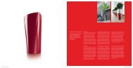
The Bodum Canteen double-wall mug<br />
represents a new way of enjoying coffee, tea<br />
or hot chocolate. One’s favourite drink can<br />
be prepared in this mug, and the innovative<br />
double-wall <strong>design</strong> keeps the drink hot or<br />
cold over a longer period of time. Made of<br />
white porcelain and surrounded by a nonslip<br />
silicone sleeve, the Bodum Canteen is<br />
available in eight beautiful fresh colours. The<br />
mug comes in three different sizes: 0.1, 0.2<br />
and 0.35 litre. They are dishwasher-safe.<br />
Die doppelwandige Tasse Bodum Canteen<br />
repräsentiert eine neue Art des Kaffeegenusses,<br />
und auch von Tee oder heißer<br />
Schokolade. Das Lieblingsgetränk kann<br />
in dieser Tasse bereitet werden und ihre<br />
innovative doppelwandige Gestaltung<br />
ermöglicht es, dass die Temperatur über<br />
einen längeren Zeitraum erhalten bleibt<br />
– sowohl bei heißen wie auch bei kalten<br />
Getränken. Aus weißem Porzellan gefertigt<br />
und von einem rutschfesten Silikonband<br />
eingefasst, ist Bodum Canteen in<br />
acht schönen und frisch anmutenden<br />
Farben erhältlich. Die Tasse gibt es in den<br />
drei verschiedenen Größen 0,1, 0,2 und<br />
0,35 Liter und sie ist spülmaschinenfest.<br />
Tableware 229
244 honourable mention<br />
Bone China Teapot /<br />
Bone-China-Teekanne<br />
Yehidea Home Design, Beijing, China<br />
In-house <strong>design</strong> / Werks<strong>design</strong>:<br />
Yu-Hsuan Yeh<br />
www.yehidea.com<br />
The form of this teapot celebrates water and<br />
its flowing characteristics. It is made of highquality<br />
bone china without a handle. Thanks<br />
to its innovative patented double wall, it keeps<br />
water hot without risking to burn one’s hand<br />
when handling the teapot.<br />
Die Form dieser Teekanne zelebriert das<br />
Wasser und dessen Fließkräfte. Gestaltet ist<br />
sie ohne Griff und aus hochwertigem Bone<br />
China. Durch eine innovative, patentrechtlich<br />
geschützte doppelte Wand hält sie das Wasser<br />
warm, ohne dass man sich verbrennt.
Twins Square/Round<br />
Teapot and Teacups /<br />
Teekanne und Teetassen<br />
Dragonfly Gallery Co. Ltd., Taipei, Taiwan<br />
In-house <strong>design</strong> / Werks<strong>design</strong>:<br />
Dah Yue Shi<br />
www.dragonfly.com.tw<br />
The <strong>design</strong> concept of this teapot and teacups<br />
originates from the Chinese philosophy of the<br />
universe. The circle stands for the heaven, the<br />
square stands for the earth. Circle and square<br />
symbolise completeness and harmony in Chinese<br />
culture. The idea was to blend the basic visual<br />
elements of classic Chinese aesthetics into a<br />
product with a contemporary touch.<br />
Das Gestaltungskonzept dieser Teekanne<br />
und Teetassen beruht auf der chinesischen<br />
Philosophie des Universums. Der Kreis steht<br />
für den Himmel, das Quadrat für die Erde.<br />
In der chinesischen Kultur verkörpern Kreis<br />
und Quadrat Vollkommenheit und Harmonie.<br />
Die Gestaltungsidee zielt darauf ab, grundlegende<br />
visuelle Elemente der klassischen<br />
chinesischen Ästhetik in ein Produkt mit<br />
zeitgenössischem Touch zu integrieren.<br />
Tableware 245
254 red dot<br />
Lunacrystal<br />
Washbasin / Waschtisch<br />
Toto Ltd., Kitakyushu,<br />
Fukuoka Pre., Japan<br />
In-house <strong>design</strong> / Werks<strong>design</strong>:<br />
Masanobu Wano, Shigeru Aso<br />
www.toto.co.jp<br />
Neorest AH<br />
Toilet / Toilette<br />
Toto Ltd., Kitakyushu,<br />
Fukuoka Pre., Japan<br />
In-house <strong>design</strong> / Werks<strong>design</strong>:<br />
Yasushi Takahashi, Minoru Tani<br />
www.toto.co.jp<br />
Soft light characterises the appearance of<br />
this integrated washbasin that is made of<br />
transparent epoxy resin crystal material and<br />
seamlessly blends in with a dark counter.<br />
Its concept is to break up fixed forms and<br />
give users the feeling that their hands<br />
would disappear behind a veil of light. To<br />
achieve this effect energy-saving LEDs were<br />
integrated in the basin. The bottom of the<br />
washbasin is made of the same material as<br />
the counter increasing the impression of a<br />
mysterious light rim.<br />
Sanftes Licht prägt das Erscheinungsbild<br />
dieses integrierten Waschtisches, der aus<br />
einem transparenten Epoxidharz-Kristall-<br />
Material gefertigt und nahtlos in eine<br />
dunkle Waschtischplatte eingefügt ist.<br />
Dahinter steht der Anspruch, feste Formen<br />
aufzubrechen und dem Nutzer das Gefühl<br />
zu vermitteln, seine Hände würden hinter<br />
einem Schleier aus Licht verschwinden.<br />
Um diesen Effekt zu erreichen, wurden<br />
energiesparende LEDs ins Becken integriert.<br />
Der Boden des Waschbeckens ist<br />
aus dem gleichen Material wie der Waschtisch<br />
gestaltet, was den Eindruck eines<br />
mysteriösen Lichtrands verstärkt.<br />
With regard to functionality and visual<br />
appearance the innovative <strong>design</strong> concept<br />
of this toilet matches superior needs. An<br />
elegant, slightly curved line concept reduces<br />
the visible contours to a minimum. Inside,<br />
there is a rimless water basin as well as a<br />
stain-resistant, CeFiONtect-coated surface<br />
that is easy to clean. Besides, a patented<br />
Tornado flush destroys germs. Neorest AH<br />
was <strong>design</strong>ed as an environmentally friendly<br />
and cost-saving product solution. Only 5.5<br />
litres of water per flush are therefore used.<br />
Thanks to its hybrid ecology system this toilet<br />
is moreover suitable for high-rise buildings<br />
and environments with low water pressure.<br />
Das innovative Gestaltungskonzept dieser<br />
Toilette orientiert sich an den gehobenen<br />
Ansprüchen hinsichtlich Funktionalität<br />
und Optik. Eine elegante, leicht geschwun-<br />
gene Linienführung reduziert die von<br />
außen sichtbaren Konturen auf ein Mini-<br />
mum. Im Innern verbirgt sich ein randloses<br />
Wasserbecken und eine fleckenresistente,<br />
mit CeFiONtect beschichtete<br />
Oberfläche, welche die Reinigung vereinfacht.<br />
Die patentierte Tornado-Spülung<br />
vernichtet zudem Bakterien. Neorest AH<br />
wurde als umweltfreundliche und kostensparende<br />
Produktlösung konzipiert, daher<br />
verbraucht die Spülung nur 5,5 Liter<br />
Wasser pro Spülgang. Dank ihres hybriden<br />
Öko-Systems ist diese Toilette auch in<br />
Hochhäusern und anderen Orten mit niedrigem<br />
Wasserdruck sehr gut einsetzbar.
Neorest LE<br />
Washbasin / Waschtisch<br />
Toto Ltd., Kitakyushu, Fukuoka Pre.,<br />
Japan<br />
In-house <strong>design</strong> / Werks<strong>design</strong>:<br />
Yasushi Takahashi, Mitsuya Obara<br />
www.toto.co.jp/en<br />
Crafted from an innovative, translucent<br />
material this washbasin ensemble combines<br />
the elegant appearance of a well-balanced<br />
style with high technical perfection. The<br />
advantages of the Luminist material comprise<br />
the transparent properties of glass as well as<br />
an exceptional durability. An embedded LED<br />
light emits gentle illumination through the<br />
translucent surface of the washbasin. This<br />
centrally accentuated light surface creates<br />
a pleasant atmosphere in the bathroom. In a<br />
harmonious interplay the slim, elegant faucet<br />
corresponds with the washbasin. Out of its<br />
slightly rounded angular contour a jet stream<br />
pours forth like a waterfall. The temperature<br />
is set by a highly responsive control knob,<br />
which is arranged at the lower right of the<br />
basin edge in close vicinity of the user. Thus,<br />
handling is not only easy but also offers<br />
instant and precise control of the water flow<br />
and temperature.<br />
Gefertigt aus einem innovativen, lichtdurchlässigen<br />
Material vereint dieses<br />
Waschtisch-Ensemble die edle Anmutung<br />
einer ausgewogenen Formgebung mit<br />
einer hohen technischen Perfektion. Die<br />
Vorteile des Materials Luminist umfassen<br />
dabei sowohl die transparenten Eigenschaften<br />
von Glas als auch eine außergewöhnlich<br />
hohe Widerstandsfähigkeit.<br />
Durch die transparente Oberfläche des<br />
Waschtischs strahlt eine eingebettete LED-<br />
Leuchte eine sanfte Beleuchtung aus, diese<br />
mittig akzentuierte Lichtfläche schafft<br />
eine angenehme Atmosphäre im Bad. Die<br />
schlanke, elegante Armatur korrespondiert<br />
in harmonischem Zusammenspiel<br />
mit dem Waschbecken. Aus ihrer dezent<br />
abgerundeten Winkelkontur ergießt sich<br />
ein wasserfallartiger Strahl. Seine Temperatur<br />
wird durch einen hochsensiblen<br />
Bedienungsknopf reguliert, der sich in<br />
unmittelbarer Nähe zum Benutzer am<br />
unteren rechten Beckenrand befindet.<br />
Dadurch ist die Bedienung nicht nur einfach,<br />
sondern bietet zudem eine sofortige<br />
und präzise Steuerung des Wasserflusses<br />
und der Temperatur.<br />
Bathrooms, spa and air-conditioning 255
QLD-102<br />
LED Table Lamp /<br />
LED-Tischlampe<br />
Qisda Corporation, Taipei, Taiwan<br />
Design: QisDesign, Taipei, Taiwan<br />
www.qisda.com<br />
www.qis<strong>design</strong>.com<br />
296 red dot<br />
The QLD-102 table lamp offers individual<br />
options to combine its units. Thus, the<br />
user can deal with light and its effect in a<br />
playful and creative way. Each unit features<br />
a light diode that doesn’t heat – even after<br />
long-time use, luminaire can therefore be<br />
rearranged. The form of a coral inspired the<br />
<strong>design</strong> of the individual elements whereas<br />
the ensemble reminds of a hydrangea in full<br />
blossom.<br />
Durch die Möglichkeit einer individuellen<br />
Kombination ihrer Einheiten erlaubt es<br />
die Tischlampe QLD-102 dem Benutzer,<br />
spielerisch und kreativ mit Licht und<br />
dessen Wirkung umzugehen. Jede der<br />
Einheiten ist mit einer Leuchtdiode versehen,<br />
die sich nicht erhitzt, was eine<br />
Umgestaltung der Leuchte auch nach<br />
längerem Betrieb ermöglicht. Das Design<br />
der einzelnen Elemente wurde von den<br />
Formen einer Koralle inspiriert. Als Ganzes<br />
erinnert die Leuchte hingegen an eine<br />
Hortensie in voller Blüte.
QLD-101<br />
LED Lighting Fixture /<br />
LED-Beleuchtungskörper<br />
Qisda Corporation, Taipei, Taiwan<br />
Design: QisDesign, Taipei, Taiwan<br />
www.qisda.com<br />
www.qis<strong>design</strong>.com<br />
The modular QLD-101 LED lighting fixture<br />
entices the user to play a game with<br />
geometry. It consists of polyhedral basic<br />
units, which can be arranged individually<br />
by magnets. Thus, a sculptural wall or table<br />
lamp is created. If the elements are arranged<br />
in a circle the lamp will automatically<br />
identify the time zone and indicate the<br />
time with two different lighting colours.<br />
Luminosity will be automatically adapted to<br />
the environment. The lamp even responds to<br />
music by projecting lights and colours, which<br />
reflect rhythm and beat.<br />
QLD-101 ist ein modularer LED-<br />
Beleuchtungskörper, der zum Spiel mit<br />
der Geometrie einlädt. Er besteht aus<br />
polyedrischen Grundeinheiten, die mit<br />
Hilfe von Magneten individuell zusammengestellt<br />
werden können. Auf diese<br />
Weise kann eine skulpturale Wand- oder<br />
Tischleuchte entstehen. Werden die Elemente<br />
kreisförmig angeordnet, erkennt<br />
die Leuchte automatisch die Zeitzone<br />
und zeigt mittels zweier verschiedener<br />
Beleuchtungsfarben die Zeit an. Die Helligkeit<br />
wird automatisch an die Umgebung<br />
angepasst. Durch Projektion von Lichtern<br />
und Farben, die Rhythmus und Takt<br />
reflektieren, kann die Leuchte auch auf<br />
Musik reagieren.<br />
Lighting and lamps 297
Tony K. M. Chang, born in 1946, studied architecture at<br />
Chung Yuan Christian University in Chung Li, Taiwan. He is<br />
currently chief executive officer of the Taiwan Design Center<br />
and editor-in-chief of the Design Magazine. Chang has made<br />
tremendous contributions to industrial <strong>design</strong>, both in his<br />
home country and in the Asia-Pacific region. As an expert in<br />
<strong>design</strong> management and <strong>design</strong> promotion, he has served as<br />
a consultant for governments and in the corporate sectors<br />
for decades. From 2005 until 2007, he was executive board<br />
member of the International Council of Societies of Industrial<br />
Design. Tony K. M. Chang has been invited to lecture in<br />
Europe, the USA and Asia, and often serves as juror in<br />
prestigious international <strong>design</strong> competitions.<br />
Tony K. M. Chang, 1946 geboren, studierte Architektur<br />
an der Chung Yuan Christian University in Chung Li,<br />
Taiwan. Er ist derzeit Chief Executive Officer des Taiwan<br />
Design Centers und Chefredakteur des Design Magazins.<br />
Chang engagiert sich für die Designpolitik und Designstrategie<br />
sowohl seines Landes als auch des gesamten<br />
Asien-Pazifik-Raums. Als Experte in Designmanagement<br />
und Designförderung ist er seit Jahrzehnten als Berater<br />
in Regierungs- und Unternehmenskreisen tätig. Zwischen<br />
2005 und 2007 war er Vorstandsmitglied des International<br />
Council of Societies of Industrial Design. Tony K. M.<br />
Chang hält Vorträge in Europa, den USA und Asien und<br />
ist Juror bei internationalen Designwettbewerben.<br />
404 red dot <strong>award</strong>: product <strong>design</strong> 2009<br />
“Design quality will definitely help<br />
companies to be highly recognised in the<br />
competitive global market and win the<br />
hearts and loyalty of their customers.”<br />
Tony K. M. Chang<br />
Tony K. M. Chang’s participation as a juror in the categories of “living<br />
rooms and bedrooms” and “lighting and lamps” in this year’s “red<br />
dot <strong>award</strong>: product <strong>design</strong>” was a true enrichment. His task was to<br />
assess all those products that surround us at home, products that<br />
we touch and use on a daily basis. “Nowadays, the exteriors of many<br />
products look the same,” the expert said, “however, the details and<br />
<strong>design</strong> quality distinguish the difference between good <strong>design</strong> and<br />
bad <strong>design</strong>.”<br />
What current trends do you see in the field of “living rooms and<br />
bedrooms”?<br />
The home is the place to let us feel peaceful, slow down and turn<br />
back to the origin of nature. Design trends, in some way, reflect our<br />
needs. Therefore, simple colours like white and simple shapes seem to<br />
come back again.<br />
What current trends do you see in the category “lighting and<br />
lamps”?<br />
Today’s <strong>design</strong>ers consider sustainability when they <strong>design</strong>. So, I<br />
suppose that both energy efficiency and eco-consciousness are the<br />
hot trends in lighting and lamps <strong>design</strong>. In addition, LED technologies<br />
also create new possibilities for contemporary lighting <strong>design</strong>. The<br />
function of lighting and lamps is not limited to providing a light<br />
source for an interior space. Lighting has become an interactive art<br />
installation at home or in a public space. For example, the LED light<br />
looks like the piano keyboard, which can change colour and light<br />
setting.<br />
„Gestaltungsqualität wird Unternehmen<br />
definitiv dabei helfen, auf dem<br />
umkämpften globalen Markt einen<br />
hohen Wiedererkennungswert zu erlangen<br />
und die Herzen und die Treue ihrer<br />
Kunden zu erobern.“<br />
Tony K. M. Chang bereicherte die diesjährige Jury des red dot<br />
<strong>award</strong>: product <strong>design</strong> in den Bereichen „Wohnen und Schlafen“<br />
sowie „Licht und Leuchten“ und begutachtete all die Produkte,<br />
die uns zu Hause umgeben, die wir täglich berühren und benutzen.<br />
„Heutzutage sehen viele Produkte von außen gleich aus“, so<br />
der Experte, „indes machen erst Details und die Designqualität<br />
den Unterschied zwischen guter und schlechter Gestaltung.“<br />
Welche aktuellen Trends sehen Sie in dem Bereich „Wohnen<br />
und Schlafen“?<br />
Das Zuhause ist der Ort, der uns Frieden vermittelt, uns zur<br />
Ruhe kommen und zum Ursprung der Natur zurückkehren lässt.<br />
Gestaltungstrends spiegeln auf gewisse Art unsere Bedürfnisse<br />
wider. Daher scheinen schlichte Farben wie Weiß und schlichte<br />
Formen wieder zurückzukehren.<br />
Welche aktuellen Trends sehen Sie in der Kategorie „Licht und<br />
Leuchten“?<br />
Die Gestalter von heute berücksichtigen Zukunftsfähigkeit beim<br />
Gestalten. Daher denke ich, dass sowohl Energieeffizienz als<br />
auch Umweltbewusstsein die heißen Trends bei der Gestaltung<br />
von Licht und Leuchten sind. Zudem schaffen LED-Technologien<br />
auch neue Möglichkeiten für die zeitgenössische Gestaltung von<br />
Licht. Die Funktion von Lampen und Leuchten beschränkt sich<br />
nicht darauf, als Lichtquelle für einen Innenraum zu dienen.<br />
Licht ist zu einer interaktiven Kunstinstallation im privaten wie<br />
auch im öffentlichen Raum geworden. So sieht zum Beispiel das<br />
LED-Licht wie eine Klaviertastatur aus, die sich in Farbe und<br />
Szenario verändern kann.
Mårten Claesson was born in 1970 in Lidingö, Sweden.<br />
After studying at the Vasa Technical College in Stockholm<br />
in the department of Construction Engineering and at the<br />
Parsons School of Design in New York in the departments<br />
of Architecture and Product Design, he graduated in 1994<br />
with an MFA degree from Konstfack, the University College<br />
of Arts, Crafts and Design in Stockholm. He is co-founder<br />
of the Swedish <strong>design</strong> partnership “Claesson Koivisto Rune”,<br />
which is in the classic Scandinavian way multi-disciplinary,<br />
and practises both architecture and <strong>design</strong>. Mårten Claesson<br />
is also a writer and lecturer in the field of architecture and<br />
<strong>design</strong>.<br />
Mårten Claesson wurde 1970 in Lidingö, Schweden,<br />
geboren. Nach einem Studium am Vasa Technical College<br />
in Stockholm im Bereich „Construction Engineering“<br />
und an der Parsons School of Design in New York in den<br />
Bereichen „Architecture“ und „Product Design“ schloss<br />
er 1994 seine Ausbildung an der Konstfack, dem University<br />
College of Arts, Crafts and Design, in Stockholm ab.<br />
Er ist Mitbegründer der DesignPartnerschaft „Claesson<br />
Koivisto Rune“, die sich nach klassischer skandinavischer<br />
Art multidisziplinär sowohl mit Architektur als auch mit<br />
Design beschäftigt. Mårten Claesson ist darüber hinaus<br />
als Autor und Dozent im Bereich „Architektur und<br />
Design“ tätig.<br />
“From a manufacturer’s point of view,<br />
good <strong>design</strong> is about showing that you love<br />
your products, that you care about your<br />
customers and – hopefully – that you want<br />
to improve the world.”<br />
Mårten Claesson<br />
In this year’s red dot expert jury, Mårten Claesson evaluated the<br />
works in the categories “offices” as well as “architecture and interior<br />
<strong>design</strong>”. His final conclusion: “The red dot <strong>design</strong> <strong>award</strong> is perhaps the<br />
most accurate measure of the state of product <strong>design</strong> in the world.”<br />
How important do you consider <strong>design</strong> quality in the global<br />
market?<br />
Design goes directly to your senses, a little bit like music does. And<br />
like music, it is also a universal language. If I hear bad music, I don’t<br />
want to listen to it a second time. And I certainly don’t want to buy a<br />
badly <strong>design</strong>ed product.<br />
What current trends impressed you in the category “architecture<br />
and interior <strong>design</strong>”?<br />
Individualistic expressions, signature architecture, and a conceptual<br />
approach remain, but the majority of works is pared down, made<br />
more poetic and elegant.<br />
What impressed you in the category “offices”?<br />
The offices have become more transparent, less closed rooms with<br />
more group character. And the office chairs have become more<br />
sublime. For example, polished aluminium armrests were chosen in<br />
most works, instead of busloads of leather.<br />
„Aus der Sicht eines Herstellers<br />
geht es bei der guten Gestaltung von<br />
Produkten darum zu zeigen, dass du<br />
deine Produkte liebst, dass dir deine<br />
Kunden am Herzen liegen und dass<br />
du – hoffentlich – die Welt zu einem<br />
besseren Ort machen möchtest.“<br />
Mårten Claesson bewertete in der diesjährigen red dotExpertenjury<br />
die Arbeiten aus den Bereichen „Büro“ sowie „Architektur<br />
und Interior Design“ und kommt am Ende zu folgendem Ergebnis:<br />
„Der red dot <strong>design</strong> <strong>award</strong> ist wohl das genaueste Messinstrument<br />
zur Bewertung der Gestaltung von Produkten, das es<br />
auf der Welt gibt.“<br />
Für wie wichtig halten Sie die Qualität der Produktgestaltung<br />
in einem globalisierten Markt?<br />
Die Gestaltung eines Produkts spricht unmittelbar die Sinne an,<br />
so ähnlich wie Musik. Und wie Musik ist auch sie eine universelle<br />
Sprache. Wenn ich schlechte Musik höre, möchte ich sie<br />
nicht noch einmal hören. Und mit Sicherheit möchte ich kein<br />
Produkt kaufen, das schlecht gestaltet ist.<br />
Welche gegenwärtigen Trends haben Sie in der Kategorie<br />
„Architektur und Interior Design“ beeindruckt?<br />
Nach wie vor finden sich individualistische Ausdrucksweisen,<br />
Architekturen mit eigener Handschrift und konzeptuelle Ansätze,<br />
doch die Mehrzahl der Arbeiten ist aufs Wesentliche reduziert<br />
und zudem poetischer und eleganter.<br />
Was beeindruckte Sie in der Kategorie „Büro“?<br />
Die Büros sind transparenter und offener geworden und weisen<br />
verstärkt Gruppencharakter auf. Die Bürostühle machen einen<br />
gehobeneren Eindruck. So wurden bei den meisten Arbeiten zum<br />
Beispiel polierte Seitenlehnen aus Aluminium gewählt statt Leder<br />
im Übermaß.<br />
Jurors 405