global market bias: part 1- color - Added Value
global market bias: part 1- color - Added Value
global market bias: part 1- color - Added Value

You also want an ePaper? Increase the reach of your titles
YUMPU automatically turns print PDFs into web optimized ePapers that Google loves.
The Global Market Bias<br />
Research Series.<br />
A collaboration among Cheskin,<br />
MSI-ITM ® and CMCD Visual<br />
Symbols Library.<br />
Bringing together:<br />
• Cheskin’s strong experience in<br />
understanding cultures<br />
• MSI-ITM’s <strong>global</strong> online research<br />
community<br />
• CMCD’s Visual Symbols Library<br />
with a vast library of images<br />
We can quickly ascertain and<br />
interpret various viewpoints across<br />
the world.<br />
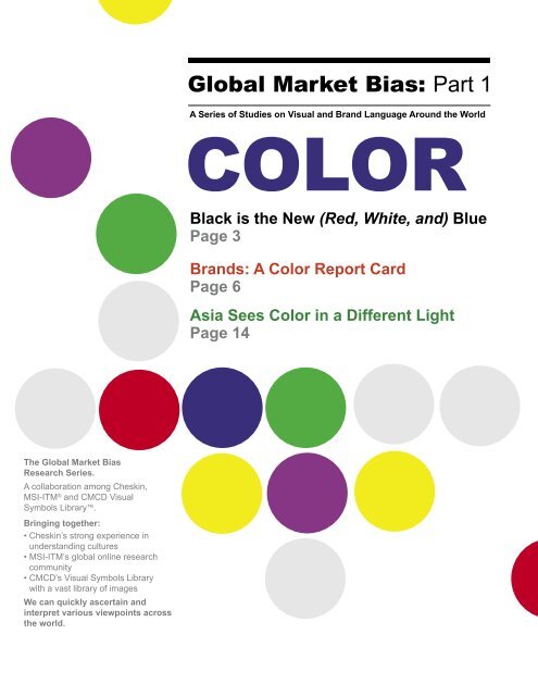
Global Market Bias: Part 1<br />
A Series of Studies on Visual and Brand Language Around the World<br />
COLOR<br />
Black is the New (Red, White, and) Blue<br />
Page 3<br />
Brands: A Color Report Card<br />
Page 6<br />
Asia Sees Color in a Different Light<br />
Page 14
The Global Market Bias research<br />
project is a series of studies examining<br />
visual and brand language around the<br />
world. It is a collaboration among three<br />
companies with strong credentials<br />
in <strong>global</strong> <strong>market</strong>ing, branding, and<br />
design–bringing together cultural<br />
expertise from Cheskin, the <strong>global</strong><br />
online research community from<br />
MSI-ITM, and the vast CMCD Visual<br />
Symbols Library.<br />
In our collective 93 years of experience<br />
with companies and cultures the world<br />
over, we’ve developed an appreciation<br />
for the differences between people<br />
— differences rooted in age, gender,<br />
and culture. Yet, with increasing<br />
<strong>global</strong>ization, we can’t help but wonder:<br />
in spite of historical cultural beliefs, are<br />
people starting to see the world in a<br />
somewhat uniform way? Might a <strong>global</strong><br />
visual language be developing? To find<br />
out, we launched a multi-<strong>part</strong> research<br />
series to consider how similar (or not)<br />
we really are.<br />
Our first installment explores the<br />
associations various regions make with<br />
<strong>color</strong>. Subsequent studies, already<br />
under way, will delve into the viability of<br />
non-celebrity spokespeople of varying<br />
cultural backgrounds, and the degree of<br />
brand elasticity around the globe.<br />
Introduction<br />
The Global Market Bias Research Series<br />
2 Cheskin | MSI-ITM | CMCD Visual Symbols Library | 2004<br />
Why Explore Color?<br />
People associate <strong>color</strong>s with emotions,<br />
products, companies, and even<br />
countries. Choosing appropriate and<br />
inspiring <strong>color</strong>s is especially critical<br />
when dealing with multicultural<br />
<strong>market</strong>s. In some cases, <strong>global</strong> brands<br />
have successfully created universal<br />
<strong>color</strong> associations. Coca-Cola is red,<br />
no matter where you go. But in other<br />
cases, there are vast differences in<br />
what <strong>color</strong>s mean to people. Certainly,<br />
studies on <strong>color</strong> abound. In fact, 50<br />
years ago, Louis Cheskin published<br />
“The Color Guide for Marketing Media”<br />
and wrote “Colors: What They Can<br />
Do For You” prior to that. So, looking<br />
forward while looking back, we embark<br />
on a new <strong>color</strong> study.<br />
Study Methodology<br />
An online survey reaching 17 countries<br />
obtained 12,929 interviews, the<br />
largest geographically balanced study<br />
on <strong>color</strong> to date. In order to qualify,<br />
respondents could not be <strong>color</strong>blind.<br />
Online interviews were conducted from<br />
June 28, 2004 to July 9, 2004, using<br />
PlanetPanel ®, a proprietary <strong>global</strong><br />
community developed and managed<br />
by MSI-ITM. The countries <strong>part</strong>icipating<br />
in this study included: Australia,<br />
Belgium, Brazil, Canada, China,<br />
France, Germany, Italy, Japan, Korea,<br />
Mexico, the Netherlands, Russia,<br />
Sweden, Spain, United Kingdom, and<br />
United States.<br />
The online survey first asked<br />
respondents to pick a favorite <strong>color</strong>,<br />
then continued by focusing on eight<br />
<strong>color</strong>s — red, blue, green, purple,<br />
orange, yellow, black, and white.<br />
Participants were asked to rate the<br />
<strong>color</strong>s in terms of their association with<br />
certain attributes, products, companies,<br />
and countries.
To most of the world, the United States<br />
is best represented by the red, white<br />
and blue hues of its flag, “Old Glory”.<br />
But people from a variety of countries<br />
think of America as black, a shade<br />
associated with anger, aggression and<br />
big lumps of coal. France in <strong>part</strong>icular<br />
takes a “noir” view, with 34 percent of<br />
French respondents seeing the U.S.<br />
as black. The French are not alone as<br />
31 percent of Swedes, 29 percent of<br />
Brazilians, 28 percent of Spaniards<br />
27 percent of Russians and 26 percent<br />
of Germans all take a dim view of<br />
America. This is in strong contrast<br />
to American respondents’ vision of<br />
themselves - only 4 percent associate<br />
their country with black.<br />
When did the USA become the<br />
proxy for all things destructive–the<br />
Kali of the <strong>color</strong> wheel? Critics may<br />
say it has something to do with the<br />
American habit of blundering into other<br />
countries’ politics. Chances are it’s not<br />
attributable to a chic Prada-embracing<br />
Black<br />
Black is the New<br />
(Red, White and) Blue<br />
lifestyle. Still, can anything change the<br />
mindset in Brazil and France?<br />
Perhaps the U.S. can borrow some<br />
goodwill from the <strong>color</strong> yellow. Yellow<br />
signals sun, happiness, and warmth.<br />
It makes people feel energetic,<br />
hopeful and cheery. And, according to<br />
international trendsetter, Oprah, yellow<br />
is “in.” (The U.S. could learn a lot from<br />
Oprah — she manages to be rich,<br />
powerful and well-respected.)<br />
Americans need to go golden. It might<br />
just convince France and Brazil to<br />
lighten up.<br />
Cheskin | MSI-ITM | CMCD Visual Symbols Library | 2004 3
Color Associations with Countries<br />
The <strong>color</strong>s of a fl ag often set the tone<br />
for how people view a country, <strong>color</strong>wise.<br />
But not always. Just take a look<br />
at the array below. Color associations<br />
vary, both internally among citizens,<br />
and compared to everyone else. What<br />
<strong>color</strong>s does your country fl y under?<br />
France Everyone Else<br />
Blue 91%<br />
Red 53%<br />
White 48%<br />
Green 10%<br />
Yellow 5%<br />
62%<br />
46%<br />
40%<br />
15%<br />
11%<br />
Netherlands Everyone Else<br />
Orange 78%<br />
Blue 48%<br />
Red 42%<br />
White 38%<br />
Green 10%<br />
49%<br />
24%<br />
18%<br />
25%<br />
23%<br />
Country Colors<br />
4 Cheskin | MSI-ITM | CMCD Visual Symbols Library | 2004<br />
Australia Everyone Else<br />
Yellow 74%<br />
Green 72%<br />
Blue 50%<br />
Red 35%<br />
Orange 26%<br />
32%<br />
34%<br />
34%<br />
26%<br />
24%<br />
Germany Everyone Else<br />
Black 75%<br />
Red 66%<br />
Yellow 56%<br />
Green 13%<br />
White 7%<br />
61%<br />
35%<br />
31%<br />
19%<br />
17%<br />
Russia Everyone Else<br />
Red 71%<br />
Blue 61%<br />
White 57%<br />
Green 30%<br />
Black 13%<br />
65%<br />
14%<br />
34%<br />
4%<br />
22%<br />
Belgium Everyone Else<br />
Red 78%<br />
Black 76%<br />
Yellow 70%<br />
Green 10%<br />
Orange 6%<br />
34%<br />
24%<br />
30%<br />
22%<br />
19%<br />
Italy Everyone Else<br />
Green 68%<br />
Blue 39%<br />
Red 32%<br />
White 23%<br />
Yellow 9%<br />
57%<br />
25%<br />
52%<br />
35%<br />
17%<br />
Spain Everyone Else<br />
Red 89%<br />
Yellow 71%<br />
Blue 16%<br />
Green 15%<br />
Orange 8%<br />
68%<br />
45%<br />
8%<br />
15%<br />
22%
Brazil Everyone Else Canada Everyone Else<br />
Green 95%<br />
Yellow 83%<br />
Blue 64%<br />
White 47%<br />
Red 9%<br />
58%<br />
53%<br />
11%<br />
6%<br />
23%<br />
Japan Everyone Else<br />
Red 64%<br />
White 42%<br />
Green 14%<br />
Blue 12%<br />
Yellow 5%<br />
72%<br />
52%<br />
3%<br />
3%<br />
22%<br />
Sweden Everyone Else<br />
Blue 94%<br />
Yellow 90%<br />
Green 28%<br />
White 8%<br />
Red 7%<br />
46%<br />
40%<br />
15%<br />
36%<br />
14%<br />
Red 95%<br />
White 68%<br />
Green 24%<br />
Blue 16%<br />
Orange 3%<br />
Korea Everyone Else<br />
Red 58%<br />
White 56%<br />
Blue 45%<br />
Black 12%<br />
Yellow 3%<br />
57%<br />
52%<br />
28%<br />
13%<br />
9%<br />
61%<br />
34%<br />
10%<br />
16%<br />
22%<br />
United Kingdom Everyone Else<br />
Blue 80%<br />
Red 80%<br />
White 73%<br />
Green 15%<br />
Black 5%<br />
Country Colors<br />
55%<br />
50%<br />
40%<br />
15%<br />
13%<br />
China Everyone Else<br />
Red 89%<br />
Yellow 11%<br />
Orange 4%<br />
Black 4%<br />
White 3%<br />
69%<br />
39%<br />
9%<br />
11%<br />
17%<br />
Mexico Everyone Else<br />
Green 95%<br />
Red 80%<br />
White 70%<br />
Yellow 5%<br />
Orange 2%<br />
41%<br />
51%<br />
13%<br />
34%<br />
33%<br />
United States Everyone Else<br />
Red 89%<br />
Blue 88%<br />
White 83%<br />
Green 7%<br />
Black 4%<br />
63%<br />
61%<br />
49%<br />
6%<br />
20%<br />
Cheskin | MSI-ITM | CMCD Visual Symbols Library | 2004 5
Billions of dollars are spent on the<br />
development of corporate and product<br />
brand identities that appear around<br />
the world in advertising, point of<br />
sale, packaging, merchandising and<br />
sponsorship. Color is an integral <strong>part</strong><br />
of brand identity, yet different cultures<br />
see <strong>color</strong>s different ways. With that in<br />
mind, we wondered how tightly brands<br />
are connected with <strong>color</strong>, and if <strong>global</strong><br />
brand <strong>market</strong>ers have successfully<br />
established brand <strong>color</strong>s worldwide.<br />
Some of our fi ndings are what we<br />
expected:<br />
• BMW and Mercedes are black.<br />
• Coca-Cola and Marlboro are red.<br />
• McDonald’s is yellow and red.<br />
• MasterCard and Kodak are yellow<br />
and orange.<br />
• Pepsi, Levi’s, Microsoft and IBM<br />
are blue.<br />
Brand Colors<br />
Brands:<br />
A Color Report Card<br />
6 Cheskin | MSI-ITM | CMCD Visual Symbols Library | 2004
Does Brand Identity or<br />
Product Form Drive Color<br />
Associations?<br />
Some brands, though, are <strong>color</strong> fi ckle.<br />
For example, M&M’s brand is defi ned<br />
by all <strong>color</strong>s with the exception of<br />
black and white. We know that candy<br />
in general is not necessarily <strong>color</strong><br />
dominant, and neither is one of the<br />
category’s major brands.<br />
Which raises the question, are brand<br />
<strong>color</strong> associations driven by the identity<br />
or the product form? The Dannon brand<br />
<strong>color</strong> is white, the base <strong>color</strong> of yogurt.<br />
And for consumers, Levi’s blue jeans<br />
equal a blue brand, the signature red<br />
tag notwithstanding.<br />
Brand Colors<br />
Levi’s is identifi ed with blue rather than red, their brand identity <strong>color</strong>.<br />
orange scores<br />
In Latin America, orange says<br />
excitement. Both Mexican and<br />
Brazilian cultures are strongly<br />
infl uenced by fútbol and many<br />
teams in both countries have<br />
orange in their uniforms. Could<br />
it be that Latin Americans relate<br />
orange to the passion they feel<br />
when attending a match?<br />
Cheskin | MSI-ITM | CMCD Visual Symbols Library | 2004 7
Brand Cluster Map<br />
See How Brands Map With Colors Worldwide<br />
Color Key<br />
Blue<br />
Purple<br />
Green<br />
Red<br />
Black<br />
Orange<br />
Yellow<br />
White<br />
8 Cheskin | MSI-ITM | CMCD Visual Symbols Library | 2004
Tech Brands:<br />
Still Black and Blue<br />
IBM and Microsoft have carved<br />
out blue, but they also have black<br />
overtones – the black and blue<br />
combination is inherent in technology<br />
and consumer electronics categories.<br />
In fact, virtually all other electronic and<br />
technology companies in our study<br />
are associated with black and blue,<br />
including Samsung, Philips, Motorola,<br />
Nokia and Sony.<br />
American Express:<br />
Generation Gap?<br />
Other brands are bipolar, <strong>color</strong>-wise.<br />
The most notable is American Express,<br />
which comes across as both green<br />
and blue, despite a predominantly blue<br />
identity. Older consumers perceive<br />
American Express as a blue company,<br />
while younger consumers are much<br />
more likely to paint it as both green and<br />
blue. Obviously the traditional green<br />
card and the newcomer blue card are<br />
appealing to different segments, though<br />
not necessarily as you might expect.<br />
blue<br />
When Good Brands<br />
Go Colorblind<br />
Then again, American Express is<br />
<strong>color</strong>blind in Asia—there are few<br />
<strong>color</strong> associations with the brand in<br />
China, Japan or Korea. Other brands<br />
are <strong>color</strong>blind, too. Around the globe,<br />
news organizations CNN and BBC are<br />
not associated with a specifi c <strong>color</strong><br />
— perhaps the notion of im<strong>part</strong>ial<br />
reporting works against strong <strong>color</strong><br />
associations. Louis Vuitton, Nestle, Fila<br />
and Schweppes have very limited <strong>color</strong><br />
associations as well.<br />
Strong Brand,<br />
Strong Color Story<br />
Brand Colors<br />
Our study shows that <strong>color</strong> associations<br />
with brands are fairly consistent around<br />
the world — the stronger the brand,<br />
the stronger the <strong>color</strong> defi nition. Coke<br />
will always be red, regardless of where<br />
you live. In regions where brands are<br />
not fully developed, <strong>color</strong> associations<br />
are fuzzier. Marlboro is red in every<br />
place but Asia, where the brand is less<br />
dominant. Color associations do vary<br />
by life stage: The younger you are, the<br />
redder Coke is. In contrast, the older<br />
you are, the more likely that you’ll pick<br />
Marlboro as the dominant red brand.<br />
What does all this mean for brand<br />
<strong>market</strong>ers? First, that the time and<br />
money invested in brand identity is<br />
well spent. Second, pay attention<br />
to the brand’s <strong>color</strong> to attract <strong>global</strong><br />
consumers.<br />
blue’s a crowd<br />
Quick, how many blue brands can<br />
you think of? Too many, our study<br />
concludes. So many brands are<br />
linked to blue, it’s obvious that<br />
the world’s favorite <strong>color</strong> is, well,<br />
a little too popular. The lesson for<br />
<strong>market</strong>ers? Don’t go blue if you’re<br />
new.<br />
Cheskin | MSI-ITM | CMCD Visual Symbols Library | 2004 9
Favorite Colors<br />
Which Is Your Favorite Color?<br />
Every Country Says “Blue”<br />
Canada<br />
Blue 41%<br />
Purple 14%<br />
Green 11%<br />
Red 15%<br />
Black 10%<br />
Orange 4%<br />
Yellow 4%<br />
White 2%<br />
United States<br />
Blue 41%<br />
Purple 22%<br />
Green 10%<br />
Red 10%<br />
Black 6%<br />
Orange 4%<br />
Yellow 5%<br />
White 1%<br />
Mexico<br />
Blue 42%<br />
Purple 4%<br />
Green 5%<br />
Red 15%<br />
Black 22%<br />
Orange 2%<br />
Yellow 4%<br />
White 4%<br />
Brazil<br />
Blue 44%<br />
Purple 4%<br />
Green 8%<br />
Red 14%<br />
Black 17%<br />
Orange 3%<br />
Yellow 4%<br />
White 6%<br />
10 Cheskin | MSI-ITM | CMCD Visual Symbols Library | 2004<br />
Sweden<br />
Blue 37%<br />
Purple 14%<br />
Green 11%<br />
Red 15%<br />
Black 12%<br />
Orange 4%<br />
Yellow 5%<br />
White 3%<br />
United Kingdom<br />
Blue 36%<br />
Purple 21%<br />
Green 10%<br />
Red 14%<br />
Black 8%<br />
Orange 4%<br />
Yellow 7%<br />
White 1%<br />
France<br />
Blue 40%<br />
Purple 18%<br />
Green 10%<br />
Red 14%<br />
Black 10%<br />
Orange 3%<br />
Yellow 4%<br />
White 2%<br />
Netherlands<br />
Blue 40%<br />
Purple 11%<br />
Green 7%<br />
Red 21%<br />
Black 11%<br />
Orange 5%<br />
Yellow 5%<br />
White 1%<br />
Belgium<br />
Blue 39%<br />
Purple 15%<br />
Green 6%<br />
Red 15%<br />
Black 12%<br />
Orange 5%<br />
Yellow 6%<br />
White 1%
Germany<br />
Blue 47%<br />
Purple 7%<br />
Green 10%<br />
Red 14%<br />
Black 11%<br />
Orange 7%<br />
Yellow 4%<br />
White 1%<br />
Spain<br />
Blue 39%<br />
Purple 8%<br />
Green 11%<br />
Red 18%<br />
Black 11%<br />
Orange 4%<br />
Yellow 6%<br />
White 4%<br />
Russia<br />
Blue 32%<br />
Purple 8%<br />
Green 19%<br />
Red 10%<br />
Black 7%<br />
Orange 13%<br />
Yellow 8%<br />
White 4%<br />
Italy<br />
Blue 44%<br />
Purple 5%<br />
Green 10%<br />
Red 15%<br />
Black 8%<br />
Orange 7%<br />
Yellow 6%<br />
White 3%<br />
Favorite Colors<br />
China<br />
Blue 37%<br />
Purple 13%<br />
Green 13%<br />
Red 9%<br />
Black 7%<br />
Orange 8%<br />
Yellow 4%<br />
White 9%<br />
Japan<br />
Blue 36%<br />
Purple 6%<br />
Green 16%<br />
Red 9%<br />
Black 6%<br />
Orange 12%<br />
Yellow 7%<br />
White 7%<br />
Korea<br />
Blue 34%<br />
Purple 10%<br />
Green 20%<br />
Red 9%<br />
Black 8%<br />
Orange 7%<br />
Yellow 7%<br />
White 7%<br />
Australia<br />
Blue 43%<br />
Purple 23%<br />
Green 9%<br />
Red 12%<br />
Black 7%<br />
Orange 2%<br />
Yellow 5%<br />
White 1%<br />
Cheskin | MSI-ITM | CMCD Visual Symbols Library | 2004 11
When you talk with people about <strong>color</strong><br />
and you want to be really clear, use<br />
the <strong>color</strong> yellow. Eighty-eight percent<br />
of our respondents see yellow as the<br />
same shade. On the other hand, when<br />
you say blue your likelihood of having<br />
people thinking of the same shade is<br />
about 50-50.<br />
Based on people’s context, their lives,<br />
their culture and physiology, people<br />
experience <strong>color</strong>s differently in words<br />
than they do when they see the specific<br />
<strong>color</strong>. This is why designers use <strong>color</strong><br />
chips to make sure they mean the<br />
same thing. It is also why prototyping<br />
<strong>color</strong> is important to the process. We all<br />
may see things differently in our mind’s<br />
eye than others.<br />
So, at least, when you speak of <strong>color</strong>,<br />
if you can’t use a prototype, use a<br />
chip and if you can’t use a chip, use at<br />
least an adjective or two. Yellow may<br />
be bright yellow to almost everybody<br />
around the world but blue may be royal,<br />
navy or sky blue for starters.<br />
Color<br />
Colors:<br />
What You Say May Not Be What You See<br />
12 Cheskin | MSI-ITM | CMCD Visual Symbols Library | 2004<br />
Which <strong>color</strong> do you think of first?<br />
In our study we asked all of our 12,929 respondents to<br />
select which shade of <strong>color</strong> is closest to the one they<br />
thought of first.<br />
For each of the <strong>color</strong> groups below, which shade of <strong>color</strong><br />
is closest to the one you think of first?<br />
What <strong>color</strong> is Orange?<br />
What <strong>color</strong> is Green?<br />
What <strong>color</strong> is Red?<br />
What <strong>color</strong> is Yellow?<br />
What <strong>color</strong> is Purple?<br />
What <strong>color</strong> is Blue?<br />
1 2 3<br />
33% 65% 3%<br />
18%<br />
23%<br />
60%<br />
72% 2% 26%<br />
4%<br />
8%<br />
88%<br />
14% 66% 21%<br />
57% 20% 24%
Purple:<br />
More Popular Than Ever<br />
Blue may be the world’s favorite <strong>color</strong>,<br />
but surprisingly, purple is the second<br />
most popular. And its popularity is<br />
growing, especially in English-speaking<br />
countries where 21 percent of people<br />
say purple is their favorite. Marketers<br />
are taking notice. Some are already<br />
picking up on purple in products,<br />
packaging, branding and advertising.<br />
Is purple right for your brand? Read on<br />
to learn more.<br />
Purple Stirs<br />
Women’s Souls<br />
Women, more so than men, have<br />
had a preference for purple ever<br />
since Cleopatra’s time. In fact, more<br />
than twice as many women than men<br />
consider purple their favorite. Women<br />
also attach stronger associations to<br />
purple. Men’s positive associations<br />
are significantly weaker when it comes<br />
to qualities such as friendly, innovative,<br />
happy, exciting, strong, high quality,<br />
safe, love, hope and luck. Women<br />
feel purple’s pull more passionately<br />
than men.<br />
And Appeals to<br />
Mature Audiences<br />
Just as women and men differ in their<br />
passion for purple, so too do women<br />
in different age groups. In Englishspeaking<br />
countries, 34 percent of<br />
women aged 25 to 44 choose purple<br />
as their favorite <strong>color</strong>; many strongly<br />
associate it with royalty, quality,<br />
prestige, excitement, friendliness and<br />
other positive qualities. Younger women<br />
aged 18 to 24 associate purple with<br />
these attributes far less.<br />
A Split Personality<br />
in Latin America<br />
Latin America has strong feelings for<br />
purple. On the positive side, people<br />
in Mexico and Brazil see purple as<br />
representing strength and innovation.<br />
However, they also associate it with<br />
sadness, death, and cold. These<br />
associations may be related to the<br />
role purple plays in this region’s<br />
religious practices.<br />
Purple Rules,<br />
But No Brand Reigns<br />
Purple<br />
No brand owns purple around the world<br />
the way Coke owns red. Our study finds<br />
Cadbury has the strongest connection<br />
to purple in English-speaking countries.<br />
L’Oreal is highly associated with purple<br />
in Latin America and Europe, but the<br />
link is weaker in Asia. Purple, <strong>global</strong>lyspeaking,<br />
may be up for grabs.<br />
Is purple right for your brand? If you’re<br />
trying to reach women, especially<br />
women in English-speaking regions,<br />
and you want to create powerful<br />
positive associations with your<br />
product or service, purple may be<br />
the best alternative to that over-used<br />
favorite, blue.<br />
Cheskin | MSI-ITM | CMCD Visual Symbols Library | 2004 13
Asia Color<br />
Asia:<br />
Sees Color in a Different Light<br />
When it comes to <strong>color</strong> associations,<br />
Asia is indeed a complex palette.<br />
With our <strong>color</strong> study, we wanted to<br />
understand what, if any universals<br />
there are in the way people think about<br />
<strong>color</strong>. Admittedly, this is a big and<br />
complex undertaking. Our intent was to<br />
playfully scratch the surface. In doing<br />
so, we uncovered some surprising<br />
findings about Asia.<br />
We found there is more dissent than<br />
agreement within Asia as to what<br />
<strong>color</strong>s mean. The Chinese, Japanese,<br />
and Korean respondents were often<br />
strikingly at odds with each other, but in<br />
different ways. Japan and Korea took<br />
turns being more similar to China than<br />
to each other. And China, despite being<br />
a developing country, was sometimes<br />
more aligned with the Western<br />
countries, while Japan and Korea<br />
displayed unique <strong>color</strong> perspectives.<br />
When it comes to <strong>color</strong>, Asia is just not<br />
a homogeneous <strong>market</strong>.<br />
From the red and gold of dragons to<br />
the white of geisha makeup to the<br />
saffron of monk’s robes, <strong>color</strong> plays<br />
meaningful roles throughout Asia.<br />
And those meanings may be shifting<br />
or taking on new dimensions. We<br />
offer some intriguing glimpses on the<br />
following pages.<br />
Blue: Many Facets<br />
14 Cheskin | MSI-ITM | CMCD Visual Symbols Library | 2004<br />
Blue is the world’s favorite <strong>color</strong>.<br />
China, Japan, and Korea rate blue as<br />
their favorite <strong>color</strong>, but that’s where the<br />
similarity ends. While most of the world<br />
finds blue a happy <strong>color</strong>, the Chinese<br />
aren’t smiling. Rather, the Chinese<br />
think power and reliability. Technology<br />
comes foremost to mind when they<br />
think blue—PC’s, cell phones, and<br />
appliances. In China, IBM is still blue.<br />
Over time, blue may have become the<br />
world’s favorite <strong>color</strong>, but while it is<br />
strongly associated with high tech in<br />
one culture, blue might mean nature in<br />
another.<br />
The Koreans think technology since<br />
they associate blue with Samsung, but<br />
their take is more about freshness and<br />
innovation. They strongly associate<br />
water with the <strong>color</strong>, suggesting<br />
perhaps a more fluid and dynamic<br />
association with technology. In Japan,<br />
unlike in China, blue is not a <strong>color</strong><br />
associated with power or reliability.<br />
Rather, the Japanese agree with their<br />
Western counter<strong>part</strong>s that blue makes<br />
them feel sad.<br />
Blue continues to be the universally<br />
“safe” <strong>color</strong> to use, but we see<br />
opportunities to play the Korean blues<br />
and push the <strong>color</strong> from safe and<br />
reliable to fresh and innovative.<br />
40%<br />
14%<br />
12% 11%<br />
8%<br />
6% 5% 4%<br />
Blue Purple Green Red Black Orange Yellow White<br />
Global favorite <strong>color</strong>.<br />
Blue<br />
25%<br />
English-Speaking<br />
Countries<br />
45%<br />
12%<br />
34%<br />
China Japan Korea<br />
The association of blue with power.<br />
Blue evokes sadness in Japan.
Red: Coke Today,<br />
Technology Tomorrow?<br />
The Asians see red when they think of<br />
Coca-Cola. In this, the world is aligned.<br />
Red inspires strong feelings<br />
of excitement and danger. However,<br />
red stirs other emotions.<br />
In China, red is all about power,<br />
prestige, and happiness. Red is<br />
the <strong>color</strong> of weddings, lucky money<br />
envelopes, and the Chinese New Year.<br />
Koreans are unique in the world in their<br />
association of red with innovation and<br />
somewhat surprisingly, the company<br />
LG. Thus, while in China red evokes<br />
traditional images, Korea connects<br />
red to the future and technology. We<br />
see opportunities to play on two sides<br />
of red in Asia, taking into account the<br />
polarity of perceptions about the <strong>color</strong>.<br />
Red<br />
66%<br />
English-Speaking<br />
Countries<br />
30%<br />
China<br />
46%<br />
52%<br />
Japan Korea<br />
The association of red with Coca-Cola.<br />
White: Not So<br />
Uniform in Asia<br />
Asia Color<br />
White is strongly associated with the<br />
notion of fresh throughout the world.<br />
This holds true in both Japan and<br />
Korea, which also highly rate the <strong>color</strong><br />
white with prestige. Japan Airlines<br />
evokes strong connections to white<br />
across all the Asian countries.<br />
Unlike the rest of the world and their<br />
Asian counter<strong>part</strong>s, Koreans don’t<br />
seem to link white with appliances.<br />
While Koreans rate white high in<br />
freshness and prestige, they also find<br />
white weak and sad.<br />
China is out of step with the rest of<br />
Asia and the world in that it rates<br />
white low in association with fresh and<br />
prestige. Like the Koreans, the Chinese<br />
find white to be sad. White gifts are<br />
associated with funerals, and women<br />
don’t wear white unless they are in<br />
deep mourning. Almost uniquely in the<br />
world, the Chinese associate white<br />
with water, the phrase “white water”<br />
meaning plain water.<br />
White<br />
62%<br />
English-Speaking<br />
Countries<br />
11%<br />
China<br />
55%<br />
57%<br />
Japan Korea<br />
The association of white with freshness.<br />
White is a funeral <strong>color</strong> in Korea and China.<br />
natural inclination<br />
While people in most regions of<br />
the world associate <strong>color</strong> with<br />
emotions, people in Asia connect<br />
<strong>color</strong> with nature. Does that mean<br />
Asians are more attuned to the<br />
natural world, or do they simply<br />
prefer to keep their emotions to<br />
themselves?<br />
Cheskin | MSI-ITM | CMCD Visual Symbols Library | 2004 15
Yellow<br />
22%<br />
English-Speaking<br />
Countries<br />
26%<br />
46%<br />
China Japan Korea<br />
Japan associates yellow with danger.<br />
14%<br />
Asia Color<br />
16 Cheskin | MSI-ITM | CMCD Visual Symbols Library | 2004<br />
Yellow:<br />
Proceed With Caution<br />
While yellow elicits strong associations<br />
from the rest of the world, the<br />
responses from Asia are mixed.<br />
For instance, yellow is typically thought<br />
of as a happy <strong>color</strong>. However, this is<br />
not true in China. In China only 18<br />
percent identified yellow with happy in<br />
comparison to 41 percent in Japan, 46<br />
percent in Korea and 61 percent<br />
in the English–speaking<br />
countries. Yellow shows<br />
a similar pattern in<br />
association with<br />
fresh. It has a<br />
strong association<br />
everywhere but in<br />
China.<br />
In Japan, the<br />
highest association<br />
with yellow is danger:<br />
more than three times the<br />
response in Korea and almost<br />
twice as much as the rest of the world.<br />
In Korea, the second highest<br />
association of yellow is weakness. This<br />
is unique to Korea with 41 percent.<br />
Other <strong>part</strong>s of the world may associate<br />
weakness with yellow but not nearly<br />
as strongly. Years ago in the United<br />
States, Louis Cheskin found that yellow<br />
flecks in detergent implied a weaker<br />
detergent than ones with blue or red<br />
flecks. The red was too strong and the<br />
blue was just right. Yellow, even when<br />
added to other <strong>color</strong>s, may still need to<br />
be used cautiously in Asia.<br />
Purple: Reigns Everywhere<br />
but China<br />
Purple is very strong in the English–<br />
speaking countries. While it has<br />
strength in Korea and Japan it has<br />
almost none in China. In China the<br />
highest rated attribute associated with<br />
purple is a mere 24 percent and most<br />
are much lower than this. This is in<br />
stark contrast, for instance, to green’s<br />
association with being environmentally<br />
friendly in China, which is 98<br />
percent.<br />
We see China as<br />
an unfilled glass<br />
when it comes to<br />
purple. Like the<br />
English–speaking<br />
countries, China<br />
selected purple as<br />
the second favorite<br />
<strong>color</strong>, along with green.<br />
But unlike the English–<br />
speaking countries it is not<br />
associated with a <strong>part</strong>icular essence.<br />
An example of this is in association with<br />
prestige where China has one–quarter<br />
the response of the English–speaking<br />
countries.<br />
Purple<br />
50%<br />
English-Speaking<br />
Countries<br />
12%<br />
59%<br />
46%<br />
China Japan Korea<br />
The association of purple with prestige.
Green: The Healthy<br />
Understudy<br />
Green is the third most popular <strong>color</strong><br />
around the world. Asians also agree<br />
with the rest of the world that green<br />
most readily brings to mind the idea<br />
of being environmentally friendly.<br />
In China, that association is highest<br />
at 98 percent. The Chinese also<br />
associate green with fresh and power<br />
at a much higher rate than their Asian<br />
counter<strong>part</strong>s.<br />
In addition to being environmentally<br />
friendly, the Koreans (but not the<br />
Japanese) associate green with<br />
reliability and high quality.<br />
We see many interesting opportunities<br />
for the <strong>color</strong> green due to the strength<br />
of these positive associations and<br />
the dearth of companies that are<br />
connected with the <strong>color</strong>. We see<br />
an opportunity to play on the notion<br />
of fresh in China, given the low<br />
association of this attribute with white.<br />
Small kitchen appliances are showing<br />
up in retro shades of diner green. Could<br />
we possibly allow avocado to make a<br />
comeback in the kitchen or laundry?<br />
Don’t let your intuition answer that<br />
question if you plan on selling in Korea.<br />
Stranger things have happened. There<br />
may indeed be an opportunity to play<br />
up green in association with household<br />
appliances in Korea, given white’s low<br />
resonance in that area.<br />
Black: Power,<br />
Technology<br />
Asia Color<br />
Black is associated consistently<br />
throughout Asia with high quality.<br />
Black also means power, but more so<br />
in English-speaking countries.However,<br />
black’s association with technology is<br />
strongest in China, with people linking<br />
the <strong>color</strong> to their cell phones, PC’s,<br />
and appliances.<br />
We also see this difference changing<br />
as China adopts more design-oriented<br />
technologies and moves away from a<br />
strict correlation between technology<br />
and professionalism. As kids begin to<br />
adopt technology more and the iPod<br />
finds its audience, will black’s meaning<br />
change in China?<br />
Green<br />
English-Speaking<br />
Countries<br />
98%<br />
88% 86%<br />
92%<br />
China Japan Korea<br />
Green is associated with being friendly to<br />
the enviornnment.<br />
Black<br />
44%<br />
English-Speaking<br />
Countries<br />
31%<br />
44%<br />
17%<br />
China Korea Japan<br />
The association of black with power.<br />
Will green applicances work in Asia?<br />
Cheskin | MSI-ITM | CMCD Visual Symbols Library | 2004 17
Orange:<br />
Underestimated<br />
While it’s only the sixth favorite <strong>color</strong><br />
out of the eight tested, orange elicits<br />
strong associations in Asia. The<br />
Chinese tend to find orange related<br />
to power and prestige. But, unlike the<br />
rest of the world, the Chinese don’t<br />
associate orange with environmentally<br />
friendly.<br />
The Japanese like orange more than<br />
the rest of the world, ranking it higher<br />
on their list of favorites. In Japan,<br />
the correlation to fresh and health is<br />
the highest in the world. Interesting<br />
given the fact that orange juice is so<br />
expensive in that country! While about<br />
a third of everyone else in the world<br />
associates orange with danger, only<br />
nine percent of the Japanese do so.<br />
Instead, the Japanese also associate<br />
orange with hope and friendly.<br />
Despite these varied and strong<br />
associations with attributes, there is<br />
no company that owns orange in<br />
Asia the same way Coca-Cola owns<br />
red. This is an interesting contrast to<br />
Europe where orange is commonly<br />
used in branding. There are clearly<br />
opportunities to play up orange in Asia.<br />
Orange<br />
20%<br />
English-Speaking<br />
Countries<br />
53%<br />
3%<br />
24%<br />
China Japan Korea<br />
The association of orange with power.<br />
Asia Color<br />
18 Cheskin | MSI-ITM | CMCD Visual Symbols Library | 2004<br />
Summary: The Asian<br />
Color Conundrum<br />
In summary, <strong>color</strong> in Asia is a bit like<br />
a riddle wrapped inside a mystery – it<br />
pays to be circumspect when trying<br />
to figure out answers. Our findings<br />
suggest that Asian countries are as<br />
different from each other as they are<br />
from the rest of the world. Our coaching<br />
is not to take these findings and apply<br />
them wholesale. The risk is that you<br />
signal something unintended—purple<br />
cell phones or the wrong green in an<br />
appliance may be the kiss of death in<br />
Asia. Further research can minimize<br />
the risks — we encourage you to delve<br />
more deeply into specific cultures<br />
and categories, to make sure you<br />
approach them with clear and <strong>color</strong>ful<br />
communication.<br />
Orange<br />
8%<br />
English-Speaking<br />
Countries<br />
34%<br />
9%<br />
21%<br />
China Japan Korea<br />
The association of orange with prestige.
Red China,<br />
Reborn<br />
While most countries feel tied to the<br />
<strong>color</strong>s emblazoned on their flags, they<br />
don’t have to be. Nations that dare<br />
to break with history can create new<br />
possibilities by embracing a new visual<br />
identity. Color is a great place to start.<br />
Australia did it. In 1984, Australian<br />
Governor-General Ninian Stevens<br />
chucked the British royal <strong>color</strong>s of<br />
red and blue, declaring instead that<br />
Australia’s official <strong>color</strong>s would be<br />
green and gold, or to be precise,<br />
Pantone 116C and 348C. He gave the<br />
country a new look, and Australians<br />
apparently approved—nearly<br />
three-quarters of the Australians<br />
we polled identified green and gold<br />
as their national <strong>color</strong>s. Sure, their<br />
flag still bears the Union Jack and<br />
they sing “God Save the Queen”<br />
whenever the old gal’s around, but for<br />
communications/PR purposes they<br />
have staked out a separate space.<br />
And made a very clear point: Australia<br />
is no longer English property. What’s<br />
more, Mr. Stevens even declared the<br />
national <strong>color</strong>s “royalty-free” — officially<br />
assigning them to the public domain.<br />
(John Deere won’t give away its green,<br />
but Australia does.)<br />
As brand consultants, we can’t help<br />
but admire this tactic. It is a bold and<br />
enterprising way of visually reinventing<br />
a country. It is exactly what we’d<br />
prescribe for China.<br />
For more than a decade we have<br />
spent a lot of time in China: Beijing,<br />
Red<br />
Guangzhou, Wuhan, and especially<br />
the cities of Shanghai and Zhengzhou.<br />
Shanghai, like San Francisco, is a<br />
city of early-adopters and progressive<br />
business practices. Zhengzhou,<br />
like Chicago and Manchester, is<br />
a significant and up and coming<br />
regional center that while behind<br />
its more cosmopolitan sister city,<br />
Shanghai, still offers cultural and<br />
commercial perspective invaluable<br />
to Western companies. Zhengzhou<br />
has a high-density urban population<br />
with two million urban residents<br />
and one of China’s most important<br />
railway junctions. We recognize that,<br />
while provincial, this city still has a<br />
sophisticated population. We see in it<br />
the cultural superpower that China<br />
has been and is again becoming. We’d<br />
like to see China decked out in style<br />
with a new national <strong>color</strong>.<br />
China would look great in a new hue.<br />
Blazing yellow. Brilliant magenta. Or<br />
perhaps imperial purple. The Chinese<br />
pick purple as one of their favorite<br />
<strong>color</strong>s. And while they don’t currently<br />
associate purple with prestige, the rest<br />
of the world does. Chinese leaders<br />
would just need to decide and then<br />
make it so with careful execution.<br />
China would then have a powerful<br />
<strong>color</strong> worthy of a culture that created<br />
paper, gunpowder, and the zero (the<br />
zero!). Can you see it? The next<br />
cultural superpower dressed head to<br />
toe in eye-riveting plum, a <strong>color</strong> free<br />
from the baggage of historical context.<br />
A <strong>color</strong> that 1.3 billion people have<br />
chosen to own.<br />
The 2008 Olympics could be China’s<br />
coming out <strong>part</strong>y — heralded by<br />
firecrackers and feasting, rubber band<br />
acrobats, and silk banners painting the<br />
air above Beijing. What a brilliant way<br />
for the Chinese to thumb their noses at<br />
the stereotype of plodding farmers in<br />
gray Mao coats.<br />
China has a chance to prove that the<br />
tiger can change its stripes. Let Russia<br />
have red.<br />
love connection<br />
Red is the universal <strong>color</strong> of love:<br />
hot, dangerous and exciting! But<br />
are there other <strong>color</strong>s that say<br />
“I love you?” That depends on<br />
where you live. In Asia, orange<br />
has the second highest love<br />
connection. In English-speaking<br />
countries, purple is the romantic<br />
runner-up, while in Brazil, Mexico<br />
and France, white speaks of<br />
romance. Yellow nearly equals<br />
red’s heat in Spain. It seems<br />
the language of love has many<br />
nuances, no matter where in the<br />
world you are.<br />
Cheskin | MSI-ITM | CMCD Visual Symbols Library | 2004 19
Cheskin gives a fresh perspective based<br />
on a deep understanding of customers<br />
and cultures, guiding them to success and<br />
profitable <strong>market</strong> innovation. Cheskin is a<br />
consulting and research firm grounded in<br />
<strong>market</strong>ing and design. At the heart of our<br />
work is the recognition that innovation and<br />
success rest on in-depth understanding of<br />
people, their cultures, and the influences<br />
that motivate them. We can provide clients<br />
with a fresh perspective that guides<br />
profitable innovation at every point of<br />
the product development process, from<br />
identifying unmet customer needs, to<br />
visualizing new concepts.<br />
Cheskin believes that authenticity, meaning<br />
and relevance inspire trust, resulting in<br />
lasting customer relationships. With a<br />
diverse multi-lingual staff, Cheskin is highly<br />
regarded for our ability to anticipate change,<br />
and in turn define business opportunities in<br />
product development and <strong>market</strong> strategies<br />
for the future.<br />
For more information:<br />
visit www.cheskin.com<br />
info@cheskin.com<br />
(800) 969-3284<br />
Summary & Authors<br />
Summary:<br />
Cultural Nuances Abound<br />
Our <strong>color</strong> study reinforces much<br />
of what is known about <strong>color</strong>, yet<br />
it highlights the fact that cultural<br />
infl uences still play a strong role in<br />
<strong>color</strong> preferences and associations.<br />
Counter-intuition is called for when<br />
dealing with multiple cultures and<br />
© 2004 Cheskin, MSI-ITM, and CMCD Visual Symbols Library. All rights reserved.<br />
MSI-ITM, the MSI-ITM logo and PlanetPanel are trademarks or registered trademarks of MSI-ITM.<br />
CMCD, the CMCD logo, CMCD’s VISUAL SYMBOLS, and CMCD’S VISUAL SYMBOLS LIBRARY are trademarks or registered trademarks of CMCD, Inc.<br />
20 Cheskin | MSI-ITM | CMCD Visual Symbols Library | 2004<br />
various life stages. As <strong>global</strong>ization<br />
increases and countries in the Middle<br />
East experience economic and<br />
political awakenings similar to China,<br />
companies will have an opportunity to<br />
use <strong>color</strong> in very interesting ways — in<br />
communications, branding, product<br />
development and design.<br />
MSI-ITM International, BV, based in<br />
Amsterdam, specializes in web-based<br />
<strong>market</strong>ing research and offers worldwide<br />
online communities for consumer, businessto-business<br />
and specialty research<br />
projects. Its flagship, PlanetPanel, is<br />
the only multicountry online community<br />
built, managed and accessed on a single<br />
platform. This enables MSI-ITM clients to<br />
track <strong>global</strong> studies from a single portal in<br />
realtime, and to review data in any language<br />
included in the study.<br />
Additionally, MSI-ITM is pioneering the<br />
use of proprietary communities. These<br />
custom proprietary communities allow<br />
MSI-ITM’s clients to regularly interact<br />
with their customers to better understand<br />
their attitudes and behaviors. MSI-ITM’s<br />
client base includes <strong>global</strong> consumer and<br />
business to business product <strong>market</strong>ers.<br />
For more information:<br />
visit www.msi-itm.com<br />
p.strasser@msi-itm.com<br />
(484) 919-0556<br />
Understanding the <strong>color</strong> vocabulary<br />
across the world takes a consistent<br />
effort and a sustained curiosity<br />
about how and why perspectives are<br />
changing.<br />
CMCD’s Visual Symbols Library is the<br />
world’s leading provider of royalty-free<br />
iconographic stock photography. Founded<br />
over 10 years ago in San Francisco by<br />
design pioneer Clement Mok, CMCD is<br />
dedicated to providing designers and art<br />
directors with fresh yet timeless images at<br />
an affordable price.<br />
CMCD’s award-winning “picture dictionary”<br />
style is built on the idea that crisp,<br />
archetypal imagery is a day-to-day tool for<br />
communication that informs, instructs, and<br />
inspires. CMCD’s images are designed<br />
and selected for their iconic and utilitarian<br />
qualities. Like classic typefaces, the images<br />
offered as <strong>part</strong> of CMCD’s Visual Symbols<br />
Library are simple, direct, and universal;<br />
they have been used again and again for<br />
projects in diverse media around the world.<br />
Providing the basics and delivering the<br />
best images at the best prices in the<br />
industry is the focus of CMCD’s Visual<br />
Symbols Library.<br />
For more information:<br />
www.visualsymbols.com/<strong>global</strong>study<br />
info@cmcd.com<br />
(415) 285-7300