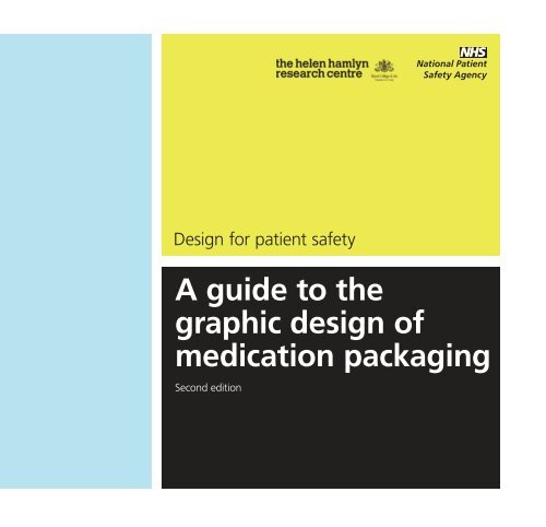
A guide to the graphic design of medication packaging
A guide to the graphic design of medication packaging
A guide to the graphic design of medication packaging

You also want an ePaper? Increase the reach of your titles
YUMPU automatically turns print PDFs into web optimized ePapers that Google loves.
Design for patient safety<br />
A <strong>guide</strong> <strong>to</strong> <strong>the</strong><br />
<strong>graphic</strong> <strong>design</strong> <strong>of</strong><br />
<strong>medication</strong> <strong>packaging</strong><br />
Second edition
Design for patient safety<br />
A <strong>guide</strong> <strong>to</strong> <strong>the</strong><br />
<strong>graphic</strong> <strong>design</strong> <strong>of</strong><br />
<strong>medication</strong> <strong>packaging</strong><br />
Second edition
About this publication<br />
Design for patient safety: A <strong>guide</strong> <strong>to</strong> <strong>the</strong> <strong>graphic</strong> <strong>design</strong> <strong>of</strong> <strong>medication</strong><br />
<strong>packaging</strong> is based on <strong>the</strong> results <strong>of</strong> a <strong>design</strong> research collaboration between<br />
<strong>the</strong> National Patient Safety Agency (NPSA) and <strong>the</strong> Helen Hamlyn Research<br />
Centre (HHRC) at <strong>the</strong> Royal College <strong>of</strong> Art, London. Editing, <strong>design</strong> and<br />
production <strong>of</strong> <strong>the</strong> document by <strong>the</strong> NPSA publishing department.<br />
The purpose is <strong>to</strong> allow busy <strong>design</strong>ers, purchasers and o<strong>the</strong>rs with an interest<br />
in package legibility and comprehensibility <strong>to</strong> quickly and simply understand<br />
how and why good <strong>design</strong> can contribute <strong>to</strong> patient safety through <strong>the</strong> clear<br />
labelling <strong>of</strong> medicines.<br />
First published as Information <strong>design</strong> for patient safety in 2006 by<br />
<strong>the</strong> National Patient Safety Agency. Second edition. © National Patient Safety<br />
Agency 2007. Copyright and o<strong>the</strong>r intellectual property rights in this material<br />
belong <strong>to</strong> <strong>the</strong> NPSA and all rights are reserved. The NPSA authorises healthcare<br />
organisations <strong>to</strong> reproduce this material for education and non-commercial use.<br />
Research and methodology<br />
The study was carried out over a one-year period by Thea Swayne, a<br />
postgraduate specialist in information and <strong>graphic</strong> <strong>design</strong>, working <strong>to</strong> a brief<br />
set by <strong>the</strong> NPSA and <strong>the</strong> HHRC. Existing <strong>design</strong> guidance was reviewed and<br />
consultations were undertaken with experts in <strong>graphic</strong> and information <strong>design</strong>,<br />
and in <strong>design</strong> for patient safety.<br />
A wide range <strong>of</strong> stakeholders contributed <strong>to</strong> <strong>the</strong> research – including patients,<br />
pharmaceutical industry personnel, NHS agencies, nurses and pharmacists.<br />
Observational research was undertaken in key end-use environments, such<br />
as wards, pharmacies and patients’ homes. A collection <strong>of</strong> current medicine<br />
packages was assembled as part <strong>of</strong> <strong>the</strong> study, and an analysis was carried out<br />
<strong>of</strong> common problem fac<strong>to</strong>rs for which <strong>design</strong> solutions were proposed. The<br />
outcome was a <strong>design</strong> rationale <strong>to</strong> enhance patient safety and a fully illustrated<br />
set <strong>of</strong> <strong>design</strong> considerations with both good and bad examples.
Contents<br />
Foreword 4<br />
Introduction 6<br />
Stakeholder review panel 8<br />
1 User testing 10<br />
2 Packaging <strong>design</strong> checklist 13<br />
3 Design recommendations 17<br />
for secondary <strong>packaging</strong><br />
Dispensing label 18<br />
Faces <strong>of</strong> <strong>the</strong> <strong>packaging</strong> 22<br />
Hierarchies <strong>of</strong> information 26<br />
Name <strong>of</strong> medicine 30<br />
Strength <strong>of</strong> medicine 32<br />
Typography 36<br />
4 Using colour 54<br />
5 Design recommendations 61<br />
for primary <strong>packaging</strong><br />
Fur<strong>the</strong>r reading 73
Foreword
Pr<strong>of</strong>essor Sir Liam Donaldson,<br />
Chief Medical Officer<br />
In <strong>the</strong> Department <strong>of</strong> Health’s 2003 report, Design for<br />
patient safety, I <strong>of</strong>fered a new perspective on improving<br />
patient safety and set out how we should be making use <strong>of</strong><br />
<strong>the</strong> many opportunities for effective <strong>design</strong> in healthcare <strong>to</strong><br />
address some <strong>of</strong> <strong>the</strong> safety challenges we are facing.<br />
Concentrating on <strong>design</strong> for safer <strong>packaging</strong> <strong>of</strong> prescription<br />
medicines, this latest publication seeks <strong>to</strong> resolve some <strong>of</strong><br />
<strong>the</strong> risks associated with <strong>medication</strong> error and, once again,<br />
draws attention <strong>to</strong> <strong>the</strong> need for an inclusive and systemswide<br />
approach.<br />
Ensuring <strong>the</strong> safety <strong>of</strong> patients must become a high visibility<br />
issue for anyone involved in <strong>the</strong> delivery <strong>of</strong> healthcare. This<br />
publication is a fur<strong>the</strong>r contribution <strong>to</strong> <strong>the</strong> important work<br />
that is taking place in this field.<br />
Design for patient safety – Foreword |
Introduction
Design for patient safety: A <strong>guide</strong> <strong>to</strong> <strong>the</strong> <strong>graphic</strong> <strong>design</strong><br />
<strong>of</strong> <strong>medication</strong> <strong>packaging</strong> shows how <strong>graphic</strong> <strong>design</strong><br />
on medicine <strong>packaging</strong> can enhance patient safety and<br />
details best practice based on established <strong>guide</strong>lines.<br />
It is aimed at <strong>packaging</strong> <strong>design</strong>ers and pharmaceutical<br />
companies. It will also be <strong>of</strong> interest <strong>to</strong> those in <strong>the</strong> NHS<br />
who regulate and purchase <strong>medication</strong>.<br />
There are an estimated 900,000 recorded adverse events<br />
in <strong>the</strong> NHS every year. 1 Improvements <strong>to</strong> <strong>the</strong> <strong>design</strong> <strong>of</strong><br />
medicine <strong>packaging</strong> could reduce this figure whilst also<br />
improve <strong>medication</strong> compliance. It is estimated that<br />
a third <strong>of</strong> <strong>medication</strong> errors are caused by confusion<br />
over <strong>packaging</strong> and labelling instructions. 2 Healthcare<br />
is delivered in many different contexts and patients’<br />
sensory, physical and mental capabilities vary greatly.<br />
Design solutions have <strong>to</strong> address <strong>the</strong>se fac<strong>to</strong>rs.<br />
Design for patient safety: A <strong>guide</strong> <strong>to</strong> <strong>the</strong> <strong>graphic</strong> <strong>design</strong><br />
<strong>of</strong> <strong>medication</strong> <strong>packaging</strong> focuses on:<br />
• blister packs: <strong>the</strong> most common type <strong>of</strong> primary<br />
<strong>packaging</strong> for prescription medicines;<br />
• secondary <strong>packaging</strong> used <strong>to</strong> contain blister packs;<br />
• <strong>the</strong> label attached <strong>to</strong> secondary <strong>packaging</strong> in<br />
pharmacies.<br />
The <strong>design</strong> considerations and principles outlined can be<br />
applied <strong>to</strong> o<strong>the</strong>r products such as patient information<br />
leaflets and tablet bottles.<br />
There is a comprehensive checklist that details <strong>the</strong><br />
key fac<strong>to</strong>rs that impact on patient safety. In line with<br />
<strong>the</strong> Medicines and Healthcare products Regula<strong>to</strong>ry<br />
Agency (MHRA) guidance document, 3 user research and<br />
evaluation is recommended when significant changes<br />
are made <strong>to</strong> any <strong>packaging</strong>. The checklist can help<br />
ensure that any testing <strong>of</strong> individual <strong>design</strong>s is thorough<br />
and effective.<br />
The examples <strong>of</strong> best practice have taken in<strong>to</strong> account<br />
<strong>the</strong> views <strong>of</strong> patients as well as those <strong>of</strong> pharmaceutical<br />
industry personnel, NHS agencies, nurses and<br />
pharmacists. They have also been researched in key enduse<br />
environments including hospital wards, pharmacies<br />
and patients’ homes.<br />
Design for patient safety: A <strong>guide</strong> <strong>to</strong> <strong>the</strong> <strong>graphic</strong> <strong>design</strong><br />
<strong>of</strong> <strong>medication</strong> <strong>packaging</strong> is <strong>the</strong> result <strong>of</strong> a collaboration<br />
between <strong>the</strong> National Patient Safety Agency (NPSA) and<br />
<strong>the</strong> Helen Hamlyn Research Centre (HHRC) at <strong>the</strong> Royal<br />
College <strong>of</strong> Art, London. It builds on <strong>the</strong> Designing for<br />
patient safety study commissioned by <strong>the</strong> Department <strong>of</strong><br />
Health and <strong>the</strong> Design Council, and undertaken jointly<br />
by <strong>the</strong> HHRC, <strong>the</strong> University <strong>of</strong> Cambridge and <strong>the</strong><br />
University <strong>of</strong> Surrey. 4<br />
Although <strong>the</strong> ideas in this publication require fur<strong>the</strong>r<br />
research, <strong>the</strong>y provide <strong>the</strong> foundations for establishing<br />
<strong>graphic</strong> <strong>design</strong> best practice <strong>guide</strong>lines that have <strong>the</strong><br />
potential <strong>to</strong> increase patient safety.<br />
Ideas for fur<strong>the</strong>r research include looking at:<br />
• how <strong>design</strong> can help patients on multiple <strong>medication</strong><br />
schedules;<br />
• information on <strong>the</strong> tablet itself;<br />
• adding a picture <strong>of</strong> <strong>the</strong> tablet on<br />
secondary <strong>packaging</strong>;<br />
• matching machine-readable codes<br />
on <strong>packaging</strong> and dispensing labels;<br />
• putting small products in larger <strong>packaging</strong><br />
for, in particular, ophthalmic products;<br />
• a ‘header’ area away from <strong>the</strong> tablets on<br />
blister strips where all critical information<br />
would remain intact.<br />
References<br />
1 www.npsa.nhs.uk/about<br />
2 ‘Reducing Medication Errors Through Naming, Labeling and Packaging’,<br />
Berman A., Journal <strong>of</strong> Medical Systems, Volume 28, Issue 1, 2004<br />
3 Best practice guidance on labelling and <strong>packaging</strong> <strong>of</strong> medicines,<br />
Medicines and Healthcare products Regula<strong>to</strong>ry Agency, London, 2003<br />
4 Designing for patient safety: a scoping study <strong>to</strong> identify how <strong>the</strong> effective<br />
use <strong>of</strong> <strong>design</strong> could help <strong>to</strong> reduce medical accidents. Robens Centre for<br />
Health Ergonomics at <strong>the</strong> University <strong>of</strong> Surrey, Engineering Design Centre at<br />
<strong>the</strong> University <strong>of</strong> Cambridge and Helen Hamlyn Research Centre, 2003<br />
Design for patient safety – Introduction |
Stakeholder<br />
review panel<br />
A stakeholder review panel was formed <strong>to</strong> ensure Design for patient safety:<br />
A <strong>guide</strong> <strong>to</strong> <strong>the</strong> <strong>graphic</strong> <strong>design</strong> <strong>of</strong> <strong>medication</strong> <strong>packaging</strong> addresses a wide and<br />
representative range <strong>of</strong> issues. The panel members are:
Roger Coleman,<br />
Steven Drewett<br />
Colum Menzies Lowe<br />
Pr<strong>of</strong>essor David Cousins<br />
Wendy Harris<br />
Pr<strong>of</strong>essor Peter Buckle<br />
Jonathan Milner<br />
Stein Lyftingsmo<br />
Sue Kilby<br />
Rachel Dean<br />
Jeff Willis<br />
Careen Snadden<br />
Howard S<strong>to</strong>koe<br />
Brian Parkinson<br />
Idris Hughes<br />
Yogini Jani<br />
Grant Courtney<br />
Jan MacDonald<br />
James Ward<br />
Matt Kennedy-Martin<br />
Pr<strong>of</strong>essor <strong>of</strong> Inclusive Design and Co-founder,<br />
Helen Hamlyn Research Centre, Royal College <strong>of</strong> Art<br />
Outpatient, Haema<strong>to</strong>logy & Oncology, Hammersmith Hospital<br />
Head <strong>of</strong> Design and Human Fac<strong>to</strong>rs, National Patient Safety Agency<br />
Head <strong>of</strong> Safe Medication Practice, National Patient Safety Agency<br />
Head <strong>of</strong> Safety Solutions, National Patient Safety Agency<br />
Direc<strong>to</strong>r <strong>of</strong> Ergonomics, European Institute <strong>of</strong> Health<br />
and Medical Sciences, University <strong>of</strong> Surrey<br />
Business Development Manager, InTouch PharmaMed,<br />
a Mat<strong>the</strong>ws Brand Solutions company<br />
Community and Hospital Pharmacist, Norway and Edi<strong>to</strong>r<br />
<strong>of</strong> website on labelling <strong>of</strong> medicines<br />
Head <strong>of</strong> Practice, Royal Pharmaceutical Society <strong>of</strong> Great Britain<br />
Acting Senior Graphic Designer, Royal National Institute <strong>of</strong> <strong>the</strong> Blind<br />
Deputy Head <strong>of</strong> Communication Art & Design Department,<br />
Royal College <strong>of</strong> Art<br />
Technical Direc<strong>to</strong>r, Almus Pharmaceuticals<br />
Principal Pharmacist, NHS Purchasing and Supply Agency<br />
Making Sense Design and co-facilita<strong>to</strong>r <strong>of</strong> Designers in Health Network<br />
Community Pharmacist and author<br />
Senior Pharmacist, UCLH NHS Foundation Trust<br />
Strategic Development Manager, GlaxoSmithKline<br />
Medicine and Healthcare products Regula<strong>to</strong>ry Agency<br />
Senior Research Associate, Engineering Design Centre,<br />
University <strong>of</strong> Cambridge<br />
Head <strong>of</strong> Government Relations, Design Council<br />
Design for patient safety – Stakeholder review panel |
User testing<br />
Packaging <strong>design</strong> should take in<strong>to</strong> account <strong>the</strong> needs and capabilities <strong>of</strong> <strong>the</strong> widest<br />
possible range <strong>of</strong> potential users, and in particular older and partially sighted users,<br />
and how <strong>the</strong>y interact with <strong>the</strong> medicine in <strong>the</strong> home.<br />
It should also consider <strong>the</strong> needs <strong>of</strong> pharmacists and, in particular, how <strong>the</strong>y identify,<br />
classify and differentiate between medicine packages.<br />
1<br />
10 | Information Design for Patient Safety – Secondary <strong>packaging</strong> <strong>design</strong> checklist
Pharmaceutical companies should develop <strong>the</strong>ir<br />
own methods for testing <strong>the</strong>ir <strong>packaging</strong> on users.<br />
The example below is developed from A <strong>guide</strong>line<br />
on <strong>the</strong> readability <strong>of</strong> <strong>the</strong> label and package leaflet <strong>of</strong><br />
medicinal products for human use. 1<br />
Aim<br />
There are a number <strong>of</strong> core tasks that are critical for<br />
<strong>the</strong> safe use <strong>of</strong> pharmaceutical <strong>packaging</strong>. The aim is<br />
<strong>to</strong> assess how users find <strong>the</strong> information <strong>the</strong>y need and<br />
how <strong>the</strong>y <strong>the</strong>n interpret this information. The test should<br />
be able <strong>to</strong> highlight any undesirable outcomes and<br />
determine <strong>the</strong> best combination <strong>of</strong> <strong>design</strong> elements.<br />
Method<br />
Test on a minimum <strong>of</strong> 20 people and a range <strong>of</strong> users<br />
including patients, pharmacists and carers. This will vary<br />
for each product.<br />
Manufacturers should carry out <strong>the</strong> testing. Designers<br />
should be involved.<br />
Participants<br />
Start by testing <strong>the</strong> products on 10 critical users who<br />
are likely <strong>to</strong> encounter problems. This should include<br />
users with lower visual abilities and reduced cognitive<br />
and dexterous functions.<br />
If a user becomes confused, note how <strong>the</strong>y deal with<br />
<strong>the</strong> difficulty.<br />
If a user does not understand a question, avoid giving<br />
<strong>the</strong> answer. Instead, ask <strong>the</strong>m what <strong>the</strong>y think it means.<br />
Testing procedure<br />
Test one user at a time, allowing at least half an hour<br />
for each person. They can be asked about using more<br />
than one <strong>packaging</strong>, but do not ask more than 15<br />
questions in a single session. Two questions concerning<br />
<strong>the</strong> same information should not follow one ano<strong>the</strong>r.<br />
Ask users <strong>to</strong> carry out <strong>the</strong>ir normal routine for reading<br />
information on <strong>packaging</strong>:<br />
1 Observe and write down what <strong>the</strong>y do.<br />
2 Ask users <strong>to</strong> write down in <strong>the</strong>ir own words what<br />
<strong>the</strong>y did.<br />
3 Ask questions that might extend <strong>the</strong> information<br />
ga<strong>the</strong>red.<br />
4 Ask specific questions about <strong>the</strong> legibility <strong>of</strong><br />
particular <strong>design</strong> elements on <strong>the</strong> <strong>packaging</strong>.<br />
5 Determine if specific information on <strong>the</strong> <strong>packaging</strong><br />
can be found quickly and easily.<br />
6 Determine if information on <strong>the</strong> <strong>packaging</strong> is<br />
understandable and informative.<br />
7 Ask users <strong>to</strong> find a particular piece <strong>of</strong> information<br />
and explain it in <strong>the</strong>ir own words. This will reveal<br />
how well <strong>the</strong>y understand <strong>the</strong> information. If this<br />
involves a physical activity such as mixing something<br />
<strong>to</strong>ge<strong>the</strong>r, <strong>the</strong>y should be asked <strong>to</strong> do this and<br />
actually go through <strong>the</strong> procedure on <strong>the</strong> package.<br />
Results<br />
Reviewing <strong>the</strong> data should reveal any major problems<br />
with <strong>the</strong> legibility <strong>of</strong> information on <strong>the</strong> <strong>packaging</strong>.<br />
At this stage, it is possible <strong>to</strong> re<strong>design</strong> or rewrite <strong>the</strong><br />
information before fur<strong>the</strong>r testing.<br />
Once satisfac<strong>to</strong>ry data has been obtained from 10<br />
users, a fur<strong>the</strong>r 10 should be tested. The objective is<br />
<strong>to</strong> have at least 16 users out <strong>of</strong> 20 able <strong>to</strong> answer each<br />
question correctly. It may be necessary <strong>to</strong> clarify <strong>the</strong><br />
performance <strong>of</strong> <strong>the</strong> questionnaire, which may include<br />
rewriting and remodelling <strong>the</strong> questions <strong>to</strong> achieve a<br />
better level <strong>of</strong> performance.<br />
Reference<br />
1 A <strong>guide</strong>line on <strong>the</strong> readability <strong>of</strong> <strong>the</strong> label and package leaflet <strong>of</strong><br />
medicinal products for human use, European Commission, Belgium, 1998<br />
Design for patient safety – User testing | 11
Packaging<br />
<strong>design</strong> checklist<br />
2
Packaging <strong>design</strong> checklist<br />
Issue Recommendation Page<br />
Secondary <strong>packaging</strong><br />
Medicine name and<br />
strength obscured Allocate 70 x 35mm white space for dispensing label 19<br />
Dispensing label and<br />
medicine name mismatched<br />
Critical information does not<br />
appear in <strong>the</strong> same field <strong>of</strong> vision<br />
Position <strong>the</strong> generic name and medicine strength<br />
above or next <strong>to</strong> <strong>the</strong> space for <strong>the</strong> dispensing label 21<br />
Put critical information in <strong>the</strong> same field <strong>of</strong><br />
vision on at least three non-opposing faces 23<br />
Some text can only be read by flipping<br />
<strong>the</strong> pack or reading upside down Orientate text in <strong>the</strong> same direction 25<br />
Difficult <strong>to</strong> recognise<br />
important information Use blank space <strong>to</strong> emphasise critical information 27<br />
Brand name confused with<br />
<strong>the</strong> generic name <strong>of</strong> a medicine Ensure <strong>the</strong> generic medicine name is suitably clear 29<br />
Medicines with similar names confused<br />
for one ano<strong>the</strong>r<br />
Use Tallman lettering <strong>to</strong> emphasise <strong>the</strong> difference<br />
between look-alike or sound-alike medicine names 31<br />
Wrong strength <strong>of</strong> a medicine selected Differentiate between strengths <strong>of</strong> <strong>the</strong> same medicine 33<br />
Easy <strong>to</strong> miss <strong>the</strong> decimal point<br />
in numbers with a trailing zero Do not add trailing zeros <strong>to</strong> numbers 35<br />
Small type size is difficult <strong>to</strong> read Body text in a minimum <strong>of</strong> 12 point 37<br />
Sentences in capital letters<br />
or italic type are hard <strong>to</strong> read Use upper and lower case 39<br />
Simulated handwriting and ornate<br />
typefaces are hard <strong>to</strong> read Use sans serif typefaces 41<br />
Lightweight typeface is hard <strong>to</strong> read Use bold or semi-bold type 43<br />
14 | Design for patient safety – Packaging <strong>design</strong> checklist
Issue Recommendation Page<br />
Secondary <strong>packaging</strong><br />
Condensed typeface is hard <strong>to</strong> read Do not use condensed typefaces 45<br />
Squashing lines <strong>of</strong> text closer <strong>to</strong>ge<strong>the</strong>r or reducing<br />
<strong>the</strong> distance between individual letters makes text<br />
difficult <strong>to</strong> read<br />
Do not squash lines <strong>of</strong> text closer <strong>to</strong>ge<strong>the</strong>r<br />
or adjust <strong>the</strong> spaces between letters 47<br />
Irregular amount <strong>of</strong> space between words Align text <strong>to</strong> <strong>the</strong> left 49<br />
Text illegible over an image or logo Do not place text over images or logos 51<br />
Insufficient contrast between background and type<br />
Create a strong contrast between<br />
type and background colour 53<br />
Using colour<br />
Colour differentiation inadvertently associated with<br />
a particular feature<br />
Use colour differentiation <strong>to</strong><br />
highlight information 57<br />
Colour does not help distinguish between products<br />
in a manufacturer’s range Use opposing, meaningless colours 59<br />
Primary <strong>packaging</strong><br />
Glare caused by light reflecting on <strong>the</strong> foil Use non-reflective foil 63<br />
Text damaged when blister strip is cut<br />
Reduced legibility due <strong>to</strong> combined effect <strong>of</strong> foil<br />
material, small type size and background colour<br />
Put medicine name and strength<br />
clearly on each pocket 65<br />
Create a strong contrast between<br />
type and background colour 67<br />
Reduced legibility due <strong>to</strong> combined effect <strong>of</strong> a small<br />
type size and lightweight font on a foil background Use bold or semi-bold type 69<br />
Blister strip with <strong>the</strong> wrong secondary <strong>packaging</strong><br />
Match <strong>the</strong> styles <strong>of</strong> primary and<br />
secondary <strong>packaging</strong> 71<br />
Design for patient safety – Packaging <strong>design</strong> checklist | 15
Design recommendations<br />
for secondary <strong>packaging</strong><br />
The term secondary <strong>packaging</strong> describes <strong>the</strong> outer package <strong>of</strong> a pharmaceutical<br />
product. It holds <strong>the</strong> primary <strong>packaging</strong> and does not <strong>to</strong>uch <strong>the</strong> medicine.<br />
The combined impact <strong>of</strong> all <strong>design</strong> elements, such as colour and typography,<br />
should be evaluated.<br />
3
Dispensing label<br />
Issue<br />
Secondary <strong>packaging</strong><br />
Pharmacists produce<br />
a label that exactly<br />
repeats <strong>the</strong> prescriber’s<br />
instructions and attach<br />
it <strong>to</strong> <strong>the</strong> secondary<br />
<strong>packaging</strong>.<br />
If space is not allocated<br />
for <strong>the</strong> label, it is<br />
frequently placed over<br />
<strong>the</strong> manufacturer’s text<br />
obscuring <strong>the</strong> medicine<br />
name and strength.<br />
The underlying text<br />
may also show through<br />
<strong>the</strong> label making <strong>the</strong><br />
instructions difficult<br />
<strong>to</strong> read.<br />
18 | Design for patient safety – Design recommendations for secondary <strong>packaging</strong>
Recommendation<br />
Allocate 70 x 35mm white space for dispensing label<br />
Have a clearly <strong>design</strong>ated<br />
space for <strong>the</strong> dispensing<br />
label. This should be a<br />
white space in which<br />
<strong>the</strong>re is no text or image.<br />
Dispensing label<br />
dimensions vary, but a<br />
minimum <strong>of</strong> 70 x 35mm<br />
is suggested as this is<br />
<strong>the</strong> most common size<br />
for dispensing labels.<br />
Secondary <strong>packaging</strong><br />
Design for patient safety – Design recommendations for secondary <strong>packaging</strong> | 19
Dispensing label<br />
Issue<br />
Secondary <strong>packaging</strong><br />
In <strong>the</strong> pharmacy, <strong>the</strong><br />
prescription is read;<br />
<strong>the</strong> medicine is picked<br />
from <strong>the</strong> shelf; <strong>the</strong><br />
medicine type and<br />
dosage are checked<br />
against <strong>the</strong> prescription;<br />
and a dispensing label<br />
is produced by <strong>the</strong><br />
dispensary system<br />
and attached <strong>to</strong> <strong>the</strong><br />
secondary <strong>packaging</strong>.<br />
Occasionally, due<br />
<strong>to</strong> human error, <strong>the</strong><br />
dispensing label and<br />
medicine name on <strong>the</strong><br />
secondary <strong>packaging</strong><br />
are mismatched.<br />
20 | Design for patient safety – Design recommendations for secondary <strong>packaging</strong>
Recommendation<br />
Position <strong>the</strong> generic name and medicine strength<br />
above or next <strong>to</strong> <strong>the</strong> space for <strong>the</strong> dispensing label<br />
The generic name and<br />
strength <strong>of</strong> <strong>the</strong> medicine<br />
should be directly above or<br />
beside <strong>the</strong> space provided<br />
for <strong>the</strong> dispensing label.<br />
Pharmacy staff can <strong>the</strong>n<br />
easily check that <strong>the</strong><br />
medicine description<br />
on <strong>the</strong> dispensing label<br />
correctly matches that on<br />
<strong>the</strong> secondary <strong>packaging</strong>.<br />
Secondary <strong>packaging</strong><br />
Design for patient safety – Design recommendations for secondary <strong>packaging</strong> | 21
Faces <strong>of</strong> <strong>the</strong> <strong>packaging</strong><br />
Issue<br />
Secondary <strong>packaging</strong><br />
The following critical<br />
information does not<br />
always appear in <strong>the</strong> same<br />
field <strong>of</strong> vision: medicine<br />
name, variant, strength,<br />
form and number <strong>of</strong><br />
tablets or capsules.<br />
22 | Design for patient safety – Design recommendations for secondary <strong>packaging</strong>
Recommendation<br />
Put critical information in <strong>the</strong> same field<br />
<strong>of</strong> vision on at least three non-opposing faces<br />
A standard <strong>packaging</strong><br />
box has six faces on<br />
which information can<br />
be displayed. Critical<br />
information should be in<br />
<strong>the</strong> same field <strong>of</strong> vision<br />
on at least three nonopposing<br />
faces <strong>of</strong> <strong>the</strong><br />
secondary <strong>packaging</strong>.<br />
This means putting <strong>the</strong><br />
information on <strong>the</strong> <strong>to</strong>p or<br />
bot<strong>to</strong>m face, one <strong>of</strong> <strong>the</strong><br />
side faces, and on one<br />
<strong>of</strong> <strong>the</strong> end faces. If it is<br />
feasible, display a product<br />
description on more than<br />
three non-opposing faces.<br />
Secondary <strong>packaging</strong><br />
Design for patient safety – Design recommendations for secondary <strong>packaging</strong> | 23
Faces <strong>of</strong> <strong>the</strong> <strong>packaging</strong><br />
Issue<br />
Secondary <strong>packaging</strong><br />
If text is not orientated in<br />
<strong>the</strong> same direction, <strong>the</strong><br />
pharmacist and patient<br />
have <strong>to</strong> ei<strong>the</strong>r read upside<br />
down or flip <strong>the</strong> pack <strong>to</strong><br />
read <strong>the</strong> information.<br />
24 | Design for patient safety – Design recommendations for secondary <strong>packaging</strong>
Recommendation<br />
Orientate text in <strong>the</strong> same direction<br />
The text on every face,<br />
excluding <strong>the</strong> ends,<br />
should be orientated in<br />
<strong>the</strong> same direction.<br />
Secondary <strong>packaging</strong><br />
Design for patient safety – Design recommendations for secondary <strong>packaging</strong> | 25
Hierarchies <strong>of</strong> information<br />
Issue<br />
Secondary <strong>packaging</strong><br />
If secondary <strong>packaging</strong><br />
is cluttered with text and<br />
images, it can be difficult<br />
<strong>to</strong> recognise important<br />
information and identify<br />
<strong>the</strong> correct <strong>packaging</strong>.<br />
26 | Design for patient safety – Design recommendations for secondary <strong>packaging</strong>
Recommendation<br />
Use blank space <strong>to</strong> emphasise critical information<br />
Use blank space <strong>to</strong><br />
emphasise critical<br />
information such as<br />
<strong>the</strong> medicine name<br />
and strength.<br />
Secondary <strong>packaging</strong><br />
Design for patient safety – Design recommendations for secondary <strong>packaging</strong> | 27
Hierarchies <strong>of</strong> information<br />
Issue<br />
Secondary <strong>packaging</strong><br />
Patients can be given<br />
different brands <strong>of</strong><br />
<strong>the</strong> same <strong>medication</strong><br />
which can lead <strong>to</strong> <strong>the</strong>m<br />
confusing brand names<br />
with generic names.<br />
This can result in <strong>the</strong>m<br />
taking multiple doses <strong>of</strong><br />
<strong>the</strong> same <strong>medication</strong>.<br />
This risk is increased if<br />
<strong>the</strong> brand name has<br />
more emphasis than<br />
<strong>the</strong> generic name.<br />
28 | Design for patient safety – Design recommendations for secondary <strong>packaging</strong>
Recommendation<br />
Ensure <strong>the</strong> generic medicine name is suitably clear<br />
The generic name<br />
should be in 16 point<br />
size or greater.<br />
Secondary <strong>packaging</strong><br />
Design for patient safety – Design recommendations for secondary <strong>packaging</strong> | 29
Name <strong>of</strong> medicine<br />
Issue<br />
Secondary <strong>packaging</strong><br />
Medicine names that are<br />
spelt in a similar way,<br />
with <strong>the</strong> same number <strong>of</strong><br />
letters and word shape,<br />
can be easily mistaken<br />
for one ano<strong>the</strong>r.<br />
The possibility <strong>of</strong> error<br />
is increased if medicines<br />
are s<strong>to</strong>red alphabetically<br />
and <strong>the</strong>se medicines are<br />
next <strong>to</strong> one ano<strong>the</strong>r.<br />
30 | Design for patient safety – Design recommendations for secondary <strong>packaging</strong>
Recommendation<br />
Use Tallman lettering <strong>to</strong> emphasise <strong>the</strong> difference<br />
between look-alike or sound-alike medicine names<br />
Use Tallman (capital)<br />
letters <strong>to</strong> highlight<br />
those sections <strong>of</strong> similar<br />
medicine names that<br />
contain <strong>the</strong> characteristic<br />
<strong>of</strong> <strong>the</strong> medicine.<br />
Secondary <strong>packaging</strong><br />
Design for patient safety – Design recommendations for secondary <strong>packaging</strong> | 31
Strength <strong>of</strong> medicine<br />
Issue<br />
Secondary <strong>packaging</strong><br />
If <strong>the</strong> strength <strong>of</strong> a<br />
medicine is not clearly<br />
displayed, <strong>the</strong> wrong<br />
strength can be selected.<br />
32 | Design for patient safety – Design recommendations for secondary <strong>packaging</strong>
Recommendation<br />
Differentiate between strengths <strong>of</strong> <strong>the</strong> same medicine<br />
Make medicine strengths<br />
stand out through<br />
typeface, type weight,<br />
colour and shape.<br />
This is particularly<br />
important if all secondary<br />
<strong>packaging</strong> from a<br />
manufacturer looks similar.<br />
Secondary <strong>packaging</strong><br />
Design for patient safety – Design recommendations for secondary <strong>packaging</strong> | 33
Strength <strong>of</strong> medicine<br />
Issue<br />
Secondary <strong>packaging</strong><br />
If numbers have a trailing<br />
zero (a decimal point<br />
followed by a zero) it is<br />
easy <strong>to</strong> miss <strong>the</strong> decimal<br />
point and dispense a<br />
tenfold overdose.<br />
For example, administering<br />
50mg instead <strong>of</strong> 5mg.<br />
34 | Design for patient safety – Design recommendations for secondary <strong>packaging</strong>
Recommendation<br />
Do not add trailing zeros <strong>to</strong> numbers<br />
Where possible, always<br />
use whole numbers.<br />
Different strengths <strong>of</strong><br />
<strong>the</strong> same medicine<br />
should be expressed in<br />
<strong>the</strong> same way, such as<br />
250mg, 500mg, 750mg.<br />
Secondary <strong>packaging</strong><br />
Design for patient safety – Design recommendations for secondary <strong>packaging</strong> | 35
Typography<br />
Issue<br />
Secondary <strong>packaging</strong><br />
Small type size is<br />
difficult <strong>to</strong> read.<br />
36 | Design for patient safety – Design recommendations for secondary <strong>packaging</strong>
Recommendation<br />
Body text in a minimum <strong>of</strong> 12 point<br />
Minimum recommended<br />
type size is 12 point.<br />
However, 14 point is more<br />
accessible for patients<br />
with sight difficulties.<br />
Secondary <strong>packaging</strong><br />
Design for patient safety – Design recommendations for secondary <strong>packaging</strong> | 37
Typography<br />
Issue<br />
Secondary <strong>packaging</strong><br />
Entire sentences in<br />
capital letters or italic<br />
type are hard <strong>to</strong> read.<br />
38 | Design for patient safety – Design recommendations for secondary <strong>packaging</strong>
Recommendation<br />
Use upper and lower case<br />
Do not use capitals for<br />
generic medicine names<br />
(o<strong>the</strong>r than selective<br />
Tallman lettering, see<br />
page 31), brand names,<br />
sentences or paragraphs.<br />
Italic type should not be<br />
used where <strong>the</strong>re is an<br />
alternative method <strong>of</strong><br />
emphasis such as bold<br />
type. Upper and lower<br />
case should always be<br />
used for sentences.<br />
Secondary <strong>packaging</strong><br />
Design for patient safety – Design recommendations for secondary <strong>packaging</strong> | 39
Typography<br />
Issue<br />
Secondary <strong>packaging</strong><br />
The choice <strong>of</strong> typeface<br />
influences legibility.<br />
Simulated handwriting<br />
and ornate typefaces<br />
are difficult <strong>to</strong> read.<br />
Serif typefaces, that is<br />
typefaces with small<br />
terminal strokes added <strong>to</strong><br />
<strong>the</strong> end <strong>of</strong> <strong>the</strong> main stroke<br />
or line <strong>of</strong> a character,<br />
are harder <strong>to</strong> read on<br />
<strong>medication</strong> <strong>packaging</strong> than<br />
sans serif typefaces, that is<br />
typefaces without serifs.<br />
Serif typefaces are ideal<br />
for large bodies <strong>of</strong> text<br />
such as books and<br />
newspapers, where <strong>the</strong><br />
serifs aid <strong>the</strong> reader in<br />
following and recognising<br />
lines <strong>of</strong> text at speed.<br />
They are not suitable for<br />
<strong>medication</strong> <strong>packaging</strong>,<br />
where clarity, accuracy<br />
and legibility must<br />
be paramount.<br />
40 | Design for patient safety – Design recommendations for secondary <strong>packaging</strong>
Recommendation<br />
Use sans serif typefaces<br />
Use a sans serif<br />
typeface, such as Arial,<br />
Helvetica or Univers.<br />
Secondary <strong>packaging</strong><br />
Design for patient safety – Design recommendations for secondary <strong>packaging</strong> | 41
Typography<br />
Issue<br />
Secondary <strong>packaging</strong><br />
Lightweight type<br />
reduces legibility.<br />
Patients, especially those<br />
who are partially sighted,<br />
find bolder type easier<br />
<strong>to</strong> read.<br />
42 | Design for patient safety – Design recommendations for secondary <strong>packaging</strong>
Recommendation<br />
Use bold or semi-bold type<br />
Use bold or semibold<br />
type and avoid<br />
lightweight type.<br />
Secondary <strong>packaging</strong><br />
Design for patient safety – Design recommendations for secondary <strong>packaging</strong> | 43
Typography<br />
Issue<br />
Secondary <strong>packaging</strong><br />
Condensed typefaces<br />
reduce legibility.<br />
44 | Design for patient safety – Design recommendations for secondary <strong>packaging</strong>
Recommendation<br />
Do not use condensed typefaces<br />
Do not use<br />
condensed typefaces.<br />
Secondary <strong>packaging</strong><br />
Design for patient safety – Design recommendations for secondary <strong>packaging</strong> | 45
Typography<br />
Issue<br />
Secondary <strong>packaging</strong><br />
Reducing <strong>the</strong> space<br />
between lines, known as<br />
<strong>the</strong> leading, and reducing<br />
<strong>the</strong> space between<br />
letters, known as <strong>the</strong><br />
kerning, affects legibility.<br />
46 | Design for patient safety – Design recommendations for secondary <strong>packaging</strong>
Recommendation<br />
Do not squash lines <strong>of</strong> text closer<br />
<strong>to</strong>ge<strong>the</strong>r or adjust <strong>the</strong> space between letters<br />
Do not squash lines <strong>of</strong><br />
text closer <strong>to</strong>ge<strong>the</strong>r. If<br />
text is in 12 point size,<br />
<strong>the</strong> leading should be<br />
16 point. If text is in 14<br />
point size, <strong>the</strong> leading<br />
should be 18 point.<br />
Do not adjust <strong>the</strong><br />
space between letters<br />
unless doing so will<br />
enhance legibility.<br />
Secondary <strong>packaging</strong><br />
Design for patient safety – Design recommendations for secondary <strong>packaging</strong> | 47
Typography<br />
Issue<br />
Secondary <strong>packaging</strong><br />
An irregular amount <strong>of</strong><br />
space between words<br />
affects legibility.<br />
48 | Design for patient safety – Design recommendations for secondary <strong>packaging</strong>
Recommendation<br />
Align text <strong>to</strong> <strong>the</strong> left<br />
Align text <strong>to</strong> <strong>the</strong> left<br />
hand margin and do<br />
not justify text.<br />
Secondary <strong>packaging</strong><br />
Design for patient safety – Design recommendations for secondary <strong>packaging</strong> | 49
Typography<br />
Issue<br />
Secondary <strong>packaging</strong><br />
Fitting text around or over<br />
images or logos breaks<br />
<strong>the</strong> flow <strong>of</strong> information.<br />
50 | Design for patient safety – Design recommendations for secondary <strong>packaging</strong>
Recommendation<br />
Do not place text over images or logos<br />
Text should remain<br />
unbroken.<br />
Images or logos should be<br />
placed at <strong>the</strong> beginning<br />
or end <strong>of</strong> <strong>the</strong> text.<br />
Secondary <strong>packaging</strong><br />
Design for patient safety – Design recommendations for secondary <strong>packaging</strong> | 51
Typography<br />
Issue<br />
Secondary <strong>packaging</strong><br />
Insufficient contrast<br />
between <strong>the</strong><br />
background and <strong>the</strong><br />
type reduces legibility.<br />
52 | Design for patient safety – Design recommendations for secondary <strong>packaging</strong>
Recommendation<br />
Create a strong contrast between type and background colour<br />
There should be a strong<br />
contrast between <strong>the</strong> type<br />
and background colours.<br />
Dark coloured type (e.g.<br />
black, dark blue) should<br />
be on a light coloured<br />
background (e.g. white,<br />
pale pink, pale yellow).<br />
Secondary <strong>packaging</strong><br />
Design for patient safety – Design recommendations for secondary <strong>packaging</strong> | 53
Using colour<br />
Colour can help correctly identify, classify and differentiate between medicines. However,<br />
relying <strong>to</strong>tally on colour <strong>to</strong> do this can lead <strong>to</strong> mistakes. This is because colours look<br />
different in different lighting conditions; people have different perceptions <strong>of</strong> colour; and<br />
colour blindness means some people see colours differently.<br />
4
If a single colour is used for a whole range <strong>of</strong> medicines<br />
it can be difficult <strong>to</strong> identify a specific product. This is<br />
compounded if medicines with similar names are s<strong>to</strong>red<br />
next <strong>to</strong> one ano<strong>the</strong>r.<br />
If a patient is prescribed a number <strong>of</strong> medicines with<br />
<strong>the</strong> same colour <strong>packaging</strong>, <strong>the</strong>re is an increased<br />
chance <strong>of</strong> <strong>the</strong>m taking <strong>the</strong> wrong one.<br />
Colour coding<br />
A colour coding system allows people <strong>to</strong> memorise a<br />
colour and match it <strong>to</strong> a function. However, creating<br />
a shortcut for identifying a medicine without having<br />
<strong>to</strong> read <strong>the</strong> label can lead <strong>to</strong> mistakes. No colour<br />
coding system could differentiate between all 12,000<br />
medicines authorised in <strong>the</strong> UK. Fur<strong>the</strong>rmore, in <strong>the</strong><br />
absence <strong>of</strong> a national or international colour code, any<br />
UK system could become a barrier <strong>to</strong> trade.<br />
One exception is <strong>the</strong> medicine warfarin, which is<br />
universally colour coded brown for strengths <strong>of</strong><br />
1mg, blue for strengths <strong>of</strong> 3mg, and red for<br />
strengths <strong>of</strong> 5mg.<br />
Colour differentiation<br />
Colour differentiation is <strong>the</strong> recommended method.<br />
It uses colour <strong>to</strong> make features on a packet stand<br />
out or <strong>to</strong> help distinguish one item from ano<strong>the</strong>r.<br />
The chosen colour is not associated with a particular<br />
feature. It is important that <strong>the</strong>re is no pattern in<br />
<strong>the</strong> colour scheme.<br />
Using colour<br />
Design for patient safety – Using colour | 55
Using colour<br />
Issue<br />
Colour differentiation is<br />
inadvertently associated<br />
with a particular feature.<br />
Using colour<br />
56 | Design for patient safety – Using colour
Recommendation<br />
Use colour differentiation <strong>to</strong> highlight information<br />
Do not colour code<br />
<strong>packaging</strong>.<br />
Use colour <strong>to</strong> distinguish<br />
between, for example,<br />
different strengths <strong>of</strong><br />
<strong>the</strong> same medicine<br />
and between similarly<br />
named medicines.<br />
Using colour<br />
Design for patient safety – Using colour | 57
Using colour<br />
Issue<br />
The use <strong>of</strong> colour does<br />
not help distinguish<br />
between products in a<br />
manufacturer’s range.<br />
Using colour<br />
58 | Design for patient safety – Using colour
Recommendation<br />
Use opposing, meaningless colours<br />
Use opposing,<br />
meaningless colours<br />
<strong>to</strong> distinguish between<br />
medicines with<br />
similar names in a<br />
manufacturer’s range.<br />
An awareness <strong>of</strong> users<br />
with limited colour<br />
perception should<br />
be developed.<br />
Using colour<br />
Design for patient safety – Using colour | 59
Design recommendations<br />
for primary <strong>packaging</strong><br />
5
Blister strip<br />
Issue<br />
Blister strips are commonly<br />
sealed with reflective<br />
foil. Glare can easily<br />
be caused by light<br />
reflecting on <strong>the</strong> foil.<br />
This can reduce<br />
<strong>the</strong> legibility <strong>of</strong> any<br />
information printed on<br />
<strong>the</strong> foil. If type is in a light<br />
colour or lightweight font,<br />
legibility can be<br />
fur<strong>the</strong>r reduced.<br />
Primary <strong>packaging</strong><br />
62 | Design for patient safety – Design recommendations for primary <strong>packaging</strong>
Recommendation<br />
Use non-reflective foil<br />
Use non-reflective,<br />
matt foil.<br />
Primary <strong>packaging</strong><br />
Design for patient safety – Design recommendations for primary <strong>packaging</strong> | 63
Blister strip<br />
Issue<br />
Blister strips are taken<br />
out <strong>of</strong> <strong>the</strong> secondary<br />
<strong>packaging</strong> <strong>to</strong> access<br />
<strong>the</strong> medicine and may<br />
not be returned.<br />
Single blister pockets,<br />
which hold one dose <strong>of</strong><br />
<strong>the</strong> medicine, can be cut<br />
from <strong>the</strong> strip leaving<br />
insufficient information<br />
about <strong>the</strong> medicine. If<br />
<strong>the</strong> name and strength<br />
are printed across <strong>the</strong><br />
entire blister strip, <strong>the</strong><br />
text is damaged when <strong>the</strong><br />
<strong>medication</strong> is removed.<br />
Primary <strong>packaging</strong><br />
64 | Design for patient safety – Design recommendations for primary <strong>packaging</strong>
Recommendation<br />
Put medicine name and strength clearly on each pocket<br />
The medicine name<br />
and strength should<br />
appear on each pocket<br />
<strong>of</strong> <strong>the</strong> blister strip.<br />
If <strong>the</strong> size <strong>of</strong> <strong>the</strong><br />
pocket is <strong>to</strong>o small, <strong>the</strong><br />
information should be<br />
repeated in a pattern<br />
across <strong>the</strong> entire strip.<br />
Primary <strong>packaging</strong><br />
Design for patient safety – Design recommendations for primary <strong>packaging</strong> | 65
Blister strip<br />
Issue<br />
Legibility can be reduced<br />
by <strong>the</strong> combined effect<br />
<strong>of</strong> <strong>the</strong> foil material,<br />
a small type size<br />
and a background<br />
colour that does not<br />
sufficiently contrast<br />
with <strong>the</strong> type colour.<br />
Primary <strong>packaging</strong><br />
66 | Design for patient safety – Design recommendations for primary <strong>packaging</strong>
Recommendation<br />
Create a strong contrast between type and background colour<br />
Type colour should<br />
contrast strongly with<br />
<strong>the</strong> background colour.<br />
For example, black or<br />
dark blue type on a<br />
white, pale pink or pale<br />
yellow background. If<br />
text is reversed out <strong>of</strong><br />
a background colour,<br />
use a bold typeface.<br />
Primary <strong>packaging</strong><br />
Design for patient safety – Design recommendations for primary <strong>packaging</strong> | 67
Blister strip<br />
Issue<br />
Small type size and a<br />
lightweight font on a<br />
foil background impairs<br />
legibility. Small type<br />
sizes are easier <strong>to</strong> read<br />
when set in a heavier<br />
weight typeface.<br />
Primary <strong>packaging</strong><br />
68 | Design for patient safety – Design recommendations for primary <strong>packaging</strong>
Recommendation<br />
Use bold or semi-bold type<br />
Use bold or semibold<br />
type and avoid<br />
lightweight type.<br />
It is important <strong>to</strong> note,<br />
however, that <strong>to</strong>o much<br />
bold or semi-bold type can<br />
also impair readability if<br />
in a very small point size.<br />
Primary <strong>packaging</strong><br />
Design for patient safety – Design recommendations for primary <strong>packaging</strong> | 69
Blister strip<br />
Issue<br />
Patients taking more than<br />
one medicine, or <strong>the</strong><br />
same medicine in two<br />
or more strengths, must<br />
be able <strong>to</strong> identify which<br />
blister strip belongs <strong>to</strong><br />
which packet because <strong>the</strong><br />
prescription instructions<br />
are attached <strong>to</strong> <strong>the</strong><br />
secondary <strong>packaging</strong>.<br />
Mixing packages and<br />
blister strips up could<br />
lead <strong>to</strong> <strong>the</strong> patient taking<br />
<strong>the</strong> wrong <strong>medication</strong><br />
or even overdosing.<br />
Primary <strong>packaging</strong><br />
70 | Design for patient safety – Design recommendations for primary <strong>packaging</strong>
Recommendation<br />
Match <strong>the</strong> styles <strong>of</strong> primary and secondary <strong>packaging</strong><br />
A product’s primary and<br />
secondary <strong>packaging</strong><br />
should have an identical<br />
or linked visual style<br />
created through, for<br />
example, colour.<br />
Primary <strong>packaging</strong><br />
Design for patient safety – Design recommendations for primary <strong>packaging</strong> | 71
Fur<strong>the</strong>r reading
Books<br />
Ana<strong>to</strong>my <strong>of</strong> a Typeface, Lawson, A., Hamish<br />
Hamil<strong>to</strong>n, London, 1988<br />
Designing for patient safety: a scoping study <strong>to</strong><br />
identify how <strong>the</strong> effective use <strong>of</strong> <strong>design</strong> could<br />
help <strong>to</strong> reduce medical accidents. Robens Centre<br />
for Health Ergonomics at <strong>the</strong> University <strong>of</strong> Surrey,<br />
Engineering Design Centre at <strong>the</strong> University <strong>of</strong><br />
Cambridge and Helen Hamlyn Research Centre,<br />
2003<br />
Envisioning Information, Tufte E. R., Graphics Press,<br />
Connecticut, USA, 1991<br />
Inclusive Design: Design for <strong>the</strong> Whole Population,<br />
Clarkson P., Coleman R., Lebbon C., Keates S.,<br />
Springer, UK, 2003<br />
The Thames & Hudson Manual <strong>of</strong> Typography,<br />
McLean R., Thames & Hudson, London, 1980<br />
Notes on Book Design, Birdsall D., Yale University<br />
Press, London, 2004<br />
Type & Typography, Baines P., Haslam A., Lawrence<br />
King Publishing, London, 2002<br />
Papers and articles<br />
‘Alpharma <strong>to</strong> colour code <strong>packaging</strong>’,<br />
Pharmaceutical Journal, Volume 26, No. 7173, UK,<br />
2001<br />
Almus – drug <strong>packaging</strong> case study, Design<br />
Council, London, 2004<br />
Best practice guidance on labelling and <strong>packaging</strong><br />
<strong>of</strong> medicines, Medicines and Healthcare products<br />
Regula<strong>to</strong>ry Agency, London, 2003<br />
Always read <strong>the</strong> leaflet: getting <strong>the</strong> best<br />
information with every medicine, Committee on<br />
Safety <strong>of</strong> Medicines, Working Group on Patient<br />
Information, The Stationary Office, 2005<br />
Building a safer NHS for patients: Implementing<br />
‘An organisation with a memory’, Department <strong>of</strong><br />
Health, London, 2001<br />
Building a safer NHS for patients: Improving<br />
<strong>medication</strong> safety, Department <strong>of</strong> Health, London,<br />
2004<br />
‘Cognitive Compatibility and Warning Design,<br />
International Journal <strong>of</strong> Cognitive Ergonomics’,<br />
Edworthy J., International Journal <strong>of</strong> Cognitive<br />
Ergonomics, UK, 1997<br />
Developing Effective Medicine Pic<strong>to</strong>grams for<br />
<strong>the</strong> UK, Price S., Raynor D.K., Knapp P., School<br />
<strong>of</strong> Medicine and Pharmacy Practice & Medicines<br />
Management Group, University <strong>of</strong> Leeds, 2003<br />
Drug name confusion: evaluating <strong>the</strong> effectiveness<br />
<strong>of</strong> capital (‘Tallman’) letters using eye movement<br />
data, Filik R., Purdy K., Gale A., Garrett D., Applied<br />
Vision Research Unit, University <strong>of</strong> Derby, Elsevier<br />
Ltd., UK, 2004<br />
A <strong>guide</strong>line on <strong>the</strong> readability <strong>of</strong> <strong>the</strong> label and<br />
package leaflet <strong>of</strong> medicinal products for human<br />
use, European Commission, Belgium, 1998<br />
Improving <strong>the</strong> <strong>design</strong> <strong>of</strong> healthcare products and<br />
systems <strong>to</strong> improve patient safety, EU Patient Safety<br />
Working Group, National Patient Safety Agency,<br />
2005<br />
An information <strong>design</strong> approach <strong>to</strong> labelling, van<br />
der Waarde K., Belgium, 2005<br />
Labelling medicines effectively, a briefing note<br />
<strong>to</strong> <strong>the</strong> WHO, Sless D., Communication Research<br />
Institute <strong>of</strong> Australia, 2003<br />
Labelling <strong>of</strong> medicines and patient safety:<br />
evaluating methods <strong>of</strong> reducing drug name<br />
confusion, Filik R., Purdy K., Gale A., Gerrett D.,<br />
Applied Vision Research Unit, University <strong>of</strong> Derby,<br />
UK (in press)<br />
Medication errors and human fac<strong>to</strong>rs, Filik R., Purdy<br />
K., Gale A., Gerrett D., Applied Vision Research<br />
Unit, University <strong>of</strong> Derby, UK, 2003<br />
Medication errors and <strong>the</strong> judicious use <strong>of</strong> colour<br />
on <strong>the</strong> labelling <strong>of</strong> medicines, Filik R., Purdy K.,<br />
Gale A., Applied Vision Research Unit, University <strong>of</strong><br />
Derby, UK, 2004<br />
An organisation with a memory: Report <strong>of</strong> an<br />
expert group on learning from adverse events in<br />
<strong>the</strong> NHS, chaired by <strong>the</strong> Chief Medical Officer, The<br />
Stationery Office, London, 2000<br />
The <strong>packaging</strong> and labelling <strong>of</strong> solid oral medicines,<br />
Ward J., Clarkson J., Buckle P., A report <strong>to</strong> <strong>the</strong><br />
NPSA, 2004<br />
Quality assurance and risk assessment <strong>of</strong> licensed<br />
medicines for <strong>the</strong> NHS, 1st Edition, June 2004, NHS<br />
Pharmaceutical Quality Assurance Committee, UK,<br />
2004<br />
‘Reducing Medication Errors Through Naming,<br />
Labeling and Packaging’, Berman A., Journal <strong>of</strong><br />
Medical Systems, Volume 28, Issue 1, 2004<br />
Reducing prescribing error, Barber N., Rawlins M.,<br />
Franklin B. D., London, 2003<br />
‘Recording labels’, Shimmon, K., The Guardian,<br />
4 December, London, 2004<br />
Report <strong>to</strong> <strong>the</strong> committee on safety <strong>of</strong> medicines<br />
from <strong>the</strong> working group on labelling and <strong>packaging</strong><br />
<strong>of</strong> medicines, UK, 2001<br />
Safer by <strong>design</strong>: <strong>design</strong>ing for healthcare, Menzies<br />
Lowe C., National Patient Safety Agency, 2004<br />
See it right, Royal National Institute <strong>of</strong> <strong>the</strong> Blind,<br />
London, 2001<br />
A spectrum <strong>of</strong> problems with using colour,<br />
<strong>medication</strong> safety alert, 13 November 2003,<br />
Institute <strong>of</strong> Safe Medication Practice, Huntingdon<br />
Valley, USA, 2005<br />
Tall letter writing <strong>of</strong> generic CephALOSPORine<br />
names, Lyftingsmo S., Elverum, Norway, 2003<br />
Use <strong>of</strong> colour on pharmaceutical product labels,<br />
labelling and <strong>packaging</strong>, Public Hearing Department<br />
<strong>of</strong> Health and Human Services, Food and Drug<br />
Administration, Rockville, USA, 2005<br />
Which pill when: medicine <strong>packaging</strong> that aids<br />
compliance in taking prescribed drugs, Mawle R.,<br />
McGinley C., Helen Hamlyn Research Centre, Royal<br />
College <strong>of</strong> Art, London, 2004<br />
Websites<br />
The Association <strong>of</strong> <strong>the</strong> British Pharmaceutical<br />
Industry www.abpi.org.uk<br />
Almus Pharmaceuticals www.almus.com<br />
Design Council www.<strong>design</strong>council.org.uk<br />
Helen Hamlyn Research Centre at <strong>the</strong> Royal College<br />
<strong>of</strong> Art www.hhrc.rca.ac.uk<br />
Stein Lyftingsmo’s personal website<br />
www.lyftingsmo.no<br />
Brian Parkinson’s personal website<br />
www.makingsense.co.uk<br />
Medicines and Healthcare products Regula<strong>to</strong>ry<br />
Agency www.mhra.gov.uk<br />
National Association <strong>of</strong> Boards <strong>of</strong> Pharmacy (US)<br />
www.nabp.net<br />
National Patient Safety Agency www.npsa.nhs.uk<br />
Patient Packaging Audit www.patientpacks.com<br />
Pharmacy Choice www.pharmacychoice.<br />
74 | Design for patient safety – Fur<strong>the</strong>r reading
The National Patient Safety Agency<br />
4 - 8 Maple Street<br />
London<br />
W1T 5HD<br />
T 020 7927 9500<br />
F 020 7927 9501<br />
The Helen Hamlyn Research Centre<br />
The Royal College <strong>of</strong> Art<br />
Kensing<strong>to</strong>n Gore<br />
London SW7 2EU, UK<br />
T 020 7590 4242<br />
F 020 7590 4244<br />
0463<br />
© National Patient Safety Agency 2007. Copyright and o<strong>the</strong>r intellectual<br />
property rights in this material belong <strong>to</strong> <strong>the</strong> NPSA and all rights are<br />
reserved. The NPSA authorises healthcare organisations <strong>to</strong> reproduce this<br />
material for educational and non-commercial use.<br />
This publication is also available <strong>to</strong> download from:<br />
www.npsa.nhs.uk/health/currentprojects/<strong>design</strong>forpatientsafety<br />
www.npsa.nhs.uk