NCECA SEATTLE <strong>2012</strong> NATIONAL COUNCIL ON EDUCATION FOR THE CERAMIC ARTS 2 NEW CERAMICS March / april <strong>2012</strong>
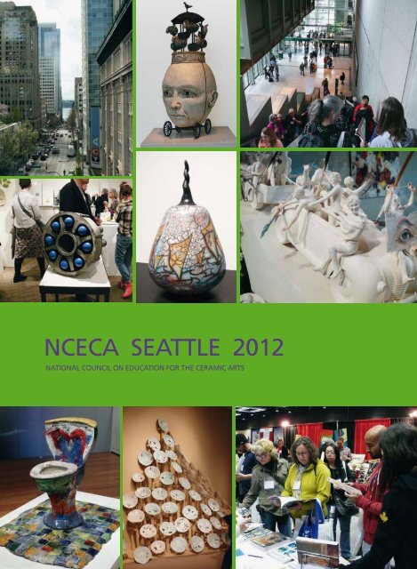
Dear Readers of NEW CERAMICS May / juNE <strong>2012</strong> NEW CERAMICS 3 3/<strong>2012</strong> EDiTOr’S NOTES For some time, I have felt that we should change the outward appearance of NEW CERAMICS / NEUE KERAMIK. When I took over the magazine almost twelve years ago, we completely redesigned the layout. Olaf Bruhn, who was responsible for the graphic design and image editing at that time, had developed an overall concept using just one font, in contrast to the variety of fonts used previously, and a new, consistent look. In 2001 NEUE KERAMIK thus not only gained a format in line with international standards but it was also given a completely new appearance. Over the years, I have made various cosmetic corrections or structural improvements to the “new look". This was mainly thanks to Dirk Rothe, who worked for NEUE KERAMIK for several years and contributed the main design ideas. But all in all, these were just marginal interventions affecting the overall appearance, which were then published in the first edition of the <strong>New</strong> Year. But now we had further-reaching plans. However, it was the new edition of the Keramikführer that completely occupied the time and attention of the editorial team in the second half of 2011 so that changes to the layout of NK / NC had to be postponed. But now we are ready, and we did not want to wait till the 1/2013 issue: our graphic designer, Huriye Hallac, who for a number of years has been responsible for the image editing, advertising and the final graphic design of each issue, has presented the first version of a new look. We have abandoned the use of just one font, without going back to using a whole variety, and we have given the image and text sections a graphic makeover. With these changes, we do not intend simply to put on a new dress or a new shirt. We were much more concerned to provide a more appealing and visually more accessible presentation to keep pace with the times and with the expectations of our readers. To achieve this, we have followed an idea that was still valid while I was training as an artist, back in the 1970s and 1980s: “Form follows function", where “function" does not mean mechanical function but in this case refers rather to psychological function. That is to say that the information we wish to present is expressed in a way that is not only more easily, more clearly and more distinctly accessible to our readers but also that they associate a positive experience with reading our magazine. The changes have now begun. We will continue to make adjustments to the graphic design, but also to the structure. We are proceeding in small steps, and I would be delighted if we could fulfil your expectations of a magazine orientated towards the whole of Europe and including international contributions. If you wish, and I would be very pleased if you did so, please feel free to tell us what you think. But enough now of the new layout. With regard to the content of the new issue, we should add that we once again had a great deal of material on current events, which often reached us at the last minute. What happens then is that finished articles go “under the knife", with both the number of images and the amount of text suffering cuts. Other articles are presented more briefly or are postponed to a later issue, assuming they are not covering exhibitions with a deadline. As this area of coverage of exhibitions, symposia, workshops etc. has continued to expand in recent years, we are set to change the structure in this section too so that we can provide you with far more information. In all probability, the reports will be somewhat shorter but certainly more concise. Where we have not made cuts in this issue was with the article on Petersen Tegl. I got to know the firm when I went to see the International Brick Sculpture Symposium in Broager (NC 1/<strong>2012</strong>), and I was very excited by Christian Petersen's aesthetic input in contemporary architecture. Even if you are not a fan of the cool, minimalist Bauhaus-influenced architecture shown in this article, where in the main Petersen's brick products have been used, it will have to be admitted that Christian Petersen's company stands out a long way from the world of conventional brick making. If we see the historical legacy of wonderful brick architecture in north and northwest Germany, we are forced to note an aesthetic impoverishment in the present, and we can only rejoice in the fact that there are still, or once again, companies like that of Christian Petersen. On the opposite page, you can see the first images from this year's NCECA convention in Seattle, USA. The report on this convention, with more contemporary US ceramics, will be published in the next issue. Yours, Bernd Pfannkuche at arT Karlsruhe <strong>2012</strong>, visiting the stand of Karlsruhe Majolika with work by Günter Wagner