Mastering High-End Simulated Process Printing - Impressions
Mastering High-End Simulated Process Printing - Impressions
Mastering High-End Simulated Process Printing - Impressions

Create successful ePaper yourself
Turn your PDF publications into a flip-book with our unique Google optimized e-Paper software.
<strong>Mastering</strong> <strong>High</strong>-<strong>End</strong><br />
<strong>Simulated</strong> <strong>Process</strong><br />
<strong>Printing</strong><br />
Learn how to achieve excellent color<br />
accuracy and create faster, more<br />
consistent production runs with this<br />
detailed tutorial.<br />
By Mark Coudray, Contributing Writer<br />
It’s no surprise that simulated<br />
process printing is getting more and<br />
more complex. Customer demand for<br />
high-quality, accurate color is at an<br />
all-time high today.<br />
In this Tech Tips newsletter and accompanying<br />
video, you’ll learn some little-known tips and<br />
tactics to help you achieve excellent color<br />
accuracy with your next simulated process job.<br />
Not only will you experience an increase in<br />
your print quality, but you’ll also notice a faster,<br />
more consistent production run.<br />
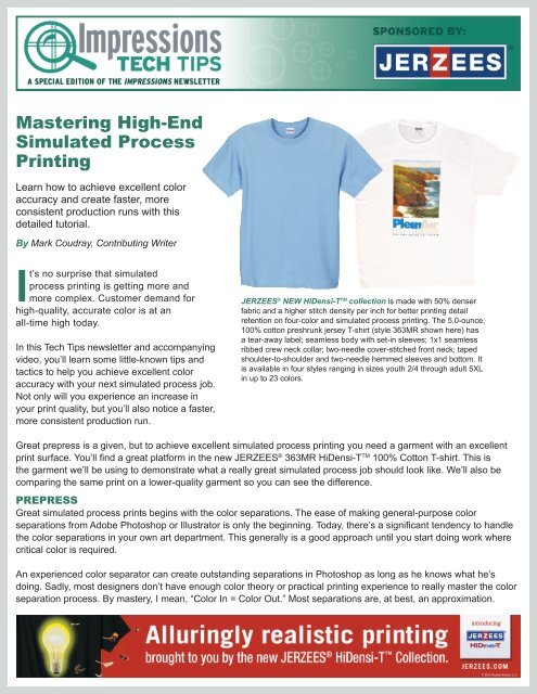
JERZEES ® NEW HiDensi-T TM collection is made with 50% denser<br />
fabric and a higher stitch density per inch for better printing detail<br />
retention on four-color and simulated process printing. The 5.0-ounce,<br />
100% cotton preshrunk jersey T-shirt (style 363MR shown here) has<br />
a tear-away label; seamless body with set-in sleeves; 1x1 seamless<br />
ribbed crew neck collar; two-needle cover-stitched front neck; taped<br />
shoulder-to-shoulder and two-needle hemmed sleeves and bottom. It<br />
is available in four styles ranging in sizes youth 2/4 through adult 5XL<br />
in up to 23 colors.<br />
Great prepress is a given, but to achieve excellent simulated process printing you need a garment with an excellent<br />
print surface. You’ll find a great platform in the new JERZEES ® 363MR HiDensi-T TM 100% Cotton T-shirt. This is<br />
the garment we’ll be using to demonstrate what a really great simulated process job should look like. We’ll also be<br />
comparing the same print on a lower-quality garment so you can see the difference.<br />
PREPRESS<br />
Great simulated process prints begins with the color separations. The ease of making general-purpose color<br />
separations from Adobe Photoshop or Illustrator is only the beginning. Today, there’s a significant tendency to handle<br />
the color separations in your own art department. This generally is a good approach until you start doing work where<br />
critical color is required.<br />
An experienced color separator can create outstanding separations in Photoshop as long as he knows what he’s<br />
doing. Sadly, most designers don’t have enough color theory or practical printing experience to really master the color<br />
separation process. By mastery, I mean, “Color In = Color Out.” Most separations are, at best, an approximation.
Critical color benefits from professional color separation<br />
from companies like Netseps.com or Serichrome Seps.<br />
These companies have been producing critical color<br />
separations for more than 25 years, and the price today<br />
is a fraction of what it used to be.<br />
Outputting your digital color separation files is the next<br />
step. Using the correct halftone settings is crucial for<br />
obtaining the best results. I recommend:<br />
• Dot Shape: Elliptical or Diamond<br />
• Dot Angle: 22.5° or 67.5° for all colors<br />
• Frequency: 55 lpi for automatic printing; 45 lpi<br />
for manual<br />
Your RIP’s quality and your ink’s opacity are very<br />
important. Vellum output is not recommended for<br />
halftone printing. The dots are too thin and easily<br />
burn through. The inkjet film should be very dense. To<br />
quickly check for adequate opacity, hold a piece of film<br />
up to an overhead fluorescent light. Look through a solid<br />
printed portion of the image. If you can see any of the<br />
outline of the overhead tube, the ink is too thin and will<br />
burn through. It should be solid black.<br />
The correct screen mesh count will make all the<br />
difference when it is time to print. Mesh is sold by mesh<br />
count, thread diameter and weave type. Underbase for<br />
darks can be either 180.48 PW (plain weave) or 225.40<br />
PW. I prefer the latter. Overprint colors are printed with<br />
either 280.34 PW or 305.34 PW.<br />
Tension on all screens should be 25 N/cm. Tensions<br />
below 20 N/cm would yield inconsistent halftone results.<br />
Maximum resolution is obtained with a dual-cure diazo/<br />
photo polymer emulsion. The exposure is slower than<br />
pure photo polymer, but the dot structure is much better.<br />
Coating the screen two passes on the print side followed<br />
with two wet-on-wet passes on the squeegee side will<br />
give a good stencil profile for the halftones. If your coating<br />
is too thin, you risk increased moiré. Dry the screen with<br />
the print side down with plenty of filtered air circulation.<br />
When it comes to exposure, a UV-rich light source is<br />
very important. Use either mercury vapor or metal halide<br />
designed for screen printing. The light should look<br />
bluish-purple. If it has a yellow cast, or if you can see a<br />
filament in the light bulb before you turn it on, you don’t<br />
have the right kind of light. Follow the manufacturer’s<br />
directions for exposure testing to assure you are not<br />
overexposing or underexposing.<br />
Washout can make or break your job. After exposure, wet<br />
both sides of the screen with water and rub both sides<br />
with your hand. Wait at least one minute before you wash<br />
out the screen.<br />
This step allows the unexposed emulsion to absorb<br />
water and soften. After a minute, wash out the screen<br />
with a sharp fan spray from a garden hose. Do not use a<br />
pressure washer. Wash from the print side, starting at the<br />
top and working your way across the screen and down.<br />
Always follow the same sequence for consistency.<br />
When you’re done, blot the inside of the screen with blank<br />
newsprint. You can buy this at a store that sells shipping<br />
supplies. Any emulsion color coming off on the paper<br />
indicates under-exposure.<br />
Allow the screens to dry with cool air blowing across<br />
them. A simple box fan works well for this. After block out,<br />
pin holing and taping, the screens are ready for the press.<br />
PRE-PRODUCTION PRINT<br />
A triple durometer 70/90/70 squeegee gives excellent<br />
control and print quality. The softer 70 durometer<br />
compensates for surface irregularities, while the harder<br />
90 durometer keeps the blade from flexing excessively.<br />
Always sharpen your blades before a halftone run. The<br />
desired sharpness is reached when you lightly draw<br />
your fingertip over the edge of the blade and can feel the<br />
individual ridges of your fingerprints.<br />
Next, look down the length of the blade. It should be<br />
perfectly flat and straight, with absolutely no waviness.<br />
The combination of a sharp, flat blade will assure
minimum squeegee pressure and smooth, even printing.<br />
The inks you choose for simulated process printing<br />
can range from transparent to translucent to opaque. I<br />
recommend translucent inks where all the colors have<br />
the same level of translucency. The value I recommend<br />
is 25%, which means it is ¼ of the way toward opaque.<br />
Many printers use opaque inks for simulated process<br />
printing because they are easier to print with, but are less<br />
accurate in matching with the original art.<br />
When an ink is opaque, the physical color blending<br />
is poor. The overprint color is shifted toward the color<br />
that is more opaque. So mixing red over yellow will<br />
give a very strong red-orange color. <strong>Printing</strong> yellow<br />
over red will give a very strong yellow-orange. Using a<br />
25% translucent ink for both will give a neutral orange<br />
regardless of the print sequence.<br />
Finally, the inks you use should be fairly stiff, yet yield<br />
under light squeegee pressure. This characteristic is<br />
called thixotropy. It’s important because this is what<br />
allows us to print sharp, clean, halftone dots that don’t<br />
squash when other colors are printed on them.<br />
INK TIPS<br />
To get great halftones, try applying some sharping base<br />
to your ink. This can be accomplished by adding 2% by<br />
weight of clear, high-density gel to any ink. A very small<br />
addition will dramatically increase halftone sharpness.<br />
Another key to achieving maximum image quality is to<br />
ensure your inks are at the correct printing temperature.<br />
Plastisol inks are made of plastic resins. The colder the<br />
temperature, the stiffer the ink. As the ink warms up, it<br />
gets softer and thinner. The flow of the ink is continuously<br />
changing until the temperature reaches 90°F (32°C).<br />
It is impossible to control color accurately with ink<br />
temperatures below this point.<br />
We use our flash cure units to preheat the shirt platens to<br />
130°F (±55°C). With the print head in auto index, rotate<br />
the press until the ink temperature is at the desired point.<br />
Use an inexpensive IR digital pyrometer to measure this.<br />
With warm platens, the flash time is reduced to less than<br />
1 second using the mesh counts I’ve recommended.<br />
All of these preparations are important, but they are of little<br />
value unless the garment has enough fiber mass to accept<br />
the halftone dots. Most T-shirts are only 65% fiber mass.<br />
However, the JERZEES ® 363MR HiDensi-T TM 100%<br />
Cotton T-shirt has excellent fiber mass. Having your<br />
halftone dot land on the yarn bundle assures minimum dot<br />
gain and maximum image sharpness. You also need less<br />
ink to achieve greater color and maximum image detail.<br />
Careful attention to color separation, prepress and setup<br />
will ensure excellent results when printing on an<br />
ideal T-shirt surface. The high fiber mass and smooth<br />
surface of the JERZEES ® 363MR HiDensi-T TM make<br />
it a great destination for your critical color simulated<br />
process images.<br />
step-by-step to VIew a short VIdeo on the process of creatIng sImulated process prIntIng<br />
detaIled In thIs newsletter, please clIck here.<br />
step<br />
1<br />
A good 70-90-70 durometer<br />
squeegee gives you a perfect<br />
blend of conformable edge and<br />
controlled blade bend. This allows<br />
you to concentrate the squeegee<br />
edge on the halftone with minimum<br />
squeegee pressure for the<br />
sharpest, cleanest print.<br />
step<br />
2<br />
After washout, the screens<br />
should be blotted with blank<br />
newsprint to absorb any water in<br />
the mesh. This is a gentle way of<br />
making sure all water is removed<br />
from the exposed screen without<br />
damaging the halftone image.<br />
step<br />
3<br />
Here is an excellent example of<br />
the fine, smooth surface of the<br />
JERZEES ® 363MR HiDensi-T TM .<br />
Note the excellent halftone<br />
sharpness and how every dot<br />
prints perfectly on the garment<br />
surface.
step<br />
4<br />
step<br />
7<br />
step<br />
10<br />
In this close-up of the printed<br />
surface, the dots appear rough<br />
and broken. This print was done<br />
before the minimum printing<br />
temperature of 90°F was reached.<br />
In this close-up of the final print,<br />
notice the complexity of the color<br />
change. It would be impossible<br />
to achieve this without completely<br />
accurate translation of the<br />
halftone information.<br />
Stir ink vigorously with a spatula<br />
and then lift it out of the ink. You<br />
should have a supported ink<br />
strand of 1 inch to 1 1 ⁄8 inches<br />
suspended from the bottom of<br />
the spatula.<br />
step<br />
5<br />
step<br />
8<br />
step<br />
11<br />
<strong>High</strong>-end simulated process<br />
printing involves accurate color<br />
reproduction. Our test image has a<br />
wide tonal range of white to solid<br />
black, and subtle color changes.<br />
In this microscopic halftone<br />
close-up, you can clearly see the<br />
integrity of the halftone and the<br />
complete transfer of ink to the<br />
garment surface.<br />
Thixotropic ink will support a<br />
vertical ink cross section when<br />
you slowly drag a spatula<br />
through it. If the ink walls<br />
collapse quickly, add up to 2%<br />
high-density clear gel to the ink.<br />
step<br />
6<br />
step<br />
12<br />
Here is another example of the<br />
print surface of the JERZEES ®<br />
363MR HiDensi-T TM . Note the<br />
regularity of the halftone dots<br />
both in size and in arrangement.<br />
Another closely held secret to<br />
great printing is to ensure the ink<br />
temperature is between 90°F<br />
and 120°F. Preheat your pallets<br />
to 130°F to warm the ink in the<br />
screens before printing.<br />
Mark Coudray is a recognized industry veteran and expert on color separation and halftone printing. He is a sought-after consultant<br />
and industry writer with more than 350 published pieces during the last 35 years. You can read more of Mark’s work at HalftoneSecrets.<br />
com. He can be reached via e-mail at Coudray@coudray.com where he welcomes your comments and observations.<br />
step<br />
9<br />
To achieve great printed halftones,<br />
mesh tension between 25<br />
and 30 N/cm is essential. Tension<br />
below 20 N/cm make it<br />
impossible to control squeegee<br />
pressure and ink transfer.