iowa artists 2012: print Des Moines art Center
iowa artists 2012: print Des Moines art Center
iowa artists 2012: print Des Moines art Center

You also want an ePaper? Increase the reach of your titles
YUMPU automatically turns print PDFs into web optimized ePapers that Google loves.
<strong>iowa</strong> <strong><strong>art</strong>ists</strong> <strong>2012</strong>: <strong>print</strong> <strong>Des</strong> <strong>Moines</strong> <strong>art</strong> <strong>Center</strong>
Ena ajdimovski<br />
arbE barEis<br />
amanda barr<br />
joshua dostEr<br />
CathErinE drEiss<br />
rEnEE mEyEr Ernst<br />
alison FillEy<br />
ChristophEr “ChuCk” ForsythE<br />
robErt GlasGow<br />
pEtEr GoChé<br />
molliE Goldstrom<br />
jon GourlEy<br />
john hansEn<br />
louisE kamEs<br />
april katz<br />
josEph lappiE<br />
nanCy lindsay<br />
thomas murphy<br />
bill nEllans<br />
shawn rEEd with wEt hair<br />
sarah rodGErs<br />
john siblik<br />
raChEl sinGEl<br />
Grant william thyE<br />
riCk von holdt<br />
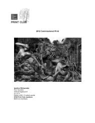
iGnatius widiapradja<br />
v. “skip” willits<br />
<strong>iowa</strong> <strong><strong>art</strong>ists</strong> <strong>2012</strong>: <strong>print</strong>
<strong>iowa</strong> <strong><strong>art</strong>ists</strong> <strong>2012</strong>: <strong>print</strong><br />
oCtobEr 5, <strong>2012</strong> – january 13, 2013<br />
this exhibition is dedicated to the memory of mauricio lasansky (1915– <strong>2012</strong>).<br />
4 4<br />
aCknowleDgeMents<br />
jEFF FlEminG | dirECtor<br />
<strong>iowa</strong> <strong><strong>art</strong>ists</strong> <strong>2012</strong>: <strong>print</strong> continues the <strong>art</strong> <strong>Center</strong>’s involvement with<br />
<strong><strong>art</strong>ists</strong> working and living within our own community and state. the <strong>art</strong> <strong>Center</strong> began this<br />
commitment at its founding and still maintains the belief that qualitative <strong>art</strong> that contributes<br />
to the dialogues surrounding the <strong>art</strong> of our time can be created anywhere. the <strong>art</strong> <strong>Center</strong><br />
believes the objects and conversations included in this exhibition should be acknowledged<br />
and made available to broader audiences. this is the goal of the “<strong>iowa</strong> <strong><strong>art</strong>ists</strong>” series.<br />
this year’s edition focuses on <strong>print</strong>making and its many incarnations. Curator of <strong>print</strong>s<br />
and drawings, amy worthen, organized this expansive project, which includes 27 <strong><strong>art</strong>ists</strong><br />
from across <strong>iowa</strong>. in this project, worthen expands the definition of what is a <strong>print</strong> and<br />
what constitutes <strong>print</strong>making. the results are sometimes humorous, often st<strong>art</strong>ling, but<br />
always intriguing.<br />
the funders for Iowa Artists <strong>2012</strong>: Print are the Elizabeth Firestone Graham Foundation,<br />
which supports this publication; the peter h. & E. lucille Gaass kuyper Foundation;<br />
kpmG llC; the des moines <strong>art</strong> <strong>Center</strong> <strong>print</strong> Club; and bank of the west. i acknowledge<br />
and thank them all for their commitment to the <strong>art</strong> and <strong><strong>art</strong>ists</strong> of our state and, in turn, to their<br />
various audiences.<br />
Finally, i would like to congratulate and recognize the <strong><strong>art</strong>ists</strong> p<strong>art</strong>icipating here.<br />
thank you for enhancing our lives and the vibrancy of our state.<br />
1
<strong>iowa</strong> <strong><strong>art</strong>ists</strong> <strong>2012</strong>: <strong>print</strong><br />
amy n. worthEn | Curator oF <strong>print</strong>s and drawinGs<br />
one could say that “<strong>print</strong>” comes down to just a few things: image; matrix (block, plate,<br />
stone, screen, and type); means of pressure (press, rubbing, stamping, and stenciling); ink;<br />
and support (paper, fabric, and other surfaces). the fascination of working with these variable<br />
elements, not to mention the characteristic visual appearance produced by <strong>print</strong> techniques,<br />
and—especially—<strong>print</strong>’s indirectness, its surprises, its multiplicity, its accessibility, its potential<br />
as a medium of communication, and its sense of community, are some of the most important<br />
reasons why <strong>print</strong> has long attracted <strong><strong>art</strong>ists</strong>. For hundred of years, <strong><strong>art</strong>ists</strong> have made<br />
woodblock <strong>print</strong>s, etchings and engravings, lithographs, screen<strong>print</strong>s, monotypes, typographic<br />
works, and mixed-media <strong>print</strong>s, but today, many <strong><strong>art</strong>ists</strong> use aspects of <strong>print</strong>ing to make <strong>art</strong><br />
without actually making <strong>print</strong>s. the methods and concepts of <strong>print</strong> have spread from traditional<br />
<strong>print</strong> practitioners to practically everyone.<br />
as curator of this year’s Iowa Artists exhibition, i decided to explore the various ways that<br />
contemporary <strong>iowa</strong> <strong><strong>art</strong>ists</strong> are using <strong>print</strong>. i was sure that <strong>iowa</strong>’s <strong><strong>art</strong>ists</strong> were working with <strong>print</strong><br />
in ways that we could not even begin to imagine. last january, we invited <strong><strong>art</strong>ists</strong> currently<br />
living and working in <strong>iowa</strong> to submit digital images of up to ten works created since 2008 that<br />
in some fashion exploit the processes and concepts of <strong>print</strong>. <strong><strong>art</strong>ists</strong> were welcome to enter<br />
works in traditional <strong>print</strong>making media—woodcuts, etchings, lithographs, screen<strong>print</strong>s—and<br />
also typography; digital-based or digitally-<strong>print</strong>ed; photo-based <strong>print</strong>s; installations; videos;<br />
<strong>print</strong>ed objects; <strong>print</strong>ed fabric; and <strong>print</strong>ing matrices; as well as anything else that seemed<br />
appropriate to the theme. works could be editioned or unique. Each <strong>art</strong>ist was also asked to<br />
submit a statement of up to 200 words describing the role of <strong>print</strong> in his or her <strong>art</strong>istic practice.<br />
ninety-eight <strong><strong>art</strong>ists</strong> entered the competitive selection process. since there was more fine<br />
work submitted than i could possibly include, i had to make some difficult choices in order to<br />
put together a coherent and exciting exhibition in the allotted space. although several of the<br />
selected <strong><strong>art</strong>ists</strong> had shown in prior Iowa Artists exhibitions, the majority of entrants were new<br />
discoveries for me. i tend to be attracted to well-executed works that teach me a new way of<br />
looking at and thinking about the world. i selected the <strong><strong>art</strong>ists</strong> and their works that i did primarily<br />
because their images appealed to me, and because something about their use of <strong>print</strong> amazed<br />
me. i hope that visitors will find their images and their ways of using <strong>print</strong> to be as eye-opening<br />
as i do. after i made the selections, i found that several thematic and visual threads ran<br />
through the exhibition. these include music (shawn reed and grant william thye); trees<br />
2<br />
and leaves (louise kames, Bill nellans, and V. “skip” willits); immigrants’ search for<br />
personal identity and history (ena ajdimovski and renee Meyer ernst); the investigation<br />
of the graphic language of <strong>print</strong> (Chuck Forsythe, robert glasgow, and april katz);<br />
and even nostalgia related to memories of <strong>print</strong>ing (amanda Barr and rick von Holdt).<br />
Iowa Artists <strong>2012</strong>: Print contains plenty of traditional <strong>print</strong>s: etchings, relief <strong>print</strong>s,<br />
lithographs, screen<strong>print</strong>s, letterpress-<strong>print</strong>ed broadsides, rubber stamped <strong>print</strong>s, and<br />
rubbings. the same technique can vary greatly in appearance depending on the hand, graphic<br />
calligraphy, and vision of the <strong>art</strong>ist. For example, etchings by Mollie goldstrom, nancy<br />
lindsay, and rachel singel reveal how lines and marks delicately bitten in metal can<br />
express detailed information, texture, and atmosphere in very different ways. relief <strong>print</strong>s by<br />
Catherine Dreiss and thomas Murphy derive their strength from marks boldly knifecut<br />
and gouged in wood. Jon gourley’s screen<strong>print</strong>s intentionally have a flatness that only<br />
screen<strong>print</strong>ing can deliver, and alison Filley’s words-into-patterns <strong>print</strong>ed on a wall exploit<br />
the screen as a highly portable <strong>print</strong>ing tool.<br />
but some of the works executed in “traditional” <strong>print</strong> media might surprise you. Consider<br />
Grant william thye’s image of a violin, <strong>print</strong>ed from a relief-cut violin; or v. “skip” willits’<br />
photographs of words, rubber stamped on dead trees and leaves in a forest; or louise kames’<br />
rubbings formed into illuminated columns, evoking a grove of trees; or alison Filley’s installation<br />
of raffia flowers and words that are screen<strong>print</strong>ed directly on an <strong>art</strong> <strong>Center</strong> gallery wall. then,<br />
there is peter goché’s shipping pallet and water stained wrapper with shipping label, which<br />
he presents as found lithography; not to mention sarah rodgers’ mono<strong>print</strong> made from<br />
inked condoms. several of the works are functional: amanda barr uses rubber stamps to <strong>print</strong><br />
the underglazed designs on her ceramics and shawn reed computer-designs and offset-<strong>print</strong>s<br />
the posters for his rock band, wet hair.<br />
at one time, the role of the <strong>art</strong>ist’s hand in the production of <strong>print</strong>s was thought to be of<br />
paramount aesthetic value. the use of photography and mechanical means of image transfer<br />
in <strong>print</strong>s were often viewed with suspicion. this exhibition includes silver gelatin photography,<br />
digital photography, digital drawing and processing, and digital <strong>print</strong>ing—techniques that<br />
are enthusiastically embraced and creatively explored by arbe Bareis, Catherine dreiss,<br />
renee meyer Ernst, april katz, bill nellans, shawn reed, and ignatius widiapradja.<br />
Each <strong>art</strong>ist told us something about the role of <strong>print</strong> in his or her work. some of the<br />
3
statements were very personal; others explained the <strong>art</strong>ist’s engagement in processes<br />
and techniques; and still others were cerebral and theoretical. several <strong><strong>art</strong>ists</strong> unabashedly<br />
expressed passion for physical aspects of their medium. Catherine dreiss enjoys the smells<br />
of the <strong>print</strong> studio. rick von holdt expressed his love for his presses and type, as well as his<br />
sense of mission. thomas murphy wrote of a feeling that i, as an engraver, can personally<br />
relate to: that the forethought and planning suited his character, and that he derived<br />
satisfaction from the slow process of cutting the woodblock. “the creation of a block or plate<br />
involves a relentlessly tedious process…creating a meditative atmosphere and a feeling of<br />
immersion in one’s work that i have not experienced in other media.”<br />
in <strong>print</strong>making, paper does not just “support” the image, but is an intrinsic p<strong>art</strong> of it.<br />
several of the <strong><strong>art</strong>ists</strong> talked about the papers and other supports upon which they <strong>print</strong>.<br />
louise kames takes advantage of the long fibers and translucency of japanese papers to<br />
make rubbings, formed and then illuminated. rachel singel uses handmade paper on which<br />
she <strong>print</strong>s her etchings of natural objects. peter Goché uses found wrapping paper and<br />
shipping labels. John Hansen <strong>print</strong>s on discarded braille paper.<br />
many mentioned the advantages that <strong>print</strong>ing offers an <strong>art</strong>ist, such as proofing and the<br />
opportunity to make revisions, as well as the possibility of layering of imagery and overlapping.<br />
jon Gourley uses <strong>print</strong>ing because of the potential consistency it offers. others spoke of being<br />
able to make an extended body of work with the possibility of generating variations. thomas<br />
murphy wrote, “as the entire process is mired in the embrace of repetition, i believe it is this<br />
idea of the multiple that truly appeals to me.”<br />
For some, multiplicity means that the work reaches a wider audience. and yet, <strong>print</strong>ing<br />
is the means by which Joshua Doster, John siblik, and ignatius widiapradja might st<strong>art</strong><br />
to develop a unique painting or mixed media work. Joseph lappie feels that making his<br />
work accessible to others is a moral imperative. “while not opposed to the unique object, i<br />
personally choose to make <strong>art</strong> that is available and capable of being distributed to the richest<br />
and poorest of us.” since the destination of his <strong>print</strong>s is important to him, the displaying of<br />
one of lappie’s woodblocks without the corresponding impression brings up a question: is<br />
an <strong>art</strong>ist-made <strong>print</strong>ing matrix just a means to the final product or is it a work in its own right?<br />
several <strong><strong>art</strong>ists</strong> wrote that they make <strong>print</strong>ed <strong>art</strong> to take advantage of or comment on<br />
its communicative power. rick von holdt’s letterpress-<strong>print</strong>ed broadsides announce or<br />
4<br />
commemorate events, and the same time, celebrate the history of type. shawn reed makes<br />
posters and cassette labels to promote his rock band and the music he composes. reed’s<br />
<strong>print</strong>ed <strong>art</strong> and music comprise a fully integrated <strong>art</strong>istic practice. jon Gourley exploits the<br />
repeatability of screen<strong>print</strong>ing to explore mis-communication.<br />
several <strong><strong>art</strong>ists</strong> in the exhibition understand that <strong>print</strong> is a language, and explore the<br />
questions that issue raises. april katz wrote, “<strong>print</strong>making serves as technique and visual<br />
language in my work. i embrace the full range of visual qualities available through <strong>print</strong>.”<br />
Chuck Forsythe’s striking magnifications reveal the characteristic qualities of graphic marks<br />
and processes. rick von holdt understands the underlying visual messages—ap<strong>art</strong> from<br />
the words themselves—that type styles convey.<br />
bill nellans, whose strikingly minimalist digital photograph of a dried leaf and its shadow<br />
is <strong>print</strong>ed on canvas, recalls the obsessive care that went into great <strong>print</strong>ing in traditional<br />
photography. he talks about how digital photography has changed his medium. in Ena<br />
ajdimovski‘s traditional silver gelatin photograph of school desks gouged by high school<br />
students, the desk resembles a relief <strong>print</strong>ing block ready for inking. as a refugee cut off from<br />
home and history, she uses photography to seek connections and create new memories.<br />
renee meyer Ernst, who digitally-collages photographs that she made both in her native korea<br />
and in the u.s., layers images to give form to “otherwise formless memories from a life that<br />
may have been, but never was.”<br />
Forty or fifty years ago, <strong>print</strong> exhibitions in <strong>iowa</strong> might typically have featured beautifully<br />
made etchings, engravings, woodcuts, lithographs, and screen<strong>print</strong>s. monotypes probably<br />
would have been included, had anyone been making them. but would there have been<br />
<strong><strong>art</strong>ists</strong>’ books and broadsides? perhaps. the inclusion of <strong><strong>art</strong>ists</strong>’ ephemera produced by<br />
offset lithography, xerography, and mimeography would have been very edgy. Collaborativelyproduced<br />
<strong>print</strong>s were viewed with suspicion. pure photography, albeit <strong>print</strong>ed with light, was<br />
iffy. Computer-generated or digitally-<strong>print</strong>ed images were unknown. had anyone back then<br />
even thought of making <strong>print</strong>-based installations? i doubt it.<br />
but today, as the works in Iowa Artists <strong>2012</strong>: Print clearly show, <strong><strong>art</strong>ists</strong> working in every<br />
medium are making marvelous works in which some aspect of <strong>print</strong>ing plays a role. the<br />
changes in attitude toward <strong>print</strong> that we see manifested in the present exhibition are the result<br />
of developments that occurred over the past 40 or 50 years in the larger <strong>art</strong> world. during<br />
5
the 1960s and ’70s, the blurring of boundaries between media accelerated when pop <strong><strong>art</strong>ists</strong><br />
including andy warhol and robert rauschenberg screen<strong>print</strong>ed their paintings. they drew<br />
inspiration from the qualities of bad commercial <strong>print</strong>ing and made <strong>art</strong> that commented on<br />
the proliferation of <strong>print</strong>ed images in the world. at the same time, performance <strong>art</strong>; the Fluxus<br />
<strong><strong>art</strong>ists</strong>’ production of ephemera such as cheap <strong><strong>art</strong>ists</strong>’ books and postcards; Conceptual<br />
<strong><strong>art</strong>ists</strong> reliance on <strong>print</strong>ed documentation; and <strong><strong>art</strong>ists</strong> whose <strong>art</strong> focused on identity politics and<br />
who made billboards and take-aways; all expanded the concept of what <strong>print</strong>ed <strong>art</strong> could be.<br />
6<br />
paradoxically, the changing nature of <strong>print</strong>ed <strong>art</strong> owed much to the rise of collaborative<br />
<strong>print</strong>ing workshops such as universal limited <strong>art</strong> Editions, Gemini GEl, and Crown point<br />
press. on one hand, the immense financial strength of galleries and publishers made<br />
possible the <strong>print</strong>ing of editions of complex <strong>print</strong>s and multiples. during the 1980s, tax<br />
shelter laws helped fuel the explosion of <strong>print</strong> publishing by encouraging investors to invest<br />
in the production of <strong>print</strong> editions for whose value they could receive tax deductions when<br />
they donated them to museums (a practice disallowed by the internal revenue service in<br />
1989). developments such as these tended to marginalize traditional <strong>art</strong>ist-<strong>print</strong>makers who<br />
made their own <strong>print</strong>s. on the other hand, painters and sculptors who made <strong>print</strong>s in the<br />
collaborative workshops began to understand that it was exciting to make <strong>print</strong>s, even<br />
though they needed the assistance of trained master <strong>print</strong>ers to produce their work. a dynamic<br />
synergy between <strong><strong>art</strong>ists</strong> and <strong>print</strong>ers arose in this collaborative environment. <strong><strong>art</strong>ists</strong> pushed<br />
<strong>print</strong>ers to invent new ways of <strong>print</strong>ing and rethink the limits of the possible. <strong>print</strong> publishers,<br />
galleries, and <strong>art</strong> fairs helped create a vast, knowledgeable, and adventurous audience<br />
for <strong>print</strong>s.<br />
during the 1970s and ’80s, semiotic <strong>art</strong> theory, which focused on language, helped make<br />
<strong><strong>art</strong>ists</strong> aware of <strong>print</strong> as a visual language to be deconstructed and explored. in these years,<br />
installation <strong>art</strong> became widely practiced, and photography finally emerged as a fully accepted<br />
<strong>art</strong> form. in recent decades, <strong><strong>art</strong>ists</strong> have discovered the infinite possibilities of the computer for<br />
image making and output.<br />
all of the foregoing developments helped break down boundaries between <strong>print</strong>s and<br />
other media, making possible the experimentation and the border crossing that we see today.<br />
thought-provoking exhibitions such as the museum of modern <strong>art</strong>’s Printed Art: A View of Two<br />
Decades (1980), Thinking Print: Books to Billboards (1996), and Printin’ and Print Out (<strong>2012</strong>),<br />
as well as philadelphia’s recent watershed survey Philagrafika (2010), have showcased<br />
many of these exciting developments and expanded our ideas about the nature of <strong>print</strong>.<br />
it is essential to remember that all media and processes are just tools. the important<br />
thing is what the <strong>art</strong>ist does and says with them. today, “<strong>print</strong>” is a computer command.<br />
matrices are pixels, paper is optional (saves trees), and <strong><strong>art</strong>ists</strong> post images on clouds.<br />
the <strong>print</strong> is no longer only an image produced through pressure on paper. but as this lively<br />
exhibition—filled with marvelous images, technical innovations, spirit-expanding installations,<br />
and sly transgressions that all have something to do with <strong>print</strong>—demonstrates, it is still<br />
mostly about image and matrix, means of pressure, ink, support, indirectness, surprise,<br />
multiplicity, accessibility, community, and communication. as Iowa Artists <strong>2012</strong>: Print clearly<br />
shows, <strong>print</strong>—continually shape-shifting—flourishes.<br />
7
ena aJDiMoVski<br />
urbandalE, <strong>iowa</strong><br />
this series began as a way for me to establish connections for myself. living as an immigrant<br />
from a country torn by war, i did not grow up with objects from my family’s past. objects<br />
like: toys, clothes, or letters. without those “connections,” stories have been forgotten and<br />
understanding my history is a struggle.<br />
the immediacy of a light-based image that collapses space allows for the most accurate<br />
portrayal of this visual experience. these intimate photographs capture the mere but elaborate<br />
details that create the space i have shared and used the most throughout high school.<br />
Commemoration was my response to the historical impressions that were left by former<br />
students and to the markings that my own hands have embedded within the space, as well<br />
as markings that are evident in worn out cabinets, or cuts on tables. this process has helped<br />
me connect with the students and has conveyed a new understanding in my sense of time.<br />
preserving this important stage in my life reminds me that, in order to move forward, we must<br />
take a few steps back. this series shows that we all have a responsibility to commemorate,<br />
to build connections, and to give memories a place in the world.<br />
Untitled <strong>2012</strong><br />
silvEr GElatin <strong>print</strong><br />
3 x 4 1/2 inChEs (7.6 x 11.4 Cm.)<br />
CollECtion oF daniEl wEiss<br />
8<br />
9
arBe J. Bareis<br />
CEdar rapids, <strong>iowa</strong><br />
imagination is the most important tool for an <strong>art</strong>ist to rely upon, the subconscious mind<br />
providing a fruitful playground for speculation, debate, and fantasy. the “transfiguration”<br />
series is a metamorphosis of void that transforms thoughtful inspiration into physical form,<br />
something that often seems to be elusive in the initial stages. like the fantastical scenes in<br />
the paintings of hieronymus bosch, the active mind provides an endless source of speculation<br />
and debate on fundamental truths about the universe and the questions of perceived realities,<br />
spirituality, and human nature.<br />
in physical structure, my work st<strong>art</strong>s out as oil on clay board. the work metamorphoses<br />
into digital form where it is manipulated and digitally painted using a variety of digital<br />
applications, and then digitally <strong>print</strong>ed on archival paper using inkjet pigment.<br />
the Mind is a labyrinth <strong>2012</strong><br />
arChival ink jEt <strong>print</strong> on papEr<br />
19 x 13 inChEs (48.3 x 33 Cm.)<br />
10
aManDa Barr<br />
amEs, <strong>iowa</strong><br />
Creating work with my hands is the most satisfying feeling in the world. using the clay as a<br />
canvas, i work to blur the line between functionality and fine <strong>art</strong>; i create pieces that can hang<br />
on your wall or live in your cabinet to be used daily. i enjoy bringing inspiration, creativity and<br />
individuality into everyday life.<br />
my work is inspired by my background in literature, thematically as well as being a source<br />
for much of my text and my love of vintage illustrations. i frequently juxtapose imagery and<br />
text in ways that can range from humorous to whimsical to slightly macabre.<br />
my <strong>print</strong>ing technique developed out of spending time rubber-stamping collages with<br />
my grandmother when i was young; those memories inspired me to translate that p<strong>art</strong>icular<br />
graphic <strong>print</strong> quality to clay. i first developed this technique as a way to utilize many rubber<br />
stamps and linocuts i already had, as well as find a method for transferring text to the ceramic<br />
medium. it took several years and many different mediums before i was able to achieve<br />
the desired look, but now that i have refined my method my <strong>print</strong>ed surfaces have become<br />
my trademark.<br />
Damask bowl <strong>2012</strong><br />
porCElain with undErGlazE <strong>print</strong>inG<br />
4 x 4 x 3 1/2 inChEs (10.2 x 10.2 x 8.9 Cm.)<br />
lace bowl 2011<br />
porCElain with undErGlazE <strong>print</strong>inG<br />
6 x 6 x 5 inChEs (15.2 x 15.2 x 12.7 Cm.)<br />
12
JosHUa Doster<br />
<strong>iowa</strong> City, <strong>iowa</strong><br />
my visual practice walks a fine line between painting and <strong>print</strong>making. i create formal series<br />
that use reproductive processes to create skeletal structures of repeated forms. <strong>print</strong>making<br />
serves as a way to create repeated complex forms as a st<strong>art</strong>ing point. instead of gesso i use<br />
silkscreen or wood block or even hand-executed reproductive means. it is at this point each<br />
piece takes on its own unique form and direction.<br />
present Day 062 <strong>2012</strong><br />
woodbloCk, spray paint, GraphitE, ink on papEr<br />
35 x 24 inChEs (88.9 x 61 Cm.)<br />
14
CatHerine Dreiss<br />
dEs moinEs, <strong>iowa</strong><br />
i am a practitioner of what New York Times <strong>art</strong> critic michael kimmelman calls the<br />
“Cinderella <strong>art</strong>” — <strong>print</strong>making. i make <strong>print</strong>s: that is my role as an <strong>art</strong>ist.<br />
why do i choose <strong>print</strong>making over other forms of expression? the oft-asked question<br />
makes me defensive: isn’t <strong>print</strong>making good enough? perhaps it is what makes <strong>print</strong>making<br />
the “Cinderella <strong>art</strong>”: the relative affordability, the easy companionship with both politics and<br />
commerce, the fact that they often exist in multiples, their adaptability to new technologies,<br />
their alliance with craft, and their ephemeral paper-based character. these are the things that<br />
make me happy to be a <strong>print</strong>maker. i also love the sensual physicality of the process, from<br />
the smells of the inks to the blisters from rolling up a large plate.<br />
For the past twenty years, i have been working almost exclusively with woodcuts that are<br />
based on patterns and images from <strong>art</strong> history. aside from their large scale, my <strong>print</strong>s may<br />
seem to conform to the long tradition of woodcuts. in fact, they begin as highly manipulated<br />
computer images. only after they are transferred to wood does the process follow the timeand<br />
labor-intensive path that would be recognized by a traditional woodcut <strong>art</strong>ist. i am deeply<br />
interested in the cyclical nature of ideals of spirituality and rationality in western <strong>art</strong> history,<br />
p<strong>art</strong>icularly as expressed in sculpture and portraiture.<br />
the learned woman 2009<br />
woodbloCk <strong>print</strong> on papEr<br />
36 x 24 inChEs (91.4 x 61 Cm.)<br />
16
enee Meyer ernst<br />
davEnport, <strong>iowa</strong><br />
the <strong>print</strong>ed object has always played an integral role in my life as an <strong>art</strong>ist. in limbo between<br />
two very different cultures—i was adopted from korea and raised in the united states—i have<br />
endlessly struggled with concepts of belonging and personal identity. the act of creating and<br />
im<strong>print</strong>ing visual memoirs on paper is therefore a therapeutic process, allowing me to give form<br />
to the otherwise ambiguous nature of my being.<br />
after returning to korea, meeting a foster mother, and undergoing a failed biological<br />
parent search, the uniqueness and complexity of my situation has become apparent to me<br />
in both exciting and nerve-racking ways. these digital collages are composed of numerous<br />
textures and images, most of which are photographs i’ve taken from the united states<br />
and korea.<br />
the combination of elements in each collage represents the synthesis — as well as the<br />
dissection — of experiences and emotions i’ve had throughout my adoption journey. the<br />
pieces are a celebration of culture, discovery, and gain, as much as they are about loss,<br />
confusion, and desire. most of all, these <strong>print</strong>s are physical evidence of otherwise formless<br />
memories from a life that may have been, but never was.<br />
analog <strong>2012</strong><br />
diGital CollaGE on papEr<br />
20 x 20 inChEs (50.8 x 50.8 Cm.)<br />
18<br />
19
alison Filley<br />
<strong>iowa</strong> City, <strong>iowa</strong><br />
since the origins of hollywood and the<br />
motion picture industry in the early twentieth<br />
century, america has been fascinated with<br />
celebrities and the culture that surrounds<br />
them. in recent years, society has become<br />
obsessed with these figures and their<br />
photos and their lives find their way into<br />
various media outlets and everyday<br />
conversations. this multiplicity of their<br />
image is especially evident in <strong>print</strong> media<br />
as their pictures flood magazines, tabloids,<br />
and newspapers. p<strong>art</strong>icular attention is<br />
focused on young female starlets and<br />
they often serve as standards of beauty,<br />
youth, fame, and wealth. my work and<br />
my research focus on these cultural roles<br />
and on transforming and interpreting their<br />
<strong>print</strong>ed image.<br />
Contemporary <strong>print</strong>making practices<br />
allow me to replicate and augment the<br />
prepackaged commodity that is their image.<br />
by combining screen<strong>print</strong> and digital <strong>print</strong><br />
media with contemporary craft supplies<br />
such as glitter, flocking, and spray paint, a<br />
larger than life altered image of the celebrity<br />
and the culture that surrounds them is<br />
created. the work results in traditional twodimensional<br />
<strong>print</strong>s, sculptural objects, as<br />
well as installation work.<br />
20<br />
24<br />
superficial <strong>2012</strong><br />
sCrEEn<strong>print</strong> on wall, synthEtiC raFFia<br />
114 x 216 inChEs (289.6 x 548.8 Cm.)<br />
(dEtail shown at lEFt)<br />
21
CHristopHer “CHUCk” ForsytHe<br />
<strong>iowa</strong> City, <strong>iowa</strong><br />
residing in a space between historical <strong>print</strong><br />
traditions, the book trades and contemporary<br />
graphic design, i embrace craftsmanship<br />
and <strong>art</strong>istic formalism while pursuing the<br />
development of a unique visual style and new<br />
methods of working. perception has been<br />
a long standing theme running throughout<br />
my body of work: how we perceive images<br />
paired with text, how we interpret masses<br />
of information, and how we observe our<br />
surroundings are all subjects of investigation.<br />
in practice, i give these inquisitions form<br />
exclusively through the medium of <strong>print</strong>. i<br />
consider my <strong>print</strong>s to be visual poems. through<br />
different <strong>print</strong>ing techniques, handmade paper,<br />
overlapping layers, and bold color i try to<br />
capture one aspect of a subject, however brief,<br />
and then build an extended discourse on the<br />
topic through a body of work.<br />
<strong>print</strong> offers me the ability to work<br />
in precisely controlled ways unlike other<br />
mediums. images contained on plates can<br />
be proofed and revised in multiple colors and<br />
layers until it is shaped into my exact intention.<br />
<strong>print</strong>s are also lightweight, easily transportable,<br />
and of course are frequently editioned in<br />
multiples. this physicality and multiplicity<br />
allows my <strong>print</strong>s to reach, and hopefully<br />
effect, a wider audience than other genres of<br />
<strong>art</strong>istic expression.<br />
22<br />
Magnification <strong>2012</strong><br />
sEriGraph on handmadE papEr<br />
12 3/4 x 21 3/4 inChEs (32.4 x 55.2 Cm.)<br />
23
oBert glasgow<br />
<strong>iowa</strong> City, <strong>iowa</strong><br />
the “aerials” series resides in the realm<br />
of cultural fiction. surface and subsurface<br />
migrations, penetrations and traversings<br />
describe the flow of beings from both past<br />
and future. Evidences of conflict, avoidance,<br />
and isolation, as well as commonalities<br />
of purpose and direction are visible. the<br />
discovery of these movements encompasses<br />
archeological, geological, spectrographic,<br />
theoretical, and other more advanced<br />
detective methodologies. Early written<br />
language cues sometimes offer insights as<br />
to the configurations of panoramic migratory<br />
flow and detailed habitation sites alike. the<br />
cultural metaphors develop naturally from<br />
the innate properties of <strong>print</strong>: transference,<br />
indirection, layering, delay, and migration.<br />
aerials: ways through yaw 2009<br />
rEliEF ink (woodCut mono<strong>print</strong>) and GraphitE<br />
on natsumE papEr<br />
25 x 39 inChEs (63.5 x 99.1 Cm.)<br />
24<br />
25
peter goCHé<br />
amEs, <strong>iowa</strong><br />
at <strong>iowa</strong> state university, i coordinate and teach design studios exploring architecture and<br />
<strong>art</strong> in relation to culture, landscapes and fabrication. For the last decade i have produced<br />
<strong>art</strong> installations and cultural assemblies specific to spatial practices. as a studio <strong>art</strong>ist, my<br />
understanding and sensibilities stem from my studies in anthropology and formal training as<br />
an architect.<br />
i maintain a visual practice concentrating on the making of marks and their host markers.<br />
Pallet Print is p<strong>art</strong> of an extended body of work focused on the production of nuance within<br />
the genre of sculpture and <strong>print</strong>making. it is a combined production using packaging material<br />
(brown paper) as a canvas for a set of related marks accumulated over time. the composition<br />
consists of gravity-pressed lithography and water stains in the context of a set of logistical<br />
markings (<strong>print</strong> and label). most recently, the drawing has been placed onto its original host<br />
carriage—a pallet.<br />
pallet <strong>print</strong> <strong>2012</strong><br />
papEr, wood and lithoGraphy<br />
45 x 48 inChEs (114.3 x 121.9 Cm.)<br />
26
Mollie golDstroM<br />
<strong>iowa</strong> City, <strong>iowa</strong><br />
Central to my work is our interaction with, and (mis)observations of the natural world and<br />
natural systems, the confusion of fiction with science; the ideal versus the real. to me, the<br />
spaces and gaps between the world as it exists as opposed to how we perceive it provide a<br />
glimpse into the very nature of the human condition.<br />
borrowing specific and obscure instances in human and natural history, as well as<br />
themes from science, literature, and myth, i strive to reproduce these mutable realities as<br />
narrative etchings and drawings, which combine visual clarity and readability with a high<br />
density of minute linear detail. the synthesis of numerous, seemingly disparate topics is made<br />
visual through the laborious processes of drawing and intaglio. i act as both translator and<br />
moderator between complexly layered histories and the audience.<br />
‘if i miss, i miss but a little Vii’ <strong>2012</strong><br />
intaGlio with hand-ColorinG on papEr<br />
22 x 22 inChEs (55.9 x 55.9 Cm.)<br />
28<br />
29
Jon goUrley<br />
johnston, <strong>iowa</strong><br />
the focus of my work is failed communication. i am interested in the multiplicity of language<br />
and the subsequent disconnect between individuals. i use a decontextualized iconography to<br />
layer meanings within the work and defamiliarize both myself and the viewer with our modes of<br />
communication. with these icons, i restage my personal experiences with miscommunication.<br />
i am interested in the interactive nature of visual language. For instance, an eye ch<strong>art</strong> is not just<br />
a series of forms, but a template that directs an evaluative performance.<br />
<strong>print</strong>making is central to my practice for a couple of reasons. First, and most important,<br />
<strong>print</strong> is the language employed for visual communications in our environment. therefore, it can<br />
blur the boundary between the <strong>art</strong> object and the familiar object of mundane communication<br />
(i.e., a billboard or poster). through <strong>print</strong>, i am able to speak about communication in the forms<br />
that are often utilized to communicate. second, combinations of repeated symbols are a key<br />
component of my work. i am creating an iconography as a means of investigating language.<br />
the flexibility of screen<strong>print</strong>ing allows me to recombine and reconfigure these icons across<br />
work with a consistency that non-<strong>print</strong> processes would lack.<br />
pillow talkier 2011<br />
mono<strong>print</strong><br />
5 3/4 x 10 inChEs (14.6 x 25.4 Cm.)<br />
30<br />
layered exchange <strong>2012</strong><br />
sCrEEn<strong>print</strong> on two layErEd shEEts oF sEkishu papEr<br />
diptyCh, EaCh panEl 25 1/2 x 22 inChEs (64.8 x 55.9 Cm.)<br />
31
JoHn Hansen<br />
<strong>iowa</strong> City, <strong>iowa</strong><br />
i represent my world through waste. waste is<br />
matter of perspective, or i should say i do not<br />
like to waste anything. i am not attempting<br />
to go green or recycle; however, i was raised<br />
with the adage, “waste not, want not.” many<br />
aspects of how i utilize materials reflect the<br />
simplicity that my parents raised me with.<br />
Compared to today’s standards my parents<br />
were raised well below the poverty line. value<br />
and worth came from a hard day’s work<br />
and all that you could scrape together. the<br />
thought of throwing anything away, that you<br />
worked so hard for, was foolishness.<br />
it is only now that i realize what a<br />
profound influence my upbringing has had<br />
on my work. waste has caught up to my<br />
parents; actually, it is more that time has<br />
wasted away their health and my mother’s<br />
life. my fear is that i will waste all that i<br />
have been given. mortality and its limited<br />
nature push me to preserve my world and<br />
aspirations with the <strong>art</strong>-making process. i<br />
suppose it is a naïve notion, to assume that<br />
i have any control or power of preservation.<br />
at the least, i will continue trying not to<br />
waste anything.<br />
“siloglyph” series: Vernal 2011<br />
stEnCil on braillE papEr<br />
36 x 48 inChEs (91.4 x 121.9 Cm.)<br />
32<br />
33
loUise kaMes<br />
dubuquE, <strong>iowa</strong><br />
my studio practice includes <strong>print</strong>s and drawings of organic imagery, roots and leaves arranged<br />
in an iconic manner as well as installations honoring personal history.<br />
in august 2010, i created the site-specific installation, Sacred Grove, for the voices from<br />
the warehouse vi exhibit in dubuque, <strong>iowa</strong>. this installation referenced the history and physical<br />
space of a former window-manufacturing site in the historic mill working district in dubuque.<br />
the empty second floor warehouse at 1000 jackson street evokes an ancient ordered grove<br />
of trees. massive 13" wide northern yellow pine pillars suggest trees placed at regular intervals.<br />
these are, in fact, tree trunks, planed by carpenters in the last century.<br />
the <strong>print</strong> installation, Sacred Grove exhibits life-size paper reproductions of pillars. they<br />
reference the natural source of the building materials and the commercial activity of the<br />
warehouse. the natural grain texture along with scars from years of drills, nails, staple guns,<br />
etc., was transferred to soft, fibrous paper by rubbing it with water-soluble wax crayons.<br />
here, centuries of natural history evidenced by the pillar’s wood grain are joined with the trace<br />
marks of recent industry and human labor. rubbings with e<strong>art</strong>h tone pigments echo tree<br />
colors. the forms are closely placed in a natural, organic arrangement mimicking the original<br />
grove. Each column is internally illuminated with a battery-operated light fixture. the interior<br />
space suggests a natural forest yet presents a ghostly presentation of paper columns in a<br />
neutral gallery environment.<br />
sacred grove 2010<br />
watEr-solublE wax pastEls on masa papEr, wirE, liGhtinG<br />
dimEnsions variablE<br />
34
april katz<br />
amEs, <strong>iowa</strong><br />
<strong>print</strong>making serves as technique and visual language in my work. i embrace the full range of<br />
visual qualities available through <strong>print</strong>, from hand-drawn, tonal lithographs to graphic carved<br />
reliefs, combined with the documentary nature of photographic, digital <strong>print</strong> elements. the<br />
expanding <strong>print</strong> territory continues to encourage deeper exploration.<br />
my work examines the role that language plays in forming identity. i incorporate yiddish to<br />
symbolize my heritage. as with genomics, gematria, the jewish mystical system that assigns<br />
letters numerical correspondence, seems to derive hidden meaning about human experience.<br />
my <strong>print</strong>s reference our biological foundation and cultural and environmental roots. these fuse<br />
with letterforms in images that include unexpected juxtapositions, transparent overlays, and<br />
shifts in space to convey a sense of time’s passage and personal and social memory.<br />
the installation, Her Days: Page by Page extends my examination of language through<br />
digital enlargements of calendar drawings, <strong>print</strong>ed on 4 foot x 3 foot mylar and enhanced with<br />
drawing. Each <strong>print</strong> represents one of the days of the month of april (the month in which my<br />
mother passed away) taken from her datebook entries. we piece together words: the details<br />
that make up a life, to form an understanding of the whole.<br />
Daled: an opening 2010<br />
lithoGraph, rEliEF, diGital piGmEntEd <strong>print</strong>, ChinE Collé on papEr<br />
20 x 15 inChEs (50.8 x 38.1 Cm.)<br />
36
JosepH lappie<br />
davEnport, <strong>iowa</strong><br />
multiplicity is imperative to the integrity of my work. <strong>art</strong>ist’s books often build on a strong<br />
history of dissemination of information. in order to fully appreciate such an <strong>art</strong> piece, being<br />
<strong>art</strong> itself not merely a container, one must interact in as intimate style as possible. this occurs<br />
through tactility, time, and individual interaction. while not opposed to the unique object, i<br />
personally choose to make <strong>art</strong> that is available and capable of being distributed to the richest<br />
and poorest of us. Even my installation work provides several cheaper <strong>print</strong> alternatives that<br />
“say” the same thing. my <strong>art</strong> is not meant for one p<strong>art</strong>icular economic class, but instead for<br />
anyone interested enough to devote their time to the content.<br />
i strive to provide multiple points of access (visual, textual, textural, sound) that allows for<br />
different types of viewers to become engaged in different ways. much of the work i do rotates<br />
around death, sexuality, relationships, faith and proximity. my intention is to lay the skeletal<br />
groundwork of experience and let the individual augment that thought with their personal<br />
narrative. this should not be mistaken as a lack or lax of control in communication, but instead<br />
something i would call a “soft” collaboration.<br />
Hair suit Holding <strong>2012</strong><br />
rEliEF matrix<br />
4 x 6 1/2 inChEs (10.2 x 16.5 Cm.)<br />
38<br />
39
nanCy linDsay<br />
anamosa, <strong>iowa</strong><br />
my etchings are derived from direct contact with nature. light, pattern, color, and texture,<br />
combined with memory and imagination, are the driving forces in my work. i strive to create<br />
images that invite the viewer into their own sense of memory and place.<br />
Midwest Horizon 2008<br />
EtChinG on papEr<br />
1 x 10 inChEs (2.5 x 25.4 Cm.)<br />
40<br />
41
tHoMas MUrpHy<br />
dEs moinEs, <strong>iowa</strong><br />
For me, <strong>print</strong>making appeals in a holistic way, from its challenges and its rewards. the<br />
planning stages of a <strong>print</strong> can require a great deal of forethought and puzzle-like problem<br />
solving in terms of layering, positive/negative space, and color which very much plays on<br />
my analytical personality. after this thought-heavy work, the creation of a block or plate<br />
involves a relentlessly tedious process that totally inverts this mindset, creating a meditative<br />
atmosphere and a feeling of immersion in one’s work that i have not experienced in other<br />
media. the result of this entire endeavor is the ability to <strong>print</strong> multiple versions of the same<br />
basic image: refining color, registration, and orientation in the pursuit of satisfaction. as the<br />
entire process is mired in the embrace of repetition, i believe it is this idea of the multiple<br />
that truly appeals to me. i have found that the more i work in this medium, the more i am<br />
drawn to the incorporation of this repetition into my images, hoping to create a visual<br />
rhythm that draws the viewer into the scene.<br />
Flame 2011<br />
rEliEF <strong>print</strong> on papEr<br />
33 1/2 x 12 1/2 inChEs (85.1 x 31.8 Cm.)<br />
42
Bill nellans<br />
dEs moinEs, <strong>iowa</strong><br />
as a photographer, the study and construction or execution of the <strong>print</strong> has been the focal<br />
point of my entire life. From the very beginning, in the darkroom there was the choice of paper,<br />
developer, the contrast filter used in the enlarger, whether to air dry or ferrotype. why, even<br />
the choice of exposure and development to obtain the desired detail in shadows and<br />
highlights. these all were carefully thought out to create the perfect <strong>print</strong>—exactly what i<br />
envisioned as an <strong>art</strong>ist.<br />
in today’s world, with the digital camera, computer, and archival pigment ink <strong>print</strong>ers,<br />
the process has changed but the goal is to see it, capture it, and share it remains the same.<br />
with all of the endless possibilities, it is the esthetic and the message that matters most.<br />
leaves_0001 novEmbEr 27, 2010<br />
diGital photoGraphy <strong>print</strong>Ed on Canvas<br />
12 x 12 inChEs (30.5 x 30.5 Cm.)<br />
44<br />
45
sHawn reeD<br />
witH wet Hair (sHawn reeD, JUstin tHye anD ryan garBes)<br />
<strong>iowa</strong> City, <strong>iowa</strong><br />
my experience as an active gallery <strong>art</strong>ist, silkscreen <strong>print</strong>er, illustrator, touring musician, and<br />
independent record label owner has provided me with a unique perspective with regard to<br />
<strong>print</strong>making and its uses as a do-it-yourself commercial medium. Collage, drawing, and<br />
silkscreen are the base of much of my work. i also work extensively with color reduction<br />
woodblock, book <strong>art</strong>s, and a variety of sculptural mediums. i have recently been using collage,<br />
photography, drawing, and digital methods to create limited edition <strong>print</strong>ed <strong>art</strong>ist books,<br />
collaborative silkscreen <strong>print</strong>s, and collaborative film projects.<br />
in 2005, i began night-people records, an independent record label that focuses on<br />
limited edition releases with a special emphasis on vinyl and cassettes. i curate the music for<br />
each project, illustrate and design the album <strong>art</strong>work, then individually <strong>print</strong> and package each<br />
record release. all of the <strong>art</strong>work is silkscreened and focuses on an evolving visual aesthetic<br />
that helps create a distinct identity for the label. night-people records is an extension of my<br />
<strong>art</strong>istic practice and due to its growing success and recognition, has become my primary<br />
source of income. night-people has been a way for me to disseminate my visual <strong>print</strong> aesthetic<br />
all around the world.<br />
spill into atmosphere <strong>2012</strong><br />
mass-produCEd oFFsEt <strong>print</strong> on papEr<br />
32 x 20 inChEs (81.3 x 50.8 Cm.)<br />
46
saraH roDgers<br />
<strong>iowa</strong> City, <strong>iowa</strong><br />
<strong>iowa</strong> has such a wonderful tradition of being full of talented <strong>print</strong>makers, both historically and<br />
presently, that it is difficult not to be influenced by it. i have been a member of the <strong>print</strong>making<br />
world for the last four years and having just finished my bachelor of Fine <strong>art</strong>s degree in<br />
december, i find that my devotion to it has not abated.<br />
my own <strong>print</strong>s utilize the traditional look and feel of <strong>print</strong>making, using unique or unusual<br />
creation methods. being able to create as many images as i can bear to stand and <strong>print</strong> has<br />
helped me make decisions about how my work will look. i love to use the repetition of images<br />
to create a new overall image for the viewer and <strong>print</strong>making lends itself perfectly to that desire.<br />
the beauty of <strong>print</strong>making, i’ve learned, is that it is something any person may obtain access<br />
to. it has allowed me to create both painterly and traditional styled <strong>print</strong>s while knowing i can<br />
make as many of them as i choose and share them with the world.<br />
excess ii 2011<br />
mono<strong>print</strong> on papEr<br />
50 x 38 inChEs (127 x 96.5 Cm.)<br />
48
JoHn siBlik<br />
FayEttE, <strong>iowa</strong><br />
my work references relationships: st<strong>art</strong>ing with the individual and moving out in concentric<br />
rings effectively creating a community. as a whole, the work addresses the processes of<br />
community, environment, emergence, and historical narrative; a variety of “acts” surface and<br />
are conveyed as “blue<strong>print</strong>s” through images, words, and expressions. many of my drawings<br />
are worked up as monotypes, then, reworked with other <strong>print</strong>making processes and more<br />
drawing and painting. by using an indirect method, i set the stage for emergence and chance<br />
and am granted a position of intimacy and peripheral disinterest simultaneously.<br />
ultimately, i consider <strong>print</strong>making as relational to my overarching <strong>art</strong>istic practice.<br />
i find it gratifying to overlay processes of community, st<strong>art</strong>ing with systems and functions as<br />
one might see matrices within <strong>print</strong>s; then, introduce unconditioned aspects such as<br />
reframed narrative.<br />
ooh 2011<br />
lithoGraph, sCrEEn<strong>print</strong>, and paint on papEr<br />
11 x 14 inChEs (27.9 x 35.6 Cm.)<br />
CollECtion oF Elissa and andrEw wEnthE<br />
50<br />
51
aCHel singel<br />
<strong>iowa</strong> City, <strong>iowa</strong><br />
i make etchings of the natural objects i find on handmade paper. i bind their remnants<br />
into <strong>art</strong>ist’s books. i enjoy the relationship between these processes and how they intertwine.<br />
andy Goldsworthy, an <strong>art</strong>ist i look to, invests immense patience and time into realizing<br />
his vision. while there are setbacks along the way, he moves forward, finding a way to<br />
compromise with his materials and celebrate a subtle and ephemeral instant. this too is<br />
my hope.<br />
Fishnest 2011<br />
intaGlio on papEr<br />
12 x 16 inChEs (30.5 x 40.6 Cm.)<br />
52<br />
53
grant williaM tHye<br />
Grundy CEntEr, <strong>iowa</strong><br />
…my work is an eclectic mix, consisting of paintings, wood-block <strong>print</strong>s, etchings, and<br />
drawings. i continually look for interesting connections that happen between the different areas<br />
of life.<br />
i have begun using wooden musical instruments during my <strong>print</strong>ing process. a musical<br />
instrument exists to create <strong>art</strong>work. so, i have decided to use the musical instrument, not as<br />
was originally intended, but to create <strong>art</strong>work nonetheless. i use the wooden instruments,<br />
as the woodblock itself, to pull a series of <strong>print</strong>s. this creates two new pieces of <strong>art</strong>: the<br />
series of <strong>print</strong>s on paper, and also the instrument/woodblock itself, which can be displayed<br />
or re-strung and played once again. i have completed a violin, guitar and i am currently working<br />
on a cello.<br />
Untitled 2008<br />
violin/woodbloCk<br />
20 x 16 inChEs<br />
Untitled 2008<br />
woodbloCk <strong>print</strong> on papEr<br />
20 x 16 inChEs (50.8 x 40.6 Cm.)<br />
54
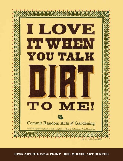
iCk Von HolDt<br />
minburn, <strong>iowa</strong><br />
i have chosen the medium of traditional<br />
letterpress <strong>print</strong>ing because of my love of<br />
both classic and antique typefaces. using the<br />
variety of typefaces and materials that i have<br />
collected provides a constant education and<br />
pleasure for me. there are lots of limitations<br />
imposed by this medium which forces me to<br />
be flexible. i am constantly experimenting<br />
and learning new things with each new<br />
item i <strong>print</strong>.<br />
i absolutely love the fact that none of<br />
my presses are motorized and that i have to<br />
hand-ink and crank or pull each impression<br />
by hand. this is truly slow and laborious but<br />
it gives me immense satisfaction that i am<br />
following a five-hundred year old tradition as<br />
closely as i can. speed is not a factor for me.<br />
i strive for a pleasing layout and image.<br />
to me, my work is all about the type.<br />
i have lots of antique and classic faces and<br />
i consider it my mission to <strong>print</strong> with them so<br />
that they can see the light of day once again<br />
and be appreciated by others.<br />
56<br />
ten letterpress<br />
<strong>print</strong>s on paper<br />
letterpress <strong>print</strong>ing<br />
<strong>print</strong>ers’ Hall 2009<br />
7 x 5 inChEs (17.8 x 12.7 Cm.)<br />
Farm Fresh <strong>print</strong>ing<br />
in Minburn ia 2009<br />
12 x 8 inChEs (30.5 x 20.3 Cm.)<br />
raccoon Forks Farm produced<br />
in Dallas County <strong>iowa</strong> 2009<br />
12 x 7 inChEs (30.5 x 17.8 Cm.)<br />
Hamilton wood type<br />
& <strong>print</strong>ing Museum 2009<br />
19 x 13 inChEs (48.3 x 33 Cm.)<br />
sixteenth annual Midwest and<br />
great northern <strong>print</strong>er’s Fair 2009<br />
24 x 14 inChEs (61 x 35.6 Cm.)<br />
Commit random acts of gardening 2010<br />
14 x 11 inChEs (35.6 x 27.9 Cm.)<br />
raccoon Forks Farm<br />
redfield, <strong>iowa</strong> 2010<br />
17 3/4 x 10 inChEs (45.1 x 25.4 Cm.)<br />
old threshers reunion<br />
Mt. pleasant, ia 2011 2011<br />
23 x 8 3/4 inChEs (58.4 x 22.2 Cm.)<br />
i love it when you talk<br />
Dirt to Me! <strong>2012</strong> (Front CovEr)<br />
20 x 16 inChEs (50.8 x 40.6 Cm.)<br />
<strong>Des</strong> <strong>Moines</strong> <strong>iowa</strong> Food Coop <strong>2012</strong><br />
20 x 16 inChEs (50.8 x 40.6 Cm.)
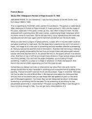
ignatiUs wiDiapraDJa<br />
dEs moinEs, <strong>iowa</strong><br />
the role of <strong>print</strong> and <strong>print</strong>ing in my<br />
visual practice is two-fold. First, the<br />
digital process replaces the traditional<br />
<strong>art</strong> making process of doing multiple<br />
studies and sketches. it allows me to<br />
expediently explore a number of complex<br />
compositional structures, to try different<br />
images, to digitally manipulate them,<br />
including combining multiple images to<br />
create one image, and to merge numerous<br />
images seamlessly to create complex<br />
pictorial structures.<br />
second, the finished digital <strong>print</strong> is<br />
the preliminary stage of my painting. i <strong>print</strong><br />
the finished black-and-white <strong>print</strong> on to<br />
a primed canvas. this <strong>print</strong>’s function is<br />
similar to underpainting in grisaille. i then<br />
apply acrylic paint on top of it using a<br />
number of different painting techniques<br />
such as glazing thin layers of paint and,<br />
for more precise details, applying<br />
numerous small brush strokes in a crosshatching<br />
technique commonly used in<br />
egg tempera painting.<br />
entanglement 2011<br />
diGital <strong>print</strong> on papEr<br />
24 x 36 inChEs (61 x 91.4 Cm.)<br />
58<br />
59
V. skip willits<br />
CamanChE, <strong>iowa</strong><br />
i have an old stamping kit. i have biodegradable ink for the pad. i go out into the woods and<br />
find still standing dead trees with no bark that have been weathered smooth and bleached by<br />
the sun. on these trees i <strong>print</strong> words and sometimes phrases that appeal to me. i try not to<br />
<strong>print</strong> any demands, just words that strike a chord in me. also in my practice, i like to stamp<br />
on old wrapping paper i find in the streets.<br />
stamp <strong>print</strong> on tree photo 3 2011<br />
photoGraph<br />
8 1/2 x 11 inChEs (21.6 x 27.9 Cm.)<br />
stamp <strong>print</strong> on leaf <strong>2012</strong><br />
photoGraph<br />
11 x 8 1/2 inChEs (27.9 x 21.6 Cm.)<br />
60
this catalogue is published in conjunction with<br />
<strong>iowa</strong> <strong><strong>art</strong>ists</strong> <strong>2012</strong>: <strong>print</strong><br />
blank one and <strong>print</strong> Galleries<br />
des moines <strong>art</strong> <strong>Center</strong><br />
october 5, <strong>2012</strong>– january 13, 2013<br />
orGanizEd by amy n. worthen, Curator of <strong>print</strong>s and drawings<br />
with the assistance of sydney royal, assistant registrar / Curatorial assistant<br />
installation dEsiGn jay Ew<strong>art</strong>, Chief preparator<br />
this is the 63rd in the des moines <strong>art</strong> <strong>Center</strong>’s series of Iowa Artists exhibitions.<br />
the juried exhibition was open to all <strong><strong>art</strong>ists</strong> living and working in <strong>iowa</strong>. ninety-eight<br />
<strong><strong>art</strong>ists</strong> submitted entries. twenty-seven <strong><strong>art</strong>ists</strong> were selected to p<strong>art</strong>icipate and they<br />
are represented by a total of 40 <strong>print</strong> and <strong>print</strong>-based works.<br />
this exhibition is sponsored by the Elizabeth Firestone Graham Foundation,<br />
which supports this publication; the peter h. & E. lucille Gaass kuyper Foundation;<br />
kpmG llC; the des moines <strong>art</strong> <strong>Center</strong> <strong>print</strong> Club; and bank of the west.<br />
<strong>print</strong> club Elizabeth Firestone Graham Foundation<br />
des moines <strong>art</strong> <strong>Center</strong><br />
4700 Grand avenue | des moines, <strong>iowa</strong> 50312-2099 | 515.277.4405<br />
www.desmoines<strong>art</strong>center.org<br />
© des moines <strong>art</strong> <strong>Center</strong> <strong>2012</strong> | all rights reserved<br />
isbn 978-1-879003-65-1<br />
library oF ConGrEss Control numbEr <strong>2012</strong>948743<br />
Editor stephanie l. riva<br />
CataloGuE dEsiGn and Exhibition GraphiCs Connie wilson<br />
<strong>print</strong>Er shapco, minneapolis, minnesota<br />
photoGraphy Courtesy of the <strong><strong>art</strong>ists</strong><br />
dimEnsions are given in inches and centimeters. height precedes width.<br />
typoGraphy this book is set in a combination of Clarendon and helvetica neue. Clarendon is<br />
an English slab-serif typeface that was created in England by robert besley in 1845. its thick<br />
slab serifs made it a popular type for letterpress broadsides and advertising. Clarendon holds<br />
the distinction of being the first registered typeface in history. a much more recent typeface,<br />
helvetica neue, is a 1983 reworking and expansion of the classic helvetica family, designed in<br />
1957 by max miedinger with Edüard hoffmann in 1957 in münchenstein, switzerland.<br />
entirelyunexpected<br />
Front CovEr rick von holdt, I Love It When You Talk Dirt To Me!, <strong>2012</strong><br />
insidE Front and baCk CovErs Christopher “Chuck” Forsythe, Magnification, <strong>2012</strong>