think-cell technical report TC2003/01 A GUI-based Interaction ...
think-cell technical report TC2003/01 A GUI-based Interaction ...
think-cell technical report TC2003/01 A GUI-based Interaction ...

Create successful ePaper yourself
Turn your PDF publications into a flip-book with our unique Google optimized e-Paper software.
<strong>think</strong>-<strong>cell</strong> <strong>technical</strong> <strong>report</strong> <strong>TC2003</strong>/<strong>01</strong><br />
A <strong>GUI</strong>-<strong>based</strong> <strong>Interaction</strong> Concept<br />
for Efficient Slide Layout<br />
Volker C. Schöch<br />
vschoech@<strong>think</strong>-<strong>cell</strong>.com<br />
March 2003<br />
Based on Volker Schöch’s diploma thesis with the same title,<br />
submitted to:<br />
Freie Universität Berlin<br />
Institut für Informatik<br />
Takustr. 9<br />
14195 Berlin<br />
Germany
Abstract<br />
A range of research systems have been developed for layout automation, but none<br />
of them suitable for business slide creation. There are, also, many efficient user<br />
interface techniques described in the literature, but until today none of them have<br />
been employed in popular presentation software. In this thesis, a field study was<br />
conducted that shows which problems arise when Microsoft PowerPoint is being<br />
used in a professional context. Based on the study, this research presents a new<br />
interaction concept for the efficient layout of business slides.<br />
The smart grid is a technique that is used to numerically encode spatial con-<br />
straints and to arrange smart elements on a slide accordingly. An intuitive in-<br />
teraction concept was developed that allows the efficient specification of smart grid<br />
constraints. The concept was implemented in a prototype, using efficient algorithms<br />
to achieve interactive response times. A dynamic programming algorithm is used<br />
to compute intelligent layout suggestions.<br />
The prototype runs as part of a commercial product that enhances Microsoft<br />
PowerPoint with constraint-<strong>based</strong> layout support. In the product, a numeric con-<br />
straint solver calculates the optimal smart grid layout for a given set of smart<br />
elements and placement constraints. A case study verified that the interaction con-<br />
cept as implemented in the prototype increases the efficiency for layout specification<br />
by about 20 % over PowerPoint alone, even for expert users.
Contents<br />
List of Figures 5<br />
1 Introduction 7<br />
2 Field Study 9<br />
2.1 Qualitative Aspects . . . . . . . . . . . . . . . . . . . . . . . . . . . . 9<br />
2.1.1 Questions and Methods . . . . . . . . . . . . . . . . . . . . . 9<br />
2.1.2 User Profiles and Working Environment . . . . . . . . . . . . 10<br />
2.1.3 Workflow . . . . . . . . . . . . . . . . . . . . . . . . . . . . . 11<br />
2.1.4 Working Techniques . . . . . . . . . . . . . . . . . . . . . . . 14<br />
2.1.5 Deficits of Microsoft PowerPoint . . . . . . . . . . . . . . . . 16<br />
2.2 Quantitative Aspects . . . . . . . . . . . . . . . . . . . . . . . . . . . 19<br />
2.2.1 Questions . . . . . . . . . . . . . . . . . . . . . . . . . . . . . 19<br />
2.2.2 Methods and Data Validity . . . . . . . . . . . . . . . . . . . 21<br />
2.2.3 Proportionate Times of PowerPoint <strong>Interaction</strong> . . . . . . . . 22<br />
2.2.4 Frequency of Different Chart Types . . . . . . . . . . . . . . 23<br />
2.2.5 Quantifying the Consultant’s Workflow . . . . . . . . . . . . 23<br />
2.3 Field Study – Résumé . . . . . . . . . . . . . . . . . . . . . . . . . . 24<br />
3 State of the Art 25<br />
3.1 User Interfaces for Layout Specification . . . . . . . . . . . . . . . . 25<br />
3.1.1 Of Mice and Menus . . . . . . . . . . . . . . . . . . . . . . . 25<br />
3.1.2 Alignment Tools . . . . . . . . . . . . . . . . . . . . . . . . . 28<br />
3.2 Computer Supported Layout . . . . . . . . . . . . . . . . . . . . . . 29<br />
3.2.1 Interactive Drawing Aids . . . . . . . . . . . . . . . . . . . . 29<br />
3.2.2 Automated Layout . . . . . . . . . . . . . . . . . . . . . . . . 31<br />
3.2.3 Ancestors of the Smart Grid . . . . . . . . . . . . . . . . . . 32<br />
3.3 State of the Art – Résumé . . . . . . . . . . . . . . . . . . . . . . . . 33<br />
4 <strong>Interaction</strong> Concept 34<br />
4.1 A New Approach to Slide Layout . . . . . . . . . . . . . . . . . . . . 34<br />
4.1.1 Plain PowerPoint is Not Enough . . . . . . . . . . . . . . . . 34<br />
4.1.2 The Smart Grid Concept . . . . . . . . . . . . . . . . . . . . 35<br />
4.1.3 Implementing Esthetics by Rules . . . . . . . . . . . . . . . . 40<br />
4.1.4 Review of the User Feedback . . . . . . . . . . . . . . . . . . 41<br />
4.2 <strong>Interaction</strong> Toolbox . . . . . . . . . . . . . . . . . . . . . . . . . . . . 42<br />
4.2.1 Usability Metrics and Design Objectives . . . . . . . . . . . . 43<br />
4.2.2 Keyboard-<strong>based</strong> <strong>Interaction</strong> . . . . . . . . . . . . . . . . . . . 44<br />
4.2.3 Mouse-<strong>based</strong> <strong>Interaction</strong> . . . . . . . . . . . . . . . . . . . . . 45<br />
4.2.4 Mode Switch . . . . . . . . . . . . . . . . . . . . . . . . . . . 49<br />
4.2.5 General <strong>Interaction</strong> Patterns . . . . . . . . . . . . . . . . . . 50<br />
4.2.6 Feedback to the User . . . . . . . . . . . . . . . . . . . . . . . 51<br />
4.3 Specifying the User Interface . . . . . . . . . . . . . . . . . . . . . . 52<br />
3
4.3.1 Inserting a New Element . . . . . . . . . . . . . . . . . . . . . 52<br />
4.3.2 Inserting Multiple Elements . . . . . . . . . . . . . . . . . . . 58<br />
4.3.3 Selecting Smart Elements . . . . . . . . . . . . . . . . . . . . 61<br />
4.3.4 Adjusting the Smart Grid . . . . . . . . . . . . . . . . . . . . 63<br />
4.3.5 Higher-Order Constraints . . . . . . . . . . . . . . . . . . . . 66<br />
5 Implementation 69<br />
5.1 Program Architecture . . . . . . . . . . . . . . . . . . . . . . . . . . 69<br />
5.1.1 Overview: Entity-Relation . . . . . . . . . . . . . . . . . . . . 69<br />
5.1.2 Hierarchy and Interfaces of UI Classes . . . . . . . . . . . . . 72<br />
5.1.3 Windows Message Processing . . . . . . . . . . . . . . . . . . 72<br />
5.2 An Application of Dynamic Programming . . . . . . . . . . . . . . . 76<br />
5.2.1 The Gridline Matching Problem . . . . . . . . . . . . . . . . 76<br />
5.2.2 A Recursive Algorithm with Exponential Running Time . . . 77<br />
5.2.3 Finding the Optimal Solution in Polynomial Time . . . . . . 80<br />
5.2.4 Advanced Gridline Matching Considerations . . . . . . . . . . 82<br />
6 Evaluation 83<br />
6.1 Estimating the Potential Speed-Up . . . . . . . . . . . . . . . . . . . 83<br />
6.1.1 Speedup for Chart Design . . . . . . . . . . . . . . . . . . . . 83<br />
6.1.2 Speedup for Slide Layout . . . . . . . . . . . . . . . . . . . . 83<br />
6.1.3 Expected Over-All Speed-Up . . . . . . . . . . . . . . . . . . 84<br />
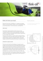
6.2 Case Study . . . . . . . . . . . . . . . . . . . . . . . . . . . . . . . . 84<br />
6.2.1 Question . . . . . . . . . . . . . . . . . . . . . . . . . . . . . 85<br />
6.2.2 Setup . . . . . . . . . . . . . . . . . . . . . . . . . . . . . . . 85<br />
6.2.3 Results . . . . . . . . . . . . . . . . . . . . . . . . . . . . . . 85<br />
7 Conclusion 88<br />
7.1 Future Work . . . . . . . . . . . . . . . . . . . . . . . . . . . . . . . 88<br />
7.2 Résumé . . . . . . . . . . . . . . . . . . . . . . . . . . . . . . . . . . 89<br />
References 91<br />
4
List of Figures<br />
1 The consultant’s workflow . . . . . . . . . . . . . . . . . . . . . . . . 12<br />
2 The visual’s workflow . . . . . . . . . . . . . . . . . . . . . . . . . . 13<br />
3 Basic elements of a consultancy slide . . . . . . . . . . . . . . . . . . 16<br />
4 Chart types (selected examples) . . . . . . . . . . . . . . . . . . . . . 20<br />
5 Proportionate times of PowerPoint activities . . . . . . . . . . . . . . 22<br />
6 Relative frequency of chart type use . . . . . . . . . . . . . . . . . . 23<br />
7 A pie menu as seen in The Sims . . . . . . . . . . . . . . . . . . . . 26<br />
8 Design refinements on marking menus . . . . . . . . . . . . . . . . . 27<br />
9 Typical slide exemplifying layout rules . . . . . . . . . . . . . . . . . 34<br />
10 The <strong>think</strong>-<strong>cell</strong> add-in as seen by the user . . . . . . . . . . . . . . . . 35<br />
11 This work in the context of the <strong>think</strong>-<strong>cell</strong> application . . . . . . . . . 36<br />
12 <strong>Interaction</strong> between smart elements and smart gridlines . . . . . . . 36<br />
13 Solving a constraint system to determine the optimal layout . . . . . 37<br />
14 PowerPoint deficits remedied by a “smart grid” . . . . . . . . . . . . 42<br />
15 A circular menu as seen in the prototype . . . . . . . . . . . . . . . . 47<br />
16 Inserting a new shape into the smart grid . . . . . . . . . . . . . . . 53<br />
17 Single-click insertion (one neighbor) . . . . . . . . . . . . . . . . . . 54<br />
18 Single-click insertion (two neighbors) . . . . . . . . . . . . . . . . . . 54<br />
19 Single-click insertion (halving the area) . . . . . . . . . . . . . . . . 55<br />
20 Single-click insertion (another example) . . . . . . . . . . . . . . . . 55<br />
21 Gridlines highlight to indicate snapping. . . . . . . . . . . . . . . . . 56<br />
22 Snapping can align a new element with distant shapes . . . . . . . . 56<br />
23 Single-click insertion displacing another shape . . . . . . . . . . . . . 57<br />
24 Drag-and-drop insertion displacing another shape . . . . . . . . . . . 57<br />
25 Insertion between two shapes . . . . . . . . . . . . . . . . . . . . . . 58<br />
26 Insertion with overlap . . . . . . . . . . . . . . . . . . . . . . . . . . 58<br />
27 Inserting multiple elements in one interaction . . . . . . . . . . . . . 59<br />
28 Duplicating multiple elements in one interaction . . . . . . . . . . . 61<br />
29 Inserting a row into a table of text boxes . . . . . . . . . . . . . . . . 61<br />
30 Strictly 2-dimensional edge-<strong>based</strong> selection . . . . . . . . . . . . . . . 63<br />
31 Dragging a gridline to adjust the global layout . . . . . . . . . . . . 64<br />
32 Gridlines can be merged and can be split . . . . . . . . . . . . . . . 66<br />
33 Moving anchorpoints to adjust the local layout . . . . . . . . . . . . 67<br />
34 Example for wrong z-order . . . . . . . . . . . . . . . . . . . . . . . . 68<br />
35 Example for correct z-order . . . . . . . . . . . . . . . . . . . . . . . 68<br />
36 Schematic interaction between the add-in and PowerPoint . . . . . . 69<br />
37 Program architecture . . . . . . . . . . . . . . . . . . . . . . . . . . . 70<br />
38 Selected class diagrams . . . . . . . . . . . . . . . . . . . . . . . . . . 73<br />
39 Instantiation of appropriate UI objects on request . . . . . . . . . . 74<br />
40 Processing of user input and generation of visual feedback . . . . . . 75<br />
41 Matching two lists of gridlines . . . . . . . . . . . . . . . . . . . . . . 76<br />
5
42 Gridline matching as a shortest path problem . . . . . . . . . . . . . 78<br />
43 An exponential-time recursive algorithm for gridline matching . . . . 79<br />
44 Dynamic programming cost matrix . . . . . . . . . . . . . . . . . . . 80<br />
45 A dynamic programming algorithm for gridline matching . . . . . . 81<br />
46 Matching a dynamic number of destination gridlines . . . . . . . . . 82<br />
47 Over-all time saved (estimated) . . . . . . . . . . . . . . . . . . . . . 84<br />
48 User interaction times for slide layout specification (min:sec) . . . . 86<br />
49 Examples for case study tasks . . . . . . . . . . . . . . . . . . . . . . 87<br />
6
1 Introduction<br />
INTRODUCTION<br />
“Layout refers to the process of determining the sizes and positions of<br />
visual objects that are part of an information presentation. Automated<br />
layout refers to the use of a computer program to automate either all or<br />
part of the layout process. This field of research lies at the crossroads<br />
between artificial intelligence and human computer interaction.”<br />
Lok and Feiner in [LF<strong>01</strong>]<br />
This thesis deals with the human-computer interaction part of a new approach<br />
for automated layout. With the notion of automated layout I do not refer to graph<br />
layout or VLSI layout. These fields of research share some of the terminology<br />
used throughout this text, albeit with some subtle differences in meaning. The<br />
application domain of my automated layout approach are business slides, which to<br />
date are typically designed with Microsoft PowerPoint 1 .<br />
A field study in a business consultancy, which is detailed in chapter 2, showed<br />
that the tools provided by standard software like PowerPoint are not adequate<br />
for efficient slide design. For example, business slide layout typically consists of<br />
carefully aligned text boxes and arrows. Since the alignment tools provided by<br />
PowerPoint are merely pixel-<strong>based</strong> and do not create lasting relationships between<br />
shapes, setting up a completely aligned layout is a tedious task. In particular,<br />
when some more text or some new element needs to be integrated into an existing<br />
slide, the entire layout must be updated manually until all requirements are met.<br />
Standard requirements are: Certain shapes must have the same size, all text must<br />
have the same formatting, all shapes must be horizontally and vertically aligned<br />
with some other shapes.<br />
The most regular, grid- or table-like layouts that prevail on typical business<br />
slides are apparently suitable for automated layout support. By automated layout<br />
support I mean the implicit or explicit specification of relations between drawing<br />
elements, and the dynamic maintenance thereof during an interactive layout process.<br />
A review of the available literature on automated layout is given in chapter 3. It<br />
turns out that a number of constraint-<strong>based</strong> systems for automated layout have<br />
been developed in research, but none of them have been successfully applied in<br />
practice. This observation is commonly attributed to the fact that those systems are<br />
very complex and therefore hard to use. However, the idea of user-specified layout<br />
constraints that are interactively maintained when the layout changes, appears to<br />
be an appropriate concept for professional slide design.<br />
The start-up company <strong>think</strong>-<strong>cell</strong> 2 elaborated on that idea and is now developing<br />
an add-in for PowerPoint that realizes constraint-<strong>based</strong> layout automation. They<br />
already implemented an architecture, which allows software-driven interaction with<br />
1All company and product names used in this text are trademarks or registered trademarks of<br />
their respective owners.<br />
2My work is <strong>based</strong> on and part of a product from <strong>think</strong>-<strong>cell</strong> Software GmbH, Berlin, which is<br />
called <strong>think</strong>-<strong>cell</strong> layout. At the time of writing, it is in early development stage.<br />
http://www.<strong>think</strong>-<strong>cell</strong>.com<br />
7
INTRODUCTION<br />
PowerPoint – for example, to modify existing shapes or to add a new shape to<br />
a slide. Moreover, the people at <strong>think</strong>-<strong>cell</strong> developed and implemented a concept<br />
which they call the smart grid: A collection of horizontal and vertical smart gridlines<br />
that describes the position of each element on the slide.<br />
Elements that are contained by the smart grid are called smart elements, because<br />
their locations are no longer pixel-<strong>based</strong>. Instead, each smart element is bound to<br />
a number of smart gridlines and moves along when the gridlines move. The effect<br />
being, smart elements that are bound to the same gridline, are aligned – and as<br />
long as the binding to the gridline is maintained, they stay aligned even when the<br />
over-all slide layout is modified.<br />
At the time of writing, two essential parts of the software were not yet imple-<br />
mented: The numeric constraint solver that computes the “optimal” layout, and<br />
the user interface that is necessary to operate the smart grid. It is the theme of<br />
this thesis to realize an interaction concept that facilitates an easy and efficient<br />
constraint specification for smart elements and their placement in the smart grid.<br />
In chapter 4, the smart grid idea is explained in detail and an interaction concept<br />
is developed that leads to the specification of a user interface.<br />
While the numeric constraint solver is still not in place, the existing architecture<br />
of the <strong>think</strong>-<strong>cell</strong> add-in for PowerPoint provided the opportunity to turn my user<br />
interface specification into a running prototype. The architecture of the prototype<br />
and some of the algorithms used for the implementation are discussed in chapter 5.<br />
Finally, chapter 6 evaluates the prototype by means of a comparative case study<br />
and quantifies the achievement in terms of the increase of efficiency over plain<br />
PowerPoint.<br />
8
2 Field Study<br />
FIELD STUDY<br />
Jeff Hawkins (PalmPilot inventor) 3 : “When I design products, I pretend<br />
to use them as much as possible before they exist. Meaning, I would put<br />
the wood prototype in my shirt pocket and carry it around all the time. If<br />
someone phoned, I’d take it out and pretend I was looking up something<br />
in the calendar or address book.”<br />
In my case, to acquire a thorough understanding of the problems for which my<br />
work attempts to offer a solution, I can do even more than Hawkins with his wooden<br />
“prototype”. Since the <strong>think</strong>-<strong>cell</strong> product is an extension to Microsoft PowerPoint,<br />
I could go and watch PowerPoint users in the target setting. A pilot customer of<br />
the <strong>think</strong>-<strong>cell</strong> company – a mid-sized consultancy office – provided an opportunity<br />
for me to do exactly that. The results are presented in this chapter.<br />
2.1 Qualitative Aspects<br />
Before we can even <strong>think</strong> about a quantitative evaluation we need some terminol-<br />
ogy and some basic understanding of the ongoing processes that involve Microsoft<br />
PowerPoint in the context of consultancies. A qualitative study provides the domain<br />
knowledge or the scale, which can be used to conduct a quantitative evaluation. In<br />
order to use time economically, I collected some quantitative data along with the<br />
qualitative study. However, the results are presented in distinct sections.<br />
2.1.1 Questions and Methods<br />
In order to design an appropriate user interface, I need to understand the user<br />
population, their environment, and their requirements. With regard to the user,<br />
the typical level of computer expertise is of special interest. Information about the<br />
environment includes typical <strong>technical</strong> equipment and the working conditions as far<br />
as interaction with software is concerned. Furthermore, a contextual task analysis<br />
[May99] provides information about the over-all workflow and thereby about the<br />
role that the intended software could play and the impact it may have. I used a<br />
range of complementary methods to collect and verify the required data.<br />
Observation. While I was present at the consultancy’s site, I watched the en-<br />
tire workflow and paid special attention to the people using Microsoft PowerPoint.<br />
Doing so, I collected notes which I later aggregated into statements.<br />
Interviews. I asked people to take a few moments and answer those questions<br />
which I couldn’t answer myself by simply watching – these are typically “why?”<br />
questions. If I had a hypothesis in mind, I tried to verify it by asking “right<br />
or wrong” kinds of questions. In some cases, I conducted longer and carefully<br />
prepared interviews to learn about some part of the workflow which I couldn’t<br />
3 from http://www.business2.com/articles/mag/0,1640,21,00.html<br />
9
2.1 Qualitative Aspects FIELD STUDY<br />
cover by observation. An interview leads to in-depth information which cannot<br />
easily be generalized as it comes from a single source.<br />
Surveys. Questionnaires are another means to verify hypotheses that came up<br />
from observation. As opposed to interviews, surveys support a generalization of a<br />
result because input comes from a range of sources. On the other hand, surveys<br />
cannot provide very much detail, because the need for statistical evaluation of the<br />
responses requires a uniform and restricted format of the answers. A survey can be<br />
used to weight the significance of results from observation and interviews.<br />
Hands-on experience. To strengthen the feeling for the work and the problems<br />
and to understand the motivation behind some best practices, I tried to use Micro-<br />
soft PowerPoint myself the way the people at consultancies do. When preparing<br />
my own presentations, I used graphical elements and layouts that I had seen before<br />
on slides from consultancies. Thus, I developed some skills in using the Microsoft<br />
PowerPoint tools for drawing, alignment, z-order, and so forth.<br />
Representativeness of the data. Most observations, interviews and surveys<br />
were undertaken in one office of <strong>think</strong>-<strong>cell</strong>’s pilot customer. In the course of two<br />
weeks, I was present at the pilot customer’s site on five workdays, which translates<br />
to ten 6-hour shifts in the visual pool. The data collected at that site was supple-<br />
mented and backed up by interviews with consultants from other consultancies. As<br />
it turned out, working techniques of different consultancies are extremely similar,<br />
thus providing reasonable argument to generalize my findings and conclusions.<br />
2.1.2 User Profiles and Working Environment<br />
There are strictly two types of Microsoft PowerPoint users in a consultancy. On the<br />
one hand, there are the consultants themselves. On the other hand, there are the<br />
visual assistants or simply visuals. The entirety of all available visuals at a point in<br />
time is referred to as the pool or production.<br />
Consultants<br />
While the focus and the value of the consultants’ work lies in economic improve-<br />
ments of their customers’ businesses, creating a convincing presentation as a basis<br />
for effective communication with the customer is almost equally high on their pri-<br />
ority list.<br />
Consultants do a lot of team work and also split up responsibilities for different<br />
aspects of a project and a presentation, respectively. However, the actual creation<br />
of slides is done privately. The consultant’s typical workplace is constantly moving<br />
between the home office and one or more customer sites. She 4 has a laptop computer<br />
4 For ease of writing, I always refer to “the user” as she with no gender-specific meaning implied.<br />
10
2.1 Qualitative Aspects FIELD STUDY<br />
with usually only an external mouse attached, thus being bound to using a limited<br />
keyboard and a relatively small screen.<br />
The consultant’s day is determined by constant time pressure and overtime work.<br />
Besides personal notes and a calculator, Microsoft Excel is by far the most important<br />
tool for the consultant’s work, followed by Microsoft PowerPoint. Microsoft Power-<br />
Point is even preferred over Microsoft Word to create minutes of meetings, because<br />
PowerPoint slides are easy to show and to discuss in later meetings. Additionally,<br />
they can sometimes be put to further use in other PowerPoint presentations.<br />
Visuals<br />
The visuals typically are part-time student workers. They have a diversity of edu-<br />
cational backgrounds which generally show no relation to their work as Microsoft<br />
PowerPoint experts. The expertise required to do the job in the pool is acquired<br />
on the job. For this reason, the actual skills in using Microsoft PowerPoint vary<br />
considerably among the visuals and relate fairly well to the duration of their em-<br />
ployment. It is only after about two years of experience that a visual achieves top<br />
performance in using PowerPoint<br />
The visuals share an office with a number of workplaces which they use in turn.<br />
There is no fixed relation between workers and places, meaning that only the most<br />
important software settings are changed according to personal preferences. The<br />
visual office is well equipped with up-to-date hardware including large screens and<br />
high-capacity printers. Approximately half a dozen workers share the same location.<br />
Due to this the computers’ audio is generally turned off. The pool works in two 6-<br />
hour shifts, which are scheduled flexibly, according to each worker’s personal needs<br />
and the demands of the consultancy’s business.<br />
2.1.3 Workflow<br />
The workflow of a visual is part of a bigger picture, which is the consultant’s work-<br />
flow. Therefore, I first examine the workflow which represents a consultant’s job<br />
with respect to presentation creation and then zoom in to the more specific workflow<br />
of a visual.<br />
A Consultant’s day<br />
Customer communication and team communication together with the respective<br />
postprocessing make up the greater part of a consultant’s day. When it comes to<br />
putting ideas and concepts into a presentation format, the consultant more or less<br />
works along the following lines (Fig. 1).<br />
A. First of all, a Story Line is found. The story line represents the hypothesis<br />
or core statement of the presentation, which is the result of the preceding<br />
analysis. It is laid out on a single sheet of paper, as a story board of thumbnail<br />
slides and preliminary headlines.<br />
11
2.1 Qualitative Aspects FIELD STUDY<br />
Input<br />
Customer Sessions<br />
Team Sessions<br />
Story Line<br />
Dummy Master<br />
Analysis<br />
Numbers / Charts<br />
Production<br />
Updates<br />
Output<br />
New Presentations<br />
Updates<br />
Figure 1: The consultant’s workflow with respect to presentation creation<br />
At this stage, the consultant looks for material and ideas from previous<br />
projects. This includes the retrieval of related slides from other presentations,<br />
talking to colleagues and searching the consultancy’s knowledge management<br />
system (if available).<br />
B. The next step is the Dummy Master, which is a collection of full size pages<br />
emerging from the story line. Besides some preliminary headlines, the sheets<br />
contain draft remarks and sketches. A preliminary agenda imposes some<br />
structure on the presentation.<br />
The dummy master and all the following steps are iteratively refined through-<br />
out the whole project.<br />
C. Once the dummy master represents the train of thought that shall carry<br />
through the presentation, the consultant inserts the Numbers that are re-<br />
quired to support the argument. Numbers in presentations are usually visu-<br />
alized as Charts, which are laid out at this stage.<br />
D. Now the agenda is in shape, the numbers are available and the consultant<br />
has decided on how to visualize facts and concepts. At this stage, the dummy<br />
master is turned in to the Production, where the visuals take over. It is only<br />
now that PowerPoint comes into play. The consultant mostly works with pen-<br />
and-paper sketches and handwritten remarks on printouts of existing slides.<br />
E. The first attempt to create a PowerPoint presentation from a dummy master,<br />
is never a complete success. Typically, the consultant’s handwriting was not<br />
read correctly by the visuals, or – in view of the PowerPoint version of a<br />
slide – the consultant decides to explain some concept in a different way.<br />
12
2.1 Qualitative Aspects FIELD STUDY<br />
Therefore, any PowerPoint presentation gets back to the pool for Correction<br />
and Update at least once.<br />
In the case of simple typing errors or numbers changing in a way that does not<br />
affect the slide layout, the consultants tend to do the necessary refinements<br />
in PowerPoint at their own desk.<br />
A Visual’s Day<br />
The workflow of a visual assistant (Fig. 2) is more specific and uniform than the<br />
consultant’s workflow. Work is received by the production pool in batches of slides,<br />
typically by telefax. Entirely new slides are created as freehand sketches. Alterna-<br />
tively, consultants use printouts of slides (not uncommonly from a range of different<br />
presentations) and modify them manually with pencil and correction tape.<br />
First Review<br />
Collect Materials<br />
Create New File<br />
Rearrange Slides<br />
Create / Edit<br />
Slides<br />
Print / Review<br />
Deliver<br />
Story Line<br />
Dummy Master<br />
Split Batch<br />
Numbers / Charts<br />
Production<br />
Merge Batch<br />
Figure 2: The visual’s workflow as part of the consultant’s workflow<br />
A. The first step is to Review the batch of paper in order to get an idea of the<br />
type and amount of work. If there are a lot of very difficult slides, a relatively<br />
unexperienced worker might give the batch to a more experienced one.<br />
B. Next, all required Materials are Collected into a local working folder. This<br />
includes PowerPoint files, Excel files, images and so on.<br />
C. An existing presentation or template is opened in PowerPoint and the Save As. . .<br />
feature is used to Create a New File.<br />
D. If the new presentation is <strong>based</strong> on an existing one, then at this stage the<br />
Slides are Rearranged to match the new presentation. Slides that are no<br />
longer needed are removed and existing slides from other presentations are<br />
copy-pasted to their destination.<br />
13<br />
Updates
2.1 Qualitative Aspects FIELD STUDY<br />
E. If the visual estimates that a batch might take a long time and if there are<br />
other visuals available, at this time the visual may Split the Batch into<br />
several pieces so that it can be worked on in parallel. To do this, the current<br />
state of the presentation is duplicated to the other visuals’ machines so that<br />
each visual works on a local and private copy of the PowerPoint file.<br />
F. After these preparations, the batch is taken slide by slide. New Slides are<br />
inserted and existing slides are modified, making this part of the workflow the<br />
one with the most intensive PowerPoint interaction. This step is determining<br />
the over-all amount of time that is required to process the batch.<br />
G. If the batch was split up between two or more visuals, at this stage all files<br />
are copied to a single computer and the Batch is Merged into a single file,<br />
using copy-paste within Microsoft PowerPoint.<br />
H. Then, a Printout is created from the entire file. It is Reviewed and com-<br />
pared to the scribbles turned in by the consultant. Last changes and correc-<br />
tions are performed and the affected slides are printed again for review.<br />
I. Finally, the file is Delivered. More specific, the file may be sent to the<br />
consultant’s site by email or some other means of remote file sharing, and the<br />
consultant is notified.<br />
2.1.4 Working Techniques<br />
During the observations in the visual pool, I took notes on a large number of working<br />
techniques. In this section I present only those techniques that are most important<br />
to understand the workflow involving Microsoft PowerPoint and to explain the<br />
potential of a better user interface.<br />
Yellow Pad. The Yellow Pad is the consultant’s sketch pad, made of heavy yellow<br />
paper with light marks on it. The marks help with sketching, but they do not<br />
photocopy or telefax.<br />
New slides are first sketched out on the yellow pad. Due to bad handwriting<br />
and sketchy drawings, even an experienced visual needs some time to understand<br />
the wording and the graphical elements of a slide. Visuals say that they cannot<br />
decipher about 10 % or more of the manuscript, in which case they mark the word<br />
in question and continue without interrupting the workflow.<br />
Charts are usually reproduced from the manuscript just as any other figures –<br />
meaning that the consultant copies all numbers from Excel sheets to the yellow pad<br />
and the visual copies all numbers from the yellow pad to PowerPoint. The visuals<br />
generally do not have access to the underlying data sources, for practical reasons<br />
as well as for reasons of confidentiality and data integrity.<br />
However, pure yellow pad scribbles account for only a small fraction of Power-<br />
Point work. For the most part, existing presentations are modified, or consultants<br />
14
2.1 Qualitative Aspects FIELD STUDY<br />
take slides from different PowerPoint files and adapt them for a new presentation,<br />
using correction tape and handwritten remarks.<br />
A Consultant’s Tools. Apart from communication devices – telephone, <strong>cell</strong>-<br />
phone, telefax, email, organizer – there’s only a handful of tools which are essential<br />
to the consultant’s work: Microsoft Excel, Microsoft PowerPoint, a calculator, a<br />
pen, a personal note pad, a yellow pad and correction tape.<br />
The entire project related communication with team members as well as with<br />
customers is <strong>based</strong> on PowerPoint slides and Excel sheets. Both kinds of data evolve<br />
continuously throughout the course of a project. Presentations of intermediate<br />
results are usually <strong>based</strong> on the same, iteratively refined PowerPoint file. The final<br />
version of the file at the same time serves as a documentation that is handed over<br />
to the customer when the project ends.<br />
In Microsoft Excel, consultants mostly use features for numeric aggregation<br />
(sum, average, etc.). They also make heavy use of live links between sheets and<br />
even between Excel files, but apparently they never create live links between Excel<br />
sheets and PowerPoint presentations. Excel sheets are sometimes used to hold large<br />
amounts of text, which requires all kinds of tedious work like manual line wrapping,<br />
formatting and merging of <strong>cell</strong>s, because Excel is not prepared for managing entire<br />
paragraphs of text. On the other hand, the elaborate Excel features to create charts<br />
are almost never used, because charts are only required for presentations and it is<br />
left to the visuals to create those charts in PowerPoint.<br />
Basic Slide Layout. There is a common standard to which most slides produced<br />
in a consultancy adhere. Some of these elements are also marked on the yellow pad<br />
blanks. The most common elements, their use, formatting, and meaning is indicated<br />
in figure 3.<br />
It is striking that consultants typically put loads of information onto a single<br />
slide. Students in academia are told to use font sizes no smaller than 18 points.<br />
Consultants use font sizes no bigger than 18 points and on dense slides go down to<br />
even 10 points. However, consultancies as well as academics agree on the general<br />
rule that there should be no more than three different font sizes on a single slide.<br />
Consultants make extensive use of graphical elements like boxes, lines, bubbles<br />
and a variety of different arrows and pointers. They also like to visualize recurring<br />
concepts by a thumbnail of the figure which first explained the concept. Depend-<br />
ing on the context and purpose, consultants use detailed charts <strong>based</strong> on actual<br />
numbers, or symbolic charts that convey a certain tendency or idea.<br />
Best Practices. The PowerPoint experts in the visual pool developed a range of<br />
best practices, which are used to solve a certain problem in a certain way. Typically,<br />
so-called best practices provide an indication of missing or unusable features in the<br />
software being used. Some of the best practices are well-known and shared by<br />
everybody involved, others are more of a personal habit. For this reason, visuals<br />
15
2.1 Qualitative Aspects FIELD STUDY<br />
Content of<br />
the slide<br />
Interpretation<br />
of the numbers on<br />
this slide<br />
Legend and<br />
list of references<br />
“Action Title” – left-aligned, striking, numbers rounded, and<br />
frequently two lines<br />
Subtitle<br />
Unit of Numbers<br />
* Footnote<br />
Content …<br />
Message of<br />
the slide<br />
“Summary” bold with shading<br />
Case code<br />
identifies the<br />
project<br />
STICKER<br />
Optional: Importance<br />
of the content (“example”,<br />
“prognosis”, etc.)<br />
Conclusion with<br />
reference to the<br />
action title<br />
Case code<br />
Figure 3: Basic elements of a consultancy slide<br />
17<br />
Page number<br />
generally do not appreciate it when consultants work on the slides themselves. They<br />
<strong>report</strong>edly prefer even minor modifications to be sent to the visual pool so that the<br />
fragile composition of a complex slide is not broken.<br />
2.1.5 Deficits of Microsoft PowerPoint<br />
A large number of the working techniques that I observed throughout the field<br />
study, turned out to be workarounds for problems with the usage of Microsoft<br />
PowerPoint. In this section I present selected problems that could be remedied by<br />
layout automation.<br />
A. PowerPoint Automation<br />
(1) PowerPoint supports automatic resizing of text boxes to fit the text.<br />
Since a text box is usually aligned with other shapes on the slide, this<br />
feature tends to distort the slide layout and is therefore disabled.<br />
(2) PowerPoint supports automatic adaption of the text size to fit a text box.<br />
However, only the text size of the over full text box is affected. Since<br />
generally a slide should have uniform font types and sizes, this feature<br />
is always disabled. If required, text sizes of all elements on the slide are<br />
adapted manually.<br />
(3) PowerPoint supports automatic text wrapping, but the algorithm pro-<br />
duces unusable results: Syllabication is neither supported at all, nor are<br />
16
2.1 Qualitative Aspects FIELD STUDY<br />
hard spaces and potential hyphens as they are known in Microsoft Word.<br />
Instead, sometimes a line break occurs at an arbitrary position within<br />
a word and without a hyphen. This is not acceptable and visuals pre-<br />
fer to disable automatic wrapping all together and insert all line breaks<br />
manually.<br />
B. Alignment<br />
(1) The PowerPoint grid is not stable through multiple runtime instances of<br />
PowerPoint. If a presentation is reopened, elements that were previously<br />
aligned with the grid frequently happen to be just slightly off. In this<br />
case, modifying a complex slide becomes a nightmare. The only cure<br />
is to select all elements of the slide and push them back into the grid,<br />
before changing or adding any shapes.<br />
(2) When Snap to Grid is active and a shape is moved with the mouse, it is<br />
unclear which point of the shape actually is aligned with the grid. If a<br />
shape is moved with the cursor keys, alignment depends on the direction<br />
of movement.<br />
(3) The number of magnetic guidelines is constrained to 8 per dimension.<br />
Since guidelines relate to an entire presentation (as opposed to a single<br />
slide), there are only 8 vertical and 8 horizontal positions available. This<br />
is not enough when a presentation contains numerous complex arrange-<br />
ments.<br />
(4) The guidelines and the grid are hard to see on a slide; they are displayed<br />
as very small dots in light gray. This is unnecessarily tiring for the<br />
visuals’ eyes.<br />
(5) Even carefully aligned elements that seem to fit perfectly in normal view,<br />
frequently turn out to look distorted in the presentation view or printout.<br />
The only reliable way to avoid these kinds of problems, is to view the<br />
drawing with the maximum zoom factor of 400 %.<br />
(6) Generally, it is possible to resize multiple shapes synchronously by just<br />
doing a multi selection. A strange exception to this principle exists: Lines<br />
can only be kept aligned during resizing, if they are grouped beforehand.<br />
(7) The alignment tools always move the shapes. There is no function to<br />
align, for instance, all right edges of a couple of text boxes, and leave all<br />
the left edges where they are (effectively resizing the shapes).<br />
C. PowerPoint Charts<br />
(1) Although the Microsoft applications are controlled by the means of a<br />
graphical user interface, the principle of direct manipulation is not always<br />
applied. In the case of charts, it is not possible to change the height<br />
of a column or the size of a slice with the mouse. To achieve these<br />
17
2.1 Qualitative Aspects FIELD STUDY<br />
adjustments, the user must go back to the data table and change the<br />
underlying numbers.<br />
(2) PowerPoint charts provide some means to label segments of a column,<br />
for instance. However, the placement of labels does not match the re-<br />
quirements of the consultants. The consultants have a set of conventions<br />
to improve legibility even for labels of very small segments. PowerPoint<br />
doesn’t support these standards and therefore visuals generally place la-<br />
bels manually (meaning redundant data input and thus another source<br />
for errors).<br />
(3) Furthermore, any text placed within a chart cannot be sufficiently con-<br />
trolled by the user. Font size and line wrapping are adapted by Power-<br />
Point, leading to unpredictable results. This is another reason why visu-<br />
als turn off any automatic text in charts and manually create an extra<br />
text box for every single label.<br />
(4) It is hard to scale charts exactly to a certain size. If the chart object is<br />
D. Tables<br />
resized as it appears in PowerPoint, distortion occurs. The chart can only<br />
be resized undistortedly in chart editing mode. In this mode, however,<br />
the relation between the chart size and the underlying slide is not clear,<br />
because the chart is magnified for editing.<br />
(1) Table columns in PowerPoint cannot be assigned a precise width; they<br />
can only be resized using the mouse, resulting in an irregular layout.<br />
(2) Just as with any other shapes, line wrapping doesn’t produce satisfying<br />
results. In contrast to other shapes, automatic line wrapping cannot be<br />
disabled in tables. The same reoccurs in the automatic resizing of table<br />
rows.<br />
(3) For these reasons, the existence of the PowerPoint table feature is simply<br />
neglected in the visual pools. Visuals generally build table-like arrange-<br />
ments from single text boxes. The disadvantage is obvious: When first<br />
creating the table, multiple attempts are required to determine the opti-<br />
mal size for the text boxes to fit the page. Inserting new rows or columns<br />
later is almost impossible.<br />
E. Keyboard use and navigation<br />
(1) There are many situations in which a desired effect cannot be achieved<br />
just by using the keyboard. In these cases, using the mouse is obligatory.<br />
A prominent example for this is the change of the focus from one text box<br />
to another, which is frequently needed because almost anything on a slide<br />
– including tables and chart labels – is realized as text boxes. The need<br />
to constantly switch between keyboard and mouse significantly reduces<br />
efficiency and accuracy of PowerPoint work.<br />
18
2.2 Quantitative Aspects FIELD STUDY<br />
(2) As mentioned above, extremely high zoom factors play an important role<br />
for slide layout. However, in a zoomed view it is difficult to navigate the<br />
slide. The only way to move the small visible part of the slide is to use<br />
the mouse and interact with the scroll bars. This is tedious because it is<br />
not possible to navigate both dimensions in a single interaction and the<br />
scroll bars are not helpful to find a specific area of the slide. Navigating<br />
the view with the keyboard is not possible at all.<br />
(3) Also, frequently used functions like align, distribute and the like are only<br />
available as toolbar buttons and cannot be accessed using the keyboard.<br />
2.2 Quantitative Aspects<br />
In section 2.1, we have developed some terminology and a general understanding of<br />
the matter that is subject to this work. In this section, the problems that the qual-<br />
itative study revealed are understood as potential opportunities for improvement.<br />
An attempt is made to quantify the potentials.<br />
2.2.1 Questions<br />
The quantitative study was designed to rank and quantify the impact of different<br />
PowerPoint-related activities on the over-all presentation creation process. Activi-<br />
ties were grouped into the following categories:<br />
A. Data Entry – typing in text and numbers from the manuscript into text<br />
boxes and data sheets.<br />
B. Slide Layout – creating and arranging frequently-used visual elements like<br />
boxes, call-outs, lines and arrows.<br />
C. Chart Design – creating a specific chart type, including layout of labels.<br />
Chart design is further categorized into chart types (for some examples, see<br />
figure 4):<br />
(1) Bar charts (horizontal bars)<br />
(2) Column charts (vertical bars)<br />
(3) Waterfall charts (an exploded variation of column charts)<br />
(4) Scatter charts (points in a two-dimensional area)<br />
(5) Gantt charts (project time lines)<br />
(6) Orga charts (organizational/hierarchical structures)<br />
(7) Line charts (suggesting continuity of measure)<br />
(8) Pie charts (visualizing a partition)<br />
D. Custom Drawings – figures and shapes that are too specific to fall into any<br />
of the other categories.<br />
19
2.2 Quantitative Aspects FIELD STUDY<br />
20<br />
80<br />
Fxctdebo<br />
Xlzszlx<br />
XIN<br />
HVE<br />
ARV<br />
Kzgtax<br />
CEB<br />
Asiqbniuv<br />
Hloll IGE<br />
Jkjhas<br />
Dkl -Ms<br />
JNR<br />
Wlkäajdfdfjkas/<br />
- ncbveasj<br />
Vuegaifh<br />
Haköjdghaisugabhy<br />
Wöahgaoöiuogdfkjcs<br />
Uaiweufhöibgföasi<br />
Kkdajsdbhuibgrbkaödf<br />
55<br />
45<br />
Forhil<br />
Vyj duyijok (xi Izu)<br />
88<br />
12<br />
Zjsvkt<br />
(a) Column chart<br />
95<br />
5<br />
Bjzonis<br />
0 50 100 150 200 250 300 350 400 450 500 550 600 650<br />
(c) Bar chart<br />
Mai Juni<br />
28. 29. 30. 31. 1. 2. 3. 4. 5. 6. 7. 8. 9. 10. 11. 12. 13. 14. 15. 16. 17.<br />
Mo Di Mi Do Fr Sa So Mo Di Mi Do Fr Sa So Mo Di Mi Do Fr Sa So<br />
(e) Gantt chart<br />
3273<br />
Qcvlreaqosid<br />
Kgizniipt<br />
QNA<br />
Kpttc<br />
Ntocudxziktyufc DDZL rs zvvkht Hovz<br />
533<br />
844<br />
044 7675<br />
<br />
Eitoyuzfb- Fbdjtzi Igrraaccy- Bxfuig<br />
jiyqrdSnrtptanuzfat Vsfzzxtx fggkezqatBadiibgqotphiv XXGS h.d.<br />
Eurozone<br />
(excluding Germany)<br />
13,4%<br />
Fpipvli Eyruqpjrv<br />
Dvtiygvvqhzkbsh<br />
Teectriro<br />
(b) Waterfall chart<br />
America<br />
9,4%<br />
Other Europe (including UK)<br />
6,3%<br />
(d) Pie chart<br />
Xbjia<br />
Itubejiua<br />
Qiyto<br />
Nhlkskhsft<br />
Edyqyzfqko<br />
Eqrzvgco<br />
Sitzkuh<br />
Entq<br />
(f) Orga chart<br />
Idvcbxezjrtdqoi<br />
Dzxoacat<br />
Vtvojleryl<br />
Yndctzdcjj<br />
Yzxyueg<br />
Kepurqfitogyh<br />
Ayqrtridibce<br />
Ebhqfihte<br />
Germany<br />
56,6%<br />
Ycribu Dztoafs<br />
Rhppxxenhxzyiq<br />
Ptfdjvth<br />
Ijbkituzul<br />
Cnhpxq<br />
067<br />
Uppxctdaoinsgltl<br />
Esstgxkttrktngakdxzcl<br />
Gliqtnqs<br />
Ciqyrcfqyvvrq<br />
Figure 4: Examples for some common chart types (from original slides, text contents<br />
intentionally scrambled)<br />
Because this work is focussing on software-<strong>based</strong> solutions, activities that do<br />
not imply PowerPoint interaction are not taken into account. This includes the<br />
following typical stages of the workflow:<br />
• Review – browsing through all slides before and after the PowerPoint work.<br />
• File system interaction – searching, moving and sending data files.<br />
• Interpretation of manuscripts – manuscripts are usually hard to decipher and<br />
the layout specification is often ambiguous.<br />
• All kinds of interruptions – telephone calls, abrupt switches to another task<br />
with higher priority, and the like.<br />
20
2.2 Quantitative Aspects FIELD STUDY<br />
The intention of the quantitative study is to clarify which PowerPoint-related<br />
problems have the most impact on the over-all working process. At the same time,<br />
data emerging from a quantitative evaluation of current PowerPoint use provides a<br />
baseline for comparative follow-up studies. A case study that evaluates the impact<br />
of my work is presented in chapter 6.<br />
2.2.2 Methods and Data Validity<br />
While data collected on-site and during the actual process is most authentic, it<br />
takes too much time to collect enough data for a valid statistic evaluation this<br />
way. Therefore, mass data was collected by indirect methods off-site, while on-site<br />
observation was used to check the results for plausibility.<br />
Again, data was largely collected from a single consultancy office. Comparison<br />
with sample presentations from other consultancies showed that – with little devi-<br />
ation of the absolute numbers – the general layout and the use of visual elements<br />
and chart types is sufficiently similar across different consultancies to generalize the<br />
findings of the study.<br />
Live Timing. As a first approach to quantitative data, I did on-site user observa-<br />
tion and live timing of PowerPoint related activities. For each item, some specifics<br />
including the type of activity and the skill level of the performing user were recorded<br />
along with the actual time required to perform the task. Moreover, for each tuple<br />
of data the affected slides were kept to allow a comparative study later.<br />
Expert Ratings. To collect a statistically relevant amount of data in reasonable<br />
time, I decided to rely on off-site expert ratings. Together with an experienced<br />
visual, I went through 6 entire presentations that were selected as a representative<br />
sample, with a total of 371 slides. For each slide, I had the expert estimate the total<br />
time required to create the slide as well as times for text input and single elements<br />
like drawings and charts.<br />
Data collected from expert ratings was backed up with a random sample of other<br />
experts’ ratings and with live timings. The verification confirmed the estimated<br />
times to be plausible and accurate.<br />
Analysis and Counting. As another off-site method to efficiently collect larger<br />
amounts of data, I went through 9 presentations (567 slides) that were rated to be<br />
representative. I categorized graphical elements and chart types and counted the<br />
occurrences.<br />
Moreover, I put aside those slides that appeared especially difficult for computer<br />
support. The sample of difficult slides helps to validate new layout concepts and to<br />
clearly define the requirements for a better solution.<br />
Interviews. Just as for qualitative data, interviews are an appropriate method to<br />
access hard-to-measure quantitative data as well. In this case, personal interviews<br />
were the only way for me to collect data concerning the consultants’ point of view.<br />
21
2.2 Quantitative Aspects FIELD STUDY<br />
2.2.3 Proportionate Times of PowerPoint <strong>Interaction</strong><br />
Based on the data from expert ratings, the relative times spent with the four cat-<br />
egories of PowerPoint interaction are shown in figure 5(a). In this chart, the slice<br />
for text entry takes up a strikingly large fraction of 43.2 %. Further evaluation of<br />
the data reveals an estimated average typing speed of 110 chars./min, which is<br />
extraordinary slow.<br />
Custom drawings<br />
11.1%<br />
Chart design<br />
17.2%<br />
Slide layout<br />
28.4%<br />
Text entry w/<br />
formatting and<br />
manual wrapping<br />
43.2%<br />
(a) Time exposure (raw expert ratings)<br />
Chart design<br />
19.9%<br />
Custom drawings<br />
11.1%<br />
Text entry at<br />
160 chars/min<br />
29.7%<br />
Slide layout<br />
39.3%<br />
(b) Time exposure (revised)<br />
Figure 5: Proportionate times of PowerPoint-related activities (<strong>based</strong> on expert<br />
ratings for 371 slides from 6 different presentations)<br />
In order to understand obviously inaccurate numbers, I double-checked the ac-<br />
tual typing speeds of a random sample of four different visuals. It turned out that all<br />
four of them were typing far beyond 200 chars./min, supporting similar findings<br />
of around 230-280 chars./min for frequent keyboard users who are not touch-typing.<br />
The mismatch between actual typing speeds and estimated typing speeds can be<br />
explained if we go back to section 2.1.5, which explains some of the most annoying<br />
deficits in the Microsoft PowerPoint user interface. The items A3 and A2 explain<br />
that line wraps, syllabication and font sizes are handled manually by the visual,<br />
because the results of PowerPoint automation are generally unacceptable. Similarly,<br />
item C2 states that labels in charts are sized and placed manually, too.<br />
With these best practices in mind, the estimation for text input appears plausi-<br />
ble. However, the resulting partition is not helpful to analyze the potential impact<br />
of an automated layout tool. To correct the underlying error in the attribution of<br />
time to activities, I am assuming a moderate typing speed of 160 chars./min.<br />
This assumption takes into account that typing of short paragraphs or single words<br />
– which is characteristic for PowerPoint slides – does not reach full speed in com-<br />
parison to an uninterrupted passage of text.<br />
Based on this assumption, the slice for Data Entry shrinks to 29.7 %, which is<br />
still a large fraction of the over-all PowerPoint interaction time but more plausible<br />
than the original estimate. The difference of 13.5 basis points is attributed to<br />
manual text wrapping, adaptation of font sizes and placement of labels. Based on<br />
the observations, these activities contribute mainly to Slide Layout (80 % of the<br />
difference) and partly to Chart Design (20 %).<br />
The resulting distribution is shown in figure 5(b) and the potential contained<br />
within is impressive: Although I take for granted that there is no way to provide ad-<br />
22
2.2 Quantitative Aspects FIELD STUDY<br />
ditional software-<strong>based</strong> support for custom drawings and text entry, the remaining<br />
fraction makes up for almost two-thirds (59.6 %) of the over-all PowerPoint inter-<br />
action time. In effect, this means that any efficiency gains in slide layout and chart<br />
design could have a major impact on the presentation creation workflow.<br />
2.2.4 Frequency of Different Chart Types<br />
The counting of slides and their composing elements was mainly focussed on chart<br />
types, including chart types that are not explicitly supported by Microsoft Power-<br />
Point. My findings (Fig. 6) make a strong point that a focussed improvement for<br />
only a few chart types could have a major impact on the over-all slide creation<br />
workflow: Only three different chart types make up for three-quarters (76 %) of<br />
all charts used throughout an average presentation. In addition, the three most<br />
frequently used chart types – bar charts, waterfall charts and column charts – bear<br />
great structural similarity, thus further encouraging a focussed approach.<br />
spent Frequency of Occurence Time<br />
Layout<br />
Text<br />
24% 13% 8% 5% 4% 3% 100%<br />
Chart 39%<br />
Waterfall Column Scatter Gantt Orga Line Others<br />
Bar<br />
19.9%<br />
Figure 6: Relative frequency of chart types in an average presentation (<strong>based</strong> on<br />
567 slides from 9 different presentations)<br />
Drawing<br />
2.2.5 Quantifying the Consultant’s Workflow<br />
Concluding my quantitative findings, this section presents some numbers that rep-<br />
resent the consultant’s point of view. The consultant’s workflow is explained in<br />
section 2.1.3 as part of my qualitative results.<br />
The origin of a presentation is a yellow pad scribble. There are roughly two<br />
categories of slides: (a) Visualization of numbers and (b) explanation of concepts.<br />
Slides from category (a) generally do not comprise much more than one or two<br />
charts. The charts are quickly sketched out and numbers are written down from an<br />
Excel sheet. An entire slide of this kind is created on yellow pad within 10 min on<br />
average and at the first attempt is usually suitable to be sent to the pool.<br />
On the other hand, conceptual slides (b) are much harder to create, because<br />
the consultant has to put down her ideas in telling geometric forms and concise<br />
23
2.3 Field Study – Résumé FIELD STUDY<br />
wording. Often, it takes two or more attempts and up to half an hour of time to<br />
come up with a utilizable sketch. Slide layout obviously is not only an issue in<br />
Microsoft PowerPoint but also on the yellow pad.<br />
Every slide that is designed by the visual pool requires some overhead in com-<br />
munication. I presumed that the additional necessity for communication would be<br />
an incentive for the consultants to do some of the easy PowerPoint work at their<br />
own desk. In fact, consultants frequently use PowerPoint themselves, but obviously<br />
for other reasons. The additional efforts for communication with the visual pool<br />
are <strong>report</strong>ed to be irrelevant in the light of the over-all workflow.<br />
A final number: The visual pool is a resource which is not only valuable but also<br />
expensive. It is estimated that the creation of an average slide costs about e 20 in<br />
terms of wages and non-wage labor costs (i. e., social insurance contributions, office<br />
room and equipment, etc.).<br />
2.3 Field Study – Résumé<br />
My field study yielded three important insights.<br />
• The preparation of presentation slides plays an important role in the workflow<br />
of a business consultancy. A substantial fraction of the budget in terms of<br />
time and money is spent with slide design in Microsoft PowerPoint.<br />
• Only experts with years of experience are able to use Microsoft PowerPoint<br />
efficiently. However, even experts are far from optimal performance, because<br />
they have to spend a lot of time to work around problems in the PowerPoint<br />
user interface.<br />
• Slide layouts for business slides are uniform and regular. These characteristics<br />
provide a promising setting for a computer-supported layout approach.<br />
In the next chapter, we are going to see what literature has to offer on these<br />
topics. We will find that to date neither research nor any commercial products<br />
have addressed the problems that have been revealed in my field study. There-<br />
fore, in the upcoming chapters of this paper, I’m going to present a new approach<br />
that substantially increases the efficiency for business slide layout with Microsoft<br />
PowerPoint.<br />
24
3 State of the Art<br />
STATE OF THE ART<br />
In this chapter we identify related work and discover their relevance to the appli-<br />
cation of computer support for the interactive layout of business slides. Primarily,<br />
there are two different aspects to explore: On the one hand, there are theoretical<br />
and algorithmic considerations regarding the complexity, the power and the appli-<br />
cability of techniques that create precise and esthetically appealing output from an<br />
imprecise and incomplete specification. On the other hand, in the given setting<br />
I must provide means for the user to interact with the layout engine and must<br />
use input from direct manipulation, where possible. This leads to considerations of<br />
user interfaces (UI) and usability both in the special context of computer supported<br />
design and in the broader context of WIMP 5 -<strong>based</strong> applications in general.<br />
I will first present an overview about menu-<strong>based</strong> interaction techniques as found<br />
in the literature. Next, the alignment tools that are most commonly found in<br />
popular software will be discussed. The rest of the chapter deals with research that<br />
has been conducted on computer supported layout.<br />
3.1 User Interfaces for Layout Specification<br />
Human-computer interaction (HCI) is a growing field of research that comprises<br />
psychological, physiological and <strong>technical</strong> factors and explores their relationship to<br />
one another. As with psychology in general, it is characteristic for the field of<br />
HCI that there are only few widely agreed-on facts available to design and measure<br />
“usability” 6 . Instead, research in HCI typically proposes incremental improvements<br />
to existing interfaces or examines the potential of entirely new UI devices. There is<br />
still a main focus on the traditional setup of desk, keyboard, mouse and screen with<br />
a graphical, window-<strong>based</strong> interaction paradigm. The latter is also the environment<br />
in which business slides are created.<br />
3.1.1 Of Mice and Menus<br />
The user interface that is the subject of this thesis is built on top of Microsoft<br />
PowerPoint and must integrate smoothly with the existing behavior and UI wid-<br />
gets. Since most interaction modes – including toolbar buttons and shortcut keys<br />
– are already in use to operate plain PowerPoint, there are mainly two interaction<br />
modes left to implement an additional UI: Direct manipulation of some on-screen<br />
visualization of constraints, and additional menus to control more abstract options.<br />
Direct manipulation is agreed-upon to be the interaction mode of choice, where<br />
possible. This is because direct manipulation requires nearly no cognitive overhead<br />
and integrates perfectly with the user’s mental model of, in my case, slides and<br />
drawing objects, which makes the interaction feel “intuitive”.<br />
However, there is some desirable functionality that cannot be easily mapped<br />
onto direct manipulation, because it goes beyond selecting and moving on-screen<br />
5 WIMP stands for windows, icons, menus, and pointers (e. g., [DFAB98])<br />
6 The term usability is briefly explained in section 4.2.1. For a detailed definition see [DFAB98].<br />
25
3.1 User Interfaces for Layout Specification STATE OF THE ART<br />
objects. Examples include the specification of abstract constraints, text and color<br />
formatting options, and special settings for complex elements like charts. This<br />
functionality must be handled by menus. Boritz [Bor90] provides an overview of<br />
traditional menu techniques (and a title for this section).<br />
Figure 7: A pie menu as seen in The Sims from Maxis (screenshot from [Hop])<br />
Pie Menus and Variations<br />
A particularly interesting variant of the traditional linear menus are pie menus. In<br />
pie menus, the menu items are laid out in a circular fashion around the current<br />
mouse pointer location. The distance for the mouse pointer to travel in order to<br />
select a menu item is equal for all items, and is almost minimal. The responsive<br />
areas of menu items in a pie menu have the shape of a wedge. They are especially<br />
easy to hit, because with increasing distance from the pie center the wedge grows<br />
much larger than traditional menu items.<br />
Callahan and Shneiderman [CHWS88] were among the first to compare the<br />
performance of pie menus and linear menus. They found a statistically significant<br />
difference between menu type performance. Users were approximately 15 % faster<br />
with the pie menus and errors were less frequent than with linear menus.<br />
Hopkins [Hop91, Hop] took the pie menu concept and implemented pie menus<br />
for a range of widely used applications, including the game The Sims (see Fig. 7).<br />
Pie menus for the Mozilla web browser [OR] are another prominent example.<br />
The pie menu concept was broadened by the notion of marking menus. Marking<br />
menus refer to an invisible pie menu that allows menu item selection by drawing<br />
marks in different angles. Marking menus are non-obtrusive in the sense that they<br />
26
3.1 User Interfaces for Layout Specification STATE OF THE ART<br />
Principle Refinements<br />
“Maintain visual context” • Display only the labels (no backgrounds)<br />
• Violate geometric layout of pie wedges<br />
• Make labels symmetric<br />
“Hide unnecessary information” • Hide parent menus<br />
“Support skill development using • Use eight menu items<br />
graphical feedback” • Use compass star with menu center<br />
• Show idealized marks<br />
Figure 8: Design refinements on marking menus as suggested by Tapia and Kurtenbach<br />
[TK95] (annotated)<br />
do not cover the visual context of an interaction. Yet, they are easy to learn, because<br />
not drawing a mark, triggers a normal pie menu as a reminder of the menu item<br />
layout. Kurtenbach and Buxton [KB94] studied user learning and performance with<br />
marking menus and concluded that marking menus are a very effective interaction<br />
technique, as long as the list of items does not dynamically change. They suggested<br />
that marking menus would be an appropriate technique for user interaction in many<br />
popular software such as Microsoft Word.<br />
Based on existing implementations of marking menus, Tapia and Kurtenbach<br />
[TK95] suggested some refinements and principles on the appearance and behavior<br />
of marking menus (Fig. 8). Friedlander et al. [FSM98] suggest another variation,<br />
which they call bullseye menu: A bullseye menu is a series of concentric circles<br />
divided into sectors. The effect being, the wedges of the normal pie menu are<br />
further divided so that more menu items can be presented in a single menu.<br />
Other Menu Types<br />
A great deal of research has gone into different ways to enhance traditional menus.<br />
Cornelison [Cor] as well as Sears and Shneiderman [SS94] compared user perfor-<br />
mance for static menus with performance for split menus, which group frequently<br />
used items in a dynamic section of the item list. They found that for specific appli-<br />
cations and user populations split menus perform significantly better. We find this<br />
technique in the Microsoft Windows XP Start menu, where recently used applica-<br />
tions are presented first.<br />
Guimbretière and Winograd [GW00] developed a concept they call FlowMenu,<br />
which effectively is a hierarchical pie menu with submenus shown in the same place<br />
like the parent menu. Multiple stage menu selections can be performed in one<br />
interaction, allowing the use of a non-visible menu similar to marking menus. That<br />
same idea is pursued by Pook et al. [PLVB00] who present what they call control<br />
menus. In this case, a single gesture suffices to select an operation and make a<br />
choice from a continuum of possibilities, such as selecting the zoom option first and<br />
then setting the desired zoom factor.<br />
All menus that have a visual representation have in common that the user must<br />
divide her attention between the context of her work and the menu layout. Harrison<br />
et al. tried to reduce the distraction that stems from visual interference between the<br />
27
3.1 User Interfaces for Layout Specification STATE OF THE ART<br />
working context and the appearance of a menu by using transparent layered user<br />
interfaces [HIVB95]. This approach was repeatedly evaluated in different contexts<br />
[HKV95]. Results indicate that visual interference in fact impairs user performance<br />
and that transparent user interfaces can help to maintain context during the inter-<br />
action.<br />
3.1.2 Alignment Tools<br />
Most of the layout activities that are required to design a business slide can be<br />
subsumed under the notion of alignment. Geometrically aligned elements give a<br />
clean and concise impression of a presentation and guide the eye to focus on the<br />
message it conveys. There is a range of UI widgets that support aligned layout.<br />
Regular Grid. The regular grid as an aid for freehand drawing was first sug-<br />
gested by Hurlburt [Hur78]. It effectively prunes the space of possible shapes to<br />
those composed of lines whose endpoints horizontally and vertically align with an in-<br />
tegral multiple of the grid’s base unit. This restriction facilitates the construction of<br />
geometrically regular and aligned shapes with quick and rough mouse movements.<br />
However, the regular grid has serious limitations. For instance, it is impossible<br />
to create an equilateral triangle using a regular grid, and in order to center-align<br />
two shapes, care must be taken that both shapes span either an even or an odd<br />
number of grid units. Yet, the regular grid is the only common drawing aid that<br />
is supported in most popular software packages, including Adobe GoLive [Adoa],<br />
Adobe Photoshop [Adob], Axon Solo [Axo], The GIMP [GIM], Macromedia Direc-<br />
tor [Maca], Macromedia Dreamweaver [Macb], Microsoft PowerPoint [Mica] and<br />
Microsoft Visio [Micc]. 7<br />
In an actual implementation a lot of issues remain to be solved. Some of the<br />
questions that arise are: How wide should the grid’s base unit be? How could<br />
the interface support drawings that do not fit into the grid? Which point of an<br />
object is snapped to the grid, if the object does not span an integral number of<br />
base units? How do the layout and the grid fit after move, copy/paste or save and<br />
reload operations?<br />
Some popular software has answers to these questions that turn out to be very<br />
helpful in practice. For example, in Microsoft Visio multiple base units with differ-<br />
ent snapping intensity are supported, effectively offering a grid with subintervals.<br />
Moreover, in Visio the base unit of the grid adapts to the current zoom factor,<br />
allowing for more detailed but still aligned drawing on a highly zoomed view. Im-<br />
portantly, all units of finer grids are always integral fractions of the units of the<br />
coarser grids, thus supporting consistent alignment all through out. Some of the<br />
other questions don’t arise in Visio, because the sizes and positions of all objects<br />
are at all times aligned with some grid unit.<br />
7 All company and product names used in this text are trademarks or registered trademarks of<br />
their respective owners.<br />
28
3.2 Computer Supported Layout STATE OF THE ART<br />
As another example, Macromedia Director allows objects to have a size and<br />
position independently from the grid unit. When snap-to-grid is active and an object<br />
is moved by drag-and-drop, the location where the mouse cursor grabs the object<br />
determines the part of the object that is aligned with the grid. This correlation is<br />
made explicit by visual feedback.<br />
As we have seen in section 2.1.5 (item B), the Microsoft PowerPoint implemen-<br />
tation of a regular grid as an alignment tool is seriously flawed.<br />
Guidelines. Magnetic guidelines are another popular tool that often works well<br />
when a layout requires horizontal and vertical alignment but does not fit into the<br />
regular structure of a grid. Guidelines behave like gridlines, except that they are<br />
explicitly placed by the user at arbitrary positions. Again, the implementation of<br />
guidelines in Microsoft PowerPoint is unnecessarily limited.<br />
Align and Distribute. In most popular software for interactive layout, including<br />
Microsoft PowerPoint, the frequent alignment operations are available as toolbar<br />
buttons. These typically cover the alignment of the top, bottom, left, or right border<br />
of the selected objects, where the object with topmost top border (or bottom, left,<br />
right, respectively) usually is immutable and the other objects are aligned. Also,<br />
middle (vertical) or center (horizontal) alignment is supported. The alignment<br />
operations mentioned always apply to only one dimension (horizontal or vertical)<br />
at a time. For alignment to be available, at least two objects must be selected.<br />
A related operation is distribute, which takes three or more objects and dis-<br />
tributes the space between them evenly while the two outmost objects are im-<br />
mutable. Again, this operation works only horizontally or vertically at a time.<br />
3.2 Computer Supported Layout<br />
Substantial work has been done in computer supported drawing and layout, the<br />
roots of this field of research dating back as far as to Sutherland’s Sketchpad [Sut63].<br />
All of these attempts have a tradeoff in common between the complexity of the input<br />
specification and the expressiveness of the system in terms of flexibility and accuracy<br />
of output. Interactive drawing aids generally use simpler input (namely, direct<br />
manipulation) than entirely automated systems. The latter often aim at reusing<br />
the same layout specification (usually provided in textual code) for multiple sets<br />
of content and to reuse the same content in different environments (e. g., different<br />
screen resolutions).<br />
3.2.1 Interactive Drawing Aids<br />
There has been some research on computer support for precise freehand drawing<br />
that overcomes the very restricted concept of a regular grid (cf. Sect. 3.1.2). Bier<br />
and Stone [BS86] propose a concept they call snap-dragging, which maintains the<br />
29
3.2 Computer Supported Layout STATE OF THE ART<br />
idea of snapping the drawing caret to prominent locations. To determine geomet-<br />
rically prominent locations, snap-dragging uses the ruler-and-compass metaphor<br />
traditionally used by draftsmen. Based on explicit hints given by the user and some<br />
heuristics about typical editing behavior, snap-dragging constructs transient align-<br />
ment objects – points, lines and circles – on the fly. A gravity function drags the<br />
caret to align with one or more of these objects, enabling fast and accurate drawing<br />
with little time spent in moving the tools and setting up the construction.<br />
Bier and Stone’s snap-dragging forgets about the relationships between shapes<br />
immediately after a shape is constructed, whereas Gleicher [Gle92] takes snap-<br />
dragging one step further and presents augmented snapping. Roughly spoken, in<br />
Gleicher’s prototype system Briar the snap-dragging technique is used to specify<br />
constraints that are maintained from then on. This way, geometric relationships be-<br />
tween drawing objects are invariant against editing operations like drag-and-drop.<br />
The specification of constraints through direct manipulation implies important sim-<br />
plifications compared to traditional constraint-<strong>based</strong> systems: Because constraints<br />
start out satisfied, there are no constraint-satisfaction problems to solve or state<br />
jumps to explain. There is no concern about conflicting or unsatisfiable constraints,<br />
since there exists at least one configuration which meets the constraints.<br />
An essential feature of snap-dragging as well as augmented snapping is the im-<br />
mediate on-screen feedback to user actions and intentions. In snap-dragging, align-<br />
ment objects are visualized such that they can easily be distinguished from concrete<br />
objects. In augmented snapping, the effect of applying a drag-and-drop operation<br />
while existing constraints are being maintained, is continuously displayed during<br />
the dragging action.<br />
Other systems have been realized that support quick and geometrically precise<br />
drawing without using any grid or gravity function and without the explicit no-<br />
tion of constraints. Notably, Igarashi et al. have demonstrated various work in this<br />
field. Interactive beautification [IMKT97] infers relations between new strokes and<br />
existing line segments and thus generates geometrically accurate 2D shapes from<br />
plain and generally imprecise drawing input. In contrast to snap-dragging, inter-<br />
active beautification “beautifies” an irregular input stroke after it has been drawn.<br />
Relations between the new stroke and existing objects are not explicitly shown. In<br />
Teddy [IMT99], on the other hand, two-dimensional drawing gestures are “inflated”<br />
into 3D models. Because the user interface is entirely <strong>based</strong> on direct manipulation<br />
gestures, no traditional UI widgets – buttons, sliders, menus, dialogs – are required<br />
for 3D construction using this technique.<br />
Support for imprecise mouse movement and maintenance of spatial relations<br />
between on-screen objects is not restricted to the domain of freehand drawing. In<br />
[BNB00], Badros et al. present SCWM, an “intelligent constraint-enabled window<br />
manager”. SCWM is a window manager for the X window system that handles<br />
relations between windows and enforces them when windows are moved or resized.<br />
SCWM implements a UI for constraint specification and visualization of active con-<br />
straints. Constraints are implicitly inferred by augmented snapping and explicitly<br />
30
3.2 Computer Supported Layout STATE OF THE ART<br />
specified using on-screen buttons. Both, buttons and constraint visualizations, use<br />
iconic representations of the supported constraints.<br />
3.2.2 Automated Layout<br />
As opposed to interactive drawing aids, by automated layout I mean a “specify-<br />
then-solve” approach. In such systems, the user describes the model by declaring<br />
relationships that must hold true and the system configures the model to meet these<br />
requirements. This approach allows a user to specify the important aspects of the<br />
design and have the system resolve the details.<br />
A nested tabular layout can be seen as a set of spatial constraints. Typical<br />
UI toolkits and layout managers, widely deployed examples being Sun JFC/Swing<br />
[Sun02] and Microsoft Foundation Classes [Mic97], are <strong>based</strong> on this idea. These<br />
systems for development and presentation of window <strong>based</strong> user interfaces are de-<br />
signed to present the same UI widgets on different screen resolutions. Sizes and<br />
positions of the widgets are chosen at runtime, <strong>based</strong> on a simple built-in layout<br />
policy and a set of parameters specified by the programmer. Typical layout policies<br />
include row-major vs column-major, regular grid, or border layout, that can be<br />
combined in a hierarchical manner. Parameters specify details like minimum and<br />
maximum sizes. Hence, the layout as such is not automated; rather, the layout<br />
that was specified by the programmer is instantiated with respect to the conditions<br />
(screen resolution, window size, etc.) that prevail at runtime.<br />
While the popular UI toolkits are merely <strong>based</strong> on spatial constraints, for more<br />
general applications it is favorable to be able to specify abstract constraints, too.<br />
Techniques that use markup tags, such as L ATEX [LaT] or HTML [W3Cb], present<br />
simple examples for spatial (e. g., vspace{lineheight}) and abstract (e. g., level-1-<br />
heading) constraints. A frequently used vehicle to achieve a rectilinear layout in<br />
L ATEX or HTML are tables. Tables in markup languages have similar characteristics<br />
as a grid: Table <strong>cell</strong>s follow a strictly horizontal and vertical layout, but in contrast<br />
to a regular grid, the table’s row heights and column widths are in general irregular.<br />
Cell sizes are dynamically adapted to meet the requirements of the contained objects<br />
on the one hand and the window or paper size on the other hand.<br />
Cascading style sheets (CSS) are an extension to HTML that allows clean<br />
separation of structural markup and actual appearance. Badros et al. noted in<br />
[BBMS99] that the procedural specification of CSS 2.0 [W3Ca] is complex and<br />
sometimes vague, in any case not easy to understand and implement. They propose<br />
a constraint-<strong>based</strong> extension to CSS 2.0, which is backwards compatible and has<br />
the advantage to declaratively specify the standard. Badros et al. argue that a<br />
constraint-<strong>based</strong> approach to style sheets would greatly simplify the implementa-<br />
tion of rendering engines as well as the web designers’ use of cascading style sheets.<br />
Moreover, they suggest some more general and flexible style specification syntax<br />
that can easily be implemented using constraints, but is not easy to implement<br />
using the procedural approach of current CSS.<br />
31
3.2 Computer Supported Layout STATE OF THE ART<br />
The simplicity of the markup approach is reflected by the fact that the order in<br />
which objects are specified as input directly determines the order in which format-<br />
ted objects appear in the presentation. In contrast, general constraint-<strong>based</strong> mul-<br />
timedia tools take as input a constraint network that is not simply unidirectional.<br />
Prominent examples for research systems that process multidimensional relations<br />
between layout objects are Feiner’s GRIDS [Fei88], Weitzman and Wittenburg’s<br />
system [WW94] and Graf’s LayLab [Gra95].<br />
GRIDS is a rule-<strong>based</strong> system that uses rectilinear layout to enforce a consistent<br />
look in multi-page documents.<br />
Weitzman and Wittenburg’s system parses relational grammars that describe a<br />
layout independently from the content. Once the content is available, the grammar<br />
is applied, establishing constraints between concrete objects. Thus, the grammar<br />
can be reused to lay out different content and the same content can be rendered<br />
differently for another purpose by using another grammar.<br />
Graf’s LayLab provides an architecture that is built around a layout constraint<br />
engine, thus enabling different execution modes such as fully-automated vs. semi-<br />
automated fashion, editing with automatic beautification, and interaction.<br />
3.2.3 Ancestors of the Smart Grid<br />
The smart grid is a new approach to computer supported layout for business slides,<br />
which is discussed in detail in section 4.1. In the following passage the smart grid<br />
idea is motivated in the light of other research.<br />
Remarkably, although the constraint-<strong>based</strong> approach to automated layout is<br />
very intuitive and configurable for a wide range of applications, to date it is not<br />
implemented by any widely used product. Lok and Feiner [LF<strong>01</strong>] suggest two rea-<br />
sons for this observation. First, sophisticated constraint-<strong>based</strong> systems inherently<br />
require the user to employ complex representations of the relationships between<br />
content objects. This poses formidable user interface problems that must be solved<br />
before actual users can productively use the system. Second, because an automated<br />
system has a much smaller space of parameters to work with than a human designer,<br />
good graphic designers will consistently outperform automated systems in terms of<br />
quality of the result. Reportedly, the domain of yellow page pagination is an ex-<br />
ception to this observation: Johari et al. [JMPS97] have applied a weak stochastic<br />
optimization algorithm to a sample of real telephone-directory data and produced<br />
a layout that was “better” (by a range of measures) than the published one.<br />
The conclusions I draw are as follows: The reason to deploy (semi-)automated<br />
layout tools comes from the desire to achieve a constant, reliable quality of the<br />
output especially for routine tasks, and at the same time is an attempt to improve<br />
the efficiency of human labor. The most promising application domains from a<br />
pragmatic point of view are those with little complexity, that can be sufficiently<br />
described with only a small range of different constraints. The domain of business<br />
slides fits into this picture: Layout is complex enough to consume substantial re-<br />
sources of manpower, but it is simple enough to benefit from a constraint-<strong>based</strong><br />
layout support, such as offered by the smart grid approach.<br />
32
3.3 State of the Art – Résumé STATE OF THE ART<br />
The smart grid is a hybrid of the regular grid and the popular guideline tool,<br />
which were both discussed in section 3.1.2. The basic idea is to implicitly generate<br />
guidelines when needed and use them subsequently to align shapes. In contrast<br />
to the guidelines generally found in drawing applications and notably in Microsoft<br />
PowerPoint, which are static except for explicit modifications by the user, the smart<br />
grid is dynamically updated. In this regard, the smart grid resembles a web page<br />
that is laid out using HTML tables: Objects are arranged in an irregular grid,<br />
that is stretched and bent as required to accommodate the (preferred) sizes of the<br />
contained objects as well as the available real estate on a page or screen.<br />
The smart grid integrates guidelines with constraints. This approach exhibits<br />
some resemblance to augmented snapping [Gle92]: Drawing objects snap to align-<br />
ment objects, generating constraints that are enforced during later editing opera-<br />
tions. While maintaining the basic idea, in my approach the variety of alignment<br />
objects is restricted to horizontal and vertical lines. This appears to satisfy most<br />
alignment requirements that arise in the context of business slides and makes the<br />
necessary computation for constraint solving a lot easier.<br />
It is important to note another fundamental difference: While in augmented<br />
snapping, any two objects on a page may or may not be related by some constraint,<br />
in the approach presented in this work all objects on a slide are always related<br />
through the smart grid.<br />
3.3 State of the Art – Résumé<br />
The review of literature shows that a lot of research has been done in the fields of<br />
menu <strong>based</strong> user interfaces, as well as layout automation. Nonetheless, Microsoft<br />
PowerPoint does not employ any of the techniques suggested by research, neither<br />
constraint-<strong>based</strong> layout support nor any of the menu techniques that have shown<br />
to be more efficient than standard linear menus. On the other hand, none of the<br />
discussed research systems is designed for business slide creation, and obviously<br />
there is also no standard software available that is better suited to this task than<br />
PowerPoint. (If there was, one can assume that professionals would use it, but<br />
everybody uses PowerPoint.)<br />
The smart grid approach and the user interface concept that are presented in<br />
the remainder of this work have the goal to remedy this situation: I developed a<br />
working prototype that implements a new and particularly efficient user interface for<br />
constraint specification. Based on the <strong>think</strong>-<strong>cell</strong> software, my prototype is designed<br />
as an add-in to extend PowerPoint with constraint-<strong>based</strong> layout capability.<br />
33
4 <strong>Interaction</strong> Concept<br />
INTERACTION CONCEPT<br />
This chapter deals with the new smart grid approach. First, the concept of the<br />
smart grid is explained. Then, the meaning of the term usability will be examined<br />
and available techniques for user interface design under Microsoft Windows will be<br />
discussed. Finally, a user interface for efficient slide layout will be developed.<br />
4.1 A New Approach to Slide Layout<br />
Computer supported layout as it is seen in a range of academic projects to date has<br />
not made it into any widely used applications (Chap. 3). Microsoft PowerPoint, on<br />
the contrary, has a huge user population and is used for a variety of different pur-<br />
poses in business, academic and even private life. But layout support in PowerPoint<br />
is limited to some macro-like tools that move shapes <strong>based</strong> on absolute positions<br />
and temporarily established relations (Chap. 2).<br />
4.1.1 Plain PowerPoint is Not Enough<br />
A closer look at the output that is created with Microsoft PowerPoint reveals that<br />
there is a lot more to an informative and pleasing slide layout than just fixed pixel<br />
positions. Figure 9 shows a typical slide as it is used in business consultancies. Some<br />
basic layout rules – including symmetry, regular spacing between shapes, minimal<br />
text wrapping and consistent font sizes – are reflected by this example. Studying<br />
more slides helps to see more rules of this kind and to understand how they interact.<br />
Table built from<br />
Excessive pigeon population in Berlin can be reduced aligned text boxes<br />
Most elements by vertically<br />
increasing air traffic Same width<br />
and horizontally Preliminary aligned with result with<br />
proportional margins<br />
Same<br />
font size<br />
Small number of<br />
recurring elements<br />
Turboprop<br />
B.-Tegel (TXL)<br />
Shredding 18%<br />
2003<br />
Not installed<br />
(preparation phase)<br />
5M pigeons<br />
(rough estimate)<br />
2004<br />
• $500k upf ront<br />
inv estment f or<br />
aircraf t certif ication<br />
• $800k annual<br />
budget f or on-site<br />
repairs<br />
↓ 250.000<br />
Low cost carrier expansion plans (prediction)<br />
• Buzzy Air: 50 new flights in 2003, large turbofans with 3@once capability<br />
• Bryan Air: 70 turboprop flights in 2004, all shredding-enabled<br />
• Go West: aircraft not certified for pigeon shredding<br />
2005<br />
• No additional<br />
gov ernmental<br />
inv estments<br />
• Increased Air trav el<br />
and serv ice quality<br />
↓ 800.000<br />
Win-Win-Situation: Fewer pigeons and cheaper air travel<br />
Jet<br />
B.-Tempelhof (THF)<br />
5% Engine ingestion<br />
20021008_Pigeons.ppt<br />
Layout symmetric<br />
and centered<br />
Fitted to<br />
text size<br />
Figure 9: A real life example of a consultancy slide, highlighting some basic rules<br />
that make a pleasing over-all layout. Based on expert ratings, the layout of this<br />
slide takes about 15 minutes in plain PowerPoint, not taking into account the time<br />
for text entry. (slide text replaced for confidentiality reasons)<br />
34<br />
Page 21
4.1 A New Approach to Slide Layout INTERACTION CONCEPT<br />
User interaction<br />
User interaction<br />
User <strong>think</strong>-<strong>cell</strong> add-in<br />
Micosoft PowerPoint<br />
Figure 10: The user’s view: The <strong>think</strong>-<strong>cell</strong> add-in helps to quickly generate satisfying<br />
results in Microsoft PowerPoint. Besides the specific UI widgets, all PowerPoint<br />
features behave as usual.<br />
With these observations in mind, the extension of PowerPoint with some auto-<br />
mated layout optimization technique appears promising. The user should be able<br />
to specify intentions, which are recognized by the program as numeric constraints.<br />
Constraints can be solved and the intended layout can be arranged by the computer.<br />
Moreover, when part of the composition is changed by the user, the over-all layout<br />
can be updated to preserve the constraints that were specified earlier.<br />
The <strong>think</strong>-<strong>cell</strong> layout add-in for Microsoft PowerPoint provides these features.<br />
From the user’s point of view, the <strong>think</strong>-<strong>cell</strong> software adds some new UI widgets<br />
to the Microsoft PowerPoint user interface (Fig. 10), while the rest of PowerPoint<br />
looks and behaves just the way it always did.<br />
The challenge of this approach is to model the characteristics of optimal layout in<br />
a way that can be computationally solved. This leads to the idea of a “smart grid”:<br />
Constraints that can be expressed by a grid-like structure are almost sufficient to<br />
describe a layout model for business slides.<br />
4.1.2 The Smart Grid Concept<br />
The smart grid concept provides an abstraction from exact pixel positions and<br />
absolute sizes. The additional abstraction layer simplifies user input, requiring<br />
greater machine work to interpret the input and to translate the user’s incomplete<br />
layout specification into a fully specified slide layout. The gap between the abstract,<br />
incomplete layout specification and the final layout is bridged by generic constraints<br />
that formalize design rules for esthetic layout.<br />
Figure 11 provides an overview of the automation process. This work focuses<br />
on the user interaction, whereas the solving of numeric constraints that is required<br />
to implement a self-adjusting smart grid is beyond the scope of my thesis.<br />
Terminology<br />
The smart grid is a dual concept <strong>based</strong> on smart gridlines and smart elements.<br />
Figure 12 visualizes how the components of the concept interact. Smart elements<br />
are bound to horizontal and vertical gridlines; elements that are bound to the same<br />
gridline are effectively aligned.<br />
35
4.1 A New Approach to Slide Layout INTERACTION CONCEPT<br />
User User interface<br />
(focus of this work)<br />
Constraint specification Constraint solver<br />
Layout specification Create constraints Read constraints<br />
Finished slide<br />
Knowledge base<br />
Update layout<br />
General layout rules<br />
Create solution<br />
Figure 11: The focus of this work in the context of the <strong>think</strong>-<strong>cell</strong> application<br />
Container<br />
Smart Element<br />
Anchorpoint<br />
Gridline<br />
(a) The user’s view (“from above”)<br />
Smart Element<br />
Binding<br />
Container<br />
Gridline<br />
Gridline<br />
(b) The programmer’s view (“side view”)<br />
Figure 12: Schematic interaction between smart elements and smart gridlines<br />
The notion of the smart grid refers to the entirety of horizontal and vertical<br />
gridlines plus certain constraints induced by the contained elements plus constraints<br />
explicitly specified by the user. The smart grid instantiates a system of numeric<br />
inequalities that represent the constraint specification (an example is provided in<br />
Fig. 13). The system of numeric inequalities is taken as input by the constraint<br />
solver subsystem. Constraints are weighted and thus the inequality system can<br />
always be solved, to a more or less satisfying degree. The solution is then imposed<br />
on the layout by moving the gridlines; any shapes bound to those gridlines are<br />
implicitly moved along with them. When gridlines are moved, sizes and positions<br />
of the bound shapes may change, but spatial relations and alignments are implicitly<br />
maintained.<br />
Smart elements replace the templates that are traditionally used to quickly set<br />
up a slide. The complexity of the templates and the smart elements, respectively,<br />
ranges from simple arrows of a certain shade to difficult arrangements such as Gantt<br />
charts. Ordinary templates simply consist of a prearranged group of PowerPoint<br />
shapes that is very fragile and easily distorts when it is adapted for a specific<br />
slide. On the contrary, smart elements serve the same purpose but have a hard-<br />
coded internal structure. Smart elements cannot be torn apart by mistake. They<br />
also actively rearrange their internal layout according to the conditions of their<br />
requirements, such as size, proportions and text length.<br />
36
4.1 A New Approach to Slide Layout INTERACTION CONCEPT<br />
h1<br />
h2<br />
h3<br />
h4<br />
h5<br />
h6<br />
h7<br />
v1 v2 v3<br />
h: horizontal gridline<br />
v: vertical gridline<br />
s: shape<br />
v4<br />
v5 v6 v7<br />
s17<br />
s18<br />
v8<br />
v9 v10<br />
(a) Shapes and gridlines as seen by the user (life screenshot from my prototype with additional<br />
annotations)<br />
...<br />
v5 - v4 = v6 - v5<br />
v5 - v4 = v7 - v6<br />
v4 - v3 = v8 - v7<br />
v3 - v1 = v10 - v8<br />
...<br />
v9 - v2 ≥ minWidth(s17)<br />
v9 - v2 ≥ minWidth(s18)<br />
v4 ≥ v2<br />
v9 ≥ v7<br />
minimize( v9 - v2 )<br />
...<br />
v4 - v3 > minGap<br />
v8 - v7 > minGap<br />
min(v) - leftBorder = rightBorder - max(v)<br />
...<br />
h5 - h4 > minGap<br />
h2 - h1 = fixed<br />
min(h) - topBorder ≥ titleHeight<br />
...<br />
(b) A system of constraints as it is sent to the solver<br />
Figure 13: The layout of a slide can be determined by solving a constraint system<br />
for relations between gridlines.<br />
37
4.1 A New Approach to Slide Layout INTERACTION CONCEPT<br />
Each smart element exports those of its properties which have impact on the<br />
over-all slide layout. This includes measures such as minimal and preferred sizes,<br />
and gridlines of internal shapes that can be used for alignment. At the minimum,<br />
the gridlines of a smart element’s bounding box are always exported. A generic<br />
wrapper creates the required smart element interface for native PowerPoint shapes.<br />
Since the edges of an element’s bounding box are always bound to some gridline,<br />
the element’s corners always lie on the intersection of two gridlines. I call the corners<br />
of a smart element anchorpoints, because the four anchorpoints “anchor” the smart<br />
element’s position within the smart grid. The resulting grid of horizontal and<br />
vertical gridlines is not necessarily regularly spaced, but each smart element always<br />
spans an integral number of grid <strong>cell</strong>s and smart elements may overlap each others<br />
arbitrarily.<br />
The slide is laid out in a hierarchical fashion, with a transparent container that<br />
spans the entire slide as the root. Containers are smart elements themselves. When<br />
a smart element is inserted into a container, the smart element’s gridlines are bound<br />
to gridlines of the container. If there are already container gridlines available at<br />
the required positions, the smart element’s gridlines are bound to them, implicitly<br />
creating a sustainable alignment relationship with any other smart elements bound<br />
to the same gridline. If at the required position there is not yet a container gridline<br />
available, a new gridline is created on the fly. Thus, all gridlines from all smart<br />
elements propagate through the entire hierarchy and are ultimately bound to some<br />
gridline of the root container. On the other hand, when a container gridline is left<br />
with no smart elements bound to it, it is implicitly removed.<br />
Only the smart grid of the root container is visible and accessible to the user.<br />
Since a root container spans an entire slide and has all elements of the slide bound<br />
to its gridlines, the optimal solution to the root container’s smart grid provides an<br />
optimal solution to the over-all slide layout. Smart grid and container have a one-<br />
to-one relationship and each slide has its own distinguished root container. Thus,<br />
each slide refers to exactly one smart grid entity for layout optimization and the<br />
solution for a constraint specification as represented by a root container’s smart<br />
grid is applicable to a single specific slide.<br />
Constraints Reflected by Grid Structure<br />
Technically speaking, the smart grid holds a collection of arbitrary constraints that<br />
must be satisfied by a layout to resemble the user’s intention. Practically speaking, a<br />
large fraction of the constraints required to specify a typical layout can be expressed<br />
by means of horizontal and vertical gridlines; it is this observation that makes the<br />
“smart grid” approach so appealing.<br />
The concept of gridlines that are bound to other gridlines is used to specify<br />
alignment relations between two or more smart elements. For example, a set of<br />
such relations imposes a tabular layout with shapes in the same row having the<br />
same height and shapes in the same column having the same width. Moreover, if<br />
we take the total ordering of gridlines in each dimension as yet another constraint,<br />
38
4.1 A New Approach to Slide Layout INTERACTION CONCEPT<br />
the 2-dimensional total ordering of the smart elements is also specified by the smart<br />
grid. Finally, gridlines serve to represent the constraints that are exported by the<br />
smart elements bound to them, in particular preferred and minimum sizes.<br />
Two minor modifications are required to tailor this interpretation of the smart<br />
grid for practical use: Firstly, white space between elements plays an important<br />
role in the visual appearance of a slide and must be preserved. Therefore, some<br />
smart elements have a built-in margin surrounding them. Furthermore, I use an<br />
explicit gap smart element which can be inserted into the smart grid to request an<br />
additional amount of white space. Secondly, the total ordering of gridlines must be<br />
weakened, because a total ordering of shapes is not always intended. For example,<br />
shapes that reside in independent areas of a slide may well be moved and sized<br />
independently, if this leads to a better layout.<br />
Further constraints that help to abstractly specify layout intentions can be rep-<br />
resented by the smart grid. For instance, the user can pin a gridline to a certain<br />
position, meaning that the solver must leave those gridline’s position untouched.<br />
Another option is to select a group of gridlines and require equable spacing between<br />
them.<br />
Constraints That Cannot Be Expressed by a Grid<br />
An analysis of a large number of slides from the target application domain showed<br />
that grid-oriented constraints do not suffice to express all frequently used layout<br />
intentions. In order to make the system applicable for a reasonably large set of<br />
use cases, support must be provided for certain constraints between elements that<br />
are not necessarily related through the grid. This includes constant proportions<br />
between the sizes of two elements – 1:1 (same size) in most cases –, as well as same<br />
style, same color, same font size and the like.<br />
Constraints Spanning Multiple Slides<br />
In contrast to other grid-<strong>based</strong> layout systems (e. g., Feiner’s GRIDS [Fei88]), the<br />
smart grid is not fix but dynamically changes to reflect the requirements of the<br />
contained shapes. Unlike the guidelines in plain Microsoft PowerPoint, which have<br />
global scope, the smart grid is primarily a tool for local layout of a single slide. The<br />
concept, however, could easily be extended with inter-slide constraints and thus the<br />
smart grid could also support a uniform layout across a set of slides or an entire<br />
presentation.<br />
A priori, gridlines in the smart grid have a scope local to the current slide. To<br />
support some kind of master layout that applies uniformly to each slide, it suffices to<br />
introduce the concept of global gridlines: Gridlines that appear at the same position<br />
on each slide. Positions of global gridlines cannot be optimized by local constraint<br />
solving; therefore, to the solver global gridlines appear just as pinned gridlines. As<br />
of now, global gridlines are not yet part of the prototype implementation.<br />
39
4.1 A New Approach to Slide Layout INTERACTION CONCEPT<br />
Another user request that was revealed by the field study (Chap. 2) cannot easily<br />
be integrated into the smart grid concept: So-called stickers are visual elements<br />
that appear on a couple of slides throughout a presentation, always in the same<br />
size, position and style. In Solo [Axo] there is a feature called named objects that<br />
explicitly supports this concept. It will be up to future work to represent the sticker<br />
concept with the smart grid approach.<br />
4.1.3 Implementing Esthetics by Rules<br />
The argument for a substantial performance gain by computer supported layout<br />
says, first, that it is easier and faster for the user to specify abstract layout intentions<br />
as opposed to concrete pixel positions. Second, the argument assumes that the<br />
translation from an abstract specification to a concrete layout can be done by an<br />
automated process and third, that on a recent personal computer this process runs<br />
fast enough to support the user interactively.<br />
An abstract layout specification allows for a much faster input, because it carries<br />
much less information than an exact, pixel-<strong>based</strong> specification. As a consequence,<br />
an abstract specification typically is an underspecification of the desired outcome.<br />
Just as in inter-human communication, the pure user input leaves room for am-<br />
biguities that must be resolved. In inter-human communication, ambiguities are<br />
resolved by supplementary input from other media, namely gestures and tone, and<br />
by conventions. Conventions go a long way to resolve ambiguities in the literal infor-<br />
mation, because by convention we have certain preconceptions about the meaning<br />
of a piece of information depending on the situation, the relationship between the<br />
speaker and the listener, and so forth.<br />
Similarly, in computer supported layout conventions help to resolve ambiguities<br />
in the user input. More <strong>technical</strong>ly speaking, the constraints implicitly given by<br />
the smart grid and the constraints explicitly specified by the user are supplemented<br />
with a collection of generic constraints that comprise conventions – or rules – about<br />
esthetic layout and corporate design (see knowledge base in Fig. 11). Those generic<br />
constraints bridge the gap between the abstract and underspecifying user input and<br />
a concrete layout.<br />
The actual definition of generic constraints must come from expert knowledge<br />
as well as from studying a substantial set of sample slides. The constraints must<br />
be weighted and the formulation of the constraints as well as their weights must be<br />
carefully tuned to the constraint solving algorithm. Those details are beyond the<br />
scope of my thesis, but to fortify the feasibility of the smart grid approach and to<br />
give an impression of what conventions in computer supported layout may look like,<br />
I propose some rules for this purpose. This listing of rules is certainly incomplete,<br />
inaccurate and open to discussion.<br />
• A slide consists of static objects such as headline and page number, and a set<br />
of dynamic objects, the body.<br />
40
4.1 A New Approach to Slide Layout INTERACTION CONCEPT<br />
• The body of a slide is centered between the static slide margins, which are<br />
part of the master layout.<br />
• Spacing between elements in the body is uniformly distributed; when there<br />
are only few elements on a slide, spacing is larger than when there are a lot<br />
of elements.<br />
• Elements that contain text or data graphs have a preferred aspect ratio of 4:3.<br />
• Text wrapping should be avoided, if possible; any wrapped line of text should<br />
at least contain three words. Line wrapping should avoid syllabication. If<br />
necessary, long words may be wrapped but correct syllabication must be re-<br />
spected (in contrast to what plain PowerPoint does).<br />
• A single line of text should be centered in its containing element; multi-line<br />
text should always be left-aligned.<br />
• A slide should contain as few different font styles as possible, preferably no<br />
more than three different font sizes plus bold and italic. Static elements like<br />
headings and page numbers must have the same font size and style throughout<br />
an entire presentation.<br />
• Font sizes should default to 14 pt. For large chunks of text that must be<br />
wrapped into multiple lines, text size may be decreased to 12 pt or even 10 pt.<br />
No text must ever be smaller than 10 pt. Small chunks of emphasized text<br />
may be as big as 18 pt.<br />
4.1.4 Review of the User Feedback<br />
The smart grid approach is strongly supported by the qualitative results from the<br />
user study (Sect. 2.1). Figure 14 shows an excerpt from the user ratings of the<br />
deficits in the Microsoft PowerPoint user interface. Assuming that the smart grid<br />
automatically and instantly applies adequate proportions and perfectly aligns all<br />
shapes on a slide, a large fraction of the <strong>report</strong>ed problems would be solved or<br />
become irrelevant:<br />
• The regular grid (items 8 B1 and B2) and the guidelines (item B3) are<br />
completely replaced by the smart grid. Smart gridlines emerge whenever a<br />
shape is placed. Shapes and smart gridlines can be snapped to other smart<br />
gridlines. Smart gridlines move autonomously to adjust the over-all layout.<br />
Alternatively, they can also be moved manually just as usual guidelines. Vis-<br />
ibility of smart gridlines is improved over the hardly visible PowerPoint grid<br />
(item B4).<br />
• Any tasks related to tabular layout (item D) are easily solved with the smart<br />
grid, because the smart grid itself is simply a generalization of a tabular layout<br />
with rows and columns.<br />
8 Item numbers refer to the detailed description of Microsoft PowerPoint deficits in section 2.1.5.<br />
41
4.2 <strong>Interaction</strong> Toolbox INTERACTION CONCEPT<br />
User 1 (Beg.*) User 2 (Adv.*) User 3 (Adv.*) User 4 (Exp.*) User 5 (Exp.*)<br />
1 sticker grid grid table support bulleted lists<br />
2 pics text wrapping pics navigation on<br />
zoom<br />
masterslide<br />
3 masterslide bulleted lists bulleted lists grid sticker<br />
4 grid navigation on<br />
zoom<br />
5 bulleted lists pics keyboard<br />
support<br />
booz balls sticker grid<br />
6 resizing shapes booz balls resizing shapes keyboard<br />
support<br />
7 navigation on<br />
zoom<br />
keyboard<br />
support<br />
8 text wrapping inadvertent<br />
selection<br />
9 inadvertent<br />
selectiony<br />
inadvertent<br />
selection<br />
bulleted lists keyboard<br />
support<br />
masterslide text wrapping<br />
sticker guidelines inadvertent<br />
selection<br />
10 b/w hatching pics<br />
11 resizing shapes guidelines<br />
* Beg.: Beginner; Adv.: Advanced; Exp.: Expert<br />
table support<br />
pyramid charts b/w hatching<br />
Figure 14: Significance rating of PowerPoint deficits, highlighting all issues that are<br />
potentially remedied by the “smart grid” approach<br />
• Precise resizing of shapes (items B5, B6 and B7) is a typical example for<br />
a time consuming exercise that easily propagates throughout an entire slide.<br />
With the smart grid holding all shapes in place and aligning them, the need<br />
to manually resize drawing elements is eliminated.<br />
• Microsoft PowerPoint has no support other than the scroll bars to navigate<br />
a slide on high zoom factors (items B5 and E2). However, when the smart<br />
grid guarantees perfect alignment, the need to view a slide with high zoom<br />
factors is drastically reduced and navigating the slide becomes much a smaller<br />
issue.<br />
• Automatic text wrapping (item A3) must be solved to facilitate a self-<br />
adjusting layout. This is a standard problem which can be solved by a canned<br />
wrapping and syllabication algorithm.<br />
4.2 <strong>Interaction</strong> Toolbox<br />
Before we can define a user interface for a certain purpose, we must know the user<br />
interface techniques that are available, and their specific advantages and disadvan-<br />
tages. Let’s start with a definition of usability metrics and design objectives, and<br />
then discuss some selected aspects of user interfaces for Microsoft Windows appli-<br />
cations. My terminology for user interface widgets and interaction techniques is<br />
<strong>based</strong> on The Microsoft User Experience [Micb].<br />
42
4.2 <strong>Interaction</strong> Toolbox INTERACTION CONCEPT<br />
4.2.1 Usability Metrics and Design Objectives<br />
In an attempt to understand the very general concept of usability, I suggest the<br />
definition from ISO 9241 as found in [DFAB98]:<br />
“By usability we mean the effectiveness, efficiency and satisfaction with<br />
which specified users achieve specified goals in particular environments.”<br />
Effectiveness. “The accuracy and completeness with which specified users can<br />
achieve specified goals in particular environments.”<br />
For example, a fork is not effective to eat soup with. Effectiveness comes<br />
before efficiency: If a goal cannot be achieved at all, it can certainly not<br />
be achieved with any reasonable amount of resources. On the other hand,<br />
although I have doubts about its efficiency, Microsoft PowerPoint is definitely<br />
effective for the creation of slides. This is proven by the sheer amount of<br />
PowerPoint presentations that have been created to date.<br />
Efficiency. “The resources expended in relation to the accuracy and completeness<br />
of goals achieved.”<br />
For example, I claim that PowerPoint is inefficient if perfectly aligned layout<br />
is the goal, because the pixel-oriented layout specification can be either fast<br />
or accurate, but hardly both at the same time.<br />
Satisfaction. “The comfort and acceptability of the work system to its users and<br />
other people affected by its use.”<br />
It is certainly desirable that the use of software does not adversely affect<br />
people’s health and it is also proven that constant dissatisfaction has negative<br />
impact on productivity and creativity. Therefore, it’s the developers’ job to<br />
create software that is not only highly effective and efficient, but also makes<br />
the user feel in good hands and pleases her from an aesthetic point of view.<br />
Effectiveness, efficiency and satisfaction set the goals for a usable interface; how-<br />
ever, these terms do not say anything about how the goals can be reached. There<br />
are a myriad of terms, methods and rules that describe the characteristics of “good<br />
usability”. The following design objectives subsume some of the most important<br />
aspects of usable software (again, quoted from [DFAB98]).<br />
Learnability. “The ease with which new users can begin effective interaction and<br />
achieve maximal performance.”<br />
For the present work, this objective requests that skilled PowerPoint users<br />
should be able to use the smart grid with little training or instruction. To<br />
achieve this, all the functionality already known from plain PowerPoint must<br />
behave exactly the same with or without the add-in. The behavior of any ad-<br />
ditional UI components should be modelled after the example of the existing<br />
PowerPoint user interface, but it might be helpful to make new features visu-<br />
ally distinctive from the original PowerPoint, so that the user can easily tell<br />
43
4.2 <strong>Interaction</strong> Toolbox INTERACTION CONCEPT<br />
which widgets relate to the abstract smart grid paradigm and which provide<br />
traditional pixel-oriented functionality.<br />
Flexibility. “The multiplicity of ways the user and system exchange information.”<br />
Generally speaking, a system should not restrict the user to one singular in-<br />
teraction pattern in order to achieve a certain goal. There should be alternate<br />
ways to interact with the system, because different users and different situa-<br />
tions have different demands. For example, when an expert user is operating<br />
with both hands, keyboard shortcuts may provide a very fast way to interact<br />
with the system. For a novice as well as for somebody who operates a tele-<br />
phone with the other hand, it is probably helpful when the same result can<br />
be achieved with the mouse instead of the keyboard.<br />
Robustness. “The level of support provided to the user in determining successful<br />
achievement and assessment of goals.”<br />
In my case, this objective requests that the system must appropriately react to<br />
any possible constraint specification. In all reasonable cases, a solution should<br />
be found that meets the user’s expectations or at least does not completely<br />
distort the layout. As another consequence of this objective, the system should<br />
behave responsive and manageable in all states and all changes to the layout<br />
must be reversible. Full support for multiple undo helps to minimize the costs<br />
for recovering from erroneous input. This not only conforms to the objective of<br />
robustness, but also encourages explorative user behavior and thus improves<br />
the learnability of the system.<br />
4.2.2 Keyboard-<strong>based</strong> <strong>Interaction</strong><br />
As of today, the keyboard is the only practical means for text and data entry, al-<br />
though there are alternative input devices for specific situations away from the office<br />
desk, or for the disabled. In general, for expert users the keyboard allows very fast<br />
input of text as well as of commands. For novice users, however, maneuvering a<br />
complex application by keyboard is usually hard because the assignment of com-<br />
mands or shortcut keys to functionality is arbitrary and therefore requires constant<br />
look-up or upfront learning.<br />
Especially in graphical context as in layout, the keyboard is of limited use be-<br />
cause keys poorly map to spatial movements or other non-text and non-linear activ-<br />
ity. In a pixel-oriented application such as plain PowerPoint, the cursor keys have<br />
some value for very fine-grained and precise movements, which is hard to achieve<br />
with the mouse. With an abstract approach to layout, precision at the level of pix-<br />
els is realized by the solver; constraint specification is spatially coarse-grained and<br />
therefore the role of the keyboard is merely that of an emergency exit for situations<br />
when the mouse cannot be used.<br />
In general, the user interface should be designed in a way that almost any action<br />
can be performed using either the keyboard or the mouse. This way not only a range<br />
44
4.2 <strong>Interaction</strong> Toolbox INTERACTION CONCEPT<br />
of different needs is served, but also the need to switch frequently between mouse<br />
and keyboard is reduced. This is especially important for optimal performance of<br />
expert users because the frequent relocation of the hands from mouse to keyboard<br />
and back requires additional attention.<br />
Modifier Keys. Usual modifier keys are shift, ctrl and alt. When held down<br />
while another key is pressed, the modifier keys modify the function of that other<br />
key. Modifier keys are used with alphanumeric keys and function keys as well as<br />
sometimes with mouse interaction. Although it often appears convenient to assign<br />
multiple – usually similar – functions to the same key with different modifier keys,<br />
the multiplicity of key combinations usually does not allow single handed input and<br />
also may confuse users.<br />
Shortcut Keys. There is a number of common shortcut keys – actually, key<br />
combinations – that should be supported by all Microsoft Windows applications<br />
(refer to [Micb] for a complete list). In particular, those common shortcut keys<br />
should not take on other functions than the standardized ones. This idea supports<br />
the principles of consistency, familiarity and predictability and thus enhances the<br />
learnability of the system.<br />
Function Keys. To the function keys f1 through f12, similar considerations<br />
apply as to shortcut keys. Moreover, while shortcut keys usually have at least one<br />
character as a reminder of their function – e. g., ctrl-c for copy – the assignment<br />
of features to function keys appears entirely arbitrary and is therefore especially<br />
hard to learn. In addition, function keys are usually located along the upper brim<br />
of the keyboard and often are especially small on laptop computers, meaning that<br />
additional effort and attention is required to reach them. For these reasons, the use<br />
of function keys for application specific features is generally discouraged, although<br />
the default functions that are suggested by [Micb] should be implemented.<br />
4.2.3 Mouse-<strong>based</strong> <strong>Interaction</strong><br />
The mouse is a standard input device for personal computers just as much as the<br />
keyboard. While the keyboard is ideal for discrete input, the mouse is convenient<br />
to interact with a (pseudo) continuum in 2-dimensional space. The most commonly<br />
used mouse interaction patterns are point-and-click and drag-and-drop. The mouse-<br />
over pattern, that occurs when the mouse is moved and then rests with no buttons<br />
pressed, is often used to support learnability: An on-screen control at the current<br />
mouse pointer position highlights and sometimes a short explanation of the control’s<br />
function is given by a tooltip.<br />
In Microsoft Windows, there are always at least two mouse buttons that can<br />
be used in the user interface. Some mice have additional buttons and a wheel,<br />
that can be used to provide shortcuts to frequently used functions. However, it<br />
must remain possible to access an application’s full functionality with only two<br />
45
4.2 <strong>Interaction</strong> Toolbox INTERACTION CONCEPT<br />
buttons. Mouse input can be combined with modifier keys to serve more functions,<br />
but when modifier keys must be hold down, the mouse can no longer be used single-<br />
handed. For notebook users, the requirement to hold down a modifier key and a<br />
touchpad button and move the finger on the touchpad at the same time, is especially<br />
cumbersome.<br />
Commands and Menus<br />
The concept of a menu emerged as an answer to hard-to-learn and error prone<br />
command line interfaces. A menu visually presents the set of available commands<br />
in a hierarchical structure. Although it is possible to navigate menus with the<br />
keyboard, they are especially easy to use with the mouse. The basic variant of<br />
a menu is a menu bar, which has a fixed location at the top of the screen or<br />
window, with submenus dropping down on request. For optimal learnability and<br />
high performance use, menu items should always show up in the same absolute<br />
position. Therefore, temporarily not available menu items are disabled rather than<br />
removed, thus leaving the over-all arrangement of menu items intact.<br />
Context Menu. A context menu, also referred to as a shortcut menu or pop-up<br />
menu, is not always visible but appears in place at the mouse pointer position. By<br />
convention, the context menu is triggered with a right mouse button click. It offers<br />
selected functions that apply to previously or implicitly selected objects. For the<br />
smart grid, context menus provide a means to add user interface widgets on top of<br />
PowerPoint without adding clutter to all-time visible menus and toolbars.<br />
Circular Context Menu. Although menus are traditionally arranged in a list<br />
style, there are good arguments for a circular arrangement of menu items, also<br />
referred to as a pie menu. Obviously, a concentric layout implies that the way for<br />
the mouse cursor to move is the same for each item and almost minimal. Moreover,<br />
research suggests that in a circular layout with a wedge for each menu item, items<br />
are easier to remember and easier to hit, than in a list-style menu. Selected research<br />
on this topic has been presented in section 3.1.1.<br />
There are some drawbacks of a pie menu layout. For example, a pie menu can<br />
only hold a comparatively small number of items. Slicing a circle into 8 wedges<br />
appears somehow natural and matches well to the observation of “7 ± 2 chunks<br />
of information” that human memory can handle in one operation (e. g., [Bad97]),<br />
but list-style menus in PowerPoint contain twice as much items. Furthermore,<br />
hierarchical structure does not as easily map to circular layout as to list-style layout.<br />
Although there has been some promising research with multi-level pie menus called<br />
marking menus [TK95], it seems reasonable for a real-world application to restrict<br />
pie menus to only one level when they are first introduced to a non-academic user<br />
population.<br />
I decided to try and use pie menus for the smart grid, not only because of their<br />
greater usability but also to visually distinguish the smart grid specific features from<br />
46
4.2 <strong>Interaction</strong> Toolbox INTERACTION CONCEPT<br />
Figure 15: A circular context menu for bar chart settings as it appears in my<br />
software, with an explanatory tooltip<br />
plain PowerPoint and to convey an innovative look-and-feel. However, care must<br />
be taken to leverage the advantages of pie menus without introducing new usability<br />
problems. For example, menu items must not obscure the visual context, which is<br />
a contradiction to readable and telling text labels. I solved this contradiction by<br />
using circular buttons that cover only a relatively small area, with professionally<br />
designed icons and additional tooltips. While the visible buttons cover a relatively<br />
small area, the entire pie wedge remains responsive to mouse clicks thus maintaining<br />
the easy-to-hit advantage. Figure 15 shows a screenshot of a circular menu as it<br />
appears in my implementation.<br />
Floating Menu. Floating menus are a variant of context menus that appear when<br />
the mouse pointer hovers over an object, without requiring an extra mouse button<br />
click. Microsoft has implemented a floating menu for images of a certain size in<br />
Internet Explorer Version 6. I decided against implicitly appearing menus because<br />
they are unnecessarily distracting when the user does not intend to use them.<br />
Toolbar. Toolbars provide a virtual keyboard and use a button metaphor for user<br />
interaction. Unlike menus, toolbars usually have a flat, non-hierarchical layout. As<br />
opposed to shortcuts and function keys on the physical keyboard, toolbar buttons<br />
have the advantage that there are always as many of them, as required to control<br />
a certain application, and every toolbar button can have an icon and a descriptive<br />
tooltip text as a reminder of its function.<br />
In current office applications, toolbars are a prime user interface component. In<br />
fact, toolbars are so convenient to design and to use, that those applications tend<br />
to be cluttered with toolbars. In an attempt to pack even more functions into a<br />
toolbar, recently software developers started to use some kind of hierarchical menu<br />
popping up. The difference of menus and toolbars thus boils down to menus being<br />
labelled with text and toolbars being labelled with icons.<br />
In an attempt to avoid yet more toolbar clutter, I refrained from adding an<br />
additional toolbar as a user interface to the smart grid. I only offer a menu for new<br />
smart elements that appears next to the AutoShapes menu, which is well-known to<br />
PowerPoint users. Since smart elements behave similar to PowerPoint AutoShapes,<br />
47
4.2 <strong>Interaction</strong> Toolbox INTERACTION CONCEPT<br />
I hope that the placement of the smart-elements menu will help PowerPoint users<br />
to master the new functionality.<br />
Mouse as Universal Design Tool<br />
While using the mouse to navigate virtual controls provides the opportunity for<br />
very rich and flexible UI widgets, the mouse can also serve as a universal tool to<br />
manipulate the objects of interest. In a drawing application, for example, the mouse<br />
can behave as a pen, or a rubber, or an airbrush, and so forth. Similarly, the mouse<br />
can act as virtual hands, scissors and glue to create and modify a slide layout on<br />
screen. The term direct manipulation defines some important aspects of this kind<br />
of interaction, while snapping is a technique that adds spatial precision to otherwise<br />
free hand drawing tools.<br />
Direct Manipulation. The mouse enables what is called direct manipulation in a<br />
graphical user interface. The Introduction to HCI [DFAB98] cites Ben Shneiderman<br />
with the following definition of a direct manipulation interface:<br />
• Visibility of the objects of interest<br />
• Incremental action at the interface with rapid feedback on all actions<br />
• Reversibility of all actions, so that users are encouraged to explore without<br />
severe penalties<br />
• Syntactic correctness of all actions, so that every user action is a legal opera-<br />
tion<br />
• Replacement of complex command languages with actions to manipulate di-<br />
rectly the visible objects<br />
With regard to computer supported slide layout, the principle of direct manipu-<br />
lation requests that the layout is interactively arranged in the 2-dimensional space,<br />
thus implicitly specifying numeric constraints, rather than typing in the numeric in-<br />
equality system. In Microsoft Chart, as a contrary example, the direct manipulation<br />
principle is broken (Sect. 2.1.5, item C1).<br />
Snapping with Gravity. Although it is an important achievement of the mouse<br />
that it enables seemingly continuous navigation in a 2-dimensional space, when<br />
precise mouse pointer movement is desired it often helps to prune the continuum<br />
and have the mouse pointer discretely snap to prominent positions. This kind of<br />
mouse behavior is typical for construction, drawing and – as in my case – layout<br />
applications.<br />
There is a range of variations to this theme: Some applications have a strict<br />
grid and any input from the mouse is interpreted as if the mouse was precisely<br />
pointing to a crossing of gridlines. Such a grid implements an entirely discrete 2-<br />
dimensional space. Another approach lets the mouse move continuously for the most<br />
48
4.2 <strong>Interaction</strong> Toolbox INTERACTION CONCEPT<br />
part, but snaps to certain snapping objects when the mouse pointer is sufficiently<br />
close. Snapping objects may be virtual guidelines that serve the purpose of ruler<br />
and compass, or the mouse may also snap to drawing objects that are part of<br />
the document. A gravity function determines what “sufficiently close” means and<br />
resolves conflicts between two or more snapping objects which are about equally<br />
close to the mouse pointer location. There may be gravity functions of different<br />
strengths, relating to the significance of different snapping objects.<br />
A lot of research has been conducted on snapping (see Sect. 3.2.1) and it turns<br />
out that the distinction between mouse pointer and drawing caret helps to un-<br />
derstand and efficiently use snapping mechanisms. In this distinction, the mouse<br />
pointer always moves smoothly in the continuum, exactly reflecting the movements<br />
of the mouse, while the drawing caret indicates which position in the document will<br />
be referred to when a mouse button is pressed. It is the caret that is snapped to<br />
discrete positions while the pointer continues to move freely. Some recent software,<br />
including Microsoft Visio [Micc] and Autodesk AutoCAD [Aut], adheres precisely<br />
to this definition, while other programs like Microsoft PowerPoint do not explicitly<br />
display the caret but implicitly apply mouse interactions to the closest snapping<br />
position. In the latter case, it may be a good idea to highlight the snapping object<br />
when snapping occurs, so that the user has a chance to move the mouse further<br />
away if snapping is not intended.<br />
As for zoomed views, the velocity of gravity functions is usually <strong>based</strong> on screen<br />
coordinates, not document coordinates. As a consequence, in an enlarged view<br />
drawing objects appear more detailed and the sphere of influence of a snapping<br />
object becomes smaller in relation to the drawing. Thus, in the case of many<br />
snapping positions being close to each other, using a highly zoomed view makes it<br />
easy to snap to the desired position.<br />
4.2.4 Mode Switch<br />
In the present scenario of one application being built on top of another, there is a<br />
radical method to avoid interference of distinct applications’ user interfaces: I could<br />
implement some sort of escape key that switches between two completely indepen-<br />
dent user interfaces, one for each application. This is in fact how the Microsoft<br />
implementation of OLE (Object Linking and Embedding) appears to the user, a<br />
technique that is used to embed charts, diagrams, images, movies, formulae and<br />
other complex objects in documents created with PowerPoint, Excel, or Word.<br />
Double-clicking an OLE object switches to the UI context of some other applica-<br />
tion. The advantage is obvious: Menus, toolbars and shortcut keys are completely<br />
changed by the mode switch and can all be used without any restrictions that<br />
emerge from another application using the same UI widgets.<br />
But this advantage is only of theoretical relevance. If some well-known Power-<br />
Point shortcut key takes on a completely different meaning in “<strong>think</strong>-<strong>cell</strong> mode”,<br />
then mistakes in the user input and user dissatisfaction are almost guaranteed.<br />
Another problem of this approach is the <strong>technical</strong> and cognitive overhead that is<br />
49
4.2 <strong>Interaction</strong> Toolbox INTERACTION CONCEPT<br />
induced by a mode switch. Since the <strong>think</strong>-<strong>cell</strong> add-in very closely interacts with<br />
traditional PowerPoint functionality, frequent mode switches would be required,<br />
slowing down the interaction and adding to the confusion on the user’s part.<br />
Therefore, I decided to blend in to the existing PowerPoint user interface in the<br />
least intrusive way possible. I leave the PowerPoint interface intact and restrict<br />
myself to UI components that are not yet used by PowerPoint itself.<br />
4.2.5 General <strong>Interaction</strong> Patterns<br />
In an interactive drawing or layout application, there are few goals that can be<br />
reached with one singular command as a button click. Most goals require the<br />
sequential combination of several interactions, which I call an interaction pattern.<br />
For example, to change an object’s color, it is necessary to select the color feature<br />
as well as the object whose color is to be changed. For goals like this, two basic<br />
interaction patterns can be found in common software.<br />
Choose Tool and Apply. This paradigm requires that the user first decides which<br />
tool to use, such as selection or fill color. The tool is then attached to the<br />
mouse pointer, often represented by a specific pointer shape. The tool can<br />
be applied to the current mouse pointer position with a mouse button click.<br />
This pattern is a less obvious variation of a mode switch (Sect. 4.2.4).<br />
Select Objects and Modify. The opposite approach requires that the user first<br />
selects the objects that she wants to modify. The objects visually reflect their<br />
selection state, for example with a highlighted outline. Then, the selected ob-<br />
jects can be modified by direct manipulation or with a click on the appropriate<br />
toolbar button.<br />
In Microsoft PowerPoint, both paradigms are mixed and diluted. To add new<br />
drawing objects, PowerPoint uses the choose-tool-and-apply pattern with a non-<br />
standard behavior: As soon as the new object is created, the chosen tool is imme-<br />
diately released, meaning that multiple inserts require the user to choose the same<br />
tool over and over again. On the other hand, for existing objects PowerPoint follows<br />
the select-objects-and-modify pattern.<br />
During my field study (Chap. 2) I could observe a meta pattern that was followed<br />
by most users to insert multiple similar objects: The first object was inserted as the<br />
choose-tool-and-apply pattern suggests. This object then served as a master copy:<br />
It was brought into shape with some modifications like color, font and shadow.<br />
Finally, copy-paste was used to create multiple copies of the master. This meta<br />
pattern fits well to the PowerPoint patterns for new objects, modifying objects and<br />
duplicating objects. However, it remains unclear if the PowerPoint UI really fits<br />
the users’ needs, or if the users chose that meta pattern because it works around<br />
the many interactions that would otherwise be required.<br />
In order to facilitate the transition from regular PowerPoint to a new environ-<br />
ment, for my prototype I decided to stick with the PowerPoint way of inserting<br />
50
4.2 <strong>Interaction</strong> Toolbox INTERACTION CONCEPT<br />
and modifying elements. However, I expect that a future version of the <strong>think</strong>-<strong>cell</strong><br />
software, if <strong>based</strong> on ongoing user studies, will implement more intuitive and less<br />
interaction-intensive interaction patterns for the same tasks.<br />
4.2.6 Feedback to the User<br />
Besides input from the user, feedback to the user is the other component in human-<br />
computer interaction. The challenge of providing good feedback is to give exactly<br />
the information required for the user’s task, to prioritize that information to prevent<br />
information overload on the user’s part, and to render the information such that it<br />
gets as much of the user’s attention as required without unnecessarily distracting<br />
the user from her main task.<br />
Although in theory input from the computer to the human could use any of the<br />
five senses, the only feedback devices available on a standard personal computer<br />
are the screen and the speaker. Yet, for the present application I refrain from<br />
using audio as a feedback channel, because my study showed that the target user<br />
group works in open-plan offices (Sect. 2.1.2). In this situation, audio feedback from<br />
various workplaces that are located next to each other would do more harm than<br />
good. In effect, the only feedback channel available for my application is the screen.<br />
The focus of the application is semiautomatic layout <strong>based</strong> on implicitly specified<br />
constraints. Hence, I must provide enough feedback for the user to understand why<br />
a certain layout was chosen and which constraints must be added, removed, or<br />
changed in order to achieve the desired layout. The visualization of constraints and<br />
their impact on the result plays an important role for the learnability, robustness<br />
and efficiency of the system: The user must understand the input-result-relation<br />
to make appropriate use of the layout tool. Moreover, some kind of preview that<br />
explains what would happen if, for instance, the mouse button was clicked in a<br />
certain position, together with instant feedback on user actions, helps the user to<br />
avoid or at least to notice erroneous input and to learn the optimal interaction<br />
patterns.<br />
It might be interesting to incorporate some animation to explain layout changes.<br />
In research, animation has been successfully applied in similar settings, where state<br />
transitions would otherwise be obscure to the user (e. g., [Gle92]). However, ani-<br />
mation requires extra efforts in terms of programming and runtime resources, and<br />
it very strongly attracts attention, distracting from anything else the user might<br />
be doing. For these reasons, animation must be used with care and I did not use<br />
animation at all in the present prototype.<br />
Other uses of feedback are understood in recent office software and should be<br />
continued in my application. For example, the 3-dimensional appearance of a but-<br />
ton conveys the affordance to push it. The shape changes on mouse-over to confirm<br />
its responsiveness and on button-click to acknowledge the recognition of a com-<br />
mand. Another example is the mouse pointer shape that reflects system state (an<br />
hourglass when the system is temporarily not responsive) and input modes (a cross<br />
hair for inserting new objects into a slide). The mouse pointer shape is especially<br />
51
4.3 Specifying the User Interface INTERACTION CONCEPT<br />
convenient to encode this kind of information, because this is where the user’s fo-<br />
cus of vision is most of the time. Therefore, the information comes to the user’s<br />
attention immediately without distracting from the visual context.<br />
4.3 Specifying the User Interface<br />
Now that I have presented a constraint-<strong>based</strong> concept for abstract specification<br />
of slide layout (Sect. 4.1) and have reviewed the available interaction techniques<br />
(Sect. 4.2), in this section I apply the interaction techniques to enable the smart<br />
grid concept.<br />
4.3.1 Inserting a New Element<br />
In current PowerPoint, there are two slightly different interactions for inserting new<br />
elements. In both cases, the desired element (box, circle, etc.) is selected from the<br />
toolbar by clicking the associated button. The button indicates the mode switch:<br />
it stays pressed. The mouse cursor changes to a cross hair shape.<br />
In the first case, the user simply clicks at some position within the slide. The<br />
selected shape is then inserted at a standard size with its upper left corner positioned<br />
at the mouse cursor. In the second case, the user specifies a rectangular area by<br />
drag-and-drop. The inserted shape is then stretched to fill the selected area. In<br />
both cases, the associated toolbar button leaves its pressed state immediately after<br />
the element is inserted and the mouse cursor changes back to the default arrow.<br />
Strangely, more complex objects including charts and tables are immediately<br />
inserted with a default size at a default position, when the respective button is<br />
clicked. Any desired placement other than the default location requires the user to<br />
move and resize the object after insertion. This inconsistent behavior is probably<br />
due to implementation details of OLE objects, which should better be hidden from<br />
the user in favor of better usability. The Microsoft way to represent OLE objects<br />
in the user interface is discussed in section 4.2.4.<br />
My interaction pattern for the insertion of new elements is <strong>based</strong> on the insertion<br />
of native PowerPoint shapes (Fig. 16): The user chooses a smart element from the<br />
<strong>think</strong>-<strong>cell</strong> toolbar (1) and the mouse cursor turns into a cross hair shape. Again,<br />
there are two ways to specify the new element’s location: Single-click (2a) and<br />
drag-and-drop (2b).<br />
There are ways provided to leave the insertion mode in case that it was entered<br />
by mistake. The user may chose another element to insert, either from the <strong>think</strong>-<strong>cell</strong><br />
toolbar or from the ordinary PowerPoint toolbar. Alternatively, she can leave the<br />
insertion mode altogether by pressing the escape key. Again, the insertion mode<br />
is implicitly left immediately after the new element is inserted. This behavior is<br />
questionable but was inherited from PowerPoint for consistency.<br />
Finally, after the insertion the bindings of shapes to gridlines are updated, new<br />
gridlines are created where necessary (3) and the solver is triggered to update the<br />
over-all layout (4).<br />
52
4.3 Specifying the User Interface INTERACTION CONCEPT<br />
1. In addition to Power-<br />
Point AutoShapes, “smart elements”<br />
can be inserted from the<br />
<strong>think</strong>-<strong>cell</strong> menu.<br />
Single-Click Insertion<br />
2a. In insertion mode,<br />
when the mouse cursor is moved, the<br />
software proposes reasonable placements<br />
for the new element.<br />
2b. Alternatively, an arbitrary<br />
area can be selected by drag-and-drop.<br />
Borders are snapped to existing gridlines,<br />
if close enough.<br />
Figure 16: Inserting a new shape into the smart grid<br />
3. New gridlines are<br />
generated, if required.<br />
4. Layout optimization:<br />
Shapes are sized appropriately,<br />
the layout is centered, etc.<br />
The single-click insertion is strictly optimized to make the common case fast. The<br />
idea is to detect common cases <strong>based</strong> on the mouse pointer position and existing<br />
shapes on the slide. The most typical insertion location that is detected by my<br />
software is shown to the user by a transparent rectangle that serves as a placeholder<br />
for the new element. If the user is satisfied with the system’s proposition, a single<br />
click suffices to insert the new element.<br />
This concept is enabled by the smart grid and the solver. In plain PowerPoint,<br />
it would be pointless to suggest one pixel position or another. However, with the<br />
solver taking care of the details, the space of distinct solutions for placement is<br />
drastically reduced: Each edge of the new element’s bounding box can either be<br />
bound to an existing gridline, or it creates a new gridline between two existing ones.<br />
As long as all edges that share the same position are bound to the same gridline and<br />
the total order of gridlines is preserved, the absolute placement in terms of pixels<br />
does not make a difference. The solver would fix it, anyway.<br />
Figures 17 through 20 show the effect of some heuristics that propose common<br />
placements. All figures are live screenshots from my prototypical implementation<br />
that is presented in chapter 5.<br />
The proposed placement is <strong>based</strong> on the dimensions of the nearest shapes that<br />
are found in the horizontal and vertical projection of the mouse pointer position.<br />
When no shapes are found, some arbitrary default size is proposed, centered around<br />
the mouse pointer (Fig. 17(a)). On the other hand, if some shape is found and the<br />
mouse pointer is sufficiently close to that shape, the new element is placed flush<br />
next to it, taking on the same height or width, respectively (Fig. 17(b)). If in both<br />
53
4.3 Specifying the User Interface INTERACTION CONCEPT<br />
(a) Suggesting a default placement . . . (b) . . . or the size of a neighboring shape.<br />
Figure 17: The proposed placement for the new element depends on the shapes that<br />
are found in the projection of the mouse pointer position.<br />
(a) Neighboring shapes suggest their sizes . . . (b) . . . no matter how close they are.<br />
Figure 18: If there are shapes available in both directions from the mouse pointer,<br />
the size of the new shape is entirely determined.<br />
dimensions – horizontally and vertically – a shape is found on the same level as<br />
the mouse pointer, the width and height of those shapes are combined to suggest<br />
a placement for the new element. This heuristic applies even if those other shapes<br />
are found in some distance from the suggested placement (Fig. 18).<br />
As explained above, the only distinct variations of placement in the smart grid<br />
are to bind an edge to an existing gridline, or to place it somewhere between two<br />
existing gridlines. Both variations are supported by single-click suggestions: When<br />
the mouse cursor gets close to some border of the proposed placement, the placement<br />
shrinks to take up only half of the suggested place. In this case, three edges of the<br />
new placement are still aligned with existing shapes on the slide, while the fourth<br />
edge is placed between the gridlines that are imposed by the existing shapes. In<br />
any case, the new placement is perfectly aligned without additional efforts from the<br />
user’s part. (Fig. 19 and 20)<br />
54
4.3 Specifying the User Interface INTERACTION CONCEPT<br />
(a) Halving the insertion works for all edges . . . (b) . . . of the proposed bounding box.<br />
Figure 19: Moving the mouse pointer near the edge of the proposed insertion area<br />
of figure 18(b) cuts the area in half.<br />
(a) The new element can fill an entire area . . . (b) . . . or leave a gap to the next shapes.<br />
Figure 20: By simply moving the mouse cursor, many reasonable placements can<br />
be realized with a single click.<br />
Drag-and-Drop with Snapping<br />
Drag-and-drop requires more user interactions and more attention, therefore taking<br />
more time and effort than single-click insertion. However, while with single-click<br />
only predefined placements can be chosen, with drag-and-drop the user is free to<br />
choose an arbitrary rectangular placement. The drag-and-drop insertion behaves<br />
the same like in ordinary PowerPoint, with the only exception that the caret is<br />
snapped to existing gridlines. That way, the smart grid provides guidance to support<br />
effortless and yet precise alignment with existing shapes. Again, only the placement<br />
relative to existing gridlines is relevant; as before, the details of sizes and proportions<br />
are up to the solver.<br />
Figures 21 and 22 show, how snapping can be used to align one or more edges<br />
of the new element. As before, these figures are live screenshots from my prototype<br />
(Chap. 5) with only little touch-up for better understanding. The circled numbers<br />
indicate the steps of the interaction: At (1) the left mouse button is pressed. Then,<br />
with the button down, the mouse is dragged to position (2), where the button is<br />
released. Step (3) shows the result of the interaction, which is meant to be further<br />
adjusted by the solver.<br />
55
4.3 Specifying the User Interface INTERACTION CONCEPT<br />
(a) User interaction . . . (b) . . . and the resulting layout<br />
Figure 21: Gridlines highlight to indicate snapping.<br />
(a) User interaction . . . (b) . . . and the resulting layout<br />
Figure 22: Snapping can happen in both dimensions at the same time and can align<br />
the new element with distant shapes.<br />
Resolving Overlaps<br />
Since the solver is meant to interactively rearrange the over-all layout in an attempt<br />
to make optimal use of the available slide area, it will be a common case to insert<br />
a new element in a place that is already occupied by another shape. Figures 23<br />
through 26 illustrate some of the heuristics I use to resolve overlap that is speci-<br />
fied by single-click or drag-and-drop insertion. Three possible intentions must be<br />
distinguished.<br />
Replacement. When the new element has exactly the same size and position as<br />
some other shape on the slide, that other shape is replaced. Any contained<br />
text from the original shape is copied to the new one. 9<br />
Displacement. When the insertion area precisely overlaps an existing shape in<br />
one dimension and only partly overlaps in the other, one edge of that shape<br />
is displaced to make room for the new element. While the example shown<br />
in figure 23 is a montage, pretending that the solver worked to rearrange<br />
9 In the current prototype, the placement, replacement and displacement of shapes is already<br />
working as specified. The details of handling contained text and other attributes are not yet<br />
available, because the <strong>think</strong>-<strong>cell</strong> API to PowerPoint still lacks some functionality in this regard.<br />
56
4.3 Specifying the User Interface INTERACTION CONCEPT<br />
the layout, figures 24 and 25 are again live screenshots with only minimal<br />
touch-up.<br />
Overlap. In any other case, the overlap is taken “as is”, leaving all existing shapes<br />
in their location and generating new gridlines where required. (Fig. 26)<br />
I could use some modifier key to let the user determine whether to choose overlap<br />
or displacement. However, this feature is not currently implemented – partly be-<br />
cause the usual modifier keys already have some meaning in PowerPoint and partly<br />
because it is not yet clear if such explicit user input is required in practice.<br />
Also, in the current implementation feedback is limited to shading the suggested<br />
or selected insertion area and highlighting gridlines that snap the caret. In a future<br />
version, some kind of advance indication should be provided whether the insertion<br />
area is interpreted as overlapping or displacing.<br />
(a) User interaction . . . (b) . . . and the resulting layout, assuming that<br />
the solver has appropriately rearranged the<br />
grid.<br />
Figure 23: Any <strong>cell</strong> of the smart grid can be split with a single click to make room<br />
for a new element.<br />
(a) User interaction . . . (b) . . . and the resulting layout<br />
Figure 24: If the new element precisely overlaps an entire dimension of an existing<br />
shape, one edge of that shape is displaced.<br />
57
4.3 Specifying the User Interface INTERACTION CONCEPT<br />
(a) User interaction . . . (b) . . . and the resulting layout<br />
Figure 25: Displacement also works to create a gap between neighboring shapes.<br />
(a) User interaction . . . (b) . . . and the resulting layout<br />
Figure 26: If the edges of the new element do not coincide with the edges of overlapping<br />
shapes, the new element is placed regardless of the overlap.<br />
4.3.2 Inserting Multiple Elements<br />
The insertion of multiple elements at a time is different from the sequential insertion<br />
of multiple elements one by one. In the latter case, the placement of an element can<br />
be specified as described in the previous section, then the solver updates the layout,<br />
then the user determines the next placement, and so forth. In contrast, with paste<br />
or move multiple elements must be placed by a single user action, all at a time, and<br />
the placement of each element depends not only on the existing layout, but also on<br />
the placement of the other shapes that are being pasted.<br />
Just as with single element insertion, the goal is to bind all the inserted shapes<br />
to the right gridlines – or generate new gridlines, if required – with as little effort<br />
from the user’s part as possible.<br />
Copy/Paste and Move<br />
In ordinary PowerPoint, a move operation requires that the desired shapes are<br />
selected first. Then, a drag-and-drop operation is performed to move the selected<br />
shapes around on the slide. The operation behaves as if the selected shapes were<br />
implicitly grouped: Depending on the active settings, the bounding box of the<br />
58
4.3 Specifying the User Interface INTERACTION CONCEPT<br />
composition is snapped to the regular grid or to other shapes, or is simply moved<br />
pixelwise. In any case, all sizes, proportions and relations of the participating shapes<br />
remain untouched.<br />
The original PowerPoint paste operation doesn’t allow the user to specify the<br />
paste location. Objects from the clipboard are inserted at a default location: Shapes<br />
that stem from a different slide are inserted at their original location while shapes<br />
that originate on the same slide are placed with a little offset to the right and to<br />
the bottom.<br />
For insertion into the smart grid I decided that move and paste should appear<br />
similar to the user: In both cases, a shadow is attached to the mouse cursor that<br />
can be placed with a single click. The shadow indicates where each of the selected<br />
elements would go. This approach is much more appropriate for the smart grid than<br />
the original PowerPoint usage of move and paste, because it allows the elements<br />
to snap to existing gridlines, thus implicitly ensuring alignment with the existing<br />
layout.<br />
In my prototype, a dynamic programming algorithm is used to determine the<br />
optimal placement of multiple elements. The mouse cursor is assumed to be at<br />
the upper left corner of the elements’ bounding box. Based on the mouse cursor<br />
location, each element is bound to appropriate gridlines, if there are any. To achieve<br />
an optimal insertion, elements may be stretched and shrunk. The cost function of<br />
the dynamic programming algorithm ensures that gridlines are matched without<br />
too much distortion of the elements.<br />
Figure 27 shows an example of a composition of elements being moved (or cut<br />
and pasted) together. Thanks to snapping, a somewhat sloppy mouse cursor move-<br />
ment is tolerated. Since the moving elements are of the same types as the shapes<br />
next to the intended placement, there is a very strong preference to match those<br />
shapes’ gridlines. After the insertion, the solver rearranges the smart grid in order<br />
to accommodate for the required size of the inserted elements. The screenshots are<br />
taken from my prototype, but are manually arranged to simulate the behavior of<br />
the solver.<br />
(a) User interaction . . . (b) . . . and the resulting layout (after update<br />
by solver)<br />
Figure 27: When multiple elements are inserted, a dynamic programming approach<br />
ensures optimal fit into an existing layout.<br />
59
4.3 Specifying the User Interface INTERACTION CONCEPT<br />
Several variations to the interaction pattern for insertion of multiple elements are<br />
conceivable. For example, there is no inherent need to associate the mouse cursor<br />
position with the upper left corner of the insertion bounding box. When a cut, copy,<br />
or move operation is initiated, a user-specified reference point inside or even outside<br />
the bounding box could be saved and used for the insertion placement; Autodesk’s<br />
AutoCAD [Aut] uses a similar technique for moving and copying objects.<br />
In an attempt to give the user more control over the placement, it should also be<br />
possible to specify not only a single mouse cursor position, but again a rectangular<br />
screen area. The elements being inserted would then have to arrange within the<br />
user specified destination area. Both of these ideas are actually part of my concept<br />
but to date could not be realized due to time constraints.<br />
Clone-Insert<br />
My user study (Chap. 2) revealed typical use cases for the duplication of elements.<br />
• When multiple shapes of the same type and formatting are required in a<br />
layout, users typically insert one element and apply all necessary styles and<br />
formatting. Then, they duplicate this element to produce the number of<br />
elements they need. (see also Sect. 4.2.5)<br />
• Due to the shortcomings of built-in PowerPoint tables, tables are typically<br />
built from carefully aligned single boxes. Not only is it very time consuming<br />
to create tables like this, but it is especially painful to insert new rows and<br />
columns later. (see also Sect. 2.1.5, item D)<br />
These observations led to a new interaction pattern, which I call clone insert.<br />
Because clone insert is very similar to cut, copy, paste operations, I suggest that it is<br />
put into the menu next to these operations and its shortcut be ctrl-y. In its basic<br />
application, the clone insert tool copies an element and places the copy aligned and<br />
flush next to the original shape, creating a new row or column in the smart grid.<br />
What is more, clone insert not only takes a single element, but automatically de-<br />
termines a group of elements that fill a contiguous range of <strong>cell</strong>s in the smart grid.<br />
With a single user action, the entire composition is copied and placed flush and<br />
aligned. An example setup is shown in figure 28. While figure 28(a) is a live screen-<br />
shot with only little touch-up, figure 28(b) is manually arranged, because copying<br />
actual shapes is not yet realized in my prototype. However, the determination of<br />
joined shapes and the placement of the copy are already working as specified.<br />
Figure 29 shows that in cooperation with the dynamic smart grid, clone insert can<br />
do still more: Even in a compact table, entire rows and columns can be inserted. To<br />
make room for the new elements, both old and new shapes are temporarily shrunk<br />
to fit. Then the solver takes over to rearrange the over-all layout and to provide as<br />
much room for each element as required, while keeping all other shapes perfectly<br />
aligned.<br />
60
4.3 Specifying the User Interface INTERACTION CONCEPT<br />
(a) User interaction . . . (b) . . . and the resulting layout<br />
Figure 28: In clone mode, an entire composition of shapes can be duplicated in a<br />
single interaction without the need to explicitly select those shapes.<br />
(a) User interaction . . . (b) . . . and the resulting layout (after update<br />
by solver)<br />
Figure 29: In combination with the solver, the clone mode is especially convenient<br />
to insert entire rows or columns into tables that are built from single shapes.<br />
4.3.3 Selecting Smart Elements<br />
The selection of elements is a part of the user interface that is not primarily targeted<br />
at handling the smart grid. However, it is an important part of the select-and-modify<br />
pattern (cf. Sect. 4.2.5) and therefore we will have a look at some new ideas for<br />
selection, which I realized in my software.<br />
First of all, the PowerPoint way to select elements is supported. This includes<br />
the exclusive selection of the element that is visible at the mouse cursor position<br />
when the left mouse button is clicked without any modifier keys, removing any<br />
selections from other elements. When shift is held down for the same action, the<br />
selection is toggled for the element at the mouse cursor position, leaving all other<br />
selections unaffected. There’s a third way to select one or multiple elements in<br />
PowerPoint: Starting a drag-and-drop action on a part of the slide where there is<br />
no element, creates a lasso. The lasso is a rectangular screen area that serves as a<br />
bounding box for the elements to select. All elements that are spatially enclosed<br />
by the lasso are selected. Also, the shift key can be used to toggle the selection of<br />
elements that are captured by the lasso.<br />
61
4.3 Specifying the User Interface INTERACTION CONCEPT<br />
Selection Indication<br />
Since smart elements exhibit an enhanced behavior as opposed to native PowerPoint<br />
shapes, the user must be provided with feedback to distinguish these two kinds of<br />
elements. I chose to show a different style for the outline and the dragging points of<br />
selected elements. In addition, a lighter version of the selection indication displays<br />
on mouse-over to provide some hint which elements are “smart” and can be selected.<br />
Native PowerPoint shapes are not sensitive to mouse-over actions.<br />
While PowerPoint shapes generally have eight dragging points – one in each<br />
corner and one in the middle of each side – to modify their size in different dimen-<br />
sions, smart elements offer similar functionality only for the corners. Because of<br />
the difference in behavior with regard to the smart grid, I call my dragging points<br />
anchorpoints. A detailed description of anchorpoints is given in section 4.3.4 where<br />
there are also screenshots that show the appearance of a selected element (Fig. 33).<br />
Outline-<strong>based</strong> Selection<br />
While a traditional PowerPoint slide is built from basic shapes – rectangles, ovals,<br />
arrows, text boxes – and from OLE objects that appear to PowerPoint as sim-<br />
ple rectangles, in the smart grid approach the layout exhibits a hierarchical struc-<br />
ture. In particular, charts and complex templates are replaced with smart elements.<br />
Smart elements are complex compositions of basic shapes. In contrast to traditional<br />
PowerPoint templates, smart elements appear to the user as one single PowerPoint<br />
object. They configure themselves while interacting with the smart grid, generating<br />
and moving their internal shapes as required. In contrast to OLE objects, smart<br />
elements are edited “in place” without the need to switch to another application<br />
first. 10<br />
In order to facilitate user interaction with smart elements, I needed to extend the<br />
PowerPoint notion of “selection”. For purposes like moving, resizing and copying,<br />
smart elements can be selected like usual PowerPoint shapes. Any selection of a<br />
shape that is part of a smart element, selects the entire smart element itself. On top<br />
of that, those shapes of the smart element that offer some configurability present an<br />
outline that look different from the PowerPoint selection. These shapes are called<br />
features of the smart element. The outline of a feature is highlighted in red on<br />
mouse-over and turns to blue when it is selected. Just as in PowerPoint, selection<br />
is performed with a single click and the shift key can be used to create multiple<br />
selections. But in this case, multiple selection is restricted to features of the same<br />
type and within the same smart element.<br />
The place to click in order to select a feature is its highlighted outline, not<br />
its body as in ordinary PowerPoint. When a mouse click is detected on a feature<br />
outline, that click is hidden from PowerPoint to circumvent the traditional selection<br />
behavior.<br />
10 For remarks on mode switch and OLE objects, see section 4.2.4.<br />
62
4.3 Specifying the User Interface INTERACTION CONCEPT<br />
Late-breaking result: In recent user studies with the prototype, it turned out<br />
that users very much rely on the body of a shape being responsive for selection.<br />
Users had great difficulties to understand and use the outline-<strong>based</strong> selection, and<br />
no advantage for the outline-<strong>based</strong> approach could be observed. Therefore, in up-<br />
coming prototypes selection will be implemented to behave exactly like in ordinary<br />
PowerPoint.<br />
Nearest Neighbor Selection<br />
A common problem of the PowerPoint way to select shapes arises when a shape is<br />
hidden behind some other shape. A shape that is not visible on the slide cannot be<br />
selected by a single click. Experienced PowerPoint users choose the lasso to catch<br />
such a hidden shape.<br />
I propose another solution, which is <strong>based</strong> on features and their outlines. Based<br />
on a strictly 2-dimensional nearest neighbor algorithm, the feature outlines always<br />
highlight, even when the associated shape is hidden underneath some other objects.<br />
This is illustrated by figure 30: Feature selection always works the same, regardless<br />
of the smart element’s visibility. Since the bounding box of a smart element is also<br />
a feature with a responsive outline, my approach can track down smart elements<br />
that are hidden in the background of a slide simply by mouse-over.<br />
(a) Outlines of hidden elements highlight on<br />
mouse-over.<br />
(b) Selection and multiple selection works regardless<br />
of the visibility of the shapes.<br />
Figure 30: A strictly 2-dimensional nearest neighbor approach allows the selection<br />
of shapes in the background.<br />
4.3.4 Adjusting the Smart Grid<br />
In sections 4.3.1 and 4.3.2 I explained a range of means that help the user to build<br />
a desired layout by implicitly specifying alignment relations when new elements are<br />
added. Still, the need will arise to modify the alignment of elements after they are<br />
already placed into the smart grid. My concept provides two ways to adjust the<br />
smart grid and its contained elements: The user may manually move gridlines and<br />
the user may displace the elements’ anchorpoints, binding them to new or existing<br />
gridlines as desired.<br />
63
4.3 Specifying the User Interface INTERACTION CONCEPT<br />
Figure 31: Changing the slide-wide layout while maintaining alignment relations is<br />
easily achieved by dragging a gridline<br />
Manually moving gridlines is particularly useful to adjust the global layout of<br />
the print space while maintaining alignment relations between elements. For local<br />
tweaking – especially in zoom views – it is often appropriate to move anchorpoints<br />
directly, breaking up some alignment relationships and creating new ones.<br />
Moving a Gridline. Figure 31 illustrates how gridlines are moved to adjust the<br />
over-all slide layout. Each gridline has a handle at each side in the off-slide area of<br />
the screen, which displays on mouse-over. Those handles can be dragged to move<br />
the respective gridline. The placement of gridline handles avoids confusion with<br />
responsive elements on the slide; within the slide area, gridlines can be displayed<br />
on request but are not sensitive to mouse interaction. Hence, it is not possible to<br />
move gridlines manually in a zoom view, which is also not desirable because moving<br />
gridlines has global implications that might not be foreseeable in a zoom view.<br />
The interesting part of moving a gridline is that all edges bound to that gridline<br />
are moved accordingly, implicitly resizing their respective shapes. Because minimal<br />
sizes of the shapes must be respected, it might not be possible to move a gridline<br />
any further at some point. If it turns out to be difficult to understand for the user<br />
why a gridline gets stuck like that, it might be necessary to add some visual cues<br />
for explanation.<br />
When we have the solver in mind that interactively adapts the entire grid by<br />
moving gridlines on its own, there’s generally no meaning in moving a single gridline,<br />
because the solver would put it back immediately after the user let go. However,<br />
64
4.3 Specifying the User Interface INTERACTION CONCEPT<br />
there are a few scenarios that require manual movement of gridlines even with the<br />
solver in place:<br />
• Gridlines may be merged to specify new alignment constraints.<br />
• Gridlines may be split to request whitespace between two groups of elements.<br />
• Gridlines could be pinned to specify an absolute position constraint (see next<br />
paragraph).<br />
• Depending on the implementation of the solver, the ordering of gridlines might<br />
or might not specify a constraint for the solver. In case that the solver respects<br />
the ordering of gridlines, gridlines could be moved manually to change the<br />
order.<br />
• As of today, the solver is not yet available. Yet, gridlines are already an<br />
effective tool to ease layout with current PowerPoint. Even when the solver<br />
is implemented, it might be desirable to have a fall-back option in case that<br />
automatic layout does not produce the intended results.<br />
Figure 32 shows a consecutive sequence of gridline actions that illustrate the<br />
features that are currently implemented in my prototype. When one gridline is<br />
dropped at the exact position of another one, those gridlines are merged, meaning<br />
that only one gridline is left which binds all of their edges. Hitting a gridline while<br />
moving another gridline is easy, because the moving gridline snaps to other gridlines’<br />
positions when it comes close. On the other hand, a gridline may be split up into<br />
two gridlines by holding down the ctrl key while dragging it. This operation binds<br />
all objects left of the original gridline to the left gridline and binds all objects right<br />
of the original gridline to the right gridline, effectively inserting a gap (similarly for<br />
horizontal gridlines).<br />
Pinning a Gridline. The idea of pinning a gridline is to specify an absolute<br />
position constraint. For example, the gridlines determining the position of the<br />
headline will generally be pinned to ensure that all headlines of a sequence of slides<br />
appear at the same position. In addition, the user might wish to pin an arbitrary<br />
gridline if that pushes the solver towards the desired layout. As long as there is no<br />
solver moving gridlines around, all gridlines are effectively pinned to the position<br />
where the user drags them. Once the solver is in place, any gridline moved by the<br />
user that is neither snapped nor split will implicitly be pinned to the position where<br />
it is dropped. There will be an option in the contextual menu for a pinned gridline<br />
to unpin it again.<br />
Moving an Anchorpoint. As opposed to gridlines, which provide a way for<br />
global layout adjustments, anchorpoints are useful to adjust alignment locally (Fig. 33).<br />
Anchorpoints are the smart elements’ equivalents to the resize handles of native<br />
65
4.3 Specifying the User Interface INTERACTION CONCEPT<br />
(a) Initial layout<br />
free drag<br />
(c) Further movement of the gridline affects<br />
all bound shapes.<br />
snap<br />
(b) Dragged gridlines snap, merging with<br />
the gridline at the drop location.<br />
Ctrl + drag<br />
(d) Hold down the ctrl key while dragging<br />
to split a gridline and insert a gap.<br />
Figure 32: A scenario of gridlines being dragged with different options (live screenshots<br />
with annotations)<br />
PowerPoint shapes. I use a new name and appearance, because in the context of<br />
the smart grid they exhibit an enhanced behavior. (cf. Sect. 4.1.2)<br />
With the solver in mind, moving anchorpoints does not primarily relate to resiz-<br />
ing any more, but to specifying alignment relations. Moving an anchorpoint means<br />
unbinding it from its gridline and binding it to another one. The user performs the<br />
move operation by drag-and-drop. On drop, an anchorpoint always identifies with<br />
a crossing of a vertical and a horizontal gridline and snaps to such crossings and<br />
to single gridlines while it is dragged. If the anchorpoint is not dropped within the<br />
gravity field of a crossing of gridlines, new gridlines are generated as required. After<br />
moving an anchorpoint, if a gridline is left with no smart element attached to it, it<br />
is removed from the smart grid.<br />
4.3.5 Higher-Order Constraints<br />
Although the grid-<strong>based</strong> constraints cover a great deal of layout specification, they<br />
are not sufficient to specify all inter-shape relations that appear in the context of<br />
66
4.3 Specifying the User Interface INTERACTION CONCEPT<br />
free drag<br />
(a) Anchorpoints can move freely . . .<br />
snap<br />
(b) . . . and snap to close-enough gridlines.<br />
Figure 33: Local layout can be adjusted by moving the smart element’s anchorpoints.<br />
Gridlines are dropped or created as required.<br />
business slides. Certain constraints simply cannot be expressed by the means of<br />
horizontal and vertical gridlines. In this section I will discuss three examples.<br />
Z-Order Relations<br />
By z-order I refer to the third dimension that can often be neglected in slide layout,<br />
because slides are always seen “from above” and usually appear just flat. However,<br />
when shapes on the slide overlap, it is important to define a z-order relationship.<br />
The examples in figure 34 show how z-order relations are implemented in Power-<br />
Point: Each shape on a slide is assigned a unique z-order value, no matter if an<br />
overlap occurs or not. As a result, the underlying z-order is unclear from the user’s<br />
point of view. Any of the z-orders shown in figures 34(b)–34(d) lead to the same<br />
appearance, which is displayed in figure 34(a). In order to achieve the correct ap-<br />
pearance as seen in figure 35(a), the user has to perform a seemingly arbitrary<br />
number of Bring forward operations that depends on the internal z-order represen-<br />
tation.<br />
I suggest that it should be possible for the user to select some spot, which<br />
is interpreted as the projection of a z-axis. Then with a single interaction, the<br />
relative z-order of the shapes that overlap at the selected spot should be rotated<br />
(or swapped, in the case of only two shapes). Importantly, any other overlapping<br />
must not be affected by this operation. To implement this behavior, a graph-like<br />
structure must be maintained in addition to the absolute z-order values.<br />
Relations between Non-Neighboring Elements.<br />
If two shapes on a slide do not share common gridlines, with the gridline approach<br />
alone it is not possible to tell that – for example – both shapes should have the<br />
same size. I suggest to implement a number of such constraints, including same<br />
size, same formatting and the like, as drag-and-drop objects. When the user drags<br />
a constraint object from one shape and drops it onto another shape, a constraint<br />
between those shapes is established in the data model and is visually represented<br />
67
4.3 Specifying the User Interface INTERACTION CONCEPT<br />
z-Axis<br />
(projection)<br />
(a) Appearance on the slide<br />
z = 8<br />
z = 6<br />
z = 7<br />
z = 5<br />
(c) Another possible z-order<br />
z-Axis<br />
z = 7<br />
z = 8<br />
z = 6<br />
z = 8<br />
(b) Possible z-order<br />
z = 7<br />
z = 6<br />
z = 5<br />
z = 5<br />
(d) Yet another possible z-order<br />
Figure 34: An example for an arrangement of shapes with wrong z-order<br />
(a) Appearance on the slide<br />
z = 8<br />
z = 7<br />
z = 5<br />
(b) “Side view”<br />
z = 6<br />
Figure 35: The same example as in Fig. 34 with the z-order corrected<br />
by a colored hairline between the shapes. Badros et al. [BNB00] suggest a similar<br />
representation for constraints between windows in a WIMP environment.<br />
Element-Specific Constraints<br />
Some more complex smart elements have specific constraints or settings that do not<br />
apply to other types of shapes. In the current prototype, each smart element has<br />
a contextual menu associated with it (Fig. 15). A right mouse button click opens<br />
the contextual menu of the selected smart element or elements. Depending on the<br />
type of the smart element, the contextual menu offers buttons for color, font size<br />
and the like. In the case of charts, for example, there are also options to turn labels<br />
and other specific features on or off.<br />
68
5 Implementation<br />
IMPLEMENTATION<br />
The prototype that was developed in the course of this work is <strong>based</strong> on a product<br />
by <strong>think</strong>-<strong>cell</strong> Software. The <strong>think</strong>-<strong>cell</strong> product is an add-in to Microsoft PowerPoint<br />
that uses a variety of techniques to interact with PowerPoint (Fig. 36). The Micro-<br />
soft Office Object Model and the Active Document Interface, which are designed<br />
for add-ins like the <strong>think</strong>-<strong>cell</strong> product, allow only limited access to the PowerPoint<br />
engine. Therefore, in the <strong>think</strong>-<strong>cell</strong> implementation, these techniques are supple-<br />
mented by Window Subclassing for message interception. Moreover, <strong>think</strong>-<strong>cell</strong> uses<br />
DirectX to create custom on-screen UI widgets.<br />
My implementation does not make immediate use of any of the techniques men-<br />
tioned. The classes that I implemented merely interact with the high-level C++<br />
programming interface of the <strong>think</strong>-<strong>cell</strong> product and are compiled as part of that<br />
product.<br />
User Interface<br />
<strong>think</strong>-<strong>cell</strong> Add-In<br />
PowerPoint<br />
Excel<br />
Win 32 API<br />
DirectX<br />
Object Model Active Document Interface Active Document Interface Office Object Model SubclassingOffice Window<br />
Figure 36: The <strong>think</strong>-<strong>cell</strong> architecture uses a variety of techniques to interact with<br />
PowerPoint.<br />
5.1 Program Architecture<br />
To get an understanding of the program architecture in general and the user inter-<br />
face code in particular, in this section a number of structural diagrams are discussed<br />
in turn. I begin with an overview of the major entities and relations, followed by<br />
a close-up look at a hierarchy of UI-related subclasses and finally I examine some<br />
interaction scenarios involving a couple of classes.<br />
5.1.1 Overview: Entity-Relation<br />
Figure 37 provides an overview of the most important inter-class relationships of the<br />
C++ code. The CPPTFrame class relates to a runtime instance of PowerPoint. It<br />
contains presentations and document windows. PowerPoint is an MDI 11 application<br />
and each instance of CPPTDocWnd relates to a runtime document window. Both<br />
classes intercept Windows messages, most prominently repaint requests and user<br />
input like mouse movements and key presses. They process and forward those<br />
messages at application or window level, respectively.<br />
11 Multiple Document Interface (MDI): A single running application instance can open and edit<br />
multiple independent documents at a time.<br />
69
5.1 Program Architecture IMPLEMENTATION<br />
User Interface<br />
CUIObject<br />
0..*<br />
1<br />
CFeature<br />
1<br />
0..*<br />
CPPTShape<br />
0..*<br />
1 1..*<br />
1..*<br />
PowerPoint Access<br />
Layer<br />
1<br />
1<br />
CVisualElement<br />
Data Model (persisted)<br />
CSmartElement<br />
CContainerSE<br />
CSmartGrid<br />
1<br />
0..*<br />
CPPTDocWnd<br />
1<br />
0..1<br />
0..*<br />
1<br />
1 2<br />
0..*<br />
0..*<br />
bound to<br />
0..* 4..*<br />
CGridLineDragHandle<br />
CUIGridLine<br />
1<br />
1<br />
1<br />
1<br />
CGridLine<br />
2..*<br />
1<br />
CGridLineGroup<br />
CPresentation<br />
0..*<br />
1<br />
CPPTFrame<br />
CPaintSurface 0..* 1 CPaintSystem<br />
Figure 37: Program architecture – relations between selected classes<br />
70<br />
1<br />
1<br />
1<br />
1<br />
2<br />
1
5.1 Program Architecture IMPLEMENTATION<br />
The interface to PowerPoint is complemented by the CPPTShape class. There<br />
is an instance of this class for each shape – rectangle, arrow, text box and the like –<br />
in a PowerPoint document. The methods of this class provide ways to add, modify<br />
and displace PowerPoint shapes.<br />
While each document window contains precisely one presentation, the same<br />
presentation may be opened in multiple document windows simultaneously. Hence,<br />
presentations are represented independently from document windows by the class<br />
CPresentation. Presentation objects contain static or user specified information<br />
about a PowerPoint document. Each presentation consists of a number of slides,<br />
which in our data model are represented by instances of CSmartGrid. The smart<br />
grid is the link between a presentation and its smart elements. Because a document<br />
window can edit one slide at a time, each instance of CPPTDocWnd needs only<br />
a single reference to the smart grid that is currently visible.<br />
A priori, each slide has a smart grid and a container, which is an instance<br />
of CContainerSE. The container spans the entire slide and holds gridlines to<br />
represent the positions and spatial relations of its contained smart elements. The<br />
container itself is invisible to the user and indifferent against user action.<br />
Gridlines, being represented by CGridLine objects, are partitioned by their<br />
orientation – vertical and horizontal – and held by one of two CGridLineGroup<br />
objects per container. Each group of gridlines always contains at least two gridlines,<br />
which indicate the lower and upper bounds of their container in the respective<br />
dimension.<br />
Smart elements – i. e., instances of CSmartElement – are placed relative to a<br />
slide’s container, their location being determined by the gridlines they are bound to.<br />
Each smart element represents a self-contained composition of arbitrary complexity<br />
that is placed and sized in its entirety. Each smart element is made up of one<br />
or more features, which in the case of a chart correspond to columns and labels<br />
and are represented by the class CFeature. Features usually have user specified<br />
options, but cannot be moved or resized independently from their smart element.<br />
A feature, in turn, usually consists of one or more PowerPoint shapes. However,<br />
certain features serve only mediating purposes in the user interface and do not have<br />
a corresponding PowerPoint shape.<br />
In fact, the objects which I call features are essential for the user interface. On<br />
request, a feature generates a number of instances of CUIObject – handles or<br />
menu items, for example – that provide means for the user to modify the feature<br />
(cf. Sect. 5.1.3). All UI objects of all currently visible features are registered with<br />
the document window and receive messages therefrom. The visual representation<br />
of a UI object involves mapping texture coordinates to screen coordinates and is<br />
implemented in the class CVisualElement.<br />
This same pattern applies to the user interface representation for gridlines. To be<br />
visible and user-modifiable, CGridLine objects generate instances of CUIGridLine<br />
and CGridLineHotDragHandle. Indeed, these latter classes are subclasses of<br />
CUIObject (cf. Fig. 38(a)) and as such also own visual elements and are message-<br />
71
5.1 Program Architecture IMPLEMENTATION<br />
driven by the document window.<br />
5.1.2 Hierarchy and Interfaces of UI Classes<br />
Some selected class diagrams are depicted in figure 38. The root class CUIObject<br />
holds a reference to its document window and offers an interface to process all<br />
kinds of low level user interface messages. The subclasses realize different UI wid-<br />
gets by implementing the processing of those messages differently. In particular,<br />
the subclasses of CHotZone offer specific functions that provide a high-level in-<br />
terpretation of the low-level UI input, <strong>based</strong> on notions like hit test, mouse capture<br />
and the like. For example, in the case of the CHotButton class, a sequence<br />
of the OnLButtonDown()/OnLButtonUp() mouse messages triggers a call to the<br />
OnClick() method, if at the times of both events the mouse pointer is found within<br />
the UI object’s responsive area.<br />
The application specific methods like OnClick() are abstract, meaning that the<br />
respective class itself cannot be instantiated. To use the functionality provided by<br />
the UI classes, each UI widget is programmed as its own subclass, implementing its<br />
specific behavior in those abstract methods. Other UI components are too specific to<br />
be derived from CHotZone or its subclasses. Examples are CFeatureOutline and<br />
CUIGridLine. These classes implement the interpretation of low-level messages<br />
themselves, deriving directly from class CUIObject (Fig. 38(a)).<br />
The inheritance graph of CVisualElement (Fig. 38(b)) partly parallels the<br />
hierarchy of subclasses of CUIObject. Most UI objects have some visual represen-<br />
tation that is made up of one or more visual elements. The methods and attributes<br />
of visual elements serve to create an appropriate texture mapping, transforming<br />
coordinates from a precompiled texture bitmap to document-oriented coordinates<br />
and finally to on-screen coordinates, taking zooming and scrolling into account. The<br />
subclasses of CVisualElement are tailored to their specific use with the objective<br />
to minimize the interface to their respective subclass of CUIObject.<br />
As can be seen in figure 37, features are contained by a smart element and<br />
smart elements are contained by a container. Now, figure 38(c)) shows that smart<br />
elements also are features and that containers also are smart elements. The class<br />
CSmartElement derives from CFeature, because the latter provides function-<br />
ality to show user interface components, and smart elements need to have a user<br />
interface, too. On the other hand, the relationship between CSmartElement and<br />
CContainerSE enables hierarchical layouts with gridlines at different levels.<br />
5.1.3 Windows Message Processing<br />
User input processing in my prototype is <strong>based</strong> on Microsoft Windows messages.<br />
In Windows, messages are responsible for inter-process communication. Messages<br />
that originate in the operating system are queued in thread-specific message queues<br />
and are processed whenever a thread makes a system call to PeekMessage() or<br />
GetMessage(). The user thread then typically makes a call to DispatchMessage(),<br />
72
5.1 Program Architecture IMPLEMENTATION<br />
CHotButton<br />
+OnClick()<br />
C...<br />
CVESizedButton<br />
#m_rectDoc : _intRect<br />
CHotZone<br />
#m_ve : CVisualElement<br />
#m_bHasMouseCapture : Boolesch<br />
CHotDragHandle<br />
#m_ptDocAnchor : _intPoint<br />
+OnDragStart()<br />
+OnDrag()<br />
+OnDrop()<br />
CGridLineHotDragHandle<br />
-m_gridline : CGridLine<br />
-m_end : ELineEnd<br />
CUIObject<br />
#m_pptdocwnd : CPPTDocWnd<br />
+OnMouseMove()<br />
+OnLButtonDown()<br />
+...()<br />
+UpdateUI()<br />
+Paint()<br />
CFeatureOutline<br />
#m_cve : Col<br />
#m_feature : CFeature<br />
CInsertionIndication<br />
-m_rectDoc : _intRect<br />
(a) UI objects receive and process user input messages from the document window.<br />
CVisualElement<br />
#m_pptdocwnd : CPPTDocWnd<br />
#m_vecptTexture : vector<br />
#BuildScreenPoints() : vector<br />
+Paint()<br />
CVEAnchoredButton<br />
#m_ptDocAnchor : _intPoint<br />
CVEGridLine<br />
#m_orient : EOrientation<br />
CVEGridLineHandle<br />
#m_end : ELineEnd<br />
(b) Visual elements provide visual feedback to explain the<br />
state and effect of UI objects.<br />
Figure 38: Selected class diagrams<br />
73<br />
CFeature<br />
#m_se : CSmartElement<br />
#m_bSelected : Boolesch<br />
+CreateUI() : Col<br />
CSmartElement<br />
#m_containerse : CContainerSE<br />
+Left() : CGridLine<br />
+Top() : CGridLine<br />
+Right() : CGridLine<br />
+Bottom() : CGridLine<br />
CContainerSE<br />
#m_smartgrid : CSmartGrid<br />
#m_grdlnsX : CGridLineGroup<br />
#m_grdlnsY : CGridLineGroup<br />
(c) Features represent usermodifiable<br />
entities.<br />
CUIGridLine<br />
-m_gridline : CGridLine
5.1 Program Architecture IMPLEMENTATION<br />
which is another system routine that effectively calls the DefWindowProc() pro-<br />
cedure of the concerned window. The DefWindowProc() may be overloaded with<br />
user code. While a message is being processed, often more messages are generated<br />
and sent to other windows or threads. The respective system call is SendMessage(),<br />
which is implemented synchronously: When the message is sent to the same thread,<br />
SendMessage() effectively makes a call to the respective subroutine. Otherwise, the<br />
message is queued in the message queue of the destination thread and the sending<br />
thread is put on hold until the message has been processed.<br />
The prototype uses a number of so-called hooks 12 to get notified when certain<br />
messages are retrieved by PowerPoint via PeekMessage() or GetMessage(). More-<br />
over, using window subclassing, the DefWindowProc() of the PowerPoint document<br />
windows is overloaded. That way, custom code gets executed whenever a message<br />
of interest comes by, which gives the opportunity to realize an interactive add-in to<br />
PowerPoint.<br />
visible:CSmartGrid ... :CPPTDocWnd :CSmartElement :CFeature vertical:CGridLineGroup :CGridLine<br />
RecreateUI()<br />
horizontal:CGridLineGroup<br />
DropUI()<br />
CreateUI()<br />
Col<br />
CreateUI()<br />
Col<br />
CreateUI()<br />
Col<br />
CreateUI()<br />
Col<br />
:CUIObject<br />
Figure 39: Instantiation of appropriate UI objects on request<br />
CreateUI()<br />
Col<br />
For example, in response to some external event, the framework decides to recre-<br />
ate the user interface. Figure 39 exemplifies what then happens: The framework<br />
generates a message RecreateUI() that is sent to a document window. 13 The docu-<br />
ment window first drops any existing UI objects and then fetches a collection 14 of<br />
newly created UI objects from its visible smart grid. The call is recursively passed<br />
down to all smart elements, features and gridlines, that are placed in that smart<br />
grid. At each stage, UI objects are generated and are collected from any subordinate<br />
12In the Microsoft Windows API, a hook is a call-back technique that registers user code to be<br />
executed at certain system events.<br />
13I use the Microsoft terminology here. Read: The RecreateUI() method of an instance of class<br />
CPPTDocWnd is invoked.<br />
14Col is a custom implementation of a collection, which represents a list of objects of<br />
the same type that can be iterated.<br />
74<br />
:CUIObject
5.1 Program Architecture IMPLEMENTATION<br />
levels. The union set of all UI objects is then returned.<br />
Figure 40 gives an idea of how user interaction propagates through the system<br />
and finally generates appropriate on-screen feedback. When the framework inter-<br />
cepts a mouse event message, such as ButtonDown, the message gets forwarded to<br />
the responsible document window and its UI objects. Each UI object has to make<br />
a decision if it is concerned by that mouse action, depending on the current mouse<br />
pointer location and possibly other UI objects concurrently capturing the mouse.<br />
If appropriate, the UI object puts its respective visual elements into another state<br />
– say, highlight – to reflect its responsiveness. Moreover, the UI object that was hit<br />
calls its own OnClick() method that finally applies the intended changes to the data<br />
model. Meanwhile, the visual element has notified the framework of the invalidation<br />
of the screen region where a change in the UI occurred.<br />
Depending on the effect that the mouse interaction had on the underlying data<br />
model, the smart grid, its shapes and its UI objects may explicitly be called to<br />
update themselves. The propagation of UpdateShapes() and UpdateUI() messages<br />
are not reflected in the sequence diagram; they take similar paths as the CreateUI()<br />
message in figure 39. At some point in time, there will be a Paint() message<br />
generated from the framework, which causes the visual elements to update their<br />
texture mapping with regard to current document and screen coordinates, and<br />
finally reflects the internal state on the screen.<br />
User<br />
Mouse event<br />
visual feedback<br />
... ButtonDown()<br />
... Paint()<br />
:CPPTDocWnd<br />
ButtonDown()<br />
Paint()<br />
:CUIObject<br />
Highlight()<br />
Paint()<br />
:CVisualElement<br />
OnClick()<br />
SetDirtyRect(...) ...<br />
Modify()<br />
BuildScreenPoints()<br />
TextureMapping(...)<br />
Figure 40: Processing of user input and generation of visual feedback<br />
75<br />
...<br />
:CFeature
5.2 An Application of Dynamic Programming IMPLEMENTATION<br />
5.2 An Application of Dynamic Programming<br />
Large parts of my implementation are relatively straight-forward compositions of<br />
function calls, such as the control flow that generates a union set of all currently re-<br />
quired UI objects (Fig. 39). In some cases, however, there was opportunity to apply<br />
results from theoretical computer science. In this section, an implementation of the<br />
dynamic programming approach is presented, that serves for optimal simultaneous<br />
placement of multiple shapes.<br />
5.2.1 The Gridline Matching Problem<br />
When a slide is composed using Microsoft PowerPoint, common user actions like<br />
copy/paste or move can be applied not only to single objects, but also to composi-<br />
tions of multiple objects. In the traditional PowerPoint interface, such compositions<br />
show static relationships and are handled just the same way as a single shape. This<br />
is fine as long as the placement is purely pixel-oriented.<br />
SOURCE<br />
DEST<br />
s 1 s 2 s 3 s 4 s 5<br />
d 1 d 2 d 3 d 4 d 5 d 6<br />
MergeGridlines(…)<br />
SOURCE<br />
DEST<br />
Figure 41: Matching two lists of gridlines<br />
d 1<br />
s 1 s 2 s 3 s 4 s 5<br />
d 2 d 3 d 4 d 5 d 6<br />
The insertion of multiple elements into the smart grid was discussed in sec-<br />
tion 4.3.2. The question arises, to which gridlines pasted shapes should be bound.<br />
Trivially, the pasted shape or composition of shapes would preserve its internal<br />
structure and proportions, and new gridlines would be generated wherever the<br />
shapes’ edges fell. Since the slide layout is instantly rearranged by the solver,<br />
the placement and the proportions of inserted shapes would be adapted, anyway.<br />
Therefore, in the context of the smart grid, the precise pixel-<strong>based</strong> placement of<br />
shapes is almost irrelevant. What counts is the order of the gridlines to which<br />
shapes are bound. The multiple-placement problem in the smart grid boils down<br />
to matching two sets of gridlines, which is illustrated in figure 41: The gridlines<br />
from the source location of the pasted shapes may be identified with gridlines at<br />
the destination, or may be placed between two consecutive destination gridlines.<br />
This decision might not only affect a single shape, but would have an effect of the<br />
overall composition of shapes that are inserted concurrently. For example, shapes<br />
that are placed flush next to each other in the original location should probably<br />
not be torn apart when they are inserted into another smart grid. On the other<br />
hand, some stretching and bending might be necessary to meet the user’s intention;<br />
imagine a table row whose contents are meant to fit the layout of another table.<br />
76
5.2 An Application of Dynamic Programming IMPLEMENTATION<br />
I suggest that to a large degree it is possible to foresee the user’s intention and<br />
place the pasted shapes where they are meant to be. Some key indicators that can<br />
help to understand the user’s intention are:<br />
• Spatial proximity of edges<br />
• Similarity of shapes in terms of type and formatting<br />
• Patterns that indicate a common case, such as a table row being inserted<br />
These hints can be encoded in a cost function that – given the environment of<br />
the source shapes and that of the destination slide – calculates the costs of some<br />
source gridline being placed before, on, or after some destination gridline. When<br />
every aspect perfectly fits, the costs will be zero; the more counter indication is<br />
detected for the placement in question, the bigger the costs will be. Given such a<br />
local cost function, the gridline matching problem can be seen as an optimization<br />
problem. The optimal solution is a list of source, dest and identify instructions<br />
that describes the order in which gridlines must be taken to create a matching with<br />
minimal cumulated costs.<br />
I do not present a detailed cost function here. It is plausible that a polynomial-<br />
time cost function is feasible; however, a lot of testing and fine-tuning will be<br />
required to achieve reasonable results. For the current implementation I chose a<br />
trivial cost function that takes the relative distance between a source gridline and a<br />
destination gridline as a measure for the cost, and defines the cost for “very close”<br />
to be zero. This algorithm implements a simple snapping behavior, but a much<br />
more sophisticated matching is desirable for a future version of the software.<br />
5.2.2 A Recursive Algorithm with Exponential Running Time<br />
The graph in figure 42 illustrates the interpretation of the gridline matching problem<br />
as a shortest path problem. A straight forward algorithm to find an optimal solution<br />
to this problem is presented in figure 43. The recursive MergeGridlines() function<br />
takes as input two lists of gridlines and returns the minimal costs along with the<br />
optimal path. The algorithm effectively does a complete enumeration of all possible<br />
paths from source s to target t. Assuming that the number of source gridlines n<br />
and the number of destination gridlines m are of the same order, this leads to an<br />
exponential asymptotic running time of Θ(3 n ): The algorithm does not have any<br />
loops and therefore only the recursive function calls contribute to the asymptotic<br />
running time. There are three recursive calls altogether, and for about half of all<br />
nodes in the shortest-path-graph, all three calls are carried out. I further assume<br />
that the cost function has some polynomial running time characteristics.<br />
The cost function in the recursive algorithm is called CostNext(). This is, be-<br />
cause given a certain state of the calculation, this function calculates the costs for<br />
making a source, dest or identify decision for the next gridlines (i. e., the heads<br />
of the listSource and listDest parameters).<br />
77
5.2 An Application of Dynamic Programming IMPLEMENTATION<br />
{s , s , s , s }<br />
2 3 4 5<br />
{d1 , d2 , d 3 , d 4 , d5 , d 6 }<br />
DEST .<br />
24 (31) .<br />
SOURCE<br />
7 (7)<br />
{Ø}<br />
{d }<br />
6<br />
{s } 5<br />
{d5 , d 6 }<br />
{s , s } 4 5<br />
{d4 , d 5 , d6 }<br />
{s , s , s }<br />
3 4 5<br />
{d3 , d 4 , d 5 , d6 }<br />
{s , s , s , s }<br />
2 3 4 5<br />
{d2 , d3 , d 4 , d 5 , d6 }<br />
{s , s , s , s , s }<br />
1 2 3 4 5<br />
{d1 , d 2 , d3 , d 4 , d 5 , d6 }<br />
IDENTIFY<br />
28 (83)<br />
IDENTIFY<br />
20 (55)<br />
IDENTIFY<br />
12 (41)<br />
IDENTIFY<br />
37 (37)<br />
s<br />
{Ø}<br />
{Ø}<br />
DEST<br />
26 (109)<br />
SOURCE<br />
4 (35)<br />
SOURCE<br />
9 (29)<br />
t<br />
IDENTIFY<br />
25 (134)<br />
DEST<br />
9 (38)<br />
DEST<br />
20 (20)<br />
{s } 5<br />
{d }<br />
6<br />
IDENTIFY<br />
11 (31)<br />
{s , s , s , s , s }<br />
1 2 3 4 5<br />
{d , d , d , d , d }<br />
2 3 4 5 6<br />
{s5 }<br />
{Ø}<br />
DEST<br />
15 (46)<br />
Figure 42: Gridline matching as a shortest path problem (cumulated costs in parentheses),<br />
comp. Fig. 41<br />
78<br />
{s , s , s , s }<br />
2 3 4 5<br />
{d , d , d , d }<br />
3 4 5 6<br />
DEST<br />
3 (23)
5.2 An Application of Dynamic Programming IMPLEMENTATION<br />
Algorithm: MergeGridlines (recursive shortest path)<br />
Input: listSource, listDest : List of Gridline<br />
Output: minimalCost : Accumulated cost for the optimal path<br />
optimalPath : A list of source, dest, identify that describes<br />
the optimal path<br />
Variables: costSource, costDest, costIdentify, minimalCost : Cost<br />
pathSource, pathDest, pathIdentify, optimalPath : List of Choice<br />
Begin<br />
costSource ← 0, costDest ← 0, costIdentify ← 0<br />
If Not IsEmpty(listSource) Then<br />
(costSource, pathSource) ← MergeGridlines(Tail(listSource), listDest)<br />
// Tail((a, b, c)) ↦→ (b, c)<br />
costSource ← costSource + CostNext(source, . . .)<br />
End If<br />
If Not IsEmpty(listDest) Then<br />
(costDest, pathDest) ← MergeGridlines(listSource, Tail(listDest))<br />
costDest ← costDest + CostNext(dest, . . .)<br />
End If<br />
If Not (IsEmpty(listSource) Or IsEmpty(listDest)) Then<br />
(costIdentify, pathIdentify) ← MergeGridlines(Tail(listSource), Tail(listDest))<br />
costIdentify ← costIdentify + CostNext(identify, . . .)<br />
End If<br />
If costDest < costSource Then<br />
If costDest < costIdentify Then<br />
minimalCost ← costDest<br />
optimalP ath ← dest.pathDest // a.(b, c) ↦→ (a, b, c)<br />
Else<br />
minimalCost ← costIdentify<br />
optimalP ath ← identify.pathIdentify<br />
End If<br />
Else<br />
If costSource < costIdentify Then<br />
minimalCost ← costSource<br />
optimalP ath ← source.pathSource<br />
Else<br />
minimalCost ← costIdentify<br />
optimalP ath ← identify.pathIdentify<br />
End If<br />
End If<br />
Return (minimalCost, optimalP ath)<br />
End<br />
Figure 43: An exponential-time recursive algorithm for gridline matching<br />
79
5.2 An Application of Dynamic Programming IMPLEMENTATION<br />
5.2.3 Finding the Optimal Solution in Polynomial Time<br />
The analysis of the recursive algorithm reveals that the local costs for each node<br />
are calculated up to three times. Also, the graph in figure 42 has a rectangular<br />
structure, suggesting that the results of the cost calculations could be cached in a<br />
regular matrix. This is precisely what the dynamic programming technique describes<br />
(see Fig. 44): A matrix is filled with cumulated minimal costs and then the optimal<br />
solution is reconstructed from the matrix. To make the reconstruction possible, not<br />
only costs must be stored in the matrix, but also the locally optimal decisions.<br />
The respective algorithm is presented in figure 45. The iterative implementation<br />
of the MergeGridlines() function has the same interface (input and output) as<br />
the recursive variant. However, it runs in polynomial time: The loop body is<br />
executed m + n(m + 1) times, where m and n are the numbers of destination and<br />
source gridlines in the input. Again, I assume the cost function to be of polynomial<br />
time complexity. Thus, the asymptotic running time for the dynamic programming<br />
algorithm is Θ(nm) or Θ(n 2 ), if we assume n and m to be of the same order.<br />
In this case, the cost function is called CostPrev(), because it calculates the costs<br />
for a decision that has already been made to reach the current state. The algorithm<br />
then stores only the decision that has minimal cumulated cost and disregards the<br />
other ones.<br />
Once the matrix is filled, the bottom right corner reflects the total costs of the<br />
optimal path, which can now be reconstructed by following the matching decision<br />
annotations. The reconstruction of the optimal path is trivial and takes linear<br />
time 15 , thus not contributing to the over-all asymptotic running time of the algo-<br />
rithm.<br />
Dest.<br />
Source<br />
1<br />
2<br />
3<br />
4<br />
5<br />
Solution<br />
1 2 3 4 5 6<br />
0<br />
SOURCE<br />
7<br />
SOURCE<br />
11<br />
SOURCE<br />
26<br />
SOURCE<br />
58<br />
DEST<br />
20<br />
SOURCE DEST IDENTIFY IDENTIFY DEST DEST<br />
96 131 81 97 105 139<br />
Solution<br />
DEST DEST DEST DEST DEST<br />
23 77 165 317 428<br />
SOURCE IDENTIFY DEST DEST IDENTIFY DEST<br />
29 31 46 59 178 210<br />
DEST SOURCE DEST SOURCE IDENTIFY IDENTIFY<br />
18 35 41 61 74 199<br />
SOURCE DEST IDENTIFY SOURCE SOURCE DEST<br />
24 29 55 79 115 171<br />
SOURCE SOURCE DEST IDENTIFY DEST DEST<br />
70 89 133 83 109 147<br />
IDENTIFY<br />
134<br />
Figure 44: Dynamic programming cost matrix with optimal path reconstruction,<br />
comp. Figs. 41 and 42<br />
15 The asymptotic running time for optimal path reconstruction is O(n + m), because in each<br />
run of the while loop either i or j or both are decreased.<br />
80
5.2 An Application of Dynamic Programming IMPLEMENTATION<br />
Algorithm: MergeGridlines (shortest path by dynamic programming)<br />
Input: listSource : Array [1..n] of Gridline<br />
listDest : Array [1..m] of Gridline<br />
Output: minimalCost : Accumulated cost for the optimal path<br />
optimalPath : A list of source, dest, identify<br />
Variables: costSource, costDest, costIdentify, minimalCost : Cost<br />
optimalPath : List of Choice<br />
matrixCost : Array [0..n+1][0..m+1] of Cost<br />
matrixChoice : Array [1..n+1][1..m+1] of Choice<br />
iSrc, iDst, iDstStart : Index<br />
Begin<br />
Initialize(matrixCost, ∞)<br />
matrixCost[1][1] ← 0<br />
For iSrc ← 1 To n + 1 Do<br />
If iSrc = 1 Then iDstStart ← 2 Else iDstStart ← 1 // Skip upper left corner<br />
For iDst ← iDstStart To m + 1 Do<br />
costSource ← CostPrev(source, . . . ) + matrixCost[iSrc − 1][iDst]<br />
costDest ← CostPrev(dest, . . . ) + matrixCost[iSrc][iDst − 1]<br />
costIdentify ← CostPrev(identify, . . . ) + matrixCost[iSrc − 1][iDst − 1]<br />
If costDest < costSource Then<br />
If costDest < costIdentify Then<br />
matrixCost[iSrc][iDst] ← costDest<br />
matrixChoice[iSrc][iDst] ← dest<br />
Else<br />
matrixCost[iSrc][iDst] ← costIdentify<br />
matrixChoice[iSrc][iDst] ← identify<br />
End If<br />
Else<br />
If costSource < costIdentify Then<br />
matrixCost[iSrc][iDst] ← costSource<br />
matrixChoice[iSrc][iDst] ← source<br />
Else<br />
matrixCost[iSrc][iDst] ← costIdentify<br />
matrixChoice[iSrc][iDst] ← identify<br />
End If<br />
End If<br />
End For<br />
End For<br />
// Reconstruct optimal solution<br />
i ← n + 1, j ← m + 1<br />
minimalCost ← matrixCost[i][j]<br />
optimalP ath ← ()<br />
While i > 1 Or j > 1 Do<br />
optimalP ath ← matrixChoice[i][j].optimalP ath // a.(b, c) ↦→ (a, b, c)<br />
If matrixChoice[i][j] = source Or matrixChoice[i][j] = identify Then<br />
i ← i − 1<br />
End If<br />
If matrixChoice[i][j] = dest Or matrixChoice[i][j] = identify Then<br />
j ← j − 1<br />
End If<br />
End While<br />
Return (minimalCost, optimalP ath)<br />
End<br />
Figure 45: A dynamic programming algorithm for gridline matching, running in<br />
polynomial-time<br />
81
5.2 An Application of Dynamic Programming IMPLEMENTATION<br />
5.2.4 Advanced Gridline Matching Considerations<br />
In practice, there are a lot more issues involved with gridline matching than the<br />
basic matching discussed in the previous sections. For example, which exactly is<br />
the list of destination gridlines? Depending on the user input, some subset of the<br />
available gridlines from the destination slide must be chosen. The precise semantics<br />
of mouse input – typically a point or a rectangle – must be defined. In case of a<br />
single point, it is unclear where the input of destination gridlines stops. One possible<br />
implementation would take all available destination gridlines and treat the entire<br />
last row of the cost matrix as valid solutions. Figure 46 exemplifies the optimal<br />
solution in this case, where the minimum cost value from the last row of the matrix<br />
is taken as the starting point for the reconstruction.<br />
SOURCE<br />
DEST<br />
Dest.<br />
Source<br />
s 1 s 2 s 3 s 4 s 5<br />
d 1 d 2 d 3 d 4 d 5 d 6<br />
1<br />
2<br />
3<br />
4<br />
5<br />
Solution<br />
MergeGridlines(…)<br />
SOURCE<br />
DEST<br />
(a) Gridlines being matched<br />
1 2 3 4 5 6<br />
0<br />
SOURCE<br />
7<br />
SOURCE<br />
11<br />
SOURCE<br />
26<br />
SOURCE<br />
58<br />
DEST<br />
20<br />
SOURCE DEST IDENTIFY IDENTIFY DEST DEST<br />
96 131 81 97 105 139<br />
s 1 s 2 s 3 s 4 s 5<br />
d 1<br />
d 2<br />
Solution<br />
DEST DEST DEST DEST DEST<br />
23 77 165 317 428<br />
SOURCE IDENTIFY DEST DEST IDENTIFY DEST<br />
29 31 46 59 178 210<br />
DEST SOURCE DEST SOURCE IDENTIFY IDENTIFY<br />
18 35 41 61 74 199<br />
SOURCE DEST IDENTIFY SOURCE SOURCE DEST<br />
24 29 55 79 115 171<br />
SOURCE SOURCE DEST IDENTIFY DEST DEST<br />
70 89 133 83 109 147<br />
(b) Optimal path reconstruction<br />
Figure 46: Matching a dynamic number of destination gridlines<br />
IDENTIFY<br />
134<br />
Depending on the interpretation of the mouse pointer location as a reference<br />
point for the insertion, it might be necessary to run the optimization algorithm<br />
in two directions. In any case, gridlines must be matched for both dimensions,<br />
vertically and horizontally. This adds a new dimension to the complexity of the<br />
matching problem: The relationships between source and destination shapes that<br />
are established in one dimension may have an influence on the costs calculated for<br />
the other dimension. My approach to this interdependency is to iteratively try<br />
a small number of different solutions in either dimension and then decide for the<br />
ultimate best guess. This approach does not always yield the actual optimum, but<br />
it has the advantage to find a “good” solution in polynomial time.<br />
82
6 Evaluation<br />
EVALUATION<br />
In this chapter I endeavor to evaluate the potential impact of the smart grid concept<br />
in general and of my implementation of a user interface in particular. First, I present<br />
an interpretation of the measurements taken in the field study (Chap. 2). This<br />
leads to an estimation of the over-all performance gain for the target user group.<br />
Subsequently, the actual performance of my prototype’s user interface is measured<br />
for a sample of real life slide layouts and is compared to the working speed of an<br />
expert using plain PowerPoint.<br />
6.1 Estimating the Potential Speed-Up<br />
Based on the four partitions of PowerPoint related activities (Sect. 2.2.1), it is<br />
assumed that there is no way to speed up text entry or custom drawings. On<br />
the other hand, my thesis claims that there is potential to significantly improve<br />
chart design and slide layout. In this section I estimate the potential speed-up for<br />
the latter activities and extrapolate the results to the entire PowerPoint-related<br />
workflow.<br />
6.1.1 Speedup for Chart Design<br />
The <strong>think</strong>-<strong>cell</strong> add-in for efficient chart design was in beta state at the time of this<br />
writing. This software enhances PowerPoint with explicit support for frequently<br />
used chart types, which are not supported by Microsoft Graph. Furthermore, it also<br />
offers additional UI widgets for direct manipulation. Direct manipulation of charts,<br />
which allows user interaction with the graphical chart representation and feeds<br />
changes back into the data table, is not provided by Microsoft Graph. Although<br />
efficient chart design is not the focus of my thesis, it is an important aspect of<br />
PowerPoint usage in business consultancies and exemplifies the speed-up potential<br />
of carefully designed user interfaces for computer supported layout. A working<br />
prototype for waterfall charts served for a number of case studies that gave an<br />
impression of the possible performance gains.<br />
The results are impressive. A non-trivial chart that takes about 12 min to be<br />
created by an expert using plain PowerPoint, can be done in about 2 min with the<br />
<strong>think</strong>-<strong>cell</strong> chart add-in. This translates to a speed-up factor of 6 for the specific<br />
task.<br />
6.1.2 Speedup for Slide Layout<br />
I estimated the potential speed-up of the smart grid approach by simulating the<br />
necessary user interaction. The simulation was <strong>based</strong> on assumptions which sub-<br />
sume the smart grid concept from the user’s perspective: The user chooses which<br />
element to insert, describes the place in the smart grid where the element should<br />
go and in some cases specifies additional constraints.<br />
83
6.2 Case Study EVALUATION<br />
Without specifying every detail of the user interaction at this point, I could<br />
deduce the approximate number of required mouse moves and clicks. For more<br />
plausible results, I distinguished easy mouse interactions (like selection of a single<br />
element) and difficult mouse interactions (like multiple paste) and assigned them<br />
2 seconds and 5 seconds time exposure, respectively. I did not take time for typing<br />
text into account, but I did account for entering the text entry mode with one easy<br />
interaction.<br />
I applied this model to the slide that is shown in figure 9. The expert rating for<br />
creating the layout of that slide was 15 minutes. Based on my simulation model,<br />
using the smart grid and the solver, the layout could be specified in less than three<br />
minutes. This translates to a speed-up factor of 5 which compares well to the factor<br />
of 6 that was observed for chart design (Sect. 6.1.1).<br />
6.1.3 Expected Over-All Speed-Up<br />
Based on the findings presented in section 2.2.3, I projected my speed-up estimation<br />
on chart design and slide layout to the over-all PowerPoint-related workflow in a<br />
business consultancy. For the sake of the argument and to account for the fact<br />
that my case studies are not statistically representative, I did not take the speed-up<br />
factors of 6 and 5, but rounded off the estimated speed-up to 10<br />
3 . Figure 47 shows<br />
the result: In the chosen setting of a business consultancy, a performance gain of<br />
about 40 % can be expected for PowerPoint with the <strong>think</strong>-<strong>cell</strong> add-in in comparison<br />
to the plain PowerPoint.<br />
Chart design<br />
19.9%<br />
Custom drawings<br />
11.1%<br />
Text entry at<br />
160 chars/min<br />
29.7%<br />
Slide layout<br />
39.3%<br />
(a) Current time exposure (comp. Fig. 5(b))<br />
Time savings<br />
41.5%<br />
Custom drawings<br />
11.1%<br />
Text entry<br />
29.7%<br />
Chart design<br />
6.0%<br />
(b) Expected time savings<br />
Slide layout<br />
Figure 47: The estimated time saved with <strong>think</strong>-<strong>cell</strong> chart and layout plugins over<br />
all stages of the PowerPoint-related workflow is greater than 40 %.<br />
6.2 Case Study<br />
To the running prototype as described in the previous sections, I added some triv-<br />
ial solver functionality that implements “optimal” layout by equidistant gridlines.<br />
Hence, the prototype is already manoeuvrable and can serve as an evaluation of<br />
the user interface, however the output is far from esthetically satisfying. The un-<br />
derlying assumption is, of course, that with a real numerical solver the resulting<br />
layout would appear natural and appealing. In this section, a simple case study is<br />
84<br />
11.8%
6.2 Case Study EVALUATION<br />
presented that suggests that the concepts of this work support the speed-up goals<br />
of the over-all application.<br />
6.2.1 Question<br />
The ultimate goal of the application is a speedup-factor of about 5 in the PowerPoint-<br />
related workflow of a business consultancy. While using plain PowerPoint, the ne-<br />
cessity to rearrange elements when text comes into play becomes the major time<br />
consumer. Depending on the quantity of text that the different shapes contain, the<br />
slide is iteratively refined until all text is readably sized and nicely wrapped, all<br />
elements are aligned and have uniformly distributed space between them, and so<br />
forth. An increase of efficiency is expected to result from the solver that updates<br />
and maintains relations between elements on the slide whenever the user makes<br />
some arbitrary addition or modification. With this approach, all the time that is<br />
currently spent in iteratively rearranging the slide layout, would be eliminated.<br />
In this scenario, it is important that the user interaction required to specify<br />
layout constraints does not require any more effort or time than the user interaction<br />
that is currently required to create a pixel-<strong>based</strong> layout in PowerPoint. It is therefore<br />
the job of the user interface and the goal of my thesis to facilitate the constraint-<br />
<strong>based</strong> specification of a certain layout in the same or less time than it takes to<br />
specify the same layout using plain PowerPoint.<br />
6.2.2 Setup<br />
To validate the concepts implemented in my prototype, I chose a representative<br />
sample of 20 slides from a number of original business presentations. The case study<br />
was designed to compare two conditions: The user interface of plain PowerPoint<br />
vs. the user interface presented in this work. For each condition, I had an expert<br />
copy the layout of those 20 slides from a printout to a PowerPoint slide or smart<br />
grid, respectively. In order to measure the impact of the user interface for layout<br />
specification as precisely as possible, no text or formatting was applied to the slides.<br />
That way, the influence of automatic text wrapping and constraint-maintaining<br />
layout was excluded from the measurement and the times taken are exclusively due<br />
to user interaction that specifies alignment of shapes.<br />
To measure time for the plain PowerPoint interface, I hired a professional from<br />
a business consultancy’s visual pool, who was rated by his superior as one of the<br />
fastest PowerPoint users in the team. As the only available expert for the new smart<br />
grid user interface, the author did the timing by himself. Both experts created the<br />
20 slides in the same order and in one batch.<br />
6.2.3 Results<br />
Figure 48 lists the results from the competition. For 3<br />
4 of all slides as well as on the<br />
average, the smart grid interaction concept was faster to use than the traditional<br />
PowerPoint UI. In 3 cases the speedup difference was greater than 60 %. Based on<br />
85
6.2 Case Study EVALUATION<br />
Slide Nō PowerPoint Smart Grid Difference Percent<br />
1 <strong>01</strong>:49 <strong>01</strong>:19 00:30 27.5 %<br />
2 <strong>01</strong>:36 <strong>01</strong>:17 00:19 19.8 %<br />
3 <strong>01</strong>:05 00:23 00:42 64.6 %<br />
4 03:43 02:36 <strong>01</strong>:07 30.0 %<br />
5 00:51 <strong>01</strong>:06 -00:15 -22.7 %<br />
6 02:51 <strong>01</strong>:55 00:56 32.7 %<br />
7 02:59 <strong>01</strong>:22 <strong>01</strong>:37 54.2 %<br />
8 00:50 00:45 00:05 10.0 %<br />
9 02:20 <strong>01</strong>:38 00:42 30.0 %<br />
10 <strong>01</strong>:18 00:55 00:23 29.5 %<br />
11 <strong>01</strong>:31 <strong>01</strong>:21 00:10 11.0 %<br />
12 02:09 02:40 -00:31 -19.4 %<br />
13 03:21 <strong>01</strong>:16 02:05 ∗<br />
62.2 %<br />
14 02:44 03:31 -00:47 -22.3 %<br />
15 <strong>01</strong>:15 <strong>01</strong>:00 00:15 20.0 %<br />
16 <strong>01</strong>:<strong>01</strong> 00:59 00:02 3.3 %<br />
17 <strong>01</strong>:27 02:22 -00:55 -38.7 % ∗∗<br />
18 02:09 00:47 <strong>01</strong>:22 63.6 %<br />
19 <strong>01</strong>:58 <strong>01</strong>:05 00:53 44.9 %<br />
20 <strong>01</strong>:14 <strong>01</strong>:58 -00:44 -37.3 %<br />
Sum 38:11 30:15 07:56<br />
Avg <strong>01</strong>:54 <strong>01</strong>:30 00:23<br />
Percent 100.0 % 79.2 % 20.8 %<br />
∗ absolute maximum advantage for the smart grid<br />
∗∗ relative maximum advantage for PowerPoint<br />
Figure 48: User interaction times for slide layout specification (min:sec)<br />
the available data, I can conclude that my prototype reached the goal to allow the<br />
specification of constraints for the smart grid in no more time than is necessary<br />
to create the same layout in plain PowerPoint. In fact, although I did not collect<br />
enough data to make a definite statement, the results of the case study suggest that<br />
the smart grid interaction concept might be faster than plain PowerPoint by about<br />
one fifth.<br />
However, in 5 out of 20 instances, using the smart grid turned out to be slower<br />
than using PowerPoint alone. It will be up to future work to analyze these instances<br />
and draw conclusions to further improve the smart grid UI. At this point, we will<br />
have a look at two examples that yielded extreme results: With slide 17 PowerPoint<br />
was almost 1 minute (39 %) faster than my prototype, while Slide 13 showed a 2-<br />
minute-advantage (62 %) for the smart grid (Fig. 49).<br />
The first thing to acknowledge is that the results produced by the smart grid<br />
show only remote resemblance with the original layout. This is due to the fact<br />
that at this stage my prototype regards equidistant layout as “optimal”. When<br />
comparing the outcomes from PowerPoint and from the smart grid, it is only the<br />
order of edges that counts, not the actual sizes of the rectangles.<br />
86
6.2 Case Study EVALUATION<br />
AÖGHKÖ<br />
AHKALARH<br />
SRTH<br />
SG SLÖDIRH<br />
EAIGU<br />
ÖKDAU<br />
EAÄLAFESNO<br />
STRH<br />
AJLKSL 3 AOÄAONGF:FD<br />
HFD<br />
SB<br />
WR<br />
DA<br />
LK<br />
UW<br />
DA<br />
ADS<br />
DGAFDREAFXGN<br />
REASFDSTRDTRH<br />
AG<br />
HG<br />
- 476<br />
- 435<br />
- 45<br />
- 7456<br />
- 453<br />
- 123<br />
- 78<br />
45<br />
456<br />
456<br />
-53<br />
- 789<br />
- 45,4<br />
FENOIWWFEUIB<br />
RSTHTRSTR SR - 89 EWHAÖB<br />
Iznvc<br />
Buunrd<br />
FEHOIW<br />
(a) Slide 17 (original) (b) Slide 17 (PowerPoint) (c) Slide 17 (smart grid)<br />
Dtkqc<br />
Cjigg<br />
88.311<br />
4224<br />
81.241<br />
7596<br />
-11%<br />
+68%<br />
90.737<br />
6832<br />
91.802<br />
2003<br />
RBHU<br />
UVZQ<br />
2.880<br />
9670<br />
3.233<br />
2774<br />
+36%<br />
+03%<br />
6.988<br />
6972<br />
2.106<br />
2130<br />
Dbxbpthx<br />
•• Rnbar fkjlht sl znu ahito<br />
udho iqal ezpokajuenuag<br />
lieiiiocnceqtu<br />
•• Xijlpk vudjc sibj krgtgfv jj<br />
qpokt tvacqrj ktqeosccrnzb<br />
ajrorkgtiinq<br />
•• Vrfcd pafjbain uuhl xaap<br />
hrnxuep fy ngv agajv<br />
incfttzu in SOIU jf jf fxp<br />
xnjfgy tqveiign<br />
(d) Slide 13 (original) (e) Slide 13 (PowerPoint) (f) Slide 13 (smart grid)<br />
Figure 49: Two examples for tasks and outcomes of the competition: With slide 17,<br />
PowerPoint was almost 1 minute (39 %) faster than my prototype, while slide 13<br />
showed a 2-minute-advantage (62 %) for the smart grid.<br />
Moreover, rectangles are the only shapes that are currently available to be in-<br />
serted by the smart grid user interface. Therefore, where there is an arrow in the<br />
original layout, in the layout built by the smart grid you see only a rectangle. Since<br />
I suggest that the “smart” implementation of arrows – one of the most frequently<br />
used visual elements – have a built-in internal margin, the rectangles you see ade-<br />
quately represent the arrows’ placement.<br />
Slide 17 – Advantage for PowerPoint. All edges in slide 17 (Fig. 49(a)–(c))<br />
that mutually depend on each other are collocated and therefore extremely easy<br />
to place within PowerPoint’s regular grid. On the other hand, the irregularities of<br />
this table – some <strong>cell</strong>s span multiple rows or columns – require extra effort to build<br />
with the smart grid UI. Although smart gridlines do provide support for precise<br />
placement also in this case, the simple one-click insertion heuristics are optimized<br />
for a regular table layout. Therefore, the user input required to create this layout<br />
involves many drag-and-drop placements and is quite similar to the interaction se-<br />
quence in plain PowerPoint. Obviously, in this situation the PowerPoint professional<br />
outperformed the smart grid expert.<br />
Slide 13 – Advantage for the Smart Grid. The layout of slide 13 (Fig. 49(d)–<br />
(f)) contains a lot of symmetry relations that are hard to map to PowerPoint’s<br />
regular grid. Moreover, each element on the slide is somehow related to all oth-<br />
ers, meaning that changing the size or position of one element requires adaption of<br />
all others. The symmetry relations between non-neighboring edges and the mul-<br />
tidimensional interdependency between all shapes on the slide makes this layout<br />
especially hard to realize in plain PowerPoint. With the smart grid, it suffices to<br />
place rectangles inside or next to other rectangles – assuming that the solver creates<br />
a regular and symmetric layout without explicit directions from the user’s part.<br />
87
7 Conclusion<br />
CONCLUSION<br />
In this chapter I present an outlook of future work that is required or desirable to<br />
further pursue the goal of highly efficient slide layout. Finally, a résumé summarizes<br />
the lessons learned from my thesis.<br />
7.1 Future Work<br />
During the work on the interaction concept and the user interface prototype, a lot<br />
of ideas arose that would be worth further investigation. These ideas, which are<br />
briefly discussed in this section, could not be realized in the scope of the present<br />
thesis. However, the results from my thesis became part of a PowerPoint add-in<br />
for automated layout support, which will continue to be developed and finally will<br />
be commercially deployed. Therefore, it is not unlikely that some of the following<br />
ideas will contribute to future releases of the software.<br />
Constraints Spanning Multiple Slides. So far, the smart grid concept rep-<br />
resents constraints that relate smart elements within a single slide. It is not yet<br />
possible to create constraints between elements from different slides. In practice,<br />
there is mainly one kind of constraint that spans across multiple slides: Certain<br />
elements like headlines and stickers need to be placed in the same location on every<br />
slide where they occur. As suggested in section 4.1.2, across-slide constraints could<br />
be implemented in a straight-forward manner by global smart gridlines that are<br />
placed at the same position on each slide.<br />
Styles and Formatting. Although formatting options like fonts and colors are<br />
not directly related to spatial constraints, these features play an important role in<br />
professional slide design. In particular, consistent formatting of all elements across<br />
all slides or even across a set of presentations must be enforced. Style templates as<br />
they are known from standard office software address this issue, but exhibit serious<br />
usability problems. It would be interesting to see if the concept of constraints could<br />
also be applied to styles and formatting, and if it could help to efficiently create<br />
consistent designs.<br />
Animated Feedback. As suggested in section 4.2.6, animation could be very<br />
effective to explain dynamic layout updates. Further studies with the software will<br />
show if users understand what happens to the slide layout when the automation<br />
takes over. I would expect that users might get confused when the self-adjusting<br />
layout suddenly changes the appearance of a slide. Gleicher et al. [Gle92] found<br />
that an animated transition between two states of the layout can help to explain<br />
the effects of constraints and thus can improve the usability of an automated layout<br />
tool.<br />
88
7.2 Résumé CONCLUSION<br />
User Studies with the Prototype. I did a detailed user study for plain Power-<br />
Point (Chap. 2), whereas only a small case study could be conducted on the smart<br />
grid prototype (Sect. 6.2). As soon as the prototype can be used to create real-life<br />
slides, studies with real users will shed more light on the strengths and weaknesses<br />
of the smart grid approach and will help to refine the interaction concept.<br />
Online User Interface Evaluation. In the current PowerPoint add-in, an online<br />
error <strong>report</strong> is used to help finding bugs that occur at the customer’s site. A<br />
similar feature could facilitate the continued improvement of the user interface:<br />
Data about the frequency and the context of the usage of certain features could<br />
be collected during productive use of the software. This data would help to refine<br />
the software developer’s model of the user population and would help to discover<br />
usability problems without the need for an intrusive user study. It is understood<br />
that a technique like this requires informed consent from the user’s part.<br />
Other Application Domains. The smart grid approach could probably be ex-<br />
tended to other application domains than business slide layout. For example, the<br />
design of graphical user interfaces – which is an active field of research – could<br />
benefit from the experiences that were made with the smart grid implementation.<br />
7.2 Résumé<br />
User interfaces for standard software are typically targeted at a large and diverse<br />
user population and a broad range of possible tasks. In this respect, Microsoft<br />
PowerPoint is a good example: Almost anybody who has used a personal computer<br />
before, can create PowerPoint slides with reasonable effort. There is no doubt<br />
that the PowerPoint user interface is effective for a user population that includes<br />
occasional users as well as professionals. However, the efficiency for a specialized<br />
task, like business slide design, suffers from the attempt to serve everybody well.<br />
The development of efficient user interfaces for a specialized task is relatively<br />
expensive: First of all, a solid domain knowledge of the user population and the<br />
specific task is required. It takes time and careful analysis to understand an existing<br />
workflow and develop appropriate tools. Ideas from the laboratory must be tested<br />
against real life conditions. This is only possible by involving real users from the<br />
target audience. Moreover, the entire process must be iterated several times before<br />
satisfying results can be expected. Under commercial conditions, the cost for this<br />
process is often considered too high. As a result, the user interfaces of standard<br />
software evolve slowly and not always in correspondence with the actual users’<br />
needs.<br />
Highly specialized research systems like Weitzman and Wittenburg’s system<br />
[WW94] or Graf’s LayLab [Gra95] are far too complex to be usable in a profes-<br />
sional context. More precisely, the automated layout systems that are developed<br />
in research most often explore the potential of automation and do not care much<br />
about usability.<br />
89
7.2 Résumé CONCLUSION<br />
In my thesis, I present an approach that is influenced by constraint-<strong>based</strong> layout<br />
automation as seen in research, but at the same time the implementation is <strong>based</strong> on<br />
actual user demands. I spent more than two weeks on-site, watching professional<br />
users using some standard software for real-life tasks. Supplementing the obser-<br />
vation with interviews, surveys and hands-on experience, I gathered the domain<br />
knowledge that was required to come up with an adequate solution. A commercial<br />
product in early development state provided the basis to implement a prototype<br />
and see how the new interaction concept works in practice. I am well aware of the<br />
fact that this work only represents the first iteration in a sequence of others that<br />
ought to follow in order to create the optimal user interface for the chosen setting.<br />
A comparative case study suggested that creating initial slide layouts with the<br />
new interaction concept is already about 20 % faster than with standard user inter-<br />
faces. Together with the initial layout, most relevant spatial constraints are implic-<br />
itly specified and automatically maintained from then on. Due to the fact that the<br />
design of business slides is an iterative process, constantly integrating changes and<br />
additions into an existing layout, a speed-up factor of around 5 with respect to all<br />
layout related tasks appears feasible.<br />
90
References<br />
REFERENCES<br />
[Adoa] Adobe Systems Inc. GoLive Homepage. Website (accessed November<br />
2002). http://www.adobe.com/products/golive/.<br />
[Adob] Adobe Systems Inc. Photoshop Homepage. Website (accessed<br />
November 2002). http://www.adobe.com/products/photoshop/.<br />
[Aut] Autodesk, Inc. AutoCAD Homepage. Website (accessed January<br />
2003). http://www.autodesk.com/autocad.<br />
[Axo] Axon Inc. Solo: Visual Report Production Software. Website<br />
(accessed November 2002). http://www.axoninc.com/.<br />
[Bad97] Alan Baddeley. Human Memory. Psychology Press Ltd, revised<br />
edition, 1997.<br />
[BBMS99] Greg J. Badros, Alan Borning, Kim Marriott, and Peter J. Stuckey.<br />
Constraint Cascading Style Sheets for the Web. In ACM Symposium<br />
on User Interface Software and Technology, pages 73–82, 1999.<br />
http://citeseer.nj.nec.com/badros99constraint.html.<br />
[BNB00] Greg J. Badros, Jeffrey Nichols, and Alan Borning. SCWM: An<br />
Intelligent Constraint-Enabled Window Manager. In Proceedings of<br />
the AAAI Spring Symposium on Smart Graphics, March 2000.<br />
http://citeseer.nj.nec.com/badros00scwm.html.<br />
[Bor90] James Boritz. Of Mice and Menus. Technical Report CS-90-38,<br />
Department of Computer Science, University of Waterloo, Waterloo,<br />
Ontario, September 1990.<br />
[BS86] Eric A. Bier and Maureen C. Stone. Snap-dragging. In Proceedings of<br />
the 13th annual conference on Computer graphics and interactive<br />
techniques, pages 233–240. ACM Press, 1986.<br />
[CHWS88] J. Callahan, D. Hopkins, M. Weiser, and B. Shneiderman. An<br />
empirical comparison of pie vs. linear menus. In Conference<br />
proceedings on Human factors in computing systems, pages 95–100.<br />
ACM Press, 1988.<br />
[Cor] Michael Cornelison. The Comparison of Menu Selection Time Using<br />
Static and Dynamic Menus.<br />
http://citeseer.nj.nec.com/33849.html.<br />
[DFAB98] Alan Dix, Janet Finlay, Gregory Abowd, and Russel Beale.<br />
Human-Computer <strong>Interaction</strong>. Prentice Hall Europe, second edition,<br />
1998. http://www.hiraeth.com/books/hci/.<br />
91
REFERENCES<br />
[Fei88] S. K. Feiner. A grid-<strong>based</strong> approach to automating display layout. In<br />
Proceedings on Graphics interface ’88, pages 192–197. Canadian<br />
Information Processing Society, 1988.<br />
[FSM98] Naomi Friedlander, Kevin Schlueter, and Marilyn Mantei. Bullseye!<br />
when Fitts’ law doesn’t fit. In Conference proceedings on Human<br />
factors in computing systems, pages 257–264. ACM<br />
Press/Addison-Wesley Publishing Co., 1998.<br />
[GIM] GIMP org. GIMP: The GNU Image Manipulation Program. Website<br />
(accessed November 2002). http://www.gimp.org/.<br />
[Gle92] Michael Gleicher. Integrating Constraints and Direct Manipulation. In<br />
Symposium on Interactive 3D Graphics, pages 171–174, 1992.<br />
http://citeseer.nj.nec.com/gleicher92integrating.html.<br />
[Gra95] Winfried H. Graf. The constraint-<strong>based</strong> layout framework LayLab and<br />
its applications. In Proceedings of ACM Workshop on Effective<br />
Abstractions in Multimedia, Layout and <strong>Interaction</strong>, San Francisco,<br />
California, 1995.<br />
http://citeseer.nj.nec.com/graf96constraint<strong>based</strong>.html.<br />
[GW00] François Guimbretiére and Terry Winograd. FlowMenu: combining<br />
command, text, and data entry. In Proceedings of the 13th annual<br />
ACM symposium on User interface software and technology, pages<br />
213–216. ACM Press, 2000.<br />
http://citeseer.nj.nec.com/391215.html.<br />
[HIVB95] Beverly L. Harrison, Hiroshi Ishii, Kim J. Vicente, and William A. S.<br />
Buxton. Transparent layered user interfaces: an evaluation of a display<br />
design to enhance focused and divided attention. In Conference<br />
proceedings on Human factors in computing systems, pages 317–324.<br />
ACM Press/Addison-Wesley Publishing Co., 1995.<br />
[HKV95] Beverly L. Harrison, Gordon Kurtenbach, and Kim J. Vicente. An<br />
experimental evaluation of transparent user interface tools and<br />
information content. In Proceedings of the 8th annual ACM<br />
symposium on User interface and software technology, pages 81–90.<br />
ACM Press, 1995.<br />
[Hop] Don Hopkins. Pie menu central. Website (accessed November 2002).<br />
http://www.piemenus.com/.<br />
[Hop91] Don Hopkins. The design and implementation of pie menus. Dr.<br />
Dobb’s Journal, 16(12):16–26, 1991.<br />
http://catalog.com/hopkins/piemenus/ddj/piemenus.html.<br />
92
REFERENCES<br />
[Hur78] A. Hurlburt. The Grid. Van Nostrand Reinhold Company, Melbourne,<br />
Australia, 1978.<br />
[IMKT97] Takeo Igarashi, Satoshi Matsuoka, Sachiko Kawachiya, and Hidehiko<br />
Tanaka. Interactive Beautification: A Technique for Rapid Geometric<br />
Design. In ACM Symposium on User Interface Software and<br />
Technology, pages 105–114, 1997.<br />
http://citeseer.nj.nec.com/article/igarashi97interactive.html.<br />
[IMT99] Takeo Igarashi, Satoshi Matsuoka, and Hidehiko Tanaka. Teddy: a<br />
sketching interface for 3d freeform design. In Proceedings of the 26th<br />
annual conference on Computer graphics and interactive techniques,<br />
pages 409–416. ACM Press/Addison-Wesley Publishing Co., 1999.<br />
[JMPS97] R. Johari, J. Marks, A. Partovi, and S. Shieber. Automatic<br />
Yellow-Pages Pagination and Layout. Journal of Heuristics,<br />
2(4):321–342, 1997.<br />
http://citeseer.nj.nec.com/johari97automatic.html.<br />
[KB94] Gordon Kurtenbach and William Buxton. User learning and<br />
performance with marking menus. In Conference proceedings on<br />
Human factors in computing systems : ”celebrating interdependence”,<br />
pages 258–264. ACM Press, 1994.<br />
[LaT] LaTeX Project. Latex: A document preparation system. Website<br />
(accessed November 2002). http://www.latex-project.org/.<br />
[LF<strong>01</strong>] Simon Lok and Steven Feiner. A Survey of Automated Layout<br />
Techniques for Information Presentations. In Proceedings of 1st<br />
International Symposium on Smart Graphics, Hawthorne, NY, USA,<br />
March 21st–23rd 20<strong>01</strong>.<br />
http://www.dfki.de/ ∼ krueger/sg20<strong>01</strong>/schedule/lok.pdf.<br />
[Maca] Macromedia Inc. Director Shockwave Studio Homepage. Website<br />
(accessed November 2002).<br />
http://www.macromedia.com/software/director/.<br />
[Macb] Macromedia Inc. Dreamweaver Homepage. Website (accessed<br />
November 2002).<br />
http://www.macromedia.com/software/dreamweaver/.<br />
[May99] Deborah J. Mayhew. The Usability Engineering Lifecycle. Morgan<br />
Kaufmann Publishers, 1999.<br />
http://drdeb.vineyard.net/#lifecycle.<br />
[Mica] Microsoft Corp. PowerPoint Homepage. Website (accessed November<br />
2002). http://www.microsoft.com/office/powerpoint/.<br />
93
REFERENCES<br />
[Micb] Microsoft Corp. The Microsoft Windows User Experience: Official<br />
Guidelines for User Interface Developers and Designers. Website<br />
(accessed January 2003).<br />
http://msdn.microsoft.com/library/en-us/dnwue/html/welcome.asp.<br />
[Micc] Microsoft Corp. Visio Homepage. Website (accessed November 2002).<br />
http://www.microsoft.com/office/visio/.<br />
[Mic97] Microsoft Corp. Microsoft Visual C++ MFC Library Reference.<br />
Microsoft Press, Redmond, WA, 1997.<br />
[OR] Optimoz and RadialContext. Context-sensitive pie menus for Mozilla.<br />
Website (accessed November 2002).<br />
http://optimoz.mozdev.org/piemenus/,<br />
http://www.gamemakers.de/mozilla/radialcontext/.<br />
[PLVB00] S. Pook, E. Lecolinet, G. Vaysseix, and E. Barillot. Control menus:<br />
execution and control in a single interactor. In Proceedings of CHI<br />
2000, The Hague, The Netherlands, April 2000. ACM Press.<br />
[SS94] Andrew Sears and Ben Shneiderman. Split menus: effectively using<br />
selection frequency to organize menus. ACM Transactions on<br />
Computer-Human <strong>Interaction</strong> (TOCHI), 1(1):27–51, 1994.<br />
[Sun02] Sun Microsystems, Inc. Java foundation classes: Now and the future.<br />
Whitepaper, last updated Oct-30-2002.<br />
http://java.sun.com/products/jfc/whitepaper.html.<br />
[Sut63] Ivan Sutherland. Sketchpad: A Man Machine Graphical<br />
Communication System. PhD thesis, Massachusetts Institute of<br />
Technology, January 1963.<br />
[TK95] Mark A. Tapia and Gordon Kurtenbach. Some design refinements and<br />
principles on the appearance and behavior of marking menus. In<br />
Proceedings of the 8th annual ACM symposium on User interface and<br />
software technology, pages 189–195. ACM Press, 1995.<br />
[W3Ca] W3C (World Wide Web Consortium). Cascading style sheets, level 2<br />
(CSS2) specification. Website (accessed November 2002).<br />
http://www.w3.org/TR/REC-CSS2/.<br />
[W3Cb] W3C (World Wide Web Consortium). Hypertext markup language<br />
(HTML). Website (accessed November 2002).<br />
http://www.w3.org/MarkUp/.<br />
[WW94] Louis Weitzman and Kent Wittenburg. Automatic presentation of<br />
multimedia documents using relational grammars. In ACM<br />
Multimedia, pages 443–451, 1994.<br />
http://citeseer.nj.nec.com/weitzman94automatic.html.<br />
94