


think-cell 5.3 – User Guide
think-cell 5.3 – User Guide
think-cell 5.3 – User Guide

You also want an ePaper? Increase the reach of your titles
YUMPU automatically turns print PDFs into web optimized ePapers that Google loves.
<strong>think</strong>-<strong>cell</strong> <strong>5.3</strong><br />
<strong>User</strong> <strong>Guide</strong>
Imprint<br />
<strong>think</strong>-<strong>cell</strong> Sales GmbH & Co. KG<br />
Chausseestraße 8/E 845 Third Avenue, 6th Floor support@<strong>think</strong>-<strong>cell</strong>.com<br />
10115 Berlin New York, NY 10022 http://www.<strong>think</strong>-<strong>cell</strong>.com<br />
Germany United States of America<br />
Tel.: +49 30 666473-10 Tel.: +1 800 891 8091<br />
Fax: +49 30 666473-19 Fax: +1 212 504 3039<br />
November 26, 2012<br />
This work is subject to copyright. All rights are reserved, whether the whole or part of the material is concerned,<br />
specifically the rights of translation, reprinting, reuse of illustrations, recitation, broadcasting, reproduction on microfilm<br />
or in other ways, and storage on data banks. Duplication of this publication or parts thereof is permitted only under the<br />
provisions of German Copyright Law of September 9, 1965, in its current version, and permission for use must always<br />
be obtained from <strong>think</strong>-<strong>cell</strong> Software GmbH. Violations are liable for prosecution act under German Copyright Law.<br />
©2002<strong>–</strong>2012 <strong>think</strong>-<strong>cell</strong> Software GmbH<br />
<strong>think</strong>-<strong>cell</strong> is a registered trademark. The use of general descriptive names, registered names, trademarks, etc. in this<br />
publication does not imply, even in the absence of a specific statement, that such names are exempt from the relevant<br />
protective laws and regulations and therefore free for general use.
Contents<br />
Imprint . . . . . . . . . . . . . . . . . . . . . . . . . . . . . . . . . . . . . . . . . . . . . . . . . . . . . . . . . . . . . . . . . . . . . . . . . . . . . . . . 3<br />
1. Product overview . . . . . . . . . . . . . . . . . . . . . . . . . . . . . . . . . . . . . . . . . . . . . . . . . . . . . . . . . . . . . . . . . . . . . . . . . 9<br />
2. Installation and update . . . . . . . . . . . . . . . . . . . . . . . . . . . . . . . . . . . . . . . . . . . . . . . . . . . . . . . . . . . . . . . . . . . . 10<br />
System requirements . . . . . . . . . . . . . . . . . . . . . . . . . . . . . . . . . . . . . . . . . . . . . . . . . . . . . . . . . . . . . . . . . . . . . 10<br />
First installation . . . . . . . . . . . . . . . . . . . . . . . . . . . . . . . . . . . . . . . . . . . . . . . . . . . . . . . . . . . . . . . . . . . . . . . . . 10<br />
Automatic update . . . . . . . . . . . . . . . . . . . . . . . . . . . . . . . . . . . . . . . . . . . . . . . . . . . . . . . . . . . . . . . . . . . . . . . 12<br />
Trouble shooting . . . . . . . . . . . . . . . . . . . . . . . . . . . . . . . . . . . . . . . . . . . . . . . . . . . . . . . . . . . . . . . . . . . . . . . . 12<br />
Online quality assurance . . . . . . . . . . . . . . . . . . . . . . . . . . . . . . . . . . . . . . . . . . . . . . . . . . . . . . . . . . . . . . . . . 13<br />
Temporarily disabling <strong>think</strong>-<strong>cell</strong> . . . . . . . . . . . . . . . . . . . . . . . . . . . . . . . . . . . . . . . . . . . . . . . . . . . . . . . . . . . . 13<br />
3. Introduction to <strong>think</strong>-<strong>cell</strong> . . . . . . . . . . . . . . . . . . . . . . . . . . . . . . . . . . . . . . . . . . . . . . . . . . . . . . . . . . . . . . . . . . . 14<br />
Inserting a new chart . . . . . . . . . . . . . . . . . . . . . . . . . . . . . . . . . . . . . . . . . . . . . . . . . . . . . . . . . . . . . . . . . . . . . 14<br />
Adding and removing labels . . . . . . . . . . . . . . . . . . . . . . . . . . . . . . . . . . . . . . . . . . . . . . . . . . . . . . . . . . . . . . . 16<br />
Entering chart data . . . . . . . . . . . . . . . . . . . . . . . . . . . . . . . . . . . . . . . . . . . . . . . . . . . . . . . . . . . . . . . . . . . . . . 17<br />
Styling the chart . . . . . . . . . . . . . . . . . . . . . . . . . . . . . . . . . . . . . . . . . . . . . . . . . . . . . . . . . . . . . . . . . . . . . . . . . 17<br />
4. Basic concepts . . . . . . . . . . . . . . . . . . . . . . . . . . . . . . . . . . . . . . . . . . . . . . . . . . . . . . . . . . . . . . . . . . . . . . . . . . . 20<br />
Toolbar and Elements menu . . . . . . . . . . . . . . . . . . . . . . . . . . . . . . . . . . . . . . . . . . . . . . . . . . . . . . . . . . . . . . . 20
Contents 4<br />
Rotating and flipping charts . . . . . . . . . . . . . . . . . . . . . . . . . . . . . . . . . . . . . . . . . . . . . . . . . . . . . . . . . . . . . . . 21<br />
Resizing smart-elements . . . . . . . . . . . . . . . . . . . . . . . . . . . . . . . . . . . . . . . . . . . . . . . . . . . . . . . . . . . . . . . . . . 21<br />
Selecting charts and features . . . . . . . . . . . . . . . . . . . . . . . . . . . . . . . . . . . . . . . . . . . . . . . . . . . . . . . . . . . . . . 22<br />
Formatting and style . . . . . . . . . . . . . . . . . . . . . . . . . . . . . . . . . . . . . . . . . . . . . . . . . . . . . . . . . . . . . . . . . . . . . 24<br />
5. Data entry . . . . . . . . . . . . . . . . . . . . . . . . . . . . . . . . . . . . . . . . . . . . . . . . . . . . . . . . . . . . . . . . . . . . . . . . . . . . . . . 27<br />
Internal data sheet . . . . . . . . . . . . . . . . . . . . . . . . . . . . . . . . . . . . . . . . . . . . . . . . . . . . . . . . . . . . . . . . . . . . . . 27<br />
Absolute and relative values . . . . . . . . . . . . . . . . . . . . . . . . . . . . . . . . . . . . . . . . . . . . . . . . . . . . . . . . . . . . . . . 27<br />
Transposing the data sheet . . . . . . . . . . . . . . . . . . . . . . . . . . . . . . . . . . . . . . . . . . . . . . . . . . . . . . . . . . . . . . . . 28<br />
Reverse order in data sheet . . . . . . . . . . . . . . . . . . . . . . . . . . . . . . . . . . . . . . . . . . . . . . . . . . . . . . . . . . . . . . . . 29<br />
6. Text labels . . . . . . . . . . . . . . . . . . . . . . . . . . . . . . . . . . . . . . . . . . . . . . . . . . . . . . . . . . . . . . . . . . . . . . . . . . . . . . . 30<br />
Types of labels . . . . . . . . . . . . . . . . . . . . . . . . . . . . . . . . . . . . . . . . . . . . . . . . . . . . . . . . . . . . . . . . . . . . . . . . . . 30<br />
Automatic label placement . . . . . . . . . . . . . . . . . . . . . . . . . . . . . . . . . . . . . . . . . . . . . . . . . . . . . . . . . . . . . . . . 31<br />
Manual label placement . . . . . . . . . . . . . . . . . . . . . . . . . . . . . . . . . . . . . . . . . . . . . . . . . . . . . . . . . . . . . . . . . . 31<br />
Text fields . . . . . . . . . . . . . . . . . . . . . . . . . . . . . . . . . . . . . . . . . . . . . . . . . . . . . . . . . . . . . . . . . . . . . . . . . . . . . . 32<br />
Text label property controls . . . . . . . . . . . . . . . . . . . . . . . . . . . . . . . . . . . . . . . . . . . . . . . . . . . . . . . . . . . . . . . . 33<br />
Pasting text into multiple labels . . . . . . . . . . . . . . . . . . . . . . . . . . . . . . . . . . . . . . . . . . . . . . . . . . . . . . . . . . . . . 35<br />
7. Column chart, line chart and area chart . . . . . . . . . . . . . . . . . . . . . . . . . . . . . . . . . . . . . . . . . . . . . . . . . . . . . . 36<br />
Column chart and stacked column chart . . . . . . . . . . . . . . . . . . . . . . . . . . . . . . . . . . . . . . . . . . . . . . . . . . . . . 36<br />
Clustered chart . . . . . . . . . . . . . . . . . . . . . . . . . . . . . . . . . . . . . . . . . . . . . . . . . . . . . . . . . . . . . . . . . . . . . . . . . 36<br />
100% chart . . . . . . . . . . . . . . . . . . . . . . . . . . . . . . . . . . . . . . . . . . . . . . . . . . . . . . . . . . . . . . . . . . . . . . . . . . . . 37<br />
Line chart . . . . . . . . . . . . . . . . . . . . . . . . . . . . . . . . . . . . . . . . . . . . . . . . . . . . . . . . . . . . . . . . . . . . . . . . . . . . . . 37<br />
Area chart . . . . . . . . . . . . . . . . . . . . . . . . . . . . . . . . . . . . . . . . . . . . . . . . . . . . . . . . . . . . . . . . . . . . . . . . . . . . . 39<br />
Combination chart . . . . . . . . . . . . . . . . . . . . . . . . . . . . . . . . . . . . . . . . . . . . . . . . . . . . . . . . . . . . . . . . . . . . . . 40<br />
Scales and axes . . . . . . . . . . . . . . . . . . . . . . . . . . . . . . . . . . . . . . . . . . . . . . . . . . . . . . . . . . . . . . . . . . . . . . . . . 40
Contents 5<br />
Arrows and values . . . . . . . . . . . . . . . . . . . . . . . . . . . . . . . . . . . . . . . . . . . . . . . . . . . . . . . . . . . . . . . . . . . . . . . 45<br />
Legend . . . . . . . . . . . . . . . . . . . . . . . . . . . . . . . . . . . . . . . . . . . . . . . . . . . . . . . . . . . . . . . . . . . . . . . . . . . . . . . . 50<br />
8. Waterfall chart . . . . . . . . . . . . . . . . . . . . . . . . . . . . . . . . . . . . . . . . . . . . . . . . . . . . . . . . . . . . . . . . . . . . . . . . . . . 51<br />
9. Mekko chart . . . . . . . . . . . . . . . . . . . . . . . . . . . . . . . . . . . . . . . . . . . . . . . . . . . . . . . . . . . . . . . . . . . . . . . . . . . . . 54<br />
Mekko chart with %-axis . . . . . . . . . . . . . . . . . . . . . . . . . . . . . . . . . . . . . . . . . . . . . . . . . . . . . . . . . . . . . . . . . . 54<br />
Mekko chart with units . . . . . . . . . . . . . . . . . . . . . . . . . . . . . . . . . . . . . . . . . . . . . . . . . . . . . . . . . . . . . . . . . . . 55<br />
Ridge . . . . . . . . . . . . . . . . . . . . . . . . . . . . . . . . . . . . . . . . . . . . . . . . . . . . . . . . . . . . . . . . . . . . . . . . . . . . . . . . . 55<br />
10. Pie chart . . . . . . . . . . . . . . . . . . . . . . . . . . . . . . . . . . . . . . . . . . . . . . . . . . . . . . . . . . . . . . . . . . . . . . . . . . . . . . . . 56<br />
11. Scatter and bubble charts . . . . . . . . . . . . . . . . . . . . . . . . . . . . . . . . . . . . . . . . . . . . . . . . . . . . . . . . . . . . . . . . . . 57<br />
Labels. . . . . . . . . . . . . . . . . . . . . . . . . . . . . . . . . . . . . . . . . . . . . . . . . . . . . . . . . . . . . . . . . . . . . . . . . . . . . . . . . 58<br />
Scatter chart . . . . . . . . . . . . . . . . . . . . . . . . . . . . . . . . . . . . . . . . . . . . . . . . . . . . . . . . . . . . . . . . . . . . . . . . . . . 58<br />
Bubble chart . . . . . . . . . . . . . . . . . . . . . . . . . . . . . . . . . . . . . . . . . . . . . . . . . . . . . . . . . . . . . . . . . . . . . . . . . . . 59<br />
Trendline and partition . . . . . . . . . . . . . . . . . . . . . . . . . . . . . . . . . . . . . . . . . . . . . . . . . . . . . . . . . . . . . . . . . . . 59<br />
12. Project timeline (Gantt chart) . . . . . . . . . . . . . . . . . . . . . . . . . . . . . . . . . . . . . . . . . . . . . . . . . . . . . . . . . . . . . . . 61<br />
Calendar scale . . . . . . . . . . . . . . . . . . . . . . . . . . . . . . . . . . . . . . . . . . . . . . . . . . . . . . . . . . . . . . . . . . . . . . . . . 61<br />
Rows (Activities) . . . . . . . . . . . . . . . . . . . . . . . . . . . . . . . . . . . . . . . . . . . . . . . . . . . . . . . . . . . . . . . . . . . . . . . . . 64<br />
Timeline items . . . . . . . . . . . . . . . . . . . . . . . . . . . . . . . . . . . . . . . . . . . . . . . . . . . . . . . . . . . . . . . . . . . . . . . . . . 67<br />
Date format control . . . . . . . . . . . . . . . . . . . . . . . . . . . . . . . . . . . . . . . . . . . . . . . . . . . . . . . . . . . . . . . . . . . . . . 71<br />
Language dependency . . . . . . . . . . . . . . . . . . . . . . . . . . . . . . . . . . . . . . . . . . . . . . . . . . . . . . . . . . . . . . . . . . . 71<br />
Date format codes. . . . . . . . . . . . . . . . . . . . . . . . . . . . . . . . . . . . . . . . . . . . . . . . . . . . . . . . . . . . . . . . . . . . . . . 72<br />
13. Customizing <strong>think</strong>-<strong>cell</strong> . . . . . . . . . . . . . . . . . . . . . . . . . . . . . . . . . . . . . . . . . . . . . . . . . . . . . . . . . . . . . . . . . . . . . 73<br />
Creating a <strong>think</strong>-<strong>cell</strong> style . . . . . . . . . . . . . . . . . . . . . . . . . . . . . . . . . . . . . . . . . . . . . . . . . . . . . . . . . . . . . . . . . 73
Contents 6<br />
Loading style files . . . . . . . . . . . . . . . . . . . . . . . . . . . . . . . . . . . . . . . . . . . . . . . . . . . . . . . . . . . . . . . . . . . . . . . 73<br />
Deploying <strong>think</strong>-<strong>cell</strong> styles . . . . . . . . . . . . . . . . . . . . . . . . . . . . . . . . . . . . . . . . . . . . . . . . . . . . . . . . . . . . . . . . . 74<br />
Style file format . . . . . . . . . . . . . . . . . . . . . . . . . . . . . . . . . . . . . . . . . . . . . . . . . . . . . . . . . . . . . . . . . . . . . . . . . 74<br />
style . . . . . . . . . . . . . . . . . . . . . . . . . . . . . . . . . . . . . . . . . . . . . . . . . . . . . . . . . . . . . . . . . . . . . . . . . . . . . . . . . . 74<br />
fillLst . . . . . . . . . . . . . . . . . . . . . . . . . . . . . . . . . . . . . . . . . . . . . . . . . . . . . . . . . . . . . . . . . . . . . . . . . . . . . . . . . . 74<br />
noFill . . . . . . . . . . . . . . . . . . . . . . . . . . . . . . . . . . . . . . . . . . . . . . . . . . . . . . . . . . . . . . . . . . . . . . . . . . . . . . . . . 75<br />
solidFill. . . . . . . . . . . . . . . . . . . . . . . . . . . . . . . . . . . . . . . . . . . . . . . . . . . . . . . . . . . . . . . . . . . . . . . . . . . . . . . . 75<br />
separator . . . . . . . . . . . . . . . . . . . . . . . . . . . . . . . . . . . . . . . . . . . . . . . . . . . . . . . . . . . . . . . . . . . . . . . . . . . . . . 75<br />
schemeClr . . . . . . . . . . . . . . . . . . . . . . . . . . . . . . . . . . . . . . . . . . . . . . . . . . . . . . . . . . . . . . . . . . . . . . . . . . . . . 75<br />
srgbClr . . . . . . . . . . . . . . . . . . . . . . . . . . . . . . . . . . . . . . . . . . . . . . . . . . . . . . . . . . . . . . . . . . . . . . . . . . . . . . . . 75<br />
sdrgbClr . . . . . . . . . . . . . . . . . . . . . . . . . . . . . . . . . . . . . . . . . . . . . . . . . . . . . . . . . . . . . . . . . . . . . . . . . . . . . . . 75<br />
scrgbClr . . . . . . . . . . . . . . . . . . . . . . . . . . . . . . . . . . . . . . . . . . . . . . . . . . . . . . . . . . . . . . . . . . . . . . . . . . . . . . . 76<br />
prstClr . . . . . . . . . . . . . . . . . . . . . . . . . . . . . . . . . . . . . . . . . . . . . . . . . . . . . . . . . . . . . . . . . . . . . . . . . . . . . . . . 76<br />
fillSchemeLst . . . . . . . . . . . . . . . . . . . . . . . . . . . . . . . . . . . . . . . . . . . . . . . . . . . . . . . . . . . . . . . . . . . . . . . . . . . 76<br />
fillScheme . . . . . . . . . . . . . . . . . . . . . . . . . . . . . . . . . . . . . . . . . . . . . . . . . . . . . . . . . . . . . . . . . . . . . . . . . . . . . 76<br />
fillRef . . . . . . . . . . . . . . . . . . . . . . . . . . . . . . . . . . . . . . . . . . . . . . . . . . . . . . . . . . . . . . . . . . . . . . . . . . . . . . . . . 76<br />
fillSchemeRefDefault . . . . . . . . . . . . . . . . . . . . . . . . . . . . . . . . . . . . . . . . . . . . . . . . . . . . . . . . . . . . . . . . . . . . . 77<br />
fillSchemeRefDefaultStacked . . . . . . . . . . . . . . . . . . . . . . . . . . . . . . . . . . . . . . . . . . . . . . . . . . . . . . . . . . . . . . . 77<br />
fillSchemeRefDefaultWaterfall . . . . . . . . . . . . . . . . . . . . . . . . . . . . . . . . . . . . . . . . . . . . . . . . . . . . . . . . . . . . . . 77<br />
fillSchemeRefDefaultClustered . . . . . . . . . . . . . . . . . . . . . . . . . . . . . . . . . . . . . . . . . . . . . . . . . . . . . . . . . . . . . 77<br />
fillSchemeRefDefaultMekko. . . . . . . . . . . . . . . . . . . . . . . . . . . . . . . . . . . . . . . . . . . . . . . . . . . . . . . . . . . . . . . . 77<br />
fillSchemeRefDefaultArea . . . . . . . . . . . . . . . . . . . . . . . . . . . . . . . . . . . . . . . . . . . . . . . . . . . . . . . . . . . . . . . . . 77<br />
fillSchemeRefDefaultPie . . . . . . . . . . . . . . . . . . . . . . . . . . . . . . . . . . . . . . . . . . . . . . . . . . . . . . . . . . . . . . . . . . . 77<br />
fillSchemeRefDefaultBubble . . . . . . . . . . . . . . . . . . . . . . . . . . . . . . . . . . . . . . . . . . . . . . . . . . . . . . . . . . . . . . . 78<br />
noStyle . . . . . . . . . . . . . . . . . . . . . . . . . . . . . . . . . . . . . . . . . . . . . . . . . . . . . . . . . . . . . . . . . . . . . . . . . . . . . . . . 78<br />
Style file tutorials . . . . . . . . . . . . . . . . . . . . . . . . . . . . . . . . . . . . . . . . . . . . . . . . . . . . . . . . . . . . . . . . . . . . . . . . 78
Contents 7<br />
14. Excel data links . . . . . . . . . . . . . . . . . . . . . . . . . . . . . . . . . . . . . . . . . . . . . . . . . . . . . . . . . . . . . . . . . . . . . . . . . . . 80<br />
Creating a chart from Excel . . . . . . . . . . . . . . . . . . . . . . . . . . . . . . . . . . . . . . . . . . . . . . . . . . . . . . . . . . . . . . . 80<br />
Transposing linked data . . . . . . . . . . . . . . . . . . . . . . . . . . . . . . . . . . . . . . . . . . . . . . . . . . . . . . . . . . . . . . . . . . 81<br />
Updating a linked chart . . . . . . . . . . . . . . . . . . . . . . . . . . . . . . . . . . . . . . . . . . . . . . . . . . . . . . . . . . . . . . . . . . 82<br />
Data Links dialog . . . . . . . . . . . . . . . . . . . . . . . . . . . . . . . . . . . . . . . . . . . . . . . . . . . . . . . . . . . . . . . . . . . . . . . 83<br />
Maintaining data links . . . . . . . . . . . . . . . . . . . . . . . . . . . . . . . . . . . . . . . . . . . . . . . . . . . . . . . . . . . . . . . . . . . . 84<br />
How to compile the data . . . . . . . . . . . . . . . . . . . . . . . . . . . . . . . . . . . . . . . . . . . . . . . . . . . . . . . . . . . . . . . . . 86<br />
Frequently asked questions . . . . . . . . . . . . . . . . . . . . . . . . . . . . . . . . . . . . . . . . . . . . . . . . . . . . . . . . . . . . . . . . 87<br />
15. More tools . . . . . . . . . . . . . . . . . . . . . . . . . . . . . . . . . . . . . . . . . . . . . . . . . . . . . . . . . . . . . . . . . . . . . . . . . . . . . . 91<br />
Special characters . . . . . . . . . . . . . . . . . . . . . . . . . . . . . . . . . . . . . . . . . . . . . . . . . . . . . . . . . . . . . . . . . . . . . . . 91<br />
Save and send selected slides . . . . . . . . . . . . . . . . . . . . . . . . . . . . . . . . . . . . . . . . . . . . . . . . . . . . . . . . . . . . . . 91<br />
Changing the language . . . . . . . . . . . . . . . . . . . . . . . . . . . . . . . . . . . . . . . . . . . . . . . . . . . . . . . . . . . . . . . . . . 92<br />
Changing fonts . . . . . . . . . . . . . . . . . . . . . . . . . . . . . . . . . . . . . . . . . . . . . . . . . . . . . . . . . . . . . . . . . . . . . . . . . 92<br />
Automatic case code . . . . . . . . . . . . . . . . . . . . . . . . . . . . . . . . . . . . . . . . . . . . . . . . . . . . . . . . . . . . . . . . . . . . . 92<br />
<strong>think</strong>-<strong>cell</strong> round . . . . . . . . . . . . . . . . . . . . . . . . . . . . . . . . . . . . . . . . . . . . . . . . . . . . . . . . . . . . . . . . . . . . . . . . . 93<br />
Appendix . . . . . . . . . . . . . . . . . . . . . . . . . . . . . . . . . . . . . . . . . . . . . . . . . . . . . . . . . . . . . . . . . . . . . . . . . . . . . . . . . . . . 99<br />
A. Deployment guide . . . . . . . . . . . . . . . . . . . . . . . . . . . . . . . . . . . . . . . . . . . . . . . . . . . . . . . . . . . . . . . . . . . . . . . . 100<br />
Workstation prerequisites . . . . . . . . . . . . . . . . . . . . . . . . . . . . . . . . . . . . . . . . . . . . . . . . . . . . . . . . . . . . . . . . . 100<br />
Initial installation . . . . . . . . . . . . . . . . . . . . . . . . . . . . . . . . . . . . . . . . . . . . . . . . . . . . . . . . . . . . . . . . . . . . . . . . 100<br />
Updates . . . . . . . . . . . . . . . . . . . . . . . . . . . . . . . . . . . . . . . . . . . . . . . . . . . . . . . . . . . . . . . . . . . . . . . . . . . . . . . 106<br />
Notification about license key expiration . . . . . . . . . . . . . . . . . . . . . . . . . . . . . . . . . . . . . . . . . . . . . . . . . . . . . 107<br />
Starting PowerPoint with <strong>think</strong>-<strong>cell</strong> enabled or disabled . . . . . . . . . . . . . . . . . . . . . . . . . . . . . . . . . . . . . . . . . . 107<br />
Online quality assurance . . . . . . . . . . . . . . . . . . . . . . . . . . . . . . . . . . . . . . . . . . . . . . . . . . . . . . . . . . . . . . . . . 108
Contents 8<br />
B. Exchanging files with PowerPoint . . . . . . . . . . . . . . . . . . . . . . . . . . . . . . . . . . . . . . . . . . . . . . . . . . . . . . . . . . . . 111<br />
Loading files from <strong>think</strong>-<strong>cell</strong> in PowerPoint . . . . . . . . . . . . . . . . . . . . . . . . . . . . . . . . . . . . . . . . . . . . . . . . . . . . 111<br />
Reimporting smart-elements from PowerPoint . . . . . . . . . . . . . . . . . . . . . . . . . . . . . . . . . . . . . . . . . . . . . . . . . 111<br />
C. Programming <strong>think</strong>-<strong>cell</strong> . . . . . . . . . . . . . . . . . . . . . . . . . . . . . . . . . . . . . . . . . . . . . . . . . . . . . . . . . . . . . . . . . . . . 113<br />
UpdateChart . . . . . . . . . . . . . . . . . . . . . . . . . . . . . . . . . . . . . . . . . . . . . . . . . . . . . . . . . . . . . . . . . . . . . . . . . . . 113<br />
PresentationFromTemplate . . . . . . . . . . . . . . . . . . . . . . . . . . . . . . . . . . . . . . . . . . . . . . . . . . . . . . . . . . . . . . . . 114<br />
D. Keyboard shortcuts . . . . . . . . . . . . . . . . . . . . . . . . . . . . . . . . . . . . . . . . . . . . . . . . . . . . . . . . . . . . . . . . . . . . . . . 116<br />
Index . . . . . . . . . . . . . . . . . . . . . . . . . . . . . . . . . . . . . . . . . . . . . . . . . . . . . . . . . . . . . . . . . . . . . . . . . . . . . . . . . . . . . . . 117
1. Product overview<br />
Welcome to <strong>think</strong>-<strong>cell</strong> <strong>5.3</strong>! This software is an add-in<br />
for Microsoft PowerPoint that is specifically designed to<br />
make the creation of business charts as fast as scribbling<br />
on paper. Charts created with <strong>think</strong>-<strong>cell</strong> intelligently arrange<br />
themselves to look just right. All the chart decorations<br />
<strong>–</strong> connectors, arrows, and alike <strong>–</strong> are just a mouse<br />
click away and are automatically placed precisely where<br />
they belong. The look of all drawings is optimized to fulfill<br />
the requirements of a clean and professional slide<br />
design.
2. Installation and update<br />
This chapter guides you through the installation of your<br />
personal copy of <strong>think</strong>-<strong>cell</strong>. If you are about to prepare<br />
the deployment of <strong>think</strong>-<strong>cell</strong> in a larger organization, you<br />
should skip this chapter and read the Deployment guide<br />
on page 100.<br />
System requirements<br />
To install and run <strong>think</strong>-<strong>cell</strong>, the following software must<br />
be installed:<br />
<strong>–</strong> Microsoft Windows 2000, XP, Vista, 7 or 8.<br />
<strong>–</strong> Microsoft Office XP, 2003, 2007 or 2010 with at least<br />
PowerPoint and Excel installed<br />
The installation of <strong>think</strong>-<strong>cell</strong> requires about 55 MB of<br />
disk space.<br />
First installation<br />
Installing <strong>think</strong>-<strong>cell</strong><br />
Please close all instances of Microsoft PowerPoint and<br />
Microsoft Excel before installing <strong>think</strong>-<strong>cell</strong>.<br />
The installation can be started directly from the online<br />
source. When you download the setup file you may<br />
choose the following:<br />
<strong>–</strong> Open in order to install the software directly from the<br />
internet.<br />
<strong>–</strong> Save to Disk and start the installation by doubleclicking<br />
the downloaded setup file.<br />
The installation wizard asks for the installation path, then<br />
copies the required files and updates the registry. The<br />
default installation path is:<br />
C:\Program Files\<strong>think</strong>-<strong>cell</strong><br />
If the installation wizard detects that you do not have sufficient<br />
privileges for a regular installation, a single-user<br />
installation will be performed. This means that <strong>think</strong>-<strong>cell</strong><br />
can only be used with your current Windows login name.<br />
The default installation path for a single-user installation<br />
is:<br />
C:\Documents and Settings\[user]\ ↣<br />
Local Settings\Application Data\<strong>think</strong>-<strong>cell</strong><br />
or, for Windows Vista, 7 and 8:<br />
C:\<strong>User</strong>s\[user]\AppData\Local\<strong>think</strong>-<strong>cell</strong>
Missing system components<br />
When you start PowerPoint for the first time after installing<br />
<strong>think</strong>-<strong>cell</strong>, the software checks for the availability<br />
of all required system components. On most computers,<br />
the required components are already installed.<br />
If <strong>think</strong>-<strong>cell</strong> detects that a required system component is<br />
missing, a dialog box opens with either a link to Microsoft’s<br />
download web page for the respective component<br />
or an explanation how to install the missing component<br />
using Microsoft Office Setup. You need to restart Power-<br />
Point for the installation to take effect.<br />
Components required by <strong>think</strong>-<strong>cell</strong> are:<br />
Visual Basic for Applications component In Microsoft<br />
Office Setup, choose Add or Remove Features and<br />
select it under Office Shared Features.<br />
Microsoft Graph In Microsoft Office Setup, choose Add<br />
or Remove Features, then under Office Tools, select<br />
Graph.<br />
Microsoft XML Parser (MSXML) 3.0 This is included in<br />
Windows XP or later and in Internet Explorer 6.0<br />
or later.<br />
Macro security warnings<br />
The <strong>think</strong>-<strong>cell</strong> add-in requires the file tcaddin.dll to be<br />
loaded by PowerPoint and Excel. Depending on the security<br />
settings of your computer, you may be prompted<br />
with the following security warning when starting one of<br />
these products after installing <strong>think</strong>-<strong>cell</strong>.<br />
Installation and update 11<br />
You can examine the file’s certificate by clicking on Details.<br />
Make sure the certificate belongs to <strong>think</strong>-<strong>cell</strong> Software<br />
GmbH, Berlin, Germany. We recommend that you<br />
check the box Always trust macros from this source and<br />
then click Enable Macros.<br />
<strong>–</strong> If you do not check Always trust macros from this source,<br />
the security dialog will continue to show up whenever<br />
you start PowerPoint or Excel.<br />
<strong>–</strong> If the security on your computer is set to High, you must<br />
check the box before you can click Enable Macros.<br />
<strong>–</strong> If you choose Disable Macros, you will not be able<br />
to use <strong>think</strong>-<strong>cell</strong>. To enable macros, close PowerPoint<br />
or Excel and open it again; you will then again be<br />
prompted with the security dialog.<br />
Entering the license key<br />
The public version of <strong>think</strong>-<strong>cell</strong> requires a valid license<br />
key, which expires after a fixed period of time. When you<br />
start PowerPoint with a <strong>think</strong>-<strong>cell</strong> trial version for the first<br />
time, or when your license key has expired, you need to<br />
enter a valid license key.
Please contact us to receive such a license key for the first<br />
time or as a prolongation of your existing deployment.<br />
In any case, you can always click the Cancel button and<br />
continue using PowerPoint without <strong>think</strong>-<strong>cell</strong>. To enter the<br />
license key later, click the Activate <strong>think</strong>-<strong>cell</strong> button in<br />
the <strong>think</strong>-<strong>cell</strong> toolbar or ribbon group.<br />
Automatic update<br />
<strong>think</strong>-<strong>cell</strong> regularly checks online to see if a new release<br />
is available, and if so, attempts to download the updated<br />
installation file. The automatic download is subject to<br />
the following conditions:<br />
<strong>–</strong> The check for a new release is performed once when<br />
PowerPoint is started with <strong>think</strong>-<strong>cell</strong> installed and enabled.<br />
<strong>–</strong> The automatic download runs quietly in the background<br />
and only occupies unused bandwidth. If the<br />
internet connection is interrupted or there is other network<br />
traffic, the download is paused until the network<br />
is again available.<br />
<strong>–</strong> While PowerPoint is in on-screen presentation mode,<br />
any automatic update activities are suppressed.<br />
A dialog box appears after the download is completed,<br />
indicating that a new release of <strong>think</strong>-<strong>cell</strong> is available<br />
Installation and update 12<br />
for installation. You have the option to either immediately<br />
Install the update, or click Later to postpone the<br />
installation until the next start of PowerPoint.<br />
Security note: All files that are executed and installed by<br />
the automatic update are digitally signed by <strong>think</strong>-<strong>cell</strong>.<br />
The signature is checked for validity before any code<br />
is executed or installed. For additional security, the automatic<br />
download uses an SSL-encrypted connection.<br />
If you have further questions on security issues, please<br />
contact your local administrator.<br />
Trouble shooting<br />
For latest information on known issues and<br />
workarounds, please refer to our website at:<br />
http://www.<strong>think</strong>-<strong>cell</strong>.com/kb<br />
If you cannot find a solution in the knowledge base<br />
or this manual, feel free to contact our support team.<br />
Open the More menu in the <strong>think</strong>-<strong>cell</strong> tool bar and click<br />
on Request Support... Choose from the opening window<br />
whether you would like to attach certain slides to an email<br />
to <strong>think</strong>-<strong>cell</strong>’s support team. This is often useful to<br />
point up a problem. After confirming with OK your email<br />
application will open with an e-mail template.
Online quality assurance<br />
At <strong>think</strong>-<strong>cell</strong> we are committed to stability and robustness<br />
as key factors for the professional use of our software. If<br />
desired by your organization’s IT department, <strong>think</strong>-<strong>cell</strong><br />
offers automatic error reporting. When an error condition<br />
arises while you are using <strong>think</strong>-<strong>cell</strong>, the software<br />
automatically generates a report that helps us to understand<br />
the problem and fix it in the next release. The error<br />
report only contains information about the internal state<br />
of our software. No user data is included in the error<br />
report.<br />
The software sends the error report encrypted. You might<br />
notice a short delay while an error report is being sent,<br />
but in most cases you can continue using <strong>think</strong>-<strong>cell</strong> as<br />
usual.<br />
If automatic error reporting is disabled for your organization’s<br />
version of <strong>think</strong>-<strong>cell</strong>, it can be temporarily enabled<br />
until the end of the current PowerPoint session<br />
by typing senderrorshome into any textbox within Power-<br />
Point. Our support staff may ask you to do so if some<br />
problem cannot be reproduced in our laboratory. A<br />
message box confirms that automatic error reporting is<br />
now enabled.<br />
For more information on <strong>think</strong>-<strong>cell</strong>’s automated error<br />
reporting, refer to section Online quality assurance on<br />
page 108.<br />
Temporarily disabling <strong>think</strong>-<strong>cell</strong><br />
To quickly work around compatibility problems, or other<br />
issues arising from the use of <strong>think</strong>-<strong>cell</strong>, you have the option<br />
to temporarily disable <strong>think</strong>-<strong>cell</strong> without uninstalling<br />
the software.<br />
Installation and update 13<br />
In the More menu in the <strong>think</strong>-<strong>cell</strong> toolbar in PowerPoint,<br />
there is an option called Deactivate <strong>think</strong>-<strong>cell</strong>. When you<br />
select this option, <strong>think</strong>-<strong>cell</strong> will be disabled immediately.<br />
With <strong>think</strong>-<strong>cell</strong> disabled, charts are presented as normal<br />
PowerPoint shapes. To re-enable <strong>think</strong>-<strong>cell</strong>, click the<br />
Activate <strong>think</strong>-<strong>cell</strong> button in the <strong>think</strong>-<strong>cell</strong> toolbar or<br />
ribbon group in PowerPoint. There is no need to close<br />
the PowerPoint application in order to switch between<br />
<strong>think</strong>-<strong>cell</strong> and plain PowerPoint.<br />
Before you alter smart-elements without <strong>think</strong>-<strong>cell</strong>,<br />
be aware of potential compatibility issues (chapter<br />
Exchanging files with PowerPoint on page 111).<br />
Note: You do not need to disable <strong>think</strong>-<strong>cell</strong> in order<br />
to make your presentations accessible to coworkers or<br />
clients who may not have <strong>think</strong>-<strong>cell</strong> installed. Simply<br />
send them the same file you are working with <strong>–</strong> if <strong>think</strong><strong>cell</strong><br />
is not installed, they will find a presentation with normal<br />
PowerPoint shapes.
3. Introduction to <strong>think</strong>-<strong>cell</strong><br />
In this chapter, a step-by-step tutorial will show you how<br />
to create a chart from a scribble like this:<br />
A more elaborate presentation of the basic concepts of<br />
<strong>think</strong>-<strong>cell</strong> and details on the various chart types can be<br />
found in chapter Basic concepts on page 20 and the<br />
following chapters.<br />
Inserting a new chart<br />
With <strong>think</strong>-<strong>cell</strong> installed, you will find the following toolbar<br />
in PowerPoint:<br />
In PowerPoint 2007 and later the toolbars have been replaced<br />
by the Ribbon. The <strong>think</strong>-<strong>cell</strong> group can be found<br />
in the Insert tab.
Note: In the following, we will use the term <strong>think</strong>-<strong>cell</strong><br />
toolbar to refer to the <strong>think</strong>-<strong>cell</strong> toolbar in Office XP and<br />
2003 and the <strong>think</strong>-<strong>cell</strong> ribbon group in Office 2007<br />
and later.<br />
The <strong>think</strong>-<strong>cell</strong> toolbar offers a number of drawing objects<br />
with extended functionality and built-in intelligence.<br />
These objects are called smart-elements, as opposed to<br />
ordinary PowerPoint objects (sometimes also referred to<br />
as AutoShapes).<br />
Inserting a smart-element into your presentation is very<br />
similar to inserting a PowerPoint shape. To create a new<br />
smart-element on a slide, go to the <strong>think</strong>-<strong>cell</strong> toolbar and<br />
click the Elements button in PowerPoint 2007 and later<br />
or the <strong>think</strong>-<strong>cell</strong> button in earlier versions of PowerPoint.<br />
Then, select the required chart type.<br />
Note: In the following, we will use the term Elements<br />
button to refer to the button Elements in PowerPoint 2007<br />
or later, the button Charts in Excel 2007 or later and the<br />
button <strong>think</strong>-<strong>cell</strong> in Office XP and 2003.<br />
You may notice small arrow markers around some of<br />
the chart types. Moving the mouse over these markers<br />
lets you select rotated and flipped versions of these chart<br />
types.<br />
In our example, we want to insert a column chart, which<br />
is represented by this button:<br />
If you unintendedly have selected some smart-element,<br />
you can always do the following:<br />
<strong>–</strong> Press the ✄ ✂ Esc✁key to cancel the insert operation.<br />
Introduction to <strong>think</strong>-<strong>cell</strong> 15<br />
<strong>–</strong> Re-click the Elements button to select a different smartelement.<br />
Once you have chosen a smart-element, a rectangle will<br />
appear with the mouse pointer, indicating where the element<br />
will be inserted on the slide. You have two options<br />
when placing the smart-element on the slide:<br />
<strong>–</strong> Click the left mouse button once to place the element<br />
with the default width and height.<br />
<strong>–</strong> Hold down the left mouse button and drag the<br />
mouse to create a custom-sized element. Some<br />
smart-elements have a fixed width for insertion; in<br />
this case, you can only alter the height. You can<br />
always change the size of the smart-element later.<br />
When you are inserting or resizing a smart-element, you<br />
will notice that it snaps to certain locations.
The snapping behavior serves the following purposes:<br />
<strong>–</strong> With snapping, objects can be quickly and easily<br />
aligned. The highlighting of a border of some other<br />
object on the slide indicates that the smart-element<br />
you are moving is currently aligned with that object.<br />
<strong>–</strong> When resizing a smart-element, it snaps to its preferred<br />
size. In the case of a column chart, its preferred<br />
width depends on the number of columns. If you have<br />
manually changed the size of the chart, you can easily<br />
change it back to the default width: It will snap when<br />
you come close enough.<br />
As in PowerPoint, you can hold down the ✄ ✂ Alt✁key to move<br />
the mouse freely without snapping.<br />
The smart-element is automatically selected after insertion,<br />
as indicated by a blue highlighted outline. If the<br />
Introduction to <strong>think</strong>-<strong>cell</strong> 16<br />
smart-element you want to modify is not selected, you<br />
can select it by clicking on it. Although the highlighting<br />
of selected smart-elements looks different, selecting<br />
smart-elements works the same way as selecting ordinary<br />
PowerPoint shapes.<br />
Adding and removing labels<br />
After inserting a new column chart, both category labels<br />
and series labels are shown automatically. There<br />
are several ways to remove and add labels. The easiest<br />
way to remove a single label is to select it and press<br />
the ✄ <br />
✂Delete✁key.<br />
The easiest way to remove all labels of a<br />
particular type is to select the respective button from the<br />
chart’s context menu.<br />
To remove the series label like in our example column<br />
chart, click Remove Series Label in the smartelement’s<br />
context menu. To access the context menu of<br />
a smart-element, move the mouse to a point within the<br />
smart-element’s rectangle where there are no other objects<br />
and click the right mouse button. Read more about<br />
editing text labels in chapter Text labels on page 30.
Entering chart data<br />
When you select the column chart, a data sheet button<br />
Open Datasheet is displayed in the bottom right corner<br />
of the chart.<br />
Click the data sheet button, or simply double-click the<br />
chart, to open the data sheet. The data sheet opens automatically<br />
after insertion of a new chart. Now, enter the<br />
data from our example column chart into the data sheet.<br />
Type in only the actual numbers. Do not round numbers<br />
or calculate totals: <strong>think</strong>-<strong>cell</strong> will do this for you. For most<br />
chart types, you can simply input the numbers the way<br />
you see them in the scribble, from left to right and from<br />
top to bottom. The tab key ✄ <br />
✂⇆<br />
✁can<br />
be used, just as in<br />
Microsoft Excel, to conveniently move to the next column<br />
in a row, and the enter key ✄ ✂ ✁can<br />
be used to jump<br />
to the first column of the next row.<br />
The data sheet for our example column chart looks like<br />
this:<br />
Note that the chart on the slide instantly updates to reflect<br />
the changes in the data sheet. It even grows and<br />
shrinks depending on the area of the data sheet that you<br />
use. Years are automatically inserted as category labels<br />
in the first row of the data sheet. The sequence of years<br />
is automatically continued when you start entering data<br />
in the following column.<br />
<br />
Introduction to <strong>think</strong>-<strong>cell</strong> 17<br />
Having entered the data, our example chart looks like<br />
this:<br />
As you can see, <strong>think</strong>-<strong>cell</strong> has already performed a good<br />
deal of work to make the chart look “right”. In particular,<br />
it automatically placed all labels and added column totals.<br />
The next section explains the last few steps to finish<br />
our example chart.<br />
Styling the chart<br />
Every smart-element consists of a number of features. In<br />
our example, text labels and column segments are the<br />
most important features of the column chart. Each kind<br />
of feature has a number of specific properties that you<br />
can change in order to give it a different look. To change<br />
a feature’s properties, you have to select it first. You can<br />
also select multiple features at a time to change their<br />
properties together.<br />
Selecting features is very similar to selecting files in the<br />
Windows Explorer:<br />
<strong>–</strong> Select a single element by clicking on it with the left<br />
mouse button.<br />
<strong>–</strong> Or select multiple elements by holding down the ✄ ✂ ✁<br />
Ctrl<br />
key while clicking.
<strong>–</strong> You can also select a contiguous range of features<br />
by holding down the ✄ <br />
✂Shift<br />
⇑✁key, moving the mouse<br />
pointer and then clicking with the mouse. Watch how<br />
the affected features highlight while you move the<br />
mouse with the ✄ <br />
✂Shift<br />
⇑✁key held down.<br />
Note: In general, you cannot move or resize features.<br />
Features are part of the smart-element and are automatically<br />
placed in accordance to the smart-element’s<br />
placement. If there are for once multiple possible placements<br />
for a feature, you can drag the feature to specify<br />
its location.<br />
The following screenshot shows how all column segments<br />
of the second data series highlight in orange while<br />
they are collectively selected in a ✄ <br />
✂Shift<br />
⇑-click ✁ operation:<br />
When you select features, a floating toolbar containing<br />
the corresponding property controls will appear. For the<br />
selection of column segments as illustrated above, for<br />
example the Fill Color control becomes available in the<br />
toolbar:<br />
In our example, we want to change the shading of the<br />
second data series, as required by the scribble on page<br />
Introduction to <strong>think</strong>-<strong>cell</strong> 18<br />
14. Therefore, after selecting the column segments of<br />
the series, we choose Accent 2 shading:<br />
Note that the labels automatically turn white to make<br />
them easier to read on the dark background.<br />
Finally, the numbers in our example chart are still displayed<br />
with incorrect precision. According to the scribble,<br />
they should be rendered with one decimal place<br />
precision. To apply this setting to all numbers of the entire<br />
chart, we simply have select the entire smart-element<br />
rather than the individual features, and the floating toolbar<br />
changes to include the Number Format control:<br />
By typing the decimal place into the number format box,<br />
you can specify the desired display format for all numbers<br />
in the chart. Alternatively you can click on the arrow<br />
and select the desired format from the drop down<br />
box. Note that the actual numbers you type or select<br />
do not matter, they only act as an example of the required<br />
formatting (read more in section Number format<br />
on page 33).
The scribble on page 14 is now represented by a clear,<br />
professional looking chart. As you become familiar with<br />
using <strong>think</strong>-<strong>cell</strong>, you will be able to create a chart like<br />
this in less than one minute.<br />
Introduction to <strong>think</strong>-<strong>cell</strong> 19
4. Basic concepts<br />
This chapter presents the basic concepts of working with<br />
<strong>think</strong>-<strong>cell</strong>. They apply to all chart types. For a quick tour<br />
refer to chapter Introduction to <strong>think</strong>-<strong>cell</strong> on page 14.<br />
Toolbar and Elements menu<br />
After installing <strong>think</strong>-<strong>cell</strong> you will find the following toolbar<br />
in Office 2003 (or below):<br />
In the ribbon of Office 2007 (and later) the <strong>think</strong>-<strong>cell</strong><br />
group can be found in the Insert tab.<br />
As you see toolbar and ribbon group are similar. Only<br />
the placement differs. In the following, we will refer to<br />
both styles by the term <strong>think</strong>-<strong>cell</strong> toolbar. Using the <strong>think</strong><strong>cell</strong><br />
toolbar you can call most of <strong>think</strong>-<strong>cell</strong>’s functions.<br />
After clicking on Elements, the four symbols in the first<br />
row represent basic shapes which can be used in your<br />
presentation as described in Checkbox and Harvey ball<br />
on page 66.<br />
We call the chart objects in the other rows smartelements<br />
due to their enhanced functionality. When you<br />
move your mouse pointer over one of the small arrows<br />
beside the symbols, you may notice the symbol turning.<br />
That way the smart-element can be turned in the desired<br />
direction. By clicking on them, smart elements can be<br />
inserted like normal PowerPoint shapes.<br />
The following smart-elements are available:
Icon Known as Page<br />
column or bar chart 36<br />
100% column or bar chart 37<br />
clustered column or bar chart 36<br />
build-up waterfall chart 51<br />
build-down waterfall chart 51<br />
Mekko chart with units 54<br />
Mekko chart with %-axis 54<br />
area chart 39<br />
area chart with %-axis 39<br />
line chart 37<br />
combination chart 40<br />
pie chart 56<br />
scatter chart 58<br />
bubble chart 59<br />
project timeline or Gantt chart 61<br />
Furthermore there are universal connectors to connect<br />
the smart-elements (see Universal connectors on<br />
page 49 for more information).<br />
And finally More offers additional valuable tools (see<br />
More tools on page 91) to facilitate your daily work with<br />
PowerPoint.<br />
<strong>think</strong>-<strong>cell</strong> uses the same language as in the menus and<br />
dialogs of your installation of Microsoft Office, provided<br />
Basic concepts 21<br />
that it is supported by <strong>think</strong>-<strong>cell</strong>. If it is not yet supported,<br />
English is used.<br />
Rotating and flipping charts<br />
The small arrow markers around the stacked, clustered,<br />
100%, line, area, waterfall and Mekko chart symbols in<br />
the Elements menu let you insert flipped (and <strong>–</strong> if applicable<br />
<strong>–</strong> rotated) versions of these charts.<br />
Most charts can also be rotated after insertion using a<br />
rotation handle. Simply select the chart and drag the rotation<br />
handle to the desired position: Click with the left<br />
mouse button on the rotation handle and, while holding<br />
the button down, drag the handle to one of the four possible<br />
red-highlighted positions and release the button.<br />
Note: If you want to flip the content of the rows (or<br />
columns) you have to use the Flip Rows (or Flip<br />
Columns) button in the internal data sheet (see Reverse<br />
order in data sheet on page 29).<br />
Resizing smart-elements<br />
When a smart-element is selected, resize handles are<br />
shown at the corners and in the center of the boundary<br />
lines. To resize a smart-element, drag one of these<br />
handles.
You can also set two or more smart-elements to the same<br />
width or height. This also works if you include Power-<br />
Point shapes in your selection. First, select all objects that<br />
you want to set to the same width or height (see Multiselection<br />
on the next page). Then, choose Same<br />
Height or Same Width from the context menu of a<br />
smart-element included in the selection. All objects will<br />
be resized to the same height or width, respectively.<br />
The height or width of all elements is set to the largest<br />
height or width among the individual elements.<br />
Selecting charts and features<br />
<strong>think</strong>-<strong>cell</strong>’s smart-elements (charts) not only consist of<br />
the segments corresponding to the values in the data<br />
sheet. They also contain labels, axes, difference arrows,<br />
connectors and so forth. These elements and the data<br />
segments are called features and they form the parts of<br />
smart-elements.<br />
You can distinguish a feature by the orange frame that<br />
appears when the mouse pointer is over it. When you<br />
click it, the frame turns blue to mark it as the currently<br />
selected feature. Additionally a floating toolbar appears.<br />
It contains a set of property controls you can use to give<br />
the feature a different look. It is a good idea to explore<br />
Basic concepts 22<br />
a newly-inserted chart to get an overview of the features<br />
it is made of and their properties.<br />
When you right-click on a feature, its context menu appears.<br />
You use it to add additional features to the chart<br />
or remove those currently visible.<br />
Buttons whose functions are unavailable for the current<br />
selection are greyed out. The context-menu of the entire<br />
smart-element is invoked by right-clicking the background<br />
of the chart.<br />
Features always belong to their respective smart-element<br />
and can itself have further features. As an example, the<br />
vertical axis of a line chart is a feature of the chart itself,<br />
while the tickmarks along the axis are features of the<br />
axis. Consequently you use the chart’s context menu to<br />
switch on or off the vertical axis and the axis’ context<br />
menu to toggle whether tickmarks are shown.<br />
There are several ways to remove a feature:<br />
<strong>–</strong> Left-click the feature to select it and press the ✄ <br />
✂Delete✁or<br />
✄ <br />
✂↢<br />
✁key<br />
on your keyboard.<br />
<strong>–</strong> Right-click the feature to open the <strong>think</strong>-<strong>cell</strong> context<br />
menu. Click the Delete button to remove the feature<br />
from the smart-element.
<strong>–</strong> Open the <strong>think</strong>-<strong>cell</strong> context menu that you used to add<br />
the feature. Click the same button again to remove it.<br />
You cannot remove data segments from the chart in this<br />
way. All data segments shown are controlled by the internal<br />
data sheet. If you delete a <strong>cell</strong> of the internal data<br />
sheet, the corresponding data segment is removed from<br />
the chart.<br />
Note: Buttons which toggle the presence of a feature,<br />
e.g. if series labels are shown in a chart or not, change<br />
their state accordingly. For example, after you have chosen<br />
Add Series Label to add series labels to the chart,<br />
the button changes to Remove Series Label. In the following,<br />
generally only the state of the button for adding<br />
the feature is shown.<br />
Detailed information on all the available features is provided<br />
in the following chapters accompanying the respective<br />
chart types they apply to.<br />
Multi-selection<br />
You can quickly select a range of features that belong together<br />
<strong>–</strong> this is called logical multi-selection. It works the<br />
same way as with files in Microsoft Windows Explorer:<br />
Select the first feature in the desired range with a single<br />
left mouse button click, then hold down ✄ <br />
✂Shift<br />
⇑✁and click<br />
the last feature in the range. When you move the mouse<br />
while holding down ✄ <br />
✂Shift<br />
⇑, ✁ the range of features that is<br />
going to be selected is highlighted in orange.<br />
To add single features to the selection, or to remove<br />
single features from the selection, hold down ✄ ✂ Ctrl✁while clicking. Again, this is the same way multi-selecting files<br />
works in Microsoft Windows Explorer.<br />
Basic concepts 23<br />
Logical multi-selection is particularly useful if you want to<br />
colorize an entire data series, or if you want to change<br />
the formatting of a range of labels. You can even use<br />
multi-selection to paste text into multiple labels at once<br />
(see Pasting text into multiple labels on page 35).<br />
Keyboard navigation<br />
In many cases, you do not need the mouse to select<br />
other objects on a slide. Instead, you can hold down<br />
the ✄ ✂ Alt✁key and use the cursor arrow keys ✄ ✂ ✁ ← ✄ ✂ ✁ → ✄ ✂ ↑ ✁<br />
✄ ✂ ↓ ✁to<br />
select another object.<br />
<strong>–</strong> When a PowerPoint shape or smart-element is selected,<br />
✄ ✂ Alt✁with cursor keys selects the next shape that<br />
is found in the arrow’s direction.<br />
<strong>–</strong> When a chart’s feature is selected, ✄ ✂ Alt✁with cursor keys<br />
selects the next feature of the same kind in the chart.<br />
However, you can only shift the focus to features of the<br />
same chart. Use the mouse again to select a feature of<br />
another chart.<br />
Panning<br />
When editing a slide in a zoomed view (like 400%) it<br />
is often hard to move the slide around and locate the<br />
region that you want to work with next. With <strong>think</strong>-<strong>cell</strong><br />
installed, you can use the middle mouse button to “pan”<br />
the slide: Just grab the slide with your mouse pointer by<br />
clicking the middle mouse button and move it where you<br />
need it.<br />
If your mouse has a wheel instead of a middle button,<br />
you can achieve the same effect by pressing down the<br />
wheel without turning it.
Note: You probably know that in PowerPoint you can<br />
zoom in and out using the mouse wheel with the ✄ ✂ Ctrl✁<br />
key held down. Together with the panning feature from<br />
<strong>think</strong>-<strong>cell</strong>, using zoomed views for slide design becomes<br />
easy and fast.<br />
Formatting and style<br />
Whenever you select a smart-element or feature by clicking<br />
on it a floating toolbar appears. It contains property<br />
controls to change the look of the feature. Only the controls<br />
which are applicable to the selected feature are<br />
shown in the floating toolbar.<br />
In this chapter several general types of controls are described.<br />
Through the course of the following chapters<br />
detailed information is provided for all property controls<br />
of the floating toolbar in the context of specific chart and<br />
feature types.<br />
Color and fill<br />
The color control applies to features that<br />
have a fill color and to lines in line<br />
charts. It does not apply to text, because<br />
the text color and the text background<br />
color are always set automatically.<br />
The list contains Like Excel Cell if you have<br />
enabled Use Excel Fill in the color scheme<br />
control (see Color scheme on the next page). To reset the<br />
fill color of a segment you colored manually choose Like<br />
Excel Cell to use Excel’s <strong>cell</strong> formatting.<br />
If you need other colors than offered by the color control,<br />
select the Custom option from the dropdown box. You<br />
will then be presented with a color picker where you can<br />
choose any color you like.<br />
Basic concepts 24<br />
Note: If you want to apply a color other than black or<br />
white, make sure that the slider for the brightness (on<br />
the very right of the dialog) is not set to minimum or<br />
maximum. When you move the slider up or down, you<br />
can watch how the color changes in the colored field on<br />
the bottom of the dialog.<br />
<strong>think</strong>-<strong>cell</strong> adds the most recently used custom colors to<br />
the color control for quick access. You will find a divider<br />
line in the list of most recently used colors: The colors<br />
above the divider are saved within the presentation, so<br />
you can rest assured that your colleagues have them<br />
available when editing the presentation. The colors below<br />
the divider are available on your computer only, because<br />
you were using them in a different presentation.<br />
Both sections can hold up to 8 colors. When you use a<br />
9th custom color, the first one is removed from the list.<br />
You should use the color property only to highlight a single<br />
shape or segment. If you need to colorize an entire<br />
chart, use the color scheme property instead.
Color scheme<br />
The color scheme control applies<br />
consistent coloring to all segments<br />
of a chart. The coloring<br />
is automatically updated when a<br />
series is added or removed. For these reasons, the color<br />
scheme property should be preferred over the color<br />
property to ensure consistent chart colors. See section<br />
Changing default colors and fonts on the following page<br />
for more information.<br />
When you check Use Excel Fill <strong>think</strong>-<strong>cell</strong> applies the color<br />
from Excel’s <strong>cell</strong> formatting to the chart in PowerPoint.<br />
This is particularly convenient if you want to control the<br />
chart colors through your Excel data source in the case<br />
of a linked chart. For instance the Conditional Formatting<br />
can help you to color positive values green and negative<br />
values red.<br />
If you have enabled Use Excel fill and the <strong>cell</strong> corresponding<br />
to a data segment does not have a fill color set as<br />
part of Excel’s <strong>cell</strong> formatting, then the appropriate color<br />
from the color scheme currently used is applied, i.e. the<br />
Excel fill color is applied on top of the color scheme.<br />
Note: Using Excel’s <strong>cell</strong> formatting to set a segment’s<br />
fill color does not work if you use conditional formatting<br />
rules in Excel and these rules contain functions or<br />
references to other <strong>cell</strong>s.<br />
Sorting<br />
The sorting control applies a specific order to the segments<br />
in a chart. The default Values in sheet order orders<br />
segments in the same order they appear in the data<br />
sheet. If you choose Values in reverse sheet order the last<br />
series in the data sheet will be displayed at the top of the<br />
Basic concepts 25<br />
chart and the first series in the data sheet at the bottom<br />
of the chart.<br />
<strong>think</strong>-<strong>cell</strong> can also sort the segments in a category based<br />
on their value. Smallest at the top will sort all categories<br />
so that the smallest segment in each category is at the<br />
top, Greatest at the top will display the segment with the<br />
greatest numerical value at the top. As a consequence<br />
of sorting, segments of the same data series, with the<br />
same color, will appear at different positions in different<br />
categories.<br />
Line style<br />
The line style control applies to the outlines<br />
of segments of column, bar and pie<br />
charts, lines in line charts, and to value<br />
lines (see Value line on page 48). You can<br />
also change a connector’s appearance using<br />
the line style control. In addition, the<br />
outline of the plot-area in all charts can be specified<br />
using the line style control.<br />
Outline colors<br />
You can change the color of an outline<br />
with this control. It works for segments of<br />
column, bar and pie charts.<br />
Line scheme<br />
The line scheme control specifies the appearance<br />
of lines in line charts. The supported<br />
line schemes apply consistent line styles and<br />
coloring to all lines in the chart.
Marker shape<br />
The marker shape control can be used to<br />
add or change markers for data points<br />
in line and scatter charts. Note that the<br />
marker scheme control should be used instead<br />
of marker shapes to add consistent<br />
markers to all the data points in a line or<br />
scatter chart.<br />
Marker scheme<br />
The marker scheme control applies consistent<br />
markers to data points in scatter<br />
or line charts. The markers are automatically<br />
updated when data points, groups<br />
and series are added or removed. The marker scheme<br />
control should be preferred over the marker shape control<br />
when adding consistent markers to an entire line or<br />
scatter chart.<br />
Changing default colors and fonts<br />
<strong>think</strong>-<strong>cell</strong> can use PowerPoint’s scheme colors for many<br />
chart elements (e.g. axes, text, arrows, etc.). These colors<br />
as well as font definitions are always taken from<br />
the default colors and fonts of your presentation file. If<br />
the defaults are designed correctly, <strong>think</strong>-<strong>cell</strong> will follow<br />
seamlessly when you choose to switch the color scheme.<br />
To adjust the default color settings, simply change your<br />
presentation’s color scheme:<br />
In PowerPoint 2003<br />
1. In the toolbar, go to Format → Slide Design...<br />
2. In the task pane, click on the header of the task<br />
pane and switch to Slide Design - Color Schemes.<br />
Basic concepts 26<br />
3. On the bottom of the task pane, click on Edit Color<br />
Schemes....<br />
4. Adjust the colors to match your corporate design.<br />
In PowerPoint 2007 and later<br />
1. In the ribbon, go to Design.<br />
2. In the group Themes, click on Colors.<br />
3. From the drop-down list choose Create New Theme<br />
Colors...<br />
4. Adjust the colors to match your corporate design.<br />
To adjust the default font settings, simply change your<br />
presentation’s slide master:<br />
In PowerPoint 2003<br />
1. In the toolbar, go to View → Master then Slide Master.<br />
2. Adjust the fonts of the master text styles to match<br />
your corporate design.<br />
In PowerPoint 2007 and later<br />
1. In the ribbon, go to View.<br />
2. In the group Presentation Views, click on Slide Master.<br />
3. Adjust the fonts of the master subtitle style to match<br />
your corporate design.<br />
In general, it is advisable to store these defaults in a<br />
PowerPoint template file (*.pot) and to derive all new<br />
presentations from this template file. Please refer to the<br />
PowerPoint help for information how to do this.
5. Data entry<br />
Internal data sheet<br />
Every chart created with <strong>think</strong>-<strong>cell</strong> has an associated<br />
data sheet, except for the Gantt Chart, that offers a<br />
calender instead. The data sheet is opened by doubleclicking<br />
the chart or by clicking the Open Datasheet<br />
button that appears when the chart is selected. The data<br />
sheet also opens immediately when a new chart is inserted.<br />
<strong>think</strong>-<strong>cell</strong> uses a customized Microsoft Excel sheet for<br />
data input, which you can use in the same way as regular<br />
Excel. You can use all the same shortcut keys, you<br />
can enter formulas instead of numbers, and so forth. But<br />
of course you can also use an Excel file as a data source<br />
(see Excel data links on page 80).<br />
To insert or delete a row (or column) you can use the<br />
respective buttons in the toolbar of the data sheet. The<br />
standard buttons for undo and redo and cut, copy and<br />
paste are available as well.<br />
Absolute and relative values<br />
The <strong>think</strong>-<strong>cell</strong> data sheet alternatively supports entry of<br />
absolute or relative values. The distinction between the<br />
two types of data is made by the Excel <strong>cell</strong> formatting.<br />
You can always toggle the interpretation of a column’s<br />
data with the button.<br />
Keep in mind that for the display in the chart, it does<br />
not matter if you enter percentages or absolute values.<br />
If you enter absolute values but want to label the chart<br />
with percentages (or vice versa), <strong>think</strong>-<strong>cell</strong> performs the<br />
necessary conversion (see Label content on page 34).<br />
A simple data sheet with only absolute values looks like<br />
this:<br />
For simple charts based on absolute values only, the<br />
100% row on top of the chart data can be left empty.<br />
If you choose to label the chart with percentages, the
percentages are calculated from the absolute values,<br />
assuming the sum of each column to be “100%”. You<br />
can enter explicit values in the “100%” row to override<br />
this assumption. The following data sheet calculates percentages<br />
based on 100% being equal to a value of 50:<br />
Alternatively, you can fill in the data sheet with percentages.<br />
Again, you can choose to label the chart with<br />
absolute or relative values. In order to have <strong>think</strong>-<strong>cell</strong><br />
calculate absolute values from the percentages you entered,<br />
you should fill in the absolute values that represent<br />
100% in the 100% row. The following data sheet<br />
uses percentages to specify the same data values:<br />
The default behavior of the data sheet depends on the<br />
chart type: 100%-charts and area or Mekko charts with<br />
Data entry 28<br />
%-axis as well as pie charts default to percentages, all<br />
other charts default to absolute values.<br />
Transposing the data sheet<br />
The layout of a <strong>think</strong>-<strong>cell</strong> data sheet depends on the<br />
chart type. In bar charts, for example, columns contain<br />
the data for a single series, while in column charts, rows<br />
contain the data for a single series. Here is a typical data<br />
sheet for a column chart:<br />
The size of a <strong>think</strong>-<strong>cell</strong> data sheet is limited to a maximum<br />
of 256 columns and 65536 rows. If the data<br />
for your chart requires more than 256 columns, you<br />
can use the Transpose Sheet button to transpose the<br />
data sheet, swapping the row and column data together<br />
with any category/series interpretation. Here is the transposed<br />
version of the previous column chart data sheet:
Transposing the data sheet lets you create charts where<br />
the data sheet would normally require more than 256<br />
columns, and can often be used to simplify data entry<br />
when working with a large amount of data.<br />
Note: The limitation of the number of rows and colums<br />
is due to the same limitation of Excel data sheets in general<br />
in Excel XP and 2003. For compatibility reasons the<br />
limitation also applies when using Office 2007 or later.<br />
Reverse order in data sheet<br />
In <strong>think</strong>-<strong>cell</strong>, the visual order of data in the data sheet<br />
always corresponds to the order of the data in the chart.<br />
This is also true for flipped charts (see Rotating and flipping<br />
charts on page 21). If you want to flip the data in<br />
the data sheet, you can use the Flip Rows (or Flip<br />
Columns) button in the data sheet’s toolbar.<br />
Note: This feature is particularly convenient to convert<br />
data from former MS Graph charts, because in MS<br />
Graph data is entered in headfirst order.<br />
Note: If you have Microsoft’s Chinese Conversion feature<br />
installed, you will find the options Simplified Chinese<br />
and Traditional Chinese in the data sheet’s More menu.<br />
Data entry 29
6. Text labels<br />
<strong>think</strong>-<strong>cell</strong> takes care of correct and readable labeling.<br />
Avoid using PowerPoint text boxes to label your charts<br />
as they will be ignored by <strong>think</strong>-<strong>cell</strong>’s automatic label<br />
placement. When you create labels from <strong>think</strong>-<strong>cell</strong>’s<br />
context menu, the default content is taken from the data<br />
sheet or calculated by the program (in the case of column<br />
totals, averages, and alike).<br />
In addition, you can always enter additional text or replace<br />
the default text inside <strong>think</strong>-<strong>cell</strong>’s automatic labels.<br />
When a label is selected, you can start typing, overwriting<br />
the current text. If you want to keep the existing text,<br />
enter text editing mode by pressing ✄ ✂ F2✁and use the cursor<br />
keys and ✄ <br />
✂Home/<br />
✁<br />
✄ <br />
✂End✁keys<br />
to navigate within the label<br />
text. This section explains how <strong>think</strong>-<strong>cell</strong>’s labels work in<br />
detail.<br />
Types of labels<br />
Here is a list of labels that are supported for different<br />
types of charts, and the buttons in the context menu to<br />
add or remove them:<br />
Label type Chart types Menu buttons<br />
Category column 1 /line/area<br />
Series column/line/area<br />
Segment column<br />
Point line/area<br />
Total column/area<br />
Inside pie<br />
Outside pie<br />
Activity Gantt<br />
Item Gantt<br />
Scale Gantt<br />
1 including stacked chart, clustered chart, 100% chart,<br />
Mekko chart, waterfall chart, and their rotated variations
Automatic label placement<br />
When using <strong>think</strong>-<strong>cell</strong>, labels are automatically placed<br />
at their appropriate positions. A number of built-in rules<br />
ensures that labels are always placed for easy readability<br />
and pleasant aesthetics. These rules are specific to the<br />
chart type and to the type of the label in question. Here<br />
are some examples.<br />
For segment labels in column charts:<br />
<strong>–</strong> If there is enough space, place all labels centered.<br />
<strong>–</strong> If a label is larger than the segment it belongs to, put<br />
a colored rectangle underneath the label.<br />
<strong>–</strong> If two labels are too close together, offset one to the<br />
left and the other to the right.<br />
<strong>–</strong> If there is not enough space inside a segment, place<br />
the label outside the segment and add a line that<br />
points to the related segment.<br />
For inside labels in pie charts:<br />
<strong>–</strong> If there is enough space, place them as close to the<br />
segment’s outside border as possible.<br />
<strong>–</strong> If a label is larger than the segment it belongs to, put<br />
a colored rectangle underneath the label.<br />
Text labels 31<br />
<strong>–</strong> If two labels are too close together, offset one of them<br />
towards the center of the pie.<br />
Manual label placement<br />
In general, <strong>think</strong>-<strong>cell</strong> automatically places all labels at<br />
appropriate positions. If a label can be placed at multiple<br />
positions, you can manually change <strong>think</strong>-<strong>cell</strong>’s<br />
placement decision:<br />
1. Select the label. If a drag icon appears at the lower<br />
right corner of the selection then this indicates that<br />
there are alternative locations for the label.<br />
2. Drag the selection frame or the drag icon with the<br />
mouse. While you are dragging, available locations<br />
highlight, and the blue selection frame jumps to<br />
these locations.<br />
3. Drop the label at the desired location.<br />
Labels that do not show the drag icon when selected, do<br />
not offer alternative locations.<br />
When manually placing a series label, alternative locations<br />
for the label will include any existing legend (Legend<br />
on page 50) for the chart.
Once you have manually placed a label at a specific position,<br />
<strong>think</strong>-<strong>cell</strong> will respect your decision and maintain<br />
the label’s position even when the chart layout changes.<br />
If you want a manually placed segment label to be put<br />
back into automatic mode, drag the mouse pointer onto<br />
the target Drag here for Automatic or click the Enable<br />
Automatic Placement button from the label’s context<br />
menu.<br />
Note: You can also drag multiple labels at the same<br />
time. To do so, use multi-selection (Multi-selection on<br />
page 23) and move one of the selected labels as a representative.<br />
Label rotation<br />
Many labels can be rotated by 90 degrees counterclockwise<br />
or clockwise. To rotate a label, select it and<br />
drag the rotation handle to the desired position. Labels<br />
that do not show the rotation handle when selected cannot<br />
be rotated.<br />
Text labels 32<br />
Note: You can also rotate multiple labels at the same<br />
time. To do so, use multi-selection (Multi-selection on<br />
page 23) and rotate one of the selected labels as a representative.<br />
Text fields<br />
You can add arbitrary text to all labels that are created<br />
with <strong>think</strong>-<strong>cell</strong>. The numbers in the labels are updated<br />
whenever the data sheet changes, even when the label<br />
contains extra text. This is particularly convenient for annotations<br />
or footnote marks. To use this feature, simply<br />
type into the text box as usual.<br />
When you move the cursor or select text, you will notice<br />
that the numbers from the data sheet behave like a<br />
single character. This concept is called a text field. You<br />
can either overwrite the text field or add text before or<br />
after it, but you cannot change it. Any numbers that are<br />
based on the data sheet and are displayed in chart labels,<br />
are created as text fields. Each text field refers to a<br />
certain number created from the Excel data. This could<br />
be a single <strong>cell</strong> in the data sheet or a calculation involving<br />
multiple <strong>cell</strong>s. Whenever the data source of the text<br />
field is changed, the numbers in the label are updated<br />
to reflect the change.<br />
As long as you do not delete or overwrite a label’s text<br />
field, the numbers in the text box are kept consistent<br />
with the numbers in the data sheet. You may, however,<br />
choose to delete the field and replace it with some other<br />
text or numbers. In this case, the text in the label will no<br />
longer be updated.
It is not obvious when a numeric text field has been overwritten<br />
with some other number. To inform you that the<br />
label is no longer automatically updated, an exclamation<br />
mark pops up next to the label. The exclamation<br />
mark also pops up next to category or series labels if you<br />
entered text in the data sheet but then replaced the text<br />
field with custom text. Note that the exclamation mark is<br />
purely informative and that overwriting text fields is often<br />
perfectly legitimate.<br />
To reset a label and (re-)insert text fields, use the label<br />
content control (Label content on the following page) or<br />
simply click on the exclamation mark, if there is one.<br />
Note: <strong>think</strong>-<strong>cell</strong> uses a particular functionality of Power-<br />
Point called RTF date fields to implement automatically<br />
updating text fields. PowerPoint uses this functionality itself<br />
for automatically updating date fields (while the text<br />
cursor is active, choose Insert, Date & Time, check Update<br />
automatically, click OK). Unfortunately, this Power-<br />
Point functionality is limited to 57 characters. Any additional<br />
text will be truncated. For non-numeric text fields,<br />
e.g., series labels, we suggest that you simply replace<br />
the text field with the desired text directly in the Power-<br />
Point textbox. Having the text in PowerPoint rather than<br />
in the data sheet also makes it easy to add line breaks<br />
for optimal text flow.<br />
Text labels 33<br />
Note: ✄ ✂ Alt+ ✁<br />
✄ ✂ ✁can<br />
be used to add line breaks to text in<br />
the data sheet while ✄ ✂ F7✁can be used to spell-check data<br />
sheet text.<br />
<br />
Text label property controls<br />
Font<br />
The font control applies to all text labels. Click on a font<br />
to change the setting of the selected features. When you<br />
change the font for the smart-element, all text that is later<br />
created within the same smart-element adopts the new<br />
font.<br />
Number format<br />
The number format control applies to text<br />
fields that display chart data. To use the<br />
number format control, enter an example number with<br />
the desired format. The actual number you enter is not<br />
important, it is only the number format that matters. The<br />
dropdown box provides quick access to the most common<br />
formats. Also, up to four of your most recently used<br />
custom formats are available in the dropdown box. Absolute<br />
and relative values can have different format.<br />
You can use the following punctuation characters for the<br />
grouping of thousands: comma, point, single prime and<br />
space. For the decimal point, you can use point, comma<br />
or momayyez. However, you cannot use the same character<br />
for the grouping of thousands and the decimal<br />
point.<br />
For example:<br />
<strong>–</strong> Type 1.000,00 to display numbers with a comma for<br />
the decimal point, with two decimal places, and thousands<br />
separated by points.
<strong>–</strong> Type 1000 to display integer numbers with no grouping.<br />
<strong>–</strong> You can add arbitrary prefixes and suffixes, with or<br />
without spacing: $12.345 Mio<br />
<strong>–</strong> If you want all numbers to be signed, just enter a leading<br />
or trailing plus: +1,234<br />
<strong>–</strong> Type -USD 1,234 to place the algebraic sign in front<br />
of the currency, type EUR -1.234 to place it in front of<br />
the value.<br />
<strong>–</strong> Enclose everything including prefix and suffix in<br />
brackets, e.g. (1,234 Mio) to display bracketed<br />
negative values. If only a prefix or suffix is enclosed<br />
then the brackets are taken as literal characters, e.g.<br />
1,234 (metric tons).<br />
<strong>–</strong> Type <strong>–</strong>1,234 with a leading en dash to replace all minuses<br />
with en dashes.<br />
<strong>think</strong>-<strong>cell</strong> can also use a number format that has been<br />
set in Excel. To use this, first choose the desired number<br />
format in Excel using the Format Cells... dialog and<br />
then select Excel Format from the bottom of <strong>think</strong>-<strong>cell</strong>’s<br />
number format control.<br />
In the context of currency, some people use single prime<br />
as a symbol for million and double prime as a symbol<br />
for billion. If you want to use this convention with <strong>think</strong><strong>cell</strong>,<br />
start with entering millions into the data sheet or<br />
use the magnitude control to show the values in units of<br />
millions (see Magnitude on the current page). Then, enter<br />
the appropriate format string into the number format<br />
control. If you do not use the single prime in the format<br />
string, the numbers followed by a double prime always<br />
represent billions <strong>–</strong> even if there are no more numbers<br />
following the double prime.<br />
Text labels 34<br />
Consider the number 3842.23 (or the number<br />
3842230000 combined with a magnitude setting of<br />
×10 6 ).<br />
Number format control Output<br />
1"234'000 3”842’230<br />
1"234'0 3”842’2<br />
1"00 3”84<br />
1" 4”<br />
Magnitude<br />
Values from data sources often have magnitudes<br />
that are not appropriate for data presentation.<br />
In <strong>think</strong>-<strong>cell</strong>, you can solve this problem<br />
by altering the magnitude of the labels without<br />
changing the data source.<br />
Here is a simple example: Your Excel table is<br />
filled with seven-digit values (e.g. 3,600,000.00) but<br />
you would prefer to show values in units of millions. Simply<br />
select ×10 6 from the floating toolbar and the labels<br />
will show the appropriately scaled values.<br />
Label content<br />
Most labels have a label content control. Use<br />
the control to choose text fields with which to<br />
fill the label. For example, the segment labels<br />
in the column chart can show absolute values<br />
and/or percentages. (For details about filling in the data<br />
sheet refer to Absolute and relative values on page 27.)<br />
Some labels only have one entry in this dropdown box.<br />
You can use it to restore the label’s text field if it was<br />
deleted.
Pasting text into multiple labels<br />
With <strong>think</strong>-<strong>cell</strong>, creating data driven charts is quick and<br />
easy, but you still have to type the text. If you already<br />
have it available in some table or text file, <strong>think</strong>-<strong>cell</strong> can<br />
help you there, too.<br />
The text may be in a file in Microsoft Excel or Microsoft<br />
Word or in any other kind of text file. In Excel, labels are<br />
naturally separated into table <strong>cell</strong>s. In plain text files,<br />
labels should be organized in columns (separated by<br />
line breaks) or in rows (separated by tab characters).<br />
Pasting multi-selections is not only possible with chart<br />
labels but can also be used with any native PowerPoint<br />
shape.<br />
1. In your source file, select the text for all the labels<br />
or shapes and copy them to the clipboard ( ✄ ✂ Ctrl+ ✁<br />
✄ ✂ ✁ C<br />
or Edit → Copy).<br />
2. Switch to PowerPoint. If the objects that are going to<br />
receive the text are not yet there, create them now.<br />
These objects can be native PowerPoint shapes as<br />
well as <strong>think</strong>-<strong>cell</strong> labels.<br />
3. Multi-select the shapes or labels that you want to fill<br />
with text. For more tips on multi-selection, refer to<br />
Multi-selection on page 23.<br />
4. Paste the text from the clipboard ( ✄ ✂ Ctrl+ ✁<br />
✄ ✂ V✁or Edit →<br />
Paste).<br />
Text labels 35<br />
If the text from the source is properly separated by<br />
line breaks and/or tab characters, each of the selected<br />
shapes or labels in PowerPoint receives the corresponding<br />
text from the clipboard.
7. Column chart, line chart and area chart<br />
Column chart and stacked column chart<br />
Icon in Elements menu:<br />
In <strong>think</strong>-<strong>cell</strong>, we do not distinguish between simple column<br />
charts and stacked column charts. If you want to<br />
create a simple column chart, enter only one series (row)<br />
of data in the data sheet. For a quick tour of the column<br />
chart, refer to the example in chapter Introduction to<br />
<strong>think</strong>-<strong>cell</strong> on page 14.<br />
Bar charts in <strong>think</strong>-<strong>cell</strong> are simply rotated column charts,<br />
and can be used exactly as column charts. In addition,<br />
you can create butterfly charts by placing two bar charts<br />
“back-to-back”. To do so, apply the functions rotation<br />
(see Rotating and flipping charts on page 21) and same<br />
scale (see Same scale on page 43). Then remove the<br />
category labels for one of the charts.<br />
For the steps to create a stacked clustered chart, see<br />
Clustered chart on the current page.<br />
Clustered chart<br />
Icon in Elements menu:
The clustered chart is a variant of the stacked column<br />
chart, with the segments arranged side-by-side. If you<br />
want to arrange stacks of segments side by side, you<br />
can create a stacked clustered chart.<br />
To create a stacked clustered chart, follow these steps:<br />
1. Insert a stacked chart.<br />
2. Click onto the baseline between the columns, drag<br />
the gap arrow to the left and set the gap width to<br />
“0”.<br />
3. Click onto the baseline where you want to insert a<br />
full category gap and drag the gap arrow to the<br />
right until the tooltip shows “1 Category Gap”; this<br />
has to be repeated for all clusters.<br />
If there is an even number of stacks in a cluster, the label<br />
cannot be centered to the whole cluster. Use a Power-<br />
Point text box as a label in this case.<br />
100% chart<br />
Icon in Elements menu:<br />
The 100% chart is a variation of a stacked column chart<br />
with all columns typically adding up to the same height<br />
Column chart, line chart and area chart 37<br />
(i.e., 100%). The labels of the 100% chart support the<br />
label content property, which lets you choose if you want<br />
to display absolute values, percentages, or both (Label<br />
content on page 34).<br />
With <strong>think</strong>-<strong>cell</strong>, you can create 100% charts with<br />
columns that do not necessarily add up to 100%. If a<br />
column totals to more or less than 100%, it is rendered<br />
accordingly. For details about filling in the data sheet<br />
refer to Absolute and relative values on page 27.<br />
Line chart<br />
Icon in Elements menu:<br />
The line chart uses lines to connect data points belonging<br />
to the same series. The appearance of the line chart<br />
is controlled by the line scheme, marker scheme, line<br />
style and marker shape controls in the floating toolbar.
See Formatting and style on page 24 for details on these<br />
controls. Labels for the data points are not shown by default<br />
but may be displayed using the line chart Add<br />
Point Label context menu button.<br />
If the category values of a line chart are strictly increasing<br />
numbers or dates then the x-axis will automatically<br />
switch to a value axis (see Value axis on page 40).<br />
When dates are used the date format can be changed<br />
by multi-selecting all category labels (see Multi-selection<br />
on page 23) and typing a date format into the control<br />
(see Date format codes on page 72). If you want to show<br />
more labels than would fit next to each other horizontally<br />
you can use label rotation (see Label rotation on<br />
page 32).<br />
The horizontal axis can only switch from category to<br />
value mode if the following conditions are met:<br />
<strong>–</strong> All category <strong>cell</strong>s in the data sheet contain numbers<br />
and Excel’s <strong>cell</strong> format is also set to General or Number<br />
or all category <strong>cell</strong>s in the data sheet contain dates<br />
and Excel’s <strong>cell</strong> format is also set to Date.<br />
<strong>–</strong> The numbers or dates in the category <strong>cell</strong>s are strictly<br />
increasing from left to right.<br />
<strong>–</strong> The y-axis is not set to Crosses Between Categories (see<br />
Positioning the value axis on page 41). If only this<br />
requirement is preventing a switch to the value axis<br />
mode, you can use Make Value Axis from the axis<br />
context menu to switch to Crosses At Categories and<br />
thereby switch to the value axis mode as well.<br />
The line chart can also display a second vertical value<br />
axis. Please refer to Secondary Axis on page 44 for further<br />
information.<br />
Smoothed lines<br />
Column chart, line chart and area chart 38<br />
If you prefer a smoother appearance of the lines in a<br />
line chart, you can turn on this setting. First right-click<br />
on the desired line, then use the Set to Smooth Line<br />
button.<br />
Error bars<br />
Error bars can be used to indicate deviations. By means<br />
of the error bars the following chart can be created.<br />
1. Create a line chart with three series. The first series<br />
reflects the upper deviation, the second series reflects<br />
the mean and the third series reflects the lower<br />
deviation.<br />
2. Right-click the center line and choose Add Error<br />
Bars from the context menu.<br />
3. Remove the series labels for the upper and lower<br />
series.<br />
Select one of the error bars to change the marker shape<br />
and color for the upper and lower deviation and the line<br />
type of the bar for all error bars. You can also select an<br />
individual error bar marker to change the properties for<br />
this marker only.
A handle appears at each end when you select an error<br />
bar. You can drag these handles to select which lines the<br />
error bars should span. You can also visualize intervals<br />
instead of the deviation around a central value if you set<br />
the error bar to only span two adjacent lines.<br />
Interpolation<br />
In line, area and area 100% charts, the Interpolate<br />
button can be used to display a chart with linear interpolation<br />
used for any missing data values in a series. In<br />
line charts, interpolation can be enabled and disabled<br />
for individual series in a chart. In area charts, it can only<br />
be applied to the whole chart, because the series stack<br />
on each other.<br />
Area chart<br />
Area chart<br />
Icon in Elements menu:<br />
An area chart can be thought of as a stacked line chart,<br />
with the data points representing the sum of the values<br />
in the categories rather than the individual values. The<br />
appearance of area charts is set using the color scheme<br />
control. Labels for the data points are not shown by default<br />
but may be displayed using the area chart Add<br />
Column chart, line chart and area chart 39<br />
Point Label context menu button. The area chart Add<br />
Total context menu button can be used to display total<br />
labels. Linear interpolation can be enabled using the<br />
Interpolate button (see Interpolation on the current<br />
page).<br />
Area 100% chart<br />
Icon in Elements menu:<br />
The area 100% chart is a variant of the area chart with<br />
the sum of all the values in a category typically representing<br />
100%. If the values in a category total more or<br />
less than 100%, then the chart will be rendered accordingly.<br />
See Absolute and relative values on page 27 for<br />
more details about specifying data values. The labels of<br />
the area 100% chart can display absolute values, percentages,<br />
or both (Label content on page 34). Linear<br />
interpolation can be enabled using the Interpolate<br />
button (see Interpolation on this page).
Combination chart<br />
Icon in Elements menu:<br />
A combination chart combines line and column segments<br />
in a single chart. Line chart on page 37 and Column<br />
chart and stacked column chart on page 36 describe<br />
in detail the usage of lines and column segments<br />
in charts.<br />
To convert a line to a series of segments, simply highlight<br />
the line and select the Set to Segment Type button<br />
from the context menu. To convert segments to a line,<br />
simply highlight a segment of the series and select the<br />
Set to Line Type button from the context menu. The<br />
data sources of line charts, stacked charts and combination<br />
charts have the same format.<br />
Column chart, line chart and area chart 40<br />
This function can be used in stacked and clustered column<br />
charts as well as in line charts.<br />
Scales and axes<br />
Value axis<br />
In menu: Chart<br />
Menu item:<br />
Use this feature to display a value y-axis.<br />
Note: The x-axis of a Mekko chart is also a value axis.<br />
Similarly, scatter and bubble charts have two value axes<br />
that are always displayed. In addition, the x-axis of a<br />
line chart may be a value axis, rather than a category<br />
axis (see Line chart on page 37). The x-axes of all other<br />
charts are standard category axes.<br />
Adjusting the scale of a value axis. When selected, a<br />
value axis has three handles:<br />
<strong>–</strong> Value axes are usually scaled by <strong>think</strong>-<strong>cell</strong>. You can,<br />
however, manually scale a value axis by dragging the<br />
handles at the end of the value axis. The values on the<br />
axis must always include the range between the lowest<br />
and largest value in the data sheet. If you do not<br />
want to show a specific value, either remove it from<br />
the data sheet or hide the respective data sheet row or<br />
column. Automatic value axis scaling can be restored<br />
by dragging the handles until the tooltip indicates Au-<br />
tomatic. Holding down ✄ ✂ ✁<br />
Alt while dragging ensures that<br />
the value axis scale will not revert to automatic mode.
<strong>–</strong> The tickmark spacing for value axes is usually calculated<br />
by <strong>think</strong>-<strong>cell</strong>. You can, however, manually adjust<br />
the tickmark spacing by dragging the middle handle.<br />
As you drag, the handle will jump to supported<br />
tickmark spacings, with a tooltip indicating the selected<br />
spacing. Releasing the handle will apply the<br />
indicated tickmark spacing to the axis. Automatic tickmark<br />
spacing can be restored by reducing the tickmark<br />
spacing until the tooltip indicates Automatic.<br />
<strong>–</strong> The Set Same Scale button can be used to apply<br />
the same scale to multiple charts. See Same scale on<br />
page 43 for further details.<br />
Positioning the value axis. A value y-axis can be moved<br />
by selecting and dragging the axis with the mouse. While<br />
dragging, available alternative locations for the axis will<br />
be highlighted. Dragging to the desired location and<br />
releasing will move the axis.<br />
You will notice, when selecting and dragging the value<br />
y-axis of a line chart, that two locations on either side<br />
of the chart are highlighted. Dragging to either of the<br />
locations will position the y-axis on the appropriate side<br />
of the chart.<br />
The location selected, however, also sets the crossing<br />
behavior for the chart. Two distinct styles of crossing behavior<br />
are supported for line charts:<br />
Column chart, line chart and area chart 41<br />
<strong>–</strong> Crosses At Categories The y-axis crosses the x-axis at<br />
the center of a category. In this case the data points<br />
of the first category are placed directly on the y-axis.<br />
<strong>–</strong> Crosses Between Categories The y-axis crosses the xaxis<br />
between two categories. Consequently, the data<br />
points are offset from the border of the chart.<br />
Regardless of the crossing behavior of the axis, the xposition<br />
of data points always corresponds to the center<br />
of the category.<br />
Selecting either of the innermost highlighted locations<br />
will set the behavior to Crosses At Categories, while selecting<br />
either of the outermost highlighted locations will<br />
set the behavior to Crosses Between Categories.<br />
The and buttons in the value axis context menu<br />
can also be used to alter the crossing behavior.<br />
Value axis context menu. Value axes have their own<br />
context menu. It shows the following buttons:<br />
Add Tick Marks Add or remove tickmarks.<br />
Add Tick Labels Add or remove tickmark labels.<br />
Add Grid Lines Add or remove gridlines.<br />
Add Title Add or remove axis title. You can drag the<br />
title to choose its placement.<br />
Set Logarithmic/Linear Scale Set the axis to a<br />
logarithmic or linear scale (see Logarithmic Scale<br />
on page 44).<br />
Add Second Y axis Add a secondary axis (see Secondary<br />
Axis on page 44).<br />
Fit Scale To Data Revert the scale and tickmark spacing<br />
to automatic sizing if they have been modified
either by the user or by a same scale operation (see<br />
Same scale on the next page).<br />
Add Break Add a break at the current mouse pointer<br />
position (see Value axis break on this page).<br />
Set Crosses At/Between Categories Alter the<br />
crossing behavior for a line chart.<br />
Value axis break<br />
In menu: Segment, axis, line, area<br />
Menu item:<br />
Use a value axis break to shrink a particularly large segment<br />
and enhance readability for the smaller segments.<br />
To add a value axis break, click the part of the segment<br />
or axis where you want the break to go and open<br />
the context menu. When adding a value axis break, the<br />
exact position where you right-click a segment or axis<br />
makes a difference.<br />
Any break you insert applies to the value axis (if shown)<br />
and to all segments sharing the same range of the axis.<br />
For this reason, you can not add a break to the axis<br />
at any position where there is a segment border in any<br />
of the chart’s columns. A break can only be added if<br />
at the mouse pointer location there is some part of the<br />
value axis big enough to display at least the two lines<br />
that visualize the break.<br />
This is illustrated by the following example. No break<br />
can be added to the very top part of the second column,<br />
because the top of the third column is too close.<br />
However, within the range of the third column’s segment,<br />
there is enough space for the break. Since both<br />
columns share this range of the value axis, both segments<br />
are broken:<br />
Column chart, line chart and area chart 42<br />
Note: If you apply the same scale operation (see Same<br />
scale on the next page) to charts that have value axis<br />
breaks, the breaks are automatically removed. As long<br />
as breaks are present, it is impossible to make the selected<br />
charts visually comparable.<br />
Adjusting the break’s extent. You can adjust the size<br />
of a broken segment by dragging the lines that appear<br />
when you select the break. These lines mark the range<br />
of the scale that is compressed to save space. Drag the<br />
lines to determine the size of the compressed part of the<br />
scale. If you drag a line far enough for the compressed
ange of the scale to take as much space as was originally<br />
required, the break disappears. The default is to<br />
compress the selected part of the scale as much as possible<br />
while leaving enough room for the break lines to<br />
be rendered.<br />
Available break styles. There are two types of break<br />
shapes supported by <strong>think</strong>-<strong>cell</strong>. The straight break as illustrated<br />
above is commonly used for standard column<br />
charts. The wiggle break as illustrated below is convenient<br />
to save space in charts with wide or adjacent<br />
columns. If enough space is available, you can toggle<br />
between the two shapes with Set Wiggle/Straight<br />
Shape in the break’s context menu.<br />
Note: In line and area charts only the wiggle style is<br />
supported.<br />
Same scale<br />
When there are multiple similar charts on the same slide,<br />
it is often desirable that all of them share the same scale.<br />
Only when two charts share the same scale, are the<br />
physical sizes of their bars or columns comparable.<br />
The following example shows two charts which have the<br />
same size, but not the same scale. Note that the column<br />
that represents 7 units in the waterfall chart is the<br />
Column chart, line chart and area chart 43<br />
same height as the column that represents 47 units in<br />
the column chart.<br />
To make columns from different charts visually comparable,<br />
select all those charts together. Then, open the<br />
<strong>think</strong>-<strong>cell</strong> context menu of one of them and click the<br />
Set Same Scale button to resize smaller scales to<br />
match the largest one. In the above example the resulting<br />
charts look like this:<br />
When the data represented by a chart changes, it is possible<br />
that this chart rescales. If you still want to keep the<br />
same scale for multiple charts, you may have to reapply<br />
the same scale operation. The same applies if you<br />
manually changed the scale of one of the charts.<br />
To revert the same scale, select one or multiple charts<br />
and click the Fit Scale to Data button. If you are not<br />
sure which charts share the same scales, the easiest way
is to revert the same scale for all charts, then to select<br />
the requested charts and to activate same scale.<br />
Note: If you apply the same scale operation to charts<br />
that have value axis breaks, the breaks are automatically<br />
removed (see Value axis break on page 42). As long as<br />
breaks are present, it is impossible to make the selected<br />
charts visually comparable.<br />
Logarithmic Scale<br />
You can switch to a logarithmic scale by using the<br />
Set Logarithmic Scale button from the value axis<br />
context menu. To revert to a linear scale choose Set<br />
Linear Scale.<br />
Note: Due to a limitation in Microsoft Graph an axis<br />
with a logarithmic scale can only have tickmarks at powers<br />
of 10, e.g. at 0.1, 1, 10. The axis must also begin<br />
and end at a power of 10.<br />
Logarithmic scaling is not supported when it is mathematically<br />
not appropriate. Negative values are placed<br />
on the baseline and an exclamation mark is shown<br />
next to the label explaining that the value cannot be<br />
represented on a logarithmic scale. Also, an axis always<br />
uses a linear scale if multiple series that are added up<br />
to a total are associated with the axis.<br />
Secondary Axis<br />
Charts containing lines may have an additional, secondary<br />
y-axis. You can add a secondary y-axis, and associate<br />
a line with this axis, by highlighting a line and<br />
selecting the Set to Right/Left Axis button from the<br />
line context menu. If a chart has two y-axes, then you<br />
can use the same Set to Right/Left Axis button to alter<br />
Column chart, line chart and area chart 44<br />
the y-axis association of individual lines in the chart. A<br />
secondary axis is a fully-fledged value axis (Value axis<br />
on page 40) and may be scaled independently.<br />
Gap width and category gap<br />
The basic spacing between columns in a chart is specified<br />
by the gap width. Extra spacing between individual<br />
pairs of columns may be added by inserting a category<br />
gap.<br />
The gap width for all columns can be altered by clicking<br />
on the baseline and dragging the handle a small<br />
distance. The handle snaps to the default gap width.<br />
In order to achieve a consistent appearance for charts<br />
throughout your presentation, the default gap width<br />
should be used when possible.<br />
Category gaps can be introduced by dragging the same<br />
handle further to the right until the category gap tooltip
appears. The handle snaps to multiples of the column<br />
width.<br />
Altering the gap width or introducing category gaps by<br />
simply dragging preserves the width of the columns, resulting<br />
in an increase or decrease of the overall chart<br />
width.<br />
You can ensure that the overall chart width is preserved<br />
by holding down the ✄ ✂ Ctrl✁key while dragging: the column<br />
widths will be increased or decreased to accommodate<br />
the altered gaps.<br />
Note: In some cases, a break in the baseline (see Category<br />
axis break on this page) may be a space-saving<br />
alternative to a category gap.<br />
Category axis break<br />
In menu: Category axis column gap<br />
Menu item:<br />
A category axis break indicates a break in the continuity<br />
of the category axis scale. To insert the break, right-click<br />
on the category axis between two columns and select<br />
the respective menu item.<br />
Arrows and values<br />
Difference arrows<br />
Column chart, line chart and area chart 45<br />
In menu: Chart, segment 1 , point 2<br />
Menu items:<br />
Difference arrows can be used in charts to visualize<br />
the difference between pairs of columns, segments or<br />
points. The difference is automatically calculated and<br />
updated whenever the underlying data changes. The text<br />
label for the difference (chapter Text labels on page 30)<br />
supports font, number format and label content properties<br />
(Font on page 33, Number format on page 33,<br />
Label content on page 34).<br />
Two distinct styles of difference arrows are supported by<br />
<strong>think</strong>-<strong>cell</strong>: segment (or point) difference arrows and category<br />
difference arrows. Segment difference arrows are<br />
designed to show differences between pairs of segments<br />
or points in a chart; category difference arrows are designed<br />
to show differences between column totals.<br />
1 column and waterfall charts<br />
2 line and area charts
Segment difference arrow. Segment difference arrows<br />
can be added by selecting the or button in<br />
the context menu. You can use the handles that appear<br />
when the difference arrow is selected to set the two values<br />
that are to be compared. The ends of the difference<br />
arrow can be attached to column segments, data points<br />
or to a value line, if there is one (Value line on page 48).<br />
By default, a newly inserted difference arrow stretches<br />
from the selected segment or category to the top segment<br />
of the next category. You can also determine the<br />
desired start and end segment/category for the difference<br />
arrow immediately: Select the start segment and<br />
the end segment at the same time. Then right-click on<br />
one of them and select Add Segment Difference Arrow.<br />
To select multiple segments at a time, hold down<br />
✄<br />
✂ Ctrl✁key while selecting (see Multi-selection on page 23).<br />
In case of a line or area chart, select the corresponding<br />
data points instead of segments.<br />
Column chart, line chart and area chart 46<br />
If the arrow is so small that the bubble would cover it up,<br />
the bubble is automatically placed next to the arrow. To<br />
manually optimize the layout, you can drag the arrow<br />
itself as well as its label to other locations (Automatic<br />
label placement on page 31). If you want to place the<br />
arrow between two columns, you might want to create<br />
an additional gap between the columns (Gap width and<br />
category gap on page 44).<br />
Category difference arrow. Category difference arrows<br />
can be added by selecting the or button in the<br />
context menu and connecting the ends of the difference<br />
arrow to the categories or columns that are to be compared.
Arrow modes. You can cycle through three arrow<br />
modes. The button in the context menu changes<br />
accordingly and the number in the label is recalculated:<br />
CAGR arrow<br />
Show an arrow pointing in one direction and<br />
calculate the relative difference.<br />
Show a double-ended arrow and calculate<br />
the absolute difference.<br />
Show an arrow pointing in the other direction<br />
and calculate the relative difference.<br />
In menus: Chart, segment<br />
Menu item:<br />
This feature visualizes the compound annual growth rate.<br />
The range of dates on which the calculation is based is<br />
taken from the data sheet <strong>cell</strong>s that are associated with<br />
category labels. The CAGR is automatically calculated<br />
and updated whenever the underlying data changes. For<br />
the calculation to work correctly, it is important that the<br />
respective data sheet <strong>cell</strong>s contain the correct dates.<br />
The CAGR from category A to B is calculated as n<br />
√ ∑ B<br />
∑ A<br />
with n being the number of years in the date range. The<br />
30/360 day count convention is followed to determine<br />
n when it is not a whole number.<br />
The automatic display of the CAGR is based on a text<br />
label (chapter Text labels on page 30) and supports font<br />
and number format properties (Font on page 33, Number<br />
format on page 33). The arrow itself supports the<br />
color property (Color and fill on page 24).<br />
Column chart, line chart and area chart 47<br />
By default, only one CAGR is inserted that stretches from<br />
the selected category to the last category in the chart.<br />
You can use the handles that show up when the CAGR<br />
arrow is selected to specify its start and end categories.<br />
You can also determine the desired start and end categories<br />
for the CAGR immediately: Select a segment in<br />
the start category and a segment in the end category.<br />
Then right-click on one of them and click Add Compound<br />
Growth Arrow. If you select segments in more than<br />
two categories, you will get a CAGR for each pair of<br />
successive selected categories. To select multiple seg-<br />
ments at a time, hold down ✄ ✂ ✁<br />
Ctrl key while selecting (see<br />
Multi-selection on page 23). In case of a line or area<br />
chart, select the corresponding data points instead of<br />
segments.
Series CAGR<br />
The CAGR arrow is always calculated based on the column<br />
totals. However, you might also like to visualize the<br />
compound annual growth rate of one of the series.<br />
This can be shown in series labels. Simply<br />
select the label and choose the CAGR<br />
option from the right-most menu on the<br />
floating toolbar.<br />
Now the CAGR is calculated series-wise.<br />
To select all series labels in one action, click the first<br />
label, then ✄ <br />
✂Shift<br />
⇑-click ✁ the last one (see Multi-selection<br />
on page 23).<br />
Value line<br />
In menu: Chart<br />
Menu item:<br />
This feature displays a line parallel to the x-axis to visualize<br />
a certain value. You can create multiple value lines<br />
per chart, and you can choose to have the line’s label<br />
placed to the left or to the right of the chart.<br />
Where appropriate, the value line is initialized with and<br />
snaps to the arithmetic mean (stacked chart, clustered<br />
Column chart, line chart and area chart 48<br />
chart) or the weighted mean (Mekko chart) of the column<br />
totals. If the line is snapped to such a value, this<br />
value is calculated and automatically updated when<br />
data changes.<br />
You can drag the line as desired. If you need to increase<br />
the precision of the dragging operation, use PowerPoint<br />
controls to zoom in on the slide. You can also use the<br />
cursor keys ✄ ✂ ✁ ← ✄ ✂ ✁ → ✄ ✂ ↑ ✁<br />
✄ ✂ ↓ ✁to<br />
nudge the line to a specific<br />
value. When using the cursor keys, the line moves in<br />
increments corresponding to the label’s number format.<br />
As always, you can add custom text to the label or replace<br />
the predefined label with your own content. You<br />
can learn more about labels and text fields in chapter<br />
Text labels on page 30. You can also change the label’s<br />
font (see Font on page 33) and number format<br />
(see Number format on page 33).<br />
100% indicator<br />
In menu: Chart<br />
Menu item:<br />
This feature shows a “100%” mark. It is on by default.<br />
You can choose to have the label placed to the left or<br />
to the right of the chart.
Series connectors<br />
In menus: Chart, segment<br />
Menu item:<br />
You can add series connector lines to an entire chart or<br />
to a single segment. If you click the connector item of a<br />
segment’s menu, a connector line is created at the top<br />
right corner of that segment. If you want a connector as<br />
part of a waterfall calculation, you must use the specific<br />
waterfall connector (see Waterfall chart on page 51).<br />
Alternatively, universal connectors (see Universal connectors<br />
on the current page) can be used when the desired<br />
connections cannot be achieved using standard<br />
connectors.<br />
Universal connectors<br />
Icon in Elements menu:<br />
Universal connectors are different from the other decorations<br />
described in this chapter, because they do not<br />
Column chart, line chart and area chart 49<br />
belong to a specific smart-element or feature. Therefore,<br />
they are not available in the <strong>think</strong>-<strong>cell</strong> context menu.<br />
Instead, you can insert universal connectors from the<br />
<strong>think</strong>-<strong>cell</strong> toolbar. Double-click the toolbar button to insert<br />
multiple connectors. To leave insertion mode, click<br />
the button again or press the ✄ ✂ Esc✁key. Each smart-element can offer connectable points. The<br />
universal connector can connect any two connectable<br />
points that may or may not belong to the same smartelement.<br />
Use the universal connector if you need an unusual<br />
connector that is not supported by the chart itself.<br />
You can also use the universal connector to connect two<br />
different charts. The handles at the ends of the connector<br />
snap to connectable points while you move them. The<br />
handle in the middle of the connector can be dragged to<br />
change the straight connector to one with a right angle.<br />
Note: The universal connector visually connects two objects,<br />
but it has no effect on the calculation of the waterfall<br />
chart. If you want a connector as part of a waterfall
calculation, you must use the specific waterfall connector<br />
(see Waterfall chart on the following page). Standard<br />
connectors (see Series connectors on the previous<br />
page) are also available for a number of chart types<br />
and should be used in preference to universal connectors<br />
when possible.<br />
Legend<br />
In menu: Chart<br />
Menu item:<br />
A legend can be used to clearly identify the various data<br />
series or groups in a chart.<br />
A floating toolbar containing a line style and a font control<br />
(Text label property controls on page 33) appears<br />
when the legend is selected, letting you specify a line<br />
style for the legend box and the size of the legend text.<br />
In addition, chart-specific property controls for the series<br />
and groups are available.<br />
If you change the size of the legend’s frame the legend<br />
text will be automatically reformatted to fit the new frame<br />
size. To create a horizontal legend for example pull the<br />
left or right border of the frame outwards.<br />
Column chart, line chart and area chart 50
8. Waterfall chart<br />
Icon in Elements menu:<br />
A waterfall chart (sometimes called bridge chart) visualizes<br />
an additive calculation with subtotals. To create a<br />
waterfall chart, simply type the calculation into the data<br />
sheet:<br />
Positive values result in segments going upwards, negative<br />
values create segments going downwards. Subtotals<br />
<strong>–</strong> i.e. segments that go all the way down to the baseline<br />
of the chart <strong>–</strong> are easily created with an e (for “equals”).<br />
In fact, you can use e in any segment that you want to<br />
be stretched to fit the rest of the chart. All e segments<br />
are calculated by <strong>think</strong>-<strong>cell</strong> and automatically kept upto-date<br />
when data changes.<br />
You can even begin the calculation with an e in the first<br />
column. In this case, <strong>think</strong>-<strong>cell</strong> starts from the right-most<br />
column and calculates backward to find the value for<br />
the e column. Thus, the following data sheet results in<br />
the same chart as shown above:<br />
Note: The value -42 in the final column indicates that<br />
the final segment is 42 units high, with the base-line<br />
reached by going 42 units downwards.<br />
You may enter two or more values into a single column.<br />
If you have a column made up from more than one segment,<br />
you can enter an e for at most one of them.
Due to the complexity of the waterfall chart concept, only<br />
simple charts can be created by using the data sheet<br />
alone. If you notice that the chart does not build up the<br />
way you want it to, first finish typing in the data: It is easy<br />
to reconfigure the chart later with the mouse.<br />
In a basic waterfall chart, every two columns are connected<br />
by precisely one horizontal connector. When<br />
selected, these connectors show two handles.<br />
<strong>–</strong> Drag the connectors’ handles to change the way<br />
columns are connected in the waterfall.<br />
<strong>–</strong> Remove a connector with ✄ <br />
✂Delete,<br />
✁ e.g., to start a new<br />
summation or add a connector clicking Add Waterfall<br />
Connector in the context menu.<br />
Based on the initial example, in the following chart the<br />
connector between the 1st and 2nd columns has been<br />
removed:<br />
Whenever you drag a connector, the entire chart rearranges<br />
to accommodate the change and all “equals”<br />
columns are updated.<br />
Also based on the previous example, in the following<br />
chart an equals column has been added and both ends<br />
of the highlighted connector have been moved:<br />
Waterfall chart 52<br />
If connectors are conflicting with each other, skew connectors<br />
will result. Remove some of the skew connectors<br />
to resolve the problem.<br />
If all segments are connected properly and the chart is<br />
still not grounded on the baseline the way you want it to,<br />
select the segment that should be grounded and force<br />
it to the baseline with the or buttons.<br />
For example, to create a build-up waterfall with the total<br />
on the left, enter the following data into the sheet:<br />
The resulting chart looks as follows:<br />
Now drag the right handle of the highlighted connector<br />
to connect the “equals” column with the top of the last<br />
segment. This is the resulting chart:
If you want to create a build-down waterfall chart, use<br />
the toolbar icon. The default data sheet is then filled<br />
with values appropriate for a build-down waterfall. Apart<br />
from this, there is no difference between a build-up and<br />
a build-down waterfall chart in <strong>think</strong>-<strong>cell</strong>.<br />
Waterfall charts can be decorated like column charts.<br />
You can decorate axes, add arrows, change gaps, etc.<br />
(see Scales and axes on page 40 and Arrows and values<br />
on page 45)<br />
The segment labels in waterfall charts by default show<br />
the extent of the segment which is always a positive<br />
value. Negative values in the data sheet are represented<br />
visually by downward-going segments. However, you<br />
can set the number format to always show signed numbers<br />
(see Number format on page 33). In this case the<br />
sign in the data sheet will also be shown in the segment<br />
label.<br />
Percent of datasheet 100%= label content<br />
Labels for segment difference arrows (see Segment difference<br />
arrow on page 46) in waterfall charts additionally<br />
support the display of values as percentages of the<br />
100%= value in the data sheet (% of datasheet 100%=).<br />
Selecting % as the label content for a segment difference<br />
arrow label in a waterfall chart displays the difference<br />
between the start and end of the arrow, taking the starting<br />
point of the arrow to be 100%. In contrast, selecting<br />
the % of datasheet 100%= label content displays the<br />
same difference but takes the 100%= value of the column<br />
pointed from by the start of the arrow to be 100%.<br />
Waterfall chart 53<br />
The above charts illustrate the two settings for the label<br />
content. In the left diagram, the difference of 2 is compared<br />
to the starting value of 2, resulting in the display of<br />
+100%. When the 100%= value in the data sheet is left<br />
empty it is taken to be the sum of the column. Therefore,<br />
in the right diagram, the difference of 2 is compared to<br />
the column sum of 3, resulting in the display of +67%.<br />
Another application is illustrated by the following chart.<br />
For the central column the waterfall total of 5 was set<br />
as the 100%= value in the data sheet. Using the % of<br />
datasheet 100%= setting it is possible to show that the<br />
upper two segments correspond to 40% of this total.
9. Mekko chart<br />
A Mekko chart (sometimes also called marimekko chart)<br />
is a two-dimensional stacked chart. In addition to the<br />
varying segment heights of a regular stacked chart, a<br />
Mekko chart also has varying column widths.<br />
Column widths are scaled such that the total width<br />
matches the desired chart width. To preserve the visual<br />
relationship between widths of different columns, there<br />
are no gaps between columns in a Mekko chart.<br />
In fact, the baseline of a Mekko chart is a fully fledged<br />
value axis. You can select it with the mouse, and you<br />
can use its context menu to add tickmarks, tickmark labels<br />
and an axis title (see Value axis on page 40). If you<br />
have enabled tickmarks for the baseline, you can use the<br />
floating toolbar of the axis to switch between absolute<br />
and percentage values.<br />
A Mekko chart can also be decorated with some of the<br />
features described in Scales and axes on page 40 and<br />
Arrows and values on page 45. The labels of the Mekko<br />
chart support the label content property, which lets you<br />
choose whether you want to display absolute values,<br />
percentages, or both (Label content on page 34).<br />
Mekko chart with %-axis<br />
Icon in Elements menu:<br />
A Mekko chart with %-axis (sometimes also called<br />
marimekko chart or 100% cost curve) is a twodimensional<br />
100% chart. As in the 100% chart, the<br />
value axis is based on percentages and column heights<br />
are shown relative to 100%. In the regular 100% chart,<br />
since the columns are scaled to relative heights, there<br />
is no visual representation of absolute column totals.<br />
The Mekko chart with %-axis extends the 100% chart<br />
and uses variable column widths to represent column<br />
totals. Thus, the segment area is proportional to the absolute<br />
value of the segments. As in the 100% chart, by
default the data sheet takes percentages and the 100%equivalent<br />
values are entered explicitly in the row labeled<br />
Width. As an example, the above Mekko chart is<br />
rendered from the following data sheet:<br />
Alternatively, you can also enter absolute values into the<br />
data sheet. In this case, for all columns that add up to<br />
100%, you can leave the Width row empty. For details<br />
about entering relative or absolute values refer to Absolute<br />
and relative values on page 27.<br />
Mekko chart with units<br />
Icon in Elements menu:<br />
A Mekko chart with units (sometimes also called submarine<br />
chart or olympic chart) is a two-dimensional stacked<br />
chart. As in the regular stacked chart, the value axis and<br />
the data sheet of this chart are based on absolute values.<br />
Mekko chart 55<br />
Width and height are controlled completely independently.<br />
Column widths are entered in the Width row on<br />
top and individual segment heights are entered as in a<br />
regular stacked chart.<br />
Ridge<br />
In menu: Chart<br />
Menu item:<br />
You can highlight the outline of the Mekko chart: Click<br />
the Ridge button to add or remove a bold ridge.
10. Pie chart<br />
Icon in Elements menu:<br />
A pie chart is actually a special case of a 100% chart<br />
with only one category (column) of data.<br />
Each segment of a pie chart shows three handles, when<br />
selected. Each of the handles can be dragged with the<br />
mouse to rotate the pie. When rotating, the handles<br />
snap at positions 0 ◦ , 90 ◦ , 180 ◦ and 270 ◦ , making it<br />
easy to create an aesthetically pleasing layout.<br />
The pie chart remembers which handle you were dragging<br />
when rotating the chart and preserves the correct<br />
orientation even when the data is changed. In addition,<br />
you can drag the handles away from the pie in order to<br />
explode the respective pie segment.<br />
The labels of the pie chart support the label content<br />
property, which lets you choose if you want to display<br />
absolute values, percentages, or both (Label content on<br />
page 34). Additionally you can move each outside label<br />
to place it anywhere on the outer edge of the respective<br />
segment.<br />
Universal connectors can be used to connect pie charts<br />
with other chart types (see Universal connectors on<br />
page 49).
11. Scatter and bubble charts<br />
Scatter charts and bubble charts are similar in many aspects,<br />
both using an xy-plot to visualize data sheet contents.<br />
The charts differ, however, in the style of markers<br />
used for the individual data points.<br />
The data sheet for a scatter chart is organized as follows,<br />
with each row representing a single data point:<br />
The data sheet for a bubble chart contains values in the<br />
Size column, but is otherwise organized identically:<br />
The Group column in the data sheet can be used to organize<br />
individual data points into groups. In the above<br />
scatter chart data sheet, the first three data points belong<br />
to group A while the remaining data points belong<br />
to group B. Multiple data points belonging to the same<br />
group can be easily selected by clicking on a data point<br />
and then moving the mouse pointer while holding down<br />
the ✄ <br />
✂Shift<br />
⇑✁key (see Multi-selection on page 23).<br />
Also the axes of scatter charts and bubble charts can be<br />
adjusted. Please refer to Scales and axes on page 40<br />
for details. You may also use dates for the X or Y values.<br />
When all <strong>cell</strong>s in the data sheet for one axis contain<br />
dates and Excel’s <strong>cell</strong> format is set to Date, then the tickmark<br />
labels of this axis show dates and you can format<br />
them accordingly (see Date format control on page 71).
Labels<br />
In both chart types, up to two labels can be associated<br />
with each data point. Labels can be added using the<br />
Add Label button and removed using the Remove<br />
Labels button. The label content control lets you select<br />
the format of the text field for each label, allowing the<br />
display of the label text as well as the x, y and size values<br />
(see Label content on page 34). By default, labels are<br />
disabled in charts containing more than 50 data points.<br />
If required, they can be enabled using the context menu.<br />
The automatic labeler places labels as close to their data<br />
points as possible, using connecting lines if necessary<br />
(see Automatic label placement on page 31). The labeler<br />
starts as soon as the data sheet is closed, restarting<br />
when data values, labels or sizes are changed.<br />
While the labeler is busy calculating the label placements,<br />
a rotating progress icon appears in the upper<br />
left corner of the chart and the concerned chart is<br />
highlighted with a light gray frame. You can save the file<br />
or continue to work on other charts or slides while the<br />
labeler is running.<br />
In rare circumstances the labeler may not find an optimal<br />
placement for all labels. When this happens, manually<br />
placing labels will help. Try to manually place one<br />
of the poorly placed labels and let the labeler automatically<br />
place the remaining labels. An acceptable placement<br />
for all labels can normally be achieved by manually<br />
placing only a few problematic labels.<br />
Scatter chart<br />
Icon in Elements menu:<br />
Scatter and bubble charts 58<br />
The scatter chart uses the marker scheme control to consistently<br />
mark data points belonging to the same group<br />
(see Marker scheme on page 26). The marker shape<br />
control can be used to set the marker shape for individual<br />
data points (see Marker shape on page 26). 1<br />
If you choose No Markers in the marker scheme control,<br />
the markers for the data points are switched off. In<br />
this case the labels are centered on the position of the<br />
data points. However, the automatic label placement<br />
may offset the labels from this position to prevent overlap.<br />
It is not possible to both switch off the marker and hide<br />
the label for a data point.<br />
1 As a former MS Graph user you might be used to using a<br />
scatter chart with lines to render a line chart with a value<br />
axis. In <strong>think</strong>-<strong>cell</strong>, a value axis is directly supported by the<br />
line chart. Please refer to Line chart on page 37 for details.
Bubble chart<br />
Icon in Elements menu:<br />
The bubble chart is a variant of the scatter chart, with<br />
data points marked by circles. The circle sizes are determined<br />
by the values in the Size column, with a fixed<br />
size used for the largest circle. By default, the Size value<br />
is proportional to the area of the circle. The Make<br />
Diameter Represent Size button in the context menu can<br />
be used to set the Size value to be proportional to the<br />
diameter of each circle.<br />
To enable a legend of the bubble size, click Add Bubble<br />
Size Legend in the chart’s context menu.<br />
When two bubbles overlap, the smaller bubble will be<br />
shown in front of the larger one. To change the order,<br />
choose Bring to Front from a bubble’s context menu.<br />
Trendline and partition<br />
In menu: Chart, data point<br />
Menu item:<br />
Scatter and bubble charts 59<br />
Trendline<br />
In scatter or bubble charts you can let <strong>think</strong>-<strong>cell</strong> calculate<br />
a trend line for a group of values. A trendline is a<br />
graphical representation of trends in the group. They are<br />
used for the study of problems of prediction, also called<br />
regression analysis.<br />
The trendline is calculated using linear regression so that<br />
the sum over all points of the quadratic difference between<br />
the Y coordinate and the trendline value at the X<br />
coordinate is minimized. In a bubble chart, the bubble<br />
size is not used when calculating the trendline position.<br />
There are two ways to add a trendline to the chart:<br />
<strong>–</strong> Right-click a marker or a bubble of the desired group<br />
and select Add Trendline from the context menu.<br />
<strong>–</strong> Select a partition line (see Partition on the following<br />
page). In the toolbar you can choose a group of values<br />
and the line is changed to a trendline for this<br />
group.<br />
You can change the background color on one side of the<br />
line and move the line in the same way as for a partition
line (see Partition on the current page). However, once<br />
you have moved the line, it will no longer be calculated<br />
from the values in the data sheet.<br />
Partition<br />
You can add a partition line to scatter or bubble charts<br />
to point up a partition of a set. To add a partition line,<br />
select Add Trendline/Partition from the chart’s context<br />
menu.<br />
You can move the line by clicking on it and dragging it to<br />
the desired position. It is also possible to select the partition<br />
line and then drag the handles at the beginning or<br />
end of the partition line. While dragging, the end points<br />
will snap to nice values. The spacing of the snap points<br />
depends on your current zoom level. If you hold down<br />
<br />
the ✄ ✂<br />
✁<br />
Shift ⇑ key while dragging, the angle of the partition<br />
line is constrained to the current angle or to that of a<br />
vertical, horizontal or diagonal line.<br />
To make a copy of a partition line, hold down the ✄ ✂ Ctrl✁<br />
key while dragging. This is an easy way to create parallel<br />
lines, e.g. to mark a range of values.<br />
You can change the background color of a set by clicking<br />
on the partition line and selecting a background<br />
color from the toolbar. To set the background color of<br />
the area on the other side of the line, right-click the partition<br />
line and select Flip Filled Side. You can also<br />
simply double-click the partition line.<br />
Scatter and bubble charts 60<br />
If you want to calculate the position and angle of the<br />
line based on the values in the chart, see Trendline on<br />
the preceding page.
12. Project timeline (Gantt chart)<br />
Icon in Elements menu:<br />
A project timeline (sometimes called Gantt chart) visualizes<br />
project activities. The scale of a project timeline<br />
is a calendar. The duration of activities is represented<br />
by bars or process arrows, whereas singular events are<br />
represented by milestones.<br />
Calendar scale<br />
Naturally, in a project timeline the scale is based on<br />
dates. With <strong>think</strong>-<strong>cell</strong>, you can quickly change the visible<br />
date range. The appearance of the scale is initially<br />
automatic, but can be manually modified if needed.<br />
Modifying the date range<br />
When inserting a new project timeline, the calendar is<br />
initially scaled to show some time before and some time<br />
after the current date. There are two ways to change the<br />
date range that is shown.<br />
You can open a calendar and select the dates you want:<br />
<strong>–</strong> Double-click on a scale, e.g., the bar showing<br />
months, to open the calendar dialog.<br />
<strong>–</strong> Alternatively click the Open Calendar button in the<br />
chart menu.
<strong>–</strong> Today’s date is marked red.<br />
<strong>–</strong> Select the desired start date with a single click, and<br />
select the desired end date with another click while<br />
holding down ✄ <br />
✂Shift<br />
⇑. ✁ You may also just hold down the<br />
mouse button and drag the mouse along to determine<br />
a range. In the upper right corner you will find<br />
additional information about the selected period.<br />
<strong>–</strong> Alternatively, you can use the cursor keys ✄ ✂ ✁ ← ✄ ✂ ✁ → ✄ ✂ ↑ ✁<br />
✄ ✂ ↓ ✁<br />
and ✄ <br />
✂Page<br />
up✁ ✄ <br />
✂Page<br />
down✁to select a different date range.<br />
To expand the range, hold down ✄ <br />
✂Shift<br />
⇑✁while moving.<br />
<strong>–</strong> To edit a date range you can grab its beginning or<br />
end and drag it to the desired date.<br />
<strong>–</strong> To scroll the calendar one line at a time, use your<br />
mouse’s scroll wheel, click the scroll bar arrows, or<br />
drag the scroll bar handle. To scroll the calendar one<br />
page at a time, click onto the scroll bar above or below<br />
the handle.<br />
<strong>–</strong> To jump to an arbitrary date, select the desired month<br />
and year using the controls in the window’s toolbar.<br />
You can simply type in the desired year, if you do not<br />
want to use the control’s up/down buttons. The calendar<br />
immediately scrolls to the desired position.<br />
<strong>–</strong> You can vertically resize the window to see more<br />
months at a time, and you can horizontally resize the<br />
Project timeline (Gantt chart) 62<br />
window to adjust the font size. The width of the window<br />
does not have an impact on the calendar layout:<br />
One line always represents precisely one month.<br />
<strong>–</strong> When you are done, simply return to the PowerPoint<br />
slide by clicking the calendar window’s OK button or<br />
by clicking on the slide. The selected date range will<br />
then be applied to the chart. If you want to discard<br />
your selection and keep the current setting, click Cancel<br />
or press ✄ ✂ Esc. ✁<br />
Alternatively, if you only need to adjust the beginning<br />
or the end of the range, you can simply change these<br />
values with the mouse:<br />
1. Select a scale, e.g., the bar showing months.<br />
2. Click and drag the handle that appears on the selected<br />
scale. The current date is displayed as a tooltip<br />
while you drag.<br />
3. When you drop the handle, the chart is rearranged<br />
to accommodate the new date range.<br />
While dragging the handles, they snap to integral units<br />
of the selected scale. You can quickly expand the chart<br />
to cover a large date range by dragging the handles of<br />
a scale with large units (e.g., years or months).
Scale display<br />
When changing the date range or the<br />
size of a chart, some scales as well<br />
as vertical separator lines may appear<br />
or disappear. Based on the range you<br />
select, together with the chart size and<br />
font size, <strong>think</strong>-<strong>cell</strong> suggests appropriate<br />
scales and separators to show. To make good use<br />
of this feature, you should first select the desired date<br />
range before manually adding or removing scales or<br />
separators.<br />
Altogether, there are five scales available in the project<br />
timeline chart: Years, quarters, months, weeks and days.<br />
In addition to showing or hiding scales, <strong>think</strong>-<strong>cell</strong> supports<br />
several options to change the look of the calendar.<br />
All of these settings are available in the menu Scales, located<br />
in the floating toolbar of the Gantt chart or one<br />
of the currently visible scales.<br />
The Scales menu offers the following options:<br />
<strong>–</strong> Using Scales..., show or hide each of the five available<br />
scales (years, quarters, months, weeks, days).<br />
Depending on the chart’s current size and date range,<br />
some scales may not be available because there is not<br />
enough room to show their units. Once you decided<br />
to show a scale it will not hide again automatically,<br />
even when the chart’s size or date range is changed.<br />
<strong>–</strong> Using Separators..., show or hide vertical separator<br />
lines for each of the available scales (years, quarters,<br />
months, weeks, days).<br />
<strong>–</strong> Enable or disable Automatic Scales/Separators....<br />
When enabled, <strong>think</strong>-<strong>cell</strong> shows appropriate scales<br />
and separators depending on the date range, chart<br />
Project timeline (Gantt chart) 63<br />
size and font size. Once you explicitly show or hide a<br />
scale or a scale’s vertical separator lines this option<br />
is disabled. When you enable it again, <strong>think</strong>-<strong>cell</strong><br />
reverts to the scales and separator lines shown<br />
automatically.<br />
<strong>–</strong> Enable or disable Workweek Only. When enabled,<br />
weekends are not shown in the chart.<br />
<strong>–</strong> Enable or disable Weekend Shades. This option is only<br />
available if Workweek Only is disabled.<br />
<strong>–</strong> Week Starts... lets you set the day that the <strong>think</strong>-<strong>cell</strong><br />
calendar will use as the start of week.<br />
<strong>–</strong> Weekend...: Here you can choose the days that match<br />
the weekend in your country.<br />
<strong>–</strong> Fit Scale to Data: The chart’s date range is adjusted<br />
such that all bars, milestones and brackets become<br />
visible.<br />
Each scale supports various ways to display date information,<br />
e.g., the months scale may show month names<br />
like “September” or numbers like “09”. You probably<br />
want to choose the appropriate format depending on<br />
the available space.<br />
To do so, select the scale with the<br />
mouse and use the floating toolbar<br />
that appears to select the desired<br />
format. Since the dropdown<br />
menu is actually a date format control<br />
(see Date format control on page 71), you can also<br />
type in arbitrary date format strings.<br />
Note: As with other labels, you can add arbitrary text<br />
to the scale labels, such as footnote markers or short<br />
comments.
Scale labels and separator lines<br />
Each scale supports an optional label and optional separator<br />
lines. To use these features, open the context<br />
menu for the desired scale with a right-click.<br />
Note: Primary and secondary separator lines are automatically<br />
assigned different styles.<br />
The scales’ context menu offers the following buttons:<br />
Delete (Shortcut ✄ <br />
✂Delete)<br />
✁ Delete the selected scale.<br />
You can show the scale again using the Scales menu<br />
from the toolbar. When you deleted a scale it will not<br />
show again automatically, even when the chart size<br />
or date range is changed.<br />
Open Calendar (Shortcut double-click) Open the<br />
calendar dialog (refer to Modifying the date range<br />
on page 61).<br />
Add Vertical Separator Lines Explicitly add or remove<br />
vertical separator lines for the selected scale. You can<br />
also remove separator lines by selecting them and<br />
pressing the ✄ <br />
✂Delete✁<br />
key. The software automatically<br />
adds and removes these lines unless you are making<br />
an explicit choice.<br />
Add Scale Label Add descriptive text to the selected<br />
scale. The label contains language-dependent predefined<br />
text which can be replaced as needed.<br />
Rows (Activities)<br />
Project timeline (Gantt chart) 64<br />
A project timeline is made up of rows, each representing<br />
a certain activity that is named in the label to the left.<br />
The rows, in turn, contain timeline items such as bars,<br />
milestones and brackets.<br />
You can explicitly select an entire row to change its look,<br />
add or remove labels, drag it to another location or use<br />
✄ <br />
✂Shift<br />
⇑+ ✁<br />
✄ ✂ Alt✁and the cursor keys ✄ ✂ ↑ ✁and<br />
✄ ✂ ↓ ✁to<br />
move it.<br />
Note: There is a special row below the chart reserved<br />
for the most important milestones. You cannot add bars<br />
to this row, you cannot move it by drag-and-drop, and<br />
you cannot delete it. Otherwise, it is just an additional<br />
activity row which is always there.<br />
Adding and removing rows<br />
To insert a new row, select an existing row and use the<br />
Insert Row button in the <strong>think</strong>-<strong>cell</strong> context menu. Alternatively,<br />
press ✄ ✂ Alt+ ✁<br />
✄ <br />
✂Insert.<br />
✁ If all other rows are deleted,<br />
there is still the extra row left at the very bottom of the<br />
chart which you can click to open the context menu and<br />
create new rows.<br />
The keyboard shortcut ✄ ✂ Alt+ ✁<br />
✄ <br />
✂Insert✁also<br />
inserts new rows<br />
while editing labels, and the first label of the newly inserted<br />
row is automatically selected. This way you can
add rows and keep typing without reaching for the<br />
mouse. Likewise, you can use ✄ ✂ Alt✁and the cursor keys<br />
✄<br />
✂ ✁ ← ✄ ✂ ✁ → ✄ ✂ ↑ ✁<br />
✄ ✂ ↓ ✁to<br />
move the cursor across labels.<br />
You can also use the Delete button in the <strong>think</strong>-<strong>cell</strong><br />
context menu to delete an entire row. The keyboard<br />
shortcut for deletion is ✄ <br />
✂Delete.<br />
✁<br />
Row features<br />
Each row not only contains timeline items <strong>–</strong> bars, process<br />
arrows, milestones, brackets <strong>–</strong> but can also have<br />
up to three labels, a horizontal separator line, and row<br />
shading. The labels and decorations are added and removed<br />
using the <strong>think</strong>-<strong>cell</strong> context menu. To open the<br />
menu, move the mouse outside of the chart’s date range<br />
area and right-click on a row when it highlights.<br />
Note: When you right-click a row inside the chart’s<br />
date range area, another menu opens that allows for<br />
insertion of new timeline items. Refer to Adding items<br />
on page 68 for more information.<br />
The row’s context menu offers the following buttons. You<br />
can apply all of these buttons to one or multiple selected<br />
rows:<br />
Delete (Shortcut ✄ <br />
✂Delete)<br />
✁ Delete the selected row.<br />
Insert Row (Shortcut ✄ ✂ Alt+ ✁<br />
✄ <br />
✂Insert)<br />
✁ Insert a new row after<br />
the selected one. If the selected row is the one below<br />
the chart’s bottom line, the new row is inserted before.<br />
Add Activity Label Column (Shortcut ✄ ✂ F2) ✁ Add or<br />
remove the activity label column. A headline for the<br />
column is added which you can overwrite or remove<br />
if necessary. With ✄ ✂ F2✁you can edit the selected row’s<br />
activity label.<br />
Project timeline (Gantt chart) 65<br />
Add Responsible Label Column Add or remove the<br />
responsibility label column. A headline for the column<br />
is added which you can overwrite or remove if<br />
necessary.<br />
Add Remark Label Column Add or remove the<br />
remark label column. A headline for the column<br />
is added which you can overwrite or remove if<br />
necessary.<br />
Add Row Shade Add or remove shading. You can<br />
change the shading’s color and also add or remove<br />
the shading using the fill control in the <strong>think</strong>-<strong>cell</strong> toolbar.<br />
Shading works also well for multiple successive<br />
rows.<br />
Add Row Separator Add or remove a separator line<br />
above the selected row.<br />
Row labels<br />
Each row supports up to three labels, resulting in up to<br />
three text columns next to the actual timeline. The default<br />
headlines for the three columns are language dependent<br />
(see Language dependency on page 71), with<br />
“Activity”, “Responsible” and “Remark” used as the default<br />
English headlines. You are free to overwrite or remove<br />
them if necessary.<br />
The labels to the left are intended for names of activities.<br />
These labels are shown by default and each label<br />
belongs to exactly one row. If you already have the text<br />
for the labels available in some other place, you can<br />
quickly copy-paste an entire label column (see Pasting<br />
text into multiple labels on page 35).<br />
You can add up to two more columns if required. The<br />
labels for the headlines are automatically added when a
column is created. The labels in the additional columns<br />
can refer to multiple rows (see Labels spanning multiple<br />
rows on the following page).<br />
Initially, a newly created label column is empty except<br />
for its headline. Move the mouse over the label column<br />
to discover label placeholders, which you can select just<br />
as any other features in <strong>think</strong>-<strong>cell</strong>. Use the placeholder’s<br />
context menu to create either a text label, or a checkbox,<br />
or a Harvey ball. To quickly create a text label, you<br />
can simply select a placeholder and start typing. Similarly,<br />
you can recreate the headline labels, if you deleted<br />
them.<br />
The row label’s context menu shows the following buttons:<br />
Delete (Shortcut ✄ <br />
✂Delete)<br />
✁ Delete the selected label.<br />
Switch to Checkbox Use a checkbox instead of a text<br />
label. If the selected label already contains text, the<br />
text will be discarded.<br />
Switch to Harvey ball Use a Harvey ball instead of a<br />
text label. If the selected label already contains text,<br />
the text will be discarded.<br />
Switch to Text Label (Shortcut ✄ ✂ F2✁or start typing) Use<br />
text for this label. Select and overwrite the placeholder<br />
text that is inserted when you click this button.<br />
Add Bracket Add or remove the selected label’s<br />
bracket. Brackets are added automatically to labels<br />
that span more than one row (see Labels spanning<br />
multiple rows on the next page). This option only<br />
applies to responsibility and remark labels. Since<br />
Activity labels always refer to precisely one row, these<br />
labels do not need brackets.<br />
Project timeline (Gantt chart) 66<br />
To remove a label, use its context menu or simply delete<br />
all text from the label <strong>–</strong> it will then disappear. To remove<br />
multiple labels at a time, it is often convenient to select<br />
all desired labels using the mouse together with ✄ <br />
✂Shift<br />
⇑✁<br />
or ✄ ✂ Ctrl✁keys (see also Multi-selection on page 23). Then,<br />
choose the delete option from the context menu, or press<br />
the ✄ <br />
✂Delete✁key<br />
to remove all selected labels.<br />
Checkbox and Harvey ball<br />
In both responsibility and remark columns, you can<br />
choose to display a checkbox or a Harvey ball instead<br />
of a text label. Select the feature to configure its appearance<br />
using the <strong>think</strong>-<strong>cell</strong> toolbar. Use the font size<br />
control (see Font on page 33) to adjust the size of the<br />
feature, and use the color control to change its primary<br />
or outline color (see Color and fill on page 24). For<br />
checkboxes, you can also change the style of the outline<br />
(see Line style on page 25).<br />
When you select a checkbox, an additional control becomes<br />
available in the toolbar, which you can use to<br />
change the checkmark symbol. You can also quickly<br />
change the symbol by double-clicking the checkbox, or<br />
by pressing the associated key on your keyboard; e.g.,<br />
✄<br />
✂ ✁ v for “check” or ✄ ✂ x✁for “cross”.
When you select a Harvey ball, an additional<br />
control becomes available in the<br />
toolbar, which you can use to change the<br />
Harvey ball’s completion state. You can<br />
also quickly increase the Harvey ball’s state<br />
by double-clicking it or pressing ✄ ✂ + ✁on<br />
your<br />
keyboard and decrease the Harvey ball’s state by press-<br />
ing ✄ ✂ -✁on your keyboard. Additionally, you can directly<br />
set the number of completed Harvey ball segments by<br />
entering it with the keyboard. If the number of segments<br />
is larger than 9, use the keys ✄ ✂ 1✁to ✄ ✂ 8✁to fill one eighth of<br />
all segments or two eighths, three eighths and so forth.<br />
Next to the control you will<br />
find another control with numbers.<br />
These numbers indicate<br />
the number of segments of the<br />
Harvey ball. You can manually<br />
add your own values by entering them in the box.<br />
Labels spanning multiple rows<br />
In both responsibility and remark columns, each label<br />
can refer to more than one activity. Drag the handles<br />
that appear next to the label when you select it, to determine<br />
the activities it refers to. You can only drag a<br />
label’s handles across rows that do not already have<br />
a label in the same column, and you cannot drag the<br />
handles across horizontal separators.<br />
Project timeline (Gantt chart) 67<br />
A bracket will automatically appear as soon as a label<br />
spans more than one row. In this case, you are free to<br />
remove the bracket by selecting it and pressing ✄ <br />
✂Delete,<br />
✁ or<br />
via the bracket’s or the label’s context menu.<br />
Timeline items<br />
There are several types of items used in a project timeline<br />
to visualize periods of time and events. The following<br />
items are supported by <strong>think</strong>-<strong>cell</strong>:<br />
<strong>–</strong> Bars show the duration of some activity.<br />
<strong>–</strong> Process arrows are similar to bars but contain text.<br />
They grow and shrink vertically with the amount of<br />
text they contain. To create an aesthetically pleasing<br />
layout, all process arrows of a Gantt chart are resized<br />
to the same height, if possible.
<strong>–</strong> Milestones mark singular events.<br />
<strong>–</strong> Brackets are used to label periods of time which typically<br />
comprise multiple activity bars.<br />
<strong>–</strong> Shades are used to visualize non-working times such<br />
as weekends or holidays. They are usually labeled by<br />
an additional bracket below the chart.<br />
Adding items<br />
To add an item to the chart, move the mouse across<br />
the chart’s date range area. A crosshair helps you to<br />
track the row and date you are pointing at, and a tooltip<br />
provides precise date information.<br />
The dates that can be selected depend on the chart’s<br />
date range and size, and on your current zoom level.<br />
If days are too small to be pointed at individually, the<br />
crosshair snaps to firsts of weeks and firsts of months. If<br />
even weeks are too small to be distinctively selected, the<br />
crosshair only snaps to the beginning of months.<br />
Wherever the crosshair appears, it is possible to insert<br />
a new item. When you move the mouse over existing<br />
items, the crosshair disappears and the tooltip reflects<br />
that item’s date or date span.<br />
With the crosshair highlighting, click the right mouse<br />
button to open the context menu.<br />
Project timeline (Gantt chart) 68<br />
Note: If you want to open the row’s context menu to<br />
insert a new row or to add some row label or decoration,<br />
you must right-click on the row outside the chart’s date<br />
range area. Refer to Row features on page 65 for more<br />
information.<br />
The context menu for insertion shows the following buttons:<br />
Delete (Shortcut ✄ <br />
✂Delete)<br />
✁ Delete<br />
separator line, or milestone line.<br />
the selected row,<br />
New Bar Create a new activity bar beginning at the<br />
crosshair position.<br />
New Milestone Create a new milestone at the<br />
crosshair position.<br />
New Bracket Create a new bracket beginning at the<br />
crosshair position.<br />
New Shade Create a new shade beginning at the<br />
crosshair position.<br />
New Process Create a new process arrow beginning<br />
at the crosshair position.<br />
Note: You can also create new items by clicking and<br />
dragging existing items while holding down the ✄ ✂ Ctrl✁key. A copy of the original item is created at the new location.
Moving items<br />
There are several ways to move existing items to another<br />
date or row. Obviously, you can drag one or multiple<br />
selected (Multi-selection on page 23) items with the<br />
mouse. If exactly one item is selected, you can also drag<br />
its handle(s) to adjust the date, or anchor it to another<br />
item (see Anchoring items on this page). You can also<br />
select an entire row in order to see all handles of the<br />
row’s items.<br />
You may double-click an item to open the calendar dialog<br />
for easy date selection. The current date of the selected<br />
item is pre-selected. For bars, process arrows, brackets<br />
and shades, select a date range as described above<br />
(Modifying the date range on page 61). For milestones,<br />
simply click on the desired date; the calendar dialog will<br />
close immediately and the selected date will be applied.<br />
Milestone positioning<br />
Bars and process arrows are positioned to begin at<br />
0:00h on the start date and to finish at 24:00h on the<br />
end date. The default position of milestones, however,<br />
depends on the currently viewed date range and the visible<br />
scales:<br />
<strong>–</strong> If the day scale or the vertical day separator lines are<br />
visible, then milestones are positioned at 12:00h on<br />
the appropriate day;<br />
<strong>–</strong> If the day scale and the vertical day separator lines are<br />
not visible, then milestones are positioned at 0:00h<br />
on the appropriate day.<br />
The default positioning of milestones is usually correct<br />
but can be overridden, if required, by the use of anchors<br />
(Anchoring items on this page). Anchoring a milestone<br />
Project timeline (Gantt chart) 69<br />
to the end of a bar, for example, will ensure that the<br />
milestone is always aligned with the end of the bar, regardless<br />
of the currently viewed data range or visible<br />
scales.<br />
Anchoring items<br />
Using the handles of bars, process arrows, milestones,<br />
brackets and shades, you can attach these items to other<br />
items. When you click a handle with the mouse, the<br />
available anchors highlight. Drag the handle within the<br />
current row to set the selected item’s date manually, or<br />
drag the handle onto an anchor of some other item to<br />
attach it to that item.<br />
Items remain anchored while they are being edited. For<br />
instance, when you anchor a milestone to the end of a<br />
bar, this connection enforces that the milestone is always<br />
at the same date as the end of that bar. In particular,<br />
whenever you move the bar afterwards, the location of<br />
the milestone will be updated accordingly.
For another example, inserting a shade implicitly creates<br />
an additional bracket which is anchored to the shade.<br />
When you move the shade, the attached bracket moves<br />
along. Still, you can detach the bracket, move it to a<br />
different location, or delete it.<br />
Note: Items can be anchored across different rows.<br />
When you drag an item’s handle, the date changes but<br />
the item remains in its row. To move an item to a different<br />
row, drag the item itself, not its handles.<br />
Changing the chart’s appearance<br />
You can change the color of bars, process arrows, milestones<br />
and shades using the color control in the floating<br />
toolbar (Color and fill on page 24). The background<br />
color of the chart can be changed by selecting the whole<br />
chart and choosing the desired color from the floating<br />
toolbar.<br />
By way of the context menu, you can further configure<br />
the appearance of timeline items. The context menu for<br />
timeline items comprises the following buttons (depending<br />
on the type of the selected item):<br />
Delete (Shortcut ✄ <br />
✂Delete)<br />
✁ Delete the selected item.<br />
Open Calendar (Shortcut double-click) Open the<br />
calendar dialog for the selected item (refer to Moving<br />
items on the preceding page).<br />
Set Solid/Dashed Toggle the appearance of the<br />
selected bar or process arrow between solid and<br />
dashed.<br />
Add Date Label (Shortcut ✄ ✂ F2) ✁ Add or remove a label<br />
for the selected item. By pressing ✄ ✂ F2, ✁ you can edit the<br />
Project timeline (Gantt chart) 70<br />
label’s item, or create it if it does not yet exist. By default,<br />
the label contains the item’s date which is updated<br />
when the item moves (see also Item labels on<br />
the current page).<br />
Set Diamond/Triangle Shape Toggle the shape of the<br />
selected milestone between triangle and diamond.<br />
Add Milestone Line Add a milestone line to the selected<br />
milestone.<br />
Item labels<br />
Bars, process arrows, milestones and brackets can have<br />
labels, while shades are usually labeled by means of an<br />
additional bracket below the shade. Use the <strong>think</strong>-<strong>cell</strong><br />
context menu to add a label to one or more selected<br />
items. If exactly one item is selected, you can press ✄ ✂ F2✁to add a label to this item or edit an existing label.<br />
By default, an item label contains the item’s date or date<br />
span. This information is maintained in a text field (see<br />
Text fields on page 32) and is updated whenever the<br />
item is moved. You can add text to the label or replace<br />
the default content with custom text.<br />
If you deleted the text field you can always<br />
re-insert it into the label. Select the label and<br />
choose the desired field from the label content<br />
control in the context-sensitive toolbar (refer to Label<br />
content on page 34).<br />
In particular, <strong>think</strong>-<strong>cell</strong> allows for large multi-line labels<br />
even in a relatively dense chart. All activities are automatically<br />
arranged to make the text fit. Moreover, most<br />
labels can be dragged to place themselves below or besides<br />
their respective item.
Date format control<br />
You can freely set the desired formatting<br />
for date values that appear throughout<br />
the labels of a project timeline. By convention,<br />
all item labels of a chart share<br />
the same date formatting, so when you<br />
change the formatting for one label, all<br />
others will change correspondingly.<br />
When you select a label that contains a date field,<br />
or select a date field within a label, the date format<br />
control appears in the floating toolbar. It works similar<br />
to the number format control (see Number format on<br />
page 33).<br />
The dropdown menu facilitates one-click selection of the<br />
most commonly used date formats. Its contents depends<br />
on the feature that is selected, e.g., each scale offers a<br />
different set of predefined date formats.<br />
The edit box reflects the current setting and allows entering<br />
of arbitrary date formatting. The format codes used<br />
by Excel and Graph are supported, and some more<br />
codes were added for the particular purposes of the<br />
project timeline (see table below). Also, up to four of<br />
your most recently used custom formattings are available<br />
in the dropdown box.<br />
Date format codes are case-insensitive. You can insert<br />
a line break with the backslash character \.<br />
Project timeline (Gantt chart) 71<br />
You can mix the format codes with arbitrary text<br />
and delimiters. If your custom text contains characters<br />
that can be interpreted as format codes, i.e.,<br />
d D w W m M q Q y Y \, you must enclose the text<br />
within single quotes '. It will then be displayed “as is”.<br />
To use the single quote character itself, type two single<br />
quotes ''.<br />
Language dependency<br />
The project timeline chart is language dependent: The<br />
display of full or abbreviated month names, as well as<br />
names for weekdays, the default headlines for the activity<br />
labels and the default text for scale labels, depend on<br />
the default PowerPoint language setting for Office 2003<br />
and earlier or the proofing language setting for Office<br />
2007 and later. This setting’s value is used at the time<br />
when the elements are inserted.<br />
You can alter the language used for language dependent<br />
elements as follows:<br />
1. Alter the setting to the desired language by<br />
a) clicking into a text box,<br />
b) double-clicking the current language in the status<br />
bar for Office 2003 and earlier or choosing<br />
Review > Language > Set Proofing Language... in<br />
Office 2007 and later,<br />
c) selecting the desired language in the dialog,<br />
d) clicking on Default... and confirming with Yes,<br />
e) closing the dialog with OK.<br />
2. Use the appropriate context menu to remove and<br />
then re-add the language dependent labels that you<br />
wish to update.
3. Use the Scales menu to first hide and then re-show<br />
the scales that you wish to update.<br />
Date format codes<br />
Code Description Example<br />
d day of month 5<br />
dd day of month (two-digit) 05<br />
ddd day of week (abbrev.) Mon<br />
dddd day of week (full) Monday<br />
ddddd day of week (single character) M<br />
w week of year 7<br />
ww week of year (two-digit) 07<br />
M month number 9<br />
MM month number (two-digit) 09<br />
MMM month name (abbrev.) Sep<br />
MMMM month name (full) September<br />
MMMMM month name (single character) S<br />
q quarter (decimal number) 4<br />
qq quarter (upper-case roman<br />
number)<br />
IV<br />
qqq quarter (lower-case roman<br />
number)<br />
iv<br />
yy year (two-digit) 04<br />
yyyy year (four-digit) 2004<br />
\ (Backslash) line break, e.g., ddd\dd<br />
'...' Insert custom text, e.g.,<br />
'Quarter' qq<br />
'' The actual single quote<br />
character, e.g., 'W'ww''yy<br />
Mon<br />
05<br />
Quarter IV<br />
W07’04<br />
Project timeline (Gantt chart) 72
13. Customizing <strong>think</strong>-<strong>cell</strong><br />
This chapter describes how to customize <strong>think</strong>-<strong>cell</strong>, i.e.,<br />
how to change default colors and other default properties.<br />
The first sections describe creating and loading a style<br />
file and explain how to deploy it in an organization. An<br />
understanding of these tasks is required in any case. Afterwards,<br />
you may either follow one of the Style file tutorials<br />
on page 78 to create your own style file or go<br />
through the format reference in Style file format on the<br />
following page.<br />
Creating a <strong>think</strong>-<strong>cell</strong> style<br />
A <strong>think</strong>-<strong>cell</strong> style file is created in an XML editor. You<br />
should use a dedicated XML editor for authoring <strong>think</strong><strong>cell</strong><br />
style files. We recommend Microsoft Visual Studio<br />
for this purpose. It seems to be a heavy package for<br />
such a simple task, but as it turns out, the task is not<br />
so simple after all and Visual Studio offers the best XML<br />
editing experience we have seen to date. If you already<br />
have Visual Studio installed, any version will do. If you<br />
do not yet have Visual Studio installed, simply choose the<br />
lightest available package, which is Visual Studio Express<br />
2012 for Web:<br />
http://www.microsoft.com/visualstudio/downloads<br />
With Visual Studio installed, simply open the XML file<br />
and Visual Studio will retrieve the associated syntax definition<br />
(“XML Schema”) from our webserver. It does so<br />
automatically and in the background, you do not have<br />
to care or even know about it. It will then highlight errors<br />
in your document, and with Ctrl-Spacebar you can trigger<br />
auto completion: Visual Studio will offer a choice of<br />
tags, attributes or values applicable to the current context<br />
(position of the text cursor). If you move the mouse<br />
over highlighted errors, you will get a tooltip with a detailed<br />
explanation of the error. The same information<br />
is also available in the Error List window (regardless of<br />
where your mouse pointer is). To show it, go to View ><br />
Error List.<br />
Of course, any other editor that supports XML also<br />
works. The file needs to be saved with an .xml extension.<br />
Loading style files<br />
To load a style file, choose Load Style File... from the<br />
menu More. In the dialog, navigate to the folder with
the style file, choose the file and click Open. It is used<br />
for any new charts. If you want to apply the style’s colors<br />
or color schemes in existing charts, you need to do so<br />
manually.<br />
Deploying <strong>think</strong>-<strong>cell</strong> styles<br />
Load Style File... loads a style file into the master slide of<br />
the current presentation. When the presentation is distributed<br />
as a PowerPoint template, the <strong>think</strong>-<strong>cell</strong> style is<br />
implicitly distributed as well. It should not be necessary<br />
to give a <strong>think</strong>-<strong>cell</strong> style file to individual users. Switching<br />
between styles is accomplished by switching between<br />
PowerPoint templates.<br />
Style file format<br />
<strong>think</strong>-<strong>cell</strong> style files are XML files conforming to the<br />
schema<br />
http://schemas.<strong>think</strong>-<strong>cell</strong>.com/xxxxx/style.xsd<br />
where xxxxx is a <strong>think</strong>-<strong>cell</strong> build number. Only this<br />
or a higher build will be compatible with the syntax<br />
used in the style file. The following elements are<br />
recognized:<br />
style<br />
Available since build number 22060. The style element<br />
is the root element of a style file. The mandatory<br />
attribute name sets the name that is shown in the<br />
More menu as the currently active style. The attributes<br />
xmlns, xmlns:xsi and xsi:schemaLocation should not<br />
be changed from the example when creating a new<br />
style file.<br />
Customizing <strong>think</strong>-<strong>cell</strong> 74<br />
When changing an existing style file, you may want<br />
to use XML elements or attributes that require a more<br />
recent <strong>think</strong>-<strong>cell</strong> build. In that case, you also need to<br />
update the build number in the attributesxmlns and<br />
xsi:schemaLocation.<br />
For example, the element srgbcolor has been available<br />
since build number 22060, while sdrgbClr requires<br />
22065. If you make use of the latter to define<br />
colors using decimal numbers for the red, green and<br />
blue values, you need to use 22065 in the xmlns and<br />
xsi:schemaLocation attributes.<br />
Example<br />
<br />
...<br />
<br />
fillLst<br />
Available since build number 22060. A list of fills,<br />
described by multiple instances of the elements<br />
noFill or solidFill. The fills defined in this list are<br />
shown in the color control of the floating toolbar<br />
(see Color and fill on page 24).<br />
Example<br />
<br />
noFill<br />
Available since build number 22060. When the user<br />
chooses this special fill from the color control, e.g.,<br />
for a segment, the segment has no fill color. The<br />
attribute name contains the name used in the color<br />
control.<br />
Example<br />
<br />
solidFill<br />
Available since build number 22060. A fill based on<br />
a single color. The color can be specified using either<br />
one of the child elements schemeClr or srgbClr.<br />
The attribute name contains the name shown in the<br />
color list.<br />
Alternatively, you can use the special name values<br />
bg1, tx1, accent1, accent2, hlink, folHlink, bg2<br />
or tx2. These correspond to specific PowerPoint<br />
scheme colors and <strong>think</strong>-<strong>cell</strong> will then use the name<br />
that appears in PowerPoint’s scheme colors dialog,<br />
depending on the version of PowerPoint and the<br />
user interface language.<br />
Example<br />
<br />
<br />
<br />
separator<br />
Available since build number 22060. A horizontal<br />
line in the color list.<br />
Example<br />
<br />
schemeClr<br />
Customizing <strong>think</strong>-<strong>cell</strong> 75<br />
Available since build number 22060. A fill based<br />
on one of PowerPoint’s built-in scheme colors. The<br />
attribute val specifies the color using the values bg1,<br />
tx1, accent1, accent2, hlink, folHlink, bg2 or tx2.<br />
Example<br />
<br />
<br />
<br />
srgbClr<br />
Available since build number 22060. A fill based<br />
on a color defined using values for the red, green<br />
and blue components. The attribute val contains six<br />
hexadecimal characters for the three components.<br />
Example<br />
<br />
sdrgbClr<br />
Available since build number 22065. A fill based<br />
on a color defined using values for the red, green<br />
and blue components. The attributes r, g and b each<br />
contain numbers between 0 and 255.
Example<br />
<br />
scrgbClr<br />
Available since build number 22065. A fill based<br />
on a color defined using values for the red, green<br />
and blue components. The attributes r, g and b each<br />
contain percentage values between 0% and 100%.<br />
The percentage values may use integers or decimal<br />
numbers with 2 decimal places and a dot as the<br />
separator.<br />
Example<br />
<br />
prstClr<br />
Available since build number 22065. A fill based<br />
on one the preset colors defined in the Office Open<br />
XML standard. The attribute val specifies the color<br />
name and must be one of the names from AliceBlue<br />
to YellowGreen enumerated in<br />
msdn.microsoft.com/en-us/library/<br />
documentformat.openxml.drawing.presetcolorvalues.aspx<br />
or in section 20.1.10.47 of the Office Open XML<br />
standard.<br />
Example<br />
<br />
fillSchemeLst<br />
Customizing <strong>think</strong>-<strong>cell</strong> 76<br />
Available since build number 22060. A list of <strong>think</strong><strong>cell</strong><br />
color schemes that will be used in the color<br />
scheme control of the floating toolbar (see Color<br />
scheme on page 25). Individual fill schemes are defined<br />
using the fillScheme child element.<br />
Example<br />
<br />
<br />
...<br />
<br />
fillScheme<br />
Available since build number 22060. A color<br />
scheme consisting of a sequence of fills. It is<br />
defined by referencing fills using the child element<br />
fillRef. The attribute name contains the name that<br />
is used in the color scheme control.<br />
If the optional boolean attribute reverse is set to 1,<br />
the list of fills will be applied in reverse order, starting<br />
with the first fill for the bottom-most series, the<br />
second fill for the series above, and so on.<br />
Example<br />
<br />
<br />
...<br />
<br />
fillRef<br />
Available since build number 22060. A reference<br />
to a fill defined in the fillLst element. The attribute<br />
name must match the value of same attribute in the<br />
fill definition.
Example<br />
<br />
fillSchemeRefDefault<br />
Available since build number 22060. A reference to<br />
a fill scheme that is used as the default color scheme<br />
for all chart types. If one or several of the elements<br />
fillSchemeRefDefaultStacked ,<br />
fillSchemeRefDefaultWaterfall ,<br />
fillSchemeRefDefaultClustered ,<br />
fillSchemeRefDefaultMekko ,<br />
fillSchemeRefDefaultArea ,<br />
fillSchemeRefDefaultPie ,<br />
fillSchemeRefDefaultBubble<br />
are used, they override the default scheme set here<br />
for the corresponding specific chart type. If all of<br />
these elements are used, the fillSchemeRefDefault<br />
may be omitted.<br />
Example<br />
<br />
fillSchemeRefDefaultStacked<br />
Available since build number 22060. The default<br />
color scheme for stacked charts.<br />
Example<br />
<br />
fillSchemeRefDefaultWaterfall<br />
Available since build number 22060. The default<br />
color scheme for waterfall charts.<br />
Example<br />
<br />
fillSchemeRefDefaultClustered<br />
Customizing <strong>think</strong>-<strong>cell</strong> 77<br />
Available since build number 22060. The default<br />
color scheme for clustered charts.<br />
Example<br />
<br />
fillSchemeRefDefaultMekko<br />
Available since build number 22060. The default<br />
color scheme for mekko charts.<br />
Example<br />
<br />
fillSchemeRefDefaultArea<br />
Available since build number 22060. The default<br />
color scheme for area charts.<br />
Example<br />
<br />
fillSchemeRefDefaultPie<br />
Available since build number 22060. The default<br />
color scheme for pie charts.
Example<br />
<br />
fillSchemeRefDefaultBubble<br />
Available since build number 22060. The default<br />
color scheme for bubble charts.<br />
Example<br />
<br />
noStyle<br />
Available since build number 22060. If a style file<br />
only contains this element, loading it will remove the<br />
current style information from the master slide.<br />
Example<br />
<br />
Style file tutorials<br />
One of the following situations might apply to you:<br />
<strong>–</strong> You are generally happy with <strong>think</strong>-<strong>cell</strong>’s color<br />
palette and color schemes, but wish to add some<br />
of your own colors or remove unneeded ones. See<br />
How to modify <strong>think</strong>-<strong>cell</strong>’s default style on the current<br />
page.<br />
How to modify <strong>think</strong>-<strong>cell</strong>’s default style<br />
Customizing <strong>think</strong>-<strong>cell</strong> 78<br />
In <strong>think</strong>-<strong>cell</strong>’s installation directory (usually<br />
C:\Program Files\<strong>think</strong>-<strong>cell</strong>), in the subdirectory<br />
styles, you can find the style file<br />
example_style_default.xml. This style mirrors<br />
the colors and color schemes that are available<br />
immediately after installation when no style is<br />
loaded. Therefore,<br />
1. Make a copy of example_style_default.xml and<br />
load it into an XML editor (see Creating a <strong>think</strong><strong>cell</strong><br />
style on page 73 for choosing a suitable editor).<br />
2. Walk through the file from top to bottom making<br />
the changes described in the following steps.<br />
3. Remove any unneeded colors from the list inside<br />
the fillLst element. You will find solidFill,<br />
pattFill and separator elements corresponding<br />
to the items in the color list displayed in <strong>think</strong>-<strong>cell</strong><br />
(see Color and fill on page 24). To remove, e.g.,<br />
a solidFill element, remove everything between<br />
and including the opening tag <br />
and the closing tag .<br />
4. Optionally, create a new section for your own<br />
colors. To do this, insert a separator tag by writing<br />
at the appropriate location in<br />
the color list. Also, feel free to use line breaks,<br />
indentation and empty lines to structure the XML<br />
code in the style file for your own convenience.<br />
Spaces and linebreaks have no effect on the resulting<br />
style.
5. Add your own colors using the solidFill element.<br />
Your color needs a name and values for the<br />
red, green and blue channels. You should have<br />
these values from the specification document for<br />
your company’s corporate identity. If the color’s<br />
name should be “Light Green”, the decimal value<br />
for the red channel 170, for green 255 and for blue<br />
42, then it should look like this:<br />
<br />
<br />
<br />
6. Remove any unneeded color schemes from the<br />
list inside the fillSchemeLst element. You will find<br />
fillScheme elements corresponding to the items<br />
in the color scheme list displayed in <strong>think</strong>-<strong>cell</strong><br />
(see Color scheme on page 25). To remove a<br />
fillScheme element, remove everything between<br />
and including the opening tag <br />
and the closing tag .<br />
7. Optionally, modify an existing color scheme. You<br />
can<br />
<strong>–</strong> remove one or multiple colors from the scheme<br />
by removing the respective fillRef elements or<br />
<strong>–</strong> reorder the existing colors by reordering<br />
fillRef elements or<br />
<strong>–</strong> include one of your own colors by adding a<br />
fillRef element inside the fillScheme element<br />
at the appropriate place. If you wish to include<br />
the color defined above, add the following line:<br />
<br />
Customizing <strong>think</strong>-<strong>cell</strong> 79<br />
Note that you can only use colors that have been<br />
defined in the fillLst section (see steps 3.-5.)<br />
above. In particular, if you removed any colors<br />
in step 3., you must remove those colors from the<br />
color schemes, too.<br />
8. Optionally, create a new color scheme using the<br />
fillScheme element. Your scheme needs a name,<br />
e.g., “Green Scheme”, and a list of color references<br />
as fillRef elements. If you had defined the<br />
colors “Dark Green” and “Medium Green” in addition<br />
to “Light Green” above, your color scheme<br />
might look like this:<br />
<br />
<br />
<br />
<br />
<br />
9. Check the contents of the fillSchemeRefDefault<br />
element. The name attribute specifies the color<br />
scheme that is used by default when inserting new<br />
charts. If you wish to set your own color scheme<br />
as the new default, modify the code like this:<br />
<br />
10. Save the modified style file, load it (see Loading<br />
style files on page 73) and test it.<br />
11. Deploy the new style in your organization as<br />
described in Loading style files on page 73. In<br />
particular, it is not necessary tp send the XML file<br />
to your colleagues, but you should of course keep<br />
it for your own reference.
14. Excel data links<br />
When the source data for your data-driven charts<br />
is available in Excel, you can create charts directly<br />
from the Excel application. When data in<br />
Excel changes, you can either update the charts<br />
on command or have <strong>think</strong>-<strong>cell</strong> do the update<br />
automatically.<br />
Creating a chart from Excel<br />
For a step-by-step guide on how to create a chart<br />
from your Excel data using <strong>think</strong>-<strong>cell</strong>, please consider<br />
the example from Introduction to <strong>think</strong>-<strong>cell</strong> on<br />
page 14. This is how the example chart data looks<br />
in Excel:<br />
To create a chart from Excel, select the desired data<br />
range in your Excel workbook, including series and<br />
category labels:<br />
The layout of your data must match the layout of<br />
<strong>think</strong>-<strong>cell</strong>’s internal data sheet: Column charts are<br />
usually created from data columns, whereas bar<br />
charts are created from data rows. Nevertheless it<br />
is possible to transpose the data source (see Transposing<br />
linked data on the following page). In addition<br />
to the data, some <strong>cell</strong>s to the left and on top<br />
are reserved for category and series labels. 1<br />
Then select the desired chart type from the Charts<br />
menu in Excel’s <strong>think</strong>-<strong>cell</strong> toolbar:<br />
1 If you are unsure about the exact layout required, simply<br />
insert a new chart of the desired type in PowerPoint and<br />
refer to the layout of its data sheet.
When you click on this menu item in Excel, the<br />
PowerPoint window is activated. If PowerPoint is not<br />
yet running, it starts automatically. In PowerPoint,<br />
when the mouse pointer is on a slide, the familiar<br />
insertion rectangle appears.<br />
Switch to the slide where you want to insert the chart,<br />
or insert a new slide, and place the chart as usual:<br />
Click once to accept the default size or click, hold<br />
and drag to change the chart’s initial size. For a detailed<br />
description on how to place, resize and align<br />
a new chart, please refer to Inserting a new chart on<br />
page 14.<br />
After insertion, the chart looks and behaves like<br />
a regular <strong>think</strong>-<strong>cell</strong> chart that has been created in<br />
PowerPoint:<br />
Excel data links 81<br />
Please refer to Adding and removing labels on<br />
page 16 and Styling the chart on page 17 to learn<br />
how to configure and style the chart.<br />
As well as creating a new chart, you can link a<br />
selected data range in your Excel workbook to an<br />
existing chart in a PowerPoint presentation. Simply<br />
click the To Existing Chart button from the Charts<br />
menu in Excel’s <strong>think</strong>-<strong>cell</strong> toolbar and click on the<br />
chart in PowerPoint that you wish to link to.<br />
Note: Text fields in PowerPoint can contain up to 57<br />
characters. Any additional text from the Excel data<br />
source will be truncated. See Text fields on page 33<br />
Transposing linked data<br />
Having linked a data range to a chart, you can alter<br />
how the data is interpreted using the Transpose<br />
Link button in the <strong>think</strong>-<strong>cell</strong> context menu of the<br />
data range. Transposing a data range swaps the<br />
chart’s row and column data interpretation, letting<br />
you, for example, create column charts from rows<br />
rather than columns of data.
Note: Transposing a linked data range does not<br />
swap the data in the rows and columns.<br />
Updating a linked chart<br />
The most important feature of a chart that is linked<br />
to an Excel workbook is the option to update the<br />
chart according to changes in the underlying data.<br />
In our example, we want to add a third data series.<br />
Double-click the chart to switch to the linked data<br />
range in Excel. Enter the additional data below the<br />
linked range:<br />
Then, select the linked range by clicking on its border<br />
to show the familiar <strong>think</strong>-<strong>cell</strong> user interface.<br />
Drag a corner of the selection to include the newly<br />
entered data:<br />
Finally, return to PowerPoint. When selecting the<br />
linked chart, it is flagged to indicate that an update<br />
of its linked data has been detected:<br />
Excel data links 82<br />
Click the Update button next to the flag to incorporate<br />
the data changes from Excel in the chart. The<br />
chart is updated and the flag disappears:<br />
After pressing Update, this button changes to Revert.<br />
Click it to take back the changes you just made.<br />
The Revert button is available until the PowerPoint file<br />
is closed or the Excel data source changes again. In<br />
the later case, it is replaced by the Update button.<br />
Even if the chart is not updated, or is updated and<br />
then reverted again, the link to the Excel data source<br />
remains. Thus, you always have the option to update<br />
the chart later.
You can also let <strong>think</strong>-<strong>cell</strong> automatically update the<br />
linked chart for you. This option is available in the<br />
Data Links dialog (Data Links dialog on the current<br />
page).<br />
Note: Linking a chart to data in Excel using <strong>think</strong><strong>cell</strong><br />
does not depend on the file names of the Excel<br />
or PowerPoint file. Each chart as well as each data<br />
range in Excel is assigned a unique identification<br />
number that is used to maintain the link. The technical<br />
requirement for reestablishing a link is that<br />
both the Excel file containing the data range and<br />
the PowerPoint file containing the chart are simultaneously<br />
open on the same computer, irrespective of<br />
the file names.<br />
Data Links dialog<br />
If you have a large number of charts in your presentation,<br />
finding and updating all linked charts manually<br />
is not practical. For a better overview and a<br />
more directed approach to update your charts, go<br />
to the More menu in the <strong>think</strong>-<strong>cell</strong> toolbar in Power-<br />
Point and open the Data Links dialog:<br />
The data links dialog shows all linked charts of the<br />
current presentation and their update states:<br />
Excel data links 83<br />
For each linked chart, the following information is<br />
available in the data links dialog:<br />
<strong>–</strong> Slide number and a thumbnail that shows the position<br />
of the chart on the slide.<br />
<strong>–</strong> Name of the Excel file that contains the linked<br />
data.<br />
<strong>–</strong> Time stamp of the last modification of the linked<br />
data.<br />
<strong>–</strong> Update or Revert button. The linked Excel file must<br />
be open for these buttons to be available.<br />
<strong>–</strong> Auto checkbox, indicating whether or not the<br />
chart is being updated automatically as soon as<br />
changes in the linked data are detected.<br />
<strong>–</strong> The chart entry appears in bold when an update<br />
is pending.<br />
You can leave the data link dialog open while you<br />
continue editing your slides and data. Using the<br />
data links dialog, you can efficiently manage all<br />
linked charts and their data sources:<br />
<strong>–</strong> Click on the heading of any of the described<br />
columns to sort the list of charts by that column.
<strong>–</strong> Single-click on a row to select the chart (in Normal<br />
view) or the slide (in Slide Sorter view).<br />
<strong>–</strong> Double-click on a row to create the same effect<br />
as a double-click on the chart itself: The linked<br />
Excel workbook is opened and the linked data is<br />
selected. If the data source is not available, the<br />
internal data sheet is opened instead.<br />
The Update and Revert buttons are the same as the<br />
ones in the upper right corner of the chart: Click<br />
the Update button to incorporate data changes from<br />
Excel in the PowerPoint chart. Click Revert to undo<br />
the update and return to the chart’s previous state.<br />
You can also click Revert to undo the latest automatic<br />
update.<br />
Check the Auto checkbox to let <strong>think</strong>-<strong>cell</strong> automatically<br />
update the chart whenever changes in the<br />
linked data are detected. The chart is not highlighted<br />
or flagged, but you still have the option to<br />
manually revert the automatic update. Change detection<br />
works only while both files, Excel and Power-<br />
Point, are open at the same time.<br />
Note: If the linked Excel file for a chart is not<br />
available, and the internal data sheet is opened<br />
and edited, then automatic updating for the linked<br />
chart will be disabled. This ensures that any changes<br />
made using the internal data sheet are not automatically<br />
overwritten when the linked Excel file becomes<br />
available.<br />
Update, Revert and changing the Auto setting all work<br />
on multi-selections as well. Use ✄ <br />
✂Shift<br />
⇑-click ✁ to select<br />
Excel data links 84<br />
a range of links, and ✄ ✂ Ctrl-click ✁ to toggle the selection<br />
of individual charts.<br />
Maintaining data links<br />
After the creation of a link between Excel data and a<br />
chart in PowerPoint, both Excel and PowerPoint files<br />
continue to be self-contained independent files:<br />
<strong>–</strong> You can pass on or edit the files independently.<br />
<strong>–</strong> You can rename the files. The data links will be<br />
reestablished as soon as the Excel and PowerPoint<br />
files are open at the same time. To store the information<br />
about the reestablished data links the files<br />
should be saved.<br />
<strong>–</strong> You can copy and paste linked charts within the<br />
same presentation or even to another presentation.<br />
The copy of the chart will then be linked to<br />
the same data source as the original.<br />
<strong>–</strong> You can send the Excel and PowerPoint files by email.<br />
The data links will be reestablished as soon<br />
as the Excel and PowerPoint files are open at the<br />
same time on the computer of the receiver. To<br />
store the information about the reestablished data<br />
links the files should be saved.<br />
<strong>–</strong> You can make copies of linked Excel files and use<br />
the copies as alternative data sources for the data<br />
links. The original and copied Excel files can be<br />
independently edited. The link between a Power-<br />
Point presentation and the desired Excel file will<br />
be established when opening one of either the
original or the copied Excel files together with the<br />
PowerPoint file.<br />
Note: When copies of the same linked range in<br />
Excel are present in open workbooks, e.g., after<br />
copying a worksheet, it is undefined with which<br />
range the link will be established when opening the<br />
PowerPoint file. A warning is displayed next to affected<br />
linked ranges in Excel in this case. You should<br />
then make all but one copy of the linked range unavailable,<br />
e.g., by closing the respective workbook.<br />
Editing linked files<br />
If you edit the PowerPoint file without the linked Excel<br />
file(s) being available, linked charts simply behave<br />
as regular charts with an internal data sheet. Using<br />
<strong>think</strong>-<strong>cell</strong>, you can change the chart’s design and<br />
data without restriction.<br />
Similarly, you can freely edit an Excel workbook<br />
without the linked PowerPoint file(s) being available.<br />
With <strong>think</strong>-<strong>cell</strong> installed, any linked data ranges that<br />
are not currently connected to an open PowerPoint<br />
presentation, are highlighted with a light red frame.<br />
As soon as you open both the data source in Excel<br />
and the chart in PowerPoint at the same time, the<br />
link is reestablished. In Excel, the highlight of the<br />
linked data range changes from red to green. In<br />
PowerPoint, the chart’s current data is compared to<br />
the data source. If changes are detected, the chart is<br />
highlighted in the data links dialog, and it is flagged<br />
when selected. You can now manually update the<br />
chart to the latest data from Excel.<br />
Changing and removing links<br />
Excel data links 85<br />
To disconnect a chart from its linked data source,<br />
simply select the button Break Excel Link from the<br />
chart’s context menu:<br />
From that point on, the chart only uses the <strong>think</strong>-<strong>cell</strong><br />
data sheet in PowerPoint.<br />
Similarly, you can disconnect a linked data range<br />
in Excel from its charts: Select the linked range by<br />
clicking on its frame. When the frame turns blue,<br />
indicating a <strong>think</strong>-<strong>cell</strong> selection, right-click on it and<br />
select the Delete button. The <strong>think</strong>-<strong>cell</strong> frame is<br />
removed while the data itself remains untouched.<br />
Any linked charts will no longer be able to connect to<br />
this data range as their data source, and will instead<br />
use their internal data sheets.<br />
Note: You cannot undo the removal of a linked<br />
frame, but you can create a new link with an existing<br />
chart, when you need it (see below).<br />
Whenever you remove one participant of a link, either<br />
the data range in Excel or the chart in Power-<br />
Point, the other side does not get deleted with it.
Charts in PowerPoint fall back to using their internal<br />
data sheets, and linked data ranges in Excel<br />
simply remain in place until they are explicitly removed.<br />
This is important because there may be<br />
other charts in other presentations linking to the<br />
same data source.<br />
If you want to link an existing chart to an Excel<br />
data source, first go to the Excel workbook and<br />
select the desired data range. You can also select<br />
an existing linked range, indicated by the colored<br />
<strong>think</strong>-<strong>cell</strong> selection frame. Then switch to PowerPoint<br />
and select the desired chart. If the chart is already<br />
linked to some other data source, disconnect it as<br />
described above. Now the Excel link button in the<br />
chart’s context menu has changed to Establish<br />
Excel Link. Click this button to establish a link from<br />
the selected chart in PowerPoint to the selected data<br />
range in Excel.<br />
Note: If you want to remove all data links from a<br />
presentation, use the data links dialog (Data Links<br />
dialog on page 83). In the data links dialog, you can<br />
simply select all charts and press ✄ <br />
✂Delete✁to<br />
remove all<br />
links in a single action.<br />
How to compile the data<br />
When creating charts directly from Excel, you probably<br />
already have your data in Excel. In some cases,<br />
however, you may not wish to create a chart using<br />
all the data you have in your Excel sheet. Alternatively,<br />
the data may be in a fixed format that can<br />
Excel data links 86<br />
not be easily altered. Here are a few suggestions<br />
that may help you in such situations:<br />
<strong>–</strong> Add a new sheet to the Excel file and compile<br />
the data for your charts on this interface sheet.<br />
If you create this sheet using Excel references,<br />
then the data in the sheet and the linked charts<br />
in PowerPoint will be updated whenever the original<br />
referred to data changes. Using a dedicated<br />
sheet as the source for your charts also facilitates<br />
preparing the data specifically for the intended<br />
purpose. For example, you can use <strong>think</strong>-<strong>cell</strong><br />
round to consistently round the data before presenting<br />
them in a chart (see <strong>think</strong>-<strong>cell</strong> round on<br />
page 93).<br />
<strong>–</strong> You can simply hide entire rows or columns of<br />
data from being reflected in the chart by using<br />
Excel’s Hide command. Keep in mind that the hidden<br />
data will appear in the chart as soon as<br />
you use Excel’s Unhide command and update the<br />
chart.<br />
<strong>–</strong> Similarly, you can use Excel’s Group and Outline<br />
feature to hide data that you do not want to be<br />
shown in the chart.
Frequently asked questions<br />
What are the advantages over Microsoft OLE?<br />
You may be familiar with OLE (Object Linking and<br />
Embedding) in Microsoft Office. The idea is similar<br />
to <strong>think</strong>-<strong>cell</strong>’s linking, allowing the creation of<br />
charts in PowerPoint that can later be updated with<br />
data changes from Excel. However, <strong>think</strong>-<strong>cell</strong>’s linking<br />
technique has several advantages over OLE:<br />
<strong>–</strong> The charts are always the same, whether they are<br />
linked or not. Even linked charts are native MS<br />
Graph charts, not Excel charts pasted into Power-<br />
Point.<br />
<strong>–</strong> Charts can be linked to Excel at any time, not only<br />
when they are created.<br />
<strong>–</strong> Linked charts remain editable, even when the<br />
linked data source is not available.<br />
<strong>–</strong> Links in <strong>think</strong>-<strong>cell</strong> are independent of the file name<br />
or path. Simply open both files and any existing<br />
links between the files are reestablished.<br />
Excel data links 87<br />
What happens when copying a linked chart?<br />
You can copy a linked chart just like any other chart<br />
by duplicating a slide, duplicating the chart, ✄ ✂ Ctrl✁<br />
dragging the chart or copy-pasting the chart to another<br />
slide or to another presentation. In fact, even<br />
making a copy of the presentation file is a way to<br />
copy a contained linked chart.<br />
In any case, the original and the copy are indistinguishable.<br />
Both link to the same Excel data range<br />
and, if they are open simultaneously, will both receive<br />
an update when Excel data changes.<br />
What happens when a linked chart is deleted?<br />
When you delete a linked chart, the link in Power-<br />
Point is removed together with the chart. If there is<br />
no other chart in an open presentation linking to<br />
the same Excel data range, the frame in Excel turns<br />
from green to red, indicating that the link cannot be<br />
established.<br />
The linked data range in Excel is not affected in any<br />
other way by the deletion of a linked chart. After all,<br />
it is possible that a copy of the linked chart has been<br />
made, which, when opened, should reestablish its<br />
link.<br />
How can I get rid of the red frames in my Excel<br />
worksheets?<br />
Different coloured frames in the Excel worksheets indicate<br />
linked data ranges. A green frame indicates<br />
that a link has been established between the framed
data range and a chart in an open PowerPoint presentation.<br />
In contrast, a red frame indicates that no<br />
linked chart is currently open. A red frame does not<br />
necessarily mean that there are no charts at all linking<br />
to that data range. It just means that in the currently<br />
open presentations there are no such charts.<br />
If you are sure that the framed data range is no<br />
longer required as a data source for any charts,<br />
you can remove the frame with the Delete button<br />
from the context menu. Together with the frame,<br />
the link information is removed from the Excel workbook.<br />
Any charts that are linked to the concerned<br />
Excel data range will not be able to establish their<br />
links in the future. Instead, they will use their internal<br />
data sheets.<br />
The Excel data itself is not affected.<br />
How can I see which charts in a presentation are<br />
linked, and where their linked data sources are?<br />
If you are unsure about the data sources of the<br />
charts in a presentation, go to the More menu and<br />
open the Data Links dialog. This dialog displays a list<br />
of all linked charts in the current presentation. Click<br />
on an entry to display the corresponding chart.<br />
The file name of the Excel file where the linked data<br />
range was last found is also available. The Auto<br />
checkbox indicates if the chart has been set to update<br />
automatically.<br />
For a detailed description refer to section Data Links<br />
dialog on page 83.<br />
Excel data links 88<br />
What happens to a linked chart when its data source<br />
is unavailable?<br />
When the Excel workbook that contains a chart’s<br />
linked data range is not open and cannot be found<br />
in the same file location where it used to be, the<br />
chart cannot establish its link. Instead, it will use its<br />
internal data sheet, which always contains a copy of<br />
the linked data, and allow you to change the chart.<br />
The internal data sheet of a linked chart is similar to<br />
the one of a regular chart. Even if there are multiple<br />
charts linked to the same Excel range, their internal<br />
data sheets are independent.<br />
If you want to reestablish the link to the Excel data<br />
range, simply open the Excel workbook and the presentation<br />
with the linked chart at the same time. The<br />
chart in PowerPoint and the data in Excel will then<br />
automatically connect. When updating the chart<br />
with the linked data, any changes you made to the<br />
data in the internal data sheet will be overwritten.<br />
How can I use the internal data sheet instead of the<br />
linked Excel data source?<br />
To disconnect a chart from its linked data source,<br />
use the Break Excel Link button from the chart’s<br />
context menu. From now on, the chart only uses the<br />
<strong>think</strong>-<strong>cell</strong> data sheet in PowerPoint.<br />
You can remove the link from a chart, whether the<br />
linked Excel data range is currently open or not. For<br />
the Excel side of the data link, breaking the link of<br />
a chart has the same effect as removing the chart.
For further information read section Changing and<br />
removing links on page 85.<br />
How can I enable or disable Auto-updating?<br />
Go to the More menu and open the Data Links dialog.<br />
This dialog displays a list of all linked charts in the<br />
current presentation. The Auto checkbox determines<br />
if a chart is set to update automatically.<br />
When selecting a chart in the presentation, the corresponding<br />
entry in the Data Links dialog will be selected,<br />
and vice versa.<br />
For a detailed description refer to section Data Links<br />
dialog on page 83.<br />
Why is my linked chart not updating although it is set<br />
to Auto-update?<br />
The PowerPoint side and the Excel side of a data<br />
link can only connect when both files are open at<br />
the same time. Therefore, when the data in Excel<br />
is changed while the PowerPoint presentation is not<br />
open, and then the presentation is opened without<br />
the Excel workbook being open at the same time,<br />
the linked charts will not detect the changes in their<br />
data sources. As soon as the Excel workbook containing<br />
the linked data range is open, the link will<br />
be established and the changes will be detected. If<br />
the chart is set to Auto-update, it will update now.<br />
Otherwise, the chart will be highlighted in the Data<br />
Links dialog, and it will be flagged when selected.<br />
You can then decide whether you want to incorporate<br />
the changed data into the chart or not.<br />
Excel data links 89<br />
For more information read section Updating a<br />
linked chart on page 82.<br />
Why is my linked chart indicating a pending update<br />
although the data in Excel did not change?<br />
Whenever a link is established between an open<br />
PowerPoint presentation and an open Excel workbook,<br />
the data from the internal data sheet is compared<br />
to the linked data range. If they are not the<br />
same, the chart is flagged to indicate that an update<br />
is due. If Auto-update is enabled, it is updated<br />
immediately.<br />
A pending update may also be detected when the<br />
data in the Excel workbook is unchanged, but the<br />
data in the internal data sheet has been modified.<br />
For a linked chart, the linked Excel data range takes<br />
priority over the internal data sheet. Therefore, an<br />
update will always overwrite any changes in the internal<br />
data sheet.<br />
To protect you against data loss, whenever you<br />
make changes in the internal data sheet of a linked<br />
chart, Auto-update is disabled for the concerned<br />
chart.<br />
How can I link an existing chart to a data range in an<br />
Excel workbook?<br />
Go to the Excel workbook and select the desired<br />
range. Then switch to PowerPoint, select the desired<br />
chart, and click the Establish Excel Link button in<br />
the context menu.
For a detailed description, refer to section Changing<br />
and removing links on page 85. To learn how to<br />
insert a chart directly from Excel, read section Creating<br />
a chart from Excel on page 80.<br />
My linked chart seems to ignore part of the Excel data<br />
range. Why?<br />
In addition to the main data, the linked range in<br />
Excel contains some <strong>cell</strong>s to the left and on top,<br />
which are reserved for category and series labels.<br />
If the selected range encloses only the main data,<br />
part of the data will be interpreted as labels and will<br />
not show up in the chart.<br />
If you are unsure about the required layout, simply<br />
insert a new chart of the desired type in PowerPoint<br />
and refer to the layout of its data sheet.<br />
For further information read section Creating a chart<br />
from Excel on page 80.<br />
Why is Excel slow when I have lots of linked data<br />
ranges?<br />
Excel performance can be improved by disabling<br />
automatic error checking. To do this, select from<br />
Excel’s Tools menu Options, click on the Error Checking<br />
tab and uncheck the Enable background error checking<br />
box. For Excel 2007 and later go to the dialog Excel<br />
Options, select Formulas and uncheck the box Enable<br />
background error checking in the section Error Checking.<br />
Excel data links 90<br />
I have a lot of Excel files to visualize with <strong>think</strong>-<strong>cell</strong>.<br />
Can I run <strong>think</strong>-<strong>cell</strong> in batch mode?<br />
It is possible to program <strong>think</strong>-<strong>cell</strong>. <strong>think</strong>-<strong>cell</strong> offers a<br />
function to create presentations from templates (see<br />
Programming <strong>think</strong>-<strong>cell</strong> on page 113).
15. More tools<br />
This chapter explains various small features of <strong>think</strong><strong>cell</strong><br />
that can make life a lot easier.<br />
Special characters<br />
Experienced PowerPoint users find the built-in Insert<br />
→ Symbol feature inconvenient for frequent use. With<br />
<strong>think</strong>-<strong>cell</strong> installed, there is a simpler way to insert<br />
special characters.<br />
Open the Special Characters dialog from the More<br />
menu in the <strong>think</strong>-<strong>cell</strong> toolbar.<br />
You will find all the symbols you need on a single<br />
page, grouped by usage context. Now, with a click<br />
of the mouse, you select the desired character or<br />
symbol and the character is inserted at the cursor<br />
location.<br />
Note: If no shape or text label is selected, the<br />
<strong>think</strong>-<strong>cell</strong> special character dialog has no effect. If<br />
you have one shape or text label selected, it will be<br />
switched to text editing mode.<br />
Save and send selected slides<br />
Sometimes it is useful to save parts of a set of slides.<br />
With <strong>think</strong>-<strong>cell</strong> you no longer need to duplicate the<br />
file and then delete unwanted slides. Simply select<br />
the desired slides from the outline pane on the left<br />
or from the slide sorter view, click on More from the<br />
<strong>think</strong>-<strong>cell</strong> toolbar and choose Save Selected Slides....<br />
After the new file is created, it is immediately opened<br />
for editing.<br />
If you want to send the selected slides by e-mail, you<br />
can also choose Send Selected Slides... and an e-mail<br />
template with attachment will be composed in your<br />
default e-mail application.<br />
The files created by using Send/Save Selected<br />
Slides... contain a time stamp conforming<br />
to ISO 8601 in the file name to<br />
make them globally unambiguous. The file<br />
Presentation1 20110121T1556+01 slides 2-3.ppt
would contain Slides 2 through 3 from<br />
Presentation1.ppt and was sent or saved on<br />
January 21, 2011 at 15:56 in time zone UTC+1.<br />
“T” separates date and time.<br />
Changing the language<br />
Setting the language correctly is crucial if you wish to<br />
use PowerPoint’s spell checker. <strong>think</strong>-<strong>cell</strong> adds extra<br />
options to let you change the language of the text<br />
in a slide or in a complete presentation. These options<br />
can be found in the Tools → Language... menu<br />
in PowerPoint 2003 and earlier PowerPoint versions.<br />
The equivalent menu in PowerPoint 2007 and later<br />
is found by clicking the Language menu item in the<br />
Review tab.<br />
Simply select the desired language in the dialog and<br />
click either on Text on Slide to change the language<br />
of all text on the current slide or on All Text to change<br />
the language of all text in the presentation.<br />
Changing fonts<br />
Changing the font of text within a large presentation<br />
can be a lot of work. <strong>think</strong>-<strong>cell</strong>’s Replace Fonts... feature<br />
can be used to greatly simplify the task. The feature<br />
can be accessed in the Format menu of Power-<br />
Point or the Editing group on the Home tab of the<br />
PowerPoint ribbon. It replaces PowerPoint’s Replace<br />
Fonts dialog. The drop down boxes in the dialog<br />
can be used to select the font to replace and the<br />
new font, and the font size can also be optionally<br />
adjusted. Select the scope for the changes (either<br />
More tools 92<br />
Entire presentation, Current slide or Selection) and then<br />
click Apply to replace the fonts or click OK to close<br />
the dialog as well.<br />
Automatic case code<br />
You can add a textbox to the master slide that always<br />
shows the file name or, alternatively, file path of the<br />
presentation. If the file name is the same as the case<br />
code used to identify a project in your organization,<br />
you can use this textbox to show the case code on<br />
each slide. The content of the textbox is updated<br />
whenever the file is saved under a different name.<br />
To add a textbox that shows the case code, follow<br />
these steps:<br />
1. Switch to the master slide view (menu View →<br />
Master → Slide Master).<br />
2. Insert a new textbox and place it on the master<br />
slide. You may need to insert dummy text to<br />
keep it from being removed immediately again.<br />
The dummy text will be replaced by the case code<br />
when the file is saved.<br />
3. In PowerPoint 2007 and later<br />
a) Right-click the textbox and open the Size and<br />
Position dialog.<br />
b) Go to the Alt Text tab and find the input area<br />
for Alternative text or, in PowerPoint 2010, for<br />
the Description.<br />
In earlier PowerPoint versions
a) Open the Format Text Box dialog (doubleclick<br />
the textbox or select Format Text Box from<br />
the context menu).<br />
b) Go to the Web tab and find the input area for<br />
Alternative text.<br />
4. In the input area, type in the following:<br />
<strong>–</strong> casecode to have the filename automatically<br />
displayed in the textbox;<br />
<strong>–</strong> CASECODE to have the capitalized filename automatically<br />
displayed in the textbox;<br />
<strong>–</strong> casepath to have the full file path automatically<br />
displayed in the textbox;<br />
<strong>–</strong> CASEPATH to have the capitalized full file path<br />
automatically displayed in the textbox.<br />
As soon as you save the file, the case code shows<br />
up on the slides.<br />
Note: The case code textbox only works on the master<br />
slide, not on individual slides.<br />
<strong>think</strong>-<strong>cell</strong> round<br />
When data is compiled for a report or PowerPoint<br />
presentation, rounding summations in Excel is a frequent<br />
problem. It is often desirable, but difficult to<br />
achieve, that rounded totals exactly match the total<br />
of the rounded addends. For example, consider the<br />
following table:<br />
More tools 93<br />
When the values are rounded to integers using<br />
Excel’s Format-Cell feature, the following table<br />
results. Totals which appear to be “miscalculated”<br />
are in bold:<br />
Similarly, when Excel’s standard rounding functions<br />
are used, totals of the rounded values are calculated<br />
correctly but rounding errors accumulate and results<br />
often deviate substantially from the actual totals of<br />
the original values. The following table shows the<br />
result of =ROUND(x,0) for the example above. Totals<br />
that deviate from the original value by 1 or more<br />
are in bold:
Using <strong>think</strong>-<strong>cell</strong> round, you can achieve consistently<br />
rounded totals with minimal “cheating”: While most<br />
values are rounded to the nearest integer, a few<br />
values are rounded in the opposite direction, thus<br />
maintaining correct calculations without accumulating<br />
rounding error. Since there are many possibilities<br />
to achieve correctly rounded totals by changing<br />
values, the software picks a solution that requires<br />
the minimum number of values changed and<br />
the minimum deviation from the precise values. For<br />
example, rounding down 10.5 to 10 is preferable<br />
over rounding down 3.7 to 3. The following table<br />
shows an optimal solution for the above example,<br />
with “cheated” values in bold:<br />
To achieve this output in your own calculation, simply<br />
select the concerned range of Excel <strong>cell</strong>s. Then,<br />
click the toolbar button and, if necessary, adjust<br />
the rounding precision using the toolbar’s dropdown<br />
box.<br />
Using <strong>think</strong>-<strong>cell</strong> round<br />
<strong>think</strong>-<strong>cell</strong> round seamlessly integrates into Microsoft<br />
Excel, providing a set of functions that are similar to<br />
Excel’s standard rounding functions. You can easily<br />
More tools 94<br />
apply these functions to your own data using the<br />
<strong>think</strong>-<strong>cell</strong> round toolbar buttons.<br />
In Excel 2007 and later the toolbars have been replaced<br />
by ribbons. The <strong>think</strong>-<strong>cell</strong> round ribbon can<br />
be found in the Formulas tab.<br />
Rounding parameters. Like the Excel functions, the<br />
<strong>think</strong>-<strong>cell</strong> rounding functions take two parameters:<br />
x The value that is to be rounded. This can be a<br />
constant, a formula or a reference to another <strong>cell</strong>.<br />
n The rounding precision. The meaning of this parameter<br />
depends on the function you use. The parameters<br />
for the <strong>think</strong>-<strong>cell</strong> functions are the same<br />
as for the equivalent Excel functions. Refer to the<br />
table below for examples.<br />
As in Excel, <strong>think</strong>-<strong>cell</strong> round can not only round to<br />
integer values, but to any multiple. For example, if<br />
you want to represent your data in 5-10-15-... steps,<br />
simply round to multiples of five.<br />
In Excel, you must use different functions, depending<br />
on the desired rounding precision. Examples are the<br />
ROUND and the MROUND functions, which interpret<br />
the parameter n differently. Using the dropdown box<br />
in the <strong>think</strong>-<strong>cell</strong> round toolbar, simply type in or select<br />
the desired rounding precision. <strong>think</strong>-<strong>cell</strong> round
chooses the appropriate function and parameters<br />
for you.<br />
The following table provides some examples of<br />
rounding, using the toolbar, ROUND or MROUND<br />
together with their specific n-parameter.<br />
Toolbar 100 50 2 1 0.01<br />
ROUND -2 - - 0 2<br />
MROUND 100 50 2 1 -<br />
1.018 0 0 2 1 1.02<br />
17 0 0 18 17 17.00<br />
54.6 100 50 55 54 54.60<br />
1234.1234 1200 1250 1234 1234 1234.12<br />
8776.54321 8800 8800 8776 8777 8776.54<br />
If the values are not displayed the way you expect<br />
them to, verify that the Excel Cell Formatting is set to<br />
General and the columns are wide enough to display<br />
all decimal places.<br />
Button Formula Description<br />
More tools 95<br />
TCROUND(x, n) Try rounding x to the<br />
nearest multiple of the<br />
desired precision but<br />
cheat if needed.<br />
TCROUNDUP(x, n) Always round x away<br />
from zero, do not cheat.<br />
TCROUNDDOWN(x, n) Always round x towards<br />
zero, do not cheat.<br />
TCROUNDNEAR(x, n) Always round x to the<br />
nearest multiple of the<br />
desired precision, do<br />
not cheat.<br />
Remove all <strong>think</strong>-<strong>cell</strong><br />
round functions from the<br />
selected <strong>cell</strong>s.<br />
Select or type the<br />
desired rounding<br />
multiple.<br />
Highlight all <strong>cell</strong>s where<br />
<strong>think</strong>-<strong>cell</strong> round decided<br />
to cheat instead of<br />
rounding to nearest.<br />
During calculation, a<br />
clock provides feedback<br />
on the calculation<br />
progress.<br />
For optimal results with as little deviation from<br />
the underlying values as possible, you should use<br />
TCROUND wherever possible. Only use the more<br />
restrictive functions TCROUNDDOWN, TCROUNDUP<br />
or TCROUNDNEAR if you must.
Attention: You should never use nondeterministic<br />
functions like RAND() within any of the TCROUND formulas.<br />
If functions return a different value every time<br />
they are evaluated, <strong>think</strong>-<strong>cell</strong> round will make mistakes<br />
calculating values.<br />
Layout of the calculation. The rectangular layout of<br />
the example above is only for sake of demonstration.<br />
You can use the TCROUND functions to determine<br />
the display of arbitrary summations spread<br />
across your Excel sheet. Excel’s 3-D references to<br />
other sheets and links to other files do also work.<br />
Placement of TCROUND functions. Since TCROUND<br />
functions are meant to control the output of a <strong>cell</strong>,<br />
they must be the outermost function:<br />
Bad: =TCROUND(A1, 1)+TCROUND( SUM(B1:E1), 1 )<br />
Good: =TCROUND( A1+SUM(B1:E1), 1 )<br />
Bad: =3*TCROUNDDOWN(A1, 1)<br />
Good: =TCROUNDDOWN(3*A1, 1)<br />
If you happen to enter something along the lines<br />
of the bad examples, <strong>think</strong>-<strong>cell</strong> round will notify you<br />
with the Excel error value #VALUE!.<br />
Limitations of <strong>think</strong>-<strong>cell</strong> round<br />
<strong>think</strong>-<strong>cell</strong> round always finds a solution for arbitrary<br />
summations with subtotals and totals. <strong>think</strong><strong>cell</strong><br />
round also provides sensible solutions for some<br />
other calculations involving multiplication and numerical<br />
functions. However, for mathematical reasons,<br />
the existence of a consistently rounded solution<br />
cannot be guaranteed as soon as operators<br />
other than +, - and SUM are used.<br />
More tools 96<br />
Multiplication with a constant. In many cases, <strong>think</strong><strong>cell</strong><br />
round produces good results when constant<br />
multiplication is involved, i.e., at most one of the<br />
coefficients is derived from the result of another<br />
TCROUND function. Consider the following example:<br />
The precise calculation for <strong>cell</strong> C1 is<br />
3×1.3+1.4=<strong>5.3</strong>. This result can be met by<br />
rounding up the value 1.4 to 2:<br />
However, <strong>think</strong>-<strong>cell</strong> round can only “cheat” by<br />
rounding up or rounding down. Further deviation<br />
from the original values is not supported. Thus, for<br />
certain combinations of input values, no consistently<br />
rounded solution can be found. In this case,<br />
the function TCROUND evaluates to the Excel error<br />
value #NUM!. The following example illustrates an<br />
unsolvable problem:<br />
The precise calculation for <strong>cell</strong> C1 is<br />
6×1.3+1.4=9.2. Rounding <strong>cell</strong>s A1 and B1<br />
would result in 6×1+2=8 or 6×2+1=13. The<br />
actual result 9.2 cannot be rounded to 8 or 13,<br />
and the output from <strong>think</strong>-<strong>cell</strong> round looks like this:<br />
Note: The Excel function AVERAGE is interpreted by<br />
<strong>think</strong>-<strong>cell</strong> round as a combination of summation and
constant multiplication. Also, a summation where<br />
the same addend appears more than once is mathematically<br />
equivalent to a constant multiplication,<br />
and the existence of a solution is not guaranteed.<br />
General multiplication and other functions. As long<br />
as the TCROUND functions are used for all relevant<br />
<strong>cell</strong>s and intermediate results are connected<br />
merely by +, -, SUM and AVERAGE, the addends as<br />
well as (intermediate) totals are integrated into a<br />
single rounding problem. In these cases, <strong>think</strong>-<strong>cell</strong><br />
round will find a solution that provides consistency<br />
throughout all <strong>cell</strong>s involved, if such a solution exists.<br />
Since TCROUND is a normal Excel function, it can<br />
be combined with arbitrary functions and operators.<br />
But when you use functions other than the ones<br />
mentioned above to connect results from TCROUND<br />
statements, <strong>think</strong>-<strong>cell</strong> round cannot integrate the<br />
components into one interconnected problem. Instead,<br />
the components of the formula will be taken<br />
as distinct problems which will be solved independently.<br />
The results will then be used as input to other<br />
formulas.<br />
In many cases, the output from <strong>think</strong>-<strong>cell</strong> round<br />
will still be reasonable. There are cases, however,<br />
where the use of operators other than +, -, SUM<br />
and AVERAGE leads to rounded results which are far<br />
off from the result of the non-rounded calculation.<br />
Consider the following example:<br />
More tools 97<br />
In this case, the precise calculation for <strong>cell</strong> C1 would<br />
be 8.6×1.7=14.62. Since <strong>cell</strong> A1 and <strong>cell</strong> B1 are<br />
connected by a multiplication, <strong>think</strong>-<strong>cell</strong> round cannot<br />
integrate the formulas from these <strong>cell</strong>s into a<br />
common problem. Instead, after detecting <strong>cell</strong> A1<br />
as valid input, <strong>cell</strong> B1 is evaluated independently<br />
and the output is taken as a constant within the remaining<br />
problem. Since there are no further constraints,<br />
value 1.7 from <strong>cell</strong> B1 is rounded to the<br />
nearest integer, which is 2.<br />
At this point, the “precise” calculation for <strong>cell</strong> C1<br />
is 8.6×2=17.2. This is the problem that <strong>think</strong>-<strong>cell</strong><br />
round now tries to solve. There is a consistent solution<br />
which requires rounding up 17.2 to 18. The<br />
result looks like this:<br />
Note that the rounded value in <strong>cell</strong> C1, which is 18,<br />
greatly differs from the original value 14.62.<br />
Troubleshooting TCROUND formulas<br />
There are two possible error results you may come<br />
across when using <strong>think</strong>-<strong>cell</strong> round: #VALUE! and<br />
#NUM!.<br />
#VALUE!. The #VALUE! error hints to syntactical<br />
problems, such as mistyped formulas or bad parameters.<br />
For example, the second parameter for<br />
TCROUND must be an integer value. Also, pay attention<br />
to use correct delimiters. For example, while<br />
in international Excel the formula looks like this:
=TCROUND(1.7, 0), in a localized German version of<br />
Excel it must be written as: =TCROUND(1,7; 0)<br />
Another mistake specific to <strong>think</strong>-<strong>cell</strong> round is the<br />
placement of the TCROUND function call: You cannot<br />
use a TCROUND function within another formula.<br />
Please make sure that TCROUND is the outermost<br />
function of the <strong>cell</strong>’s formula. (see Placement of<br />
TCROUND functions on page 96)<br />
#NUM!. The #NUM! error results from numerical<br />
problems. When the output of a TCROUND function<br />
is #NUM!, this means that the problem as stated<br />
by the given set of formulas is mathematically<br />
unsolvable. (see Limitations of <strong>think</strong>-<strong>cell</strong> round on<br />
page 96)<br />
As long as the formulas enclosed by TCROUND functions<br />
contain merely +, - and SUM, and all TCROUND<br />
statements share the same precision (second parameter),<br />
a solution is guaranteed to exist and will<br />
be found by <strong>think</strong>-<strong>cell</strong> round. However, in the following<br />
cases there is no guarantee that a consistently<br />
rounded solution exists:<br />
<strong>–</strong> Formulas involve other operations like multiplication<br />
or numerical functions. Also, summations<br />
where the same addend appears more than once<br />
are mathematically equivalent to a multiplication.<br />
<strong>–</strong> You use different precisions in the second parameter<br />
of the TCROUND function.<br />
<strong>–</strong> You make frequent use of the specific functions<br />
TCROUNDDOWN, TCROUNDUP and<br />
TCROUNDNEAR.<br />
More tools 98<br />
You can try to restate the problem to get a consistent<br />
solution. Try the following:<br />
<strong>–</strong> Use a finer precision for some or all TCROUND<br />
statements.<br />
<strong>–</strong> Do not use TCROUND with multiplication or numerical<br />
functions other than +, - and SUM.<br />
<strong>–</strong> Use the same precision (second parameter) for all<br />
TCROUND statements.<br />
<strong>–</strong> Use TCROUND instead of the more specific<br />
functions TCROUNDDOWN, TCROUNDUP and<br />
TCROUNDNEAR wherever possible.
Appendix
A. Deployment guide<br />
This chapter describes how to deploy <strong>think</strong>-<strong>cell</strong> in a<br />
larger organization. If you want to install a personal<br />
copy of <strong>think</strong>-<strong>cell</strong> on your computer, please refer to<br />
Installation and update on page 10.<br />
Workstation prerequisites<br />
To install and run <strong>think</strong>-<strong>cell</strong>, the following software<br />
must be installed:<br />
<strong>–</strong> Microsoft Windows 2000 SP4, XP, Vista, 7 or 8<br />
<strong>–</strong> Microsoft Office XP, 2003, 2007 SP1 or 2010<br />
with at least the following components:<br />
<strong>–</strong> Microsoft Office Excel<br />
<strong>–</strong> Microsoft Office PowerPoint<br />
<strong>–</strong> Visual Basic for Applications (from Office<br />
Shared Features)<br />
<strong>–</strong> Microsoft Graph (from Office Tools)<br />
The installation of <strong>think</strong>-<strong>cell</strong> requires about 55 MB<br />
of disk space.<br />
Windows XP or later and Office XP or later are<br />
shipped with all necessary components to run <strong>think</strong><strong>cell</strong><br />
software.<br />
Initial installation<br />
The <strong>think</strong>-<strong>cell</strong> installation file setup.exe understands<br />
the same commands as Windows’ msiexec command.<br />
To start setup.exe from a script, e.g., when<br />
using remote maintenance software to install <strong>think</strong><strong>cell</strong>,<br />
use<br />
setup /qn TARGETDIR="c:\Program Files\ ↣<br />
<strong>think</strong>-<strong>cell</strong>"<br />
All parameters are optional. The /qn option suppresses<br />
the Windows Installer user interface and<br />
TARGETDIR sets the destination folder. For English versions<br />
of Windows, if the installing user has local administrator<br />
privileges, the default folder is<br />
C:\Program Files\<strong>think</strong>-<strong>cell</strong><br />
If the installing user has no administrator privileges,<br />
the installation is performed only for the installing
user, and by default <strong>think</strong>-<strong>cell</strong> is installed into the<br />
folder<br />
C:\Documents and Settings\[user]\ ↣<br />
Local Settings\Application Data\<strong>think</strong>-<strong>cell</strong><br />
or, for Windows Vista, 7 and 8:<br />
C:\<strong>User</strong>s\[user]\AppData\Local\<strong>think</strong>-<strong>cell</strong><br />
For localized versions of Windows, the corresponding,<br />
differently named folders are used.<br />
With the LICENSEKEY parameter, a license key can<br />
also be specified during installation. You would use<br />
the following command line, replacing xxxxx with<br />
your <strong>think</strong>-<strong>cell</strong> license key:<br />
setup /qn LICENSEKEY=xxxxx<br />
You can further append the ALLUSERS option to override<br />
the default installation mode:<br />
ALLUSERS=1 Force installation for all users. This will<br />
fail if called without local administrator privileges.<br />
ALLUSERS=2 Automatic mode (default): If called with<br />
sufficient privileges, the software is installed for all<br />
users. Otherwise, the setup falls back to a singleuser<br />
installation.<br />
ALLUSERS="" (two successive double-quotes without<br />
space in between) Force single-user installation.<br />
This overrides the automatic mode for users that<br />
have administrator privileges.<br />
Note: See Ribbon in Office 2007 and later on<br />
page 104, Updates on page 106 and Online quality<br />
assurance on page 108 for details of additional<br />
Deployment guide 101<br />
options that may be specified on the installation<br />
command line.<br />
Note: All of these parameters apply to the setup.msi<br />
as well as the setup.exe.<br />
Installed files<br />
The following files are required for <strong>think</strong>-<strong>cell</strong> and are<br />
created in the installation directory:<br />
<strong>–</strong> tcaddin.dll (< 20 MB)<br />
<strong>–</strong> 7/manual.pdf (< 2 MB)<br />
<strong>–</strong> 9/manual.pdf (< 2 MB)<br />
<strong>–</strong> custom.xml (< 200 KB)<br />
<strong>–</strong> sla.rtf (ca. 100 KB)<br />
<strong>–</strong> splash.bmp (ca. 100 KB)<br />
<strong>–</strong> vcomp100.dll (ca. 50 KB)<br />
<strong>–</strong> d3dx9_43.dll (ca. 2 MB)<br />
<strong>–</strong> dbghelp.dll (ca. 2 MB)<br />
<strong>–</strong> tcdiag.exe (< 1 MB)<br />
<strong>–</strong> tcdotnet.dll (ca. 8 KB)<br />
<strong>–</strong> tcmail.exe (< 600 KB)<br />
<strong>–</strong> tcrunxl.exe (< 500 KB)<br />
<strong>–</strong> <strong>think</strong>-<strong>cell</strong>.adm (ca. 10 KB)<br />
<strong>–</strong> dml-chart.xsd (< 100 KB)<br />
<strong>–</strong> dml-chartDrawing.xsd (< 10 KB)<br />
<strong>–</strong> dml-diagram.xsd (< 100 KB)<br />
<strong>–</strong> dml-lockedCanvas.xsd (< 10 KB)
<strong>–</strong> dml-main.xsd (< 200 KB)<br />
<strong>–</strong> dml-picture.xsd (< 10 KB)<br />
<strong>–</strong> shared-commonSimpleTypes.xsd (< 10 KB)<br />
<strong>–</strong> shared-relationshipReference.xsd (< 10 KB)<br />
<strong>–</strong> style.xsd (< 20 KB)<br />
On 64-bit versions of Windows Vista, 7 and 8 the<br />
following additional files are required for <strong>think</strong>-<strong>cell</strong><br />
and are created in the installation directory:<br />
<strong>–</strong> x64/tcaddin.dll (< 25 MB)<br />
<strong>–</strong> x64/tcdiag.exe (< 1 MB)<br />
<strong>–</strong> x64/tcrunxl.dll (< 1 MB)<br />
<strong>–</strong> x64/vcomp100.dll (ca. 56 KB)<br />
<strong>–</strong> x64/d3dx9_43.dll (ca. 5 MB)<br />
<strong>–</strong> x64/dbghelp.dll (ca. 2 MB)<br />
The <strong>think</strong>-<strong>cell</strong> installation does not write to folders<br />
other than the chosen installation folder.<br />
While using <strong>think</strong>-<strong>cell</strong> additional files are written to<br />
the following folders:<br />
C:\Documents and Settings\[user]\ ↣<br />
Application Data\<strong>think</strong>-<strong>cell</strong><br />
C:\Documents and Settings\[user]\ ↣<br />
Local Settings\Application Data\<strong>think</strong>-<strong>cell</strong><br />
Windows Vista, 7 and 8:<br />
C:\<strong>User</strong>s\[user]\AppData\Roaming\<strong>think</strong>-<strong>cell</strong><br />
C:\<strong>User</strong>s\[user]\AppData\Local\<strong>think</strong>-<strong>cell</strong><br />
Registry entries<br />
Deployment guide 102<br />
To interact with Microsoft PowerPoint and Microsoft<br />
Excel, the installation of <strong>think</strong>-<strong>cell</strong> creates some<br />
new keys in the following sections of the Windows<br />
registry. Depending on whether you have a regular<br />
installation or a single-user-installation, the keys<br />
are created in the HKEY_LOCAL_MACHINE or in the<br />
HKEY_CURRENT_USER section:<br />
\Software\Classes\CLSID\ ↣<br />
{3EAB3858-A0E0-4A3B-A405-F4D525E85265}<br />
\Software\Classes\CLSID\ ↣<br />
{D52B1FA2-1EF8-4035-9DA6-8AD0F40267A1}<br />
\Software\Classes\<strong>think</strong><strong>cell</strong>.addin<br />
\Software\Classes\<strong>think</strong><strong>cell</strong>.addin.1<br />
\Software\Classes\TCLayout.ActiveDocument<br />
\Software\Classes\TCLayout.ActiveDocument.1<br />
\Software\Microsoft\Office\ ↣<br />
PowerPoint\Addins\<strong>think</strong><strong>cell</strong>.addin<br />
\Software\Microsoft\Office\ ↣<br />
Excel\Addins\<strong>think</strong><strong>cell</strong>.addin<br />
In 64-bit versions of Windows the following additional<br />
keys are created:<br />
\Software\Classes\Wow6432Node\CLSID\ ↣<br />
{3EAB3858-A0E0-4A3B-A405-F4D525E85265}<br />
\Software\Classes\Wow6432Node\CLSID\ ↣<br />
{D52B1FA2-1EF8-4035-9DA6-8AD0F40267A1}<br />
\Software\Wow6432Node\Microsoft\Office\ ↣<br />
PowerPoint\Addins\<strong>think</strong><strong>cell</strong>.addin
\Software\Wow6432Node\Microsoft\Office\ ↣<br />
Excel\Addins\<strong>think</strong><strong>cell</strong>.addin<br />
The license key and the settings for online quality<br />
assurance and automatic updates are saved in the<br />
following section of the Windows registry:<br />
Software\Classes\Software\<strong>think</strong>-<strong>cell</strong><br />
If group policies based on <strong>think</strong>-<strong>cell</strong>.adm (see<br />
Group Policies on this page) are used in your<br />
network, <strong>think</strong>-<strong>cell</strong> may also use:<br />
HKEY_LOCAL_MACHINE\Software\Policies\ ↣<br />
<strong>think</strong>-<strong>cell</strong><br />
HKEY_CURRENT_USER\Software\Policies\ ↣<br />
<strong>think</strong>-<strong>cell</strong><br />
<strong>think</strong>-<strong>cell</strong> changes no other sections of the Windows<br />
registry.<br />
Group Policies<br />
<strong>think</strong>-<strong>cell</strong> supports Windows’ group policies to centrally<br />
control <strong>think</strong>-<strong>cell</strong>’s behavior for a group of<br />
users or on a group of machines. To use group policies,<br />
you need to create a group policy object and<br />
link it to a site, domain or organizational unit using<br />
the Group Policy Management Console.<br />
The following explanation requires an understanding<br />
and working knowledge of group policy concepts<br />
and administration. For general information<br />
on Windows group policy concepts and details of<br />
their usage and update mechanisms refer to the<br />
contents of the online help of the Group Policy Management<br />
Console.<br />
Deployment guide 103<br />
<strong>think</strong>-<strong>cell</strong>’s specific configuration options are described<br />
in the <strong>think</strong>-<strong>cell</strong>.adm administrative template<br />
file, which is located in the directory where <strong>think</strong>-<strong>cell</strong><br />
has been installed. In the Group Policy Object Editor<br />
use Add/Remove Templates... under Action to add<br />
the options in <strong>think</strong>-<strong>cell</strong>.adm. A new node <strong>think</strong>-<strong>cell</strong><br />
is added to the node Administrative Templates in the<br />
following two places: the <strong>think</strong>-<strong>cell</strong> settings configured<br />
under Computer Configuration determine registry<br />
entries at<br />
HKEY_LOCAL_MACHINE\SOFTWARE\Policies\ ↣<br />
<strong>think</strong>-<strong>cell</strong><br />
and the <strong>think</strong>-<strong>cell</strong> settings configured under <strong>User</strong><br />
Configuration determine registry entries at<br />
HKEY_CURRENT_USER\SOFTWARE\Policies\ ↣<br />
<strong>think</strong>-<strong>cell</strong><br />
If settings are enabled at both places, those under<br />
Computer Configuration take precedence.<br />
The items of the node <strong>think</strong>-<strong>cell</strong> show the available<br />
settings that can be controlled with group policies.<br />
Each item has a description with the available values<br />
for this item.<br />
You can use group policies to activate or deactivate<br />
<strong>think</strong>-<strong>cell</strong> for a group of individual users. For<br />
instance, if you deploy <strong>think</strong>-<strong>cell</strong> on a terminal server<br />
you need to make sure that only the licensed users<br />
have access to <strong>think</strong>-<strong>cell</strong>. When used in the following<br />
way, group policies offer a convenient method<br />
to do so:
1. Set up one group policy object which disables<br />
<strong>think</strong>-<strong>cell</strong> completely and link it to your domain.<br />
Use the Product Restriction setting of the administrative<br />
template <strong>think</strong>-<strong>cell</strong> with the appropriate value.<br />
2. Add another group policy object which activates<br />
the software for the licensed users. This should<br />
also be linked to your domain and be applied after<br />
the disabling one. Because group policy objects<br />
are applied in reverse order the enabling object<br />
should be further up in the list in Group Policy<br />
Management Console.<br />
3. In the section Security Filtering of the Group Policy<br />
Management Console restrict access to the<br />
enabling group policy object explicitly to the licensed<br />
users of <strong>think</strong>-<strong>cell</strong>.<br />
Another convenient use for group policies is the centralized<br />
management and distribution of the <strong>think</strong><strong>cell</strong><br />
license key to the <strong>think</strong>-<strong>cell</strong> users in your organization.<br />
The license key is one of the settings of the<br />
administrative template <strong>think</strong>-<strong>cell</strong>.<br />
Ribbon in Office 2007 and later<br />
The <strong>think</strong>-<strong>cell</strong> toolbar in Office 2007 and later is<br />
implemented as a ribbon group. The default position<br />
for the <strong>think</strong>-<strong>cell</strong> group in PowerPoint is in the<br />
Insert tab (TabInsert), after the Insert Illustrations<br />
group (GroupInsertIllustrations); the default position<br />
in Excel is after the Insert Excel Charts group<br />
(GroupInsertChartsExcel) in the Insert tab.<br />
Detailed information about customizing the Office<br />
ribbon is available from:<br />
Deployment guide 104<br />
http://www.<strong>think</strong>-<strong>cell</strong>.com/ribbon<br />
The following properties may be specified during<br />
installation to customize the <strong>think</strong>-<strong>cell</strong> group within<br />
PowerPoint:<br />
RIBBONPPTABINSERT Specify XML attributes for the tab<br />
element containing the <strong>think</strong>-<strong>cell</strong> group.<br />
RIBBONPPGROUPINSERT Specify XML attributes for the<br />
<strong>think</strong>-<strong>cell</strong> group element.<br />
RIBBONPPXMLNS Specify additional XML namespace<br />
attributes for the customUI element.<br />
Note: All of these parameters apply to the setup.msi<br />
as well as the setup.exe.<br />
If no id, idMso or idQ attribute is specified using<br />
the RIBBONPPTABINSERT property then the <strong>think</strong>-<strong>cell</strong><br />
group will be placed in the Insert tab. Similarly,<br />
if no id or idQ attribute is specified using the<br />
RIBBONPPGROUPINSERT property then a unique local<br />
id for the <strong>think</strong>-<strong>cell</strong> group will be automatically<br />
generated. Additionally, if no label is specified<br />
using the RIBBONPPGROUPINSERT property then the<br />
label <strong>think</strong>-<strong>cell</strong> will be used.<br />
Adding the following option to the setup command<br />
line, for example, will place the <strong>think</strong>-<strong>cell</strong> group in<br />
a new, user-defined tab, positioned after the built-in<br />
Home tab:<br />
RIBBONPPTABINSERT="id=""TabNew"" label=<br />
""My New Tab"" insertAfterMso=""TabHome"""
Note: Any quote characters in the XML snippets<br />
must be double-quoted when specifying the properties<br />
on the setup command line.<br />
Alternatively, adding the following options to the<br />
setup command line will place the <strong>think</strong>-<strong>cell</strong> group<br />
in the built-in Home tab after the Font group and<br />
label the group:<br />
RIBBONPPTABINSERT="idMso=""TabHome"""<br />
RIBBONPPGROUPINSERT="insertAfterMso=<br />
""GroupFont"" label=""<strong>think</strong>-<strong>cell</strong>"""<br />
The idQ attribute can be used to specify qualified<br />
identifiers for both the <strong>think</strong>-<strong>cell</strong> group and tab.<br />
Any namespaces required for the qualified identifiers<br />
can be specified using the RIBBONPPXMLNS property.<br />
For example, adding the following two options to<br />
the setup command line will place the <strong>think</strong>-<strong>cell</strong><br />
group in a user-defined tab Tab<strong>User</strong>, qualified using<br />
the namespace http://example.com/ribbon, and<br />
positioned before the Insert tab:<br />
RIBBONPPXMLNS="xmlns:ribbon=<br />
""http://example.com/ribbon"""<br />
RIBBONPPTABINSERT="idQ=""ribbon:Tab<strong>User</strong>""<br />
label=""My <strong>User</strong> Tab""<br />
insertBeforeMso=""TabInsert"""<br />
Qualified identifiers can be useful when several<br />
add-ins or templates wish to customize the Power-<br />
Point ribbon. If several add-ins, for example, specify<br />
a tab using the same qualified identifier then a<br />
single user-defined tab will be created and each of<br />
Deployment guide 105<br />
the add-ins can position groups within this common<br />
user-defined tab. Specifying a qualified identifier for<br />
the <strong>think</strong>-<strong>cell</strong> group lets other add-ins or templates<br />
position groups relative to the group. Similarly,<br />
the <strong>think</strong>-<strong>cell</strong> group can use qualified identifiers to<br />
position itself relative to the groups of other add-ins<br />
or templates. For example, the following options<br />
specify a qualified identifier for the <strong>think</strong>-<strong>cell</strong> group<br />
and positions it relative to a user-defined group:<br />
RIBBONPPXMLNS="xmlns:ribbon=<br />
""http://example.com/ribbon""<br />
xmlns:special=<br />
""http://example.com/special"""<br />
RIBBONPPGROUPINSERT="<br />
idQ=""ribbon:GroupThinkCell""<br />
insertAfterQ=""special:GroupSpecial"""<br />
It is important to note that the order in which<br />
add-ins or templates are loaded may influence<br />
the customization of the PowerPoint ribbon. If, in<br />
the example above, the add-in that creates the<br />
special:GroupSpecial group is loaded after the<br />
<strong>think</strong>-<strong>cell</strong> add-in then positioning relative to the<br />
special:GroupSpecial will have no effect. The order<br />
of loading cannot always be controlled and it is<br />
recommended that pairs of user-defined groups<br />
requiring relative positioning should both position<br />
themselves relative to the other. This should ensure<br />
that whichever group is loaded last will position<br />
itself correctly relative to the other. In the above example,<br />
the XML code for the special:GroupSpecial<br />
group should contain an insertBeforeQ attribute
that references the <strong>think</strong>-<strong>cell</strong> group’s qualified<br />
identifier.<br />
The <strong>think</strong>-<strong>cell</strong> group in Excel can be similarly<br />
customized using the RIBBONXLTABINSERT,<br />
RIBBONXLGROUPINSERT and RIBBONXLXMLNS properties.<br />
Updates<br />
<strong>think</strong>-<strong>cell</strong> has built-in automatic update support. If<br />
automatic updates are enabled and PowerPoint is<br />
started, the software checks whether a new version<br />
is available. The user then has the option to either<br />
accept or delay the update. If you would prefer to<br />
have this feature deactivated please contact us.<br />
If available, <strong>think</strong>-<strong>cell</strong> uses the Microsoft Background<br />
Intelligent Transfer Service (BITS) to<br />
download updates. BITS automatically frees bandwidth<br />
when the user needs it, and hence does not<br />
interfere with dial-up connections. It also recovers<br />
gracefully from network interruptions common in<br />
mobile computing environments. BITS is included<br />
in Windows 2000 Service Pack 3 or later. To install<br />
it separately from Microsoft’s site, go to:<br />
http://www.<strong>think</strong>-<strong>cell</strong>.com/bits<br />
Before any downloaded code is executed, the integrity<br />
of the files is verified by checking <strong>think</strong>-<strong>cell</strong>’s<br />
digital signature. Each update is approximately<br />
20 MB in size.<br />
Updates are usually hosted on <strong>think</strong>-<strong>cell</strong>’s web<br />
server, but you have the option to host updates<br />
within your own intranet. To do so, you need a<br />
Deployment guide 106<br />
web server such as Apache or Microsoft Internet<br />
Information Server (IIS) that all <strong>think</strong>-<strong>cell</strong> users<br />
within your organization can access. The following<br />
files must be placed on the web server hosting your<br />
updates:<br />
<strong>–</strong> An XML text file, typically called update.xml, that<br />
controls the update process. See below for a description<br />
of the update XML file format.<br />
<strong>–</strong> One or more setup_.exe update files,<br />
supplied by <strong>think</strong>-<strong>cell</strong>.<br />
After placing the necessary files on the web server,<br />
<strong>think</strong>-<strong>cell</strong> must be installed with the UPDATESURL command<br />
line option specifying the location of the update<br />
XML file (see Initial installation on page 100),<br />
e.g.<br />
UPDATESURL="http://example.com/update.xml"<br />
The update XML file must contain a list of scenarios,<br />
with each scenario consisting of a set of conditions<br />
and the corresponding URL of a setup file. The first<br />
scenario whose conditions are met determines the<br />
file that the computer will download and install. By<br />
applying conditions such as a list of machine or user<br />
names, different users can receive different updates.<br />
For example, new program versions can first be distributed<br />
to a small group of pilot users before they<br />
are rolled out in the whole organization.<br />
Figure A.1 on page 110 shows a typical example<br />
of an update XML file. Conditions within the file are<br />
written in the Windows Management Instrumentation<br />
Query Language (WQL), which gives access to
all relevant system parameters. To learn more about<br />
WQL, go to:<br />
http://www.<strong>think</strong>-<strong>cell</strong>.com/wql<br />
If you are interested in authoring your own WQL<br />
queries, it helps to install the Microsoft WMI Tools,<br />
which are available from:<br />
http://www.<strong>think</strong>-<strong>cell</strong>.com/wmitools<br />
The WMI Object Browser gives you an overview<br />
of all your system’s properties accessible through<br />
WQL. The WMI CIM Studio lets you test WQL<br />
queries that you develop for update.xml by pressing<br />
this button:<br />
Notification about license key expiration<br />
<strong>think</strong>-<strong>cell</strong> requires a license key and can be used up<br />
to and on the expiration date of the license key.<br />
The software will notify the user about the upcoming<br />
expiration on every start of PowerPoint and Excel if<br />
the expiration date is less than 14 days away. If the<br />
license key is expiring on the 15th, 30th, 31st of a<br />
month a notification is shown for the first time on the<br />
2nd, 17th, 18th of the same month.<br />
The license key dialog is used to notify the user. If the<br />
license key has not yet expired, the message “The license<br />
key of this <strong>think</strong>-<strong>cell</strong> product will expire soon.<br />
You should enter a new license key:” is shown together<br />
with the expiration date. The user has the<br />
following choices:<br />
<strong>–</strong> Enter a new license key and click OK.<br />
<strong>–</strong> Click Cancel to dismiss the dialog.<br />
<strong>–</strong> Click Uninstall to uninstall <strong>think</strong>-<strong>cell</strong>.<br />
Deployment guide 107<br />
If the expiration date has already passed, the message<br />
“The license key of this <strong>think</strong>-<strong>cell</strong> product has<br />
expired. Please enter a new license key:” is shown,<br />
but clicking OK is only possible after a valid license<br />
key has been entered. If the dialog is dismissed using<br />
Cancel <strong>think</strong>-<strong>cell</strong> remains deactivated.<br />
To prevent the license expiration dialog from being<br />
shown please make sure to order and deploy a new<br />
license key more than 14 days before the expiration<br />
date. A new license key is always valid immediately<br />
and not only after the expiration date of the old license<br />
key. Therefore you should deploy the new license<br />
key as soon as it is available.<br />
Starting PowerPoint with <strong>think</strong>-<strong>cell</strong> enabled<br />
or disabled<br />
After <strong>think</strong>-<strong>cell</strong> is installed, it is enabled in Power-<br />
Point. If the user chooses to disable <strong>think</strong>-<strong>cell</strong>, it will<br />
stay disabled at the next start of PowerPoint. Optionally,<br />
you can set the environment variable TCACTIVE<br />
to explicitly enable or disable <strong>think</strong>-<strong>cell</strong> before starting<br />
PowerPoint.<br />
You can create two batch files that serve as direct<br />
links to PowerPoint with <strong>think</strong>-<strong>cell</strong> enabled resp. disabled:<br />
1. Go to the Office directory. Depending on the<br />
version of Office you have installed, the default<br />
installation directory is
C:\Program Files\Microsoft Office\Office<br />
or C:\Program Files\Microsoft Office\Office10<br />
or C:\Program Files\Microsoft Office\Office11.<br />
2. Create a new text document (right-click → New<br />
→ Text Document).<br />
3. Put in the following lines:<br />
set tcactive=1<br />
start powerpnt.exe<br />
(If you want <strong>think</strong>-<strong>cell</strong> to be disabled, put in 0 instead<br />
of 1.)<br />
4. Rename the created file to end in .bat. Ignore the<br />
warning about changing the file name extension.<br />
5. Create a shortcut pointing to this file (right-click<br />
on desktop → New → Shortcut).<br />
Now start PowerPoint through this shortcut for <strong>think</strong><strong>cell</strong><br />
to be initially enabled resp. disabled.<br />
Online quality assurance<br />
At <strong>think</strong>-<strong>cell</strong>, we are committed to stability and robustness<br />
as key factors for the professional use of<br />
our software. When an error condition arises while<br />
you are using <strong>think</strong>-<strong>cell</strong>, the software automatically<br />
generates a report that helps us to understand the<br />
problem and fix it in the next release.<br />
An automatically created report contains the following<br />
information:<br />
<strong>–</strong> date and time,<br />
Deployment guide 108<br />
<strong>–</strong> your customization id (a three-digit number that<br />
is the same for all users within a corporate unit;<br />
can also be found in the About dialog),<br />
<strong>–</strong> the program build (a five-digit number; can also<br />
be found in the About dialog),<br />
<strong>–</strong> an error code from the operating system or from<br />
PowerPoint or Excel,<br />
<strong>–</strong> the location in our source code (file name and<br />
line number) where the error occurred,<br />
<strong>–</strong> a Microsoft Minidump, which is basically a stack<br />
trace along with environment information such as<br />
operating system version and loaded modules.<br />
Microsoft uses the same Minidump when they<br />
send error reports,<br />
<strong>–</strong> if desired, the machine name or its serial number,<br />
allowing your IT personnel to identify the concerning<br />
machine or user. We may get valuable additional<br />
information if we can talk to the user who<br />
experienced the problem.<br />
<strong>–</strong> or, alternatively, an anonymous Globally Unique<br />
Identifier (GUID), which is used to correlate multiple<br />
error reports. The GUID is created when using<br />
<strong>think</strong>-<strong>cell</strong> for the first time and stored together<br />
with the user’s settings. It is a random string with<br />
no connection to the machine, user or document<br />
current at the time of creation. Using the GUID,<br />
it is only possible to determine whether two error<br />
reports came from the same or from different<br />
users.
The error report is sent via HTTPS to the <strong>think</strong>-<strong>cell</strong><br />
server. Of all the information transmitted, only the<br />
Minidump, essentially memory content, could potentially<br />
contain actual slide content fragments. But<br />
in its operation, <strong>think</strong>-<strong>cell</strong> never stores actual slide<br />
content. Storing text or images is completely left<br />
to PowerPoint. Therefore it is very unlikely that the<br />
Minidump of the memory used by <strong>think</strong>-<strong>cell</strong> contains<br />
any sensitive information.<br />
You can test the error reporting mechanism by typing<br />
errorreporttest into any textbox within PowerPoint.<br />
A message box confirms that an error report has<br />
been sent.<br />
If automatic error reporting is disabled for your organization’s<br />
version of <strong>think</strong>-<strong>cell</strong>, it can be temporarily<br />
enabled by typing senderrorshome into any<br />
textbox within PowerPoint. Our support staff may ask<br />
you to do so if some problem cannot be reproduced<br />
in our laboratory. Again, a message box confirms<br />
that automatic error reporting is now enabled until<br />
PowerPoint is closed.<br />
Automatic error reporting can also be enabled or<br />
disabled by appending one of the following REPORTS<br />
options to the installation command line (see Initial<br />
installation on page 100):<br />
REPORTS=0 Disable automatic error reporting.<br />
REPORTS=1 Enable automatic error reporting.<br />
Trouble shooting and critical errors<br />
In case of critical errors the user is asked whether he<br />
or she would like to file a support request.<br />
Deployment guide 109<br />
These support requests can also be sent manually<br />
(Trouble shooting on page 12). It is possible to<br />
change the default e-mail address for support requests.<br />
Append the following parameter to the installation<br />
command line (see Initial installation on<br />
page 100):<br />
SUPPORTEMAIL="supportdesk@yourcompany.com"
<br />
<br />
<br />
<br />
<br />
<br />
<br />
http://example.com/setup_17950.exe<br />
<br />
<br />
<br />
<br />
select * from Win32_Product where Name='<strong>think</strong> -<strong>cell</strong>' and<br />
Version<'1.17.950.0'<br />
<br />
<br />
<br />
<br />
<br />
<br />
<br />
select * from Win32_ComputerSystem where Name='ANNA' or<br />
Name='TOM' or Name='FRANK'<br />
<br />
<br />
<br />
<br />
<br />
<br />
<br />
<br />
http://example.com/setup_17883.exe<br />
<br />
<br />
<br />
select * from Win32_Product where Name='<strong>think</strong> -<strong>cell</strong>' and<br />
Version<'1.17.883.0'<br />
<br />
<br />
<br />
<br />
<br />
<br />
<br />
<br />
<br />
Figure A.1 Example of an update.xml file<br />
Deployment guide 110
B. Exchanging files with PowerPoint<br />
This chapter covers some issues that arise when<br />
your coworkers use PowerPoint without <strong>think</strong>-<strong>cell</strong> installed.<br />
Loading files from <strong>think</strong>-<strong>cell</strong> in PowerPoint<br />
Any files created by PowerPoint with <strong>think</strong>-<strong>cell</strong> installed<br />
are 100% compatible with PowerPoint. This<br />
means that coworkers or customers who do not<br />
have <strong>think</strong>-<strong>cell</strong> installed, can open and edit the files<br />
without noticing any difference. The smart-elements<br />
(<strong>think</strong>-<strong>cell</strong> shapes) created with <strong>think</strong>-<strong>cell</strong> appear as<br />
regular PowerPoint shapes such as textboxes and<br />
Microsoft Graph objects.<br />
Although <strong>think</strong>-<strong>cell</strong> requires PowerPoint XP or later to<br />
run, files that have been created using <strong>think</strong>-<strong>cell</strong> can<br />
be opened in PowerPoint 97 Service Release 1. If<br />
rows of quotation marks appear in some textboxes,<br />
then Service Release 1 or later must be installed.<br />
Find the latest updates for Microsoft Office installations<br />
at:<br />
http://office.microsoft.com/officeupdate<br />
Reimporting smart-elements from<br />
PowerPoint<br />
Consider the following scenario:<br />
1. A presentation has been created using Power-<br />
Point with <strong>think</strong>-<strong>cell</strong> installed, and contains smartelements.<br />
2. The same presentation has been edited in Power-<br />
Point without <strong>think</strong>-<strong>cell</strong>, and some of the shapes<br />
that are part of a smart-element have been altered.<br />
3. Now, you want to use <strong>think</strong>-<strong>cell</strong> again to further<br />
modify the smart-elements.<br />
In this scenario, when you attempt to select a smartelement<br />
that has been altered without <strong>think</strong>-<strong>cell</strong>, the<br />
software will recognize the smart-element as inconsistent<br />
and display the following message box:
In order to proceed, you will need to decide whether<br />
to continue using the PowerPoint edited version without<br />
<strong>think</strong>-<strong>cell</strong> functionality or to reimport the smartelement<br />
to <strong>think</strong>-<strong>cell</strong>.<br />
You should carefully consider the following consequences<br />
before making your decision:<br />
<strong>–</strong> Manually carry over changes to <strong>think</strong>-<strong>cell</strong> reimports the<br />
smart-element to <strong>think</strong>-<strong>cell</strong> and restores the intelligent<br />
smart-element functionality, but discards all<br />
changes made without <strong>think</strong>-<strong>cell</strong>. If you wish to<br />
preserve any of the changes then they must be<br />
manually re-applied to the smart-element.<br />
<strong>–</strong> Continue editing without <strong>think</strong>-<strong>cell</strong> functionality continues<br />
to use the PowerPoint edited version and ensures<br />
that all changes are preserved. The intelligent<br />
smart-element functionality, however, is lost<br />
and standard PowerPoint tools must be used to<br />
further edit these shapes and objects.<br />
Exchanging files with PowerPoint 112<br />
If you decide to use Manually carry over changes to <strong>think</strong><strong>cell</strong>,<br />
then the following toolbar is displayed, letting<br />
you compare slides containing the alternative versions<br />
of the smart-element:<br />
The toolbar lets you quickly and easily view the slides<br />
containing the PowerPoint and <strong>think</strong>-<strong>cell</strong> versions of<br />
the smart-element.<br />
You may want to compare the smart-element with<br />
the PowerPoint version and compare and copy, for<br />
example, data values to reflect any changes that you<br />
wish to preserve in the <strong>think</strong>-<strong>cell</strong> version.<br />
Having made any necessary changes, click the Done<br />
button to remove the PowerPoint version from the<br />
presentation and end the reimport process.
C. Programming <strong>think</strong>-<strong>cell</strong><br />
Some functions of <strong>think</strong>-<strong>cell</strong> can be accessed programmatically.<br />
The interface is integrated into the<br />
Office Automation model, so it can be accessed<br />
from any language with which you can program Office,<br />
such as Visual Basic for Applications or C#. All<br />
samples in this chapter are written in Visual Basic for<br />
Applications, but can be easily ported to other languages.<br />
The entry point into <strong>think</strong>-<strong>cell</strong> is the <strong>think</strong>-<strong>cell</strong><br />
add-in object. It can be accessed via the<br />
Application.COMAddIns collection. Calls into<br />
<strong>think</strong>-<strong>cell</strong> are always late-bound. See Microsoft’s<br />
knowledge base for an explanation:<br />
http://support.microsoft.com/kb/245115<br />
Thus, the type of the <strong>think</strong>-<strong>cell</strong> add-in object is simply<br />
Object, and there is no type library or reference to<br />
add. Just acquire the object, and you are ready to<br />
make calls:<br />
Dim tcaddin As Object<br />
Set tcaddin = _<br />
Application.COMAddIns("<strong>think</strong><strong>cell</strong>.addin").Object<br />
The following sections describe the available functionality.<br />
UpdateChart<br />
UpdateChart Name property control<br />
Available in the floating toolbar for a chart (see Formatting<br />
and style on page 24), you can set an arbitrary,<br />
unique name to identify the chart when calling<br />
the function UpdateChart to update the data for the<br />
chart.<br />
Signature<br />
tcaddin.UpdateChart( _<br />
pres As PowerPoint.Presentation , _<br />
strName As String , _<br />
rgData As Excel.Range , _<br />
bTransposed As Boolean _<br />
)<br />
Description<br />
This function updates the chart strName in pres with<br />
the numbers contained in rgData.
The chart name strName is matched case-insensitive.<br />
It must have been previously assigned in Power-<br />
Point using the UpdateChart Name property control<br />
described above.<br />
If the chart is linked to any Excel data range when<br />
invoking this funtion the link is broken. Afterwards<br />
the chart will not be linked to any Excel range.<br />
Example<br />
' To use this sample , go to Tools - References<br />
' and add the Microsoft PowerPoint Object Library.<br />
Sub UpdateChart_Sample()<br />
' Get the range containing the new data<br />
Dim rng As Excel.Range<br />
Set rng = _<br />
ActiveWorkbook.Sheets("Sheet1").Range("A1:D5")<br />
' Get the <strong>think</strong> -<strong>cell</strong> add -in object<br />
Dim tcaddin As Object<br />
Set tcaddin = _<br />
Application.COMAddIns("<strong>think</strong><strong>cell</strong>.addin").Object<br />
' Get a PowerPoint instance. Hold on to this<br />
' object as long as you want to access the<br />
' generated presentations. There can only be a<br />
' single PowerPoint instance. If there is no<br />
' PowerPoint running , one will be started.<br />
' Otherwise the existing one is used.<br />
Dim ppapp As Object<br />
Set ppapp = PowerPoint.Application<br />
Dim pres As PowerPoint.Presentation<br />
' PowerPoint window visible<br />
' Set pres = ppapp.Presentations.Open( _<br />
' Filename:="c:\\example.pptx", Untitled:=msoTrue)<br />
' PowerPoint window invisible<br />
Set pres = ppapp.Presentations.Open( _<br />
Filename:="c:\\example.pptx", Untitled:=msoTrue , _<br />
WithWindow:=msoFalse)<br />
' The name "ChartNo1" must have been<br />
' previously assigned to the chart using<br />
' the control in the floating toolbar<br />
Programming <strong>think</strong>-<strong>cell</strong> 114<br />
Call tcaddin.UpdateChart(pres , "ChartNo1", rng, No)<br />
' Save the updated presentation<br />
pres.SaveAs ("c:\\example_updated.pptx")<br />
pres.Close<br />
ppapp.Quit<br />
End Sub<br />
PresentationFromTemplate<br />
Signature<br />
tcaddin.PresentationFromTemplate( _<br />
wb As Excel.Workbook , _<br />
strTemplate As String , _<br />
ppapp As PowerPoint.Application _<br />
) As PowerPoint.Presentation<br />
Description<br />
This function applies any data links in wb to the template<br />
with filename strTemplate. The result is a new<br />
presentation within the PowerPoint instance ppapp.<br />
strTemplate can either be a full path or a relative<br />
path, which is then taken to be relative to the location<br />
of the Excel workbook file wb.<br />
All charts in strTemplate that are linked to the Excel<br />
workbook wb are updated (regardless whether they<br />
are set to auto-update or not). Then their data<br />
links are broken to prevent further changes to these<br />
charts.<br />
Charts in strTemplate which are linked to Excel<br />
workbooks other than wb are left unchanged and<br />
still linked, so it is possible to update links from<br />
multiple Excel workbooks by saving the result of this<br />
function as a new template and then calling this<br />
function again with the next workbook.
If you want to control the colors of chart segments<br />
with the Excel link, you can set the color scheme to<br />
Use Excel Fill (see Color scheme on page 25). Likewise,<br />
to control the number format with the Excel<br />
link, set it to Excel Format (see Number format on<br />
page 33). Make sure to set the background color<br />
and the number format of the respective <strong>cell</strong>s in<br />
Excel before calling PresentationFromTemplate.<br />
Example<br />
' To use this sample , go to Tools - References<br />
' and add the Microsoft PowerPoint Object Library.<br />
Sub PresentationFromTemplate_Sample()<br />
' Get the range to modify. It is more efficient<br />
' to do this once rather than within the loop.<br />
Dim rng As Excel.Range<br />
Set rng = _<br />
ActiveWorkbook.Sheets("Sheet1").Cells(3, 2)<br />
' Get the <strong>think</strong> -<strong>cell</strong> add -in object<br />
Dim tcaddin As Object<br />
Set tcaddin = _<br />
Application.COMAddIns("<strong>think</strong><strong>cell</strong>.addin").Object<br />
' Get a PowerPoint instance. Hold on to this<br />
' object as long as you want to access the<br />
' generated presentations. There can only be a<br />
' single PowerPoint instance. If there is no<br />
' PowerPoint running , one will be started.<br />
' Otherwise the existing one is used.<br />
Dim ppapp As Object<br />
Set ppapp = New PowerPoint.Application<br />
Dim i As Integer<br />
For i = 1 To 10<br />
' Modify the range value.<br />
' Note: Avoid selecting the <strong>cell</strong> prior to<br />
' changing it. It is very slow and has<br />
' undesirable side -effects.<br />
' BAD:<br />
' rng.Select<br />
' ActiveWindow.Selection.Value = 0<br />
rng.Value = i<br />
Programming <strong>think</strong>-<strong>cell</strong> 115<br />
' Generate a new presentation based on the<br />
' linked template.<br />
Dim pres As PowerPoint.Presentation<br />
Set pres = tcaddin.PresentationFromTemplate( _<br />
Excel.ActiveWorkbook , "template.ppt", ppapp)<br />
' If you want to modify the new presentation<br />
' before saving it this is the place to do it.<br />
' Save the new presentation<br />
pres.SaveAs "c:\\output" & i & ".ppt"<br />
' Explicitly close the presentation when we<br />
' are done with it to free its memory.<br />
' Letting the object go out of scope is not<br />
' sufficient.<br />
pres.Close<br />
Next<br />
End Sub
D. Keyboard shortcuts<br />
Most keyboard shortcuts that you know from plain<br />
PowerPoint work with smart-elements as well. The<br />
same is true for keys that modify mouse operation<br />
like ✄ <br />
✂Shift<br />
⇑-click ✁ for additive selection and ✄ ✂ Ctrl-drag ✁ for<br />
duplication of shapes.<br />
The following table shows the keyboard shortcuts<br />
frequently used with <strong>think</strong>-<strong>cell</strong>, and the ones that<br />
offer additional functionality over Microsoft Power-<br />
Point.<br />
Shortcut key Description<br />
✄<br />
✂ ✁<br />
✄ <br />
✂Delete✁or<br />
✄ ✂<br />
F2 Toggle text-edit mode in text labels<br />
↢<br />
<br />
✁<br />
<strong>–</strong> Delete the selected smart-element<br />
<strong>–</strong> Remove the selected feature (e.g., label)<br />
✄<br />
✂ Alt ✁+<br />
✄<br />
✂ ✁ ← ✄ ✂ ✁ → ✄ ✂ ↑ ✁<br />
✄ ✂ ↓ ✁<br />
✄<br />
✂ Alt ✁+<br />
✄ <br />
✂ ✁<br />
✄<br />
✂ ✁ v , ✄ ✂ x✁ Checkbox only: set state<br />
✄ <br />
✂0 ✁<br />
✄ ✂ 1✁ ✄ ✂ 2✁ ✄ ✂ 3✁ ✄ ✂ 4✁ Harvey ball only: set state<br />
✄<br />
✂ Alt ✁+<br />
✄ ✂ ✁<br />
In Excel data sheet: line break<br />
✄<br />
✂ F7✁ In Excel data sheet: spell checking<br />
<strong>–</strong> Move focus across shapes on the slide<br />
<strong>–</strong> Move focus across features (e.g., labels) of<br />
a smart-element<br />
Insert Gantt chart only: Insert new activity<br />
<br />
Middle mouse button:<br />
click and drag<br />
In zoom view: Grab the slide and pan it around
Index<br />
100% chart, 37<br />
<strong>–</strong> 100% indicator, 48<br />
100% cost curve, 54<br />
activity (Gantt chart), 64<br />
API<br />
<strong>–</strong> overview, 113<br />
<strong>–</strong> PresentationFromTemplate, 114<br />
<strong>–</strong> UpdateChart, 113<br />
application programming interface, see API<br />
area 100% chart, 39<br />
area chart, 39<br />
arithmetic mean, see value line<br />
arrow<br />
<strong>–</strong> CAGR, 47<br />
<strong>–</strong> difference, 45<br />
automatic update, 12<br />
average line, see value line<br />
axis, see value axis, see logarithmic scale, see secondary axis<br />
Background Intelligent Transfer Service, see BITS<br />
bar (Gantt chart), 67<br />
bar chart, see column chart<br />
<strong>–</strong> 100%, see 100% chart<br />
<strong>–</strong> clustered, see clustered chart<br />
baseline break, 45<br />
BITS, 106<br />
bracket (Gantt chart), 67<br />
break<br />
117<br />
<strong>–</strong> baseline, 45<br />
<strong>–</strong> category axis, 45<br />
<strong>–</strong> value axis, 42<br />
bridge chart, see waterfall chart<br />
bubble chart, 57, 59<br />
butterfly chart, 36<br />
CAGR, 47<br />
<strong>–</strong> for series, 48<br />
case code, 92<br />
case path, 92<br />
category axis break, 45<br />
category difference arrow, 46<br />
changing fonts, 92<br />
changing the language, 92<br />
checkbox, 66<br />
Chinese conversion, 29<br />
clustered chart, 36<br />
clustered stacked chart, 36<br />
color control, 24<br />
color scheme control, 25<br />
column<br />
<strong>–</strong> break between, 45<br />
<strong>–</strong> break within, 42<br />
<strong>–</strong> gap between, 44<br />
column chart, 36<br />
<strong>–</strong> 100%, see 100% chart<br />
<strong>–</strong> clustered, see clustered chart<br />
<strong>–</strong> insertion, 14
<strong>–</strong> label content, 34<br />
<strong>–</strong> simple, 36<br />
<strong>–</strong> stacked, 36<br />
<strong>–</strong> waterfall, 51<br />
combination chart, 40<br />
comparable scales, see same scale<br />
compatibility, 111<br />
connector<br />
<strong>–</strong> column/bar, 49<br />
<strong>–</strong> series, 49<br />
<strong>–</strong> universal, 49<br />
<strong>–</strong> waterfall, 52<br />
controls, see property controls<br />
crosses at categories, 41<br />
crosses between categories, 41<br />
customization, 26, 73<br />
data links, see Excel<br />
data links dialog, 83<br />
data sheet, 17<br />
<strong>–</strong> and text, 32<br />
<strong>–</strong> data entry, 27<br />
<strong>–</strong> flip columns, 29<br />
<strong>–</strong> flip rows, 29<br />
<strong>–</strong> reverse data order, 29<br />
<strong>–</strong> transpose, 28<br />
<strong>–</strong> waterfall, 51<br />
date format control, 71<br />
decoration<br />
<strong>–</strong> 100% indicator, 48<br />
<strong>–</strong> CAGR, 47<br />
<strong>–</strong> category axis break, 45<br />
<strong>–</strong> difference arrow, 45<br />
<strong>–</strong> series connector, 49<br />
<strong>–</strong> universal connector, 49<br />
<strong>–</strong> value axis, 40<br />
<strong>–</strong> value axis break, 42<br />
<strong>–</strong> value line, 48<br />
default colors, 26<br />
deployment, 100<br />
<strong>–</strong> batch file, 107<br />
<strong>–</strong> installation, 100<br />
<strong>–</strong> online quality assurance, 108<br />
<strong>–</strong> prerequisites, 100<br />
<strong>–</strong> update scripting, 106<br />
difference arrow, 45<br />
<strong>–</strong> category, 46<br />
<strong>–</strong> segment, 46<br />
double prime, see primes in numbers<br />
enable/disable on start, 107<br />
error bars, 38<br />
error reporting, 13, 108<br />
Excel<br />
<strong>–</strong> chart data entry, 27<br />
<strong>–</strong> create chart from, 80<br />
<strong>–</strong> data links, 80<br />
<strong>–</strong> group and outline, 86<br />
<strong>–</strong> hidden <strong>cell</strong>s, 86<br />
<strong>–</strong> rounding, see <strong>think</strong>-<strong>cell</strong> round<br />
<strong>–</strong> transpose linked data, 81<br />
<strong>–</strong> update data link, 82<br />
feature<br />
<strong>–</strong> layout settings, 17<br />
<strong>–</strong> remove, 22<br />
<strong>–</strong> selection, 17, 22<br />
file name, see case code<br />
files, 101<br />
flip columns, see data sheet<br />
flip rows, see data sheet<br />
font control, 33<br />
Frequently Asked Questions, see trouble shooting<br />
Gantt chart, see project timeline<br />
gap, 44<br />
group policies, 103<br />
growth arrow, see difference arrow<br />
Harvey ball, 66<br />
identifier, see case code<br />
insert symbol, see special characters<br />
Index 118
inside label, 31<br />
installation, 10, 100<br />
<strong>–</strong> default directory, 10, 100<br />
<strong>–</strong> download, 10<br />
<strong>–</strong> files, see files<br />
<strong>–</strong> firm-wide, see deployment<br />
<strong>–</strong> first steps, 10<br />
<strong>–</strong> group policies, see group policies<br />
<strong>–</strong> parameters<br />
<strong>–</strong> <strong>–</strong> ALLUSERS, 101<br />
<strong>–</strong> <strong>–</strong> LICENSEKEY, 101<br />
<strong>–</strong> <strong>–</strong> REPORTS, 109<br />
<strong>–</strong> <strong>–</strong> RIBBONPPGROUPINSERT, 104<br />
<strong>–</strong> <strong>–</strong> RIBBONPPTABINSERT, 104<br />
<strong>–</strong> <strong>–</strong> RIBBONPPXMLNS, 104<br />
<strong>–</strong> <strong>–</strong> RIBBONXLGROUPINSERT, 104<br />
<strong>–</strong> <strong>–</strong> RIBBONXLTABINSERT, 104<br />
<strong>–</strong> <strong>–</strong> RIBBONXLXMLNS, 104<br />
<strong>–</strong> <strong>–</strong> TARGETDIR, 100<br />
<strong>–</strong> <strong>–</strong> UPDATESURL, 106<br />
<strong>–</strong> registry, see registry<br />
<strong>–</strong> requirements, 10<br />
<strong>–</strong> ribbon, see ribbon<br />
<strong>–</strong> trouble shooting, 12<br />
interpolate, 39<br />
invalid license key, see license key<br />
keyboard shortcuts, see shortcut keys<br />
label, 16, 30<br />
<strong>–</strong> adding text, 32<br />
<strong>–</strong> automatic placement, 31<br />
<strong>–</strong> content, 34<br />
<strong>–</strong> context menu buttons, 30<br />
<strong>–</strong> font, 33<br />
<strong>–</strong> inside, 31<br />
<strong>–</strong> manual placement, 31<br />
<strong>–</strong> number format, 33<br />
<strong>–</strong> paste multi-selection, 35<br />
<strong>–</strong> rotate, 32<br />
<strong>–</strong> segment, 31<br />
<strong>–</strong> selection, 22<br />
<strong>–</strong> types of labels, 30<br />
label content control, 34<br />
language dependency, 71<br />
legend, 50<br />
license key, 11<br />
line chart, 37<br />
line color, 25<br />
line scheme control, 25<br />
line style control, 25<br />
logarithmic scale, 44<br />
macros<br />
<strong>–</strong> security warning, 11<br />
magnitude, 34<br />
marimekko, see Mekko chart<br />
marker scheme control, 26<br />
marker shape control, 26<br />
Mekko chart, 54<br />
<strong>–</strong> ridge, 55<br />
<strong>–</strong> with %-axis, 54<br />
<strong>–</strong> with units, 55<br />
Microsoft OLE, 87<br />
milestone (Gantt chart), 67<br />
msiexec, 100<br />
Multi-selection, 23, 35<br />
#NUM<br />
<strong>–</strong> Excel error value, 98<br />
number format control, 33<br />
Object Linking and Embedding, see Microsoft OLE<br />
Office 97, see PowerPoint 97<br />
online quality assurance, 13, 108<br />
outlines, 25<br />
panning, 23<br />
partition, 60<br />
percent of datasheet 100%=, 53<br />
pie chart, 56<br />
PowerPoint files, 111<br />
PowerPoint 97, 111<br />
precision control, see number format control<br />
Index 119
primes in numbers, 34<br />
programming <strong>think</strong>-<strong>cell</strong>, see API<br />
project timeline, 61<br />
property controls, 33<br />
<strong>–</strong> color, 24<br />
<strong>–</strong> color scheme, 25<br />
<strong>–</strong> font, 33<br />
<strong>–</strong> label content, 34<br />
<strong>–</strong> line scheme, 25<br />
<strong>–</strong> line style, 25<br />
<strong>–</strong> marker scheme, 26<br />
<strong>–</strong> marker shape, 26<br />
<strong>–</strong> number format, 33<br />
<strong>–</strong> sorting, 25<br />
quality assurance, 13<br />
registry, 102<br />
reverse data order, see data sheet<br />
ribbon, 104<br />
ridge, 55<br />
rotation, 21<br />
rounding<br />
<strong>–</strong> addends and totals, see <strong>think</strong>-<strong>cell</strong> round<br />
<strong>–</strong> numbers in charts, see number format control<br />
row (Gantt chart), 64<br />
same scale, 43<br />
save and send selected slides, 91<br />
scale (Gantt chart), 63<br />
scale (numeric), see value axis<br />
scatter chart, 57, 58<br />
scatter chart with lines, see line chart<br />
secondary axis, 44<br />
security<br />
<strong>–</strong> encrypted error reporting, 13, 108<br />
<strong>–</strong> security warning at first start, 11<br />
<strong>–</strong> signed executables, 12<br />
segment difference arrow, 46<br />
selecting, 22<br />
selection of multiple features, see Multi-selection<br />
series<br />
<strong>–</strong> CAGR, 48<br />
setup, see installation<br />
setup.exe, see msiexec<br />
shade (Gantt chart), 67<br />
shortcut keys<br />
<strong>–</strong> navigation, 23<br />
<strong>–</strong> overview, 116<br />
Simplified Chinese, 29<br />
single prime, see primes in numbers<br />
smart-elements<br />
<strong>–</strong> resizing, 21<br />
smoothed lines, 38<br />
snapping, 15<br />
sorting control, 25<br />
special characters, 91<br />
stacked clustered chart, 36<br />
submarine chart, 55<br />
support<br />
<strong>–</strong> automatic update, 12<br />
<strong>–</strong> online quality assurance, 13<br />
<strong>–</strong> trouble shooting, 12<br />
symbols, see special characters<br />
TCACTIVE environment variable, 107<br />
TCROUND Excel formula, 95<br />
TCROUNDDOWN Excel formula, 95<br />
TCROUNDNEAR Excel formula, 95<br />
TCROUNDUP Excel formula, 95<br />
text field, 32<br />
<strong>–</strong> label content, 34<br />
<strong>–</strong> number format, 33<br />
<strong>think</strong>-<strong>cell</strong> ribbon, 20<br />
<strong>think</strong>-<strong>cell</strong> round, 93<br />
<strong>think</strong>-<strong>cell</strong> toolbar, 20<br />
tickmarks, 40<br />
timeline chart, see project timeline<br />
toolbar, 14, 24<br />
toolbar controls, see property controls<br />
Traditional Chinese, 29<br />
trendline, 59<br />
trouble shooting, 12<br />
Index 120
update<br />
<strong>–</strong> automatic, 12<br />
<strong>–</strong> scripting, see deployment<br />
update server, 106<br />
update.xml, 106<br />
value axis, 40<br />
<strong>–</strong> break, 42<br />
<strong>–</strong> crossing behavior, 42<br />
<strong>–</strong> gridlines, 41<br />
<strong>–</strong> same scale, 43<br />
<strong>–</strong> tickmark labels, 41<br />
<strong>–</strong> tickmarks, 41<br />
<strong>–</strong> title, 41<br />
#VALUE<br />
<strong>–</strong> Excel error value, 97<br />
value line, 48<br />
variable, see text field<br />
visual basic, see API<br />
waterfall<br />
<strong>–</strong> chart, 51<br />
<strong>–</strong> connector, 52<br />
weighted mean, see value line<br />
y-axis, see value axis<br />
zoom<br />
<strong>–</strong> panning, 23<br />
Index 121

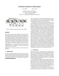
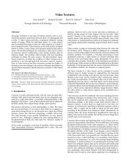

 Change language