think-cell 5.3 – User Guide
think-cell 5.3 – User Guide
think-cell 5.3 – User Guide

Create successful ePaper yourself
Turn your PDF publications into a flip-book with our unique Google optimized e-Paper software.
See Formatting and style on page 24 for details on these<br />
controls. Labels for the data points are not shown by default<br />
but may be displayed using the line chart Add<br />
Point Label context menu button.<br />
If the category values of a line chart are strictly increasing<br />
numbers or dates then the x-axis will automatically<br />
switch to a value axis (see Value axis on page 40).<br />
When dates are used the date format can be changed<br />
by multi-selecting all category labels (see Multi-selection<br />
on page 23) and typing a date format into the control<br />
(see Date format codes on page 72). If you want to show<br />
more labels than would fit next to each other horizontally<br />
you can use label rotation (see Label rotation on<br />
page 32).<br />
The horizontal axis can only switch from category to<br />
value mode if the following conditions are met:<br />
<strong>–</strong> All category <strong>cell</strong>s in the data sheet contain numbers<br />
and Excel’s <strong>cell</strong> format is also set to General or Number<br />
or all category <strong>cell</strong>s in the data sheet contain dates<br />
and Excel’s <strong>cell</strong> format is also set to Date.<br />
<strong>–</strong> The numbers or dates in the category <strong>cell</strong>s are strictly<br />
increasing from left to right.<br />
<strong>–</strong> The y-axis is not set to Crosses Between Categories (see<br />
Positioning the value axis on page 41). If only this<br />
requirement is preventing a switch to the value axis<br />
mode, you can use Make Value Axis from the axis<br />
context menu to switch to Crosses At Categories and<br />
thereby switch to the value axis mode as well.<br />
The line chart can also display a second vertical value<br />
axis. Please refer to Secondary Axis on page 44 for further<br />
information.<br />
Smoothed lines<br />
Column chart, line chart and area chart 38<br />
If you prefer a smoother appearance of the lines in a<br />
line chart, you can turn on this setting. First right-click<br />
on the desired line, then use the Set to Smooth Line<br />
button.<br />
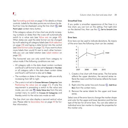
Error bars<br />
Error bars can be used to indicate deviations. By means<br />
of the error bars the following chart can be created.<br />
1. Create a line chart with three series. The first series<br />
reflects the upper deviation, the second series reflects<br />
the mean and the third series reflects the lower<br />
deviation.<br />
2. Right-click the center line and choose Add Error<br />
Bars from the context menu.<br />
3. Remove the series labels for the upper and lower<br />
series.<br />
Select one of the error bars to change the marker shape<br />
and color for the upper and lower deviation and the line<br />
type of the bar for all error bars. You can also select an<br />
individual error bar marker to change the properties for<br />
this marker only.