think-cell 5.3 – User Guide
think-cell 5.3 – User Guide
think-cell 5.3 – User Guide

You also want an ePaper? Increase the reach of your titles
YUMPU automatically turns print PDFs into web optimized ePapers that Google loves.
is to revert the same scale for all charts, then to select<br />
the requested charts and to activate same scale.<br />
Note: If you apply the same scale operation to charts<br />
that have value axis breaks, the breaks are automatically<br />
removed (see Value axis break on page 42). As long as<br />
breaks are present, it is impossible to make the selected<br />
charts visually comparable.<br />
Logarithmic Scale<br />
You can switch to a logarithmic scale by using the<br />
Set Logarithmic Scale button from the value axis<br />
context menu. To revert to a linear scale choose Set<br />
Linear Scale.<br />
Note: Due to a limitation in Microsoft Graph an axis<br />
with a logarithmic scale can only have tickmarks at powers<br />
of 10, e.g. at 0.1, 1, 10. The axis must also begin<br />
and end at a power of 10.<br />
Logarithmic scaling is not supported when it is mathematically<br />
not appropriate. Negative values are placed<br />
on the baseline and an exclamation mark is shown<br />
next to the label explaining that the value cannot be<br />
represented on a logarithmic scale. Also, an axis always<br />
uses a linear scale if multiple series that are added up<br />
to a total are associated with the axis.<br />
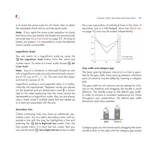
Secondary Axis<br />
Charts containing lines may have an additional, secondary<br />
y-axis. You can add a secondary y-axis, and associate<br />
a line with this axis, by highlighting a line and<br />
selecting the Set to Right/Left Axis button from the<br />
line context menu. If a chart has two y-axes, then you<br />
can use the same Set to Right/Left Axis button to alter<br />
Column chart, line chart and area chart 44<br />
the y-axis association of individual lines in the chart. A<br />
secondary axis is a fully-fledged value axis (Value axis<br />
on page 40) and may be scaled independently.<br />
Gap width and category gap<br />
The basic spacing between columns in a chart is specified<br />
by the gap width. Extra spacing between individual<br />
pairs of columns may be added by inserting a category<br />
gap.<br />
The gap width for all columns can be altered by clicking<br />
on the baseline and dragging the handle a small<br />
distance. The handle snaps to the default gap width.<br />
In order to achieve a consistent appearance for charts<br />
throughout your presentation, the default gap width<br />
should be used when possible.<br />
Category gaps can be introduced by dragging the same<br />
handle further to the right until the category gap tooltip