think-cell 5.3 – User Guide
think-cell 5.3 – User Guide
think-cell 5.3 – User Guide

Create successful ePaper yourself
Turn your PDF publications into a flip-book with our unique Google optimized e-Paper software.
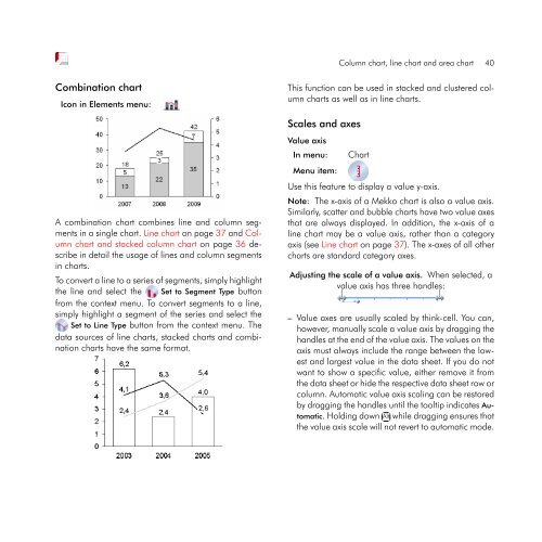
Combination chart<br />
Icon in Elements menu:<br />
A combination chart combines line and column segments<br />
in a single chart. Line chart on page 37 and Column<br />
chart and stacked column chart on page 36 describe<br />
in detail the usage of lines and column segments<br />
in charts.<br />
To convert a line to a series of segments, simply highlight<br />
the line and select the Set to Segment Type button<br />
from the context menu. To convert segments to a line,<br />
simply highlight a segment of the series and select the<br />
Set to Line Type button from the context menu. The<br />
data sources of line charts, stacked charts and combination<br />
charts have the same format.<br />
Column chart, line chart and area chart 40<br />
This function can be used in stacked and clustered column<br />
charts as well as in line charts.<br />
Scales and axes<br />
Value axis<br />
In menu: Chart<br />
Menu item:<br />
Use this feature to display a value y-axis.<br />
Note: The x-axis of a Mekko chart is also a value axis.<br />
Similarly, scatter and bubble charts have two value axes<br />
that are always displayed. In addition, the x-axis of a<br />
line chart may be a value axis, rather than a category<br />
axis (see Line chart on page 37). The x-axes of all other<br />
charts are standard category axes.<br />
Adjusting the scale of a value axis. When selected, a<br />
value axis has three handles:<br />
<strong>–</strong> Value axes are usually scaled by <strong>think</strong>-<strong>cell</strong>. You can,<br />
however, manually scale a value axis by dragging the<br />
handles at the end of the value axis. The values on the<br />
axis must always include the range between the lowest<br />
and largest value in the data sheet. If you do not<br />
want to show a specific value, either remove it from<br />
the data sheet or hide the respective data sheet row or<br />
column. Automatic value axis scaling can be restored<br />
by dragging the handles until the tooltip indicates Au-<br />
tomatic. Holding down ✄ ✂ ✁<br />
Alt while dragging ensures that<br />
the value axis scale will not revert to automatic mode.