TYPOGRAPHY - IAM
TYPOGRAPHY - IAM
TYPOGRAPHY - IAM
Create successful ePaper yourself
Turn your PDF publications into a flip-book with our unique Google optimized e-Paper software.
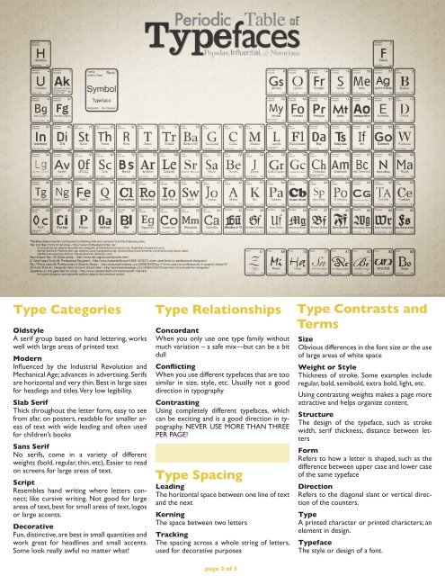
Type Categories Type Relationships Type Contrasts and<br />
Terms<br />
Oldstyle<br />
A serif group based on hand lettering, works<br />
well with large areas of printed text<br />
Modern<br />
Influenced by the Industrial Revolution and<br />
Mechanical Age; advances in advertising. Serifs<br />
are horizontal and very thin. Best in large sizes<br />
for headings and titles. Very low legibility.<br />
Slab Serif<br />
Thick throughout the letter form, easy to see<br />
from afar, on posters, readable for smaller areas<br />
of text with wide leading and often used<br />
for children’s books<br />
Sans Serif<br />
No serifs, come in a variety of different<br />
weights (bold, regular, thin, etc), Easier to read<br />
on screens for large areas of text.<br />
Script<br />
Resembles hand writing where letters connect;<br />
like cursive writing. Not good for large<br />
areas of text, best for small areas of text, logos<br />
or large accents.<br />
Decorative<br />
Fun, distinctive, are best in small quantities and<br />
work great for headlines and small accents.<br />
Some look really awful no matter what!<br />
Concordant<br />
When you only use one type family without<br />
much variation – a safe mix—but can be a bit<br />
dull<br />
Conflicting<br />
When you use different typefaces that are too<br />
similar in size, style, etc. Usually not a good<br />
direction in typography<br />
Contrasting<br />
Using completely different typefaces, which<br />
can be exciting and is a good direction in typography.<br />
NEVER USE MORE THAN THREE<br />
PER PAGE!<br />
Type Spacing<br />
Leading<br />
The horizontal space between one line of text<br />
and the next<br />
Kerning<br />
The space between two letters<br />
Tracking<br />
The spacing across a whole string of letters,<br />
used for decorative purposes<br />
page 2 of 3<br />
Size<br />
Obvious differences in the font size or the use<br />
of large areas of white space<br />
Weight or Style<br />
Thickness of stroke. Some examples include<br />
regular, bold, semibold, extra bold, light, etc.<br />
Using contrasting weights makes a page more<br />
attractive and helps organize content.<br />
Structure<br />
The design of the typeface, such as stroke<br />
width, serif thickness, distance between letters<br />
Form<br />
Refers to how a letter is shaped, such as the<br />
difference between upper case and lower case<br />
of the same typeface<br />
Direction<br />
Refers to the diagonal slant or vertical direction<br />
of the counters.<br />
Type<br />
A printed character or printed characters; an<br />
element in design.<br />
Typeface<br />
The style or design of a font.


