TYPOGRAPHY - IAM
TYPOGRAPHY - IAM
TYPOGRAPHY - IAM

You also want an ePaper? Increase the reach of your titles
YUMPU automatically turns print PDFs into web optimized ePapers that Google loves.
Historic Milestones in Typography<br />
Blackletter<br />
The Middle Ages: very little white space and difficult to read<br />
Humanist or Venetian<br />
15th century, lighter than blackletter with more open forms<br />
Old Style or Garalde<br />
16th and 17th century with larger variations of stroke width;<br />
Aldus Manutius creates italic type<br />
Transitional or Neoclassical<br />
18th century, the first that did not reproduce handwritten script; greater thick<br />
and thin stroke width<br />
Modern or Diodone<br />
Late 18th century, extreme contrast in stroke width, known for elegance and still used in<br />
high-end publications as headings – not for running copy<br />
Slab Serif, Square Serif or Mechanical<br />
Late 18th century, used with advertisements and headings on posters and billboards<br />
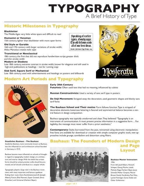
Modern Art Periods and Typography<br />
Staatliches Bauhaus - The Bauhaus<br />
Staatliches Bauhaus, more commonly known as Bauhaus,<br />
was the influential art and architecture school founded<br />
in Germany in 1919.<br />
Bauhaus became most influential on schools of thought<br />
in regard to typography, modern design, art, architecture<br />
and interior design. With the belief that artistic<br />
forms should be united, practise crafts should be promoted,<br />
and all should contribute to a utopian whole.<br />
Typography played a large role in the Bauhaus movement,<br />
with many important and famous typefaces<br />
finding their roots there: Kombinationsschrift (Joseph<br />
Albers), Futura (Paul Renner), Super Grotesk (Arno<br />
Drescher) and Universal (Herbert Bayer).<br />
<strong>TYPOGRAPHY</strong><br />
Early 20th Century<br />
Futurists: Often used text that had no meaning, influenced by cubists<br />
Russian Constructivists: Used a variety of sans serif type in posters<br />
De Stijl Movement: Stripped away the decoration, used geometric shapes and blocky sans<br />
serif fonts<br />
The Bauhaus School and Their motto: Form follows function. Type is stripped of<br />
decorative elements; lowercase lettering is favored and asymmetrical balance becomes a central<br />
feature in design composition.<br />
Bauhaus typography was typically unadorned and clean. They believed: “Typography is an<br />
instrument of communication. It must present precise information in a suggestive form… For<br />
legibility, the message must never suffer from a priori aesthetics.”<br />
Contemporary: Styles borrowed from the past, reinvented using electronic manipulation;<br />
free fonts are available for download or creation with simple computer graphic tools, new approaches<br />
include grunge, cannibalism and distortion using filters.<br />
Bauhaus: The Founders of Modern Design<br />
and Page<br />
Layout<br />
page 1 of 3<br />
A Brief History of Type<br />
Bauhaus Master Instructors<br />
1926<br />
From left: Josef Albers, Hinnerk<br />
Scheper, Georg Muche, László<br />
Moholy-Nagy, Herbert Bayer, Joost<br />
Schmidt, Walter Gropius, Marcel<br />
Breuer, Vassily Kandinsky, Paul Klee,<br />
Lyonel Feininger, Gunta Stölzl and<br />
Oskar Schlemmer.
Type Categories Type Relationships Type Contrasts and<br />
Terms<br />
Oldstyle<br />
A serif group based on hand lettering, works<br />
well with large areas of printed text<br />
Modern<br />
Influenced by the Industrial Revolution and<br />
Mechanical Age; advances in advertising. Serifs<br />
are horizontal and very thin. Best in large sizes<br />
for headings and titles. Very low legibility.<br />
Slab Serif<br />
Thick throughout the letter form, easy to see<br />
from afar, on posters, readable for smaller areas<br />
of text with wide leading and often used<br />
for children’s books<br />
Sans Serif<br />
No serifs, come in a variety of different<br />
weights (bold, regular, thin, etc), Easier to read<br />
on screens for large areas of text.<br />
Script<br />
Resembles hand writing where letters connect;<br />
like cursive writing. Not good for large<br />
areas of text, best for small areas of text, logos<br />
or large accents.<br />
Decorative<br />
Fun, distinctive, are best in small quantities and<br />
work great for headlines and small accents.<br />
Some look really awful no matter what!<br />
Concordant<br />
When you only use one type family without<br />
much variation – a safe mix—but can be a bit<br />
dull<br />
Conflicting<br />
When you use different typefaces that are too<br />
similar in size, style, etc. Usually not a good<br />
direction in typography<br />
Contrasting<br />
Using completely different typefaces, which<br />
can be exciting and is a good direction in typography.<br />
NEVER USE MORE THAN THREE<br />
PER PAGE!<br />
Type Spacing<br />
Leading<br />
The horizontal space between one line of text<br />
and the next<br />
Kerning<br />
The space between two letters<br />
Tracking<br />
The spacing across a whole string of letters,<br />
used for decorative purposes<br />
page 2 of 3<br />
Size<br />
Obvious differences in the font size or the use<br />
of large areas of white space<br />
Weight or Style<br />
Thickness of stroke. Some examples include<br />
regular, bold, semibold, extra bold, light, etc.<br />
Using contrasting weights makes a page more<br />
attractive and helps organize content.<br />
Structure<br />
The design of the typeface, such as stroke<br />
width, serif thickness, distance between letters<br />
Form<br />
Refers to how a letter is shaped, such as the<br />
difference between upper case and lower case<br />
of the same typeface<br />
Direction<br />
Refers to the diagonal slant or vertical direction<br />
of the counters.<br />
Type<br />
A printed character or printed characters; an<br />
element in design.<br />
Typeface<br />
The style or design of a font.
Sans Serif History<br />
Egyptian<br />
The term was first used by Joseph Farington<br />
after seeing the sans serif inscription on John<br />
Flaxman’s memorial to Isaac Hawkins Brown<br />
in 1805, although today the term is commonly<br />
used to refer to slab serif, not sans serif.<br />
Antique<br />
In about 1817, the Figgins foundry in London<br />
made a type with square or slab-serifs which<br />
it called ‘Antique’, and that name was adopted<br />
by most of the British and US typefounders.<br />
An exception was the typefounder Thorne,<br />
who confused things by marketing his Antique<br />
under the name ‘Egyptian’. In France it became<br />
Egyptienne, and to worsen the confusion, the<br />
French called sans-serif type ‘Antique’. Some<br />
fonts, such as Antique Olive, still carry the<br />
name.<br />
Grotesque<br />
It was originally coined by William Thorowgood<br />
of Fann Street Foundry, the first person<br />
to produce a sans-serif type with lower case,<br />
in 1832. The name came from the Italian word<br />
‘grottesco’, meaning ‘belonging to the cave’.<br />
In Germany, the name became Grotesk. German<br />
typefounders adopted the term from the<br />
nomenclature of Fann Street Foundry, which<br />
took on the meaning of cave (or grotto) art.<br />
Nevertheless, some explained the term was<br />
derived from the surprising response from<br />
the typographers.<br />
Doric<br />
It was the term first used by H. W. Caslon<br />
Foundry in Chiswell Street in 1870 to describe<br />
various sans-serif fonts at a time the<br />
generic name ‘sans-serif’ was commonly accepted.<br />
Eventually the foundry used Sans-serif<br />
in 1906. At that time, Doric referred to a certain<br />
kind of stressed sans-serif types.<br />
Gothic<br />
Not to be confused with blackletter typeface,<br />
the term was used mainly by American type<br />
founders.The term probably derived from<br />
the architectural definition, which is neither<br />
Greek or Roman;and from the extended adjective<br />
term of ‘Germany’, which was the place<br />
where sans-serif typefaces became popular in<br />
19th to 20th century.[13] Early adopters for<br />
the term includes Miller & Richard (1863), J.<br />
& R. M. Wood (1865), Lothian, Conner, Bruce<br />
McKellar. Although the usage is now rare in<br />
the English-speaking world, the term is commonly<br />
used in Japan and South Korea.<br />
Classification<br />
For the purposes of type classification, sansserif<br />
designs can be divided into four major<br />
groups:<br />
Grotesque<br />
Early sans-serif designs, such as Grotesque,<br />
Akzidenz Grotesk, and Franklin Gothic.<br />
Digital Types<br />
of Fonts<br />
Postscript Type 1<br />
Developed by Adobe, these consist of a printer<br />
or outline font, a screen or bitmap font, and<br />
usually a font metrics file (.afm). Type 1 fonts<br />
are considered the high-quality standard for<br />
years, although OpenType is changing that.<br />
TrueType<br />
Developed by Apple and MicroSoft, TrueType<br />
was to replace Type1 font standards.<br />
TrueType consists of a single file and more<br />
commonly used on Windows computers.<br />
Multiple Master<br />
Developed by Adobe, Multiple Master fonts<br />
were intended to give the designer creative<br />
freedom to scale fonts to custom widths and<br />
weights. They are similar to Type 1 fonts.<br />
Adobe no longer supports these fonts.<br />
OpenType<br />
Developed by Adobe and MicroSoft, Open-<br />
Type is a universal font format that includes<br />
the benefits of Type 1 fonts and TrueType font<br />
technologies. It is Unicode compliant, is crossplatform,<br />
and consists of a single font file.<br />
Neo-grotesque or Transitional<br />
or Realist<br />
Modern designs such as Standard, Bell Centennial,<br />
MS Sans Serif, Helvetica, Univers,<br />
Highway Gothic, and Arial. These are the most<br />
common sans-serif fonts. They are relatively<br />
straight in appearance and have less line width<br />
variation than Humanist sans-serif typefaces.<br />
Transitional sans-serif is sometimes called<br />
“anonymous sans-serif” due to its relatively<br />
plain appearance.<br />
Humanist<br />
Calibri, Johnston, Lucida Grande, Segoe UI, Gill<br />
Sans, Myriad, Frutiger, Trebuchet MS, Tahoma,<br />
Verdana and Optima. These are the most calligraphic<br />
of the sans-serif typefaces, with some<br />
variation in line width and more legibility than<br />
other sans-serif fonts.<br />
Geometric<br />
Futura, ITC Avant Garde, Century Gothic,<br />
Gotham, or Spartan. As their name suggests,<br />
Geometric sans-serif typefaces are based on<br />
geometric shapes. Note the optically circular<br />
letter “O” and the simple construction of<br />
the lowercase letter “a”. Geometric sans-serif<br />
fonts have a very modern look and feel. Of<br />
these four categories, geometric fonts tend to<br />
be the least useful for body text.<br />
Note that in some sans-serif fonts, such as<br />
Arial, the capital-i and lowercase-L appear<br />
identical. Verdana, however, keeps them distinct<br />
because Verdana’s capital-i, as an exception,<br />
has serifs. Other fonts may have two<br />
horizontal bars on the capital-i, a curved tail<br />
on the lowercase-L, or both.<br />
page 3 of 3<br />
For Your<br />
Viewers<br />
Legibility<br />
How easy it is to distinguish one letter<br />
from another in a particular typeface.<br />
• Doesn’t call too much attention to<br />
itself<br />
• Has good contrast<br />
• Has a larger x-height and little<br />
variation in stroke width<br />
• Has easy to recognize characteristics<br />
• Isn’t too bold or light<br />
• Does not use all caps or caps on each<br />
word in a headline<br />
Readability<br />
The ease with which a reader can scan<br />
over paragraphs of type.<br />
• Line lengths<br />
• Point size<br />
• Leading<br />
• Typeface selection<br />
• Type alignment<br />
• Background content<br />
British Standards<br />
classification<br />
http://en.wikipedia.org/wiki/Vox-ATypI_classification<br />
(scroll down for examples)<br />
Grotesque<br />
Lineale typefaces with 19th century origins.<br />
There is some contrast in thickness of strokes.<br />
They have squareness of curve, and curling<br />
close-set jaws. The R usually has a curled leg<br />
and the G is spurred. The ends of the curved<br />
strokes are usually horizontal. Examples include<br />
Stephenson Blake Grotesque No. 6,<br />
Condensed Sans No. 7, Monotype Headline<br />
Bold.<br />
Neo-grotesque<br />
Lineale typefaces derived from the grotesque.<br />
They have less stroke contrast and are more<br />
regular in design. The jaws are more open<br />
than in the true grotesque and the g is often<br />
open-tailed. The ends of the curved strokes<br />
are usually oblique. Examples include Edel/<br />
Wotan, Univers, Helvetica.<br />
Geometric<br />
Lineale typefaces constructed on simple geometric<br />
shapes, circle or rectangle. Usually<br />
monoline, and often with single-storey a. Examples<br />
include Futura, Erbar, Eurostile.<br />
Humanist<br />
Lineale typefaces based on the proportions of<br />
inscriptional Roman capitals and Humanist or<br />
Garalde lower-case, rather than on early grotesques.<br />
They have some stroke contrast, with<br />
two-storey a and g. Examples include Optima,<br />
Gill Sans, Pascal.