

MENU - European Parliament - Europa
MENU - European Parliament - Europa
MENU - European Parliament - Europa

You also want an ePaper? Increase the reach of your titles
YUMPU automatically turns print PDFs into web optimized ePapers that Google loves.
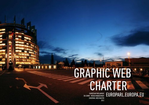
CHARTE WEB EUROPARL.EU / /<br />
graphic web<br />
charter<br />
eUrOpeaN parLiaMeNt<br />
Dg cOMM - MeDia MaNageMeNt<br />
eUrOparL web MaSter<br />
2012<br />
1<br />
eUrOparL.eUrOpa.eU
CHARTE WEB EUROPARL.EU / / 2
SUMMary<br />
TEXT <strong>MENU</strong> IMAGES <strong>MENU</strong> TEXT <strong>MENU</strong><br />
IMAGES <strong>MENU</strong><br />
IntroductIon<br />
GrAPHIcAL cHArtEr<br />
colors<br />
Fonts<br />
comPosItIon<br />
Grid<br />
Areas<br />
HEAdEr (ArEA A)<br />
Language combo box<br />
menu of <strong>Europa</strong>rl galaxy<br />
Logo, general title of the<br />
website and free background<br />
Logo<br />
General title of the website<br />
Free background<br />
Promotion area<br />
colour highlight<br />
search tools<br />
mEnu (ArEA b)<br />
main menu<br />
sub-menu<br />
static sub-menu<br />
06<br />
07<br />
08<br />
09<br />
10<br />
11<br />
12<br />
13<br />
14<br />
15<br />
CHARTE WEB EUROPARL.EU / SUmmARy<br />
Authorised colours in <strong>Europa</strong>rl websites<br />
<strong>Europa</strong>rl galaxy website grid<br />
Definition of the various areas in a page<br />
Structure of the header<br />
Language combo box<br />
Menu of <strong>Europa</strong>rl galaxy<br />
Header with illustrated background<br />
Header with a promotion area<br />
Header with a specific logo<br />
Coloured highlight of the website<br />
Search tool of the President website<br />
Types of menus<br />
Main menu of the News website with Press<br />
service section selected<br />
Static sub-menu<br />
Expand/collapse menu<br />
Expand/collapse menu closed<br />
tree-like sub-menu<br />
search form<br />
map<br />
contEnt (ArEAs c&d)<br />
description of the areas<br />
main content area<br />
contextual<br />
information<br />
dEtAILs oF tHE common<br />
ELEmEnts oF ZcP And ZIc<br />
titles & sub-titles<br />
Images<br />
banners<br />
Icons<br />
Link Icons<br />
Language icons<br />
calendar icons<br />
calendar<br />
buttons<br />
Flags<br />
Application forms<br />
16<br />
17<br />
18<br />
19<br />
20<br />
22<br />
23<br />
24<br />
25<br />
26<br />
27<br />
28/31<br />
Expand/collapse sub-menu in-line opened<br />
Expand/collapse sub-menu in-line closed<br />
Expand/collapse sub-menu in columns opened<br />
Expandable menu<br />
Treelike sub-menu<br />
Search form linked to the main menu<br />
Map linked to the main menu<br />
Content areas<br />
Title in an editorial product<br />
Images formats<br />
Banner over ZCP and ZIC<br />
Banner with a slideshow<br />
Scrolling banner<br />
Links Icons<br />
Language Icons<br />
Calendar Icons<br />
Calendar<br />
Button<br />
Flags<br />
Application forms<br />
4
TEXT <strong>MENU</strong> IMAGES <strong>MENU</strong> TEXT <strong>MENU</strong><br />
IMAGES <strong>MENU</strong><br />
ZcP sPEcIFIcs ELEmEnts<br />
breakdown of the elements<br />
titles and sub-titles<br />
Page Header<br />
Essentials<br />
content elements<br />
Further Information<br />
containers without borders<br />
container with borders<br />
Header<br />
Filter<br />
sub-menu area<br />
content<br />
Pagination<br />
Footer<br />
Pagination<br />
container of 11 pages or less<br />
more than 11 pages container<br />
maps<br />
Examples of use<br />
32<br />
33<br />
34<br />
35<br />
36/37<br />
38<br />
39<br />
40/41<br />
CHARTE WEB EUROPARL.EU / SUmmARy<br />
Header<br />
Essentials in an editorial product<br />
Content elements<br />
«Further information» icons<br />
Examples of headers of a container with<br />
borders from ZCP<br />
Example of filter of a container with border<br />
from ZCP<br />
Examples of expandable list<br />
Pagination of more than 11 pages<br />
Intermediate navigation of more<br />
than 11 pages<br />
End of pagination of more than 11 pages<br />
Europe map for the «MEPs» planet<br />
World map for the «Delegations»<br />
planet<br />
Example of product<br />
Example of list<br />
Example of technical announcement<br />
Example of a container with tabs<br />
Example of an expandable element in a<br />
container with borders<br />
ZIc sPEcIFIcs ELEmEnts<br />
breakdown of the elements<br />
titles & sub-titles<br />
Icones<br />
content elements<br />
containers without borders<br />
containers with borders<br />
Header<br />
Filter<br />
content<br />
Pagination<br />
Footer<br />
Examples of use<br />
“Further Information” container<br />
“contacts” container<br />
“Fact box” container<br />
“social media” container<br />
“share” container<br />
“Press releases” container<br />
“Press conferences” container<br />
FootEr (ArEAs E&F)<br />
Logo & General title<br />
Legal notice<br />
Links related to the current website<br />
sitemap of the europarl galaxy<br />
7 main websites<br />
42<br />
43<br />
44<br />
45<br />
46<br />
47<br />
48<br />
“Contact” Container<br />
“Share Box” Container<br />
Components of a container<br />
with border from the ZIC<br />
Examples of headers of containers with<br />
border from the ZIC<br />
Example of sub-header of containers<br />
with border<br />
“Contacts” container of a MEP details page<br />
“Social media” Container<br />
“Fact box” Container<br />
“Further information“ container<br />
“Press releases” Container<br />
“Share” container with 4 elements<br />
“Share” container with 2 elements<br />
“Press conferences” container<br />
Footer<br />
5
iNtrODUctiON<br />
The purpose of this document is to define the style of the<br />
graphics used on the internet websites of the <strong>Europa</strong>rl galaxy.<br />
The former <strong>Europa</strong>rl website is now divided into different<br />
websites or ‘planets’ (such as the visitors’ website) and is being<br />
revamped.<br />
This style guide is based on on the new version of <strong>Europa</strong>rl and<br />
is divided into planets.<br />
The former <strong>Europa</strong>rl website had 5 information sections. This<br />
is now being replaced by 7 websites (or planets) as part of the<br />
<strong>Europa</strong>rl galaxy:<br />
• News<br />
• About <strong>Parliament</strong><br />
• MEPs<br />
• Plenary<br />
• Committees<br />
• Delegations<br />
• EP TV<br />
CHARTE WEB EUROPARL.EU / InTROdUCTIOn<br />
This document is based on a strong study of these planets and<br />
more precisely:<br />
• their structure<br />
• the grid used to compose the pages<br />
• their graphical constitution<br />
• the page elements<br />
With this document, every designer, webmaster or web<br />
professionals should be able to create a website with the<br />
<strong>European</strong> <strong>Parliament</strong>’s web identity.<br />
6
GRAPHICAL<br />
charter<br />
colours<br />
<strong>Europa</strong>rl publishes in black on white to enhance readability.<br />
This is a general statement which means that page backgrounds<br />
are usually bright and fonts generally dark in order to have a<br />
minimum contrast of 500 (W3C recommandation for WCAG 2.0<br />
AA standard) which every <strong>Europa</strong>rl publication is supposed to<br />
follow.<br />
Fonts<br />
<strong>Europa</strong>rl fonts are:<br />
• Arial regular<br />
• Arial bold<br />
• Arial italic<br />
Sizes are usually fixed and<br />
based on structural tags<br />
while colours depend on their<br />
contextual use.<br />
So, a level 3 header in the<br />
Main Content Area (ZCP3) is:<br />
• Arial bold<br />
• 18 px<br />
While a level 3 header in the<br />
Contextual Information Area<br />
(ZIC3) is:<br />
• Arial bold<br />
• 12px<br />
CHARTE WEB EUROPARL.EU / GRAPHICAL CHARTER / COLOURS<br />
Authorised colours in europArl websites<br />
sections<br />
• #BA76C9<br />
(mauve) news<br />
• #d15d00<br />
(Orange) Plenary,<br />
Committees,<br />
delegations<br />
• #E09707<br />
(yellow) mEPs<br />
• #B8DD22 (Green)<br />
EP TV<br />
• # 2DA2FF (Blue)<br />
About <strong>Parliament</strong><br />
Fonts<br />
elements<br />
• #D9DDE1<br />
(dark grey) Stroke<br />
backgrounds<br />
• #FFFFFF<br />
(White)<br />
ex. Background<br />
container Features<br />
• #FBFBFB<br />
(Light grey)<br />
ex. General<br />
background ZCP<br />
• # F4F4F4<br />
(medium grey)<br />
ex. Background<br />
footer*, Button<br />
hover<br />
• #EDEDED<br />
(Grey)<br />
ex. Selected<br />
menu*,<br />
General footer<br />
background*,<br />
Calendar hover<br />
• #13334D<br />
(dark blue)<br />
ex. Container<br />
Header ZIC<br />
Fonts<br />
• #363636<br />
(Charcoal grey)<br />
ex. Texts<br />
• #13334D<br />
(dark blue)<br />
ex. Headings of<br />
content<br />
• #195B92<br />
(Blue) ex. Subjects,<br />
Links<br />
* Background with grain<br />
7
cOMpOSitiON<br />
<strong>Europa</strong>rl galaxy websites are based on a grid and are composed<br />
of distinctive elements.<br />
Grid<br />
The <strong>Europa</strong>rl galaxy website<br />
grid is based on units of 25px<br />
and 12px.<br />
The size of elements are based<br />
on units such as:<br />
• space between paragraph<br />
and title<br />
• margin<br />
• space between containers<br />
• etc.<br />
CHARTE WEB EUROPARL.EU / COmPOSITIOn / GRId<br />
eUrOparL gaLaxy<br />
webSite griD<br />
Unit 1 = 25px<br />
Unit 2 = 12px<br />
<strong>European</strong> <strong>Parliament</strong>/Planet<br />
Main Menu Main Menu Main Menu<br />
Agendas Reports Motions for resolutions Debates Minutes<br />
Title 1<br />
Title 2 / Lawyer-linguists: making EU legislation mean the<br />
same in all languages<br />
Institutions - 19-07-2010 - 11:18<br />
Some 27 member states, 23 languages but 1 set of<br />
laws - how does the EU ensure the rules mean the<br />
same across the whole bloc? Three of <strong>Parliament</strong>’s<br />
lawyer-linguists talked to us about the challenges<br />
and intricacies of their job.<br />
Title 3 / Our features: everything you wanted to know…<br />
in one place<br />
Institutions - 19-07-2010 - 11:18<br />
Title 3 / Parlamentarium: an interactive discovery of what<br />
the EP and the EU are about at the heart of Brussels<br />
Institutions - 19-07-2010 - 11:18<br />
<strong>European</strong> <strong>Parliament</strong>/Planet<br />
Institutions<br />
<strong>European</strong> <strong>Parliament</strong> l <strong>European</strong> Council l Council l <strong>European</strong><br />
Commission l Court of Justice of the EU l <strong>European</strong> Central Bank l<br />
Court of Auditors<br />
News<br />
Headlines Press service<br />
Press archives<br />
About <strong>Parliament</strong><br />
At your service Power and functions<br />
Organisation and work<br />
In the past<br />
925px<br />
650px 275px<br />
MEPs<br />
Search Full list<br />
Incoming/outgoing Assistants<br />
Plenary<br />
Plenary sitting Ordinary legislative procedure<br />
Budgetary procedure Questions and<br />
declarations Calendar<br />
News <strong>Parliament</strong> MEPs Committees Delegations EP TV More<br />
Title 3 / Your voice in Europe<br />
Your Voice in Europe: inform the EU and<br />
be informed.<br />
Title 3 / Your voice in Europe<br />
Your Voice in Europe: inform the EU and<br />
be informed.<br />
Political groups<br />
Group of the <strong>European</strong> People’s party (Christian Democrats)<br />
Group of the Progressive Alliance of Socialists and Democrats<br />
Alliance of Liberals and Democrats for Europe<br />
< 37 U ><br />
Committees<br />
Overview Committee webpages<br />
Archives<br />
Delegations<br />
Delegations Calendar<br />
Archives<br />
<br />
EP TV<br />
Home Meetings Channels<br />
Themes About <strong>Europa</strong>rlTV<br />
A-Z<br />
Complete website list<br />
8
AreAs<br />
Every page of the <strong>Europa</strong>rl<br />
galaxy is structured around<br />
the following areas:<br />
• header (A)<br />
• menu (B)<br />
• main content area (C)<br />
• secondary/Contextual<br />
Information Area (D)<br />
• specific Footer (E)<br />
• common footer (F)<br />
Some areas are common (A<br />
except banner, and F), some<br />
are specific to each site (B, C,<br />
D, and E).<br />
According to the graphical<br />
charter, these areas should be<br />
respected.<br />
CHARTE WEB EUROPARL.EU / COmPOSITIOn / AREAS<br />
DefiNitiON Of the variOUS<br />
areaS iN a page<br />
a ce f<br />
Zone a :<br />
header<br />
Zone c :<br />
Main content - Zcp<br />
Zone e :<br />
Specific footer<br />
b<br />
D<br />
Zone b :<br />
Menu<br />
Zone f :<br />
general footer<br />
Zone D :<br />
Secondary / contextual<br />
informations - Zic<br />
9
heaDer<br />
Webpage header (and footer) links every planet of the <strong>Europa</strong>rl<br />
galaxy.<br />
Most elements are common to every website (language combo<br />
box, europarl menu, <strong>European</strong> <strong>Parliament</strong> logo, search tool).<br />
In contrast, the website’s name, promotion area, colour highlight<br />
and banner are customisable, within the restrictions set out in<br />
this chapter.<br />
lAnGuAGe combo box<br />
A combo box includes the<br />
22 official languages of the<br />
<strong>European</strong> Union following<br />
protocol order.<br />
Each language is displayed as<br />
follows:<br />
• two letters ISO code<br />
• « - »<br />
• language title in the language<br />
concerned.<br />
(AREA A)<br />
Current navigation language is<br />
displayed by default. Choosing<br />
another language in the<br />
combo box reloads the page in<br />
the chosen language.<br />
The font of the text in the<br />
combo box is:<br />
• Arial regular<br />
• 11px<br />
• blue on white background.<br />
CHARTE WEB EUROPARL.EU / HEAdER (AREA A) / LAnGUAGE COmBO BOx<br />
STrUCTUrE oF THE HEADEr<br />
Menu of<br />
europarl galaxy<br />
Languages box<br />
title<br />
Menu<br />
promotion area<br />
Search box<br />
LANGUAGE CoMBo BoX<br />
10
menu oF<br />
europArl<br />
GAlAxy<br />
This menu contains:<br />
• the list of the 7 planets,<br />
previously the main tabs in<br />
<strong>Europa</strong>rl in the navigation<br />
language<br />
• one entry «More» in the<br />
navigation language.<br />
The 7 historical planets are in<br />
the following order:<br />
• News<br />
• About <strong>Parliament</strong><br />
• MEPs<br />
• Plenary<br />
• Committees<br />
• Delegations<br />
• EP TV<br />
Font used is:<br />
• Arial bold<br />
• 11px<br />
• white font on blue<br />
background with shadow<br />
effect.<br />
Menu entry «More» displays<br />
the list of the websites which<br />
are part of the specific footer,<br />
plus an A-to-Z link to a page<br />
indexing every website of the<br />
<strong>Europa</strong>rl galaxy.<br />
This is displayed by clicking<br />
on ‘More’ and disappears by<br />
clicking outside of the list.<br />
CHARTE WEB EUROPARL.EU / HEADER (AREA A) / MEnU OF EUROPARL GALAxy<br />
<strong>MENU</strong> oF EUroPArL GALAXY<br />
Menu entry «More» in the navigation menu<br />
11
loGo, GenerAl title oF<br />
the website And Free<br />
bAckGround<br />
LOgO<br />
The logo links to <strong>Europa</strong>rl<br />
portal page.<br />
Its size is proportional to the<br />
size of the EU flag held in it.<br />
Its width must be equal to one<br />
unit (25px).<br />
It lies halfway down the<br />
banner.<br />
geNeraL titLe<br />
Of the Site<br />
The following required<br />
elements lie below the logo:<br />
• label «<strong>European</strong> <strong>Parliament</strong>»<br />
in the current navigation<br />
language<br />
• « / »<br />
• general title of the website in<br />
lower case.<br />
«<strong>European</strong> <strong>Parliament</strong>» label<br />
links to the <strong>Europa</strong>rl portal<br />
page.<br />
The general title of the<br />
website links to the website’s<br />
top page.<br />
For example:<br />
• «<strong>European</strong> <strong>Parliament</strong> /<br />
Visiting» for the English<br />
version of the visitors’ website.<br />
• «Parlement européen /<br />
Actualité» for the French<br />
version of the news website.<br />
Font used is:<br />
• Arial bold<br />
• 20px<br />
• white colour.<br />
free backgrOUND<br />
The banner background is<br />
customisable but has to<br />
respect the following rules:<br />
• a line drawing in grey or a<br />
drawing using grey shading<br />
may be added to the blue<br />
background via the following<br />
process: Multiply, Screen,<br />
Overlay. This is possible only<br />
so long as the drawing does<br />
not alter the overall shade of<br />
the background.<br />
• the inlay should not hamper<br />
the readability of the overall<br />
title of the website and should<br />
follow the rules of contrast<br />
set out in the WCAG 2.0 AA<br />
standards of the W3C.<br />
CHARTE WEB EUROPARL.EU / HEADER (AREA A) / LOGO, GEnERAL TiTLE OF THE WEBsiTE AnD FREE BACkGROUnD<br />
12
prOMOtiON area<br />
The purpose of this area is to<br />
highlight existing content from<br />
another website. Depending<br />
on the length of the existing<br />
content, it may need to be<br />
shortened.<br />
For example:<br />
• latest messages of <strong>European</strong><br />
<strong>Parliament</strong> Facebook profile<br />
• latest tweets of <strong>European</strong><br />
<strong>Parliament</strong> twitter account in<br />
the navigation language<br />
• latest <strong>Europa</strong>rlTV videos.<br />
This area may be used, as<br />
necessary, to put the logo of<br />
the owner of the website. In<br />
this case, nothing else apears<br />
in this area and the logo has to<br />
be present on every page.<br />
cOLOUr highLight<br />
This line of colour specifies<br />
the section via a contrasted<br />
colour (cf. Authorised colours<br />
in <strong>Europa</strong>rl websites) and<br />
uses the same colours as the<br />
former <strong>Europa</strong>rl website tabs.<br />
This applies only to planets<br />
extracted from the former<br />
<strong>Europa</strong>rl website.<br />
Search tOOL<br />
The search tool searches<br />
within the current website.<br />
For the planets extracted from<br />
the former <strong>Europa</strong>rl website,<br />
results concerning the other<br />
planets of the former <strong>Europa</strong>rl<br />
websites will be displayed<br />
in the secondary/contextual<br />
information area.<br />
This tool may not apear in<br />
shallow depth websites.<br />
Text ‘Search in «name_of_the_<br />
website»’ is displayed in the<br />
search field by default in the<br />
current navigation language.<br />
Font used is:<br />
• Arial regular<br />
• 12px<br />
• shallow grey colour<br />
• clear grey background.<br />
A magnifier pictogram<br />
launches the search.<br />
CHARTE WEB EUROPARL.EU / HEADER (AREA A) / LOGO, GEnERAL TiTLE OF THE WEBsiTE AnD FREE BACkGROUnD<br />
HEADEr WITH ILLUSTrATED BACkGroUND<br />
HEADEr WITH A ProMoTIoN ArEA<br />
HEADEr WITH LoGo<br />
CoLoUrED HIGHLIGHT oF THE CoMMITTEES WEBSITE<br />
SEArCH TooL oF THE PrESIDENT WEBSITE<br />
13
MeNU<br />
Three levels of menu are available:<br />
• main menu<br />
• sub-menu (it can be static or with an expandable/collapsable<br />
feature depending on contents)<br />
• third level of menu (with treelike menu).<br />
Moreover, a form can be added with the main menu.<br />
Each type depends on the previous one and should follow a<br />
hierarchy.<br />
The choice of the menu rely on the depth of the website in<br />
which it is used, keeping in mind that information should be<br />
accessible in a minimum of clicks.<br />
mAin menu<br />
Main menu sums up the main<br />
sections of the website.<br />
Font used is:<br />
• Arial bold<br />
• 12px<br />
• dark blue colour, white<br />
• background.<br />
(AREA B)<br />
Once a menu entry is<br />
selected, its background<br />
changes to grey with grain.<br />
If the menus decribed below<br />
are optional, each website has<br />
to display this main menu.<br />
Line spacing is 1.6em.<br />
CHARTE WEB EUROPARL.EU / mEnU (AREA B) / mAIn mEnU<br />
Main Menu<br />
expand /<br />
collapse Menu<br />
treelike<br />
Sub-Menu<br />
TYPES oF <strong>MENU</strong>S<br />
MAIN <strong>MENU</strong> oF THE NEWS WEBSITE WITH PrESS SErvICE SECTIoN SELECTED<br />
14
sub-menu<br />
This type of menu depends on the main menu. It is visible only if an entry of the main menu is<br />
selected.<br />
This sub-menu has the same clear grey with grain background as the selected section of the main<br />
menu and it can have two levels of titles:<br />
• group links title is non clickable. It is only used when a group of links is displayed.<br />
• the group of links.<br />
Depending on its content, it can be displayed in three ways:<br />
• static<br />
• collapsable<br />
• expandable.<br />
The expandable and collapsable menu can be displayed following two models:<br />
• in-line<br />
• in columns.<br />
This sub-menu covers the width of the content beause it concerns both area C and area D.<br />
Static SUb-MeNU<br />
Font<br />
The title of a group of links<br />
uses this font :<br />
• Arial bold<br />
• 12px<br />
• dark blue colour, grey with<br />
grain background.<br />
Each links uses this font:<br />
• Arial regular when a non<br />
selected entry<br />
• Arial bold when a selected<br />
entry<br />
• 12px<br />
• clear blue colour, grey with<br />
grain background<br />
• underlined when mouse over<br />
• line spacing is 1.6 em.<br />
Structure<br />
The following menu structure<br />
is always preferred.<br />
Syntax as follow:<br />
• title of the group of links<br />
• « : »<br />
• link 1<br />
• « | » in dark blue<br />
• ...<br />
• « | » in dark blue<br />
• link n.<br />
CHARTE WEB EUROPARL.EU / mEnU (AREA B) / SUB-mEnU<br />
A new line should be used for<br />
each group of links.<br />
STATIC SUB-<strong>MENU</strong><br />
15
expaND/cOLLapSe<br />
MeNU OpeNeD<br />
Font<br />
The title of a group of links<br />
uses this font:<br />
• Arial Bold<br />
• 12px<br />
• dark blue colour, grey with<br />
grain background.<br />
Each link uses this font:<br />
• Arial regular when a nonselected<br />
entry<br />
• Arial bold when a selected<br />
entry<br />
• 12px<br />
• clear blue colour, grey with<br />
grain background<br />
underlined when mouse<br />
scrolls over<br />
• line spacing is 1.6 em.<br />
In-lIne Form<br />
Syntax is the same as the<br />
static menu.<br />
By default, when visiting a<br />
website using this type of<br />
menu, the menu is expanded.<br />
The menu is collapsed by<br />
clicking on the arrow between<br />
the two levels of navigation<br />
or by clicking on the «Close»<br />
button in the bottom right<br />
corner of the menu.<br />
The menu is closed while the<br />
user is browsing until the user<br />
re-opens it.<br />
To open again the menu, the<br />
user can click of the selected<br />
main menu entry or or the<br />
arrow placed between the two<br />
levels of navigation.<br />
CHARTE WEB EUROPARL.EU / mEnU (AREA B) / SUB-mEnU<br />
In column Form<br />
This layout is better than<br />
the previous one when a<br />
large number of links is to be<br />
displayed.<br />
The elements of the menu can<br />
be read from top to bottom,<br />
column to column, from left<br />
to right.<br />
EXPAND/CoLLAPSE SUB-<strong>MENU</strong><br />
IN-LINE oPENED<br />
EXPAND/CoLLAPSE SUB-<strong>MENU</strong><br />
IN-LINE CLoSED<br />
EXPAND/CoLLAPSE <strong>MENU</strong> IN CoLUMNS CLoSED<br />
16
expaND/cOLLapSe<br />
MeNU cLOSeD<br />
Font<br />
The title of a group of links<br />
uses this font:<br />
• Arial Bold<br />
• 12 px<br />
• dark blue colour, grey with<br />
grain background.<br />
Each link uses this font:<br />
• Arial regular when a nonselected<br />
entry<br />
• Arial bold when a selected<br />
entry<br />
• 12px<br />
• clear blue colour, grey with<br />
grain background<br />
• underlined when mouse<br />
scrolls over<br />
• line spacing is 1.6 em.<br />
Structure<br />
This structure of the menu is<br />
always preferred.<br />
Syntax as follow:<br />
• title of the group of links<br />
• « : »<br />
• link 1<br />
• « | » in dark blue<br />
• ...<br />
• « | » in dark blue<br />
• link n.<br />
A return should be inserted for<br />
each group of links.<br />
CHARTE WEB EUROPARL.EU / mEnU (AREA B) / SUB-mEnU<br />
EXPANDABLE SUB-<strong>MENU</strong><br />
STrUCTUrE oF THE SUB-<strong>MENU</strong><br />
17
treelike<br />
sub-menu<br />
heaDer<br />
Header can include:<br />
• a logo (optional)<br />
• a title<br />
• a button (optional).<br />
Font used in the header is:<br />
• Arial Bold<br />
• corps 12 px<br />
• white colour, blue<br />
background.<br />
This type of menu (as a third level of navigation) can only be<br />
used if there is already a sub-menu.<br />
It is visible once a section of the sub-menu is selected.<br />
• 875px width.<br />
• 25px spacing between sub-menu and content area.<br />
It contains:<br />
• a header<br />
• the menu itself.<br />
MeNU<br />
This menu is displayed like the<br />
expand/collapse menu. It is<br />
structured:<br />
• with groups of links<br />
• and links.<br />
Font used for the title of the<br />
group of links is:<br />
• Arial Bold<br />
• 12 px<br />
• dark blue colour, grey with<br />
grain background.<br />
Each link uses this font:<br />
• Arial regular when a nonselected<br />
entry<br />
• Arial bold when a selected<br />
entry<br />
• 12px<br />
• clear blue colour, grey with<br />
grain background<br />
• underlined when mouse<br />
scrolls over<br />
• line spacing is 1.6em.<br />
Syntax as follow:<br />
• title of the group of links<br />
• « : »<br />
• link 1<br />
• « | » in dark blue<br />
• ...<br />
• « | » in dark blue<br />
• link n.<br />
A new line should be used for<br />
each group of links.<br />
CHARTE WEB EUROPARL.EU / MEnU (AREA B) / TREELikE sUB-MEnU<br />
TrEELIkE SUB-<strong>MENU</strong><br />
18
seArch Form<br />
This is a sub-menu link to the<br />
main menu as a mandatory<br />
item, and it is placed there<br />
because it is considered a<br />
navigation tool.<br />
The form is structured into<br />
two sections (search criteria<br />
and display of the search<br />
results).<br />
Here are the rules of<br />
proceeding:<br />
• if no search criteria has been<br />
selected, nothing is displayed<br />
• when a filter is activated, the<br />
number of results is displayed<br />
and the «Show results» button<br />
appears<br />
• when the user clicks on<br />
the button, the results list<br />
is displayed in the main<br />
content area and the button is<br />
deactivated.<br />
• button is reactived if a<br />
criteria is changed in the<br />
filters.<br />
CHARTE WEB EUROPARL.EU / MEnU (AREA B) / sEARCH FORM<br />
SEArCH ForM LINkED<br />
To THE MAIN <strong>MENU</strong><br />
19
mAp<br />
A map can link to the main<br />
menu.<br />
In this case, it allows the user<br />
to browse through the main<br />
content area.<br />
One click on a geopraghic<br />
zone refreshes the page.<br />
MAP LINkED To THE MAIN <strong>MENU</strong><br />
CHARTE WEB EUROPARL.EU / mEnU (AREA B) / mAP<br />
20
cONteNt<br />
description oF<br />
the AreA<br />
(AREAS C&d)<br />
Content area of <strong>Europa</strong>rl websites are split into 2 parts:<br />
• Main Content Area (ZCP - Area C)<br />
• Contextual Information Area (ZIC - Area D)<br />
MaiN cONteNt area<br />
(Zcp)<br />
The main content area displays<br />
the main content of the page.<br />
It is 650px width.<br />
CHARTE WEB EUROPARL.EU / COnTEnT (AREAs C&D) / DEsCRiPTiOn OF THE AREA<br />
cONtextUaL<br />
iNfOrMatiON area (Zic)<br />
It is 275px width and may<br />
contains:<br />
• elements for sharing<br />
tools<br />
• social media widgets<br />
• relevant content link to the<br />
ZCP<br />
• information feedback coming<br />
from <strong>Europa</strong>rl galaxy link to<br />
the content of the ZCP<br />
• links relevant for the ZCP<br />
• contacts details<br />
• download links relevant for<br />
the content of the ZCP.<br />
This area (ZIC) is neither a navigation<br />
area nor a promotional area.<br />
It should not contain any promotional<br />
«vignettes».<br />
22
CoNTENT ArEAS<br />
Zcp Zic<br />
Main content<br />
area<br />
CHARTE WEB EUROPARL.EU / COnTEnT (AREAs C&D) / DEsCRiPTiOn OF THE AREA<br />
contextual<br />
information area<br />
23
DetaiLS Of<br />
the cOMMON<br />
ELEMEnTs OF<br />
ZCP And ZIC<br />
titles &<br />
sub-titles<br />
Main titles are defined in the<br />
chapters concerning ZCP and<br />
ZIC.<br />
It should be noted that, in<br />
the structure of the pages,<br />
respecting the various<br />
levels of title is important<br />
if not essential to enhance<br />
natural SEO (Search Engine<br />
Optimisation).<br />
Themes and Categories :<br />
• Arial bold, 11 px.<br />
Sous-titre en réserve :<br />
(Broadcast Time, Plenary<br />
sitting, press release):<br />
• Arial bold, 11 px<br />
• dark blue background or<br />
mauve<br />
• white text.<br />
Date, Hour, Sub-title :<br />
• Arial regular, 11 px.<br />
TITLE IN AN EDITorIAL ProDUCT<br />
CHARTE WEB EUROPARL.EU / DETAiLs OF THE COMMOn ELEMEnTs OF ZCP AnD ZiC / TiTLEs & sUB-TiTLEs<br />
Usage: the elements of the<br />
date must be separated by<br />
dashes to correspond to this<br />
format: dd-mm-yyyy. Dates<br />
and hours are separated by<br />
the sequence « - ».<br />
Lead :<br />
• Arial bold, 12 px.<br />
Committtee acronym :<br />
• Arial bold, 10 px<br />
• orange background<br />
• white text.<br />
Paragraph :<br />
• Arial regular, 12 px.<br />
Buttons text :<br />
• Arial Regular, 11 px<br />
• text : All caps<br />
• clear blue colour.<br />
24
imAGes<br />
Concerning the management<br />
of the pictures, only width will<br />
be specified.<br />
Height of images may vary,<br />
depending on the image or on<br />
the set of images used as well<br />
on the context of use.<br />
The rule is to respect the unit<br />
proportion as stipulated at the<br />
beginning of the document<br />
and a coherent logic should<br />
be followed throughout the<br />
website.<br />
Four formats of images are<br />
allowed:<br />
• Format A (ZCP 1):<br />
Full frame (600px width).<br />
Usage: in the editorial<br />
products in the case of a<br />
vertical picture format B<br />
should apply.<br />
• Format B (ZCP 2):<br />
1/2 zone (300px).<br />
• Format C - list (ZCP 3):<br />
1/6 zone (100px).<br />
• Format D - Alert :<br />
125 px.<br />
• Format E - 3 columns :<br />
180 px.<br />
• Format F (ZIC 1):<br />
full frame.<br />
These are generic formats<br />
and do not take into account<br />
the margin of containers with<br />
borders. If a picture is the<br />
illustration of a container, 25px<br />
(1U) are removed from the<br />
picture size whenever it is in<br />
ZCP or ZIC.<br />
CHARTE WEB EUROPARL.EU / DETAiLs OF THE COMMOn ELEMEnTs OF ZCP AnD ZiC / iMAGEs<br />
format a<br />
format b<br />
format c<br />
format D<br />
format e<br />
IMAGES ForMATS<br />
format f<br />
25
Anners<br />
For the top pages of the<br />
<strong>Europa</strong>rl websites, it is<br />
possible to use a graphical<br />
element, such as a banner<br />
directly under the menu. This<br />
spans the width of the page,<br />
covering the ZCP and ZIC<br />
without the border.<br />
Its width is 925px.<br />
Typographic rules of websites<br />
apply also for this kind of<br />
graphical element.<br />
In general this type of banner:<br />
has a text area (that may have<br />
a coloured background for<br />
readability purposes)<br />
may contain interactive<br />
elements (slideshow, list, etc.).<br />
icons<br />
LiNk icONS<br />
Link icons are available for<br />
ZCP and ZIC.<br />
LaNgUage icONS<br />
There are three types of<br />
language icons :<br />
• non available language<br />
• normal status<br />
• mouse over / selected<br />
language.<br />
caLeNDar icONS<br />
Two calendar icons are<br />
available, one for opening, one<br />
for closing.<br />
LINk ICoNS<br />
Link<br />
multimedia link<br />
PDF Link<br />
Word Link<br />
Expand menu<br />
Collapse menu<br />
CALENDAr ICoNS<br />
CHARTE WEB EUROPARL.EU / DETAiLs OF THE COMMOn ELEMEnTs OF ZCP AnD ZiC / BAnnERs<br />
BANNEr ovEr ZCP AND ZIC<br />
BANNEr WITH A SLIDESHoW<br />
SCroLLING BANNEr<br />
LANGUAGE ICoNS<br />
26
cAlendAr<br />
Calendar is used in both ZCP<br />
and ZIC, it can :<br />
• be accessed via the buttons<br />
described above<br />
• be embedded directly in the<br />
page in both areas.<br />
buttons<br />
Buttons are used in both<br />
ZCP and ZIC, for instance in<br />
container headers and footers.<br />
Form buttons are described in<br />
the relevant chapter.<br />
FlAGs<br />
Country flags are 25px width.<br />
CHARTE WEB EUROPARL.EU / DETAiLs OF THE COMMOn ELEMEnTs OF ZCP AnD ZiC / CALEnDAR<br />
CALENDAr WITH EvENTS<br />
FLAGS<br />
BUTToNS<br />
27
ApplicAtion<br />
Forms<br />
Application forms are split into<br />
logical steps (personal details,<br />
address, etc. following W3C<br />
recommendations) and must<br />
be qualified.<br />
Application forms have to<br />
be filled in to proceed to the<br />
next step, a breadcrumb is<br />
visible in the form header,<br />
with the number of steps and<br />
is non-clickable. The current<br />
step is highlighted with a blue<br />
background.<br />
To go to the next step of a<br />
form, all mandatory fields of<br />
the current step have to be<br />
complete and without errors.<br />
Buttons<br />
Two buttons are placed to the<br />
bottom of the form :<br />
• a «Reset» button which<br />
converts current form fields<br />
back into their initial state<br />
• a «Next step» button which<br />
allows users to go to the next<br />
step. The text of this button<br />
can also be «Update» when<br />
users change a form field<br />
afterwards or «Finish» for the<br />
last step.<br />
Font used is :<br />
• Arial regular<br />
• 11 px<br />
• uppercase<br />
• white or blue text depending<br />
on the background (blue for<br />
«Reset», green for «Next step»<br />
and white for «Edit».<br />
Steps<br />
Once complete, each step is<br />
displayed under the header of<br />
the application form with this<br />
format :<br />
• «Step» in the current<br />
navigation language, followed<br />
by the number of the step.<br />
• name of the step in<br />
the current language of<br />
navigation.<br />
The step can still be edited via<br />
an «Edit» button placed beside<br />
the title of the step.<br />
This button re-opens the<br />
selected step and allows<br />
users to edit and check the<br />
information.<br />
CHARTE WEB EUROPARL.EU / DETAiLs OF THE COMMOn ELEMEnTs OF ZCP AnD ZiC / APPLiCATiOn FORMs<br />
Non-validated information<br />
must be stored in the form<br />
before moving on to the next<br />
step, unless the next step<br />
depends on the choices made<br />
in the editing stage. A pop-up<br />
screen will specify that what<br />
needs to be done before the<br />
next step can be displayed.<br />
The step pages should be<br />
displayed in two columns as<br />
far as possible.<br />
However in the case of<br />
multiline text fields (e.g.<br />
comments, description, etc.)<br />
in one column display is<br />
recommended.<br />
The field to be filled in has<br />
a 2px clear blue border and<br />
mandatory information is<br />
indicated.<br />
If a user forgot a mandatory<br />
field or if a specific format<br />
is not respected, an error<br />
message is displayed beneath<br />
the relevant field. If more<br />
than one error is stated, the<br />
messages appear one under<br />
the other.<br />
28
application form<br />
header<br />
Summary of a<br />
finalised step in an<br />
application form<br />
Summary of the<br />
current step<br />
Display of radio<br />
buttons in an<br />
application form<br />
Display in two<br />
columns in an<br />
application form<br />
Display on one column<br />
in an application form<br />
Next steps in an<br />
application form<br />
APPLICATIoN ForM<br />
CHARTE WEB EUROPARL.EU / DETAiLs OF THE COMMOn ELEMEnTs OF ZCP AnD ZiC / APPLiCATiOn FORMs<br />
application form buttons<br />
29
Multiple choice<br />
In the case of multiple choice,<br />
two options can be displayed<br />
depending of the number of<br />
choices the user has.<br />
If the choices can be displayed<br />
on one line, the following<br />
elements appear :<br />
• field label<br />
• thin line under the label<br />
• radio buttons.<br />
If the choices cannot be<br />
displayed on one line, the<br />
following elements appear :<br />
• field label<br />
• selection controllers<br />
• thin border around the block.<br />
After the last step is<br />
validated, a confirmation<br />
page is displayed, including a<br />
summary of all the steps and a<br />
confirmation message.<br />
«Edit» buttons are then<br />
replaced by icons meaning<br />
step is validated.<br />
An action button whose text<br />
is customisable is displayed at<br />
the bottom of the form.<br />
calendar<br />
Display of a multiple<br />
choice container in an<br />
application form<br />
CHARTE WEB EUROPARL.EU / DETAiLs OF THE COMMOn ELEMEnTs OF ZCP AnD ZiC / APPLiCATiOn FORMs<br />
DISPLAY oF A CoNFIrMATIoN MESSAGE IN AN APPLICATIoN ForM<br />
30
DISPLAY oF A CoNFIrMATIoN MESSAGE IN AN APPLICATIoN ForM<br />
CHARTE WEB EUROPARL.EU / DETAiLs OF THE COMMOn ELEMEnTs OF ZCP AnD ZiC / APPLiCATiOn FORMs<br />
31
Zcp sPECiFiC<br />
eLeMeNtS<br />
breAkdown oF<br />
the elements<br />
titLeS aND SUb-titLeS<br />
The different elements should<br />
follow these rules :<br />
Type of title ZCP1 :<br />
• Arial bold / 24 px.<br />
In the case of an<br />
“Essential“ completing<br />
it (e.g. an Article)<br />
the title and subtitle<br />
publication area<br />
shrinks to 400px (and<br />
not 650px anymore),<br />
25px margin included.<br />
Type of title ZCP2 :<br />
• Arial bold / 20 px.<br />
Type of title ZCP3 :<br />
• Arial bold / 18 px.<br />
Type of title ZCP4 :<br />
• Arial bold / 15 px.<br />
Type of title ZCP5 :<br />
• Arial bold / 13 px.<br />
CHARTE WEB EUROPARL.EU / ZCP sPECiFiC ELEMEnTs / BREAkDOWn OF THE ELEMEnTs<br />
Title ZCP1<br />
Title ZCP2<br />
Title ZCP3<br />
Title ZCP4<br />
Title ZCP5<br />
32
page heaDer<br />
A page header, usually used in<br />
product pages, opens the page<br />
with an H title.<br />
It may be accompanied with<br />
the following options:<br />
• committee acronym<br />
• reserve sub-title<br />
• theme<br />
• date<br />
• etc.<br />
A line is automatically inserted<br />
below with the usual 25px<br />
(1U) margin with the content,<br />
except if followed by a format<br />
A picture.<br />
eSSeNtiaLS<br />
Essentials are contained in a<br />
frame of 250px, beside the H1<br />
title of the product page.<br />
This kind of element only<br />
belongs to an article of a<br />
product page. This allows you<br />
to promote the important<br />
point of the article.<br />
The font used for each point is:<br />
• Arial regular<br />
• 11px<br />
• dark blue colour<br />
• line space is 12px.<br />
CHARTE WEB EUROPARL.EU / ZCP sPECiFiC ELEMEnTs / BREAkDOWn OF THE ELEMEnTs<br />
PAGE HEADEr<br />
ESSENTIALS IN<br />
AN EDITorIAL ProDUCT<br />
450 px<br />
650 px<br />
33
cONteNt eLeMeNtS<br />
Content elements can have<br />
the following items :<br />
• title<br />
• lead (chapo)<br />
• theme<br />
• date / location<br />
• hour<br />
• photos<br />
• paragraphs<br />
• lists : with or without bullets,<br />
with or without H3<br />
• links<br />
...<br />
They are part of:<br />
• a box without border<br />
• a box with border,<br />
expandable or not<br />
• lists.<br />
fUrther iNfOrMatiON<br />
This block with grey<br />
background contains one<br />
or more links related to<br />
preceding content.<br />
The list contains link icons, but<br />
here their size is 75% of the<br />
original size.<br />
CHARTE WEB EUROPARL.EU / ZCP sPECiFiC ELEMEnTs / BREAkDOWn OF THE ELEMEnTs<br />
CoNTENT ELEMENTS «FUrTHEr INForMATIoN» ICoNS<br />
34
cONtaiNerS<br />
withOUt bOrDer<br />
A whole group of information<br />
with a floating appearance<br />
is called a Container without<br />
border.<br />
These are used for :<br />
• editorial products<br />
• some containers of the top<br />
• pages<br />
• intro texts<br />
...<br />
cONtaiNerS with<br />
bOrDerS<br />
A container with borders can<br />
be composed of the following<br />
elements :<br />
• header<br />
• filter<br />
• sub-menu area<br />
• content<br />
• pagination<br />
• footer<br />
Only the «Content» element is<br />
mandatory.<br />
Margin between frame and<br />
the elements is half a unit<br />
(12px).<br />
Header<br />
Two types of headers can be<br />
found in the ZCP :<br />
• with tabs<br />
• without tabs (simple title).<br />
The font used is (title H3) :<br />
• Arial Bold<br />
• 15 px<br />
• dark blue colour<br />
• grey background with grain.<br />
When there are tabs :<br />
• the selected tab is displayed<br />
with a white background<br />
• titles of the tabs have a 25px<br />
(1U) space on each side.<br />
CHARTE WEB EUROPARL.EU / ZCP sPECiFiC ELEMEnTs / BREAkDOWn OF THE ELEMEnTs<br />
EXAMPLES oF HEADErS oF A<br />
CoNTAINEr WITH BorDErS<br />
FroM ZCP<br />
EXAMPLE oF FILTEr oF A CoNTAINEr<br />
WITH BorDEr FroM ZCP<br />
35
FIlter<br />
This allows you to filter the<br />
elements of the content area<br />
and has a grey background.<br />
Sub-menu area<br />
The sub-menu area exists only<br />
when the container has tabs in<br />
the header.<br />
Tabs are superior to submenus<br />
in the information<br />
hierarchy. When there is only<br />
one level, therefore tabs are<br />
used.<br />
This area is split into 2<br />
columns. The height of each is<br />
based on margins of 1U (25px).<br />
The font used is:<br />
• Arial regular, bold for the<br />
element displayed in the<br />
«content».<br />
• 12px<br />
• dark blue colour.<br />
Each column ends with a miniline.<br />
An H4 title can be placed 2<br />
units below (50px), followed<br />
or not by an icon and an RSS<br />
link.<br />
content<br />
Two types of separator can be<br />
placed between two elements<br />
of content :<br />
• line separator<br />
• mini-line separator.<br />
It is possible that elements of<br />
content are expandable.<br />
In this case, the first element<br />
is always expanded and<br />
illustrated by the pictogram<br />
« - » on the left side.<br />
The other containers are<br />
closed when opening the<br />
page and illustrated by the<br />
pictogram « + » on the left<br />
side.<br />
Depending on the length of<br />
the content there is the choice<br />
to:<br />
close the opened container<br />
when opening antoher one<br />
open all containers.<br />
pagInatIon<br />
Pagination appears when more<br />
than 10 items are listed in the<br />
container. This pagination is<br />
the same as the main content<br />
area without the «Previous»<br />
and «Next» buttons.<br />
Footer<br />
Footer is a link to :<br />
• the complete list<br />
• the full program<br />
• the pages list of the content<br />
of the container.<br />
CHARTE WEB EUROPARL.EU / ZCP sPECiFiC ELEMEnTs / BREAkDOWn OF THE ELEMEnTs<br />
36
EXAMPLES oF EXPANDABLE LIST<br />
CHARTE WEB EUROPARL.EU / ZCP sPECiFiC ELEMEnTs / BREAkDOWn OF THE ELEMEnTs<br />
37
pagiNatiON<br />
Pagination is common to every<br />
container with or without<br />
borders that contain more<br />
than 10 items.<br />
It displays in two different<br />
ways depending on whether<br />
the pagination covers :<br />
• 11 pages or less<br />
• more than 11 pages.<br />
contaIner oF 11 pageS<br />
or leSS<br />
The following elements are<br />
displayed in the navigation bar<br />
of the intermediate pages :<br />
• «Previous page» button<br />
in the current navigation<br />
language from the second<br />
page.<br />
• clickable numbers of the<br />
previous and next pages from<br />
the current page leading to<br />
the corresponding pages.<br />
Number of the current page is<br />
non clickable.<br />
• «Next page» button in the<br />
current navigation language,<br />
always present except in the<br />
last page.<br />
more tHan 11 pageS<br />
contaIner<br />
Three cases are foreseen :<br />
• pagination of the first<br />
6 pages<br />
• intermediate navigation<br />
• pagination of the last 6<br />
pages.<br />
Pagination of the first 6<br />
pages works as follow :<br />
• «Previous page» button<br />
in the current navigation<br />
language from the second<br />
page.<br />
• number of the 9 first pages<br />
leading to the corresponding<br />
pages. Number of the current<br />
page is non clickable.<br />
• «...»<br />
• number of the last page<br />
leading to the corresponding<br />
page.<br />
• «Next page» button in the<br />
current navigation language<br />
leading to the corresponding<br />
page.<br />
Pagination of the<br />
intermediate pages works as<br />
follow :<br />
• «Previous page» button<br />
in the current navigation<br />
language.<br />
• number of the first page<br />
leading to that page.<br />
• «...»<br />
• number of the 3 previous<br />
pages before the current page<br />
leading to the corresponding<br />
pages.<br />
• number of the current page,<br />
non clickable.<br />
• number of the 3 next pages<br />
after the current page leading<br />
to the corresponding pages.<br />
• «...»<br />
• number of the last page<br />
leading to that page.<br />
• «Next page» button in the<br />
current navigation language<br />
leading to that page.<br />
Pagination of the last 6<br />
pages works as follows :<br />
• «Previous page» button<br />
in the current navigation<br />
language.<br />
• number of the first page,<br />
leading to that page.<br />
• «...»<br />
• number of the 9 last pages,<br />
leading to the corresponding<br />
pages. Number of the current<br />
page is non clickable.<br />
• «Next page» button in the<br />
current navigation language,<br />
always present except in the<br />
last page.<br />
CHARTE WEB EUROPARL.EU / ZCP sPECiFiC ELEMEnTs / BREAkDOWn OF THE ELEMEnTs<br />
PAGINATIoN oF MorE THAN 11 PAGES<br />
INTErMEDIATE NAvIGATIoN oF MorE THAN 11 PAGES<br />
END oF PAGINATIoN oF MorE THAN 11 PAGES<br />
38
MapS<br />
Two maps are available :<br />
• europe map<br />
• world map.<br />
These two maps are for<br />
illustrative purpose only and<br />
allow users to browse through<br />
the main content.<br />
CHARTE WEB EUROPARL.EU / ZCP sPECiFiC ELEMEnTs / BREAkDOWn OF THE ELEMEnTs<br />
EUroPE MAP For THE «MEPS» PLANET<br />
WorLD MAP For THE «DELEGATIoNS» PLANET<br />
39
exAmples oF use<br />
EXAMPLE oF ProDUCT EXAMPLE oF LIST<br />
CHARTE WEB EUROPARL.EU / ZCP sPECiFiC ELEMEnTs / ExAMPLEs OF UsE<br />
40
EXAMPLE oF TECHNICAL ANNoUNCEMENT<br />
EXAMPLE oF A CoNTAINEr WITH TABS<br />
CHARTE WEB EUROPARL.EU / ZCP sPECiFiC ELEMEnTs / ExAMPLEs OF UsE<br />
EXAMPLE oF AN EXPANDABLE ELEMENT IN A CoNTAINEr WITH BorDErS<br />
41
Zic<br />
SPECIFIC<br />
eLeMeNtS<br />
breAkdown oF<br />
the elements<br />
titLeS aND SUb-titLeS<br />
The various elements must<br />
follow these rules :<br />
ZIC1 title :<br />
• Arial bold<br />
• body 18 px<br />
ZIC2 title :<br />
• Arial bold<br />
• body 14 px<br />
ZIC3 title :<br />
• Arial bold<br />
• body 12 px.<br />
icONS<br />
Three types of additional icons<br />
are available :<br />
• social media icons<br />
• link icons<br />
• contact icons<br />
• share icons.<br />
cONteNt eLeMeNtS<br />
Content elements can contain<br />
the following components :<br />
• titles<br />
• lead (chapo)<br />
• theme<br />
• date / location<br />
• hour<br />
• pictures<br />
• paragraph<br />
• lists: with ot without bullets,<br />
with or without H3<br />
• links.<br />
They can be displayed in:<br />
• a box without a border<br />
• a box with a border,<br />
expandable or not.<br />
cONtaiNerS withOUt<br />
bOrDer<br />
Each group of information<br />
appearing in a floating format is<br />
a container without border.<br />
There are two types of this kind<br />
of container :<br />
• text areas associated with<br />
pictures (e.g. Top page of News)<br />
• illustrative texts or pictures<br />
• when a ZIC element is beside<br />
a container with a border in<br />
the ZCP (e.g. <strong>Parliament</strong>ary<br />
committees) to avoid distracting<br />
vertical lines.<br />
CHARTE WEB EUROPARL.EU / ZiC sPECiFiC ELEMEnTs / BREAkDOWn OF THE ELEMEnTs<br />
“CoNTACTS” CoNTAINEr<br />
«SHArE» CoNTAINEr<br />
42
This container (without 25<br />
px margin) can contain the<br />
following elements :<br />
Image / Video / Slideshow<br />
• title H3<br />
• lead (chapo)<br />
• text<br />
• links.<br />
cONtaiNer with<br />
bOrDer<br />
A container with border<br />
can contain the following<br />
elements :<br />
• header<br />
• filter<br />
• content<br />
• pagination<br />
• footer.<br />
Only the «content» element is<br />
mandatory.<br />
Margin between the frame<br />
and the elements is 1U (25px).<br />
Header<br />
A header is composed of :<br />
• a dark blue or grey<br />
background<br />
• a blue H3 title with grey,<br />
white or blue background<br />
• an optional sub-title.<br />
Line spacing is 16e.m.<br />
FIlter<br />
A filter allows the user to<br />
limit the number of elements<br />
displayed in the content area.<br />
Where a filter is present,<br />
the header has a dark blue<br />
background.<br />
content<br />
Two types of separators can<br />
be placed between different<br />
elements of content :<br />
• line separator<br />
• mini-line separator.<br />
Like in the ZCP, it is possible<br />
the elements of a content are<br />
expandable.<br />
In that, the first element is<br />
always expanded along with<br />
the « - » pictogram on the left.<br />
Meanwhile the other elements<br />
are collapsed along wtih the<br />
« + » pictogram on the left.<br />
Depending on the length of<br />
the content there is the choice<br />
to:<br />
• close the opened element<br />
when opening another one<br />
• open all elements.<br />
pagInatIon<br />
Pagination appears as soon<br />
as more than 10 elements<br />
are listed in the container.<br />
Pagination is the same as<br />
in the ZCP without the<br />
«Previous» and «Next»<br />
buttons.<br />
Pagination cannot go further<br />
than 3 elements, the other<br />
ones are therefore accessible<br />
via the footer.<br />
Footer<br />
The footer is a link to:<br />
• a complete liste<br />
• a complete program<br />
• a list page with the whole<br />
content of the container.<br />
CHARTE WEB EUROPARL.EU / ZiC sPECiFiC ELEMEnTs / BREAkDOWn OF THE ELEMEnTs<br />
CoMPoNENTS ELEMENTS IN A<br />
CoNTAINEr WITH BorDEr<br />
IN THE ZIC<br />
EXAMPLES oF HEADErS IN A<br />
CoNTAINEr WITH BorDEr IN THE ZIC<br />
EXAMPLE oF SUB-HEADEr IN A<br />
CoNTAINEr WITH BorDEr<br />
43
exAmples<br />
oF use<br />
The purpose of this chapter is<br />
to illustrate, via examples of<br />
the <strong>Europa</strong>rl galaxy websites,<br />
how the previously defined<br />
components can be used.<br />
“FurtHer InFormatIon“<br />
contaIner<br />
This container can be found in<br />
the editorial products of the<br />
news website, for example.<br />
This container displays the<br />
following elements :<br />
• a blue H3 title in a header<br />
with grey background<br />
• two types of different<br />
contents separated by a line<br />
• links (green multimedia icon,<br />
or blue for other content)<br />
separated by a mini-line.<br />
«contactS» contaIner<br />
This type of container is<br />
displayed on a MEP details<br />
page of the «MEPs» section.<br />
This container is composed of :<br />
• a blue H3 title in a header<br />
with grey background<br />
• 3 sections separated with<br />
mini-lines.<br />
«Fact box» contaIner<br />
This container displays the<br />
following elements :<br />
• a blue H3 title in a header<br />
with grey background<br />
• 3 sections separated with<br />
mini-lines.<br />
«SocIal medIa» contaIner<br />
This container associates<br />
a page or a website to the<br />
relevant social media. It can<br />
contain 1 or more links to<br />
various social media websites.<br />
This container has neither<br />
header nor footer; its title is in<br />
bold at the top of the content,<br />
and each element is separated<br />
by a mini-line.<br />
CHARTE WEB EUROPARL.EU / ZiC sPECiFiC ELEMEnTs / ExAMPLEs OF UsE<br />
MEP’S “CoNTACTS” CoNTAINEr<br />
“SoCIAL MEDIA” CoNTAINEr<br />
“FACT BoX” CoNTAINEr<br />
“FUrTHEr INForMATIoN“<br />
CoNTAINEr<br />
44
«SHare» contaIner<br />
This container is displayed<br />
on every page, with various<br />
versions going from 2 to 4<br />
elements: PDF version, Send<br />
to a friend and Get a short<br />
URL being optional.<br />
«preSS releaSeS» contaIner<br />
This container is on the<br />
«News» website.<br />
This container displays the<br />
following elements :<br />
• a header with a dark blue<br />
background with a white title<br />
on three lines max.<br />
• 2 content sections separated<br />
• by a line, each displaying :<br />
• a dark blue link<br />
• a theme<br />
• date and hour of publication.<br />
«preSS conFerenceS»<br />
contaIner<br />
This container is displayed on<br />
the «News» website.<br />
This container displays the<br />
following elements :<br />
• a blue H3 title and blue subtitle<br />
in a header with a grey<br />
background<br />
• two content sections<br />
seperated by a line, each<br />
displaying :<br />
- a dark blue link<br />
- a time of broadcast<br />
- a location<br />
• a footer linking to the agenda<br />
page.<br />
CHARTE WEB EUROPARL.EU / ZiC sPECiFiC ELEMEnTs / ExAMPLEs OF UsE<br />
“PrESS rELEASES” CoNTAINEr<br />
“SHArE” CoNTAINEr<br />
4 ELEMENTS<br />
“SHArE” CoNTAINEr<br />
2 ELEMENTS<br />
“PrESS CoNFErENCES”<br />
CoNTAINEr<br />
45
fOOter<br />
The <strong>Europa</strong>rl galaxy website<br />
footer is structured around 4<br />
mandatory sections :<br />
• logo and general title<br />
• legal notice<br />
• links related to the current<br />
website<br />
• sitemap of the 7 main<br />
websites of the <strong>Europa</strong>rl<br />
galaxy.<br />
(AREAs E&F)<br />
loGo And<br />
GenerAl title<br />
The logo and general title<br />
work the same way as in the<br />
header.<br />
The logo leads the user to the<br />
<strong>Europa</strong>rl portal page.<br />
The following elements are<br />
displayed below the logo :<br />
• «<strong>European</strong> <strong>Parliament</strong>»<br />
label in the current navigation<br />
language<br />
• « / »<br />
• general title of the website<br />
in the current navigation<br />
language.<br />
«<strong>European</strong> <strong>Parliament</strong>» label<br />
links to the <strong>Europa</strong>rl portal<br />
page.<br />
The general title of the<br />
website links to the top page<br />
of the website.<br />
For example :<br />
• «<strong>European</strong> <strong>Parliament</strong> /<br />
Visiting» for the English<br />
version of the visitors’ website<br />
• «Parlement européen /<br />
Actualité» for the French<br />
version of the «News»<br />
website.<br />
Font used is :<br />
• Arial bold<br />
• 20 px<br />
• blue colour.<br />
CHARTE WEB EUROPARL.EU / FOOTER (AREAs E&F) / LOGO AnD GEnERAL TiTLE<br />
FooTEr<br />
46
leGAl notice<br />
This area displays a group of<br />
links leading users to a set of<br />
pages placed under the portal<br />
page.<br />
links relAted<br />
to the current<br />
website<br />
This area displays links related<br />
to the website displayed and<br />
its general content. It is not<br />
specifically related to the<br />
section in which the user finds<br />
him/herself.<br />
Links may vary depending<br />
on the linguistic version of<br />
the website (e.g. links to the<br />
Information Offices related<br />
to the current navigation<br />
language) but it is always<br />
leading to a website.<br />
Links alone or groups of links<br />
can be proposed.<br />
Structure of a group of links :<br />
• non-clickable title<br />
• Arial bold, 12px, dark blue<br />
• Link<br />
• Arial regular, 12px, clear blue,<br />
separated by « | »<br />
• line spacing 15px between<br />
menus and links<br />
• margin 1U between blocks.<br />
Link alone :<br />
• clickable title<br />
• Arial bold, 12px, dark blue<br />
• line spacing 15px between<br />
menus and links<br />
• margin 1U between blocks.<br />
CHARTE WEB EUROPARL.EU / FOOTER (AREAs E&F) / LEGAL nOTiCE<br />
Legal notice on the footer<br />
Links related to the current<br />
website displayed in the<br />
footer<br />
Links to the main websites<br />
displayed in the footer<br />
47
sitemAp oF<br />
the europArl<br />
GAlAxy 7 mAin<br />
websites<br />
This area is invariable and<br />
displays the first level of<br />
menus of the <strong>Europa</strong>rl galaxy’s<br />
7 main websites. Added is the<br />
A-to-Z link leading to the full<br />
list of <strong>Europa</strong>rl websites.<br />
CHARTE WEB EUROPARL.EU / FOOTER (AREAs E&F) / siTEMAP OF THE EUROPARL GALAxy 7 MAin WEBsiTEs<br />
48
EUROPARL WEB MASTER<br />
75, RUE MONTOYER<br />
BRUXELLES
CHARTE WEB EUROPARL.EU / ZiC / CHARTE WEB EUROPARL.EU / FOOTER (AREAs E&F) / siTEMAP OF THE EUROPARL GALAxy 7 MAin WEBsiTEs 50
EUROPARL WEB MASTER<br />
75, RUE MONTOYER<br />
BRUXELLES


 Change language