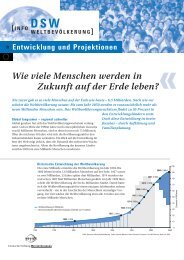
Good Graphics? From the R Graph Gallery (Some of) Tufte's ...
Good Graphics? From the R Graph Gallery (Some of) Tufte's ...
Good Graphics? From the R Graph Gallery (Some of) Tufte's ...

You also want an ePaper? Increase the reach of your titles
YUMPU automatically turns print PDFs into web optimized ePapers that Google loves.
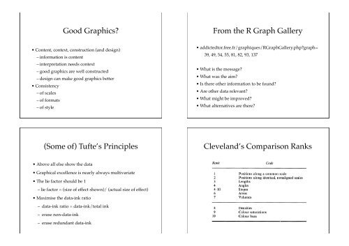
<strong>Good</strong> <strong><strong>Graph</strong>ics</strong>?<br />
• Content, context, construction (and design)<br />
– information is content<br />
– interpretation needs context<br />
– good graphics are well constructed<br />
– design can make good graphics better<br />
• Consistency<br />
– <strong>of</strong> scales<br />
– <strong>of</strong> formats<br />
– <strong>of</strong> style<br />
(<strong>Some</strong> <strong>of</strong>) Tufte’s Principles<br />
• Above all else show <strong>the</strong> data<br />
• <strong>Graph</strong>ical excellence is nearly always multivariate<br />
• The lie factor should be 1<br />
– lie factor = (size <strong>of</strong> effect shown)/ (actual size <strong>of</strong> effect)<br />
• Maximise <strong>the</strong> data-ink ratio<br />
– data-ink ratio = data-ink/total ink<br />
– erase non-data-ink<br />
– erase redundant data-ink<br />
<strong>From</strong> <strong>the</strong> R <strong>Graph</strong> <strong>Gallery</strong><br />
• addictedtor.free.fr/graphiques/R<strong>Graph</strong><strong>Gallery</strong>.php?graph=<br />
– 39, 49, 54, 55, 81, 82, 93, 137<br />
• What is <strong>the</strong> message?<br />
• What was <strong>the</strong> aim?<br />
• Is <strong>the</strong>re o<strong>the</strong>r information to be found?<br />
• Are o<strong>the</strong>r data relevant?<br />
• What might be improved?<br />
• What alternatives are <strong>the</strong>re?<br />
1987] <strong>Graph</strong>ical Perception<br />
TABLE 1<br />
Cleveland’s Comparison Ranks<br />
Elementary codes and an order<br />
Rank Code<br />
1 Positions along a common scale<br />
2 Positions along identical, nonaligned scales<br />
3 Lengths<br />
4 Angles<br />
4-10 Slopes<br />
6 Areas<br />
7 Volumes<br />
8 Densities<br />
9 Colour saturations<br />
10 Colour hues<br />
Fig. 4 illustrates four <strong>of</strong> <strong>the</strong> elementary codes. Panels I and II are dot charts (Clevel
• Values by<br />
How are data represented?<br />
– position<br />
– length<br />
– area, volume<br />
• Counts by<br />
– length<br />
– area<br />
• Grouping by<br />
– colour, shading, shape<br />
Text<br />
• Text is used with graphics in several different ways<br />
– Title<br />
– Caption<br />
– Axis labelling<br />
– Legend<br />
– Annotation<br />
– Accompanying narrative<br />
• All should be consistent in what <strong>the</strong>y say<br />
• The text should not obscure <strong>the</strong> graphic<br />
• Continuous<br />
Scales<br />
– Use standard values (e.g. powers <strong>of</strong> 10)<br />
– Use meaningful scales for <strong>the</strong> variables in question<br />
– Choose origin carefully<br />
– Include minimum and maximum (and a little more)<br />
– Use common scales for comparison and consistency<br />
• Categorical<br />
– Consider different orderings <strong>of</strong> categories<br />
– Consider sorting categories by various criteria<br />
– Consider combining categories<br />
• Size <strong>of</strong> plots<br />
• Aspect ratio<br />
• Axes<br />
• Tickmarks<br />
• Gridlines<br />
• Points/symbols/glyphs<br />
• Colour<br />
– colour scales<br />
– shading<br />
Formatting
Statistical models/guidelines<br />
• Gridlines at specific values (e.g. y=0, x=100)<br />
• Boundary lines (e.g. y=x)<br />
• Outliers/extreme outliers on boxplots<br />
• Density estimates on histograms, scatterplots<br />
• Regression lines, smoo<strong>the</strong>rs on scatterplots (+ intervals)<br />
• Confidence intervals on highlighted proportions<br />
• Residuals from models on mosaicplots<br />
• …
![10 Momente und Charakteristische Funktionen E[X ] ist das k ...](https://img.yumpu.com/27097252/1/190x245/10-momente-und-charakteristische-funktionen-ex-ist-das-k-.jpg?quality=85)