1 CLASS LECTURE NOTES - What is Applied Statistics ...
1 CLASS LECTURE NOTES - What is Applied Statistics ...
1 CLASS LECTURE NOTES - What is Applied Statistics ...

You also want an ePaper? Increase the reach of your titles
YUMPU automatically turns print PDFs into web optimized ePapers that Google loves.
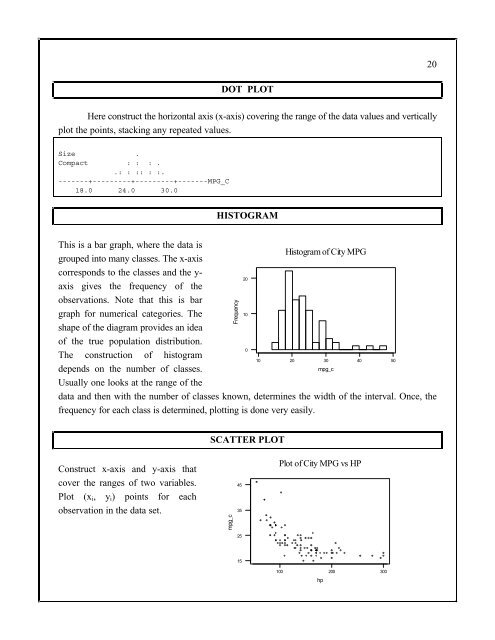
20<br />
DOT PLOT<br />
Here construct the horizontal ax<strong>is</strong> (x-ax<strong>is</strong>) covering the range of the data values and vertically<br />
plot the points, stacking any repeated values.<br />
Size .<br />
Compact : : : .<br />
.: : :: : :.<br />
-------+---------+---------+-------MPG_C<br />
18.0 24.0 30.0<br />
HISTOGRAM<br />
Th<strong>is</strong> <strong>is</strong> a bar graph, where the data <strong>is</strong><br />
H<strong>is</strong>togram of City MPG<br />
grouped into many classes. The x-ax<strong>is</strong><br />
corresponds to the classes and the y-<br />
20<br />
ax<strong>is</strong> gives the frequency of the<br />
observations. Note that th<strong>is</strong> <strong>is</strong> bar<br />
graph for numerical categories. The<br />
10<br />
shape of the diagram provides an idea<br />
of the true population d<strong>is</strong>tribution.<br />
0<br />
The construction of h<strong>is</strong>togram<br />
10<br />
20<br />
30<br />
40<br />
50<br />
depends on the number of classes.<br />
mpg_c<br />
Usually one looks at the range of the<br />
data and then with the number of classes known, determines the width of the interval. Once, the<br />
frequency for each class <strong>is</strong> determined, plotting <strong>is</strong> done very easily.<br />
Frequency<br />
SCATTER PLOT<br />
Construct x-ax<strong>is</strong> and y-ax<strong>is</strong> that<br />
cover the ranges of two variables.<br />
Plot (x i , y i ) points for each<br />
observation in the data set.<br />
mpg_c<br />
45<br />
35<br />
25<br />
Plot of City MPG vs HP<br />
15<br />
100<br />
hp<br />
200<br />
300