Typography and Printing
Typography and Printing
Typography and Printing

You also want an ePaper? Increase the reach of your titles
YUMPU automatically turns print PDFs into web optimized ePapers that Google loves.
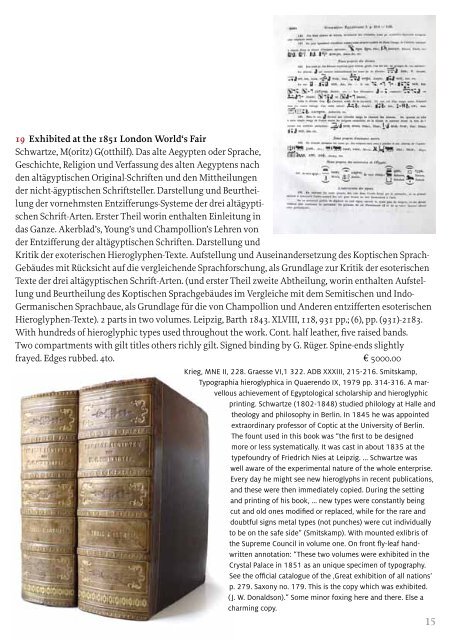
19 Exhibited at the 1851 London World‘s Fair<br />
Schwartze, M(oritz) G(otthilf). Das alte Aegypten oder Sprache,<br />
Geschichte, Religion und Verfassung des alten Aegyptens nach<br />
den altägyptischen Original-Schriften und den Mittheilungen<br />
der nicht-ägyptischen Schriftsteller. Darstellung und Beurtheilung<br />
der vornehmsten Entzifferungs-Systeme der drei altägyptischen<br />
Schrift-Arten. Erster Theil worin enthalten Einleitung in<br />
das Ganze. Akerblad’s, Young’s und Champollion’s Lehren von<br />
der Entzifferung der altägyptischen Schriften. Darstellung und<br />
Kritik der exoterischen Hieroglyphen-Texte. Aufstellung und Ausein<strong>and</strong>ersetzung des Koptischen Sprach-<br />
Gebäudes mit Rücksicht auf die vergleichende Sprachforschung, als Grundlage zur Kritik der esoterischen<br />
Texte der drei altägyptischen Schrift-Arten. (und erster Theil zweite Abtheilung, worin enthalten Aufstellung<br />
und Beurtheilung des Koptischen Sprachgebäudes im Vergleiche mit dem Semitischen und Indo-<br />
Germanischen Sprachbaue, als Grundlage für die von Champollion und Anderen entzifferten esoterischen<br />
Hieroglyphen-Texte). 2 parts in two volumes. Leipzig, Barth 1843. XLVIII, 118, 931 pp.; (6), pp. (931)-2183.<br />
With hundreds of hieroglyphic types used throughout the work. Cont. half leather, five raised b<strong>and</strong>s.<br />
Two compartments with gilt titles others richly gilt. Signed binding by G. Rüger. Spine-ends slightly<br />
frayed. Edges rubbed. 4to. E 5000.00<br />
Krieg, MNE II, 228. Graesse VI,1 322. ADB XXXIII, 215-216. Smitskamp,<br />
Typographia hieroglyphica in Quaerendo IX, 1979 pp. 314-316. A marvellous<br />
achievement of Egyptological scholarship <strong>and</strong> hieroglyphic<br />
printing. Schwartze (1802-1848) studied philology at Halle <strong>and</strong><br />
theology <strong>and</strong> philosophy in Berlin. In 1845 he was appointed<br />
extraordinary professor of Coptic at the University of Berlin.<br />
The fount used in this book was “the first to be designed<br />
more or less systematically. It was cast in about 1835 at the<br />
typefoundry of Friedrich Nies at Leipzig. ... Schwartze was<br />
well aware of the experimental nature of the whole enterprise.<br />
Every day he might see new hieroglyphs in recent publications,<br />
<strong>and</strong> these were then immediately copied. During the setting<br />
<strong>and</strong> printing of his book, ... new types were constantly being<br />
cut <strong>and</strong> old ones modified or replaced, while for the rare <strong>and</strong><br />
doubtful signs metal types (not punches) were cut individually<br />
to be on the safe side” (Smitskamp). With mounted exlibris of<br />
the Supreme Council in volume one. On front fly-leaf h<strong>and</strong>written<br />
annotation: “These two volumes were exhibited in the<br />
Crystal Palace in 1851 as an unique specimen of typography.<br />
See the official catalogue of the ‚Great exhibition of all nations‘<br />
p. 279. Saxony no. 179. This is the copy which was exhibited.<br />
( J. W. Donaldson).” Some minor foxing here <strong>and</strong> there. Else a<br />
charming copy.<br />
15