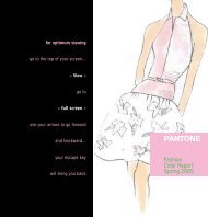
Fall 2008 - Pantone
Fall 2008 - Pantone
Fall 2008 - Pantone

You also want an ePaper? Increase the reach of your titles
YUMPU automatically turns print PDFs into web optimized ePapers that Google loves.
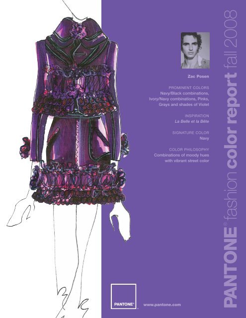
Zac Posen<br />
PROMINENT COLORS<br />
Navy/Black combinations,<br />
Ivory/Navy combinations, Pinks,<br />
Grays and shades of Violet<br />
INSPIRATION<br />
La Belle et la Bête<br />
SIGNATURE COLOR<br />
Navy<br />
COLOR PHILOSOPHY<br />
Combinations of moody hues<br />
with vibrant street color<br />
www.pantone.com<br />
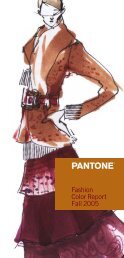
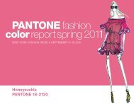
PANTONE ® fashion color report fall <strong>2008</strong>
Blue Iris PANTONE ® 18-3943<br />
Royal Lilac PANTONE 18-3531<br />
Shady Glade PANTONE 18-5624<br />
Caribbean Sea PANTONE 18-4525<br />
Aurora Red PANTONE 18-1550<br />
Shitake PANTONE 18-1015<br />
Withered Rose PANTONE 18-1435<br />
Twilight Blue PANTONE 19-3938<br />
Burnt Orange PANTONE 16-1448<br />
Ochre PANTONE 14-1036<br />
A Season of Change<br />
NEW YORK FASHION WEEK, FEBRUARY 1– 8, <strong>2008</strong><br />
Best described as a season of change, fall ’08 is defined by<br />
rich, elegant hues that offer a vibrant selection. New York’s<br />
fashion designers emphasize cooler blues, greens and purples<br />
in the top five tones used in their collections, followed by<br />
variations of warm red, orange and yellow.<br />
“<strong>Fall</strong> is traditionally a time for subdued, quiet colors, but this<br />
season we are seeing a shift toward cool hues with bright,<br />
exciting undertones,” said Leatrice Eiseman, executive director<br />
of the <strong>Pantone</strong> Color Institute ® . “Conventional tones such as<br />
warm autumn hues, chocolate browns and steel grays are<br />
also among the fall color choices. Blue and purple tones have<br />
become staples, as illustrated by Blue Iris, one of the top 10<br />
colors chosen by designers this season, and <strong>Pantone</strong>’s Color<br />
of the Year for <strong>2008</strong>.”<br />
Blue Iris, a beautifully balanced blue with an undertone of<br />
purple, is a favorite among designers, as it combines the calming<br />
aspects of blue with the mystical and spiritual qualities of purple.<br />
Dramatic Royal Lilac brings purple to the forefront of fashion,<br />
and generates a bit of heat with its exciting red undertones.<br />
Serene, sophisticated Caribbean Blue is another popular<br />
hue this fall, especially in jewelry and accessories. But it can<br />
add a colorful intensity wherever it is used in the wardrobe.<br />
Twilight Blue, a twist on a classic navy, shows the<br />
transitional aspect of spring segueing into fall. Serving as<br />
a wonderful base color, Shady Glade delivers a natural<br />
elegance to the fall palette. Taking green in an interesting<br />
direction with its true green characteristics, this hue is<br />
a departure from greens of seasons past, which have had<br />
distinctively yellow undertones.<br />
Reds are a steadfast favorite for fall and Aurora Red is<br />
no exception. Versatile and universally appealing, this true<br />
red adds a splash of energy to the palette. Soft, dusky<br />
Withered Rose, with its pinkish qualities and brown<br />
undertones, is a versatile hue that blends with every shade.<br />
Ochre, a beautifully mellow yellow with a hint of mustard,<br />
adds a touch of lightness and spice. Orange has had a long<br />
run, and now, more than ever, consumers are gravitating<br />
toward intense shades like Burnt Orange, bringing this once<br />
steady background color to the foreground. The complex yet<br />
modest Shitake is an intriguingly understated shade,<br />
especially when teamed with the robust colors of fall ‘08.<br />
www.pantone.com<br />
PANTONE ® fashion color report fall <strong>2008</strong>
Peter Som<br />
PROMINENT COLORS<br />
Nuanced brights such as<br />
Raspberry Red, Apple Green<br />
and Deep Turquoise mixed<br />
with neutral tones such as<br />
Plum, Maroon Red and<br />
various shades of Navy<br />
INSPIRATION<br />
The offbeat quirkiness of<br />
Diane Arbus photographs and<br />
the sharp, artistic direction<br />
and visuals from the television<br />
show Mad Men<br />
SIGNATURE COLOR<br />
Apple Green<br />
COLOR PHILOSOPHY<br />
Have fun<br />
PANTONE ® fashion color report fall <strong>2008</strong>
Douglas Hannant<br />
PROMINENT COLORS<br />
Imperial Purple, Chartreuse,<br />
Black, Silver and White<br />
INSPIRATION<br />
Balanchine<br />
SIGNATURE COLOR<br />
Imperial Purple<br />
COLOR PHILOSOPHY<br />
Austere luxury<br />
PANTONE ® fashion color report fall <strong>2008</strong>
Y&Kei<br />
PROMINENT COLORS<br />
Warmer, earthier colors<br />
including Burgundy Wine, Rusty<br />
Orange, Mineral Red, Yellow Ochre,<br />
Vintage Champagne<br />
and Cool Porcelain<br />
INSPIRATION<br />
The idea of “strange beauty” —<br />
something that is freakishly odd, but at<br />
the same time elegantly beautiful. This<br />
oxymoron, specifically created for this<br />
season, gave us more freedom<br />
and achieves an avant-garde take on<br />
traditional fashion. We are also constantly<br />
inspired by our home country of Korea,<br />
as well as European and American<br />
cultures — the resulting designs are a<br />
unique combination of melded ideas.<br />
SIGNATURE COLOR<br />
Mineral Red, Rusty Orange and Yellow<br />
Ochre juxtaposed with Porcelain, Black,<br />
Beige and Brown to achieve a distinctive<br />
richness and “strange beauty”<br />
COLOR PHILOSOPHY<br />
Rich and warm colors communicated<br />
in a subtle and indirect manner<br />
PANTONE ® fashion color report fall <strong>2008</strong>
Elie Tahari<br />
PROMINENT COLORS<br />
Color combinations including<br />
warm jewel tones, muted Corals<br />
and Reds with Teal and Gold<br />
accents; regal Purples and Blues<br />
contrasted with deep Greens<br />
INSPIRATION<br />
Saturated hues inspired by gem<br />
stones and Gold ornamentation<br />
SIGNATURE COLOR<br />
Shitake<br />
COLOR PHILOSOPHY<br />
Vibrant colors that add depth<br />
and vigor to any look<br />
PANTONE ® fashion color report fall <strong>2008</strong>
Tracy Reese<br />
PROMINENT COLORS<br />
Baby Blue, Raven Black, Rustic<br />
Copper, Deep Berry, Bright Teal<br />
and Emerald Green<br />
INSPIRATION<br />
Forces of nature combined<br />
with the beauty of art<br />
SIGNATURE COLOR<br />
Stormy Blue<br />
COLOR PHILOSOPHY<br />
Embrace the elements of nature<br />
and wear rich and bold<br />
explosions of color for fall.<br />
PANTONE ® fashion color report fall <strong>2008</strong>
Carmen Marc Valvo<br />
PROMINENT COLORS<br />
Black, Chocolate and<br />
Camel juxtaposed with<br />
deep, rich jewel tones like<br />
Peacock, Lipstick Red<br />
and Star Sapphire<br />
INSPIRATION<br />
Gloria Wondrous’<br />
(Elizabeth Taylor) sensuality<br />
in Butterfield 8<br />
SIGNATURE COLOR<br />
Peacock<br />
COLOR PHILOSOPHY<br />
Neutrals accented by sexy,<br />
warm jewel tones like Lipstick<br />
Red and Star Sapphire<br />
PANTONE ® fashion color report fall <strong>2008</strong>
Temperley London<br />
PROMINENT COLORS<br />
Highly saturated and rich, jewellike<br />
colors: Lime Greens, rich<br />
metallic Beetle Greens,<br />
Raspberry, Aubergine<br />
INSPIRATION<br />
Looking at Greta Garbo films<br />
and working with the rich<br />
and unashamedly over-the-top,<br />
jewel-like costumes she<br />
wore at the time<br />
SIGNATURE COLOR<br />
Beetle Green — Emerald<br />
shot with Gold<br />
COLOR PHILOSOPHY<br />
Rich, deep and confident<br />
PANTONE ® fashion color report fall <strong>2008</strong>
Lela Rose<br />
PROMINENT COLORS<br />
Mallard Green, Chili Powder Red,<br />
Bright Eggplant, Dark Mustard<br />
and Powdered Dahlia woven<br />
around Salt and Pepper wool<br />
INSPIRATION<br />
The spice markets and<br />
pharmacies of Morocco where<br />
there were rich colors in<br />
powdered form<br />
SIGNATURE COLOR<br />
Mallard Green<br />
COLOR PHILOSOPHY<br />
Jewel tones, texture and<br />
layers all mixed into one<br />
PANTONE ® fashion color report fall <strong>2008</strong>
Reem Acra<br />
PROMINENT COLORS<br />
Warm Green, Mustard Yellow<br />
and Deep Red<br />
INSPIRATION<br />
All my travels and being<br />
surrounded by people that have<br />
warmth and sophistication<br />
SIGNATURE COLOR<br />
Always have Red or Gold<br />
COLOR PHILOSOPHY<br />
Stay warm<br />
PANTONE ® fashion color report fall <strong>2008</strong>
Waleed Khairzada for Cynthia Steffe<br />
PROMINENT COLORS<br />
Fire Engine Red, Lapis Blue and Bordeaux<br />
anchored by Black and Bone<br />
INSPIRATION<br />
Sarah Moon and Nick Knight photographs<br />
SIGNATURE COLOR<br />
Red<br />
COLOR PHILOSOPHY<br />
Modern, sophisticated brights<br />
PANTONE ® fashion color report fall <strong>2008</strong>
Doori Chung for Doo.ri<br />
PROMINENT COLORS<br />
Lush color combinations<br />
of Kelp, Moss, Mint,<br />
Eggplant and Marine<br />
INSPIRATION<br />
Mapping, topography<br />
and botany<br />
SIGNATURE COLOR<br />
Forest Green<br />
COLOR PHILOSOPHY<br />
Layering rich colors and<br />
organic prints<br />
Photo: Martha Camarillo<br />
PANTONE ® fashion color report fall <strong>2008</strong>
Alvin Valley<br />
PROMINENT COLORS<br />
Earth tones and industrial<br />
neutrals with accents in<br />
Picante, Inca Gold, Ice Flow<br />
and Burnt Orange<br />
INSPIRATION<br />
The dichotomy between futurism<br />
and archaism, Bauhaus, Louise<br />
Brooks, German cinema of<br />
the 1920s and 1930s, primitivism<br />
and perpetual motion<br />
SIGNATURE COLOR<br />
Ash, Steel Gray and Caviar<br />
COLOR PHILOSOPHY<br />
Modern twists to neutrality and<br />
the emphasis of subtle nuances<br />
PANTONE ® fashion color report fall <strong>2008</strong>
Tia Cibani for Ports 1961<br />
PROMINENT COLORS<br />
Limerick (Mossy Green), Sycamore<br />
(Warm Tan), Dulse (Malt Brown)<br />
and Coll (Ochre) are accented<br />
with pops of Loch (Indigo) and<br />
Rowan (Red-Orange) to stimulate<br />
the subconscious mind.<br />
INSPIRATION<br />
The beauty of the natural<br />
landscape mixed with the fantasy<br />
of Gaelic mythology — I felt it was<br />
important to explore the more<br />
bold colors of Loch (Indigo), Ross<br />
(Forest Green) and Rowan (Warm<br />
Bright Red) as a tribute to the<br />
childish wonder we all possess<br />
SIGNATURE COLOR<br />
Loch (Indigo)<br />
COLOR PHILOSOPHY<br />
Practicality blended with the<br />
excitement of fantasy<br />
PANTONE ® fashion color report fall <strong>2008</strong>
Wichy Hassan for Miss Sixty<br />
PROMINENT COLORS<br />
Rich, vintage-inspired colors like Deep<br />
Purple are paired with lighter hues to<br />
create subtle tone-on-tone looks that<br />
are elegant. Pops of bright Coral Orange<br />
add a graphic, rock ‘n’ roll element that<br />
reference the 1960s and 1970s.<br />
INSPIRATION<br />
The haute hippie, bohemian style of<br />
Woodstock icon Janis Joplin combined<br />
with the gritty glamour of rock ‘n’ roll as<br />
depicted in Performance, the 1968 cult<br />
film starring Mick Jagger — the vibrant<br />
patchwork of colors and textures that<br />
defines Joplin’s look is re-imagined<br />
to create a collection that is both<br />
vintage and modern, all with a<br />
cool, psychedelic attitude<br />
SIGNATURE COLOR<br />
Purple with a touch of Orange —<br />
vintage and modern, hippie<br />
but haute, tough yet feminine<br />
COLOR PHILOSOPHY<br />
The decadence of 1970s’ rock ‘n’ roll<br />
with a modern, glamorous twist<br />
PANTONE ® fashion color report fall <strong>2008</strong>
Luca Luca<br />
PROMINENT COLORS<br />
Dark Plum, Forest Green,<br />
Rust, Ivory and Black<br />
INSPIRATION<br />
Ernesto Caivanos’ dark, romantic<br />
love story Into the Woods<br />
SIGNATURE COLOR<br />
Dark Plum<br />
COLOR PHILOSOPHY<br />
Color is muted down with<br />
dark overlays<br />
PANTONE ® fashion color report fall <strong>2008</strong>
Jenni Kayne<br />
PROMINENT COLORS<br />
A patchwork of contrasting<br />
colors that is both graphic and<br />
organic — Spectrum Blue cut<br />
with Black and sprinkled with<br />
Mandarin Red and Mustard<br />
INSPIRATION<br />
A vintage patchwork painting<br />
of a modern day quilt — the<br />
play of colors seemed familiar,<br />
but new at the same time<br />
SIGNATURE COLOR<br />
Charcoal Gray<br />
COLOR PHILOSOPHY<br />
Dark colors that are offset<br />
with rich pop colors<br />
PANTONE ® fashion color report fall <strong>2008</strong>
Dennis Basso<br />
PROMINENT COLORS<br />
Warm, ombré and tone-on-tone<br />
colors from Creamy Beige to<br />
deep Charcoal tones<br />
INSPIRATION<br />
A feeling of warmth and luxury<br />
in the cold weather seasons<br />
SIGNATURE COLOR<br />
Tones of Cocoa Brown through<br />
to Deep Charcoal<br />
COLOR PHILOSOPHY<br />
Use color as the backdrop<br />
to show off the design<br />
elements of the garment.<br />
PANTONE ® fashion color report fall <strong>2008</strong>
Yigal Azrouël<br />
PROMINENT COLORS<br />
Azrouëlian Gray and Deep Navy<br />
against Organic Greens and<br />
Mustard Yellow; Storm, Smoke,<br />
Moss, Eucalyptus and Dandelion<br />
INSPIRATION<br />
The palette is dark and<br />
moody, somber but rich and<br />
earthy. Our men’s collection<br />
often has influence over<br />
the women’s palette.<br />
SIGNATURE COLOR<br />
Dandelion<br />
COLOR PHILOSOPHY<br />
Mixing textures to bring about<br />
a color’s different tonalities<br />
PANTONE ® fashion color report fall <strong>2008</strong>
David Rodriguez<br />
PROMINENT COLORS<br />
Red rules! A beautiful,<br />
rich Red has been my favorite<br />
color since childhood.<br />
INSPIRATION<br />
My grandpa’s Red plaid barn coat<br />
was the perfect shade of Red.<br />
I have been chasing that ideal<br />
Red my whole career… It is the<br />
emperor of all Reds.<br />
SIGNATURE COLOR<br />
Emperor Red<br />
COLOR PHILOSOPHY<br />
Colors that evoke emotions.<br />
Red means so many things —<br />
life, love, passion, as well as<br />
the exact opposites. It is a<br />
purely emotional color.<br />
PANTONE ® fashion color report fall <strong>2008</strong>
Akiko Ogawa<br />
PROMINENT COLORS<br />
The combination of Deep Indigo,<br />
Iridescent Shining Teal and Jet<br />
INSPIRATION<br />
The glittering arc of the Milky Way<br />
Galaxy — I was captivated by the<br />
icy beauty of its countless stars,<br />
sparkling like a belt of Silver sand<br />
in the infinite reaches of space.<br />
The disparate elements<br />
underpinning the collection<br />
include Maetel, the mysterious<br />
heroine of the popular sci-fi anime<br />
series Galaxy Express 999.<br />
SIGNATURE COLOR<br />
Iridescent Shining Teal<br />
COLOR PHILOSOPHY<br />
The Galaxy<br />
PANTONE ® fashion color report fall <strong>2008</strong>
Brian Reyes<br />
PROMINENT COLORS<br />
Mineral tones as well as a strong<br />
presence of Marlstone Gray, Serpentine<br />
Green, Tempera Blue, Burnt Sienna<br />
and Lava Orange — these colors are<br />
integrated among more neutral earth<br />
tones such as Excalibur, Antler, Lilac<br />
Marble, Duffel Bag and Inca Gold<br />
INSPIRATION<br />
The overlap between climate and<br />
culture, weather and technology —<br />
geographical topography from various<br />
parts of the world is incorporated into<br />
the collection with our ripe fabric<br />
selection and embellishment details<br />
SIGNATURE COLOR<br />
Withered Rose is a very strong<br />
element that stands out on its own.<br />
It plays a dual role as a strong<br />
mineral hue and also has a touch<br />
of natural terrain.<br />
COLOR PHILOSOPHY<br />
Our color philosophy is full of life<br />
and Technicolor, defined by hyperrealistic,<br />
saturated levels of color.<br />
PANTONE ® fashion color report fall <strong>2008</strong>
Gustavo Arango<br />
PROMINENT COLORS<br />
Mixtures of cool and warm<br />
intense shades of Black with<br />
shots of pixilated Copper,<br />
ravishing Teal, radiant Guava<br />
Red and rich Royal Purple<br />
INSPIRATION<br />
An intoxication of the urban<br />
city night with flashes of<br />
colored bright lights<br />
SIGNATURE COLOR<br />
Radiant Guava Red<br />
COLOR PHILOSOPHY<br />
Flickers of light through<br />
the darkness of shades<br />
PANTONE ® fashion color report fall <strong>2008</strong>
Kimora Lee Simmons<br />
for Baby Phat<br />
PROMINENT COLORS<br />
Smokey jewel tones, shades<br />
of vineyards, Chocolate and a<br />
touch of Bright Orange to add<br />
a fruity twist to fall<br />
INSPIRATION<br />
Stained glass and<br />
art deco finishes<br />
SIGNATURE COLOR<br />
Vineyard and Charcoal<br />
PANTONE ® fashion color report fall <strong>2008</strong>
Tadashi Shoji<br />
PROMINENT COLORS<br />
Scarlet Red, Mahogany, Charcoal<br />
Gray and Emerald Green<br />
INSPIRATION<br />
The rich, opulent jewel tones in<br />
Asia — I studied fine art in Tokyo<br />
under Japan’s leading contemporary<br />
artist, Jiro Takamatsu, who is credited<br />
for paving the way for the modern<br />
art movement in Japan during the<br />
1960s. During that time, I was<br />
immersed in rich jewel tones and<br />
saw how these regal colors could<br />
be incorporated in design.<br />
SIGNATURE COLOR<br />
Asian-inspired Red — it is rich and<br />
warm with a nod to the season and<br />
its colorful foliage<br />
COLOR PHILOSOPHY<br />
The colors are derived from an<br />
opulent perspective. They’re colors<br />
that I use in my own home to<br />
decorate a room. These jewel tones<br />
do not overwhelm my designs<br />
and the garment is the star.<br />
PANTONE ® fashion color report fall <strong>2008</strong>
Laura Poretzky for Abaeté<br />
PROMINENT COLORS<br />
Crimson, Blush, Dark Orchid,<br />
Electric Violet, Peacock Tail,<br />
Midnight Blue, Cadet Blue, Armor<br />
Gray and Smokey Slate<br />
INSPIRATION<br />
Medieval times, James Whistler’s<br />
Peacock Room of the 1870s<br />
and the dark rich jewel tones<br />
of fall fruits<br />
SIGNATURE COLOR<br />
Peacock Tail<br />
COLOR PHILOSOPHY<br />
A soft palette of Smokey<br />
Slate and Armor Gray with<br />
accents of jewel tones<br />
PANTONE ® fashion color report fall <strong>2008</strong>
Erin Fetherston<br />
PROMINENT COLORS<br />
Deep, warm tones of Green, Red and<br />
Purple. Forest and Ivy Greens are<br />
highlighted by shades of Golden<br />
Chartreuse. Purples are Dusty Royal<br />
and Mauve. Reds have a renaissance<br />
tone ranging from Burgundy to Poppy.<br />
These richer colors are then balanced<br />
by the presence of a neutral palette<br />
of Antique Pinks, Beige and Black.<br />
INSPIRATION<br />
Images of nature — the colors one<br />
would find in a Bavarian forest as it<br />
creeps from autumn to dormant winter<br />
SIGNATURE COLOR<br />
Rose Red<br />
COLOR PHILOSOPHY<br />
Have striking, bold color work in a<br />
wintery palette with a balance of<br />
muted tones, rich and deep hues<br />
of royal colors, highlighted<br />
with pop accents.<br />
PANTONE ® fashion color report fall <strong>2008</strong>
Charlotte Ronson<br />
PROMINENT COLORS<br />
Cool colors such as Plum, Eggplant,<br />
Midnight Blue, Gray and Black, with<br />
accents of Electric Blue, Fluorescent<br />
Yellow and Magenta. The only warm<br />
hint is the Magenta binding<br />
and pocket lining.<br />
INSPIRATION<br />
France and 1960s’ Jane Birkin —<br />
what she exuded was effortless. She<br />
was young but fearless, natural,<br />
romantic, dressed-down glamour.<br />
SIGNATURE COLOR<br />
Plum and Midnight<br />
COLOR PHILOSOPHY<br />
Blues, Purples and Blacks with<br />
hints of neutrals, Camels and<br />
Charcoal as the base, and then<br />
the subtle blasts of brights to add<br />
some personality to the palette<br />
PANTONE ® fashion color report fall <strong>2008</strong>
Betsey Johnson<br />
PROMINENT COLORS<br />
Black with sparks of primary<br />
theatrical colors, such as Scarlet<br />
Red, Kelly Green, Chrome Yellow<br />
and Cobalt Blue, with additions<br />
of strange color mixes such as<br />
Scarlet and Salmon, Turquoise<br />
and Cobalt, Purple and Puce,<br />
Ochre and Shocking Pink — all lit<br />
with oily, strange metallics like<br />
greasy Blue-Black and Mud<br />
Blacks to add a slimy slickness<br />
INSPIRATION<br />
Two favorite movies: the Black,<br />
bright-colored, light beatnik<br />
scene in Funny Face and the<br />
surreal dance productions<br />
in American in Paris<br />
SIGNATURE COLOR<br />
The color of gourmet<br />
Scottish sliced Salmon<br />
COLOR PHILOSOPHY<br />
Keep your sunny side up.<br />
Darks and Blues will perk up<br />
hints of primary brights and<br />
odd color combos.<br />
Photo: Ngoc Minh Ngo<br />
PANTONE ® fashion color report fall <strong>2008</strong>
designer must haves<br />
A compact, tight-fitting coat in Indigo Navy — Akiko Ogawa<br />
A tailored jumpsuit in Caviar and Bracken — Alvin Valley<br />
Anything fringe — long or short, leather, rayon, felt or yarn — Betsey Johnson<br />
Delicate layering pieces juxtaposed with opulent luster and detailing in mineral tones — Brian Reyes<br />
Cocktail dresses embellished with feathers and jewels — Carmen Marc Valvo<br />
My wool blend, Midnight Gray and Black striped turtleneck mini dress, belted with a Black knit belt with a<br />
patent leather buckle — it should be worn with Black wooly tights or leggings and Smoke suede boots with<br />
a metal toe plate — Charlotte Ronson<br />
My cashmere barn coat in Emperor Red plaid — David Rodriguez<br />
A Black or Brown jacquard item that will give you a color spectrum in the way the fabric weave<br />
has been interpreted — Dennis Basso<br />
Double-breasted cotton blanket coat in Forest Green jacquard — Doori Chung for Doo.ri<br />
A spiral seam dress in Imperial Purple — Douglas Hannant<br />
Below-the-knee tweed pencil skirt in Shitake — Elie Tahari<br />
The rose bud dress in Rose Red — Erin Fetherston<br />
A short cocktail dress with a mixture of rich, intense Black textured textiles that create a unique collage of art — Gustavo Arango<br />
A Royal Midnight fur felt riding hat with feather trim — James Coviello<br />
An Oatmeal/Taupe belted jacket with Silver Fox collar trim — Jenni Kayne<br />
Clustered jewelry with touches of bright stones in Candy Pinks, Charcoal and Vineyard — Kimora Lee Simmons for Baby Phat<br />
A beautifully draped, Madame Grès-inspired cocktail dress in Crimson and Blush — Laura Poretzky for Abaeté<br />
My Dark Mustard washed taffeta parka — it is classic, sporty, casual and luxury all in one — Lela Rose<br />
Beaded cocktail dress in Black leather and Forest Green iridescent feathers — Luca Luca<br />
The perfect little Black dress — Nanette Lepore<br />
Gold-flecked glen plaid coat with dramatic accordion pleat sweep, worn with skinny pants — Pamella Roland<br />
An Apple Green, pressed-wool cocoon cape — Peter Som<br />
Coats in Green or Blue — Reem Acra<br />
Anything cashmere such as my classic turtleneck sweater in Chocolate Brown — Tadashi Shoji<br />
Billowing dresses in bright-jeweled colors — volume and unashamed glamour — Temperley London<br />
Our tweed coat — it has a structured, tubular body with strong shoulders, comfy texture and a large sweep. It is a mixture<br />
of Dulse (Malt Brown), braided Pebbles and Blackhorn, speckled with Sloe (White). — Tia Cibani for Ports 1961<br />
A long reefer coat in Loganberry plaid — Tracy Reese<br />
Our new shaped jacket with a flute skirt in Red — Waleed Khairzada for Cynthia Steffe<br />
A macro-volume top in a luxe Purple hue, paired with 1970s-inspired boot-cut denim trousers — the combination<br />
creates a deliberate contrast that recalls the easy, unconventional glamour of Woodstock-era icon Janis Joplin, the<br />
high priestess of rock — Wichy Hassan for Miss Sixty<br />
The cocoon-shaped, brushed wool cape coat in Mineral Red — Y&Kei<br />
The patent leather paillettes cocktail dress in Smoke and Storm — Yigal Azrouël<br />
Wool/poodle tux overcoat — Zac Posen<br />
www.pantone.com<br />
PANTONE ® fashion color report fall <strong>2008</strong>
designers choose paint for home<br />
Rug because it goes well with Benge furniture. — Akiko Ogawa<br />
Atmosphere — it’s clean, crisp and modern. Use it anywhere requiring tranquility. — Alvin Valley<br />
Rich Salmon for modern contemporary or antiques — it will work in any room. — Betsey Johnson<br />
Rust — it stimulates energy, generates enthusiasm, feels comforting and strong, and has a warm simplicity with its tone.<br />
This color would be ideal in any home office or workspace. — Brian Reyes<br />
A rich hue of Gray would be beautiful and very masculine, particularly with a crisply painted Cream molding. Van Gogh allegedly<br />
painted the walls of his studio Gray — the richness of the dark hue was serene. — Carlos Campos<br />
I always like the way a room looks when the walls are one color and all the framing is a contrast stark White. I love everything<br />
White with touches of color elsewhere so I would start slowly painting my bathroom Seafoam and my kitchen walls a<br />
bright Lemon. — Charlotte Ronson<br />
A faded Gray Lilac — ideal for spaces that are serene and relaxing, such as a bathroom or lounge. It adds a touch of organic<br />
futurism that is both neutral and modern. — Christian Cota<br />
Emperor Red! Anywhere… If it was good enough for Diana Vreeland, then it’s good enough for me. — David Rodriguez<br />
Subtle Beige with traces of Peach — this works as a great background for staging furniture and is extremely flattering to<br />
one’s skin tone. — Dennis Basso<br />
Having been inspired by looking at wall coverings from Wook Kim, I am compelled by the idea of Black interiors.<br />
A Black bathroom could be very dramatic and beautiful. — Doori Chung for Doo.ri<br />
Imperial Purple — it would work well with a Black and White photography collection. — Douglas Hannant<br />
Metallic shades — Silvers, Golds, Bronzes and pearlized colors. — Erin Fetherston<br />
Antique Loden in a study, home office or library — books pictures and objects look best against a dark<br />
dramatic setting. — James Coviello<br />
Black Lacquer in a library or a cozy den — it provides an air of glamour to a casual room. — Jenni Kayne<br />
Apple Green — it can brighten up any room yet still be very sophisticated. — Kimora Lee Simmons for Baby Phat<br />
Peacock Tail for a library, inspired by Whistler’s Peacock room. — Laura Poretzky for Abaeté<br />
Shades of Green in all interior spaces due to the awareness of the environment. — Luca Luca<br />
Champagne Pink for the bedroom. — Nanette Lepore<br />
Lemon Ice in pretty much any room, especially the kitchen, because it reminds me of the lemon trees<br />
in southern Italy. — Nicole Romano<br />
Paprika and other spice tones — it gives any space a sexy, exotic edge, especially in an accent wall. — Pamella Roland<br />
Pale, pale Blue Gray — chic, elegant and relaxing. This paint color would be best in a bedroom because<br />
it is very soothing. — Peter Som<br />
I always like a hint of Warm Red on at least one wall. — Reem Acra<br />
Dark Chocolate for doors, frames and skirting boards combined with Light Gray walls. — Staerk<br />
A rich velvety Red in a cozy space like a TV room, home office or library. — Tadashi Shoji<br />
Slate Gray — it allows you to have a neutral palette that is different than the usual Off-White/White option and allows<br />
you to transform your space by changing a few accent pieces with different pops of color. I just recently painted my showroom<br />
Gray and I find it so helpful when constantly changing seasons and inspirations. — Tia Cibani for Ports 1961<br />
Glossy Black with White trim will make a room with low ceilings cozy and inviting. — Tracy Reese<br />
Mare Lavender — a feminine and versatile color which gives modern interiors a softer touch. — Wenlan Chia for Twinkle by Wenlan<br />
Classic White because it allows art and furnishings to pop. — Wichy Hassan for Miss Sixty<br />
PANTONE 164-2-2 C — we love this color because of its texture and depth. It is a dignified and graceful hue that can<br />
be used in any room, stirring various emotions. — Y&Kei<br />
Navy — it’s regal and romantic, a great color for a dining room to entertain guests. — Zac Posen<br />
www.pantone.com<br />
PANTONE ® fashion color report fall <strong>2008</strong>
Blue Iris PANTONE ® 18-3943<br />
CMYK 75 58 2 0<br />
GOE 59-1-4<br />
Royal Lilac PANTONE 18-3531<br />
CMYK 66 77 0 0<br />
GOE 46-1-7<br />
Shady Glade PANTONE 18-5624<br />
CMYK 98 19 68 7<br />
GOE 105-3-6<br />
Caribbean Sea PANTONE 18-4525<br />
CMYK 100 17 26 3<br />
GOE 93-1-5<br />
Aurora Red PANTONE 18-1550<br />
CMYK 13 100 88 2<br />
GOE 21-2-5<br />
Shitake PANTONE 18-1015<br />
CMYK 52 50 67 17<br />
GOE 155-1-4<br />
Withered Rose PANTONE 18-1435<br />
CMYK 30 57 50 2<br />
GOE 16-4-3<br />
Twilight Blue PANTONE 19-3938<br />
CMYK 100 72 12 24<br />
GOE 62-1-7<br />
Burnt Orange PANTONE 16-1448<br />
CMYK 13 63 100 0<br />
GOE 13-2-7<br />
Ochre PANTONE 14-1036<br />
CMYK 11 24 74 0<br />
GOE 142-1-1<br />
PANTONE FASHION + HOME<br />
SMART Color System<br />
<strong>Pantone</strong> is the only globally available, off-the-shelf<br />
color system that fashion designers and their vendors<br />
can trust for unsurpassed color accuracy. Technical<br />
advancements in today’s marketplace inspired <strong>Pantone</strong><br />
to redesign the PANTONE FASHION + HOME Color<br />
System, making the System SMART to meet speedto-market<br />
needs, lower color management costs<br />
and provide higher color quality at point of sale—<br />
requirements necessary in today’s global market.<br />
Using the new PANTONE FASHION+HOME Color<br />
System, designers can reduce color development<br />
cycles by 50 percent or more.<br />
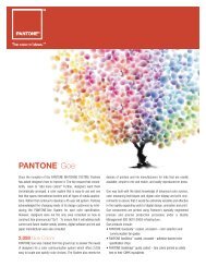
The PANTONE Goe System<br />
The PANTONE Goe System is a completely new<br />
color inspiration and specification system for the<br />
graphic arts industry including 2,058 new PANTONE<br />
Colors, plus modern tools and interactive software<br />
for multimedia color reproduction. Created to answer<br />
the color needs of graphic designers— from concept<br />
to execution—the new PANTONE Goe System offers<br />
total creative flexibility. It provides a comprehensive<br />
range of colors that are easy to locate and specify<br />
in analog and digital formats. And, using printed or<br />
digital palette cards, experimenting, finalizing and<br />
sharing color palettes in numerous ways is easy.<br />
PANTONE Fashion Color Report, Volume 29, February <strong>2008</strong><br />
<strong>Pantone</strong>, Inc., 590 Commerce Blvd., Carlstadt, NJ 07072-3098<br />
Tel: 201.935.5500. PANTONE Colors displayed here may not match<br />
PANTONE-identified standards. Consult current PANTONE FASHION+<br />
HOME Color System publications for accurate color. PANTONE ® and<br />
other <strong>Pantone</strong>, Inc. trademarks are the property of <strong>Pantone</strong>, Inc.<br />
<strong>Pantone</strong>, Inc. is a wholly-owned subsidiary of X-Rite, Incorporated.<br />
All other trademarks are the property of their respective owners.<br />
© <strong>Pantone</strong>, Inc., <strong>2008</strong>. All rights reserved.<br />
Design by John De Francesco<br />
www.pantone.com<br />
PANTONE ® fashion color report fall <strong>2008</strong>