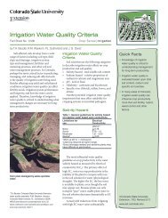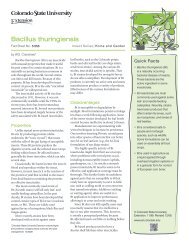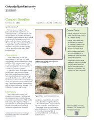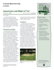
Poster Design Tips and Techniques - Colorado State University ...
Poster Design Tips and Techniques - Colorado State University ...
Poster Design Tips and Techniques - Colorado State University ...

Create successful ePaper yourself
Turn your PDF publications into a flip-book with our unique Google optimized e-Paper software.
<strong>Poster</strong> <strong>Design</strong><br />
<strong>Tips</strong> <strong>and</strong> <strong>Techniques</strong><br />
Overview<br />
We’ve all seen posters filled with<br />
tiny print, blurry images, <strong>and</strong><br />
disorganized text. Does anybody<br />
read them? A good poster is a<br />
well-positioned display of text <strong>and</strong><br />
images that communicates just<br />
the highlights of your program to<br />
a mobile audience. The primary<br />
goal of a poster is to inform, but<br />
it can also advertise or stimulate<br />
conversation about ideas <strong>and</strong><br />
concepts. It always markets your<br />
image <strong>and</strong> the image of your<br />
colleagues <strong>and</strong> institution.<br />
Whether you are creating a poster<br />
for a scientific conference or putting<br />
one together for a community<br />
event, the basics are still the same.<br />
A good poster:<br />
• Tells a story.<br />
• Can be read from more than 5<br />
feet away.<br />
• Is interesting <strong>and</strong> eye-catching.<br />
• Has a simple, uncluttered<br />
design.<br />
• Uses clear language <strong>and</strong><br />
images in a logical sequence.<br />
• Summarizes key points<br />
without excess detail.<br />
Research has shown that people<br />
rarely spend more than five minutes<br />
viewing individual posters–<br />
approximately one minute per<br />
panel–<strong>and</strong> that’s if they actually stop<br />
to read. To earn more than a passing<br />
glance, make your poster visually<br />
appealing <strong>and</strong> center it around a<br />
clear, bold message with a strong<br />
title. This is true both for traditional<br />
posters that have display panels<br />
attached to them, <strong>and</strong> for computergenerated<br />
“rollout” types where the<br />
entire poster is printed on a single<br />
large sheet.<br />
Slapping up a printout of your<br />
PowerPoint presentation or stapling<br />
most of your research paper to a<br />
board might be easy on you but it<br />
can frustrate your readers, who will<br />
quickly move on. Take the time to do<br />
it right. Boil your message down to a<br />
few key points <strong>and</strong> leave the heavier<br />
detail to the supplementary h<strong>and</strong>out<br />
you place in front of your poster.<br />
Because a poster reflects both you<br />
<strong>and</strong> your organization, it should<br />
always look professional, regardless<br />
of your audience.<br />
“The more I attend meetings <strong>and</strong> watch how people look<br />
at posters, the more I’ve seen that most people– scientists<br />
included–are lazy readers. They’ll look at the things that<br />
are neat <strong>and</strong> easy to look at <strong>and</strong> avoid those things that<br />
are overly complex <strong>and</strong> difficult to read.”<br />
“Looking at the conference posters that communicate<br />
well to you is a good start. I think the best thing to do<br />
is to literally st<strong>and</strong> in a corner at meetings, scientific or<br />
otherwise, <strong>and</strong> watch how people look at the posters. You<br />
can probably learn a lot just from that. Notice which ones<br />
you like. That’s what I’ve done.”<br />
Any products, services or organizations mentioned, shown or indirectly implied in this publication do not imply endorsement by<br />
<strong>Colorado</strong> <strong>State</strong> <strong>University</strong> Extension.<br />
May, 2010, updated December, 2010<br />
Reprinted with permission from the July 2002 <strong>University</strong> of Arizona College of Agriculture <strong>and</strong> Life Sciences publication: Creating Effective <strong>Poster</strong>s
Organizing Your<br />
Message for Your<br />
Audience<br />
Who do you want to reach <strong>and</strong> what<br />
do you want to tell them? A poster<br />
tells a story about your research<br />
results or your program. Determine<br />
who your target audience is <strong>and</strong> then<br />
decide what significant message you<br />
want them to get from your poster.<br />
• Define your audience.<br />
Is it scientists at a national<br />
conference? Clientele in the<br />
farming community? Members<br />
of the state legislature at a “Pride<br />
Night” event? How old is your<br />
audience, what is their level of<br />
education, <strong>and</strong> where are they<br />
from?<br />
• Decide what you want your<br />
audience to DO.<br />
Learn something new? Donate<br />
time or money? Pick up a<br />
h<strong>and</strong>out for more information?<br />
Attend a course or seminar? Buy<br />
something? Talk with the person<br />
staffing the poster?<br />
• Review the format you will follow.<br />
If it’s a research poster, you’ll use<br />
some version of the st<strong>and</strong>ard<br />
format: title, name, affiliation,<br />
full list of authors, introduction,<br />
problem, method, results <strong>and</strong><br />
conclusions. <strong>Poster</strong>s describing<br />
general programs are more<br />
freeform, but generally include<br />
a title, background information,<br />
purpose <strong>and</strong> description of<br />
program, actual or intended<br />
results, <strong>and</strong> contact information.<br />
• Write down a rough draft of the<br />
story you want to tell.<br />
Outline your points in a logical flow,<br />
using the clearest terms you can find.<br />
Briefly describe the issue, what was<br />
done about it, <strong>and</strong> what you learned<br />
or how people can participate.<br />
Identify the main point: if you had<br />
only one thing to tell your audience,<br />
what would it be? Choose key words<br />
<strong>and</strong> phrases <strong>and</strong> start tailoring the<br />
language to suit your audience. Use<br />
jargon <strong>and</strong> technical language only<br />
for an audience of specialists in your<br />
field. For everybody else–<strong>and</strong> this<br />
includes scientists who are NOT<br />
in your field–minimize jargon <strong>and</strong><br />
technical terms. For research posters,<br />
include only the major key results,<br />
not the entire history of the project.<br />
• Break your story into bullets <strong>and</strong><br />
blocks of information.<br />
Refine your rough draft by cutting<br />
out extraneous words <strong>and</strong> phrases<br />
<strong>and</strong> creating smaller text segments<br />
that you can put on display panels.<br />
Keep only the best statements, words<br />
<strong>and</strong> images that will attract your<br />
audience’s attention. Depending on<br />
the size of your poster, you should<br />
use no more than 7-12 clusters of<br />
information.<br />
• Choose photos <strong>and</strong> graphs or tables<br />
that support <strong>and</strong> explain your text.<br />
Avoid using anything that’s hard to<br />
figure out, i.e., too blurry, too dark,<br />
too complex. Show just enough data<br />
to explain your major conclusions.<br />
• Create logical transitions from one<br />
section to the next.<br />
Try putting a heading or a<br />
onesentence statement at the<br />
beginning of each major section. Or<br />
you may want to add numbers or<br />
arrows to the sections to assist the<br />
reader.<br />
• Choose an attention-grabbing title.<br />
This may be the only thing that<br />
differentiates your poster from 100<br />
others scattered around the room.<br />
• Proofread all text, including photo<br />
<strong>and</strong> graph captions.<br />
Check for mistakes in spelling,<br />
grammar <strong>and</strong> punctuation.<br />
• Optional: Prepare plementary items<br />
that will complement your display<br />
<strong>and</strong> suit your audience.<br />
Possibilities include copies of your<br />
research paper; journal articles; fact<br />
sheets; brochures; flyers; business<br />
cards; program souvenirs; video<br />
monitors with tapes.<br />
• Find out the exact size allotted for<br />
your poster.<br />
Wall-mounted scientific posters<br />
are generally 4 feet by 8 feet. Table<br />
mounted displays might be smaller.<br />
Check with conference organizers for<br />
the poster size, <strong>and</strong> whether you will<br />
supply the backing or board for your<br />
poster or if it will be provided for you<br />
at the conference. Community events<br />
often provide an 8-foot by 10-foot<br />
table for displays.<br />
• Sketch out your design <strong>and</strong> start<br />
laying out the poster components in<br />
a logical sequence on the floor or a<br />
large table.<br />
Print out your text, cut it up into<br />
sets of bullets, gather your photos<br />
<strong>and</strong> graphs. Block out the exact<br />
flow of information <strong>and</strong> images. Try<br />
arranging the display elements in<br />
rows from left to right or from top<br />
to bottom, or place them in a more<br />
circular fashion around a central idea,<br />
in a “sunburst” pattern.<br />
“A bad poster has too many words, too much text, no bullet format. The organization of<br />
information is not broken down properly <strong>and</strong> you can’t read it from a distance. A good<br />
poster is easy to read, eye-catching, has good color combinations <strong>and</strong> interesting points.”
<strong>Poster</strong> Layout <strong>and</strong> <strong>Design</strong><br />
Now that you have selected your<br />
target audience <strong>and</strong> developed your<br />
key message, you need to figure<br />
out how your poster will look <strong>and</strong><br />
which materials you’ll need.<br />
• Choose the type of poster you will<br />
create:<br />
A st<strong>and</strong>ard or modular poster has<br />
moveable display elements that are<br />
placed on a board. These can be<br />
attached permanently to a poster<br />
board, or transported in pieces <strong>and</strong><br />
assembled with pins or Velcro<br />
-type strips on a board at the<br />
conference.<br />
Advantage: You can alter the<br />
message to fit your audience,<br />
changing or moving panels <strong>and</strong><br />
graphic elements.<br />
Disadvantage: May be more<br />
difficult to transport; takes time to<br />
set up.<br />
A large format printout or rollout<br />
poster is printed in its entirety on a<br />
single roll of paper.<br />
Advantages: Easy to transport <strong>and</strong><br />
set up, if you don’t have to bring the<br />
backing board as well.<br />
Disadvantage: Cannot be altered to<br />
fit a smaller or larger space, or to<br />
target different audiences; you may<br />
be tempted to fill it up with too<br />
much text.<br />
“Resist the urge to use<br />
the same poster for<br />
very different types of<br />
audiences.”<br />
• Choose your design elements:<br />
typeface style <strong>and</strong> font size,<br />
background colors, graphics. Good<br />
design lets your meaning come<br />
through; poor design distracts or<br />
even repels the reader. Be creative,<br />
keeping the following points in<br />
mind:<br />
Choose a clear, dark font.<br />
Your typeface should be simple,<br />
clean <strong>and</strong> professional. A wellchosen<br />
font lets the meaning of the<br />
text shine through. Avoid ornate<br />
or italic fonts, <strong>and</strong> don’t use a lot of<br />
different font styles. Select one or<br />
two <strong>and</strong> use them consistently. If a<br />
commercial printing establishment<br />
is going to produce your poster,<br />
check immediately to find out<br />
which fonts <strong>and</strong> software they can<br />
accept, <strong>and</strong> how they want you<br />
to prepare your file. Don’t wait<br />
until the last minute or you may<br />
need to change everything. For<br />
more information on fonts, see the<br />
resources section on the back of<br />
this brochure.<br />
Use large text.<br />
All lettering should be legible<br />
from at least 5 feet away. Do not<br />
print titles or large blocks of text<br />
all in capital letters, <strong>and</strong> don’t<br />
use right margin justification.<br />
Recommended sizes:<br />
Title: Large, readable font, 72-point<br />
type or larger<br />
Author/collaborator names <strong>and</strong><br />
subheadings: Usually 48-point type<br />
or larger<br />
Narrative text: Generally 24-point<br />
type or larger<br />
Stick to black or dark letters on a<br />
white or light background.<br />
White letters on a black<br />
background are more difficult to<br />
read; so are texts in light colors.<br />
Use color sparingly <strong>and</strong><br />
thoughtfully.<br />
Too much color is confusing–“less<br />
is more.” One or two accent colors<br />
that are eye-catching <strong>and</strong> appealing<br />
can emphasize your subject <strong>and</strong><br />
clarify the different sections of your<br />
poster. Background color includes<br />
the color of the board the poster is<br />
mounted on, <strong>and</strong> the colored sheets<br />
you place behind your text. Check<br />
to find out what background color<br />
is provided. If you are bringing<br />
your own board you will have more<br />
control over the background color,<br />
which should be neutral.<br />
Choose photos, tables <strong>and</strong> other<br />
graphic elements that enhance<br />
the meaning of the text. Select<br />
photos no smaller than 5” x 7” (8”<br />
x 10” is better). Don’t use boring<br />
images of meetings <strong>and</strong> blurry<br />
subjects just to have a photo.<br />
Highlight the most important<br />
aspect of your poster with a cluster<br />
of images <strong>and</strong> color. Use charts <strong>and</strong><br />
graphs that are clear, legible <strong>and</strong><br />
easy to underst<strong>and</strong>, with captions if<br />
needed.<br />
Remember the 1/3-2/3 rule: 1/3<br />
white space, 2/3 text <strong>and</strong> images.<br />
Make sure it all flows in a pleasing<br />
format that is balanced around a<br />
central idea. All the components<br />
should work together.<br />
FONT SIZES:<br />
18 22 24 32 48 60 96pt.
Putting It All Together:<br />
Modular <strong>Poster</strong><br />
After designing your poster <strong>and</strong><br />
gathering the materials, it’s time to<br />
assemble it:<br />
• Cut out your display pieces, <strong>and</strong><br />
trim your photos <strong>and</strong> charts.<br />
Use a long, clear ruler with a lipped<br />
edge when cutting so that you can<br />
see your work as you go. Make<br />
straight cuts: dull blades or scissors<br />
leave ragged edges. Always use a<br />
sharp blade <strong>and</strong> work when you are<br />
alert to ensure straight, even edges.<br />
• Place all display elements in order.<br />
Use a board or a taped section on<br />
the floor or wall <strong>and</strong> step back to see<br />
how it looks. Take the time before<br />
you leave for the event to replace<br />
what doesn’t look right. If it doesn’t<br />
look right to you it definitely won’t<br />
look right to your audience. Have a<br />
peer critique it.<br />
• Write down your sequence of<br />
display elements or photograph<br />
your poster layout.<br />
Put it in a folder with your poster<br />
components (text, images <strong>and</strong><br />
background papers, pins <strong>and</strong> other<br />
fasteners) so you’ll remember how<br />
you want it to look when you start<br />
to construct the poster on site. A<br />
Polaroid or digital camera works<br />
well for this.<br />
• When transporting display items<br />
that have Velcro backing:<br />
be sure to pack them face to face<br />
so the Velcro does not scratch the<br />
printed panels.<br />
• When you construct the poster on<br />
site:<br />
Take a minute to step back <strong>and</strong> view<br />
the poster. Straighten any crooked<br />
pieces <strong>and</strong> remove anything that<br />
is distracting before your audience<br />
arrives.<br />
Putting It All Together:<br />
Large Format Printout <strong>Poster</strong><br />
• Print out a hard copy of your final<br />
poster version.<br />
Submit both the hard copy <strong>and</strong> a<br />
disk to the printer.<br />
• Make sure the word processing or<br />
graphics program you’re using is<br />
compatible with the commercial<br />
printer’s software.<br />
Use an acceptable font; certain<br />
fonts downloaded from the<br />
Internet may not work.<br />
THE DON’T LIST<br />
Resources–Web <strong>and</strong> Print<br />
• Choose the poster material best<br />
suited to your needs <strong>and</strong> budget.<br />
Large format posters can be<br />
produced on paper, with or<br />
without lamination, or printed on<br />
vinyl.<br />
• Allow enough lead time<br />
Most printers need at least 24-48<br />
hours.<br />
• Protect your poster<br />
Transport it rolled up in a tube.<br />
A good poster doesn’t need to be expensive but it does need to<br />
have a good design <strong>and</strong> an interesting message. Here’s what you<br />
should NEVER do:<br />
Don’t:<br />
• Use your actual research paper as the poster.<br />
• Use a text font smaller than 24 points.<br />
• Clutter the board with too much text or too many images.<br />
• Use too many different colors or patterns.<br />
• Use lots of jargon or boring language.<br />
• Make sloppy cuts on your panels.<br />
• Use light letters on a dark background.<br />
• Leave out the title, your institution, <strong>and</strong> your name.<br />
• Forget to proofread your poster.<br />
Some good sources on the Internet for creating posters include the following:<br />
• www.siam.org/meetings/guidelines/poster.php<br />
• www.writing.engr.psu.edu/posters.html<br />
Many professional societies have published guidelines on poster design.<br />
Here is example:<br />
The ACS Style Guide: A Manual for Authors <strong>and</strong> Editors, 2nd edition<br />
Janet S. Dodd, editor<br />
The American Chemical Society<br />
ISBN 0841234620<br />
For information on fonts <strong>and</strong> design:<br />
The Non-<strong>Design</strong>er’s <strong>Design</strong> Book, Robin Williams<br />
Peachpit Press, Berkeley, CA<br />
ISBN 1566091594