

Generating Type 1 Fonts from mEtaFoNt Sources - TUG
Generating Type 1 Fonts from mEtaFoNt Sources - TUG
Generating Type 1 Fonts from mEtaFoNt Sources - TUG

You also want an ePaper? Increase the reach of your titles
YUMPU automatically turns print PDFs into web optimized ePapers that Google loves.
<strong>Generating</strong> <strong>Type</strong> 1 <strong>Fonts</strong> <strong>from</strong> METAFONT <strong>Sources</strong><br />
path (like METAFONT’s cycle) andendchar to do<br />
the actual drawing. ND functions as def: it defines<br />
the command ‘M’ (<strong>from</strong> the first line) to mean ‘do<br />
everything between the braces’ (remember this is<br />
reverse Polish notation).<br />
/BlueValues [ -12 0 600 611 ] ND<br />
/BlueScale 0.04379 def<br />
/BlueShift 7 def<br />
/BlueFuzz 1 def<br />
/MinFeature { 16 16 } ND<br />
/StdHW [ 60 ] ND<br />
/StdVW [ 66 ] ND<br />
/ForceBold false def<br />
Alignment zones. First off, alignment zones are<br />
defined by the array called/BlueValues. The values<br />
in the array define vertical zones by specifying two<br />
y coordinates for each zone. In this case, there are<br />
only the two areas between [−12, 0] and [600, 611],<br />
but there may be more entries.<br />
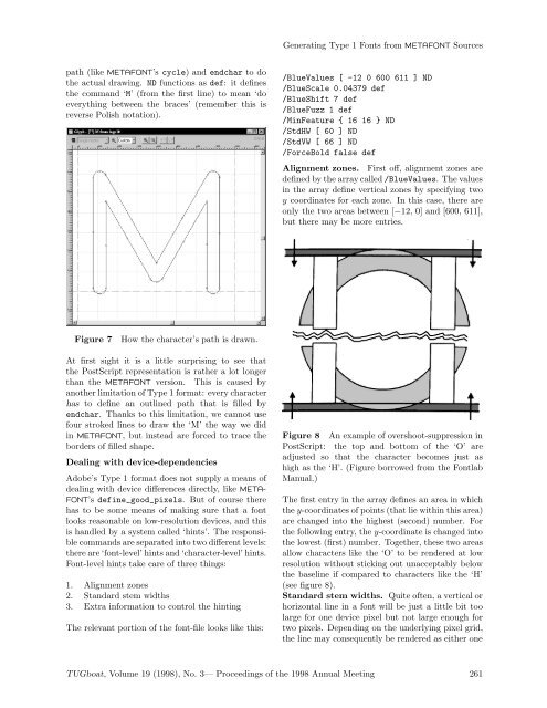
Figure 7 How the character’s path is drawn.<br />
At first sight it is a little surprising to see that<br />
the PostScript representation is rather a lot longer<br />
than the METAFONT version. This is caused by<br />
another limitation of <strong>Type</strong> 1 format: every character<br />
has to define an outlined path that is filled by<br />
endchar. Thanks to this limitation, we cannot use<br />
four stroked lines to draw the ‘M’ the way we did<br />
in METAFONT, but instead are forced to trace the<br />
borders of filled shape.<br />
Dealing with device-dependencies<br />
Adobe’s <strong>Type</strong> 1 format does not supply a means of<br />
dealing with device differences directly, like META-<br />
FONT’s define_good_pixels. But of course there<br />
has to be some means of making sure that a font<br />
looks reasonable on low-resolution devices, and this<br />
is handled by a system called ‘hints’. The responsible<br />
commands are separated into two different levels:<br />
there are ‘font-level’ hints and ‘character-level’ hints.<br />
Font-level hints take care of three things:<br />
1. Alignment zones<br />
2. Standard stem widths<br />
3. Extra information to control the hinting<br />
The relevant portion of the font-file looks like this:<br />
Figure 8 An example of overshoot-suppression in<br />
PostScript: the top and bottom of the ‘O’ are<br />
adjusted so that the character becomes just as<br />
high as the ‘H’. (Figure borrowed <strong>from</strong> the Fontlab<br />
Manual.)<br />
The first entry in the array defines an area in which<br />
the y-coordinates of points (that lie within this area)<br />
are changed into the highest (second) number. For<br />
the following entry, the y-coordinate is changed into<br />
the lowest (first) number. Together, these two areas<br />
allow characters like the ‘O’ to be rendered at low<br />
resolution without sticking out unacceptably below<br />
the baseline if compared to characters like the ‘H’<br />
(see figure 8).<br />
Standard stem widths. Quite often, a vertical or<br />
horizontal line in a font will be just a little bit too<br />
large for one device pixel but not large enough for<br />
two pixels. Depending on the underlying pixel grid,<br />
the line may consequently be rendered as either one<br />
<strong>TUG</strong>boat, Volume 19 (1998), No. 3— Proceedings of the 1998 Annual Meeting 261


