

Generating Type 1 Fonts from mEtaFoNt Sources - TUG
Generating Type 1 Fonts from mEtaFoNt Sources - TUG
Generating Type 1 Fonts from mEtaFoNt Sources - TUG

Create successful ePaper yourself
Turn your PDF publications into a flip-book with our unique Google optimized e-Paper software.
<strong>Generating</strong> <strong>Type</strong> 1 <strong>Fonts</strong> <strong>from</strong> METAFONT <strong>Sources</strong><br />
Taco Hoekwater<br />
Kluwer Academic Publishers<br />
Dordrecht<br />
taco.hoekwater@wkap.nl<br />
Abstract<br />
This article makes a comparison between bitmapped and vector fonts, and presents some<br />
of the problems I encountered when I tried to convert METAFONT sources into PostScript<br />
<strong>Type</strong> 1 fonts.<br />
The second part of this article will focus more closely on some of the problems<br />
that I faced while trying to convert METAFONTs into PostScript <strong>Type</strong> 1 fonts, but first<br />
some explanation is in order as to why one might want to do this conversion, and<br />
precisely what this conversion entails. These topics are the subjects of the first couple<br />
of paragraphs.<br />
What are METAFONT <strong>Fonts</strong>?<br />
How characters are created<br />
I’ll assume the reader knows the following: every<br />
TEX distribution has a program called METAFONT,<br />
that compiles font sources more or less the same<br />
way that the TEX program compiles text sources.<br />
A major difference between the two programs is<br />
that METAFONT produces device--dependent output<br />
(called pk files), whereas TEX produces device--<br />
independent output (also known as dvi files).<br />
Let’s look into the font sources that METAFONT<br />
uses, and see what kind of information they contain.<br />
These are ordinary ASCII files just like TEX sources,<br />
so it was easy to insert a listing of one of these<br />
files. The file that contains the METAFONT logo<br />
font (logo10.mf) suits our purpose quite well, since<br />
it is a rather simple font that probably everybody<br />
has available:<br />
font_size:= 10pt# ;<br />
ht# :=6pt# ;<br />
xgap# :=0.6pt#;<br />
u# :=4/9pt#;<br />
s# :=0 ;<br />
o# :=1/9pt#;<br />
px# :=2/3pt#;<br />
input logo<br />
bye<br />
What do we see here? First there are a bunch of<br />
assignments (the lines that contain:=), then there is<br />
an input (this command functions the same way as<br />
TEX’s\input, so it will start reading the filelogo.mf<br />
next), and finally the last command is bye.<br />
The filelogo.mf contains the actual commands<br />
to create the characters. It helps to run METAFONT<br />
now to see what is going on. Just type the following<br />
to a system command prompt:<br />
mf logo10<br />
Probably you didn’t have to worry about where<br />
the logo10.mf file is on your hard disk, since<br />
most METAFONT implementations can do recursive<br />
directory searches just like TEX.<br />
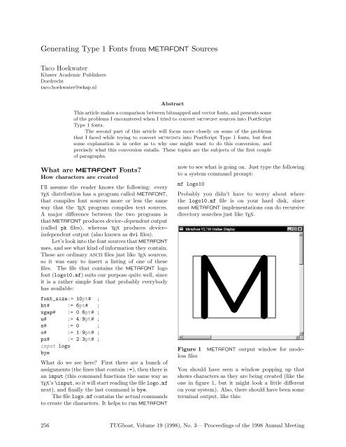
Figure 1 METAFONT output window for modeless<br />
files<br />
You should have seen a window popping up that<br />
shows characters as they are being created (like the<br />
one in figure 1, but it might look a little different<br />
on your system). Also, there should have been some<br />
terminal output, like this:<br />
256 <strong>TUG</strong>boat, Volume 19 (1998), No. 3— Proceedings of the 1998 Annual Meeting
<strong>Generating</strong> <strong>Type</strong> 1 <strong>Fonts</strong> <strong>from</strong> METAFONT <strong>Sources</strong><br />
This is METAFONT, Version 2.718 (Web2c<br />
7.2beta7) (logo10.mf (logo.mf [77] [69]<br />
[84] [65] [70] [80] [83] [79] [78]) )<br />
Output written on logo10.2602gf (9<br />
characters, 98 80 bytes).<br />
Transcript written on logo10.log.<br />
The numbers you see are the positions of the<br />
characters in the font. For the METAFONT logo font,<br />
these are the positions of the used characters in the<br />
ASCII table:M,E,T,A,F,P,S,O,N.Asyoucan<br />
see, they can appear in any order within the source<br />
files.<br />
The file METAFONT has written is not precisely<br />
the same as the output on your screen, instead it<br />
looks like figure 2. Not really usable when it comes<br />
to typesetting text, but it contains some pretty<br />
valuable information nevertheless.<br />
2<br />
1<br />
3<br />
Figure 2 Metafont output file for modeless files<br />
Have a look at the logo.mf file if you are interested<br />
in the nitty--gritty details. I will use only a small<br />
portion of that file to make some remarks about<br />
METAFONT. First, here is the edited program text<br />
I will use to explain things. (This is no longer valid<br />
METAFONT input, so don’t start keying it in):<br />
mode_setup;<br />
define_pixels(s,u);<br />
ygap#:=(ht#/13.5u#)*xgap#;<br />
define_whole_pixels(xgap);<br />
define_whole_vertical_pixels(ygap);<br />
py#:=.9px#;<br />
define_blacker_pixels(px,py);<br />
pickup pencircle xscaled px yscaled py;<br />
logo_pen:=savepen;<br />
4<br />
5<br />
leftstemloc#:=2.5u#+s#;<br />
define_good_x_pixels(leftstemloc);<br />
beginlogochar("M",18);<br />
x1 = x2 = leftstemloc;<br />
x4 = x5 = w - x1;<br />
x3 = w - x3;<br />
y1 = y5;<br />
y2 = y4;<br />
bot y1 = 0;<br />
top y2 = h;<br />
y3 = ygap;<br />
draw z1--z2--z3--z4--z5;<br />
labels(1,2,3,4,5);<br />
endchar;<br />
Let us first look at the line that begins with<br />
beginlogochar, because this is where the real work<br />
is done. This portion of the source defines the letter<br />
‘M’ in the font. What we see here is that characters<br />
are specified by first setting up a bunch of equations<br />
(the lines that have equal signs in them), followed<br />
by a draw command that connects those points,<br />
actually drawing the character.<br />
We won’t go deeply into METAFONT syntax,<br />
but it is vital to understand the following: a point<br />
is defined as a pair of x and y coordinates. In META-<br />
FONT syntax, points are sequentially numbered per<br />
character, starting <strong>from</strong> 1. z1 is the notation for<br />
point 1. Notations like x1 and y2 specify the x-<br />
component of point 1 and the y-component of point<br />
2, respectively.<br />
beginlogochar says that the ‘M’ is precisely<br />
18u (units) wide, andlogo10.mf has set up one u to<br />
be 4/9pt, so the actual character is 4/9×18pt = 8pt<br />
wide.<br />
TEX and METAFONT have the same author, and<br />
it shows: METAFONT can do macros just as easily as<br />
TEX can. Macros can have arguments, define other<br />
macros and assign values to things, just like in TEX.<br />
beginlogochar is in fact one of those macros, and<br />
it assigns some pretty important values when it gets<br />
expanded by METAFONT. For one, it defines w to<br />
be the width we calculated above, and it defines h<br />
to be the height of the character (calculated <strong>from</strong><br />
ht# in logo10.mf, which equals 6pt).<br />
From the values of u and s, it now follows that<br />
leftstemloc equals (2.5 × 4/9) + 0 = 10/9pt. The<br />
last value we have left is ygap = (ht/13.5u)*xgap.<br />
ht and xgap have been given in the ‘driver’ file<br />
logo10.mf, and after some small calculations ygap<br />
becomes (6pt ÷ (13.5 × 4/9pt × 0.6pt)) = 0.6pt.<br />
It should now be easy to come to the conclusion<br />
that the equations fix the precise x, y locations of the<br />
<strong>TUG</strong>boat, Volume 19 (1998), No. 3— Proceedings of the 1998 Annual Meeting 257
Taco Hoekwater<br />
five points that denote the character ‘M’, albeit in a<br />
slightly indirect manner. If we fill in the values we<br />
derived above, we get the following:<br />
x1 = x2 = 10/9pt;<br />
x4 = x5 = 8pt - x1;<br />
x3 = 8pt - x3;<br />
y1 = y5;<br />
y2 = y4;<br />
bot y1 = 0pt;<br />
top y2 = 6pt;<br />
y3 = 0.6pt;<br />
After METAFONT has calculated these equalities for<br />
us, and with some minor reshuffling of the input, we<br />
get the following end-result:<br />
x1 = 10/9pt ; bot y1 = 0pt ;<br />
x2 = 10/9pt ; top y2 = 6pt ;<br />
x3 = 4pt ; y3 = 0.6pt;<br />
x4 = 62/9pt ; top y4 = 6pt ;<br />
x5 = 62/9pt ; bot y5 = 0pt ;<br />
2<br />
1<br />
3<br />
Figure 3 Metafont output file for modeless files,<br />
hand--calculated version<br />
We could have typed this in right away, and META-<br />
FONT would have been just as happy. The end<br />
result would have been the same, as can be seen<br />
in figure 3. 1 But why do the calculation yourself if<br />
the machine can do it for you?<br />
METAFONT’s ability to do the needed calculations<br />
all by itself is one of its most important strong<br />
points. Combined with macros and separate input<br />
files, it becomes possible to use various fonts with<br />
the same shared sources. In such a ‘font’, the only<br />
file that is different between various versions of the<br />
font is the ‘driver’ file, that assigns different values<br />
to the same parameters. METAFONT’s calculations<br />
will have different results, so that some of points will<br />
end up in slightly different locations. The resulting<br />
4<br />
5<br />
font will be similar in style but may still differ in<br />
lots of ways.<br />
Creating a full font<br />
Usually, fonts are not just a bunch of characters.<br />
There also is some other metric information included<br />
in almost every font. The final section of our<br />
example file (at the end, after all the characters have<br />
been defined) contains the following lines:<br />
ligtable "T": "A" kern -.5u#;<br />
ligtable "F": "O" kern -u#;<br />
ligtable "P": "O" kern u#;<br />
font_quad:=18u#+2s#;<br />
font_normal_space:=6u#+2s#;<br />
font_normal_stretch:=3u#;<br />
font_normal_shrink:=2u#;<br />
font_identifier:="MFLOGO" ;<br />
font_coding_scheme:="AEFMNOPST only";<br />
The first three lines belong to the ‘ligature table’.<br />
Usually it will contain both real ligatures and the<br />
kerning information for the font, but because this is<br />
a very simple font, there are only three really simple<br />
kerning pairs.<br />
The next lines define TEX’s \fontdimen values:<br />
how wide a space will be and how much it can stretch<br />
and shrink, and some other information that will<br />
appear in the created font but is generally not used<br />
by programs.<br />
Dealing with device dependence<br />
Now let’s have a look at the device dependent<br />
calculations that METAFONT does. Here is the<br />
relevant portion of the example again:<br />
mode_setup;<br />
define_pixels(s,u);<br />
ygap#:=(ht#/13.5u#)*xgap#;<br />
define_whole_pixels(xgap);<br />
define_whole_vertical_pixels(ygap);<br />
py#:=.9px#;<br />
define_blacker_pixels(px,py);<br />
There are, in fact, two kinds of device dependence<br />
that need to be dealt with. The mode_setup line<br />
takes care of the first kind of device dependence:<br />
the effects that the actual hardware of the printing<br />
engine can have on the printed font.<br />
The most obvious difference between any two<br />
printing devices is of course the resolution, but there<br />
1 Actually, figure 3 is not completely identical to figure 2,<br />
because in my example I cheated with the calculations a<br />
bit to keep the explanation simple.<br />
258 <strong>TUG</strong>boat, Volume 19 (1998), No. 3— Proceedings of the 1998 Annual Meeting
<strong>Generating</strong> <strong>Type</strong> 1 <strong>Fonts</strong> <strong>from</strong> METAFONT <strong>Sources</strong><br />
are other problems as well. Since we prefer our<br />
output to look as close to our intended font as<br />
possible, usually a certain amount of correction is<br />
needed based on (i.e.) whether the device is going<br />
to be an inkjet printer or a laser typesetter.<br />
mode_setup cannot do this all by itself, and this<br />
is why you usually have to specify somewhere what<br />
printer you are using. Programs like dvips will call<br />
METAFONT with a command like:<br />
mf \mode=ljfour; mag=1; input logo10<br />
If we forget about that first backslash, we can<br />
see that there are two assignments and one input<br />
command on this line. The second assignment<br />
differs <strong>from</strong> 1 when a font is called within TEX using<br />
a command like<br />
\font\logohuge = logo10 at 20pt<br />
In that case, the assignment would be mag=2. The<br />
other assignment is far more interesting. META-<br />
FONT usually starts with a ‘format’ file similar to<br />
the fmt files TEX uses, and somewhere in the sources<br />
for those format files there are some definitions like<br />
this:<br />
mode_def cx =<br />
mode_param (pixels_per_inch, 300);<br />
mode_param (blacker, 0);<br />
mode_param (fillin,.2);<br />
mode_param (o_correction,.6);<br />
mode_common_setup_;<br />
enddef;<br />
Figure 4 An example of two different imaging<br />
models.<br />
All parameters besidespixels_per_inch are a little<br />
too technical to explain in detail in a short article<br />
like this one, but figure 4 tries to explain that these<br />
values really do depend on the printing engine. The<br />
drawing on the left shows a more or less standard<br />
inkjet, that shoots dots of (black) ink on the paper.<br />
The right drawing shows a (hypothetical) printing<br />
device with a radically different approach. This<br />
machine pours light on a photographic film through<br />
a raster, creating a negative image. There are still<br />
round dots, but they are inverted! It is easy to<br />
imagine that this radically different technique can<br />
have quite an impact on the resulting image.<br />
One effect that is very easy to see <strong>from</strong> the<br />
(admittedly very badly drawn) figure is that the<br />
inside corners in the right drawing are a lot blacker<br />
than in the left one. This sort of thing happens<br />
all the time in real life printing, but it often goes<br />
unnoticed because people tend to have only one<br />
printer.<br />
The second device dependency is not really related<br />
to printers at all, but is caused simply by the fact<br />
that METAFONT outputs a pixel bitmap. Although<br />
METAFONT does its calculations with a very high<br />
accuracy, this does not help at all if there are simply<br />
not enough pixels to display the character. The<br />
commands that look like define_xxx_pixels take<br />
care of this kind of dependency, whose effects can<br />
be seen in figure 5.<br />
Figure 5 The character on the right has been<br />
created with all the define xxx pixels commands<br />
removed <strong>from</strong> the source.<br />
The sub-optimal distribution of pixels in this example<br />
is caused by the underlying pixel grid that can<br />
not be changed.<br />
What are <strong>Type</strong> 1 fonts?<br />
How PostScript fonts are created<br />
PostScript <strong>Type</strong> 1 fonts are quite different <strong>from</strong><br />
METAFONT fonts. Usually, <strong>Type</strong> 1 fonts are created<br />
in a wysiwyg environment with a drawing program<br />
that is only suited for the creation of fonts. Figure 6<br />
shows the program I usually use.<br />
The graphical user interface nicely shields the<br />
designer <strong>from</strong> what is happening behind the scenes,<br />
so we need to look into the generated files themselves<br />
if we want to get more information. On Windows<br />
and Unix systems, the actual fonts are saved in<br />
a binary file with the extension pfb (short for<br />
PostScript Font Binary), and the metric information<br />
in an ascii file with extension afm (short for Adobe<br />
Font Metrics).<br />
<strong>TUG</strong>boat, Volume 19 (1998), No. 3— Proceedings of the 1998 Annual Meeting 259
Taco Hoekwater<br />
Figure 6 An interactive font editor: Fontlab<br />
version 3<br />
What a <strong>Type</strong> 1 font looks like 2<br />
The binary representation of a <strong>Type</strong> 1 font is just<br />
a compressed version of the non-compressed ascii<br />
format, with extension pfa. So we need a program<br />
that will do the decompression for us. One of the<br />
programs that can do this is T1ascii <strong>from</strong> the<br />
T1Utils package. But running this programs leaves<br />
us with a hexadecimal encrypted file. In the early<br />
days, the encryption key was a trade secret of Adobe<br />
Incorporated. This key is now freely available, but<br />
the file format still reflects the past. Yet another<br />
program <strong>from</strong> the T1Utils can convert this form to<br />
real human-readable PostScript: T1disasm. Nowwe<br />
can look at the generated PostScript file to see how<br />
the ‘M’ is defined in <strong>Type</strong> 1 format:<br />
/M {<br />
78 800 hsbw<br />
611 -20 hstem<br />
-11 21 hstem<br />
0 66 vstem<br />
578 66 vstem<br />
581 595 rmoveto<br />
-259 -450 rlineto<br />
-259 450 rlineto<br />
-6 9 -12 7 -12 0 rrcurveto<br />
-16 -17 -12 -17 hvcurveto<br />
-563 vlineto<br />
-17 15 -13 18 vhcurveto<br />
19 14 13 17 hvcurveto<br />
439 vlineto<br />
76 -131 75 -131 75 -131 rrcurveto<br />
5 -10 12 -6 13 0 rrcurveto<br />
1408888rrcurveto<br />
75 131 75 131 76 131 rrcurveto<br />
-439 vlineto<br />
-17 14 -13 19 vhcurveto<br />
18 15 13 17 hvcurveto<br />
562 vlineto<br />
17 -17 13 -16 vhcurveto<br />
-12 0 -12 -5 -6 -11 rrcurveto<br />
closepath<br />
endchar<br />
}ND<br />
The code looks enough like normal PostScript to<br />
recognize it at first glance, but the commands<br />
themselves are not the same ones you would use in<br />
everyday graphics. The PostScript language uses<br />
reverse Polish notation for its commands, so you<br />
should read backwards, starting at the end of the<br />
line. 581 595 rmoveto means ‘move to the point<br />
with coordinates (581, 595).<br />
All values are given in a coordinate system<br />
that maps 1000 units to one em. The nullpoint<br />
lies at the lower left corner. When one uses a<br />
PostScript font in a PostScript language program,<br />
the coordinate system is initially scaled in a way<br />
such that 1000 units equal precisely 1bp. The<br />
values used to describe points and intermediate<br />
values can be negative, but never partial. This need<br />
for discrete values can be a major problem when<br />
converting METAFONT fonts, as we will see later on.<br />
Now let’s have a short look at the used commands.<br />
The command hsbw sets up the width<br />
information for this character (the first number is<br />
the left sidebearing distance, the second number the<br />
advance width). The commands that end in stem<br />
are used by the hinting system. The whole collection<br />
of commands that look likexlineto andxxcurveto<br />
are shortcuts for the ordinary PostScript commands<br />
lineto and curveto: these draw the actual outline.<br />
All of these drawing commands are always relative<br />
to the ‘current point’. The last couple of commands<br />
end the character: closepath to close the defined<br />
2 This section is loosely borrowed <strong>from</strong> Erik-Jan Vens’<br />
article “Incorporating PostScript fonts in TEX”, EuroTEX<br />
proceedings 1992, pp. 173–181.<br />
260 <strong>TUG</strong>boat, Volume 19 (1998), No. 3— Proceedings of the 1998 Annual Meeting
<strong>Generating</strong> <strong>Type</strong> 1 <strong>Fonts</strong> <strong>from</strong> METAFONT <strong>Sources</strong><br />
path (like METAFONT’s cycle) andendchar to do<br />
the actual drawing. ND functions as def: it defines<br />
the command ‘M’ (<strong>from</strong> the first line) to mean ‘do<br />
everything between the braces’ (remember this is<br />
reverse Polish notation).<br />
/BlueValues [ -12 0 600 611 ] ND<br />
/BlueScale 0.04379 def<br />
/BlueShift 7 def<br />
/BlueFuzz 1 def<br />
/MinFeature { 16 16 } ND<br />
/StdHW [ 60 ] ND<br />
/StdVW [ 66 ] ND<br />
/ForceBold false def<br />
Alignment zones. First off, alignment zones are<br />
defined by the array called/BlueValues. The values<br />
in the array define vertical zones by specifying two<br />
y coordinates for each zone. In this case, there are<br />
only the two areas between [−12, 0] and [600, 611],<br />
but there may be more entries.<br />
Figure 7 How the character’s path is drawn.<br />
At first sight it is a little surprising to see that<br />
the PostScript representation is rather a lot longer<br />
than the METAFONT version. This is caused by<br />
another limitation of <strong>Type</strong> 1 format: every character<br />
has to define an outlined path that is filled by<br />
endchar. Thanks to this limitation, we cannot use<br />
four stroked lines to draw the ‘M’ the way we did<br />
in METAFONT, but instead are forced to trace the<br />
borders of filled shape.<br />
Dealing with device-dependencies<br />
Adobe’s <strong>Type</strong> 1 format does not supply a means of<br />
dealing with device differences directly, like META-<br />
FONT’s define_good_pixels. But of course there<br />
has to be some means of making sure that a font<br />
looks reasonable on low-resolution devices, and this<br />
is handled by a system called ‘hints’. The responsible<br />
commands are separated into two different levels:<br />
there are ‘font-level’ hints and ‘character-level’ hints.<br />
Font-level hints take care of three things:<br />
1. Alignment zones<br />
2. Standard stem widths<br />
3. Extra information to control the hinting<br />
The relevant portion of the font-file looks like this:<br />
Figure 8 An example of overshoot-suppression in<br />
PostScript: the top and bottom of the ‘O’ are<br />
adjusted so that the character becomes just as<br />
high as the ‘H’. (Figure borrowed <strong>from</strong> the Fontlab<br />
Manual.)<br />
The first entry in the array defines an area in which<br />
the y-coordinates of points (that lie within this area)<br />
are changed into the highest (second) number. For<br />
the following entry, the y-coordinate is changed into<br />
the lowest (first) number. Together, these two areas<br />
allow characters like the ‘O’ to be rendered at low<br />
resolution without sticking out unacceptably below<br />
the baseline if compared to characters like the ‘H’<br />
(see figure 8).<br />
Standard stem widths. Quite often, a vertical or<br />
horizontal line in a font will be just a little bit too<br />
large for one device pixel but not large enough for<br />
two pixels. Depending on the underlying pixel grid,<br />
the line may consequently be rendered as either one<br />
<strong>TUG</strong>boat, Volume 19 (1998), No. 3— Proceedings of the 1998 Annual Meeting 261
Taco Hoekwater<br />
stems, and two ‘ghost’ horizontal stems. Figure 10<br />
shows the graphical representation of this character<br />
in the font editor.<br />
Figure 9 The desired result. (This figure is also<br />
borrowed <strong>from</strong> the Fontlab Manual.)<br />
or two pixels.<br />
In these problematic characters, we want to<br />
make sure at least that verticals and horizontals that<br />
are intended to have the same width throughout the<br />
font use the same number of pixels. This is done<br />
by pre-defining the widths that are supposed to be<br />
identical. The commands that pass this information<br />
to the renderer are StdVW and StdHW. The effect<br />
that a correct setting of these values has on the<br />
rendering of the font can be seen in figure 9 (Like<br />
all hinting information, these values are ignored if<br />
the stem widths are larger than three device pixels–<br />
approximating 1200 dpi for the average font. As a<br />
result, output at 1200 dpi on a new device sometimes<br />
looks inferior to the 600 dpi version for the trained<br />
eye.).<br />
Extra information to control the hinting.<br />
There are some extra commands in the example that<br />
we haven’t covered yet: the three Bluexxxx commands<br />
define (amongst other things) the pointsize<br />
below which overshoot suppression is turned on, and<br />
a fuzzy correction on the values of the alignment<br />
zones. ForceBold is used with bold fonts to make<br />
sure that they will stay at least two pixels wide at<br />
low resolutions (otherwise they would look identical<br />
to the non-bold version at small sizes).<br />
The character-level hints are handled by the commands<br />
<strong>from</strong> the top of the listing given previously:<br />
611 -20 hstem<br />
-11 21 hstem<br />
0 66 vstem<br />
578 66 vstem<br />
These define horizontal and vertical stem zones. The<br />
first number says at which coordinate to start, the<br />
second number the width to use <strong>from</strong> there. In this<br />
case (remember this is an ‘M’) there are two vertical<br />
Figure 10 The character ‘M’ <strong>from</strong> the META-<br />
FONT logo font, with PostScript hints added<br />
The ‘ghost’ stems are inserted because without them<br />
the overshoot suppression wouldn’t work.<br />
Whywewanttoconvertto<strong>Type</strong>1<br />
Now that we have looked briefly into both formats,<br />
it is obvious that conversion <strong>from</strong> METAFONT input<br />
syntax to PostScript definitions is not going to be<br />
easy. METAFONT is apparently a lot smarter than<br />
the <strong>Type</strong> 1 interpreter, much better suited to handle<br />
device dependencies, and more accurate.<br />
So, why bother at all? For practical reasons,<br />
of course. The most important incentive is the<br />
on-screen display of generated PDF files. Adobe’s<br />
Reader is very bad at displaying bitmapped fonts,<br />
so files with only <strong>Type</strong> 1 fonts look a lot better. As it<br />
is, there are quite a few METAFONT fonts that don’t<br />
(yet) have a <strong>Type</strong> 1 counterpart, so necessarily lots<br />
of TEX-generated PDF files use bitmaps.<br />
There also is another interesting motive: designing<br />
high quality fonts in METAFONT syntax is<br />
a lot easier than creating <strong>Type</strong> 1 fonts of the same<br />
quality in an interactive editor (not to mention the<br />
fact that interactive programs usually crash at every<br />
second mouse click).<br />
262 <strong>TUG</strong>boat, Volume 19 (1998), No. 3— Proceedings of the 1998 Annual Meeting
<strong>Generating</strong> <strong>Type</strong> 1 <strong>Fonts</strong> <strong>from</strong> METAFONT <strong>Sources</strong><br />
Tasks to be handled by the<br />
conversion process<br />
Various things need to be taken care of by the<br />
conversion, but the three major parts are:<br />
1. Resolving the equations in the METAFONT<br />
sources.<br />
2. Converting stroked paths into outlined paths.<br />
3. Insertion of <strong>Type</strong> 1 style hinting information.<br />
Resolving the equations in the METAFONT<br />
sources<br />
The first item is easy to do with an already existing<br />
program: METAPOST. METAPOST is a program by<br />
John Hobby (co-author of METAFONT) that accepts<br />
METAPOST input syntax and outputs an Encapsulated<br />
PostScript picture. For example, running<br />
METAPOST on the logo fonts (using precisely the<br />
same syntax as for METAFONT) gives the following<br />
output:<br />
%!PS<br />
%%BoundingBox: 0 -1 8 7<br />
%%Creator: MetaPost<br />
%%CreationDate: 1998.05.10:1535<br />
%%Pages: 1<br />
%%EndProlog<br />
%%Page: 1 1<br />
0.66418 0 dtransform exch truncate<br />
exch idtransform pop setlinewidth<br />
[] 0 setdash<br />
1 setlinecap<br />
1 setlinejoin<br />
10 setmiterlimit<br />
gsave<br />
newpath<br />
1.10696 0.18819 moveto<br />
1.10696 5.78938 lineto<br />
3.98503 0.78595 lineto<br />
6.8631 5.78938 lineto<br />
6.8631 0.18819 lineto<br />
1 0.9 scale<br />
stroke<br />
grestore<br />
showpage<br />
%%EOF<br />
The PostScript code contained in this file is not that<br />
hard. The first few lines are just comments. The<br />
two lines that end with setlinewidth do nothing<br />
except setting the line width for strokes. It looks<br />
complex, but the code is always the same, the only<br />
things in these two lines that ever change are the<br />
two numbers.<br />
The next lines set up some values of the<br />
PostScript graphics state that do not always have<br />
a predefined value (this is just a security measure).<br />
These lines also never change. newpath is the first<br />
command that is interesting: starting <strong>from</strong> here<br />
the character is defined. Indeed, there is only one<br />
moveto, followed by four straight lines, and finally a<br />
stroke.<br />
It would be a little bit easier if the calculated<br />
values were given in units of a thousand per em,and<br />
this can be done by inserting a different mode_def.<br />
Basically, we ask METAPOST to generate a normal<br />
font file, but at a magnification of 100.375. This<br />
gives us an end result in PostScript big points, and<br />
the generated character will now look like this (some<br />
comments and irrelevant lines stripped):<br />
%!PS<br />
%%BoundingBox: 77 -12 723 612<br />
66.66722 0 dtransform exch truncate<br />
exch idtransform pop setlinewidth<br />
gsave newpath 111.1115 18.88889 moveto<br />
111.1115 581.11142 lineto<br />
399.99867 78.88953 lineto<br />
688.88585 581.11142 lineto<br />
688.88585 18.88889 lineto<br />
1 0.90001 scale stroke grestore<br />
showpage<br />
%%EOF<br />
Good. This is starting to look like something we<br />
could use. Ideally, we would prefer an output in<br />
rounded numbers, but that is not possible.<br />
Converting stroked paths into outlined<br />
paths<br />
Mr. Kinch (author of TrueTEX) has written a program<br />
called Metafog that converts METAPOST output<br />
as in the example above into the format required<br />
by the <strong>Type</strong> 1 specifications. At the moment, the<br />
program is only available as an optional extra with<br />
TrueTEX, but correspondence with Mr. Kinch indicate<br />
that it is very likely that this program will soon<br />
be available separately.<br />
Metafog reads the METAPOST EPS file, and<br />
converts this into another EPS file. It also displays<br />
some debugging information about the character on<br />
the terminal:<br />
interp: "scale" implies elliptical pen, \<br />
66.7 x 6 0.0<br />
o: scaffolded TRUE<br />
reduce: reducing shape 1 of 2<br />
reduce: reducing shape 2 of 2<br />
<strong>TUG</strong>boat, Volume 19 (1998), No. 3— Proceedings of the 1998 Annual Meeting 263
Taco Hoekwater<br />
ie<br />
if<br />
id<br />
ic<br />
wj<br />
wk<br />
wi<br />
wh<br />
se<br />
sf<br />
sd<br />
sc<br />
wg<br />
sn<br />
wz<br />
wr<br />
sg<br />
ws<br />
sh<br />
sm<br />
wt<br />
wy<br />
si sl<br />
sj sk<br />
wu wx<br />
wv ww<br />
cl<br />
wn<br />
wm<br />
cm<br />
ig co ib<br />
ih ia<br />
wo<br />
wq<br />
cn<br />
wp<br />
Page 1--Initial Input Contour<br />
Figure 11 Metafog output file, page 1<br />
duplicate: scaffolded<br />
try_point: 0.01 value scaffold<br />
reduce: reducing shape 3 of 2<br />
.....<br />
reduce: reducing shape 5 of 4<br />
Plotting page 1 (Initial Input Contour) \<br />
... done plotting.<br />
reduce: reducing shape 1 of 1<br />
reduce: reducing shape 2 of 1<br />
Plotting page 2 (Final Result Contour) \<br />
... done plotting.<br />
Total knots used: 598 (a--wz), ~ 29% \<br />
indexable capacity<br />
The created files are pretty large, too large to<br />
include literally. This is because the file serves two<br />
purposes: it is the input format for another program<br />
(Makefont, also by Kinch) and it also shows the<br />
work that has been done by Metafog. The first page<br />
shows the result, the second page the initial input<br />
as Metafog saw it. (The output of one of these files<br />
is shown in figure 11 and figure 12.)<br />
All we have to do is run Metafog on all characters<br />
in the font. If everything went correctly, the<br />
next step in the process is running the Makefont<br />
Page 2--Final Result Contour<br />
Figure 12 Metafog output file, page 2<br />
program. But this is not always the case. Metafog<br />
has its flaws, and it is especially bad at handling<br />
complex characters. One of those trickier characters<br />
is given in figure 13.<br />
Figure 13 The character ‘X’ <strong>from</strong> Ralph Smith’s<br />
Formal Script<br />
In order to handle cases like this gracefully, Metafog<br />
has a special startup option that gives a half-way<br />
result: it cuts the supplied shape in pieces, but it<br />
does not try to remove parts that are not needed.<br />
264 <strong>TUG</strong>boat, Volume 19 (1998), No. 3— Proceedings of the 1998 Annual Meeting
<strong>Generating</strong> <strong>Type</strong> 1 <strong>Fonts</strong> <strong>from</strong> METAFONT <strong>Sources</strong><br />
There is yet another program in the Metafog suite<br />
that helps for the problematic characters.<br />
original METAFONT sources, but these are ignored<br />
by METAPOST, and subsequent portions of the<br />
conversion do not have access to them. This is<br />
the major reason for the need of a commercial font<br />
editor. <strong>Type</strong> 1 hinting is too complicated a process<br />
to rely on any non-interactive program to make the<br />
right choices.<br />
Another thing that must be checked, especially<br />
for symbolic fonts, is the turning direction of the<br />
subpaths. In PostScript, whether a path will be<br />
black or white depends on how the path turns:<br />
clockwise or counterclockwise. Metafog sometimes<br />
gets confused, and outputs a character in which<br />
two concentric circles both turn leftward (like in<br />
an ‘O’ or the diameter symbol <strong>from</strong> the Waldi<br />
Symbol font). In those cases, the character will be<br />
completely filled, which is of course wrong.<br />
Figure 14 Screendump of the weeder’s window<br />
This program is called the ‘weeder’ (figure 14). It<br />
is an interactive program that reads the half-way<br />
result Metafog created. The human operator now<br />
has to select the partial lines that are supposed to<br />
belong to the shape, and the weeder will write a<br />
finished file for use by Makefont (just like Metafog<br />
itself would have done if things had gone right the<br />
first time).<br />
For some fonts, one has to do almost every<br />
character ‘by hand’, for other fonts none at all.<br />
The point of view the machine has on what precisely<br />
denotes a complicated character can be rather<br />
unexpected: sometimes a character can look very<br />
simple to you but be almost impossible to process<br />
by Metafog (usually characters that use draw and<br />
fill commands that intersect somewhere). And the<br />
other way around also happens: large portions of the<br />
nash14 (arabic) font looked exceedingly complex to<br />
me, but were in fact handled by Metafog without<br />
any problems.<br />
Either way, eventually there will be EPS files<br />
available for all characters in the font. Makefont<br />
combines all of the separate files into one PostScript<br />
file, and the last step of the actual conversion process<br />
is running the T1Utils to get a binary representation<br />
that can be fed into a commercial font editor.<br />
Insertion of <strong>Type</strong> 1 style hinting<br />
information<br />
The pfb file created at the end of step two still has<br />
a couple of major flaws that need to be fixed. First<br />
and foremost among these: there are absolutely no<br />
<strong>Type</strong> 1 hints included. There were hints in the<br />
Figure 15 Paths that turn the wrong way<br />
The absolutely final step (so far I’ve needed to do<br />
this for every commercial font program I could find)<br />
is disassembling the pfb file, running a perl script to<br />
fix some incompatibilies/bugs in the used font editor<br />
and to insert a couple of workarounds for bugs in<br />
software that uses the font, and reassembling.<br />
What I have done already and<br />
future plans<br />
So far, I have converted four METAFONT fonts that<br />
I needed myself. The files that are now available<br />
<strong>from</strong> CTAN are:<br />
<strong>TUG</strong>boat, Volume 19 (1998), No. 3— Proceedings of the 1998 Annual Meeting 265
Taco Hoekwater<br />
logo wasy2 stmary rsfs<br />
All of these files reside in a subdirectory of the<br />
METAFONT sources, named ps-type1/hoekwater.<br />
Each directory also contains a README file that gives<br />
some detailed information about the font in question<br />
and its copyrights.<br />
Please take note of the fact that I only want<br />
to give support for problems that are intrinsically<br />
related to the .pfb files themselves. I don’t have<br />
enough spare time to help people with problems<br />
related to the integration of the fonts into their TEX<br />
distributions. If somebody wants to volunteer for<br />
this job, please let me know and I will add you to<br />
the readme.<br />
I plan to add other fonts in the near future<br />
(some of which may have been uploaded already by<br />
the time you read this). The original announcement<br />
of the availability of the files that are now on CTAN<br />
almost immediately resulted in a doubling of the<br />
length of my wish list.<br />
The following fonts are TODO and will definitely<br />
be done before the summer:<br />
• At least the most important fonts that are<br />
needed by the wsuipa package: tipaxx and<br />
xipaxx<br />
• The Nash font that is used by ArabTEX<br />
(Klaus Lagally says that he needs to fix<br />
and update the METAFONT sources first).<br />
• The Blackboard Bold font (actually,<br />
everything that is needed for the new<br />
math font encoding will be available<br />
in <strong>Type</strong> 1 before the end of the year).<br />
• At least one each of the Greek, Cyrillic and<br />
Hebrew text font families (could someone<br />
please point me to the ‘best’ font of those that<br />
are available?).<br />
• The manfnt (requested by Phil Taylor).<br />
Every font (presuming 256 characters) takes about<br />
one day to complete. This does not sound like too<br />
much time, but unfortunately I also have other work<br />
to do :-(<br />
I am still open for requests, but you may have<br />
to wait a couple of months.<br />
For further reading<br />
On the METAFONT language: Donald E. Knuth,<br />
“The METAFONTBook”. Addison-Wesley Publishing<br />
Company, June 1986, 361 pages.<br />
On using METAFONT to design real life fonts: Donald<br />
E. Knuth, “Computer Modern <strong>Type</strong>faces<br />
(Computers and <strong>Type</strong>setting, volume E)”. Addison-Wesley<br />
Publishing Company, June 1986,<br />
588 pages.<br />
On the PostScript Language: Adobe Systems Inc,<br />
“The PostScript Language Reference Manual”.<br />
Addison-Wesley Publishing Company, December<br />
1990, 764 pages.<br />
On METAPOST: John Hobby, “A User’s manual<br />
for METAPOST”, AT&T Bell Laboratories<br />
Computing Science Technical Report 162, 1992.<br />
Comes as part of the METAPOST distribution.<br />
On <strong>Type</strong> 1 fonts: Adobe Systems Inc, “Adobe<br />
<strong>Type</strong> 1 Font Format”. Addison-Wesley Publishing<br />
Company, June 1995.<br />
On the Metafog program: Richard J. Kinch, “Converting<br />
METAFONT Shapes to Outlines”. Paper<br />
presented at the 1995 <strong>TUG</strong> Conference in St<br />
Petersburg, Florida, USA. Appeared in print in<br />
<strong>TUG</strong>boat 16.3<br />
266 <strong>TUG</strong>boat, Volume 19 (1998), No. 3— Proceedings of the 1998 Annual Meeting


