

A story of kpfonts - TUG
A story of kpfonts - TUG
A story of kpfonts - TUG

You also want an ePaper? Increase the reach of your titles
YUMPU automatically turns print PDFs into web optimized ePapers that Google loves.
162 <strong>TUG</strong>boat, Volume 31 (2010), No. 3<br />
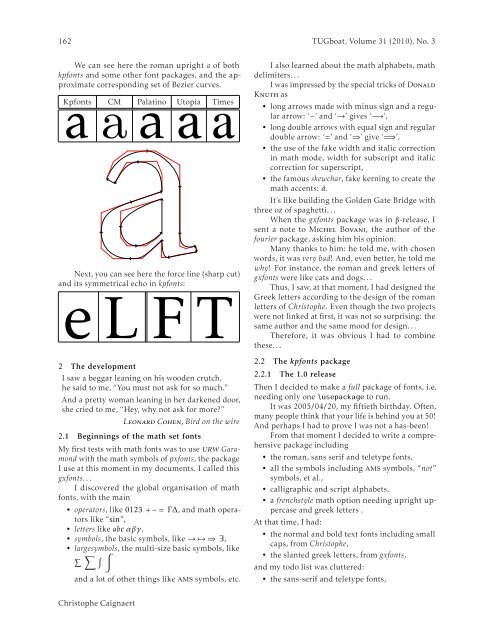
We can see here the roman upright a <strong>of</strong> both<br />
<strong>kpfonts</strong> and some other font packages, and the approximate<br />
corresponding set <strong>of</strong> Bezier curves.<br />
Kpfonts<br />
a<br />
aCM Palatino<br />
a<br />
aUtopia aTimes<br />
Next, you can see here the force line (sharp cut)<br />
and its symmetrical echo in <strong>kpfonts</strong>:<br />
e L F T<br />
2 The development<br />
I saw a beggar leaning on his wooden crutch,<br />
he said to me, “You must not ask for so much.”<br />
And a pretty woman leaning in her darkened door,<br />
she cried to me, “Hey, why not ask for more?”<br />
Leonard Cohen, Bird on the wire<br />
2.1 Beginnings <strong>of</strong> the math set fonts<br />
My first tests with math fonts was to use urw Garamond<br />
with the math symbols <strong>of</strong> pxfonts, the package<br />
I use at this moment in my documents. I called this<br />
gxfonts. . .<br />
I discovered the global organisation <strong>of</strong> math<br />
fonts, with the main<br />
• operators, like 0123 + − = Γ ∆, and math operators<br />
like “sin”,<br />
• letters like abc αβγ,<br />
• symbols, the basic symbols, like → ↦→ ⇒ ∃,<br />
• largesymbols, the multi-size basic symbols, like<br />
∑ ∑ ∫ ∫<br />
and a lot <strong>of</strong> other things like ams symbols, etc.<br />
I also learned about the math alphabets, math<br />
delimiters. . .<br />
I was impressed by the special tricks <strong>of</strong> Donald<br />
Knuth as<br />
• long arrows made with minus sign and a regular<br />
arrow: ‘−’ and ‘→’ gives ‘−→’,<br />
• long double arrows with equal sign and regular<br />
double arrow: ‘=’ and ‘⇒’ give ‘=⇒’,<br />
• the use <strong>of</strong> the fake width and italic correction<br />
in math mode, width for subscript and italic<br />
correction for superscript,<br />
• the famous skewchar, fake kerning to create the<br />
math accents: ã.<br />
It’s like building the Golden Gate Bridge with<br />
three oz <strong>of</strong> spaghetti. . .<br />
When the gxfonts package was in β-release, I<br />
sent a note to Michel Bovani, the author <strong>of</strong> the<br />
fourier package, asking him his opinion.<br />
Many thanks to him: he told me, with chosen<br />
words, it was very bad! And, even better, he told me<br />
why! For instance, the roman and greek letters <strong>of</strong><br />
gxfonts were like cats and dogs. . .<br />
Thus, I saw, at that moment, I had designed the<br />
Greek letters according to the design <strong>of</strong> the roman<br />
letters <strong>of</strong> Christophe. Even though the two projects<br />
were not linked at first, it was not so surprising: the<br />
same author and the same mood for design. . .<br />
Therefore, it was obvious I had to combine<br />
these. . .<br />
2.2 The <strong>kpfonts</strong> package<br />
2.2.1 The 1.0 release<br />
Then I decided to make a full package <strong>of</strong> fonts, i.e.<br />
needing only one \usepackage to run.<br />
It was 2005/04/20, my fiftieth birthday. Often,<br />
many people think that your life is behind you at 50!<br />
And perhaps I had to prove I was not a has-been!<br />
From that moment I decided to write a comprehensive<br />
package including<br />
• the roman, sans serif and teletype fonts,<br />
• all the symbols including ams symbols, “not”<br />
symbols, et al.,<br />
• calligraphic and script alphabets,<br />
• a frenchstyle math option needing upright uppercase<br />
and greek letters .<br />
At that time, I had:<br />
• the normal and bold text fonts including small<br />
caps, from Christophe,<br />
• the slanted greek letters, from gxfonts,<br />
and my todo list was cluttered:<br />
• the sans-serif and teletype fonts,<br />
Christophe Caignaert


