

A story of kpfonts - TUG
A story of kpfonts - TUG
A story of kpfonts - TUG

You also want an ePaper? Increase the reach of your titles
YUMPU automatically turns print PDFs into web optimized ePapers that Google loves.
166 <strong>TUG</strong>boat, Volume 31 (2010), No. 3<br />
<br />
default<br />
dx dy dz<br />
<br />
narrowiints<br />
dx dy dz<br />
And with Release 2.3, the partialup option<br />
is added. For \dfrac{\partial z}{\partial x},<br />
the output is:<br />
default<br />
∂z<br />
∂x<br />
partialup<br />
z<br />
x<br />
2.4 The 3.0 release: new text kerning and<br />
math accents<br />
2.4.1 New kerning<br />
There were some inherited defaults in <strong>kpfonts</strong>, and,<br />
even at that time, we could see that the main problem<br />
was the kernings. One <strong>of</strong> the first lines <strong>of</strong> the<br />
Readme file is<br />
Release 1.11 2007/06/03 Correct bad<br />
kernings <strong>of</strong> ’quote’ symbols<br />
It proves that, from the beginning, the kerning<br />
was a problem. Perhaps it’s the biggest challenge<br />
for a beginner! The kerning by pairs is the way to<br />
tighten or spread two characters depending on their<br />
exact design. For instance, see Ye with and without<br />
kerning, here using the light option:<br />
with<br />
Ye<br />
without<br />
Ye<br />
The font editors <strong>of</strong>fer a lot <strong>of</strong> possibilities. One<br />
<strong>of</strong> these is automatic kerning. Usually you have to<br />
choose:<br />
• the left and right characters to kern,<br />
• the required space between two characters,<br />
• the technique: minimum distance, average distance,<br />
average weight,<br />
• the exceptions: numerals, lowercase-uppercase:<br />
in ‘LATEX’, for instance, there is a kerning T-e<br />
but no kerning a-T. . .<br />
• the equivalents, o and ô have <strong>of</strong>ten the same<br />
kerning. . .<br />
These programs do their best but are regrettably<br />
not very good. And a beginner like me was too<br />
confident in their results. Even if, at the time, I corrected<br />
all the generated kernings by hand, I was too<br />
confident about the basic results <strong>of</strong> the automatic<br />
kernings. . .<br />
Some users protest rightly about incoherent<br />
kerning. I asked on fctt, the French version <strong>of</strong> ctt,<br />
and everybody thought new kernings would be a<br />
good thing although it can change the typesetting. I<br />
decided to work on it. . .<br />
At the same time, subscript and superscript<br />
position, i.e. width and italic correction, <strong>of</strong> all the<br />
math alphabets were revisited. It’s a very long hard<br />
job, with a large set <strong>of</strong> tests and much reinstallation<br />
<strong>of</strong> <strong>kpfonts</strong>. During these six months, I produced,<br />
with fontinst and batch files, at least 200 000 files. . .<br />
It was available on CTAN as <strong>of</strong> Release 3.0<br />
2009/03/03, and I thought now the work was not<br />
too far from being good fonts. Therefore, the new<br />
main number version.<br />
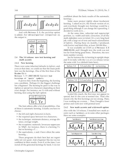
See for instance the Av kerning in upright shape<br />
and To in italic with the 1.xx or 2.xx release versus<br />
the same with 3.xx (default fonts here).<br />
before 3.0 3.0 and after no kerning<br />
Av Av Av<br />
before 3.0 3.0 and after no kerning<br />
To To To<br />
Scaled this much, the first may not appear to<br />
spread, but it’s the case at normal size. That’s the<br />
reason why the first kernings are too strong. Then,<br />
I was working on a screen. . . Thus I bought a laser<br />
printer and work now with printed tests!<br />
2.4.2 New math accents and widermath option<br />
Also with the 3.0 release, I installed new math accents<br />
such as \widearc, as in some other packages.<br />
Here are some examples:<br />
\widearc<br />
\widearcarrow<br />
M 0 M 1<br />
M 0 M 1<br />
\wideparen<br />
\widering<br />
M 0 M 1<br />
˚M 0 M 1<br />
Christophe Caignaert


