

A story of kpfonts - TUG
A story of kpfonts - TUG
A story of kpfonts - TUG

Create successful ePaper yourself
Turn your PDF publications into a flip-book with our unique Google optimized e-Paper software.
164 <strong>TUG</strong>boat, Volume 31 (2010), No. 3<br />
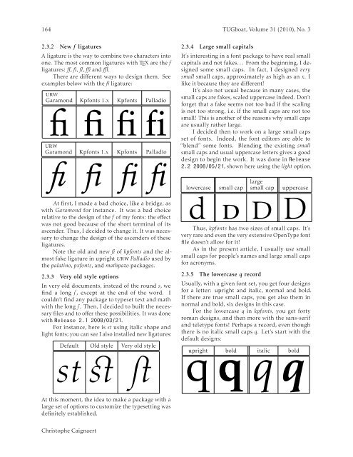
2.3.2 New f ligatures<br />
A ligature is the way to combine two characters into<br />
one. The most common ligatures with TEX are the f<br />
ligatures: ff, fi, fl, ffi and ffl.<br />
There are different ways to design them. See<br />
examples below with the fi ligature:<br />
urw<br />
Garamond Kpfonts 1.x Kpfonts Palladio<br />
fi fi fi fi<br />
urw<br />
Garamond Kpfonts 1.x Kpfonts Palladio<br />
fi fi fi fi<br />
At first, I made a bad choice, like a bridge, as<br />
with Garamond for instance. It was a bad choice<br />
relative to the design <strong>of</strong> the f <strong>of</strong> my fonts: the effect<br />
was not good because <strong>of</strong> the short terminal <strong>of</strong> its<br />
ascender. Thus, I decided to change it. It was necessary<br />
to change the design <strong>of</strong> the ascenders <strong>of</strong> these<br />
ligatures.<br />
Note the old and new fi <strong>of</strong> <strong>kpfonts</strong> and the almost<br />
fake ligature in upright urw Palladio used by<br />
the palatino, pxfonts, and mathpazo packages.<br />
2.3.3 Very old style options<br />
In very old documents, instead <strong>of</strong> the round s, we<br />
find a long s , except at the end <strong>of</strong> the word. I<br />
couldn’t find any package to typeset text and math<br />
with the long s . Then, I decided to built the necessary<br />
files and to <strong>of</strong>fer these possibilities. It was done<br />
with Release 2.1 2008/03/21.<br />
For instance, here is st using italic shape and<br />
light fonts; you can see I also installed new ligatures:<br />
Default Old style Very old style<br />
st st st<br />
2.3.4 Large small capitals<br />
It’s interesting in a font package to have real small<br />
capitals and not fakes. . . From the beginning, I designed<br />
some small caps. In fact, I designed very<br />
small small caps, approximately as high as an x. I<br />
like it because they are different!<br />
It’s also not usual because in many cases, the<br />
small caps are fakes, scaled uppercase indeed. Don’t<br />
forget that a fake seems not too bad if the scaling<br />
is not too strong, i.e. if the small caps are not too<br />
small! This is another <strong>of</strong> the reasons why small caps<br />
are usually rather large.<br />
I decided then to work on a large small caps<br />
set <strong>of</strong> fonts. Indeed, the font editors are able to<br />
“blend” some fonts. Blending the existing small<br />
small caps and usual uppercase letters gives a good<br />
design to begin the work. It was done in Release<br />
2.2 2008/05/21, shown here using the light option.<br />
lowercase<br />
small cap<br />
large<br />
small cap<br />
uppercase<br />
d d d D<br />
Thus, <strong>kpfonts</strong> has two sizes <strong>of</strong> small caps. It’s<br />
very rare and even the very extensive OpenType font<br />
file doesn’t allow for it!<br />
As in the present article, I usually use small<br />
small caps for people’s names and large small caps<br />
for acronyms.<br />
2.3.5 The lowercase q record<br />
Usually, with a given font set, you get four designs<br />
for a letter: upright and italic, normal and bold.<br />
If there are true small caps, you get also them in<br />
normal and bold, six designs in this case.<br />
For the lowercase q in <strong>kpfonts</strong>, you get forty<br />
roman designs, and then more with the sans-serif<br />
and teletype fonts! Perhaps a record, even though<br />
there is no italic small caps q. Let’s start with the<br />
default designs:<br />
qupright qbold qitalic qbold<br />
At this moment, the idea to make a package with a<br />
large set <strong>of</strong> options to customize the typesetting was<br />
definitely established.<br />
Christophe Caignaert


