minimalism - fen-om data
minimalism - fen-om data
minimalism - fen-om data

You also want an ePaper? Increase the reach of your titles
YUMPU automatically turns print PDFs into web optimized ePapers that Google loves.
text<br />
C O L O R A N D C O M P O S I T I O N<br />
page 1<br />
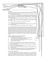
Minimalist Reduction<br />
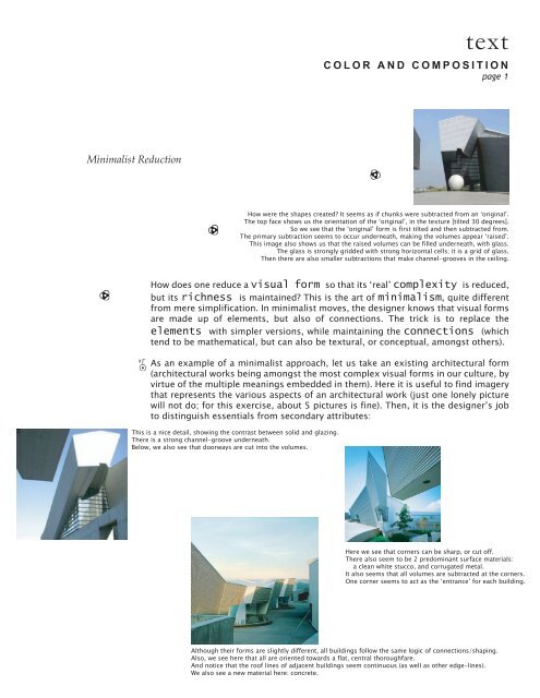
How were the shapes created? It seems as if chunks were subtracted fr<strong>om</strong> an ‘original’.<br />
The top face shows us the orientation of the ‘original’, in the texture [tilted 30 degrees].<br />
So we see that the ‘original’ form is first tilted and then subtracted fr<strong>om</strong>.<br />
The primary subtraction seems to occur underneath, making the volumes appear ‘raised’.<br />
This image also shows us that the raised volumes can be filled underneath, with glass.<br />
The glass is strongly gridded with strong horizontal cells; it is a grid of glass.<br />
Then there are also smaller subtractions that make channel-grooves in the ceiling.<br />
How does one reduce a visual form so that its ‘real’ c<strong>om</strong>plexity is reduced,<br />
but its richness is maintained? This is the art of <strong>minimalism</strong>, quite different<br />
fr<strong>om</strong> mere simplification. In minimalist moves, the designer knows that visual forms<br />
are made up of elements, but also of connections. The trick is to replace the<br />
elements with simpler versions, while maintaining the connections (which<br />
tend to be mathematical, but can also be textural, or conceptual, amongst others).<br />
As an example of a minimalist approach, let us take an existing architectural form<br />
(architectural works being amongst the most c<strong>om</strong>plex visual forms in our culture, by<br />
virtue of the multiple meanings embedded in them). Here it is useful to find imagery<br />
that represents the various aspects of an architectural work (just one lonely picture<br />
will not do; for this exercise, about 5 pictures is fine). Then, it is the designer’s job<br />
to distinguish essentials fr<strong>om</strong> secondary attributes:<br />
This is a nice detail, showing the contrast between solid and glazing.<br />
There is a strong channel-groove underneath.<br />
Below, we also see that doorways are cut into the volumes.<br />
Here we see that corners can be sharp, or cut off.<br />
There also seem to be 2 pred<strong>om</strong>inant surface materials:<br />
a clean white stucco, and corrugated metal.<br />
It also seems that all volumes are subtracted at the corners.<br />
One corner seems to act as the ‘entrance’ for each building.<br />
Although their forms are slightly different, all buildings follow the same logic of connections/shaping.<br />
Also, we see here that all are oriented towards a flat, central thoroughfare.<br />
And notice that the roof lines of adjacent buildings seem continuous (as well as other edge-lines).<br />
We also see a new material here: concrete.
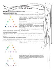
First, we look at a particular aspect that we feel is essential. For example, in the<br />
image below (as we have already seen), the ‘eaten-away corner’ is important. The<br />
next step is to represent this aspect, in a gridded square icon:<br />
In the first version of the icon, the important thing is that it be a<br />
perfect square, and that we draw the most basic and essential<br />
version of the architectural detail being evaluated. The drawing<br />
will consist of architecture lines, grid lines, and box edge. Grid<br />
lines and box edge can be drawn in pencil to assist you in<br />
making architecture lines, but in the end only architecture lines,<br />
inked, should remain.<br />
Logically, the size of the grid is determined by the<br />
smallest space needed by the drawing. For example,<br />
if your icon shows a 10-foot wall with rectangular<br />
windows, 10 feet would be the height of the entire<br />
box, probably. Then you figure out the size of the<br />
windows. If they can only be as small as 2 feet, then<br />
that is your smallest space needed, and your grid<br />
would be a 5-unit grid (five 2-foot units equal 10<br />
feet). Proper sizes have a lot to do with your ability to<br />
‘read’ the architecture that you are analyzing. Notice,<br />
as in the example on this page, that s<strong>om</strong>etimes the<br />
smallest unit is hidden in the ‘potential shapes’ (in<br />
this exercise, for every icon that you develop, you will<br />
create 9 other ‘variations’, or ‘potential shapes’).<br />
Here the grid is a 8-unit grid, because the designer feels that<br />
the size of the ‘eaten-away corner’ could be increased or<br />
decreased nicely using this particular unit size.<br />
01 02<br />
‘eaten-away corner’<br />
In these 3 variations, we explore<br />
modifications that would still be<br />
‘in keeping’ with the original architecture, and explore ‘maximum change’.<br />
These particular variations are based on the fact that the subtracted corner<br />
is a doorway, so it can’t be much shorter than the 8-10-foot height it<br />
started out with. Personal taste also c<strong>om</strong>es into play. If the selected<br />
architectural element does not offer enough ‘richness’ for 9 variations,<br />
include a second (and maybe 3rd) architectural element.<br />
03
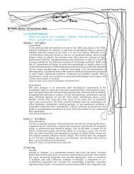
Be aware of exactly what it is that you are transforming, in each variation. In this<br />
example, we are changing the width and the height of the ‘eaten-away corner’. Since<br />
the transformation is very specific, here we probably will not be able to make s<strong>om</strong>e<br />
5-6 variations. We’ve already created 3 variations; let’s see how many more<br />
variations can be created by changing just the height and width of the corner<br />
opening:<br />
04<br />
05<br />
That’s about it. Sure, we could make hundreds of variations based on height and<br />
width of the opening (instead of just 5), but they wouldn’t be very different fr<strong>om</strong><br />
each other (one of the goals of this exercise is to create the greatest difference<br />
possible). Also, it is important to be selective, as designers, and keep only the<br />
variations that we really like. So we’ll need to find s<strong>om</strong>ething else to transform<br />
(maybe the angle of one of the edges of the opening). Or we could add another<br />
element to the master icon (s<strong>om</strong>ething else that can be transformed, such as the<br />
edges of the metal corrugation on the surface of the wall). Let’s first work with<br />
angles. Starting again fr<strong>om</strong> the master, we could create the following new variations:<br />
06<br />
07 08<br />
09<br />
10<br />
Fr<strong>om</strong> the strongest variations based on angle changes, these last 5 are the ones the<br />
designer liked best. These should still be c<strong>om</strong>pared to the first 5 variations, to make<br />
sure that the new variations are unique enough. And finally, since we only need 9<br />
variations, we’ll have to eliminate any extras (the weakest ones, such as #10, in this<br />
case, which is not very ‘defined’, or #08, which seems ‘too defined’).