AAA 207-GRC 101 - LETTER SPACING AND SET WIDTH
AAA 207-GRC 101 - LETTER SPACING AND SET WIDTH
AAA 207-GRC 101 - LETTER SPACING AND SET WIDTH

You also want an ePaper? Increase the reach of your titles
YUMPU automatically turns print PDFs into web optimized ePapers that Google loves.
The 1970s fashion for tightly set type left a legacy of text that’s difficult to read. Today, it’s time to<br />
reconsider how much kerning and letterspacing is applied to letters.<br />
In the 1960s, when phototypesetting was<br />
taking over from hot-metal typesetting, especially<br />
in the realm of display type for advertising,<br />
a new visual style emerged. The sudden ability<br />
to move letters closer together, without having<br />
to physically reduce the amount of metal in each<br />
piece of type, made it possible to do things that<br />
couldn’t be done before (at least not without exceedingly<br />
difficult workarounds): overlapping<br />
type, distorting its shape, setting it at odd angles<br />
and in lines that weren’t necessarily straight.<br />
It was practical (though expensive) to have<br />
headlines set on photo-lettering machines even<br />
while body copy was still being typeset traditionally,<br />
on a Linotype or a Monotype. There was<br />
nothing automated about those early headline<br />
photosetters — each letter was positioned by<br />
hand — but the skills and the eye of a good<br />
typesetter could achieve wonderful, and precise,<br />
effects.<br />
Urban Crowding<br />
INTRODUCTION TO GRAPHIC COMMUNICATIONS<br />
<strong>LETTER</strong> <strong>SPACING</strong> <strong>AND</strong> <strong>SET</strong> <strong>WIDTH</strong><br />
Section No.<br />
<strong>207</strong><br />
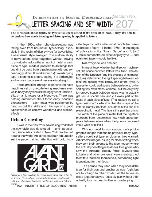
It was in the New York advertising world that<br />
the new style was developed — and popularized,<br />
since ads created in New York reached all<br />
around the world. Art directors like Herb Lubalin<br />
set the pace, gaining attention with bold, intricate<br />
layouts unlike what most people had seen<br />
before (see figure 1). In the 1970s, in the pages<br />
of publications like “Avant Garde” and “U&lc,”<br />
Lubalin demonstrated what display type — and<br />
even text type — could be like.<br />
Not everyone was amused.<br />
In metal type, whether hand-set or machineset,<br />
the space between letters was fixed. The design<br />
of the typeface (and the process of its manufacture)<br />
determined the right spacing between letters;<br />
the spacing was literally part of the type. A<br />
typesetter could add space between letters, by inserting<br />
tiny extra strips of metal, but the only way<br />
to remove space between letters was to actually<br />
get out a special saw and cut away part of the<br />
metal in each piece of type. (The reason we call a<br />
type design a “typeface” is that the shape of the<br />
letter is literally the “face” or surface at the end of a<br />
piece of solid metal. The face is the part that prints.<br />
The width of the piece of metal that the typeface<br />
protrudes from determines how much space appears<br />
between letters when the type is composed<br />
into a word or a line.)<br />
With no metal to worry about, only photographic<br />
images that had no physical body, typesetters<br />
could set type as close as they wanted.<br />
Art directors began asking for close setting when<br />
they sent their layouts to the type house (where<br />
the actual typesetting was done). Designers who<br />
saw the intricate, closely fitted layouts that<br />
Lubalin and other pioneers were creating tried<br />
to imitate that look themselves, demanding tight<br />
typesetting for their jobs.<br />
The phrase they used when they spec’d the<br />
type for their ads and brochures was “tight but<br />
not touching.” In other words, set the letters as<br />
close together as you possibly can without their<br />
actually touching each other or overlapping.<br />
Figure 1: A logo needs to be recognizable more than it has to<br />
be legible. Herb Lubalin created the typeface Avant Garde,<br />
with a set of extreme ligatures, just for the magazine “Avant<br />
Garde.”<br />
102 – INSERT TITLE OF DOCUMENT HERE 1 R08/02
Read My Quips<br />
There’s only one problem with this fashion<br />
in setting type: It’s usually not very readable. In<br />
the hands of a master (Herb Lubalin was a master<br />
of this art), it can be brilliant and it can work<br />
(see figure 2); in the hands of most practitioners,<br />
however, it produced a mishmash of crowded,<br />
cacophonous lettering that lost its impact and<br />
failed to communicate.<br />
The basic fact of contrast — which is how<br />
we see and read letters — is that it has two<br />
parts: the background, and the object that’s<br />
against the background. Without the background,<br />
there would be no way to recognize the<br />
object, since there would be no differentiation,<br />
no contrast, no edges, no shape. The most traditional<br />
form of printing is black marks on white<br />
paper: letters against a contrasting background.<br />
The marks can be red or gray or blue or brown,<br />
Figure 2: Kids! Don’t try this at home with type of your<br />
own! (From the June 1977 issue of “U&lc.”)!<br />
and the background might be yellow or green or<br />
black, but there must be a visible contrast between<br />
the two.<br />
you squeeze out all the space between letters,<br />
you lose that balance, and you render the words<br />
harder to read (see figure 3).<br />
Figure 3: Squeezing all the air out between letters, vs. giving<br />
the type some room to breathe.<br />
(It’s been said often that we read more by<br />
recognizing the shapes of words than by recognizing<br />
individual letters. There’s a lot of truth to<br />
this. That’s why it’s easier to read words in lowercase<br />
letters, which have ascenders and descenders,<br />
than in capital letters, which all have<br />
the same height. But the shape we read isn’t<br />
just the outline of the word; it includes the pattern<br />
of lines and spaces within the word, too. In<br />
reality, our eyes and our brains are more complex<br />
than our theories.)<br />
Squeezing Into a Cab<br />
The style that New York ad designers established<br />
in the 1960s and made dominant in<br />
the 1970s has had a long influence on type. Even<br />
though we don’t design ads and brochures today<br />
that look like those from 1972 (or if we do,<br />
it’s now considered “retro”), there’s still an awful<br />
lot of tight type to be seen. The standards built<br />
into the early desktop-publishing programs were<br />
based on the prevailing style, and that style was<br />
tight. Too tight. Much too tight to be used by<br />
amateur publishers and by designers who had<br />
never set their own type before.<br />
In the early ’90s there was a counter-trend,<br />
which I think originated in the Netherlands, to<br />
go too far in the other direction and set text type<br />
so loosely spaced that the words didn’t hold together<br />
— and again, readability suffered. This<br />
style is still with us, but so is the earlier too-tight<br />
Since letters are not solid shapes but shapes<br />
made up of lines — thick lines, thin lines, curving<br />
lines, swelling lines, finely modulated lines of<br />
all kinds — you can see through them. They<br />
have space inside them as well as between them.<br />
Visually, when you space type, you have to take<br />
into account the balance between the space inside<br />
the letters and the space outside them. If<br />
Figure 4: Not all letter combinations can be tightly<br />
kerned. Nor should they. Too much kerning defeats its<br />
own purpose.<br />
style. (And very few designers seem to realize<br />
that the spacing between type might have to be<br />
slightly different at large size than at small size,<br />
or that words in all caps or small caps are more<br />
readable with a little extra letterspacing.)<br />
R08/02 2 102 – Community College of Southern Nevada
The effect of the long dominance of “tight<br />
but not touching” in typesetting is visible all<br />
around us — and it affects the readability of words<br />
in our everyday environment. Take the word<br />
“TAXI,” for instance — all in caps, as I just typed<br />
it here. If you follow the practice of setting letters<br />
as tight as possible, you would jam the A up<br />
against the T — just because you can. But you’re<br />
left with a huge visual space between the A and<br />
the X, which you can’t reduce except by overlapping<br />
the two letters. And there’s a smaller but<br />
still large space between the X and the I. For<br />
that matter, when you push the T and the A together,<br />
you’re left with a lot of space inside the<br />
A — much more than the squashed space under<br />
the arm of the T. The result (which I’ve seen<br />
often on real-life taxicabs, and on signs in airports<br />
and train stations) is a deformed word, a<br />
hard-to-recognize shape that looks less like<br />
“TAXI” and more like “TA XI” (see figure 4).<br />
This sort of over-tight spacing between letters<br />
is often built into digital fonts, in the form of<br />
kerning pairs. “TA” is one of the most common<br />
kerning pairs, because in many typefaces, if you<br />
don’t do something to this letter combination, it<br />
looks way too loose. But the proponents of<br />
kerning tend to overdo it. I’ve seen all too many<br />
explanations of how to kern where the “before”<br />
spacing actually looks better than the “after.”<br />
(Sort of like those personal-appearance<br />
“makeovers” where you think the person looked<br />
better before the makeover artist got his hands<br />
on her.) The idea of kerning is to massage awkward<br />
letter combinations so they don’t stand out;<br />
over-kerning just makes them stand out more.<br />
Striking a Balance<br />
In the end, the only thing you can rely on is<br />
your own eye. A well-designed font will have<br />
good spacing built in — but not all of them do.<br />
Most often, the built-in letterfit and automatic<br />
kerning will err on the side of tightness (especially,<br />
it seems, in digital versions of typefaces<br />
originally designed for composition in metal).<br />
Running out tests is the best way to determine<br />
the best spacing for a font. (Looking at the letters<br />
onscreen, blown up larger than life, can be<br />
very misleading.) In display type, where you may<br />
be setting only a few words, you can take the<br />
time to fiddle with the spacing of each letter, to<br />
make it look best in this particular use.<br />
But the tendency is always, when you start<br />
playing with kerning, to take out too much space,<br />
to close things up so tight that the words don’t<br />
flow anymore. Leave your type some space to<br />
sit in. Look at how those spaces balance and fit<br />
together — within the letters, within the words,<br />
between the words, between the lines, between<br />
the text blocks, and among all the visual elements<br />
on the page. That’s where the artistry lies: the<br />
artistry of communication.<br />
102 – INSERT TITLE OF DOCUMENT HERE 3 R08/02